
Last Seen Blogs

studyiqeducation
StudyIQ

hyakki-doro
Dororo, a horse.

curlslovekpop
Curlslovekpop

evlaluzeligarcia
Untitled

the-cindy-diaries
THE DIARIES
Text
Connecting with the Audience

Figure 1 Outside of Theater Box from Hudson Yards Studio
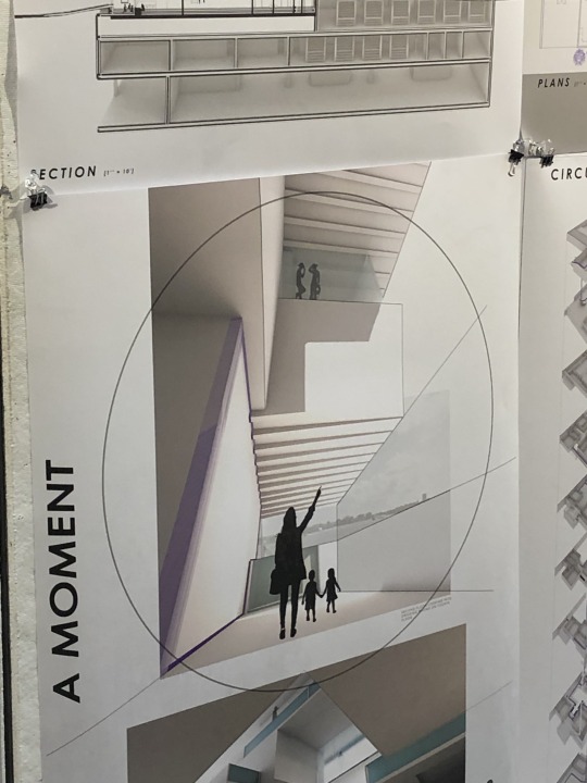
Figure 2 Interior of Theater Box
The review I visited was in the atrium on Thursday morning. The studio was of the Hudson Yards development project with this design in particular being a collection of small theaters. This project looked to become an entertainment center in Ney York City. The design was built with the same grid design from the surrounding city by separating the place into small box theaters with a central hallway, built like a movie theater. The project creates a small-scale version of the common theater with more focus on interaction with the audience. The inner hallways are also not fully separated from the actors, allowing the viewers to see some backstage areas and create the closeness between people and actors. In this way, the project builds an experience for the audience the second the enter the building. The critics for this design generally supported the design and the reasons behind it. They agreed with the interconnecting design and I did as well, however, they looked at the controlling aspect of the design as a negative. The creator said there would need to be modified versions of plays to fit the smaller theaters and create a connection with audience members. The design also works pragmatically, but the critics hoped for more in terms of the social aspect and the connection with society. For the interconnecting design the critics recognized the design as something refreshing and showed a lot of support in that piece of the design. This project felt easier for me to understand in terms of why the structure was created in a certain way and the creator’s intent. I had a lack of understanding of what the critics were discussing the social aspect of the design as I thought the creator discussed how the theater acted as a social center.
0 notes
Text
Creation of Mosque

Figure 1 Outside of mosque from Hudson Yards Studio
Figure 2 Prayer Room of mosque from Hudson Yards Studio
The review I visited was in the atrium on Thursday morning. The studio was of the Hudson Yards development project with this design in particular being a mosque. This project was created as a new place of worship and learning inside New York City. The structure was created in a way to attract people and have an inviting entrance. The ramp up to the entrance provides an outside area that feeds into an entrance. The outside of the building is also on street corner in order to be available for people and be in a heavy traffic. The student showed her research of transportation and noise density in order to place the building in a quiet, yet somewhat busy place of the city. She also showed of the interior of the design of the prayer room that has a window facing towards mecca. The purpose of the room is clearly shown with the purpose of facing mecca. These ideas behind the building are logical and make sense, but the critiques focused on the experience of visiting the space. They acknowledged the function of the reasons for making the building, but they wanted to better understand how the architecture leads to having a certain experience with the space. The critics were positive in the way she analyzed the location with research and the creation of something new and I agree with this support as the ideas all made sense to me. The main complaint coming from the reviewers was the program of the structure. This idea was more complicated than what I was used to discussing in class, but I grasped that the reviewers wanted a greater interaction between the building and the people rather than the people going through motions of visiting the mosque. This conversation between the critics and the presenter was more of a conversation than learning methods I had seen before. Overall, I agree with the critics that the building fulfilled all purposes and was created with a good reason in mind, but I found it hard to understand why the building didn’t engage the visitors enough.
0 notes
Text
Modern Research in Design

Figure 1 Kieran Timberlake office from https://kierantimberlake.com/pages/view/166/profile/parent:33

Figure 2 Nurse interaction data from Kieran Timberlake's research at Jefferson Hospital from https://kierantimberlake.com/pages/view/591/occupant-mapping/parent:4
Billie Faircloth showed the way her firm, Kieran Timberlake, uses research and collaboration to logically breakdown problems in architecture and methodically solve them. Her firm uses these ideas to help expand the reach of what design can do. Faircloth first showed the idea of collaboration in the design of the firm’s office (Fig. 1). The workspace shows all people connected even if they work in different areas. Faircloth discussed how some members work in research or design or even software, but they all interact together in the problem-solving process. She also showed how anyone working there can bring up an idea they want researched or talked about if they show there is good reason behind it. This interworking of all branches of the firm impressed me in terms of how dynamic the firm functions. She showed several projects they worked on to demonstrate the different areas the firm looks into and the different approaches to solve them. One method discussed was the process of observing and modelling the decay and discoloration of wood over a long period of time. In this project the firm looked to create a wooden structure that would be affected by water over time, so they took that into account by doing their own research. Another project they worked on was the U.S. embassy in the London where they planned on adding curved surfaces to the outside of the building. To model this they created prototypes of the structure to record the affects to light, temperature and other changes that could be caused by this. Faircloth also showed the extent of their research by presenting the project at Jefferson Hospital. Here, her firm looked to understand the flow of patients and nurses in order to construct the most efficient design for a hospital. To complete this, the firm has to collect data on the movement of all people in the hospital, the time spent in each area by each person and other statistics such as the temperature at these locations (Fig. 2). By using all these ideas, Kieran Timberlake can do more as a firm in terms of the purpose of their design. This section was presented well by Faircloth as I was fully able to grasp what made her firm special. The research they do lets them go beyond what just may seem correct for the design of a hospital and breaks down its function to create the best design based on the data they have gathered.
0 notes
Text
Lighting Up the Neighborhood

Dutch firm, MVRDV, introduces this new colorful project in a dense and lively section of Manhattan. They bring new values of stranger shapes and colors to add more expression in their environment. The structure is the sight of a new radio tower, a hotel, some office spaces, and some shops. Here each piece of the structure defines a certain section, but they all connect together in odd fashion just like the all the places they represent. The building allows all people to become a part of it and creates a bright image of itself in this lively section of New York.
MVRDV has created projects with similar strange designs and have now added a great piece in this part of the world. Their relaxed style may be seen as a contrast from other solid, square buildings around it, but the building connects breathes a new life into the space. Having an office building look like a Lego brick may be seen as not rigid enough, that is very much the point of this structure. Instead of a cookie cutter workspace, MVRDV looks to create a new and decorated environment that reaches out to the people rather than just containing them.
0 notes
Text
Modern Living

Figure 1 Exterior of Ecological Living Module from https://www.dezeen.com/2018/11/07/ecological-living-module-off-grid-tiny-home-gray-organschi-architecture-yale-university-united-nations/
Created by Gray Organschi Architecture with assistance from Yale’s Center for Ecosystems in Architecture, this project looks to address the issues caused by housing worldwide. This small house confronts the problem of informal living situations in many parts of the world as well as the damage to the environment caused by the housing sector.
Commissioned by the UN, the designers behind this project needed to work with the concept that a large portion of people cannot afford the type of large and grand houses that the world in accustomed to. This house defies the idea of house but keeps all the features that allow for a living space. Inside the house is a kitchen, bathroom, living space, and lofted bedroom. By looking at only the defining features the cost of living can be cut down immensely allowing these houses to be produced at $50,000 each which creates affordable living for most areas in the world.
The project is also created with the modern environment in mind. The house is sustainable in terms for plumbing, power, water supply, and food. The several plants the decorate the exterior and the bedroom allow for farming on a smaller scale. In terms of the water supply, the house collects and filters water from rain and from the humidity in the air. These processes cut down on any damage to the nearby environment that would occur due to consuming the equivalent food and water. The panels resting on the roof are essentially more efficient solar panels. The house provides for its own power through them and allows for living of the use on any electrical grid.
This house is an overall complete project that is able to address both the social and environmental issues caused by modern housing. The design stands out among others in terms of affordability and sustainability.
0 notes
Text
Emptiness and Space


Cooper is flying above a planet in a mostly empty space. In the small window of his ship, the focus of his vision, the Endurance explodes. Above the planet they just left the now damaged Endurance spirals out of control with debris flying in all directions. Everywhere else is empty space with nothing in it. Cooper’s face becomes intense in the ship. He shifts the tone of despair due to the damage of the ship into the focus to recover this situation by his expression. Cooper’s ship approaches the Endurance and there is hope as the gap between the two ships is closed. The emptiness of the space remains, but the chance to recover is seen as the vessels attempt to close the gap. From there Cooper is seen looking at the endurance through the window from below. The two are almost connected now and Cooper’s ship is seen to come below the Endurance in order to stop. The space between the two ships is now further closed as they make the final approach to connect. Suspense rises as the climax of this scene approaches and the idea that the closer the ships become, the more intense the moment continues to hold true. The ship begins to match the rotation of the Endurance and the two pilots are forced to the side from the force. The struggle of the situation now directly impacts the physical state of the pilots. While the two have not left their small cabin the scene around them has changed so much. The space between them and the Endurance has almost disappeared as the two match their spinning and Cooper’s ship aligns with the Endurance. Here, the two ships are almost at the most intense moment. Once the connection is made, the emptiness of the space becomes less important, but there is no sense of relief yet. The ship starts its engines to escape the gravity of the planet and the two pilots now have control over the space they’re in once again. No the suspense can be lifted and the emptiness of the space between the two ships shifts into the emptiness of space beyond the planet and the ship in preparation for the next turn of events.
0 notes
Text
One of a Kind Skyscraper
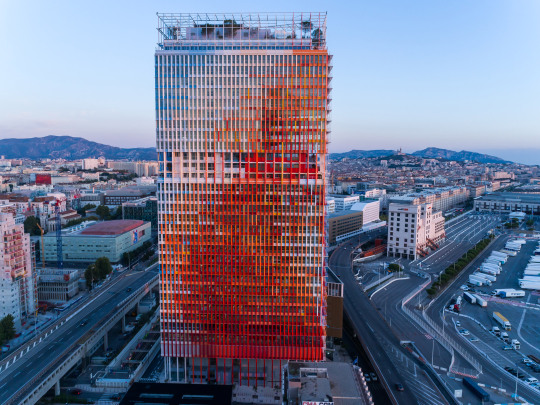
La Marseillaise by Jean Nouvel is an extravagant and unique design created to help define the city of Marseille. This project pushes the bounds of what is an acceptable design for a skyscraper with the three colors of the French flag, red, white and blue boldly standing out against a rather normal coastline. These colors also look to present Marseille individually as much of the colors seen in the region are red, white and blue.
Nouvel looked to create something special with this outrageous design. He wanted to make sure people would know exactly where they were when viewing this structure. Looking at any random skyscraper gives no insight into the location or the culture of the area. Nouvel has seen this concept and created something special that would not exist in any other region. Since the culture of the area is infused into its creation this building wouldn’t carry the same meaning nor would it fit the context of the New York City skyline. The structure exists only in one context and can only exist in this one space, which shows how truly unique and incredible this design is.

Figure 2 New York Skyline with Brooklyn Bridge from https://www.videoblocks.com/video/brooklyn-bridge-with-manhattan-skylines---new-york-city-bu0xuae8eixu5nqh0
0 notes
Text
Creating an Image
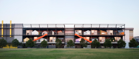
Figure 1 Front view of studios at Queen Elizabeth Olympic Park from https://www.dezeen.com/2018/10/26/hawkins-brown-wikihouse-workplaces-here-east-olympic-broadcast-centre-architecture/
These 21 individual workspaces at Queen Elizabeth Olympic Park are a design from Hawkins\Brown to convert an empty shell of a structure into a new workplace center. The complex was used during the 2012 Olympic Games but has not seen permanent use since the event.
This project is not what’s expected of a workplace environment from the outside with the different colors and patterns of each piece. What this somewhat strange looking design gives to the previously undefined structure is a sense of character. A normal office space would not define the empty structure or give it an identity. However, the contrast and individuality of each workspace creates a beautiful overall image of the project.
The building of the project also demonstrates a great use of available materials and processes. Hawkins\Brown used a process called WikiHouse that allows them to develop large parts of each section offsite before moving to the park for final assembly. The project also made use of the previous purpose of the structure. As the building was used as a broadcast center during the Games, the data infrastructure was already in place that would be needed for a workplace. These methods showed quality and efficient design from Hawkins\Brown in creating a new workplace and identity.
0 notes
Text
Power of Collaboration
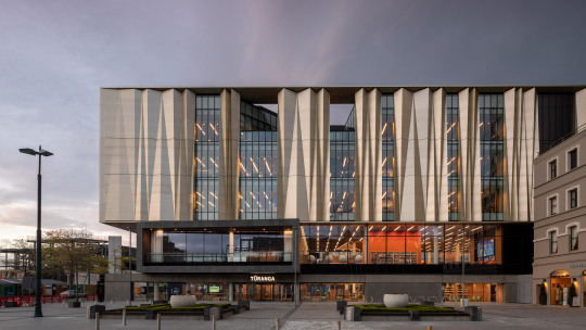
Figure 1 The central library in Christchurch from https://www.dezeen.com/2018/10/18/schmidt-hammer-lassen-architectus-christchurch-central-library-architecture/
This project is the new central library in Christchurch, New Zealand. It was developed mainly by Schmidt Hammer Lassen after the previous one was destroyed by an earthquake in 2011.
This project stands out to me for the intelligent work put in to prevent an outcome similar to the previous library. The work has steel cables holding the building together and a self-stabilizing device to keep it standing. Much of the work is defined by this need to maintain stability and be a lasting beacon in the city, but it also needs to fit the cultural context of its setting.
The local culture of the Maori people is meant to be shown in this structure. The golden screen reflecting light, the sculptures on the inside and the open stairways reaching up towards the ceiling all reflect aspects of Maori culture. As the library was to become a center for enjoyment and hope for the people of this town the building needed to reflect both the strength to withstand future damages and the openness of being a gathering place for people.
Collaboration is also a valuable piece of this design. Schmidt Hammer Lassen was the lead firm working on this project, but they also worked with a local architecture firm, an engineering consultant firm and a group that represents the Maori people’s interests. This combination of ideas of the Maori people and the quality design of the structure are only possible due to this collaboration and show how several aspects of design being developed by multiple groups can create a more valuable and lasting project.
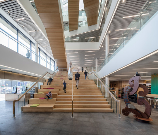
Figure 2 Atrium inside the library showing decorative lobby from https://www.dezeen.com/2018/10/18/schmidt-hammer-lassen-architectus-christchurch-central-library-architecture/
0 notes
Text
Sustainability and Lattes

Figure 1 Starbuck in Hualien Bay Mall by Kengo Kuma from https://www.dezeen.com/2018/10/15/kengo-kuma-shipping-container-starbucks-coffee-shop-taiwan-architecture/
The project presented in this Dezeen article is a new Starbucks, created by 29 shipping crates, designed by Kengo Kuma. The work is found in Hualien, Taiwan and the article can be found at https://www.dezeen.com/2018/10/15/kengo-kuma-shipping-container-starbucks-coffee-shop-taiwan-architecture/.
This design looked to use old shipping containers in an effort to repurpose them into something useful and extravagant. This design shows two aspects of Starbucks and uses these containers to convey a message about what the company wants to present themselves as.
The first aspect that can be clearly seen is the idea of sustainability. Starbucks has been keen on making decisions that are conscious towards the environment and sustainable works. By using the shipping containers, this work clearly displays the ideals of Starbucks and their goals. Also the outlandish nature of this design and its placement in a new mall show how this piece is meant to garner attention toward this idea, helping show the purpose behind its creation in this manner.

Figure 2 Interior of Starbucks by Kengo Kuma from https://www.dezeen.com/2018/10/15/kengo-kuma-shipping-container-starbucks-coffee-shop-taiwan-architecture/
The other important aspect of this structure is how it stays true to the main pieces of what goes into a Starbucks. Even with the alternate design, the coffee shop still has its characteristic drive-through and green logo. The interior of the shop shows the relaxed and social atmosphere with many chairs grouped together in the normal fashion of a Starbucks. This shows that even though the outside presents the message of their goal in sustainability, they also show a focus on what makes Starbucks a world wide chain by keeping the same concepts no matter where or what the location is.
0 notes
Text
Snᴓhetta Viewpoint
SWW 9/4 First_Cycle
Snow, Mountains, Remote, Beauty, Open.
Wood, Cozy, Warm, People.
Glass, Movement, Landscape.
SWW 9/13 Second_Cycle
Mountains, Snow, Train, White, Nature, Trees, Animals, Flowers.
Wood, Curves, Cozy, Cold, Jagged, People, Communication, Seats.
Reflection, Fire, Warmth, Clouds, Change, Shadows, Glass, Protection.
SWW 9/18 Third_Cycle
White snow, Red train, Brown sign, Green grass, White flower.
Brown building, Blue sky, White clouds, Black rock, brown wood.
Orange fire, Black fireplace, Black shadows, Brown seats.
SWW 9/25 Fourth_Cycle
Rolling mountains, Open fields of green, Wood structure.
Moving people, Reflective glass, Crackling fire.
Curving seats, Snowy peaks, Clean floors.
SWW 10/3 Fifth_Cycle
The glowing fireplace hanging in the shelter.
A deep black color with a glowing orange flame.
Cold mountains in the background.
Crackling fire creates a cozy, warm interior.


Screen Captures by SWW. From 4K film Snᴓhetta Viewpoint, by Alejandro Villanueva
0 notes
Text
Turning Tragedy into Happiness
Julie Beckman presented a very informative and emotional lecture on her work with the Pentagon 9/11 Memorial. Her lecture explained all the work that goes into designing and constructing a project as well as how pieces of architecture affect people. She spent a large portion of the lecture showing the ideas that go into design and the extra research used to work with certain materials and structural issues. In this way she also identified the reasoning behind design decisions and allowed us to see why she chose to create something in certain way. Her choice to create the age lines in the memorial really stood out to me as she explained that since there were several children in the memorial this idea helped create a special area to set the tone of the memorial as well as recognize those few children (Fig. 1).

Figure 1 Pentagon 9/11 Memorial aerial view showing the age lines from https://utk.instructure.com/courses/55919/files/folder/Lectures%20(Guest)
I was also impressed during the lecture in the research put into the materials of the benches at the memorial as well as the mechanical design of the water system under the bench. This opened me up to a piece of the design process that I appreciate that looks at what goes into the materials and structure of any project. Beckman also presented the idea of how her project can affect those who visit and those who experienced the tragedy. The image of smiling family members of those killed was a very memorable piece of the lecture as is showed how design can impact and help people in such a positive way (Fig. 2).

Figure 2 Families of 9/11 victims smiling after seeing the design memorial from https://utk.instructure.com/courses/55919/files/folder/Lectures%20(Guest)
This focus on the emotional response of visitors to the memorial was also clearly intended in the creation of it. Beckman described how she wanted the area to open to interpretation of those visiting and allow the space to be a place of remembrance as well as whatever the person visiting saw it to be. This idea of an area being open to interpretation based on its design caused me to think of the idea of modernism that was discussed in class. It coincided with the idea that the purpose of the memorial is not fully designated by its design, but rather the interpretation of the people. In this was the design of the memorial is also pretty incredible. Overall, seeing the work that goes behind the design process and the effects that design has on people helped gain a better appreciation for architecture and design from this lecture.
0 notes
Text
Blog Post 5
Below the Surface of Design

Figure 1 Design of benches in 9/11 Pentagon Memorial by Julie Beckman from https://utk.instructure.com/courses/55919/files/folder/Lectures%20(Guest)
The quote from Peter Zumthor that engages me is, “I feel respect for the art of joining, the ability of craftsman and engineers. I am impressed by the knowledge of how to make things, which lies at the bottom of human skill. I try to design buildings that are worthy of this knowledge and merit the challenge to this skill”. My understanding of this quote is that Zumthor appreciates all the work that has gone into how buildings are created. This appeals to me as it observes a side of architecture that I find interesting which is all the different methods and practices that are used to create structures. This approach fits my idea of architecture that places lots of focus towards the research behind every structure and how ideas of materials and structural concerns are used to further the project. In this way the beauty in design comes from not only the outward appearance, but also the work done to optimize every singe piece of a structure.
Oasis of the School
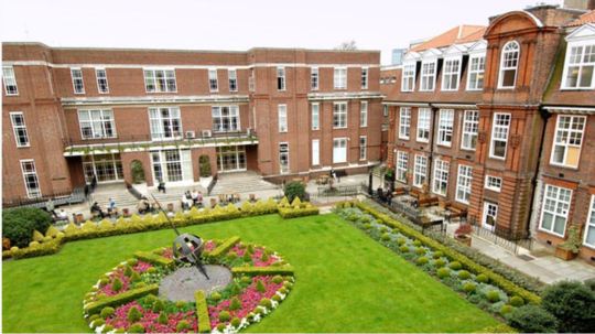
Figure 1 Courtyard from Regent's University London from https://www.spiritofmath.com/ukcamps/regents-university-london-1/#prettyPhoto
One of my earlier memories defined by a space would be from outside my Spanish class in my middle school. My middle school was built in a figure 8 shape with courtyards in the middle of the loops. My friends and I would relax in the courtyard on the grass or benches after lunch in the courtyard. I didn’t realize then, but the area we enjoyed was defined by the structure of the school. Since these courtyards were inside the school, they were easily accessible and allowed for students to relax throughout the day. However, the courtyards were in the middle of the two-story structure and therefore separated from the classes. This created an isolated space that was a piece of the school but also a different place with its grass field. The courtyard also had no covering, so it was always sunny and warm compared to the somewhat bleak school environment. This warm and open area was created by the structures surrounding it and allowed for my memory of the space to be defined as it currently is.
0 notes
Text
Blog Post 4: Uniformity and Equality
The story Cities & Sign 3 describes the idea of the city that defies expectations of what a city is. In this city one cannot differentiate between the palaces, the slums, the markets or any other areas. The story speaks to the uniformity of cities and what that means for the place. One may believe that this uniformity of a city creates a dullness and negates some of what makes a city special, but I believe the contrary is true. A city is the only place where uniformity and order could take place on such a large scale. A place that is equal across all sectors also shows the equality among people and communities which is demonstrated in the city. The city battles expectations of defining its sections through differences in design and speaks to the community and equality of the city and its people.

Figure 1 Houses on Burano, an island in Venetian Lagoon from http://www.italymagazine.com/venice
This image of Venice shows the uniformity across one street. In the image, the only thing used to individualize the houses are their colors. None of them stretch high into the sky or look like they are about to fall apart. In this way, the ideas of the story are reflected by having each piece of the city, while not having the same function, have the same standing. The image reflects the idea of a suburb even though it exists in the city. It goes against the standard image of the city just like it is expressed in the story. The image also shows another piece to the story in the way the colors actually create differences. The colors let each building be their own structure while not changing the equality that each building shares with each other.
0 notes
Text
Blog Post 3: Connections of a City
The story speaks of the beauty of the city as a whole. It refers to the connections between the individual pieces of the city that create a network rather than the details of each piece. The city is presented as a set of pathways one can pass through as if they’re passing through a set of memories. Viewing the city in this manner relates heavily to the way I can remember a city and enjoy its innate beauty. The simple act of passing through the streets of a city creates a pathway of memories in the same way. It turns the spaces of the city into a journey that connects all the separate and divided parts of the city.
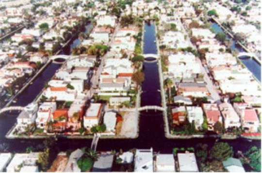
Figure 1 Venice Canals and Bridges from http://www.venicebeachliving.com/nb/canal.html
This depiction of Venice shows the variety of connections throughout the city. The alleys between the houses, the bridges over the canals as well as the canals themselves are all part of the connections through the city. Together these pathways connect the city and contain the memories it holds. Just as the description focuses on the city as a whole and as a combination of its pieces, this picture shows the city coming together and with all of its connections between each block of buildings.
0 notes
Text
Blog Post 2
Blog Post 2

Figure 1 Plan for Garden and Palace of Versailles from lecture 3
The palace commands the city. It is the face of the city and a show of power from royalty, yet both are dwarfed by the Garden of Versailles. The garden shrinks the scale of the city and dominates the land. They make all visitors feel small and insignificant inside the maze of giant hedges and interconnected pathways. Power and history are both expressed in the scale and extravagance of the gardens. The careful planning also creates an order more meticulous and extensive than the city that houses the beautiful gardens.
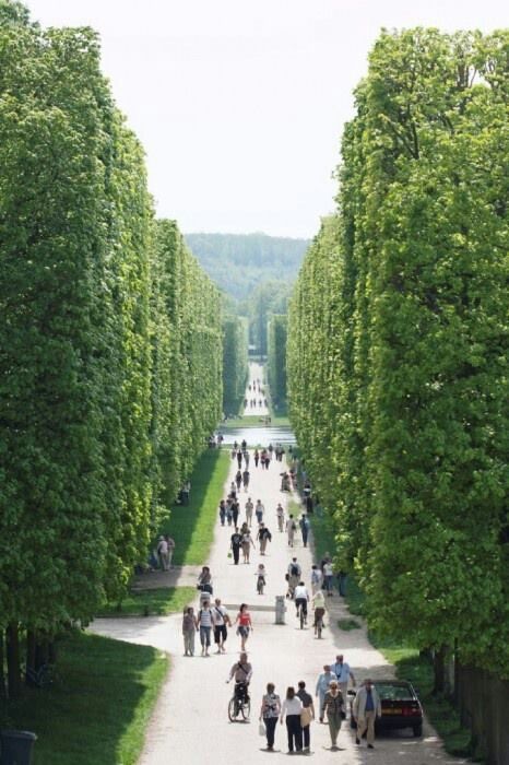
Figure 2 Hedges from within Garden of Versailles from
https://www.pinterest.com/pin/841399142852420813/
The towering hedges inside the garden seem to shrink the tourists. Emphasizes the insignificance of people compared the power of the garden. Massive hedges isolate people and contain them to only experiencing the garden. This creates a whole separate world from the city and palace. The unbelievable scale of these gardens completely minimizes the people and the city.
0 notes
Text
Blog Post 1: Center Points of Campus
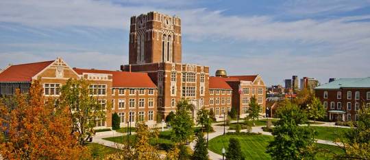
Figure 1 Ayres Hall from https://www.math.utk.edu/
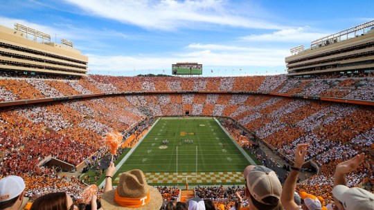
Figure 2 Neyland Stadium during a football game, from https://utsports.com/facilities/?id=8
Two of the most recognizable buildings on campus are Ayres Hall and Neyland Stadium. Every student knows both buildings, not only for their location and size, but also for the role they play as part of the campus. Looking first at Neyland, the stadium carries the importance of football to the school and the spirit of the fans behind it. People associate the structure with the Volunteer football team and the national championships won by this team in the past 100 years. The stadium also tells the story of the growth of the university over time, having begun as simply some bleachers, the current stadium holds over 100,000 Volunteers and shows how much support football has gained from the fans. The stadium is seen by many as the defining structure for athletics at UTK. In a somewhat similar way, Ayres Hall is seen by many as the defining structure of academics, rather than athletics, at UTK. Being at the peak of the hill, it stands out among other halls as the center of learning for students. While the classes taught inside have changed many times since its creation, the exterior has remained the same throughout generations. It’s a structure that connects past alumni to current students and represents education at UTK. Even though these two structures come from different parts of the university, they both stand as the main points of campus.
0 notes