
benitez-film
Film Blog '24
Bailey Benitez, Media Studies, MV
57 posts
Don't wanna be here? Send us removal request.
Last Seen Blogs

110789angle
this What?

medical-equipment-supplier-uae
Maxvalue Medicals

ill-procastinato
Ender!
presleysgirl6
PresleysGirl6

dailythg
#dailythg

Text
MV - Before final touch ups
youtube
This is my music video before its final edits and changes. Whilst this would have been my final edit, certain recommendations and edits were given by my peers and teacher that I wanted to include in my final product.
0 notes
Text
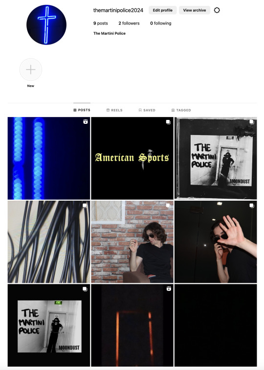
Social media production
When it came to producing my social media page, after what I had discovered through the research and various articles I chose to develop an Instagram for my band “The Martini Police”.
Whilst I used my previous photography of my artist and for my social media page, I also set out to develop a promotional video in order to build hype and general intrigue surrounding the storyline to the album. I wanted this to be under a minute, and then decided that under 50 seconds would be the best length. This is primarily as it stays short and engaging, but also manages to be as informative as it can without being too lengthy. After I filmed outside in order to gain specific shots of the ground and other locations, I finished the promotional video by editing strategically placed subtitles and images from the music video to help tie the storyline together.
I consistently posted on the instagram, making sure to keep the engagement high for my social media page. This can ensure consistent excitement when it comes to my audience and their general response to the video/album release, but also increases the chance of new viewers coming back, as they will be notified when I post/will always see new content.

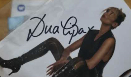
In regards to each of the 9 posts, I attempted to remain strategic in what I am posting and how much I reveal to the audience. My first post was a black screen that simply stated "07.02.2024.", which was made to be ambiguous in order to increase intrigue and a buzz around a specific date from the first post. This is also quite a memorable and direct statement, which helps to stick in viewers' heads. My next post was the promotional video for the album as a whole, in which reveals the MOONDUST album title, along with some specific images that help detail the content of my album. Some images were included in which I didn't use in my music video, helping to tie all aspects of my video and its promotion together. My third post revealed the album covers for my cd, cassette and vinyl release. "Drip feeding" the content in such a way was something I learnt from my extensive research of popular artists and their album releases, so slowly providing information is another way to increase the amount of listeners and viewers the band would gain on their release. The next three posts consisted of general promotional photos from the set of the American Sports mv, hinting at the title tracks video release. My 7th post was taken directly from Dua Lipa as well as other artists decisions to sign a limited amount of albums, of which can provide even more incentive to listeners as they can gain a limited version of the album. Finally, posts 8 and 9 were both the release of the American Sports music video, and more promotional content for the albums message as a whole.
I believe I effectively and convincingly created a promotional package in which spans both the digital and physical means, with my physical product being featured and promoted on the bands Instagram page. I successfully tied all aspects of the bands image and meaning together, and created a promotional video in which details further context surrounding the album, ultimately providing a complete experience for consumers.
0 notes
Text
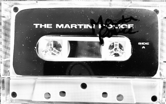
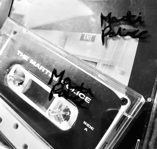
Limited release - signed CD and Cassette
As a form of promotion, I intend to release an early release of album purchases that feature a hand signed digipak, vinyl and cassette tape. This is in order to build "hype" and intrigue surrounding the album, as well as inciting others to buy the album due to tis exclusivity. It can also be a way to increase album sales, as the idea that buyers are "in for a chance" to win can increase an audiences excitement, and lead to increased sales.
The following are screenshots from successful signed album releases in which I got this idea from:

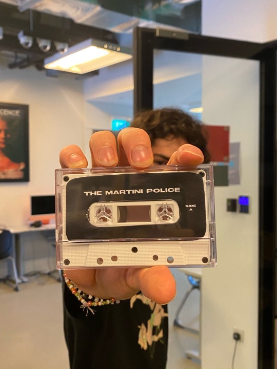
Here is my final signed cd and cassettte:

0 notes
Text
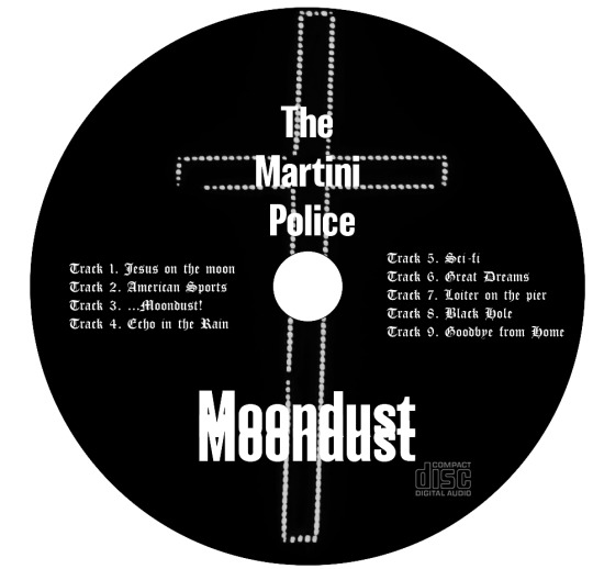
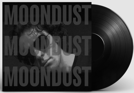
CD, Cassette and Vinyl - Production Update
The following are my final products, of which I believe perfectly fit my genre and artist. I have chosen to follow the black and white theme consistently throughout all products, and intend on using the CD and cassette within my final music video, as a way to further promote the physical purchasing of my album.


0 notes
Text
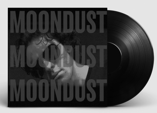
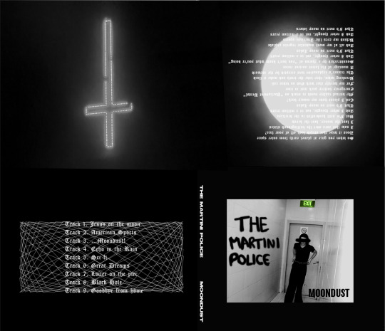
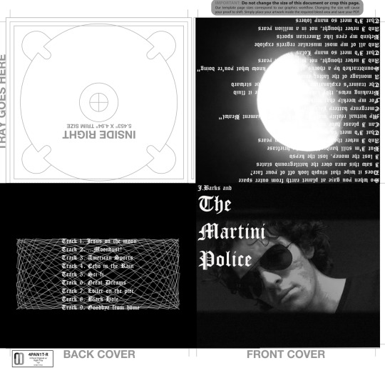
Final Digipak - Digipak production update
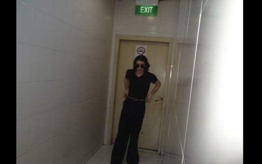
The four images above are the final iterations of my CD and the case. The main issue I experienced was getting the final images to fit inside the template used on Photoshop, as I haven't used the application until this year. Working with it was quite tedious, and I had to ask for help from both teachers and peers, along with using online tutorials and other websites in order to make the masking of my cover work. Ultimately, I have gained the skills require to make an album cover, of which will greatly help in future work that is required on Photoshop.
In addition, I faced challenges when it came to creating an album cover that fit my genre. Whilst my final product still fits a more grunge or even rap genre, I believe the black and white motif, along with the harsher and grittier look of the CD helps to undercover the hidden 'dystopian' association there is to the song 'American Sports', as I believe the song attempts to mask the dark lifestyle of an artist with grandiose instrumentals and world building, which is ultimately shown within the booklet and inner sections of the CD. Perhaps the most difficult aspect was getting the green colour on the “EXIT” sign on my album cover. This was achieved with major help from my peers, helping me to colour in this single area with the rest remaining black and white, achieving what I think is an entirely eye catching and great looking album cover.
Ultimately, I have decided to flip what was presented in the song; Instead of masking the true struggle faced by the artist detailed in the song, I instead put this on show, and in turn keep the grand moon image and suave font for both the CD, booklet and back of the record, subverting from what was typically present on the original album 'Tranquility Base Hotel & Casino'.

As for my CD, design, this remained fairly consistent from the beginning. I loved having the bands main iconography being the LED cross, that features as one of the first images seen in the music video. This helps to solidify the image as the bands own for this specific album cycle, as well as providing insight into what the album may be about. Whilst this isn’t the main cover, featuring this on the CD can be an extremely memorable and iconic image, as this is what is seen every time someone plays the disk.
1 note
·
View note
Text
Digipak drawings - Digipak production update


Once I had settled on the font that was heavily inspired by the 'BEEF' opening artwork and title, I drew up various ideas surrounding the font. This involved printing out the main cover, and attempting to recreate the font with handwritten text. As I intended to use a Wacom (drawing) pad within Photoshop, I played around with various graffiti looking text. I also drew over a photo I had taken during our shoot, as I felt it was quite coherent with the candid look of the photoshoot and the wider music video.
0 notes
Text
Font test - Digipak production update

At this stage, I managed to discover my desired font that was direct reference and inspiration from 'BEEF', as I loved the matter of factness from the font, that gave a somewhat aggressive and confrontational feel. I began to play around with varying font positioning, colour and size, Sticking with the 'MOONDUST' title as I felt no matter what visuals I chose, the name would always be a direct reference to the space pop era of music in which the song is somewhat referencing, both through lyricism and instrumentals. Although I eventually changed the photo, I remained with the black and white motif as not only would it remain consistent throughout my entire digipak, but would also be a nod to 50s and early 60s cinema, of which the singer / songwriter Alex Turner was heavily inspired by during the production of 'American Sports' and the album as a whole. In addition, I liked this version so much that I chose to include it as my vinyl cover, but changing the colour to black and white in order to better fit within my nostalgic theme.
0 notes
Text
BEEF titles inspiration - Digipak production update
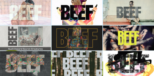
After struggling with inspiration for my CD cover, I remembered the intense and grand opening texts and artwork used in the show 'BEEF'. I loved how the text seemed to become a part of the artwork, with the similar colours pairing to create quite a seamless design, of which I believe to be quite effective. I also loved the hand drawn aspect to it, and whilst I didn't want to hand draw my front cover, was still inspired to involve certain handwritten lettering, and was undeniably inspired by the chaotic and somewhat intense feelings drawn from the opening credit sequence. This bold statement is something I wanted to evoke in my own cd and digipak, with the all caps and lettering to be taking heavy inspiration from the show.
0 notes
Text
Digipak production update
My original first draft remained an option to me for a while, although I felt was too basic. This was primarily as I was still learning the basics of Photoshop, as well as changing fonts and various positioning to best fit the genre. Ultimately, I developed a liking towards albums that subverted the genre in which they were, and found this front cover too sterile and unconvincing when it came to being a realistic album cover.
However, I did like the black and white motif that ran through both my music video and digipak, as it upheld a level of consistency that I feel paired nicely. In addition, I like the inclusion of the quite decadent font used, and still hated to keep the oscilloscope and the back of the CD cover, as well as the moon in the inside cover. Also, using the lyrics from the song over the moon was another aspect I loved and stuck with, primarily as the different length of lyrics looked quite cool over the moonlight, and also pays homage to the opening of my music video.
Although there were still aspects I wanted to keep, I was still learning about photoshop and wanted to challenge myself, even including some handwritten aspects in order to provide a more human made and dystopian feel to my album.
0 notes
Text
Digipak - 3 products
Record (only digital)
Album (digital and physical)
Cassette (digital and physical)
The reason for the 3 products is that my band is obsessed and transfixed on paying homage to the early 60’s and 70’s, of which cassettes and vinyls were massively prevalent, due to it being before the massive rise in streaming services within the 2010’s. Therefore, ‘The Martini Police’ would want to pander to this audience, hence the development of the cassette tape and the record.
My CD and cassette will by digital and made as physical products, as I intend on involving these within my music video. This will help it become more immersive, creating the illusion that this band really does exist with their own merchandise.
0 notes
Text
Social Media Research
When it came to research for my social media page, I began by looking over three articles and gathering information in regards to how I would develop my artists image, and specifically how to successfully do it on social media.
https://www.icmp.ac.uk/blog/10-best-music-marketing-campaigns
This article detailed the top 10 marketing campaigns from varying artists. It detailed that 54% of marketers believe a music video is the most valuable aspect to achieving marketing success through social media, and posting snippets or short extracts of these can help build hype and attention from audiences. It suggests that artists like Beyonce have seen success as they are titans of multiple aspects of music, both with unique sound with experimental and constantly different visuals, culminating in visual albums or lengthy videos that stand out from others. Similarly, rap artist Stormzy rose to fame through high profile interviews with the likes of Louis Theroux, gaining a large amount of attention and leading to his massively popular first album. It also discusses the punk band Creeper and their ability to create buzz through deleting their social media and reporting members as “missing”. Various clues were left on the internet, leading to the eventual release of their album.
https://www.yellowbrick.co/blog/music/exploring-the-impact-of-social-media-in-the-music-industry
In the second article, it details the adaptation that marketing has had to make now that we are in the age of social media, and how that shifts hoe audiences discover new artists and music, with the ever challenging task of standing out against others. It details the importance of an online persona, as it not only connects you with your fans, but can even be the way fans interact with your music, through Facebook events or Songkick, an online website that promotes live shows to a larger audience. Whilst the proliferation of the online presence continues to have positives, social media platforms can be massively overwhelming for new artists, and increasingly difficult to separate yourself from the hundreds of artists attempting to be unique every day.
https://www.dk-mba.com/blog/social-media-for-musicians
Finally, the third article details the non-negotiable online presence an artist must have in order to succeed in the 2020’s. Understanding how social media works is the primary way for a large audience to be gained, how how most importantly, “attention is everything”. My primary takeaway was the importance of social media marketing on an artist, and for it to not be seen as an arbitrary aspect of a musicians career. Understanding the algorithm is another importance, posting little by little in order to build hype, and to not be lost in the masses of content. Holding our attention as audience members is crucial, and this is primarily how money is made; with people interacting with our content. Knowing your demographic and tailoring to them through short form content is another crucial aspect, as the rise in tiktok directly showcases the importance of short and sweet videos in order to grab our attention and make an artist memorable.
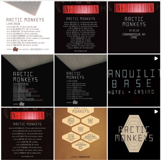
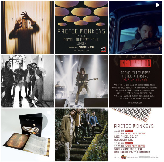
Arctic Monkeys Case Study:
In regards to Arctic Monkeys, their promotional posting for ‘Tranquility Base hotel and Casino’ on social media began with a small video that featured the moving hotel model that is on the cover of the vinyl. The rest of their posts consist of various simple, but still promotional, photos or videos, with the band in a photoshoot or album pictures being stand out and recieving the most attention. It mainly consists of their performance dates and promoting their live shows, but has a slight mix with merchandise advertisement.
Photoshoot:
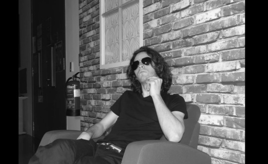
I have finished my photoshoot during my music video shooting as it was something I wanted to include directly in my video. My favourites consisted of the following:


0 notes
Text
Album Cover Inspiration - Digipak Research

Generally, I was inspired by 50s -60s space pop album covers, depicting science fiction and space in a unique way. I also wanted to adopt either the block text or more flamboyant and old fashioned font that is utilised by a lot of older bands. The simplicity behind the album cover is something I wanted to use as it pays homage to the simple yet quite odd style of these previous albums in the space pop genre. In addition to this, I wanted to use the poly__ that I have previously seen on youtube, of which evokes quite a futuristic yet oddly reminiscent depiction of science fiction.
Specific to CD covers!!
(Although I want to produce a Vinyl, CD and cassette)
The Land Is Inhospitable And So Are We
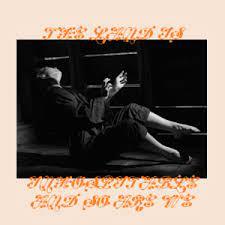
"The Land Is Inhospitable And So Are We" is a 2023 album by Mitski, of which utilises obscure font that is both hard to read and brightly coloured on an otherwise simple CD. This cover is an inspiration primarily for its rectangular photo in the centre, as I feel it evokes entrapment and confinement, something that reflects the claustrophobic environment that my artist appears stuck in himself.
With The Beatles
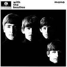
This monochromatic Beatles cover is also something I take inspiration from, purely for its simplicity, as well as the bold use of chiaroscuro as the band members faces are obscured in shadow. Whilst a little too simple for what I aim to achieve, I think this combined with brighter and more "space pop" influence is exactly what I intend to create.
0 notes
Text
Purposes of a digipak

Primarily, a Digipak is used in order to showcase the artists “phase” or “era” they are currently in, hopefully granting audiences a clear view into what they are aiming to achieve with their current album cycle. With my band “The Martini Police”, only the front man is in the music video, emphasising how he is the face of the band. Through the black and white CD cover, I aim to create a nostalgic aura to the band reminiscent of the 70’s, whilst the graffiti, paint over the front mans eyes, and the bold font represent an aggressive or punk dystopian place in which he lives. The title “MOONDUST” directly pays homage to the space pop era of the 60’s, with an almost comedically on the nose title.
0 notes