
balestrapatrick
Patrick Balestra
Software Developer with a passion for iOS.
11 posts
Don't wanna be here? Send us removal request.
Last Seen Blogs

sgwwsstuff
Untitled

musicisthegreatestart
#Musicisthegreatestart

vegedream
Sans titre

techanswershub
Tech Answers Hub

stxphaaniee
intro
Text
WWDC 2017 Organizational Thoughts
I attended WWDC 2017 on a student scholarship this year. I had the possibility to attend it in San Francisco back in 2014 too. Now that I am back home and I have the time to reflect on the week I spent with the best Apple minds, I found some interesting differences between how the two conferences were organized.
As a conference organizer myself, I know how much work goes into making such an event happen. I always appreciate when people give feedback about App Builders and Swift Alps. It's important to keep improving future events for everyone!
First of all, I would like to thank the whole Apple team that was able to do an extraordinary job in planning the conference. Every staff member was always nice, polite, and super helpful.
This is a very personal opinion and other attendees will have a different opinion for sure. Happy to hear other takes on everything I am going to list!
I would like to write about what I liked and what could be improved in the future editions. Sorry Apple people, but I couldn't find the WWDC category in radar, so here I am! 😉
Pins: pins were definitely one of the highlights of the conference. We were given a set of 6 random pins when checking-in. Together with the WWDC 2017 Levi's jacket, a country pin was also available for the attendees to collect. Nicola Giancecchi, also a scholarship recipient, lives in San Marino (the 4th smallest country in the world with only 31,781 people) and I was surprised to see they printed his flag too! 🇸🇲
During the conference, some Staff members were distributing new special pins. That was a really nice touch.
Soon the exchange market started. A really nice way to bring the community together.
Staff: As mentioned before, the Staff was very helpful in every occasion. They had explosive-sniffing dogs for the whole week inside and outside the convention center (with even their own dub dub badge) and they were happy to have people pet them.
Keynote: I was a little disappointed to see nobody distributing coffee or food while in line. This was most probably because in San Jose there are fewer companies looking to promote themselves. In 2014, companies were distributing free food and drinks to help kill the time and promote their company while the attendees lined up during the night. As students, we were told to be in the convention center by 8.15 AM to be able to enter our reserved area. I was in line since 4.30 AM but surprisingly our reserved sector was the second one (> 25th row). A few friends and I joined another friend in the 7th row to have a better view though 🙃
Security for the keynote was very fast, just a quick bag check and metal detector for everyone.
Food was very disappointing. The 2014 catering in Moscone Center had many more choices for breakfast (the more 🍩, the better). Box lunch was very disappointing. Almost the same burrito box every day. Some sandwiches were also available but calling "italian", a sandwich with multiple 2cm pieces of onion inside it is way too much for my taste. 🙈
I know, it's very difficult to feed 5k developers in a very short amount of time, but more quality could go into the food in my opinion. Nonetheless, I had the opportunity to explore a few food places in San Jose.
Music in the breakfast and lunch room was a little bit boring. Only 4-5 songs were playing all day. It was supposed to be a background music for people to be able to work, but after a few days I couldn't stand the music anymore. More songs would have helped a lot. 😬
Wi-Fi was a little bit disappointing. For most of the conference, it was unusable. So unusable, that when I was told to file a radar, bugreport.apple.com didn't even load 😭
I think a better Wi-Fi would benefit everyone, but again, having 5k developers in the same building makes the IT team very sad.
Bash: I loved the Bash. The new location was huge and it felt like being at a real music festival for one night. In 2014, students who weren't allowed to drink were located on the terrace of the Yerba Buena Gardens. Good landscape for sure, but impossible to interact with other 21+ attendees. Food was better in this case, a lot more choice than lunch. A few social games were also available to play during the party. A very nice idea 👍
San Jose has very few people in the streets at all times. It felt like a ghost town. The weather was definitely an improvement over San Francisco, but in contrast San Jose had less choices of places to go.
Convention Center: I loved the convention center. The outdoor location in front of it was spectacular. Having lunch with the sun shining instead of being in dark room with everyone on their computers was a big improvement. The hallway was actually smaller than Moscone Center and this caused some issues when many people queued up for the same session. The entrance for the lunch room was blocked sometimes but the staff managed that pretty well. Shortly said, big 👍 for the same location in the future.
I hope you enjoyed my short report about WWDC 2017 whether you were there in person or followed it from your comfortable home. If you were there, please share your thoughts about the conference, I would love to read other attendee's opinion.
I would like to thank everyone again, I met a lot of amazing people thanks to WWDC. I can't wait to experience it again in the future!
Thanks to Alexsander Akers for proof-reading.
0 notes
Text
How to Improve Your GitHub README
I spend quite some time browsing GitHub every day. I use the Trending section to filter the projects by language. I then proceed to explore each project by reading the README and maybe browsing the code, some issues and pull requests to see how the project is being maintained. The community is creating an immense number of projects and it’s one of the things I like the most about the Swift community.
By browsing new open source projects almost every day, I noticed that many of them don’t take full advantage of some cool Markdown features. The README is the first thing that people see when approaching your repository. If you want to attract users, contributors or simply interest, it is crucial to give them the best possible first impression. In this post, I would like to show some tips and tricks to take your README to the next level.
This post is focused on Swift but many of the following points can be applied to any other language.
Syntax Highlighting
This is a very simple feature that you can add to your code snippets. GitHub uses Linguist to do the syntax highlighting and automatically set your repo language. Just add the language name after triple backticks.
https://gist.github.com/BalestraPatrick/2c1f6e60dc3416965459c5507e950896
The result will be much easier to read and understand.
Spoiler Effect
Markdown doesn’t provide a lot of features to make text interactive but we can use some supported HTML tags given that GitHub uses what’s called “GitHub Flavored Markdown”. I recently discovered this feature after using fastlane which heavily uses it to make submitting and browsing issues a joy.
It allows to collapse text inside a section. You can then click on the arrow to reveal the full content. This is especially useful to keep the text short to read but still preserve the information for those who need are interested.
There are a lot of use cases. For example you could offer both Swift and Objective-C example code for your library or show multiple methods of integration with different dependency managers. This is what the HTML code could look like:
https://gist.github.com/BalestraPatrick/20596fe752368a5a69a2add4c63f3d48
This is what it looks like in action.
https://gist.github.com/BalestraPatrick/6e3bd5af61cd230b172450a53dbe61e9
Demo Image or Video
An image is worth a thousand words, you know that. If I don’t see a demo image, GIF or video for a project, chances are high that I will leave without trying it out. You should try as much as possible to grab the user attention with a concise image or GIF to show off what your project does. A great example is an animation library called Hero. It was released a few weeks ago and the developer published a Youtube video showing all the power of the library. The video went viral in my timeline and that brought traffic to the project which today has over 5K ⭐️.
Unfortunately Markdown doesn’t support embedded videos, so your options are:
If the video isn’t too long, create a GIF out of it and add it to the repo.
Display an image with a link to the video.
Simply mention the video and add a link somewhere in your README.
I usually try to go with the first option as it doesn’t require the user to switch context to watch the video.
Links Grouping
This was a very new addition that I didn’t know was supported. If you find yourself writing more than once the same link in your Markdown file, you can create an alias so that you can define it only once.
https://gist.github.com/BalestraPatrick/773b97796cb1d78e0c28b32a2c2f46cf
This pattern makes it really easy to change a link later on without having to go through the whole file to make sure every link was changed.
Coding Guidelines
Try to stick to a single coding style for your whole project. I recommend reading the Swift Style Guide so that other developers can see your coding style in case they would like to contribute.
Structure
Try to structure your README in a easy way to navigate. Write your first version and then come back after a few days to make sure it’s understandable for someone who has never seen your project.
To insert a line to divide sections use 5 consecutive “-” for example. Take a look at the Markdown syntax in this guide.
Code of Conduct and Contributing Guidelines
Having a code of conduct is always a nice addition if you plan to scale your library to the next level. Contributing guidelines are also useful for new developers who would like to contribute to your project. A simple list of required step to open an issue or pull request is a very nice idea. Check out the GitHub documentation to learn what you can do to make it easier for people to contribute to your project.
Contact Information
Don’t forget to mention who is part of the project, it’s always nice to see who is behind any cool idea on the internet. 😎
Please let me know of any tips you think are useful for improving a README on Twitter.
0 notes
Text
Automating my Bedroom with HomeKit
I've been wanting to play with HomeKit for a few months but I never actually bought any HomeKit compatible device until a few weeks ago. I wanted to start slow and see how HomeKit has improved over the last iOS versions.
I am completely new to this @internetofshit thing, so here are my thoughts! 😄
I started by buying a simple control switch built specifically for the swiss plug type J and it's called myStrom. The price is inline with other similar plugs, 39 CHF.
It unofficially supports HomeKit and a few friends confirmed that it worked well for them. After connecting it with my Christmas tree lights, I was able to quickly turn it on/off from the Control Center of my iPhone. The result is pretty nice.
Got my first HomeKit accessory. Scheduling my Christmas tree comfortably from my couch. Love this 👍🏻🎄 pic.twitter.com/SP4zRv0vtd
— Patrick Balestra (@BalestraPatrick)
December 5, 2016
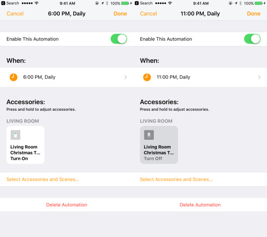
I then automated this behavior by turning on the plug everyday at 6.00pm and turning it off at 11.00pm by creating a simple automation in the Home app.
This works even remotely if you have an Apple TV or iPad that you can use as home hub. I have an Apple TV 4th generation and after a restart, HomeKit was enabled via iCloud. I didn't want my family to ask me to light the Christmas tree when I wasn't home (even though the plug has a small button that can turn it on and off manually).
I discovered that you can easily grant other people access by adding them to your house.
The Home app is a very beautiful app in terms of user interface, but the user experience could be improved. I took me some minutes to find a few basic features like this one.
I added my mom and sister to my House and they can now simply swipe up the control center to light the Christmas tree! 🎄🔆
As soon as my mom enters the house, she can switch it on from her iPhone with Siri. Awesome!
I could automate it even further by using geofencing, but I haven't tried this feature yet.
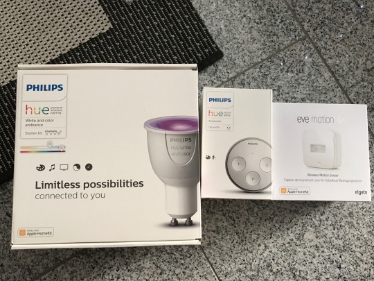
As a Christmas gift for myself, I decided to convert my room to smart lightbulbs. I ordered the Philips Hue White and Color Starter Kit and the Philips Hue tap Switch. I also wanted to get the new Elgato Eve Motion at the same time but it wasn't available to order online. While visiting the Apple Store in Bergamo, I saw it on the shelves and decided to pick it up as well to automate my room even further.
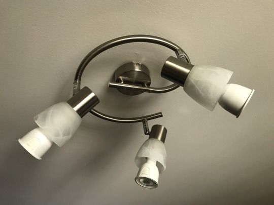
The current lamp in my room supports light bulbs of type E14 but the Philips Hue was only sold with the type GU10. The solution was to buy a cheap adapter from Ebay.
The Hue bridge was very easy to set up, just wire it to the router with the provided Ethernet cable and to the power. The Hue iOS app will do the rest. Setting up the Eve Motion was very straightforward too after having downloaded the Eve iOS app. Just scan the barcode and that's it. The fun (and most difficult) part is automating the whole system.
I thought that I could set up all my actions through the Home app and manage everything from one place, but I was wrong. The third-party apps are actually more powerful and allow for more complicated automations.
If you would like to add multiple conditions to a trigger, you can not do that with the Home app even though HomeKit supports this feature. You have to use a third-party app like Eve or Hesperus. This inconsistencies complicate the user experience.
Let's now take my room as example.
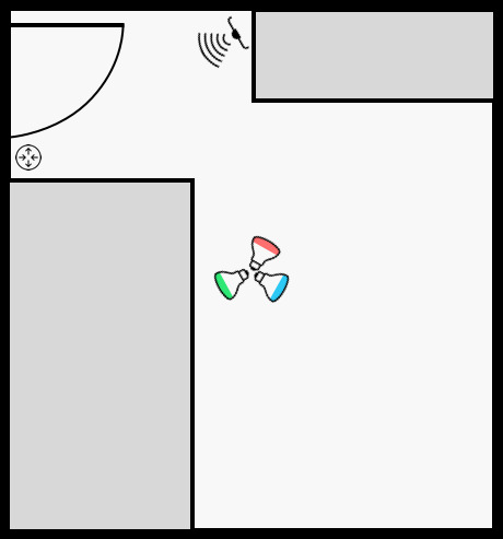
I have a lamp hanged on the ceiling of my room where I mounted the three Hue bulbs. As I step into my room, the motion sensor triggers my lights depending on the time of the day. When I exit my room, I simply press the button on the Hue tap next to my door to turn everything off. I couldn't find a way to automate this behavior. Let me know if you have any idea.
As I mentioned before, multiple conditions in a trigger are very useful. The brightness of the lights during the night should be lower compared to other times of the day. For this reason I created two different scenes that set the color and brightness differently. Here you can see my actions in Hesperus.
The cool thing is that HomeKit actions, scenes and accessories are shared between apps. You can use any app you want to set up your home.
Given that I only have a single motion sensor, before getting into bed I move my motion sensor closer to the bed. In this way, as soon as I step out of my bed one of the lights turns on at the minimum brightness to show me the way to the door.
I took inspiration for this night setup from the MOXY Milan Malpensa Airport hotel. As soon as I was stepping out of the bed, a motion sensor would switch on the LED strip under the edges of the bed at the minimum brightness. It was a pretty amazing effect for the guests.
One of the problems I encountered was that the motion sensor was not working 100% initially, but after discovering how to change the sensitivity of the sensor in the Eve app, it started to work more reliably.
I am pretty happy with the setup after a few days of usage. I still have to create a few custom scenes to fully obtain the effect and colors that I want. For example, I would like to slowly turn on the lights to wake me up in the morning. As I am currently in winter break from school and I am not on a regular sleep schedule, I was not able to test this feature yet. 😴
If anyone's interested, I'll share more opinions about this topic in the future.
Thanks to @KhaosT for the help in understanding HomeKit.
0 notes
Text
Playground in Xcode 8
During session 213 of WWDC 2016, some changes to Playground in Xcode 8 were mentioned. The talk shows more tips and tricks to make use of the powerful Xcode features such as Assets Catalogs to avoid writing more code than what is necessary. I highly reccomend you to watch it!
To manage the execution of a Playground, the PlaygroundSupport framework can now be used. By ⌘ + clicking the framework name, this is what you can find:
A UIViewController and UIView extension that implement the PlaygroundLiveViewable protocol.
The PlaygroundLiveViewRepresentation enum which describes if the current live view shows a UIView or a UIViewController.
The PlaygroundLiveViewable protocol itself that has a variable to hold the current live view representation.
The PlaygroundPage class that allows you to modify the playground execution.
A Playground is compiled like a script, line after line. This is great until you want to test a network request that is performed asynchronously. You will never see the callback result because the Playground is simply stopped before the response can arrive. To fix this problem you have to tell Xcode that your page needsIndefiniteExecution. Let's take a look at a common URLSession usage.
https://gist.github.com/BalestraPatrick/827d1b3d0054044f7ebd035bc9405ddd
We first import the new PlaygroundSupport framework at the top. We then set the PlaygroundPage.current.needsIndefiniteExecution property to true so that the playground will continue the execution of the Swift file even after reaching the last line. In this way, we are able to debug and see the response of our request.
You can also tell your Playground to stop waiting for something to happen. You could for example add this line in your completion handler to stop the execution of the page.
https://gist.github.com/BalestraPatrick/2cb4221cf1307e244d41c487244fc3d5
Another cool feature shown in the session which was added in Xcode 7.3, is the ability to interact with the live view. You can for example create a UIViewController and assign it to the Playground liveView as follows:
https://gist.github.com/BalestraPatrick/27b5596a7a88c30bedd135fddf27181b
This is useful to test a component before actually implement it into your project. To read more about this specific feature, watch the WWDC session 213 video or read this blog post on the Swift official blog.
Thanks for reading 🤓
0 notes
Text
Implement a UITableView in RxSwift
RxSwift is a reactive programming framework which enables easy composition of asynchronous operations and event/data streams. I’m currently building a Twitter timeline analyzer iOS app called Tweetometer to learn RxSwift. You can check out the code in the repository on Github. In this post I’d like to show how to build a simple UITableView with RxSwift.
Start by creating a new iOS project and set the language to Swift. You now have to install the RxSwift framework. Follow the instructions in the official repository to install it with CocoaPods or Carthage. If you choose CocoaPods, this is what your Podfile should look like.
https://gist.github.com/BalestraPatrick/b13e061ee8780ee212b4
Make sure you install RxDataSources which wraps the UITableView and UICollectionView data sources for RxSwift.
We are now able to import our two frameworks in the ViewController class:
https://gist.github.com/BalestraPatrick/b4f41e23d5fef47f418a
Open the Main.storyboard and drag into the scene a UIViewController object and embed it in a Navigation Controller by doing Editor → Embed In → Navigation Controller. Configure a UITableView with a UITableViewCell with a unique identifier such as Cell. Create an outlet from the UITableView to the ViewController. This is how your Main.storyboard and ViewController.swift files should look like.
https://gist.github.com/BalestraPatrick/af98935f48ecab0efc17
Great, we are now ready to implement our UITableViewDelegate and UITableViewDataSource methods, right? Well, not really. Since we’re using a different reactive approach, we’re not going to write all those boring methods. We’ll use the power of RxSwift combined with RxDataSources to configure the UITableView.
Let’s create an example. You have a model that consists of a list of users and you want to display them. A User is defined as a struct with a few simple properties:
https://gist.github.com/BalestraPatrick/81c9dc772c328413aacc
In the ViewController we declare a constant that contains the data source by specifying the type of objects that we will display in our UITableView.
https://gist.github.com/BalestraPatrick/51f7654f9522f49cd73f
This is a RxDataSources class that specifies what our data source contains. It contains a SectionModel with a String as the section name and a User as the item type. You can ⌘ + click on the objects declaration to see the implementation of those objects if you are feeling curious.
We can now create the View Model which will pass the data to our data source. By separating the view model, we avoid to add the the code that takes care of building the model from the ViewController. Create a new class and call it ViewModel.swift. Import RxSwift in the new file.
https://gist.github.com/BalestraPatrick/469a52cacabbd8c67988
Let’s write the main function that will create the user objects. In your application, you could fetch objects from the network or from a local database in this function. You can see an example on how to load a JSON file from the Twitter APIs in my Tweetometer View Model.
The function getUsers() is defined as follows:
https://gist.github.com/BalestraPatrick/6de904d7f4c5bdbab8bc
An Observable is the most important and basic object in reactive programming and it is a sequence of values. That’s why it’s really easy to add an asynchronous operation to fetch your data. You can connect multiple Observables together and wait for those to complete before reloading a UITableView for example.
The Observable we just defined, is an array of SectionModel containing a String and a User. Do you remember this type? It’s exactly what a row of our UITableView data source expects. We insert three users with some example data in an array and we create a single section. We specify an empty String as the name of the Section because we don’t want any section title in this case. If you would like to add a section title, you should add a title in your SectionModel and implement the titleForHeaderInSection method in the ViewController.
We then tell our observer that our sequence of values is finished and we complete our function by calling the .onCompleted() method. We also return a AnonymousDisposable to make sure that our resources are cleaned after the function returns. In the case of a network request, you could for example cancel all the pending requests in the AnonymousDisposable closure. There is a really good explanation of the Sequence and Disposable concepts in this Getting Started guide.
After having created the logic in the ViewModel, we can now go back in the ViewController and connect our data source. First of all, create two now constants holding the ViewModel and a DisposeBag. This is an object that controls the cleaning of the used resources after the ViewController is deallocated.
https://gist.github.com/BalestraPatrick/11664ef0578c5ee5f283
In the viewDidLoad() method, let’s configure a UITableViewCell and bind the ViewModel with the UITableView data source.
https://gist.github.com/BalestraPatrick/ad02b9586dbbc614cd2f
We create a UITableViewCell with the given identifier in Storyboard. The configureCell closure gives the possibility to configure each cell. This is very similar to what you would do in the cellForRowAtIndexPath method. We change the backgroundColor property based on the indexPath and we automatically get the User object for the correct indexPath! ✨
We create a simple String out of the user data and we display it in the cell’s UILabel. This is all the customization we need for this example.
The last thing to do is to bind the Observable returned from the getUsers() function to our data source. As soon as the ViewModel will return a SectionModel object, our UITableView will automatically display the users. Awesome! 🎉
This is the result after running the application.
RxDataSources is very powerful. Instead of using a simple RxTableViewSectionedReloadDataSource we could use a RxTableViewSectionedAnimatedDataSource to animate the data source changes. It even supports UICollectionView.
We could extend this example much more in the future by passing the selected item into a UIStoryboardSegue. The project is available on Github.
This is all I wanted to share in this post, let me know if you have any improvement or feedback on Twitter.
Thanks a lot to @a2 for proofreading this post.
0 notes
Text
My First Month in University

I started university a little more than a month ago and I thought it would be nice to share my experience. I had many discussions with other student developers about the pros and cons of studying computer science. I won't go into the details if you should or should not go to university (or college or whatever you prefer). The goal of this post is to share my experience at USI (Università della Svizzera italiana) which is located in Lugano. My experience could highly differ from any other university which is nice if you want to compare it to your own experience.
I will try to focus a little more on my university program and not on the general case because each university has a different method of teaching and different programs. USI is a small university compared to basically every other school and the number of bachelor students in Informatics is 52. I really like the small number of students because a special connection with professors and teaching assistants is made.
All the classes are thaught in english (not a really common thing in non-english countries during bachelor) and so the english level is improved by just following a lecture. Many students obviously speak italian and during group projects we often end up speaking italian for simplicity and speed of communication.
Unlike other computer science programs, math is just a small part of the curriculum. One of the reasons why I chose this university over bigger and more popular universities was the focus on the practical skills.
One of the courses during the first semester is called Programming Fundamentals and is teaching Racket, a functional programming language. It is really interesting to get to know the basics of logics while having fun.
Another course is called Computer Architecture in which we learn the basics at a hardware level.
Maybe the most interesting course is Software Tools Atelier which is teaching the basic of Informatics in many different areas. In the first month an introduction was given about the Shell, LaTex, HTML and CSS.
There are many group projects which already started the first week. The goal is to teach team work which obviously is a very important thing in the industry. Homeworks are usually to be handed in in pairs so that's a nice way to share opinions and skills.
There is a special course called Privatissimum which takes just one hour every week. All the students were split into small groups of 5-6 people and assigned to a professor. Every week we get together to talk about university problems and tips and trick to improve our daily student life. This goes to show how much the school cares about us.
I'm really enjoying my time in university so far. I couldn’t hope for a better start.
My first midterm is scheduled for next week, wish me luck!
0 notes
Text
How to ask for App Store reviews
In this post I want to explain how easy it is to get positive reviews for your App Store app. The method I started using with my customers brought my app more positive reviews than before so I am confident that other developers could find this explanation useful.
Let’s first say that there is (still) not a way to contact users who leave a review on the App Store. Most of the times, users download an app and they expect it to work immediately and perfectly. If this is the case (and we all hope it is), then users will enjoy the app. The problem is that very few people will remember to go back in the App Store and write a nice review.
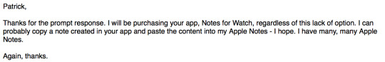
There are many ways to ask users for a review which are for example showing an alert to the user after the app was opened 10 times or sending a push notification. I find none of this methods appropriate and I started experimenting a few weeks ago how I could get a nice reviews for my app Notes for Watch.
When I shipped the first version, a bug occurred when users were using both the Apple Watch and the iPhone at the same time. This resulted in a really low rating as you can see.
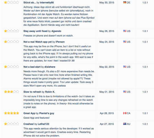
Please note the last review: “if it worked as advertised it would get 6 stars”. I fixed the issue in the next version and no, I never received 6 stars.
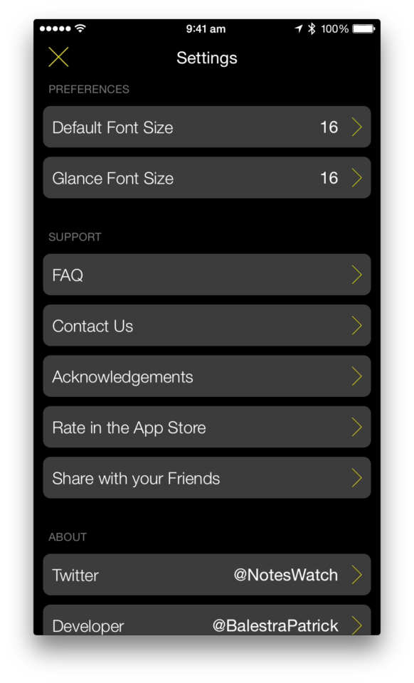
To avoid receiving more negative reviews, I made sure to add more support options in the app. The FAQ section is easily reachable in the settings view (it’s just one tap away from the main view) and the contact button offers support via email or via Twitter. This is how the settings view looks like in Notes for Watch.
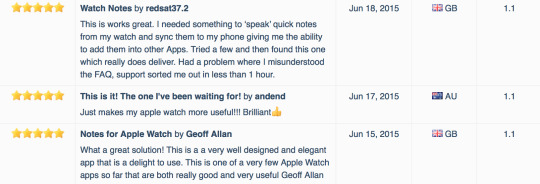
Notes for Watch started getting more and more users which translated into more support emails. When I’m not asleep, I usually have a pretty fast replying time (sometimes I’m even able to reply to a customer support request in less than 15 minutes). This is positive for customers which are always surprised by the quick response and they immediately thank me for the fast reply. Here there are a few examples.
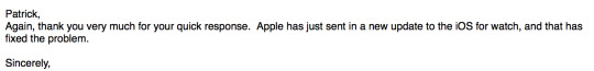
Awesome, now customers know that there is a real person behind the app and it’s actively supported and improved. When users have issues or they simply want to send feedback about future features, it’s good to reply as soon as possible. When the problem is fixed and I’m sure that users are enjoying the app, I add a post scriptum to my email like this:
P.s: If you're enjoying the app, please take a very short moment to leave a quick review in the App Store. It helps continuing the development of the app :)
In this moment, users are happy because they know the app is working properly, they quickly received support and they can trust the developer for other issues in the future. They are most likely in spending a few minutes of their day in writing a positive review for your app now. The results are positive and as you can see, I’ve received three 5 stars reviews since I added the previous sentence to my last support email I send to customers.
If I didn’t explicitly ask for a review, I would’t have received those 3 positive reviews.
Let me know your opinion on Twitter. Thanks for reading.
Thanks to Max Bäumle for proofreading this post.
0 notes
Text
Apple Watch Thoughts and Improvemements
I am an owner of an Apple Watch Sport 42mm with a white band since a week and I decided to write my thoughts and what I would like to see improved in the next software updates from an user perspective.
Friends button: I have used the side button to access my friends list very few times. As Benjamin Mayo tweeted, it would be better to add a Friends Glance and give a more important use to the physical button.
Load faster: this is a common lament and apps really need to load faster. Apps are supposed to be used for just a few seconds and you probably don’t want users to wait the same amount of time they’ll use the app in front of a loading indicator.
Digital crown: the digital crown is amazing. It avoids to scroll the touchscreen with your finger and cover the content you’re trying to read. Its use is currently limited to scrolling vertically and increasing and decreasing values in sliders and steppers. I’d love to be able to dismiss notifications with it. Just scroll down to dismiss a notifcation without having to interact with the screen while on your way. Same interaction could be applied to dismiss the notification/glance screen and even to scroll glances horizontally.
Taptic engine: when I first tried the taptic engine, it almost hurted me and it felt a little bit weird. It takes a few days to get used to it and then it’s a great way to come to know about new notifications.
Less iPhone: it feels great to spend less time in front of my iPhone. I can trust my watch to advise me when something needs my attention. Also, having an Apple Watch doesn’t drain the battery any faster than usual and I’m slowly getting used to take out my iPhone only when I really need it. The battery consequently drains slower and I’m usually able to reach home with my iPhone still turned on.
Activity app: I first had my move goal set to 650 calories but based on my daily life (I’m sitting during most of the day at school), I was never able to reach the goal and I was feeling kind of sad. I lowered it to 350 and I was able to reach it for 3 days in a row. Actually, yesterday I was 3 minutes away from my exercise my goal and I decided to do some push ups and abdominal exercises before going to bed to reach my goal!
Zoom in Messages: it’s possible to zoom in a photo with the digital crown in the Photos app but when a picture is received in the Messages app, it is not. I don’t know if this is a bug but I hope it will be improved soon.
Water resistance: I usually take a shower as soon as I get ouf bed in the morning and I tried to take a shower with my watch on twice. It worked fine and I received a notification and I could read it easily. However, I wasn’t able to dismiss it because water and touchscreens don’t really go well together (this issue could actually be fixed by implementing my second point written at the top). I noticed a few minor glitches with the digital crown after showering with it (messages not scrolling and unresponsive menu zoom) but I can’t confirm that those glitches were caused by some water under the digital crown. It could also be a small momentary software issue.
Battery: it's really not a problem. I never had to use the power reserve mode and I usually end the day with over 30% of battery left.
Comfort: the sport band is very comfortable and I hardly remember to take it off before sleeping.
I’m really looking forward to WWDC and the full WatchKit SDK which will open more interactions and possibilities for both users and developers. I may write more about the Apple Watch and WatchKit over the next few weeks. Stay tuned!
0 notes
Text
Spring Forward Event
On March 9th the Spring Forward Event took place in San Francisco. Apple announced a new Macbook and revealed some more information about the Apple Watch. The "most personal device" will be preorderable starting April 10th and will finally be available in the stores on the 28th of the same month.
I'd like to talk about a single slide that Tim Cook showed during the presentation. The exact moment is at the minute 80.10 in the video:
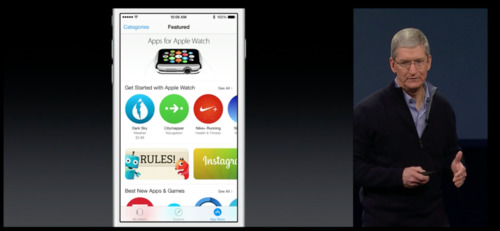
Tim Cook was talking about the new Apple Watch companion app that shipped with iOS 8.2. Tim Cook said:
"This is the app where you see, browse and download apps."
My reaction looked something like this:

YES. This is awesome and exactly what I was hoping for. Users will be able to check and download apps directly from the Apple Watch app. This feature prevents users from switching to the main App Store app and look for a specific category or use the already broken search engine to look for an Apple Watch app. Apple Watch owners are going to download more apps because they are just one tap away the store. New apps made specifically for the watch will be easier to discover.
Another positive point of this approach is that, as a developer, you don't need to waste your 100 words keywords with generic terms like "apple watch".
If an app contains a WatchKit extension, it will show up in both the App Store and the Apple Watch App Store. The app will be used to manage all the settings and apps too. There will be also how-to videos.
As you can see from the screenshot above, the icon can be different. The documentation says that the icon can be different from the containing app and you'll upload it in iTunes Connect. You can't submit WatchKit apps at this moment and it's not clear when submissions will open yet.
Pretty cool stuff!
0 notes
Text
WatchKit Settings Bundle
In this first post, I’d like to explore a new feature which Apple introduced in WatchKit with iOS 8.2 beta 5: Settings Bundles.
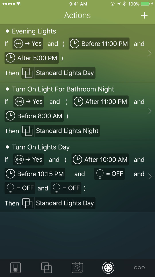
You may be familiar with them in iOS apps. Starting from iOS 8, every single app has its own place in the main Settings app as you can see from the following image. This is the screen showed by the Settings app for Reviews for iOS which contains a Settings bundle.
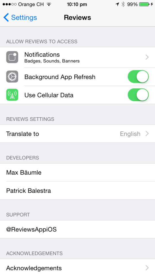
The first rows in top part of the screen are taken by the authorization and access requests required by iOS (such as notifications, location access, internet access, camera roll access). If your app contains a Settings bundle, iOS shows it just after the first section with your app's custom preferences. In my case, I’ve added a preference to let users choose the default language along with some more information about the app.
Let’s switch over to WatchKit now where things are very similar. As you may know, the Apple Watch will begin shipping in April but we don’t know all the details yet. What we know though, is that Apple Watch users will install an official Apple Watch app that will manage the watch preferences. In Mark Gurman's 9to5mac article, there are a few really interesting screenshots. It looks like the companion app is used to manage all the different settings from a single place. The cool thing is that Apple decided to let WatchKit developers add their settings into the same companion app too! A single place for everything!
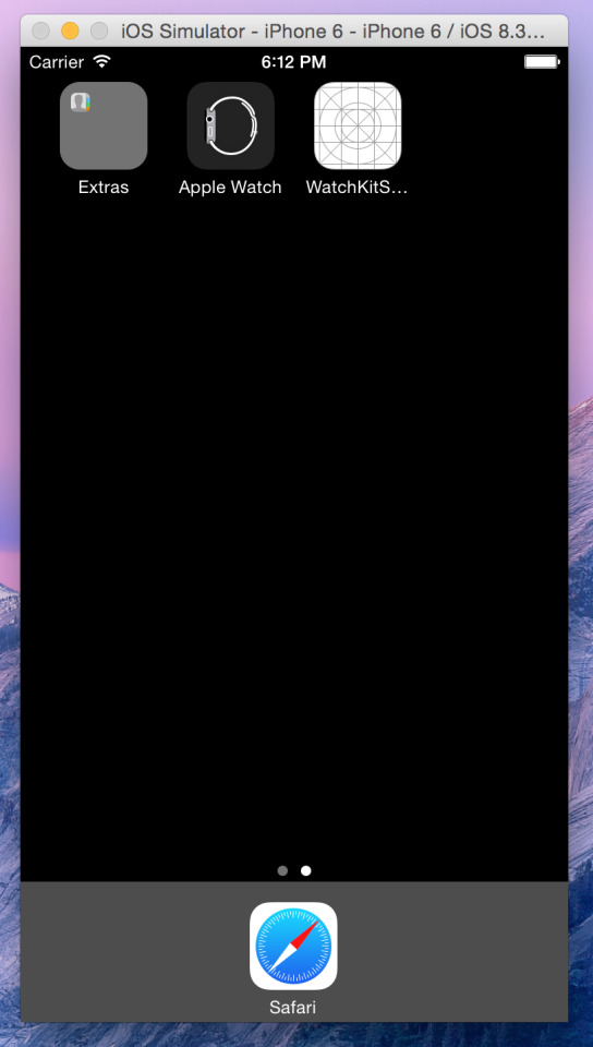
Xcode 6.2 beta 5 introduced a new app in the iOS Simulator, the Apple Watch app, which you can use to test Settings bundles.
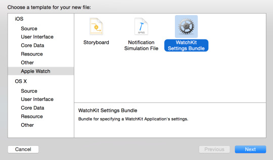
Let’s start coding now. Enough words. I will show you how to create a WatchKit app that will change the font size of a label based on the user preference. Create a new Xcode project and add a WatchKit target. Then do File → New and select the Apple Watch section on the left side. Choose a WatchKit Settings Bundle. Don’t change the default name from "Settings-Watch.bundle" and press Create.
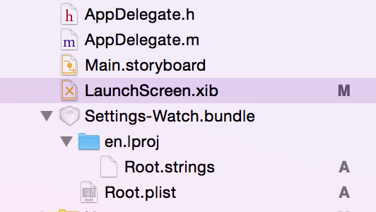
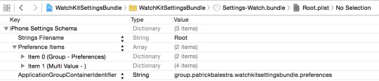
A bundle will be added to the iOS target of your project. A Settings bundle has the .bundle extension and is composed by a main Root plist file which contains its structure. This is the main file of the bundle and where you’ll decide what to show in the Apple Watch companion app. It is localizable and so it contains a .strings file for every language you support where you can place your translations.
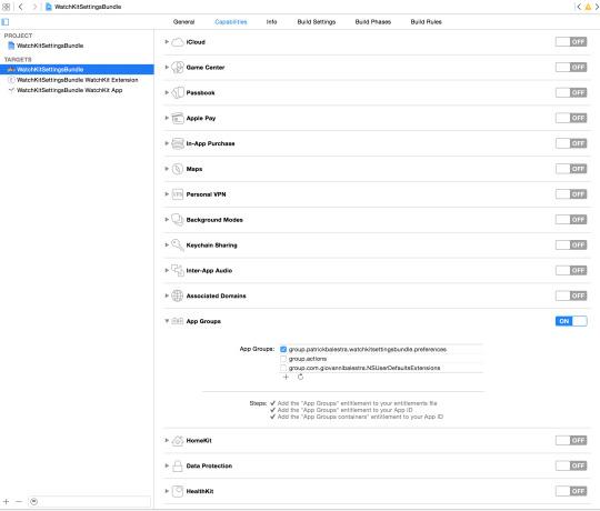
After adding the bundle, the first thing you need to do is to make sure your iOS app, your WatchKit app and the Settings bundle in the Apple Watch companion app will be able to share the same preferences. To do that, navigate under your main projects settings and select the Capabilities section at the top. Scroll down and turn on the App Groups capability. Choose a unique application group identifier to distinguish your preferences from the other apps. The identifier must start with "group" and it’s recommended to use the reverse-domain name style string. Something like “group.com.company.appname.settings” should be fine. If Xcode loves you back, it will automatically add the entitlement to your App ID in the developer portal. The following image should be the result. Now do the same thing but this time select the WatchKit app target and turn on the App Group capability and check the previously created group identifier.
The next thing to do is to tell your settings bundle in which group to save the preferences. Open the Root.plist file and paste the just created identifier in the last row (which should have an empty value) of the plist with the key ApplicationGroupContainerIdentifier. Now the bundle knows where to save the preferences and you will be able to check them from your iOS app and WatchKit app whenever you need.
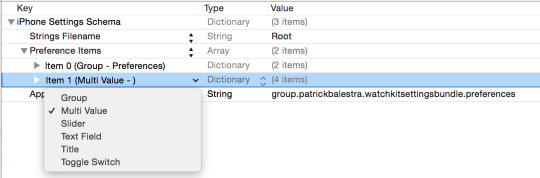
In the Root.plist file you need to structure your bundle. There are many different types of fields you can add. Here is the complete list.
Text field
Title
Toggle switch
Slider
Multi value
Group
Child pane
If you want to know more about each type of preference control, check the official documentation. This part of the process really depends on your app's preferences. You may prefer toggle switches over sliders or textfields. The process is basically the same for every type of value you want users to customize.
Start by deleting the items 1, 2, 3 that were automatically added by Xcode. The item 0 is the name of your first section. Expand it and change the Title value. After changing it in the Root.plist file, you must always remember to update the .strings with the corresponding word or translations. In this example, we will use a Multi Value control. To add a preference item, select the Preference Items row and press the + button that just appeared. You can now select which type of control you’d like to add and fill in the values.
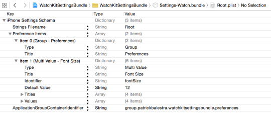
This is how my Root.plist file looks like in the end which shows the name of the section (Group - Preferences) and a Multi Value row.
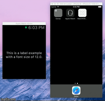
The first thing to do is to create the user interface of our WatchKit app in the Storyboard file. Add a label and create an outlet.
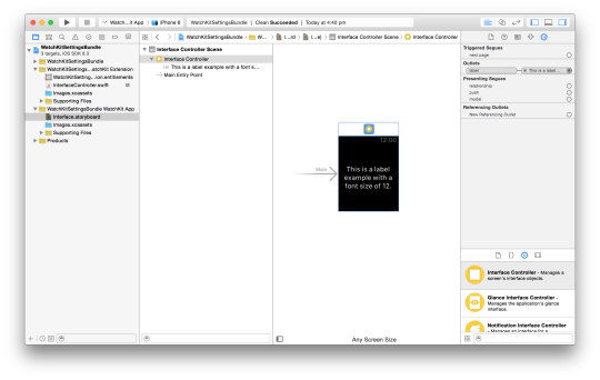
Now we are able read the user's preferences from the group container and subscribe to changes through NSNotificationCenter. We can then update the UI. The Swift code looks like this.
class InterfaceController: WKInterfaceController { @IBOutlet weak var label: WKInterfaceLabel! override func awakeWithContext(context: AnyObject?) { super.awakeWithContext(context) loadFontSize() NSNotificationCenter.defaultCenter().addObserver(self, selector: "loadFontSize", name: NSUserDefaultsDidChangeNotification, object: nil) } override func didDeactivate() { NSNotificationCenter.defaultCenter().removeObserver(self) } func loadFontSize() { let preferencesUserDefaults = NSUserDefaults(suiteName: "group.patrickbalestra.watchkitsettingsbundle.preferences") if let fontSizeString = preferencesUserDefaults?.valueForKey("fontSize") as? NSString { let fontSize = CGFloat((preferencesUserDefaults?.valueForKey("fontSize") as! NSString).floatValue) println(fontSizeString) let attributedString = NSAttributedString(string: "This is a label example with a font size of \(fontSize).", attributes: [NSFontAttributeName : UIFont.systemFontOfSize(fontSize)]) label.setAttributedText(attributedString) } } }
In the awakeWithContext method we subscribe to the NSUserDefaultsDidChangeNotification so we will be immediately notified when the user changes a preference. We use the loadFontSize method to load the value of the key "fontSize" and change our label font.
We can do the same thing in the iOS app. Open the Storyboard file and drag a UISegmentedControl and a static UILabel. Create an outlet and a Value Changed action to your ViewController.swift file for the UISegmentedControl object.
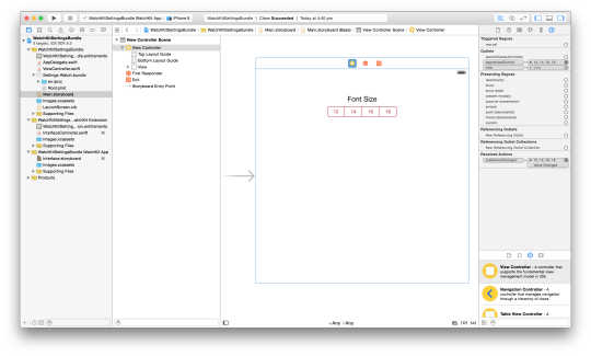
We now need to write the code which is similar to the one for the WatchKit side to sync the preferences and to allow users to change the font size directly from the our app.
class ViewController: UIViewController { @IBOutlet weak var segmentedControl: UISegmentedControl! override func viewDidLoad() { super.viewDidLoad() loadFontSize() NSNotificationCenter.defaultCenter().addObserver(self, selector: "loadFontSize", name: NSUserDefaultsDidChangeNotification, object: nil) } override func viewDidDisappear(animated: Bool) { NSNotificationCenter.defaultCenter().removeObserver(self) } func loadFontSize() { let fontSizes = ["12", "14", "16", "18"] let preferencesUserDefaults = NSUserDefaults(suiteName: "group.patrickbalestra.watchkitsettingsbundle.preferences") if let fontSize = preferencesUserDefaults?.valueForKey("fontSize") as? NSString { segmentedControl.selectedSegmentIndex = find(fontSizes, fontSize as! String)! } } @IBAction func preferenceChanged(sender: UISegmentedControl) { let preferencesUserDefaults = NSUserDefaults(suiteName: "group.patrickbalestra.watchkitsettingsbundle.preferences") preferencesUserDefaults?.setObject(sender.titleForSegmentAtIndex(sender.selectedSegmentIndex), forKey: "fontSize") } }
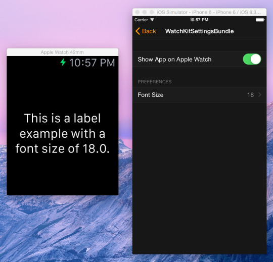
We now have a Settings bundle built-in the Apple Watch app and in our iOS app. Our WatchKit app is able to change the font size based on the user preference selected on the iPhone.
The complete project is available on GitHub. If you have any questions or feedback, feel free to tweet me @BalestraPatrick.
Thanks for reading.
0 notes
Text
Welcome to my first blog!
Hey!
Along with a major redesign of my website, I decided to open my first blog.
Stay tuned for my first blog post which is coming soon :)
Patrick Balestra
0 notes