ariannasart
GAD 1
independent and college work
114 posts
Don't wanna be here? Send us removal request.
Last Seen Blogs


darker-soft-starker
it's not that serious
taising
Tai Sing Corporation

linex555
Без названия

yoshimie
Untitled
Text
3D Evaluation:
a picture that has impacted my work-

a photograph of a tower in my work-

a drawing of a tower-
an independent outcome-

During this assignment I have used a limited amount of resources, a few being: watercolour, inkpads, acrylic paint, finerliners and sharpie. I have also learnt to use photopea, a photoshop alternative, for my independent outcomes. In my drawing I have used a few different techniques such as continuous line drawings, collage on photoshop and creating texture with concrete and graphite. In this project I didn't learn anything new necessarily, but I did strengthen my abilities and learn how to work with limited time a resources.
At the start and almost all the way through my project I had no idea what i was going to draw/create so i just went with what i thought of every time i picked up a pen. I had alot of other things happening around me these past two weeks which created a stressful and tense environment that I couldn't change, so I adapted to it. I was also unable to install photoshop so I had to adjust to photopea which although it's similar, it isn't the same and the commands are different compared to the macs.
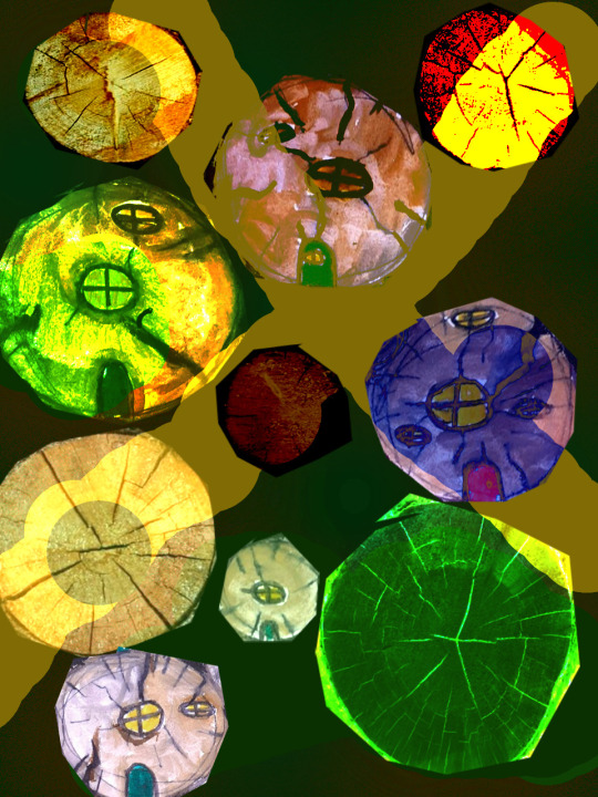
The main relation between my initial work and independent art is the towers I've drawn. In my independent outcomes I have collaged/merged my initial work together to create new buildings, cities or landscapes. For example , I added the stacked rocks, monster cans and the drawing on jewelry boxes to this plain document to create a symmetrical design, which almost looks like it's out of a fantasy game. I added various blends to make the cool colours and contrasts.

I also have a few independent outcomes that involve almost every building I've drawn, an example is shown below:
although most of them are quite chaotic , it reflects the busy-ness of normal life that we have mostly grown so used to. However unlike normal life, these structures have brighter ,bolder colours which make them alot more enticing. Altogether I am very pleased with what I have created this project and think I have done quite well.
0 notes
Text
Final outcomes-
I decided to draw large mushrooms because I wanted to do it earlier into this project, but I couldn't find any around. Although mushrooms aren't very big , from a faeries point of view they are skyscrapers , like New York city. It's a common idea in the pagan community that faeries live in mushrooms which also relates to the towers theme. I used colouring pencils to make this and I thought it gave quite a natural effect. For the sky and grass I used colours that compliment each other because it then contrasts to the bright red of the mushroom.
I then decided to take this into photoshop and edit it. To do this I tried to copy the colour combinations onto a clean page but with a large brush. I then put the original picture on top and added blends to make it look abstract. These are by far my favourite pieces from this project because they look very abstract and unique. I also like the drawing because it's something I'd normally draw.


0 notes
Text
Independent outcomes-
These photoshop outcomes are more symmetrical and individual, it doesn't involve many different drawings. I used the same techniques again. My favourite is the pink rocks because it worked the best and is pleasing to look at. The colours also compliment each other well.


0 notes
Text
Independent outcomes-
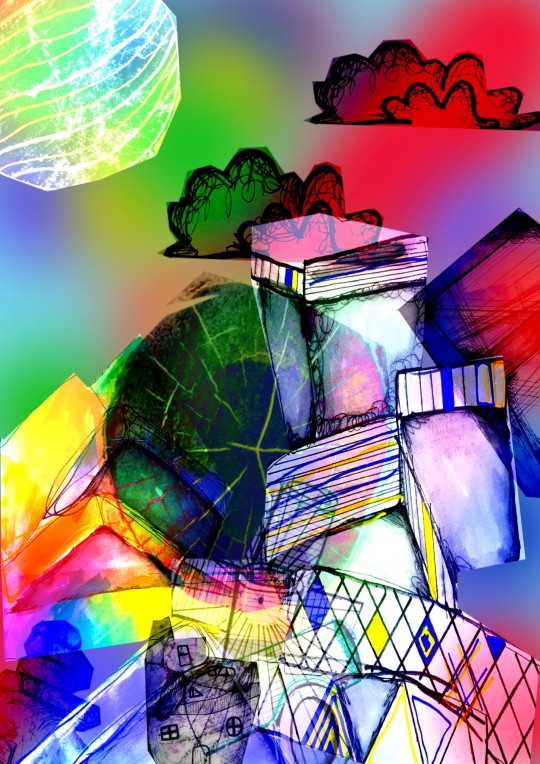
For these photoshop independent outcomes I combined a few or all of the structures I've drawn and heavily edited them. I added colours in the background after placing the structures (using the polygonal lasso tool) and added heavy blends to create the cool effects shown below . I'm really pleased with how these turned out and now that I know more about photoshop, will continue to use it.


0 notes
Text
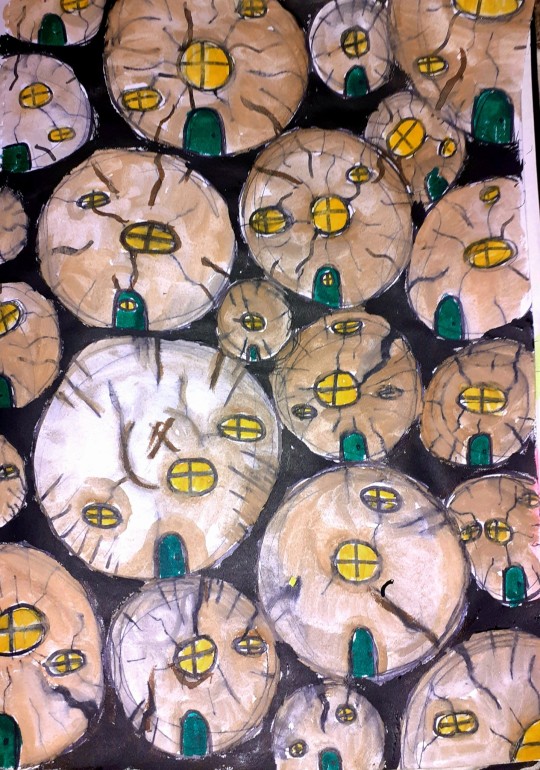
Drawings-
Using a stack of logs I drew little log houses that faeries could live in, I used watercolour and watercolour pens for the logs and black acrylic for the background.

0 notes
Text
Drawings -
I chose to draw a different angle of the books from earlier. I used a black fineliner and water to create the outline and shading. I also used a fineliner and sharpie for the lines. I then used the ink pad to add more colour, as not many of my drawings are bright. I got a stick of graphite and rubbed it on the background to darken it.


0 notes
Text
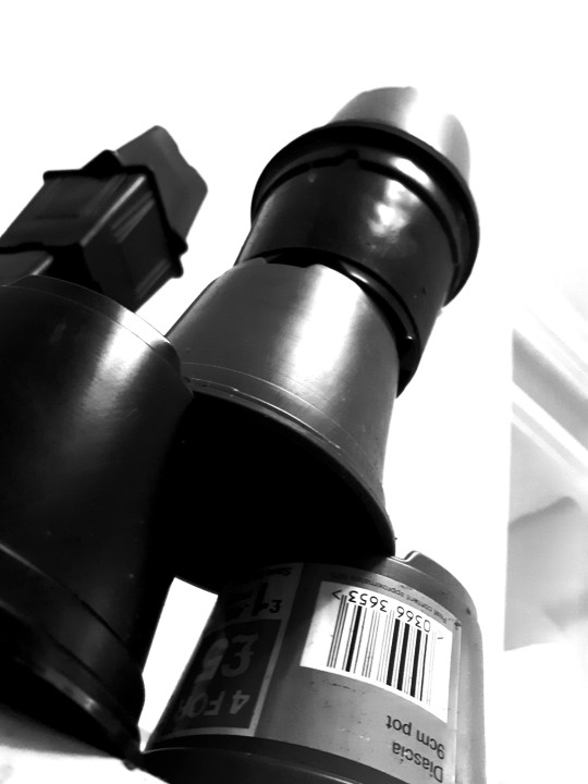
Drawings-
For this drawing I decided to draw a different angle of the pots. I used black fineliner and sharpie to create the outline and added water to create the shading. I used acrylic pen for the blue and yellow to add contrast and make the drawing bolder.


0 notes
Text
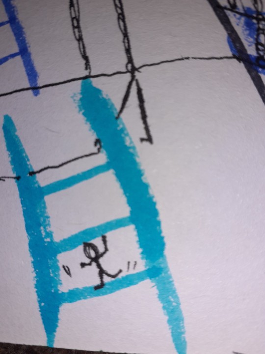
Drawings-
I got bored drawing this stack of pots so I decided to add some little stick men and ladders, ropes and slides into this. I used sharpie, fineliner and watercolour pens to create this.

0 notes
Text
Drawings-
Using fineliner and sharpie I recreated a stack of plant pots that can be interpreted as a building. I wanted it to look messy because I think it adds to the building. This was a continuous line drawing aswell to make it fast.

0 notes
Text
Drawings-
The inspiration behind this was some stacked stone/concrete I found in the woods near my house. I added texture to the base with concrete and graphite and painted the background a dark forest green, to make the structure more prominent. For this I also decided to turn it into a house , with windows of different shapes and a door .


0 notes
Text
Drawings-
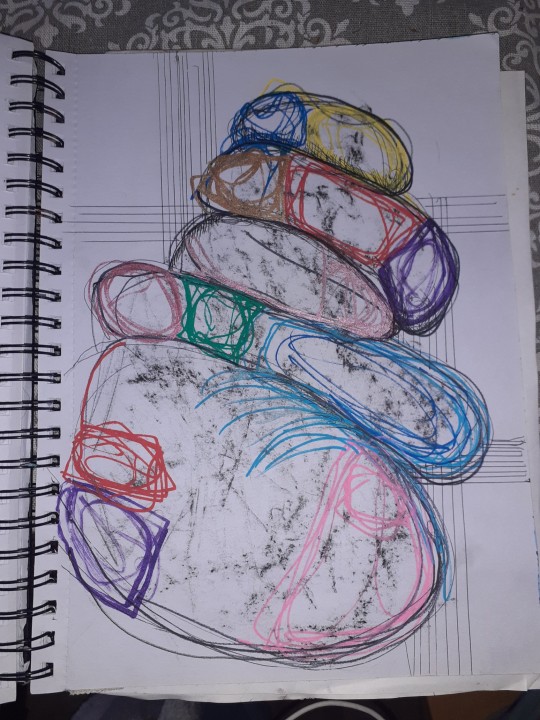
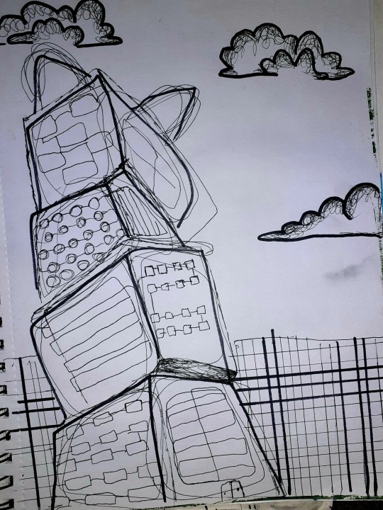
This is by far one of my favourite so far as i think the techniques I used worked well together. For this I used a stack of earring boxes for inspiration.


When drawing the structure I thought it looked quite boring so I decided to draw around a bowl to create a mood, then I went outside and rubbed to concrete onto the page, missing the actual structure to create a contrast which I think was quite successful. I then added random lines in fineliner and blue acrylic pen to add detail.
0 notes
Text
Drawings-
I used carefully stacked stones for inspiration for this drawing.


I used a graphite stick to rub concrete onto my page to add texture and used a sharpie and fineliner to draw the pebbles. I then got a pack of acrylic pens and drew random shapes repeatedly. I thought the background looked quite bland so I added some lines to tie it in with the drawing.
0 notes
Text
Drawings-
I used my photo of stacked monster cans to create this drawing.

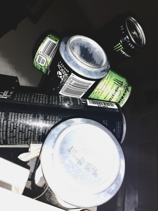
I used thick and thin fineliners to create the structure aswell as the circular design. I then used green water colour and acrylic pen to add hints of colour.
0 notes
Text
PhotoPea:
Independent outcome-
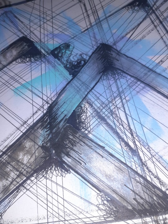
I attempted to use the online editor Photopea to create a structure. I used 3 different photos and merged them together (shown below) on an A4 page.


After adjusting the levels of each photo, I used the polygonal lasso tool to put them all on the same page. I placed them where I wanted and added a red background for a contrast. I then decided that I was going to adjust the blends, creating a cool and abstract effect that I really like, I also added a blue stripe at the top which I blended aswell.

By using this software I renewed my knowledge on photoshop for when I install it. I am very pleased with how this turned out and I plan to use more photoshop in the future.
0 notes
Text
Process For Context:
Drawing from our images-
Looking at my image I picked out the very basic shape.


This was obviously very dull and boring so I decided to add fineliner over the original lines, giving it a bit more depth and detail.

After this I decided to add some colour to brighten it up and make it more 'abstract'. I used the Color Box multi colour ink pad to do this as I thought the sponge would give more texture. The placement of the colour was not planned but I think it works well.

Finally I added shading in inner corners and places that join to give it extra depth and contrast aswell as detail.

0 notes
Text
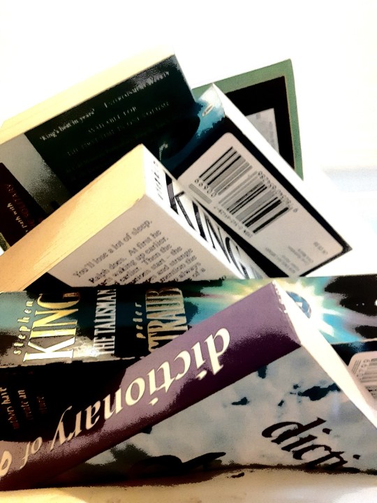
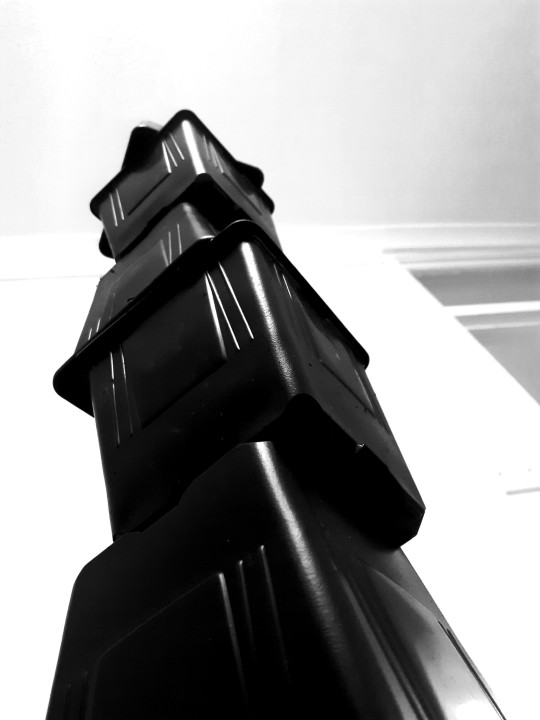
Photography:
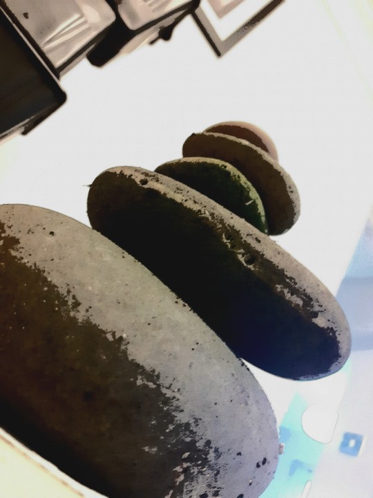
Stacked items-
After completing research, I decided to start making my own structures, I did this with: stones, pots, jewelry boxes, monster cans and books. I photographed them from below and edited them on my phone, these are the outcomes:


0 notes
Text
Research-
Haines House, Christopher Polly:
Art based on the building and blueprint of Haines House is Australia.
5 words: Confusing, Contrasting,Detailed, Accurate, Bold.

0 notes