
Last Seen Blogs

zxcdertgb
เทียนหยด

feelnthatway
Untitled

gamblingtime
♤ //ᴀʟʟ ᴛʜᴇ ᴛɪᴍᴇ ɪɴ ᴛʜᴇ ᴡᴏʀʟᴅ

cathman2017
Fun with Foley CATHETER

jacobdavis250-blog
Untitled
Text
My final decision is to pick the version 1 for my final poster design. Since having the whole poster look like a polaroid gives it a sense on tangibility.
0 notes
Text

Version 2 of final poster design. Top with black wording. Bottom with dark blue wording.
0 notes
Text


Version 1 of final poster design. Top with dark blue wording. Bottom with black wording.
0 notes
Text
My poster still felt kinda empty after colouring it. So I was thinking of a way I could make it feel a bit more special.
I came up with the idea of adding a border on the poster that makes in look like a polaroid photograph.
Polaroids feel special since its a image that is taken and a single photo is printed on the spot. The fact that knowing there will only be one original of it makes it even more special.
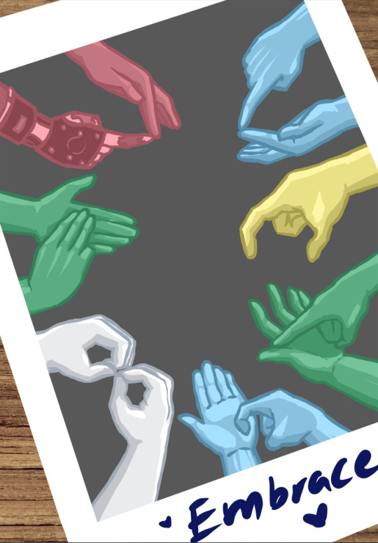
So I belive making my poster look like a polaroid will make it seem special. To me it gives the idea of a special moment between a group of friends where they have learned to use sign language so that they can finally communicate with their deaf and mute friends. And they are capturing a moment of unity and embrace.
0 notes
Text


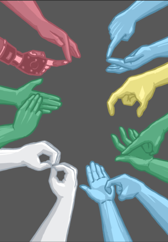
I made a small change to the design of one of the hands.
Inspired by the disability pride flag, I wanted each hand to represent a disability group so that not only am I giving awareness to people who use sign language but also give a sense of unity and to bring out the meaning of Embracing each other and their disabilities out more.
And according to the disability pride flag, the pair of hands that include the prostetic will be in red. I also wanted to have 2 hands in the colour green since the poster is mainly about the people with sensory disabilities.
0 notes
Text
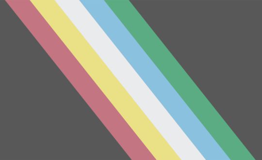
I wanted to use the colour palette of the disability flag.
The disability flag having only 3 colours did restrict me alot when it came to colour. The disability pride flags has more freedom when it comes to colour.
So I decided to use the colour palette of the disability pride flag since it also has a lot of meaning behind each colour on the flag.
0 notes
Text
0 notes
Text

While searching for inspiration for a colour palette for my poster I came across the disability flag which is the one on top, and the disability pride flag which is the one at the bottom.
The disbility flag is a tricolor flag with three equally-sized horizontal stripes of gold, silver, and bronze,representing the three medals at the Paralympic Games, Gold, Silver, and Bronze. However, according to the designer of the flag Eros Recio, the three colors also represent the different forms of disability, physical, mental (intellectual or psychosocial), and sensory. But, the meanings of these colors are open to interpretation by the communities they represent.
The Disability pride flag is an evolution of the Lightning Bolt Disability Pride Flag(Pictured below), which is safer for people with visually-triggered disabilities. The color brightness changes also make the flag more accessible to those with color blindness. The new Disability Pride Flag is a charcoal grey flag bisected diagonally from the top left corner to the lower right corner by five parallel stripes in red, pale gold, pale grey, light blue, and green. The Disability Pride Flag comprises several different elements, each symbolizing various aspects of the disability experience.

As for what the colours on the flag represent: Green is for sensory disabilities, Blue represents emotional and psychiatric disabilities, White stands for non-visible and undiagnosed disabilities, Gold is for neurodiversity, Red represents physical disabilities.
The stripes are displayed on a faded charcoal black background which commemorates and mourns disabled people who’ve died due to ableism, violence, negligence, suicide, rebellion, illness and eugenics. The dark background also represents rage and protest against the mistreatment of the disabled community.
0 notes
Text
0 notes
Text
I decided that I will be digitally hand drawing my poster.
Poster size is 70x100 cm (in accordance to the brief).
0 notes
Text
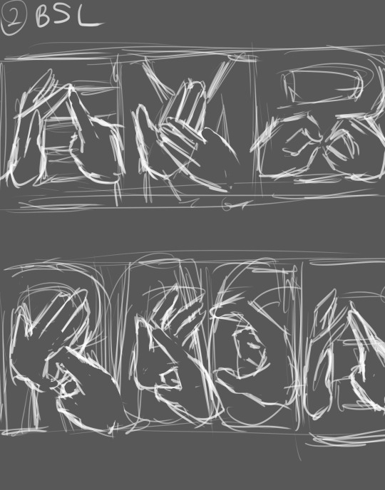


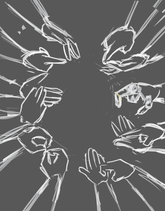
Poster concept 4
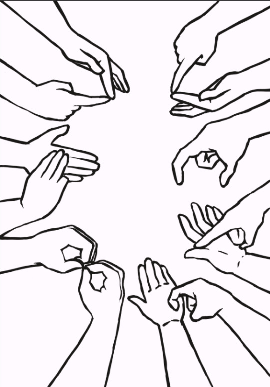
I used the same concept as concept 3 but using BSL instead of ASL. Behind the hands that are doing the hand signs there are the English letters so that people cna easliy understand the meaning of the sign made.
Here I drew 2 people, One who is hearing impared and another who has no diabilites. They are leaning on to each other affectionately, hands interlocking while making the hand gesture for the word "Embrace".
Multiple hands in a semi circle spelling out the word "Embrace".
The same concept as 3. but fills in a lot of the empty space.
0 notes
Text


I realized that there is a difference between ASL and BSL. So I decided to use BSL instead.
0 notes