
alfieshaw
Alfie
AUB Visual Communication Studenthttps://ayanp.xyz/
641 posts
Don't wanna be here? Send us removal request.
Last Seen Blogs

larbisblog
Sans titre

lamianxious
[ LA ]

reallygross2hathoughts
NSFW 2Ha Grossness
reallygross2hathoughts
NSFW 2Ha Grossness

easy-trip
Easy Trip
Text
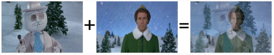
Using Kicks from the song to adjust the transformations of the masked video to create some interesting shapes and
0 notes
Text
0 notes
Text
Tests with multiple videos which play on cue to the values of the music
0 notes
Text
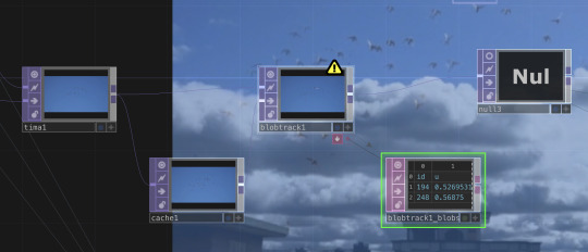
Blob Detection + Experiments
In Image processing, blob detection refers to modules that are aimed at detecting points and/or regions in the image that differ in properties like brightness or colour compared to the surrounding.
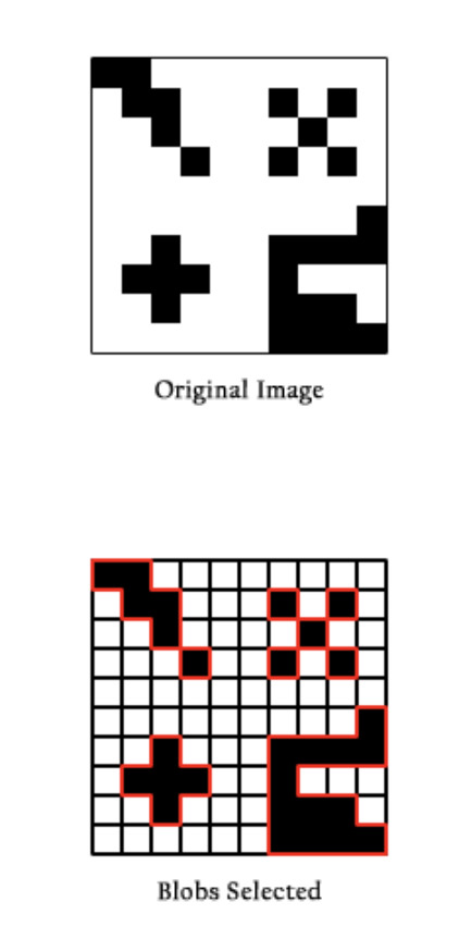
I experimented with this video where I implemented blob tracking on a video of birds flying.
The blobs are the squares which appear around the movement.
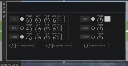
In this video Im transforming the audio from the music along with the movement of the birds into 'blob's along with other elements.
I imported the song :
youtube
From Vegyn, because I'm a fan of the music and I thought that because it had a lot of consistent kicks, I could analyse the sounds to create something audio reactive.
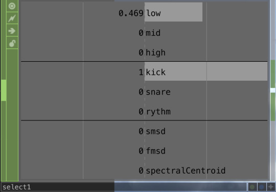
Inside of touchdesigner, I'm using an audio analyser to detect every time a kick is played in the song.
Im transforming this data into video by connecting the kick output into the 'cue' of the video.
For the video, I used a video of birds flocking from Pexels.
If you watch the video you can see that everytime the kick is played the video 'cues' to a different time. This means that the video is jumping and cutting to a different point in time with the music.
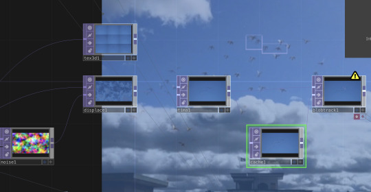
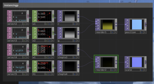
A lot of the video utilises the data from the song. For example the blob tracking combines the information of the music and the movement inside of the video.
Im translating the audio into a value/number and then linking that number to a noise value.
Im then transforming this data into something visual by drawing blobs around the movement which is based on the data of the music.
0 notes
Text
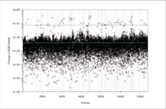
Movie Colours
This project uses Processing to visualise movie colours in a few different ways.
Each vertical line is a one-second slice of the movie. The colour of each line is the average colour of that one-second slice.
Timeline

All Frames
A multiple exposure is created by overlapping multiple pictures on top of each other:

The example above is from "Finding Nemo", whats interesting is that you can make out a slight orange hue in the centre from the repeated frames of Nemo centred throughout the movie.
Happy CodingAvailable from: https://happycoding.io/gallery/movie-colors/index (2018). Movie Colors [online]. [Accessed 8 February 2024].
0 notes
Text
The Analysis of Film
Raymond Bellour is a French film critic and theorist.
The Analysis of Film is a collection of some of Bellour’s most classic essays. Influenced by Christian Metz, Bellour applies the concepts of structuralism, semiotics and psychoanalysis that revolutionised film criticism in the 1970s.
What is most remarkable in his essays about Hitchcock's films is the detailed individual analysis of each shot in a sequence and how each camera position is reused throughout it, studying the gaze of the characters, symbologies that relate to psychoanalytic concepts and studies of symmetry and asymmetry.
‘The Analysis of Film’, Raymond BellourAvailable from: https://booksoncinema.blogspot.com/2018/05/the-analysis-of-film-raymond-bellour.html (n.d.). ‘The Analysis of Film’, Raymond Bellour [online]. [Accessed 8 February 2024].
0 notes
Text
Cybernetic Serendipity Music
Cybernetic Serendipity was an exhibition of cybernetic art curated by Jasia Reichardt, shown at the Institute of Contemporary Arts, London.
It was the worlds first exhibition to bring together art, music, and computers.
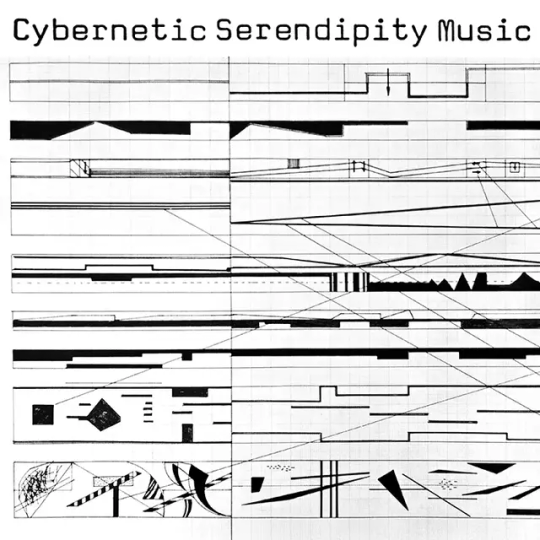
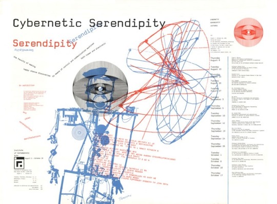
In the context of music, Cybernetic Serendipity Music often involved the use of computers and electronic devices to generate or manipulate sound in innovative ways.
Artists sought to create systems where the music could evolve and change based on input from external sources or through feedback loops within the system itself.
Some artists explored the use of analog and digital electronic components to create kinetic sculptures, light installations, or audiovisual performances.
These works often involved the use of sensors, motors, and other electronic devices to create dynamic and immersive experiences.
youtube
Some exhibits might have included interactive elements where viewers could manipulate the data or observe how changes in input parameters affected the visual output. This approach not only showcased the capabilities of technology but also encouraged viewers to engage with and reflect on the underlying concepts of cybernetics and information processing.
Lucarelli, F. (2014). Roland Kayn and the Development of Cybernetic Music – SOCKS [online]. Available from: https://socks-studio.com/2014/11/03/roland-kayn-and-the-development-of-cybernetic-music/ [Accessed 7 February 2024].
1 note
·
View note
Text
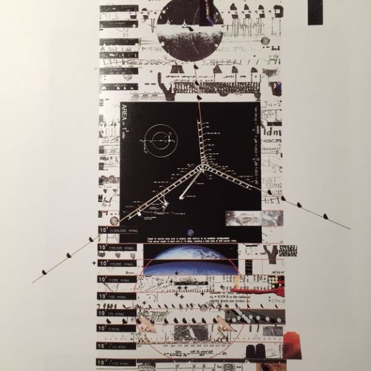
Data For Aliens
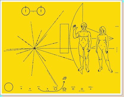
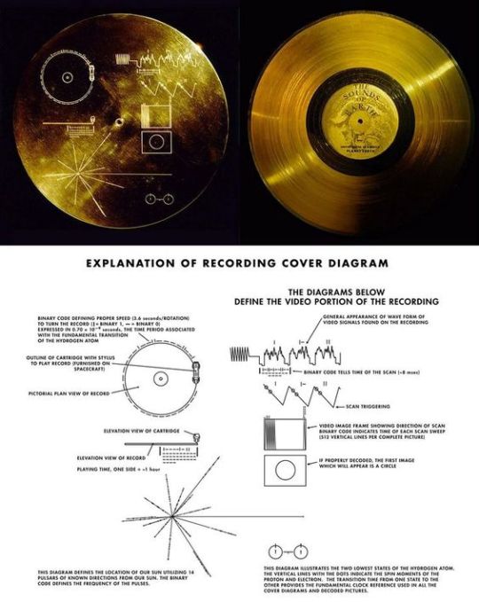
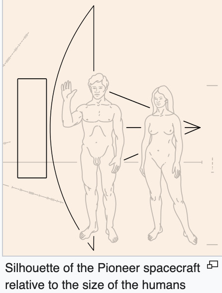
In 1972, the Pioneer 10 became the first spacecraft to be poised to leave our solar system, and journalist Eric Burgess had the idea of communicating to aliens that life existed on Earth.
In two weeks, the team had to boil all of humanity down into a simple line drawing, engrave it onto a set of identical golden plaques, and bolt them to NASA’s two Pioneer spacecraft.
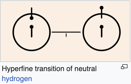
The plaque’s drawings distill Earth’s history, all of humanity, and an explanation of the spacecraft itself down to seven illustrations (drawn by Salzman Sagan): our solar system; Pioneer’s trajectory; Pioneer’s silhouette; the figures of a man and a woman; the relative position of the sun to the center of the galaxy; and a diagram of the hyperfine transition of neutral hydrogen, the most abundant element in our universe.
“What I love is the idea that it represents the best of what makes us human–that constant seeking of what’s next on the horizon, and the hope and sense of wonder that makes us who we are. This abstract symbolism embodies that for me somehow.” Duane King
https://www.fastcompany.com/90125750/45-years-ago-nasa-launched-an-infographic-for-aliens-into-space#:~:text=The%20plaque's%20drawings%20distill%20Earth's,the%20center%20of%20the%20galaxy%3B
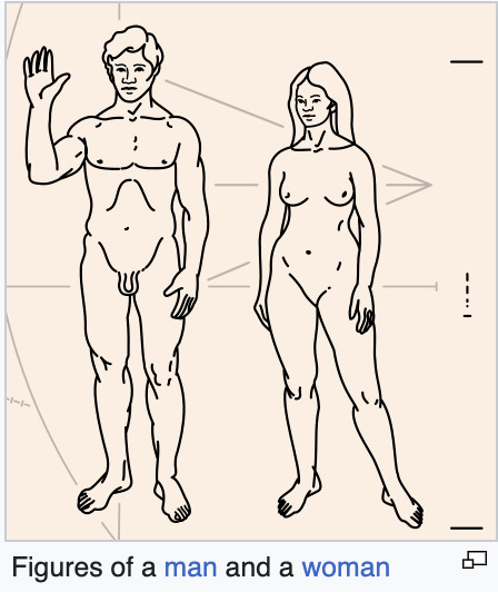
The right hand of the man is raised as a sign of good will. Although this gesture may not be understood, it offers a way to show the opposable thumb and how the limbs can be moved.
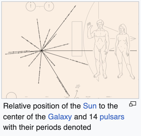
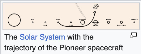
I found this interesting due to the semiotics of the illustration and how symbols such as an 'arrow' -> were used to show the trajectory of an object, yet that symbol is something which may have a completely different meaning to different cultural hermitages.
0 notes
Text
Learning to see data
Carey, B. (2015). Learning to See Data. The New York Times. 27th March [online]. Available from: https://www.nytimes.com/2015/03/29/sunday-review/learning-to-see-data.html [Accessed 1 February 2024].
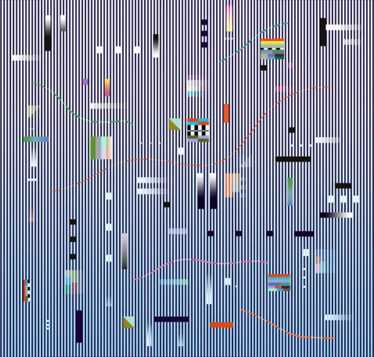
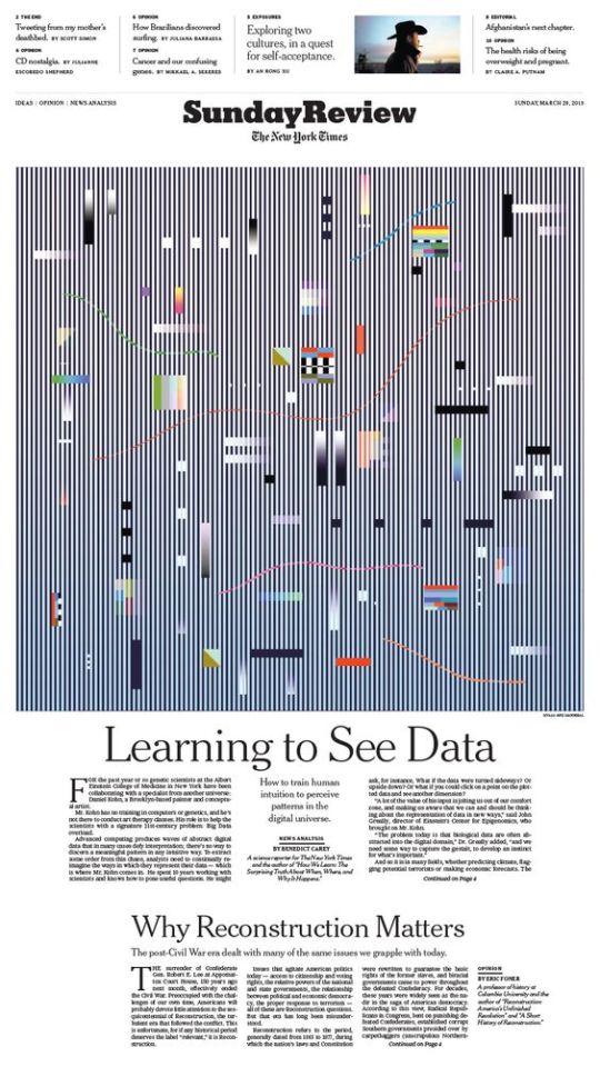
I read the Learning to See Data article by the NY Times and the TLDR of it is that genetic scientists at the Albert Einstein College of Medicine are collaborating with artist Daniel Kohn to address Big Data overload in their research.
Kohn helps them think differently about data representation. Perceptual learning, a psychological concept, suggests that specific visual skills can be trained rapidly, enhancing intuition. This approach has been successful in fields like flying, surgery, and dermatology. The idea is to sharpen instincts for recognising patterns in complex data, offering a potential solution to the challenge of handling vast amounts of digital information effectively.
I couldn't find much on what Hvass & Hannibal's design actually visualises but I still wanted to post about it because of interesting elements of line, grids and colour to visual values. It's a little too far on the abstract side for me because it's difficult to read to nethertheless interesting to look at.
0 notes
Text
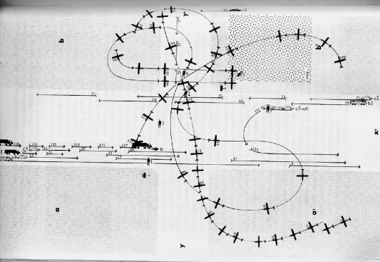
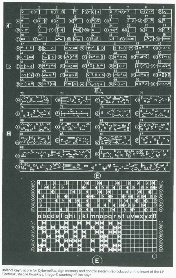
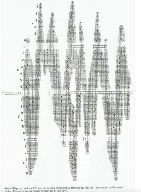
Critical Mapping
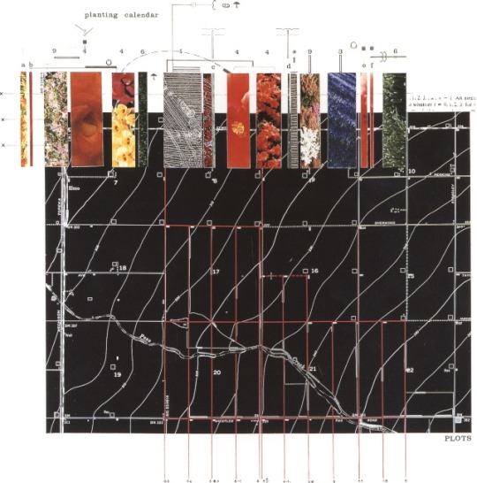
Planting Calendar from James Corner Field Operations.
“You can start looking at what’s on the map, what is not on the map. What is missing? How is it packaged? How is it framed? How is it meant to be used? We don't know a lot of these things, by the way. It’s like any historical document that you get. That it tends to all of a sudden put things together spatially, and say, ‘Well, what implication does it have? What does that mean? Why is this cartographer emphasizing this dimension?’ ... And we might, in our minds, think about alternative ways, alternative audiences, alternative purposes. And once you start playing with the map like that, it's a series of questions and answers and arguments, and delivery systems if you wish.”
— Gerald Danzer in “Analyzing Maps,” 2003-2005
Available from: https://www.thepolisblog.org/2012/07/gerald-danzer-on-critical-mapping.html (n.d.). Gerald Danzer on Critical Mapping [online]. [Accessed 1 February 2024].
This Critical Mapping as an Articulatory Design Practice Visual Guide is written and designed by Tristan Schultz.
It has been compiled as a guide for designers, activists, organisers and others wishing to utilise a loose methodology that might help them map out their concerns with decolonising and future-oriented perspectives.
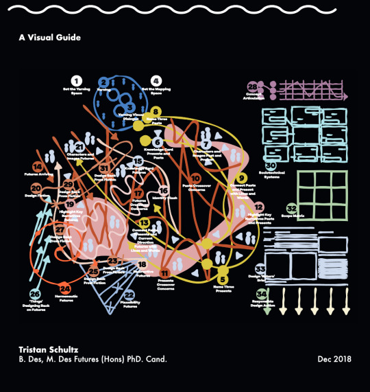
Relative CreativeAvailable from: https://relativecreative.com.au/resource/critical-mapping-visual-guide/ (n.d.). Critical Mapping: A Visual Guide.
Critical mapping or cartography is a term used in geography and mapping to describe an approach that goes beyond traditional cartography to explore the power dynamics and social implications of maps.
I found these to be visually striking methods of data visualisation.
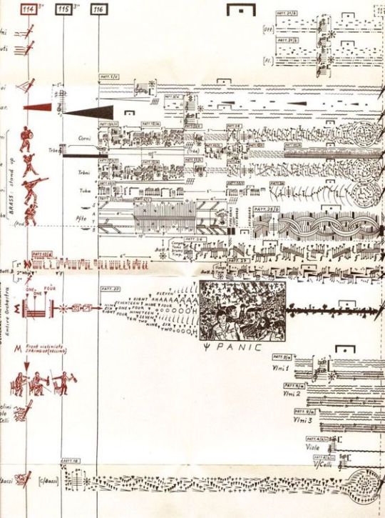
This doesn't just apply for maps but also for music sheets and notes as a form of visualising/mapping sequences in the form of avant garde visual sheets.
0 notes
Text
This is a piece of work I found by Steven Mark Kubler for his master thesis.
www.instagram.comAvailable from: https://www.instagram.com/perspek.steven/?img_index=1 (n.d.). Instagram [online]. [Accessed 1 February 2024].
Transmitting data from an @arduino.cc board to @touchdesigner - Utilising various informations from different sensors to dynamically adjust the gravitational acceleration within the scene.
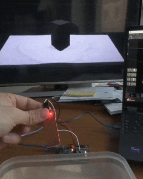
In this example he's using the data of the reaction to water to displace the simulation on the screen.
I like the approach of using Touch Designer for data visualisation and from my experiences theres countless methods to visualise data using the software.
0 notes
Text
Translate + Transform
Translation can mean the process of translating
words or text from one language to another.
The conversion of one
form or medium into another.
The process of moving something from one place to
another as found in mathematics or coding.
The Task
Pick something and translate it visually using a system devised by you, mapping the process and explaining this clearly.
Generate something new and enable your audience to interpret, understand and identify where your content originated from.
0 notes
Text
Critical Reflection
Overall I’m happy with the final outcome of the project. It’s a topic I’ve found interesting and I enjoyed the exploration into the ASCII movement.
I believe I’ve effectively used Scrolly Telling to inform my audience and celebrate the decade long art form.
My website tells the story and linearity of ASCII art, discussing it’s history and how the style built foundations for many modern movements.
I also believe I incorporated strong use of user-testing to improve the UI/UX of the site, something I struggled with last term.
If I had more time, I would have liked to explore the formatting of my text to improve upon the hierarchy of some of my body copy.
Im glad I spent the experimental stages refining my skills in Processing as the knowledge is directly transferable to p5.js if I continue working with web design.
Time management was my main weakness this brief. If I started the website further out from the hand-in,
I would have more time to reflect upon feedback and optimise the performance of the website.
I’m glad I’ve been able to improve my capabilities of web design. Using my knowledge gained this term, I will be able to have more effective time management as I know have more knowledge over certain tasks.
Lastly, I’m happy I spelt some time experimenting and refining in areas I wish to peruse after graduation. Web design is an industry I’m especially interesting and I’ve learnt a considerable amount this term which be further enable me to work more efficiently come my final major project.
0 notes
Text
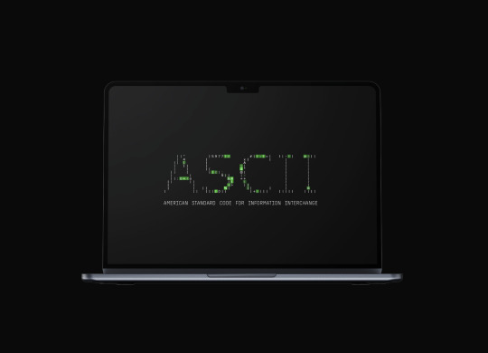
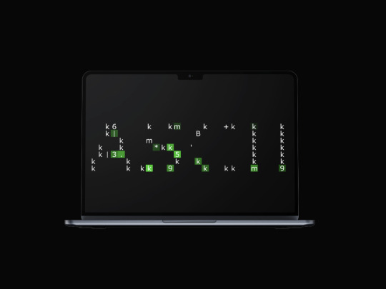
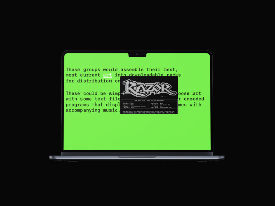
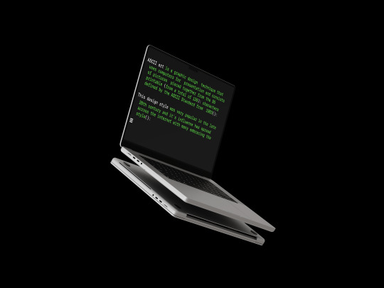
Thought of doing some of the screen grabs in mock up as a way for presenting them on a portfolio page/in my process book.
0 notes
Text
Final video of website
https://ayanp.xyz/
As of Dec 2023, only formatted for Mac devices
Note, Please resize the window and allow a few seconds for the images to load
0 notes
Text
Navigation Bar
I didn't think this would take as long as it did but creating this used up a lot of my remaining time as I ended up breaking the entire website in the process and messing up the orders of the layers:
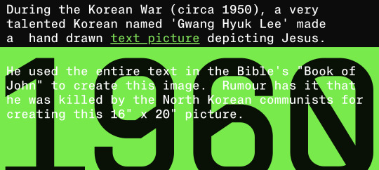
However the end result definitely aids the navigation of the website and greatly improves the UX.
I ended up just going for a simple burger menu with the years as pop-ups, then when you click on them it directs you that pixel of the site.
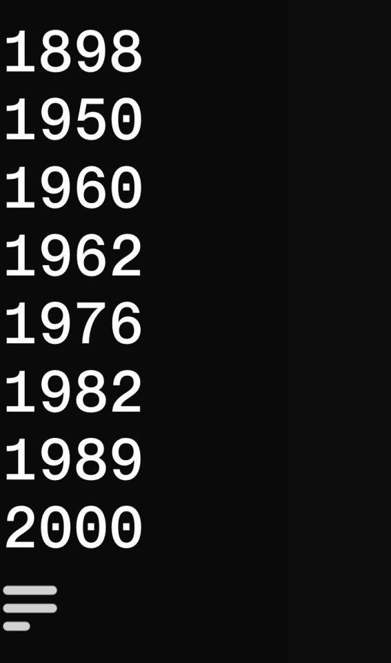
Visually, the menu could look a lot nicer, however with how long this took me, I'm going to have to settle with this for now as its beyond my current technical skills to improved it.
The menu does sometimes clash with the background content so i added a low opacity background to create a distinction but its still not perfect.
If i had another week this would be something I work on, however with my time, I have to settle with this.
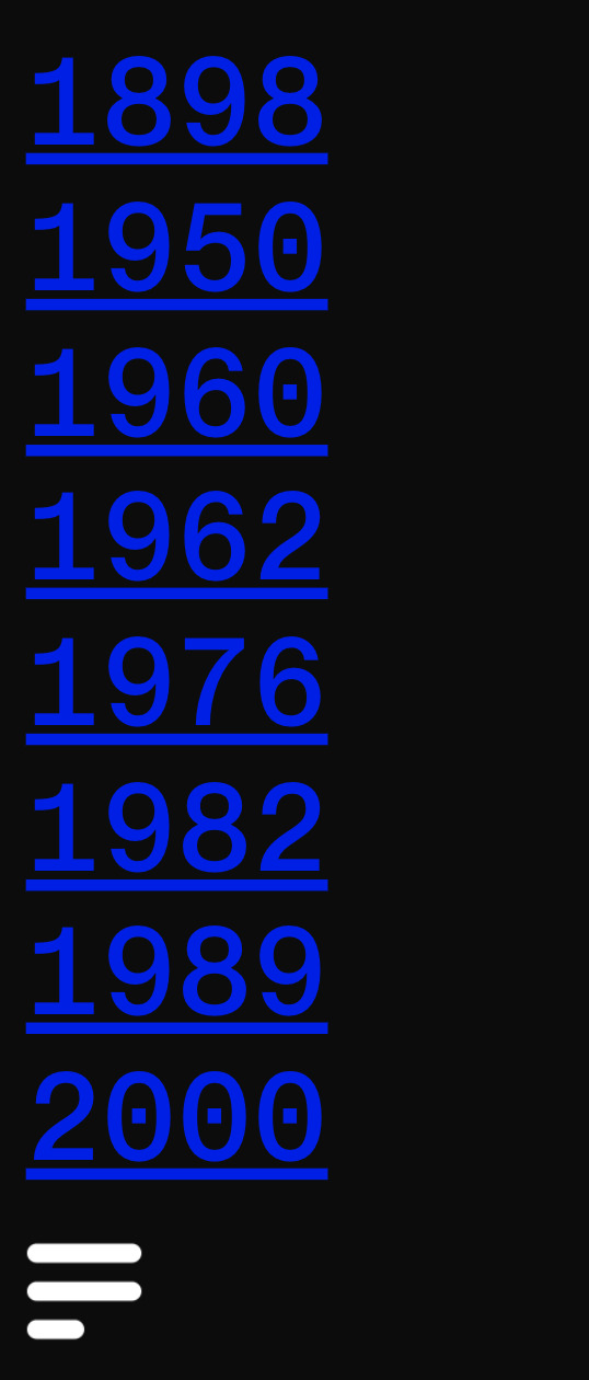
I found through user testing that on some devices, the icons are blue. Im assuming because they are links to a page of the website.
On the one hand, this looks quite ugly, however on the other hand at least the type doesn't blend in with the background or body colour.
0 notes