alexmarsdenblog
Alex Marsden Design
Visual communication student at AUB
763 posts
Don't wanna be here? Send us removal request.
Last Seen Blogs
atomicfluf
#봄의_빛나는별_성화야_생일축하해
letsfucklovato
All Night Long

thinkingjasico
I live in my own little world
not-all-angels-can-fly-blog
"what about us" well what about me?
bluedragonfairy2000
Enjoyer Of Videogame Lore, Especially Minecraft
Video
youtube
FINAL CAMPAIGN VIDEO
Really happy with the final outcome, I feel it sums up my major project well. The combination of GoPro footage, 3D renders of the app in motion, as well as the audio and voice-over creates the intended pace and tone for the video.
0 notes
Text
STANCE - FMP EVALUATION
Throughout the duration of this project, I have engaged in a thorough investigation to dive into user interface and user experience design. The outcome for the project changed throughout the duration however the outcome still sits within the same subject area. My design process was inspired by the current campaign that followed the same idea of promoting exercise in daily routines. I was intrigued by the research that led me to big sports brand campaigns such as Nike, Garmin and Fitbit to name a few. I also was fairly new to UX/UI design so this meant I would look for inspiration and check websites such as Sreenlane for inspiration and tips on how to improve my designs. Constantly checking design blogs like ItsNiceThat and design week kept the inspiration coming and was a chance to see what was happening in the industry.
My project saw many changes, from the development of the branding to the process of designing the Adobe XD files. After tutorials, I would reflect and make and necessary changes needed. My project was constantly evolving throughout the initial stages. The idea was changed and developed into the final idea around Easter. The stage that saw the most changes was the designing stage where I spent time creating as many possible logos, colour palettes and layouts to choose from to make sure the final outcome communicated the best message.
My time management throughout this project was good, I was ready to present my current ideas and designs for each week’s presentation and allocated enough time to personally reflect upon the work I had done Each week. My time management towards the end of the project could have been better, however, my project had evolved into something that was taking a fair amount of time to design. The final idea proved to be broad and the work I wanted to create meant I had to direct the project as best as possible whilst making sure it was still within a realistic time frame.
I was getting constant feedback from tutorials and other students. I would blog after each tutorial any feedback I had received and respond accordingly. The day after receiving the feedback would be spent going over possible routes to go down. I always had plenty of feedback and some were down to personal preference on how to take it. I feel I worked well alongside feedback that has enabled me to create a body of work that follows the brief I set out and communicates the message intended effectively.
There are always areas of my practice that could do improvement, however, in this project, I feel my design process worked well. The only thing I could improve upon was making sure to not overload me with work as I often felt I had bitten off more than I could chew. However, this was something that I overcame and it ended up being a good chance to test myself by setting out a series of deliverables out. Curate and design myself.
This unit has taught me a lot about management and more so balancing a fairly hectic workload with reflection and research. One thing I made sure to do during the duration of this project was to continue to question what works best and check in on the research. This helped the body of work I had made be relevant and best communicate the message I set out to tell.
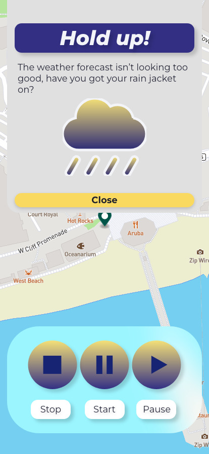
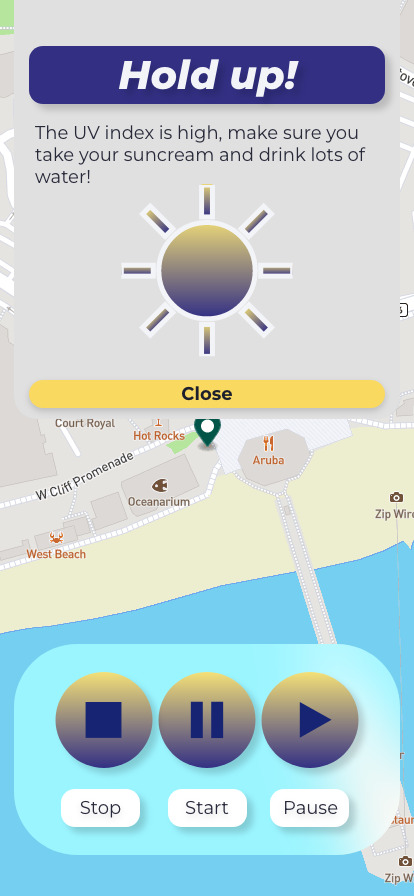
If there were any elements I would change on my project, it would be during the process where I was designing the layout of the app. For example asides, from the features, the app layout was something I needed to get done in order to make sure the rest of the project had enough time to be made. Overall I am really happy with the body of work I have curated for my final major project and think it is my best work to date. I feel it consists of several elements of the design of which I am proud and I directed a campaign that helps tell the brand story at the same time as solving the problem I set out to solve, which was making exercising outdoors easy, fun and accessible to all ages.
0 notes
Text
TRANSFORM + TRANSLATE EVALUATION
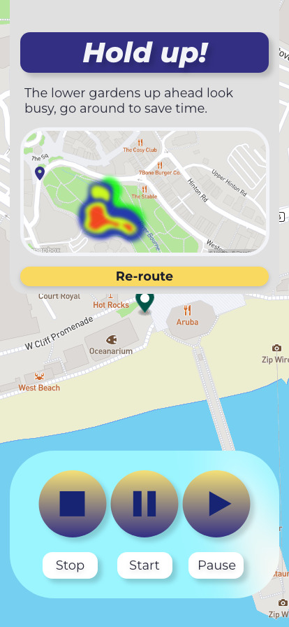
For this short project, I wanted to explore an area I am interested in, taking my knowledge and understanding and developing a system that evidences a translation of a form of data. I began by looking into Premier League football stats that lead me to heat maps. I found these new maps had a nice aesthetic and saw the potential for developing them into a different framework. I found that my design decisions were affected by a personal desire to explore 3D design.
I took the heatmaps and transformed them into 3D renders and used these new forms of data visualisation to represent the movement in a different framework. The overall design of thermal heat mapping affected the design of the graphs I had created based on the colour palette I had made from these maps.
As this project was short there were few changes. I originally found myself a bit stuck when decided on how to transform and translate this data. The main development my project saw was experimentation with illustrators’ new 3D extrude and bevel tool. This was something I was unfamiliar with so saw a few changes throughout the process.
As this was a short project I had to work quickly and make sure that I was staying on the brief. I feel I spent sufficient time researching that in-term aided the development of the visuals I designed for the final outcomes.
The feedback I got from the presentation was helpful, it gave me a sense of direction for which to develop upon and potentially spark ideas for my major project brief. The feedback led me to investigate the combination of thermal hat mapping and sports data visualisation.
At this stage I could have been more experimental with moving image, I created a brief animation of each card I created, however, I could have spent some time improving my animation skills during this period.
This unit of study was very quick and didn’t leave much time to reflect until it was over, however, I feel I have looked into a topic I was interested in and taken a form of data and translated it into a new framework.
I would change the outcome of the project as I feel they could still somewhat be associated with the original source, I feel it translated the data, however, could have been more experimental.
0 notes
Video
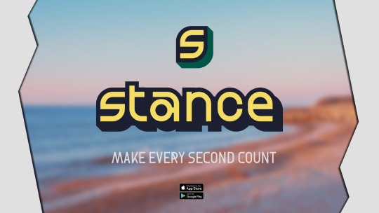
Extra assets for the deliverables, perhaps a billboard mock up.
Working with the brand slogan ‘what’s your stance?’
0 notes
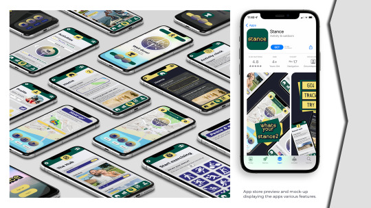
Photo
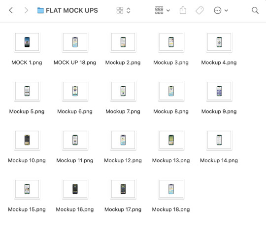
FLAT LAY IPHONE MOCK UPS
These were created to be used across portfolio pages.
0 notes
Video
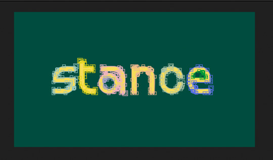
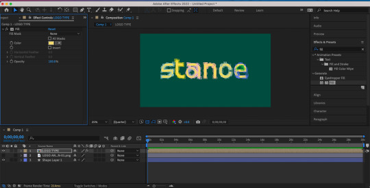
Stance logo animation -
This animation builds the logo from 0 opacity, it builds up the stroke to make the effect as if it growing on the screen. I also delayed the appearance of the offset path stroke behind the logotype. The aim of this animation was to create an impact on the ending of the campaign video. I also included the app store and google play assets to help communicate where you can find the app.
0 notes
Photo
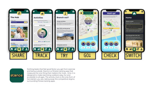
Portfolio page development
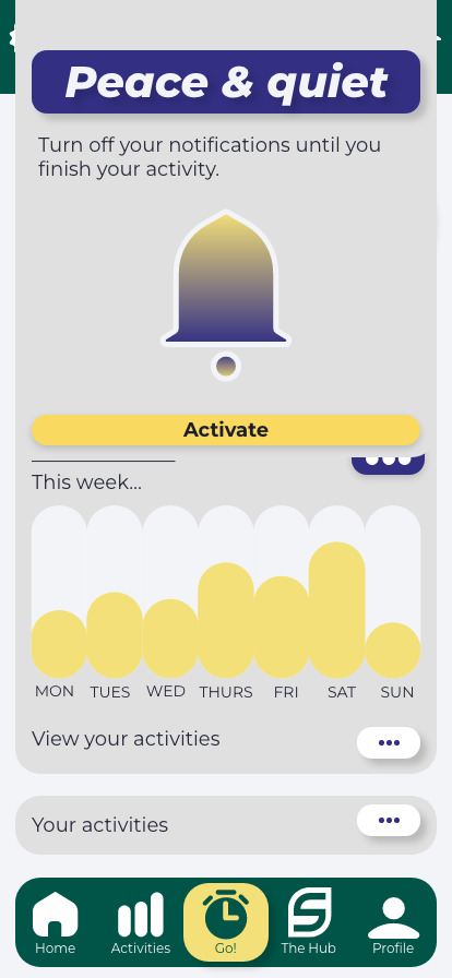
Using the branding components and colour palette I create a few test portfolio pages. I created the tag lines - share, track, try, go!, check, switch - to help grab the attention of the user and talk about the functions of the app.
0 notes
Video
youtube
CAMPAIGN VIDEO WITH MY VOICEOVER
At this stage, was when I wanted to explore the option to get the voice over done by someone else, I could have hired out a mic from siso, however, I wanted to voiceover to fit the video and have the same audio style as the campaign videos that inspired my development.
0 notes
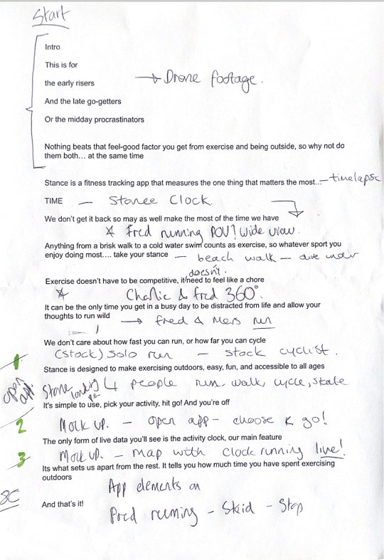
Photo
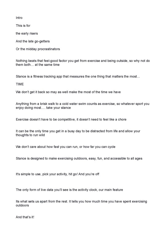
FINAL SCRIPT
After creating a somewhat long script for the video I had to take some time to strip back parts that were not needed, this was down to the fact the timing needed to be around 2 minutes. The script here is as refined as it could get without missing any explanations for the app and its functions, as well as explaining a bit about the brand.
0 notes
Video
3D Render development
The process used to make the realistic phone mock-ups, playing around with adding type to appear with the animation, however, this did not make the final edit as the was hard to read at the current point size, instead, I overlaid the type in after effects.
0 notes
Photo
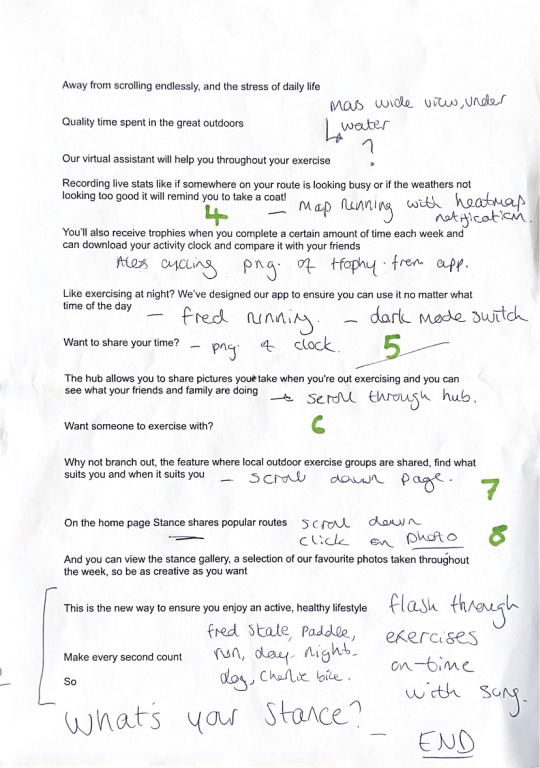
Script development
I printed out the final script and wrote over each section to help get a better idea of what content would go where in the video. Very messy pages, however were good to refer back to during the edit.
0 notes
Video
3D render mock-up
This display did not make the final edit, there was too much going on for the short duration it would feature on the video. It did not follow the 3-second rule, which was the attention span to engage and inform the viewer.
0 notes
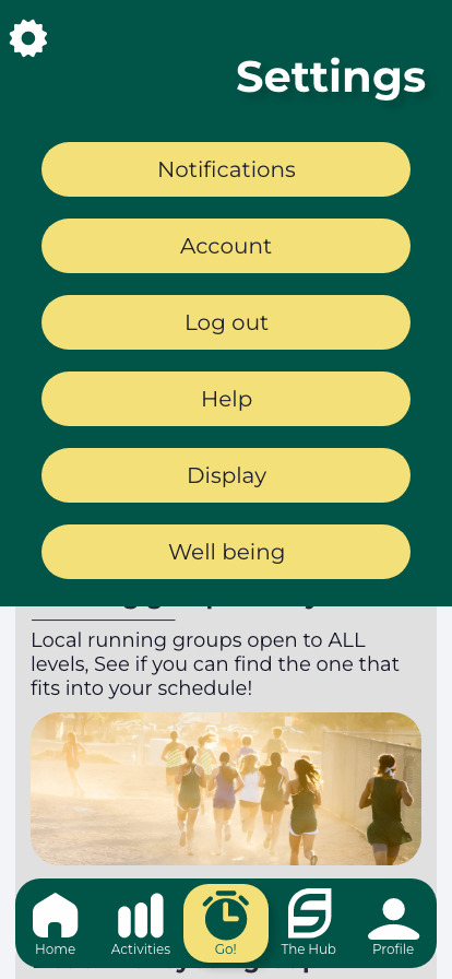
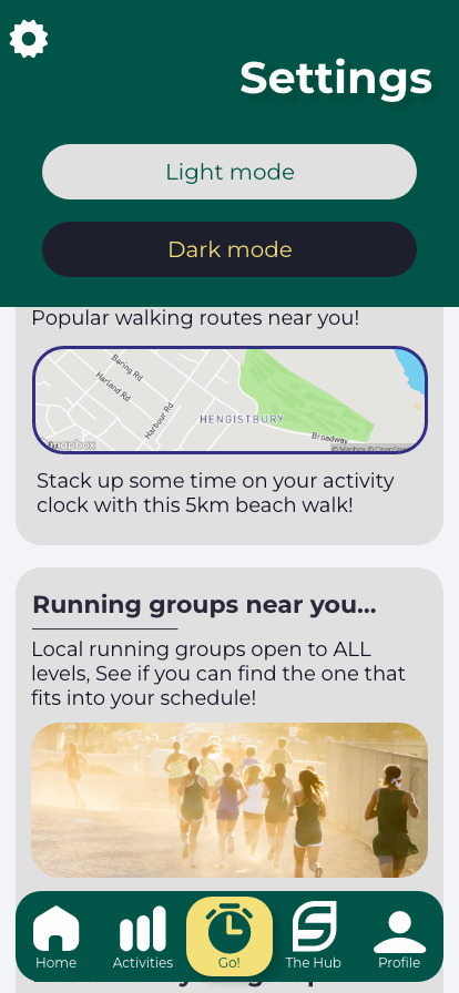
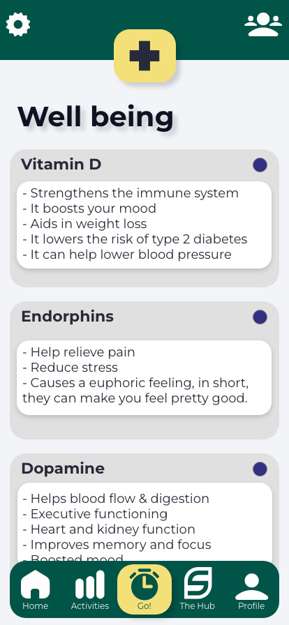
Photo
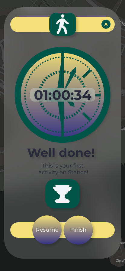
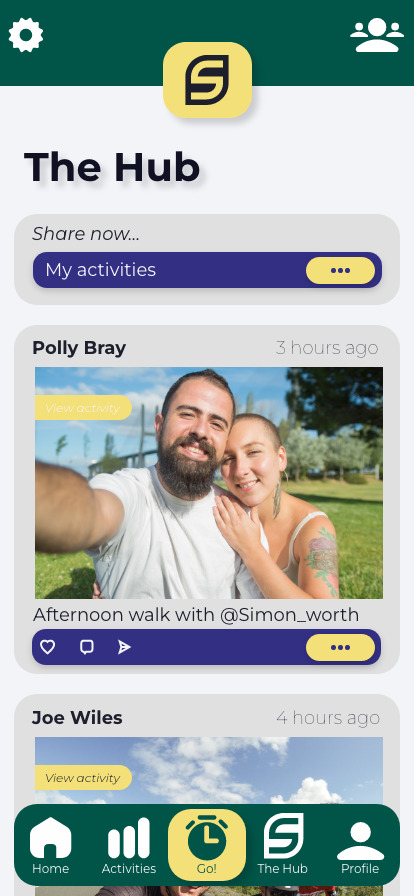
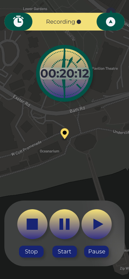
FINAL ARTBOARDS 3
Png files of the final app displayed from the XD document. Most of the pages had scrolling abilities, however, these were exported to be used on mock-ups.
0 notes
Photo
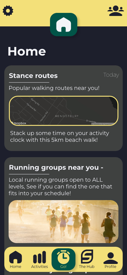
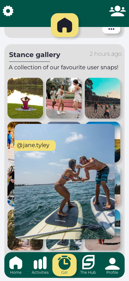
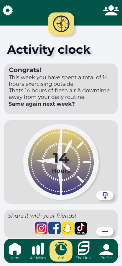
FINAL ARTBOARDS 2
Png files of the final app displayed from the XD document. Most of the pages had scrolling abilities, however, these were exported to be used on mock-ups.
0 notes