
adamascroft
Adam Ascroft
Hello, My name is Adam Ascroft and I am currently studying at Salford University in my last year on the Graphic Design. My tumbler will be showcasing my work, research and development.
348 posts
Don't wanna be here? Send us removal request.
Last Seen Blogs

theappideas1
appideas

oneweee
Butterfly, find your flower

brokebackkiller
Jake

accounting3
محاسبة الشركات


Photo
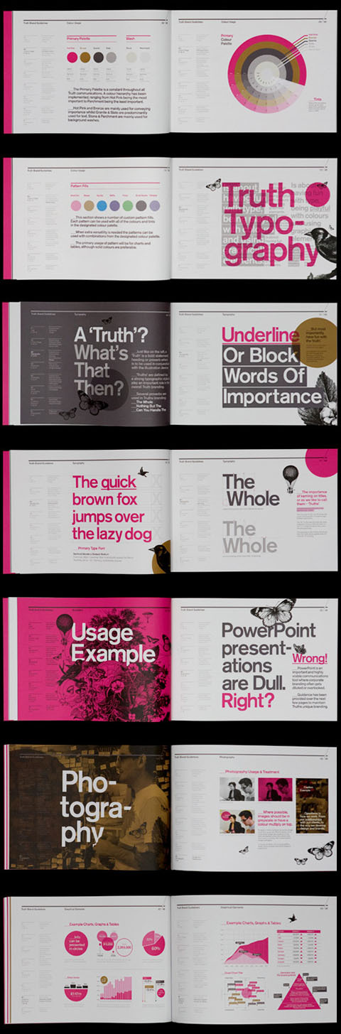
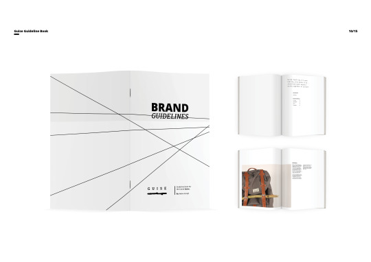
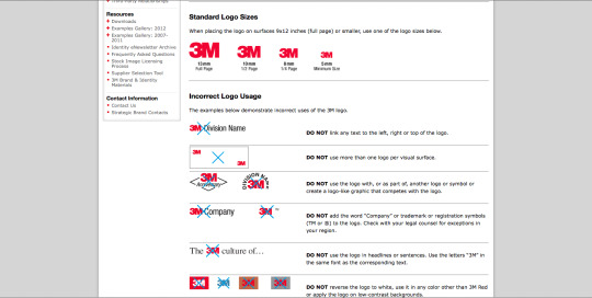
A great example of a brand guideline book online I found, it goes so much in-depth that it would e hard to miss any of the guidelines, the problem I had with my brand is that It doesn't have the same substance as a company who is selling products all the time and actually has stores and shops they are able to get pictures whenever where ever and see their posters on walls but I don't I only have what I created.
0 notes
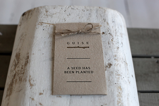
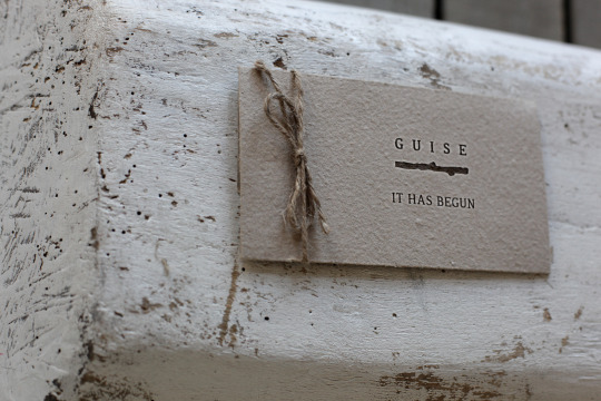
Photo
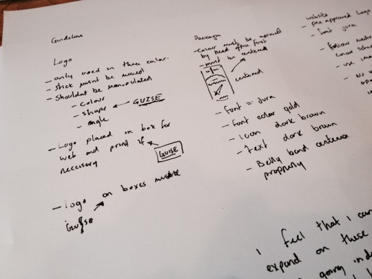
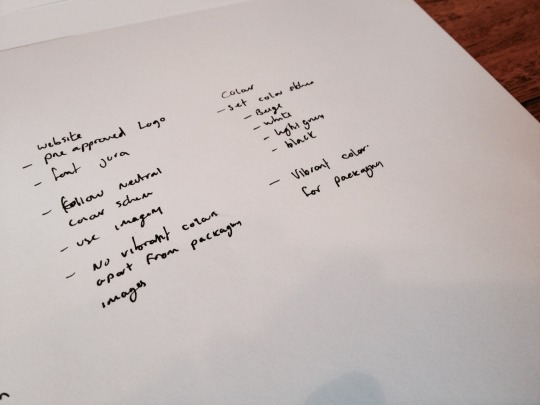
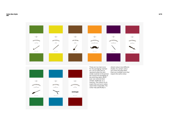
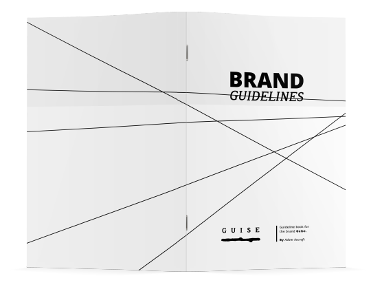
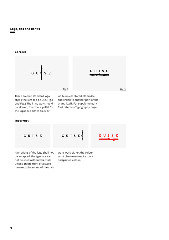
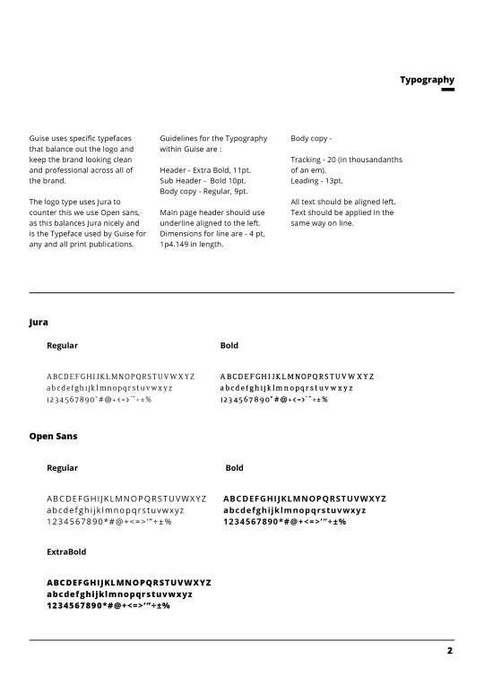
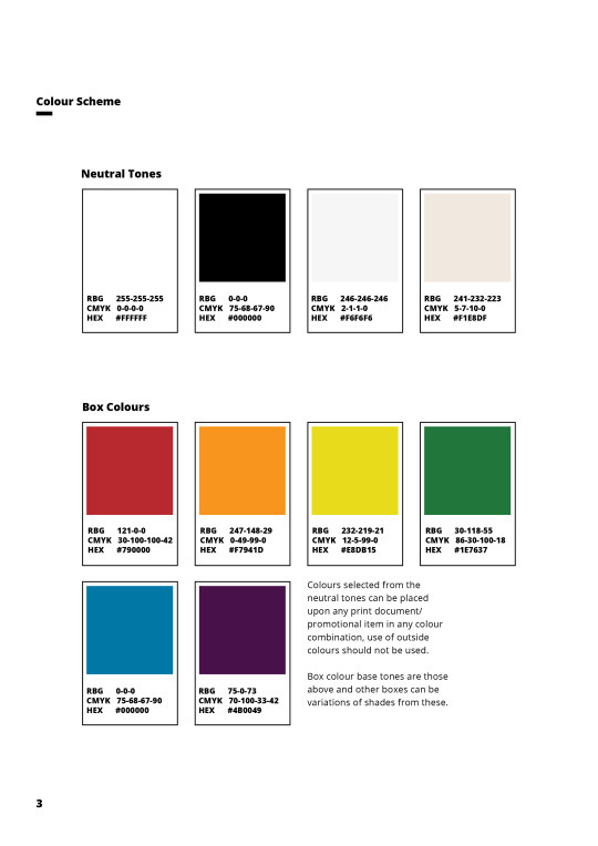
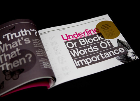
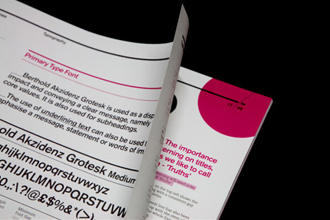
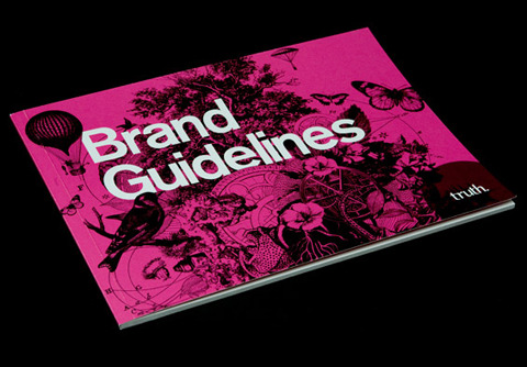
As part of my brand guise i wanted a way to show the entirety of the brand and to make sure everything goes together so I decided on creating a brand guideline book. This book would then include everything about the brand and how it presents itself, examples of this are.. the font in print has to be size 11, Open Sans and for the tracking to be 30. We can then do these rules for every part of the brand, how the colours look, positioning of the text, size of the box, ect ect.
0 notes
Photo
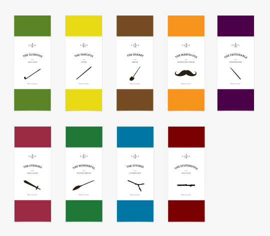

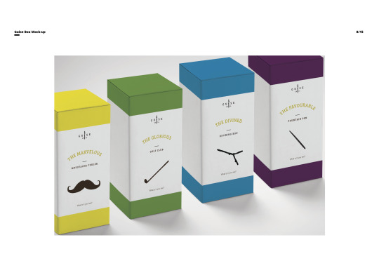
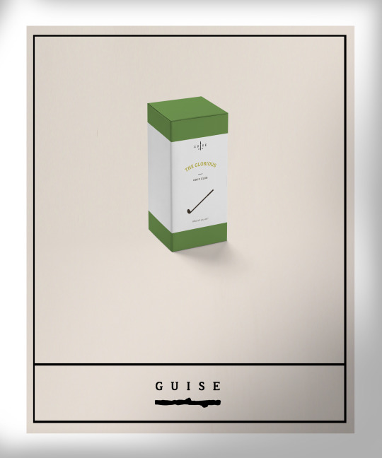
Final box colours and mockups, really happy how these turned out, together they look amazing in a line so I can imagine a full shelf of these inshore looking smart. For the final ones at the bottom I changed the text so that its gold as I wanted to gold foil those to give it a more luxurious effect.
1 note
·
View note
Photo

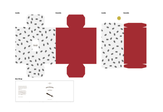
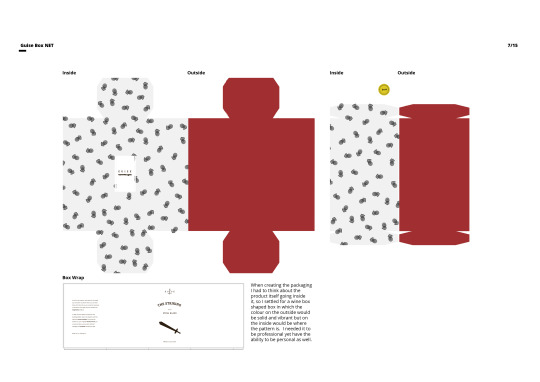
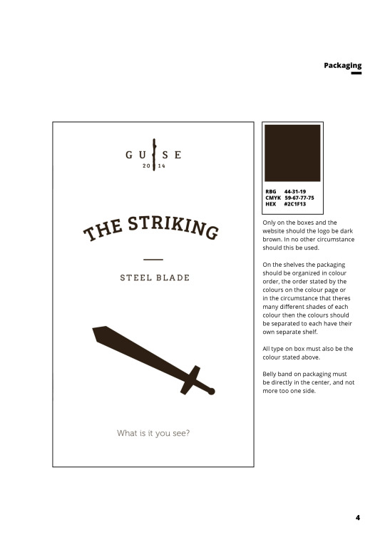
Packaging Final, Mocked this up ready too print, how I wanted my packaging to look after several variations, the patterns on the inside really work well with this as it leave the best inside and you only experience it once you have opened it.
0 notes
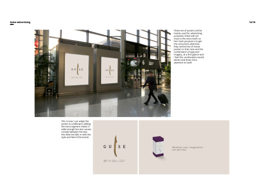
Photo
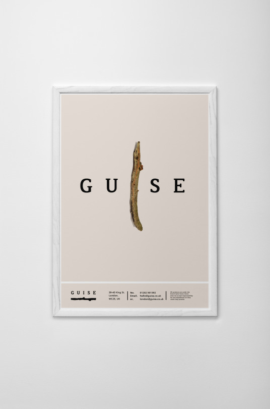
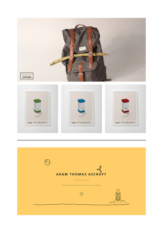
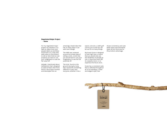
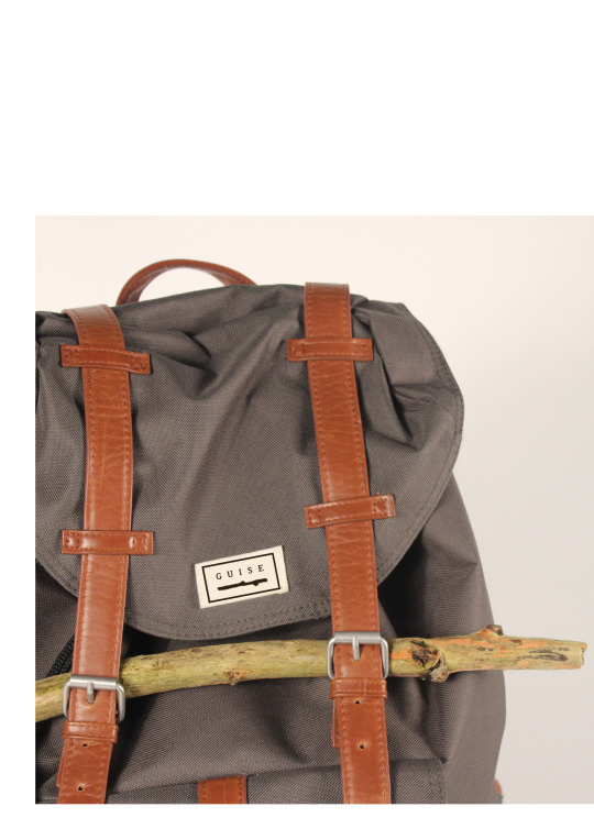
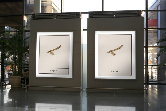
I love the substitute for the illustrator stck with the real stick, It gives it a sort of movie poster style which I really like and comings photography into it, which seems to of been playing a huge part of this project.
The bottom image is a billboard of sorts I kept the same style but adapted and changed t and these posters are great for being able to do this.
0 notes
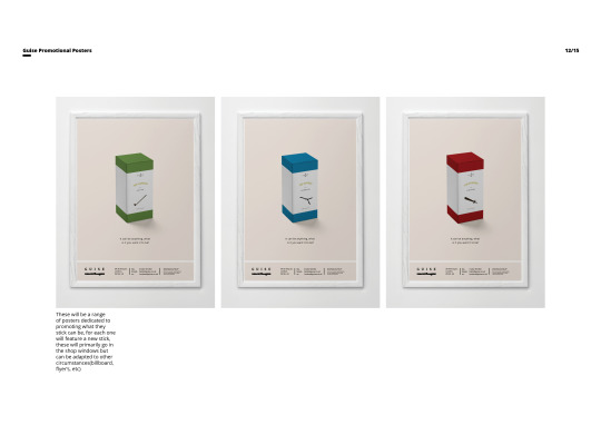
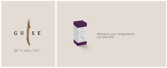
Photo
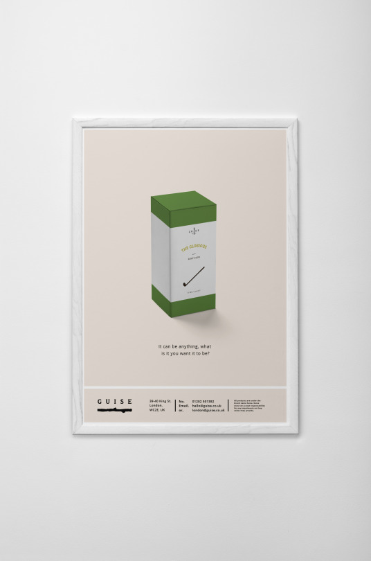
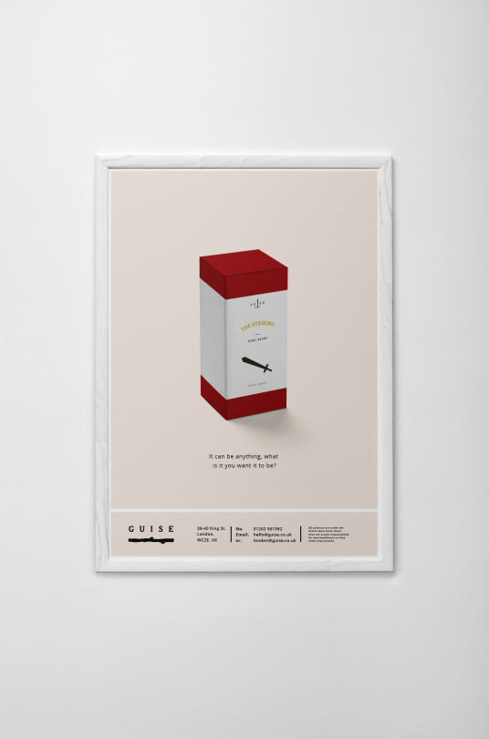
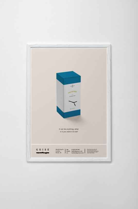
Basically keeping the same style and layout as the other poster designed, I just added the little touches to make them a lot better, the text at the bottom, getting rid of the black lines as they don't do anything to improve it. I am happy with this design as it works really well within the brand helps to show off the product.
0 notes
Photo
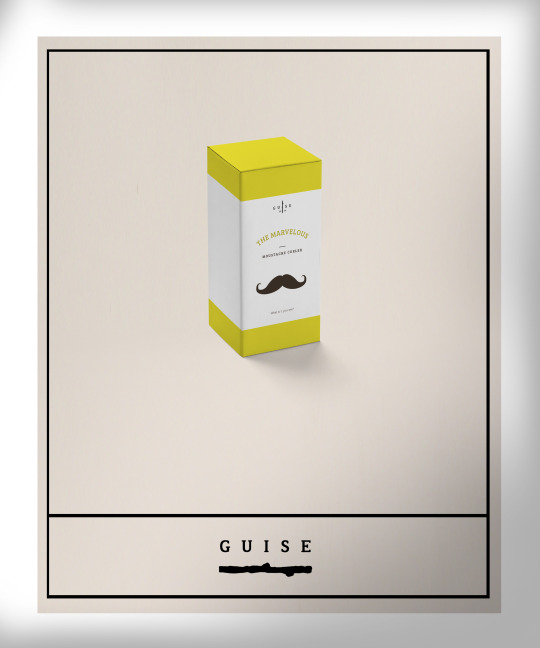
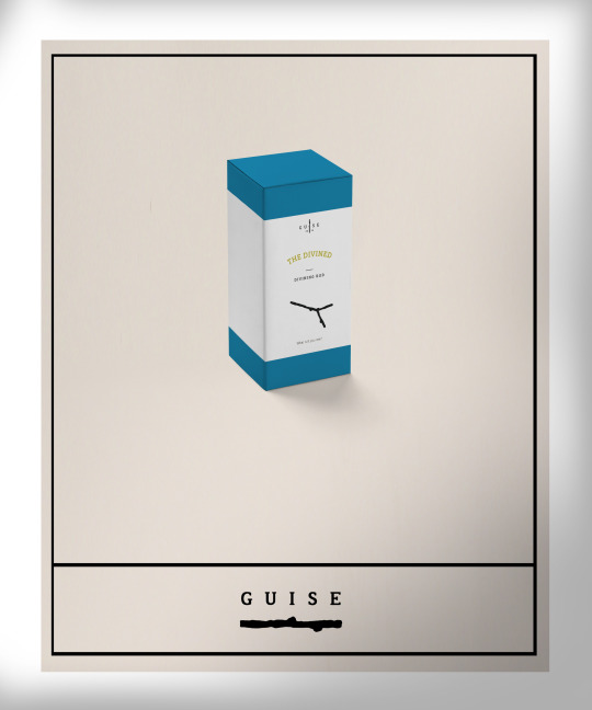
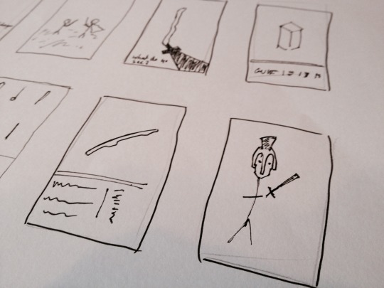
These are some early versions of my posters, I feel that these didn't seem to work out all too well in their designs they were lacking in substance layout and style.
Within my posters though I still like the idea of the minimalist style and the use of space and imagery as this is part of the brand and keeping things relating to each other will make the brand more recognisable.
0 notes
Photo
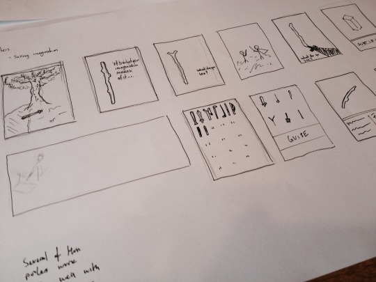
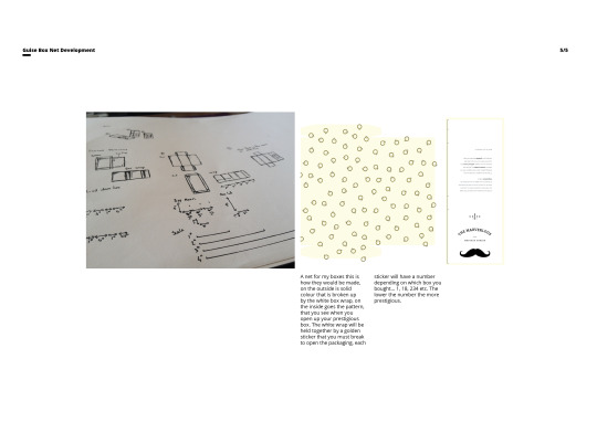
Some quick little sketches when i first thought about the product I didn't at the time think that they would be of any significance to my project but towards the end when creating all the bits and bobs I went back too these and started to create some of the designs to see if any of them will work out.
0 notes
Photo
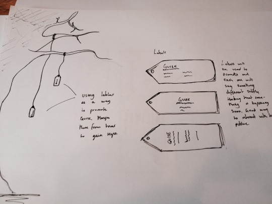

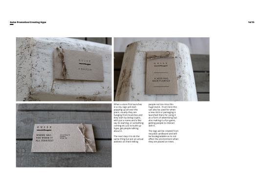
One idea is too create a variety of labels that will be hanging from trees all over the town and city that Guise was in. They would all be mysterious in what is written on them, they would be a pre courser to an event that will be occurring but no now will know what it is, it could be a sale, or a new box, or even these could be placed if there plans to be a new store owning in the area to build up hype.
0 notes
Photo
Saw this disturbing advertisement on TV the other day unexacting the ending as I've never seen it before. The end was one of those.. automatic Ha awww moments where a dull laugh slips out before you realise what the message is. Its a great advertising campaign that works well to get the message across. Its an unexpected ending but its shock advertising tactic works well. I aim to create a campaign that will get people talking, I don't want a campaign thats aim is too shock anyone but to get them interested.
0 notes