
abbiewilmottunit34-blog
Unit 34: Image Manipulation
31 posts
Don't wanna be here? Send us removal request.
Last Seen Blogs

topurologist
Untitled
dontcallme-bby
Cami
dontcallme-bby
Cami

bugsprayyy
rainworl hyperfixation is so real

kakkoe
(e Design
Photo

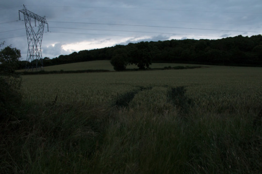
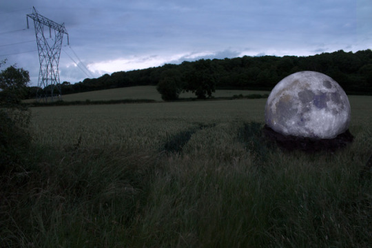
Evaluation:
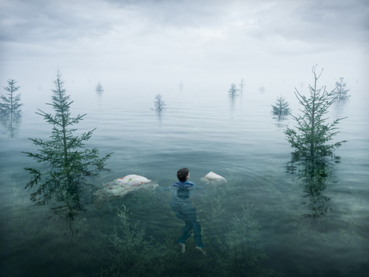
This brief required us to create a digitally manipulated image to be hung as an art piece. To come up with an idea for this project, I first wrote a few words down that I liked the sound of, and then furthered the ideas that I wanted to pursue by deciding what photos I’d need to take to create the image. I then narrowed down which ideas I could create within the time frame I had. This lead to me to the post-apocalyptic style photo I originally wanted to create. However, I misjudged how difficult it would be to make this, and so I had to resort to my second idea, the moon. I took inspiration from some of the photographers I looked at, such as Erik Johansson. To plan for the images, I had to decide which photos I needed to take, and at what time and weather I wanted to take them. I settled on a photo of a field, and one of a dirt pile, both to be taken just before it got dark. To do this, I needed a tripod, so I could reach the slower shutter speeds and smaller apertures without compromising the exposure of the image.
My final piece was never created with a meaning in mind. I just thought the concept was interesting, and the final outcome could look nice. I chose this field as the base for my final image because I wanted one where the grass wasn’t too long, as I thought this might make editing the dirt in much harder. I also liked that this one had the pre-flattened tracks through the grass that I could use as an edge to the dirt, rather than having to edit the grass to look as though it had the gap in it. When choosing the photo of dirt, I decided to use one of the ones with the tennis ball in the centre, as this helped to give me a guide on where to place the moon. It also made it easier to see where the edge of the dirt was, so I knew how much I had to edit out to create the mound. When taking the dirt photo, I thought creating the shape for the image would be a lot easier than trying to do this in post-production, because I already had the shape and curve of the dirt to work with.
I think my strengths within this unit were my ability to learn and retain new skills, so I didn’t have to spend extra time during the final piece trying to figure out how to do different techniques to achieve the look I wanted. I weakness I faced was coming up with the idea in the first place, as I had to have a lot of input from the people around me to help to come up with it. If I were to do this project again, I would try and come up with an idea earlier, to give me the most time to take photos and more time in case I decide to change my idea. I would also have taken more photos for the piece, because I had to use different areas of the same image to edit parts of it, and I think having more images to work from would have been beneficial during this, especially concerning the grass. I should have taken more with the grass in different positions to make the final edit look better. Throughout this unit, I have learnt a lot more about different masks and how they work, and also how other, more basic tools can be used in creative ways to improve the look of an image.
0 notes
Photo
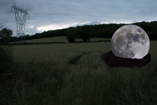

Final Editing Process:
To edit this image, I first added a levels layer to brighten the exposure slightly. I then dragged the moon image into the document above the field layer, and positioned it where I thought it looked best. I then inserted the image of the dirt to the photo, and placed it vaguely where it needed to be. I moved it into place by lowering the layer’s opacity, and lining the hole up with the bottom of the moon. I used a feathered brush with black to blend the edges of the dirt that would be touching grass more, to make sure the lines weren’t too harsh.
I duplicated the field layer, and moved above the dirt layer. I turned this layer’s visibility off so I could see the entire image, and then used the rectangular marquee tool to make a selection in the bottom half of the dirt. I changed the feather of this selection to 10 pixels. Next, I added a layer mask to the duplicated layer, and made it visible again. I used black paint on a feathered brush at a lowered opacity (around 70%) to soften the harsh lines around the selection. I also changed the opacity of the layer until it looked more natural. I wanted it to look as though the grass was standing in front of the dirt. I repeated this in different areas of the dirt, and then duplicated the levels layer above the base image multiple times. I placed a duplicate above each new field layer I had created, held Alt, and clicked between each level and field layer to clip the levels to them. This meant it would only affect that layer, rather than all of the layers below. I did this to make sure the exposure of the grass was consistent throughout the image.
To edit the power lines, I created a new layer, and then used the clone stamp to stamp the line below the original line. I then used Ctrl+t to rotate it and warp it so it curves towards the ground, as though it had been cut. I added a layer mask to this layer so I could clean up the edges using black paint on the brush. I also had to create a levels layer to adjust the colouring, since using the perspective warp had adjusted the way they looked. I clipped this to the layer by pressing alt and clicking between the two layers. Next, I created another new layer, where I used the spot healing brush to remove the original power line. I repeated this on the 4th line down, but the other lines were too fiddly to do in a way that looked realistic, so I just removed them with the spot healing brush, and hoped it looked like they had just broken off.
Next, I decided I wanted to move the moon lower into the soil so it would look better, so I pressed Ctrl+t to transform it, and held shift when resizing to make sure it kept the same dimensions. I then moved it back into position in the soil. I had to add a layer mask and use the black brush to remove the bottom half so it didn’t stick out from under the dirt layer. I duplicated the moon layer so my editing would be non-destructive, and used the burn tool to shade it so it looked like it fit the lighting better. I also wanted to tweak the way the grass sat against the dirt, specifically at the sides of the soil, as I thought it didn’t look as good as it could. I used the pen tool to cut out part of the grass at the front of the image on a duplicated base layer, added a layer mask so that was the only part visible, and then moved it to the right side of the dirt. I chose to use the grass at the front because you could clearly see the side of it, rather than just from above, and I thought this would make it look as though it had been pushed backwards by the dirt pile-up.
Finally, I added a Hue/Saturation layer at the top of the layers panel, where I adjusted the colour and saturation for the sky to improve how the blue looked. I inverted the layer mask using Ctrl+i, and then used a brush with white paint to paint back in the colour into the sky. This meant these adjustments wouldn’t affect anywhere else in the image. I added a photo filter to tie all of the colours in together. I used the ‘Cooling Filter (LBB)’ at 14% opacity.
Moon photo taken by Neven Krcmarek on Unsplash.
0 notes
Photo
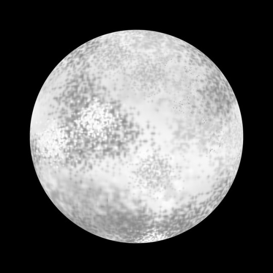
Testing Ideas: Moons
Trying to create my own moon for my final piece would show more Photoshop skills than borrowing an image from another photographer. It took me a few attempts to get the brush technique to look okay. To create this moon, I started with a square document, filled the bottom layer with black paint, and then used the ellipse marquee tool to create a circle selection. I made a new layer, and filled in the circle with white paint as a base. I added another new layer, Ctrl+Clicked on the circle layer to select the shape, and then used speckled brushes in a variety of grey tones to give the moon a texture. I added a Colour Overlay, with an opacity of 70%, and the Linear Add blending mode. Finally, I used a distorting filter to spherize the image, so it looked round.
Although I had spent the time trying to create a good moon, because it was going to be the main focus of the image, I wanted it to be realistic, and so I decided to just use another image from a photographer. I thought this would make the final piece look nicer.
0 notes
Photo
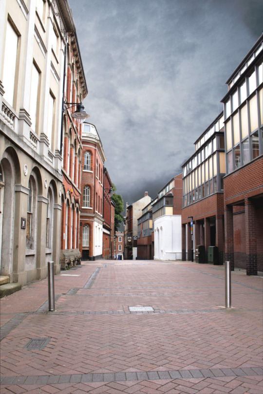
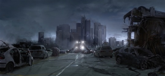
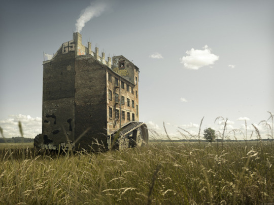
Final Piece: Bad Attempt
As my first idea, I wanted to make a photo of a street look as though it had been taken after a disaster. However, this proved to difficult for me to achieve with the skills and time frame I had. This meant I had to resort to my plan B.
To create the above image, I first used ‘Scripts’>’Statistics’, selected all of my files that I wanted to combine, changed the mode to median, and then pressed OK. Because all of the images I used had the exact same composition, Photoshop was able to identify all of the anomalous pixels and remove them, leaving me with a photo free of people.
Next, I added a curves layer to increase the contrast within the image. I then used the pen tool to draw a path around the buildings, leaving a small amount of space inside the tree’s edge because I was going to come back to fix these later. I went around again, refining the path, and then made the selection with a feather of 1 pixel. I repeated this around the lower section of the sky, but when making the selection, I made sure to change it to ‘Add to Selection’ rather than making a new one. I inverted the selection by pressing Ctrl+Shift+i, and then added a layer mask to the building layer.
I added a Solid Colour layer below the image, and used the ‘Select and Mask’ tool to refine the edges of the trees. After leaving this mode, I created a new layer. I then clicked on the layer mask of the buildings layer while holding Ctrl to make it a selection, and re-selected the new layer. I used the clone stamp to ‘bulk up’ the edges of the trees so they looked better. I then opened the image I was using for the clouds, dragged it into the document, and then below the building layer. I resized using Ctrl+t so it fit the space.
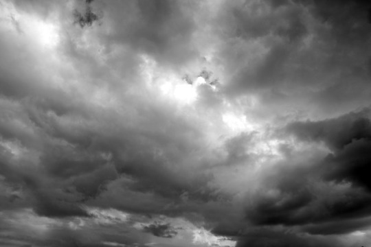
Cloud image taken by Dorin Vancea on Unsplash.
0 notes
Photo
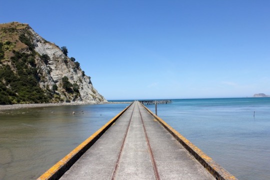
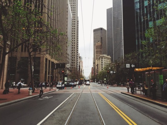
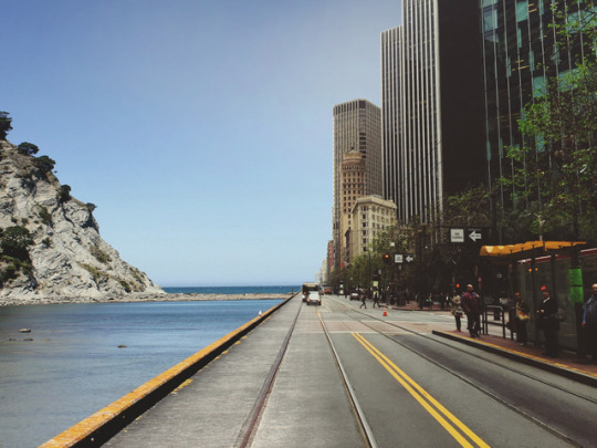
Advanced Photo Compositing:
In this task, we were asked to blend the photo of the beach and the photo of the city together.
To start, I dragged the photo of the beach into the image of the city, and then used the Free Transform tool (Ctrl+t) to adjust the perspective of the photo. By holding Shift+Ctrl when dragging the bottom corners, I was able to line up the lines on the road with the lines on the pier.
I made sure the beach was below the city layer, added a layer mask, and then used a brush with black paint to uncover the beach on around half of the building. I made sure not to brush too close to the building so as not to remove them from the image. Next, I used the pen tool to select around the buildings, made a selection with a feather of 2 pixels, and then used the brush inside the selection so the sky of the beach reached the edge of the buildings.
This left the cars and bus looking ghostly, so I also drew around them with the pen tool and made the selection. I used a brush with white paint to bring them back into the image. I then needed to blend the two different roads together. To do this, I used a brush with black paint, a low opacity, and low flow to slowly remove the city road and replace it with the pier, so it looked more blended. I also used a similar technique to blend out the sky. I duplicated the beach layer, and then selected the dodge tool at a low opacity, and created a gradient, getting darker as I got further from the buildings.
Finally, I had to fix the colour and tone of the photo. I created a levels layer in between the beach and city layer, and adjusted the tones until the road looked more like it matched the one in the city. I also limited the tonal range so the blacks weren’t as dark. I then added a Photo Filter as the top layer to help make the images look as though they belong together. I chose the yellow filter, at an opacity of 10%.
0 notes
Photo
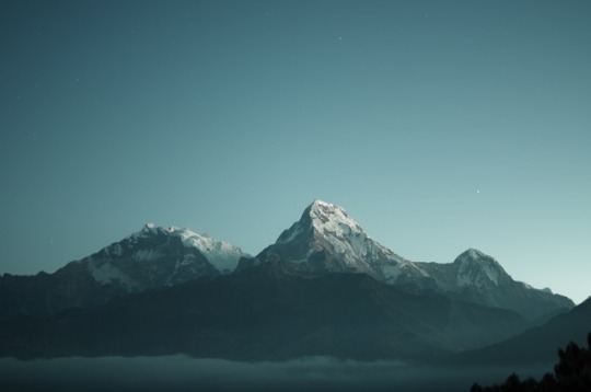

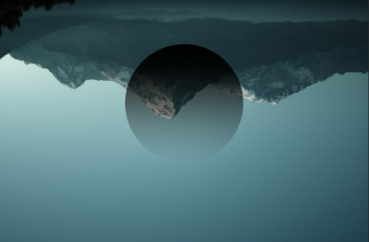

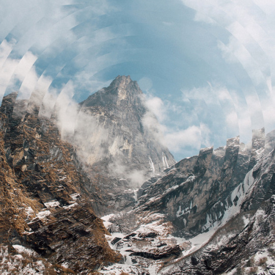
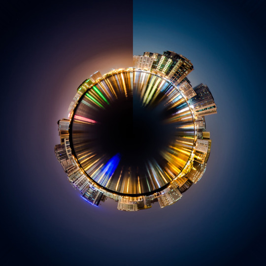
Geometric Landscapes:
To edit this photo, I first duplicated it, and then flipped the duplicate 180 degrees by pressing Ctrl+t, and holding shift when I rotated to make it rotate and 15 degree increments. This made it much easier to flip accurately. Next, I used the Marquee tool in the elipse shape to create a circle. I had to hold shift when dragging to make the shape a perfect circle. I then added a gradient layer, going from a colour to transparent, and then checked the reverse box. I then created a clipping mask between the layers by holding alt and then clicking between them. I adjusted the positioning of the second image, and the circle by pressing Ctrl+t and moving them around until I was happy with it. Finally, in order to follow the square format of Siemer’s images, I used the crop tool in a 1:1 ratio.
Photograph taken by Daniel Leone. Idea by Victoria Siemer.
0 notes
Photo
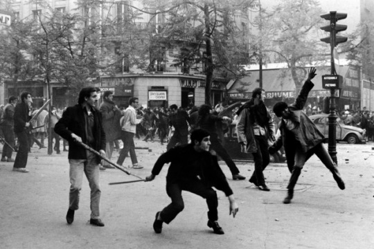
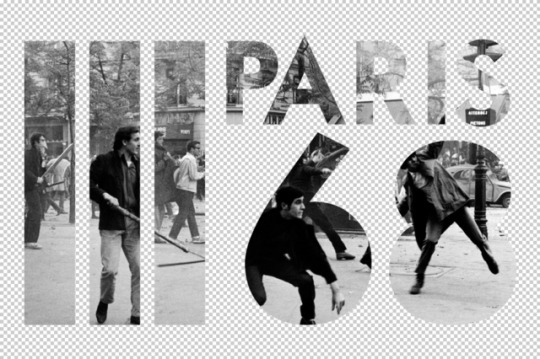


Using Clipping Masks:
To create this photo, I dragged the riot image into the text .psd document, and moved it above the text layer. I then held alt, and clicked between the two layers to add a clipping mask. This means the upper layer ‘clips’ to the layer below, so the photo took the shape of the text layer underneath it.
Next, I added a Solid Colour layer and picked a colour I liked, then moved it below the text. I selected the top layer, and added another Solid Colour Layer so that it would appear as the top layer. I clipped this to the layer below, and because that layer was already clipped to the text, the colour layer also did. I had to change the blending mode to screen so the photo was still visible underneath the colour.
Finally, I used free transform (Ctrl+t) to adjust the image and text so that the photo was framed better within the text.
0 notes
Photo


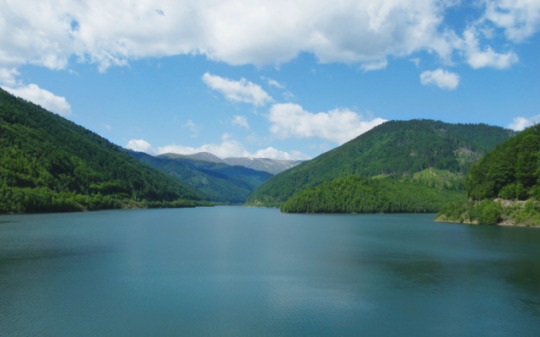
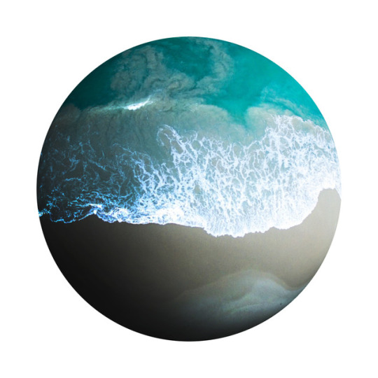
Layer Masks on Adjustment Layers:
For this task, we were asked to edit this image using adjustment layers with layer masks.
To start, I added a Hue/Saturation layer, and adjusted the colours until I found one that I liked on the trees, ignoring the rest of the image. I inverted the layer mask using Ctrl+i so these changes weren’t visible, and then used a brush with white paint to paint the adjustment layer back into the image over the trees. I repeated this with the water to make it bluer on another adjustment layer. For the sky, I used a curves layer to raise the contrast between the shaded areas and the whites by created a small s-curve in the line. I still inverted the layer mask and then painted the levels back into the image in the places I wanted them using white paint.
Finally, I added a Photo Filter layer, and changed it to a cooling filter. I changed the opacity of this layer from 25% to 10% as I didn’t want the blues in the photo to be too saturated.
0 notes
Photo
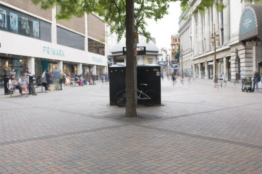
Removing People:
For this task, we were asked to take multiple photos of a highly populated area, and then remove the people from the final image.
To start, I had to go out and take at least 10 images of the exact same scene, with people walking past. I had to use a tripod to make sure the camera didn’t move in between exposures, or this could mess up part of the editing process. I also put the shutter on a timer so that the shake from me pressing the shutter button didn’t affect the images. Unfortunately, the tripod sat at an angle, and so I just had to straighten the image when editing because I didn’t have the time to fix it.
To automate the process of stacking the images, removing anomalous pixels, I went to ‘File’>’Scripts’>’Statistics...’ and changed the mode from mean to median. I also checked the box that said ‘Attempt to align source images’, because this meant Photoshop would try and line up images that may have been out of line due to the camera moving. After this process had completed, I straightened the photo, and was then left with the second photo. This had ‘ghosts’ of people in it, where Photoshop hadn’t been able to remove the anomalies fully.
Next, in new layers, I used the clone stamp, patch tool, and spot healing brush to try and remove these ‘ghosts’ from the image, so all that was left was an empty street, and the people that hadn’t moved between all of the exposures.
0 notes
Photo

Geometric Editing:
To create this image, I first opened the .jpg of the black and white rings. I then opened this photo and dragged into the ‘Circles’ document. I duplicated this layer using Ctrl+j. Using the magic wand tool, I selected the black rings, and then created a layer mask on the top layer. Using Ctrl+t, I rotated the image to distort the photo slightly. Finally, I added a levels layer from the adjustments panel, and increased the black tones to make it stand out from the base image more. To make this only affect the top layer, I added a clipping mask.
The photo used was taken by Rosan Harmens.
0 notes
Photo

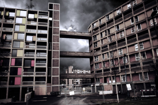
Basic Compositing:
Photocompositing is the placing together of photos to create a composite image.
To create this composite, I first opened the two images, and then dragged the clouds layer across into the ‘Park Hill’ document. I moved it below the building layer so it wasn’t visible. I then used the pen tool to make a path around the lower section of sky in between the bridges. To make this a selection, I right clicked on the image, and then pressed ‘Make Selection’, made sure the feather was at 0, and finally pressed OK. Continuing with the pen tool, I made another path around the middle sky section, but when making it a selection, I made sure to change the settings to ‘Add to Selection’. I then repeated this for the top section.
I added a layer mask using the button at the bottom of the layers panel to cut out the selection I had made non-destructively, meaning I could always revert back to the original image if necessary. I had to invert this layer mask so that the sky was cut out instead of the buildings.
I selected the clouds layer, and used Ctrl+t to free transform the image to the desired size and position. I then added a levels layer below the building layer, but above the clouds, where I increased the tonal range of the clouds image to match the range of the buildings, as this would make it look more like it belonged in the image. Finally, I added a photo filter: ‘Deep Blue’ at 25% opacity.
0 notes
Photo
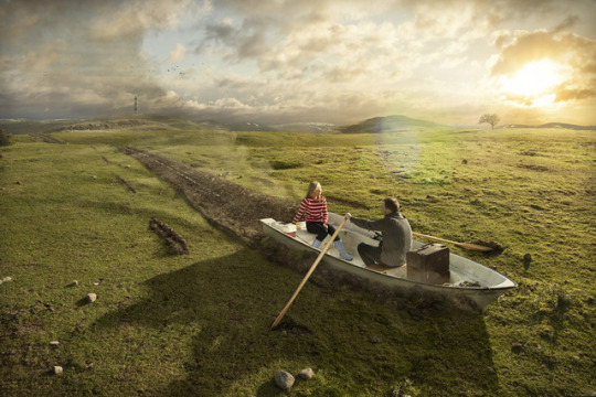
Research:
This photo, created by Erik Johansson, would have been made of at least 4 different images composited together. He would have started this piece with a sketch of what he wanted the final image to look like, and then worked from that sketch to figure out what he needed to photograph in order to make this possible. I think he would have needed a photo of the field, though this may have been comprised of multiple images stitched together so he could get them to look exactly how he wanted. He also would have needed one of the boat and oars, and a few of different dirt trails to place behind the boat and where the oars had been dragged too. It is likely that he also took photos to add in the background details, such as the lighthouse. When taking the boat photo, he would have had to use a similar lighting as the field photo, to create the shadow in a way that would look as though it fit. However, he may have also made this in post-production using the burn tool or a brightness adjustment layer. To edit this image, Johansson would have had to cut out all of the images he wanted to composite using the pen tool, as this ensures he has the most accurate selection. He also would have had to use a lot of layer masks around each image he embedded, to make sure his editing was non-destructive, and that he could revert back to the original. These also would have helped when blending the images together to make them look as though they naturally fit together.
0 notes
Text
Proposal:
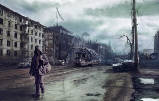
For this assignment, I decided to follow a post-apocalyptic theme, and manipulate a photo of the current world to look as though it had been taken after a disaster. I wanted it to make the viewer think about the future of the world, and what happened to cause the breakdown of civilisation.
To create this final piece, I will potentially need to take multiple photos of the base area, a street in the city, depending on how busy it is. If it is busy, taking several photos will allow me to use one of Photoshop’s automated processes to remove the people by layering the photos and removing the pixels that differ between the images. This means I’ll need to take a tripod to the location, which is fine because the location is only a short walk away. I also want some photos of bricks so I can edit some of them out of the path so the location looks more destroyed, and then edit the new photos of the bricks into various locations across the floor. I also want some photos of broken windows to place over the other windows. I will also need a photo of clouds, to help set the mood of the image, assuming the weather won’t be exactly how I want it when I’m taking the photos. Finally, I want a photo of dirt to edit into the spaces where I remove the bricks. When taking all of these extra photos, I need to remember the lighting of the original image, and try to match it to make the editing process much easier. I also need to take a lot of photos from different angles, giving me the best range of images to pick from so that I have one that fits well into the image.
When editing the image, I want to make it have a negative mood, so I want to make sure the contrast is quite high, and nothing is too bright or saturated. I want to keep the landscape bleak, to communicate to the viewer how bad this future is. I’m predicting that the burn tool will be important for fixing the shading on certain objects I’m editing into the image, as will using layer masks, and the clone stamp. I may also need to source some images from online, especially for the sky, because I want it to look perfect and it’s unlikely that I’ll be able to capture an image that works the way I want it to before the deadline, especially given the time of year I’m shooting in. Other images would be harder to source, since I need the specific angle and lighting, and so will be easier to take myself.
As a plan B, I came up with another idea based on a book I read as a kid, in which someone convinces someone else that the moon’s reflection was actually the moon and it had fallen into a pond (The Moon in the Pond). I took this idea and changed it, so that the moon had actually fallen to the Earth. I want to have it sat in a field, with the dirt piled up in front of it, and a trail behind it where it had dug into the ground when hitting the floor. To create this idea, I will need a photo of a field, hopefully as it starts to get dark because this fits with the moon theme, rather than having it midday. I think the dark will give it a better effect. I will also need a photo of the moon, which I will have to find from another photographer, because I don’t have a good enough lens to take a photo with a high enough resolution to be usable. I will also need photos of dirt piled around a spherical object to edit around the moon, as the field I will be using isn’t my own, and I can’t do this in the original photo.
0 notes
Photo
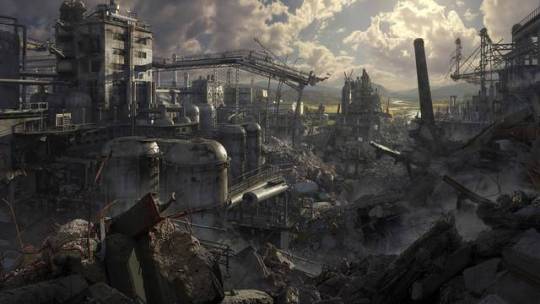
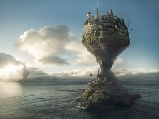
Theme Research:
I decided that I wanted to potentially explore a theme of post-apocalyptic landscapes, as the idea of a world after a disaster interested me. I was also inspired by some of the art pictured above, and some video games and movies that also explore this. I wanted to find common consistencies within the post-apocalypse genre, as this would help me figure out what to with my final piece.
The lighting in a scene is usually dull and cloudy, used to portray negative moods to the viewer. A common occurrence throughout the art I found is wrecked cars, although this might be harder for me to get photos of, so I might have to compromise and leave them out, and instead focus on some of the other aspects, including cracked roads, and shattered windows. Two of the pieces use people, but I want to avoid that because I want the landscape to look as desolate as possible, to really portray a sense of loneliness to the viewer. Obviously, I would have to keep the destruction on a much smaller scale than the artists did, because I’m limited by my Photoshop skills.
0 notes
Photo

Testing Ideas: Making Planets
I found 2 different ways to make planet shapes when starting out my idea generation. I wanted to make sure the ideas I had were possible before deciding on them to be my final design.
To create the first, I had to crop the image into a square so the final shape would be circular. I flipped the image vertically so that it was upside down, and then went to Filter>Distort>Polar Coordinates and pressed OK. Flipping made sure the buildings were on the outside of the image. I don’t like this way of creating a planet shape, as it leaves the center of the image blurred, and stretches the outsides/tops of the buildings in a way I didn’t want it to.
For the second, I used the ‘Eliptical Marquee’ tool, and held shift to make sure the circle stayed perfectly round. I then made sure I was on the photo layer and added a layer mask to cut out the circle from the image. I then used the burn tool to create the shadows on the circle to create the 3D effect. Finally, I used the ‘Spherize’ tool to make it look slightly more rounded. I prefer this method, because it allows me to use a wider range of photos, and I also think it looks better than the other method.
Even if I don’t decide to use this idea, testing this technique allowed me to see the effects of shading, and how to shade in a way that looks realistic.
0 notes
Photo
Erik Johansson:
Erik Johansson is a photographer from Sweden, who uses photoshop to create surreal photographs.
The first photo, called ‘Leaving Home’, was created in 2014. He would have started this idea with a sketch of the final design, and figured out what photos he would need to take in order to create it. He would have needed a photo of the field (and also one with the grass in front of the lens), the building, and wheels, likely to have been from construction machinery. He then would have used the pen tool to remove the building from its background, and move it into the field. He would have used the pen tool to select the wheels from their photo too, and move them to each side of the house. To fix the lighting, he would have used the burn tool to increase the shading in different areas, to make it look as though all of the photos are being affected by the same light.
The second photo, titled ‘Demand & Supply’ was created in 2017. This would have also started out as a sketch of an idea, which would have been used to decide on which images he would need. To composite the image, he would have needed a photo of a village, or multiple buildings to be put together to create the houses at the top. He also would have needed one of the construction vehicles at the bottom of the island, and one of the pulley system lifting materials to the top of the island. He also would have needed the base image of the ocean to put the photos of the island into. I think this photo is a comment on how we are using resources. Materials are being taken from the part of the island that holds up the civilisation, suggesting that we are using up everything that we require to stay alive.
The next photo, called ‘Wake Up’, was made in 2016. He would have needed a variety of photos to create this photo, including a photo of the lake he was using for a base image. He took a photo of the woman in water, specifically a pool, so he could edit her into the lake easily. He also photographed a forest from above, so he could place it at the bottom of the lake.
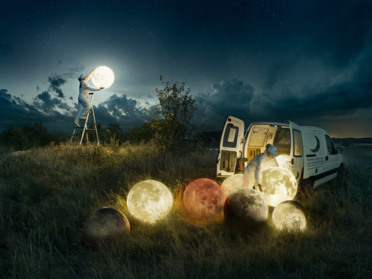
The final photo, called ‘Full Moon Service’ was created in 2017. To make the photo, he needed pictures of each moon, and one of the scene with lamps set where each moon was going to be placed, because this gave them the glow. He also took a photo of the posters within the van separately, and then edited them into the base photo. He would have had to adjust the lighting on these in post-production so they match the scene, because they were taken in daylight and the image is set at night.
0 notes
Photo

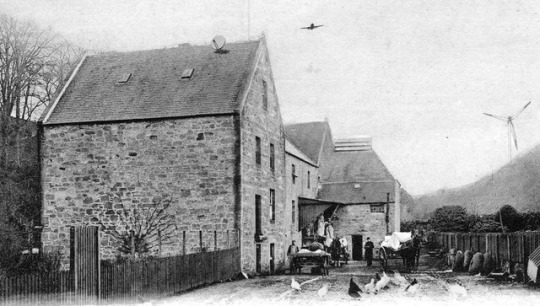
Modern Edits:
For this task, we were provided a selection of old photos which we had to modernise by adding things that typically wouldn’t have been seen at the time the image was taken.
To add each object into the image, I embedded the photo into the file, through File>Place Embedded. I resized the image by pressing Ctrl+T, and moved it to where I wanted it to be. I then gave the layer a layer mask and used the brush to remove the background from the image. Finally, I used Filter>Noise>Add Noise to lower the quality of the objects so they fit with the rest of the image.
I used this method for the satellite dish and plane, but I had to use the pen tool to cut the wind turbine from its background. I placed anchor points around the turbine, made it into a selection by right clicking and pressing ‘Make Selection’, and then added a layer mask to get rid of the background precisely. I also added noise to this image to match the original photo quality.
0 notes