Last Seen Blogs

loveabibliophile-blog
For the Love of Books and Bookish Things!

cullen-family-bonding
A Twilight Sideblog, In MY 2024?
gemstoneeeee
Gemstones

wordpress-guides
WordPress Guides
Text
Final Project
The final project consists of designing and producing an accordion book that utilizes at least 8 of the lessons covered over the course of the semester. In order to reinforce the lesson learned in the midterm project the final project will also concentrate on the narrative quality of images through the retelling of a story.
Telling the story
For this project you will need to re-tell a published story. Allowable source material includes: novels, movie scripts, graphic novels, songs, plays, white papers, scientific and academic papers. In the case of an animated movie script or graphic novel you must reinvent any characters that appear in these types of works. Create your own!
Content and Application of 2D design devices
The layout of your story will be typical of visual story telling, each page in your book could represent a specific scene or event in the narrative. How do you clearly convey your story through only using images (no narrative text)? For each page of your narrative you must apply/reiterate your understanding of the concepts covered in class - primarily focusing on the formal elements and principles. For example, the opening scene in your story must also utilize the concepts learned in one of the lessons covered in class (shape for example) and the work you create for this page must tell the specifics your story and also utilize the concepts learned in the shape lesson. How will you let the viewer know that this page is about shape, but also convey the story clearly at the same time?
Each page of your story must utilize a different lesson covered in class. Therefore each page in your book must take on specific visual criteria while also progressing your narrative. The arrangement of lessons applied to each page does not have to follow the order of the class (it does not need to be chronological from our syllabus), for example, you do not need to depict the line lesson on the first page of your book. You can determine for yourself and base it on what you think is best for re-telling your story which 2D lesson to apply to each page. In addition, the imagery of each page should slightly bleed into the next page thereby allowing the book to be seen in a page-by-page format or allow for all the pages to be seen all at once. (see example below)
Final Project Requirements
Each page must represent a scene in your story and one concept covered in each class
The concept on each page must slightly bleed into the next page
Your book must be, at least 8 pages.
Your book must have a front or back/transition cover
You must use both sides of each page.
This project must be digital and hands on.
Assignments covered over the semester (book pages must reflect these assignments)
Line
Balance
Unity
Shape
Space
Rhythm or Repetition or Pattern
Text
Value - Grey scale
Texture
Optical mixing or Designing with color wheel or Color
Scale
Proportion
Emphasis/Focal Point
_______________________________________________________________________
Step1: Planning the book
A sketch or design of the book layout – a rough sketch of what is going to happen on each page can be helpful for planning ahead and can help guide you before you begin working digitally or by hand.
You might have to make several detailed drawings of you 8 page thumbnails (small/quick sketches - they do not need to be in color) as you plan and change aspects of your book.
Your minimum dimensions for your book are 4x4 inches. Your book can certainly be bigger and it is not restricted to a square or rectangular format. Think about the content of your story, if it make more sense to have round pages, triangular pages, or star shaped pages, go for it! If changing the shape/dimensions of the pages doesn’t make sense, you can always make a larger front and back cover that reflects a shape or form. You are not required to change shape of your book - this is just another option.
If you decide to complete the digital book option, you will maintain the rectangular/square format of the art boards.

Getting ready and questions to ask your self for planning (THINKING):
Design is essentially the opposite of chance. As artists and designers we plan the arrangement of elements to form visual pattern. No matter how and in what order the result is always visual organization. What we have discovered is that art, like other careers and occupations, is concerned with seeking answers to problems. Art, however, seeks visual solutions in what we explored as the design process. This book is a way for us to put together everything we’ve been learning over the course of this semester in an intentional manner to reinforce our content.
First ask yourself, what is my story?
What are the stylistic components that I need to plan for?
How will my story unfold visually? Then, what class concepts can I link with a particular part of my story?
How does adding a class concept alter my story, or a character? Do I need to account for that in some way?
Will a character require a redesign? How much redesigning will a character require? Can I make this character my own? Do I become the character?
What is happening in the background of each image; should it be a solid color, pattern, or full color image with a graphic foreground? How will this help tie my story together? What role will the front and back cover play in my book?
What part of my book is digital and what part is hands on?
Step 2: Gathering materials and images (LOOKING)
Gather all the materials you need in one central file or one central place if you are working hands on so all your materials are easily accessed. Stay organized. Seeing all your materials together will help you see what you have and be able to edit and move things around much easier.
Create a specific file folder for all jpg. images and illustrator vectors you are using in your book.
Step 3: Making the accordion book (DOING)
This is an important step, make sure you take your time and not rush through this part of the process. The cleaner the hand made part of the book is the better it will look in the end. Below are some suggested tools (though not required).

Follow the link below on a tutorial for a HOW-TO on accordion book making:
http://www.designsponge.com/2013/03/bookbinding-101-accordion-book.html
Step 4: Inserting the printed component into the accordion book and adding any hands on elements. Again, if you decide to go the more hands-on route with your final project, try to fill and activate the entire page with visual information. The easiest/most straight forward way to do this is to create an environment for your story to play across.
___________________________________________________________________
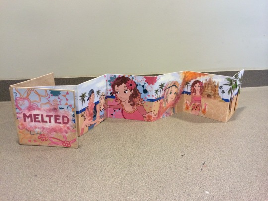
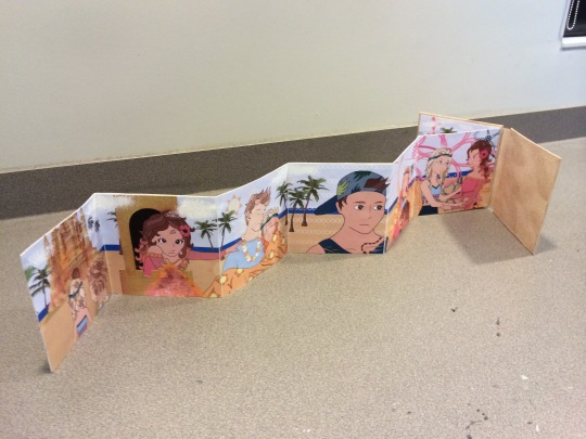
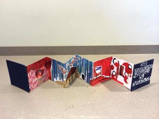
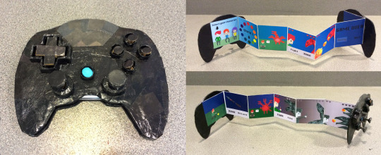
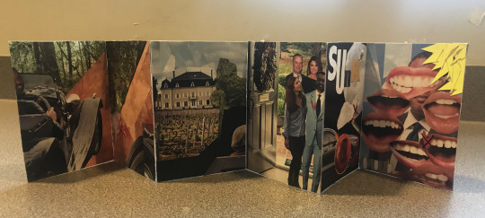
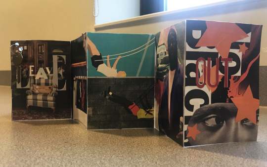
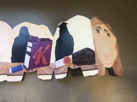
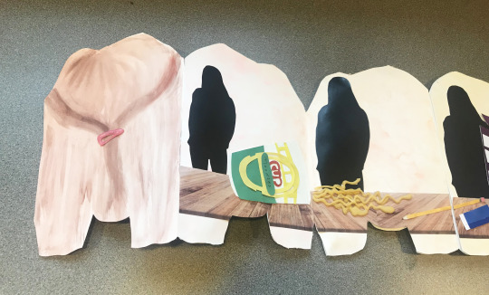
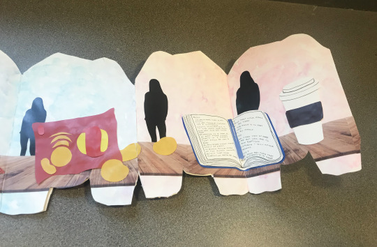
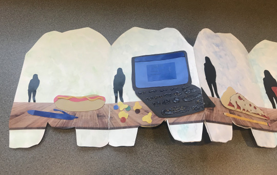
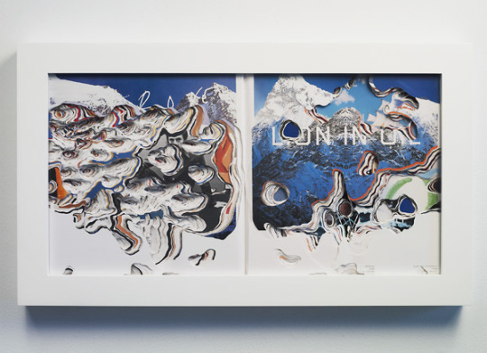
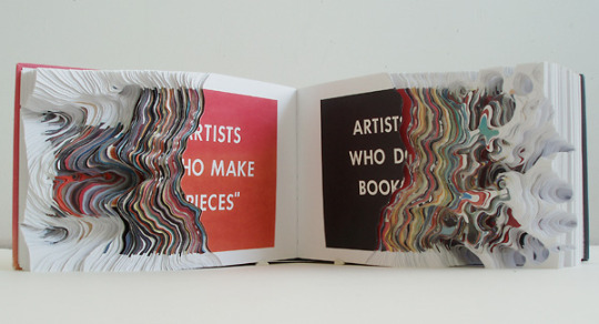
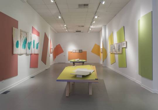
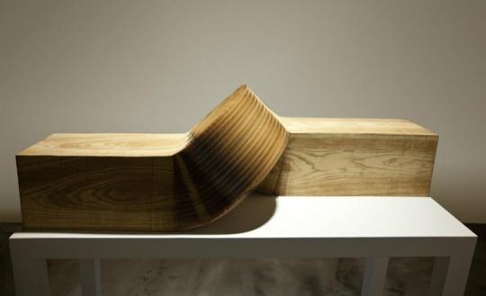
Student Examples:


5 notes
·
View notes


Photo


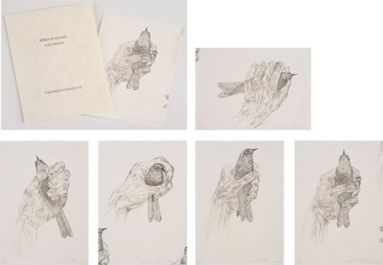


Kiki Smith
youtube
youtube
https://art21.org/watch/art-in-the-twenty-first-century/s2/kiki-smith-in-stories-segment/
0 notes
Link
0 notes
Link
0 notes
Link
0 notes
Link
0 notes
Text
Scale/Proportion
Scale
Scale and proportion are related terms in that both basically refer to size. Scale is essentially another word for size. Large scale is a way of saying big and small scale mean small. Big and small however are related. What is Big? Big is meaningless unless we have some standard of reference. A big dog means nothing if we don’t know the size of most dogs. This is what separates the two terms. Proportion refers to relative size, size measured against other elements or against some mental norm or standard.
We often think of the word proportion and connection with mathematical systems of numerical ratios. It is true that historically many such systems have been developed. Artists have attempted to find the most pleasing size relationships in items as diverse as the width and length of sides of a rectangle to parts of the human body.
Scale and proportion are closely tied to emphasis and focal point. Large scale especially large scale and proportion to other elements, makes for an obvious visual emphasis.
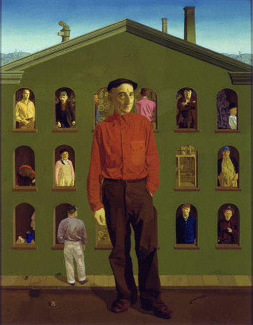
Honore Sharrer, The Industiral Scene, center panel of Tribute to the American Working People, Oil on canvas, 25 x 31" 1945-50.
A dramatic juxtaposition in scale is made possible through montage of images. Think about how we collage found images together, weather through the cut and paste the photographs or digitized editing possible with the computer. this allows us to play with ideas of scale and proportion very easily.
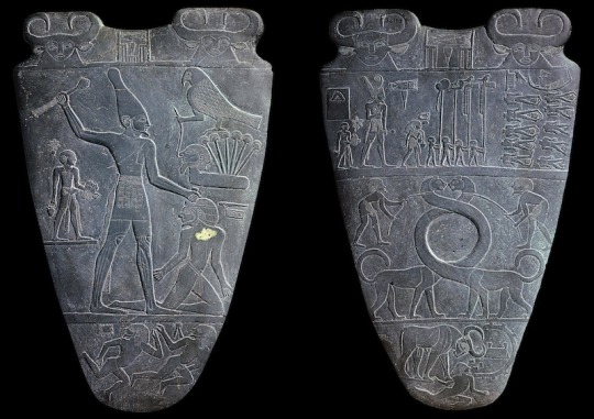
Palette Narmer
In past centuries visual scale was often related to thematic importance. The size of the figure was based on their symbolic importance in the subject being present. By making the most important person the largest in the composition, the artist immediately establishes not only an obvious focal point that indicates the relative conceptual status of that individual. this use the scale is called hieratic scaling.
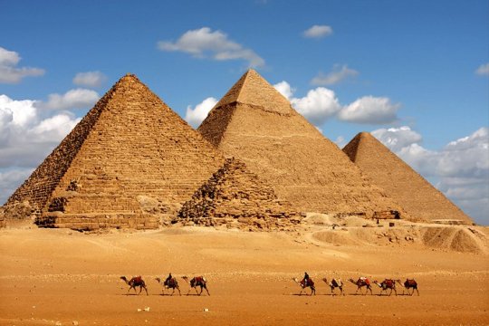
The gigantic pyramids made a political statement of the pharaohs eternal power.
Scale of Art
Human scale reference -
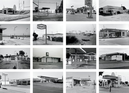
One way to think of artistic scale is to consider the scale of the work itself - It’s size in relationship to other art, in relationship to its surroundings, or in relationship to human size. Unhappily book illustrations, the internet, slides, social media, etc. cannot show art in its original size or scale. Unusual or unexpected scale as a rusty in an attention-getting. Sheer size does impress us.
Scale is the size of something compared to the world in general - an artwork might be termed miniature, small scale, full scale or life-size, large scale or larger than life, or monumental.
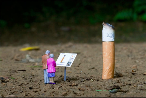
Miniature scale
Slinkachu - Relics, 2010
Monumental Scale
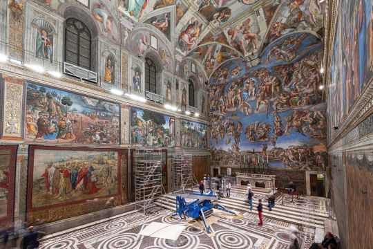
When we are confronted by Frescoes such as the Sistine Chapel ceiling, our first reaction is simply all at the enormous scope of the work. Later we study and admire details, but first we are overwhelmed with sheer magnitude. Works of art option selected or creative for specific locations, and their size and proportion to the setting is a prime consideration. A small religious painting appropriate for side chapel could be visually lost on the altar of a vast cathedral.

Earthworks are unique in the grandeur of their scale.
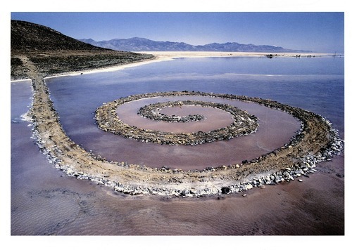
Robert Smithson - Spiral Jetty, 1970, mud, precipitated salt crystals, rocks, water, coil 1500’ long and 15’ wide
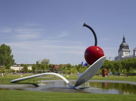
Claes Oldenburg has made use of a leap of scale and his “Spoonbridge and Cherry.” As with the work of other pop artist, the piece calls attention to an every day object not previously considered worthy of aesthetic consideration. Oldenburg transforms the object by elevating it to a monumental scale. A magnification such as this allows us to see the form with fresh eyes, and as a result we might discover new associations, such as the graceful arch of the of the spoon’s handle. It can also be argued that Oldenburg makes monuments appropriate to a consumer culture.
Naturalistic images blown up to such monumental scale cannot be ignored and they alter an urban environment.
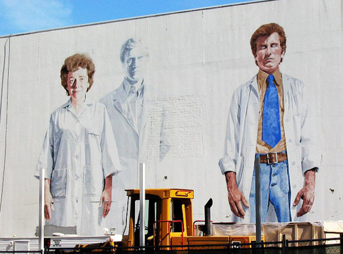
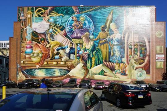
Kent Twitchell, The Holy Trinity with the Virgin, acrylic wall painting, 40 x 56’ 1977-78.
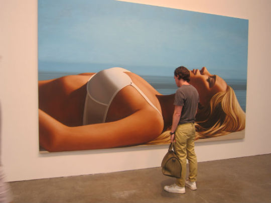
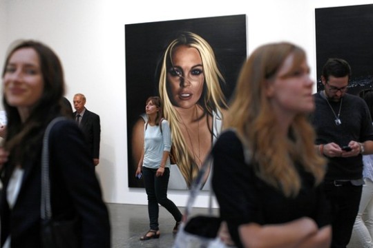
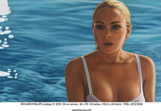
Look at the difference of scale can make an a painting.
Richard Phillips
Scale within Art
INTERNAL PROPORTIONS
The second way to discuss artistic scale is to consider the scale and size of elements within the design or pattern. The scale here, of course, is relative to the overall area of the format - A big element and one painting might be small and a large work. Again we often use the term proportion to describe the size relationship between various parts of a unit. Do you say an element in a composition is out of proportion and carries a negative feeling, and it is true that such a visual effect is often startling or unsettling. However, it is possible that this reaction is precisely what some artists desire.
The three examples contains the same elements. But in each design the scale of the items is different, that’s altering the proportional relationship between the parts. This variation results in very different visual effects, in the same way that altering the proportions of ingredients in the recipe changes the final dish. which design is best or which we prefer can be argued. The answer would depend on what effect we wish to create.
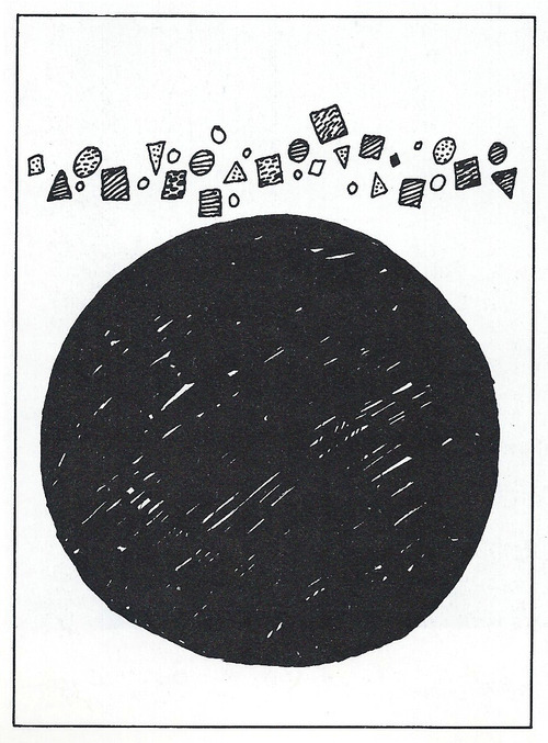
In the figure above the large black circle would certainly be called large scale. It is a large element and occupies much of the space, given the overall dimensions of the design. It can also be described as out of proportion. Compared to the other tiny elements it is too large and overwhelms the rest of the pattern, demanding all our visual attention.
CONTRAST OF SCALE
Scale can attract attention in different ways depending on the artist purpose. Scale can be used to draw our attention to unexpected or exaggerated, as when small objects are magnified or large ones reduced. Just the extreme change and scale attracts attention.
Unexpected skills often used in advertising. The visual attention can be directed to a product, we regularly see layouts with a large package, cookie, automobile grill, or cereal Flake, for example. A sudden scale change surprises us and gets our attention. The use of larger small skills often employed and painting or design. However, a more common practice is to combine the two for dramatic contrast.
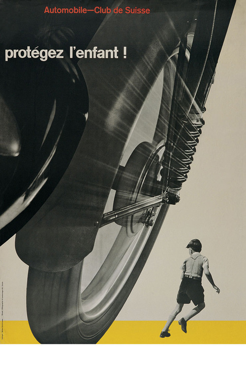
Josef Muller-Brockman, “Mind the Child”, poster, 1953
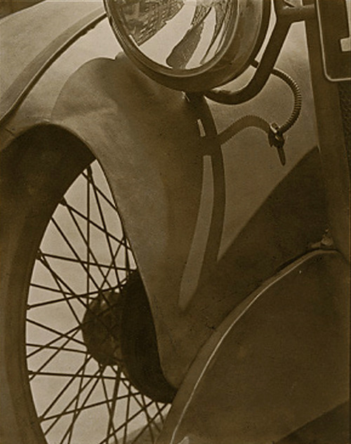
Paul Strand, Wheel 2 Mudguard, platinum print, 1917. Metropolitan Museum of Art, New York
Scale Confusion
The deliberate changing of natural scale is not unusual and painting. Some artists you scale changes intentionally to intrigue or mystify us rather than to clarify the focal point. Surrealism is an art form based on Paradox, on images I cannot be explained and rational terms. Artist who work in this manner present the irrational world of the dream or nightmare - recognizable elements in impossible situations.

Urbanized movie poster
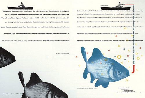
Bradbury Thompson, Westvaco Inspirations, magazine double paper, 1949
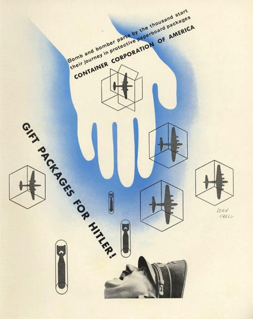
Jean Carlu, Gift package for Hitler, CAA Advertisement 1943
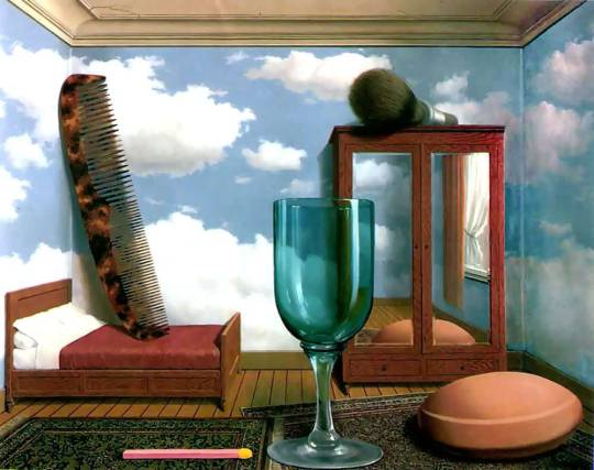
Rene, Magritte, “Personal Values” 1952, Oil Painting.
The Magritte painting shows one such enigma, with much of the mystery stemming from a confusion of scale. we identify the various elements easily enough, but they are all the wrong size and strange in proportion to each other. Does the painting show an impossibly large comb, shaving brush, bar soap, and other items, or are these items normal size but placed in a dollhouse room? Neither explanation makes rational sense.
Proportion
Proportion is the relationship of sizes between different parts of a work. For example, how wide it is compared to how tall it is. Some proportions, such as the golden ratio and the rule of thirds, are thought to be more naturally pleasing.
NOTIONS OF THE IDEAL
Proportion is linked to ratio that is just say we judge the proportions of some thing to be corrected the ratio of one element to another is correct. For example, the ratio of a babies head size to its body size is in proportion for an infant, but would strike us as out of proportion for an adult. In a life drawing class you might learn that in adult is about 7 1/2 has top. Formulas for the ideal figure have at times had the authority of a rule or Canon. Contemporary art or design seldom seems based on such cannons, but you may have noticed the apparent standard of 10 heads tall in an exaggerated proportion of fashion illustration.
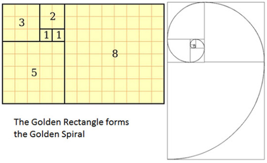
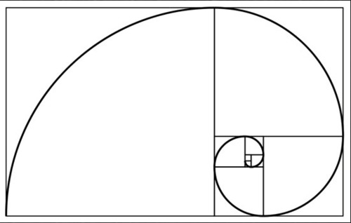
The agent Greeks had a desire to discover ideal proportions, and these took the form of mathematical ratios. They found the perfect body to be seven headstall and even idealize the proportions of the parts of the body. In similar fashion they saw perfect proportions and rectangles employed in architectural design. Among these rectangles the one most often cited as perfect one is the golden rectangle. Well this is certainly a subjective judgment, the golden rectangle has Influenced Art and design throughout this is seceding centuries. The fact that this proportion is found in growth patterns in nature and lens itself to a modular repetition has given it some authority in the histories of design.
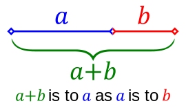
The Golden Ratio, Section, Mean, Rectangle, Spiral, Etc.
The golden ratio is a recurring relationship found in math, art and nature, and is thought by many to be inherently aesthetically pleasing. A number of contemporary artists and architects use the proportions of the golden ratio. These proportions do not provide a formula for design success. As with other visual principles, the attributes of the golden ration offer an option for design exploration.
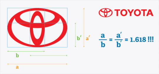
In its many forms it boils down to approximately 1.618: a rectangle with dimensions 1 x 1.62 could be called a golden rectangle. More elegantly and interestingly expressed, two quantities,
a and b, are in the golden ration if a is to b as a + b is to a.

The golden ratio is said to be the basis of the proportions of many works of art and architecture, including most famously the Parthenon. However, like conspiracy theories, once you start looking for golden ratios, you can find them everywhere. Whether the artist intentionally employed the ratio, and whether it helps make the work more aesthetically pleasing, can sometimes be open to debate.
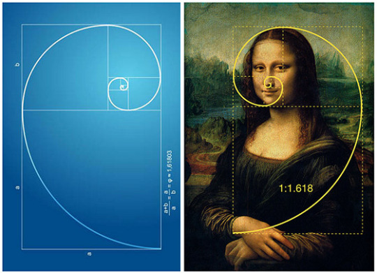
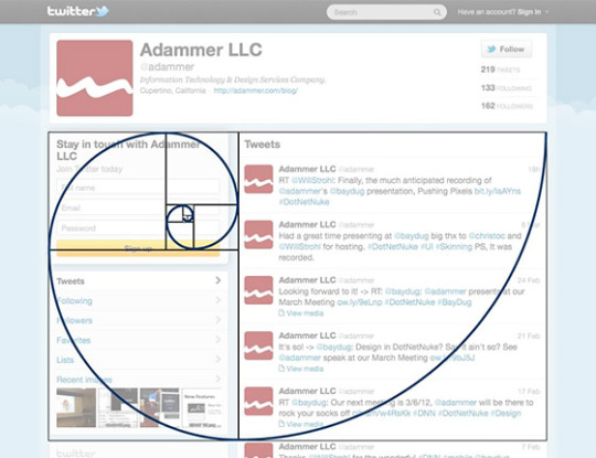
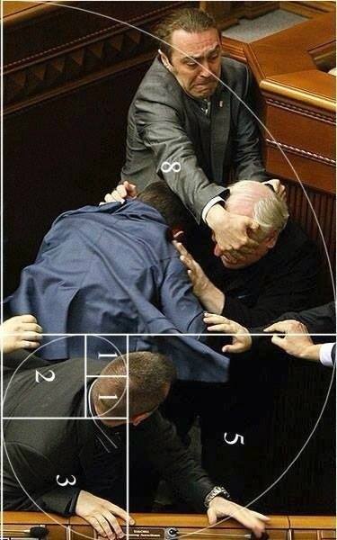
Golden ratio graph over image of a fight that broke out in Australia’s parliament.
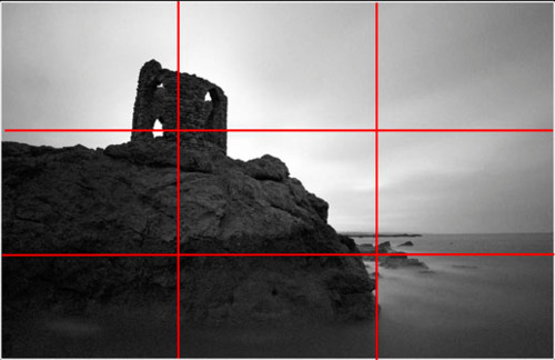
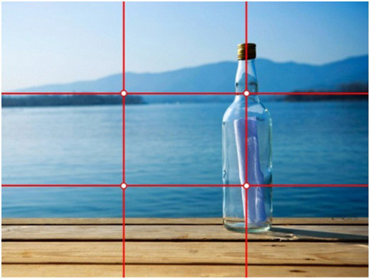
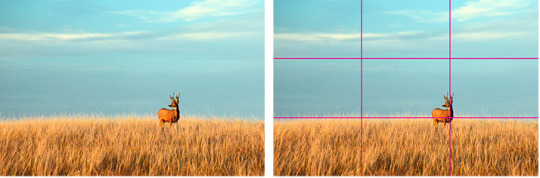
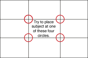
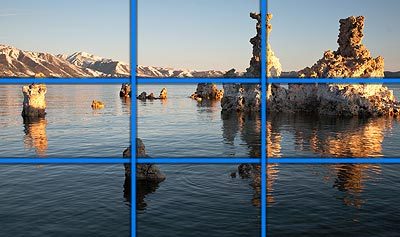
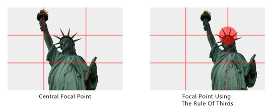
The Rule Of Thirds
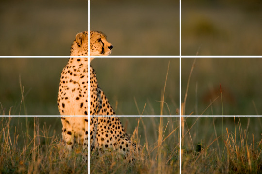
As a compositional rule of thumb, the rule of thirds states that it’s a good idea to imagine the picture plane divided into thirds horizontally and vertically, and then to align or place compositional elements along these guidelines or at their intersections. Placing the subject off-center and the horizon at the upper or lower third creates a more interest and can invite the viewer to look at more of the picture. If the subject is at the center, it can be more confrontational and in-your-face, and more formally balanced and static. The same idea may be applied to three-dimensional art. Good artists will neither slavishly follow this rule nor automatically center everything in the middle of the canvas or viewfinder: rather, they will consider what they want to convey, experiment with their subject, and then choose the composition and proportions that best help express their intent.
Class Exercise:
Scale, Proportion, & Ratio in Ads & Images (Written assignment)
Find 2 ads or images (found or taken) that utilize the 1. rule of thirds and 2. The Golden Ratio/Spiral. You must use your Photoshop tools to help guide you. Overlay your grid or spiral and screen shot your work to upload to tumblr. Then provide a written analysis of the ad's or image’s effectiveness. Written homework must be 250 words each. Post the images on your blog along with your written analysis.
Pertinent questions to ask about: how is scale/proportion used to attract our eye? Does the use of scale create urgency and how? What is placement doing? What is placed where? Analyze and describe any other kind of 2d design issue you think are important. Discuss any subtext that may be crucial to the ad’s or image’s effectiveness.
Homework
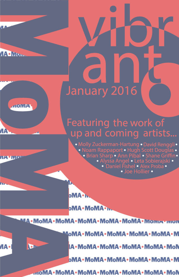
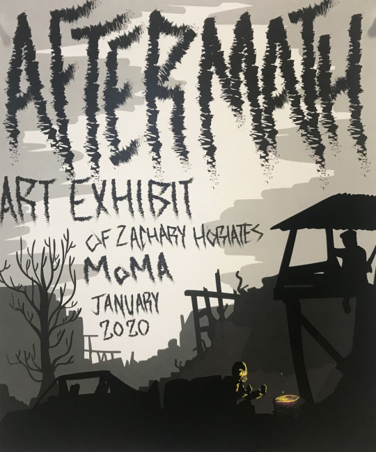
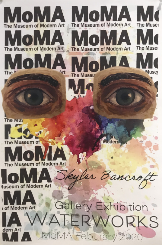
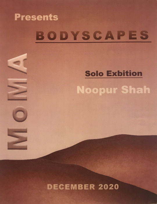
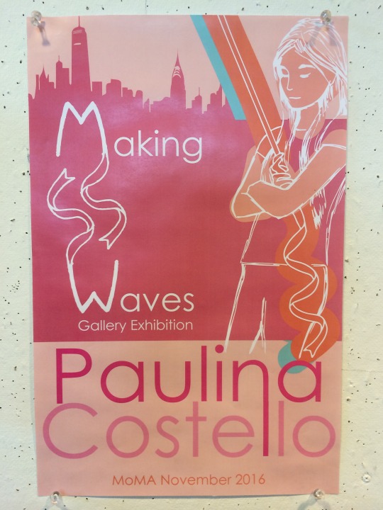
Scale and Proportion Advertisements
Create 2 advertisement posters that utilize the various scale/proportion issues discussed in class. Posters must advertise exhibitions that you are participating in. One ad should be for a group show that you are participating in. The other must be a solo exhibition.
For the group show consider the list of artists or designers you will be exhibiting with and the premise/theme of the group show. Do your research. What artists have I given you or showed the class over the course of the semester that are similar to your work or interest you? Choose up to 5 artists you would like to show with.
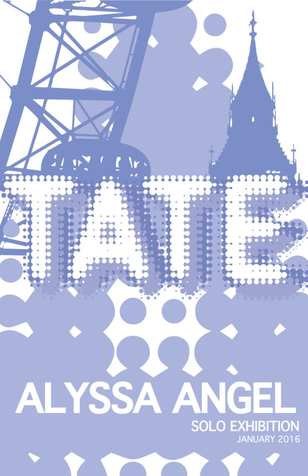
The solo show advertisement, this can be for a gallery or museum exhibit and/or a retrospective of your works at some future date. For the solo show consider carefully the venue that you will show in. Do you research. Where you decide to show your work is important. Make sure you know what type of work the gallery or museum exhibits. The Metropolitan Museum of Art is very different than MoMA PS1 which is different than Vox Populi Gallery which is different than the Mutter Museum. Choose a city and then research the institutions. See which one makes sense for your show.
Requirements and Restrictions
Each ad must include several images or designs relevant to the ad.
Each poster must be at least 11x 8.5 inches.
It can be should be entirely digital in nature (you do not need to print your posters).

0 notes
Link
0 notes
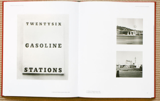
Photo


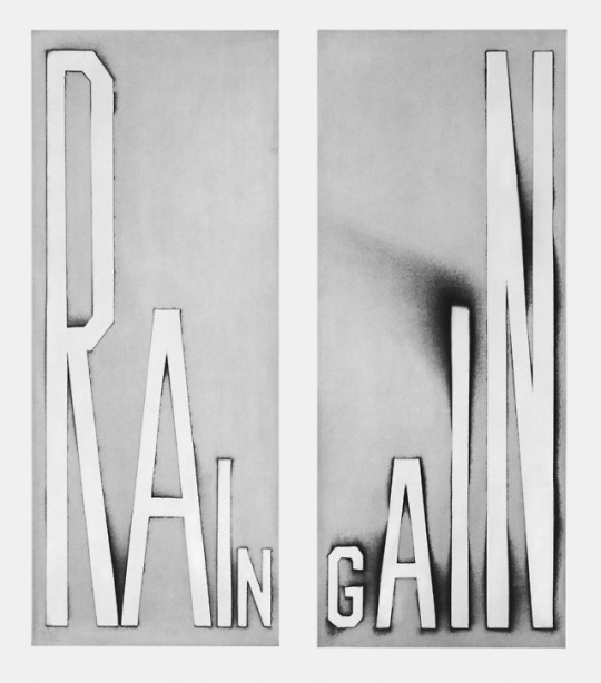
Ed Ruscha
Ruscha achieved recognition for paintings incorporating words and phrases and for his many photographic books, all influenced by the deadpan irreverence of the Pop Art movement. His textual, flat paintings have been linked with both the Pop Art movement and the beat generation.
0 notes
Photo


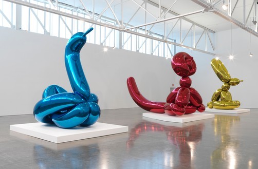
Jeff Koons
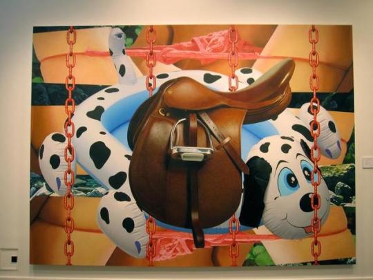
PLEASE READ: https://www.widewalls.ch/scale-in-art/
0 notes