2022-inrd601-jontichang
2022-INRD601-JontiChang
26 posts
Don't wanna be here? Send us removal request.
Last Seen Blogs


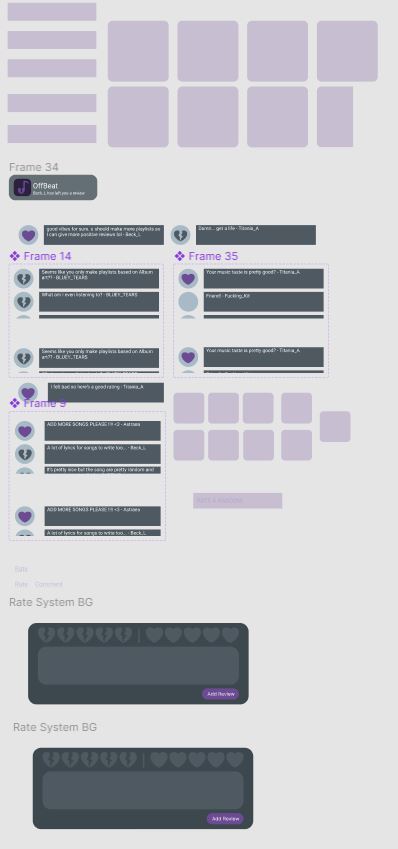
Photo

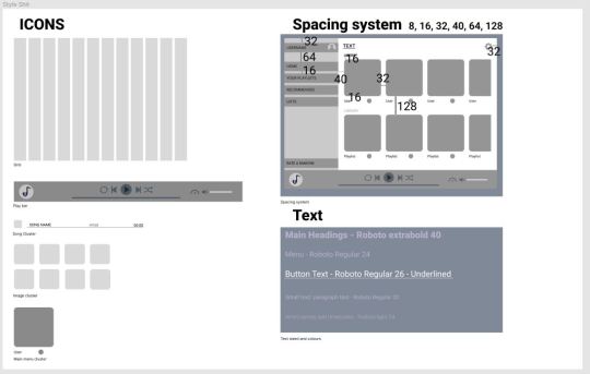
Our final stylesheet. In the end we created a few additional buttons such as a menu button (three lines) and a speedup button. This sheet also goes into more depth about our spacing, sizing, colors, fonts and colors for the elements that appear in our music player.
0 notes
Photo
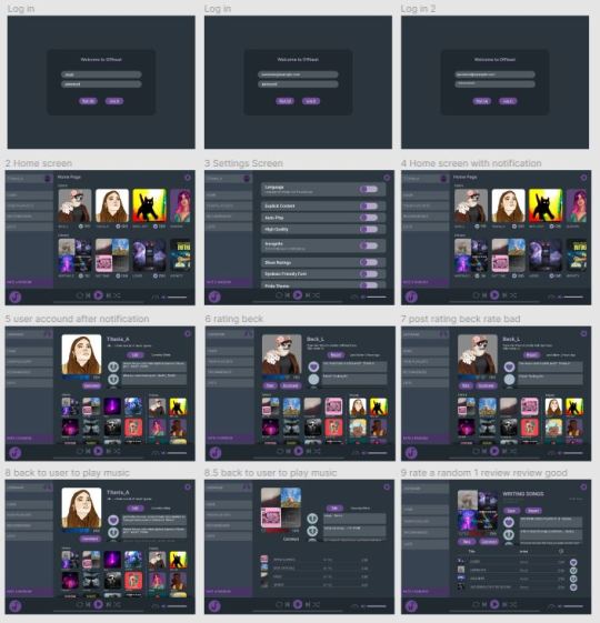

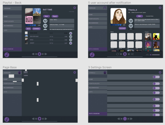
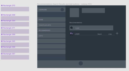
These are the pages we had for showcasing our music player in our final submission video. With the components we used for creating our Offbeat experience. We added a few things such as an updating review system (it would update after a review) a notification that would tell you when someone made a review that you could click on and when you do it would move the reviews down, showing the most recent one this could be seen in our video.
0 notes
Photo


These are a before and after photos of our music player after the feedback session.
Having a smaller sidebar meant that we could have more space on the page to show information so that thing’s weren’t so cluttered together. We also changed up the sign in and settings page to fit better with our style, less harsh and edgy corners.
0 notes
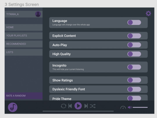
Photo

From our feedback we reduced the size of the sidebar and made the buttons smaller. We also used more of a grid system with our music player layout, including specific spacing between objects and sizing of our buttons and links.
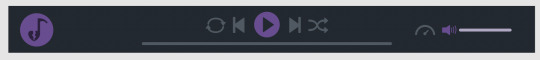
We also did more work on our player bar adding features such as a volume bar, shuffle, repeat and speed adjustment button.
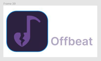
We also needed to come up with a name and logo for our app. We settled with Offbeat and our logo was a music note with the note replaced by our broken heart icon.
0 notes
Photo


This was the feedback we got from our first session there was a both good and negative things as well as suggestions on how to improve our music player. The main issues that the people had when using our player was that the sidebar was too big and the icons were too big. People like our idea of a rating and review system and our colour which was good.
We created this music player so that everything could be interacted with and linked with each other, however I think getting this to work spread our resources a little thin and for a trial we could have made a more guided tour for our app which would allow us to focus on the quality.
After the feedback session, because we had to create a video for the experience of using our app, I created a way through our music player that could show off our features better. I started with seeing what pages we had to show off and then coming up with a path that would make sense to a normal user.
0 notes
Photo


For our first feedback session this was what we had. We made a large amount of pages along with buttons that took you to each of them. We made layouts for log in/sign up, home page, user profile, album/playlists and an explore page for things like top rated/worst rated lists.
On each of these pages we had interactive buttons that would take you to another page which were all interconnected so there were a variety of ways to navigate the music player to get to where you would want to go.
Because we were creating a desktop music player, for these buttons we had to show that they were something the user could click on and to do this we had them show a different colour signifying that it could be interacted with.
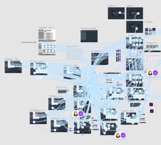
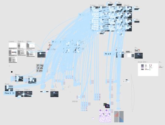
The way we did this was it would open an overlay when hovered, and the overlay when clicked would take you to another page, all these buttons linked to each other. These had to appear on each page with some of them such as the review button needing its own chain of processes. This meant that the Figma document looked quite messy as so many things were linked together, this was difficult to work with but there was no other way around it with our knowledge of Figma so we just had to push on.
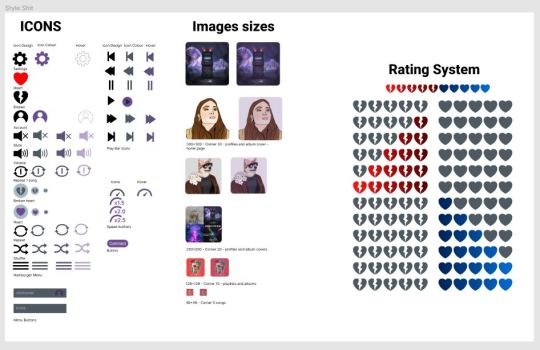
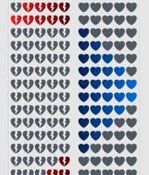
The final photo is of our style sheet at the time where we had our icons and colours laid out. We decided on using purple colours for our music app as it was the combination of the colours on our rating scale (blue and red).
0 notes
Photo

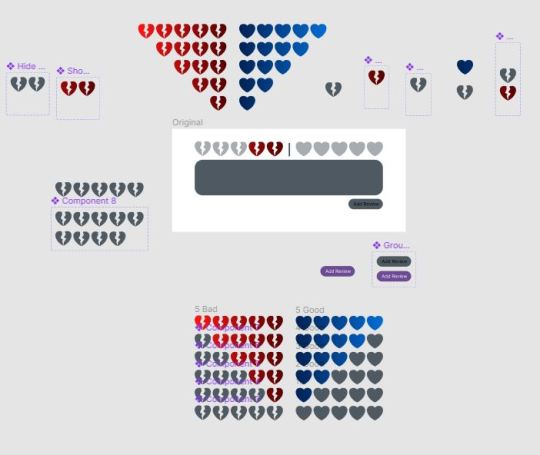
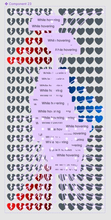
My focus was on the rating system. Because Figma doesn’t allow 2 inputs such as hover and click to occur at the same time, it made the creation of the rating system a whole lot more complicated. From our rating system we wanted this:
1. When you hover it will show you the rating your are giving
2. When you click it will stay as that rating
3. You are able to change rating after already selecting a rating
At the start I was just trying to get it to work, so I made a 1 star interactable button that you can click on and click off on the negative side of the scale. It worked using variables and several layers on the interactive aspects.
Originally, it worked like this... So the first layer (neutral) when hovered would disappear revealing the bottom layer (red) that you can interact with, when you click on this layer it would toggle the variable layer on the top that was originally not shown to stay and when you clicked on it again it would revert back to grey (neutral first layer).
This worked and I was very happy that I was able to figure it out. However though this worked with one star, it would not work with multiple stars as the hover overlaps with each other. I also think because of the gradient we used for the rating scale it made it more difficult as each of the ratings on the scale was it’s own colour.
This got me bummed out as I had spent so much time trying to figure this out. Jorja showed me a video tutorial online for a normal 5 star rating system which used components. Though I didn’t want to use this method as it seemed very inefficient, it seemed like the only way to create something like this, and it worked.
Basically it starts with the normal neutral layer, the hearts on the scale, when hovered would open an overlay showing the stars then when clicked it would stay like that, and when you want to hover over another rating on the scale it would show that and if clicked on would stay as the new rating. Every heart of each rating on the scale would have to be linked to each other possible version of that rating so that it would work seamlessly.
With that working we just had to put it on a rating screen that would show up, with a box for writing a review and a submit button that would only be interacted with when a rating is selected.
0 notes
Photo


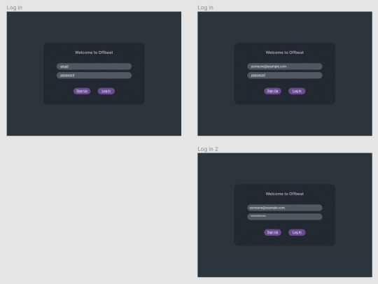
About 2 and a half weeks in we started creating our music player on Figma.
We created a sign up/ log in page, how we wanted to lay out our information, profile and worked with overlays which would appear when buttons were hovered over.
We also attempted to implement a scrollbar for each of the categories however because of limitations with Figma we would later remove the scroll bar.
0 notes
Photo


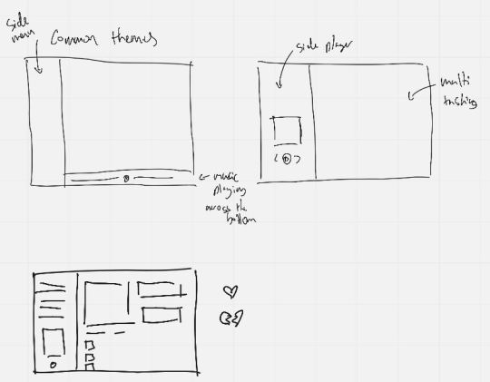
We started with a wireframe of our music player, we tried a variety of layouts and how our review system would work and look like. We settled on having the menu bar on the left and play bar at the bottom with space on the right to show information on the page.
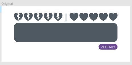
We tasked Jorja with creating the icons for the music player so everything would remain consistent. Because we wanted negative reviews to be possible too we had to rethink a normal 5 star rating system. She made the hearts and broken hearts which would become the main iconography for our music app.
0 notes
Photo
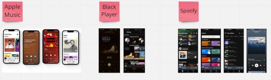
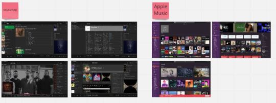


We did research by looking at a variety of phone and desktop versions of music players, for phone we looked at Apple Music, Spotify and Black Player, for desktop we looked at Apple Music, Spotify and MusicBee. Because we had decided on having a review system in our app we also looked at Rotten Tomatoes as well as Zomato to see how they showed their information and layout of their designs.
It was interesting seeing their differences and similarities, what each music player prioritised showing, how they show information and what they allowed and didn’t allow the user to do.
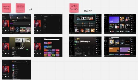
Since me and Rebekah mainly use Spotify, we compared our desktop versions and saw differences in how we liked to see our music being played or whether or not we had our friends bar showing on the right. Jorja used more niche music players such as MusicBee and Black Player so it was interesting seeing how less popular music apps have certain looks or allow features that appeal to the people that use them.
After our research we decided to create a music player meant for desktop rather than for phones as we thought the review system would work better on there.
0 notes
Photo

This was our research and brainstorming for our music app.
We first came up with ideas of what we would have liked to see in our music app. Some were minor features such as an ability to speed up songs, or the ability to play songs from more than one playlist together without combining the playlists themselves.
The major feature that we wanted our music player to have was a sharing and review system. This would allow users of our app to rate each other’s albums, playlists and profiles. We thought it would be a good way to share music and create a community for people who are passionate about music.
0 notes
Text
Reflection
This will just be a general overview, thoughts and reflection on the experience of the work we’ve done and what I’ve learnt so far in this first half of the semester.
All in all this was a very interactive and meaningful experience. Working with Rebekah was fun we have lots of banter and I think we work well together, we managed to finish everything but I think we could still work on our time management so we can do more and show more exploration.
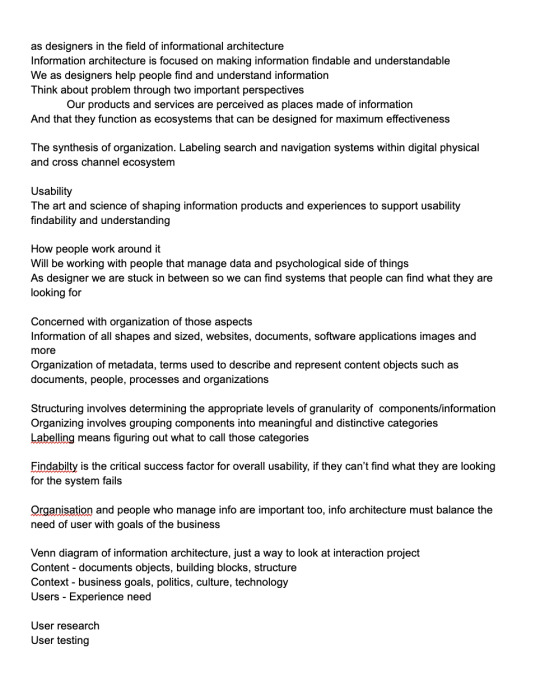
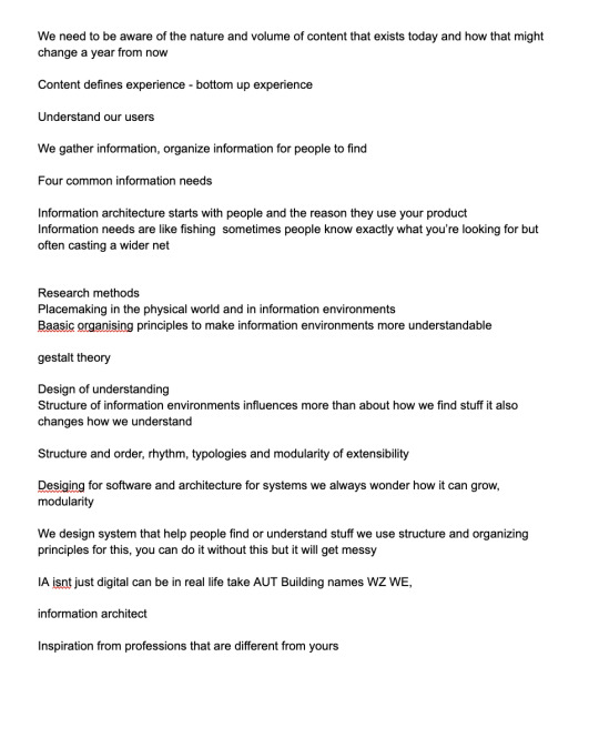
Sitemap - It was interesting learning about information architecture during this stage and will be able to look at the notes I took for reference in the future as the concepts and tips are very crucial to interaction design, Top-down/bottom up. I wish to further familiarize myself with these concepts so that I would be able to communicate it to other people
Card Sorting and Diagraming - Leant about labelling systems and how the way you see a certain system or how you design it may not be the way others/ users would. And it was interesting seeing how people reacted to our initial system and coming up with a different approach to the task.
Wire Framing - This was a very good experience using Figma and learning a new design program. Though because I haven’t used it before I wasn’t sure if my inability to do certain things was just lack of knowledge or just limitations with the program. I would like to try out Adobe XD to see what it has to offer.
Prototyping - The prototyping was difficult but very insightful. In the end we were only able to do very basic things (linking pages) and had to jerry rig certain components but further exploration with the program can help with doing things we weren’t able to before.
Infographic - It was difficult trying to fit our information on such a small space but in the end we had to settle with what we got and the responses we got from out classmates was very helpful to see what we did right, what we did wrong and how we could improve it.
Presentation - This was the final stretch we worked on it for about a week, first putting all the information on and then organizing it into a cohesive structure for better understanding we had a pretty good flow with first showing the initial stages and then the developed stages of our project, the response we received was good. Seeing the other classmates presentations was also very helpful to kinda see what we may have missed out on what we did well comparatively, things like how we could have explained more the theory side of things and maybe how our slides were arranged was better, it was very helpful and will keep these things in mind for the future.
With the experience and knowledges gained from these exercises and projects, I am very much looking forward to working on the second assignment and will utilize what I have learnt with using programs, research, and teamwork to create a unique music player application.
Jonti
April 6 2022
p.s. for the tumblr uploads, G recommended in class to have a weekly to upload time to show what I did that week, i think thats a really good system so I don’t forget about posting stuff and that way the showing of my work becomes more organic, so will definitely try this in the future.
0 notes
Photo

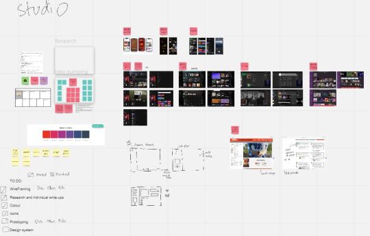
This was the workspace for our infographic, as you can see, we had quite a lot of stuff to fit in so we found it difficult figuring out what we can keep and take away and trying to figure out how to lay out all this information.
0 notes
Photo

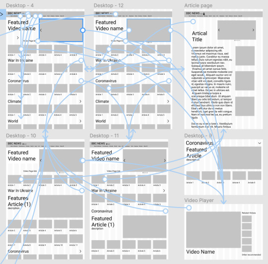


This is our current wireframe along with prototyping. Rebekah and I will further work on it to ensure all our features are implemented so the prototype actually works the way we want it to. This will require us to understand figma a bit more maybe look at some tutorials online, I just found out about components and am still trying to figure it out so I can use it in the future, I think it will be really important to making a good prototype.
0 notes
Photo


Sorry this part onwards is just the stuff that I forgot to put in beforehand, its a bit messy but I think the info is necessary. For our infographic and presentation I reorganized the layout of our sitemap on Miro so it would look nicer. And easier to look at
0 notes
Photo
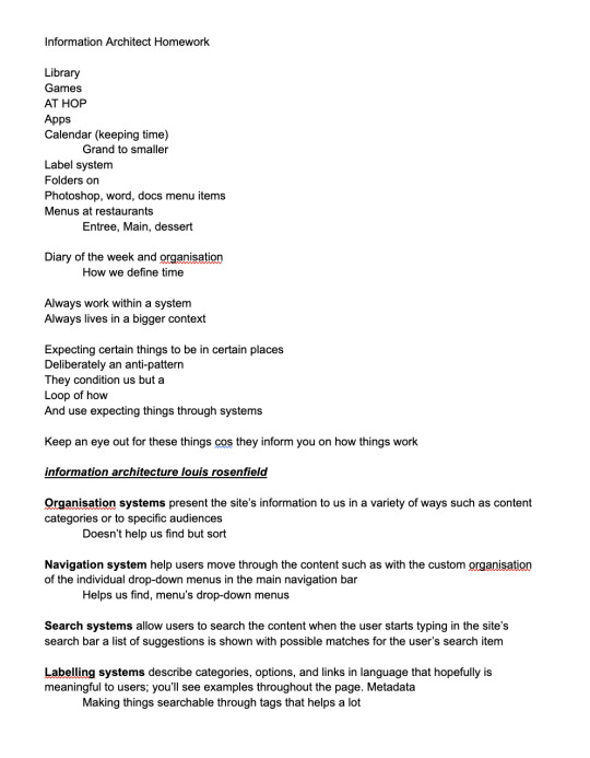

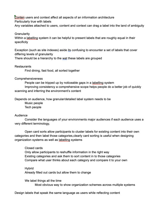
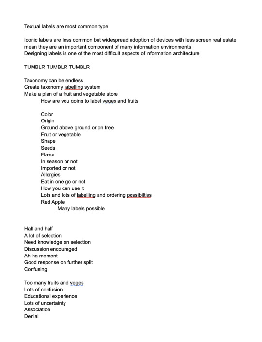
6th April
These are my notes from class, there’s more notes. The presentation reminded me to look back on these to see more about the theory and it was very helpful kind of looking back at the past 6 weeks.
0 notes
Photo
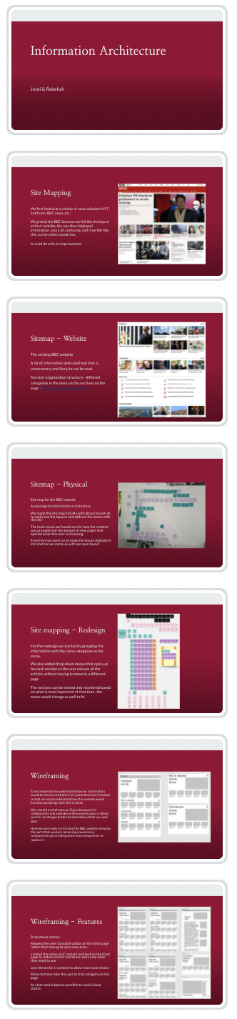

6th April
Our final presentation slides (top down then right).
Just finished presenting and looking at other people’s presentations.
We learnt a lot from this experience, it was fun presenting, we did 2 presentations and swapped orders for the second one which was not a good idea as we weren’t as familiar with what we were talking about.
Looking at other’s we also learned a lot. Our presentation focused more on the process we went through and how we learnt and changed.
However in hindsight I think we could have talked more about the theory of Information Architecture as it would be helpful for the viewer and their understanding of what we’re talking about and it would be a good refresher for us to cement our knowledge about the subject.
Our feedback was good, the people we presented to liked our honesty, though we noticed a lot of nodding and both me and Rebekah thought we could have spoken a little slower so it would be easier to understand. We blame this on how we watch things at double speed.
0 notes