#unless you airbrushed them by hand or something I don't know how this works
Note
hi! i've always loved your hnk panel redraws and recently i've been so inspired by them that i've tried my hand at coloring some panels too! if you don't mind me asking, do you have any tips?
oh i certainly do! some of these are a bit generic/art related but they’re definitely useful in this case too. I’m adding a read more because unfortunately it got a bit long but here you go:
1) Get to know your tools!
Since you weren’t very specific, I’ll assume you aren’t too familiar with art softwares (and if you are, you can just skip that part it’s not That deep). I’ll start with the basics; I know this is obvious, but please bear with me, because understanding how your program works WILL make you a lot more efficient.Here are quick descriptions of some features I think are very useful - I use Clip Studio Paint, but I believe most programs have equivalents. If you don’t know them, please experiment with them, they’ll come in handy!
- Locking transparency :
Locking the transparency of a layer means only the parts where something is already drawn can be modified. Basically, you can recolour something that already exists in a rather precise way.
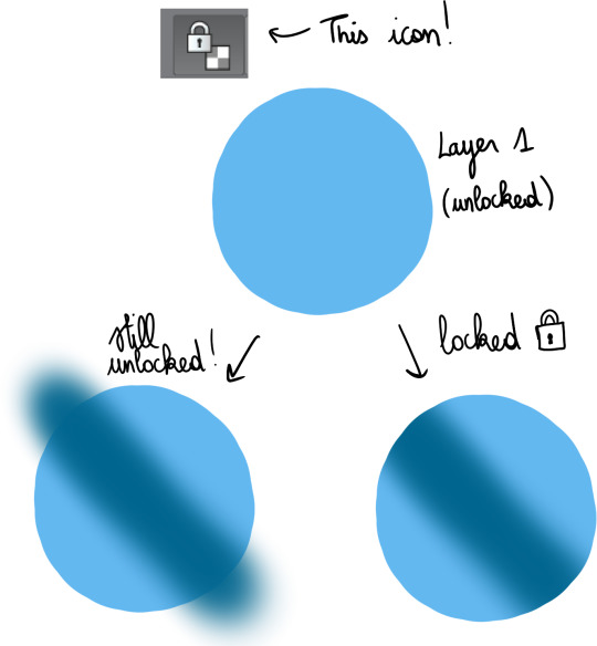
This is very useful for gradients, which I’ll talk about a bit later.
- Clipping layers :
This gives the same result as locking a layer then drawing over it, but the difference is that you use more than 1 layer ; one as the bottom layer, defining the part of the canvas you can draw on, and the others, clipped on top, where you’ll draw. This can be more practical than locking transparency, because if you have a lot of details to add, doing everything on a single layer may make things more difficult.

I use this a lot when I shade, but just like gradients, I’ll bring that up later.
- Layer settings :
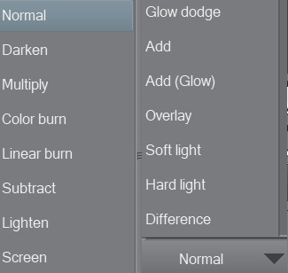
These options change the way the colours on a layer blend with the colours below. As an example, addglow is pretty good for colouring very bright light sources or for adding highlights on gems :

Basically, using those isn’t a necessity, but they’re still pretty useful so I’d recommend experimenting with them whenever you feel like it!
- Magic Wand :

Not the most complicated to use, but damn it’s really useful. It allows you to make selections based on the colours you’re targeting, so basically, if you need to colour an entire area a certain colour, you can just select it from the original panel, go on the layer where you’re colouring, and colour nothing but the part you selected. That’s about it!
There are lots of others, but these are the main ones you need to know about when you’re getting started.
2) Colouring stuff
This is where it gets interesting! I guess! I’m not too good at just coming up with these kind of tips, so I’ll illustrate with some colouring, hopefully it’ll help you out?
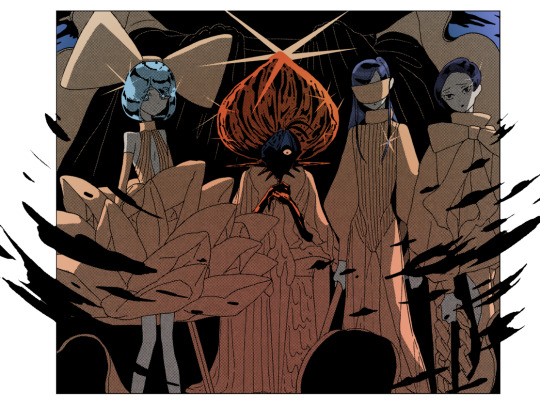
I usually colour in 5 parts : 1) Preparing the panel(s), 2) Applying flat colours, 3) Adding gradients, 4) Adding shading, 5) Finalising with details.
I always prepare pages in the same way: first, I use the magic wand to select everything i do NOT want to colour ; the frames around the panels, the speech bubbles, the sfx, etc. Once they’re selected, I copy them, and paste them on a new layer. Then, I select the original layer, and turn it transparent so I can colour below while still keeping the lines. To do that, I go in Menu > Edit > Change brightness to opacity (in CSP at least, it depends on your program tho but most of them support this, I think!).
I end up with something like this :
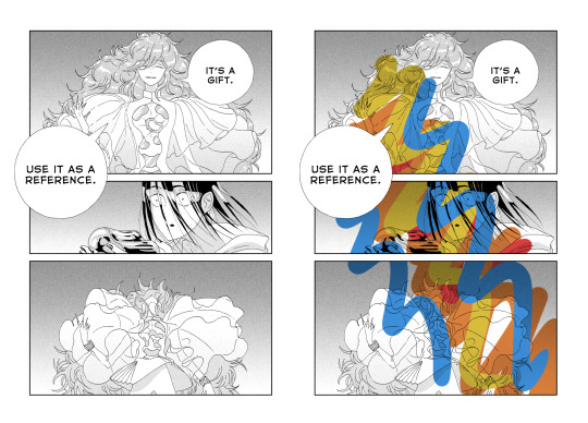
Two layers, one on the bottom with the semi-transparent page, and another on top, with everything that I don’t plan on touching. On the page on the right, you can get an idea of what it looks like when you add a layer below these 2 and draw on it.
Now that I’m done with the panel, I can start adding some (flat) colours.
I think it’s a good idea to start with the background, because it’ll help you figure out the feeling you want to give the panel.
The airbrush is a pretty good tool for gradients btw, just make sure you use a brush that is big enough so the transition in colours looks natural.
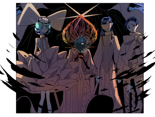
Next, I add a new layer, and colour the shape of the characters (and here the vessel as well), so it stands out from the background. It’ll make colouring less complicated, since the lines will be clearer.

As you can see, I was kind of confident, so I directly added a gradient. The bottom of the panel is a bit “darker”, because I wanted the main light source to be the reflect on Phos’….. head thing?
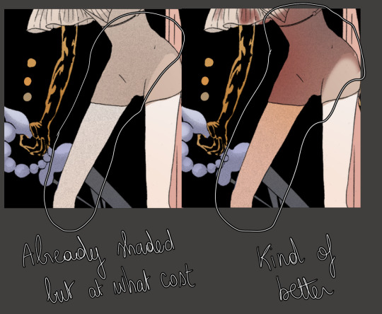
Here’s something kind of important about your choice of colours : if you’re colouring an area that is already shaded in the original panel, I would recommend taking a colour that is more saturated than it should, or else the colour may end up looking dull because the original shading will make it darker.
Next, I do more flat colours. Nothing too fancy, and pretty much everything is on different layers. The clothes are left uncoloured because the background colour already fits, so it’s okay honestly
Then, I added some gradients using clip layers :
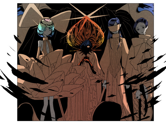
As a reference, I used some overlay layers for Dia’s hair, and some addglow layers for Phos’ alloy.
I mean it when I say gradients are important! They make your colouring feel more complete even when they’re barely visible. quickly coloured bortz for reference, assuming tumblr won’t compress the colours too much:
the bastard on the left has nothing but flat colours. They’re nice, but when you’ll have shaded everything, chances are it’ll look kind of …. i dunno, like something is missing? So yeah, gradients : good, though i would recommend you keep them in the same tone as the base colour. I’ll talk about this a bit more later if i don’t forget.
Ok! next:
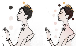
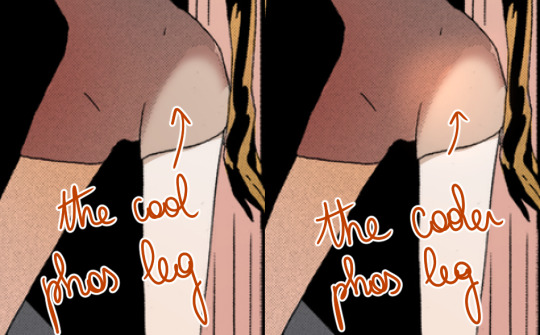
I felt like golden colours weren’t quite fitting the mood, so i added a layer with blue on top of it to make it colder. It’s at 40% transparency, so you can still see the colours behind well enough. Some parts were slightly erased because i liked the idea of these parts being lighter (you can see it a little bit around phos’ neck, or above dia’s knees : these parts are yellower than the rest of the pic)
I added some shading! Nothing too fancy. also not to sound like some gradient-freak but you can add some of those in shading as well, it’s usually a nice touch.

After than, I added some lightings, which are on a layer clipped on the original manga panel (so basically only the black parts of the original image changed colours, and the colouring work I did on the layers below wasn’t really affected, if that makes sense?)
The red lighting is the obvious one (it’s an airbrush, and i used an eraser to clear the part near Phos’ head so it looks like it’s coming from above/behind them and not from themself).
There is another lighting at the bottom, which is grey/blueish, to contrast with the warm colours on the top of the pic. it also kind of looks like smoke but yeah
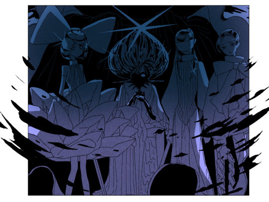
Now the panel is mostly done, and I’m starting the “details” part.
Something I find really bothersome in the manga is the *original* shading : while it’s always really good, colouring under it will leave some grid of pixels on top of your colours, so to counter that i just colour on top of the grid by colour picking and painting on a layer above the manga layer.
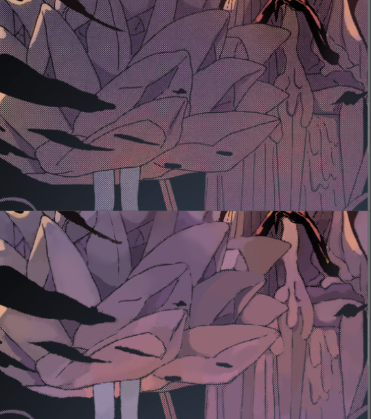
It’s a bit tedious but it has a texture that makes it look like a painting. The downside is that the colours can be altered since you’re colourpicking from something with an irregular pattern, but it can end up making your panel look less boring, honestly, it just depends on what you’re aiming for!
I end up with something like that :
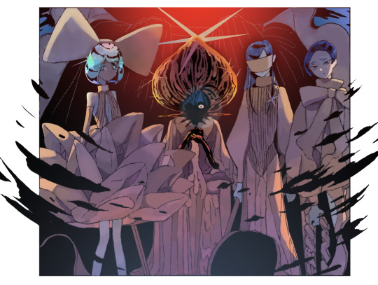
And then it’s just. Whatever man. I added a black border and some highlights, sparkles, etc, it’s the kind of things you do when you’re basically done.
For the technical aspect, I’m not sure I have a lot more to add. If you want some advices for picking colours, tho…
3) General colour stuff :
These are just recommendations! Licherally these are mental notes i came up with ever since i’ve started colouring, so they’re kind of personal and if you don’t follow them you’ll be fine, i suppose. But so far they’ve been useful to me so consider them whenever you’ll be colouring something:
- Do not use pure white! Unless it’s for something CLEARLY meant to stand out, such as the frame of your pages, a speech bubble, sparkles, or a light source/something very shiny. If you’re just colouring something that is not meant to draw attention, use some other shade of white, but not the #ffffff one if you see what i mean?
- Same about pure black, to be honest.
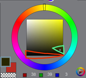
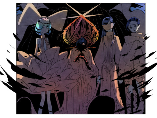
The shades circled in red tend to look “emptier” than the ones circled in green (here the hue of the colour is yellow but it works with most colours). It doesn’t mean you can’t use it, just, use it sparingly or it may make things look dull I think? I would recommend trying a few shades before taking a decision.
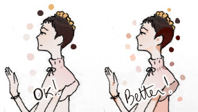
- Sometimes adding highlights where the shading starts can make the transition look smoother:
- Even if a panel is already shaded in the original page, I would recommend shading it again, because the manga shading is a black shading and shading a coloured drawing with black usually doesn’t look that good. (hence why i said something about using saturated colours in shading earlier).
- Even if a panel isn’t shaded in the original page, consider shading it anyways, even if it’s just a very light shading. It’s worth it :o)
I’m running out of things to say oh well
#i didnt mean to write so much. it just happened i hope it's not a pain to read#also i hope it was clear but if it wasnt. (points @ my inbox)#whenever people tell me theyre getting into panel colouring i go... [powercry emoji]... its really fun and honestly i dont see that many#ppl into it so i get really enthusiastic ? thats it#personal#asks
116 notes
·
View notes
Last Seen Blogs

juhanchuanwu
League shipping

analisislibre
Análisis Libre
doorlampwrites
Bits and Pieces

shopfoxavenue
FOX Avenue