#maybe one day i'll upgrade to freehand but that day is not today 🙃
Text
HOW TO DRAW WILD KRATTS ART STYLE
in the specific way that i've learned to do it
FEATURING A BOY IN MORTAL DANGER
SO! You want to know how to replicate the iconic lineless art style of Wild Kratts. Cool! There are a handful of people in the fandom who can do this, and as I have recently become one of them, I'll walk you through my process!
Remember that everyone does it differently so what works for some may not work for others, it's ok to experiment!
I'm going to make it clear first off that if you're looking to know how to freehand draw the characters, this is not the tutorial for you. My method is far less technical and, to some, probably less authentic. But it works and it's fun and it's easy so here it is!
SPECS
I use the Medibang Paint Pro mobile app to draw. It's available for both Android and iOS. (There's also a PC version but I'm less familiar with it.) A couple years ago, I paid for an expansion that lets you group layers and download brushes and idk if that's still behind a paywall or not, but those are things I can do.
Also worth noting is that I draw on a 4k canvas (3840x2160 pixels). It makes it easier to get little details in higher quality on any given drawing.
SKETCH AND REFS
ALRIGHT ON TO THE DRAWING
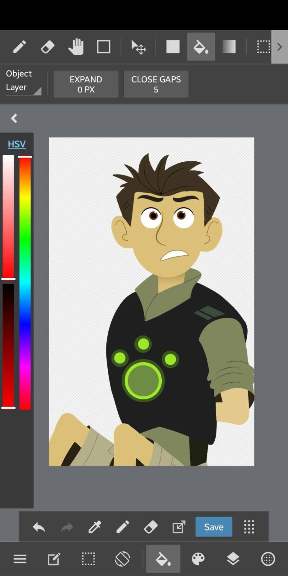
I'm using a fake screencap I've already finished for demonstration. I've cropped it down to just Chris because there's some PFJ plot tied to this image that I'm not going to allude to just yet 😉

Looks pretty accurate, right? The reason is because this image was actually drawn based on a bunch of screencap references from episodes of the show.
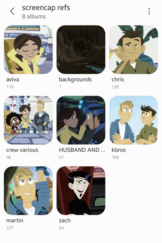
I downloaded the broad majority of these from @calliecat93's screencap compilations. As you can see, I have some biases. (not me subtly pushing the martiva agenda in the middle of a drawing tutorial 🤣)
I used about seven different images of Chris to make this one, but this is the base image against the main sketch:
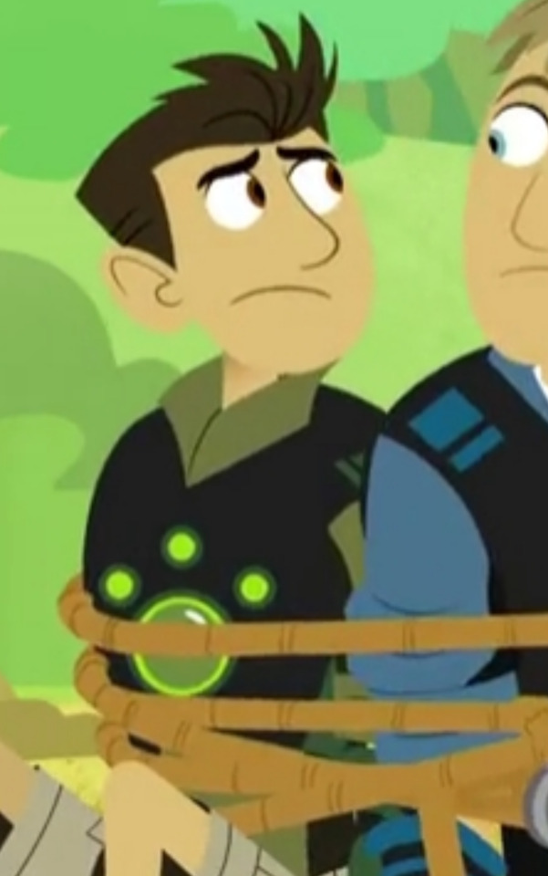
As you can see, it matches how I wanted it to look so this is how it starts. But the position of his head is completely wrong so we need to fix that.

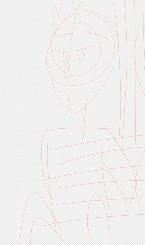
This is what happened when I slapped all the references on top of each other, I had refs meant individually for his head, his eyebrows, and the part of his arm that's blocked in the base image.
So basically I take all these images and Frankenstein them together until they look like what I want. Sometimes cropping, sometimes selecting and literally bending images at the joints to a point that works. Whatever gets it to look like what it needs to.
THE DRAWING
The first thing I do is trace all the lines in bright red. This way, when we go back to color them, it's easier to see where we've been and what we need to cover. Lines stick out in a lineless style and if they're disorganized it can look even worse.
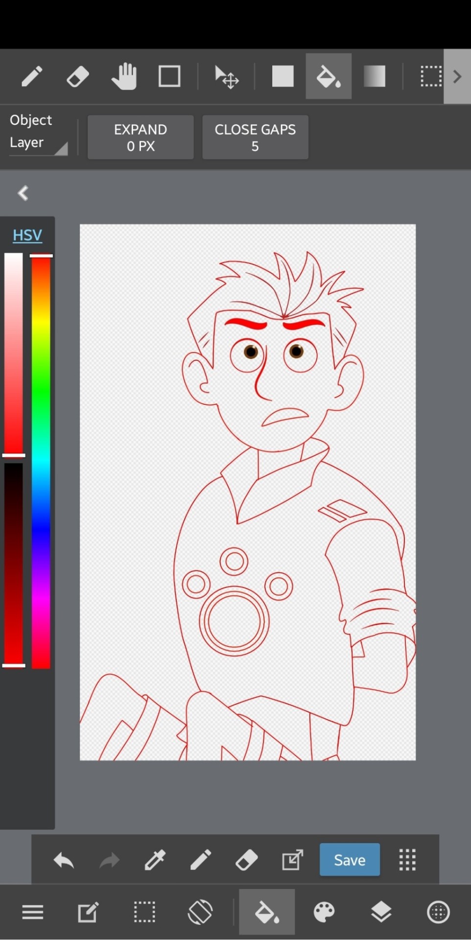
(I've moved the drawing out of line from the refs since I made this, but note that this was drawn with the refs showing underneath to keep the lines clean and on track.)
IMPORTANT: I always make sure to keep like-colored lines on the same layer and separate them out. So it would be like, the head layer, the hair layer, the inner details of each, eyeballs, pupils, neck, and body. Groups of lines that are gonna be the same color when you go back over the image.
The neck layer in particular is important to keep separate because of the show's use of gradient to highlight the separation on most of the characters. We'll cover that in a bit.
I make sure to pay attention to line thickness on the detail layers so it looks as accurate as possible.
After you're done with the lines, we can move on to coloring!
COLOR
The first thing I do is make a new layer to put all the flat color on. How you select and actually color in the lines is up to you, but I keep a separate reference open to pull the colors from to keep the colors consistent. This is usually the same image every time.
Flat color comes BEFORE coloring the lines because you'll use the color you fill it in with to go over the lines to ensure an accurate color match.
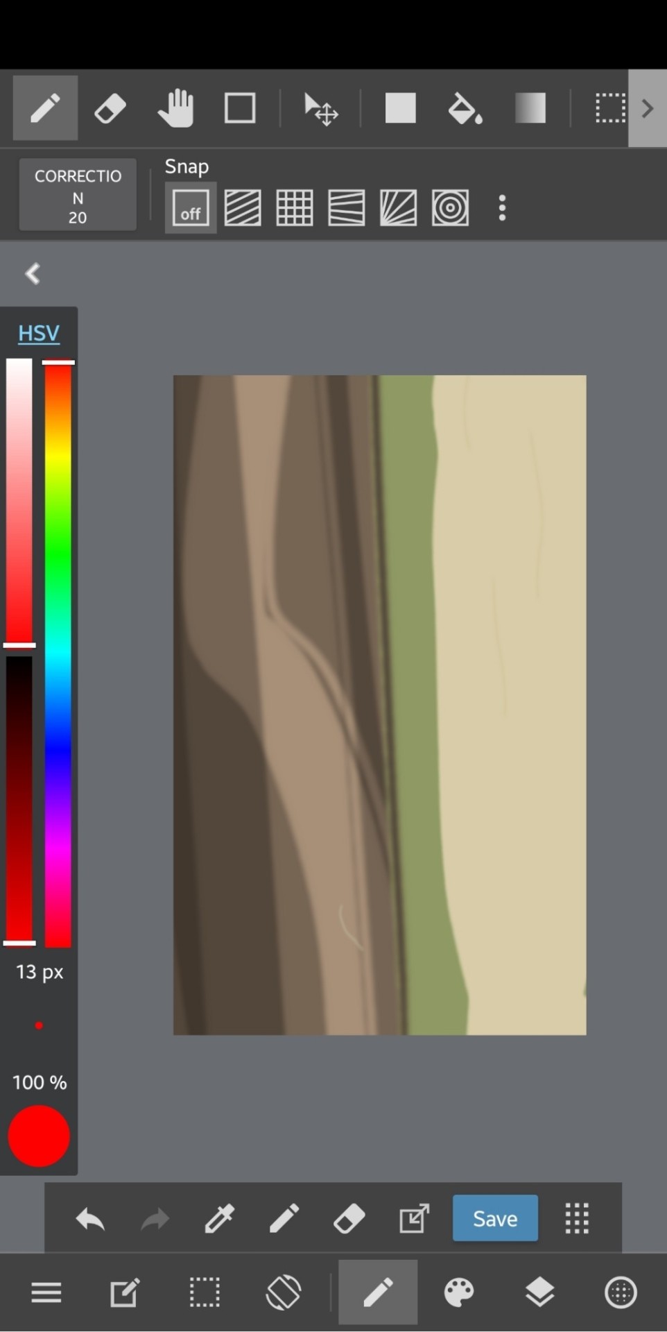
But this is what he looks like with just the flat color. The lines have been colored in now but I can explain that.
Up above your layers, you can turn on certain setting for the one you're selected on. "Protect Alpha" is a setting that will make it so you can only draw in places where you've drawn previously, making it easy to slap down the color for the lines without too much hassle. And when you put everything on separate layers, you don't need to worry about overlap and recoloring in certain places.
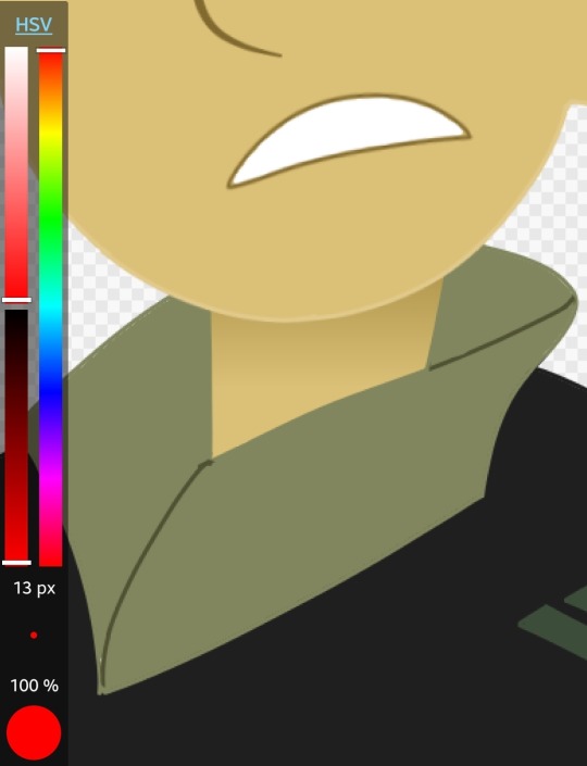
And this is where I'll mention his neck. The gradient effect is best achieved if you put down the entire neck, completely colored, and then add another layer for the gradient and use the "Clipping" feature to make the gradient only appear on the neck. In this case, I just selected the part I would need to put a gradient on and did it without the clipping, but it still looks the same so it's not a big deal.
The final step is to add the background and lighting!
Background and Lighting
Lighting is my favorite part of any drawing because there are so many layer blending filters to play around with.
This is what the background looks like. Simple and to the point and also referenced from an episode.
Play around with lighting however you want! it's all up to you and it can change the entire tone and context of a scene
So this is what it looks like after all the lighting and foreground elements are added! Looks like it's right out of the show! And now that you're able to duplicate this chad of an art style, you too can bend reality to your will--
This was a pretty rushed explanation of what I do, so if you have a question, I'll be more than happy to answer it!
#wild kratts#chris kratt#drawing tutorial#jmoneydraws#i think the drawing i'm using here is the first one i ever did#using the method i'm describing#so what i'm saying and what the images say might not line up but the process is still in its infancy#maybe one day i'll upgrade to freehand but that day is not today 🙃
63 notes
·
View notes
Last Seen Blogs
mosicats
aubrie ☆ on art hiatus
hinosyou
氷乃 蝶
otakubimbo
TheeOtakuBimbo
vidxnda
Moved
ammisalami
Dear Diarrhe