#lots of white space and nice clear font so it's incredibly easy to read
Text

Was this written by future President of the United States Chester Arthur or Anne of Green Gables?
#history is awesome#presidential talk#most of the letter is on a similar level of unrestrained gushing#he was totally a sanguine#there are lots of fun letters which makes it very easy to keep reading#woodrow wilson's was more impressive than it might have been because it came right after the tafts#so i was just like 'thank goodness! someone who knows how to use punctuation!'#(but also it is a nice letter in its own right)#theodore roosevelt wins the prize so far for complete lack of punctuation#which does have the effect of making it seem very stream-of-consciousness which seems very right for him (esp at that age)#lucretia (soon-to-be) garfield's letter made me tear up though#i might need to make that its own post because wow the drama and the heartbreak (and the spine of steel that woman had)#i was unsure about this purchase but dang it might be the best book i've bought this year#extremely good formatting for one#lots of white space and nice clear font so it's incredibly easy to read#which is a very underrated aspect of books but maybe one of the most important things when it comes to the reading experience#i've started taking that into account when i select books and it's made my reading life so much better
29 notes
·
View notes
Text
The Elements Project
This is blog looks at different content types, organising content and looking at taxonomies. This blog also looks at the elements project and the building of the work page for the website.
Different types of content
When someone thinks of content they may think of the stuff they read or see, but they don’t realise is the content is specific to them and what they want. It may also shock them to find that there is a multitude of different content types each with their own specific benefits. Different content types help with connecting with loads of different audiences as everyone is looking for something specific, below are the 8 main types of content:
1.Blogging: Blog post are probably one of the most common types of content people will see and they are a main stake in a companies content marketing strategy and for good reason. Blogs are easily found in google, people are happy to read and share them but they also don’t have to take to long to write and it offers some value to customers without costing much. While blogging is the most accessible type of content some brands can fall into a few holes in the ground such as not posting regularly, not linking sources or not including keywords, these blunders can make people tune out of the content but if done smartly it can drive a lot of traffic to a site or businesses.
2. Longform Content: The thing with longform content is that its free and online. This is a great way to build and increase a subscriber count by giving people a taste and offering to keep them up to date if they subscribe they will be the first to know when the next phase comes out. These longforms are big they can range from about 5,000 to 15,000 words and this increase the immense value seen by the customer due to various chapters and several url links, user wont have to leave the main form to read the rest of the info and they are incredibly accessible. They do require planning such as knowing how and when to break sections up, how to link them well and how to advertise them well so they gain the traffic they need.
3. Case Studies: Case studies are a in-depth coverage document which provides users with both knowledge and actionable information. They work well for a number of reasons primarily because they allow people to share them easily and are unique take on a study or article that has been conducted. They follow a simple structure which is to have a summary, explaining the problem and the solution. The biggest problem for these is lack of structure as most studies just show the results and people get bored and confused as to how the results were achieved.
4. White Papers: These papers are the more information dense content sources. They offer solutions and data about a range of topics and subjects. The main focus is on the details of the paper, they work well for building a good reputation within a industry and are good magnets for users looking solutions to problems. Due to the large amount of info in these papers they do naturally take longer to create and can be the more expensive type to create if someone is hired to create it. Good footnotes to remember is that a good paper has a table of contents and has a summary with the rest of the information organised into specific sections and always focus on one specific problem. These papers are very good way of showcasing a product or services due to the break down that is provided.
5. E Books: Ebooks seem daunting at first glance but they are on the rise in terms of reading material which means they are great magnets to attract people to the content that a company is creating or about a specific issue. They can be long and short 5 pages or 30 pages it doesn't matter as long as the value is there. The content needs to be structure right for this format and again like most content it needs to be clear about its message other wise it will confusing and bore people while rubbing badly off on the company or oneself.
6. Info graphics: Info graphics are most likely the best shareable source of content due to the comp[act nature and nice visual style they have. It takes the most important information and displays it nicely with some graphics that make people share it. The joy about using these to get many shares is that the back links that generate from these mass shares will divert a lot of traffic back in the long run. Info graphics shouldn't be over cramped with content just the key details and they need to be legible by using sections for the content and if necessarily sub titles can be sued for people to understand the information otherwise no one will care.
7. Template and Checklist Downloads: These are great lead magnets for users as they are actionable and great resources that users can utilise more than once giving it that sense of value and re usability. They don’t take a lot of money to produce and offering them for email subscriptions to a news letter to promote other content that is produced. These need to be clean and organised and have constant font choice and have the brand somewhere on it, these also make good use of white space.
8.Video: Video may get overlooked as a form of content creation but it is. They can be dynamic, they engaged with the viewers and more people would rather watch a video than read in today's world so its dumb to not consider this as a viable outlet for a content creator. The best place to upload videos is to YouTube, having the videos linked into and be relevant to the blog post but also linking the blog posts in the description so people have everything they need. Good videos will put the CTA at the end as views that watch to the end are the ones more likely to use the CTA to forward themselves to a product or more content.
https://adespresso.com/blog/main-different-types-content-use/
Taxonomies in word press
Taxonomies are a way of grouping posts together based on a few key relationship values. Usually a standard post will have two taxonomy types called categories and tags which is an easy way for user to find certain types of content on the site. Taxonomies can be pared with things called terms and the best way to think of it is a taxonomies would be the tile while the term would be the sub titles for example a blog post about Cars would have car models as a term and car engines as a term.
https://wordpress.org/support/article/taxonomies/
The elements project
The elements project is a task to create a user experience around the elements of the periodic table. The challenge is very open and allows for great creative freedom. The elements project can be for any age group, the only limitation was that it had to be about elements. The ulster museum has the elements exhibit which was focused around using the elements in a very attractive looking way to appeal to primary key stage 3 students to show that chemistry inst scary or hard but can be fun. The museum highlights the focus on the STEM learning curve and its importance in their exhibition so that something to think about for the future of the project. The first task was to arrange content into a spreadsheet, there were a number of elements and the task was to research the data and arrange them in fitting titles and display them so anyone could understand the info much better. Below is the before and after of the data that was arranged.


The audience
The audience for this project is young kids in about P7 as designing for these younger audiences is something that has never been tried before by oneself and the experience and challenge for this where intriguing. When thinking about this type of audience the mind goes back to thinking about the very basics what do they need to know and who can it be fun and engaging. Below is a spider diagram which was done to highlight the main areas of child learning.

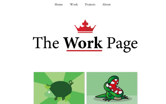
The work page for the website
The continuation of the website development of course continued this week, the main progress for this week was the work page being completed. The work page used the css grid to have a column going down the middle of the page that consisted of two rows, the title replicates the main logo with the crown and the buttons don’t move from their original positions. The code for the columns was just repeated to have multiple of them but most of the code follows the main page code. For the grid auto fill was used to make the most of the space with a grid gap of 20px.


0 notes
Text
Best WordPress Minimalist Themes TopNotch Themes | Templified
New Post has been published on https://templified.com/minimalist-wordpress-themes/
Best WordPress Minimalist Themes TopNotch Themes
Amadeus
Theme Isle’s Amadeus Pro WP theme allows your blog to be compatible with all major internet browsers, be it on desktop or mobile. This is important so that your readers can access your work from anywhere and from any time they wish. This also makes it easy for you to make your own posts since you do not have to worry about formatting.
The other main features of Amadeus Pro are simplicity and style. For the former, you can edit the theme’s code easily and with no problem since it was written neatly and efficiently. You also don’t have to worry about widgets and other add-ins. The relevant sliders are already incorporated into the theme. For the latter, you can customize the theme depending on your taste. There is an unlimited amount of possible colors, or you can pick out ready-made color schemes. The theme makes sure that your blog always looks at its best according to the owner’s discretion.
DemoMore Information Get Hosting
Cre8or
Cre8or is a simple, clean, fast loading theme with a beautiful grid layout style. Create amazing stuff with style, energy and fun. That’s what Cre8or is all about.
Tesla Themes has crafted another awesome theme for WordPress, this one is called Cre8or. This minimalist portfolio template is full of white space. (Is that actually possible?) Cre8or is a portfolio theme that’s got tons of features and allows display of your products and projects in a professional grid layout that’s as impressive to look at as it is easy to use. Tesla Themes is rightly proud of this template and this is what they have to say about what Cre8or has to offer creatives of all kinds.
Creative and fun, Cre8or has five different post styles to choose from, each one highlighting your content in a slightly different way. Cre8or makes sure whatever you want, you can have it. Within reason, of course. Cre8or makes it very simple to adjust colors and fonts, providing the fabric of a website that you can really adapt and mold to what you envision.
Are you currently in the outsourcing business? Cre8or is a portfolio WordPress theme, which allows users to show their work at a gorgeous layout online. By building a site with Cre8or, you’ll have a private space which you can design based on your intended customers’ tastes. It’s perfect for businesses that have visually appealing products like bakeries, photography studios and site design. Because it is 100% responsive, you can easily show it to customers using your telephone or your tablet computer during encounters. Prospective customers looking at your site will not have any trouble viewing your page since it’s intended to operate with any browser. The theme designers out of Tesla Themes also made certain that the theme is optimized to load quickly even with slow connection speed.
Upon activation, the theme produces a theme options part in your WordPress sidebar so you just have to go to one place for all of the theme attributes. You can begin by selecting from the five available portfolio layouts. In these layouts, your clients will instantly find the images and videos that you share in your website. The attention to detail inside this theme can be seen in the innovative but fast loading animation features. Every page transition, by way of example, is revived to create your site more memorable. Clients looking for creative forms will certainly enjoy their experience in the website. All of the customization you want are accessible from the themes choices. The theme designers also included an visual composer for those that don’t want to get HTML codes. Whatever you share in your portfolio could be shared to your various social media accounts since the theme is incorporated with social networking sharing.
DemoMore Information Get Hosting
Milo
This is Milo, a simple minimalist WordPress theme for blogs and portfolios, it’s a professional grade theme with clean code, a beautiful left hand menu and great typography. I think you’ll find it has enough features to keep you happily blogging for years, since the code is crystal clear, bug-free and it helps your site to load quickly, even if you have sizable images. If you’d like to see more minimalist themes, check out our big collection. You’re nearly guaranteed to find something you really like.
The Milo WordPress portfolio theme gives you a convenient, minimalist and simple WordPress framework, as well as an elegant layout, for either people or companies who want to create a simple, mdoern and easily accessible website to build a business. This theme most definitely powerful for people that want to showcase a graphic work portfolio of their photographic work to shoppers or individuals, because the simple and minimal style doesn’t get in the way of the content. That’s exactly as it should be. No matter how sizable or little the completed website is, Milo gives the flexibility, utility and versatility to manage it. Easily adjust any setting you can imagine, from colors to typography. The flexibility is there to create the site you have in mind.
All aspects of this amazing, responsive theme concentrates on displaying skills and your outstanding skills and if you’re curious about starting a website that has the ability to sell products on-line, the WooCommerce integration gives you a massive headstart to doing just that. WooCommerce is simple to set up and it’s practically infinitely extendable with a ton of add-on modules to help make it even more powerful. Digital products, brick and mortal style products, it doesn’t matter. Either will fly off the shelves with Milo.
DemoMore Information Get Hosting
No Sidebar Pro
If you want to remove everything possible to help keep your website slim and trim, who not consider removing the sidebar entirely? I mean, that’s one option for sure. This theme, creatively named ‘No Sidebar Pro’ has done just that and I think it results in an incredibly clean, simple and easy to manage website. It doesn’t hurt that this theme is a Genesis Framework child theme, which makes it one of the fastest loading themes around. This theme has removed everything that wasn’t absolutely essential to the success of the theme and this is the result, a professional and minimalist design that’s got plenty of features left to make it a great choice for all kinds of bloggers and businesses alike.
DemoMore Information Get Hosting
Monochrome Pro
Monochrome Pro is a true, simple Masterpiece. This theme, built on the Genesis framework, give you an incredibly simple looking platform for any sort of written and visual content. Monochrome Pro uses a clean, black and white color scheme to really focus your readers attention on what it is that you put on the page. Created by studiopress, this is a substantial but simple template, it has an incredibly sleep design with lots of white space and an Easy-to-Read typography set up. This is a visually strong theme, giving you an amazing online presents and an easy to use and easy to customized back end. There are plenty of theme options to choose from, getting started with this theme is fast and easy, the header is completely customizable, there are four different widget areas to add custom features to your site, monochrome Pro is eCommerce ready and mobile friendly as well. This theme really does seem to be the total package, ideal for any sort of blog or online
DemoMore Information Get Hosting
Monument Valley
Here we go, this is Monument Valley, an incredibly simple, beginner friendly WordPress theme that offers bigtime features, a GPL license and tons of simple to use tools to help make your website look and feel just like you want it to be. This theme was coded to conform perfectly to the WordPress.org codex, following all of the latest best practices. That can help it to feel familiar and highly usable. It also does a great job of SEO, which isn’t surprising, because this theme is fast loading and lightweight. With Monument Valley, you’ll have the ability to use any of the popular drag and drop page builders to help extend your website’s flexibility. No coding is required when using any of these drag and drop page builders, they’re very intuitive to use and make it fun to make your website. There are multiple demos, video support and plenty more. Well with checking out this simple, functional theme.
Demo More Information Get Hosting
Maav
For agencies and creatives who want a super-simple way to present all of their creative work, a modern and minimalist platform for expressing that inner creativity, allowing said creative work to burst forth to the world, impressing everyone who lays eyes on those incredible creations, Maav might be a great choice. This unique theme has it all, from ease of use to a massive amount of flexibility and I know a lot of folks really love it. In fact, Maav has a perfect 5.0 rating on ThemeForest at the moment, though that could change at any moment.
Made by mThemesNet, Maav is a totally unique theme, Maav is fun, Maav is great for all sorts of projects, creative and otherwise. I love the subtle curve to the front page image or video, it’s a nice little touch that helps differentiate the Maav theme from many others on the market. Not everybody will agree, but it does give the site a slight different look than many others out there.
Maav offers one click setup, so you can begin the process of customization within moments of installing the theme. There are three basic home layouts included, a minimal portfolio, a video header design and a basic agency site. All three are outstanding ways to get your creative works out there for the world to enjoy. There’s even a page builder to add tons of flexibility to your design layouts. So whatever your website’s needs, they’re sure to be addressed by Maav.
Demo More Information Get Hosting
Simply Pro
Simple clean WordPress themes like Simply Pro won’t overshadow your posts or pages. The style is beautiful and understated. Simply Pro is a modern, minimalist and attractive WordPress theme, great for bloggers and with the kind of simple, clean and crisp design that Simply Pro provides, your content will look amazing. What should you look for in a great minimalist WordPress theme? Design is certainly one. And since Simply Pro has some of the best design around, your posts, your images, they’re going to look absolutely amazing. Simply Pro isn’t just a pretty face, this Genesis Framework child theme makes your site work perfectly on all devices with fluid, mobile ready and responsive layouts that are constantly updated to work with the latest and greatest version of WordPress. That’s one of the real advantages of a Genesis child theme, the fact that it will never fall behind the constant updates to WordPress. Always a good idea. Simply Pro is one of my favorite Genesis child themes, because it’s so minimalist and yet, the style is a little different than many other themes. It’s a nice combo.
Simply Pro is also a theme with just a hint of bold, feminine style. you may be interested in these great feminine WordPress themes. Simply Pro is a modern theme for bloggers who want a trendy and attractive, powerful and simple to use theme. With Simply Pro, you get a minimal style for your blog, the content is practically going to jump off the screen. Colors and fonts can be switched out with ease and the Genesis framework is what powers this theme, so it’s rock steady and stable, not to mention perfectly responsive.
Demo More Information Get Hosting
Dorsey
Dorsey is one of the best minimalist WordPress themes around today, simple and easy to use. Why should you pick a simple WordPress theme like Dorsey here? Well, if you aim to offer up the cleanest reading experience around, you could do a lot worse than a slick, simple, clean and crystal clear theme like this one. The best WordPress minimalist themes all have a few things in common, beautiful, clean layouts with plenty of white space and not a lot of extra embellishments in the design. Dorsey is no exception. This WooCommerce ready blog and portfolio theme is bursting with simple, easy to navigate content. Dorsey is very simple to set up, simple to customize and simple to use for both front and back end users. Everybody can be happy with that experience. Any kind of blog looks great on this responsive, retina ready theme and I think you’re going to love it. Dorsey may be pretty simple to look at, but it’s got a lot going for it. This WooCommerce ready theme is great for blogging as well as showcasing your portfolio, which is a nice combination if you want to sell some products on the side. Whether you’re selling digital downloads or tangible goods, Dorsey can help achieve a look you like with the features you need. The price is a little higher than some themes at $100, but if this theme has the look you want, I suppose it’s worth the price, considering how solid the support and features are.
Demo More Information Get Hosting
Mona
Mona is a lovely looking, simply designed women’s WordPress blog theme with very clean, attractive typography that’s going to really wow your audience and a lot of features that make it look different than other feminine WP templates. Whatever you’re blogging about, a mommy blog, women’s fashion, news or just your own personal experiences, Mona is a really slickly designed and popular theme for women. Friendly, fun and professional, that’s how I’d describe this theme. Mona is easy to customize, completely responsive and it’s even retina display ready, so you can rest assured that this theme will look fantastic on any size screen resolution or on any device. Cool! Mona includes 3 main layouts for your brand new front page. Two of these designs are grid layouts, and then there’s the design pictured above, the classic layout. I prefer that one, but the grid designs are cool too. If you’re a beginner, Mona is there for you. User experience and ease of use are at the forefront, so your personal blog page, magazine or online journal will look amazing with easy to customize style.
Demo More Information Get Hosting
Beautiful Pro
Beautiful Pro is a minimalist theme for writers of all kinds, travel and lifestyle, personal and professional. Beautiful Pro is a great looking, minimalist personal blog theme for WordPress, with ultra-clean lines, a well balanced layout and great typography. That’s undoubtedly going to make for a wonderful user experience and it’s going to help readers to engage with your content, no matter the subject matter and no matter whether it’s written material or images and videos. This gorgeous child theme for the Genesis Framework is ultimately flexible, you can add custom features to give it nearly any functionality that you want it to have. Responsive themes like Beautiful Pro make for great user experience on all devices too, since these responsive themes fluidly respond to the screen on which they’re being viewed. That’s nice. Oh yeah, since Genesis professional child themes are updated from the inside out, you’ll never have to worry about WordPress updates making your site look weird. It’s all taken care of without even thinking about it, which means you can spend a lot more time creating content for your site, which is what blogging is all about.
Beautiful Pro is a stylish and attractive blog theme with a great style, clean layout, attractive typography and more. With Beautiful Pro, you get a rock solid framework to build the kind of website that attracts tons of attention. There are no extra embellishments to get in the way, the bright and sparkling style is plenty to help draw attention to your posts and pages, the canvas that is created with Beautiful Pro alows you to build a wonderful site that looks and behaves the way you want it to.
Demo More Information Get Hosting
Eclecticon
All the modern features of WordPress but with a clean, simple style that doesn’t attract unwanted attention to your site’s design. Looking for a simple, minimal and modern WordPress theme with all the features of more intricately designed themes? Then have a look at Eclecticon, a blog theme from CSSIgniter. Eclecticon is a responsive theme that focuses the reader’s attention on your work, whether it’s images or blog posts, not on the theme’s design itself. That helps to make a great first impression. The Eclecticon theme has a minimalistic layout and it’s completely responsive, loads up lightning fast and it’s SEO optimized too. You’ll have complete control over all design aspects of your site with dozens of different options available in the theme customizer and it’s incredibly easy to use. For a minimalist portfolio, you should definitely consider Eclecticon.
Eclecticon is a thoughtfully designed, simple and modern looking WordPress blog and portfolio theme. Built by CSSIgniter, this theme offers a bold black and white palette with clean navigation that really makes a wonderful first impression on your potential clients. The design, which is minimal in style, leaves the focus squarely on your images and text, so your viewers will really know what your site is about the first time they set eyes on it. The elements in this theme let the images and typography speak for themselves and as a responsive theme, it loads quickly and looks fantastic on each and every device we tried it on. CSSIgniter is known for their SEO optimized templates and this one is no exception. You have ultimate control over tweaking this theme to look exactly how you want it to look, with a lot of options for beginners and advanced users alike.
Demo More Information Get Hosting
Hardy
This simple, clean one column WordPress theme has a style that doesn’t distract from your posts and pages, which is what minimalist design is all about. This is Hardy, from ThemeTrust, and it’s one of my favorite one column themes around. Simple doesn’t mean this theme scrimps on features though, it’s easy to create a website that looks precisely like you want it to look. For blogs or portfolios, this one is a real winner. If you’d like a bigger selection of personal WordPress blog themes, check out our full collection.
Demo More Information Get Hosting
Ariva
Ariva is a simple, modern text based theme that’s just come on the market and I thought I’d pop it into our collection here. While I’m not sure it’s completely minimal in style, a lot of people have asked me about text based ‘typography driven’ themes and so, here’s a great example of that. Why do I say it’s not truly minimalist? Well, it’s got a little hint of a shadow behind the text, which means it’s more of a material design theme. (A full collection of those can be found here.) Either way, Ariva is a theme with over a hundred different layouts included, there are nine featured sections, half a dozen simple header styles, and seven post layouts. That gives you a lot of flexibility in designing your website. Fast, fast, fast, that’s one of the benefits of a text based theme but it’s true that it won’t work for everyone out there. Simple, stylish and professional, what more could you want?
Demo More Information Get Hosting
Flexible
A theme that is perfect for minimalists, Flexible is filled with the kind of features that you need to help your readers get to know more about your brand while still being able to protect your business. With a fully responsive design that works for both web and mobile browsers, it allows you to design your site with CSS and HTML without the fear that it wouldn’t look right in certain browsers or so. More so, Flexible also has the ePanel options panel that gives you better control of your website—or even websites, if you need more than one, and this would automatically appear once you decide to use this theme.
Flexible also offers various page templates that you can use to customize your website, examples of which are contacts, blog page, search page, sitemap, and the like. It also has built-in shortcodes that you can use to customize your site even if you are not knowledgeable in code! Plus, with complete localization, an easy-to-sort Ajax gallery, and unparalleled support—plus free access to updates, this theme has everything you need to complete your site and make it work. If simplicity and manageability are your priorities, then Flexible is the theme for you to try!
Demo More Information Get Hosting
Minicon
Minicon is a clean, basic and simple WordPress theme that is a creative solution to the problem of finding a theme that perfectly blends form and function. Minicon is a creative theme with single page and multipage layouts available to you. With this theme, you can rapidly set up a fantastic homepage for creative agencies, studios, portfolios and other sorts of creative sites. Minicon was coded with the absolute freshest Bootstrap code for fast loading times and great display on all browsers and all screen sizes. Minicon is simple to use and simple to customize.
Demo More Information Get Hosting
Base
Base is a WordPress theme that is minimal in design, meaning the content is what matters most, the actual styling of the theme is quite simple and to the point. But that simple, modern style has a very important purpose, to make sure your readers are able to full concentrate on your content without distractions. That makes it easy for you to blog about what you want to and give a wonderful first impression on every single page or post on your site. Base includes an application Framework, a powerful and robust theme options framework and a boatload of options to help you customize your website.
Base is responsive, meaning it looks amazing on each and every device it was tested on, the images and layout seamlessly adapt to the screen size of your reader. That’s a nice effect and it’s almost mandatory to offer these days, with the prevalence of handheld devices like iPhones and Androids. Responsive websites tend to outrank similar sites that only offer fixed width layouts, all other factors being equal, so if you switch to a responsive them, you may actually see a ranking increase. Custom widget areas, post formats and simply customized headers, text blocks, backgrounds and more, mean this theme is simple to use, powerful enough for any application and a smart way to help grow your business online.
Base was designed to be simple to customize via the use of child themes, so it will look incredible even if WordPress decides to change their code, it won’t break your site. That’s a wonderful features to help give you peace of mind. All in all, Base is a great theme to use if you value creative flexibility and a wide range of easily customized features.
DemoMore Information Get Hosting
Tabor
Tabor is a WordPress theme that pushes the envelope of minimalism with it’s design. This theme is absolutely stripped of anything that isn’t completely essential to running a blog. You’ll find absolutely no fat in this theme and the typography and images really pop because of that. Tabor is a theme built for content marketers, for professional writers and bloggers. This theme supports all the makor plugins you might want to use to help drive traffic to your site, plugins like Yoast, Schema, OptinMonster and lots more. Tabor is a Gutenberg friendly theme too, so you can make use of the latest tools for editing your posts, making sure the layout and content is exactly as you want it to be. Rich Tabor, the designer behind this theme, decided to get ahead of the curve and make this theme perfectly, 100% ready to support the WordPress block editor. It’s the wave of the future. As Rich Tabor says in the description, with Tabor and Gutenberg, WordPress is finally fun again.
DemoMore Information Get Hosting
Marcell
Marcell is a clean and minimalist WordPress theme that is great for personal blogs and online magazines using WordPress. It should not be confused with Marcel the monkey from the television show Friends. Remember that cute little guy, ah, so cute. I was actually never much of a fan of Friends, I was more of a Seinfeld guy myself, but I can see why people enjoyed it. It was sort of the first Gen-X sitcom to come around and some of the characters were funny at times. But, whatever, I’m getting sidetracked when I should be telling you about this clean and simple WordPress theme.
Let’s take a look at one of the home pages for Marcell. Oh, before I forget, I’ve been using a really cool website to build these preview images, it’s called browserframe.com, and it allows you to upload a little screencap and it automatically puts the browser frame image around it. I think it’s a cool look, what do you think? Hopefully it’s adding a little bit of extra value to each of these posts that I am creating.
Hey, why not, here’s one more look at one of the 20 different unique homepage demo styles that are included with your download. You get all of this for a low introductory rate of $29. I think Theme Rex will probably up that price relatively quickly, but if you get it right away, you could get a premium theme for probably under under half of what it will end up costing down the road. The look, it sort of reminds me of Medium.com, don’t you think?
This theme has an ultra fast load time, thanks to its clean design and lightweight code. I’ve already shown you a handful of the 20 different design styles that are possible with Marcell, and each one of them can be installed with just a single click. You can import demo data and have your site set up almost immediately. It’s a real time-saver and it’s really helpful to know precisely what you’re going to get for your website. Sometimes, themes are more difficult to set up and customize to look like you wanted to look, so it’s really nice when I seen offers that feature.
Marcell gives you the ability to set up an online shop and sell products with WooCommerce, that’s perhaps not necessary for all personal blog or lifestyle blog sites, but if you want to sell stuff, it certainly future you’re going to need. I mean, that makes sense, right?
If you’d like to take a look at more options for building a classic personal blog website, or full theme collection is a great resource to help save you time and energy. We’ve added dozens of the finest WordPress themes that we could find and hopefully you find one in that collection that works perfectly for you. I’m not going to add this theme to that collection just yet, but I am going to keep my eye on it, because I think that it is a great looking minimalist blog. As the steam accrues more reviews, I may take a second look at it and add to the collection. Considering the fact that it was only updated in September of 2018, it just hasn’t had enough time to proved itself to be a very high quality and popular, not to mention well-reviewed, WordPress template.
I just went back and looked at Marcel, it’s still rated absolutely perfect with over 100 sales. Great work by the developer.
DemoMore Information Get Hosting
Nouveau
Most modern companies, if they’ve got a level of taste, are going to truly appreciate the flexibility and elegant sophistication or the minimal, modern, sleek and stylized Nouveau WordPress theme, which is one of the best designed simple theme we’ve seen in quite some time. What makes it so great, you ask? Well, the responsive, Retina display for graphics is a start, this theme looks incredible on each and every device we’ve tried it on.
Simply stunning in resolution, Nouveau is a really nice take on a traditional blog theme, with bold parallax style. Simple enough that you get the point across, just enough style to look incredible to a wide audience. This theme fits so many niches, activities, genres, industries and hobbies, it’s a wonderful solution to a wide range of problems. With stylish retina-ready visual capabilities and a vast multitude of structured, well designed layouts, Nouveau can certainly be counted on to work for a wide variety of uses. Creative professionals, from graphic artists to photographers and even interior designers or fashion designers will find a lot of utility in this theme. It’s a fully responsive theme, page creation is snappy and fun, since the interface is totally intuitive. Have a header only layout, if that’s what you want.
Or, put the menu on the left side for highlighting your content with a little bit of spice. The structure of the individual pages can be rapidly edited and you don’t have to have a degree from ITT Tech to make that happen. Thank goodness, right? Non-developers rejoice! The responsive design that Nouveau offers, the popular color schemes and layouts, the perfect looking theme, the high class features…these things and more are what set Nouveau apart and what makes it such a fantastic theme. Create a website that defines you and defines your career.
WordPress Gallery Themes, Image Galleries for Photos
Demo Get Hosting
Zoa
This gorgeous WordPress team is called Zoa. So it was built with the elementary page builder plug-in and it’s a modern and minimalist eCommerce name that’s great for clothing stores for men and women, furniture stores, watch shops, jewelry stores, handbags, accessories and probably plenty more too.
Zoa Works hand-in-hand with WooCommerce as well as it’s many plugins and built-in features, so provides a mini cart, custom widgets, unattractive slider and smooth transition effects. There are unlimited color schemes, a menu with multiple columns Styles and plenty of widgets with Advanced features two. You can control the same and customize it anyway you want, making your store user-friendly for all. For more WordPress WooCommerce themes, check this collection out.
Zoa has a very clean, flat and minimalist Style. That makes your products look great. With Zoa’s SEO optimization, your website loads fast and looks great on all devices thanks to a fluid and responsive design. If you never use the Elementor page builder it’s definitely one of the best out there. There’s almost no layout you can imagine that you can’t create with ease. This flat, minimal Shop theme is certainly one of the best come along in 2018.
This men’s shop demo looks great, I love a flat, simple and clean look. This theme looks to really open up the possibilities for branding.
And this is the basic, flat shop that first attracted me to this theme. I think it’s one of the best I’ve seen in 2018.
Zoa is completely responsive, WPML ready, has extensive documentation and is very well supported by the themes developer. You can build any sort of website thanks to the Elementor page builder. With regard to the shop you get a built-in quick view feature, color and image swatches are built-in, there are different product Styles, there multiple shop cat categories and layouts. All Things Considered this is definitely one of the best eCommerce WordPress themes around.
DemoMore Information Get Hosting
0 notes
Text
Web Design Inspiration 2017
Out with the old and in with the new – Web Design Inspiration 2017!
If you’ve been following this blog for any number of posts (or years) it’s often about web design inspiration, but time slows for no man, and this web design inspiration 2017 list is intended to get the juices flowing for what will be your best year yet in your digital marketing efforts!
Some web design inspiration 2017 elements that might work their way into your designs?
Full width photographic elements with angles for transitions to flat color sections (see the first site for an example)
Angles in general on the full-width elements
Gold on dark, and gold on white
Transparent boxy elements overlayed on photos (see the second site for an example)
Incredible attention to typography (Make them say this type is “so considered!”)
Mauna Kea – Adventure Sports
This page has mostly cold yet vivid colors give the website a peaceful feeling. The only really warm color in the website is the red of the woman’s jacket. This demonstrates that she must be an important figure, and makes her a focal point. Although the website is pushing the boundaries when it comes to design, the navigation is standard which makes the website user friendly. The menu’s small text buttons, separated by the logo in the center provide a great sense of balance.
The alternation from dark backgrounds to light (white) backgrounds combined with the use of diagonals (as opposed to straight, horizontal lines) give it a unique look. The website is definitely not “static”. The use of the diagonals definitely lead your eyes around the page. There is a lot of negative space used in the design, preventing it from appearing cluttered or overly busy. The fonts and colors used make the text very legible. The overall minimal layout of this website makes it visually pleasing and emphasizes the importance of the content within the page.
Kiko Miuhara
The soft shades of primary colors behind the grayscale images really makes them stand out. The distribution of color is attention grabbing, but doesn’t draw you away from the text completely. A standard sans serif font is used which makes the text very readable. The placement of the type is spaced out nicely, surrounded by a good amount of white space, so it doesn’t look cluttered. The menu at the top left of the page is standard making the navigation process easy. The alteration of shapes on one side with text on the other keep your eyes moving around.
The sites header is quite large, making it the main area of focus, which isn’t necessarily a bad thing. The letters “K” and “M” in the header stand out the most because they are the only areas that are colored. The emphasis on the models initials may be important I suppose, and the color used does make this an interesting design element. One thing I don’t understand is whether the colored “K” or sideways “M” at the top or the “K” or upside down “M” at the bottom are all logos. I think she needs to find a logo and stick to it. In this website I’m seeing three, maybe four different logos. The footer could use some work too. It just repeats the letters and is tiny compared to the massive header. And the Chinese text in the footer is a bit confusing too?
Acolytes
Okay, I’ll admit that I have no idea what this webpage says, but the layout looks very nice to me. I like the alteration from text on left and picture on right to text on right and picture on left. It forces your eyes to move throughout the page. Assuming that the images aren’t totally unrelated to the sections, they work well. The subtle gray to white gradient backgrounds look good with the black text. They chose a light enough gray for the text to remain readable.
The large, bold headers for each section are positioned well and I like the Sans Serif font they chose because it doesn’t look too spread out or condensed (proper kerning). Bold subheads are good, but what I don’t like is that all of the text (apart from the headers) is italicized. In my opinion, italicized type should not be used for an entire body of text. Italic type is generally used to call attention to a specific area of text or emphasize certain words. Overall I feel that it is a nice site though. There is plenty of white space or “negative space” which prevents the site from looking cluttered or overwhelming. The amount of content within the site is enough to inform without making the viewer feel like they are reading a novel.
Next Digital Filmmaker
Ok, just by coincidence I stumbled upon another non-english page, well, mostly non-english. The site looks pretty sharp at first glance. I like the soft pastel colors they chose. They used interesting photographs which are laid out well.
Now let’s talk about the text a bit. The font is very readable, but I feel like the placement of the text is very “scattered” and inconsistent. I’m also not a big fan of centered text, unless there is a good reason for it to be centered. All of the bodies of text on this page are centered for no apparent reason. Just keep it left aligned unless there is a good reason not to! Centering all of your test makes it look awkward and in my opinion, shitty.
As far as areas of color, whitespace and images, I’ll give this site a thumbs up. But the arrangement of text gets a thumbs down. And where the fuck is the navigation? Are those boxed in words buttons? I would have to drag my mouse around waiting for the cursor to become a hand in order to find links, or, maybe there aren’t any links… I don’t know, It’s in Spanish.
Salon Di Bellezza
This is an example of good web design. Beautiful Header image, clear navigation, great use of negative space, clearly defined sections, stunning images, nice fonts, great color choices, etc. Also, not an overwhelming amount of information which would clutter up the page and deter the viewer from wanting to read any of it. I don’t know about you, but if the amount of text looks like it would take more than about 45 seconds to read I’m like “Fuck this!”.
One thing I am usually not a fan of is centered text, but I can’t necessarily say that the centered text doesn’t work here. In this case there is very little text and each body of text is centered on the page. This keeps your eyes focused on the center of the page and not wondering all over the place. The entire design of this page is centered, so the centered text makes sense.
I like the fact that they have used large arrows as well as buttons in their galleries. There is definitely no confusion as to where the gallery is or whether there are galleries in the first place. The use of a thick black border (which also serves as the footer) keeps your attention on the page, not wandering to other areas on your screen. The grainy, tan background is soft and a nice change up from a standard white or black. The large angled text in each section of the page saves the viewer from any confusion as to where one section ends and the next begins. My one issue with this site is the huge map at the bottom. It definitely takes away from the beauty of the page as a whole. But overall, I think this is a very nicely designed website. Way to keep it simple!
Ce Soir Restaurant
This website is kind of irritating me at the moment because it just made me realize how hungry I am. I want that asparagus! I want that egg! Very outstanding images which do exactly what they are intended to do I would assume, which is stimulate ones appetite. Like a lot of websites are, this website alternates images on the right and text on the left with images on the left and text on the right. The white painted brick background is a unique choice. I imagine the restaurant to be an upscale, health conscious type of joint, probably in a unique old building which has been renovated several times. But then again, I might be totally wrong, in which case it would be a misleading design element.
The headers for each body of text are large and bold which make it very readable. The bodies of text under the headers are definitely not easy to read though. The text is very small and the font does not work well, at least at that size. And like so many other sites, ALL of the text is centered. But the arrangement of the text is irrelevant if it can’t be read in the first place.
I also like the minimal use of the color pink in the site. It really emphasizes certain areas, including their logo. And finally, their logo… it it way to complicated and IT’S A FRIGGIN DEAR’S HEAD! Even if they happen to serve a lot of dishes containing venison, this logo is garbage. But I’m critiquing websites, not logos, so I’ll shut up now.
Vinto – Creative Portfolio
I like the use of repetition with the diamond shapes here. Black, white and red is a favorite minimal color scheme of mine. I don’t know how I feel about the color photo of the woman in the center of the page. I think that if she were in B&W as well, it would not only match the rest of the color scheme, but provide a “retro” sort of feel which might be cool. The white space used works well. It emphasizes what needs to be seen on the page. The subtle top, horizontal navigation looks nice and simple to navigate. It looks like there are two menus at the top though, one main navigation and one for areas of the portfolio. Perhaps the portfolio menu could be in the main navigation as a drop down or something… I just don’t know how I feel about the two navigation menus, both at the top of the page. And the contact area at the bottom of the page is HUGE! Perhaps it wouldn’t look as balanced if it were smaller. IDK, I’d have to see it I guess.
Uniq-X Unique Template Design
The images are the first thing I notice on this page. They are clear and colorful and look quite nice. The site looks very classy with the exception of the set of photos in the center (the creepy clown, the goat, etc…). It looks like a really nice, classy site with some kids shit thrown in the center. The pastel colors don’t seem to match the rest of the page. I think there would have been a better design solution for these images, rather that throwing them in the middle of the site (literally like half way down). And that clown… Ugh!!! It looks pretty psychotic. In my opinion it should go, or at least be replaced with an image of a more pleasant looking clown. The images combined with the text do a good job of leading the eyes from one element to the next. Got no issues with the standard, up top horizontal navigation. I prefer simplicity when it comes to navigation. There’s no reason to get experimental with menus. Keep it simple and user friendly, like this site does.
Disney’s Big Hero 6
Sweet anime! I like the distinct sections (4 of them) which make up the page. The colors are great and will definitely want to make kids check this out. The pages have a right hand navigation which may not be the easiest to follow, but I’m sure most of us could figure it out. I love the icon buttons for the galleries. I like what they have done with the scroll bars I think that’s what they are next to the bodies of text). I don’t see custom designed scroll bars too often, pretty cool. The white sans serif font is pretty legible and works well with the rest of the site. Nice futuristic look, but may be a bit complicated to navigate for the computer illiterate or young children. It is a fun website though which can be enjoyed by all ages. Good job Disney!
Carsonified
I love science, so I was drawn to this website right away. How can you not be with those sweet illustrations on super vivid colors? The dashed line with the scissors (to make it look like coupons) is an awesome idea. I haven’t seen that used yet, so to me it seems like a great original idea. Perfect, clear place for the navigation (upper right). The highlighting of the active ensures that one will always know where they are in the site. Getting lost in websites is a pain. If I have to use that default, browser back arrow the designer did something very wrong. But that’s not the case here. This website is successful on many levels – visually, functionally, legibly… And there is enough negative space to prevent it from looking cluttered. It is a very fun website, but doesn’t lack a seriousness when it comes to promoting their business.
We hope you enjoyed this “Web design Inspiration 2017″ collection – and I don’t want you to flit off unless you’ve seen some other places we like to get inspired for web design projects.
Consider tapping these web design inspiration resources as well!
Dribbble
Behance
Pinterest
Muzli – Chrome Extension
The number one thing I’d think about is that ‘nothing is original!’ so take elements that inspire you and apply them to anything you’re making. The number one most important thing is that the design does it’s job! Whether it be selling a product, an idea, or a cause.
The distinction between art – and design is the function of design is not merely intended to entertain, or stimulate. The function of design is to accomplish some specific goal or end. If you create a beautiful and stimulating visual piece that accomplishes no other goal than to be beautiful to look at, it’s still wonderful – but it’s more art than design. That doesn’t mean there aren’t artistic elements in design – and these pieces curated prove that!
The post Web Design Inspiration 2017 appeared first on Tim Brown.
from Web Design Inspiration 2017
0 notes
Text
Best Simple WordPress Themes
New Post has been published on https://www.templified.com/best-simple-wordpress-themes/
Best Simple WordPress Themes
Simple can be better. At least when it comes to websites, a minimalist design might be exactly what your site needs to really draw in traffic and help keep them engaged. Simple, minimal, modern and straightforward designs allow your content to shine through. Whether you’re a blogger, a photographer, designer or a business, you can benefit from a simple web design that puts your content at the center of attention. For some more specifics, we’ve built a collection of minimalist blog themes and another for minimal style portfolio themes too.
We’re really into minimalist WordPress themes, because they’re a fantastic way to create a bold, exciting and engaging website, without a lot of extra onscreen junk that distracts from the content. And content is what it’s all about so a minimal theme works wonders to frame your content and show it in the best possible light.
For many, a minimalist design might be precisely what you need to really draw in traffic and help keep them engaged, since the content is always the star of the show.
When it comes to web design, simple, minimal, modern and straightforward designs allow your content to shine through. If you’re a photographer, a blogger, you run your own business or maybe you’re a freelancer, anyone can benefit from a simple web design that puts your content at forefront of your site. Oh, minimal themes also help with loading speeds, since the site only loads up what is absolutely necessary, which can actually help your site rank a little better. This list of minimalist WordPress themes is constantly being updated and upgraded so check back often.
So, here we go, the best minimal WordPress themes around.
Monument Valley
This attractive, reliable, versatile, very easy to use and trendy theme makes it possible to build your business, manage shipping and your stock, sell existing products, communicate with customers and advertise new products and a lot more. WordPress is an effective way to start an online business, even if you’re not a professional in coding, since it will be very easily altered to accommodate your needs. This striking style looks extraordinary on each and every device since it’s coded to be responsive. When you happen to be developing a web based business, clients are obviously vitally important and permitting them to access your site everywhere at any time is very important.
Demo More Information Get Hosting
Awesome
The main goal of Graph Paper Press’ Awesome Theme is to create a minimalist website while still preserving the essential features needed to best showcase an artist’s portfolio. The Awesome Theme may suit photographers, videographers, illustrators, painters, graphic artists, and designers.
With the Awesome Theme, you are greeted with an uncluttered homepage that you can customize to your heart’s content. Each theme option have corresponding backend (or dashboard) options where you can add, change, or remove headers, menus, texts, backgrounds, and other design themes. The theme also boasts unlimited color options that you can mix and match depending on your site’s design. The theme’s main advantage is its built-in Slideshow feature where you can add on the homepage or on its own page.
The Awesome Theme supports various posting formats and makes it easier to post images and videos in their own galleries. Audio, links, and quote formats are also supported by the Awesome Theme.
Widgets for subscription forms, contact forms, images, blocks of texts, and other pieces of code can also be added on any area of your webpage running the Awesome Theme. As with all themes created by Graph Paper Press, the Awesome Theme has a mobile-friendly design, includes automatic updates for all active members, includes translation-ready .mo and .po files, and comes with html5 markup codes.
Demo More Information Get Hosting
Underwood
Simple, modern, minimalist, those are three words I’d use to describe Underwood, a wonderful personal blog and WooCommerce theme from ThemeShift. ThemeShift is known for well designed themes based on Bootstrap and Underwood absolutely knocks it out of the park. The design is simple and effective, easy to use and flexible, modern and classic at the same time. The support, documentation and code is absolutely top notch, which means you won’t run into problems integrating new features or while customizing your website. With Underwood, you can create a website that looks just like you imagined and if you want a simple, classical looking theme that puts all the focus and attention on your content, this minimalist WordPress theme could be just what you’ve been searching for.
Underwood is a simple, clean and minimalist WordPress blog theme by ThemeShift. I’ve reviewed a handful of their themes and I really like their designs, classic and simple but with enough style to make your content look fresh. Incredibly versatile and well structured, bold and stylish, basic looking and powerful, that’s what Underwood brings to the table. The best minimal WordPress themes are a simple, fun and absolutely perfect way to get online with a WP webpage fast and that’s what Underwood aims to do. While any of these extraordinary top quality styles offer scores of advantages, I think Underwood does a particularly nice job of combining splendid support as you set the theme up, plain capability, first-rate style. Your business is extremely vital, your blog absolutely must be magnificent. Underwood is a WordPress minimalist theme that’s great for businesses, blogging or revealing your incredible portfolio.
Demo More Information Get Hosting
Collecto
Building a simple and attractive travel magazine theme? Want a minimalist option? Then consider Collecto. Collecto is a beautiful, simple, smart and minimal portfolio, blog and magazine theme for WordPress. This is something completely new and innovative, Collecto is a grid based newspaper inspired theme that is contemporary in style, yet timeless, since much of the design is so simple, it’s evocative of a previous time and place. With Collecto, the dynamic grid is constantly adapting to the length and order of your content, so it looks professional and elegant on every device, no matter the size and shape of your images or the length of your posts. You can even sticky posts on the front page, which causes them to take up two columns. It’s a great, simple and elegant way to highlight your most important or newest articles. For a minimalist theme, typography can be a very important consideration and Collecto offers over 800+ Google fonts, so you don’t have to settle for something that’s not quite right.
In the event that you’re setting up an uncomplicated and beautiful publication blog and you need to have a minimalist theme, you should think about the Collecto WordPress theme. Shaped by daily newspapers, Collecto is an avant-garde style for an incredibly old concept, a basic, professional and minimal style, remarkable typography and a flawless configuration that emphasizes your posts and offers it proficiently. It’s a timeless union and one that maybe you’ll cherish. With Collecto, you will get absolutely everything you might expect in a nice looking magazine theme, like responsive layout and extraordinary versatility in terms of colors and typography. In addition, you receive an absolutely nice function, the dynamic grid system, which makes Collecto kind of a full blown electronic magazine. It’s incredibly awesome to see that kind of thing.
If you’d like to see everything that Themes Kingdom has to offer, check out our review of the entire Themes Kingdom WordPress theme collection here.
Demo More Information Get Hosting
Simply Pro
Simple clean WordPress themes like Simply Pro won’t overshadow your posts or pages. The style is beautiful and understated. Simply Pro is a modern, minimalist and attractive WordPress theme, great for bloggers and with the kind of simple, clean and crisp design that Simply Pro provides, your content will look amazing. What should you look for in a great minimalist WordPress theme? Design is certainly one. And since Simply Pro has some of the best design around, your posts, your images, they’re going to look absolutely amazing. Simply Pro isn’t just a pretty face, this Genesis Framework child theme makes your site work perfectly on all devices with fluid, mobile ready and responsive layouts that are constantly updated to work with the latest and greatest version of WordPress. That’s one of the real advantages of a Genesis child theme, the fact that it will never fall behind the constant updates to WordPress. Always a good idea. Simply Pro is one of my favorite Genesis child themes, because it’s so minimalist and yet, the style is a little different than many other themes. It’s a nice combo.
Simply Pro is also a theme with just a hint of bold, feminine style. you may be interested in these great feminine WordPress themes. Simply Pro is a modern theme for bloggers who want a trendy and attractive, powerful and simple to use theme. With Simply Pro, you get a minimal style for your blog, the content is practically going to jump off the screen. Colors and fonts can be switched out with ease and the Genesis framework is what powers this theme, so it’s rock steady and stable, not to mention perfectly responsive.
Demo More Information Get Hosting
Dorsey
Dorsey is one of the best minimalist WordPress themes around today, simple and easy to use. Why should you pick a simple WordPress theme like Dorsey here? Well, if you aim to offer up the cleanest reading experience around, you could do a lot worse than a slick, simple, clean and crystal clear theme like this one. The best WordPress minimalist themes all have a few things in common, beautiful, clean layouts with plenty of white space and not a lot of extra embellishments in the design. Dorsey is no exception. This WooCommerce ready blog and portfolio theme is bursting with simple, easy to navigate content. Dorsey is very simple to set up, simple to customize and simple to use for both front and back end users. Everybody can be happy with that experience. Any kind of blog looks great on this responsive, retina ready theme and I think you’re going to love it. Dorsey may be pretty simple to look at, but it’s got a lot going for it. This WooCommerce ready theme is great for blogging as well as showcasing your portfolio, which is a nice combination if you want to sell some products on the side. Whether you’re selling digital downloads or tangible goods, Dorsey can help achieve a look you like with the features you need. The price is a little higher than some themes at $100, but if this theme has the look you want, I suppose it’s worth the price, considering how solid the support and features are.
Demo More Information Get Hosting
Mona
Mona is a lovely looking, simply designed women’s WordPress blog theme with very clean, attractive typography that’s going to really wow your audience and a lot of features that make it look different than other feminine WP templates. Whatever you’re blogging about, a mommy blog, women’s fashion, news or just your own personal experiences, Mona is a really slickly designed and popular theme for women. Friendly, fun and professional, that’s how I’d describe this theme. Mona is easy to customize, completely responsive and it’s even retina display ready, so you can rest assured that this theme will look fantastic on any size screen resolution or on any device. Cool! Mona includes 3 main layouts for your brand new front page. Two of these designs are grid layouts, and then there’s the design pictured above, the classic layout. I prefer that one, but the grid designs are cool too. If you’re a beginner, Mona is there for you. User experience and ease of use are at the forefront, so your personal blog page, magazine or online journal will look amazing with easy to customize style.
Demo More Information Get Hosting
Beautiful Pro
Beautiful Pro is a minimalist theme for writers of all kinds, travel and lifestyle, personal and professional. Beautiful Pro is a great looking, minimalist personal blog theme for WordPress, with ultra-clean lines, a well balanced layout and great typography. That’s undoubtedly going to make for a wonderful user experience and it’s going to help readers to engage with your content, no matter the subject matter and no matter whether it’s written material or images and videos. This gorgeous child theme for the Genesis Framework is ultimately flexible, you can add custom features to give it nearly any functionality that you want it to have. Responsive themes like Beautiful Pro make for great user experience on all devices too, since these responsive themes fluidly respond to the screen on which they’re being viewed. That’s nice. Oh yeah, since Genesis professional child themes are updated from the inside out, you’ll never have to worry about WordPress updates making your site look weird. It’s all taken care of without even thinking about it, which means you can spend a lot more time creating content for your site, which is what blogging is all about.
Beautiful Pro is a stylish and attractive blog theme with a great style, clean layout, attractive typography and more. With Beautiful Pro, you get a rock solid framework to build the kind of website that attracts tons of attention. There are no extra embellishments to get in the way, the bright and sparkling style is plenty to help draw attention to your posts and pages, the canvas that is created with Beautiful Pro alows you to build a wonderful site that looks and behaves the way you want it to.
Demo More Information Get Hosting
Eclecticon
All the modern features of WordPress but with a clean, simple style that doesn’t attract unwanted attention to your site’s design. Looking for a simple, minimal and modern WordPress theme with all the features of more intricately designed themes? Then have a look at Eclecticon, a blog theme from CSSIgniter. Eclecticon is a responsive theme that focuses the reader’s attention on your work, whether it’s images or blog posts, not on the theme’s design itself. That helps to make a great first impression. The Eclecticon theme has a minimalistic layout and it’s completely responsive, loads up lightning fast and it’s SEO optimized too. You’ll have complete control over all design aspects of your site with dozens of different options available in the theme customizer and it’s incredibly easy to use. For a minimalist portfolio, you should definitely consider Eclecticon.
Eclecticon is a thoughtfully designed, simple and modern looking WordPress blog and portfolio theme. Built by CSSIgniter, this theme offers a bold black and white palette with clean navigation that really makes a wonderful first impression on your potential clients. The design, which is minimal in style, leaves the focus squarely on your images and text, so your viewers will really know what your site is about the first time they set eyes on it. The elements in this theme let the images and typography speak for themselves and as a responsive theme, it loads quickly and looks fantastic on each and every device we tried it on. CSSIgniter is known for their SEO optimized templates and this one is no exception. You have ultimate control over tweaking this theme to look exactly how you want it to look, with a lot of options for beginners and advanced users alike.
Demo More Information Get Hosting
Cre8or
Cre8or, by Tesla Themes, is a simple, minimal, clean and clear portfolio theme, ideal for just about any sort of project. With Visual Composer included, you’ll be able to craft a layout that perfectly fits your needs, assuming one of the five pre-made post layouts isn’t exactly what you need. Cre8or is optimized for fast page load times, offers built-in shortcodes, it updated frequently and also provides extensive documentation to help get you started. If you want a simple looking WordPress theme that’s easy to use but also incredibly flexible, this could be a perfect fit.
Tesla Themes has delivered another winning WordPress theme called Cre8or, a simple and beautiful portfolio theme that allows your content the right stage for a proper presentation. Cre8or is modern with amazing typography, it’s the right way to showcase any type of content, from personal projects to agency sites, videos or artistic collectives, this theme has what it takes to make your work look great on all devices. Blog and portfolio in one, this responsive theme has 5 different portfolio and single project layouts for maximizing your ability to create posts and projects that look just like you want them to look, with the types of features you need your projects to have.
DemoMore Information Get Hosting
Amadeus
Amadeus Pro is a wonderfully simple blogging theme for WordPress, it’s a great theme to get started with since it’s simple for beginners to get the hang of. (Of course, if you want a simple blog theme that also has the bonus of being free, you can try our Silverbow theme, and if you love what you see, you can download it absolutely free of cost. It’s a solid theme too!)
But this is about Amadeus Pro, which is made by ThemeIsle. This premium offering has a simple, typography centric design, one that makes your images look fantastic and helps market your ideas. It’s a really strong all around blogging theme.
Amadeus is a clean, minimalist blog theme from ThemeIsle, who happen to be among my favorite theme developers. Why do I like them so much? Well, their themes are well designed with clean, perfectly validated code. If you’re going to start anywhere, start with the code. The design, the layout, that kind of stuff is easy to change, but a problem with the original code, that can stick with you. In the case of Amadeus, you’ve got nothing to worry about, it’s perfectly coded for fast loading times and perfect display on all devices. So, as for customization, Amadeus makes it very simple to adjust the look of your website. From colors to fonts, social media integration and even the basic layout, it’s all there in your theme options panel. Localization, custom theme widgets, browser compatibility, ThemeIsle has thought of everything. For all your minimalist needs, Amadeus is one to consider for sure.
More great blog themes can be found here.
Demo More Information Get Hosting
Hardy
This simple, clean one column WordPress theme has a style that doesn’t distract from your posts and pages, which is what minimalist design is all about. This is Hardy, from ThemeTrust, and it’s one of my favorite one column themes around. Simple doesn’t mean this theme scrimps on features though, it’s easy to create a website that looks precisely like you want it to look. For blogs or portfolios, this one is a real winner. If you’d like a bigger selection of personal WordPress blog themes, check out our full collection.
Demo More Information Get Hosting
Ariva
Ariva is a simple, modern text based theme that’s just come on the market and I thought I’d pop it into our collection here. While I’m not sure it’s completely minimal in style, a lot of people have asked me about text based ‘typography driven’ themes and so, here’s a great example of that. Why do I say it’s not truly minimalist? Well, it’s got a little hint of a shadow behind the text, which means it’s more of a material design theme. (A full collection of those can be found here.) Either way, Ariva is a theme with over a hundred different layouts included, there are nine featured sections, half a dozen simple header styles, and seven post layouts. That gives you a lot of flexibility in designing your website. Fast, fast, fast, that’s one of the benefits of a text based theme but it’s true that it won’t work for everyone out there. Simple, stylish and professional, what more could you want?
Demo More Information Get Hosting
Flexible WordPress Portfolio Theme
A theme that is perfect for minimalists, Flexible is filled with the kind of features that you need to help your readers get to know more about your brand while still being able to protect your business. With a fully responsive design that works for both web and mobile browsers, it allows you to design your site with CSS and HTML without the fear that it wouldn’t look right in certain browsers or so. More so, Flexible also has the ePanel options panel that gives you better control of your website—or even websites, if you need more than one, and this would automatically appear once you decide to use this theme.
Flexible also offers various page templates that you can use to customize your website, examples of which are contacts, blog page, search page, sitemap, and the like. It also has built-in shortcodes that you can use to customize your site even if you are not knowledgeable in code! Plus, with complete localization, an easy-to-sort Ajax gallery, and unparalleled support—plus free access to updates, this theme has everything you need to complete your site and make it work. If simplicity and manageability are your priorities, then Flexible is the theme for you to try!
Demo More Information Get Hosting
Minicon
Minicon is a clean, basic and simple WordPress theme that is a creative solution to the problem of finding a theme that perfectly blends form and function. Minicon is a creative theme with single page and multipage layouts available to you. With this theme, you can rapidly set up a fantastic homepage for creative agencies, studios, portfolios and other sorts of creative sites. Minicon was coded with the absolute freshest Bootstrap code for fast loading times and great display on all browsers and all screen sizes. Minicon is simple to use and simple to customize.
Demo More Information Get Hosting
Base
Base is a WordPress theme that is minimal in design, meaning the content is what matters most, the actual styling of the theme is quite simple and to the point. But that simple, modern style has a very important purpose, to make sure your readers are able to full concentrate on your content without distractions. That makes it easy for you to blog about what you want to and give a wonderful first impression on every single page or post on your site. Base includes an application Framework, a powerful and robust theme options framework and a boatload of options to help you customize your website.
Base is responsive, meaning it looks amazing on each and every device it was tested on, the images and layout seamlessly adapt to the screen size of your reader. That’s a nice effect and it’s almost mandatory to offer these days, with the prevalence of handheld devices like iPhones and Androids. Responsive websites tend to outrank similar sites that only offer fixed width layouts, all other factors being equal, so if you switch to a responsive them, you may actually see a ranking increase. Custom widget areas, post formats and simply customized headers, text blocks, backgrounds and more, mean this theme is simple to use, powerful enough for any application and a smart way to help grow your business online.
Base was designed to be simple to customize via the use of child themes, so it will look incredible even if WordPress decides to change their code, it won’t break your site. That’s a wonderful features to help give you peace of mind. All in all, Base is a great theme to use if you value creative flexibility and a wide range of easily customized features.
DemoMore Information Get Hosting
0 notes
Last Seen Blogs

andrew-aries-wallpapers
Wallpapers, fan arts

summerpaper
Summer Paper

theworldofmakebelieve
FREE PALESTINE

charlieisacastle
charlie

angryparadisecycle-blog
Sem título