#i don't know how to draw a car interior oops
Text
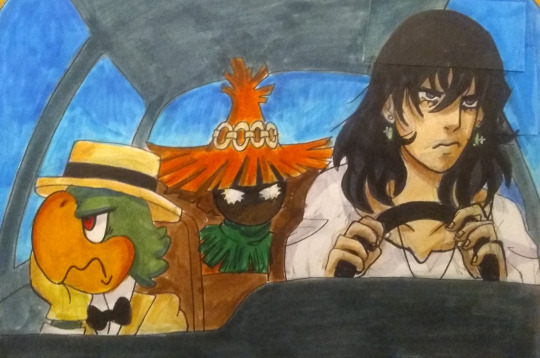
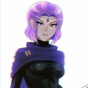
DREW THE THING! Howls' Moving Castle is dramatic, Three Caballeros is pure fun, and Majora's Mask is tragic- my favorite comfort things! And now my favorite characters are seething in a car together- fantastic.
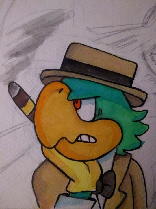
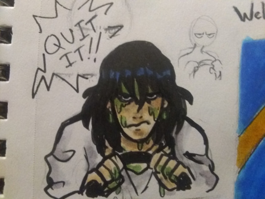
bonus things- i wanted to redraw it and watercolor but gave up- and slime time
#i don't know how to draw a car interior oops#also as much as i love howls moving castle i never draw anything for it too bad#Jose smoking in the car also makes it look like he's the one makin everyone maD AL;DJFAF DO THAT OUTSIDE DUDE#oogh i haven't posted art in months but I've been stockpiling disney art lately so mayhaps soon...#also sorry rock lee you're definitley a favorite character but when i'm sobbin i'm not hunting down your episodes#howl's moving castle#howl jenkins pendragon#jose carioca#three caballeros#skullkid#majora's mask
39 notes
·
View notes
Text
Artist’s Commentary
Rather than a new page this week, I will instead be reviewing and providing commentary for the previous 10 pages published. For the most part I will be going over my own mistakes, as well as explaining some of the choices made, and whether or not they worked. Before we start however, I would like to note these pages are not complete, but more of a rough draft. There are several reasons for this. One major reason, is that it has been several years since I have drawn with any regularity. Producing a page each week will, I hope, shake off the rust. Additionally, neither my or my brother's hardware is up to the task of rendering RFO. One day, RFO may see an updated version that better fits our mutual vision of this project. And so, the commentary begins. RFO 1 -Jude Anderson lives in a poor neighborhood; identical row houses with unkempt lawns and no decoration outside. -My first mistake was leaving the sky blank. Its meant to be near midnight, but the bright sky and lack of shading imply otherwise. -Jude's front door and the paneling on it will change in scale just about every panel. Partly, this is because there was no consistent model. -Jude's house -interior and exterior- were modeled in Lego Digital Designer. -Jude's house number is 616, a less popular interpretation of the number of the beast. -My original attempt at this was painted in photoshop. The foreshortened fences were an absolute nightmare. I'm still not too happy about them as drawn now, but its still better than it was. -I forgot to shade the first floor window shutters. Oops. RFO 2 -Jude is whistling the ever popular 'Happy Birthday'. I’m not totally certain about the notation here, because I haven't had to read music since middle school. (side note: This song recently entered the public domain) -Jude's outfit was inspired by Back to the Future's Marty McFly. -I forgot to put a candle in the birthday apple pie. -You may notice Jude has no visible fridge in his kitchen. Jude cant afford a full fridge, or fit it in his kitchen. Instead, anything he needs cold is kept in a basement mini-fridge. -Jude’s facial features and hair take inspiration from Norville 'Shaggy' Rogers of Scooby Doo. -You may notice the quality of characters hands changing. Hands are still difficult for me, but I'm hoping to improve. -My brother pointed out that the carpet in Jude's living room looks like grass. I'm not really certain how one draws carpet. -The leftmost painting depicts two figures with an arm around the others shoulder. A third figure appears later, but there is no story significance, I just forgot what it was supposed to be. RFO 3 -The overly enthusiastic individual at Jude's door is meant to be androgynous. I feel I made them a little too masculine -The design on the handbag clearly denotes a christian denomination, although not any specific one. I wanted it to be generic, but evocative of several things. (a cross, a sword, an angel, a shooting star, etc) -While it was done primarily to help them stand out, the white outline around the stranger nicely implies a holy glow. -I'm most proud of this page, and how uncomfortable and annoyed Jude is by this stranger interrupting his birthday and asking about religion at midnight. -Several of these pages were first sketched in faint colored pencil. Its not meant to show up when scanned, but clearly that didn't work quite as advertised. -You may notice proportions are inconsistent, especially regarding head size. Like most of my mistakes, I did not notice until it was already too late to fix without starting the whole page over. -The handbag is unshaded in the last panel. RFO 4 -I'm not sure how I feel about these sound effects in retrospect. I'm still toying with how they work. -One habit I need to break is placing speech bubbles too close to the papers edge. The scanner sometimes cuts them! -As Jude gets more confused and frustrated by strangers popping up at or in his house, his hair gets wilder. -Jude's house layout is similar to several I personally have been in. RFO 5 -I'm not happy at all with the posing of the officer; they're so stiff and lifeless. While I could try to pass it off as part of the stranger's idea of how a police officer asks, the truth is that even when my skills weren't rusty; posing was never my strong suit. -Some panels have blank backgrounds partly due to laziness on my part, and partly so the paper could be held without smearing -The officer's nametag reads 'GATES'.This, along with his unusual badge and emblems, indicate that this is still the same person who was at Jude's door only a minute before. RFO 6 -I don't have much to say about this page, except that the officers uniform is visibly becoming simpler by the panel. This is because drawing those details was hurting my wrist. In the future I will try to be more economical with character design. RFO 7 -If the past ten weeks have taught me anything, its that I should plan out what I'm going to do more thoroughly. Jude's speech balloon was drawn first, and ended up over the other man's crotch. Now it looks stupid. -The officer (stranger) tends to be to Jude left, while the other man tends to the right. -The middle left panel is another I'm proud of, not for any major thing, but because tilting the head is difficult for me to do on purpose; especially when the part of the head where the jaw meets the neck is visible, but I think I did okay here. -The hard angles and edges of the final speech balloon show the officer is stern and serious. It is also shaped like a stop sign. RFO 8 -While the officer is still left of Jude (to the viewer), he is now right of the other man. Left positioning in RFO signifies benevolence, right signifies malice. It could have been the opposite just as easily, but sometimes you have to make an arbitrary choice for theming purposes. -The other man's hair forms horns on the sides and a tail in the back whereas the officer's (stranger's) hair is more flowing and wing-like. -Jude only owns one other jacket, as seen in his barren closet. -The officer's proportions in the bottom left are so off, I'm not sure why I thought it looked okay. -The other man's outfit and personality are meant to evoke a stereotypical used car salesman. Also Rodney Dangerfield! RFO 9 -Not much to say here. I will continue to simplify the style until an equilibrium is met between making things look good versus not destroying my wrist. -Also, the other man's sleeve in the first panel is missing its vertical stripes. RFO 10 -Jude's face in the last panel seems off to me. I don't quite know why, and I'm the one who drew it. -When I originally planned this page out, there was too much vertical space. It would have left me either having to draw their legs (which would been difficult with the furniture in the scene at leg height) or leaving a terrible amount of dead air above their heads. Instead, I tried to do something more visually interesting with that negative space, by making the last two panels more diagonal than horizontal. Jacob Birmingham
0 notes
Last Seen Blogs

recombined
recombined
raventodd
★☆RavenTodd☆★
fuitgummybat
Gay Vampire Thoughts

azureeclipse
Reposts of Reposts of Reposts