#Krita's been difficult to navigate
Text

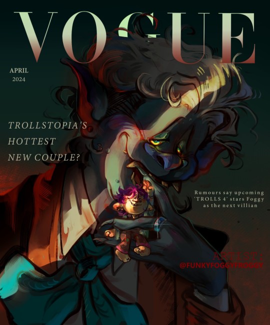
A bergen and a troll on the front of a Vogue cover?? Could this be?? (No, she gets eaten)
#trolls fanart#trolls#trollsona#trolls oc#bergensona#YEAAAAH I KINDA WENT HARD ON THIS ONE#Krita's been difficult to navigate#BUT I'm getting around their system and mechanics
28 notes
·
View notes
Text
So Windows 10 has released filters for Colorblind users and this is super important for anyone with colorblindness!
Accessibility in the graphics making community and rpc is important and I havent seen this floating around despite the fact that the update came out earlier this year so heres a run down on the filter and a review from a Deut. Colorblind artist and newb graphics maker.
How to get it on Windows 10.
Go to settings -> ease of access -> color and high contrast
There you can select your form of colorblindness from a drop down menu!
The filter affects all programs on your computer and can be toggled on and off by hitting the windows button +ctrl+c!
Review from a Deut. Colorblind user.
I do see a lot more colors, way more than I thought actually existed which was mind blowing when I first installed it! I was very skeptical it would work but so far so good! I have tested it on video games, editing programs, and chrome. Here are some pros and cons . . .
Pros
It actually allows you to pick up on colors you cannot see IRL
it has different settings for each specific type of colorblindness!
Its per user so if you use a shared computer you can still use the setting and not affect other accounts!
You can find new favorite colors!!! I really love this red-orangey color Idk WHAT its called but I found it now and I love it?? but I cant see it off the computer. so its a special treat for me when i log on and see it.
It affects editing software so it translates over to photopea,gimp,krita etc
You can navigate peoples profiles and read colored text with it (rejoice)
If you dont know what color something is you can take a pic and load it to your computer and viola! I had no idea my cat was THAT orange. But i do now!
Watching youtube videos of things you cant take pics of to get the color experience!!!!!!!!!!
Pride flags, yall, those pride flags
You can better appreciate peoples art and graphics because you can SEE it now.
Cons
I think the biggest downside for me is that the vibrancy actually produces eye strain. even if I do not notice the vibrancy changes I have noticed an increase in eye strain after installation.
I still struggle with subtle tones like skin tones but I struggle LESS than I did before- much noticably less but its still more difficult then it probably is for people with competent cones in their eyes
You find you have 0 idea what colors are supposed to look like and that can be Stressful (see above)
You start to doubt your perception switching between offline and online, its a bit disorienting.
In addition I am uncertain whether the graphics I make look the same to me as they do to individuals who see colors. so far I havent been told otherwise but there are still some difficulties when creating.
people who use your computer treat it like the ‘is the dress black and blue or white and gold’ or whatever that dress thing was, which can get a bit annoying.
Not Colorblind?? Keep us in mind!
The world has just become a bit more accessible for us, but we still need the help of all yall with functioning cones in your eyes to boost this information and ALSO to keep us in mind when designing profiles and using graphic designs. Not everyone has access to windows 10 or colorblindness filters so its vital to keep us in mind when designing!
Check out the filters and see how different your profile looks to us and use that to make design choices.
Check out some youtube videos showing how different colorblindnesses affect how people see the world
Be willing to send links to pages to colorblind rp-ers who cannot navigate your pages. Especially if you dont use a generic link on your blog.
Also be considerate to colorblind creators! We physically cannot see color as you do and that means; shit happens. Things look weird to you but they look accurate to us. That means if an artist has colorblind on their profile and you notice something is tomato washed etc let them know and help them get the colors and vibrancies right! We want our graphics and psd’s to look right just like you do we just have a physical hurdle.
Dont ask us if we can see something to test or make sure we are colorblind. Its not cool and its annoying
41 notes
·
View notes
Text
Learning Krita
I’ve been learning Krita. It’s not fun.
The UX is decent, and the program packs a lot of features and punches, but often, it’s difficult to navigate, especially with the high lag rate. At least I managed to make the feature image of the bird you see… using Pixlr.
I’ve been trying to mess around with layers here and there using Krita, but my loading wheel comes up way too often. As an absolute…
View On WordPress
0 notes
Text
A bergen and a troll on the front of a Vogue cover?? Could this be?? (No, she gets eaten)
#trolls fanart#trolls#trollsona#trolls oc#bergensona#YEAAAAH I KINDA WENT HARD ON THIS ONE#Krita's been difficult to navigate#BUT I'm getting around their system and mechanics
8 notes
·
View notes
Last Seen Blogs
aamutakkipaholainen
Chancellor Palpatine, Shitpostin’ is my speciality

hello-storytimegirl
Kim's Storytimes 2017-18

vasilesorocan
Untitled

therestisconfettii
Welcome to my Chamber of Secrets △⃒⃘ ⚯͛

mortemnism
Mortemnism