#It's a bit early for a sketchdump but I'm not sure how interesting a bunch of UI and other video game design updates would be lol
Photo

So I may have gotten momentarily distracted about The Dating Sim
Honestly most of this is UI design and thinking around the mechanics of how a Dating Sim could be made with some spoilery(???) uses of said mechanics; I am completely enamoured by game design and player accessibility but it can be kind of a weird niche lol ♪
Starting off with text boxes!
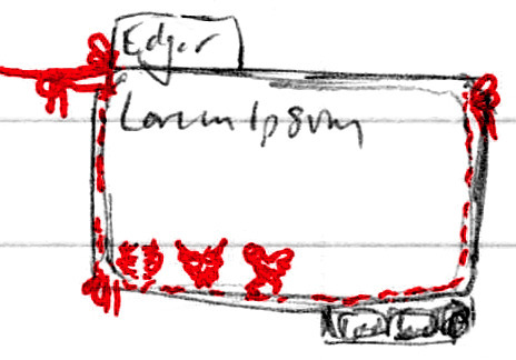
Tried out a design with yarn acting as the entire border and bows tied throughout. The little scribbles of red in the lower left corner were supposed to be stitched/knitted heart patterns to represent Edgar’s Affection Points, but I still haven’t settled on a design I’m happy with |P

This is probably the closest, but it’s also the most simple - nothing wrong with simple! But I still feel like I can do better. 10 stitches for 10 possible Affection Points ♪
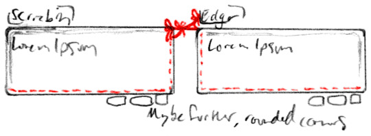
A slightly more refined take on the text box(es), especially to do with how Scriabin and Edgar’s complement each other - both sides of the yarn would go offscreen for either of them, but it’s mean to look like if you could zoom out the screen they would be tied to each other. The three bows are a bit much for such a confined space lol, but maybe if they were a bit more spread out. And giving each of them a directional border on the side the yarn ties in as well, I like that it’s more subtle :)

Still working on Edgar’s Affection display, I just can’t find a good balance of simple and thematic >:/ I do like the knitted text box tho, if it was subtle enough and I could get it to look right, I wouldn’t mind certain threads turning from a light grey to red ♪ I just worry that might be too much yarn, if such a thing exists haha

Down to just one loop-de-loop - it could reasonably show for both of them, cut off just after it on each side to indicate they share the one ♥
All menus all the time!
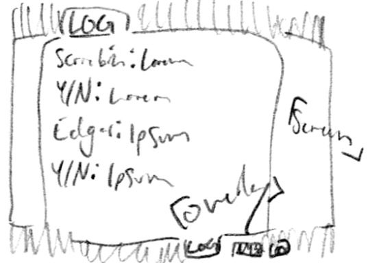
The buttons at the bottom of the text boxes would open up three different overlays with either a darkened BG or see-through screened effect, I’d have to test them digitally to see which is the most readable :P But they open to LOG (this screen: The current scene’s dialogue in case you clicked too fast or forgot a detail) - MENU - and a gear that opens OPTIONS

The aforementioned OPTIONS; mostly the basics for now, Text and Size, Music volume (I’d probably change it to overall volume and/or SFX specific) - I did forget one option here, toggling Adult Content since y’know, Vargas can get kind of A Lot sometimes haha ♪

A potential MENU layout, though I also like the SAVE/LOAD/TITLE/EXIT options being at the bottom of the screen, decisions decisions. I think leaving them to the side to allow the saves to have a multiple page listing at the bottom and keeps it all pretty clean and readable tho, hmm. Both OPTIONS and MENU would have the same overlay as LOG from earlier as well ♪ Unified design!

Me, just completely lost in the sauce: What is the most organic/non-utilitarian but still readable layout I can make so that the options are integrated but not a clusterfuck hmmmmmmmmm. Lol, it’s important to me! Depending on how tall and centralized the splash art is, either a stack would be too dividing or would cover up details - but it could also be used as an intentional divider! You can see I tried separating the buttons to each take a corner and hated that lol (which sucks ‘cause that would allow the art to be very centralized lol), and my notes from the OPTIONS spilling over haha
Next up: Endings Chart! Edgar’s on the left, Scriabin on the right; an ↑ indicates high Affection (7+), a - means mid-range Affection (~5), and a ↓ means low Affection (3-)

I actually forgot about the Neutral Ending, but that’s ‘cause it’s the Neutral Ending lol - it’s basically what happens if you get to the end without raising either of their affection high or low enough to get any other ending - basically if you start ignoring them and run out the days as normal. Technically the lowest one could be considered the Worst Ending, but it’s meant to be a joke ending lol :P

And finally thinking about a secret on the Title Screen, if I could figure out how to do it lol - since there’s like seven endings, it could be a pain to see how many you’ve gotten up to this point/how many are left, and how to get the last one(s), so why not a handy flow chart? But just leaving that out in the open feels like spoilers to new players and cheating for those who haven’t gotten at least one ending yet, so I liked the idea of hiding it in the yarn tied to their hands; on a first boot-up, the cursor wouldn’t react to it and the image wouldn’t look like something that can be clicked on, but if you did, it could still take you to the chart, but the intended route is to complete the game at least once, and then once the cursor is hovered over the yarn it would glow and change from a regular cursor to a clickable indicator, so anyone who got curious would get a bigger hint ♪ Still hidden, but easy to access :D
Those are most of my design notes and ideas for an over-excited first run lol, all the rest of my ideas were dialogue- and scenario-based :3c
#💟#Doodles#Art#Scriabin#Edgar#Dating Sim#Yeah I can already tell this is gonna need its own tag lol#It's a bit early for a sketchdump but I'm not sure how interesting a bunch of UI and other video game design updates would be lol#I have just realized I put different ''an'' and ''a'' to refer to the arrows because I was still thinking of their words and not symbols lol#''An upward arrow'' and ''a downward arrow'' why don't I just type out the word at that point#Anyway lol#There's something funny to me about Scriabin saying ''Y/N'' - as well as all the cutesy floral stuff meanwhile Edgar is crying and bruised#Juxtaposition eh lol#I don't have a go-to player name these days so sure [Your Name Here] will do lol#All my notes just refer to them as ''The Player'' so it's not like I've got much to go on lol#I have also written out all the endings and the basics of how to get them! I think six main routes and one joke ending are pretty good :3c#Then again I haven't actually played that many dating sims - but for two options? Yeah I still don't know that might not be a lot#I did have fun with it tho ♪
18 notes
·
View notes
Last Seen Blogs
kellen-me-softly
KELLEN

amputeecuties
Sexy Amputee Women
squashedcatsorchestra
Оркестр прищимленных кошек

mientrastantoenbilbao-blog
... mientras tanto en Bilbao ...