#I wasn't ever gonna revisit the sketch I did for this but well I kinda did lol
Text

The Aftermath
#Mae Borowski#Bea Santello#MaeBea#Night in the Woods#NitW#my art#digital art#I wasn't ever gonna revisit the sketch I did for this but well I kinda did lol
155 notes
·
View notes
Text
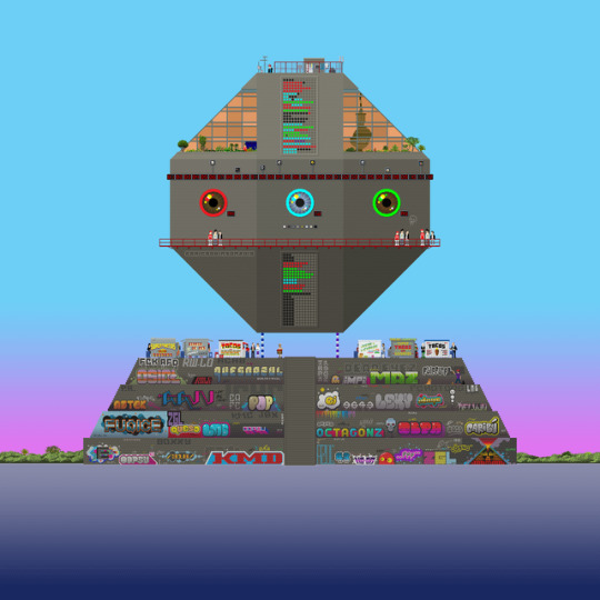

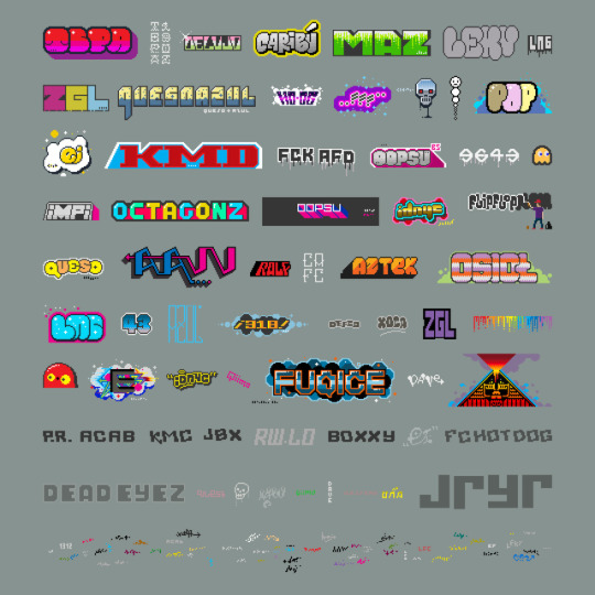
CARIBOU DELUXE (EDICIÓN DE LUJO)
This drawing is called Caribou Deluxe. The other images in this post make it the edición de lujo, the deluxe edition; kinda like when a band does a special version of their new album. I wanted to do a drawing that was more than "a" drawing. I wanted to do something that could be explored, something that was more than just a series of close-up details of the main drawing. So the main drawing is kinda like the cover of a magazine, showing you what is inside.
CONTENTS
1. Caribou Deluxe. The actual drawing.
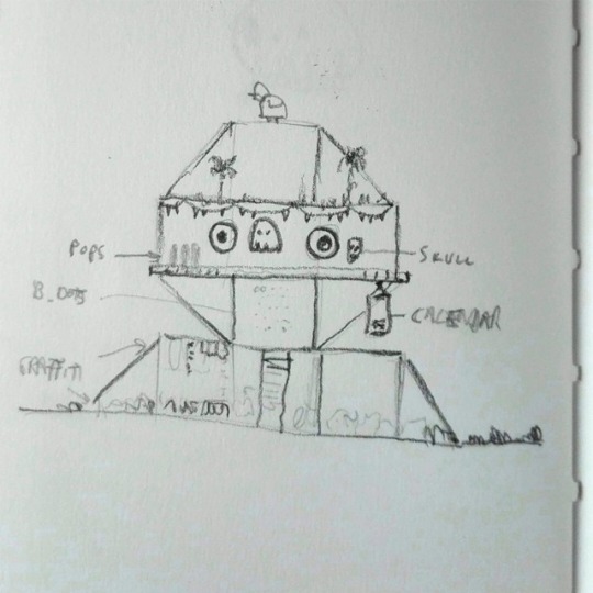
2. The initial quick notebook sketch.
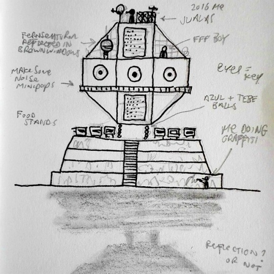
3. Another sketch done a couple of days later, after the digital process had begun and the general idea became clearer in my head.
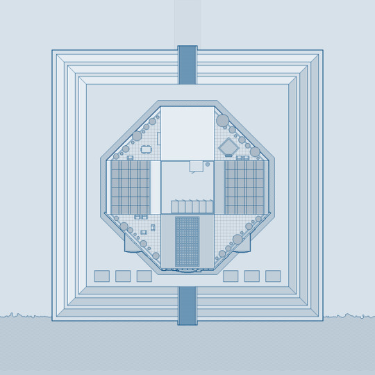
4. Top view.
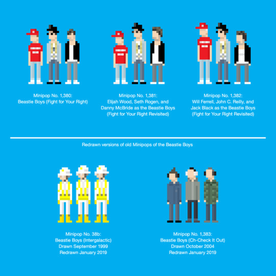
5. Three new Minipops and two redrawn Minipops. The new Minipops: No. 1,380 - Beastie Boys (Fight for Your Right). No. 1,381 - Elijah Wood, Seth Rogen, and Danny McBride as the Beastie Boys. No. 1,382 - Will Ferrell, John C. Reilly, and Jack Black as the Beastie Boys. The redrawn Minipops: No. 38b - Beastie Boys (Intergalactic), originally drawn in 1999. No. 1,383 - Beastie Boys (Ch-Check It Out). The latter was done for a client (MTV Europe) in 2004, and was never given a Minipop number at the time, thus it being No. 1,383. I, as you may well imagine, am slightly irritated by this chronological mess-up.
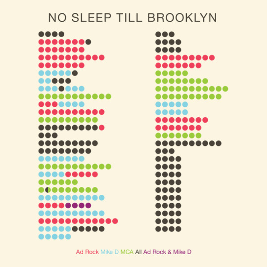
6. Beastie Dots: No Sleep Till Brooklyn. Data visualisation of who raps what on the song.
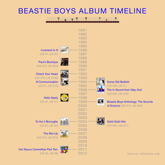
7. Beastie Boys album timeline.
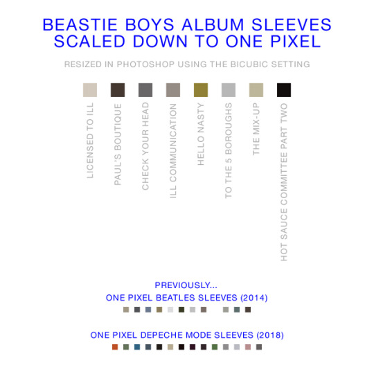
8. One pixel Beastie Boys sleeves. Plus previous one pixel sleeves by the Beatles and Depeche Mode.
9. A full version of the Berliner Fernsehturm that is reflected in copper-coloured mirror glass windows at the top of the octagon "head."
10. All the graffiti on the pyramid.
ABOUT CARIBOU DELUXE
A brief explanation: I wanted to draw something that relates to where my brain is at right now, in January 2019.
The Fernsehturm reflected in the brown windows (inspired by the old Palast der Republik) is there because Berlin will always be in my head. It's the place where I've spent the most time in my adult life, and the place that feels closest to a home town (even though I wasn't born here).
The pyramid base is a Mesoamerican thing, and that—combined with the food stalls and the rooftop laundry cages—is for Mexico, the other place that feels like home, the place where my heart is.
I'm trying to be a better person as I get older, and trying to get rid of elements of grumpiness, bad moods, etc. Trying not to be a person that automatically assumes young people aren't doing life the right way. That's where the graffiti comes in. For quite a while I thought of it purely as vandalism, but something clicked in my brain recently: it is a part of every city—specifically the cities I love—and it's not gonna ever go away. I covered the pyramid in graffiti to remind myself of that. (The graffiti names, btw, are either random words that came into my head, or are related to things or people in my life. I also wanted to show the range of graffiti styles I see around Berlin every day. If I have used a real graffiti artist's name here, it is purely a coincidence. Indeed, after finishing the pixel graffiti, I saw some graffiti in my neighbourhood that said "Queso." Apologies to the real-life Queso for borrowing his/her name.)
I've been listening to the Beastie Boys quite a bit recently and thinking about how they are only a few years older than me. I was a teenager when the tabloids were getting the vapours about their behaviour when they were touring in the UK for the first time. I remember every Volkswagen car in my (actual) home town suddenly missing its badge. A band getting older, changing as people and artistically, seemed to fit with the whole idea of examining my own life. Plus, y'know, people (friends, artists, musicians...) can do wonderful things, but life isn't always wonderful. Sometimes people you love die.
There are four separate parts to the Beastie Boys stuff here. The coloured dots in the centre of the top and bottom thirds of the octagonal head represent the lyrics of No Sleep Till Brooklyn. Each dot is a word. The colours of the dots show who rapped the words: red dots are Ad-Rock, blue dots are Mike D, green dots are MCA. Above the eyes there's a timeline of their studio albums, showing the year of release, and the height shows the US chart peak positions. The eight little squares beneath the blue eye (each of the eyes are the colour of the members of the band, and the ring around the eyes acts as a key to aforementioned No Sleep Till Brooklyn dots) are the colours one gets when the sleeves of the albums are resized to be one pixel in size.
You may be wondering why I've drawn Minipops of the Fight for Your Right version of the Beastie Boys and the coloured dots are for No Sleep Till Brooklyn. The drawing is because I wanted to draw the other two versions of the band played by actors in Fight for Your Right Revisited. I liked the idea of drawing them three times, as I'd already included three versions of me in the drawing (a younger version of me on the left balcony at the top, a version from a couple of years ago on the roof, and the current me spraying graffiti on the pyramid which, it should be noted, is the closest I will ever get to actually doing any graffiti). Plus, I already did a graphic for Fight for Your Right in 2012 (look for "Beastie Dots" on flipflopflyin.com), and wanted to do something new for this piece.
Another thing that I should probably note is the unrealistic-ness of certain parts. The sky hints at the sun setting behind the structure, yet the reflection of the Fernsehturm (and the way shadows fall on other things) mean that the sun would be over the left shoulder of you, the viewer. Similarly, there's no reflection of the structure and bushes on the water. I have done 14 drawings in this vein over the last year, with pyramid-y or octagonal structures on the shore of a lagoon, and have yet to do a proper reflection in the water. I always think I should try it, and I did try it with this drawing, but it didn't look "right". I'm okay with this unrealistic element contributing to the fantasy of the landscapes. I'm similarly okay with drawing things that aren't correct while striving for getting other parts, other details as accurate as possible. I kinda like that it reenforces that this is MY landscape, not a drawing of a specific place.
As a whole, I had a desire to do something cool with pixels, to draw things that are a challenge, fun, and packed full of details. And to represent all of the shit that floats around my brain. To bring together different things I like doing: putting Minipops in non-Minipop-themed pixel drawings, and making the organisation of information (that would normally only occur as infographics) a part of something bigger. I hope you enjoy it x
#minipops#pixel#pixelart#digitalart#digitalartwork#drawing#art#kunst#graffiti#streetart#fernsehturm#berlin#infographic#streetfood#mexico#mexicocity#ciudaddemexico#df#cdmx#dataart#beastieboys#nosleeptillbrooklyn#fightforyourrighttoparty#illustration#architecture#tacos#pyramid#octagon#photoshop#landscape
15 notes
·
View notes
Last Seen Blogs

lamexicanrestaurants-blog
Mexican Restaurants In LA

willowsrage
𝕎𝕚𝕝𝕝𝕠𝕨
flakapinto
Flakapinto
frillsand
🎥🍎Welcome Home Actor Au🍎🎥
crenifer
hey ! [[sponge]] i have [[ten kromer]] commissions