#1930's-era architecture
Text
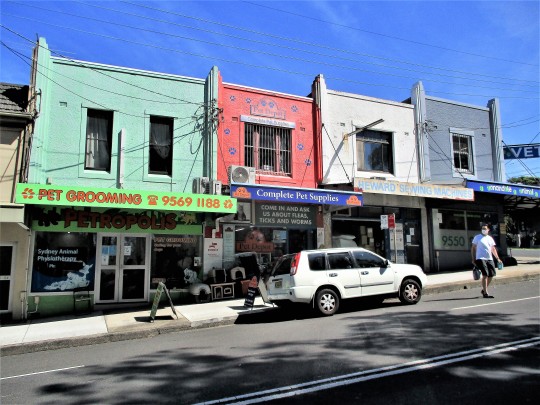
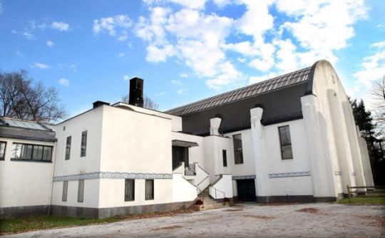
Art deco pet strip. 1930's era shop fronts, now devoted to domestic animals. The old sewing machine shop now used for storage the odd one out. Annandale.
#art deco#streetscape#shop fronts#1930's#vintage#it's a sign#pictures on walls#inter war era architecture#facade#skyline#street scene#pets#domestic animals#inner west sydney
55 notes
·
View notes
Text
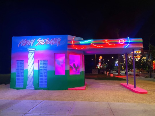


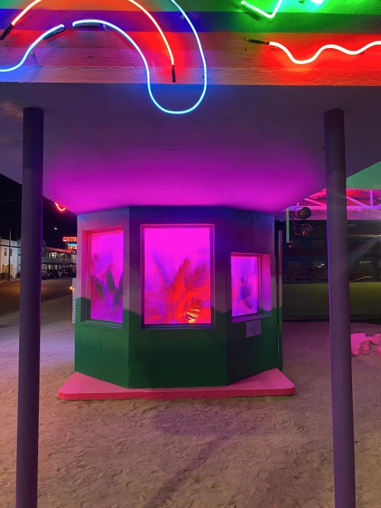


Neon Saltwater's "Mystery Cruise 1990."
Up-and-coming digital artist and designer Abigail Dougherty, better known as Neon Saltwater traveled from Seattle to Downtown Las Vegas, invited by curator group Justkids, to freshen up a 1930’s gas station located on Fremont Street in the heart of the city.
The artist breathed new life into the vintage architecture by transforming the building into a beautiful retro landscape rendered in dreamy colors bouncing off of bright fluorescent neon lights. Notorious for her rooms and spaces renderings, Neon Saltwater’s digital images come forward in an 'unvirtual' 3D dreamscape titled "Mystery Cruise 1990," and provide the viewer with a real environment created by an artist whose work is mainly known on a screen.
“In an era where many artists go from the physical to the digital space, we thought it would be interesting to actually export Neon Saltwater’s cyber wonders into a non-virtual art experience, not just on a screen, but in a tangible public art form. Physically manifesting Mystery Cruise 1990, an exclusive digital rendering space with dreamy colors, neon lights, and spooky ‘90s vibes into an immersive piece outside of a social media platform, is almost like a paranormal experience and so satisfying for the Neon Saltwater’s fans like myself” said Justkids Curator and Director, Charlotte Dutoit.

THE SUPERSONIC ART SHOP | FOLLOW ON INSTAGRAM
162 notes
·
View notes
Text
Hashima Island, Japan
Ghost Town 03
Population: 5,259 (1959) - 0 (2016)
Country: Japan
Years active: 1887-1974
Why Was It Abandoned?
Hashima Island was known for its undersea coal mines during the industrialisation of Japan in 1887.
In 1974, the mines were closed due to the depletion of coal and the use of petroleum in place of coal, which led to many coal mines shutting down across the country. The residents of the island left soon after, and Hashima Island remained abandoned for the following three decades.
In the 2000s, Hashima Island attracted tourists and gained interest because of its untouched historic ruins. This led to Hashima Island being open to tourists on April 22, 2009 and being protected/restored.
Island Life
Originally on Takashima island, an island that was not far from Hashima, the Fukahori family owned the property as feudal lords and took advantage of the profitable opportunities that coal on the island brought. Coal mining was the basis of the local economy and residents were only seen as workers on the island. Due to the increasing demand of coal in the Western continents such as the UK and US for their steam ships in the 1850′s, Thomas B. Glover brought British equipment to the island coal reserves around Nagasaki, which advanced technology and mining practices in 1869 and introduced a new age of coal mining. Because of the success and increase in foreign currency, Fukahori decided to expand on neighboring islands, which is how Hashima Island became a coal mining island.
Around 15.7 million tons of coal were mined and excavated between 1891 and 1974. Coal was used by many Japanese people to heat their homes. They called this “goheita” after the legend about a man who stumbled upon the use of coal by accident.
In 1916, Japan’s first large reinforced concrete building was built to home the workers of the mines. The material used to build the structures pedaled Japan into a new era of architecture. They used concrete as protection against typhoons.
Over the next 55 years, Hashima Island began to grow. Apartment blocks, schools, a hospital, town hall, community centre, clubhouse, cinema, communal bath, swimming pool, rooftop gardens, shops, and a pachinko parlour were built for the miners and their families who lived on the island.
The economy on Hashima Island can be best described as socialist. Housing, electricity, and water were all free for the workers as long as they contributed to public work and territory clean up. The residents of Hashima Island had to depend on the outer world for food, clothes, and other articles of commerce. Fresh water was also delivered to the island until 1957 when tubes connected Hashima Island with water reservoirs on the mainland. This was inconvenient for islanders because of the potential threat of storms preventing sailing to Hashima Island for more than a day.
Until 1963, Hashima Island was just mountains and rock. That was until the “green campaign”, where Hashima residents brought soil from the mainland to the island to create roof gardens where they could grow vegetables and flowers. This also temporarily brought more “life and energy” to the island to lessen its gloomy appearance.
During the 1930’s until the end of World War II, conscripted Koreans and Chinese prisoners of war were forced to work under brutal treatment at the Mitsubishi facility as forced labourers under Japanese wartime mobilization policies. Many labourers died on the island from underground accidents, exhaustion, and malnutrition.
Today Hashima Island attracts many locals from Japan to tour on the island. Hashima Island also eventually became a World Heritage center, but on the condition that the government acknowledges the history of Hashima’s forced labor of Koreans. This was agreed upon, but due to the understatements made about Hashima Island’s forced labor from the Japanese government and addressing it as “work” instead of “forced labor” and disregarding the islands history has made a lot of Koreans and Japanese citizens feel as though the government cares more about the country’s reputation rather than the events and impact it’s had on workers. This is also supported by the fact that the history of Hashima Island’s forced labor is not taught in Japanese schools, which leaves many Japanese citizens unaware of the island’s history and cruelty to conscripted Koreans and war prisoners.
Victims of forced labor have described their experiences on Hashima Island as “a living hell”. Victims mention of how they were forced to work 12 hours a day in the mines while suffering from hunger.
The Nagaski Peace Museum, established in 1995, was created by Japanese citizens to publicize the truth about Japan’s history and demand compensation and apology to the foreign victims of Japan during World War II.
Pop Culture / Media Representation
Hashima, Japan documentary (2002)
History Channel’s Life After People (2009)
James Bond Film, Skyfall (2012)
live action Japanese films for Attack on Titan (2015)
Thai horror film Hashima Project (2013)
South Korean World War II film “Battleship Island” (2017)
Sources
Wikipedia
Why All The Islanders Left Hashima
The Truth About Hashima
2 notes
·
View notes
Text
Downton Abbey: New Era Film Score Thoughts and Analysis (Part 1)
Since the movie has been released, so is the film score by John Lunn together with the Chamber Orchestra of London. And I know I have not seen the film yet so I've decided to try and analyze and somehow create an imagined storyline based on soundtrack. I'm a total geek over music anyway so my skill of conjuring up different images while different tones of music playing can definitely do me good!
But obviously first, my thoughts. For me the score did not capture much of the grandeur that I personally loved from the first film's. It was moderate, it's like a simple morning at Downton but with a little twist: the coming of the 1930's. There were a lot of jazz, which I loved and there were times it sounded like a Hollywood film. However, I did expect it to be romantically grand (similar to how it sounded in the trailers and TV spots) with a bit of French and enigma behind it but I believe those tracks were not included. But yes, it did miss a lot of the French aspect in my opinion although it's quite encapsulated in the track Le Chapeau De Carson, I just need more I guess.
Anyways back to this imagined pretend-storyline that I have, I know this does not equate to the movie itself and hey, a girl is free to imagine right? I was able to not follow the actual flow from the album itself because I thought each track communicated a different scene for me.
Now, to reiterate again based from the soundtrack alone, the movie obviously starts as a new day arrives with the track of A New Era playing. I imagine traces of Downton Abbey's architecture being shown with the glimmer of the sunrise. I do feel like in this track will consist of the preparation for Tom and Lucy's wedding, we see Lucy in a gorgeous dress and probably Tom jokingly messing with his own look. We cut to the chapel itself, where we see some of the familiar faces we have known as they wait for the bride and groom. And by the end of the wedding in the church, we go to the reception and Crazy Rhythm will play as not only the newlywed couple dance but also everyone else-- I imagine Bertie and Edith just twisting to the jazzy music!
Now at this point, there is not track to describe Mary's problem with Downton's financial stability but let's assume that situation. With this, Mary finds sort-of-a-saving-grace in Hugh Dancy's director-character, who offers to use and pay for Downton Abbey as a set location for his movie. This is captured in the track Then You're in Luck where we can see a proposition scene and we immediately move to Downton being a movie set with Kinema. Everyone, especially the Downstairs people, is awestruck to see the film sets, cameras, lights, costumes, everything! It's like they are amazed that they can already personally see the things that they have watched in movies. And we suddenly see the entrance of a known and handsome actor, Dominic West's character I suppose with Guy playing. The women are in such awe, maybe we can also see Thomas sort-of curious (hehe).
We now go ahead to the Upstairs people going to France with All-Aboard, boarding a ship (probably similar to how the movie Titanic did it) and I just would like to imagine Carson still fussing with his Lordship's bags and probably strictly instructing a boy where to put the bags. As the Upstairs people settle in some sort of balcony in the ship, they glance at the sea and await their French destination. It will probably take days for them to travel and when they do get there, Cote D'Azur will then play and all of them-- Robert, Cora, Edith, Bertie, Lucy, Tom, Carson, Bates and Baxter, and any other person they are with are just amazed to see the beauty that is the French Riviera. This track will also cover how they will discover the said villa Violet mentioned and they know this is in itself an adventure they had never expected and that they are willing to soon uncover.
That is all that I have with my braincells right now, but I did have some draft pretend-scenes from the other tracks that I can't wait to share. So in the meantime that I have not seen the film, I will accomplish this. :)
#downton abbey new era#downton abbey 2#downton abbey 2 speculations#john lunn#downton abbey soundtrack
3 notes
·
View notes
Text

_________
Art Deco is a design era with geometric patterns and modernization of every day items. From cars, architecture, furniture, fashion and everyday household items, these designs told the world that you have style.
Let’s face it, men are difficult to shop for. Christmas, birthdays, anniversary, it doesn’t matter, their tastes are unique and if they want something very specific, they would probably prefer to purchase themself. But for the men appreciates something vintage, especially clothing, there is always the sure fire gift. The vintage tie. Vintage clothes already says I’m I’m looking to live in a world of uniqueness, quality and beauty. These vintage clothes have held up for decades, I still don’t have the sweater from last year. These ties are colorful, fun, and tell others that I have something to say, and these clothes are going to say it for me. That’s the purpose of fashion. However, to understand any vintage, cars, architecture, furniture, or clothing, it’s first best to know some of the history behind it.
History
The origin of the necktie comes from the 17th century Croatian soldiers who wore a piece of cloth around their neck as part of their military uniform. King Louis XIII liked the look of this and adopted it in to his kingdom and named it La Cravate. Different kingdoms added this look displaying their royal colors representing their castle almost like wearing a family crest or a flag on your chest. England’s King Edward VII developed a University system that each private schools had their own unique color on a tie identifying what school they attended, like the famous Oxford or Harvard ties. The Ascot tie is almost like a handkerchief around your neck , it was seen at high holidays and military ceremonies.
During the 1800s exclusive businessmen club’s had their crest patterns on their tie showing exclusivity of the organizations they belonged. In the American West the Bolo tie became popular with a long strand of braided leather with decorative metal tips secured with a piece of silver in the middle. The brown bow tie was a solution to the working class so it didn’t get in the way of machinery in factories, then colorful bow ties were adopted with the young upper class and and also with stage entertainers think of a barber shop quartet.
In the 20th century the black bow tie was used for the tuxedo. However most of the long neck ties were a simple one piece of cloth that after several years became flimsy and didn’t stay in place. Men began wearing vests with a suit keeping their tie tucked in and in place. Although there were several innovations of men’s neckties these changes came slow until something revolutionary happened in 1924.
the 1920's
In 1924 Jesse Langsdorf, a New York taylor cut a three angular segments of fabric and sewed them together creating the Langsdorf tie. These Langsdorf ties start out narrow and become wider at the bottom and end with a sharp triangle. Almost all modern ties are made this way today. Because these ties no longer needed to be tucked in into vests, jackets became wider, looser and evolved into the a more casual blazer. Different knots were introduced showing there are several ways to tie a tie.
The Duke of Windsor created the Windsor knot, and there is the Grantchester, slip knot and the Pratt tie. Soon men found new designs on their tie as an extension of one's personality and expresses emotion and mood. In the roaring 20s F. Scott Fitzgerald wrote in length about the clothes his characters wore. In the Great Gatsby he wrote about how Gatsby wore a white flannel suit, a silver shirt and a bright yellow tie. Nick Carraway wore a bow tie making him look more studious and junior like.
Jazz musicians in the 20s wore loud bright colorful ties some at the Harlem Apollo Theater painted their ties to reflect the lights while on stage. In the 1930s and early 40s The Zoot Suits was a comedy team at the Harlem’s Apollo Theater thought up by Ernest "Skillet" Mayhand. During his shows the dancing men wore a broad-shouldered drape jacket, balloon-leg trousers and a flamboyant hat with loud bright yellow silk ties.
These suits became popular with Hispanic and Cuban young men. In Los Angeles as young local men were sent off to fight in the war many Hispanic workers replaced their jobs and were often seen wearing these flashy suits around town. After there was a local unsolved murder Hispanic men wearing these suits were blamed causing a race riot known as the Zoot Suits Riot.
After WW2
After the war in the 1950s came an explosion space age shapes, fins on our cars, giant signs on bowling alleys and colorful triangles on our ties. In the 60s ties got narrow and darker colors. In the 70s fabrics of rayon and polyester became popular and ties became wide with muted earth colors of orange and browns.
In the 80s came a resurgence of the bright and colorful silk tie. Ralph Lauren got his start in the clothing business by selling ties in New York and moved up to be head of wardrobe on the Robert Redford’s version of the Great Gatsby. He opened a chain of stores along with Brooks Brothers and became a part of the fashion era of the young YUPPY professional 80s look combined with the style of a well dressed sporty looking man. Many 80s musicians wore skinny ties and in the 90s more of the character ties became popular, like a tie with Space Jams’s Bugs Bunny on it. Today men are wearing less ties in this casual world which makes us hold on to the vintage Art Deco ties with all the more reverence. So this Christmas season browse eBay, Etsy, Poshmark, and always support your local vintage stores.
0 notes
Text

The Hangar Recreation Association
24400 Cedar Rd.
Beachwood, OH
The Hangar, a private recreation center, was built in 1930 as part of the Dudley S. Blossom estate, in what was then Lyndhurst but is now Beachwood, Ohio. Many estates and country houses of that era incorporated a private sports facility, as a place where children, their friends -- and adults -- could swim and play tennis indoors. From the outside, this Cleveland version of a private recreation center does partly resemble an airplane hangar -- because of the two glass-pitched roofs, one each over the tennis court and swimming pool. The plain stucco exterior evokes Art Moderne. Its architect was the highly regarded Abram Garfield, whose father, James A. Garfield, served briefly as the 20th president of the United States before dying in 1881 of wounds from an assassin's bullet. The Hangar shows the fluency that Abram Garfield had. It was the only Art Deco building Garfield would ever create.
Dudley Blossom was a successful Cleveland businessman, but he and his wife are more widely known for their philanthropy, in particular their support of the musical arts. Elizabeth Blossom -- nee Bingham -- was the sister of Frances Payne Bolton, who was married to Chester Bolton, a congressman whose seat Frances would fill upon his death. The Bolton and Blossom estates took up hundreds of acres of the land adjacent to what is now Cedar and Richmond roads. The Blossoms, best known today for the amphitheater named for them in Cuyahoga Falls, the summer home of the Cleveland Orchestra, had a longtime friendship and professional relationship with Abram Garfield.
Garfield, who would found the school of architecture that would be enfolded into Case Western Reserve University, had designed many other homes, including the Mather House at CWRU and the Hay-McKinney Mansion of the Western Reserve Historical Society. He had also designed the Blossoms' Tudor Revival home in Lyndhurst, which was built about a decade before the Hangar was added. The Hangar was his first foray into the design style that had swept the world since the 1925 exhibition in Paris of "arts decoratifs." That exposition debuted a modern style characterized by a streamlined classicism, and geometric and symmetrical compositions. Its prominent motifs often included stylized animals and Aztec or Egyptian references (the latter inspired by the mania surrounding the 1922 discovery of King Tut's tomb).
The Hangar is not open to the public. Today, it is owned by Charles Bolton, whose great-aunt was Blossom's wife, Elizabeth. It is Bolton who oversaw its restoration in the mid-1980s, which was around the same time that the Hangar was listed on January 9, 1986, with the National Register of Historic Places. The Hangar's glory resides in its interior. Guests who arrive in the main lounge are immediately surrounded by a vivid, sea-themed wall mural that leads upward to a sapphire-glass tray ceiling, from which hangs a sleek, silvery chandelier. The mural is signed "June Platt, 1930." Platt's mural at the Hangar shows a mastery of detail and imagination. Sea anemones, guppies, zebra fish and other samples of fantastical marine life swirl in pinks, mint greens and soothing blues, in forms both bold and delicate.
In the 1970s, the membership rolls of the private Hangar Recreation Association read like a who's who of Cleveland's East Side, including names such as Burton, Meacham and Dempsey. Even Sherman Lee, the director of the Cleveland Museum of Art, was an avid tennis-playing member. During the restoration, the Boltons (Charles' wife, Julia, was also greatly involved) salvaged small pieces of wallpaper from protected areas and then had a specialty firm in Cincinnati re-create the original design, using a silk-screen process. The result: walls papered with vintage designs in saturated hues. Today The Hangar is the occasional site of a wedding or a member's private party.
0 notes
Text
I was browsing Zillow and dreaming about someday owning a home with a yard big enough for a garden and a henhouse when I stumbled across the classical beauty of a 1930's home. Original brickwork and stonework, enough bedrooms to house a growing family, a sunroom and more than enough space for the vegetable garden of my dreams. <$300k.
I have never so wished I wasn't a broke joke.
It has a historical housing tax exemption, and that's with someone having been absolutely cruel to the property at large. They tried to add another house in the backyard and it's the most miserable example of modern architecture you've ever seen. The siding is shredding from the ground up, the ceiling has fallen in on one of the rooms, and the foundation is cracked so drastically you can see it - across the floor and all the way up to the roofline. Probably the reason the property has been on the market for over a year; they're trying to sell it as an "extra unit" that can be refurbished to add value, when really it's a money sink that would be better off demoed and ripped out of the lot.
I keep having crazy thoughts, like how neat it would be to add a shed and a chicken house in such a way that they seem like they could have been built during the same era - made of local materials and solid as a rock. How fun it would be to set up water collection systems and plantings of historical and drought-resistant flowers and herbs. How the Conversation Society probably has a list of experts that can help with this.
I never thought it'd get this into some old house.
Maybe it'll still be around by the time I can afford it.
#Oh to be a wealthy heiress buying and refurbishing#historical homes#for fun instead of being a#college dropout#with half a business degree and none of the money
1 note
·
View note
Text
Salem, OR's Historic Districts: A Journey Through Time
Salem, OR, is a city rich in history, with many historic districts that offer visitors a glimpse into the past. From Victorian-era homes to mid-century modern architecture, Salem's historic districts showcase a range of architectural styles and highlight the city's evolution over time. In this blog post, we will take a journey through time and explore some of Salem's historic districts.

Grant Neighborhood Historic District
The Grant Neighborhood Historic District is located in the heart of Salem and features homes built in the late 1800s and early 1900s. The district is named after Ulysses S. Grant, the 18th President of the United States. The homes in the district are primarily Victorian in style and showcase a range of architectural details, including intricate woodwork, stained glass windows, and ornate porches.
Gaiety Hill/Bush's Pasture Park Historic District
The Gaiety Hill/Bush's Pasture Park Historic District is one of Salem's most exclusive neighborhoods, featuring homes built in the early 1900s. The district is named after the Gaiety Theater, which was once located in the area. The homes in the district are primarily Colonial Revival and Craftsman in style and feature large, lushly landscaped yards.
Englewood Park Historic District
The Englewood Park Historic District is located in northeast Salem and features homes built in the 1930s and 1940s. The district is named after Englewood Park, which is located in the area. The homes in the district are primarily Tudor Revival and Colonial Revival in style and feature distinctive brickwork and steeply pitched roofs.
North Capitol Mall Historic District
The North Capitol Mall Historic District is located in downtown Salem and features a mix of historic buildings, including the Oregon State Capitol, the State Library, and the State Supreme Court Building. The district also features several mid-century modern buildings, including the Mark O. Hatfield Library and the Salem Conference Center.
Court-Chemeketa Historic District
The Court-Chemeketa Historic District is located in northwest Salem and features homes built in the early 1900s. The district is named after Court Street and Chemeketa Street, which are the main streets in the area. The homes in the district are primarily Craftsman and Colonial Revival in style and feature large front porches and brick or stone exteriors.
South Central Commercial Historic District
The South Central Commercial Historic District is located in downtown Salem and features a mix of historic commercial buildings. The district includes the Salem Public Library, the Reed Opera House, and the Elsinore Theatre. The district also features a variety of restaurants, bars, and shops.
West Salem Residential Historic District
The West Salem Residential Historic District is located on the west side of the Willamette River and features homes built in the early 1900s. The district is named after the West Salem neighborhood and is primarily composed of Craftsman and Colonial Revival-style homes. The district also features several mid-century modern homes, including the iconic "flying saucer" house.
Salem's historic districts offer visitors a glimpse into the city's past and highlight the diversity of architectural styles and cultural influences that have shaped the city over time. Whether you're a history buff, architecture enthusiast, or just looking for a unique and interesting way to explore Salem, a journey through the city's historic districts is a must-see experience.

In conclusion, if you are looking for a reliable and experienced fence contractor in Salem, OR, OnPoint Fencing and Decking is a great choice. Their team of skilled professionals is committed to providing high-quality fence installation, repair, and maintenance services to their customers.
Whether you need a new fence installed for privacy or security, or your existing fence needs repair, OnPoint Fencing and Decking has the expertise and resources to get the job done right. They offer a wide variety of fencing materials and styles to choose from, so you can find the perfect fit for your home or business.
Additionally, their team is dedicated to delivering exceptional customer service, ensuring that you are completely satisfied with their work from start to finish. They will work closely with you to understand your needs and preferences, and provide personalized solutions that meet your specific requirements.
Overall, OnPoint Fencing and Decking is a reputable and trustworthy fence company Salem, OR, that you can rely on for all your fencing needs. Contact them today to learn more about their services and to schedule a consultation.
OnPoint Fencing and Decking
1865 McGilchrist St SE, Salem, OR 97302, United States
(503) 949-2712
http://onpointfencing.com/
1 note
·
View note
Text
Architecture in the 60s
The 1960s is known as the era of bell-bottoms and lava lamps. This groovy decade was a turning point for home, architecture, interior design and iconic elements are still revered today.
Single-story Ranch homes reached their heyday in the 1960s. Especially on the West Coast, this distinctive style is known for its low rooflines. These homes were an evolution of the classic Bungalow style that had grown in popularity from the turn of the century through the 1930s.
The 1960s marked a shift in how families interacted with their homes. As suburban living became a common, creating enjoyable outdoor spaces also became a priority. Having a lush green lawn became a status symbol and lawn care became a priority. Similarly, creating outdoor living spaces with patio furniture, swing sets and other yard accessories was a priority for many families.
Throughout the 60s and 70s, wood panelling was a must-have in almost any home. The rich hue of the wood paired nicely with the bright and bold colour palettes that were popular in the era. Whether painted over in a bold colour or stripped down to its original finish, panelling was popular again.
Harvard Referencing
CINTRON, M. (2021) Mad for mod: Why Midcentury Modern architecture is hotter than before. [Online] Available from: https://www.briggsfreeman.com/blog/posts/2021/06/17/mad-for-mod-why-midcentury-modern-architecture-is-hotter-than-ever/. [Accessed: 11th December 2022].
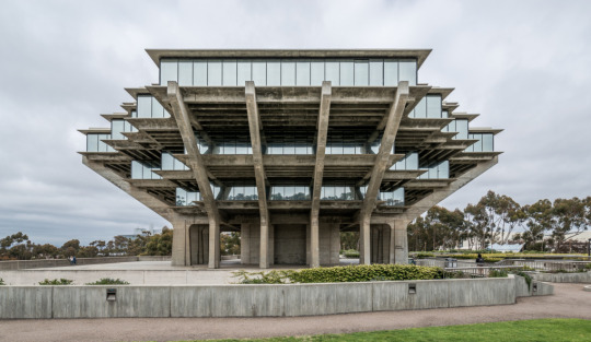
Fig 1. ARCHEYES. (1960s) The Geisel Library/ William Pereira & Associates. [Photograph] Available from: https://www.google.co.uk/amp/s/archeyes.com/tag/william-pereira-associates/. [Accessed: 11th December 2022].
1 note
·
View note
Text

Former smash repairs and motor body workshop (1930). Didn't survive the Pandemic. Camperdown.
#old workshop#finished#gone#vintage#1930's#inter war era architecture#facade#smash repairs#it's a sign#streetscape#functionalist#ephemeral#inner west sydney
54 notes
·
View notes
Text
Havard Referencing for the images I used:
Vintage Dancer. (2015). Victorian Edwardian Tea Dress and Gown Guide. [Online]. Vintage Dancer. Last Updated: 29 June 2015. Available at: https://vintagedancer.com/1900s/edwardian-tea-dress-and-gown/ [Accessed 2 December 2022].
Pjosik. (2019). 1980s Moodboard. [Online]. Imgur. Last Updated: 19 November 2019. Available at: https://imgur.com/gallery/s4QfhMK [Accessed 2 December 2022].
eighth of may outfitters. (2021). 80’s Mood Board. [Online]. Printerest. Available at: https://www.pinterest.co.uk/pin/678565868855657736/sent/?invite_code=2482d535fefb46708cb38a775be93e4 [Accessed 2 December 2022].
Molly savident. (2015). 1980's moodboard. [Online]. Molly savident. Last Updated: 2 February 2015. Available at: https://mollysavident.wordpress.com/2015/02/02/1980s-moodboard/ [Accessed 2 December 2022].
margaret-skratulja. (2012). 1920s collage. [Online]. Printerest. Last Updated: December 2012. Available at: https://www.pinterest.co.uk/pin/417849671646795213/sent/?invite_code=a6c0132d2e224a879c4b26bdfe12415 [Accessed 2 December 2022].
Jennifer Emmerich. (2019). 20s Vintage edit. [Online]. Printerest. Available at: https://www.pinterest.co.uk/pin/810296157948154388/sent/?invite_code=168b1b29b971425e902010672d3489a [Accessed 3 December 2022].
Victoria Montalti. (2019). Pop Culture: From Days of Decadence to Age of A.I.. [Online]. The Lexington Line. Last Updated: 4 December 2019. Available at: https://www.thelexingtonline.com/blog/2019/10/25/pop-culture-from-days-of-decadence-to-days-of-ai [Accessed 3 December 2022].
Lady JoJo's. (2018). 60s Fashion. [Online]. Printerest. Available at: https://www.pinterest.co.uk/pin/80361174573806866/sent/?invite_code=4f25f3c1e0554ac7b86735789cff8603 [Accessed 3 December 2022].
Paul Swendson. (2022). The Ultimate Generation Gap of the 1960s. [Online]. soapboxie. Last Updated: 19 October 2022. Available at: https://soapboxie.com/social-issues/The-Ultimate-Generation-Gap-of-the-1960s [Accessed 3 December 2022].
The Ultimate Generation Gap of the 1960s - Soapboxie
VL McBeath. (2017). Victorian Era Women's Suffrage. [Online]. VL McBeath. Available at: https://travelwritedraw.com/portfolio/ [Accessed 3 December 2022].
Kathryn Hughes. (2011). Victorian buildings: architecture and morality. [Online]. The Guardian. Last Updated: 11 September 2011. Available at: https://www.theguardian.com/artanddesign/2011/sep/11/victorian-edwardian-british-architecture [Accessed 3 December 2022].
Pastime design. (2022). Vintage 1800s Ladies Hat Fashion,Instant download,Vintage Victorian Ephemera,Printable vintage image,vintage download,Vi. [Online]. Etsy. Available at: https://www.etsy.com/uk/listing/615514772/vintage-1800s-ladies-hat-fashioninstant [Accessed 5 December 2022].
Christine Bolton. (2020). Art Movements of the 1920s. [Online]. hancock historical museum. Available at: https://hancockhistoricalmuseum.org/i-love-the-1920s/art-movements-of-the-1920s/ [Accessed 5 December 2022].
Lynsey Ford. (2018). The 10 Most Influential Artworks from the 1920s and 1930s. [Online]. culture trip. Last Updated: 6 April 2018. Available at: https://theculturetrip.com/europe/united-kingdom/england/london/articles/the-10-most-influential-art [Accessed 5 December 2022].
Elizabeth Puckett. (2021). Some Of The Most Beautiful 1920s and 1930s Cars On The Planet. [Online]. Motorious. Last Updated: 9 October 2021. Available at: https://www.motorious.com/articles/features-3/1920s-and-1930s-cars/ [Accessed 5 December 2022].
Simone Aïda Baur. (2014). The past en vogue: Vintage and retro. [Online]. global inspirations design. Last Updated: 8 August 2014. Available at: https://www.globalinspirationsdesign.com/50s-60s-interior-design/ [Accessed 5 December 2022].
the new york times. (2018). Painting From the 1980s, When Brash Met Flash. [Online]. The New York Times. Available at: https://www.nytimes.com/2017/02/09/arts/design/painting-from-the-1980s-when-brash-met-flash.html [Accessed 5 December 2022].
1 note
·
View note
Photo


My post on Shaker Heights may be considered foreshadowing for what is to come, but for now let’s focus our sights on the 20′s and 30′s as continued growth and expansion in the city is resulting in a more mature and cohesive urban landscape. Some of that can be attributed to the Group Plan of Public Buildings in 1903, which resulted in a grand, public mall ringed with many different buildings inspired by beaux arts and other forms of classical architecture (seen in 5th picture in set). The Cleveland Public Library (1926), the Public Auditorium (1922) and the Board of Education Building (1930) all sported designs that were informed by the Group Plan.
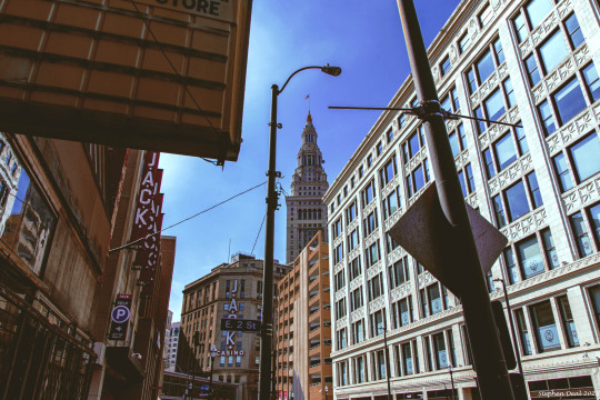
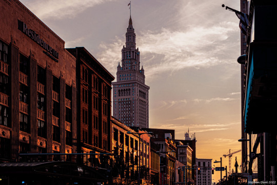
With the completion of the 708 foot Terminal Tower (featured in 9th picture) in 1930, a structure that was briefly the tallest tower in the world outside of New York City, Cleveland became a city where beaux arts design and neoclassical architecture is king. The strict classicism and high preponderance of civic buildings situated near public squares and parks gives Cleveland an identity that feels heavy and institutional. Like Carl Sanburg’s “Chicago”, Cleveland may be aptly personified as a “city of big shoulders”, albeit not as big and broad as its neighbor to the north. However, with a population of 900,000 in 1930, who’s to say at that time that Cleveland is not destined for bigger and better things? One brief aside, I was considering doing a blog entry on the Terminal Tower, due to its stature as Cleveland’s chief landmark, but the building is so massive and encompasses so many phases of Cleveland history at this point I think it transcends any simple time stamp I could put on it.
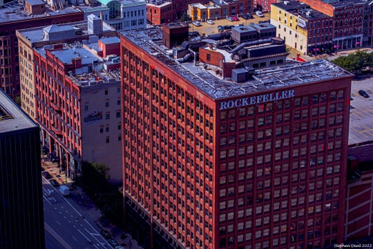
Though Beaux Arts and Classicism reigned in the city, there were also some notable structures built in the other important architectural vocabulary of the time: Art Deco. A prime example of the Art Deco Style in Cleveland was the Ohio Bell Telephone Building completed in 1927 (7th picture in the set). It was briefly the tallest building in the city and some believe that its design inspired the Daily Planet Building featured in the Superman comics. The Hope Memorial Bridge, just outside of downtown, is also a unique example of Art Deco aesthetics applied to transportation. Looking at the bevy of important structures built in the 20′s and early 30′s, it is easy to view this era as a kind of urban renaissance for design and architecture in Cleveland. The question to be addressed in later blog posts though is how does leadership in Cleveland build on this rich architectural legacy?
0 notes
Text
Keyword #2 Modernism Architecture
Modern Architecture stems from the modernism era originating out of the 1930′s heroed by Le Corbusier. Not only an architectural, but rather an art style - Modernism is an era which emphasises function over form, a departure from precedent, more decorative eras such as Baroque, Arts & Crafts and Art Deco. Characteristics of modernist architecture include minimalism, structure and open plan to which was adopted internationally and further aptly named as the international style of architecture for its universal legibility and adoption into society (Rossi, 2016).
Personally, modernism architecture being highlighted as a key word is a reflection to my personal design journey of which I have a degree in architecture. Modernism architecture is something that largely inspired me to study architecture and is also a huge driver to my passion in swiss graphic design (Hollis, 2006). Swiss graphic design principles are largely borrowed from modernism architecture with direct parallels able to be identified between the two styles. Such parallels include;
grid system (graphic design) - grid system (architecture)
negative space (graphic design) - open plan (architecture)
sans-serif typography (graphic design) - minimalism (architecture)
References
Hollis, R. (2006). Swiss Graphic Design: The origins and growth of an international style (1st ed.). Yale University Press.
Rossi, E. (2016). Free Plan. In The Bloomsbury Encyclopedia of Design (pp. 39–40). London: Bloomsbury Academic. Retrieved August 27, 2021, from http://dx.doi.org/10.5040/9781472596161-BED-F046
0 notes
Text
Week 9 Lecture Summary
In this weeks lecture, we had Elena Panaita talk to us. She is an Illustrator and a lecturer at AUT for Communication design. Today she spoke about the Russian Art Revolution which was from the early 1900′s, 1910 - 1930 to be exact.
She started out by talking about some events which had originally “kickstarted” or “influenced” the Russian Art Revolution. The Coronation disaster was from 1896. This was where 3600 people came to celebrate the coronation but they were crushed, trampled and then passed due to bad organisation of the event. 10 years later the Revolution happened in1905. The civilians had been marching on the winter palace with a petition for the tsar, calling for reforms and relaxations. This was caused by the shooting of protesting factory workers in St Petersburg in January 1905.
Elena moved on the talk about two art movements within the Russian Art Revolution. Constructivism and The Ballets Russes.
Constructivism was the art movement from 1915 to 1930. It can also be known as “the art and dance of propaganda”. The art styles that created Constructivism were futurism (in defence of free art), Suprematism (the supremacy of pure artistic feeling), and .... The idea behind constructivism art was that it were to be plastered everywhere. As previous famous art was concentrated in museums and “shrine like” places, people who were into constructivism wanted the art everywhere. Constructivism design is seen in architecture, theatre, and your usual poster/advertisement design.
The Ballets Russes was an art movement from 1909 to 1929. It was also talked about as “When art danced with Music” which is how Sergei Diaghilev, the founder of this movement, explained it. This movement brings focus to poetry, art, theater, dance, music and fashion and shows how they all inspire each other and intertwine with one another. Sergei Diaghilev said “I thought about creating a new more concise kind of ballet, which would be a self sufficient phenomenon of art, and would include three important factors of ballet. -music, drawing, and fashion.” Elena showed us many photos of how this art movement influenced the fashion of this era and the dance costumes.
0 notes
Photo


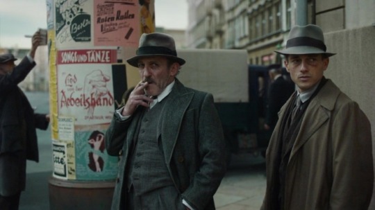
What would you say to a Raymond Chandler-style murder mystery set in 1920s Germany that stars Volker Bruch (a subtle genetic blend of a Young Dennis Hopper and Montgomery Clift) as a PTSD-addled cop, and cute little Lisa Fries as a Weimar-era Nancy Drew? And done on a budget that would embarrass all of Hollywood combined, and crafted with attention to absurd, gorgeous detail that makes Wes Anderson seem carefree.
Hold that notion for a moment.
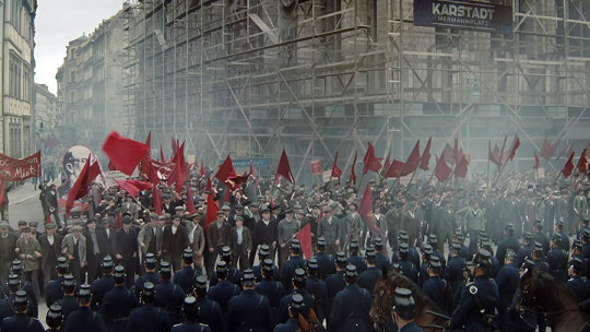
Babylon Berlin’s noir-infused narrative crawls alongside Germany’s rise to power, which we’ve seen in various productions dozens of times. But rather than stern drama, it’s instead a massive-scale fantasia (the most expensive television production in history) that employs the tropes and features of musicals, surrealism, police procedural, occult mystery, and cliffhanger serials.
Whole episodes seem at times solely devoted to offering brief devotions on the topics of architecture, psychoanalysis, fanaticism, Jugendstil Art Deco, surrealism, or cinema itself. But it’s all done as a delirious (if grim) visual tour, as opposed to a lecture.
I’m not doing the series justice here. Bear in mind that this is a Tom Tykwer project, and it revisits the imaginative, perverse energy of his Run Lola Run and Winter Sleepers work. It gets weirder and broader than all that, by far.
The aesthetic and vibe bring to mind Werner Herzog re-doing the entire “Avengers” British television series of the 1960s as a tribute to Fritz Lang and Neitzsche, or Paul Thomas Anderson reimagining Cabaret as one big episode of “Law & Order.”
It should be seen on a huge HD screen. Just wait until you get a load of the Hermann Platz and Rosenthaler Platz U-Bahn stations, or the Rotes Rathaus city hall on Alexanderplatz. It’s almost like the very sets and structures are characters in this bizarre, heartbreaking story.
Thanks to this series, I’ve had Roxy Music’s “Dance Away” in my head for the past few weeks. No, not the version we all grew up with. I mean the jazz age, klezmer-esque, Kurt Weill-ish version that—with a kind of reverse hauntology—woozily snakes its way through this mesmerizing, almost indescribable tale.
That song is about escaping the heartache of betrayal by getting lost in a pleasant diversion, to the point of obsession. That’s how romance and dating turn out sometimes. Babylon Berlin is about escaping betrayal and heartache because, well, that’s how history and culture turn out sometimes.
In 1920s Berlin, the dancing, along with numerous other diversions that are as perverse, frenetic, dark, and addictive as they want to be, take place in clubs and bars and brothels. Other folks are dancing in the streets, so to speak, in brutal clashes between numerous, barely distinguishable factions of Communists, Social Democrats, and the Berliner Polizist cops. There’s also a group of Trotskyites who can’t catch a break, and countless dual loyalties among Right and Left wings complicating the internecine fights that plague each political group. (Yes, the series does call for a Weimar politics flow chart at times.)
Most intriguing is that there’s hardly a Nazi to be found in the mix, unless you count the occasional dust-up with a few dozen Sturmabteilung bullies (those clumsy lads in sad, military-surplus brown shirts and little red arm bands).
There does seem to be a larger, more organized group waiting in the wings. Bunch of resentful holdovers from the First World War. Old, humorless guys in quite striking forest-green felduniform. Sure, it’s an army, but everyone in Germany in 1928 knows there aren’t going to be any more wars; that’s verrückt talk.
Speaking of crazy, the series has the main character’s mental illness, in the form of post-traumatic stress, function as a metaphor for the Weimar zeitgeist. It might seem like a facile reduction, especially if it were done in service to the notion that the cure is worse than the illness. But something else happens.
The close study of multiple characters in this series suggests that history may not always be guided by x-number of people getting swept up by something larger than themselves. Or by a mad leader.
Yes, a lot of folks march, shout, and fight in unison. But in this realm, major social changes are catalyzed by discrete (and often discreet), traumatic, life-altering personal histories that, solely by accident of geographical proximity, coalesce into what we would call a movement or a cause.
The world did witness the worst possible manifestations of “the madness of crowds” with what followed in Germany during the 1930s. But a deeper examination of what’s known as “the human experience” might reveal that each German was crazy alone before all of them were crazy together.
37 notes
·
View notes
Text

The Evolution of the Gallery and the White Cube
The role of museums and galleries has evolved over previous centuries. The first established public art museum was the Museo Capitolino which opened in Rome in 1734, built to display a collection of paintings donated to the people of Rome by Pope Clement XII. This art museum served as the model for many of today’s institutions, such as the Louvre and the Uffizi. Many of these galleries, perhaps surprisingly, continue to exhibit some of their collections today as they were displayed in the late 18th century. Prior to this, however, art was mainly housed in private collections and was the domain of the wealthy. Occasionally, private collections would be opened to the public but it can be argued that the main purpose of such art collections and displays at this point in history was quantitative and as an indicator of status. By the 19th century, galleries were developed as places to evoke a sense of the bourgeois and this was highlighted in the opulent and extravagant surroundings of the Parisian Salons and in buildings such as the Walker Art Gallery in Liverpool, where collections were hung in elaborately decorated rooms so that every inch of wall space was covered with framed works of art. Such institutions were often funded through the business profits of the upper classes and most frequently served to provide a place where art could be seen and sold. Visitors to the gallery were there to merely observe the scene rather than to interpret the art itself. Art installation in this manner and at this time was, as Greenberg, Fergus & Nairne noted in Thinking About Exhibitions (1996, p.373), ‘decidedly an ornamental and illustrative process’.
As mentioned, some museums and galleries in the 21st century still cling to the tradition of the classical painting galleries of the 18th century, retaining rooms with luxuriously wallpapered walls and ornate gilt frames, creating an atmosphere of ceremony and ‘imbuing the exhibited objects with preciousness’ (Greenberg, Ferguson & Nairne, 1996, p.374). However, by the early 20th century, art became more abstract in form and this resulted in the development of a new style of gallery space, the white cube, which remains prevalent today. This aesthetic consists of a square or rectangular room where the walls are bare and painted white. The room is usually lit from a source in the ceiling. Initially, the Bauhaus group and artists such as de Stijl insisted their work was displayed against white walls since they believed that the background was integral to the artwork and served as its frame. The plain walls of the white cube afforded the maximum contrast to the dominating colours of these abstract paintings.
The first white cube was developed in New York’s Metropolitan Museum of Art by its director, Alfred H. Barr in the 1930’s. Inspired by architectural trends of the era, the gallery space was also intended to allow the viewer to focus on a limited selection of works in what was considered, as Birkett noted in To Infinity and Beyond: A Critique of the Aesthetic White Cube (2012, p.75), a ‘simple yet dynamic setting’. Barr therefore developed a venue that met the needs of the social and political era by presenting art as ‘self-sufficient symbols of freedom in a capitalist culture’ (Birkett, 2012, p. 78). The white cube was subsequently replicated in museums and galleries across the globe.
The white cube can thus be considered as a neutral space in which art can be exhibited, and for this reason it appears to be the favoured gallery space for most contemporary art exhibitions today. I would agree that, in many of the exhibitions I have attended, the plain white walls do allow the artworks to speak for themselves and I find this less distracting than busier walls, for example the heavily patterned wallpapers found in some of the traditional galleries within The Walker or The Ashmolean in Oxford. It is worth noting, however, that the more classical exhibiting of works does tend to mainly remain reserved for pre- 20th century pieces.
It is also interesting to consider that Barr was developing the white cube aesthetic in Germany at the time of Nazism and so this approach to exhibiting art might also be seen in relation to his desire to protect art and ensure that it was autonomous - free from cultural oppression and the political agenda of the milieu. However, it can also be argued that the painting of gallery walls white could be viewed as elitist in that, ideologically, it hints at the early patronage of art by white, male, wealthy individuals and that exhibitions were traditionally the domain of a predominantly white, middle class, ‘educated’ audience. The white cube here could therefore be criticised for alienating large groups within society.
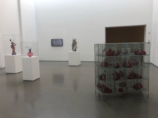
Recently, I attended a photographic exhibition at the Open Eye gallery in Liverpool, Follow The River, Follow The Thread, which explores sustainable futures in Africa. The exhibition contained several images taken by artists of colour. The Open Eye is a prime example of a white cube gallery, yet for this exhibition the walls of the gallery had been repainted an earthy brown. The gallery guide informed me that this had been a choice made on the basis of the aesthetics and theme of the works exhibited and also in response to the notion of white walls as sometimes being interpreted as discriminatory and exclusionary. I felt the colour worked well with the pieces displayed and the re-painting of the white walls here automatically made me reconsider the allusion to elitism and alienation the white cube gallery can suggest.
In Artforum in 1976, Brian O'Doherty explored 20th century art's shift toward context, in relation to the white cube space. He analysed what this highly controlled framework of the modernist gallery does to the art object it exhibits and to the viewer, and how the setting can be seen to ‘devour and thereby become’ the artwork. In his first essay, O'Doherty described the modern gallery space as being ‘constructed along laws as rigorous as those for building a medieval church.’ I find this view particularly fascinating, as O’Doherty continues, it suggests that ‘the outside world must not come in’. Often, in white cube spaces, windows are missing or are sealed off so the ceiling becomes the only source of artificial light. Here, the art can be free 'to take on its own life.' O’Doherty argues that the white cube gallery as a setting is therefore similar to the purpose of a church and that the artworks, ‘like religious verities, are to appear untouched by time and its vicissitudes.’ Many religious buildings, like the medieval church O’Doherty compares the white cube to, were also designed so as to eliminate any awareness of the outside world. I feel that when I have observed visitors to many white cube gallery exhibitions their behaviour is very similar to the behaviour I’ve also witnessed of visitors to religious buildings. Generally, people instinctively walk slowly around the space, they talk in whispers if at all and the artworks somehow seem to become sacred objects to be revered within that setting, often little emotion is shown by the viewers. I would argue that, in this way, the white cube can therefore be seen as limiting the viewers’ response to and engagement with the art, in a similar way to the gilt framed paintings of the classical art world, where the frame itself served to focus and limit the viewers’ response. This idea opposes the notion that the white cube offers a space where the art can be appreciated in its own right in an unconstrained manner. The white cube gallery can appear here as a limiting space rather than one associated with the freedom of thought.
As new genres of art emerge, galleries are now rethinking their response to the white cube aesthetic and how appropriate it is in the display of more dynamic and varied artforms. The recent Derek Jarman retrospective, PROTEST!, that I attended in Manchester Art Gallery, showed his vast array of divergent works against black walls. This seemed much more intimate than when the same works were shown against white walls previously, when the exhibition first opened in the Irish Museum of Modern Art in Dublin, as pictured in the exhibition catalogue. The black walls also worked well with the vibrancy of much of Jarman’s work, in particular his films, and this also added a bleakness to his final poignant film, Blue, which I felt brought a sadness that wouldn’t have appeared so all-consuming had the gallery walls been white and stark. O’Doherty also suggested that, ‘For many of us, the gallery space still gives off negative vibrations when we wander in. Aesthetics are turned into a kind of social elitism – the gallery space is exclusive. Isolated in plots of space, what is on display looks a bit like valuable scarce goods… the gallery space is expensive.’ This speaks of a viewer who is not always so engaged with the art but feels it is unattainable. Whilst the white cube walls do offer a negative expanse where the art can be viewed in an uninterrupted manner, I believe that there will be a move away from this pristine void form of gallery space in the future, in response to the changing nature of art and its dynamism and desire to be more relevant to all, inclusive, and demanding of a deeper level of engagement and reaction from the audience.
2 notes
·
View notes
Last Seen Blogs