#(first was embroidery. i like cross stitching but i find it really fiddly and time consuming and i absolutely hate doing detail work
Text
Final Outcome samples
I have really enjoyed this project as it has enabled me to explore something that I have such a strong interest in in a lot more depth, such as discovering Henri Toulouse-Lautrec, his art, and how he has impacted the Moulin Rouge's legacy. I really enjoyed being able to incorporate stylistic elements of the film/stage show such as the costumes, set and story.
I have particularly enjoyed exploring different textile techniques, working with different fabrics and being able to develop my work into something better even when it doesn't quite go to plan.
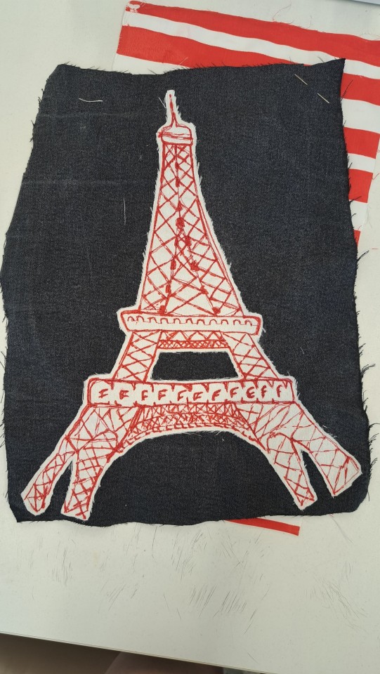
For my final few samples I wanted to show an array of the techniques I have learned and discovered as I think it will summarise my project and process really well. My first sample a more simplistic print of my Eiffel tower mark-making onto some hand-printed stripes. When creating this set of stripes I decided to alter it slightly form my first set by creating a thinner then thicker repetitive pattern, Then I printed the tower onto the stripes, I positioned it sightly to the side so I was more reminiscent of a landscape then of a poster. I think this print piece looks good, I really like the contrast in the colour palette, although I wish the tower was a bit more prominent.
For my next sample I wanted to make an applique sample similar to my reversed applique motifs, I was considering making it reversed applique as well but I was concerned it would be too similar and I eventually ran out of time to do it. To finish this sample I wanted to recreate the cross-stitch stars which I had made towards the beginning of my sketchbook so that it had more volume. I think the layout and the colour choices work well as a nod to my poster inspired samples. (unfortunately didn't manage to take a photograph of the finished sample).
For my third sample I wanted to work with pleating again as it had been really successful the first time round. I thought about what I could do differently and I decided to create a honey-comb style piece as it would have a lot of texture and shape to it. I also used my black and red gradient stripes to make it less plain. Overall I like this piece, particularly when it is stretched out it works really well, however it does keep condensing back down into a thin flat position and I couldn't find a way for it to hold its shape.
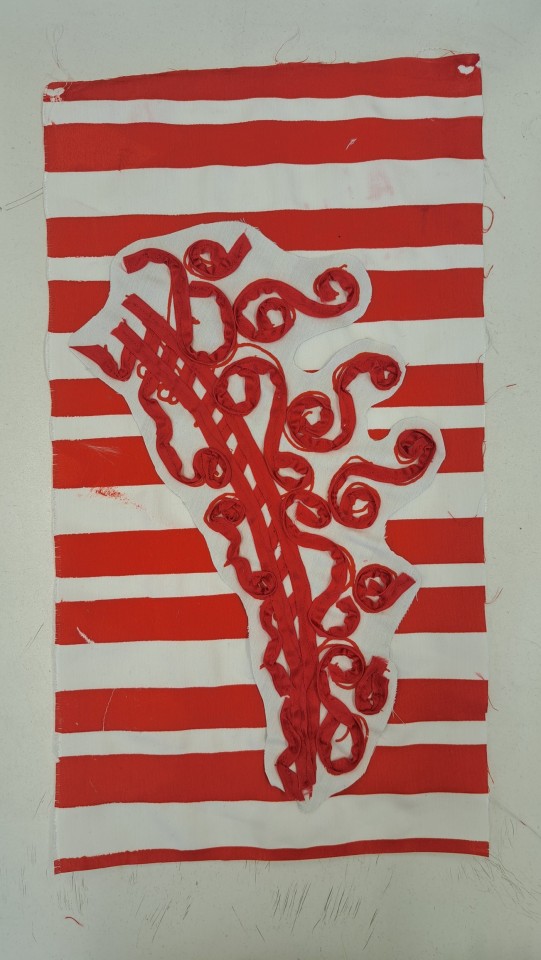
For my Final sample I wanted to work with the print I hadn't yet worked with which is the spiral motif, I thought a lot about what I could to to this piece to add dimension and shape to make it more distinct and I eventually decided to do some couching with it. I looked at different thread options that had different levels of thickness but I felt that the regular red ribbon would have the most prominent effect and would be less fiddly to work with. I used the embroidery foot on the sewing machine and I placed the down on the print lines as I sewed along them, making sure to not let the ribbon fold over. I'm really happy with the piece, I like how the ribbon sticks up and has a lot of texture whilst still holding the shape of the print design. Once again I placed my sample onto some of my hand-printed stripes so that it had a strong base layer and didn't fade into that background.


0 notes
Photo


“Each Time” Print Process and Development
REPLACE LAST IMAGE WITH BETTER VERSION AND CLOSE-UPS OF FINAL AND ADD PRESS VERSION OF PAPER PRINT
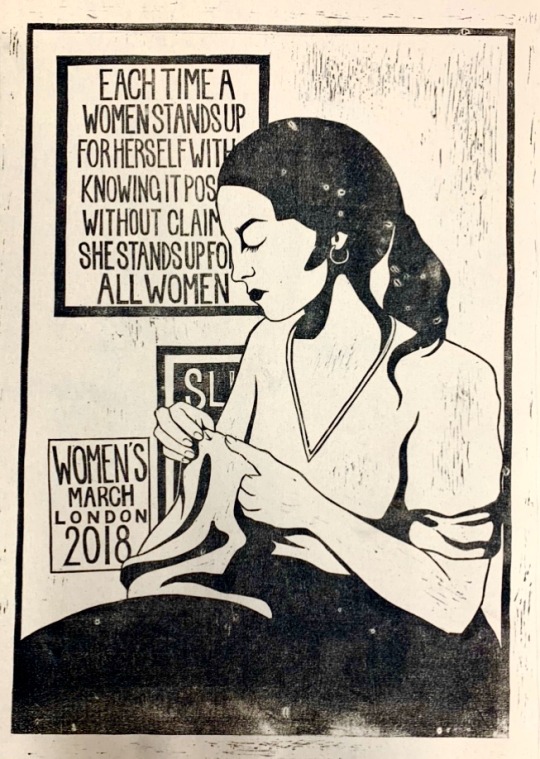
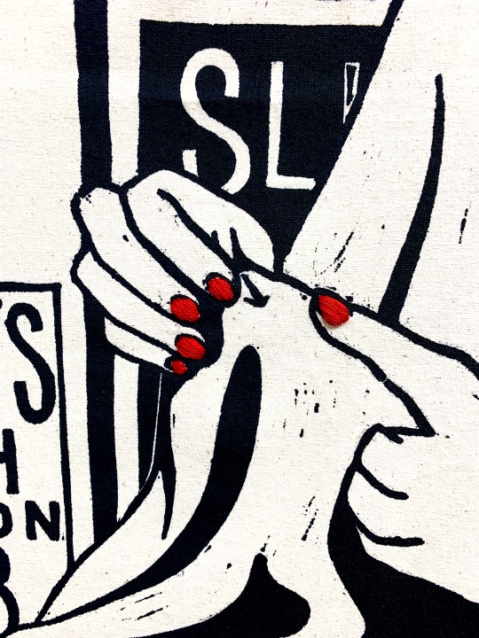
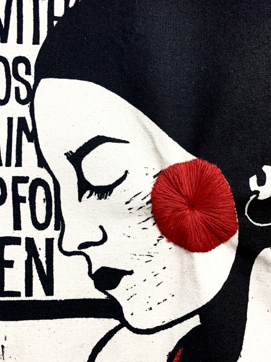
In my research for my dissertation, I have been looking into women in the workplace and women in the home and how the role of women in society changed through the 20th century. I have also been researching the role of women’s voluntary groups during and after the second world war and how they influenced and supported women. These groups supported women in traditional female roles of wives and mothers and encouraged and helped many working-class women improve “mothercraft” skills such as cooking and mending clothes. Middle-class women, as a trend, tending to be more experienced in these areas and were then encouraged to engage in craft-style activities such as flower arranging, embroidery and cross-stitch and making garments from scratch. In my art practice, I have engaged in time-consuming practices such as lino printing and embroidery, the repetitive nature and delayed gratification of the process is something I really enjoy about them. However, embroidery and needlework do have a traditionally feminine connotation that really informs the subject matter of my work.
I wanted to create a print that depicted a woman absorbed in her needlework, a traditionally feminine practice, with framed prints in the background featuring feminist literature and posters from women’s marches etc. I really wanted to convey a sense that it is okay for women to partake in traditionally feminine activities and present as very feminine but still be very involved in feminism and women’s rights. In the initial sketch, I had originally planned to include a clock in the top right corner of the image but decided against it as I felt that the composition of the image was stronger without it. It can be seen in the original sketch and also the prepped plate that I had also intended for there to be a wallpaper with a repeating pattern in the background, but I also decided against this as I wanted all of the attention to be on the words of the posters.
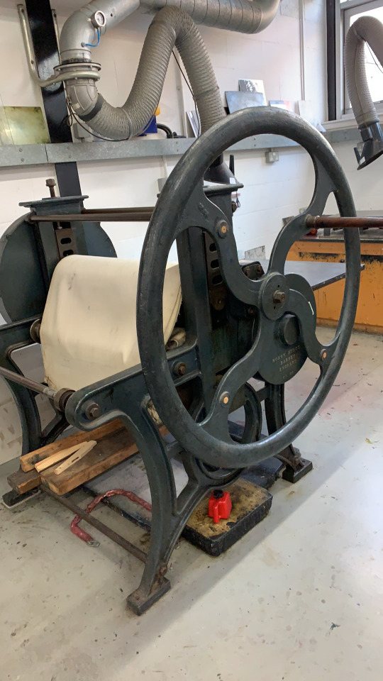
The process of carving this plate was quite difficult and took longer than I expected. Although it involved removing lots of areas of blank space, carving around the edges of each letter was quite fiddly. For the first two prints pictured above (which are not as successful) I used the largest single-hand roller I could find and printed the piece by hand just using the back of a wooden spoon to transfer the ink. As seen above, there are sections that didn’t print very well and the opacity of the ink isn't as strong as it could be, I decided to experiment with using an acrylic marker to add red accents anyway. For the paper and canvas prints at the bottom of the post, I decided to use a mono printing press (pictured above) to get a large amount of even pressure over the paper to get a really opaque transfer of ink. I also used a really large rolling pin style roller to load up the plate to allow for even application of the ink.
After getting a successful print that I was happy with on canvas I allowed a full week for the ink to completely dry to avoid smudging the design like I did on my cotton print. I then worked into the piece with red embroidery, adding details to the fingernails, cheek and piping on the shirt, I then added a thin red border around the edge of the piece to tie it all together. I also decided to take inspiration from the hanging style of presented work from Emma Talbot and Annette Messager and created small loops in the fabric at the top and bottom of the piece and threaded thin wooden poles through them to ensure the piece hung correctly. This piece really challenged me as I felt that it wasn’t working and didn’t look right, but I am so glad that I stuck with it and was determined to produce something that I was really happy with.
5 notes
·
View notes
Last Seen Blogs

udnua
UDNUA

bahja999
الحياة الطيبة

theyuseifan
i may be stupid

jotterstan
Wayne Gretzky's Service Top

ganem-ouchie
That hurt