
visualcommunicationswithjack
Visual Communications with Jack
24 posts
Don't wanna be here? Send us removal request.
Last Seen Blogs
disan
Disan
saevus-brutalis
brutalis (semi-hiatus)

awkward-postage-stamp
S.o.S.

ijungberg
alive girl
Photo

So that concludes my visual communication blog for this semester. I hope you enjoyed following along with me as I journeyed through this module and I hope I was able to show some nice examples of visual communication and share what I learned.
I really enjoyed this module and learned a lot about visual communication. It has changed the way I look at things and made me take notice of design around me a lot more.
1 note
·
View note
Photo
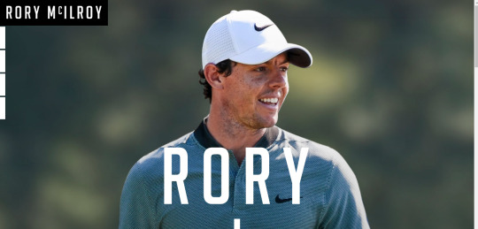


Because we had looked at portfolio websites in our last class, I was also interested in sharing some examples of websites from famous athletes I really like.
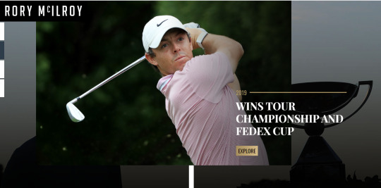
Rory McIlroy
http://www.rorymcilroy.com/index.html
This first being Rory McIlroy. He has a really nice website. I love the large imagery and the center line on the webpage. It acts like a timeline and as you scroll down you see you different stories or his victories in chronological order.
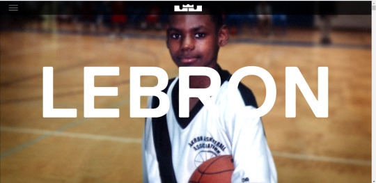
Lebron James
https://www.lebronjames.com/
Next us Lebron James. His website is awesome. He has a black theme and it’s layout is a long scrollable one. Like I mentioned in the last blog post, I really like dark designs with light text. What is really cool about this site is as you are scrolling down, when you get to a section and keep scrolling, it then scrolls horizontally through that section before then scrolling down to the next section. Really cool engaging site full of imagery.
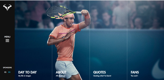
Rafa Nadal
https://rafaelnadal.com/en/
Lastly we have Rafa Nadal. His website is very simple when it comes to content. It just has an about page, his day to day activity, quotes and some fan content. But what I love again, is the large quality imagery and the layout. I really like the side menu and the split in the image for the different sections. When you hover over a different section the main image changes also which is really cool.
Three awesome sports stars websites that I find really inspiring.
0 notes
Photo

In our final class, we looked at building a portfolio and the importance of a strong portfolio for you career prospects. We also looked at some examples of good portfolios. So I wanted to share some examples I really like.
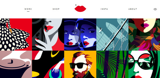
Malika Favre
https://www.malikafavre.com/
This first being Malika Favre. She is a French artist and illustrator based in Barcelona. As can be seen in the first two images, her website is like a canvas with all her illustrations. When you click on one it will show you the illustration in a larger window and you can also see the magazine where it was published. Her work is amazing and I love the simplistic view and layout of her website. I could spend all night looking at her work.
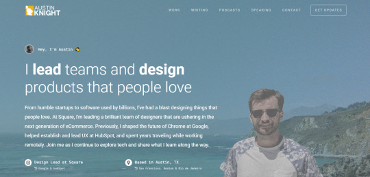
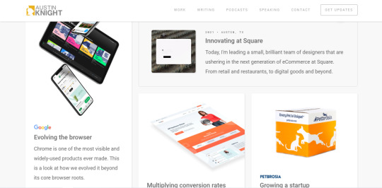
Austin Knight
https://austinknight.com/
Next we have Austin Knight who is a product designer for Google. He has a really nice long scrollable website where he has all his work in a blog like layout where you can click to read and learn more. I like the layout and the home page section. The larger text stating what he does with bold emphasis on him leading teams and designing products people love is really confident and to the point. A really nice website overall.
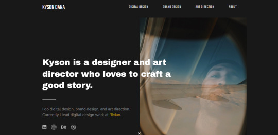
Kyson Dana
https://www.kysondana.com/
Finally we have Kyson Dana who is a designer and art director working at Rivian. He has worked for the likes of Tesla and Adobe before. I love the design of this site. I really like the dark site with light text and large imagery. It makes for a really slick and strong portfolio website.
So three very different but very strong portfolio websites I really like.
0 notes
Photo
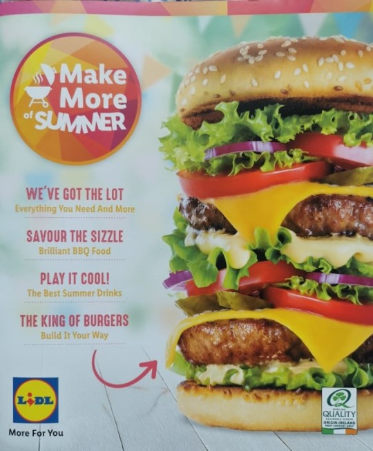
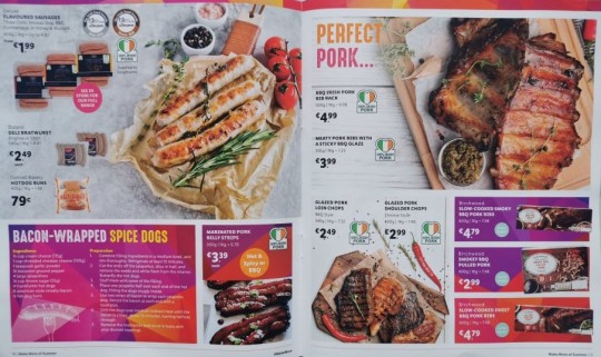


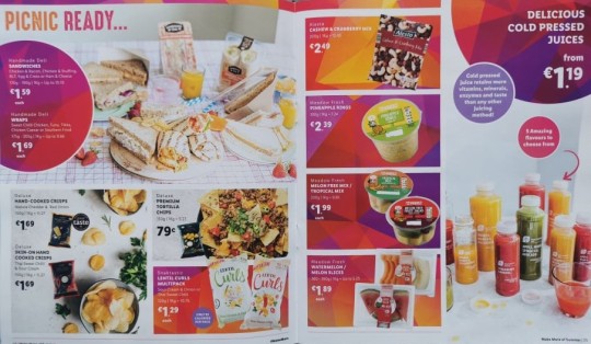
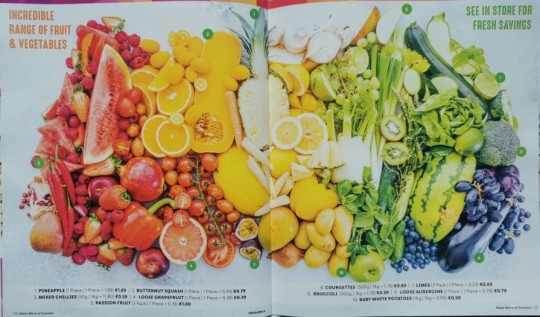
In our latest class. We looked at advertising. I have covered some advertising in my various posts but one area of advertising I was yet to get to was food advertising. Above I have shared a Lidl summer booklet I had at home which advertises all their summer bbq products.
I really like this example as they use a range of techniques and methods here creating a fantastic piece of advertising.
Imagery
The first being imagery, I love the imagery used by food companies and supermarkets. This booklet from Lidl has beautifully presented food with vibrant colours which creates strong delicious and fresh ingredient imagery for the advertisement. I especially like in the final image how they have a created a colour chart using the various fruit and veg.
Colour, Shapes and Layout
Along with the vibrant colourful, I really like the layout of the booklet, use of shapes and colours. Again very vibrant engaging colours used for the shapes and nice grids and shapes to layout the various text and product boxes.
Typography
Finally, the use of big, bold and colourful text works great here. Very eye catching and easy to read.
An example of really great advertising using a variety of elements to achieve this.
1 note
·
View note
Photo


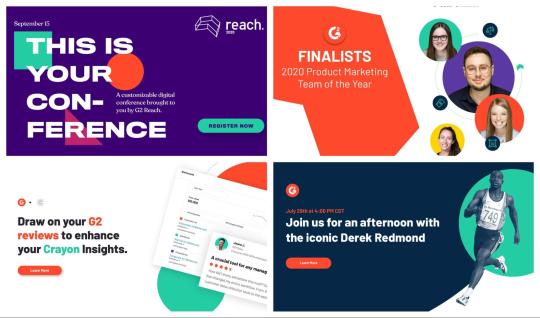

In last weeks class, we looked at some of the design trends that will be in focus for 2021. These included UI Design, Illustrations, Motion Design and Interactions and Package Design.
This prompted me to do some further research and look at the graphic design trends for 2021. Below I will post a link to a nice detailed article which covers seven trends and I will also give a brief run through of the topics of the article and the photos I have shared above from the article.
https://venngage.com/blog/graphic-design-trends/
1. Muted Colour
The first trend is muted colours. As can be seen from the first image, muted colours are vibrant colours that have their edge taken off by adding white or black to dull them. This really took off last year and seems to be the desired choice going forward over bright colours in graphic design.
2. Simple Data Visualizations
With shortening attention spans. People want data and information instantly. So simple data visualizations are becoming the standard. As can be seen from the above tweet about the NBA. You can see the simplistic and straightforward graph comparing the restart game viewings to Christmas game viewings and the 73 percent increase. In order to engage the reader, you have to get straight to the point with clear visuals.
3. Geometric Shapes
Another very simple and effective technique becoming popular is geometric shapes. This enables designers to add colourful elements, frame pictures or pieces of text in a simple and creative way which can really add to a design.
4. Flat Icons and Illustrations
A trend that has come full circle after first becoming popular in 2015. I love illustrations and it’s something I would really like to get good at. Icons and illustrations are a really simple, beautiful and powerful way of visually communicating information.
5. Serif fonts
Serif fonts are the oldest types of fonts and are seen as classic, elegant and trustworthy. They can work so well for an array of designs. They work really well for headings also and can pair well with sans serif fonts this way.
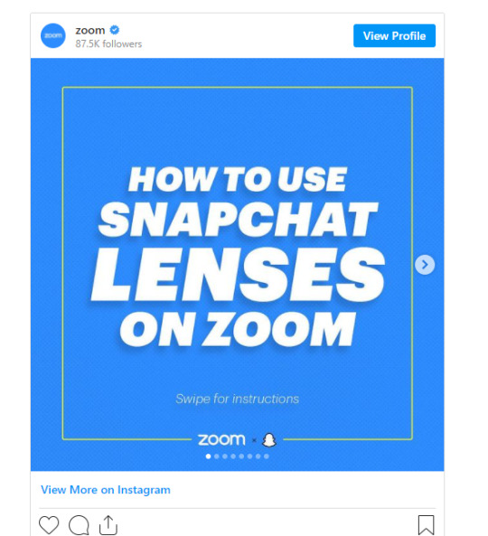
6. Slide Decks
Slide decks are very popular as again, with shortening attention spans, they can communicate information in a slide show presentation like the Zoom slide deck example above rather than trying to get users to click a link to go to a different page. This can be a far more effective method to use.
7. Text Heavy Videos
Finally, a trend for 2021 is text heavy videos. Because of zoom, people are probably going to be tired of watching a person on a video. So creating engaging videos with motion graphics and lots of text is predicted to be an effective method in 2021.
1 note
·
View note
Photo
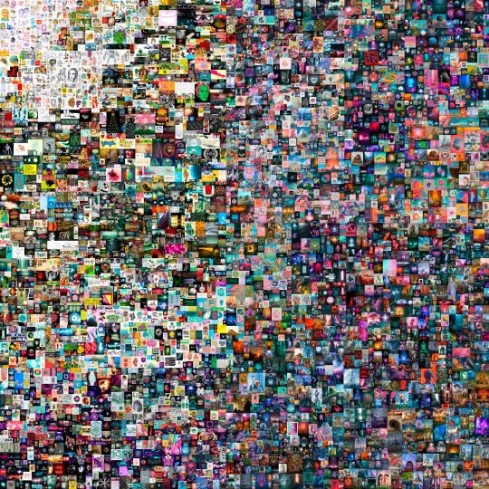


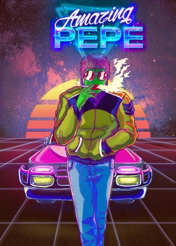
The latest emerging trend in Visual Communication is Digital Art. This coming in the form of Non Fungible Tokens or NFTs. These are all bought and sold online with crypto currency on a blockchain where the original Owner and chain of subsequent owners is visible for all to see.
These NFT’s cover a range of categories from genuine digital art, pixel art, cats, memes like pepe and even basketball. These are selling for crazy amounts of money and seem to be the future of art. Rather than having physical art, people will be trading digital art online.
The first example I have shared is called Everydays - The First 5000 Days. A massive compilation of artworks by Beeple which was started way back in 2007 with one artwork been created everyday since until it was sold for $69.3 Million!! Just astounding!
So who knows where exactly we are headed in the future but with the continuing rise of crypto currency and emergence of NFTs, Blockchain and digital art, it’s seems to be future of the marketplace for art.
1 note
·
View note
Photo
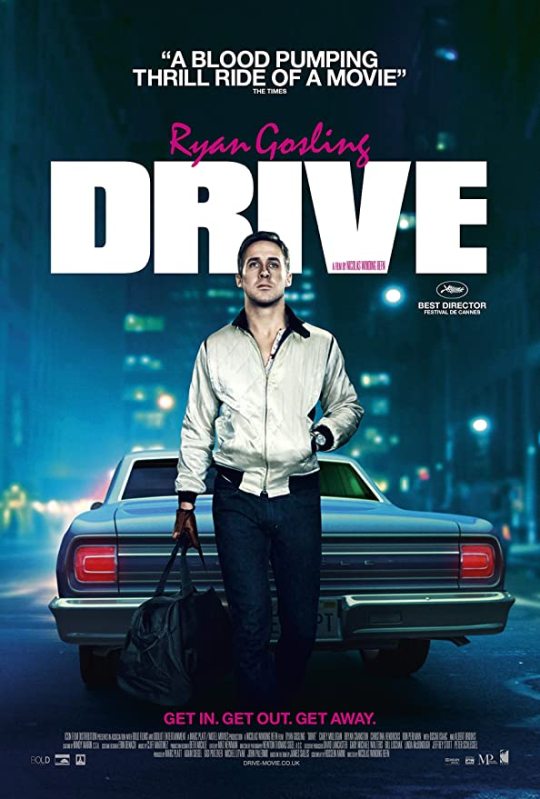


In this weeks class, we looked at movie posters and the various elements that go in to making a quality movie poster. Movie posters are integral pieces of visual communication that help sell a movie to potential viewers. Above I have shared some movie posters from some of my favourite movies.
Drive
Drive is a really cool movie. It has one of the best soundtracks and revolves around the main character played by Ryan Gosling who is ice cold cool in the movie. I really like the bold, in your face font of the title complimented by the pink text of the tagline and main actor. The image of gosling in front of the car with the money bag is really fitting as he is a heist getaway driver in the movie.
Interstellar
I could have done a whole blog post about Christopher Nolan. He has made so many epic movies over the years, none more so than Interstellar. I just love the imagery used in this poster. The epic view of the black hole among the stars as a lone man walks on the surface of a distant planet. A fitting image for what is an absolute adventure of a movie.
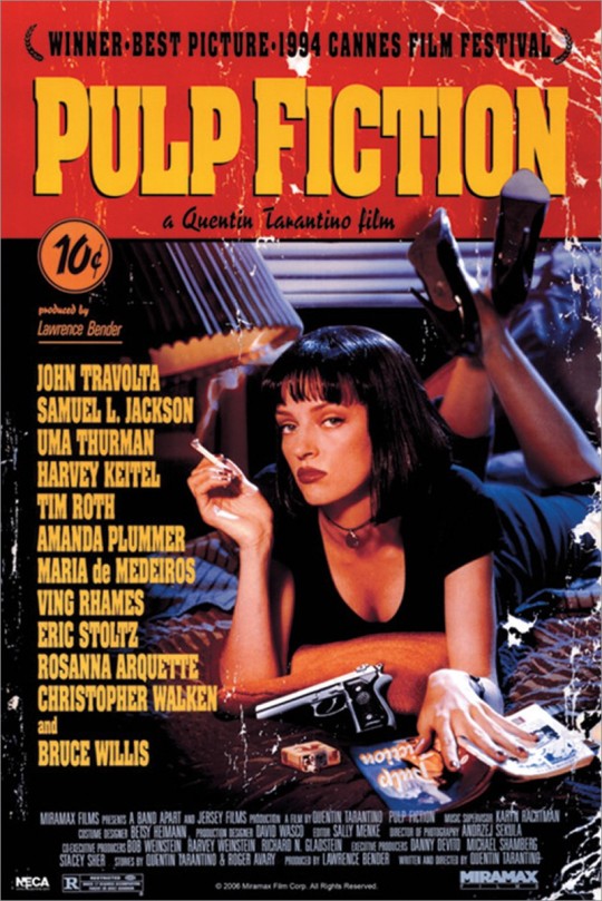
Pulp Fiction
Quentin Tarantino’s most iconic movie with an equally iconic poster. Uma Thurman looks so badass in the photo with her stone cold expression, the cigarette in hand and gun on the bed. The typeface used for the title is really attention grabbing also. A really cool poster.
The Dark Knight
Another Christopher Nolan example. His Batman trilogy is simply perfection and I never get sick of watching the three movies. The most famous being the second instalment because of Heath Ledger’s brilliant Joker performance. The poster really captures the chaos of the movie with the burning bat symbol in the building couple with the tagline above the building. Another really strong visual poster from a Christopher Nolan Movie.
Casino Royale
My favourite James Bond film to date. Daniel Craig's first outing as Bond was excellent. I love the use of the two “O’s” for the 007 logo in the movie title. The visual imagery of Bond in a undone tuxedo holding a gun portrays a suave Bond but also one who is ready for action no matter what.
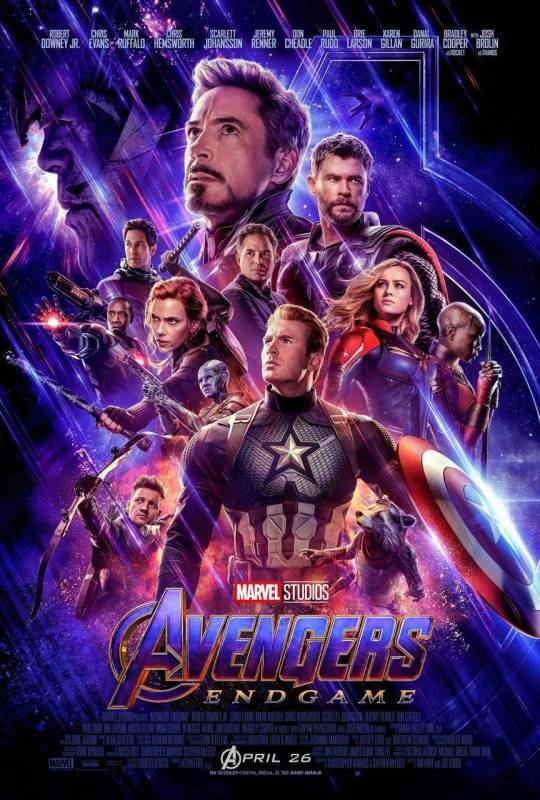
Avengers Endgame
And finally, the last movie poster I wanted to share was the titanic finale to the Marvel cinematic universe. Marvel have made so many great movie posters for the various different movies. But this one was awesome and fit all the mega superstars in the one poster. I love the colour and epic imagery. A truly fitting poster for a blockbuster movie.
3 notes
·
View notes
Photo

An area of logo design I love is sporting logos. iconic teams need iconic logos. Above I have shared some classic sporting logos.
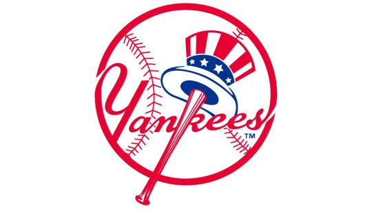
New York Yankees
The biggest and most successful franchise in baseball, the New York Yankees are world famous. Their logo is American as it gets. The strong use of red, white and blue and the brilliant visual of a baseball bat with an Uncle Sam hat hanging on it in front of a big baseball works really well. The typeface is really nice and I love how they work the baseball bat inbetween the “N” and “K” and the team name joins with the outline of the baseball.
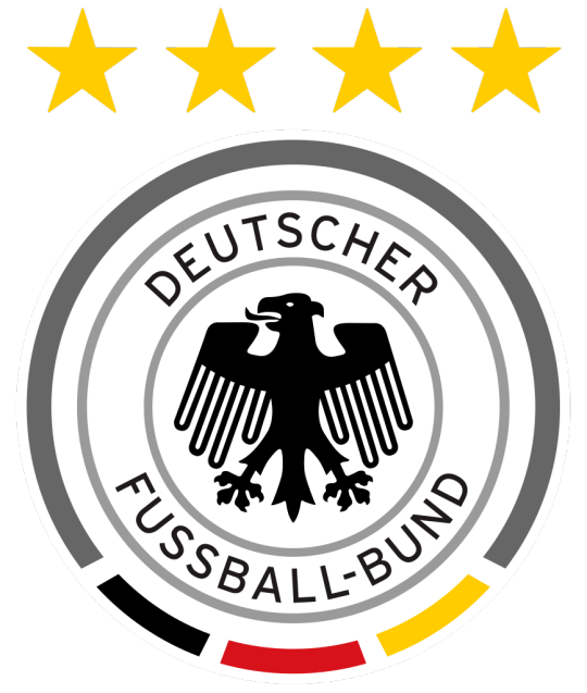
Germany National Football
Giants of world football and feared by everyone. Germany’s logo oozes class and strength which matches their footballing ability. I really like the strong visual of the eagle in the middle of the badge. The circle design with the coloured segments for their national flag is beautiful. The text wraps nicely around the eagle and the four stars for their four World Cups is a lovely touch. Just a class logo.
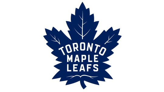
Toronto Maple Leafs
I lived in Toronto for two years and hockey is an absolute religion over their. Tickets for a Leafs game are in high demand and will cost you quite a bit. The franchise has a gorgeous simplistic logo. The giant maple leaf proudly representing Canada. It has a really nice sans serif font for the team name and I really like curved Toronto over the Maple Leafs. I also think the use of a blue leaf with white veins works really well.
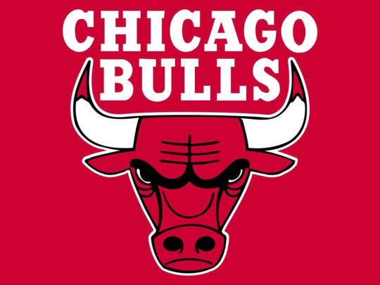
Chicago Bulls
Another world famous franchise, thanks to Michael Jordan and the teams success in the 90′s. One of the things I really like about American sports is the use of animals as mascots and logos. They create beautiful intimidating animal illustrations that work really for the team and also for all types of merchandise they sell. This being very true with the Bull for Chicago. Its a really nice illustration of the angry bull. The name of the franchise just rolls of the tongue aswell.
Baltimore Ravens
The Ravens are an NFL team. Not the biggest franchise in the world but they have been SuperBowl Champions. What I really like about the logo is the colour combination and the placement of the “B” on the ravens head. Its makes the raven look like he is wearing a football helmet which is very clever. The purple, gold, black and white all work really well together and I like the red intimidating eye of the raven.
1 note
·
View note
Photo

In this weeks class, we looked at logos. We looked at all the elements that go in to creating a strong logo like colour, typography and graphical elements. So I wanted to share some brand logos that I really like and are prevalent in my life.
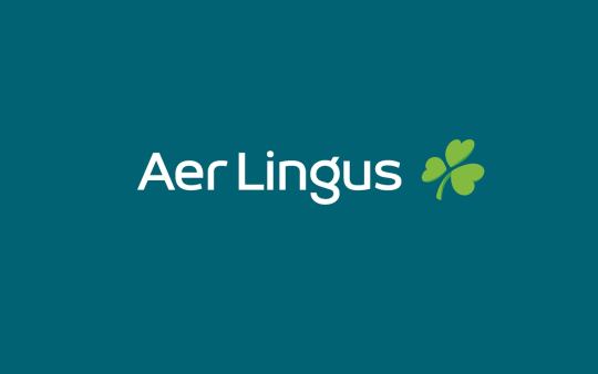
Aer Lingus
The first being Aer Lingus. I have a nostalgic and sentimental attachment to this brand as my mum used to work for them and I usually flew with them when I was younger. But they have a really strong logo and brand. The use of three leafed clover and green colours clear represent their Irish identity. The darker green for the background is a really rich and elegant green. They make use of a unique san serif font which also works really well for the logo.
Titleist
I mentioned Titleist in one of my first blog posts when it came to their advertising strengths. They also have a beautiful and simple logo. The cursive font they use just gives off a classy, traditional, expensive and quality vibe which really represents them as a brand. They are expensive but the absolute best in quality when it comes to golfing equipment so it is a fitting logo.
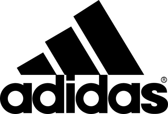
Adidas
Another sporting brand, Adidas is one of my favourite brands. The three stripes being so unique to them and instantly making their products recognizable. I like the newer logo compared to the original plant logo. Another nice unique sans serif typeface that is really bold and eye catching. They layout of the three stripes also just fits the logo so well.
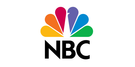
NBC
Next is the logo for the National Broadcasting Company in America. I usually watch NBC’s coverage of the golf on tv. This is a really colourful logo with great meaning. The logo is a peacock which was first introduced in 1956 to highlight the companies colour programming. A truly beautiful logo with fantastic colour use and nice sans serif font for the acronym.
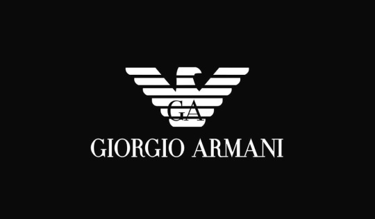
Giorgio Armani
Next is Giorgio Armani. I really like their watches and just think their logo is fantastic. The eagle is a strong visual and just symbolizes their quality and excellence as a brand. The serif font is also very classy and really fits the graphical logo.
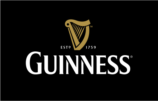
Guinness
And finally, I can’t be Irish and talk about logos without mentioning Guinness. I had mentioned them in an earlier blog when it came to strong visual communication in advertising but they also have a quality logo. The harp is so synonymous with Ireland and is an excellent choice. They established in 1759 either side of the harp works really well and the serif style font is really nice and attention grabbing.
Just some logos I think are really strong.
0 notes
Photo


In our last couple of classes, we have looked at Visual Rhetoric and the power of imagery and the emotional response it can cause. I think the most powerful examples with imagery we see are used to bring attention to current issues and topics in the world.
Surfrider Foundation
The first is from the Surfrider Foundation, a non profit organistaion that works to protect and preserve the world oceans. Plastic waste has been a major problem for many years and continues to be. This was a very powerful image with a strong tagline also. The sushi filled and wrapped in plastic is very clever and makes for a strong image portraying the disgusting pollution we are causing with our plastic waste and how in the end we are only going to be consuming this waste.
Climate Change - Polar Bear
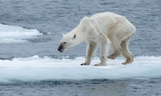
This shocking image was taken by Kerstin Langenberger. It graphically portrays the damage of climate change in the Arctic that we cannot see and are not taking note of. The melting of ice caps, the starvation and struggle for animals living there. Again, the damage that are we are causing to our home planet and what these rising temperatures are doing. Some animals and parts of the world are suffering and changing more than others and it seems until it starts directly effecting us, we won’t start taking action. A very powerful, graphic and sad image.
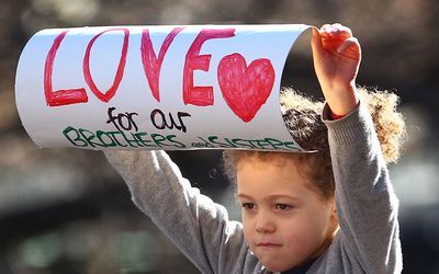
Love Sign
The third image I have shared is of a young girl holding a sign during a protest with the simple message of “Love our brothers and sisters”. The impact of children engaging in protest is very powerful. Children don’t know about racism, discrimination or divide when they are young. These are all things we learn about or influenced by as we grow older which only goes to show that they are not in human nature. We need solidarity now more than ever especially after this pandemic so hopefully we can continue to strive towards that.
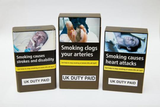
Anti Smoking Images
The final example I have shared is a couple of examples of the anti smoking images they started to put on packs a few years ago. As a former smoker myself, these images were powerful and there was usually certain images I especially didn’t enjoy seeing. So the power of these images worked and I think definitely helped me in quitting as every time you grabbed a smoke you saw these images. They are graphic but true to the dangers of smoking and how smoking is a silent killer. In most cases you can’t see the effect it has on you and your body.
Just some examples of powerful imagery and how they can cause emotional reactions and make you think about and start to be concerned about certain topics or issues.
0 notes
Photo


In our last class we looked at photography techniques and the power of imagery. We looked at some iconic photos throughout the years. I wanted to share some iconic photos I really enjoy. As I am a sports fanatic, I’ll be focusing on sporting moments.
Tiger Woods
The first image is from Tiger Woods victory at the 2018 Tour Championship. His first win in 5 years. As he strode down the 18th, fans excitement could not be contained as they burst through the ropes and swarmed around Tiger. The atmosphere was electric. A really cool photo with Tiger in the middle of the sea of fans that just captures the epic moment that it was.
The second image being of Tiger’s Masters win in 2019. His first Major in 11 years, an even longer wait. Many had said he was finished but he proved his doubters wrong and this photo brilliant captures the release of shear raw emotion from Tiger, something he was never known for. It just shows how much it meant to him. Two iconic photos of the greatest golfer of all time.
Lebron James
This is one of the coldest and coolest basketball photos ever taken back in 2010. Lebron James about to dunk a layup from his teammate Dwayne Wade as Wade celebrates arms out without even looking. Total confidence in James and the inevitable score.
Michael Jordan
Another iconic basketball photo. The 1988 dunk contest saw Jordan take the trophy and produce a stunning dunk that lived up to his nickname “Air Jordan”. The perfectly timed photo captures Jordan mid flight and makes it appear he is flying towards the basket.
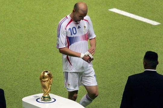
Zinedine Zidane
An iconic photo from football but for all the wrong reasons. Zidane, arguably the greatest midfielder of all time, playing his last ever game, the 2006 world cup final, in a moment of madness headbutted his opponent in the chest after an argument and was sent off. The photographer captured this tragic image of Zidane walking by the trophy, removing his tape, head hanging in despair as the final carried on behind him. France went on to lose the final and Zidane left to rue what might have been. A bitter end to a glittering career.
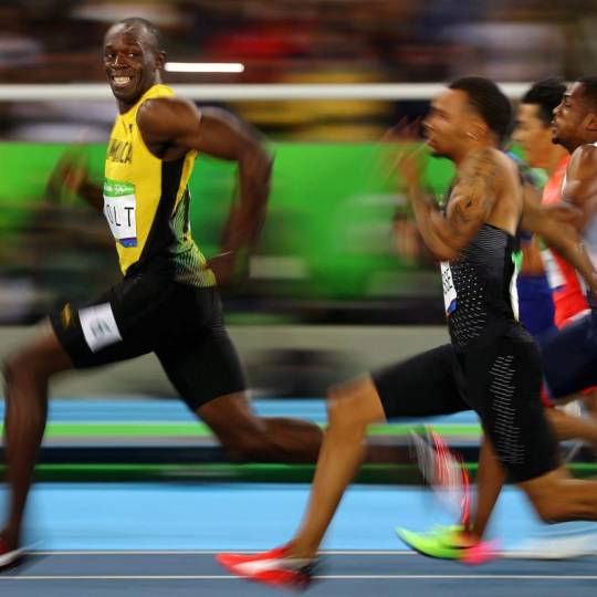
Usain Bolt
An amazing photo taken of Usain Bolt from the 2016 Olympics. The fastest man in the world, cemented his place in history as one of the greatest athletes. He seemingly jogged his was to victory and even had time to look back and smile and enjoy the moment while the rest of his competitors strained and giving every ounce just to try keep up with him. Truly remarkable.
Odell Beckham Jnr
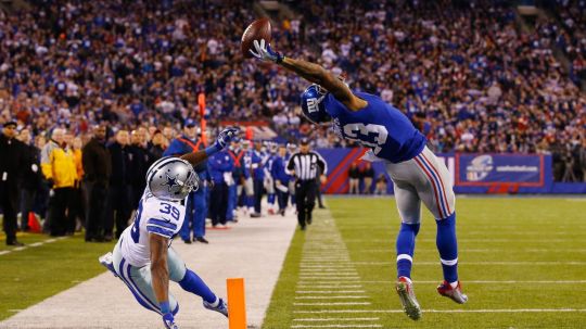
Lastly is a photo of probably the greatest catch in NFL history in 2014. Beckham Jnr caught a 43 yard pass one handed over his head jumping backwards at full stretch. This perfectly time photo captures this unbelievable moment of the seemingly impossible.
Just some iconic images in sport I wanted to share.
4 notes
·
View notes
Photo
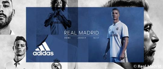


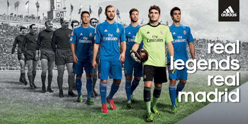
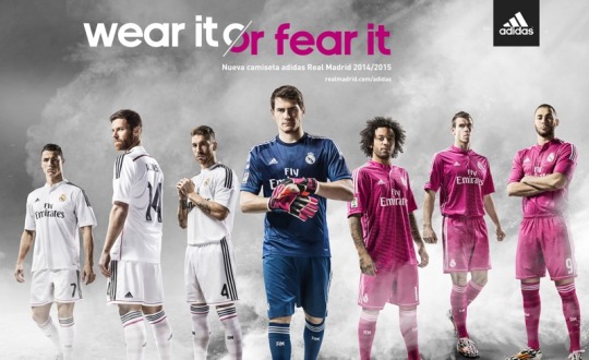
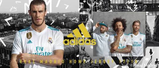
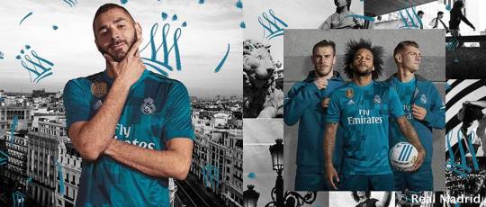

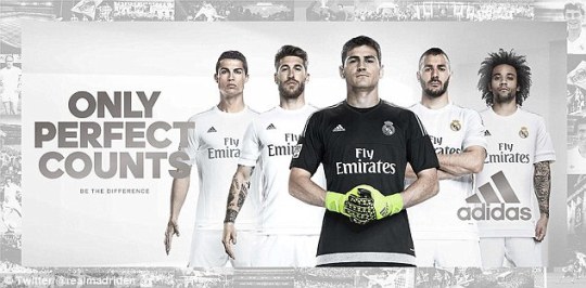
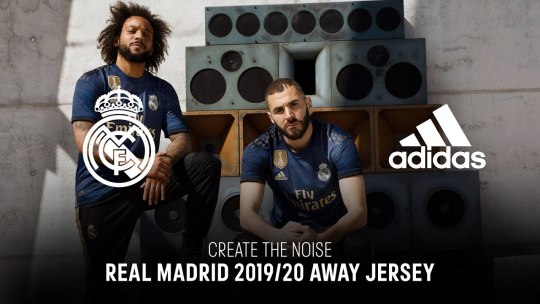
In this weeks personal topic, I wanted to share visual communication pieces from Adidas and in particular, their kit launches for Real Madrid. I’m a supporter of Real Madrid and lover of Adidas gear.
Above I have posted several kit launch advertisements they have done over the past few years. Adidas always seem to produce strong visual communication pieces for all their products.
They have a fantastic use of photography, colour, lighting, photo editing and graphic design. They always have a very catchy tagline with their launches aswell. Overall I just think they do a brilliant job of marketing their products and they create great visual communication through photo and video advertisements.
#visualcommunication#digital media#graphic design#marketing#photography#football#real madrid#adidas#student#blog
7 notes
·
View notes
Photo


In last weeks class, we looked at Visual Rhetoric and Solutions. We particularly looked at grids and their use and importance for layout and design.
We learned about the history and anatomy of grids. We then looked at the various types of grids such as manuscript, column, modular, baseline, hierarchical and composite.
Above I have shared examples of good use of various grid styles in layout and design I enjoyed from books, magazines and pamphlets I found at home.
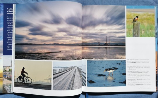
Dublin Bay City by the Sea
The first example is a really nice photography book of Dublin Bay. This book has very little text so mainly focuses on imagery. It has a really nice variety of image size and oragnises them in a composite grid with the text box on the right hand side of the right page.
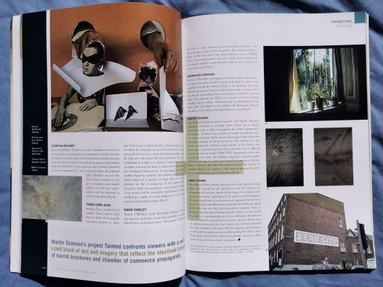
Irish Arts Magazine
The second example is from the Irish Arts Magazine. This is probably the most chaotic but still has use of column and composite grid. Although there is a lot going on, I still find it visually appealing. Again I like the variety of image scale and placement. The black margin on the left works well and I like the larger text box at the bottom to display and important piece of text.
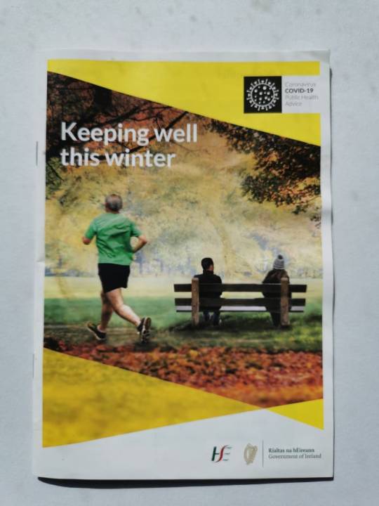
HSE pamphlet
The third example is a pamphlet from the HSE. This particular page makes us of a column style grid with the text page on the right and uses a modular grid on the left to display the precautionary steps to prevent the spread of Covid-19. Again a nicely laid out section using grids.
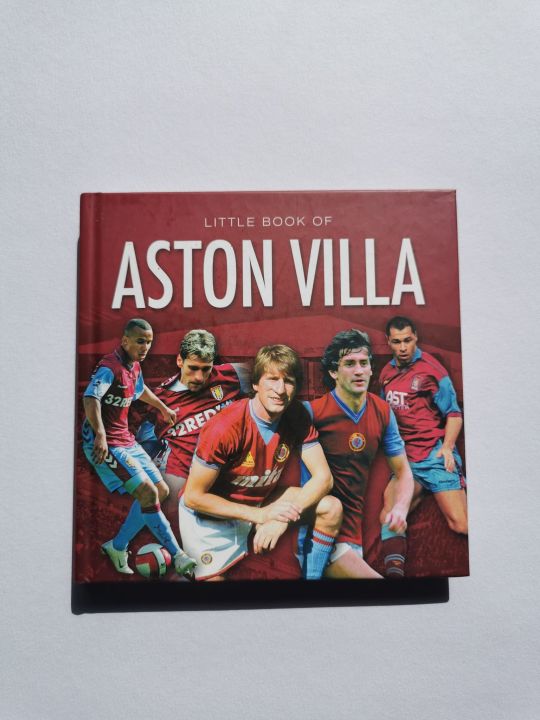
The Little Book of Aston Villa
The fourth example is one I liked because of how small the book is but also how well laid out it is. They still manage to use larger images with long text despite the size. It mainly uses a column layout. I like these particular pages as I thought the layout of the image was really well done.
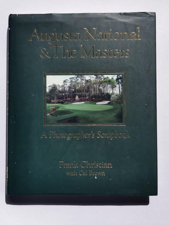
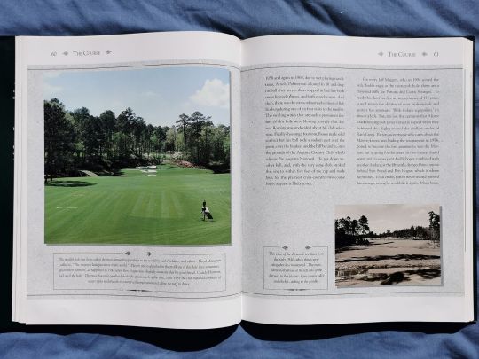
Augusta National & The Masters
The fifth and final example is from a book about the history of the Masters Golf tournament. This book has a mixed layout throughout using column and composite. What I really like is the use of colour with this layout also. The information is put on a nice subtle grey background and a variety of image scale is also used throughout.
1 note
·
View note
Photo


The next area I wanted to look at was visual communication used in alcohol advertising. As I mentioned in my menu design post, I have been bartending in the service industry for a few years now so I have seen so many wonderful bottle designs and labels that inspire me.
Alcohol companies not only make beautiful bottles and products, they also produce excellent visual adverts for their product.
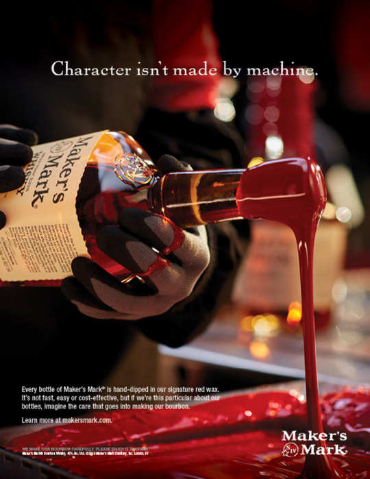
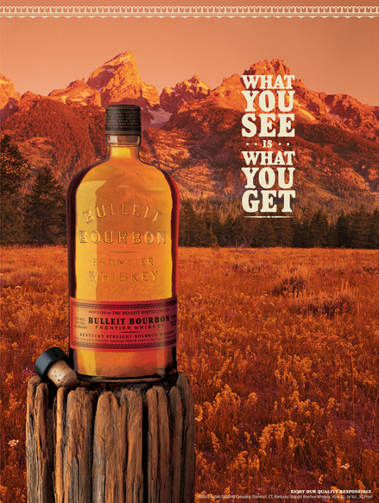
Makers Mark & Bulleit Bourbon
The first two examples I have shared are two bourbon makers, Makers Mark and Bulleit.
The Makers Mark advert is a fantastic example of quality photography which helps capture their core values as a brand. They produce quality bourbon and hand dip every bottle in wax to seal it and as they state on the advert, “character isn’t made my machine” and that they hand dip every bottle not because its cheaper but because they are that particular about their bottles so imagine how particular they are about their bourbon. The image just captures the personal human care and quality that goes in to producing their excellent product and it’s a fitting tagline to go with the image. I really like how the dripping wax leads you to their brand name and also up to their bottle. Also the focus used in the image is very good and draws all your attention to the bottle being waxed.
The Bulleit advert has a beautiful use of colour and imagery. The golden brown coloring of the mid western American landscape gives it a old nostalgic look, aligning with the fact it is a very old bourbon recipe that they revived when creating the Bulleit brand. You get that old western, cowboy feel from it which I really like. I like the simple impactful tagline and the placement of the bourbon in the foreground on the old wooden stump is a nice touch also. The whole advert really captures the old western bourbon identity.
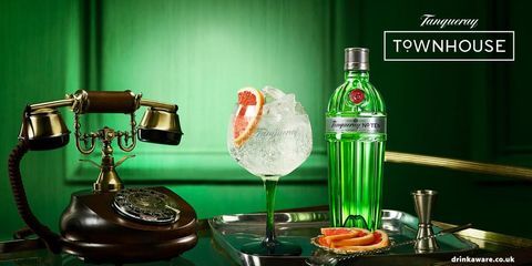
Bombay & Tanqueray
The next two examples I have shared are from Bombay and Tanqueray Gin. These companies both have lovely coloured bottles which they make full use of in their adverts.
The Bombay ad is a really cool image. I really like the simple tagline of imagination distilled and how they have all this beautiful imagination like imagery flowing in to the tap that fills the bottle. The fact that all this imagery and the light around the bottle forms the shape of a martini glass is brilliant also. The aqua blue is a beautiful, refreshing colour and works really well for their brand. The image just has fantastic use of colour, lighting and imagery.
The Tanqueray advert is a nice simple but effective use of photography. The setup of the tray with the bottle, bar tools, gin goblet, cut grapefruit, old telephone and the green walls as the background just has a real sophisticated look to it. This is their no.10 brand which is the premium gin. I just get a home office feel from this image, like this tray would be beside a huge desk in a big townhouse office. Nothing crazy going on, just focus on the pure premium sophisticated gin. So I really like the image and think it just fits the product really well. Very good imagery and colour usage.
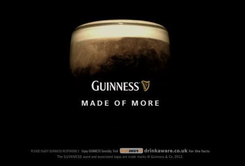
Guinness
I couldn’t talk about alcohol advertising without mentioning Guinness. They just have such a globally recognized brand and product. They always produce strong visual communication pieces.
I love the simplicity of the above photo I shared. They don't even need to show the full pint or glass anymore. A lot of their advertisements are on black backgrounds and just use the creamy white head as the focal point. It’s all they need for their brand to be recognized at this stage. As soon as you see black and white like that you know who it is. I really like the tagline coupled with the magical show the setting of the pint has. I think Guinness have used that so well over the years, so much is going on in the pint before it finally sets to the beautiful black pint we all know and love. It’s just a gorgeous image and Guinness are experts at producing pieces like this.
Hennessy
Lastly, I have shared a piece from Hennessy. Hennessy is the most famous cognac in the world. A favourite among many celebrities and used in many songs by musicians like Drake.
This was just a stunning visual piece I found. I love the potion like vapour that surrounds the bottle. It just creates this mystical charm and how they describe each drop as an odyssey. The colours are super aswell. It’s a beautifully designed bottle and I like the product shot of it in a glass on ice under the bottle. Overall just a gorgeous, easy on the eye piece.
As you can see, alcohol companies produce great visual pieces when advertising their product and they use a variety of styles and techniques to do so.
2 notes
·
View notes
Photo

This weeks lecture focused on imagery and it’s use in visual communication. As the old saying goes, a picture can tell a thousand words. So imagery can play a vital role in your design.
This being especially true for advertisements. We only have a short window to take in the advert, be it a photo, billboard, tv ad etc. So a strong use of photography is need to capture the consumers attention. Above I have posted three examples of advertisements that I think have really strong imagery in them.
Jameson
The first advert I shared is for Jameson, one of the biggest Whiskey brands in the world. This is a beautiful product shot. The setting of Hogan's bar on George’s Street in Dublin is really fitting for the shot. It’s a traditional old style pub and really gives this advert an authentic Irish feel and the Jameson bottle and glass look so natural on the old wooden bar.
The focus on the product and slight blurring of the background is a nice touch and draws you to the product. This image also makes good use of lines to do that. The lines of bar top naturally draw you towards the whiskey, so the placement of the product on the corner of the bar was an excellent decision. Finally the simplistic short tagline is perfect for the ad. Jameson needs no explaining being the Whiskey giant that it is.
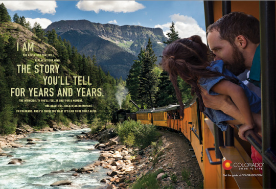
Colorado Tourism Ad
Tourism adverts really heavily on quality photography. You are trying to sell your country and sell an unforgettable experience to potential tourists. So capturing this adventure is imperative to drawing them in. Above is a picture from the Colorado Tourism Office. This is a fantastic photo and advert for Colorado.
Firstly, this photo also has great use of lines. The line of the train naturally draws you in deeper in to the photo and gorgeous landscape. The photo is beautifully complimented by the river, distant mountains, sky and the hillside on the left. I really like the placement of the father and daughter in the foreground to give a strong human connection and drive home the point of this family adventure Colorado offers. The tagline on the left is nicely laid out also, with the mix of font size. It is meant to be read all together but I like how they made the “I am the story you’ll tell for years and years” stand out. A lot of excellent photography and design features to this piece.
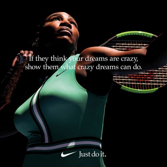
Nike
Nike in recent years have created so many powerful adverts using strong imagery. They tend to be strong motivational adverts using the worlds best athletes encouraging people to dream big and go and achieve those dreams. This ties in well with their tagline of “Just do it”. Above is one of my favourites which they did with Serena Williams. The message itself is a powerful motivational piece alone. But it is perfectly complimented by the photo. I really like the use of the dark background and the spotlight above Serena. It just draws full attention and focus to her. The pure face of focus in the worlds spotlight as the best female tennis player. All achieved by having crazy dreams and turning them in to a reality. Nike have done a great job like this in so many motivational adverts they have released.
0 notes
Photo

The next area of visual communication I wanted to look at was album covers. Album covers are really expressive forms of art and create strong connections with us and create feelings of nostalgia when we see them.
This class has made me naturally start to look at all forms of visual communications both old and new around me and critique them. I listen to music everyday so have started to notice album cover art and design much more.
Nas - Illmatic
The first album cover I have such a connection with is “illmatic” by Nas. This is Nas’ debut album released way back in 1992 and is considered on of the greatest rap albums of all time. I really like the strong imagery used in the cover. I feel the picture of a young, probably more innocent Nas faded in to the picture of a Queens street in New York where he grew up has a really cold, eerie and nostalgic feel to it. It also is maybe a reference to his upbringing and how he grew up in the streets and it shaped him in to who he is today. A lot of his music does speak about struggles in the streets and growing up in New York.
I think its a pretty cool typeface he uses for his name and the album name. You’re eye is naturally drawn to the name of Nas. The highlighting of “ill” in white is very clever too as his best friend “ill Will” was his first DJ when he started so it is a tribute to him. A very old but really cool piece of visual communication.
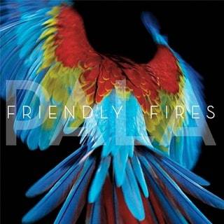
Friendly Fires - Pala
The second album I have shared is “Pala” by Friendly Fires released in 2011. They are an indie rock band from England. They make a lot of upbeat and uptempo music. I like the use of the colourful tropical parrot on the album cover. I feel this really represents them and this album in particular. They even have one song called Hawaiian air on it so the parrot fits in with the summer and tropical vibe of the album. I really like the black background in contrast to the bright colours of the bird.
I also think the typography is really nice. Sans serif, white coloured text makes it easy to read and the album name Pala layered underneath the bands name with lower opacity is a sweet touch also. Another visually pleasing album cover.
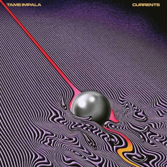
Tame Impala - Currents
The third example I have shared is “Currents” by Tame Impala which was released in 2015. Tame Impala is the psychedelic music project of Kevin Parker. Currents album uses a lot of synthesizers and the image of vortex shredding I think represents this psychedelic dance, funky and alternative style Parker has in this album and it’s like his music is the ball and its disrupting the straight lines of the “normal” continuous flow of life or music that you see. I like the use of the colours in the imagery.
The sans serif album and artist text is also nice and highlighted by a vibrant yellow. This all adds to the visual stimulation the album cover gives.
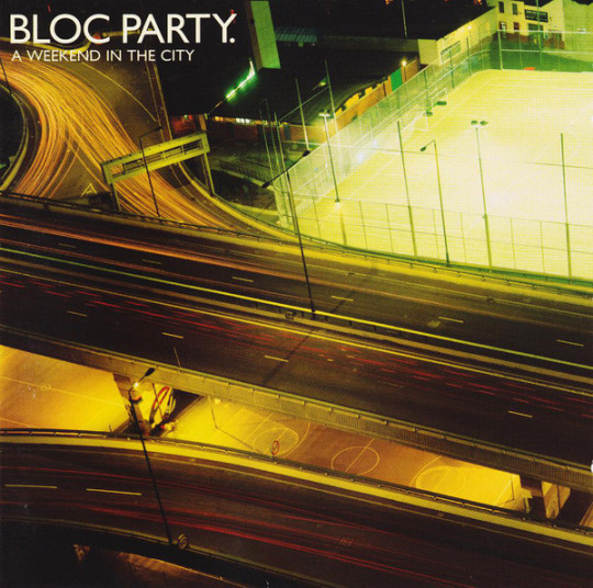
Bloc Party - A weekend in the city
The final example I have is “A weekend in the cty” by Bloc Party which was released in 2007. I could have dedicated this whole blog post to Bloc Party really, they have so many awesome album covers with beautiful imagery and typography.
This one is probably my favourite though. It just represents the band and their music so well. They are the type of band you listen to at 3.am or when walking home at night or on the bus home. They have such a chill style of rock that is really soothing on this album and I just love this image. The sweeping lights of the headlights on the motorway accompanied by the empty basketball courts just conveys this peaceful night scene. I can just imagine this dead quiet atmosphere on the courts with the whizzing of traffic above. This powerful imagery accompanied with nice simple sans serif album and artist text in the top corner. Just a beautiful album cover.
Four different styles of album covers but all ones I have strong connections with.
3 notes
·
View notes
Photo

In this weeks class, we looked at Typography. Typography plays a very important role in design and can make the difference between good and great design.
It is important to choose text that compliments your design but also is legible for your reader. You want it to draw their attention and be memorable.
Books are a great example of where typography plays a key role. It can be the difference in your book standing out from the crowd and grabbing a potential reader. I have attached three photos of such examples above from my book collection at home.
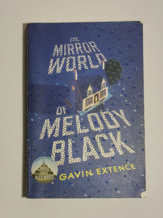
The first being “The Mirror World of Melody Black” by Gavin Extence. Having the 3D perspective of the house built upon a vast tiled ground which contains the book name text is a really cool effect and I think it worked really well. It draws you in to read the title. The authors name is nicely highlighted by the yellow colouring and it not being in the tiles like the book name. Visually it is just a stimulating and intriguing book cover and I really enjoyed the typography effect the designer used.
The second example I found really good was the book cover of “Dark Matter” by Blake Crouch. The use of bold sans serif for the title makes it attention grabbing and is nicely complimented by the surrounding serif text. The broken effect given to the text by the wooden boards coupled with the red colour and black text colour strongly represents the mind bending, intense thriller that the book is.
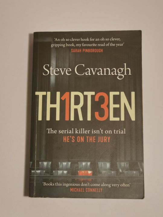
The final example I have is the book “Thirteen” by Steve Cavanagh. This also has a good use to serif and sans serif text to compliment each other. The use of the number “1″ and “3″ instead of the letters “I” and “E” is a clever addition and the use of the colour red to highlight these aswell as the tagline and jury chair really creates that sinister murder mystery atmosphere that this book is about.
Overall, three good examples of strong typography and colour use in visual communication.
1 note
·
View note