
trishagoh
Trisha Goh
Hi friends, my name is Trisha! I'm a first year student in IACT college, pursuing a Bachelors Degree in Advertising and Design. This is a college assignment account. Here, I will be posting some of my previous advertising and design work to be critiqued by anyone from the industry.
The purpose is that, with this, I'll be able to learn and improve, so all constructive feedback and advice would be deeply appreciated.
Thank you for your time in advance!
5 posts
Don't wanna be here? Send us removal request.
Last Seen Blogs
angeliise
Zuatara & SasuHina for life
yesdealforkeeps-blog
Untitled

knockoffmordred
Untitled

wizardsmaster-blog
The Dark One
askfem-sanders-sides
With Quirks!!!
Text
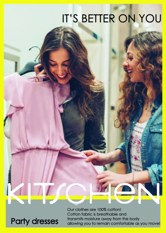
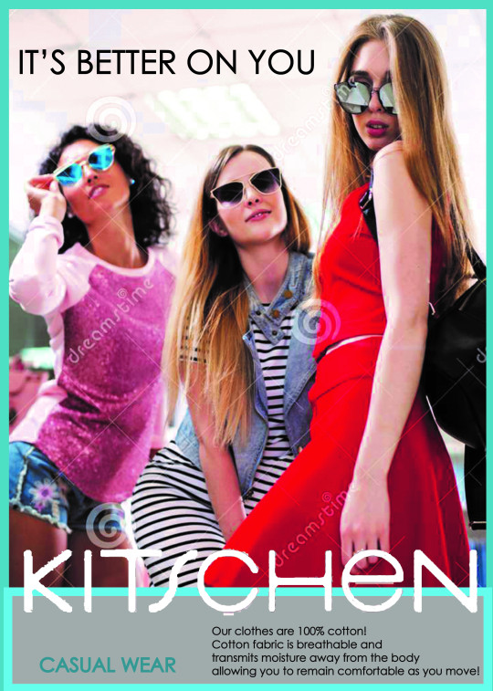
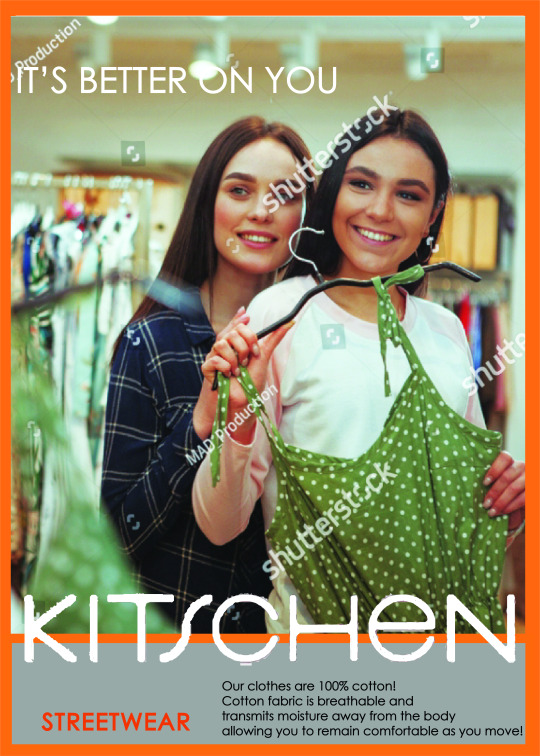
KITSCHEN CAMPAIGN
#It’s better on you is a mock campaign created for Kitchen Campaign.
The objectives of this campaign is to present Kitschen as a clothing store where you and your friends can hang out and take nice aesthetic pictures together.
The problem is that there’s little number of walk ins. And they position themselves to attract young teens, but more mature people are entering.
Hence, I decided to make the store interactive and appealing for walk ins. Brand it in a way where good memories can be created when spending quality time together and what better way than to go clothes shopping or have clothing tryouts with your girl friends?
By using In store posters and store stickers. To create interaction with customers. Attract customers to walk in and try on.
Poster Series:
Store Stickers:
I thought of using the blues and yellows and greens to associate it with some of the store colors. I thought that maybe encouragements or praises may encourage customers to try on more clothes and maybe eventually purchase them.
And it may boost walk ins as it may intrigue others to intrigue them to try on clothes to see what statement the mirrors light up.

(Button Sensor:This flashes on whenever someone presses it. This are on the mirrors placed in the store, to encourage customers to try on.)
In dressing room: In front of the mirror, a big X can be placed on the floor in front of it to direct customers to stand at the spot after trying on clothes, we can have white LED lights behind the mirror to have good lighting and beside the door of the changing room would be magazine frame.

(Reflection in the mirror)
When customers take a selfie it would be as if they were on a magazine cover.
CRITS:
1. Damien Chung:
I think the idea behind it is good, but the CTA might not be strong enough. Encouragement is great, putting a smile on people’s faces is important, but ultimately, would that be the deciding factor for customers to buy the products. People might just go and and take photos and have a great time, but retail companies ultimately look at the conversion rate of the stores, is it worth spending so much to get many people in only to have mediocre sales.
I think the tie in to purchase needs to be stronger.
2. Ian Lai:
I feel the concept could work a little harder for the target audience. If you think about teens, they are very digital. And if you consider their behaviour, I don’t think they will easily walk into a store just to try clothes and have fun. They will go to a mall to hangout, but they will just walk around the mall window shopping. You first need to get them into the store.Rather than ‘it’s better on you,’ leverage on the behaviour of the target audience with ‘#betterinreallife”. As a shop idea, perhaps a screen can be displayed at the shop window that projects clothes onto passersby. If the clothes project on them look good, it will entice them to come in to the shop and try on the clothes, and hence better in real life.I think the visuals of the girls trying out clothes is too literal and dated. If these were magazine ads, imagine a girl with clothes clipped out of magazines pasted onto her with the tag”#betterinreallife”.
Or those cut out dolls with cutout clothes could make a great magazine insert. I think juxtaposition of what’s ‘real’ and what is not makes for a striking visual for the campaign. Also, trying to sell happy moments while trying out clothes with friends doesn’t really focus on the clothes.
But you really want to drive more sales, and that is the measure of success of every campaign: ROI.Again, typography has room for improvement. Visual hierarchy can be better (where do you want your audience to read first? How does the eyes move across the visual?).
The logo on the visuals don’t have to be so big. Focus more on the campaign tagline.
0 notes
Text
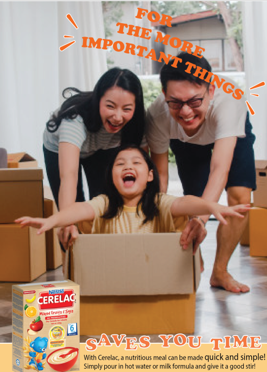
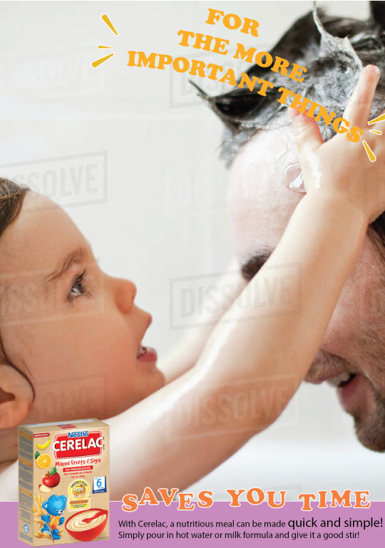
NESTLE CERELAC CAMPAIGN
#SAVESYOUTIMEFORTHEMOREIMPORTANTTHINGS is a mock campaign created for Nestle Cerelac.
The objectives of this campaign is to present Nestle Cerelac as a quick yet healthy solution, to help parents save time on having to prepare meals for their baby to have more precious time spent with their baby.
The problem is that Nestle Cerelac is perceived to be boring. Flavors are too basic and plain: wheat, grains, bananas...
Parents tend to think if it’s so simple and plain, they might as well make from scratch.
Hence, I decided to use that as its unique selling point and brand it in a way where spending precious time to create fond memories with baby is more important.
By using Nestle Cerelac as a base, which is loaded with nutrients sufficient for babies, saves them time then having to make it from scratch as it is quick and simple to make just by adding milk formula or hot water.
The visuals would work as a poster series, capturing the fun times and memories parents can create with their little ones.
POSTER SERIES
Visual 1:

Visual 2:
Visual 3:
Visual 4:

Note: The images used are sourced from Google and edited on Adobe Photoshop.
CRITS:
1. Joanna Dorai:
Consider a key message that is closer and clearer to the role of the product...
In reality, parents would spend time with their kids with or without the product. Or, they could be too busy to spend time with kids anyway, let alone prepare a simple meal. In this way, the headline doesn't quite sell the product.
So think about what the product really solves - yes it is a quick and nutritious meal. The question is, so what? And why would people care?
Therefore perhaps think about what Cerelac (quick nutritious meal) would mean to them as a busy parent. For example, busy parents need a quick fix for their children's meals. The problem is the instant format makes them feel like it is less nutritious which makes them feel guilty for spending so little effort in preparing an important meal for their children. The challenge then is how do we make the simple act of pouring in hot water or milk formula feel like a respectable effort? Explore if this will inform better your copywriting and art direction.
2. Gabrielle Moey:
It's nice that you use another approach (sentimental element) on this as you are right, I think people generally see this as quite a boring product. I think your poster conveys that mum and kids relationship/memories very well. But looking from the branding perspective, I think your key message could be improved.
Right now I see 2 key messages - "The More Important" & "Saves you Time". Perhaps focusing on just one can help expand your vision more and help you further communicate the message to your audience.
Once you have your narrowed down key message and target audience, I'm sure that you will come up with a more clear direction of design that works for that particular audience.
3. Annabelle Foo:
Choice of visuals are warm and captures the heart of spending quality time with family.
Convenience of the product is clear & straight to the point.
Suggestions/Feedback:
Although the visuals revolve around a similar theme, try using images without watermarks on them! (Visual 3 & 4)
The messaging behind #SAVESYOUTIMEFORTHEMOREIMPORTANTTHINGS can be expanded more to highlight the values that your visuals are bringing out. Like you said, the series captures the fun parents have with their little ones - these important things are actually little things that a parent would never want to miss out on in their child’s life - like when their baby learns to crawl for the first time or when a toddler utters words. However in reality, these moments take time and it’s easy for them to go by.
You could expand these situations into different headlines of your visual instead of having a similar headline since it’s already in your visuals! You have a really strong concept going on already, and if you boil it down even more to a single sentiment, I think it could be #NeverMisstheLittleThings or even #LittleThingsTakeTime which is where the main benefit of Nestle Cerelac also comes in - convenience!
That way, the hashtag also becomes catchy/memorable and also most importantly easier-utilised on social media platforms.
3. Eunice Loke:
Layout is clean
Question: If the time spent to make porridge from scratch and make cerelac and add stuff is the same, why would I want to buy this?
Problem: boring and plain
Solution: Spice it up
4. Basil Cha:
Definitely a great cause, about creating time to spend with parents and kids- Think it needs a bit more depth. The direct solution is that the solution saves much more time that can be spent with kids, but how can the brand actually encourage this relationship between parents and baby even more?
Feels like parenting is a chore and this solution is just helping your burden but what if we position it as “my favorite things” instead of “the more important things” e.g. My favorite thing is playtime and I have more of it because I spend less time prepping meals. “These are a few of my favorite things”
Advertising has gone past straightforward directions, need to tap into your audience. Is it stay-at-home moms? Working moms? What are their biggest pain points, what are their joys? When we understand our audience we know how to reach them. (Similar to evangelism no? HAHA)
Try not to use pictures with watermarks on it (if not have to Photoshop them out with the Clone Stamp tool – you can explore this) but there are tons of free stock images now like Pexels and Unsplash. Also if you’re targeting Malaysian people use Asian families not white people?
5. Yae-ber Neo:
Hashtag as campaign title ought to be careful with use of hashtags as campaign titles. Think from the perspective of a user on Social Media what would catch your eye, readability, length and message all play a part. Study the more successful hashtag campaigns and discover the big idea that drives their campaign to relate with the target audience.
Execution: Elevate your execution by photographing on your own, examiners appreciate this better because then you can also incorporate a stronger conceptualization to back your execution. If you have to use a stock photo, do make sure to get those without a watermark. Visual hierarchy: arrangement of your items (visual, headline, body copy) should lead your reader to understand the message just as you plan for.
Choice of size, colour, contrast, alignment and placement will do the trick!
Headline: your headline ‘for the more important things’ is not bad, the treatment however can improve. The visibility is not as clear as your slogan/subhead, ‘saves your time’. Experiment with choice of colour, outlines, drop shadow etc. to see how you can make your key message (headline) stand out. Colour: Creating a colour palette that you stick to would give overall brand consistency. Body copy: should give it a little more breathing space, have more negative space on each side, look a little cramp atm, and enlarge the bottom box.
6. Sarah Ann Toolseram:
Choose the right images.
Change The font or change colour to give allowance for printing errors. Pictures are appropriate for target audience
-Feeding can be a bonding activity.
-Saves you time from prepping the meal or feeding the kid? So you can have more time for fun things.For the more important things
-TaglineDesign consistency.
7. Damien Chung:
I Understand the idea behind it, the motivation behind it. It’s a good thought. Personally, I don’t find the selling point really convincing for me. It’s basically the same as milo or rather powdered milk (since it’s for babies), or baby food. Perhaps what can be done is not shifting away the focus from the boring flavours but instead find a way to highlight it and make it interesting. Because parents might actually find the process of making food for their babies even more so interesting and also worthwhile, rather than finding ways to save time on it. From that satisfaction, it might then translate to them having fun with children. Preparing food is also considered “an important” thing
8. Ian Lai:
I really like the concept of focusing on the important things, like special moments with your child. But “#SAVESYOUTIMEFORTHEMOREIMPORTANTTHINGS” doesn’t work as a campaign hashtag, it’s too long and hard to read and remember. Something simpler like “#theimportantthings” would be easier to remember.As for the visuals/ads, I think that it can be stronger to drive home the message of focusing on the important things. Right now parents spending time with their kids is too generic. You want to really guilt trip parents with the visuals. For example, baby’s first steps. It would really suck for a parent to miss it, and every parent can relate to it. Copywriting can really drive the message across, “Don’t miss baby’s first steps just because you’re busy preparing her dinner.”“Saves you time for the more important things” is a good tagline for the campaign. Every ad could end with that as a tag. The typography can be more simple and tasteful, no need to have different font sizes or dancing letters (a bit high school word art). Also a better font choice for the body copy would help
0 notes
Text
EXPRESS CHEF BUSINESS
We were tasked to select one of 4 businesses to work on, and I decided to go with a food concept business. I decided to go with the food related business because I personally love to cook myself and would be interested to see what ideas I can come up with if I really had a small food business on my own.
The objective of this food business is suppose to be a quick service type of business, where it’s catered mostly for clients who have surprise guests, short on time, have had a last minute cooking disaster, poor cooks or have culinary emergencies.This business can supply a door-to-door chef at a very short notice to supply the finest ingredients to cook up a meal for 20 people or deliver fine cooked meals to your doorstep in a jiffy!
The green and orange brown colour is the company’s staple colour. Green colour is known universally as ‘GO’ which emphasizes it being fast and convenient. Brown colour together with the green helps bring a sophisticated and classy image, that even though its a fast cooking service, there’s a sense of as if dining in a restaurant.
The logo is based off a motorcycle outline, highlighting the door-to-door services and delivery services. It’s white in colour for it to stand out from the coloured background.
POSTER

Note: The designs shown above were created through Adobe Illustrator and Photoshop.
CRITS:
1. Gabrielle Moey:
This concept is so cool! It'd be great if there's really a service like that!
Branding wise, the illustration (cursive writing and the food sketch) adds a very customized/personalized touch to it, but I'm not sure if it would work as express chef leaves an impression of "fast, quick, now" kind of mood.
As a reference you can study how Grab always try to keep things simple, because they want their audience to be able to understand it right away, and that's what they are known for, they are convenient, you can get it at the top of your fingertips. You can also use some delivery company as a case study as well to see how they communicate the "fast&quick" element through their branding.
2. Basil Cha:
There’s good color semantics
Cool idea for logo, but could be executed better
The layout is nice and clean too
Think about how you can execute more, even if it’s a small change in copy, etc. it will look better than just a single poster/image.
3. Yae-ber Neo:
Logo Stroke: could look better if you use ‘round cap’ but the ends since your logo is more fluid. It should give a cleaner look.
Colour: not so convinced with them, experiment a little more!
4. Eunice Loke:
One thing about advertising: always have someone look at it for a different perspective on it.
Cannot see the USP: They come to your home.
Not clear enough.
Logo: clarity can't see the motorcycle.
5. Thashini M Sivakumar:
The logo has to be more clearer.
If want to promote a new service:
Don't get the emergency food service.
Focus on the chef part coming to the home.
"Express Chef at your service"
"At your service, in your home"
Characteristics of the chef.
Describing the chef
Depending on target audience
Whether to use images or lines.
The key is to stay on brand.
6. Sarah Ann Toolseram:
Alignment
Ai alignment.
If it's an event, dates should be bigger.
Event poster, call to action: getting people to go to the location.
7. Damien Chung:
It’s good, it’s simple, easy to understand. Perhaps the visual can be more appealing. I think something to take note of is when you scroll through Instagram or ads, would this ad make you look at it for 5 seconds or more.
8. Ian Lai:
I like the idea of a double-meaning logo, but I must say the F in CHEF is a bit hard to make out. The overall shape of the bike is also not very obvious, it takes awhile to get it. I think this can be improved by making the silhouette lines of the bike thicker. The express is also a bit small in comparison to the CHEF, and this might be an issue for small printed materials (imagine food boxes or serviettes) as the express might be illegible. The typography for ‘express’ can also be stronger, more bold and in all caps. You want it to contrast the cursive ‘chef’ a bit more.
I like the idea that green = express and orange = food/chef, but the way the colour cuts across diagonally doesn’t bring out the meaning. Imagine you have a wheel on the green side and half of it is an orange on the orange size, that would make for a stronger visual and more meaningful play on the brand colours.
0 notes
Text
SWATCH X JAPAN
In this assignment, we were tasked to create a new, unique and commercially viable design for Swatch. Wanting to create something based on the idea of ‘Seasons in different countries’, I decided to go with Spring in Japan, when cherry blossoms bloom beautifully. Most of the illustrations are inspired by Japanese art styles, and Japan’s prized possessions.
POSTER

DESIGN RATIONALE
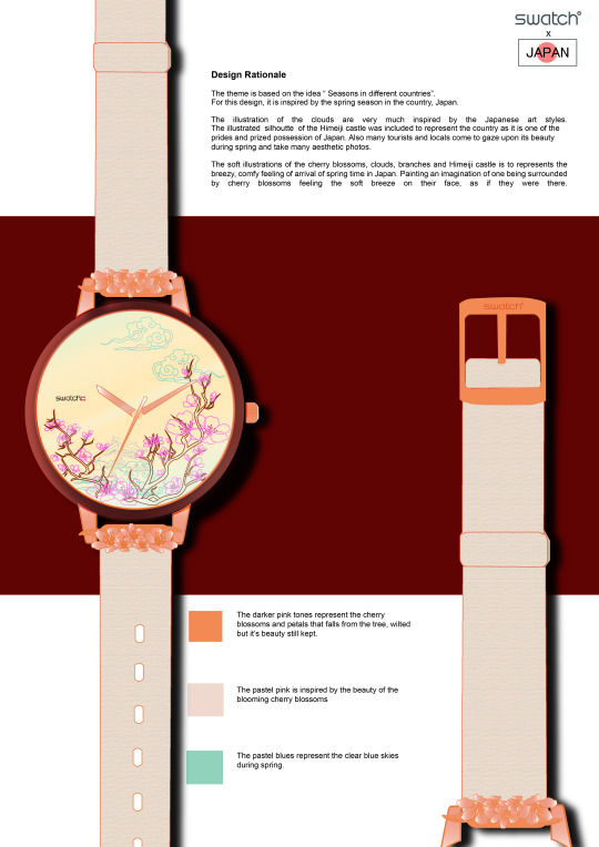
Note: The watch and designs shown above were illustrated and done fully through Adobe Illustrator.
CRTIS:
1. Joanna Dorai:
Love the design, very current.
2. Basil Cha:
Feels refreshing (a style you’re more comfortable with?)
Just some slight improvements with execution can help the design a lot (e.g. the way the gradient flows, consistency of colors, choice of fonts, etc.)
3. Yae-ber Neo:
Watch design: is nice.
Poster: the watch doesn’t stand out, hidden by the cherry blossom branches. background colour doesn’t help either.
4. Damien Chung:
I like this, this is good.
5. Ian Lai:
While the line art is nice, I feel it visually lacks focus and is too busy for a small item. You want to design with it being worn on the wrist in mind. The illustration may look good up close, but most of the time people look at their watches at least 20 cm away, which means the details can hardly be seen. Swatch watches are also worn as fashion statements, so the design has to be visible from afar.
Contemporary Japanese culture is also very minimal, think Muji or Marie Kondo. As such, I think it’s alright to take the cherry blossom as inspiration because it is the most iconic thing about spring in Japan. Perhaps exploration could be done on abstraction of the structure of the cherry blossom flower, the way the petals and stamens are arranged could make for an interesting pattern on a watch ace. It will be like wearing a cherry blossom on your wrist, which would make more of a statement.
1 note
·
View note
Text
VALENTINE WITH WONDERMILK
The objective of this assignment was to create a full campaign plan for the brand ‘Wondermilk’, which is a local sweet treat store. Firstly, we had to identify the issue or problem that can be solved via marketing communication and then detail the full campaign plan. ‘Valentine with Wondermilk’
Campaign concept: The message objective is to show that Wondermilk cares about you and your partner. The campaign is heavily weighing on the concept that girls don’t need to wait to receive cupcakes, but instead give it to them! And that cupcakes are not just for girls, guys too can receive cupcakes as gifts. In collaboration with Happy Bunch as promo item.
POSTER
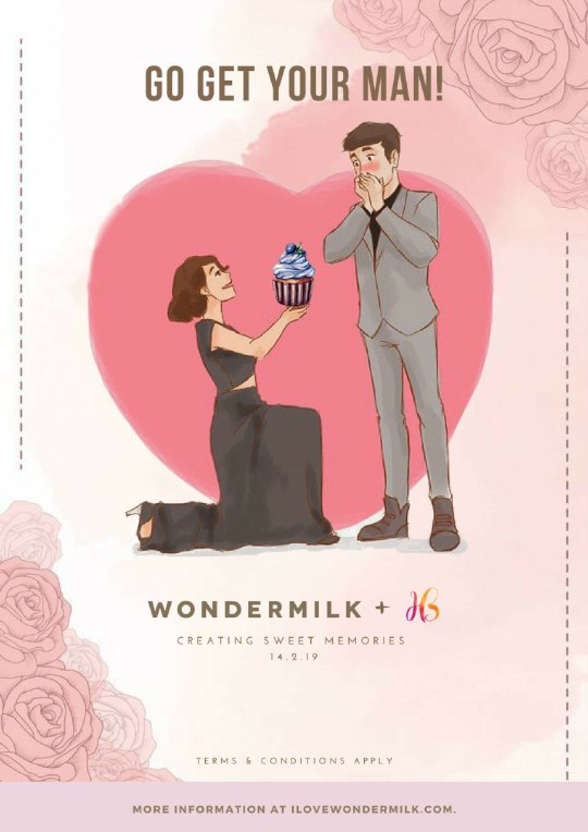
Note: The illustrated images and the logos used in the poster (without text or stamp) was sourced from Pinterest, Wondermilk and Happy Bunch logos.
CRITS:
1. Joanna Dorai:
Interesting concept. Will definitely spark a conversation. Worth testing if it is culturally acceptable or socially celebrated.
2. Basil Cha:
Very cool concept
The illustrations are good would have wanted to see more of it
Don’t think the collaboration is necessary, should be focusing more on the message/concept.
Could be expanded further into different illustrations, scenarios about “sweet memories”
The copy could be crafted better… If your audience is women there’s a tendency to relate better reading as first person rather than being told what to do (e.g. “This time, I made the first move” sounds sweeter versus “Go get your man”… “I was shy but he was shyer” and so on.
Some tips you can generally consider:
- Go on YouTube, there are a lot of tutorials you can learn from
- Execute way way more (even if it’s a difference of photography or tiny copy) a small change can spark a big idea, but practice doing it. It also makes your lecturer feel like you did more work.
- Look at brands/designs/etc. and copy/reference them. Spend a lot of time looking for references, stuff on Pinterest, Dribbble, etc.
- Mockups add a lot of points to professionalism, which is something you wanna try achieving even as a student. It gives some context to where you’d see the ad, poster, etc. There are a ton of free mockups online.
- Do some research between your friends about how they feel about the design, etc. and test your designs on yourself. Would this make you more curious about the product/brand yourself?
3. Eunice Loke:
Gentle is a strength. Sell to guys bases that it’s okay to be gentle and loving.
Layout and execution wise: okay.
How do you solve your problem? Need to Improve.
4. Damien Chung:
I’m not sure what’s the problem stated here, but I kinda get where you’re coming from. Hahaha
5. Ian Lai:
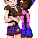
I like the unconventional concept of girls not needing to wait and being more aggressive in pursuing love. However, I’m not sure if cupcakes make suitable gifts for guys (most guys won’t admit they have a sweet tooth). I like the illustrated characters, I kinda want to get to know them better. So perhaps the concept would come more alive if we followed these two and made them the central subject. For example, imagine if this was a comic, and each poster is a scene from a comic strip and piecing it together would form the full picture.
The storyline could be kinda cute but bittersweet, like a Sundae Kids comic. I think using the comic strip would be ideal for social media platforms like instagram.
As for the execution of the piece, I think the typography could be a lot more stylised, rather than just a bold typeface. The headline seems a bit hanging, some body copy or a sub-headline could tie in closer to the product. I also think the CTA could be more direct, rather than just a link to the website. It’s ok to be a bit more tactical by showing the price or promotion of the product in this case.
1 note
·
View note