#typographyy
Photo

0 notes
Text
Week 2.2: Photography, Type, and Alphabet
Photography
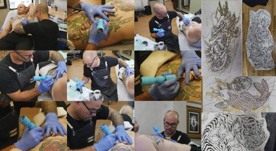

I spent a day outside of work photographing Hamish and a lot of his personal work in order to build up a background on irezumi tattooing and practice
I also wanted to test whether this could be an option of alternate imagery in my publication rather than the straight illustration.
Although I wanted to illustrate. I also tried out photographing other artists and their work for the publication imagery to see if it could be a better fit. These images are of Hamish Mclauchlan, the tattoo artist I work under. He specialises in largescale Irezumi pieces and is widely recognised in the tattooing world.
Ultimately I decided against using an artists face or their professional work in my publication. This is because I wanted the focus to be on the concept of irezumi itself, without attaching a specific person and their established style of tattooing to it.
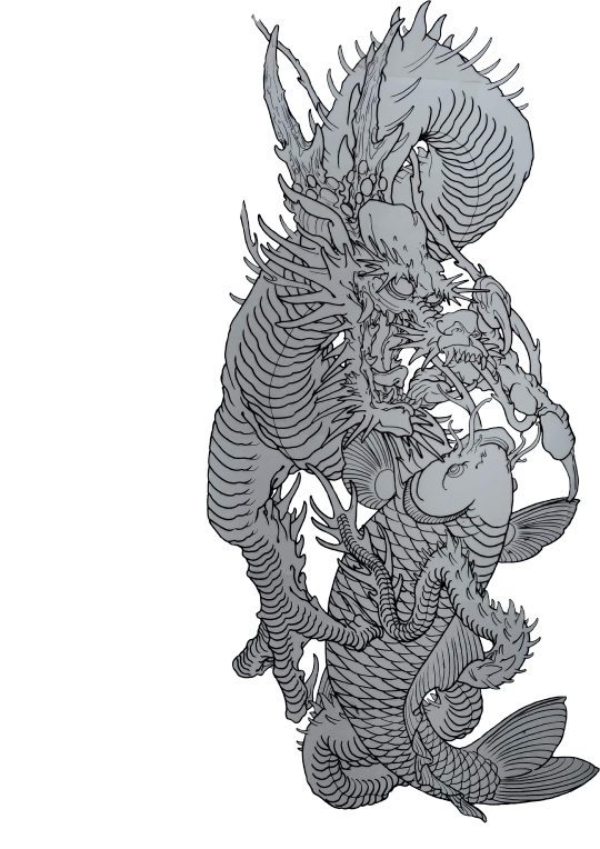
I used my own illustrations because although they are all produced by one person, they are an ambiguous interpretation of a massive collection of irezumi artwork. The reader should be able to envision their own world of irezumi from the publication without bias.
Typography
I know I want my display type and potentially bodycopy to follow a loose, script like/ handrawn, personable feel. Something inky and imperfect would be excellent for a title font as I want it to match the illustrations in this illustrative and painted style. Below are some rough options that I was drawn towards for the minimal type that I plan to have in this picture book like publication.

Alphabet for Irezumi
Since I want my picture book to follow this ABC structure I started brainstorming ideas for each letter of the alphabet. I thought this would be a way to link the western world to this popular Japanese tattoo style that has been made popular worldwide. Western clients are becoming more and more common and this is likely who my picture book will be aimed towards as they are more likely to have a lack of understanding of the cultural and historical symbolism of the irezumi style rather than local Japanese people.
The only thing to take into consideration is the fact that in japan a few letters in the english alphabet do not exist so I will have to comment on this at some point in my book as some letters such as q and x. Below is my current list that I am constantly returning to in order to structure my illustrative process moving forward.
Ape, Akkorokamui (octopus)
Bones, Baku (devoured of dreams), Blossum, Botan (peony)
Cat, Crab, Crane, Crysanthumum
Daruma
Enkō (kappa of shikoku), enenra (yokai of smoke)
Frog, Fujin, Foo dog
Geisha, Golden boy, Genbu (black tortoise)
Hannya, Hou-oo (pheonix), Hebi (snake), Heikegani (crab)
Irezumi, ikuchi (yokai of the sea, serpent)
Jorogumo (spider woman), Jishin-namazu (giant catfish that causes natural disasters)
Koi, Kitsune, Kappa, Kirin, koinobori, Kiku (Chrysanthemum), Kaeru (frog)
Lotus (Hasu)
Masks, monkey, Maneki Neku (cat)
Nue (chimeria), Namakubi (severed head), Namazu (catfish), Noppera-bō (faceless ghost)
Oni
Pheonix, Peony
Q
Ryu, Raijin
Serpent, Sakura, Samurai
Tiger, Tengu, Toad, Tanuki (raccoon dog)
Ushi-Oni
Vulture
Warrior, Wave of Kanagawa, wakkaonna
X
Yokai (ghosts demons spirits)
Zugaikotsu (Skull)
5 notes
·
View notes
Text
Developments
YOOYOYO im ngl i am soooo burnt out rn like oml but I can do little things like brainstorming :))
Logo
Change the logo to be something more simple and indicative to the point of difference which is the bee nectar.
Moodboard:

Typography
I think I’ll keep the main header as I’ve grown to be quite fond of it!
The body copy might be altered - maybe something more trusted and traditional (so a serif typeface).
Colour palette
Slight tweak - I feel like if people are gardening then they’re gonna get their garden gloves and dirt all over the box HAHA sooo like, should I go with a dirt brown? I feel liek it should be some deeper shade but then again, we might be steering away from the eco-friendly stuff...

0 notes
Photo

Body Typography
I am deciding to use mostra nuova as my main body copy type. Overall, I thing that it is a lot easier to read in bulk compared to medl sans.
0 notes
Photo

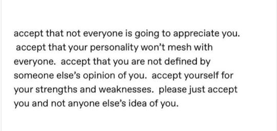
#uploads#art#quotes#words#typographyy#pastel#pink#inspirational#motivational#positivity#inspirational quotes#motivationalquotes#positivity quotes#curators of tumblr#source in bottom left corner !<of post not image!
39 notes
·
View notes
Photo
cozyvu on insta
#uploads#art#quotes#words#typographyy#inspirational#motivational#positivity#inspirationalquotes#motivational quotes#positivity quotes#curators of tumblr
22 notes
·
View notes
Text
oh fuck i got design hw shiiiiiit
1 note
·
View note
Photo


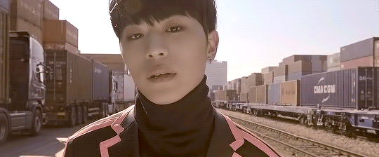

Without U
#romeo#ct romeo#ctromeonet#mgroupsedit#mygifs#*ot7#*teaser#*without u#the word without is starting to look real strange to me#also my first time attempting typographyy??? or whatever its called like text on gifs???
81 notes
·
View notes
Photo

1 note
·
View note
Photo
0 notes
Photo

0 notes
Photo

0 notes
Photo
1 note
·
View note
Photo

1 note
·
View note
Photo
0 notes
Photo

~ pinterest ~
4 notes
·
View notes
Last Seen Blogs

ravi-chakrabarti-me
Dr. Ravi Chakrabarti M.E.
siboona
no running on the stairs victor

gallavloggermom
The Softer Side of the Gallavloggers
theyakuza893
The Yakuza 893
alanrxx
Alan