#trying out traditional 2d animation
Text
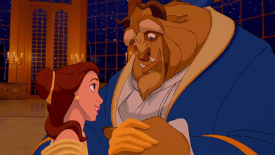
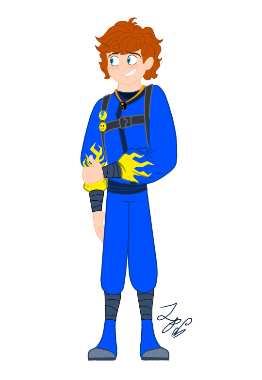
THE MOMENT WE WERE ALL WAITING FOR, FINALLY FINISHED THE DESIGN OF ASTER YESSSSSS ✨✨✨✨✨✨❤❤
This design belongs to the Wish rewrite called "The kingdom of wishes" (Written by @annymation and soon illustrated by @emillyverse and me)
Sorry for the delay, but this guy had so many things to draw and I also had a thousand ideas that it took me a while to capture them all (4 drawings wow, even I'm surprised lol)
Now after this introduction I will tell you the procedure of its design :]
2D MODEL:
-Maybe some don't notice it, but for the 2D drawing of Aster I didn't add many shadows, because in the classic Disney movies the animation doesn't have many shadows if we look closely, this is for several reasons (at that time they had to inking FRAME BY FRAME, can you imagine how much longer it would have taken to add detailed shadows? I really have respect for the animators)

(Here are some examples of what I'm trying to explain)
-As I said before, I didn't detach myself much from the concept art of the movie, I just added some other details that occurred to me, Anny and Emy.
-We decided that his cape would have the constellations of the signs of the zodiac (It was Emy's idea), which in the final result are on the cape, the constellations are noticeable more or less depending on Aster's mood.
-In the Wish rewrite it is mentioned that Aster's hair is like a candle (Reference to Hades) so I decided not to add the lineart in that part
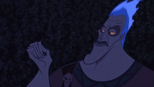
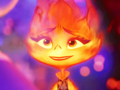
His hair changes depending on his emotions, but not only that, but also his lineart, the calmer he is, the cleaner his animation will be, however with strong emotions (anger, sadness, nervousness) his details will be more neglected, especially when He is REALLY angry, by the way I made his hair look like a flame to give more drama to his design and also make a reference to Ember from Elemental
And as a final detail, the star-shaped gem that she has as a brooch changes color, just like her earrings.
3D MODEL:
-When Aster disguises himself as a human, his details on his clothes would disappear and the shape of his accessories would change to ones without a star shape, also the tone of yellow would look duller, you know so as not to draw attention (although he is dressed like a prince with a giant cape, the boy doesn't know how to hide the truth very well lmao)
-In general, it's just that the design becomes simpler, the only thing that changes is her hair that is no longer a flame, her freckles that are no longer little stars, her clothes no longer have so many details and her mark on her eye disappears( ̄▽ ̄) .
By the way, I wanted to thank @the-autistic-idiot for giving us the great idea of Aster having a star-shaped mark on his eye :D.
-Also, I think that those who have seen my other Wish redesigns are wondering why it seems like I had spit a rainbow at Aster's 3D drawings, what happened is that when I was painting my neurons said ✨Change your coloring✨ and well, The drawing in the end came out like this, although I honestly like it better, it better represents how I draw in a traditional way
Yes, basically the coloring of my drawings is as if a unicorn had spit on them lol
FINAL COMMENTS:
-It was very fun to draw Aster! The boy really has a lot of changes, but thanks to him I already discovered my digital drawing style so I am satisfied.
-Again sorry for the delay, I know that for many Aster must be their favorite character so I hope your wait was worth it :]
See you next time!✨✨
#disney wish#wish 2023#disney#wish movie#sketch#wish#art#artists on tumblr#artwork#drawing#star wish#starboy#human star#wish star#starsha#star redesing#the kingdom of wishes#the kingdom of wishes fandom#the kingdom of wishes au#starboy wish#starboy x asha#asha and starboy#wish concept art#asha x star#wish asha#wish disney#disney fanart#disney movies#disney animation#walt disney animation studios
340 notes
·
View notes
Text
OK, but hear me out
Say Ride the Cyclone were to be adapted into a film; imagine how much fun it would be to see it animated.
Because for the main plot, like the intro song and the mostly dialogue scenes in limbo, you could easily do a stylistic, but still grounded in realism style that a lot of modern animated projects are doing right now (think Arcane or Into the Spider Verse). But once each of the kids go into their respective songs/fantasies for what their life could have been? What if those were done in completely different styles?? Imagine the additional, visual storytelling that would tell about who they are as characters?
Like say, for Ocean's number, WTWN, everything became more simplified, and the characters (especially Ocean herself) turned into a more rounded, chibi-like style to enhance just how cutesy and likeable she's trying to portray herself throughout that number.
Or for Noel's Lament, everything goes black and white, and the characters become even more 2D stylized, and the film scales down to a smaller millimeter frame, more reminiscent of cartoons from the early 20's, when animation was just starting out, to enhance his idealization of "the olden days" (as Ocean puts it).
Mischa's song, This Song is Awesome could be animated with a more choppy frame rate, and the character designs turn a little more jagged around the edges, kind of like animated music videos (I'm thinking a Gorillaz band vibe). But as he transitions into singing about Talia, the colors start to bleed out over their lineart, and become more paint-like and Talia herself moves like a rotoscoped character (think Loving, Vincent that came out a few years ago) to enhance the sense that she's somewhere between a real person and a fantasy Mischa's built in his mind.
Ricky's song would, of course, be stylized after those sci-fi cartoons from the 90's, like X-Men or Captain Planet.
For the Ballad of Jane Doe, I would love to see something like what Wolfwalkers did back in 2020, where most of the characters (in this case, the other kids) are for the most part, animated like traditional, 2D characters with very clean lines and neat movements, whereas Jane herself stands out for having messier, sketchy line art, and looks more and more unfinished in her animation as the song goes on, because she can feel more and more of her own identity being lost.
Constance's Sugar Cloud I could see done in the classic 2D Disney style (i.e., the Renaissance era of Disney, like the Lion King or Little Mermaid days) because not only is it really smooth and colorful and just all around nice to look at, but it reminds the average moviegoer of their childhood growing up with those movies (among others, obviously), which ties in nicely with Constance's preceding monologue about remembering her own life, and the good that came with the bad.
I'm even tempted to envision the first half of the finale song in a different style, when the stage production would show a quick projection of Jane/Penny's life after she returned to the world of the living. Imagine watching this animated film, and for that segment alone, it becomes that really hyper-realistic, almost uncanny valley CGI animation style, to show that she really has joined the world of the living, i.e. our world, among us, the living breathing movie goers watching this, and watching the other kids still in limbo fade back to that main art style for the final number.
I don't know; it just feels like something that would be so engaging to see from an already compelling storyline and characters. Especially with more experimental animation projects on the rise right now
#random rambling#Ride the Cyclone#Ocean O'Connell Rosenberg#Noel Gruber#Mischa Bachinski#Ricky Potts#Jane Doe#Penny Lamb#Constance Blackwood#idk I just really love animation you guys#so naturally I have to bring my latest hyperfixation into that world#might even sketch these different styles#for a better visual idea#but I haven't done any sketches in a hot minute#so who knows
983 notes
·
View notes
Text
transmigrator, meet manipulator
Chapter 1 of functio laesa
Gojo x Fem!Reader; Geto & Reader [platonic]; Canon Divergent AU; Isekai. Fluff & Angst & Drama & Humor; Reincarnation; Somebody Lives/Not Everyone Dies; Incredibly Self-Indulgent; Eventual Happy Ending; Eventual Friendships & Romance.

I've jumped on the Isekai bandwagon, y'all. [And I don't regret it one bit.] [Yet.]
Chapter warnings: Mentions of dying, accidents and panicking. Cult leader Geto.
Many ways exist for one to start a story.
They can write a duel. A confession. A query. A mansion. Or even introduce a character if they wanna.
But no.
You don't start your story any of these ways.
You start it by screeching. Then fainting.
If not totally, quite a bit– oh, who are you even kidding– you're totally freaking out, girl.
****
Dying is sad.
Sadder if you're dying with so many dreams unfulfilled.
Saddest if you're dying in one world, only to find yourself in another world, before realising you'll die [again] in this new world.
Sounds like one hell of an overdramatic overreaction, right?
It won't when your eyes open to a person with black eyes and black hair and bangs. Next move to the 2014 in bold on the wall calendar. Then finally fall on the traditional Buddhist monk robes worn by him... Oh, no way in hell—
A terrified shiver racks through your body; you try your best to hide it as you smile politely at the man.
"Um, hey."
Geto looks at you blankly for a while longer, before cracking a genial smile. In another universe, he would have made an excellent actor, you're sure.
"How are you feeling now?" he asks warmly, moving from the sofa to the chair beside your bed; you really wish he didn't, "You sure do look much better than when I found you."
"I'm better now," you reply, still smiling despite not really wanting to. Then add, wanting to continue your tirade of politeness as a survival tactic, "Thanks for bringing me to the hospital, by the way. I'm sure I would've bled out from my injuries if not for you. Thank you, Geto-san."
Whatever response you might have expected, a pair of wide eyes certainly wasn't a part of them. Geto looks at you, baffled, for another moment, before coughing up a visibly startled chuckle.
"Ah, there's no need to thank me, Miss. I was simply doing what I deemed right. Though I must say..." He trails off for a beat, before resuming, a smirk playing on his features, "I'm pleasantly surprised to see you interact with me so freely. I was thinking you might run for the hills on waking up and seeing me the first thing, from the way you screamed at me earlier today."
"Haha, sorry," you say sheepishly, not knowing how to form a seemingly legit reply.
You definitely cannot say you were scared shitless then, seeing a 2D character in the flesh. Even more for it being the genocidal villain from your favourite anime movie. No, you definitely cannot even utter that.
You ultimately decide to settle for something half-truth-y, "I was terribly shocked then, I think. Not in the right mental space after being hit by a vehic–"
A ringtone cuts you off in the middle of your strained apology. For the first time in your life [lives?], you feel happy for being interrupted while speaking. The man plucks his phone out, wrinkles folding his forehead as he glances at the screen. Only to cut the call in the next instant, shooting you a contrite smile as he rises from his seat.
"Sorry to cut short our little talk, Miss," The man sounds genuinely apologetic; you know better though, "But I'm sure we'll meet again. Soon enough. There are many questions I need you to answer, you see."
"Of course, Geto-san," you chuckle, sagging in relief inside when he finally, frigging finally, steps towards the door. And quite possibly– no, definitely out of your life too. 'Cause there's no way in hell you will let him meet you again. New world or not, you know you have to AND YOU WILL get as far as possible from this–
Geto pauses. One hand on the doorknob. Head twisted slightly to show you a closed-eye smile.
"I never introduced myself once tonight," he hums, "nor did I find you on a road. I found you in the middle of a deserted forest."
A second passes. Or maybe ten. Or maybe sixty. You don't know. You're too busy panicking to know.
Your savior's [more like, future slaughterer's] smile grows impossibly wider. The air feels impossibly colder.
"Goodnight Miss," he says, opening the door. The lights from the room spill into the dark corridor outside. "We will meet again."
'Looks-like-a-cinnamon-roll-but-will-kill-you' Geto and 'Looks-like-a-cinnamon-roll-and-is-a-very-jumpy-one' Reader.
What can ever go wrong?
Divider by @benkeibear. Header from Pinterest. I don't own the characters used here.
54 notes
·
View notes
Text
Ninjago Remastered Designs!

THEY'RE DONE! After months of work!!! They are DOOOOOOOOOOONE. WOOOOOOOOOOO! Lol! Welp, these are my Ninjago designs! Basically, this is my take on the Ninja if they were in a 2d animated cartoon! And yes! I will be drawing more characters. Tumblr butchered the quality, so close ups and design notes are below the cut. They're pretty detailed, so I highly recommend checking them out. Feel free to ask questions about the designs! ⬇️⬇️⬇️ - ✒️🐉


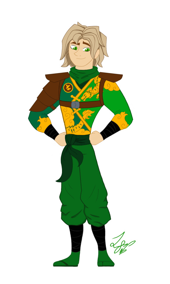
When designing these outfits, I tried to take inspiration from the ones in the show. And in terms of art style, drew inspiration from early 2000s cartoons, (Action Adventure ones specifically,) Anime inspired shows, and even a hint of traditional Disney animation. And while I designed them with a 2d cartoon in mind, most of the designs would most likely have to be simplified for them to be used in animation. So let's get started!
Kai: Kai was a pretty fun to work with. I actually didn't plan on giving him a sleeveless outfit. But it happened! And I like it! If you'll notice, the flame pattern on his vest mirrors the pattern on his sister Nya's outfit. I thought that would be a cool detail to include. It was inspired by their March of The Oni outfits. I also made sure to include his scar and bandaid. And gave him reddish brown eyes to signify his elemental power. Him and sister I imagine being Brazilian/Taiwanese. So I hope I captured their ethnicity properly. I'm pretty happy with this design. Especially his hair, which was hard to replicate.
Jay: Jay was a hard one for sure. I wasn't too sure how to vamp up his outfit. So I started by giving him some lightning patterns on his Gi. (At least I think that's what it's called?) And I decided to make it look a little baggy and soft. It just seemed to suit him. I tried something a little more form fitting and didn't look right. Also! A fun detail I included was his half the Yin Yang pendent around his neck! And of course Nya has her half. I imagine him having Irish ancestry, so I gave him pale, freckled skin. And gorgeous curly red hair. (As a fellow red head, I'm very proud.) Overall, I think he turned out pretty adorable. And his face is spot on.
Nya: Nya I pretty much got right on the first try! I just had a really clear vision of her in my head. I gave her a grey outfit with bright, vibrant blue details. The pattern on her Gi is inspired by Koi Scales. And she has her half of the Yin Yang pendent around her neck. I really like this one, because while it is simple, it's beautiful. And I think it reflects her element nicely. The only thing I missed was to give her a symbol like the rest. But overall, I love it! One more thing is that I wanted to give her and Pixal different hair. So when I finally release my Pixal design, you'll see that while they both have ponytails, I gave them different cut and styled ones. Should be neat!
Zane: Zane was the first one of the Ninjas I redesigned! I love how he turned out. I tried to give him a splintered ice effect on his outfit inspired by his Core minifigure and gave him his faithful falcon companion. Falcon has his old greyish purple feathers, but blue icy eyes to match his owner. I also wanted to give Zane flowing sleeves, that would look very majestic waving about in a blizzard wind. He is also incredibly tall. Taller than Cole even! I was inspired by the giant humanoid robots I'd seen in movies. In his cloaking disguise, I imagine him looking German. With blond hair, blue eyes, and light skin. I also like to think Dr Julian was German. (Was this influenced by my German ancestry? Who knows?)
Cole: You would not believe how many times I had to redraw this man's face. Haha! I just could find that sweet spot! That face that perfectly encapsulated his strong, but gentle personality. But I think I did it! His outfit is based on his Oni Trilogy Gi, with orange detailing. And he has his Island ponytail and bandana. I absolutely loved that hair style on him. So I had to use it! And if you'll notice, he has a beautiful tattoo on his right arm, with his symbol in the center. I imagine him being half Maori, from his mother's side. And the tattoo was inspired by Maori tattoos I saw pictures of. I'm not too sure how accurate those images were. But hopefully I hit the mark.
Lloyd: Finally! Our green Ninja Lloyd! His outfit was inspired by two things. Dragons, and his outfit from the Secrets of Forbidden Spinjitsu seasons. I gave him a beautiful golden dragon and cloud pattern on his clothes, a leather arm guard, and shoulder pads. If you look closer, you'll also see he has cat-like dragon eyes which pays homage to his dragon and Oni heritage. I like to think that depending on his emotions, his eyes will go from slits, to big and wide. So they are good indicators for his mood. I also imagine him being Japanese. But his powers give him his classic blond hair and green eyes. I'm very happy with this design. His hair, eyes, and face all look exactly how I see him in my head.
Well, that's all. I hope you enjoyed these designs and notes! I assure you, you will see more of the them.
Bye! - ✒️🐉
#ninjago#lego ninjago#ninjago lego#ninjago fanart#ninjago lloyd#ninjago jay#ninjago cole#ninjago au#nya smith#lloyd garmadon#lloyd ninjago#lloyd montgomery garmadon#jay ninjago#jay walker#nya ninjago#ninjago nya#cole brookestone#cole ninjago#cole brookstone#ninjago kai#kai jiang#kai ninjago#kai smith#zane ninjago#zane julien#ninjago zane#My art#ink dragon#Ninjago Remastered
76 notes
·
View notes
Text
rn attempts to use AI in anime have mostly been generating backgrounds in a short film by Wit, and the results were pretty awful. garbage in garbage out though. the question is whether the tech can be made useful - keeping interesting artistic decisions in the hands of humans and automating the tedious parts, and giving enough artistic control to achieve a coherent direction and clean up the jank.
for example, if someone figured out how to make a really good AI inbetweener, with consistent volumes and artist control over spacing, that would be huge. inbetweening is the part of 2D animation that nobody especially wants to do if they can help it; it's relatively mindless application of principle, artistic decisions are limited (I recall Felix Colgrave saying something very witty to this effect but I don't have it to hand). but it's also really important to do well - a huge part of KyoAni's magic recipe is valuing inbetweeners and treating it as a respectable permanent position instead of a training position. good inbetweening means good movement. but everywhere outside KyoAni, it mostly gets outsourced to the bottom of the chain, mainly internationally to South Korea and the Philippines. in some anime studios it's been explicitly treated as a training position and they charge for the use of a desk if you take too long to graduate to a key animator.
some studios like Science Saru have been using vector animation in Flash to enable automated inbetweening. the results have a very distinct look - they got a lot better at it over time but it can feel quite uncanny. Blender Grease Pencil, which is also vector software, also gives you automated inbetweening, though it's rather fiddly to set up since it requires the two drawings to have the same stroke count and order, so it's best used if you've sculpted the lines rather than redrawn them.
however, most animators prefer to work in raster rather than vector, which is harder to inbetween automatically.
AI video interpolation tools also exist, though they draw a lot of ire from animators who see those '60fps anime' videos which completely shit all over the timing and spacing and ruin the feeling and weight of the animation, lack any understanding of animating on 2s/3s/4s in the source, and often create ugly incomprehensible mushy inbetweens which only work at all because they're on screen so briefly.
a better approach would be to create inbetweens earlier in the pipeline when the drawings are clean and the AI doesn't have to try to replicate compositing and photography. in theory this is a well posed problem for training a neural network, you could give it lots of examples of key drawing input and inbetween output. probably you'd need some way to inform the AI about matching features of the drawing, the way that key animators will often put a number on each lock of hair to help the inbetweener keep track of which way it's going. you'd also need a way to communicate arcs and spacing. but that all sounds pretty solvable.
this would not be good news for job security at outsourcing studios, obviously - these aren't particularly good jobs with poor pay and extreme hours, but they do keep a bunch of people housed and fed, people who are essential to anime yet already treated as disposable footnotes by the industry. it also would be another nail in the coffin of inbetweening's traditional role as a school of animation drawing skills for future key animators. on the other hand, it would be incredible news for bedroom animators, allowing much larger and more ambitious independent traditional animation - as long as the cheap compute still exists. hard to say how things would fall in the long run. ultimately the only solution is to break copies-of-art as a commodity and find another way to divert a proportion of the social surplus to artistic expression.
i feel like this kind of tool will exist sooner or later. not looking forward to the discourse bomb when the first real AI-assisted anime drops lmao
37 notes
·
View notes
Text
We Don't Gatekeep Art Resources | A Comprehensive List
Here's a list of some of the tools/sites I currently use or have used previously for works/studies. I'll separate it into Software/Utility, Reference, and 'Other' which will be just general things that could help you map out things for your experience with art.
**[Free highlighted in pink, paid highlighted in green. Blue is variable/both. Prices Listed in USD]**
Software/Utility:
2D
Krita Painting app (PC) (my main digital art software on PC for 5+ yrs)
Clip Studio Paint [PC] [CSP 2.0+ allows for 3d modelling within the painting app and a lot of other cool features] [apparently allows up to 6 months free trial]
Procreate (12.99) [iPad/iPad Pro] (the GOAT)
Artstudio Pro [iPad/iPad Pro] (An alternative to Procreate if you enjoy the more traditional art app layout) -- I find this app handy when Procreate is lacking a feature I need, or vice versa. (you can easily transfer files between the two, but keep in mind Procreate's layer limit)
2D "Collaborative Painting/Drawing apps"
Magma Studio
Drawpile
Discord Whiteboard
Gartic Phone (Pretty decent for 2d animation practice, but has a hard limit on frames)
3D
Blender [3D Modelling, Sculpting + Layout] (PC)
Sculptris [PC] (it's an old unsupported version of Zbrush, but can help to get ideas out, and functions better than browser sculpting apps
Nomad Sculpt [iPad/iPad Pro] ($20) Works pretty well if you prefer a mobile setup, but it is a bit intense on the battery life and takes some getting used to
References + Study
Magic Poser [ PC and Mobile ] Has both free and paid versions, I've made do with just the lite version before
Artpose ($9.99) [Iphone + Steam]
Head Model Studio [IPhone] A 3D head, with both a basic blockout version for angles, and a paid version with more detail
Cubebrush [simply search "[keyword] pose reference pack"], they usually have good results + they frequently have sales!
Line of Action [Good for Gesture practice + daily sketching], also has other resources built in.
Quickposes Similar to Line of action, more geared toward anatomy
Drawabox | Perspective Fundamentals Improvement modules (Suggested by @taffingspy )
Sketchfab, this skull in particular is useful, but there is other models that can help you study anatomy as well.
Pinterest can be good, you just have to be careful, usually you're better off just finding reference pack if you have the money, sometimes certain creators have freebies as well
Artstation Marketplace can be decent [make sure to turn on the Aye-Eye filter so it doesn't feed you trash], a colleague of mine recommended this head model for practicing facial blocking, there is also this free version without lighting.
Local Art Museums [Unironically good for studying old "master work" if you're into that, or even just getting some inspiration]
Brushes + Other Useful software:
I personally have used both of these brush packs before making my own
(I actually don't know how to share my daily brush set because I frequently switch between Krita, Procreate, and ASP, but once I figure that out I'll be sure to do that lol)
Marc Brunet's Starter brush pack [Technically free but supporting him for this if you like it is ideal, there's some good brushes]
Dave Greco Brush Pack [$3]
Gumroad in general is a good place to find brushes and art resources. *Note; for Krita specifically, brush packs are a bit weird, so it may require you to find different packs, or import them in a particular way
PureRef [PC] - Reference Compiler/Moodboarding
VizRef ($3.99) [iPad] - Moodboarding/Reference Compiler
Artist Youtubers/Creators that helped me improve/guide me along as a self-taught artist from when I first started digital art to where I am today:
Proko
Marco Bucci
Sinix Design
Sycra
Hardy Fowler
Lighting Mentor
Winged Canvas
Moderndayjames
Swatches
Chommang_drawing
Marc Brunet (YTartschool)
+ Observing a lot of speedpaint art by people whose work I enjoy on social media/youtube, trying to dissect their processes
If you've gotten this far, first of all, congrats, you can read a lot, and second of all, thank you for reading and I hope this helps! I'll continue to come back and update this if I find any new resources in the future, or if my processes change :)
Much Love,
-Remedy (aka "grommy_art")
#art#artwork#digital painting#painting#artists on tumblr#drawing#anime art#sketch#digital illustration#transfem#art tools#art resources#useful websites#small artist#illustration#digital art#artist on tumblr#procreate#my process#my art#krita#art tag#sharing is caring#learning#knowledge#useful stuff#links#reference
25 notes
·
View notes
Text
Didn't want to piggyback entirely off this post, but I do feel it important to make a lil PSA for the kink community by saying:
Hey. It's okay to be bad at art. When you're just starting, that's what you should expect. It'll take time, don't rush it. Go at your own pace. No one's telling you to be perfect.
That being said, how about a list of resources to help you get started? And on a budget too! This by no means will be the most exhaustive list, so others are free to weigh in. And ultimately I'm giving what is ultimately useful information from my perspective. No one perspective is the most correct in creating art, it's all about what you make of it!
For Traditional Art
You can make traditional art starting with just pencil and paper! Then you can use your phone's camera to take pictures and most phones have photo editing tools to help sharpen the quality of your photos of your artwork. It's really easy, and sometimes filters can make your artwork pop without putting too much work in!
If you want color, then I personally suggest looking into watercolor pencils. You have the flexibility to either use them dry as color pencils OR as watercolors by adding water! There are many different techniques to these, and given they're water soluble, means you can mix the colors and get more colors out of a standard box set. Art supplies can be costly, but you are looking at a product that will last you quite a long while, years even! In college I used Prisma, but Faber-Castells are good. Heck, any budget art products you can find I suggest getting just to try and muck around with first.
Also, personally, I favored working in Canson mixed-media sketchbooks. If you are fine with a ring binding, this paper is great to work with for just about anything. I found them often at Walmart, so they're pretty accessible.
Don't get too caught up in the quality of art products, just find something and practice!
For Digital Art
There exist several free art programs that are easy to install and you can pick up and use anytime. You don't need a fancy art program to make sophisticated art, so don't go blowing your paycheck on Clip Studio Paint just yet. A great program I hear many people use for art and even animation is Krita!
If you have an iPad and an apple pen, something like Procreate is only $10 and you keep it without paying any extra licensing. It's a favorite amongst many industry professionals.
Many of you might feel you need a tablet, which if you are financially able, I suggest looking at Huion's supply! They're great budget tablets with a fantastic help desk reputation.
Though you don't even need a tablet, you can draw first on paper and then scan or take a photo of your drawing, and bring it in to edit and colorize in an art program!
Other Forms of Art to Consider...
Something with a fantastic point of access that many people seem to overlook is 3D art. The program Blender is absolutely free and is comparable to, if not better than some industry licensed programs like Autodesk. There is a learning curve to using it, but there is an active community that you can turn to around every corner for advice, troubleshooting, and who can supply you with accessible assets! Many assets may require money, which may be worth it depending on your projects. Otherwise, there are countless tutorials online you can use and you don't even need to be an artist in the traditional sense!
Another form of art that may not come across as art, but does still count for wanting to create images for your kink interests, might be to use the Sims. Now, I don't advise getting the sims JUST to create kink content, but hear me out... There are mods to allow you to pose sims! And coming from the preg kink community, there are many pregnancy poses that exist. I've seen people pose and make stories around photos they take of their sims, so I say anything's possible to be considered art!
If you struggle with technology or find it hard to capture images in 2D, perhaps consider creating art in a tactile way. You could do: paper cut outs, clay sculpting, or doll customizing! Just to name a few.
And while writing is by no means an easier alternative, it cannot be overstated how important an art form it is and how much you can convey through text and words.
A Final Note...
Art is about creating something and being proud of that creation, feeling truly accomplished by something you made by your own skill. It's also got many benefits to your well being! (Granted that you don't have a self destructive personality or drive yourself into burnout over it)
There exist a plethora of resources now more than ever before to help you create art. So many art hacks, short cuts, tutorials, and even full on art lectures can be found on YouTube alone. Also, I think it can be safely stated that asking other artists' for advice or for a look into their process is allowed and welcome! I will go out on a limb and say maybe every 7 out of 10 artists will be more than happy to explain how it is they draw something. I would be happy to be one of those 7 artists!
You may get responses like "just practice" and there is a bit of that even in this post, but honestly, you just gotta. That's how we got here, and that's how you get anywhere. You will improve steadily, and it's okay if it takes a long time.
I know it's sad that you can't just come right out the gate drawing in your favorite show's style right away, but that's okay. It took them several years just to develop THAT style, you're gonna need time to get there. No one is telling you to get there now, no one is telling you that you're not good enough or that you will never improve.
You might need to dedicate some time aside in your off-time to do it, but you are still well and able to do it.
Anyway, please ditch ai art generators, and sincerely consider picking up a pencil and drawing something!
#i did shamefully pull up maybe the first thing I found via search results#but like also if you find better tutorials or examples out there for stuff then please be my guest
49 notes
·
View notes
Text
ARE Y'ALL FUCKIN READY FOR THIS THING I MADE THAT I WANNA MAKE YOU WATCH
Prepare to be....well....not overwhelmed. Not underwhelmed...more....Satisfactorilywhelmed *drum roll* My first traditionally 2d animated short is done (well. Done enough. Not perfect but it's just an informal practice thing so you know what it's fine for that 🙃) BEHOLD
Sound on for questionable quality keyboard noises
So yeah this is a little experiment I churned out in a month of neglecting other more important projects....it's supposed to be like.....the feeling of slumping into burnout and then the ups and downs of trying to get out of it? does it make sense...?
But yeah basically it's traditional animation - like ink and paint on cels and composited and scanned manually bc it annoys me the mainstream has decided this is an obsolete art form and I'm protesty about it because IT'S ART IT DOESNT BECOME OBSOLETE BC PROGRAMS EXIST DO NOT PASS GO DO NOT COLLECT 200 DOLLARS. I did cheat a little and digitally cut the water and copy-pasted it onto some frames but that's because I could find ONE TRANSPARENT BLUE SHEET IN THE ENTIRE METROPOLITAN AREA I SHIT YOU NOT. and I didn't want to cut my only precious water sheet in case something went wrong or I had to redo a shot. But everything else is pretty manual. Also the music is op 76 no 2 by Sibelius - ATTEMPTED 🙃. Sorry some notes are just SO QUIET but it's good enough it's whatever. My level of piano skill is like. Not professional by any stretch of the imagination and this is good enough for me
Oh and backgrounds are generally various kinds of charcoal with ink
anyway hope you at least found my project interesting thanks for watching
(actually not to make it weird but my whole life has led up to me trying this and I blame Joe Murray for making me want to be an animator when I was a little kid and I always wanted to try this kind and now I finally had the time and money and enough drawing skills to try it so yeah it's not like fuckin Disney or whatever but I am happy I got to make it exist. feels like I checked a thing off my bucket list)
#Traditional animation#Cel animation#Burn out#Artists on tumblr#Piano music#Overly ambitious nonsense#'Hey ej why didn't you just have water on its own cels '#BECAUSE THIS SHIT IS MORE EXPENSIVE THAN MY ENGINEERING DEGREE AND I WILL BE UNABLE TO AFFORD MY MORTGAGE#Also as for the music it's Good Enough bc I had a few good runs and cobbled together the best bits and#I GUARANTEE YOU I WILL NEVER BE ABLE TO PLAY IT WELL AGAIN THATS JUST HOW THIS GOES
17 notes
·
View notes
Photo
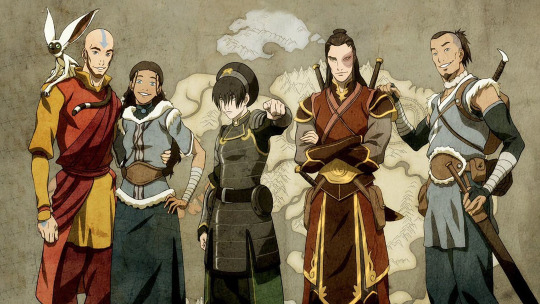
Everything we know about Avatar Studios’ first movie
It’s time for a good ol’ masterpost!
Here’s everything we here at Avatar News know about Avatar Studios’ first movie! Info that Avatar News is the exclusive source for is specified, otherwise everything is official public info from Paramount/Avatar Studios/etc.
Last updated on February 18th, 2023.
Title
The movie is currently designated “ANIMATED AANG AVATAR” in Paramount's slate, but is untitled
The Avatar franchise has been officially named “Avatar Legends” since 2022
A potential working title is Avatar The Last Airbender: Echoes and Aftershocks, based on a Paramount employee’s resume
A rumored title is Hidden Kingdom
Release
Release date: October 10th, 2025
Will be released in theaters exclusively at first, then stream on Paramount+ after
Previously estimated for 2024 internally at Paramount, but not announced publicly (source: Avatar News)
Story
Featuring “Aang and his friends”
Aang and Team Avatar will be young adults (source: Avatar News)
A movie with a Zuko-focused storyline was/is in development, it’s possible that this is that movie (source: Avatar News) - Update: The Zuko movie is separate
Brand-new original story, not an adaptation of an existing story from a comic, novel, etc.
Crew on this specific movie
Director: Lauren Montgomery (storyboard artist on ATLA, supervising producer on TLOK Books 2-4, showrunner of Voltron: Legendary Defender)
Writer: Kenneth Lin (Netflix’s House of Cards, Paramount’s Star Trek: Discovery)
Producers: Michael Dante DiMartino and Bryan Konietzko (showrunners of ATLA and TLOK, Chief Creative Officers of Avatar Studios), Eric Coleman (executive in charge of production of ATLA, suggested the creation of the character of Zuko in early development)
Production companies: Paramount Pictures, Nickelodeon Movies, Paramount Animation, Nickelodeon Animation Studio, Avatar Studios, Flying Bark Productions
Crew at Avatar Studios whose involvement in this specific movie, if any, we don’t know yet
Composer: Jeremy Zuckerman (composer of ATLA and TLOK)
Writer: Tim Hedrick (writer on ATLA/TLOK/VLD, showrunner of Fast & Furious: Spy Racers)
Head of story(board): Steve Ahn (storyboard artist and assistant director on TLOK)
Executive art director: Christie Tseng (character designer on TLOK)
Art director: William Niu (background designer on TLOK)
Consultant on native representation: Migizi Pensoneau (Reservation Dogs)
Many, many more crewmembers, of course.
Animation
Animation studio: Flying Bark Productions (Rise of the Teenage Mutant Ninja Turtles (2018-2020), Glitch Techs (2020), Monkie Kid (2020-), Marvel Studios’ What If...? (2021), Rise of the Teenage Mutant Ninja Turtles: The Movie (2022))
Animation style: traditional 2D + substantial CG
History of statements on animation style:
Sep 2 2021: “series of CG films” - Brian Robbins (president and CEO of Nickelodeon and chief content officer of kids and family for Paramount+)
Dec 2 2021: “outstanding and customized [...] unique production look” that “integrates [...] traditional 2D and CG” - Paramount recruiting for Avatar Studios
Jun 29 2022: “our main bread and butter is 2D animation” / “homage to anime” / “[not] gonna be [...] hardcore straightedge 2D” / “start with hand-drawn, handmade artwork and then: what can technology do to help us enhance it, to help us deepen it, to help the filmmaking, to make it more cinematic” / “not [...] starting purely 3D and then trying to stylize” / “looking hard to form our own look” / “not doing anything purely 3D” - Bryan Konietzko (Avatar Studios co-Chief Creative Officer)
Oct 13 2022: “2D Avatar feature film” / “couple traditional 2D animation with substantial CG elements” - Flying Bark Productions (the movie’s animation studio)
Cast
No cast info for this specific movie yet
Dante Basco is attached as Zuko, reprising his role from ATLA
A global casting call is going out for Asian and Indigenous voice actors in their 20s for Aang, Katara, Sokka, and Toph
Janet Varney, the voice of Korra in TLOK (2012-2014) has announced that she doesn’t want to voice Korra in the future; she wants an Indigenous voice actor to voice Korra (Korra is from the Water Tribe in the world of Avatar, which is inspired by Indigenous culture in the real world). It’s possible other voice actors will make the same choice.
Characters we know will definitely be in this movie:
Aang - previously voiced as a child by Zach Tyler Eisen in ATLA (2005-2008) and as an adult by D. B. Sweeney in TLOK (2012-2013)
Katara (source: Avatar News) - previously voiced as a child by Mae Whitman in ATLA (2005-2008) and as an elder by Eva Marie Saint in TLOK (2012-2014)
Zuko - see above
“Aang[’s] friends”
Other
Three theatrical animated movies are currently in development at Avatar Studios
Each movie has a standalone story-- they’re not a trilogy-- so the story of this movie won’t be continued in the next movie after it
The second movie is focused on Zuko (source: Avatar News)
The third movie is focused on the new earth Avatar after Aang and Korra (source: Avatar News)
The image above is official canon art of the Gaang as adults, but it’s from the lead-up to the release of The Legend of Korra in 2012, not from this upcoming movie. Fun fact: it was drawn by Joaquim Dos Santos, co-showrunner of TLOK and director of Spider-Man: Across the Spider-Verse (2023) and Spider-Man: Beyond the Spider-Verse (2024)!
247 notes
·
View notes
Text
About accessories and their secondary functions in Animation and Character Design
Well that title makes it sound way grander than it is, haha! I've no idea how this thing will go since I don't really have experience writing essays in english, but I'll do my best to give it some semblance of order. Shoutout to @haloheadhater who brought the topic out of me and showed interest in my sharing further!
Here's the TL:DR. Characters often wear accessories to complement their outfits, and these items don't just function as a visual representation of their personalities and interests (like real people); they also may have a "mechanical" function, so to speak. This function is much more secondary to visual storytelling, but sometimes designers will strategically place accessories on a character to facilitate their jobs on the long run. It is often a "two birds, one stone" situation, really.
Here's how that works in more detail.
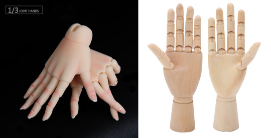
Disguising Joints
Humans have joints all over their bodies, that's fact. It's what allows us to move and bend like we do. When designing toys, we try to imitate just that: articulated dolls, mannequins, marionettes, figurines and puppets have hinges and ball joints so they can be posed more realistically.
A sign of care and quality in manufacturing all these is how well these joints are disguised, so they look as "organic" as possible. Screws and hinges get covered up as seamlessly as possible, so these puppets may resemble people more accurately: obvious, open and visible joints quickly break the immersion (and often places them in the uncanny valley).
Compare these high-quality doll hands to your basic wooden posable hand models. Notice how the doll hands do their very best to imitate the natural curves of human hands and how the knuckles cover the joints as much as possible even when they're bent. Meanwhile, the joints in the wooden model hands are plainly visible, and the shapes are very stiff-looking, so they don't feel as human.
Animation is no different! A good animated character manages to suspend disbelief: for however long the character moves on screen, the audience has to feel like this character is alive and real enough to relate to them and their story. Human brains are really good at detecting when something moves wrong, so the more "natural" your character is, the easier it'll be to keep up with them.
In puppet animation (often called flash animation thanks to Adobe Flash, now Adobe Animate, popularizing the method), characters are made of cuts, individual pieces held together by joints, much like traditional paper shadow puppets.

Animators and character designers often place accessories to cover up these cuts between joints, so when the character moves there's less risk of seeing them. My favorite example is vambraces, wristbands, watches and bracelets! Notice how uncommon it is to find a character with naked wrists? Well now you know half a reason! As the years go by and animation softwares improve, there's less need for this trick, or rather, it is often less obvious.
Disguising Texture Seams
Now see, 3D models look gray by default: you have to paint them over, like one of those tabletop figurines, for them to look pretty and presentable. This painting process results in a 2D image (called texture map) that has to be projected onto the 3D model. There is a variety of other maps that control different things, like how the model's surface reflects light (specular and diffuse maps) or if it's a porous, creviced or bumpy surface (bump, normal and/or displacement maps), but let's just focus on the texture map this time.
The process of projecting a 2D map onto a 3D model is called UV Mapping, and it looks similar to sewing patterns. There's plenty of methods to hide the seams in maps, but computers can be a bit unpredictable, and all 3D renders require touch-ups and a post-production process (especially light and reflectiveness). Sometimes though, covering seams with accessories is frankly easier, so CGI artists always keep clothes and items in mind when UV mapping, as well as the natural folds and crevices in the character's model.

Here's a good example of what I mean (by Thora Tong). This 3D model's UV seams, highlighted in white, were placed in a way that they'd be easily covered by clothes and accessories. Notice the seams on the wrists and ankles, and how the other seams around the body are very similar to the ones you'd see on actual pieces of clothing.
Volume and Foreshortening Guidelines
Drawing perspective is hard as it is, but organic shapes are particularly complicated. Accessories can help disguise certain perspective errors, or help convey the volumes and shapes of the body much more clearly. They are especially useful as guidelines for foreshortening.
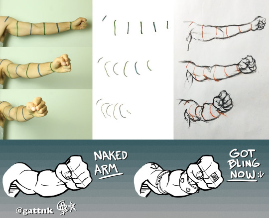
Anything you append to a character is a useful marker for later. The way these items bend alongside the body thanks to perspective is a useful visual key for later. If you're not sure how an arm will look from a certain angle, maybe imagining a bracelet on that same angle would be easier! The bracelets I drew over the naked arm serve the same purpose as the guidelines you see in the image above. This is especially useful for drawings with little to no shading, where conveying the volumes of muscles presents a challenge.
Bonus - Body Lines
When a human fetus is forming, its cells grow in a particular pattern; these patterns that the body cells follow determine the flow of muscles, nerves, and even how the skin folds or how pigmentation distributes itself. There's a variety of body lines, though the most known and studied (as far as I'm aware) are Blaschko's, Kraissl's and Langer's lines.
Langer's lines are particularly interesting: they're also known as skin tension lines or cleavage lines, because they indicate the best place for medical incisions on the skin, especially in the forensic field. There's many different models but here's a good example illustrating them.
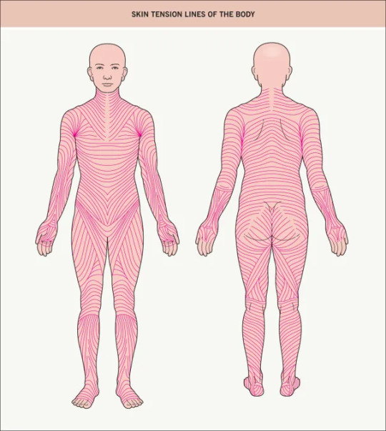
Placing accessories following Langer's lines can be really aesthetically pleasing. Since tension lines follow along muscle mass and fat, they also indicate how the skin warps and folds around them. Knowing tension lines is especially useful in terms of studying how the body creases when bending around (and subsequently, clothes too!), so discretely marking them out with accessories can be useful on the long run.

Japanese animation is especially guilty of using Langer's lines on skin-tight scifi suits. They're simply incredibly useful as design and anatomic guidelines, and they look so good, they easily survive the test of time!
Conclusion
Character design often involves following rules of practicality that viewers seldom notice. This is perfectly fine because they're not really meant to be noticed by anyone, except members of the team of course. Design of any kind should be done under the premise of aesthetics and function working together, and not against/in spite of each other, so it is no wonder that animators and character designers put some thought into meeting both when adding a little "spice" to their designs.
Anything and everything you can do as a character designer or animator to facilitate your work on the long run, or that of your team mates, is welcome. Covering seams and joints makes it easier for the guys in postproduction, as they have one less thing to look out for, for example. The animation industry is built on the backs of (often) exploited employees that sacrificed a lot of their time and resources into doing what they love most: deceiving the human eye and brain into believing for just a little bit that what they made is real. Truly wonderful!
So next time you're working on a character, try to think about the functionality of what you're including into them. Test your imagination, and see what comes out of your mindful placement of accessories with secondary functions.
32 notes
·
View notes
Note
I really like that barney animation you made, and I've been trying to do something simmilar, do you have any good advice for animating humans?
thank you anon! yeah i saw that my barney calhoun animation was going around again, it's nice to know that ppl still like it
your question is a little broad, but since you said that you wanted to do something similar to my barney anim, i'll assume you're looking for advice on animating dialogue specifically
first i wanna disclose that i have a lot more experience in 2d anim than 3d anim (though i had recently been looking into exploring 3d anim again), and i focus more on naturalistic movement, so i'll give broad advice about this style of animation that doesn't go into the technicalities of an animation program:
one of the best ways to make a character feel more natural is making sure that not everything starts and ends at the same time. a simple example would be a head turn showing from the chest and up, here's the general order of movement:
1. character moves their eyes to the side first (head and body do NOT move at all yet)
2. soon after their head turns
3. then their shoulders follow through (but they only move slightly in comparison to how much their head turns). the head should have already stopped moving before the shoulders come to their final pose
if you animate everything moving at the same time, it will give it a very robotic feel
for lipsync, the same thing applies. when you talk, sometimes your lips and jaw start moving before you make any sound, such as when you're trying to interject in a conversation
also another thing about lipsync, a common mistake i see is ppl overemphasizing every mouth shape or moving the jaw up and down for every. single. syllable.
your lips and jaw do not move as much as you think they do, put your hand underneath your chin and say your dialogue out loud naturally, you'll find that a lot of syllables blend jnto some jaw movements. it feels very unnatural to move your jaw up and down for every syllable
for slower movements, if you're aiming for a more naturalistic approach to animating like me, you'll have to use lots of easing. i'll copy and paste a comment i made on an animator's shot i was correcting, since a common note that the director kept making on a lot of animators'shots is to add more easing:
youtube
"For reference/inspiration on what [the director] is looking for when it comes to easing, take a look at this shot from Anastasia from 20 to 24 sec, especially the character on the right side! Notice the way how he moves from the 1st pose (arm raised up) to the 2nd (plainly standing upright), he's continually being animated with new drawings that are almost the same as each other as they get closer to his 2nd pose, just super tiny adjustments in spacing"
so in traditional frame by frame animation, this means lots of drawings that look nearly identical to each other. for 3d animation, that means adjustments in the graph editor when cleaning it up (and having a really solid blocking stage before you begin doing so)
#sorry for the long answer#seeking advice on ''animating humans'' is broad#so i wanted to cover all bases#i didn't wanna just say the usual ''just study irl people'' as that can be too broad as well#the wisp answers#Anonymous
10 notes
·
View notes
Text
art youtube is overwhelming AF.
sifting through all the art advice available on youtube (and other sources!) can be overwhelming AF. an ocean of voices screaming DO THIS! DON'T DO THAT! YOU MUST DO THIS!
i feel like no one ever really talks about that.
also: some ways i cut through some of this noise to find signal, below the cut.
i mean, some of these videos are legitimately helpful! and many are drama about the latest outrageous, racist thing some artist *cough cough* kooleen *ahem* did or said in a 'how to draw X' tutorial just noise. still more of them contain outright bad advice, or advice that can't easily be personalized.
(i can tell you right now that 'you must draw everyday!!!' is terrible fucking advice. not everyone can set aside time to do that, and guilt is the world's worst motivator for enjoyment. ever. just stop)
and almost all of it hides behind titles designed to raise your anxiety levels and get you to click. sadly, this is the nature of the platform. emotional engagement drives traffic, and every YT creator is trying to maximize that as best as they can. i don't fault anyone for that; people's livelihoods depend on these streams.
i have advised novice artists to try to narrow things down as much as possible, to 'get granular' about what they want to learn: painting skin. drawing hands, or noses, or faces, or feet, or poses. drawing more expressive lines. workflow, for traditional art or the raster graphics editor of their choice. it doesn't always help: for every subject i've listed, there exists a veritable firehose of videos about it.
so might i suggest a ruthless pruning here?
just go with whatever thumbnail looks interesting and is the least shouty/dogmatic about what it promises to teach you. you will probably miss out on some good advice, but the effect of all the preaching is cumulative. and your sanity is worth it. i promise.
if you don't have the time or patience for hour-long videos, either watch at 1.5-2x speed or skip ahead for the content you want.
look for specific solutions for your specific frustrations. and emphasize the process. how does this artist accomplish what you want to do? how do they lay out lineart, begin the rendering process, and why? can they explain that in a way that makes sense for you (if this is something you need)? if not, don't waste your time watching.
i remember breathing the world's biggest sigh of relief on hearing a professional animator confess that shadows don't always have to make sense for a piece of work to look right.
look for ideas on how to break what you see into scaffolding. by this i mean 3D approximations on a 2D surface, on which you can draw guidelines for proportions. ultimately, this is the key to 'drawing from imagination' and even to successfully working with reference photos. videos on how an artist draws eyes from one specific angle will not necessarily help you draw eyes from other angles. not unless they also touch on eyeball shape and position on the head. and how perspective changes the shapes you see. and...
lastly, how do you feel about the video you're watching? if the creator's voice or sense of humor annoys you, or you don't love the stereotypical way they draw female bodies, or they're actually kinda racist/ableist, or whatever–you're allowed to nope out and look for another source of info. there is a lot to be said for the skill of picking diamonds out of manure... but you can find diamonds of similar quality that aren't coated in shit, too.
#drawing#art advice#artists on tumblr#vent#solutions#intermediate visual artist#professional graphic designer#the best resource is one you'll actually use
6 notes
·
View notes
Text
The Evolution of Slam Dunk: From Anime to Personal Passion Project
As a child, after finishing school for the day, I would switch on MBC3, a television channel that aired anime. I'd gather with my cousins and we'd watch anime during our pastime together. Among the popular shows like Dragon Ball Z, Beyblade, Sailor Moon, and Yu-Gi-Oh, one that stands out in my memory is Slam Dunk.
The anime adaptation of Slam Dunk ran for 101 episodes, which were based on the manga series written and illustrated by Takehiko Inoue from 1990 to 1996. The story's narratives revolves around Hanamichi Sakuragi, who develops feelings for a girl named Haruko Akagi. Sakuragi decides to join the Shohuku High School Basket Team in an attempt to win her affections.
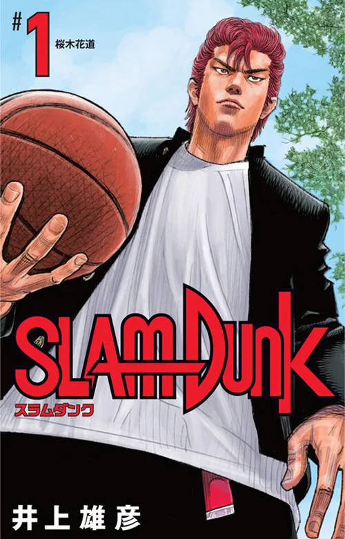
Slam Dunk first volume manga cover, featuring Hanamichi Sakuragi (redesigned)
The First Slam Dunk (2022): An Overview
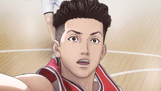
Takehiko Inoue took on the roles of both screenwriter and director for the First Slam Dunk movie, making it a personal passion project. The film picks up where the anime left off, after the climactic match between Shohoku and the Shoyo and Ryonan teams combined. However, rather than focusing on Hanamichi Sakuragi, the protagonist of the original story, the movie shifts its focus to Ryota Miyagi. It follows Miyagi's journey as he navigates the world of basketball, his relationships within the team, and his own personal growth.
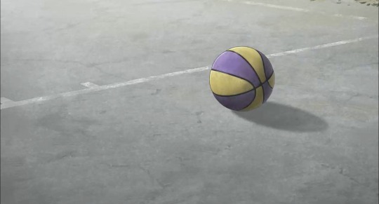
The Establishing Shot
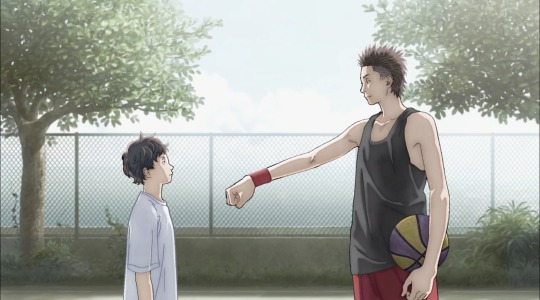
The movie opens with a scene of Ryota engaged in a one-on-one basketball match with his older brother, Shota Miyagi, on a court. The opening scene effectively sets the tone for the film by showcasing the close bond between Ryota and his brother, and illustrates their deep connection to basketball. Despite the scene's initial brightness and joy, it carries a sense of foreboding, hinting at the tragedy to come: Shota's unexpected death.
Following this loss, the movie delves into Ryota's journey of grief and his determination to honor his brother's memory by pursuing basketball.
Throughout the film, we see present-day or specifically courtside scenes intercut with flashbacks to Ryota's childhood, which is heavy with the weight of processing grief. This storytelling technique slows the pace of the film, allowing the emotional impact to unfold and resonate with viewers.
The Film's Animation
Inoue wanted the movie to capture the essence of the manga, so he chose a light and muted color palette. The film combined 3D CG imagery for basketball scenes mixed with traditional hand-drawn 2D animation for everyday life scenes. Personally, I believe Inoue achieved his goals because as I watched the movie, it felt like the manga illustrations were coming alive. I particularly enjoyed the "watercolor" effect created by the sharp outlines around the characters, and the soft, layered colors.
Lessons Learnt from Shota Miyagi
"I’m always like this too, my heart pounds like crazy. That’s why… I have to pretend that I’m fine."
In the opening scene, at the basketball court, Shota is not only teaching Ryota how to play basketball but also valuable life lessons about strength and resilience. In the scenes leading up to this, we witness Shota processing with the loss of his father while also being a support for his mother. Despite his own grief, Shota bravely declares to his mother that he will take on the responsibility of being the head of the household. This display of strength and determination resonates deeply, almost as if Shota is speaking directly to the audience (breaking the fourth wall), urging them to remain steadfast in the face of adversity. His courage serves as an inspiring reminder to stay strong during trying times, no matter how challenging they may seem.
Final Thoughts
"The First Slam Dunk" stands out from other sports and action anime or movies by taking viewers on a journey from pain and trauma to resilience and strength. It blends fast-paced basketball scenes with slow flashbacks, creating tension and anticipation that keeps viewers engaged. When I watched the film in the cinema, I felt inspired and motivated—it made me want to start drawing in my sketchbook right then and there. The movie left a strong impression on me and remains my biggest inspiration for improving my artwork.
It was incredible to see how the narrative shifted from focusing solely on sports and romance in the anime adaptation I watched as a child to a more personal and meaningful message in the movie years later. As the title suggests, Inoue intended for both familiar and unfamiliar audiences to experience it as though it were their first time watching, establishing a different perspective and impact.
6 notes
·
View notes
Text
Shipping with Damien💀🦇🗡️
The Darling of Vesuvia with too much to prove—and even more to lose.
Age: 24
Height: 5’3
Favorite Food: Candy—specifically chocolates
Favorite Flower: Roses
Star Sign: Scorpio Sun; Pisces Moon; Aries Rising [October 31st]

Likes/Hobbies etc.
Talking about wine—drinking it is another question
Parties—to an extent
Damien is a nerd at heart; art, science, history, local mythology/legends—he gobbles it up like candy and throws it all up on whoever he thinks will listen and not judge him lol
Particularly interested in death, preservation, and anatomy (GEE WHERE DID HE GET THAT FROM?)
Taxidermy—Damien does his own taxidermy and will often try to replicate magical creatures he’s read about
Sports—think horseback riding, shooting (bow and arrow), swimming, etc. This is often surprising to some people, but Damien is very competitive at heart and will use any chance he can to show off his physical prowess lol
He’s a little pot head but his mama raised him right and he will be surprisingly VERY polite during a smoke sesh lol (he’s a bit of a lightweight though, which is endearing)
Dancing and singing; he often incorporates music into his magical displays at the palace (he’s like a proto-pop star in Renaissance times lol)
Dolls/toys/stuffed animals
Sweets—the best way to initiate a courtship is to get him something sweet, preferably chocolates
Fiber arts—Damien is very experimental in his art (for Renaissance standards) and often incorporates fibers with traditional 2D mediums. He particularly likes knitting, embroidery, and felt, and he primarily uses oil pants and charcoal
Dislikes/Potential triggers
Claustrophobic
Afraid of the dark
Hates feeling like he’s being made fun of/the butt of a joke he isn’t aware of
Cannot stand someone speaking poorly of his parents, especially Donna as typically other nobles are particularly cruel
Anyone bringing up his “disappearance” in any context
He has a bit of an emetophobia—he hates throwing up (see: ectoplasm boy lol)
Being sick in general and doctors in general
Has many sensory issues to be mindful of, specifically with regard to touch and sound
Damien has a tendency to disassociate in the middle of a conversation, either for magic reasons, PTSD reasons, or more often some combo of the two
Hates being touched without his permission—will become violent in response
While Damien personally compares himself to his father, he hates when others do it to him, especially regarding looks
Damien is. Complicated.
Damien is well known throughout Vesuvia, and he has a multitude of suitors and playmates. He is deceptively sweet and charming, which gives people the impression that he is more invested in their relationship than he really is. Truly, Damien is a very shallow person and will sleep with who he needs to in order to rise to the top. Sex and romance are games to him, and he intends on winning (though what that means or looks like, he isn’t quite sure). It is not uncommon for some of his partners to see that he has written nearly identical letters to another person or has sent someone else a nearly identical gift. However, he typically always has an excuse up his sleeve, and if that fails, his crocodile tears are quite convincing to an unsuspecting person.
With that being said, out of all of my OCs, Damien craves love and genuine connection the most. Someone will be able to tell easily if Damien is genuinely interested in them: he will script less of your conversations, will seek you out first, will open up more easily, etc., etc. He is a bit useless when it comes to people he likes, and it is common for him to withdraw entirely before he ruins things. He needs a long-term partner who is patient but firm with him and won’t just concede to his whining. (And of course, Damien has a laundry list of shit he needs to do before being able to be in a relationship at all lmao)
Damien grew up thinking he was, literally, a monster and still believes this. He doesn't necessarily think he is deserving of genuine love, and in many ways, he is still very much the hurt child he was all those years ago, scared and insecure. These are things that a partner cannot change or make better, which makes romantic ships much harder and more complicated (fun sex is on the table though lmao).
He is prone to very severe breakdowns, and he has a bit of a temper even on a good day. Patience, understanding, and communication are key for him. Once he is calmed down, he is able to self-reflect and apologize properly. He never wants to hurt people he cares about on purpose—he’s truly a big work in progress lmao
Now let’s talk sex ! :D LMAO
Damien identifies as a dominant and will only take on a dominant role with suitors or new playmates. Sex and kink give him a sense of power and control, and he refuses to give that up to another person he doesn’t trust. However, he’s Donna’s kid at heart, and he deeply understands what it’s like to give up control and the trust that requires at the moment. He is very much inspired by older dominas, and his style and presentation reflect that (I'm still toying with a mentor character for him, but definitely a latex goddess lmao). He loves doling out punishments and just adores humiliating others—especially when he’s given enthusiastic consent to do so. He loves a sub that will lie on their back and beg to be degraded and stepped on lmfao He is not as invested in breaking a sub as much as he is in fulfilling both of their desires willingly. Damien was bullied very severely as a child, so he’s very big on aftercare and reflection after a scene with longer-term partners. He sometimes has a tendency to go overboard, so critique is important to him.
That being said, if he is with someone he trusts and has feelings for, Damien is actually not that kinky and is much more docile and submissive LOL He can be a bit of a pillow prince with someone he likes, and he can get very whiney and needy. Sometimes he truly just wants to be fucked in the ass until he falls asleep cuddling you, and that’s that lol 110% has a daddy-dom fetish (as a submissive—not as a dominant lol), but it will be like pulling teeth to get him to admit it lmao
The other biggest thing of note with Damien is that he will NEVER do vaginal penetration. You will be bitten, literally, if you try to break this rule, and it won’t be by his mouth either. He is okay with clitoral stimulation once he shows someone how to do it, but more often than not, he will get himself off with his own hands. However, he loves anal and everything about it. Damien also requires that his gloves and stockings stay on during sex, and he will get violent if someone pushes him to take them off lmao
Annnd now here is a full list of his kinks and fetishes; I may be adding more in there as time goes on, but right now these are the core ones lmfao
#bottom ponders#bottom draws#problem child Damien#shipping bio#the arcana original character#my troubled troubled boy LMAOOO#a pathetic little beast#officially making him a short king because i can
19 notes
·
View notes
Note
How aren't mediums fungible? Any art history class would teach you they very much are.
what, has 'the medium is the message' gone out of fashion now or something?
but to explain what I'm trying to get at, since there's a good chance I misused the word >< - each medium brings its own set of affordances and emphases. if I see a CG animation I pay attention to different things than if I see traditional animation or stop motion or what have you.
for example, we could have a look at the animation of Hiroyuki Okiura - say, the introduction to the Cowboy Bebop movie, or his work in Magnetic Rose. Okiura is one of the most renowned realist animators, someone whose drawing style, camerawork etc. hews very close to live action film. his exceptional sense of perspective and space is remarkable in traditional animation. by contrast, you 'get it for free' in CG and stop motion - you will always have perfect linear perspective unless you go out of your way to break it. however, CG rarely captures the exact qualities of Okiura's animation, which come from the sense of drawing principles - how to simplify shapes, 2D spacing etc. and by making it something constructed, the way characters move through space, the way a drawing can suddenly feel 3D, becomes foregrounded - it's no longer incidental but now a core part of what Okiura's animation is expressing.
so, 'live action into anime' is kinda what the AI style transfer tools are going for. in the technique from the recent paper, you start with a static drawing of a character and some animation data (likely mocap), and the program will generate an animation. that's similar what Corridor Digital attempted a few months ago, using a neural network finetuned on Vampire Hunter D: Bloodlust, and applying 'style transfer' to live action footage they shot. the results were, viewed as rotoscoping, kind of hideous, with shapes constantly flickering and turning into mush. the new paper I linked offers some techniques to improve the temporal consistency of this type of AI rotoscoping which should make it look a lot less bad, though it remains to be seen whether it works in situations other than 'well-lit fullbody shot'.
still, even if Corridor's video was a lot more technically solid (and give AI development a few years to iron out the kinks, I'm sure it will look downright quaint), it doesn't provoke the same response in me as Okiura's animation. the process of drawing something involves a lot of artistic decisions about what to capture, simplify, emphasise; for all that it is 'realist', Okiura's animation likewise has a particular feeling to the way characters move, the way they interact with light, the use of line, etc. which in some large part arises from how it is produced. so much of that is all but impossible to capture in words.
but also - knowing a bit about how it's made, and having my own experiences of animation, gives me an angle to appreciate what Okiura is doing. a drawing of something is a way of drawing attention to the specific details of the subject. two people drawing the same subject will never draw it the exact same way. one of the joys of going to life drawing is seeing how many different ways people can approach the same subject in the same ten minutes - inflected by different media like charcoal or watercolour pencils. one of the great things about anime is the space it gives key animators to bring their own sensibility to a particular shot.
I certainly accept that is inevitable that mediums will evolve with time. anime looks very different today than it did 30 years ago. part of of that is evolving sensibilities, partly the slow-motion collapse of an overstrained industry, but also a lot has do with the fact that every studio has switched to digital compositing and digital background painting. it's possible through painstaking effort to fairly closely imitate the look of cel animation on a computer, but you really have to go out of your way, and it's rare to do that.
and I do feel like something has been lost with the death of cels - qualities of line and colour, the difference between digital bloom and backlight animation. but something has been gained at the same time: maybe we've gradually lost the traditional skills for drawing layouts because the conditions of production made it so that skills weren't passed on to the current generation of animators, which sucks, but we have simultaneously gained the ability to merge 2D and 3D animation with tools like Grease Pencil, to use the camera-like digital compositing effects of directors like Naoko Yamada and Makoto Shinkai. it's not better, just different.
this isn't to make the boring argument that AI art is soulless, or lacks the magic human touch, or whathaveyou. it's just a different medium. nor would it be right to say that there are no connections between media - literally right now I'm modelling an arm, and my experience of drawing arms is directly influencing how I break down the forms and all of that. AI generated images derive in obvious ways from traditional animation and CG and photography and all that, AI engineers study these media in great detail as they develop their programs; our knowledge of those media can inform how we respond to AI.
honestly, CG that aims to replicate the look of traditional animation, such as in the games of ArcSystem Works, or the works of Orange like their Houseki no Kuni, is something I actually find very interesting. not because I think it could or should replace traditional animation; it just reveals fascinating things about both media. the same can be true of AI, I think. like what do you learn from what a neural network is able to capture, and what it isn't? and what does studying neural networks tell us about human brains?
if the development of AI and the accessibility of new tools leads to a flourishing of interesting new animation, I'll be happy. I just don't see it as a replacement for traditional animation and 3DCG. if anything the future of animation will probably look like a hybrid process taking advantage of the best features of all the different media we've invented - insert the usual spiel about Arcane and Spiderverse here. AI is currently very immature, we're still figuring out what it's good for and the hype drowns out everything, but I'm sure it will find a comfortable place, and I'll be interested to see how it all shakes out.
but what I meant with 'not fungible' is that, if you try to replace one medium with another, you will inevitably change the qualities of what you make. nowt wrong with that. like, just because you can adapt books into films (and vice versa) doesn't mean books are obsolete. some things are easier to express in prose, others in film. you can have prose that's informed by film, and film that's informed by prose. everything's talking to everything else, it's great! but the tools you choose are meaningful, and interesting. not just an irrelevant detail to be swapped out when "superior" technology comes along.
#ai#this is all from a very pie in the sky art perspective - not even touching on the implications for industry. labour. etc.#because we don't get free choice of media. nobody will fund a cel animation film now.
36 notes
·
View notes
Photo

while im posting tonight. i think about that ptg doodle thats peppino vs pepperman in presumably a 2d fighter a lot so heres my thoughts on how most of the pt + sugspi cast would play in a traditional fg
i posted this in the sugary spire discord and many ppl didnt know the terms. this is alright! i dont mind. i made a little in-depth explanation of the terms i use and break down a little bit more of what i want for each character. pasted under the cut if you would like to see (watch out! its long)
peppino:
zangief- very traditional grappler, peppino actually already takes some poses from him while doing certain grabs in pizza tower
+rtemkin- considered to be the "best" (in terms of tier placement) incarnation of potemkin, a guilty gear grappler with a lot of really cool tools that really shine at high execution.
"grappler with a shoryu" - a shoryu, or a shoryuken/DP is a reversal with an invincible startup. peppino's uppercat animation resembles a shoryuken, hence he gets one. grapplers dont usually get these for balance reasons
noise:
kohaku- meddling trap-placement character in melty blood, big trickster that puts things around that youll run into trying to get to her essentially, though shes got really good offense on her own
faust- item toss character thats really good at keeping you at whatever range he wants you at onscreen
midrange zoner- wants to keep you away, but not at fullscreen, so he can keep putting you into bullshit
pepperman:
"big body but not a grappler" - big bodies usually have more health/defense and "armor" on their moves in exchange for slower movement and better payoff
"maybe hes doing some tekken shit" - yeah
"definitely has counters" - a counter move is a parry that automatically grants you a counterattack
gustavo and brick:
relius- guy with good offense who controls a second body on a separate resource meter to lock down pressure
vigi:
keepaway characters traditionally have less health than others to make you REALLY worry about getting caught; the noise prefers midrange but vigi prefers full-range and has efficient tools for arena escape
feppi:
"what if rainbow mika was dan hibiki" - ok this one has layers. rainbow mika is a disciple of zangief and thus plays somewhat similarly, with more emphasis on speed and such. dan hibiki is a joke "worse" version of ryu
command grab rekkas - rekkas are moves in multiple parts/moves that branch into multiple paths. like A->B->C or A->B-or-C->D. rekkas tend to give characters really cool routing abilities and a more free-flowing playstyle
command movement- a move that makes a character perform a special action rather than necessarily an attack, like a teleport or a dodge
pizzahead:
i mean hes there(*)
noisette:
a "shoto" is a function like ryu or ken, very much the white bread of fighting games but always welcome and usually very fun and expressive to pick up. usually has a projectile and a shoryuken, at least
pizzelle:
shoto was explained on the noisette slide 👍
chipp and millia are both characters that focus on incredibly pressure and high combo counts, but have low health and poor defense to balance it out. basically speed demons
pizzano:
SUPER ARMOR means you can hit him but it Will Not Stun Him. characters that super armor through shit are usually seen as Scary as Hell but also tend to be slower, big-body damage sponges. i think pizzano can move tho
"this mf has divekicks" - this mf has divekicks
"what if viewtiful joe was big and scary" - viewtiful joe is generally regarded to be a lower tier character in Ultimate Marvel VS Capcom 3: one of the smallest and slowest characters, with a lot of quirky bullshit that requires a lot of high execution but also a tv pose spotdodge (spotdodge: stay in place and avoid an attack). making vjoe 1. big 2. move better 3. not die instantly the second he gets touched by a magneto would create a horrifying force
gumbob:
honest footsies gumbob
he has a raging demon
stinky:
usually characters with executional difficulty are higher up on the tierlist of a game (like arakune from blazblue and johnny and i-no from ggxrd), but sometimes this is not true (like angel from kof, who is the hardest character in the game to learn but considered one of the worst despite it all)
i think stinky would be somewhere in the middle; a character that gives you arthritis to play and has a lot of expression, but gets shut down easy and can have his setups blow up in his face incredibly easy
if anyone else out there has any thoughts on this matter i would love to hear them. im insane.
(*) i dont actually hate pizzahead or anything i think hes really fun. he just baffles me in the way that hes popular and i think im just tired of seeing the popular depictions of him. godspeed pizzahead lovers do not hurl bricks at my window
26 notes
·
View notes
Last Seen Blogs
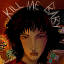
moxdioxide
Moxdioxide
wingedheroh4wks
ave

aesthetictoo
aesTHEtictoo
maybelsblog-blog
Té para a dos
dfnews
DUGGAR FAMILY NEWS:
Pickles & Hairspray