#thanks so much once again!!!
Photo

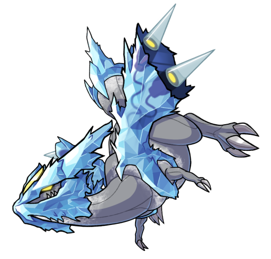
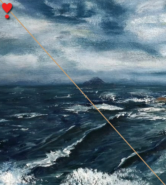
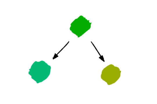
Day 3340 - 27 June 2022
☢️☢️☢️
A commission for xietLied!
.//projectTiGER
#projecttiger#commission things#THANKS SO MUCH ONCE AGAIN!!!#hehe her name is MENSA and i wish her a very pleasant take over world or whatever she has her sights on#I LOVE!! ANTAGONISTIC!! CHARACTERS!!!!#nefarious looking laboratories???? count me IN
505 notes
·
View notes
Text

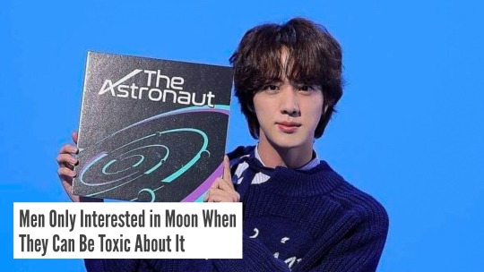


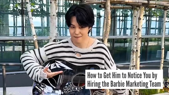


bts + reductress headlines pt.12
#figured we were due a little comic relief after that trauma dump of a weekend and the subsequent Taehyung Horrors#thank you so much for all the love on this series despite the appallingly infrequent updates (i fear this will not improve)#shamelessly tagging all my favs once again <33#trackofthesoul#annietrack#boongietrack#usersky#heyryen#usermaggie#userkelli#tusercelia#tuserjay#networkbangtan#reductress#reductress headlines#textsfrombangtan#bts#couple of footnotes:#kim seokjin i'm sorry but the astronaut??? MOON???? i dare say you have nary a leg to stand on#however if you and your military muscles would like to have a discussion about it that can very much be arranged#and @ jeon jungkook... even god rested on the seventh day. there's no way
3K notes
·
View notes
Text
Dick from a guy that thinks you’re too good for him.
#I’m once again thinking of Bakugou#just imagine him trying that much harder because he proper fancies you#and wants you to fancy him too?🥺#and he’s thanking whatever god is watching over him right now for you letting him hit that#and he wants to make it worth your time#and maybe he’s been chasing you for a while?#or just pining after you for a while#so when you finally come together he can’t believe his luck
2K notes
·
View notes
Text


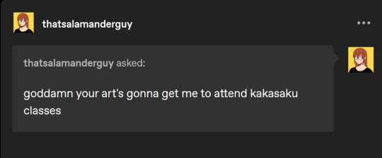

@kohnnors-blog
@thatsalamanderguy
YES. COME TO THE DARK SIDE. (We bully hot men here :))
#naruto#haruno sakura#kakashi#kakasaku#kksk#If big strong men aren't reduced to blushing messes we're doing it wrong#we bully men on this blog (in hot ways)#also if anyone has some good sakura/girls ffic pls feed me#once again thank you so much for all the kind words#kakashis just getting a physical i dont know what ur talking about#coven!Sakura
525 notes
·
View notes
Text
My two stickers I made for @cecilioque ‘s awesome sticker collab!!
➡️PREORDERS RELEASE MARCH 9TH AT 10AM PST!!⬅️
I was honored I got to make something for this collab alongside so many talented contributors!! Thank you so much for having me, and for putting this project together for all of us to get to participate in! It turned out fantastically and I’m amazed by everyone’s work!!
—————
CHECK OUT THE COLLABORATION BELOW!! (And check out the reusable sticker books as well if you haven’t gotten one for all your stickers yet!!)
⬇️⬇️⬇️⬇️⬇️
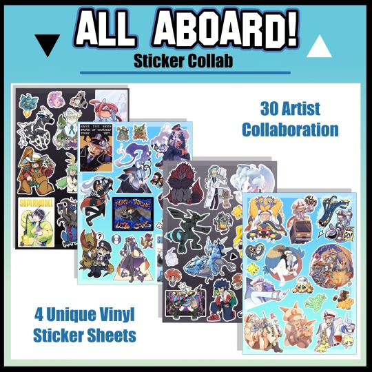

CHECK OUT THE ORIGINAL POST FOR MORE INFO ON UPCOMING PREORDERS!!
⬇️⬇️⬇️⬇️⬇️
#submas#Ingo#subway boss Ingo#subway master Ingo#haxorus#kyurem#Pokemon black and white#pokemon bw#pokemon bw2#pokemon#waywardstationart#sticker collab#I HAD SO MUCH FUN WITH THIS!!#got to experiment with new styles and techniques to get around limitations and everything#thank you sunny for putting this together!#ONCE AGAIN AWESOME JOB EVERYONE#get ready for preorders!!
589 notes
·
View notes
Text
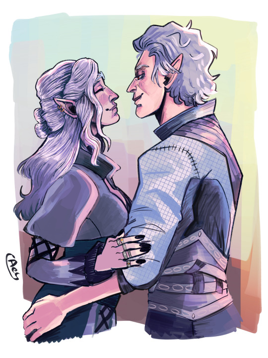
𝐘𝐨𝐮 𝐠𝐚𝐯𝐞 𝐦𝐞 𝐩𝐫𝐞𝐜𝐢𝐨𝐮𝐬, 𝐢𝐦𝐩𝐨𝐬𝐬𝐢𝐛𝐥𝐞 𝐦𝐨𝐦𝐞𝐧𝐭𝐬 𝐨𝐟 𝐜𝐨𝐦𝐟𝐨𝐫𝐭.
This beautiful art of Maleane & Astarion was made by the wonderfully talented @tadpole-apocalypse thank you so much!!! They're open to commissions, so check them out!
#baldur's gate 3#baldur's gate#bg3#bg3 fanart#astarion#astarion ancunin#astarion bg3#astarion x tav#tavstarion#astarion x oc#bg3 astarion#bg3 tav#bg3 oc#oc: maleane#maleane/astarion#art#aaaa they look so so so good!! thank you so much once again!!! 💖#and also thank you for my first proper art trade!!! i haven't been this excited in a while!#i am weeping though my beautiful blorbos in the sun 😩🥺#i want to write something mhm#they look so happy!!! and they are!!! just thinking about mal smiling sincerely 🥺🥺🥺🥺#and then astarion recognizing that? him noticing the little differences in how she acts around him vs the others?#brb i need to scream into a pillow
440 notes
·
View notes
Photo
Hello may 31th anon! Look at that, another year behind us and a new one to come. Have a nice day! ₍՞◌′ᵕ‵ू◌₎♡
#may 31th anon#hello friends!! (。’▽’。)♡ how are you!! I missed you so much!#I'm sorry that once again i have not been posting but I did that thing again where I got scared of posting#I do not know why but it is the same with physical paper diarys#I have 3 diarys and they all have 1 entry#I think one just says 'I am ten'#what have you been up to!! did you do something fun? is it summer too where you live? c:#my tumblr messages seem to be broken! I'm sorry if you wrote something :C it just says 'no new messages' despite also saying new messages#not a lot has happened here! I got a tomato plant and then I got very invested into the tomato plant and I have eaten three tomatos so far (#my roses are also doing well!! I just got a new yellow rose and since she got here she only made orange flowers#I do not know the meaning of that#but I am very thankful! ( ˊᵕˋ )♡ I love it when things are orange!!#I've been trying to buy an orange shirt for the past 2 weeks but they always sell out before I get to them#I'm also thinking about buying a jean jacket#I have not worn a jean jacket for at least 15 years because one time in 7th grade tthe girl behind me said#that I was wearing a cool jean jacket and I just assumed that this was bullying for no actual reason#but maybe she just thought that it was an acutal cool jean jacket#we'll soon have out 10 year school reunion#maybe I should ask her#is anyone else going to a secret Sherlock phase again#I just want to see that silly little hat again#would sherlock holmes wear a jean jacket#have a nice day everyone!!#see you soon hopefully!!#♡^▽^♡
1K notes
·
View notes
Text
HYUNJIN BIRTHDAY COUNTDOWN (2024):
↘ D-DAY | HAPPY BIRTHDAY HWANG HYUNJIN❣️
#hwang hyunjin#hyunjin#stray kids#bystay#createskz#flashing tw#a9gifs#*gif#*hyunjin#*ccarly#*carly:hyunjin#*series:hjbday24#once again i fear we have a whole countdown leading up to this only for it to be lackluster. every year LDJKSSJLKDGLKJSD#sorry if this is a flop finale but i had fun <3#i hope these are synced too science says they should be but my laptop never loads them all at once akldjfajklsdjglks#anyway this concludes the countdown it went by so fast.....thank u for liking it everyone 🫶#i will never be doing this again. LKJSDKFLSJKDGLKSDG#maybe a countdown but not 30 sets. i DID IT THOUGH. very proud of myself for being that insane. good times#also happy birthday hyun i love u so so much and hope you have an amazing day :((((#do something fun...take a nice nap...eat good food...hope u get to celebrate however u want this year
307 notes
·
View notes
Text

Day 3580 - 19 December 2023
🍻
.//projectTiGER
#projecttiger#commission things#I'll drink to that! Thank you so much once again!!#this was veryfun to do i may or may not have spent a good portion of time looking up christmas socks#christmas is one of the prettiest festivals i like it very much
519 notes
·
View notes
Text
farewell boops…
the boopening has brought me closer to my followers and mutuals than ever before and im so grateful for it 💛
🌟 thank you to everyone that returned my boop
🌟 thank you to everyone that super booped me!
🌟 thank you to everyone that normal booped me!
🌟 thank you to everyone that evil booped me!
🌟 thank you to everyone that booped me and thought it went by unnoticed!
🌟 thank you to everyone that spam booped me!
🌟 thank you to everyone that booped me in my inbox!
🌟 thank you for allowing me to boop you!
i love each and everyone of you guys on this silly site 💫
#mitsu babbling#i loved this event so much#im feeling things ehehe#its more than just a silly little april fools event to me#once again i love you all so much#thank you for sharing love with just the single touch of a boop button#boops#boop#boop o meter#the boopening will always be remembered
245 notes
·
View notes
Note
Hello!! I'm a huge fan of your art and I thought I would ask about your colorwork, because it's genuinely super impressive to me how all your pieces have amazing palettes and they add so so so much to the general atmosphere. Do you have any process to pick colors for pieces? Like using picture references, gradient maps, etc or do you genuinely just eyeball them? I'm super curious :]
But yea I really love what you do and love seeing every new piece!! Have a nice day! Ty for reading <3
Thanks! I very much use references, though I don't use the color picker on them, gotta train the eye. I have an ever-expanding reference folder of photos and paintings with colors that I like so that when I start a new painting and I have an idea of the color scheme I want in mind, I'll already have some reference on hand. Good reference really makes a world of difference!
I also like to bias colors a little bit away from their standard versions:
The more blue green and the more yellow green are both more interesting to me than the "just green" green. Nothing wrong with that average green though, sometimes that's exactly what you need. It's always situational.
Lastly, a fantastic color tip for digital art specifically that I got from Mike Hernandez: Use the RGB sliders instead of the HSB color selection!
By default, Photoshop gives you the HSB (Hue, Saturation, Brightness) color picking setup which looks like this:
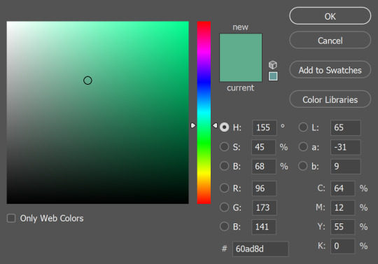
It's perfectly functional and has its uses, but it doesn't really feel like mixing color. On the other hand, if you use the RGB sliders:
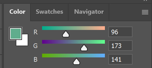
Now you can add a little more blue if you think that's what the color needs, or you can take away red, add some green, etc. It gets you actually mixing color and thinking more about how the colors relate to each other. It can take some getting used to if you've only used the HSB setup before, but it's worth it!
#and thank you for your patience!#I know this and other questions have been sitting in my inbox for a while#these past months have been the type where there was always something (or several somethings) just a little more urgent on the to-do list#and once again thank you so so much to everyone who has sent in kind messages about my work!!#it would flood this blog if I were to respond to every one but know that I do immensely appreciate every one#they absolutely make my day
196 notes
·
View notes
Text
If I could hold you for a minute,
Darling, I’d go through it again
For @edsbacktattoo & @stedesearring 💕
Show: Our Flag Means Death - Season 1 & 2
Music: Francesca by Hozier
YouTube
#ofmd#our flag means death#gentlebeard#stede bonnet#edward teach#ofmdedit#ofmdaily#ofmd source#ofmd fanvid#ofmd s2#ofmd edit#blackbonnet#ella’s edit#HAPPY BIRTHDAY JAMS ❤️#AND A BELATED HAPPY BIRTHDAY KAITLIN ❤️#i'm killing two (impossible) birds with one stone by dedictating this video to both of you absolute angels!!#jams i love you so much. you're so incredibly talented and hilarious and kind and amazing. i'm so grateful for you.#if you didn't live halfway around the world i would come over and give you the biggest and warmest hug#thank you for letting me scream in your dms all the time. whether it's about our pirate boys or your writing or cancellation hell™️#and just THANK YOU for being such a wonderful presence in my life#oh and kaitlin. lovely sweet kind kaitlin. the one we all love to call a human ray of sunshine because you're just THAT lovely#your little yellow hearts in the tags brighten my day every time i see them. whenever i talk to you you're just so sweet#thanks for every single lovely word. for every music rec. for every sweet message or ask. what a gift you are. ily!!!#speaking of gifts: i couldn't think of a more perfect song for the two of you than francesca#so i hope you like my little creation that i've put together. once again shoutout to#evil gang 😈
375 notes
·
View notes
Text
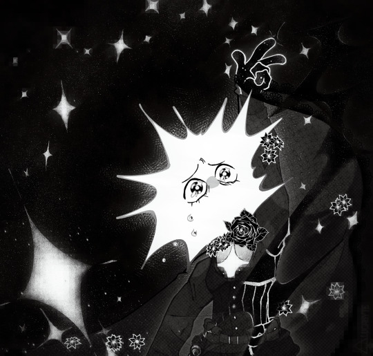
Stardust.
#last time i was on the thread of burial rites it was the highest peak option. so as for this time. this time. this time.#throw my ashes to the sky.#in stars and time#in stars and time fanart#in stars and time spoilers#isat fanart#isat#nohats au#isat loop#isat au#lucabyteart#once again thank @samhainian for the original idea because when we both realised we were picturing the same pose from the prologue .... oug#but! an excuse to draw the outfit i designed for loop again... and uh. i realised something? that had subconciously influenced me#when i was designing the outfit something in my brain seemed insistent on 1. a corset and 2. its shape. which i didnt question at the time.#but i realised when looking at img refs later. oh god. i accidentally recreated the king's armor. which is so much worse than i intended#so. im just going to run with that implication. and you should too. have fun!
228 notes
·
View notes
Text


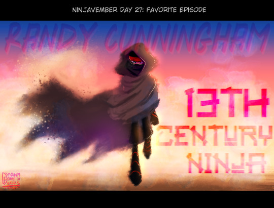


Ninjavember Days 25-30! 🎉🎉🎉
#ninjavember 2023#rc9gn#randy cunningham 9th grade ninja#rc9gn sorcerer#rc9gn peddler#rc9gn first ninja#first ninja#randy cunningham#howard weinerman#can't believe i managed a whole -ber event!!!(except for one day but considering how much i drew for others its like meh)#like it happened only once or twice in my life before where i got thru whole month! lol#thank u evilspiritweek again for hosting! (also dude my brain literally didnt comprehend the 31 day thing until u pointed it out. so like#no worries dude we are all brainfryed around here)#also thank you anyone who enjoyed my prompt fills!! im glad my insanity didnt go unwitnessed! xD
315 notes
·
View notes
Text

T4t huntlow so real etc etc
#for u anon#huntlow#hunter#willow park#the owl house#toh#fanart#art#tbh i have mixed feelings abt changing characters gender for the sake of shipping in general#my trans willow was mostly bc ppl always focus so much on hunter and not on willow#not that i oppose to any hcs or aus or etc etc#also picked this hairstyle for hunter bc in thanks to them hunter says he likes who he is (right now) while looking in the mirror :)#and giving back his mullet and hair noodle was belos once again taking his agency and person away from him#and forcing him back into the caleb square#so as much i do like the hair noodle i support the haircut more
2K notes
·
View notes
Note
I’ve been scrolling through some of the Linked Universe tags the past few days and every so often I’ve come across your art, mostly of Warriors and Time and I just wanted to say I absolutely love it! Your art style is really cool and I love the way you colour the pieces you draw, it’s very nice! I hope you’re having an excellent day!
Thank you so much!! I’ve had so much fun drawing Warrior and Time shenanigans and it’s really helped push my art wrt character interactions
I’m so glad you’re enjoying it! 🥰🥰🥰
.
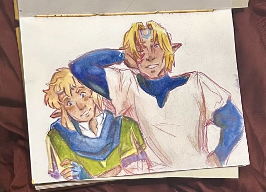
Time: So, what’s going on here?
Warriors: Not sure, but it definitely seems like something you should deal with.
#my money is on Legend and Four causing problems#they’re the real chaos duo of the Chain#my art#artist asks#artist of tumblr#tumblr artist#fanart#art#sketchbook#watercolor practice#colored pencils#linked universe fanart#lu fanart#lu time#lu warriors#the privilege of being the eldest brother but not group leader is getting to pass responsibility off to your baby brother#I am once again overwhelmed by yalls kind words and don’t know what else to do but draw#thank you so much seriously#alt title: POV: your trying to explain why you got arrested to your older brothers and both are trying not to laugh#tloz fanart#loz fanart
321 notes
·
View notes
Last Seen Blogs
pinkfluffacttuff
PinkFluffActTuff
jklmn-oh
sarang, sarang, sarang
jklmn-oh
sarang, sarang, sarang
jklmn-oh
sarang, sarang, sarang
diseric
№9 ## START