#taao
Text
Remembering Megatron got a redemption arc in IDW and then in Earthspark and meanwhile starscream is always left like this :]
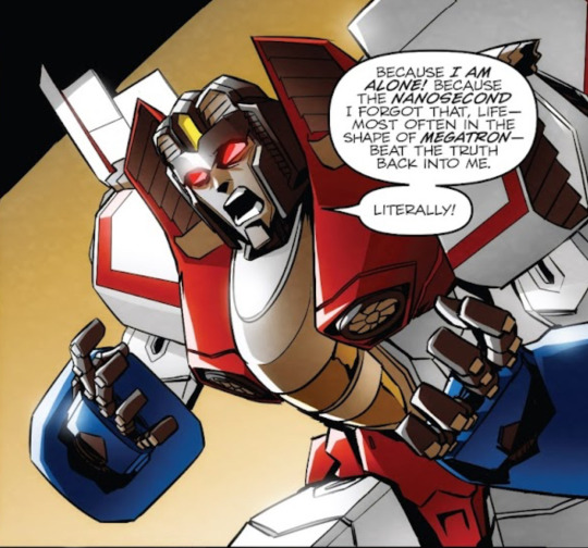
#cue the random anons thatre gotta fill my ask saying starscream wasnt an abuse victim#like i think you miss the point#his character is to show you that even though he was a victim that doesnt make him better than his abuser#either way.#justice for my girl#transformers#maccadam#transformers idw#starscream#taao
619 notes
·
View notes
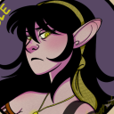
Text
screamer
3K notes
·
View notes
Text

he's so hot and for WHAT
#taao#vigilem#cjj sayeth#i just read this w friends and DAMNNNN ZAMNNNN#kinda hot and bad... and a baddie.... and hes a titan??? SHEEEESHHHHHHHHHH anywayyy#maccadam
500 notes
·
View notes
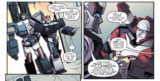
Text
So what do y'all think he's talking about?
583 notes
·
View notes
Photo

tiny friends for Starscream!
#starscream#windblade#metalhawk#bumblebee#wheeljack#rattrap#taao#maccadam#maccadams#transformers#my art#made for the starscream friendship zine from a while ago!#important people he met along the way ;v;#let him have friends!!!
2K notes
·
View notes
Text

You already know the meme.
Starscream always have to be pretty for the cameras.
#transformers#taao#digitalart#maccadam#starscream#till all are one#windblade#more than meets the eye#maccadams#windscream
1K notes
·
View notes
Text

#my art#transformers#tf#i drew them g1 but that’s cause i was too lazy to use my brain and draw the taao designs#tf g1#transformers g1#taao#idw tf#starscream#bumblebee#starbee
1K notes
·
View notes
Text
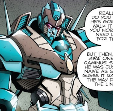
I was going over the timeline of events for the latest IDW issues I’ve been reading, and I realized something:

Prowl is literally RIGHT there as Sovereign says the undead titans are still on their way to Cybertron.
And what does he do?
He takes a sabbatical.
But wait! There’s more-
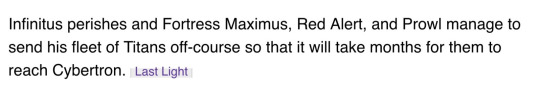
Prowl had SEVERAL MONTHS to take action, and judging from the events in TAAO, he didn’t even bother sending Starscream and Co. a heads-up 💀

Sovereign: So, uh…that massive army of zombie titans is still headed toward Cybertron. They’ll be there in a few months, give or take.
Prowl:

Prowl is just done.
With everything.
#did he just assume Starscream and Co. would work things out?#sorry but this is just so funny to me#maccadam#idw transformers#idw1#MTMTE#TAAO#idw prowl#the wolf of petrex
175 notes
·
View notes
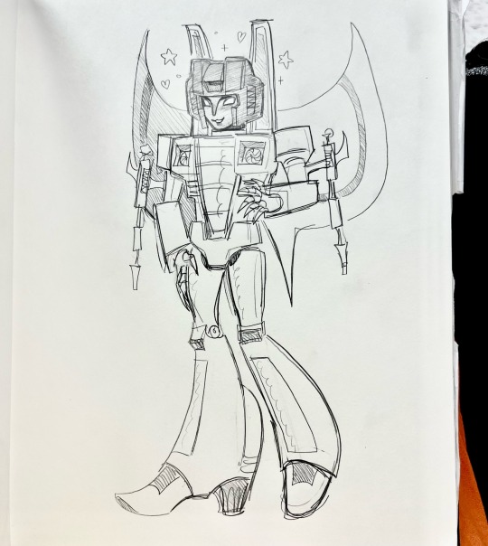
Text


TAAO Starscream sketch
#starscream#idw starscream#tf starscream#tf idw#starscream transformers#taao#Transformers#maccadam#maccadams#transformers#bumblecow
281 notes
·
View notes
Text

i've missed them
#starbee#starscream#bumblebee#transformers idw#bumblebee transformers#idw bumblebee#idw transformers#maccadam#macaddam#taao#till all are one#transformers#my art
259 notes
·
View notes
Text

(727): she kept her crown on the whole time i was giving her birthday sex
#maccadam#bumblebee#starscream#starbee#tf idw#taao#texts from cybertron#texts from last night#727#vp mention
237 notes
·
View notes
Text
[A spark only burns away the slag.
Whatever is true in you will still remain.]
505 notes
·
View notes
Photo


Some sketches from one AU I have where Starscream is Citispeaker of Vos City (Trypticon titan) and Rodimus is the Holy Sacred Prime.
#rodimus#rodimus prime#mtmte#transformers#transformers au#starscream#cityspeaker#cityspeaker starscream#maccadams#taao#myla xan
973 notes
·
View notes
Text
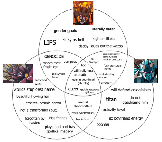
these three guys: a chart
#overlord#vigilem#lord imperious delirious#taao#mtmte#beast wars uprising#maccadam#transformers#meme.jpg
263 notes
·
View notes
Text
You know what, I love the colors on the Combaticons. I could get into how each color design suits their personalities because man they really do but I won’t because that’s a whole post in of itself.
But anyway. Onslaught’s colors? I mean, look at that. Beautiful.

I think Brawl has a similar green for his frame, but he ALSO looks really good in it. Also very pretty.

Blast Off? Kind of an interesting color combination, but I LOVE IT. It really really suits him… don’t ask me why I think that, I can’t explain it. Kind of gives sopping wet kitten vibes but I’m here for it.
I FUCKING LOVE VORTEX’S COLORS. The teal with the grey, a little bit of purple in there too? Also some red because of course… It’s so different, almost random, so unique. IT SUITS HIM SO WELL. I love him. I love it.

I left Swindle for last, the flamboyant little bastard, but his colors are so pretty. Eye-catching, a little glamorous, really fit his personality. Holding myself back from going into a character study based on their frame colors but here have it just have it already. Full body pic for him, gotta get all of the goodness.

I love them all so much, but I especially love their colors.
#taao#combaticons#onslaught#brawl#blast off#vortex#swindle#maybe if you guys are interested I’ll do some of that character study stuff#but with their chosen paint jobs!#we’ll see
79 notes
·
View notes
Text

old habits die hard
1K notes
·
View notes
Last Seen Blogs
thetentaclesoflife
The Tentacles of Life

aledclar
Newfound Hope

lucyyrose-blog
♛Star Rider♛
ask-purple-guy-and-purple-girl
Ask blog
cynicaljoystick
Lavender & Chamomile