#shadowcolors
Text
勘と運で戦うBlender
わくわくフェイス拡張or作成RTAキット以下わくフェの解説やフェイス改造に関する小ネタいろいろ
わからないことがあったらCM3D2-COM3D2 MOD制作Wikiを見よう
それでもわからなかったらカス侍に聞いてみよう わからないこと以外はなんでもわかるぞ
使い所がよくわからないシェイプキーの解説
※若干のブラクラ注意
[瞳]手前に移動
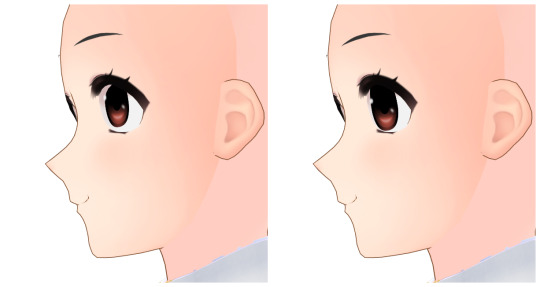
撮影機能のボーン移動で目を前面に出そうとすると一枚目のように白目や肌部分に埋もれちゃったりする これを回避して自然な上目遣いに見せるキー
[瞳]上目遣い2
上の差分で瞳を時計回りに回転させることで上目遣いをよりそれっぽく見せるキー のつもりだったんだけどいまいち使い道がない V5削除候補の筆頭
[その他]目を拡大する・目の位置を下げる
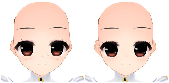
元ネタ
拡張スライダーで限界を越えて目を拡大&位置を下げると頬付近に輪郭線が浮き出たり側頭骨が出っ張ってしまうのを軽減するためのキー 適用後の右は拡大と位置下げどちらも100%の状態で本体側スライダーの目の上下位置・縦横幅は初期値の50のままです
他にいただいたネタについてはV5に先送りしました ゆるして
トリビアの泉

厄介なあの隙間は自ロダで配布中の改変ボディ素体に含まれる頭と首関連のキーで誤魔化せる
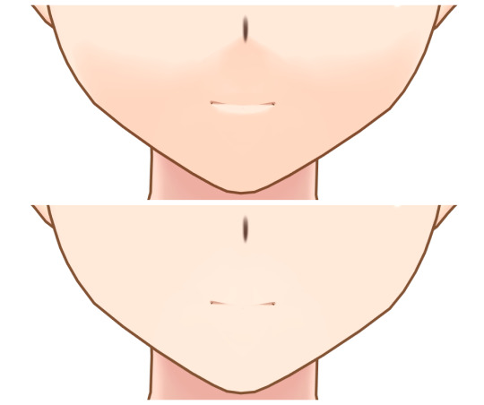
[表情]むーは横から見るとかわいい
目元系のシェイプキーを乱用しすぎると目がちゃんと閉じられなくなるのは仕様(手動での修正もできないことはないけど面倒だから一時的に目元関連のキーを無効にしたほうが楽)
Fbのeyeclose系は上瞼の外の数値で形が変わる
目を閉じたまま上瞼の外をいじってもリアルタイムで反映されるので静止画撮影時にだけ好みの形に変えても楽しい
フェイスのスキンテクスチャを変える
スキンテクスチャは「skin_002(_XXX).tex」及び「skin_002_shadow(_XXX).tex」に割り当てられています
わくフェ作成RTAキットでは雛形内のskinフォルダ直下に四色分のテクスチャファイルが入っているのでこれを任意のスキンテクスチャで上書きしてください
ちなみにXXXの部分は
002(名称なし) = ライトイエロー
lwhite =ライトホワイト
ldark = ライトダーク
mugen = フリーカラー
にそれぞれ対応しています
特定の色しか使わないようならそれ以外を削除しても特に問題はないですが、うっかり用意のない色を選択してしまったときやひょんなことからデフォルトメイドさんに差し替えられてしまったときなんかにエラーが出てしまうので切り替え時に選ばれやすいフリーカラーとライトイエローは残しておいたほうが無難です
専用のスキンテクスチャがある肌MODを使用する場合はそちらが優先的に読み込まれるためフェイスではなく肌MOD側で指定されているテクスチャを上書きする必要があります
まつ毛のテクスチャを改変する(Fbフェイス以外)
Fbフェイス以前のまつ毛は「_skinalpha.tex」に割り当てられています
ただしスキンテクスチャ以外はフェイスの命名規則に従ったテクスチャを用意するだけでは反映されません(設定を変えないと本体内部に含まれる改変元のオリジナルデータを参照するようになっている)
ので、以下の手順でテクスチャの指定先を変更してあげてください
なお一連の操作はBlenderでも行えますが今回はUIがシンプルでわかりやすいComSh作者さんのModelTweakを使っています
①差し替える「_skinalpha.tex」を用意する
skinalphaのまつ毛部分はフェイスによって異なるため必ず改変元のオリジナルデータを使用してください
②用意した「_skinalpha.tex」をリネームする
ここではRTAキットに合わせて「custom_face_gp_skinalpha.tex」とします
③ModelTweakでフェイスモデルを開く
④texタブ内から「XXX_Skinalpha」を探す
⑤右側に表示されたファイル名の部分を「custom_face_gp_skinalpha」 に書き換える
ゲームを起動して用意したテクスチャが読み込まれていれば成功です
ちなみにこれは口内に対応するmouth.texの改変にも応用できます
番外編・GPフェイスのまつ毛を透過する
この記事の2022/10/02の回答にあります
便宜上GPって書いたけど現オダメでFb以前のフェイスを利用するなら多分どれでも通用するはず
フェイスのマテリアルを改造する
転送ついでにBlenderでサクッと行えるおすすめ改造ポイントまとめ
さいでんかさんや夜勤DさんのModel編集ツールなどでも同じことができます
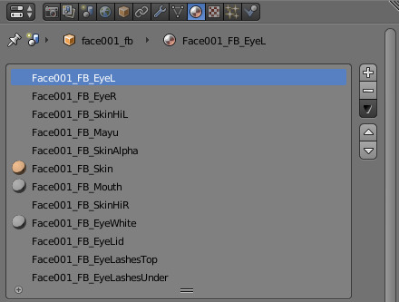
マテリアルタブはシェイプキータブすぐ隣のここ
顔のToonRampを無効にする
逆光にすると顔に浮かび上がるアレが嫌いならSkinタブを開いてToonRampの項目を削除するかテクスチャの指定を「noTex」に変える(後者のほうが多分安全)
おてがる肌toonにも顔のToonRampを一時的に無効にするアイテムがあります
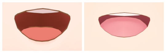
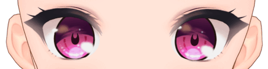
白目の影を非表示にする
スクリーンショット忘れた
バニラだと白目にも影が描写されるのが気になるならEyeWhiteタブを開いてShadowColorを1.000にするか透明度を0にする
眉毛の透明度を変える

スクリーンショット忘れた
前髪に隠れている部分はうっすら表示されるようにしたいならMayuタブを開いてShaderをToony_Lighted_Trans_NoZTestからToony_Lighted_Trans_NoZに変更してからZTest2Alphaの値を調整する
書いといてなんだけどフェイスパーツ詰めに入れた透過度変更アイテムを使ったほうが多分楽です
口内の輪郭線と色を変える
バニラだと色が暗め&輪郭線が太めなのが気になるならMourhタブを開いてColorのRGBを1.000から1.100にしてOutlineWidthも0.0016から0.0003くらいに変える

シェイプキーを左右で分割する
わくフェに含まれる瞳の形状変更のような左右同時に動いてしまうシェイプキーを分割して使いたい そんなときもModelTweak
シェイプキータブで分割したいシェイプキーを探す→左右に分割→実行 これだけです すげー!
構造上どうしても人力で分割しないといけない場合はこの記事が参考になるかもしれません
シェイプキーを統合する
とっても便利なシェイプキーによる顔エディットにもダンスやシーンの切り替えでリセットされてしまうという欠点がありますが、これは使用しているシェイプキーを統合するだけであっさり解決します
①シェイプキーの数値が確認できるプラグインを用意する(メイドいぢり推奨)
※設定数値がわかればなんでもいい ShapeAnimatorはconfigファイルから確認できます
②Blenderでモデルを読み込みシェイプキー項目を開く
③使用しているシェイプキーを探して右側の0.000の部分に設定数値を打ち込む
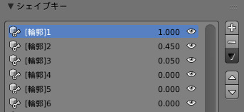
メイドいぢりの場合は上画像の赤丸で囲んだ部分の数値をBlender上で名前が一致するシェイプキーの横に打ち込んでいきます
メイドいぢりで100%ならBlenderで1.000、45%なら0.450、5%なら0.050です
これを使用しているシェイプキーの数だけ繰り返してください
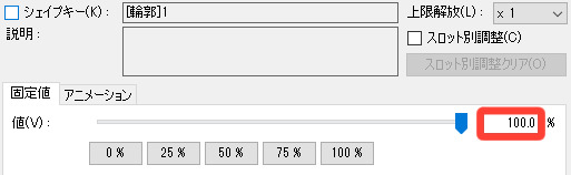
④打ち込み作業を終えたら▼内の「新シェイプをミックスから作成」をクリックする
⑤リストの一番下に新しいシェイプキー(Key XX)が作成されていることを確認する
⑥スライダーから動かせる公式シェイプキーのいずれかと置き換える
顔の輪郭(丸) = shape
顔の輪郭(尖) = shapeslim
エルフ耳 = earelf
左はゲーム上で表示されるスライダー名、右はBlenderで表示されるシェイプキー名です
公式機能のスライダーで制御する上記のシェイプキーはシーンの切り替えでも効果がリセットされないのでコイツと無理やり置き換えることで固定してやります
shapeと置き換える場合:Blenderのシェイプキーリストから既存の「shape」を探して削除orリネーム退避→⑤で新規作成されたシェイプキーの名前を「shape」に変える
以降顔の輪郭(丸)スライダーで統合シェイプキーが扱えるようになります
注意点としてV4から追加された目元系や部位の拡大縮小・位置調整系などは目や口がうまく開閉できなくなるといった弊害が生じることもあるので、統合シェイプキーには含めず別枠として固定するのがおすすめです でも動作に問題がないことが確認できれば置き換えずにベース化(Basis化)しちゃってもOK
その場合は統合シェイプキーを選択した状態でまた▼を押して下にある「このシェイプキーをベースに」をクリック、初期状態ならオプションはそのまま(文字が白い状態)で実行し、シェイプキーリストの一番上に移動した統合シェイプキーの名前を「Basis」に変更(元のBasisは事前にリネームしておく)してください
元のBasisシェイプキーはゲーム上でも操作できるし同じようにベース化すればまた最初の状態に戻せます 安全第一なら置換式、既存のシェイプキーを上書きしたくなければベース化とプレイスタイルに合わせて好きな方法を選んで構いません
ただミックス機能で作成したシェイプキーはたまーに動作が不安定になったりならなかったりするらしい なんかうまくいかねえなってときはひとつずつ合成する方法もあります この記事の応用でいけるぞ
口フックぷにフェイスのシェイプキーを他のフェイスに移植したい
わくフェと一切関係がなければお題箱にいただいた質問への回答そのままですが意外と需要がありそうなのでこちらにも
前作時代の傑作MOD、口フックぷにフェイスのシェイプキーを他のフェイスでも使えたらと悲嘆に暮れた紳士諸兄、めっちゃくちゃいると思います
結論から言えばわくフェのようなワンクリック転送は厳しいんですが、フックや汗表現・自由度の高すぎる舌といった口フックぷにフェイス独自の機能に関してはシェイプキーだけではなくモデルそのものを移植する方法で扱えるようになる なりたいね
さすがにシェイプキー転送ほど簡単にとはいかないものの難解な操作を求められるわけでもないので比較的手を出しやすい部類だと思います
以下クソほど大雑把な舌の移植方法 必要な操作と知識はBlender及びCM3D2-Converterの基礎だけで一通り学べるはず
①転送先となるフェイスから舌メッシュのみを削除する
②口フックぷにフェイスから以下を削除する
ここでは
舌以外のメッシュ
全マテリアル
舌の動作に関係しない全シェイプキー
Bone_Face以外の頂点グループ
上記のすべてを削除する必要があります
③シェイプキー転送と同じ要領で口フックぷにフェイスの舌をクリック→転送先フェイスのモデルをShiftクリックして初期画面左側メニューのツール内から統合を選択
④二つのモデルが合体したら①のように舌メッシュのみを選択して編集モードからマテリアルのXXX_Mouthに割り当てる
これでどのフェイスでも口フックぷにフェイスの舌を使えるようになります ただフェイスによっては位置調整とかもろもろ修正しないといけないのでそれなりにBlenderでの改造に慣れた人向けかも フックと汗表現の移植は対象が舌じゃなくなるだけで基本的なやり方は同じなので省きます
わくわくフェイス拡張キットには入れられなかったFbフェイス向けシェイプキーの紹介と再現方法
こちらもお題箱にいただいた質問より 仕様&規約上わくフェへの実装が難しいFbフェイス向けの目ヂカラモリモリシェイプキーをご家庭で再現するための紹介動画です V4にて実装 でもフェイス改造者増えてほしいし小ネタとして一応残しておく
Blenderの初心者向け講座しか読んだことない人間が勘と運だけを頼りにやっこさんと殴り合っています 多分かなりの我流です 己を信じろ
こうして

こうすると
こうなる
比較は他の部分もいじってるけど目尻付近の変化は上のシェイプキーによるものです でもやりすぎると顔からはみ出すのでほどほどに
ちょっとわかりやすい動画版
動画内でやってること
①オブジェクトモードから編集モードに切り替える
②シェイプキー項目の+を押してシェイプキーを追加する
※Basisや既にあるシェイプキーでは絶対にやらない 後悔します
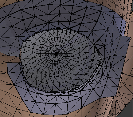
③頂点グループから一括選択した瞳とハイライトをHキーで非表示にする(睫毛だけが動くようになる)
④プロポーショナル編集を有効化する
⑤動かす
※円のサイズはプロポーショナル編集の効果が及ぶ範囲です Gを押してからホイールで変えられます
⑥完成したシェイプキーの値を100(画面上で1.0)にする
⑦シェイプキー項目▼内の「新シェイプをミックスから作成」を押す
⑧シェイプキーのコピーができたら今度は「ミラー反転」を押す
⑨反対側に同じ動きのシェイプキーができる
⑩録画終了ボタンが見つからずウロウロするマウスカーソルくん
上でも出てきた⑦の「新シェイプをミックスから作成」のおさらい こいつは今値が設定されているシェイプキーの動きを合成してくれるすごいやつなのでたとえば動画内のKey93とKey94をどちらも1.0にしてからもう一度ミックスすれば左右の睫毛が動くkey95ができます
オプションからXミラーを有効にして動かせば⑥以降の手順は省略できるけど左右対称じゃないとグチャ……ってなるので注意
1 note
·
View note
Text


ꜜ᧞𖣦䨻ⵓ🐼 𝐧͟𝐞͟𝐰͟ 𝕡𖦹𝐬𝐭 ˖ ▹ ★᯾❜....ઊ ⋮ꈊ 𝐥𝐢𝐤𝐞 𝐨𝐫 𝐫𝐞𝐛𝐥𝐨𝐠 𝐢𝐟 𝐲𝐨𝐮 𝐬𝐚𝐯𝐞 ਏਓ!𖤐𓏰݉ ➛ ୪ ㍿ֵ▓ ❭c𝐫͟𝐞͟𝐝͟𝐢͟𝐭͟𝐬͟ 𝐦𝐞 ⋆⌇⌾🌀❟ ✿。❀ i𝐜𝐨nsꉂ𝐈̶̲ pietro maximoff ▒゙⃨る๑ . psd: @xcosmicboy
#pietro maximoff#icons pietro maximoff#pietro maximoff icons#icons for tumblr#icons for twitter#marvel icons#icons marvel#icons marvel with psd#marvel icons with psd#quicksilver icons with psd#icons quicksilver with psd#aaron taylor-johnson icons with psd#icons aaron taylor-johnson with psd#psd#male icons with psd#packs for twitter#packs for tumblr#quicksilver packs#shadowcolors
187 notes
·
View notes
Photo

to conclude, Sir Reginald Hargreeves ! I achieved this draw without conviction, many weeks after the others so he is less "chibi", and to be honest I needed many wiki materials because... this character often escape from what I remember of the show ^^. Even if he had his memorable moments (not this memorable, to me^^) in this season but... I don't hook to the character. He is not enough refered to, not well introduced... Maybe this role will make sense later and will get me the urge to re watch the show ^^, I hope future will get me wrong ! Whatever, Instagram has this implicit rule of "make 3 multiples asap", and this will make a heavy 9 block ot umbrella academy often in my gallery ^^. (How to instile obsessive-compulsive disorder to your audience, not thank you insta). #umbrellaacademy #netflixshow #SirReginaldHargreeves #ReginaldHargreeves #reginald #monocle #themonocle #instagramartist #shadowcolor #twinmarkerscolors #twinmarkerpen #traditionnalart #violetcolor #umbrella #dandy #tradi #markers #smocking #gentleman #bourgeois #purpletones #purpleshade #drawingcolorful #colorful #snob #patriarch https://www.instagram.com/p/CIEDsWiDkO2/?igshid=65wvgqalwlz5
#frominsta#umbrellaacademy#netflixshow#sirreginaldhargreeves#reginaldhargreeves#reginald#monocle#themonocle#instagramartist#shadowcolor#twinmarkerscolors#twinmarkerpen#traditionnalart#violetcolor#umbrella#dandy#tradi#markers#smocking#gentleman#bourgeois#purpletones#purpleshade#drawingcolorful#colorful#snob#patriarch
0 notes
Video
youtube
Flutter Mobile Apps Adding Elevation and ShadowColor to Flutter Card
0 notes
Text
[Flutter]ElevatedButtonの影の色を変える方法
どうも、ちょげ(@chogetarou)です。
ElevatedButtonの影の色を変える方法を紹介します。
方法
ElevatedButtonの影の色を変えるには、「ElevatedButton.styleFrom」を使います。
「ElevatedButton.styleFrom」の引数「shadowColor」で影の色を設定することが出来ます。
そして、影の色を設定した「ElevatedButton.styleFrom」を、ElevatedButtonの引数「style」に指定します。
ElevatedButton(
onPressed: () {},
child: Text('Button'),
style: ElevatedButton.styleFrom(
elevation: 8,
shadowColor:…

View On WordPress
0 notes
Text
Simulating Drop Shadows with the CSS Paint API
Ask a hundred front-end developers, and most, if not all, of them will have used the box-shadow property in their careers. Shadows are enduringly popular, and can add an elegant, subtle effect if used properly. But shadows occupy a strange place in the CSS box model. They have no effect on an element’s width and height, and are readily clipped if overflow on a parent (or grandparent) element is hidden.
We can work around this with standard CSS in a few different ways. But, now that some of the CSS Houdini specifications are being implemented in browsers, there are tantalizing new options. The CSS Paint API, for example, allows developers to generate images programmatically at run time. Let’s look at how we can use this to paint a complex shadow within a border image.
A quick primer on Houdini
You may have heard of some newfangled CSS tech hitting the platform with the catchy name of Houdini. Houdini promises to deliver greater access to how the browser paints the page. As MDN states, it is “a set of low-level APIs that exposes parts of the CSS engine, giving developers the power to extend CSS by hooking into the styling and layout process of a browser’s rendering engine.”
The CSS Paint API
The CSS Paint API is one of the first of these APIs to hit browsers. It is a W3C candidate recommendation. This is the stage when specifications start to see implementation. It is currently available for general use in Chrome and Edge, while Safari has it behind a flag and Firefox lists it as “worth prototyping”. There is a polyfill available for unsupported browsers, though it will not run in IE11.
While the CSS Paint API is enabled in Chromium, passing arguments to the paint() function is still behind a flag. You’ll need to enable experimental web platform features for the time being. These examples may not, unfortunately, work in your browser of choice at the moment. Consider them an example of things to come, and not yet ready for production.
The approach
We’re going to generate an image with a shadow, and then use it for a border-image… huh? Well, let’s take a deeper look.
As mentioned above, shadows don’t add any width or height to an element, but spread out from its bounding box. In most cases, this isn’t a problem, but those shadows are vulnerable to clipping. A common workaround is to create some sort of offset with either padding or margin.
What we’re going to do is build the shadow right into the element by painting it in to the border-image area. This has a few key advantages:
border-width adds to the overall element width
Content won’t spill into the border area and overlap the shadow
Padding won’t need any extra width to accommodate the shadow and content
Margins around the element won’t interfere with that element’s siblings
For that aforementioned group of one hundred developers who’ve used box-shadow, it’s likely only a few of them have used border-image. It’s a funky property. Essentially, it takes an image and slices it into nine pieces, then places them in the four corners, sides and (optionally) the center. You can read more about how all this works in Nora Brown’s article.
The CSS Paint API will handle the heavy lifting of generating the image. We’re going to create a module for it that tells it how to layer a series of shadows on top of each other. That image will then get used by border-image.
These are the steps we’ll take:
Set up the HTML and CSS for the element we want to paint in
Create a module that draws the image
Load the module into a paint worklet
Call the worklet in CSS with the new paint() function
Setting up the canvas
You’re going to hear the term canvas a few times here, and in other CSS Paint API resources. If that term sounds familiar, you’re right. The API works in a similar way to the HTML <canvas> element.
First, we have to set up the canvas on which the API will paint. This area will have the same dimensions as the element that calls the paint function. Let’s make a 300×300 div.
<section> <div class="foo"></div> </section>
And the styles:
.foo { border: 15px solid #efefef; box-sizing: border-box; height: 300px; width: 300px; }
CodePen Embed Fallback
Creating the paint class
HTTPS is required for any JavaScript worklet, including paint worklets. You won’t be able to use it at all if you’re serving your content over HTTP.
The second step is to create the module that is loaded into the worklet — a simple file with the registerPaint() function. This function takes two arguments: the name of the worklet and a class that has the painting logic. To stay tidy, we’ll use an anonymous class.
registerPaint( "shadow", class {} );
In our case, the class needs two attributes, inputProperties and inputArguments, and a method, paint().
registerPaint( "shadow", class { static get inputProperties() { return []; } static get inputArguments() { return []; } paint(context, size, props, args) {} } );
inputProperties and inputArguments are optional, but necessary to pass data into the class.
Adding input properties
We need to tell the worklet which CSS properties to pull from the target element with inputProperties. It’s a getter that returns an array of strings.
In this array, we list both the custom and standard properties the class needs: --shadow-colors, background-color, and border-top-width. Pay particular attention to how we use non-shorthand properties.
static get inputProperties() { return ["--shadow-colors", "background-color", "border-top-width"]; }
For simplicity, we’re assuming here that the border is even on all sides.
Adding arguments
Currently, inputArguments are still behind a flag, hence enabling experimental features. Without them, use inputProperties and custom properties instead.
We also pass arguments to the paint module with inputArguments. At first glance, they may seem superfluous to inputProperties, but there are subtle differences in how the two are used.
When the paint function is called in the stylesheet, inputArguments are explicitly passed in the paint() call. This gives them an advantage over inputProperties, which might be listening for properties that could be modified by other scripts or styles. For example, if you’re using a custom property set on :root that changes, it may filter down and affect the output.
The second important difference for inputArguments, which is not intuitive, is that they are not named. Instead, they are referenced as items in an array within the paint method. When we tell inputArguments what it’s receiving, we are actually giving it the type of the argument.
The shadow class is going to need three arguments: one for X positions, one for Y positions, and one for blurs. We’ll set that up as three space-separated lists of integers.
Anyone who has registered a custom property may recognize the syntax. In our case, the <integer> keyword means any whole number, while + denotes a space-separated list.
static get inputArguments() { return ["<integer>+", "<integer>+", "<integer>+"]; }
To use inputProperties in place of inputArguments, you could set custom properties directly on the element and listen for them. Namespacing would be critical to ensure inherited custom properties from elsewhere don’t leak in.
Adding the paint method
Now that we have the inputs, it’s time to set up the paint method.
A key concept for paint() is the context object. It is similar to, and works much like, the HTML <canvas> element context, albeit with a few small differences. Currently, you cannot read pixels back from the canvas (for security reasons), or render text (there’s a brief explanation why in this GitHub thread).
The paint() method has four implicit parameters:
The context object
Geometry (an object with width and height)
Properties (a map from inputProperties)
Arguments (the arguments passed from the stylesheet)
paint(ctx, geom, props, args) {}
Getting the dimensions
The geometry object knows how big the element is, but we need to adjust for the 30 pixels of total border on the X and Y axis:
const width = (geom.width - borderWidth * 2); const height = (geom.height - borderWidth * 2);
Using properties and arguments
Properties and arguments hold the resolved data from inputProperties and inputArguments. Properties come in as a map-like object, and we can pull values out with get() and getAll():
const borderWidth = props.get("border-top-width").value; const shadowColors = props.getAll("--shadow-colors");
get() returns a single value, while getAll() returns an array.
--shadow-colors will be a space-separated list of colors which can be pulled into an array. We’ll register this with the browser later so it knows what to expect.
We also need to specify what color to fill the rectangle with. It will use the same background color as the element:
ctx.fillStyle = props.get("background-color").toString();
As mentioned earlier, arguments come into the module as an array, and we reference them by index. They’re of the type CSSStyleValue right now — let’s make it easier to iterate through them:
Convert the CSSStyleValue into a string with its toString() method
Split the result on spaces with a regex
const blurArray = args[2].toString().split(/\s+/); const xArray = args[0].toString().split(/\s+/); const yArray = args[1].toString().split(/\s+/); // e.g. ‘1 2 3’ -> [‘1’, ‘2’, ‘3’]
Drawing the shadows
Now that we have the dimensions and properties, it’s time to draw something! Since we need a shadow for each item in shadowColors, we’ll loop through them. Start with a forEach() loop:
shadowColors.forEach((shadowColor, index) => { });
With the index of the array, we’ll grab the matching values from the X, Y, and blur arguments:
shadowColors.forEach((shadowColor, index) => { ctx.shadowOffsetX = xArray[index]; ctx.shadowOffsetY = yArray[index]; ctx.shadowBlur = blurArray[index]; ctx.shadowColor = shadowColor.toString(); });
Finally, we’ll use the fillRect() method to draw in the canvas. It takes four arguments: X position, Y position, width, and height. For the position values, we’ll use border-width from inputProperties; this way, the border-image is clipped to contain just the shadow around the rectangle.
shadowColors.forEach((shadowColor, index) => { ctx.shadowOffsetX = xArray[index]; ctx.shadowOffsetY = yArray[index]; ctx.shadowBlur = blurArray[index]; ctx.shadowColor = shadowColor.toString(); ctx.fillRect(borderWidth, borderWidth, width, height); });
This technique can also be done using a canvas drop-shadow filter and a single rectangle. It’s supported in Chrome, Edge, and Firefox, but not Safari. See a finished example on CodePen.
Almost there! There are just a few more steps to wire things up.
Registering the paint module
We first need to register our module as a paint worklet with the browser. This is done back in our main JavaScript file:
CSS.paintWorklet.addModule("https://codepen.io/steve_fulghum/pen/bGevbzm.js"); https://codepen.io/steve_fulghum/pen/BazexJX
Registering custom properties
Something else we should do, but isn’t strictly necessary, is to tell the browser a little more about our custom properties by registering them.
Registering properties gives them a type. We want the browser to know that --shadow-colors is a list of actual colors, not just a string.
If you need to target browsers that don’t support the Properties and Values API, don’t despair! Custom properties can still be read by the paint module, even if not registered. However, they will be treated as unparsed values, which are effectively strings. You’ll need to add your own parsing logic.
Like addModule(), this is added to the main JavaScript file:
CSS.registerProperty({ name: "--shadow-colors", syntax: "<color>+", initialValue: "black", inherits: false });
You can also use @property in your stylesheet to register properties. You can read a brief explanation on MDN.
Applying this to border-image
Our worklet is now registered with the browser, and we can call the paint method in our main CSS file to take the place of an image URL:
border-image-source: paint(shadow, 0 0 0, 8 2 1, 8 5 3) 15; border-image-slice: 15;
These are unitless values. Since we’re drawing a 1:1 image, they equate to pixels.
Adapting to display ratios
We’re almost done, but there’s one more problem to tackle.
For some of you, things might not look quite as expected. I’ll bet you sprung for the fancy, high DPI monitor, didn’t you? We’ve encountered an issue with the device pixel ratio. The dimensions that have been passed to the paint worklet haven’t been scaled to match.
Rather than go through and scale each value manually, a simple solution is to multiply the border-image-slice value. Here’s how to do it for proper cross-environment display.
First, let’s register a new custom property for CSS that exposes window.devicePixelRatio:
CSS.registerProperty({ name: "--device-pixel-ratio", syntax: "<number>", initialValue: window.devicePixelRatio, inherits: true });
Since we’re registering the property, and giving it an initial value, we don’t need to set it on :root because inherit: true passes it down to all elements.
And, last, we’ll multiply our value for border-image-slice with calc():
.foo { border-image-slice: calc(15 * var(--device-pixel-ratio)); }
It’s important to note that paint worklets also have access to the devicePixelRatio value by default. You can simply reference it in the class, e.g. console.log(devicePixelRatio).
Finished
Whew! We should now have a properly scaled image being painted in the confines of the border area!
Live demo (best viewed in Chrome and Edge)
Bonus: Apply this to a background image
I’d be remiss to not also demonstrate a solution that uses background-image instead of border-image. It’s easy to do with just a few modifications to the module we just wrote.
Since there isn’t a border-width value to use, we’ll make that a custom property:
CSS.registerProperty({ name: "--shadow-area-width", syntax: "<integer>", initialValue: "0", inherits: false });
We’ll also have to control the background color with a custom property as well. Since we’re drawing inside the content box, setting an actual background-color will still show behind the background image.
CSS.registerProperty({ name: "--shadow-rectangle-fill", syntax: "<color>", initialValue: "#fff", inherits: false });
Then set them on .foo:
.foo { --shadow-area-width: 15; --shadow-rectangle-fill: #efefef; }
This time around, paint() gets set on background-image, using the same arguments as we did for border-image:
.foo { --shadow-area-width: 15; --shadow-rectangle-fill: #efefef; background-image: paint(shadow, 0 0 0, 8 2 1, 8 5 3); }
As expected, this will paint the shadow in the background. However, since background images extend into the padding box, we’ll need to adjust padding so that text doesn’t overlap:
.foo { --shadow-area-width: 15; --shadow-rectangle-fill: #efefef; background-image: paint(shadow, 0 0 0, 8 2 1, 8 5 3); padding: 15px; }
CodePen Embed Fallback
Fallbacks
As we all know, we don’t live in a world where everyone uses the same browser, or has access to the latest and greatest. To make sure they don’t receive a busted layout, let’s consider some fallbacks.
Padding fix
Padding on the parent element will condense the content box to accommodate for shadows that extend from its children.
section.parent { padding: 6px; /* size of shadow on child */ }
CodePen Embed Fallback
Margin fix
Margins on child elements can be used for spacing, to keep shadows away from their clipping parents:
div.child { margin: 6px; /* size of shadow on self */ }
CodePen Embed Fallback
Combining border-image with a radial gradient
This is a little more off the beaten path than padding or margins, but it’s got great browser support. CSS allows gradients to be used in place of images, so we can use one within a border-image, just like how we did with paint(). This may be a great option as a fallback for the Paint API solution, as long as the design doesn’t require exactly the same shadow:
Gradients can be finicky and tricky to get right, but Geoff Graham has a great article on using them.
div { border: 6px solid; border-image: radial-gradient( white, #aaa 0%, #fff 80%, transparent 100% ) 25%; }
CodePen Embed Fallback
An offset pseudo-element
If you don’t mind some extra markup and CSS positioning, and need an exact shadow, you can also use an inset pseudo-element. Beware the z-index! Depending on the context, it may need to be adjusted.
.foo { box-sizing: border-box; position: relative; width: 300px; height: 300px; padding: 15px; } .foo::before { background: #fff; bottom: 15px; box-shadow: 0px 2px 8px 2px #333; content: ""; display: block; left: 15px; position: absolute; right: 15px; top: 15px; z-index: -1; }
CodePen Embed Fallback
Final thoughts
And that, folks, is how you can use the CSS Paint API to paint just the image you need. Is it the first thing to reach for in your next project? Well, that’s for you to decide. Browser support is still forthcoming, but pushing forward.
In all fairness, it may add far more complexity than a simple problem calls for. However, if you’ve got a situation that calls for pixels put right where you want them, the CSS Paint API is a powerful tool to have.
What’s most exciting though, is the opportunity it provides for designers and developers. Drawing shadows is only a small example of what the API can do. With some imagination and ingenuity, all sorts of new designs and interactions are possible.
Further reading
The CSS Paint API specification
Is Houdini Ready Yet?
CSS Paint API (Google Web Developers)
CSS Houdini Experiments
Another example that uses the Paint API to draw triangles and radio inputs
The post Simulating Drop Shadows with the CSS Paint API appeared first on CSS-Tricks.
You can support CSS-Tricks by being an MVP Supporter.
Simulating Drop Shadows with the CSS Paint API published first on https://deskbysnafu.tumblr.com/
0 notes
Link
Specifications: Ingredient: ModificationBenefit: NaturalNET WT: Eye shadowSize: Full SizeSingle color/multi-color: Above eight colorsCountry/Region of Manufacture: CHINACertificate Number: Eight color and aboveModel Number: 18 color desert eye shadowFinish: NaturalWaterproof / Water-Resistant: NoQuantity: Eye shadowcolor: 18 color
0 notes
Text
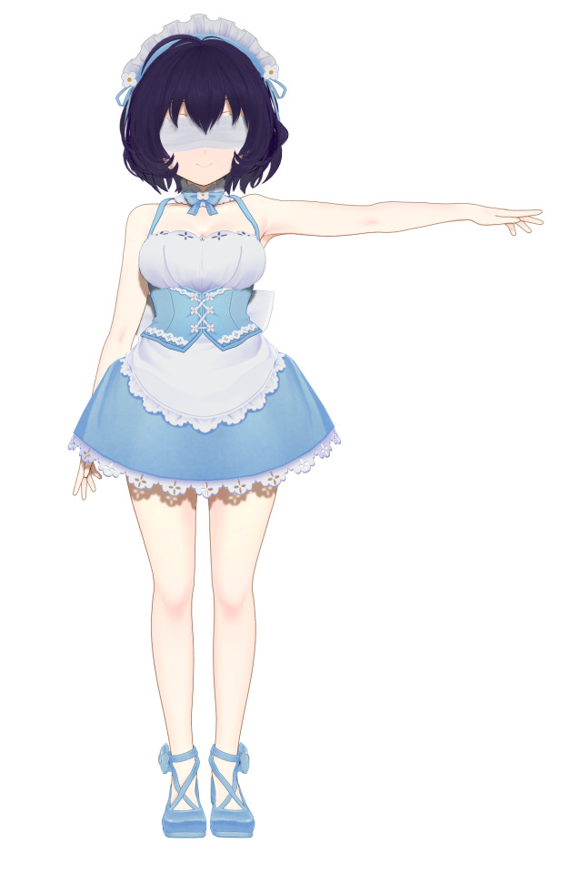
めちゃくちゃ楽をしてそれっぽい絵にしたい2022
これは自作MODのダイマであり事実上のおてがるTips②です
2021の画像を差し替えてほんの少し加筆しただけ
一応この記事のリニューアルになります 時代の流れを感じたい方はどうぞ
導入前提プラグイン
複数メイド撮影プラグイン
AlwaysColorChangeEx.Plugin(以下ACC)
COM3D2.NPRShader.Plugin(以下NPR)
COM3D2.AdvancedShadowSetting(以下影のすごいやつ)

2021をこっそり削除したのは当時のエディットが今の趣味と合わなくなってしまったからなので今回はなるべく長く残しておくためにありあわせでセルフモザイクをかけました
照明も影の強さを明るさの初期値と同じにしただけでそれ以外はデフォルト値のまま、お借りしたポーズを読み込んだ状態です
いまどうしてる? → 鼻カテゴリからおてがる肌colorを選択
初期設定の公式肌だとライトホワイト?なので顔と身体のcolor値を一括調整しています
なおここからしばらく肌の調整が続きますが鮭弁さんの神MODのように独自のtoonなどが用意されているものは効果を上書きしてしまうので下手にいじらないほうがいいです
いまどうしてる? → 鼻カテゴリからおてがる肌shadowを選択
顔と身体に落ちるセルフシャドウの色を一括調整しています

いまどうしてる? → 鼻カテゴリからおてがる肌toonを選択
今までは脳死で肌toonを使っていたんですがライティングや肌色面積によってはrimで赤みをつけるほうがいい感じになるかもしれませんやっぱりtoonで赤みをつけてrimで光らせるのが最強かもしれない

いまどうしてる? → 鼻カテゴリからおてがる肌rimを選択
フチにハイライトっぽいものがつきます 赤みマシマシにもできるけど今回は光らせる

いまどうしてる? → 鼻カテゴリからおてがる肌toon2を選択
おてがる肌toon2は影やリムライトの合成範囲を決めるShadowRateToonを変更するMODです
デフォルト(ひとつ上の状態)だとリムライトが強くおてがる肌toonことToonRampによる赤みも薄れてしまうのでこれでいい感じに馴染ませています

いまどうしてる? → 髪カラー選択ですなさんのNPR髪ハイライト2(要NPRプラグイン)を選択
神 すごい
さすがにこれだけ神ってるとACCと競合してしまったり(NPRの専用シェーダーを使用しているカテゴリのみ操作を受け付けないだけなのですべての機能が使えなくなるというわけではないです=NPR化するとACCでその部分をいじれなくなります)照明を追加するたびにその位置で反映されたシェーダーの効果が固定されてしまったり(言語化できない)制約もそれなりにあるのですが、それを補って余りある神プラグイン&神MODです
基本的に左右対称の髪なら大抵それっぽい位置にハイライトが落ちると思うのでNPRシェーダーを使用した髪ハイライト、非常におすすめ なのですが惜しむらくはそのNPRプラグインが現在入手不可なこと……

いまどうしてる? → 鼻カテゴリからおてがる髪shadowを選択
髪色&長さのせいで変化がまったくわかりませんが髪に落ちるセルフシャドウの色が変わっています
一応NPRでも影色はいじれるのですがACCほど手軽にとはいかないのでズボラヒューマンは髪カテゴリすべての影色を特定の色に一括変更するおてがる髪shadowを作りました
いまどうしてる? → 鼻カテゴリからおてがるNPR髪setを選択
リムライトの色や範囲、アウトラインの太さをいじっています 注意点としておてがるNPR髪setは自ロダで配布しているイラストっぽくなるかもしれない髪ハイライトへの使用を前提に調整したものなので他作者さまのNPR化ヘアーに使うと見た目が変わってしまう こともあるかもしれません

いまどうしてる? → 鼻カテゴリからおてがる衣装setを選択
color・shadowをそれぞれ適用してお洋服の色と影色を一括で明るくしています
おまけのACCの各項目詳細
RQ … アイテムの表示優先度
color … 基本カラー
ShadowColor … セルフシャドウの色
RimColor … リムライト(フチの発光する部分)の色
OutlineColor … 輪郭線の色
Shininess … 反射光
OutlineWidth … 輪郭線の太さ
RimPower … リムライトの強さ
RimShift … リムライトの適用範囲
HiRate,HiPow … Rimの髪ハイライト版

比較
ちなみにここまでのおてがる肌ナントカの効果はおてがる一括調整で文字通り一括適用できます 鼻カテゴリから選ぶ従来のおてがるシリーズはエディット画面を抜けるとリセットされてしまいますがこちらは装着している限りシーンを切り替えても外れません
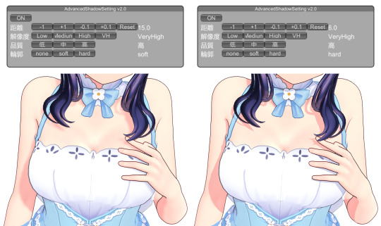
撮影前はCOM3D2.AdvancedShadowSettingこと影のすごいやつプラグインで影の描写距離をいじる アニメ調のくっきりとした影が好きなので自分はこのプラグインがないと死んでしまいます
そういやコレ結構重要なはずだけど書いてなかったし他所でもあんまり見ないな……とふと思い出したこと
NVIDIAの設定だけでもかなり変わります
うんちスペックなのであまり無理はさせない方針です
ガンマ修正とトランスペアレンシーはクソデカ解像度で撮影でもしない限りオフにしています 画像のシャープ化は必要なら後から加工する派なのでオフにしていますが線をより鮮明にしたいならオンでよさげ
なお本体のグラフィック設定からいじれるアンチエイリアス・影のクオリティ・テクスチャクオリティはいずれも最高(キャプチャ倍率はパソコンくんと要相談)、ブルームは常時切っています
1 note
·
View note
Text
‹⟦இ♥︎ꜜ᯾💐 -★ꉂ☆ ຣ¡𝕥ᴥᩚ m𝗼𝗱ᴥᩚ𝕝 ᦋ𝗶r𝗹𝘀ಣ㌡❔🌀⟩ꊞ¡✿〛


ᰢᩚ✹:¨·.·¨:🐾ꦱ▓⃞⃯💌 𝕟ᦾ᭙ᮁ ᰍᩚ𖦹𝘀ᡶ ⧛ⴰ𔘓ⴰꖺ ̫✶ ⟬𖣦❭ 🍥 ▎𖡄 x ᭆ .☹︎.☻︎. 🎯 ⚙お% 𝕔rᦸᩚ𝗱!ᡶs ⲙɘ. 𓄲 𖣠𓈒࣪🍰る 𝕝!𝗸ᦸᩚ 𝗈𝗋 𝗿𝕖𝖻𝗅✿𝗀 [⾕?ꫤ⭑꒧⟬യ/🍄ೃ. .v .
#site models#site models icons#icons site models#icons for tumblr#icons for twitter#psd#women icons with psd#icons site model with psd#icons women with psd#packs for twitter#icons site models with psd#site model icons with psd#psd blue#psd orange#icons beauty women#beauty women icons with psd#packs for tumblr#shadowcolors#bwbejacksonpsd
56 notes
·
View notes
Photo

SO ! Today a work from september, when I tried to go "yolo" on the color choices, and it finally went to dozens of layers of color before I reach a good result. I mean, maybe matching red hair and biker clothes was not easy to begin with... ^^ Whatever, it's good looking now, even if the scan does a too much contrast on the blue shadows on the pants... Fot the little background, I did this draw thinking of La roux (@larouxroux ), a electro artist I liked a lot back then, (bulletproof single cover) #instagramartist #shadowcolor #twinmarkerscolors #twinmarkerpen #traditionnalart #laroux #saturatedshadow #findcolors #streetcorner #testcolors #tradi #markers #redhair #badboy #depacotille #bluetones #blueshade #drawingcolorful #colorful #concrete #square https://www.instagram.com/p/CHay75VjKeh/?igshid=gqcmjqjk0y1u
#frominsta#instagramartist#shadowcolor#twinmarkerscolors#twinmarkerpen#traditionnalart#laroux#saturatedshadow#findcolors#streetcorner#testcolors#tradi#markers#redhair#badboy#depacotille#bluetones#blueshade#drawingcolorful#colorful#concrete#square
0 notes
Photo
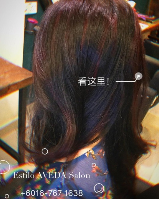
#estiloavedasalon #estilocolor #avedacolor #shadowcolor #twotonehair #hairsalon #penangtrip #penangsalon #penanghairsalon #penang https://www.instagram.com/p/BnTDoq-liFm/?utm_source=ig_tumblr_share&igshid=1s4y58ih4w3zo
#estiloavedasalon#estilocolor#avedacolor#shadowcolor#twotonehair#hairsalon#penangtrip#penangsalon#penanghairsalon#penang
0 notes
Photo

“Gorgeous hair is the best revenge.” #gorgeoushair #hydrahairsalon #hydrahair #pembrokepineshairsalon #westpineshair #longblondehair #longlayers #vshapehaircut #shadowcolor #honeyblonde #hairsalon #hairfeelsreallygood #freshlook (at hydra hair salon)
#vshapehaircut#westpineshair#hydrahair#hairsalon#hydrahairsalon#freshlook#gorgeoushair#longblondehair#hairfeelsreallygood#longlayers#pembrokepineshairsalon#honeyblonde#shadowcolor
0 notes
Video
youtube
Check out #ShadowColor - an interactive assistant for freehand drawing and coloration of human faces. I love how it blends perfectly too when the picture is "painted". https://youtu.be/7bBxmYNu9w0
0 notes
Last Seen Blogs
somnulentus-blog
BLOW MY BRAINS OUT.

millamaatta-blog
VISUAL DIARY

freinhardt56
The Fangirling dude

mrdurwin
Untitled

resonancecollegehyderabad
Untitled