#serif gothic
Text

Star trek
#Star trek#serifgothic#dispigna#serif gothic#lubalin#logo#design#film#typography#movie#music#spock#james t kirk#star trek fanart#nyota uhura#star trek art
77 notes
·
View notes
Text
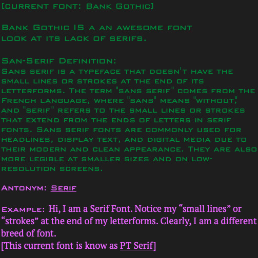
Bank Gothic Font: A Classic Typeface That Continues to Impress in the Digital Age
by Arti Graphique
Bank Gothic is a sans-serif typeface that was first introduced in the early 20th century. The font features bold, straight lines and a clean, modern look that has become popular in a wide range of applications.
The history of Bank Gothic dates back to the early 1900s when it was developed by Morris Fuller Benton for the American Type Founders (ATF). The design of the font was heavily influenced by the geometric shapes that were popular at the time. The font was originally created for use in bank advertisements and other financial documents. The font's name is believed to have been inspired by its use in bank logos and advertisements.
Morris Fuller Benton was a prolific typeface designer who worked for the ATF for over 50 years. He is credited with designing over 200 typefaces during his career, including other popular fonts like Franklin Gothic and News Gothic.
Bank Gothic was initially intended for use in the financial industry due to its clean, modern look and easy-to-read design. However, the font quickly gained popularity in other industries, including advertising, signage, and print media. The font's popularity continued to grow throughout the mid-20th century, and it became a staple of modern graphic design.
Today, Bank Gothic remains a popular font choice in the digital age. The font's bold, modern look makes it a popular choice for logos, headlines, and other display text. Many modern websites also use Bank Gothic for headings and other design elements.
In conclusion, Bank Gothic is a classic sans-serif font that has remained popular for over a century. Its clean, modern design and easy-to-read style make it a popular choice for a wide range of applications, from financial documents to modern websites. The font's impact on modern design cannot be overstated, and it remains a popular choice for designers and advertisers around the world.
#Bank Gothic#font#typeface#modern design#advertising#graphic design#websites#Morris Fuller Benton#sans-serif#clean design#financial industry#display text#easy-to-read#popular font#Stepanka Designs
3 notes
·
View notes
Text
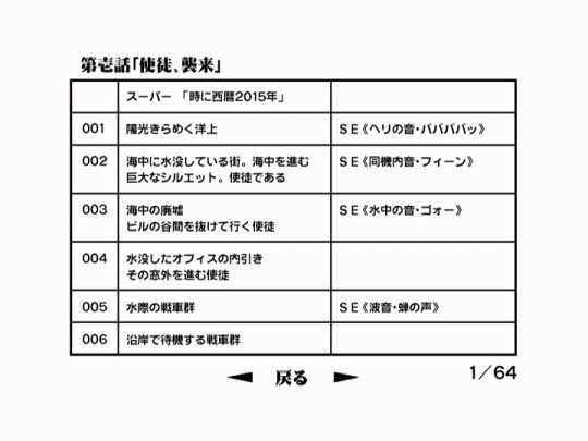
Made a quick mockup in LibreImpress of a potential layout for my transcription that preserves the original format as much as possible. (Original at the top; 'facsimile' below.)
Obviously I can't match the typeface exactly, and I'm working on a 16:9 monitor rather than a 4:3 one (as the original images were designed for), so I went with a fairly legible demibold Mincho font and tried to approximate the proportions of the table as best I could given the difference in aspect ratio.
However, I was able to match the line breaks, alignment, character width, and 3-column layout from the original, none of which are preserved in my in-line translation version, so...it's something I might continue working on further down the line, so as to create as much of a high-quality 'facsimile' of the image as I can.
Making more of these isn't going to be a top priority for now - I want to focus on translation and transcription at the moment, and each page has to be replicated more or less by hand, so it's a bit of a process. But I just wanted to demonstrate that this is possible and an element of the Project that could be developed further going forward.
#the evangelion annotation project#(obviously there are little things that could be fixed. the borders are a little too thin)#(and i know using a gothic/sans-serif fontset would technically be a better match. but for now i prefer this one.)#anyways! if anyone has any comments/critiques/advice i'd be happy to hear it. just wanted to post this as a proof-of-concept.
3 notes
·
View notes
Text

Heavy Metal Maniac (sticker)
2 notes
·
View notes
Note
Who are y’all? Tell us a little bit bout yourselves, like ur likes and dislikes.
"Oh, well, that's… a hard question t-to answer." Gothic started, messing with his fingers while Marlett jumped up to put her hands on his shoulders. "I like dancing!" Gothic stumbles, and falls forward with her landing on top of him.
Calibri looked over at them and lets out a snort, then shakes his head and holds up his hand in a fist. "I like myself a good fight! To be prepared to fight, is to be prepared to live!" Arial shakes her head, waving her arms. "No! No fighting. You know what happens when you fight with people!" they started to argue and Serif sighs, putting his hand over his face.
These weirdos…
Lotus peeks from around him, and smiles. "I like to pick flowers, and spend time with my friends. Serif likes it when we all get along, even if he doesn't like to admit it." "Oh shut up." Serif says, pushing Lotus' head down, which caused her to laugh.
Script was watching this all go down, with a smile on his face then looks at the reader and shrugs. He didn't really know what he liked…
His friends, he guessed?
(sorry this isn't a drawing! I didn't really know what to do with that ^^')
#undertale alternate universe#Undertale AU#Human Souls#Undertale Human Souls#Gothic#Marlett#Calibri#Arial#Serif#Lotus#Script
0 notes
Text

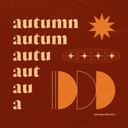
my favourite season!! 🍁✨🧡
typeface: Nyght Serif Dark by Maksym Kobuzan
#my work#autumn#fall#dark academia#dark academia aesthetic#gothic#gothic aesthetic#graphic#graphic design#typography#type#type design#serif#serif typeface#serif font#vector#vector illustration#vector design#vector art#design#poster#adobe#adobe illustrator#digital#digital illustration
0 notes
Text
do u guys have a favorite font. century gothic is my best friend ever
#marzi speaks#she's sleek. she's sans serif. she can be casual or professional#she goes with everything. she's a little playful#loveeeee century gothic. literally best font in the world#helvetica's not bad either tho
1 note
·
View note
Text
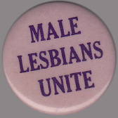


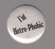
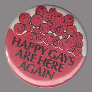

some of my fav pins from the Lesbian Herstory Archives
[ID: 9 close up pictures of a pin against a gray background. In this description, images are numbered 1 through 9.
1. A pale pink pin with purple text. In caps, it reads: "male lesbians unite."
2. A pale yellow pin with cartoonish dark blue text. It reads: "Mr. Lady records • videos. The punctuation points are little white stars." White curvy lines and more stars are inside the word lady.
3. A black pin with gothic red text. It reads: "Serenity through viciousness."
4. A white pin with gray text. It reads: "I'm Hetro-Phobic." The word "I'm" is tilted.
5. A pin with dark gray text. The bottom half is red, and the top half has a bunch of red, distorted smiley faces, with a white background peeking through. In caps, the text reads: "happy gays are here again."
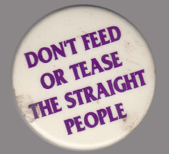
6. A white pin with saturated purple text. In caps, it reads: "don't feed or tease the straight people."
7. A sky blue pin with small gray text. It reads: "fondle with care."
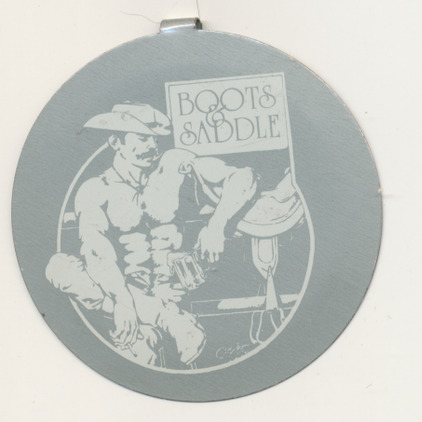
8. A grey pin with a light gray illustration of a shirtless, tired looking cowboy. They hold a mug of beer in their hands, resting against a fence with a saddle on it. The sign next to them reads "Boots & Saddle."
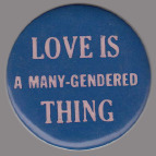
9. A royal blue pin with lilac purple text. The first and last line are in a larger, serif font, and the center line is a smaller, sans serif font. In caps, it reads: "love is a many-gendered thing."
Quoted with slashes indicating line breaks, it reads: "love is / a many-gendered / thing." /End ID]
#lgbt#queer#lgbt history#lesbian#gay#gay history#lesbian history#vintage gay#vintage lesbian#lgbt pins#lgbt buttons#ID added !
16K notes
·
View notes
Text
Franklin Gothic Font
Franklin Gothic is a delicate and clean sans serif font that was created and shared by URW Type Foundry GmbH. The typeface continues to be seen in many high-profile situations, from books to billboards, was featured on the cover of Lady Gaga’s second album, The Fame Monster, is the official typeface of the Museum of Modern Art in New York, and was even the resident typeface of the PBS series The…

View On WordPress
#Franklin Font#Franklin Gothic#Franklin Gothic Font#Franklin Gothic Sans#Franklin Gothic Sans Serif#Franklin Sans#Franklin Sans Serif#Gothic Font#Sans#sans serif
0 notes
Text
#typography#horrorart#occult#dark art#deadverlaine#dark aesthetic#gothic#serif font#logotype#logoconcept#darkart
1 note
·
View note
Text
It's FanFiction Writer's Appreciation Day!
In order to show our appreciation @renegadepublishing fanbinding guild runs Renegade Loves Fic(Writers), an event where members choose a fic they love and make it into a book to send to the story's author!
This year I chose to bind:
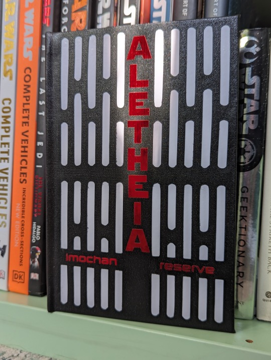
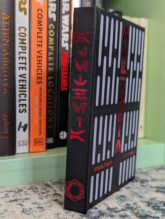
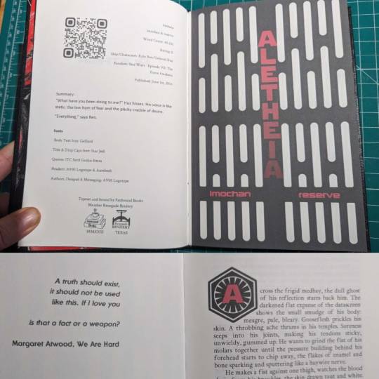
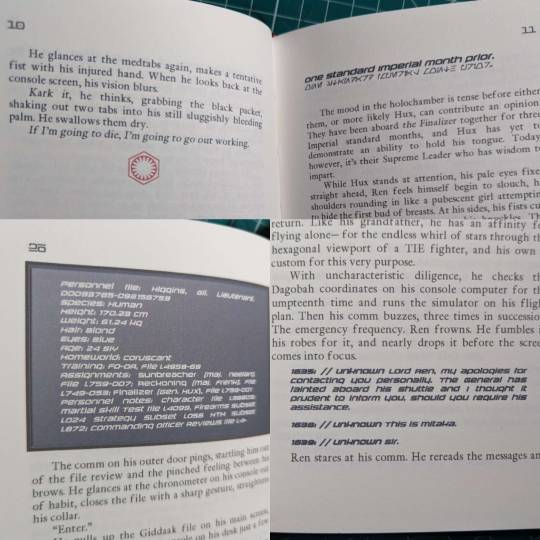
Aletheia
by imochan, & reserve on A03, @badspacebabies & @reserve here on the tumblr space
Fandom: Star Wars
Ship: Kylux
Word Count: 40,150
Rating: E (this story is spicy and has some dark elements, please read the tag and notes)
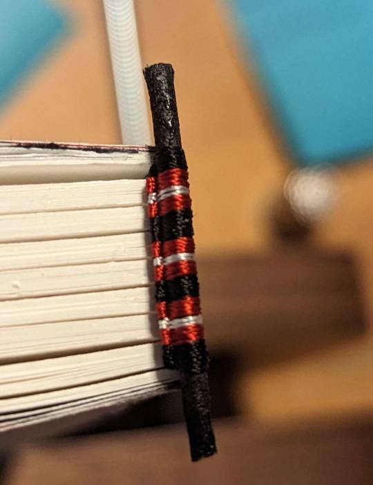
I made three copies of this book, one for each of the authors and one for me. I had a lot of fun making this book and my favorite part was the cover. Typically when you add elements to the cover they go on top of the bookcloth. But I really wanted the white for the imperial lighting to be recessed below the black of the cover. So it was more like lights behind metal girders. So in this case I put the white vinyl on the board for the case then cut the holes for the lights in the bookcloth and built the case. It was my first time trying something like this and I love how it turned out!!!
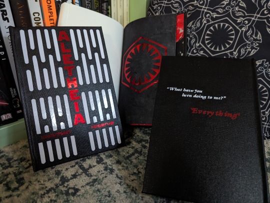
I knew was gonna do this story for my FFWAD book a while back, so when I was at the Renegade Retreat back in April I made a point to marble some papers just for them!
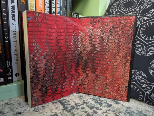
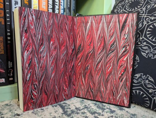

I also sewed some endbands for these, in a false double core style.

Inside!
Fonts used:
Body Text font: Galliard
Title & Drop Cap font: Star Jedi
Quotes: ITC Serif Gothic Extra
Headers: AV05 Logotype & Aurebesh
Authors, Datapad & Messaging: AV05 Logotype
Thank you again to the authors for making this story!!
274 notes
·
View notes
Text
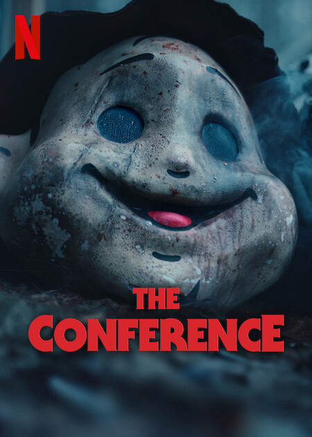
#The Conference#netflix#Halloween#serif gothic#lubalin#dispigna#serifgothic#logo#typography#design#music#film#movie#happy halloween#spooky season#spooky
7 notes
·
View notes
Text
watched some of the Diablo 4 gameplay vids. most of the onscreen text is disgustingly sans-serif. legibility is for wimps you should be training your players to read 10pt gothic fraktur from the corner of their eyes
584 notes
·
View notes
Text
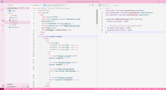
How I pinkify my code editor/IDE!
Continuing on posting about how I making my coding experience more fun, I'll be going to show you what I did to pinkify my:
code editor (VSCode)
IDE (Visual Studio)

Visual Studio
Theme
So, let's start with Visual Studio because I use that the most because of work! I installed themes to it (here is a post I made on how to install the exact ones I have (install once, comes with lots of themes)) and I changed the fonts!
Best you follow my installation post, as the themes I will list now will be from that exact theme set I installed (called "The Doki Theme"). I'm a fan of Light themes more than the Dark ones for VS:
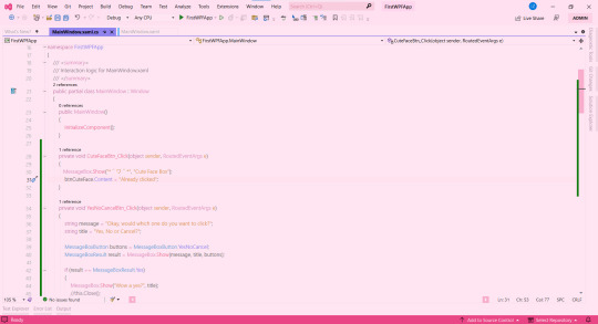
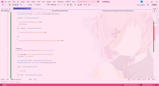
♡ Natsuki Light (the theme in the pictures + my favourite)
♡ Beatrice
♡ Mai Light
♡ Miia
♡ Mioda Ibuki Light
♡ Nakano Itsuki
♡ Nakano Nino
♡ Ram
Themes 'Beatrice' to 'Ram' have pink in the themes but it's not the main colour of the theme, if that makes sense, but still cool to me so I switch to them every so often! ヾ(^-^)ノ
Fonts
Sometimes I get tired of the monospace font on my code editor. I know it's almost a crime to change the font of your code editor/IDE but I get bored so easily, a well-known trait of mine, and want to spice things up again so I change the font! As well as that, my eyes have a hard time reading the code after a while because of the monospace font! I still sometimes use it though~! (´;ω;`)
But first, for those who don't know how to change the font + font size (if you want also) in Visual Studio:
♡ Toolbar > Tools > Options > Environment > Fonts and Colors > Font
Okay, so I split my chosen fonts so you can pick according to your font style taste~! :
Sans Serif
♡ Bahnschrift SemiLight
♡ Calibri
♡ Gadugi
♡ Segoe UI Semilight
♡ Segoe UI Historic
♡ Yu Gothic
Serif
♡ SimSun
Monospace
♡ Modern
♡ Terminal
That's it for Visual Studio!
Visual Studio Code
Theme
These are my favourite themes and the first one is the one I am currently using! To learn how to change the theme on VSCode: here. Now my chosen themes:
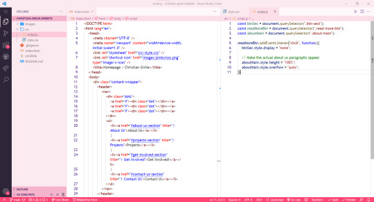
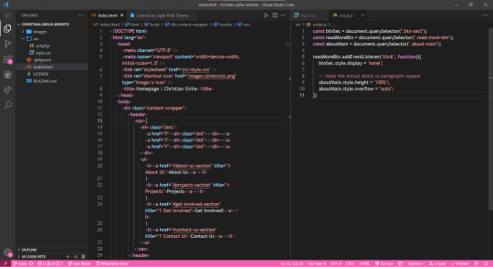
♡ Cute (no. 1 shown)
♡ Fluffy Theme
♡ Huacat Pink Theme
♡ Light Pink (no. 2 shown)
♡ PinkyBoo
♡ Tinacious Design (Light) from Tinacious Design theme
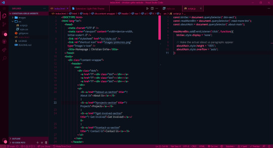
♡ Dark Pink from Light Pink Theme (no. 4 shown)
♡ Her.
♡ Kawaine Theme
♡ Pink Cat Boo
♡ PinkBlue from PinkBlue Theme
♡ Robot Light Pink (no. 4 shown)
Fonts
The current font I have on VSCode is Trebuchet MS. But the font mentioned before are the ones I used in VSCode as well! To change the font in VSCode:
♡ Settings > type in the search bar 'Font' > Editor: Font Family
That's all!
I hope this was a fun read and helps someone! Make you're coding environment fun! (and pink) 🥰💗
#codeblr#coding#progblr#programming#studying#studyblr#comp sci#codeblr pink girl#codeblr girl goals#pink#pink aesthetic#pinkcore#visual studio code#visual studio#vscode#my resources
207 notes
·
View notes
Photo


Alina Starkov
ID under cut
[image description: 3 large, blended, coloured gifs of Alina Starkov from Shadow and Bone.
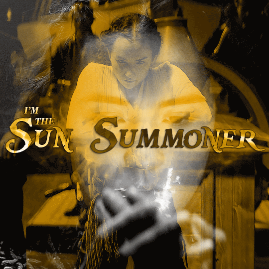
Gif 1: A blend of 2 gifs. First, from 104, a black and white close up of Alina's face as she summons a small ball of light in Baghra's room. Blended over top is a shot from 202, a yellow coloured shot of Alina letting out a burst of light as she tests her powers on Sturmhond's ship after getting the second amplifier. Over the middle of the gif are the words, "I'm the Sun Summoner" in a yellow gradient. The words "I'm the" are in serif print, and the words "sun summoner" are in gothic print.
Gif 2: A blend of 2 gifs. First, from 207, a yellow coloured shot of Alina unleashing a light cut towards the Darkling. Blended over top is a shot from 208, a black and white shot of Alina unleashing a shadow cut against the Fjerdan assassin. Over the middle of the gif are the words, "it gets dark" in a yellow gradient. The words "it gets" are in serif print, and the word "dark" is in gothic print.
Gif 3: A blend of 2 gifs. First, from 105, a shot of Alina smiling proudly with her hands clasped after giving her demonstration to the palace guests. Blended over top is a shot from 208, of Alina faintly smirking after performing a shadow cut against the Fjerdan assassin. The gif has a yellow background. Over the middle of the gif are the words, "when i say it does" in a yellow gradient. The words "when i" and "it does" are in serif print, and the word "say" is in gothic print.]
#shadow and bone#sabedit#shadowandboneedit#shadowandbonecentral#dailyshadowandbone#userbbelcher#chewieblog#cinematv#tvfilmgifs#televisiongifs#userbecca#ughmerlin#useryellow#*gifs#tvfilmsource#filmtvcentral#flashing gif#i've always wanted to do a set with this quote but never had an idea for it til now
353 notes
·
View notes
Text

The Trials and Tribulations of Edward Harcourt is back with its Third Chapter!
Picking up from your afternoon down exploring the village, Chapter 3 continues your adventure with Edwards Harcourt in Gairbuie!
In this chapter, you will be able to [REDACTED], discover and go through a [REDACTED], and maybe have some [REDACTED].
The mystery has only begun... Ready to investigate it more?
Change-log:
[Add] Chapter 3, including a new mechanic and journal entries, making the total word count reach 53k.
[Settings] Font change for the Journal (2 cursive options, serif, sans, open dyslexic).
[UI] Fiddling with the title page and some background CSS rules.
Recommended to play with a Gothic Atmospheric Playlist in the background (like this one). Rating is still recommended to be 16+, check the Trigger Warnings before playing.
PLAY THE DEMO | RATE ON ITCH | REVIEW ON IFBD | TAGS
#ttateh#the trials and tribulations of edward harcourt#update#chapter 3#interactive fiction#lovecraft#horror#itch#twine game#twine if#interactive game#interactive story#indie dev
187 notes
·
View notes
Last Seen Blogs


miimdesign
Miim Design

wesleykwon-blog
Untitled

ottomh
ottomh's Clip Board

elegantcollectionlover23
제목 없음