#process art
Text
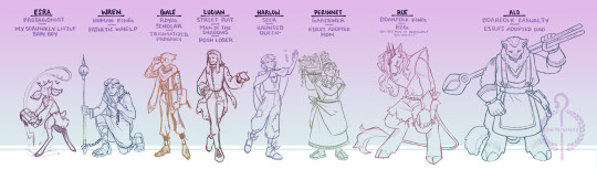

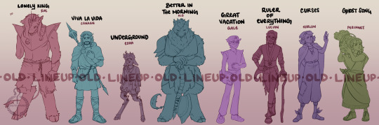
Souls in the Sand: Concept Art
As I’ve mentioned here and there, I’ve spent the last two years developing an original story inspired by a small Origins+Empires server a few friends and I started planning. The more I developed plans for my empire to be a sprawling overgrown cityscape of ruins and stone framework inspired by the nether, the more I built up this backstory for the character I wanted to play, a small deerfolk boy named Esra. From there, and over months of working and reworking the story and its characters, I’m proud to say I’m coming up on a 100 piece gallery for my Masters Exhibition to display this story in the form of a song-inspired comic, titled: Souls in the Sand.
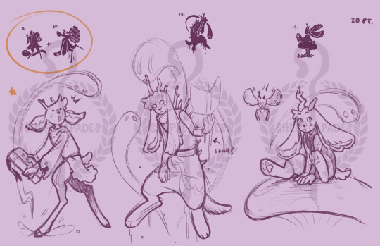
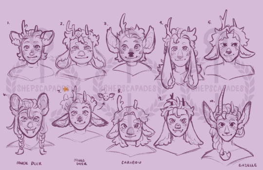
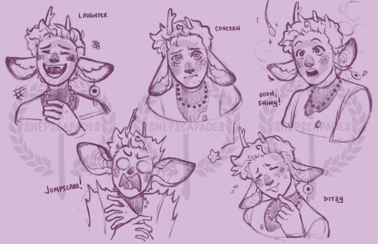
Over the next month and beyond the date of my exhibition in April, I wanted to start sharing my work here! I thought it would be fitting to first share all of the concept work I did for the characters last semester as I took each character from their old lineup and reworked them from scratch to see if there were any designs I could make more unique or appropriate for the story. This process consisted of four stages: silhouettes, full-body mock-ups, face and head shapes/designs, and experimenting with the final characters’ designs with a set of unique expressions that best fit their personalities and narrative role.
Since each character was reworked separately, the “new” concept lineup is a little disjointed (and some of the characters’ faces actually ended up different from their full-body designs), but I thought it would be fun to line them up to compare the overall cast to their old designs. With each character(s) I post the concept process for, I may share little bits of the work I’m doing or talk a little about their narrative roles as I go, but for now, have Esra!
I know I don’t post original work here often, but I wanted to share parts of this journey with you guys because it’s been very meaningful to me! And I hope all of the work I’ve been doing may at the very least serve as a bit of inspiration or encouragement for us to keep making silly minecraft stories, to keep drawing the characters we love, and to keep being creative in whatever way is meaningful! <3

#original artwork#original character#character design#concept art#Shep’s oc#Souls in the Sand#sits#art escapades#minecraft original story#esra#alo#deerfolk#boarfolk#piglin#minecraft oc#oc#original characters#conceptualization#process art#rue#wren#gale#lucian#perinnet#harlow#original story#illustration#personal art#drawings#original art
605 notes
·
View notes
Text

Process gif of the Alienor piece (def recommend viewing in browser!)
I do commissions|Tip me here
#anonbeadraws#digital art#gif#process gif#process art#art#moving image#tiefling#dress#dancer#dnd commission#digital commission#artists on tumblr
1K notes
·
View notes
Text
Process for this piece.
If you'd like the final piece as a print, card, sticker, or anything, it's up in my print shop! Link below.
Also, commissions are open! I've got ten slots and can make you whatever you like.
✨ 🐝 Commissions | Instagram | Buy Prints 🐝 ✨
#my art#fanart#artists on tumblr#black artists on tumblr#process video#process art#starfire#teen titans#new teen titans#koriand'r#koriandr#kori anders#kory anders#dc comics#dc fanart#titans#dickkory
122 notes
·
View notes
Text
Finally starting my first fan art piece with the mosaic paper method I've been using for years. Here's Aziraphale starting to form.
118 notes
·
View notes
Photo

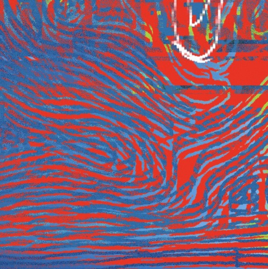
#aesthetics#animation#process art#colour#abstract art#calming#colorful#creative coding#colors#cool#beautiful#graphic#gif#color#artists on tumblr#design#aesthetic#digital art#gifs#art#RGB#*d56#*pfn e0 sp1 r94#*c104.253.70.192.98.251#*mp0532.2788.0409#*tp0200.0456.0207
106 notes
·
View notes
Text
*waves a white flag* ok. Im done for the day. Here's a sneak peek.
I tried to finish it but I am so fucking tired. It's been a day. I will be back tomorrow with more art.
Good night my viewers!
*exit stage left*
#good omens#good omens fanart#crowley#david tennant#good omens season 2#neil gaiman#process art#progress#tired
272 notes
·
View notes
Text
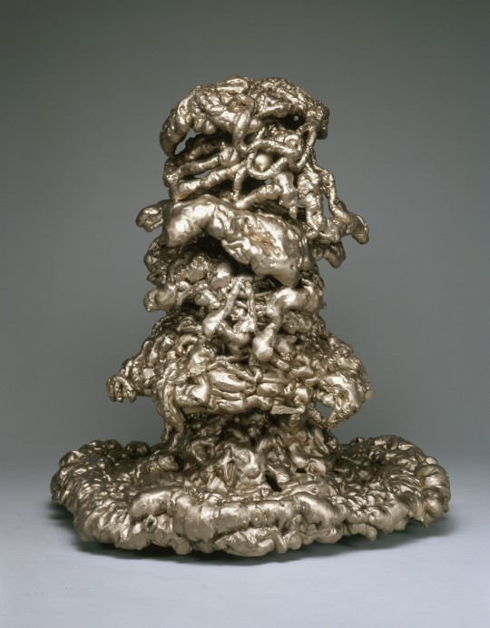
LYNDA BENGLIS / "STORM PATTERN" / 2003
[bronze | 29 × 27 × 25"]
#lynda benglis#postminimalism#process art#sculpture#contemporary art#abstract#bronze#00s#american#art#u
87 notes
·
View notes
Text
I know it’s everyone’s favourite moments 😏
I couldn’t not to draw that
#alastor the radio demon#alastor fanart#hazbin alastor#hazbin hotel alastor#alastor hazbin hotel#alastor#hazbin hotel characters#hazbin hotel fanart#hazbin hotel#hazbin art#hazbin fandom#hazbin fanart#hazbin hotel fandom#stayed gone#pen sketches#pen sketch#pen drawing#sketching#drawing process#process art#art process#sketchbook art#sketchbook page#pen art#drawing#drawing fanart#fanarts#fanart#radio demon#demon art
61 notes
·
View notes
Text

Matthew Brandt. from the series Lakes & Reservoirs, 2013.
chromogenic print soaked in Lake Lewis water
66 notes
·
View notes
Text


dogmatic dragons two
#brain empty so I’m titling this after the most exciting news I’ve heard this week#thanks capcom#it’s really just another detail post of the process documentation for ‘gloam’#my art#glitch art#aesthetic#art#artwork#webcore#glitchcore#internetcore#abstract#artists on tumblr#abstract expressionism#abstract aesthetic#glitch aesthetic#collage art#intuitive#process art#geography#retrofuturism#retro aesthetic
185 notes
·
View notes
Text
Illustration process!
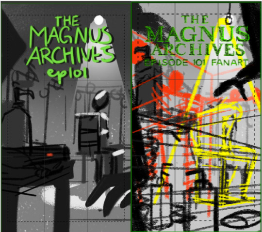
Sketchy thumbnail getting the general layout!
still working loose and sketchy, but figuring out layout and proper perspective. You can see I changed where the camera sits, instead of focusing on the tape recorder I dropped down to the floor to show more lotion bottles! I also moved the waxworks hands up higher, to make it look like they're reaching for Jon!
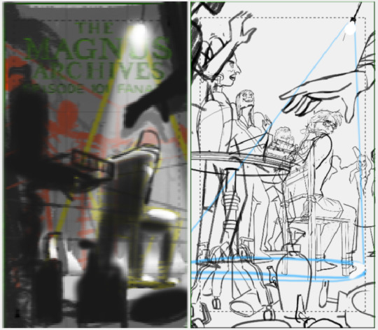
3. Very blurry, because I copy the picture and shrink it WAAAAY down to block in the lighting. I want to make sure I can tell what's happening in the picture even if it's teeny-tiny.
4. Lineart! Everything is split into different layers between foreground (table, bottles, big hands), middle ground (Jon, chair, spotlight) and background (ooooh all those waxworks)
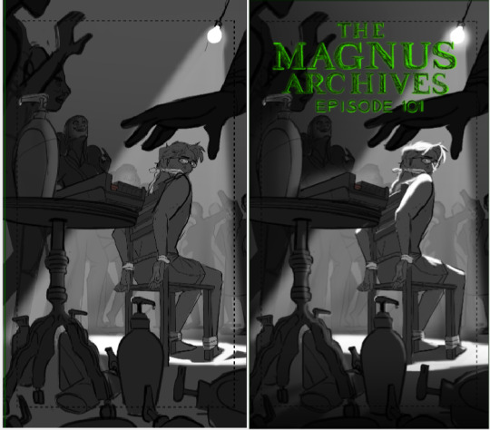
05. Mattes! Nice solid colors behind each item, also in their own layers so it's easy to edit later if i want. And finally--
06. Lighting! I put big soft shadows on the left hand and lower sides, to tone down the "visual noise" there and put a nice bright highlight on the star of the show. I want viewers to look at Jon first, then follow the hand to the table, then down to the bottles on the floor. And while I want the bg dimmer, I also need it visible enough that if people study they can see it alllll the horrors
282 notes
·
View notes
Text

Robert Morris, Untitled, 1967, felt, dimensions variable
approximately 99 x 98 x 38 inches (252 x 249 x 97 cm)
69 notes
·
View notes
Text
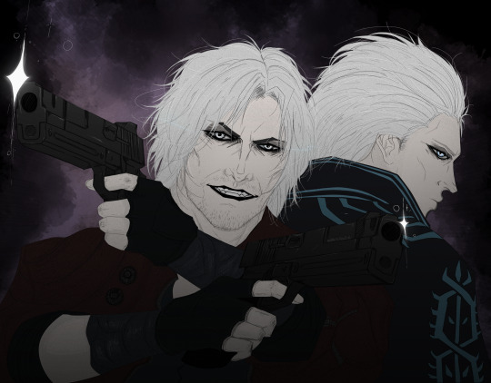

.\\d e v i l_t r i g g e r
#dante#vergil#dmc#dmc5#devil may cry#devil may cry 5#dante dmc#vergil dmc#process art#razerwin#sketch
103 notes
·
View notes
Text

Today was a struggle. Here’s something I made 🌈
#artist#dreamy#ethereal#abstract art#abstract#mixed media#collage#art journal#journal#sketchbook#abstract artist#mixed media journal#mixed media collage#process art#rainbow art#rainbow aesthetic#abstract collage artist#abstract collage
34 notes
·
View notes
Photo

#asmr#calming#satisfying#abstract#aesthetic#digital art#artists on tumblr#color palette#arte#stim#colors#gif#colorful#process art#art#gifs#color#designs#animation#colourful#HSL#*d15#*pf v sp1#*c84.249.74.226.44.245
137 notes
·
View notes
Text
Process video for I Finally Found You
And if you go, I want to go with you.
And if you die, I want to die with you.
Take your hand and walk away.
✨ 🐝 Commissions | Instagram | Buy Prints 🐝 ✨
#my art#artists on tumblr#black artists on tumblr#process art#process video#digital art#richonne twd#fanart#twd#rick twd#rick and michonne#rick x michonne#rick grimes#michonne hawthorne#richonne#the ones who live#towl#twd towl#the walking dead
39 notes
·
View notes
Last Seen Blogs

laurentbourrelly
Boot Camp SEO
fr-cobaltcupcakes
CobaltCupcakes FR

puneproerynews-blog
Pune Property News
an-3rd-radish
anRadish

deliciousdreamdream
Senza titolo