#packaging illustration
Text
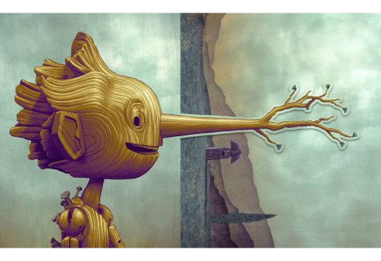
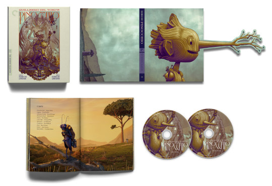
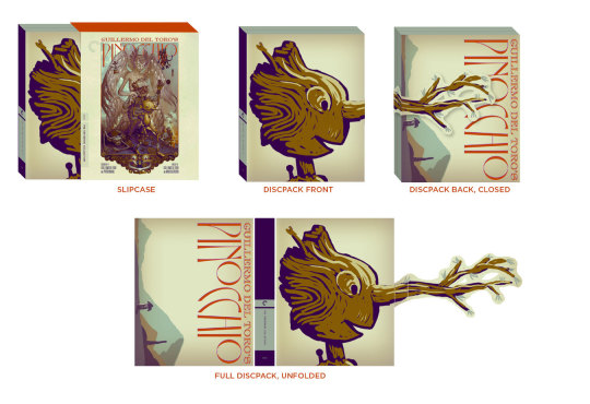
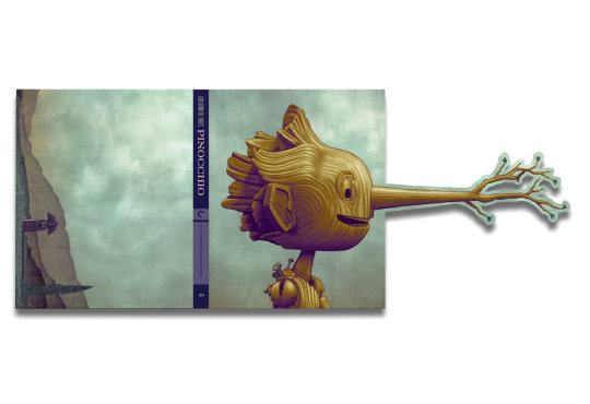
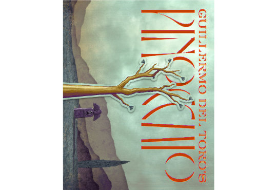
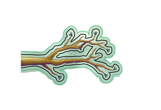
Pinch hitting for James Jean? What an honor when the best creative director in the biz Eric Skillman called me to do the interior tri-fold discpak for Guillermo Del Toro and Mark Gustafson's Criterion Collection release of Pinocchio. James' insane poster serves at the cover art and he was busy hanging his insane show in Shenzen at the time so I was called in for the additional art. Remember, this film won the Oscar for best animated feature last year! Back to James Jean, he was my hero when I was in school so even being considered to sub for him is crazy to me. You can see the mind of Eric Skillman in image 3 where he mocked up his plan. The last image is an inside baseball peak at additional bleed that needed to be added. I'll post a clip of the whole fold out in action when I get one. Thank you thank you to all involved and Gris Grimly who's also a hero of mine and who's 2003 Pinocchio book was their inspiration and he exec produced too.
#pinocchio#james jean#illustration#guillermo del toro#criterion collection#criterion#stop motion#stop motion animation#gris grimly#mark gustafson#key art#physical media#artists on tumblr#fyiart#packaging illustration#packaging design#slipcase#packaging art#packaging
41 notes
·
View notes
Text
#cute packaging#packaging#packaging illustration#packaging design#packaging art#illustratrice#illustration#illustration shop#shop illustration#art#dessin#drawing#character art#illustrator#illustrator on tumblr#watercolor#peinture#aquarelle
15 notes
·
View notes
Text
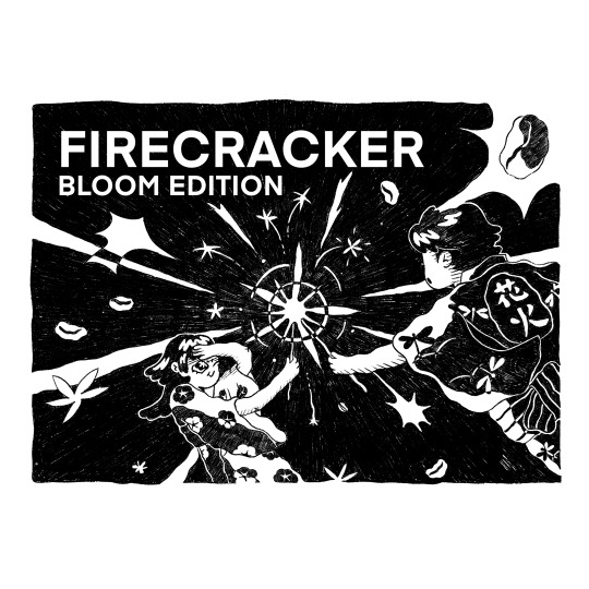

FIRECRACKER BLOOM EDITION. Product illustration for Single O
#single O coffee#single o#product design#packaging design#firecracker bloom edition#coffee bag#coffee bag illustration#packaging illustration#matsuri#summer festival
1 note
·
View note
Text
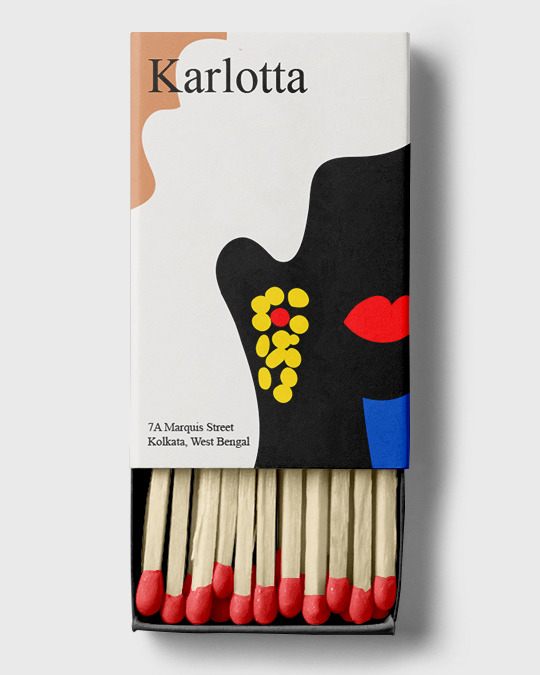
Matches
1 note
·
View note
Text
Get ready to be impressed by the captivating packaging illustrations by Gracie Healy

Gracie Healy is a renowned digital illustrator and graphic designer who works with brands to create impactful campaigns. Her portfolio includes everything from digital prints to illustrations, murals, bilingual artwork, and more. She has worked with global brands to create captivating packaging illustrations to appease their customers. With her creativity, Gracie is helping brands create a strong brand identity among their customers. You can view her packaging illustration collection here.
#Packaging Illustrations#Packaging Illustration#Packaging Illustrators#Gracie Healy Packaging#Gracie Healy Packaging Illustrator#Gracie Healy Packaging Artists
0 notes
Text


Sketches for a packaging design project, this time for a s'mores flavored chocolate bar. I'll eventually take my favorites from these sketches and resize/rearrange them into a repeating pattern, clean them up, and add color. Think funky wallpaper, as chocolate bar wrapper.
I really love the little trees closest to the camper, I want to add more elements like those.
Drawn in Fresco!
#smores#camper#sketchbook#illustration#packaging illustration#jordanphillipsart#sketches#work in progress#wip#art wip#camping#art#drawing#backpacking#adobe fresco#my art
0 notes
Text
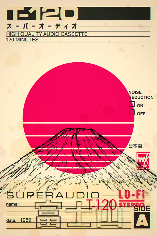
Superaudio Mount Fuji
#mt fuji#mount fuji#japan#art#illustration#mtfuji#japanese#inspired#illustrators on tumblr#pencil#cassette#cassette tape#pop art#retro#nostalgia#lofi#aesthetic#superaudio#packaging#vintage
671 notes
·
View notes
Text
"I got a package for you!"
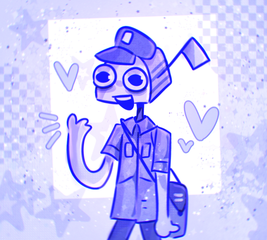
OH NO A SCARY DOG AAARHHJGH!!! *GETS CHASED BY DOG*
Would you trust him with your letters? <3
#he ate the package on the way there🥺#hes such a loser/pos#my art#sillyposting#mailman oc#art#oc#*GETS BITTEN IN THE ASS*#NOOO MY CAKE-!!#oc art#my ocs#artists on tumblr#digital art#illustration#character art#my oc art#original character#artist#artwork#oc artist#oc artwork#original art#drawing#digital drawing#ocs#oc drawing#digital artist#digital illustration#doodle#silly guy
687 notes
·
View notes
Text

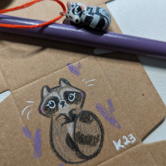
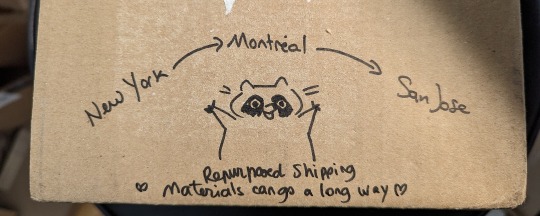
Shipping day cuteness
#small business#shipping stuff#ceramicist#ceramics#artoftheday#handmade#cute#art#pottery#porcelain#illustration#reduce reuse recycle#repurposed#packaging#raccoon#raccoons
734 notes
·
View notes
Text

サバ Saba - Mackerel
I got to try mackerel for the first time I visited Japan and it tastes so different from the freshwater fish we have in Austria. I really like it! It goes great with rice! Unfortunately, mackerels are very hard to get in Austria. Do you eat fish?
264 notes
·
View notes
Note
How do you pick your colors? Your art style is so cohesive and i love the palettes you use!!
thank you! im a very intuitive artist, i think i draw frequently enough to know my preferences pretty well lol, but recently I’ve been enjoying working with somehow complementary colors?

like these don't look that similar but i did use the same 4 colors or so! i like to complement yellow/orange (skin) with teal (most of the clothes lol), I think they make each other pop rlly well
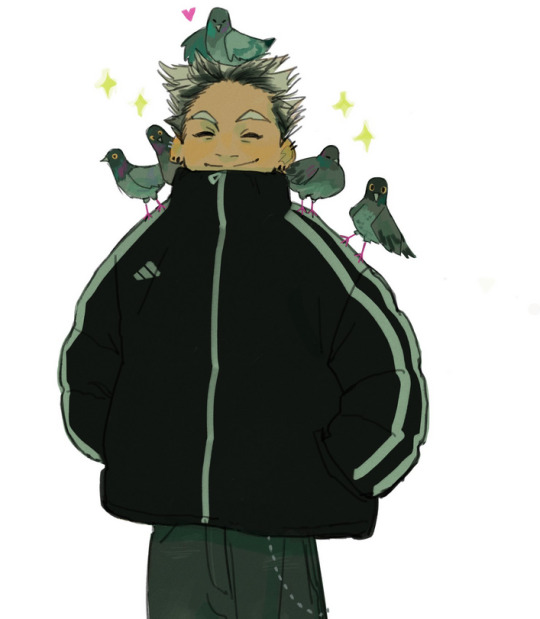
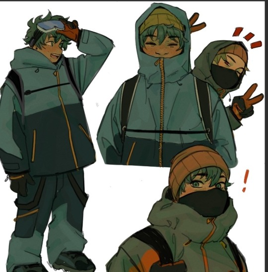
i also keep my palettes very minimal, i used the same blue hues for bokuto's hair, outfit, and the pigeons, too! same with deku’s outfits and hair, it’s the same color in different hues :)
i keep my palettes very minimal in general, i think its easier to create a somehow cohesive/harmonious palette and illustrations if you limit yourself :) as you can see, the colors I predominantly use are all hues of green and yellow, I let the overlay balance it all out and make it look less harsh I guess
also i don’t limit myself to fixed color palettes, i just use the same base color and overlay layer for most illustrations, I think those bring everything together even if I dont really know what I’m doing, i hope this helpssss

#A big part of art is just observing tbh#observe what you like and dislike. figure out your own patterns and why you gravitate towards certain art styles or mediums#or what kind of packaging or posters or fashion choices liik good to you#imo it’s easier to figure out what you want to create if you move through the world appreciating colors and shapes everywhere :)#I like children’s book illustrations a lot and kind of let those inspire me#but it can be anything#some products have rlly nice packaging you can also look at those for palette inspo!#asks
245 notes
·
View notes
Text
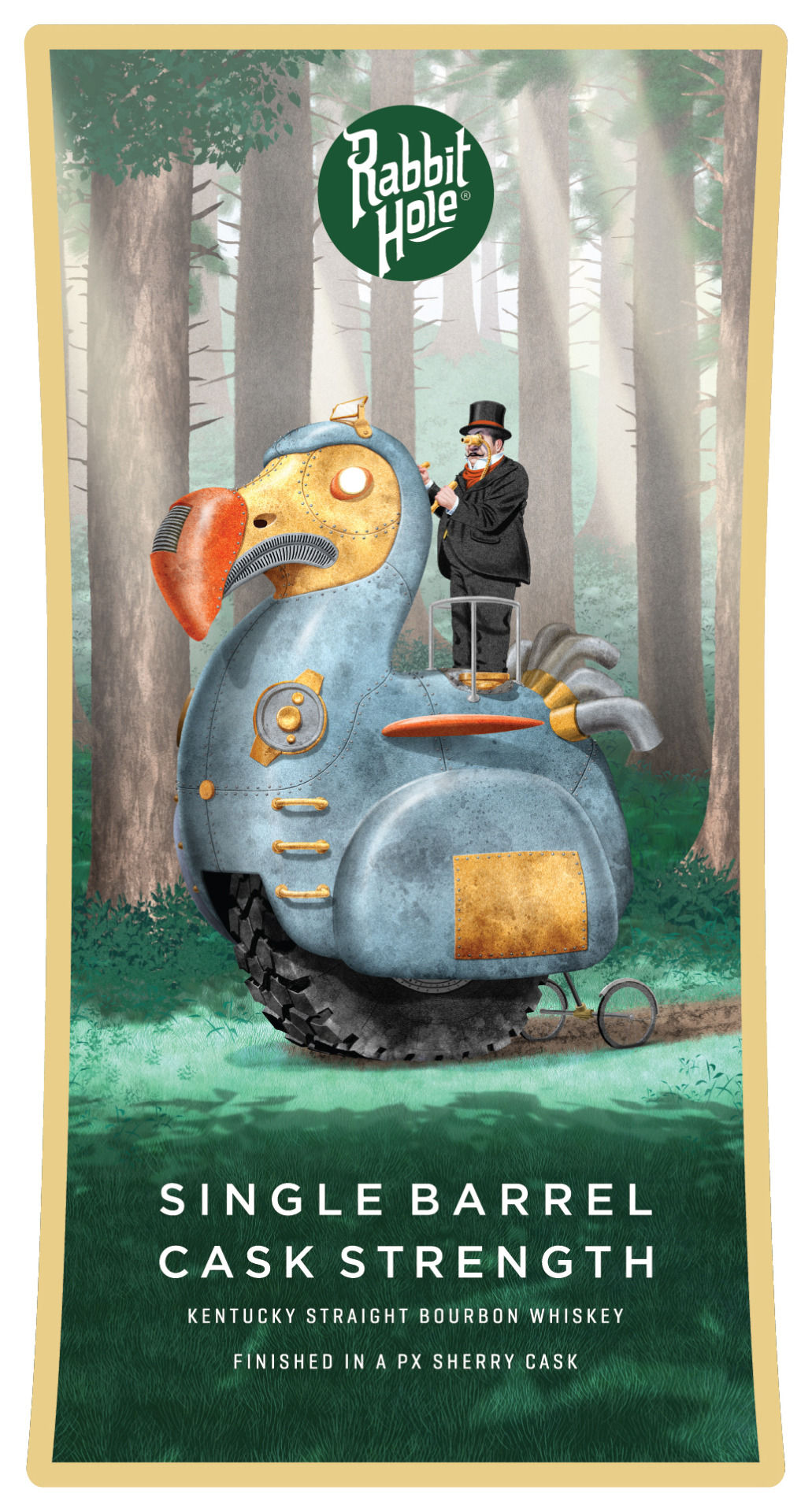
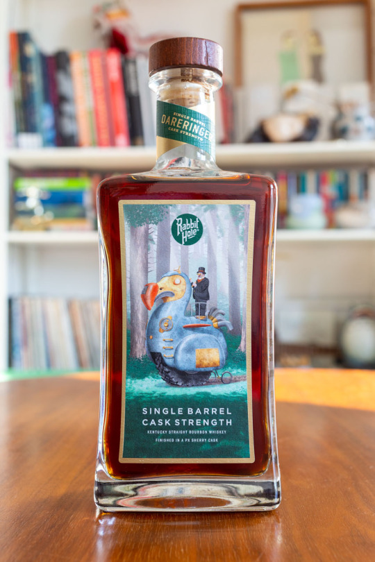

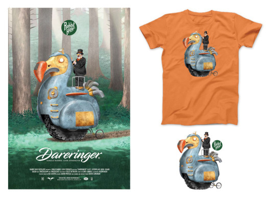
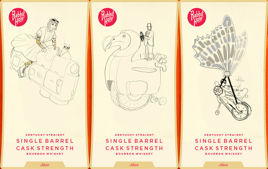
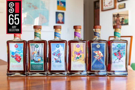
The Dodo for my Limited edition artist series bottles for Rabbit Hole Distillery. I reimagined Lewis Carroll’s Alice in Wonderland characters in a sort of Steam Punk vehicle riding world. Alice is all grown up and tatted with Dinah as co-pilot in the front. The Dodo, (who was a metaphor for politicians) has a Boss Tweed type driver atop his destructive steel behemoth. The Caterpillar has emerged from his cocoon even more twee and affectatious than before and flies away in a puff of hookah smoke. Will Tweedle Dee and Tweedle Dum ever make it out of the forest while working against their own interests? The Queen’s Card Guardsman patrols the night skies. The Queen of Hearts is imposing on her half flamingo-half machine. “Dareringer” is single barrel cask strength Kentucky straight bourbon whiskey finished in Pedro Ximénez sherry casks at 118 proof and luckily is my favorite of all their offerings. Available at select retailers in South Carolina and Texas. Posters, T-shirts, and stickers are also available. This was an incredible amount of work conceptualizing and designing and redesigning these characters and backgrounds. Alice in wonderland is beloved and has been reimagined so many times it took so long to develop something new. We had several half starts and reworks but in the end it was worth it, the bottles are beautifully printed and even have spot gloss embossing on the art. Time for me to go have 2 or 3 (or 4) fingers, Cheers! (also there will be more posts with behind the scenes and details stay tuned). See more of this project on my website
#alice in wonderland#artists on tumblr#Illustration#fyiart#packaging design#packaging illustration#label art#the dodo#steam punk#steampunk#character design#original character#lewis carroll#rabbit hole whiskey#rabbit hole distillery#whiskey#dodo#dodo bird#boss tweed#politician
15 notes
·
View notes
Text
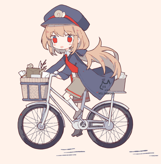
Snail mail 🐌
#original#anime#illustration#drawing#artwork#chibi#artist#patreon#post office#delivery#package#mail#snail mail#kawaii art#anime art#character illustration#character design
150 notes
·
View notes
Text
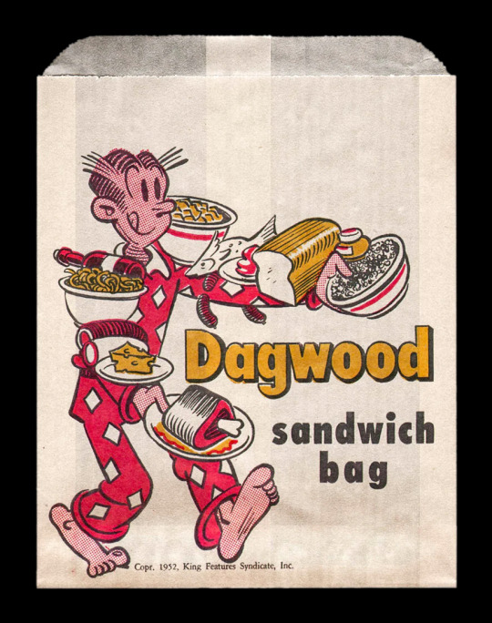
Vintage Dagwood Sandwich bag.
#vintage illustration#vintage advertising#vintage typography#package design#vintage packaging#dagwood#dagwood sandwich
345 notes
·
View notes
Photo
F&J represents the artists of Packaging Illustrations
With unique ideas and style, F&J present their well-known packaging illustration artists, who have worked on several campaigns in different industrial sectors. They give a more innovative look to your products and bring them to life through their photography skills. See how our artists work to make your brand stand out.
0 notes
Text
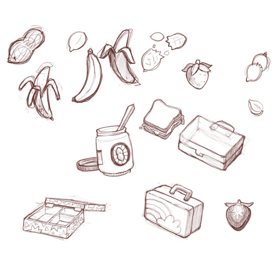
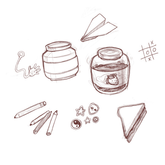
Sketches for a packaging design project, this time for a PB&J flavored chocolate bar. I'll eventually take my favorites from these sketches and resize/rearrange them into a repeating pattern, clean them up, and add color. Think funky wallpaper, as chocolate bar wrapper.
I wanted to evoke some memories of being in elementary school in the '90s, without too much of an "academic" feel: just slappin' each other with gooey hands and trading stickers at lunch tables, y'know?
(Originally I was planning on PB & banana, another chocolate combo that I love, thus the bananas... PB&J just had better "stuff" that went with it, aaand this is the joy of self-initiated projects... I can just change whatever I want!)
#peanut butter and jelly#sketches#food illustration#90s nostalgia#packaging illustration#illustration sketchbook#pbj#adobe fresco#elementary school#lunch box#pb and j#strawberry jelly#peanut butter#art#jordanphillipsart#packaging design#work in progress#wip#illustration
0 notes
Last Seen Blogs
omgkatsudonplease
and the stars will wait;

potionworld
Potion World
love-me-satoru
Salutaions Milkers

bpzau-art
Bp
iminlove-withmybestfriend
Cast your soul to the sea