#like with the rest of the story
Text
We're not appreciating the Weird Barbie enough. It's said in the movie that she helps everyone who need help while they always see her as someone who's not as good as them. She was friends with all dismissed Barbies and Kens, was there to offer support and safe shelter for everyone who needed it in Kendom, without her nothing in the movie would've been alright. When Stereotypical Barbie calls her "ugly and unwanted" she still helps her.
She was representing a woman in women's world who was pushed aside by other women because she didn't fit in but still had more wisdom and kindness than everyone who thought they're better than her.
#weird barbie#barbie#Barbie movie#everyone looks at her as a queer person i see her as me I'm a straight person who got bullied simply for being different than the rest#but it's beautiful that we all see ourselves in her whatever our story is#cuz that's the point of characters like her
46K notes
·
View notes
Text
There's a version of the "don't go grocery shopping while hungry" rule specifically for writers where you should never under any circumstances be allowed to touch your draft within 3 hours of reading a really good story. Because sometimes when you read something great your head goes "fuck this is so much better than my stuff I should make that more like THIS instead!" Look at me. That's the devil talking and you should close the document NOW.
#you will make superficial edits that do not gell well with the rest of your work#and won't actually capture what you thought was so good about that story#close the doc. sit down. think about it for a while. inspiration is fine. getting a 'eureka' moment from another story is fine#but if you find yourself comparing your work one to one with someone else's and taking any differences to be flaws on your part then STOP#you will never write good stuff by trying to make it look less like you wrote it#writing#writing advice#guess who just had to go into her google doc history and undo a bunch of panic-induced edits#because she read a fic about the same characters she's writing for?#meeee. they aged badly within just a few hours of hindsight. learn from my mistakes#self-hatred is not a good motivation for creation#fic writing
9K notes
·
View notes
Text
calling it right now that season 3 starts like this
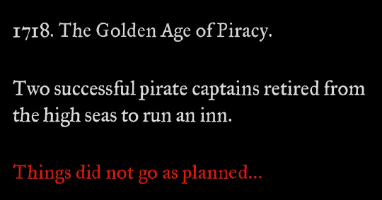
#so confused about people saying the season finale feels like the end because to me it didn't at all#there's like 5-10 issues immediately set up for another season#they're in a happy place at this point because they've both realized their love is bigger than anything else#and makes it worth working on their problems together#the problems are still very much there#both of them have deep self esteem/self loathing issues that haven't been resolved in the week since ed woke up#ed doesn't know about stede's trauma#they haven't talked through anything#and they'll be shit at starting/running an inn lmao it's not gonna go well#and those are just some of the internal issues#then there's prince ricky and all the authorities that would very much like to get their hands on both blackbeard and stede bonnet#because stede just full-on kept using his government name after faking his death. nice one#the crew are not “gone” they're more like off to college for a bit but will probably run into trouble immediately#again because while they escaped to the ship they didn't eliminate the threat (the british empire)#it's not a forever goodbye#ok this got super long already anyway i have a whole fic marinading in my brain until i've finished these 4 wips i'm in the middle of ✌️#hope we get a renewal soon because i want to see the rest of their story!!#ofmd s2 spoilers#ofmd s2#ofmd#our flag means death
2K notes
·
View notes
Note
I love your take on Crowley!
I know that the early, non-Diasomnia stories aren't really your thing, but are you reading the novels at all?
I have been following some of the fan translations and the second book seems intense! Would love to hear what you think about them.
thank you! 💚💚💚 I'm not really sure why you think I don't like the earlier arcs though, I love pretty much all the characters and their storis! (I think 5 and 1 are my favorite of the past episodes, though 6 infected me with the Shroud brainrot something fierce.) I just...ESPECIALLY love diasomnia. :') but there is room in my heart for all of these dweebs! like, who among us is not just as ride-or-die for Adeuce as they are for us.
that said, I don't really follow the other adaptations like the manga (aside from a dip-in just to see the new Yuus) or the novels, though I keep meaning to check them out! I do like seeing the differences between the different forms of media, and how certain things get adapted one way or another! but alas, time/a lack of accessibility stands in our way more often than not. :( someday...someday I will have time to consume all of the media...
#art#twisted wonderland#i have been playing this game since the day it came out#and believe me i could not have stuck with it for the past three and a half years if i was not deep into all of these idiots#not to harp on it but i do think it's funny because i actually. really did not like the diasomnias at first.#it was like a month before their cards/personal stories were added and so we knew almost NOTHING about them#the website descriptions basically make everyone sound awful#so i thought they were kind of mean/boring compared to everyone else!#(except maybe lilia but i was mad at him for the two seconds of 'girl? 👀' hope i had when they were revealed)#but once their cards came out i fell just as hard for them as i did the rest of this silly game#well. sebek took a little longer. but his ketchup incident converted me.#anyway i have so much sentimentality for episode 1 especially#the prologue was like 'oh this is actually a very silly game! oh there is a plot!'#episode 1 was like 'oh i LIKE these characters and what they're doing with them'#(i think ace punching riddle was the moment i decided i REALLY liked this game) (sorry riddle) (you were being a huge dick though)#also...ink drips. ink drips everywhere.#look when i say this game is laser-focused at me and my tastes specifically i am not kidding
1K notes
·
View notes
Text


and are you really okay?
are you really okay?
#cw for sh mention in song ! i removed that part in this !#narilamb#cotl#cult of the lamb#cotl narinder#eye strain#blood cw#not 100% happy but couldn't keep picking lmao#song is#are you really okay by sleep token#anyway there is some story to this. but first and foremost i think lamb probably breaks down often over the fact they're the Last sheep and#their whole race was killed. it's fucked up#anyway the small detail is that in ~my version~ narinder is very passive aggressive where he can be. like wearing white robes so#his bleeding (he has lacerations that appear even as an ex god) is always staining them. as a fuck you to lamb because he refuses to#wear red/darker colours like the rest of the cult#but over time his robes do get slightly darker. until say there's a night where he does find lamb fixating on blood/their species being#completely culled. and he silently makes the choice to wear much darker robes And stuff underneath so his Ooze doesn't show as much#:3#cotl fanart#cult of the lamb fanart#cotl toww
524 notes
·
View notes
Text
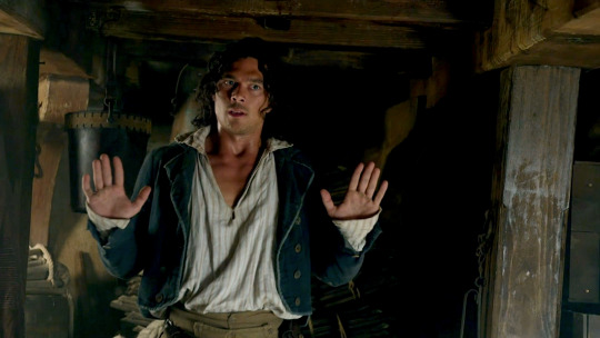


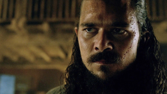
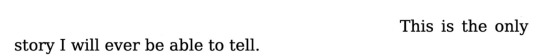
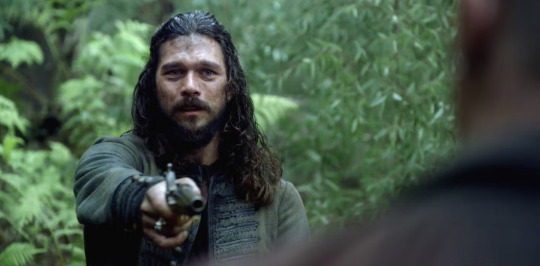
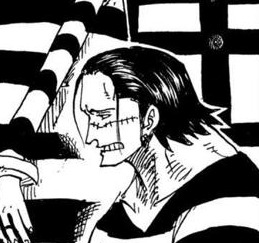
“I suppose at one time in my life I might have had any number of stories, but now there is no other. This is the only story I will ever be able to tell.” — The Secret History, Donna Tartt
#black sails#long john silver#john silver#black sails edit#do you get it so you see it. he comes into the story and he’s not long john silver yet. he doesn’t have to be. but the story goes on and#and he gets swept up in it more and more until he has to be long john silver. there’s only one ending. there’s only one story left for him#to obsess over for the rest of his life. he is shaped so wholly by the events that it’s all that’s left.#like luke arnold said: ‘he always had one leg out the door and then they cut it off f’
853 notes
·
View notes
Text
Mourning Cloak is a normal mech that nothing bad could happen to "If you roll the same number on all three dice, you disappear until your group rests, at which point you reappear nearby."
WHERE DID THEY GO
#lancer#lancer rpg#lancer ttrpg#making mechs is a joy#could spend hours on compcon#i have moments were my little story breaks pretty far from the lancer universe#but then the mechs are just- lancer mechs expect for a few Real Unique ones that are like- you meet One somewhat early and the rest...#rn only move if like a Bad Ending happens#which i have drawn cuz its Pretty but- death
974 notes
·
View notes
Text
what i think people are missing about derol in glass onion is that he is played by noah segan. the same guy who played trooper wagner in the first knives out movie. and i for one, think noah should continue to play goofy little characters in the rest of the knives out movies. not anything to do with the mystery, not a potential killer or anything, just a goofy little guy living his best life, fangirling over his fave mystery author and getting high as hell on a billionaires greek island. good for him.
#another possibility is that it is revealed at the end of the series that its all been the same guy#and his story is interwoven#into the rest of the films#like love actually but just derol wagner living his best life#glass onion#knives out#knives out 2#benoit blanc#trooper wagner#noah segan#glass onion movie#glass onion netflix#glass onion a knives out mystery#knives out glass onion#derol
6K notes
·
View notes
Text
continuing on my "Lup and Barry get married every cycle and the ensuing weddings encompass a very wide range of tones" bullshit: consider, if you will, a cycle where they mean to get married early on, they really do. but the hunt for the Light is just so intense, and the time flies by so fast, that they still haven't done it by the time the end is closing in...
and in the final fight for the Light, a little under a month out from the Hunger's arrival, Lup is grievously wounded. she lies in Barry's arms, bleeding out, and with her dying breath, she whispers her final wish:
"reanimate my corpse and put her in a nice dress for the wedding"
and who is Barry to turn down a dying wish from his wife, let alone a dying wish that's that fucking funny, so Barry loyally throws some wedding plans and some necromancy spells together so that Zombie Lup can attend the ceremony. her soul doesn't reside in her body anymore because no one was willing to burn the spell slots on True Resurrection (it's only a month out from resets, come on), but she's very well-behaved as Barry very sincerely declares his eternal love and wiggles this cycle's ring onto her finger.
Taako hates it so much. the energy in the studio is incredibly uncomfortable. Lucretia takes a bunch of photographs of every moment so that Lup can enjoy it later upon respawn. most of the crew eventually looks back and recognizes this instance as the start of the slippery slope that lead to lichdom, but Lup and Barry refuse to acknowledge how fucking weird it was. they will treasure those pictures forever
#taz#taz balance#taz balance spoilers#blupjeans#lup taaco#barry bluejeans#like no offense but i think that this fandom could be making lup and barry SO much weirder#they're little freaks (affectionate) and the rest of the crew must have so many horror stories#anyways i've decided this is canon to someone i have loved but never known#just didn't make it into the memory montage
1K notes
·
View notes
Text
why Aurora's art is genius
It's break for me, and I've been meaning to sit down and read the Aurora webcomic (https://comicaurora.com/, @comicaurora on Tumblr) for quite a bit. So I did that over the last few days.
And… y'know. I can't actually say "I should've read this earlier," because otherwise I would've been up at 2:30-3am when I had responsibilities in the morning and I couldn't have properly enjoyed it, but. Holy shit guys THIS COMIC.
I intended to just do a generalized "hello this is all the things I love about this story," and I wrote a paragraph or two about art style. …and then another. And another. And I realized I needed to actually reference things so I would stop being too vague. I was reading the comic on my tablet or phone, because I wanted to stay curled up in my chair, but I type at a big monitor and so I saw more details… aaaaaand it turned into its own giant-ass post.
SO. Enjoy a few thousand words of me nerding out about this insanely cool art style and how fucking gorgeous this comic is? (There are screenshots, I promise it isn't just a wall of text.) In my defense, I just spent two semesters in graphic design classes focusing on the Adobe Suite, so… I get to be a nerd about pretty things…???
All positive feedback btw! No downers here. <3
---
I cannot emphasize enough how much I love the beautiful, simple stylistic method of drawing characters and figures. It is absolutely stunning and effortless and utterly graceful—it is so hard to capture the sheer beauty and fluidity of the human form in such a fashion. Even a simple outline of a character feels dynamic! It's gorgeous!
Though I do have a love-hate relationship with this, because my artistic side looks at that lovely simplicity, goes "I CAN DO THAT!" and then I sit down and go to the paper and realize that no, in fact, I cannot do that yet, because that simplicity is born of a hell of a lot of practice and understanding of bodies and actually is really hard to do. It's a very developed style that only looks simple because the artist knows what they're doing. The human body is hard to pull off, and this comic does so beautifully and makes it look effortless.
Also: line weight line weight line weight. It's especially important in simplified shapes and figures like this, and hoo boy is it used excellently. It's especially apparent the newer the pages get—I love watching that improvement over time—but with simpler figures and lines, you get nice light lines to emphasize both smaller details, like in the draping of clothing and the curls of hair—which, hello, yes—and thicker lines to emphasize bigger and more important details and silhouettes. It's the sort of thing that's essential to most illustrations, but I wanted to make a note of it because it's so vital to this art style.
THE USE OF LAYER BLENDING MODES OH MY GODS. (...uhhh, apologies to the people who don't know what that means, it's a digital art program thing? This article explains it for beginners.)
Bear with me, I just finished my second Photoshop course, I spent months and months working on projects with this shit so I see the genius use of Screen and/or its siblings (of which there are many—if I say "Screen" here, assume I mean the entire umbrella of Screen blending modes and possibly Overlay) and go nuts, but seriously it's so clever and also fucking gorgeous:
Firstly: the use of screened-on sound effect words over an action? A "CRACK" written over a branch and then put on Screen in glowy green so that it's subtle enough that it doesn't disrupt the visual flow, but still sticks out enough to make itself heard? Little "scritches" that are transparent where they're laid on without outlines to emphasize the sound without disrupting the underlying image? FUCK YES. I haven't seen this done literally anywhere else—granted, I haven't read a massive amount of comics, but I've read enough—and it is so clever and I adore it. Examples:


Secondly: The beautiful lighting effects. The curling leaves, all the magic, the various glowing eyes, the fog, the way it's all so vividly colored but doesn't burn your eyeballs out—a balance that's way harder to achieve than you'd think—and the soft glows around them, eeeee it's so pretty so pretty SO PRETTY. Not sure if some of these are Outer/Inner Glow/Shadow layer effects or if it's entirely hand-drawn, but major kudos either way; I can see the beautiful use of blending modes and I SALUTE YOUR GENIUS.
I keep looking at some of this stuff and go "is that a layer effect or is it done by hand?" Because you can make some similar things with the Satin layer effect in Photoshop (I don't know if other programs have this? I'm gonna have to find out since I won't have access to PS for much longer ;-;) that resembles some of the swirly inner bits on some of the lit effects, but I'm not sure if it is that or not. Or you could mask over textures? There's... many ways to do it.
If done by hand: oh my gods the patience, how. If done with layer effects: really clever work that knows how to stop said effects from looking wonky, because ugh those things get temperamental. If done with a layer of texture that's been masked over: very, very good masking work. No matter the method, pretty shimmers and swirly bits inside the bigger pretty swirls!
Next: The way color contrast is used! I will never be over the glowy green-on-black Primordial Life vibes when Alinua gets dropped into that… unconscious space?? with Life, for example, and the sharp contrast of vines and crack and branches and leaves against pitch black is just visually stunning. The way the roots sink into the ground and the three-dimensional sensation of it is particularly badass here:

Friggin. How does this imply depth like that. HOW. IT'S SO FREAKING COOL.
A huge point here is also color language and use! Everybody has their own particular shade, generally matching their eyes, magic, and personality, and I adore how this is used to make it clear who's talking or who's doing an action. That was especially apparent to me with Dainix and Falst in the caves—their colors are both fairly warm, but quite distinct, and I love how this clarifies who's doing what in panels with a lot of action from both of them. There is a particular bit that stuck out to me, so I dug up the panels (see this page and the following one https://comicaurora.com/aurora/1-20-30/):

(Gods it looks even prettier now that I put it against a plain background. Also, appreciation to Falst for managing a bridal-carry midair, damn.)
The way that their colors MERGE here! And the immense attention to detail in doing so—Dainix is higher up than Falst is in the first panel, so Dainix's orange fades into Falst's orange at the base. The next panel has gold up top and orange on bottom; we can't really tell in that panel where each of them are, but that's carried over to the next panel—

—where we now see that Falst's position is raised above Dainix's due to the way he's carrying him. (Points for continuity!) And, of course, we see the little "huffs" flowing from orange to yellow over their heads (where Dainix's head is higher than Falst's) to merge the sound of their breathing, which is absurdly clever because it emphasizes to the viewer how we hear two sets of huffing overlaying each other, not one. Absolutely brilliant.
(A few other notes of appreciation to that panel: beautiful glows around them, the sparks, the jagged silhouette of the spider legs, the lovely colors that have no right to make the area around a spider corpse that pretty, the excellent texturing on the cave walls plus perspective, the way Falst's movements imply Dainix's hefty weight, the natural posing of the characters, their on-point expressions that convey exactly how fuckin terrifying everything is right now, the slight glows to their eyes, and also they're just handsome boys <3)
Next up: Rain!!!! So well done! It's subtle enough that it never ever disrupts the impact of the focal point, but evident enough you can tell! And more importantly: THE MIST OFF THE CHARACTERS. Rain does this irl, it has that little vapor that comes off you and makes that little misty effect that plays with lighting, it's so cool-looking and here it's used to such pretty effect!
One of the panel captions says something about it blurring out all the injuries on the characters but like THAT AIN'T TOO BIG OF A PROBLEM when it gets across the environmental vibes, and also that'd be how it would look in real life too so like… outside viewer's angle is the same as the characters', mostly? my point is: that's the environment!!! that's the vibes, that's the feel! It gets it across and it does so in the most pretty way possible!
And another thing re: rain, the use of it to establish perspective, particularly in panels like this—

—where we can tell we're looking down at Tynan due to the perspective on the rain and where it's pointing. Excellent. (Also, kudos for looking down and emphasizing how Tynan's losing his advantage—lovely use of visual storytelling.)
Additionally, the misting here:

We see it most heavily in the leftmost panel, where it's quite foggy as you would expect in a rainstorm, especially in an environment with a lot of heat, but it's also lightly powdered on in the following two panels and tends to follow light sources, which makes complete sense given how light bounces off particles in the air.
A major point of strength in these too is a thorough understanding of lighting, like rim lighting, the various hues and shades, and an intricate understanding of how light bounces off surfaces even when they're in shadow (we'll see a faint glow in spots where characters are half in shadow, but that's how it would work in real life, because of how light bounces around).
Bringing some of these points together: the fluidity of the lines in magic, and the way simple glowing lines are used to emphasize motion and the magic itself, is deeply clever. I'm basically pulling at random from panels and there's definitely even better examples, but here's one (see this page https://comicaurora.com/aurora/1-16-33/):

First panel, listed in numbers because these build on each other:
The tension of the lines in Tess's magic here. This works on a couple levels: first, the way she's holding her fists, as if she's pulling a rope taut.
The way there's one primary line, emphasizing the rope feeling, accompanied by smaller ones.
The additional lines starbursting around her hands, to indicate the energy crackling in her hands and how she's doing a good bit more than just holding it. (That combined with the fists suggests some tension to the magic, too.) Also the variations in brightness, a feature you'll find in actual lightning. :D Additional kudos for how the lightning sparks and breaks off the metal of the sword.
A handful of miscellaneous notes on the second panel:
The reflection of the flames in Erin's typically dark blue eyes (which bears a remarkable resemblance to Dainix, incidentally—almost a thematic sort of parallel given Erin's using the same magic Dainix specializes in?)
The flowing of fabric in the wind and associated variation in the lineart
The way Erin's tattoos interact with the fire he's pulling to his hand
The way the rain overlays some of the fainter areas of fire (attention! to! detail! hell yeah!)
I could go on. I won't because this is a lot of writing already.
Third panel gets paragraphs, not bullets:
Erin's giant-ass "FWOOM" of fire there, and the way the outline of the word is puffy-edged and gradated to feel almost three-dimensional, plus once again using Screen or a variation on it so that the stars show up in the background. All this against that stunning plume of fire, which ripples and sparks so gorgeously, and the ending "om" of the onomatopoeia is emphasized incredibly brightly against that, adding to the punch of it and making the plume feel even brighter.
Also, once again, rain helping establish perspective, especially in how it's very angular in the left side of the panel and then slowly becomes more like a point to the right to indicate it's falling directly down on the viewer. Add in the bright, beautiful glow effects, fainter but no less important black lines beneath them to emphasize the sky and smoke and the like, and the stunningly beautiful lighting and gradated glows surrounding Erin plus the lightning jagging up at him from below, and you get one hell of an impactful panel right there. (And there is definitely more in there I could break down, this is just a lot already.)
And in general: The colors in this? Incredible. The blues and purples and oranges and golds compliment so well, and it's all so rich.
Like, seriously, just throughout the whole comic, the use of gradients, blending modes, color balance and hues, all the things, all the things, it makes for the most beautiful effects and glows and such a rich environment. There's a very distinct style to this comic in its simplified backgrounds (which I recognize are done partly because it's way easier and also backgrounds are so time-consuming dear gods but lemme say this) and vivid, smoothly drawn characters; the simplicity lets them come to the front and gives room for those beautiful, richly saturated focal points, letting the stylized designs of the magic and characters shine. The use of distinct silhouettes is insanely good. Honestly, complex backgrounds might run the risk of making everything too visually busy in this case. It's just, augh, so GORGEOUS.
Another bit, take a look at this page (https://comicaurora.com/aurora/1-15-28/):

It's not quite as evident here as it is in the next page, but this one does some other fun things so I'm grabbing it. Points:
Once again, using different colors to represent different character actions. The "WHAM" of Kendal hitting the ground is caused by Dainix's force, so it's orange (and kudos for doubling the word over to add a shake effect). But we see blue layered underneath, which could be an environmental choice, but might also be because it's Kendal, whose color is blue.
And speaking off, take a look at the right-most panel on top, where Kendal grabs the spear: his motion is, again, illustrated in bright blue, versus the atmospheric screened-on orange lines that point toward him around the whole panel (I'm sure these have a name, I think they might be more of a manga thing though and the only experience I have in manga is reading a bit of Fullmetal Alchemist). Those lines emphasize the weight of the spear being shoved at him, and their color tells us Dainix is responsible for it.
One of my all-time favorite effects in this comic is the way cracks manifest across Dainix's body to represent when he starts to lose control; it is utterly gorgeous and wonderfully thematic. These are more evident in the page before and after this one, but you get a decent idea here. I love the way they glow softly, the way the fire juuuust flickers through at the start and then becomes more evident over time, and the cracks feel so realistic, like his skin is made of pottery. Additional points for how fire begins to creep into his hair.
A small detail that's generally consistent across the comic, but which I want to make note of here because you can see it pretty well: Kendal's eyes glow about the same as the jewel in his sword, mirroring his connection to said sword and calling back to how the jewel became Vash's eye temporarily and thus was once Kendal's eye. You can always see this connection (though there might be some spots where this also changes in a symbolic manner; I went through it quickly on the first time around, so I'll pay more attention when I inevitably reread this), where Kendal's always got that little shine of blue in his eyes the same as the jewel. It's a beautiful visual parallel that encourages the reader to subconsciously link them together, especially since the lines used to illustrate character movements typically mirror their eye color. It's an extension of Kendal.
Did I mention how ABSOLUTELY BEAUTIFUL the colors in this are?
Also, the mythological/legend-type scenes are illustrated in familiar style often used for that type of story, a simple and heavily symbolic two-dimensional cave-painting-like look. They are absolutely beautiful on many levels, employing simple, lovely gradients, slightly rougher and thicker lineart that is nonetheless smoothly beautiful, and working with clear silhouettes (a major strength of this art style, but also a strength in the comic overall). But in particular, I wanted to call attention to a particular thing (see this page https://comicaurora.com/aurora/1-12-4/):

The flowing symbolic lineart surrounding each character. This is actually quite consistent across characters—see also Life's typical lines and how they curl:

What's particularly interesting here is how these symbols are often similar, but not the same. Vash's lines are always smooth, clean curls, often playing off each other and echoing one another like ripples in a pond. You'd think they'd look too similar to Life's—but they don't. Life's curl like vines, and they remain connected; where one curve might echo another but exist entirely detached from each other in Vash's, Life's lines still remain wound together, because vines are continuous and don't float around. :P
Tahraim's are less continuous, often breaking up with significantly smaller bits and pieces floating around like—of course—sparks, and come to sharper points. These are also constants: we see the vines repeated over and over in Alinua's dreams of Life, and the echoing ripples of Vash are consistent wherever we encounter him. Kendal's dream of the ghost citizens of the city of Vash in the last few chapters is filled with these rippling, echoing patterns, to beautiful effect (https://comicaurora.com/aurora/1-20-14/):

They ripple and spiral, often in long, sinuous curves, with smooth elegance. It reminds me a great deal of images of space and sine waves and the like. This establishes a definite feel to these different characters and their magic. And the thing is, that's not something that had to be done—the colors are good at emphasizing who's who. But it was done, and it adds a whole other dimension to the story. Whenever you're in a deity's domain, you know whose it is no matter the color.
Regarding that shape language, I wanted to make another note, too—Vash is sometimes described as chaotic and doing what he likes, which is interesting to me, because smooth, elegant curves and the color blue aren't generally associated with chaos. So while Vash might behave like that on the surface, I'm guessing he's got a lot more going on underneath; he's probably much more intentional in his actions than you'd think at a glance, and he is certainly quite caring with his city. The other thing is that this suits Kendal perfectly. He's a paragon character; he is kind, virtuous, and self-sacrificing, and often we see him aiming to calm others and keep them safe. Blue is such a good color for him. There is… probably more to this, but I'm not deep enough in yet to say.
And here's the thing: I'm only scratching the surface. There is so much more here I'm not covering (color palettes! outfits! character design! environment! the deities! so much more!) and a lot more I can't cover, because I don't have the experience; this is me as a hobbyist artist who happened to take a couple design classes because I wanted to. The art style to this comic is so clever and creative and beautiful, though, I just had to go off about it. <3
...brownie points for getting all the way down here? Have a cookie.
#aurora comic#aurora webcomic#comicaurora#art analysis#...I hope those are the right tags???#new fandom new tagging practices to learn ig#much thanks for something to read while I try to rest my wrists. carpal tunnel BAD. (ignore that I wrote this I've got braces ok it's fine)#anyway! I HAVE. MANY MORE THOUGHTS. ON THE STORY ITSELF. THIS LOVELY STORY#also a collection of reactions to a chunk of the comic before I hit the point where I was too busy reading to write anything down#idk how to format those tho#...yeet them into one post...???#eh I usually don't go off this much these days but this seems like a smaller tight-knit fandom so... might as well help build it?#and I have a little more time thanks to break so#oh yes also shoutout to my insanely awesome professor for teaching me all the technical stuff from this he is LOVELY#made an incredibly complex program into something comprehensible <3#synapse talks
740 notes
·
View notes
Text
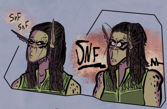
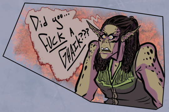
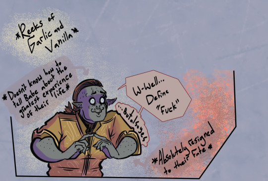

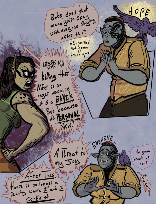

Alright. So. I'm not making this triangle conclusion because I like triangles
But because it's the only. the only conclusion I could make
For the morning after. After noticing Babe-
YOU'D THINK it'd go that Lae'zel and friends would never find out because even though I wanted to tell Lae'zel, A SHAME IT DIDN"T GIVE ME THE OPTION. A SHAME THE GAME WANTED ME TO KEEP THIS A DANG SECRET FROM MY TEAM AND JUST HAVE SOME SIMPLE-ASS INTERNAL CONFLICT.
But ohnononono, this magical patch 0 playthrough had other plans. Because for some reason. Babe was talking like we were in ACT 1 again. Babe became a killer coconut again
Babe knew. BABE KNEW ABOUT LAST NIGHT. AND BABE WAS CRANKY (understandably so of course)
And yet. Babe was also still allowing kisses. so. not. not OVER. BABE STILL LOVED THIS IDIOT HALF-ORC.
So. I could only conclude this. This is why.
and totally not because apparently it was a glitch (that they now fixed) all along pff
SO. Maybe just. This once. With this Tav. This playthrough. A Godsdamn Love Triangle friggin' happened alfdjkkasdj
Bonus (Because Greygold had to tell somebody):
#bg3 spoilers#baldur's gate 3#bg3#lae'zel#bg3 emperor#the emperor bg3#greygold#bg3 fanart#bg3 comic#Lae'zel is definitely sorting out her feelings with murder again#pretty sure lae'zel knows what illithids smell like what with being on the nautiloid and all#didn't have no functioning soap in this playthrough NEITHER SO-#stinky half-orc#sometimes glitches make a game/story experience so much WILDER#meanwhile my silly ass played the rest of the game thinking cranky lae'zel was intentional#like it was the game's way of saying she knew#remember how I said relationships can get bumpy?#well THIS ONE WAS A FRIGGIN' ROLLERCOASTER RIDE
424 notes
·
View notes
Text
so we all know astarion was named after the minotaur of greek myth, who, despite widely known as the minotaur (“bull of minos”), was named astarion/asterion (“starry one”) by his mother at birth. asterion the minotaur was trapped in a labyrinth and cursed to devour virginal men and women thrown in there as sacrifices.
”The House of Asterion” is a 1947 short story by Argentine writer Jorge Luis Borges that retells the story of the minotaur from the minotaur’s point of view. it’s one of his best early short stories and it’s very short, only 3 pages long. you can read it here.
borges is in my top 3 favorite writers of all time, and “The House of Asterion” obviously deserves to be considered on its own merits, so i feel slightly irreverent connecting this text to a recent video game. but i reread this short story today and there was much to think about, there were many more seeds planted in my mind in terms of interpretations of the minotaur myth and how asterion the minotaur relates to the story of astarion the vampire. i think it will for you, too.
anyway. if you don’t click through and read it, please at least read how it ends, remembering, of course, that the speaker is asterion the minotaur:

:)
#baldur’s gate 3#astarion#bg3#bg3 meta#OPENLY TAGGING THIS. WHO CARES. CRY WITH ME.#maybe im the only person openly weeping abt this in *connection* to astarion bg#the story itself is more than enough to make you weep#god theres something about#I hope he will take me to a place with fewer galleries and fewer doors.#also like. obviously. tav as the redeemer.#‘will he be like me?’ (full of trembling hope) makes me think of durge tav ok shut up#the way ‘my loneliness no longer bothers me’ is so clearly not true from the rest of the pragraph#OKAY
778 notes
·
View notes
Text
neil posted a new story in his instagram
#neil ellice#bearded neil#he's so beautiful#we finally have another training story again#his beard looks so perfect#like the rest of him#i need him so bad#im gonna lose my mind#soap cod#johnny soap mactavish#soap mactavish#call of duty#call of duty modern warfare
371 notes
·
View notes
Note
We ARE going to bring up Captain Amelia. You have good taste! GOOD TASTE I SAY! *aka I just rewatched Treasure Planet and got hit with, "Oh yeahhhhh... that explains a lot!"*
honestly, the Meg/Jasmine/Amelia trifecta tells you 90% about me as a person. (the rest is covered by Sailor Jupiter and Sailor Uranus and, uhhh, I'll stop baring my soul to the world now)
and speaking of Amelia, this is tangential, but like -- there's one Twst comic I have been kicking at for a while where I needed an RSA sports/flight teacher and, uh, well
someday I will wrangle this stupid comic into coherency and she'll get to make an appearance (in the background of a single panel, half-obscured by a tall hat) (but I will know she's there and that's the important thing)
#art#twisted wonderland#twst oc#my plan worked i've tricked you all into looking at my anime catgirl oc#she exists to yell at some rsa boys so she doesn't really have like. a character or story or anything. sorry!#(her name is alexandria north and that is what she considers a sporty outfit. that's as far as i got)#this is the one that is mainly about silver and neige having a mutual bluebird friend and i am having terrible trouble making it not suck#which given some of the stuff i post should tell you something about how it's going so far#(it's just kind of an incoherent mess of ideas at this point. nothing specific just ~the creative process~)#maybe the rest of episode 7 will give my brain the kickstart it needs. depends on how that goes i guess#god. the next episode 7 bit drops in (probably) just a few days.#I'M NOT READY#i have simultaneously never been ready and always been ready#i exist in a perpetual state of impatience
919 notes
·
View notes
Text
It’s crazy to me that Adventure Time had such a perfect ending, and yet 5 years later it seems like CN/HBO Max have been in consistent talks for spin-offs for it, and those spin-offs have actually been pretty consistently good
#adventure time#I think it’s in part because with Obsidian it was a story they were finally getting the chance to tell#and in the rest of distant lands they were just kinda like. special Adventure Time episodes#so it works#and now with Fionna and Cake the show is growing with its audience and further exploring characters and themes they couldn’t before
1K notes
·
View notes
Text
People often bring up the omake No Respect Time to use as Crocodad Propaganda, and y'know, I think there might be just a smidge more the omake can provide to Crocodad than what people have already discussed in the past
Like everyone's seen the comparisons between Crocodile and the anime screencaps of Don Luffyone, we all know how the two look so similar etc etc. But honestly, the resemblance is even more obvious (and hilarious) when you look at the OG manga version
(Sidenote but Don Luffyone is the only one who smokes cigars in the omake... Everyone else has plain ol' cigarettes... That sure was a decision there Oda)
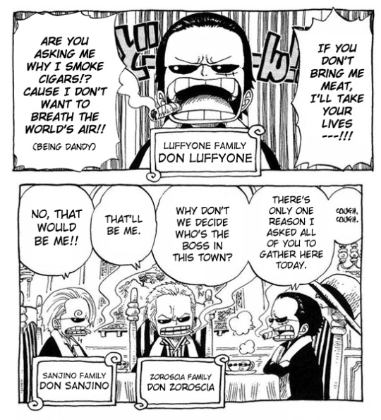
And yeah, you might be thinking I picked this mangacap of Crocodile in particular because the resemblance is the most obvious here and I have My Crocodad Agenda to push etc etc.
But I will have you know that the original omake was from Log Book 5, which was published February 28th 2006. Meanwhile that Crocodile is from the cover of chapter 398, published February 6th 2006. So these were drawn by Oda around the same time. I didn't just cherry pick this cover page because it's convenient for my evil agenda, if these were drawn around the same time then the likelihood the resemblance is intentional does legitimately go up a little. (Also since they're both drawn by Oda instead of random animators, again, it's a bit less coincidental and could be a bit more intentional)
But as I said, I think there might be more to the omake than that.
In the past people have also pointed out and joked how a mere few months before Oda revealed Dragon was Luffy's father to us in the story (post-Enies Lobby), in the Monster Time-omake Luffy was depicted as a dragon.
Needless to say, people believe this was intentional foreshadowing (/trolling) to the Dragon reveal by Oda-- if not it'd be one hell of a coincidence at the very least.
The reason I'm bringing that up is that if people think it's safe to assume Oda was hinting at Luffy's heritage in one omake by making him a dragon like his father, then why couldn't Oda do the same in another omake (by making Luffy a mafia boss who smokes cigars like his father)? Keep in mind that Monster Time was published in May 2006 (in Log Book 7), just three months after No Respect Time. So again, these are from the same era. To me, that just makes the resemblance between Don Luffyone and Crocodile seem even less coincidental
Oh, but there's one more omake I want to bring up.
So people do often bring up Nerd!Luffy's appearance in One Piece Gakuen spin-off manga, pointing out how much he looks quite a lot like the Theoretical Child Oda gave to Crocodile in that one SBS. Yeah. So. 'Bout that.
There was this one omake called Red Hair of Class 3-Sea Time, in which Luffy was a loser ass nerd. And man, that resemblance

Like it's one thing when a spin-off manga drawn by a different artist does A Thing. It's another when Oda himself does it
#Moon posting#OP Meta#Crocodad#Sir Crocodile#3rd Year Class is from 2007. Can't remember what year the SBS Child is from but I'm guessing long after 2013??#Point is that I would considder the Theoretical Child the weakest piece of Crocodad Propaganda#Also just to re-iterate: even if Crocodile wasn't Luffy's other dad I'm sure Oda knows who Luffy's other parent is and what happened to 'em#Like it doesn't matter if it was some random chick who fell down the stairs or was kidnapped or whatever#It doesn't matter if Luffy's other parent is relevant to the story or not; I'm sure Oda knows The Truth himself#But also Crocodile's always been relevant in the story around the same time the rest of Luffy's other family is relevant to the story#You know what I might actually save these thoughts for a separate post hold on#POINT IS THAT THE FACT THAT THE TWO OMAKE ARE FROM THE SAME TIME#AS WELL AS THE TIME WHEN DRAGON AND GARP WERE REVEALED TO BE RELATED TO LUFFY#THAT'S A SUS COINCIDENCE. THAT'S THE POINT
229 notes
·
View notes
Last Seen Blogs
get-blessed
get #blessed

empireidols-blog1
Untitled

borderwarm89
Без названия

we-found-us
My Randomness

panty4arie
Untitled