#large abstract modern painting
Text
#office wall art#home decor#wall decor#wall art#art prints#artist#artwork#digital art#fractal art#murals#painting#large canvas prints#canvas print#canvas painting#canvas#canvasprints#canvas art#abstract modern art#modern art#modern wall art
4 notes
·
View notes
Text
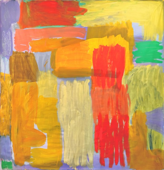
2023 untitled no. 105
225x215 cm
Acrylic and spray paint on canvas
Www.heidistibaekkaiser.com
#contemporary painting#art#heidi stibæk kaiser#heidistibaekkaiser#copenhagen#modernart#modern painting#abstract expressionism#abstractpainting#scandinavian female artist#made in copenhagen#colors#orange and yellow#large scale art#large scale painting
2 notes
·
View notes
Photo
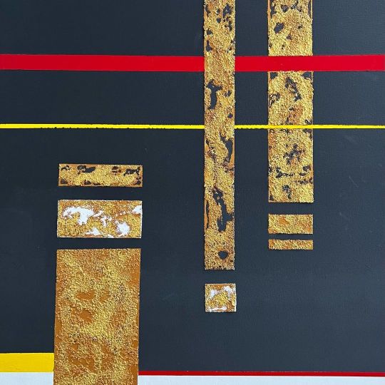
Title: BARRED PATTERNS CLICK ON : etsy.me/3yXLIrl via @Etsy #WallArt #Original #Acrylic #Geometric #Contemporary #HomeDecor #Abstract #Modern #Large Yellow, #Black #White #Gold #Painting https://www.instagram.com/p/Cf43RtYr63L/?igshid=NGJjMDIxMWI=
#wallart#original#acrylic#geometric#contemporary#homedecor#abstract#modern#large#black#white#gold#painting
4 notes
·
View notes
Text
Modern Wall Decor Blue Pink Wall Art Canvas Textured Painting
FREE Global Shipping Available, Purchase Here
https://krivaarthouse.etsy.com/uk/listing/838315073/extra-large-abstract-painting-oversize
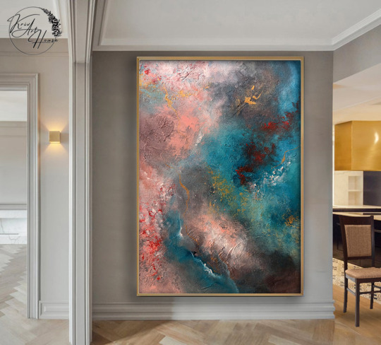

#modernart#modern painting#walldecor#abstract wall art#abstractart#textureartwork#textureart#textured painting#large wall decor#decor wall art
0 notes
Text
Website: https://www.annalisawallacefineart.com/
Annalisa Wallace is an artist based in the UK. In 2021 Annalisa was a finalist in the international Sketch For Survival competition, run by Explorers Against Extinction, a UK conservation charity.
About Me:
Watercolours, charcoal, pastels, ink, I'm a fan of them all. Whatever suits the subject matter best. I have a soft spot for painting elephants and cats (who doesn't) but I'll turn my hand to most things should inspiration strike. If it's natural, beautiful, and it makes you want to smile, I'll gladly give it a try.
Feel free to have a good look around my website. Everything is available to buy. If there's something special you would like – a favourite landscape or beloved pet portrait perhaps – I am open for commissions. You can contact me via the contact form.
Facebook: https://www.facebook.com/AnnalisaWallaceFineArt
Instagram: https://www.instagram.com/annalisa_wallace_fine_art/
Keywords:
artists online gallery
online artists gallery
artist online gallery
artist collective online gallery
artist gallery online
online artist gallery
online gallery artist collective
online gallery of artist
online gallery of artists
buy wildlife art
charcoal art buy
wildlife art to buy
buy watercolor art
pastel art to buy
buy handmade paintings
buy handmade paintings online
arts and crafts shops here can i buy drawing charcoal
can i buy different colour charcoals for art
charcoal art buy
charcoal art buy
animal crossing buy art
buying art animal crossing
buying art in animal crossing
buying art on animal crossing
how to buy art animal crossing
how to buy art in animal crossing
how to buy real art animal crossing
animal crossing how to buy art
anime art buy
best place to buy anime wall art
buy animation art
buy anime art
buy art animal crossing
buying art animal crossing new horizons
buying art from the fox animal crossing
how to buy real art in animal crossing
where to buy art in animal crossing
abstract art painting
abstract art paint
painting abstract art
abstract paint art
how to paint abstract art
paintings of abstract art
abstract art acrylic paint
abstract art acrylic painting
abstract art paintings acrylic
abstract art with acrylic paint
acrylic paint abstract art
abstract art acrylic painting techniques
abstract art body painting
abstract art canvas paintings
abstract art canvas paintings uk
abstract art easy to paint
abstract art eyes painting
abstract art flowers paintings
abstract art ideas for painting
abstract art landscape paintings
abstract art oil painting
abstract art paint splatter
abstract art painting ideas
abstract art painting on canvas
abstract art painting techniques
abstract art paintings by famous artists
abstract art paintings famous artists
abstract art paintings for sale
abstract art spray paint
abstract art using acrylic paints
abstract art wall painting
abstract art woman painting
abstract body art painting
abstract contemporary art paintings
abstract hand painted art
abstract line art painting
abstract modern art paintings
abstract paint splatter art
abstract painting art
abstract painting wall art
abstract pop art paintings
abstract spray paint art
abstract wall art painting
acrylic abstract art painting ideas
acrylic paint for abstract art
art abstract painting
art abstract painting ideas
art deco abstract paintings
art painting abstract
best acrylic paint for abstract art
best paint for abstract art on canvas
best type of paint for abstract art
canvas painting abstract art
contemporary abstract art paintings
easy abstract art paintings
famous abstract art paintings
hand painted abstract art
hand painted abstract wall art
#how do you paint abstract art#how to paint abstract art on canvas#how to paint abstract art with acrylics#how to paint abstract wall art#how to paint acrylic abstract art#how to paint textured abstract art on canvas#how to paint watercolour abstract art#large abstract art paintings#learn to paint abstract art#minimal abstract art paintings#minimalist abstract art paintings#modern abstract art oil painting#oil painting abstract art#oil painting modern abstract art#original abstract art paintings#paint abstract art
1 note
·
View note
Photo

Family Room Loft-Style
#Large modern loft-style game room concept large abstract#abstract painting#modern art#midcentury art#chris mundwiller#industrial art#contemporary decor
0 notes
Text
Marigold Grey Tone Abstract Art, Mid-Century Modern Print A8-01
Marigold Grey Tone Abstract Art, Mid-Century Modern Print A8-01
https://www.etsy.com/TanyDiArtDesign/listing/1181836230

View On WordPress
#24x30 trendy 16x20#24x36 wall art 18x24#A1 printable art set#abstract trendy art#bedroom painting#geometric art print#large minimal art#marigold grey tones#mid century modern#modern elegant art#room interior decors#TanyDi ArtDeco print#trendy art poster
1 note
·
View note
Text
DM ART Gallery wants to make sure that every canvas of art you see on our site resonates with you in some way our mission is to create an environment where our customers can find their perfect piece of art - a place where they can make their personal statement with the perfect painting. We want customers to leave our site feeling like they've found something really special.
Large Wall Art | DM ART Gallery
1 note
·
View note
Text
Website : https://www.kingneonfineart.com/
James 'Kingneon' Guçwa was born with a paintbrush in his hand. There was never any doubt in his mind that, one way or another, he would become a professional fine art painter. This was his dream.
After obtaining a BFA in painting, he yearned for more and began additional study as a private student at the Dan Welden Lithographic Studio in Long Island, N.Y., and shortly after, as a painting apprentice in the art studio of the late contemporary painter, Gregory Gillespie, (Fulbright Scholarship, Whitney Museum, Hirshhorn Museum, Forum Gallery, N.Y.C.).
The French post-impressionist, Paul Gauguin, moved to Tahiti to live and paint its people and tropical landscape. Admiring this artist's choice, Guçwa left for the island of Jamaica to do the same.
Business mail : [email protected]
Keywords:
modern art prints
wall art prints
artist painting
large art prints
vintage art prints
art prints online
cheap art prints
abstract landscape painting
river painting
lake painting
oil paintings on sale
oil painting for sale
ikea paintings
glaze a painting
park painting
art prints near me
abstract landscape paintings
boho art prints
oil painting sale
digital art prints
pop art prints
black art prints
original paintings
smith oil
the storm painting
art prints sale
daybreak painting
art prints modern
large wall painting
buy art prints online
bathroom art prints
oil canvas
original oil paintings for sale
moth painting
painting print
painting large
Follow on :
Facebook : https://www.facebook.com/kingneonart
Instagram : https://www.instagram.com/kingneonfineart/
Linkedin : https://www.linkedin.com/in/kingneonfineart/
Twitter : https://twitter.com/kingneonfineart
#modern art prints#wall art prints#artist painting#large art prints#vintage art prints#art prints online#cheap art prints#abstract landscape painting#river painting#lake painting#oil paintings on sale#oil painting for sale#ikea paintings#glaze a painting#park painting#art prints near me#abstract landscape paintings#boho art prints#oil painting sale#digital art prints#pop art prints#black art prints#original paintings#smith oil#the storm painting#art prints sale#daybreak painting#art prints modern#large wall painting#buy art prints online
1 note
·
View note
Text
#abstract modern art#home decor#wall decor#wall art#art prints#artist#artwork#digital art#fractal art#murals#painting#abstract art#large canvas prints#canvas print#canvas painting#canvas#canvasprints#canvas art#canvas prints#can
1 note
·
View note
Text
Random Stuff #12: What is Simplified Chinese?
For people like me who grew up speaking and using Chinese in day to day life, the vast majority of us have at least a basic understanding of what Simplified Chinese is, but it wasn’t until some days ago when an English speaker asked me “what is Simplified Chinese?” that I realized not many people here understand what Simplified Chinese is. So, I’ve gathered some misconceptions I’ve encountered both in real life and online, and I will try to answer them in a concise but factual manner.
But first, let us talk basics. There are three things we must cover first before going into this topic. The first is the fact that both Simplified Chinese (简体中文) and Traditional Chinese (繁體中文) used today are modern standardized systems of written Chinese, as in both were compiled within the past 100 years or so (modern Simplified from 1935-1936, then again from 1956 and on; modern Traditional starting from 1973), and the two currently widely used versions of both systems were officially standardized in the past 50 years (modern Simplified current version standardized in 2013; modern Traditional current version standardized in 1982). However, since simplified characters already exist in history (called 简化字/簡化字 or 俗体字/俗體字/”informal characters”), and “Traditional Chinese” can be taken to mean “written Chinese used in history”, in this post I will use “modern Simplified/Traditional Chinese” or “modern Simplified/Traditional” when referring to the currently used modern standardized systems.
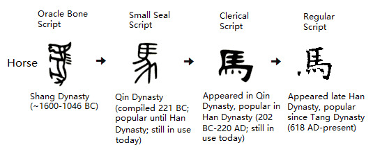
Second is the evolution of written Chinese. Usually when this is taught, instructors use examples of how certain characters evolved over time, for example one might encounter a linear diagram like this in Chinese class:
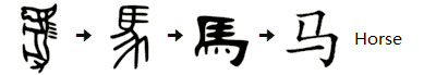
(Original picture from Mandarinpedia)
However, this diagram only gives a very general idea of how characters evolved from more picture-like logograms to the more abstract symbols we call characters today, and does not reflect the complexity of this evolution at all. To get into these details we will need to talk about Chinese calligraphy. In terms of the evolution of written Chinese, Chinese calligraphy--all those scripts like oracle bone script (甲骨文), bronze/Jinwen script (金文), Seal/Zhuan script (篆书/篆書), Clerical/Li script (隶书/隸書), Regular/Kai script (楷书/楷書), etc--they aren’t just calligraphy fonts, but actually change the way characters are written, and are representative of the commonly used forms of written Chinese at different points in Chinese history, as in the appearance of a certain script on a historical artifact can actually be used to estimate how old the artifact is. Below is a (very) rough timeline of when each script appeared and when they are most popular:
Oracle bone script/Jiaguwen (甲骨文): Shang dynasty (~1600 BC-1046 BC)
Bronze/Jinwen script (金文; includes Large Seal script/大篆): Western Zhou dynasty (~1046 BC-771 BC)
Seal/Zhuan script (篆书/篆書; sometimes called Small Seal script/小篆 or Qin script/秦篆): compiled in Qin dynasty by chancellor Li Si/李斯 around 221 BC, was the official script in Qin dynasty (221 BC-207 AD); popularity went down after Qin dynasty but was still in use for ceremonial purposes like official seals (the archaic meaning of 篆 is “official seal”, hence the English name); still in use today in very specific areas like seal stamps, calligraphy, logos, and art.
Clerical/Li script (隶书/隸書): appeared in Qin dynasty, became the main script used in Han dynasty (202 BC-220 AD); popularity went down after Han dynasty but was still in use; still in use today in specific areas like calligraphy, inscriptions/signatures on traditional Chinese paintings, logos, and other art.
Regular/Kai script (楷书/楷書): appeared in late Han dynasty, became the main script used in Tang dynasty and has been popular ever since (618 AD-present).
(Note: there are other calligraphy scripts like Semi-Cursive script/行书/行書 and Cursive script/草书/草書 that were never mainstream yet were also significant, especially in the case of modern Simplified Chinese, but I will mention them later so this won’t become too confusing)
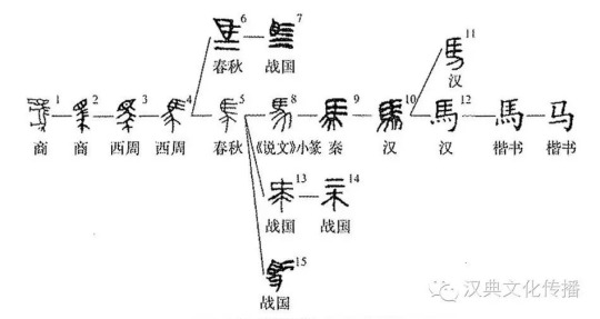
So if we plug the information from the very rough timeline above into the linear diagram, it becomes this:
But wait! There’s even more! Because there is a thing called variant Chinese characters/异体字/異體字, which basically means that there have been multiple ways in which a character can be written (“one character, many forms”/一字多形), and these can come about as a result of homophones, personal preference of historically significant people, historical trends, mistakes in the past that stuck around, or the result of stylized scripts like Cursive script/草书/草書, which simplifies and connects strokes in a liberal manner. The reason Cursive script is important here is because of the logographic nature of written Chinese, meaning the simplifying or connecting of strokes actually changes how the character is written. Because of this, 马 and 馬 were forms that have already existed before modern Simplified and modern Traditional were compiled. A diagram that takes variations and evolution into account should look something like this:
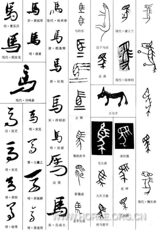
And since the above diagram did not take Cursive script into account, here’s another picture of a myriad of scripts/fonts (not in chronological order) that includes 馬 in Cursive script (mostly on bottom left):
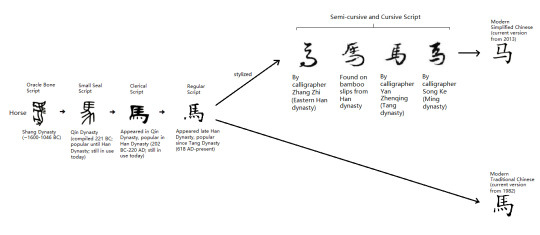
Now you may have an idea of where modern Simplified and Traditional Chinese came from: they are both compiled from existing variants. Since both modern Simplified and modern Traditional are supposed to be standardizations of written Chinese, they each set a single variant for each character as the “standard”. Modern Traditional Chinese kept the more historically mainstream 馬, and modern Simplified Chinese substituted it with the simpler variant 马. Taking all of this into account but still keeping it concise for our topic here, our linear diagram from the beginning should be modified to look like this:
And that’s just an example of a single character. This evolution diagram can differ depending on the character too, due to there being other rules for simplifying characters. This is why standardizing written Chinese is an immense amount of work, but once standardized, the written language will be streamlined and much easier to use in communication.
Finally, we are ready to clear some misconceptions.
---------------------------------------------------
About Common Misconceptions Regarding Modern Simplified Chinese:
“Simplified Chinese replaced all Traditional Chinese characters”. Untrue. Modern Simplified Chinese only standardized 2274 of the most used Chinese characters and 14 radicals with simpler variants. That’s really all there is to it. For reference there are a total of about 60,000 Chinese characters, and about 3,500 of these are deemed to be often-used characters; so only ~3.7% of all Chinese characters and ~65% of often-used Chinese characters are simplified in modern Simplified Chinese. Play around with any online tool that can switch between modern Simplified and modern Traditional, and you will find that many characters stayed the same.
“Simplified Chinese is the opposite of Traditional Chinese”. Untrue. Modern Simplified Chinese is just a simplified and standardized system of written Chinese. Modern Simplified Chinese and modern Traditional Chinese are not “opposites” of each other at all, just different standardized systems serving different purposes. Modern Simplified was compiled with ease of use in mind, since Traditional characters can be time-consuming to write, for example imagine writing 聲 (sound) when you can just write 声 instead. Also back when Simplified was being introduced to the public, a huge part of the population was illiterate, especially farmers, poor people, and women, so Simplified Chinese was a great way to quickly educate them on reading and writing, and to improve efficiency in all aspects of life. Knowing how to read and write is key to education, and education is a must if people's lives were to be improved at all.
“Simplified Chinese is Mandarin”. Untrue. Mandarin is a spoken dialect that came from Beijing dialect, and both modern Simplified and modern Traditional Chinese are modern standardized systems of written Chinese. One concerns the written language and the other concerns a spoken dialect.
"Simplified Chinese was invented by the Communist Party". Untrue. As mentioned before, most characters used in modern Simplified Chinese are already present in ancient texts, artifacts, and inscriptions as variants. Apparently the only character simplified by PRC was 簾 (blinds/curtain), which became 帘 in modern Simplified Chinese. History wise, Republic of China was the first to start compiling Simplified Chinese in 1935 and introducing it to the public, but this was called off after 4 months. PRC modified and built on the original plan, and introduced it to the public again starting from 1956.
"Simplified Chinese is to Traditional Chinese as Newspeak is to English in 1984". Completely untrue. Modern Simplified Chinese is just a simplified way to write commonly used Chinese characters and does not alter the meaning of the characters. There are some Traditional characters that are combined as one simplified character in modern Simplified, but the meanings are not lost or altered. For example, 發 fā (development) and 髪 fà (hair) are combined as 发 in modern Simplified, resulting in 发 having 2 different pronunciations (both fā and fà), and each of these pronunciations carrying their original meaning. The meaning of neither 發 nor 髪 was lost, 发 will just have a longer dictionary entry.
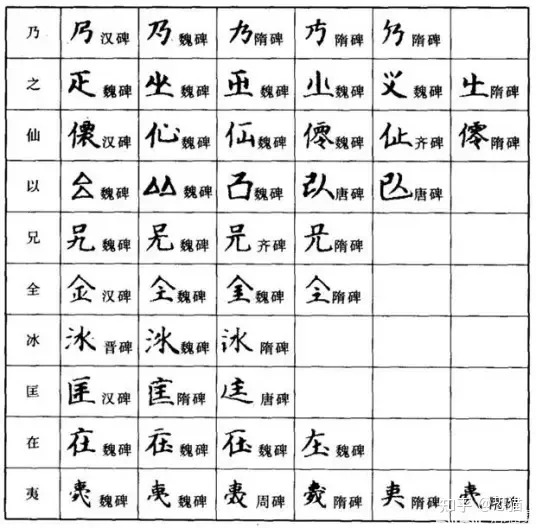
"Simplified Chinese is a huge change from Traditional Chinese". Only partly true in that it is a change, but it is a change justified by the evolution of written Chinese throughout history. The origin of most modern Simplified Chinese characters come straight from history itself, since many characters had alternative ways in which they were written (sometimes for convenience), for example these characters below. Each row contains different forms of a single character (smaller characters indicate what time period these variants are from; ex: 汉碑 means the variant is from a Han dynasty inscription).
In reality, written Chinese has always been standardizing itself. Less-used variants become forgotten over time, sometimes only rediscovered through archaeology. Besides, effective written communication does partly rely on standardization of the written language (imagine everyone writing in the various variants...how horrible would that be?). Modern Simplified just took this one step farther and made some characters easier to write.
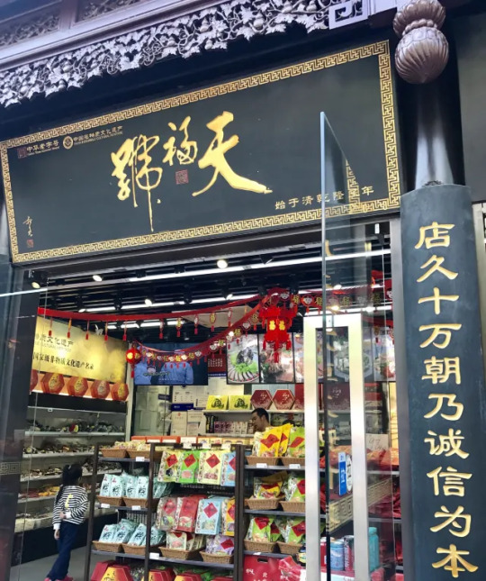
“Traditional Chinese is no longer used in Mainland China”. Untrue. Modern Simplified is the commonly used form in Mainland China, but Traditional is still used in a variety of places, such as on store signs/brand logos, particularly for stores/brand that are old. For example the old Beijing brand 天福号 below (est. 1738). On their logo, 天福号 is written as 天福號 from right to left, which is the traditional way of writing horizontally.
Traditional Chinese is also used in the logos for many universities in China:

Another way in which Traditional Chinese is commonly used in mainland China are personal seal stamps. Often times when people carve seal stamps for personal use (for example showing ownership on artwork they created or collected), they would put their name/courtesy name/nickname on the seal stamps in Zhuan/篆 calligraphy font, and Zhuan font use Traditional Chinese. Of course, the ways in which Traditional Chinese is still used in mainland China isn’t restricted to these two examples here. There are other places where Traditional Chinese is still used, such as traditional paintings/国画, calligraphy/书法, and many many more.
“People who grew up reading Simplified Chinese cannot read Traditional Chinese”. Depends on who you are asking. I grew up learning only modern Simplified, and I can read Traditional/modern Traditional Chinese just fine without having to actually learn it from anyone. Most people who grew up with Simplified Chinese should be able to read at least some Traditional without help. There are some people who say they can’t read Traditional without taking the time to learn it, but I doubt they’ve really tried, to be very honest.
---------------------------------------------------
And that’s it for the misconceptions!
My personal philosophy regarding modern Simplified Chinese and modern Traditional Chinese can be summed up as 识繁写简, or basically “know how to read Traditional and know how to write Simplified”. In a way, knowing how to read Traditional is a bit like knowing how to read cursive: a lot of history could be lost if we completely stopped using/learning about Traditional Chinese, but to meet the fast pace that modern life demands, I think modern Simplified Chinese is the more convenient choice for writing for day-to-day purposes. Since quite a few posts on this blog concern history, you will find that I usually use both Traditional Chinese and Simplified Chinese for historical things, since modern Traditional Chinese is closest to what people used in the past, and modern Simplified Chinese is more often used now. If it appears that I didn’t put modern Simplified and modern Traditional side by side, that usually means either the characters stayed the same and there’s no need for me to type the same thing out again, or the topic does not call for both to be shown.
Finally, the fun part. Here’s a Seal/Zhuan script calligraphy work by Mi Fu/米芾 (1051-1107):
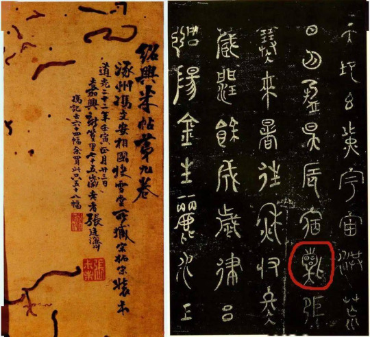
Does something look familiar there?
#simplified chinese#chinese language#language#written language#traditional chinese#chinese calligraphy#chinese history#random stuff#what is simplified chinese
990 notes
·
View notes
Text
I know the fandom loves throwing ideas around for a hypothetical adaptation, so why not chime in.
I think most of us agree that an animated series would be better than the dreaded life-action adaptation. Regardless of format, any adaptation would have to somehow preserve the peculiarities, the absolute whiplash, and way the narration shapes the narrative. In my opinion, an animated series could do this quite well.
We start off with Gideon the Ninth. It's shown in heavily stylized 3d animation (think, at least Arcane-style), with strong contrasts in the colors. The Ninth house is dark and desaturated, the lights in the eyes of animated skeletons and Gideon's hair positively burn among the dreary surroundings. Then, getting to the First, the world is vibrant and bright, lots of elaborate light refractions in the broken windows of Canaan house.
Characters are accompanied not only by small, individual musical themes, but also by visual clues. Each house might have distinct little particles and effects that appear in scenes in which the respective characters act. They might synergize in scenes where characters cooperate or contrast in scenes in which they fight. (example: the Niners are always accompanied by shadows, ink-blots staining the scenery around them. The Third are too graceful to be real, all of their animations use exaggerated smear-frames in overly grandiose flourishes. When Naberius fights Gideon, his strikes stir the shadows around Gideon, cleaving bright rifts into the inkstained dark.)
The story is told as we know it, without reordering or large ommissions. One thing we see not nearly often enough in modern television is actual narration in the background. We don't need it for all of the visuals and happenings, but so much of gtn profits from Gideon's thoughts and feelings.
A few scenes look differently though. When Gideon allows Harrow to take over her vision, the animation style changes. It gets a bit more abstract, the surroundings are textured like oil paintings, and Gideon herself has trails of smoke and ink following her movements. This is how they see the world together, and it is reflected again at the very end of the first book, when Harrow ascends. Except this time there's no borrowing, it's something deeper. The world is painted, more abstractly this time, and the characters appear almost like paper cuts.
And then the fun begins. We leave gtn and start htn. There is no more Gideon in our narrative, and yet there is her narration. As in the first series we retain parts of the narration, and it is her voice - mostly. Now, this is a source of great confusion in the book, right? The series would have to make it explicit that it is her voice, but it can have fun with it nevertheless. Some words are garbled, overlapping, distorted. Sometimes, Harrow's voice seamlessly takes over the narration, drifting in and continuing, while still using Gideon's pronunciation and vocal flow.
The visuals, on the other hand - now, that's an entirely different thing. At this point we know what the world looks like when Gideon sees it and what it looks like when they see it together. htn gives us two exciting new variations: 'Harrow with very little Gideon' for the Mithraeum story, and 'Harrow entirely without Gideon' for the river bubble. In the main, physical-world story we retain broad strokes of thick oil paint for the world around Harrow. The characters are too clean on a messy background, with some of the paint steadily bleeding into their shapes. The paint seems almost like it is an active participant in the narrative, crawling across inconvenient truths to blot them out, staining everyone but keeping it's distant from John, who therefore remains clearer than clear, shiny and bright, squeaky clean and lemon scented. But then there's the river bubble, and we get full Harrow, with a teeny bit of Wake. The scenery around the characters is vague and misty, swathes of color arrange into a distorted background like ink being poured into water. The entire scenery bleeds color and light into the surroundings of dark, barely saturated characters. It breaks at the seams when the uncomfortably realistic fleshy pipes wind through the walls, something too concrete for a tearstained world.
Towards the final act, we see a few changes: Abigail summons Nonius, and the shape language changes. Everything's still illustrated the way it was before, but the stark, desaturated characters in his proximity stop being mere dark blots in this scenery, and instead become almost comic-like. Their strikes and attacks are supported by respective action lines, their poses and moves adapt to the newly imposed genre conventions. Meanwhile, on the Mithraeum, Gideon is keeping the fires burning. We're almost back to the way we used to see the world in the beginning, Gideon's stark contrast and smooth environments. But there's the ink bleeding into the scenery from dark corners and bright red puddles, there's enough of Harrow here to stain the world.
And, well. We get to Nona. And Nona's world fundamentally isn't like the one the other's see. Nona's world is mismatched and chaotic and charmingly odd. Most of it is claymation, interspersed with some other materials. Cam's swords are real metal, the dust of New Rho fills the air, and most of the food is probably actual food that looks as dreadfully out of place in this world as it feels in Nona's mouth. There remains a touch of Harrow, expressive movements are exaggerated with her flowing ink, action lines like calligraphy. Of course, there are also the John chapters. Here, we get to have proper fun with the visuals. Let's recap: it's Harrow getting to experience a memory of Alecto, narrated by John. We already know Harrow's flowing colors that stain the backgrounds, and we get mixed medium animation with it: articulated plastic dolls, of course, with some natural materials (moss, wood, some metal scraps) as set dressing.
I'm still not entirely settled on the Nona Epilogue. As long as Alecto isn't out I'm not sure whether I want to keep in line with something from the next book, or whether it's its own thing. Until we know more: illuminated manuscript.
---
Well, that was more than I originally intended to write, but I've had those thoughts in my head basically since I've started the books, and they needed an outlet. There's plenty more ideas where those came from, please please talk to me. 'The Unwanted Guest' as an actual play, anyone? (When Cam makes contact with Babs, and the fight initiates, the camera zooms out from the now frozen claymation, revealing it's situated on a table in the front row of a theatre hall BTW)
#the locked tomb#tlt#Gideon the Ninth spoilers#Harrow the Ninth spoilers#Nona the Ninth spoilers#I could keep talking for hours. Anyone want a full concept for the soundtrack?#just tell me
74 notes
·
View notes
Text
Blackthorn Modern Day Teaser | K.NJ
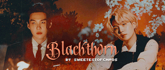
summary - Welcome to Kim's Flowers & Apothecary! Did you need a bouquet or spell today?
pairings - namjoon x jungkook
warnings - sol, mentions of a past life, crying, hybird familiar!jungkook, warlock!namjoon
wc - .8K
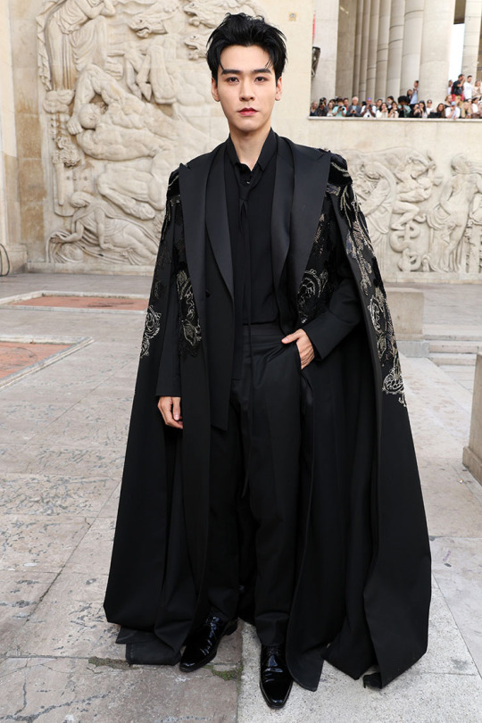
a/n: Someone (@kokosg) wanted to chose violence yesterday, so I had to retaliate. Here's a little sneak peak of Blackthorn!Namjoon during the modern era. Also, Namjoon's outfit is shared at the bottom, if you would like to see what mans is working with now.
The modern day version of Blackthorn hasn't been started yet. I am still working on the Min dynasty half of Blackthorn. If you haven't read it, please do! Yoongi is a prince and Agust is his dragon spirit!
taglist: @thickemadame @loisje123
Series Masterlist | Masterlist

The sign out front read Kim’s Flowers & Apothecary. The store itself was right out of a novel, a building that stood out on the street. The building was massive, built in an earlier time that had seen better days. The stone was darkened by rain water and time while the wooden door jam, windows and pillars were a deep oak with details painted in gold. It was a building that normal folk stirred clear of while those who still dabbled in magic eagerly seeked out. Plants and bottles of all shapes and sizes took up space in the large glass windows, to quip the interests of those who passed by.
Through the doorway, the room gave way to vine covered walls and an open glass ceiling that turned the inside to a grand solarium of sorts. It was magical with floating lanterns, inlaid bookshelves stacked to capacity with long forgotten text and scrolls; and cabinets filled with glass jars of Atropa belladonna, Verbena officinalis and more. The tiled floors were a lighter color to offset the darkness from the plants and blurred the reflection from the lanterns, creating a subtle glow from overhead and down below.
There is a hallway decorated in cream and green vintage wallpaper and wainscoted walls that leads to the garden; a large outdoor space with a greenhouse attached farther down the yard, past the miniature maze that was built for fun. Within the green hedges, Namjoon keeps a relic from a past life at the center of the maze. Surrounded by a magic halo, a large blackthorn tree sways gently in the breeze. Its trunk is wide and strong, showing its scares of the past to anyone who will look. A story that Namjoon will always recall whenever it rains.
Back inside a large oak cashwrap separates guests from accessing the more lethal ingredients that are kept behind an emerald velvet curtain in the backroom. A spiral staircase hidden in the back room that led to the upstairs where Namjoon and his partner resided after a long day's work. The homely apartment above is much more updated than down below.
The floor is tiled all throughout in soft grays, beiges and creams while the wooden furniture throughout is a deep purple with hints of lighter colors. The kitchen is large, the counter cabinets all a matching purple with lighter wooden butcher block countertops. There are floating shelves built into the walls, cluttered with plants and nick nacks from all throughout time.
The rest of the home is built much the same, softer tones brighten up the darkness of the purple and pull a renewed warmth into the atmosphere. The bedroom is the only difference, the walls were hand painted by Namjoon’s lover, Jeon Jungkook. Different shades of blue and pinks come together in a colorful and serene abstract mosaic that brightens the whole room on an accent wall. That same wall is where the bed is pushed up against with thick purple and blue bedding. Gold accents are littered through the room and bed, creating a galaxy like ambience.
Down stairs, Namjoon waters the flowers. A thick vine hovering nearby in case the warlock drops the watering can. Namjoon has changed through the years and yet stayed the same. His blue hair is now a striking blond and cut short, tapered close to his scalp on the sides and long around the top of his head. His skin is still dusted in a warm caramel from his time in the sun and his body has grown stronger, larger. The hanfu and hanbok of the Joseon dynasty have been updated to match the modern times, but are worn only when Namjoon is meeting with friends of his past. Namjoon now wears colorful capes, velvet robes, double breasted overcoats that have elaborate embroidery on them with simple slacks that match whatever color he wears.
Today he wears an all black double breasted suit and a black button up with a silk tie that he didn’t bother to fasten fully looped loosely around his neck. He has somewhere to be in an hour, so his long black overcoat is hanging on the hook by the garden door, with black and gold thread embroidery that swirls to create an illusion of a tiger and flowers. Namjoon speaks softly to the plants, his black shoes moving carefully as avoids stepping on any little critters that have made a home of his garden.
The door to the garden is ripped open and Namjoon jumps, his hand losing on the watercan as a green and white blur rushes at him. The vine is quick to catch the falling can but not fast enough to save Namjoon from tumbling a few steps backwards.
“Kook? What’s wrong, love?”
Namjoon’s arms wrap around his lover’s waist without a second thought, moving without his mind even telling them to. In his arms, with his face smashed into Namjoon’s face, Jungkook cries. His tears soak through the fabric of Namjoon’s shirt, the blond of his hair, tickling under Namjoon’s cheek as he rocks from side to side.
“H-Hyung!” Jungkook hiccups as he pulls his face away from Namjoon’s chest, his green triangle ears flicker around on his head as he stares at Namjoon with big, teary doe eyes. “H-Hyung….s-she’s here! She’s here!!”

22 notes
·
View notes
Note
What are your thoughts on the Schiaparelli tech baby, specifically in regards to any sort of societal commentary but also in terms of the rest of the collection?
Collection description from Daniel Roseberry
If there's one thing Schiaparelli is good at, it's having a weird showstopper that everyone will be talking about. It always feels a little gimmicky but clearly it works and keeps fashion week interesting, so I'm not complaining. Also, Daniel Roseberry's dedication to fashion + couture is always inspiring. You can read an article here where he complains about people feeding his work through AI, being inspired by other couture icons, and honoring a member of the atelier who's retring.
I think they accomplished the classic Schiaparelli goal of putting two unlikely things together and making them work, but to me this collection kind of felt like it had one too many design concepts going on. It had extraterrestrial, technology, texas cowboy, and then all the iconic Schiaparelli design elements. The outfits on their own were great and cohesive, but it kind of made the show feel like it was all over the place.
Collection description from Daniel Roseberry:
In 1877, Elsa Schiaparelli’s uncle Giovanni Schiaparelli, the director of the Brera Observatory in Milan, discovered something new: a series of channels, an area as large as the Grand Canyon, scoring the surface of Mars. He also coined the term “Martian”, and inadvertently began our modern fascination with creatures from out there, a fascination that continues to this day.
So it makes sense that space has always been an informal code of the Maison. Elsa was, famously, preoccupied with astrology, and why not? Looking to the stars was clearly a family pastime. This collection is an homage to that obsession, as well as a study in contradictions — of legacy and the avant-garde, of the beautiful and the provocative, of the earthbound and the heaven-sent.
But as art (and nature) teaches us again and again, the things and ideas that seem diametrically opposed to each other can also combine to make startling chimeras, objects composed of familiar parts that, when united, create something unexpected and new It is, in fact, one of the Maison’s guiding philosophies: Elsa was committed to unlikely marriages win her own design, and the looks in this collection honor that tradition, combining old world techniques (such as over-embroidered guipure laces, velvet and lace appliqués, and hand cut and embroidered chenille fringe) with new world shapes, patterns, and references (such as a motherboard-and-strasse microchip dress encrusted with pre-2007 technological artifacts — now, the technology I grew up with is so antiquated that it’s almost as difficult to source as certain vintage fabrics and embellishments).
They also unite her personal references with my own: you’ll see abstracted references to iconographies of my home state of Texas throughout, from the bandana, here remade in hand-painted paillettes; to the cowboy boot, reconceived as a thigh-high fantasy bristling with buckles; to the iconic horse braid dressage knots redone as silk satin spikes and smothering a camel suede bomber jacket and a white denim corset suit. Elsa was famous for her codes — the keyhole, the measuring tape, anatomical body parts — and we’ve embedded them like Easter eggs in jewelry, shoes, clutches, and embroidery, a secret message from us to the woman who wears them. The result are a series of profiles both familiar and not — part human, part something else. And, therefore, totally Schiaparelli.
24 notes
·
View notes
Text
A Thing Of Vikings Chapter 79: On The Threshold
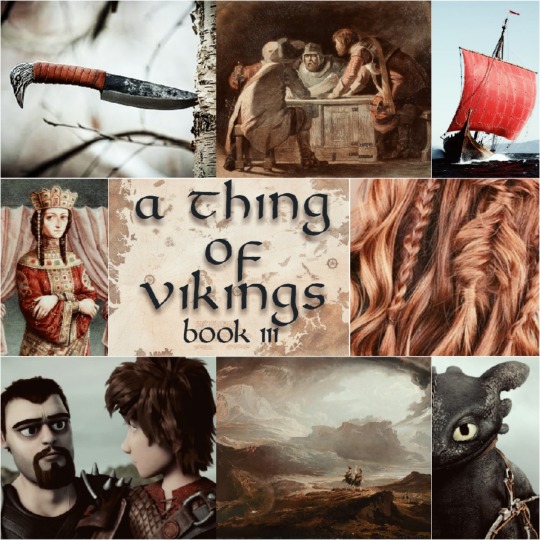
Chapter 79: On The Threshold
One of the great paradoxes that comes from the study of history is that historians are forced to simultaneously speak in both concrete and abstract terms. We say 'the society decided to change' at the same time as we speak of the leaders making specific decisions. But the society did not decide to change. The Hooligans of Berk, for example, did not, as some abstract whole, decide to adopt dragons and grow to become the core of a new sovereign nation over the next five years. Nor did then-Chief Stoick's decision to allow for the adoption of dragons force this decision. No. Individuals within that society decided to change, in how they acted or how they viewed the world, while others did not. And yet we are forced to speak in the aggregate, the cumulative, taking the broad trend of the social unit and applying it to all members inside. We can recognize the individual dissenters when their dissent from the mean is sufficient to stand out, and yet this very recognition paints a degree of uniformity on the rest that is both unrealistic and unearned.
Furthermore, referring to the aggregate of the society in the abstract creates a false impression of their numbers, simply due to the common fallacies of equivocation and false equivalence (i.e. we call them the same thing, ergo we see them as being roughly the same). We project ourselves and our own modern expectations and experiences with current political entities onto the past, despite those historical units being vastly smaller, simpler, and less developed). We speak of the Byzantine Empire and the North Sea Empire as two simple units. Due to the difficulties that many have with comprehending large numbers and larger scales, the typical comprehension of the concept of "Empire" lends itself to a false equivalence, that one Empire is much like another Empire in size, population, economy, culture and so forth, but that mental abstraction again does a disservice in scale. To illustrate, consider that, in AD 1040, there were more people occupying Constantinople and the Thracian farmland immediately outside the city's famous walls than there were in all of the island of Eire in that same year. Meanwhile, Sweden, Norway and Denmark together had less than a million people combined, while the city of Baghdad alone had over a million people sheltering behind its walls. And again, in making such comparisons, we fall prey to the lure of the abstract, of referencing the masses of otherwise anonymous people as conglomerate wholes.
But at the same time, such abstraction is necessary; we do not have the data to be able to conclusively say that, out of the approximately 300,000 Albans who lived under King Mac Bethad's rule, 68,821 agreed with his stated desire for continued independence from Berk's influence, while another 121,749 would have been happier if he had made overtures of integration prior to his fatal duel with Astrid clan Haddock. Such precision is not available to us and we are thus forced to speak in the abstract and the aggregate, erasing the heterogeneous beliefs and attitudes of entire generations—save those individuals who had the foresight to record their thoughts, or the impact that inspired others to record them.
—To Label The Stars: The Cultural Impact Of Names, Kyoto University Press, Ltd.
AO3 Chapter Link
~~~
My Original Fiction | Original Fiction Patreon
16 notes
·
View notes
Text
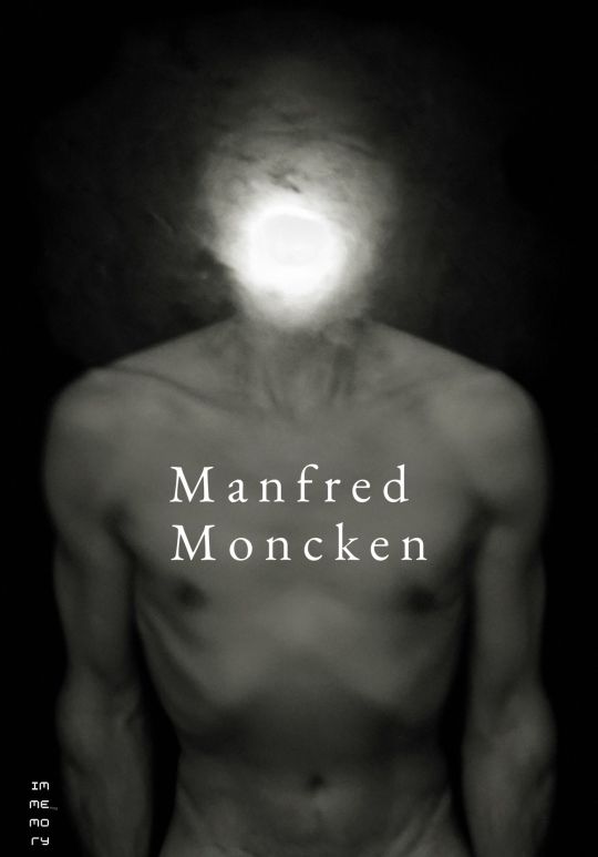
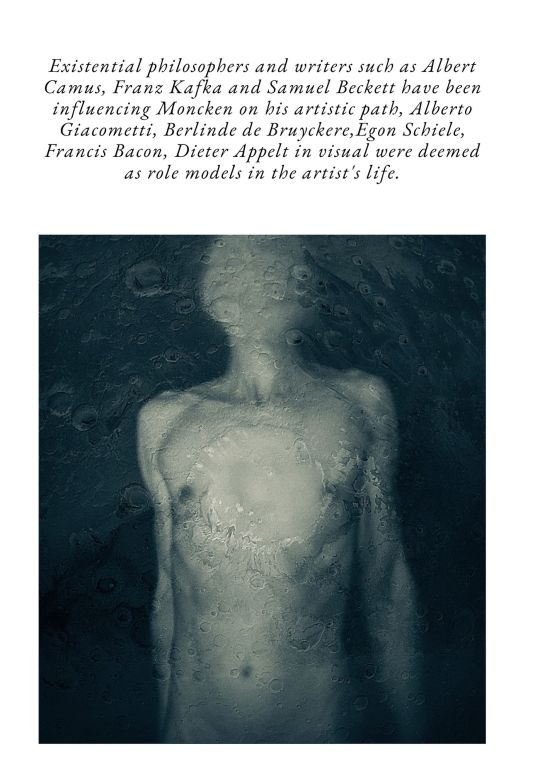
Manfred Moncken was born in Bamberg/Bavaria, studied sculpture at Dresden University of Fine Arts, currently lives and works in Dresden. After graduation from the university Moncken
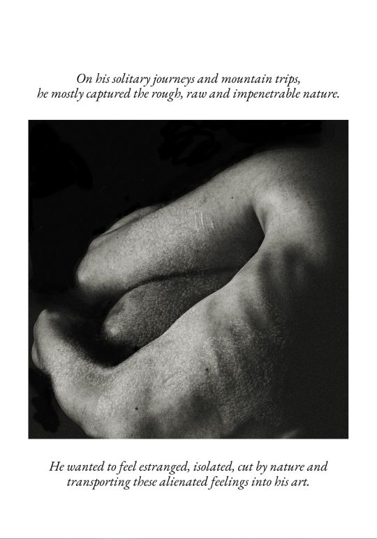
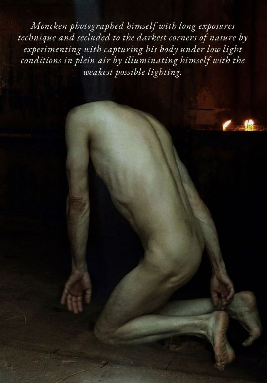
concentrated more on photography. On his solitary journeys and mountain trips, he mostly captured the rough, raw and impenetrable nature. He wanted to feel estranged, isolated, cut by nature and transporting these alienated feelings into his art. Moncken photographed himself with long exposures technique and secluded to the darkest corners of nature by experimenting with capturing his body under low light conditions in plein air by
illuminating himself with the weakest possible lighting. Moncken wanted to express the flickering shine of the bodily presence, the momentary transitory existence of human life.
Existential philosophers and writers such as Albert Camus, Franz Kafka and Samuel Beckett have been influencing Moncken on his artistic path, Alberto Giacometti, Berlinde de
Bruyckere,Egon Schiele, Francis Bacon, Dieter Appelt in visual were deemed as role models in the artist's life.
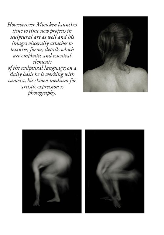
Howeverever Moncken launches time to time new projects in sculptural art as well and his images viscerally attaches to textures, forms, details which are emphatic and essential elements
of the sculptural language; on a daily basis he is working with camera, his chosen medium for artistic expression is photography.
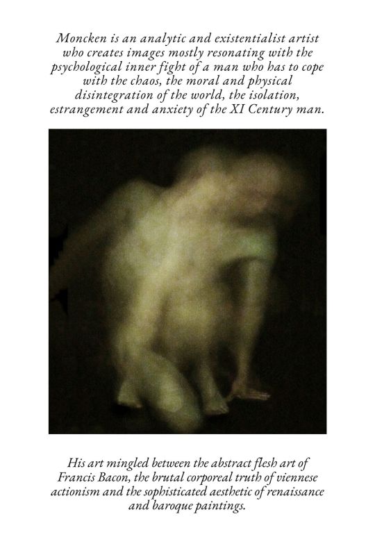
Moncken is an analytic and existentialist artist who creates images mostly resonating with the psychological inner fight of a man who has to cope with the chaos, the moral and physical
disintegration of the world, the isolation, estrangement and anxiety of the XI Century man. His art mingled between the abstract flesh art of Francis Bacon, the brutal corporeal truth of
viennese actionism and the sophisticated aesthetic of renaissance and baroque paintings.
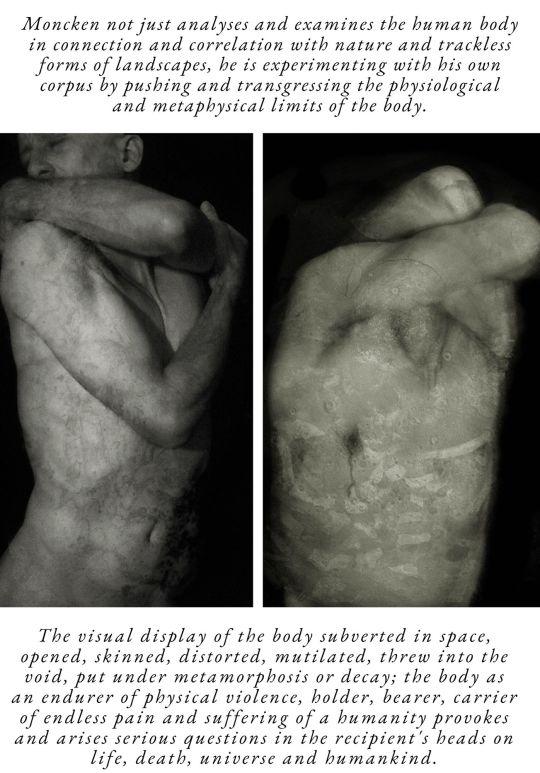
Moncken not just analyses and examines the human body in connection and correlation with nature and trackless forms of landscapes, he is experimenting with his own corpus by pushing
and transgressing the physiological and metaphysical limits of the body.The visual display of the body subverted in space, opened, skinned, distorted, mutilated, threw into the void, put under
metamorphosis or decay; the body as an endurer of physical violence, holder, bearer, carrier of endless pain and suffering of a humanity provokes and arises serious questions in the
recipient's heads on life, death, universe and humankind.
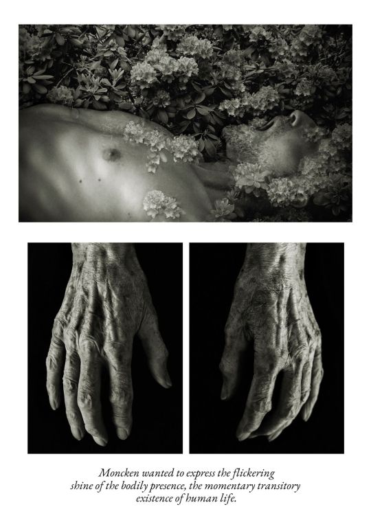
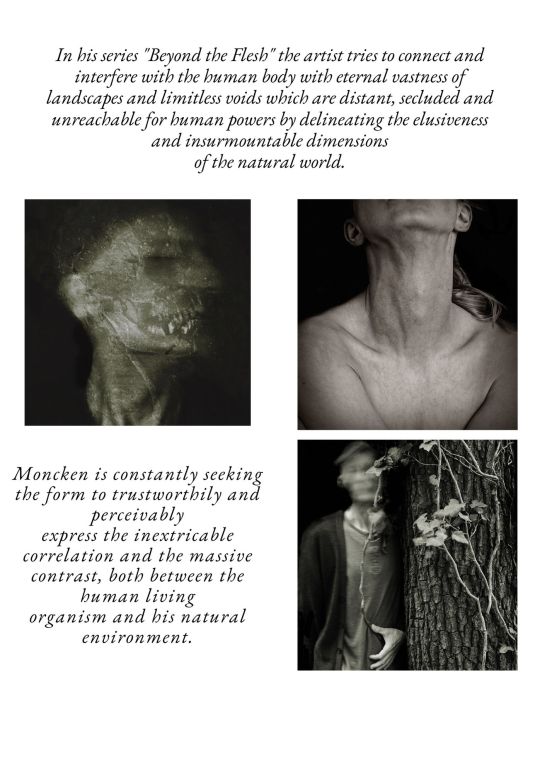
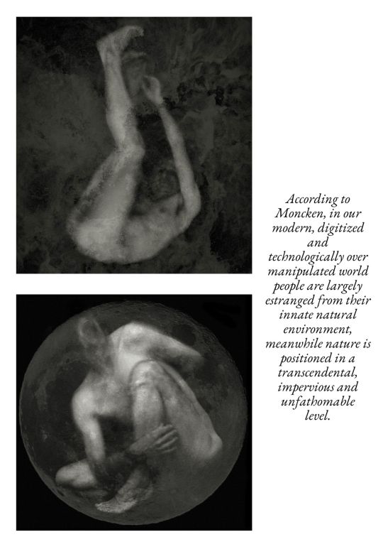
In his series "Beyond the Flesh" the artist tries to connect and interfere with the human body with eternal vastness of landscapes and limitless voids which are distant, secluded and unreachable for human powers by delineating the elusiveness and insurmountable dimensions of the natural world. Moncken is constantly seeking the form to trustworthily and perceivable express the inextricable correlation and the massive contrast, both between the human living organism and his natural environment. According to Moncken, in our modern, digitized and technologically over manipulated world people are largely estranged from their innate naturalenvironment, meanwhile nature is positioned in a transcendental, impervious and unfathomable level. His artistic aim is to endlessly searching the possible connecting thread, the visual interface between the two poles: body and nature, nature and body, and depicting this complex, sometimes paradoxical interrelation by pushing both, the boundaries of the human body and the limits of tactible, cognizable nature by extruding the interpretation the furthest possible with aesthetic and visual expression.
He would like to shed the light on the vulnerability and ephemeral existence of humanity, the
transient and terminate nature of life.
text by Katalin Pusztaszeri
27 notes
·
View notes
Last Seen Blogs

qloadinfo
Без названия
klausper
Klausper

toytoybox
toybox
theteacherlesstrainee
Solo Student Of The Three Treasures