#l logo
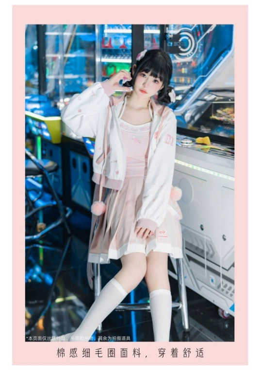
Photo

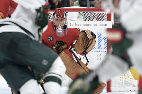

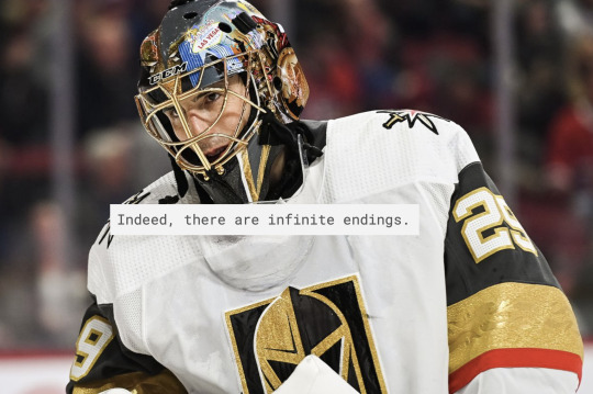

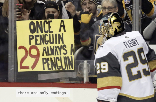
“As I turned over the last page, a wave of sorrow enveloped me. Where had they all gone, these people who had seemed so real?”
― Louise Glück, Faithful and Virtuous Night
#I'm sorry I just miss him#hes still a penguin TO ME#marc andre fleury#pittsburgh penguins#minnesota wild#vegas golden knights#flower flower flower flower flower f l o w e r#hockey poetry posts#cw: racist logo
392 notes
·
View notes
Text

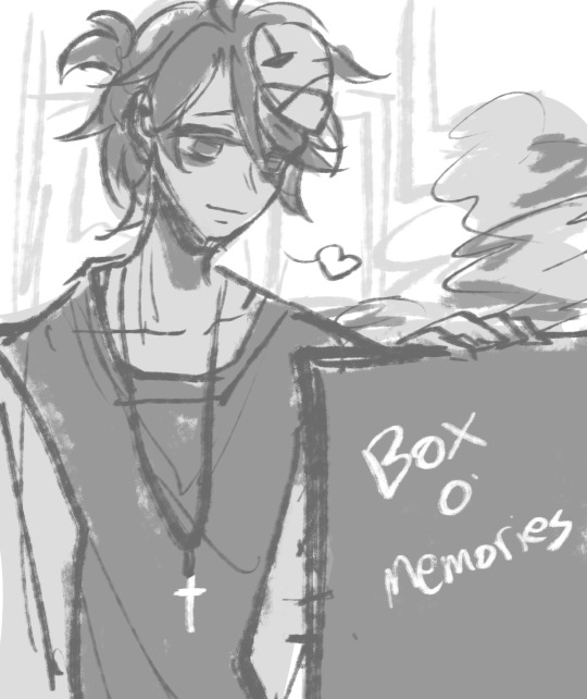
definitely not perfect but i made a quick little fittes poster while procrastinating on my paper
#l&co propaganda#lockwood and co#lockwood & co#l&co#this post brought to you by the archive channel of the cot3 server#we’ve been talking about propaganda the past few days#so we made some propaganda#i wish i’d made the fittes logo more square but it is what it is
346 notes
·
View notes
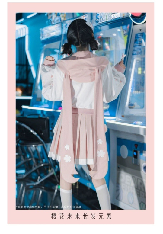
Photo


Yugyeom ✰︎ 뱀집 ep. 11
#yugyeom#kim yugyeom#got7#got7daily#got7edit#malegroupsnet#kpopco#dailybg#madstual#eritual#bf shaped:)#the second one... i l*ve him#this was almost 8 gifs but i got myself under control sjdkfdj#one thing about me is i WILL blur every single subtitle and logo and caption#ilygif#208-213#emigif
153 notes
·
View notes
Text


episode four mork face appreciation ✨
#my ride the series#my ride rewatch 2023#fluke pongsakorn#userpetri#rowan gifs#if i haven't yet made it clear enough what i'm coming to my ride for let me make it e x p l i c i t#this is my baby. im putting him in my pocket#i was trying to do simple colorings here but i did make mork purple in the first one because i literally cannot help myself#also the last one is cropped like that because The Logo Is In The Way#like. pleeeeeease go to the original look at his full expression it is Peak puppy eyes. i'm so sorry i had to hide them
73 notes
·
View notes
Text
it takes some time of knowing a character before i can truly understand on how to draw their eyes
#mob's rectangle eyes are a reference to the zeros of the mp logo#and reigens are kinda catty like a fox... at lease in more recent art#and teru.. ok hes just kinda the default but its very noncontroversial- which is how he looks in general...#except for that one time. and that other time.#and ritsus are sharp but rectangular and calculating and to match his brothers but without that hollow in the middle uknow???#anyways one time when i was still developing my artstyle i saw a post warning artists of same face syndrome or at least talking about it#and i was determined ever since. if too many characters have that L nose i start feeling guilty. even tho its the easiest to get along with#anyways i love character design
12 notes
·
View notes
Note
hihhiii!! amazing work on leo/need main story!!
but i would recommend just paragraph breaking it more to look more digestible! bc esp when i saw the huge blocks of text without pause for the tldr it still looks very intimidating and sometimes hard to read :'D
to separate between chapters more, in case paragraph breaks make that confusing, you can very quickly make your own image line breakers, anything as simple as opening the nearest art program and drawing one blue line will do!! ^-^
Thank you so much, anon! You're right, that text block was quite large. I've gone back and separated it into more manageable paragraphs.
I really like that line break idea!! I'll try making some fun ones when I get a chance, but in the meantime, I've changed the colors of the chapter sections to help them stand out more. Gives it a little variety, y'know? Hopefully that will help!
#asks#not a summary#thank you so so so so so much for this anon i really appreciate the feedback <3333#if the premise of this blog proves anything its that i never do things by halves#so i want to make some nice cute linebreaks :) thinking a meteor one for l/n and a clover-decorated one for mmj#spray paint for vbs and stars/balloons for wxs! and maybe the nightcord logo separating that cool cross they have!#my main contribution has always been fanart so i want to make it look cool :) (shameless self promo lol go check out @spaceyaceyart)
14 notes
·
View notes
Text
@hiyari8
#vocastuff#i kinda want the skirt more tbh#tho i wouldn't be surprised if it was overpriced#esp since it's the chinese side of the merch#the top is cute too#not sure what hte logo is on the skirt b/c pic is blurry#but surprised they didn't take the opportunity to make the white hem also have#some sakura petals/cherry blossom shapes like the parka does#( ifee l liek the twintails would end up getting caught on something or cut off in the wash or so)#(unless ur also willing to go outta your way to spend money on 'dry cleaning' as well XD)
6 notes
·
View notes
Text
i fucked up where gordon's gun hand is supposed to be in the last one. dont look at me
#'left/right is easy just look at your hands the one thats L is Left' FUCK entirely off whe you draw someone theyre usually mirroring you#i WILL NOT learn ive been trying my whole life#words from the monarch#maybe ill fix it. idc idc (<-cares a lot is is clenching my fists so hard theyre bleeding#edit i fixed it. flipped the drawing#and fixed benrey’s nametag and black mesa logo
16 notes
·
View notes
Photo
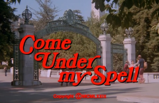
#Come under my spell#X X X#logo#a d u l t#70's#70s#1979#text#hypnotism#P O R N#Spell#libidinous#seduce women#book#hypnosis#hypnotic
162 notes
·
View notes
Text
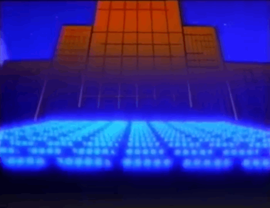
We at KPLY industries aspire to have a logo this ominous one day.
#animated gif#animated gifs#gif#gifs#old advertisements#old ads#retro#vhs#animation#animated#logos#80s#control#l#mind control#possibly#neon#it's probably something boring actually#sparkles
11 notes
·
View notes
Text
Hm....with the shit show that's happening on twitter it sure would be nice to come back on here again...
#I come back after the godawful logo on twt changed and see the layout's different on here too wtf#I feel l;ike I'm revisiting an abandoned treehouse filled with dusty sweet memories#I'm currently burned out like shit so it feels unreal coming on here remembered how much I use to draw...#The messages left by ppl are also unreal to read cuz of how sweet and supportive ppl are ;-;#xeiv babbles#How long has it been damn#I come on here every now and then and everytime it's still unreal#Tumblr era was baby first yr at University.....now I'm like (hopefully) last year....aha......#god i've been stuck at school for far too long#I hope all my followers (active or not--) are doing okay
18 notes
·
View notes
Text
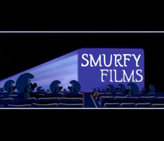
Smurfs variant of the Gracie Films logo. Image edit of the original Gracie Films logo.
The logo would basically be the same, but with Smurfs instead of people. Plus, I imagine it having a short electric piano and drums rendition of the 1980s Smurfs theme song at the end instead of its usual jingle.
The Smurfs (C) Peyo/IMPS/Lafig Belgium, S.A.
Gracie Films (C) James L. Brooks
#the smurfs#peyo#gracie films#variant#image edit#hanna barbera#logo#james l brooks#smurfs#logo variant#1981 series
12 notes
·
View notes
Note
Fav NFL or NBA logo
this might be a controversial onion but my fav nba logo... is the okc thunder one 😭 ... oh and my fav nfl logo is the dolphins !!!
#I AM WEAK TO COMPLIMENTARY COLORS OK IMPRISON ME 😭😭#they might not even be complimentary i got like a negative in the color theory tumblr test#LISTEN I L I K E THE BLUE OKC JERSEYS!!!!#and the white ones but specifically when they have the heart on them#some of my fav jerseys are the hornets and Vancouver grizzlies tho so i might just be weak to blue in general#but I DIGRESS!!!#other logos like pistons sixers nets raptors etc ARE nice#just a lil simple tho#like the spurs are clean but a lil too clean... that is how the spurs operated back then tho#the pop regime#heat hornets bulls bucks cavs etc like those with an animal or symbol are cool but more dif color would be nice#like complimentary to make them stand out more#but like the bulls cant rlly do that so i understand#the gsw is cool cus i like the gold/yellow on the blue but what okc has over it is the noncircle shape#so basically i like okc cus it's nice on the eyes but still stands out some (unique shape and colors#but still simple enough not to be too distracting#i like the mavs animal art but overall it looks a little much#as for football HELMETS tho i love the rams one#miami wouldve won that as well if the dolphin still had the little dolphin helmet but it doesnt#so now it will be concussed and die#thank u for asking!!!! this was cute <3!!! sorry for being wrong if u think i am except i never am <3#im buzzbeeutiful ted awesome jrues hips#ted tumbunity things
16 notes
·
View notes
Text
why are they removing the cool parts from cars :(
#cars#reject modernity embrace tradition#morden#i hate the whole sleek simplifed lool#*look#its like what they did to logos l#obviously morden cars are safer but why cant they be safe and cool#half of them so smooth and blocky they just look poorly rendered atp#metaverse looking motherfuckers
3 notes
·
View notes
Text
i need a lockwood and co logo or symbol or something
#mainly to doodle#or paint#or some other way keep forever#im willing to regress to middle school#where i wrote all my fandom stuff everywhere#just give me something#i drew a very bad rapier on my leg at work today#and a memory version of lockwoods ring#because i got bored and didnt have a logo to draw#lockwood and co#netflix lockwood and co#lockwood & co#l&co#logo#symbol#fandom
14 notes
·
View notes

Last Seen Blogs
makopoppingsauce
LET'S BE BEAUTIFUL

slavicswidow
THE RED DEATH.
tadashi-builds-stuff
of metaphor and mattonymy
pete05impreza
Pete