#j horace macfarland
Photo

suburban french
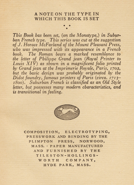
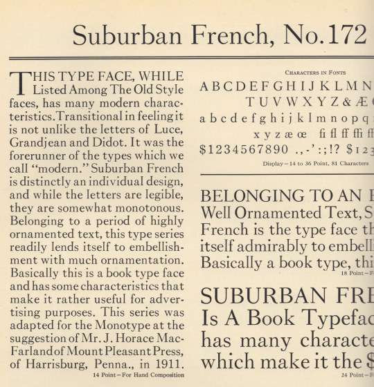
i recently lighted upon volume ii of a relatively scarce edition of Don Quixote—the 1926, knopf edition; & opening to the colophon [1st illustration] noticed the interesting choice of type: lanston monotype suburban french, no. 172 (what, one wonders, has it to do with the suburbs?). once we get past the editor’s first-line punctuation crisis—commas or parentheses, not both, better neither—we find a muddled history, with a howler: «Grand jean», who could mess that up? i reached for the lanston monotype master catalog [c.1930s] & found the source for part of the information [2nd illustration]—monotype, at least, set «Grandjean» correctly. this is the first mention i have encountered of j. horace macfarland & his mount pleasant press, & was surprised to discover the mount pleasant press was not a private, fine press, as i should first guess, but a trade press, printer of plant seed catalogs & treatises on horticulture [cf. www.hmdb.org/m.asp?m=6850]. monotype’s specimen tells us macfarland had suggested this recutting; the knopf editor further intimates macfarland had admired it in a french book—would be nice were we given the title!
«The Roman bears a marked resemblance to the letter of Phillipe Grand jean (Royal Printer to Louis XIV) as shown in a magnificent folio printed by Grand jean at the Imprimerie Royal, Paris, 1702,»
hmm… phillipe grandjean was the royal type cutter [graveur du roi], not the «Royal Printer»: the imprimeur du roi at the time was «Jean Anisson, printer of lyon, the first member of a new dynasty of directors of the Impremerie Royal» [james mosley, ‘The Romain Du Roi’: A Type made for the Royal Printing House of Louis XIV» in: Printing for Kingdom, Empire and Republic, the grolier club, new york, 2011, p44]. the «magnificent folio» of 1702 is entitled Médailles sur les principaux évènements du règne du Louis le Grand, & annison saw it through the press. as to «letter», it is the «romain du roi» [3rd illustration], which was property of the king & thus forbidden to copy; indeed, the first cuts were engraved by grandjean, & completed by his successors, jean alexandre & louis luce; but the designs issued from a committee appointed by the académie des sciences, chaired by jaques jaugeon. the «romain du roi» signalled the advent of modern typography: it was designed on a mathematical basis & employed a first attempt at standardised type bodies based upon a point system; aesthetically it was the spark of the transition toward the full modern cut [vide ‹canonical modern cut›]. [cf.: a.f. johnson, Type Designs, grafton & co., london, 1959, pp 56–59.] of the suburban french italic neither source makes mention.
«…but the basic design was probably originated by the Didot foundry, famous printers of Paris (circa. 1713–1800).»
the didot family constituted a dynasty with members practising variously in all the departments of book production, & several members operated foundries: i cannot, however, locate the didot cut alluded to by the knopf editor. a.f. johnson relates: «But that the types of the Imprimerie were in fact copied, we know from Pierre Cot’s Essai de Caractères d’Imprimerie, Paris, 1707…; the descriptions of the types shown are set in a roman which has all the characteristic features of the ‘romain du roi’. We also have the evidence of Pierre François Didot le jeune. In 1783 that printer was accused of imitating these types, and in his defence protested against the injustice of his being accused, whereas he was only the printer and several typefounders had for years shown designs like the ‘romains du roi’.» [ibid., p58].
3rd illustration: page from the Médailles [plate 17 in Printing for Kingdom, Empire and Republic, the grolier club, new york, 2011, p44].
#typography#romain du roi#suburban french#don quixote#j horace macfarland#mount pleasant press#alfred forbes johnson
0 notes
Last Seen Blogs

mayonniseman
Untitled

rainbowcold
(...18;21...)

hardpietoadlight-blog
Sem título

angszz
Angel

rottenwebs
Untitled