#italic
Text
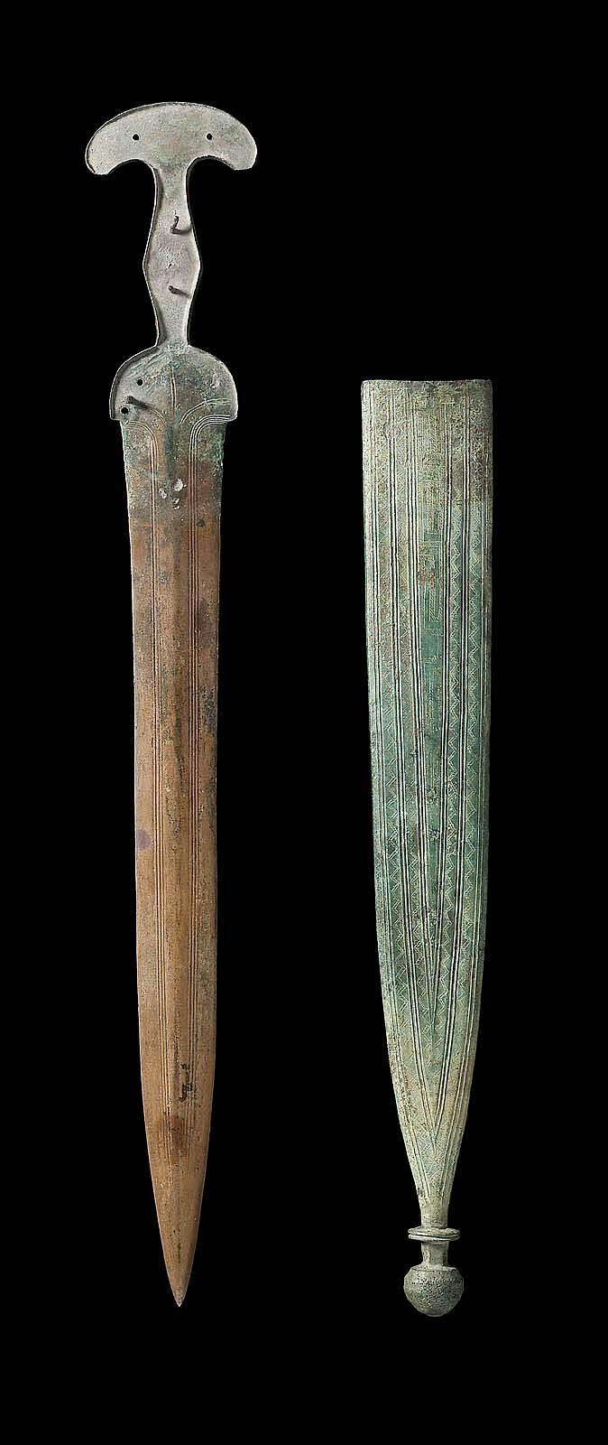
~ Short sword and sheath.
Culture: Italic or Syrian
Period: Geometric/Latial II
Date: 9th century B.C.
Place of origin: Italy, Lazio
Medium: Bronze
#ancient#ancient art#history#museum#archeology#ancient history#ancient weapons#short sword#sword#italic#syrian#bronze#9th century B.C.
679 notes
·
View notes
Text
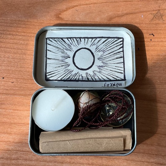
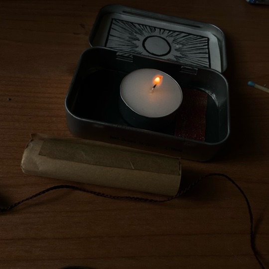

ἐσχάρα: altar for libations and sacrifices
I borrowed that concepts (from Homer) to assemble a portable altar to worship Apollo. A bound sunstone to build a temporary sacellum, a laurel leaf and a coin offer to remind of their Underworld aspect. The pastel and the sheet block to write down prayers to "burn" and dedicate towards the deity.
#apollo#eschara#chaotic academia#archaeology#hellenic#mythology#occult#magick#fire altar#ancient greek#greek mythology#hellenic deities#italic#sun#⚫☀️:post#portable altar#tin altar
14 notes
·
View notes
Text
HAH ITALIC AS FRSH THAT I DREW OVER THE SUMMER

24 notes
·
View notes
Text

Aspicilia malmeana (H. Magn.) Ozenda & Clauzade [ITALIC – The Information System on Italian Lichens, Version 7.0, Dept. of Biology, University of Trieste, Trieste]
Bibl.: Adolf Hugo Magnusson, Studies in Species of Lecanora. Mainly the Aspicilia Gibbosa Group, Kungliga Svenska Vetenskapsakademiens Handlingar, Vol. 17, No. 5, Almqvist & Wiksells Boktryckeri, Stockholm, 1939
#graphic design#botany#biology#chemistry#phytochemistry#illustration#lichen#book#adolf hugo magnusson#italic#kungliga svenska vetenskapsakademiens handlingar#1930s
15 notes
·
View notes
Text
Damn… everybody who’s mad the StrayCatJ Land Lady is so cool and so right for having such a totally legitimate and correct opinion.
Over here pissing and shitting my pants crying, just imaging all the valuable jobs she, personally, stole from creatives by using an AI to generate a photo of her own cats instead of pulling out her own phone and taking the same photo of her own cats with her own two hands and involving nobody else, anyway. Crazy man… 😔 What has the world come too. /s
8 notes
·
View notes
Text
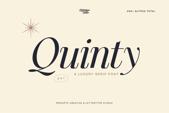

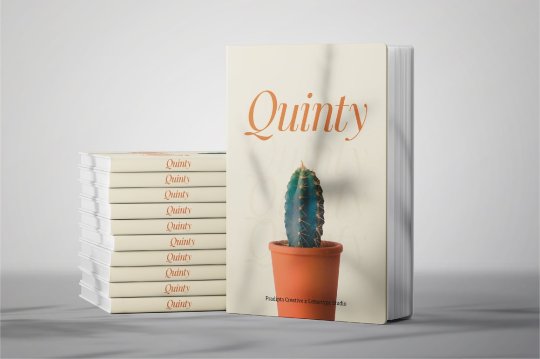
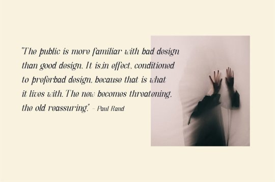
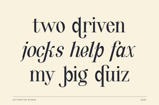

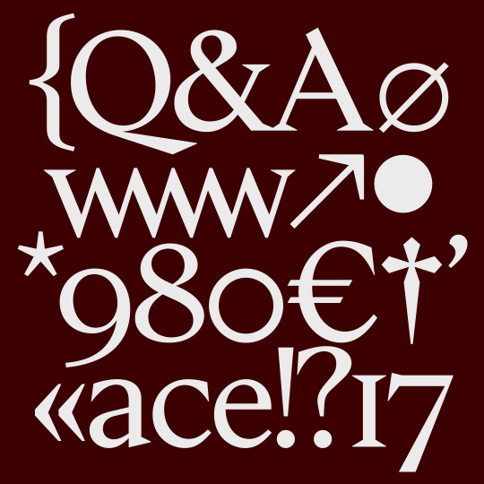
Quinty font designed by Lettertype Studio
#serif#italic#fonts#typography#design#webdesign#lettering#font#type#typeface#inspiration#brand#branding#branddesign#brandingdesign#bookcover#bookcoverdesign#magazinecover#magazinecoverdesign#otf
15 notes
·
View notes
Photo


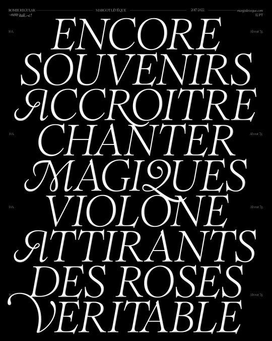

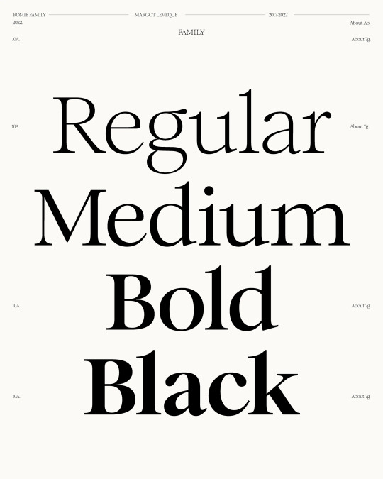
https://margotleveque.com/collections/romie
66 notes
·
View notes
Photo
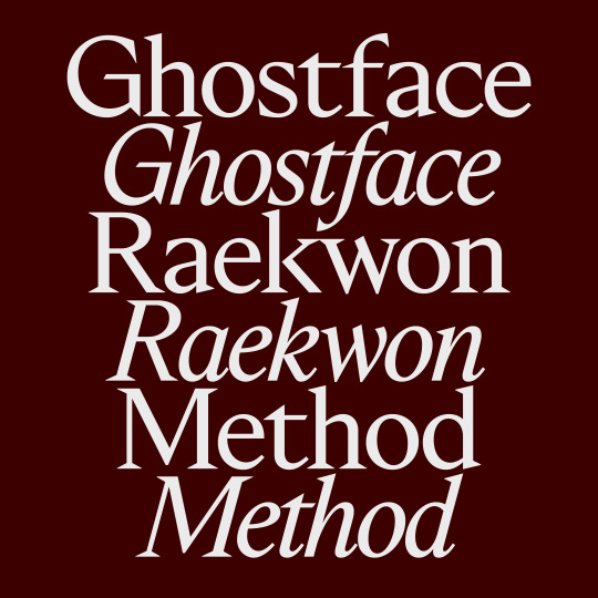
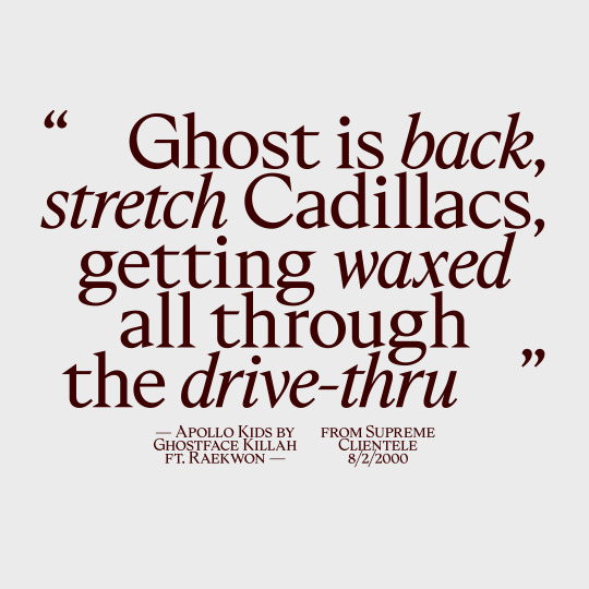

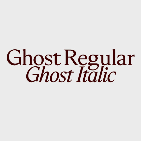
Upcoming: TWK Ghost! 👻 Long time in the making, Ghost will soon start its journey into the wild with two styles: Regular and Italic! I’ve been working intensively on these two cuts the last few months and I can’t wait to finally release this one, as usual over TYPE.WELTKERN®. More info soon!
#typeweltkern#twkghost#type#typedesign#typeface#typography#serif#sharp#regular#italic#ghostface#wutang#ghost
350 notes
·
View notes
Note
Oh
you like ferrets?
well then


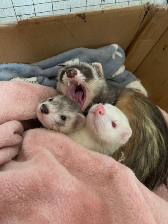
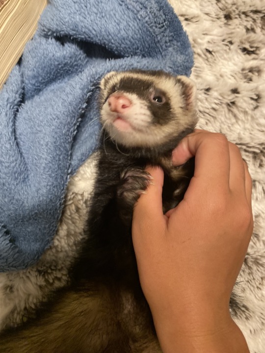

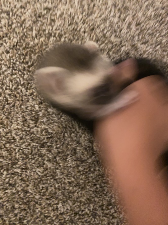
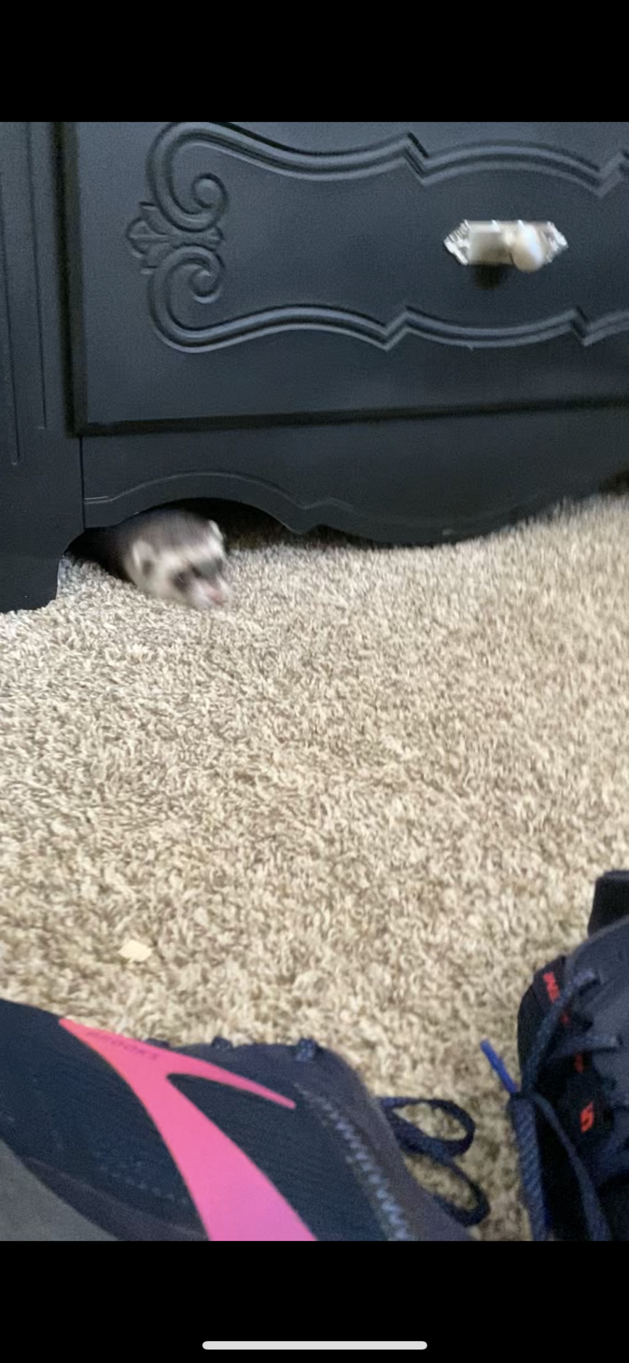

As many ferret pics as I could find before therapy
I only have one, his name is PJ (pineapple juice)
My gods how ADROABLE
Also PINEAPPLE JUICE IS THE BEST NAME EVER
11 notes
·
View notes
Text
17 of the Best New Font Releases: March 2024
New Post has been published on https://thedigitalinsider.com/17-of-the-best-new-font-releases-march-2024/
17 of the Best New Font Releases: March 2024
Check out the best new font releases for March 2024! Often new fonts are released with some nice discounts, so it can be the perfect time to pick them up when they’re fresh out of the font foundry. Some of these typefaces have up to 60% off, and certain fonts can even be downloaded free!
[embedded content]
Up first is an expertly designed font called Garrison, it’s a nice modern sans serif with a humanist style, a little like the classic Gill Sans. This one comes packed with 21 individual fonts in a variety of weights and styles, and what’s more it’s currently 60% off as part of its launch sale.
Next up is a great looking new condensed sans named Entropia. It’s another family of loads of styles, including a rather unusual backslant version, for those rare occasions you might want an italic but leaning the opposite way. The full collection is quite pricey at almost £300, but you can pick up 3 versions for free. You could even combine them with a selection Regular, Bold, Black and Heavy fonts to build your own much more cost-effective bundle.
Petrov Sans is another highly ranked new release. This modern sans has quite a futuristic look to it and includes 19 styles ranging from Thin and Extra Light all the way to Black and Extra Black. It’s another font that is currently on offer at 60% off.
Greater Neue Condensed… Or ‘NOIER’ is if I was to pronounce it correctly… is a nice new industrial style condensed sans that’s right up my street. I can see myself only using this in its heavier weights and only in all caps for logos or headlines, so the full price of £200 probably wouldn’t be worth it for me, but it just happens that you can pick up the individual Greater Neue Condensed Heavy font for free.
Script fonts have been in trend for several years now, but this new Retro Script named The Original stands out with a pretty unique style. It’s based on vintage car badge inscriptions, so it’s much slimmer than some other scripts and has a large selection of elegant swashes to completely customise its appearance.
Font Duos take the hassle out of having to find two separate typefaces to pair together. Hajime is the perfect combo of bold condensed sans and a cursive script. You can use them individually in your regular design work, or together to create cool quote art. At the $10 discount price it’s definitely worth adding to your collection.
Brush scripts are one handwritten lettering style that fully makes use of SVG font technology. With SVG Fonts like the new Beast Mode you can include the authentic texturing of hand painted lettering directly into each glyph, rather than it just being a solid letter shape. Several of Sam from Set Sail Studio’s fonts are amongst my go-to favourites in my library so I think Beast Mode definitely needs to be added to the collection, especially with such a memorable name!
The name of Qumer Pefolijqey probably *isn’t* one of the most memorable font names, but this new script font needs to be one to remember for when you need a cursive, monoweight typeface. With 363 glyphs comprising of multilingual characters and several ligatures it’s capable of displaying whatever words you need it to. This is one of a few fonts in this roundup from Envato Elements, so it can be downloaded as part of your subscription if you’re a member like me. Check the link in the description to sign up to the biggest creative library out there.
Millaris is another font with extensive multilingual support, but the reason I chose it for this roundup is its lovely design. It’s described as a modern retro serif. It doesn’t come in any other weights or styles, but with a decent selection of alternates and ligatures it would be a great choice for logos or even editorial titles.
Kirgina is a Modern Condensed Sans with a cool unique style. It has some really high contrast in its letter shapes and tight angles which makes it almost a display font, but it comes in plenty of styles from Light to Extra Bold. This is another font that’s available to download from Envato Elements.
Brickers is a really narrow condensed sans that doesn’t come in any additional weights, but some of the ligatures do transform this font with some quirky and unusual layouts that would make great logos or quote art. It’s available in an inline version too, but to be honest you could save some money by just picking up the main regular version and apply your own stroke.
The Brucken is another brush script, but this one is more in the style of the popular brush script fonts with its fatter appearance and simpler swooshes. There are loads of these kinds of brush scripts out there but the best ones are those that include lots of stylistic alternates so you can tweak it to perfectly suit your wording. The Brucken has plenty to choose from!
If you already have some of the classic Swiss neo grotesque fonts such as Helvetica, Univers or Akzidenz then there might not be much reason to spend $360 on Solidus Open as a newcomer in 2024 compared to those timeless typographic icons from centuries past. But if you look closely it does have some really nice features, namely the opened up terminals which gives it a really cool appearance. It also comes in a huge selection of 19 styles with weights from Hairline to Black.
Massivemoon is one font I wasn’t going to include in this roundup with it being more of a display typeface, but I really like its retro style and it has some unique alternate characters that can inject ludicrously stretched out letters. I’m not entirely sure when you might need to create such a typographic layout, but the main reason it made the pick was its bargain price at just $5 for the main desktop version.
Variable Fonts are the latest typographic technology. Rather than have several separate font files for each weight, variable fonts combine them into one so you can essentially stretch the font to the exact size you need and the font will fill the space with the relevant weight without affecting the typefaces proportions. Check out Graveur as a classy looking serif that’s ideal for headings and even small book text.
Corsario is another variable serif font, but this time with a much more modern style. This was designed with magazine and editorial use in mind, so if you’re in that field of graphic design, it could be a great choice for a headline, especially with it being easily accessible directly in InDesign via Adobe Fonts.
And to finish off this first roundup of the best new fonts we have another variable font choice from Adobe Fonts named Picholine Antique. This one is a slab serif with some nice curves that help soften it up compared to many other hard slab serif styles. What’s great about the Adobe Fonts library is not only are these hot new variable fonts available for use directly in your software at no extra cost, they’re also cleared for commercial use too.
#2024#adobe#Art#badge#book#bundle#Design#desktop#display#editorial#Features#fonts#Full#Graphic design#hand#icons#it#italic#layout#Light#Link#Logos#mind#money#namely#News#One#opposite#Other#price
2 notes
·
View notes
Text
Summe deum, sancti custos Soractis Apollo.
Soractis, similarly to Soranus and Śuri, is a name from a elderly italic cult (Virgil) of a solar deity who eventually got syncretized within Apollo.
Soranus and Apollo probably derived from Suri, a god of the underworld who was recorded in Etruscan inscriptions from at least the 6th century BC: he was known by the Faliscans as Soranus (Roman Dis Pater, probably a 'younger version' of Jupiter) and at Cumae as Aplu, an underworld version of Apollo. On this hypothesis, the Etruscan Suri gave his name to both Soranus (applied to Apollo) and Soracte (applied to this mountain cult).
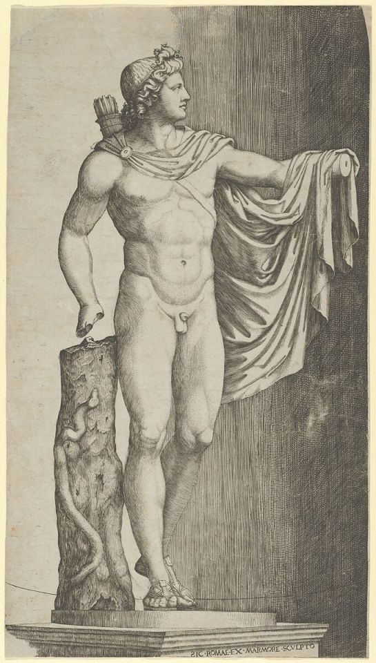
Drawing of Apollo del Belvedere, 1510 - 1527
#chaotic academia#greek mythology#archaeology#apollo#⚫☀️#dark academia#hellenic deities#etruscan#italic#sun#belvedere#art#drawing
14 notes
·
View notes
Text
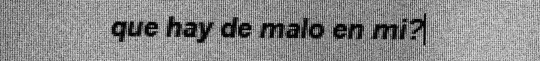
I end up talking about calligraphy a reasonable amount on here and lately it's been bugging me that I haven't shared my work before. I also practice! To absolutely nobody's surprise, I have lately been practicing with Hannibal quotes.
#calligraphy#my calligraphy#this is#italic#and#foundational#my very least favorite thing to do is quote selection#truly special hell#the poetry hobby i don't have would be immensely useful if only i had it#fortunately hannibal is a pretty good source!#i've dusted off my old pens in the last couple of months and it feels good#also#the statement “i haven't shared my work before”#is only mostly true#about 99% true#the counterexample is _right_ there#but maybe not particularly obvious
2 notes
·
View notes
Last Seen Blogs

0-g-i
Welcome!
everlasi-blog
Untitled
gundamdoublex
Goondums
everlasi-blog
Untitled
entitybriel
Entitybriel