#it’ll make more sense after I do lineart
Text
Hey y’all, here are some process stages for one of the more recent illustrations I did!
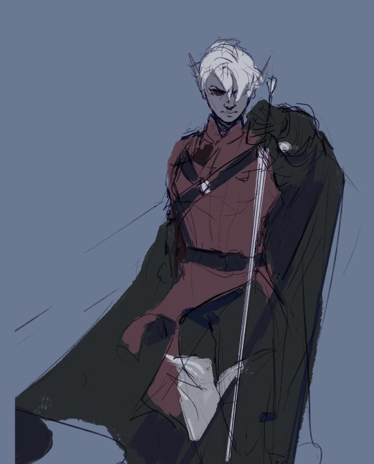
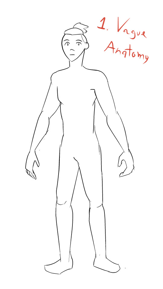
My sketches have never been very detailed. I remember being inspired for a pose while scrolling through pintrest and just threw some lines down on a page. I think more about the general pose and feeling I want more than the worry of anatomical correctness because I know I’ll fix it as I go.
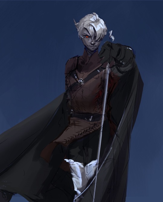
In the next stage I establish stronger more contrasting colors and start to define the form of some shapes. The anatomy is still bad so at this point I’ll start to use the warp tool to move things around and adjust proportions. I also end up using the selection tool to cut various parts of the figure apart in order to put them back together in a way I like (I do not recommend doing this lol the sooner you can establish a solid foundation the better because it’ll save you a lot of work as you go. I just have a really hard time seeing my mistakes until I have something visual to work off of.) I alternate using the warp tool and selection tool and painting again and again until I get something relatively presentable like what I have at stage 3!
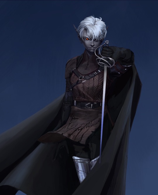
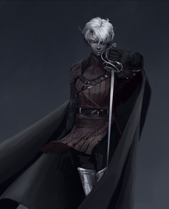
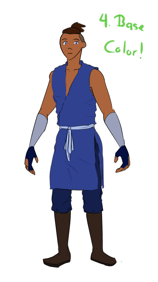
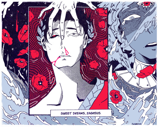
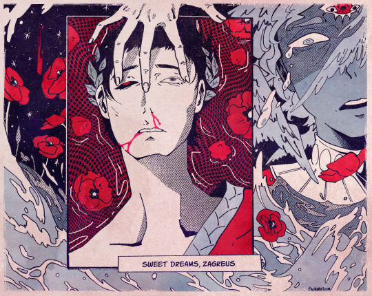
At this point all I have left are color adjustments and tweaking some small details. I usually don’t make such drastic color changes at the end of my work because I’ll have found my desired pallet through rendering. However with this one I wasn’t yet sure if I wanted a strong blue bg to contrast the orange of Lucéena’s eye or if I wanted the eye itself to be the main point of color. I knew I wanted the eye to stand out so I thought it was worth trying some things. That’s also why I decided to leave some parts messy in the final piece. I wanted the most well-rendered area to be Lucéena’s face to bring attention to that new shines eye she has.
I hope this was interesting and insightful!
With every illustration, I start off with a loose sketch. At this stage I’m not worried about perfection, my lines are more to serves as composition guides so I know where things will roughly go. If there are parts of the illustration that I know I want to put a lot of detail into (such as the face) I will often give that part more time. Then, I jump into colors by laying down flats behind the lineart and then beginning the process of refinement with a new layer on top. At this stage I would have 4 layers, 1 as the bg color (the blue expanse), 2 as the flats of the character, 3 as the line sketch, and 4 as the rough detailing. After this the number of layers I uses depends on how much of the illustration I want to preserve from itself or how many layer filters I end up using (to tweak color and lighting). Still, my illustrations always start with these 4. Once I get to a rendering point similar to stage 2 I start worrying more about the “correctness” of my structure and how I can make the anatomy more realistic. To do this, I like to duplicate then merge all of my layers, excluding the bg layer. Now I have my character one one whole layer and the expanse of blue on another. I have the individual layers still on hand if I want to refer to my og sketch but at this point having them all as one is easier to work with because to tweak the anatomy of a character I usually cut them up into parts and move/warp them to be more precise. Is this the most effective method? Probably not, but I rely a lot on the warp tool to get the exact shapes that I want. And seeing shapes for me is a lot easier when I have some color and value to work with. (I’m not a very “line visual” person if that makes sense XD) The rest of my process is a combination of rendering and adjusting details with the warp tool. At the very end I did some color adjustments (seen between stages 3 and 4) to see if I could get them closer to the initial feel that I wanted. Because I drew this to showcase Luceena’s new magic eye I wanted that to be the focal point of the illustration. So not only is that the place I put the most detail into, it’s also where I wanted the most color to be. I thought that having a blue bg would contrast nicely with the orange of her eye, but I ended up desaturating the whole piece and let that one note of color stand by itself. Lucéena also received her eye in the Shadowfell so the grey, drab vibes ended up fitting perfectly!
#art#digital art#wip#art process#dnd#dungeons and dragons#I was asking some friends for their thoughts on the desaturated version (never be afraid to ask for a second opinion!)#and we joked that this was Lucéena’s villain look because I don’t usually make her quite so angry#she has a resting bitch face tho so I mean this is prob what she loks like all the time lolo#I think her hair is kinda growing out since I first established her design#it didn’t always cover her face so much I think??#what is consistency let me draw my self-indulgent character traits#which means that all of my characters have to have long hair or at least long bangs so that it can be sexily flung over their face#in the heat of battle#and i love givig luceena in particular messy hair because thats a Vibe
69 notes
·
View notes
Text

WIP
#yes I know it’s messy lol#even I can barely tell what’s going on#local dad picking up his two children after they got beat in a fight#genshin impact#art#fanart#dainslief#Aether#Lumine#it’ll make more sense after I do lineart
212 notes
·
View notes
Note
Heya, I got a question, Artist to Artist, Do you have any advices on starting a series? I've been thinking about starting a series here and i drew some concept art on it already but i have no clue how to start it so any advices?
This is flattering, but I need to first warn you. I have never done a comic series. Even though my story is based on a webcomic and I adore webcomics, I don’t have the patience to draw panel after panel. That being said, I am a good storyteller and I do have some tips.
So first off, choose an idea or story you love. Something you adore because it’ll be what you’ll be spending a lot of time and energy on. You best love what you’re working on plus if you like, it doesn’t matter if other people do or don’t.
Before you start drawing, write the story first. Have a storyline and direction. It’ll save you a bunch of revising and redrawing if you know where you’re going. If you don’t know where to start there, here are some things to help you think:
-What’s the setting? Is there a clear sense of time, place, the mood and vibe of your area. Is it a gothic castle, fantasy forest, crowded city?
-Who are your characters? Are they developed and believable? Do you know their distinct personalities, motivations, and challenges?
- What’s your plot? Does your story follow a natural sequence or arc (background information, rising action, conflict, resolution)? Are there any gaps in these beats that could confuse your readers?
-What’s your point of view? Is it consistent?
-What is/are your theme(s)? What lessons are your characters going to learn in this story?
Once you have your story figured out it’s time to look at your layout. What’s the style you’re going for? How important will color and shading be? It might be a good time to look to some of your favorite series and see how they organized the flow of their pages and panels. If you’re just starting out, I’d say to keep it simple. Find what works for you and flows nicely.
Now to actually draw! My advice is to start with thumbnails. Just quick, messy drawings of the layout for that page and that chapter will be. That way you can see if everything fits on the page without it being overwhelming. The actions and poses are clear, the dialogue fits and it’s easy for the eye to go from panel to panel, dialogue to dialogue. You can organize it and if you have to toss a problematic page out, well it was just a thumbnail. The skeleton of the comic. You didn’t take hours with the lineart or the colors and shading. Leave the complicated compositions for later works too. This is something that will just take practice and will get easier the more you do it.
Last, give yourself some rules. You can experiment but if you are doing a long comic, make some rules for yourself to so can try to be consistent. For your panel layouts, to your page flow, to your character designs. It’s easy to let your style change from the beginning of the comic to later on. It happens to everyone really. But don’t give yourself a character you really struggle drawing because it’ll kill you every time they show up in your story.
And most of all have fun! Love what you do and go for it. I hope this helped a bit with getting started!
#answers#inky answers#inkymystery#the inky mystery#babitim#inky mystery#artists#start with the end in mind
37 notes
·
View notes
Note
Do you have any advice on how to draw clothing? I’ve been trying to get into making my own art and all my characters look like they are walking around in socks 😂. Idk how you do it so well
... that the day has come when someone has asked me how I draw ANYTHING is genuinely mindblowing to me xD I know I've upped my game in fabrics lately but this is surreal xD Am I really gonna do an art tutorial, for the first time ever in my whole life?!
Well, for you, Anon, I shall try xD

First off, you're going to want to doodle a basic body shape. I am not going to pretend I am good at doodling body shapes. Nope. But what matters there is getting the position of your character, figuring out what goes where. Once you have that, you go to stage two, and that is putting clothes on 'em!
You can start with basic clothes, the way I did. I simply draw them atop the body outline, then erase whatever bits of the body the fabric will cover up. Depending on what kind of clothes you're drawing, the fabric behaves differently. But what you need to keep in mind is that fabric usually has its own volume, weight, and is affected by a body's movements and positioning. As this body is in a general, simple standing position, the fabric doesn't need to move around MUCH... but it does need to move around a bit if we want it to feel legit.

For the sake of making it look more real, you have to account for where the folds show up more often in clothes. My typical choices for that are locations where fabrics overlap, or where there are joints. Feel free to add a few extra folds here and there, of course, especially if the clothes are meant to be baggy and with a lot of air! The clothes that aren't baggy, however, like (in this case) the gloves or the arm bandages, as they're meant to be tight on the body, won't need folds unless you're drawing something highly detailed with a very peculiar hand shape.
After that, it's base color time! Base color is very very important, as the shades and lighting will be derived from that initial hue. Gotta pick each color right!


Now... SHADING! This is something I used to do with air brush tools. Currently, as I'm working on Clip Studio Paint, I use this fabrics' brush and it has really improved my fabrics' game, so if you can find a good brush that gives your fabrics more texture, it'll help heaps :D if you can't, however, the basic air brush tool, on any art software I've used, can achieve good results on its own.
Normally, when I color, I select the fabric's color, all of it, to avoid unwanted accidents with color bleeding out all over the place. I believe some people just make different layers for everything, but I like pain (?) So, believe it or not, the most important part here is selecting the right color: I leveled up big time in art on the day I started choosing more saturated colors for shadows. I typically went for gray-ish shadow tones, back in the day... but in my humble opinion, it does not hit the same way as more saturated shadows do.
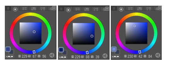
The first one there is the base color, the second one the shading color and the last one is the lighting color. As you can see, I'm not that far inside the black area of the color wheel in the shading one, but I'm choosing a much more intense shade of blue, and that results in a contrast that doesn't require a lot of darkness to feel right.
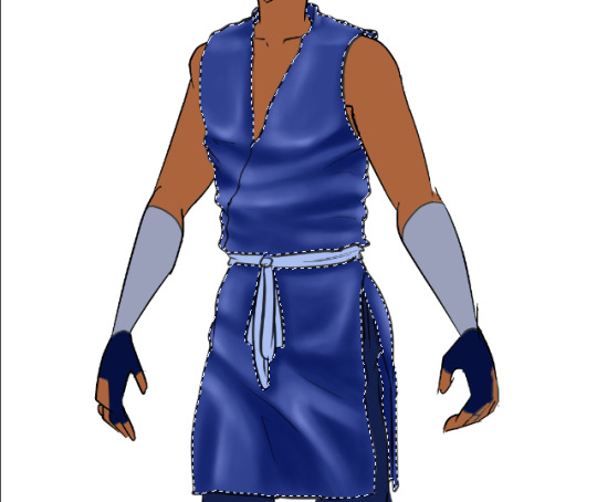
As for where to apply your shading? That's in fact what the folds are for! :D they serve as guidelines, pretty much, for how you'll shift the color across the fabric. At the shading stage you can even add extra folds you didn't place in your lineart too, if you want, but what matters most is that they will give your clothing volume and texture.
Just as it is with the shading, lighting will lean on the folds as well!

(don't fret, we ain't done yet xD gotta soften that lighting later, naturally...)
I picked a much brighter color for the lighting, and far closer to white. This can work fairly well, but you can also choose a more saturated color if you want to, in some clothes. Makes them feel extra luxurious in my experience xD One of my tricks here is that there will be parts touched by the light that will be brighter than others. Hence why you can see that, while I applied my brush all over the folds, some parts are softer than others. This as well provides texture to the piece, and a dynamic feel that offers it extra volume.
With my base color once again, I've softened the lighting by brushing the base color over it veeeery lightly, and lo and behold! Looks a lot more normal now, right? :D and the colors blend well into each other (if you can't achieve this with a simple airbrush, the blending tool, applied carefully, can result in a similar outcome).
You can use the lighting and shadows to highlight some body shapes too: see how there's shading on that thigh, but instead of flowing right back into the base color, it shifts into the lighting color directly? That helps in giving the fabrics some shape too, therefore, the lineart isn't the only bit that matters in giving fabrics the behavior you may be looking for.

And as I wasn't even sure what number we were at anymore, here we go, step number ?, finish up lighting and shading everything XD I left it with very basic lighting and shading because Tumblr won't let me add any more images to a single post *shakes fist* but usually I play with layer modes, namely Multiply, Glow Dodge, or Color Dodge, to get some extra volume and feeling in clothes. Still, the bulk of the work is what you've seen here :D
Alright, some last tricks I want to share: if you take the lighting shades and brush them veeeeeeeery softly over the edges of each element in the artwork, you can get a really nice contrast that makes the clothes more realistic, to a fault. And one last important thing to point out is... commit to your shadows and lights xD if one area of the shirt is bright and, say, there's another layer of fabric right below it, you have to try your best to follow the pattern of lighting and shading that you set up in the first clothing item you shaded and lit up (?) if that makes sense xD if it doesn't, I'll try to explain it better in another ask, if you send one :D
Anyway! I hope this has been helpful, if it's not thorough enough then I'll have to think of some other way to pack up a proper tutorial that Tumblr won't attempt to destroy x'D but good luck with your next art ventures, and may all the fabrics be on your side in the future! :D
#anon#sokka#I kinda had to#I thought of using Azula but her clothes are... not just more complicated but very armor-y#whenever I draw her :'D#so Sokka felt like a more natural choice for this xD#thanks for the interest in my wonky techniques!#I am by no means a professional but if my amateur ramblings and tricks help anyone I'll be thrilled!#:D
13 notes
·
View notes
Note
hiya, I really love your art, and how you make your latest stuff look really vintage and aged, it’s really super cool and I was wondering if you’d be willing to share your process for that?? thank you so much and I hope you have a wonderful day!!! :D
aww thanks so much! and of course i can share my process, no prob!! ^^
i’ll be using this piece as an example, and uh, for the context of it u might have to look on twitter lol. but whatever

it’ll be a bit long so everything is under the cut
(this is just based on my process, and i know its weird and csp specific.
feel free to pick and choose pieces from my process!)
and also the programs i used were procreate and csp and i have a mac. u could probably do this with other set ups, but this tutorial might not be super helpful near the end
i usually make my lineart in procreate and import it into csp as a .psd file

for this, in procreate, select the file you want to export and click PSD and then I airdrop it to my mac.
i think the only thing about the lineart i have tips on is to keep it toothy/gritty if that makes sense?
i use the 6B pencil in procreate with a bunch of tweaks to the pressure sensitivity and opacity/size change.
but anything with a good size jitter should do the job!
in csp i shade and color the piece.
picking out the colors is a whole other mess
feel free to ask about it but ill skip for now ;v;

flat colors

csp has a lot of nice halftone options!
group up ur lineart and everything thats black rn in a folder and above them set a clipping layer to add
fill it with a color lighter than black; the less pure blacks and white u have on a piece the better
feel free to go to town w the grunge or noise texture of ur choosing! the grittier the better bc during this step i try to get the feel of worn off ink. just make sure the linearts still visible, though. u went through all the trouble to make it after all! ^^
(i have specific brushes but again thats something else u can ask me about)
above all the layers, make a multiply layer and do something similar.
same advice as above

this is ur “paper” texture, tho, so try to keep it more even in tone so things don’t get too messy
(but if it works for u, feel free to do it! find what works is my advice!)
ok time for some super csp-specific steps (sorry to non-csp users)
the csp asset store/website(?) has a lot of nice textures and brushes available.
look through it if u haven't
it will make ur life so much easier
theres a really nice tileable watercolor texture set there
(this one specifically)
(it also had some really good paper texture bc whoever made this is a godsend)
i slap that over the color layer, set it to clipping, and mess with the blending modes
its usually a tossup between soft light, overlay, multiply, and the overlay texture effect tho
theres another optional step of using the overlay texture effect on a paper texture
i didn’t do it on this example sorry :’(
i think i used another watercolor texture set to soft light on this piece?
after that, if u want, i like setting a noise texture at a v low opacity over everything for extra jitter

(i use this one. u can just make it in csp and probably any other drawing software but im lazy lmao)
save it as a png/jpg/etc.
and ur done!
i do some extra stuff to the final image like scale everything down and add a bit of a 3D effect for a bit of extra kick
(but again thats a bit complex and specific so feel free to ask but ill keep it short
for your sanity’s sake)
(and once again, the final image! ta-da!)
some tips to keep in mind i guess
jitter, grit and noise textures are very good things when u want something to look rough
avoid pure blacks and whites; most paper isn’t printed pure black or white and it only gets more faded and colored with time
if ur super lost, look at reference!! theres a lot of good artists and media out there to get inspiration from, and looking at scans of actual old comics is a nice way to see if ur work looks aged
(also u don’t have to use old comics as reference; i like looking at old vcr footage for reference bc of the texture!! :D)
that’s all i have for my general process
uhh for specifics feel free to ask
i can make more tutorials but this one is a general overview, i just didn’t to take up too much of ur time….
but i really hope it helped! and im very sorry if it didn’t
i’ve never made a tutorial so im sorry if it didn’t answer ur question and also im sorry if this one’s not very useful
thank you for reading!!!
and thank you to whoever asked! :D
52 notes
·
View notes
Text
Lines.

✎desc; how I would rate haikyuu character's drawing.
✎team[s]; fukurodani, inarizaki
✎genre; crack
✎language[s]; english
✎chef note; okay, first off, I'm not a professional drawer but I can still rate drawings. This idea just came to me like a minute ago and I had to do it now, so enjoy :)
fukurodani.
Bokuto
Aight, I see that we started off greatly.
In all honesty, he have no idea how to draw,
And of course his drawing would look,,,, quite terrible i'm so sorry bokuto lovers
He's that kid in art class where's when the teacher already told them what to draw,
Bokuto sat there on his chair, staring at the canvas
Like, what is he suppose to do? Draw?
Well, yeah technically but what???
I can totally see him frustratingly erase the sketch if it can be called as a sketch
And then proceed to try to copy other people's work
Keyword; try
It's bad but at least he had an effort to finish it
4/10, there I said it
Akaashi
His drawings are not that professional but it's pretty
Have you ever seen a drawing that you wanted to stare at it for hours until you're satisfied?
That what's his drawing are like
Not typically an art kid so he's fine when student's from his art class asked him to draw for them
And is feeling pretty neutral with his talent (he actually won't call it a talent but more like a hobby or sum)
And just say 'thanks' if peoples compliments his drawing
Let say his drawing is, a good 8/10
A decent drawer in conclusion :)
Konoha
Not a bad drawer but he rather keep it basic
Konoha's prolly too lazy to draw something over the top so he's just gonna draw flower or something ksndnzkj
Sometimes sleep during art class and had to ask what they had to draw
Proceeds to decently draws a scenery
He's totally not the creative kid so whenever the teach tell them to draw something, he'll always go with basket of fruits, like,
Man, I appreciated the drawing but at least put some effort on thinking what to draw
The art teacher also kept telling him that he have raw talent and should enhance the skill more,
But that never happened, no
"Sorry ma'am, I'll just stick to volleyball, thank you,"
One part of the art room has a section of konoha's basket of fruits drawings but in different mediums
Rating is 7/10
Washio
IS actually an art kid and you cannot convince me otherwise
Has a small sketchbook with him and he'll always doodle when he's bored or in a middle of a lecture (while taking notes of course)
His main skill in drawing tho is painting
The colors blends in so well with one another and he's good at picking color palettes
Also, he doesn't really get that annoyed if some kids from his class ask him to teach them how to draw
Or even look through his sketchbook
He'll just nod and hand it to them without a second thought
Ajsjdhsijsi Washio get so blushy when someone compliments his drawing,,,,
I’ll give a 10/10 :), congrats
Sarukui
The best that he can do is doodles of owls and other shits but other than that, he cannot do
But the doodles are kinda cute doe ngl
He’ll have his moment where he’s in class and have no idea what to do, and just doodles a bunch of stuff
Once he draw his whole teammate including his coach and himself, he thought to himself,
“Huh, this looks good,”
And then take a picture of it for memories (cause he might throw the book he’s doodling in away)
Speaking of that, he doesn’t have an official book for drawing and just draws in his english or math’s textbook or sum
His juniors eyes are blessed when they got his textbook
Sarukui just vibes in during art class, draws and that’s pretty much it
The drawings,,,,,eh,,,, not that good, he only specialize in doodling as I said
so in conclusion,
drawing? 2/10
doodling? I’ll give a solid 5/10, good job
Komi
I’m gonna say this and I’m prolly gonna say it again
He hates art class
Like, even with him trying his best to draw, it’ll always gonna look strange than what he planned
mf cannot draw a straight line in art class
This dood can draw a nice straight line in any other class whether it’s for a graph or others,
And then proceed to shakily draw a straight line during art session
Totally not an art kid and will never be one
His drawings,,,,
I’m so sorry but it looks so bad
It’ll prolly look a lot better if he put more effort, but it’ll still look bad no matter what
Komi hates art class and can’t draw even a decent doodle so unfortunately, I’ll have to rate it 0/10, sorry :(
Anahori
His drawings are eh
It’s not good but also not bad?
Sometimes you’ll just stare at his drawing for a good minute and be like, what did he just draw just now?
What I’m saying is that his drawing’s are unexplainable
Maybe if you stare at it a little bit longer then it’ll make sense and you can see the beauty in it
But honestly I can’t really see anything, not in a bad way, but like, literally nothing
You’ll be staring at his canvas as the mario kart rainbow road music started playing inside your head
But Anahori is always proud of his drawings no manner what
So, I’ll rate confusion/10
Onaga
Just like Komi, he sorta hates art class too
But lemme tell ya, his sketches are GODLY, like, have you seen those pinterest hand sketches?
That’s what his sketch would look like
It’s so yummy to look at what
But he sucks at lineart so JAHGSDSHD
Onaga cannot properly hold the black pen and do the lineart, it’ll always turn wonky and he had to throw it away
Like, if he spend even hours tryna outline it all, and then erase it
It’ll look so trash
And he’ll just stare at it for a couple of minutes before crumpling the paper
He’ll also suck at coloring
Mans cannot understand how the color blend in together
And I think I’ll rate,,,,,6/10 just cause he suck at coloring and lineart lmao don’t worry i suck at coloring too
Kaori
Another decent drawer and her drawings are almost the same as Akaashi’s
But instead of it looking pretty, it looks cute
I have a headcanon that Kaori have a journal and does journaling so that’s prolly the reason why her drawings are cute af
But honestly, her drawings sometimes depends on her mood,
If she’s mad or frustrated, her drawing would look kinda rough and not that cute anymore
If she’s feeling happy tho, It’ll look so nice and cuddly does that even make any sense
Isn’t necessarily an art kid but would love to try be one
And she totally have drawing sessions with Washio aaaaaa,
Just imagine both of them sketching in the same sketchbook while talking about the volleyball club or anything else
She’s getting an 9/10 just cause her sketchs looks clean <33
Yukie
She doesn’t draw at all
Like, you’ll never see her drawing at any kind of time so you have no idea what it looks like
Yukie would still attend art class,
But never draws
She said that she’s pretty lazy to draw it and said to draw it at her home later
But no one even saw that drawing after that
Yukie doesn’t show her drawings nor EVEN draw for once
So I technically can’t rate :/
inarizaki.
Ginjima
LISTEN
The only reason why I started with Gin is because he have some amazing drawing skills
He admit that he’s not an art kid but draws godly as if he had been thought since he was a kid,
Well, actually yes
I think Ginjima actually wanted to be a drawer when he was still a little kid way before he started his 3rd year of middle school
So he practiced a few and became a nice drawer since then,
But he kinda quit being a drawer and decided to go with volleyball
And guess what?
His drawing talent is still there
He totally specialize in pencil drawing cause that’s the first thing he started learning
The lines are smooth and the shading are so yummy what is wrong with me
The Miya twins and Suna are so sh00ked when he saw his drawing during art class
ngl he’s pretty smug about it too but doesn’t brag about it
I’ll give this boy 12/10, mwuaah
Suna
I hate this man for this sole reason
Suna is too LAZY to draw so he doesn’t give any effort in his drawing
I can guarantee myself that I’ll get an eye strain when I saw his drawing
And...
*wipes away tears*
He draws too many dick
–2/10
Don’t come for my head Suna lovers
Atsumu
OMFG
OKAY, OKAY, I KNOW THAT ATSUMU MIGHT PUT ON SOME EFFORT IN HIS DRAWINGS,
BUT WHY IS IT STILL SO BAD?????
He’ll prolly think his drawing would look good but no, it’s not
No matter on what perspective you look his drawings at, It’ll still look bad
AND HE DOESN’T EVEN NOTICE IT
Osamu laughs a lot at his drawing and they started fighting for that only reason smh
Atsumu, I appreciate your effort so SO much,
But please, just stick to volleyball
–10+/10
I put a plus there because of his effort and because of pity
Osamu
He draws in ms paint, with a mouse
But he can draw some foods tho
But all of it looks wonky af
1/10
Akagi
A pretty decent drawer
Akagi always draw happy and cute drawings so you’ll also get happy when you saw his drawings
Puts on a big smile when people compliments his drawing and shyly scratches the back of his neck
“Nah, this just look normal!”
But he draws oddly thick lines sometimes
Sometimes it looks good in some drawing
And sometimes it looks, bizzare in others...
But I think his drawing would look nice <3
Overall, I’ll give a,,, 7.5/10, keep up the good work
Oomimi
He’s from class 7 AND I really think that he’ll be good at drawing
Well, he can draw a few things but he struggles drawing other things he never accustomed to
But!
Oomimi is that kid who’s good at drawing scenery
He knows basic color palettes and which is cold and hot colors
So the scenery drawing would always look good
He get a lot of compliments for the drawing (50% of it from Akagi)
I think he doesn’t have that many time to relax and draw freely but when he does have it, it’ll just be small and simple doodles
um, let’s go with 8/10 <3
Aran
I truly believe that Aran can draw peoples face but in a pretty decent amount
He’s also good with anatomy teach me your ways king
But as much as he’s good at that, he kinda sucks at drawing any kind of background drawings
Mans can’t draw a scenery I’m telling you
As if the background doesn’t even exist in his mind lolol I’m sorry Aran lovers, I didn’t mean that in a bad way
Mainly uses copic markers to color and color pencils to shade
The first time he use the copic marker, he got really frustrated that the marker stain the other pages lmao
And he never uses digital drawing applications or softwares
Aran just doesn’t
I think I’ll rate him, 8.5/10
Kita
Okay, I know that Kita’s a top student and never fails in anything
But he’s not typically a good drawer that much
His drawing still got good marks but when you look at it, it just looks normal
I just know that the Kita lovers gonna get me after this
It’s not that bad and not that good, just a nice balance in between
I personally think Kita’s not that godly in drawing but rather a neutral drawer
He draw what he can and does shading and coloring when it’s needed
The colors are all basic colors, no pastel, no neon
And the shadings are pretty basic
Just a normal drawer here
Ya’ll gonna fight me for this but I’ll give Kita’s point,
7/10
#haikyuu#haikyuu headcanons#haikyuu crack#inarizaki#fukurodani#bokuto#akaashi#konoha#washio#sarukui#komi#anahori#onaga#yukie#kaori#ginjima#suna#atsumu#osamu#akagi#oomimi#aran#kita
25 notes
·
View notes
Note
Heya! I really really like your style and saw the commission thing and was wondering how to, y'know, commission a tningy ^^' I haven't done it before
Glad you like my art and like it enough to consider commissioning! ^u^
My commission information page is here. I suggest looking through it. I explain how I work in that as well, at the very bottom. But, I’ll give ya a breakdown for the Never Commissioned Before. (since that version lowkey assumes at least slight familiarity)
It’s not too difficult or anything so don't stress it! If you want a general price-point before diving in or anything: for me, an average work tends to be around $35-50ish USD (usually mostly depending on color or number of characters) but some of the more complex stuff, which often includes multiple characters and background goes more up towards $200ish. If you’re tighter on cash, as I know a lot of people are, I suggest setting yourself a budget and telling me what it is! That way if you want something, but you can’t afford it, I can help make it something affordable! (ie I may suggest not using full color, or having a bust rather than a full character- etc)
For the actual process, I’ve put it under the cut. I go pretty in-depth and it got long.
Step One: Message me with what you want to commission me to do. Give a short description.
You can message me on tumblr or through my email [email protected]. I like it if you come in with a semi-solid idea of what you want. Hopefully you read through my commission page, but, I’m also happy to provide suggestions and ideas as well. I do fanart and original works! You should have a description of what you have in mind ready.
Here’s two examples on each extreme of what I can work with:
“A picture of my character, standing with their hands on their hips. They have long brown hair and eyes and wear a pirate-like costume”
“A picture of my character, standing with their hands on their hips, a little sassy in pose an expression. They have long brown hair that goes to their hips, and is parted to the left. They have brown eyes, and a small scar on their cheek. They’re a little stocky and they wear a v-cut loose black tunic, a purple vest and leather belt.”
I’d ask more questions for both of these! I’ve never had a commission where I don’t feel the need to ask for more information. If it’s an original character (or even au-versions of fanart or characters I’m not familiar with), I love hearing about who they are as a character, since that gives me a sense of what energy I’m trying to portray with the character. If you have references (doesn’t matter if it’s an amalgamation of references plucked off of google or something you drew yourself) that’s awesome! I don't require it, but, they’re always appreciated. I am totally open to helping you make decisions too! if you have the base idea, but you don’t know if you want them to have a coat or not, I can give you sketches with both options.
Step 2: Pricing.
If you don’t already mention it, I’ll ask you specifics of the things in my commission post- ie: if it’s full body or a half body, or if it’s full color or anything.
If anything on my commission post confuses you, you can always ask me for more examples or an explanation of the difference!
After determining exactly what you want me to do, I’ll usually give you an estimate for how much it would cost to complete. Sometimes, if you’re still deciding between things that determine the price, like how complex the pose is, I might do some sketches first and see which ones you like before giving you a price. I have a little leeway on pricing here, and if you think it’s too much, you’re welcome to ask me to explain why I priced it that way and if I can lower the price. That said, a lower price means lower complexity and detail.
If we’re confident in the price, I like if you pay me at this point, rather than later, as it’s easy to forget, and frankly, I’d rather not do all this work just for someone to take the image and not pay me at the end. I have some leeway, but I usually prefer if you pay me before I get to the last step before completion. If it’s a lineart work, that means after the sketch. If it’s a colored work, it means after the lineart.
Step 3: Sketches.
When I get started with sketches it usually takes me a day or 2 to get them done. I’ll give you several to choose from. I usually do about 4-6 individual sketches and label them by number (because I’m dyslexic and for the life of me never remember left vs right).
Once I send you a batch of sketches I’ll ask you for your opinion. I basically want to know: which sketch(es) fit your idea the best and if there’s anything I’m missing or need to get rid of. It’s going to be loose and messy, so if you want me to explain anything about how it looks, please feel free to ask. I can combine sketches if you like parts of one or two of them but as a whole they’re not perfect. If I’m totally off the mark, you can totally tell me so! That kinda means I didn’t do my job right in step 1, and I’ll ask more questions to understand which aspect I’m missing.
Once we have one sketch that works, I’ll ask you a few more questions about what you’d like to see on the lineart.
Step 4: Lineart
Depending on how complex it is and how busy my life is, this might take me a day or a whole week.
Using the sketch as my base I’ll use this time to make clean lines, get some details in (this is usually where expressions and clothes are defined beyond the general structure.)
I’ll send you the sketch after I’m finished and once again, ask you what you think and what might need adjustment. Your job is to nitpick here! Please, feel free to nitpick. Is the hair too short? Is the arm in a funky angle? Tell me! You’re buying it, you get to critique it. I’ll work with you to come to an agreeable look.
If you’re commissioning me for a colored work, I’ll also ask you for any clarification/changes from the original concept for the color.
Step 5: Color
This tends to take about 1-3 days.
If it’s flat color, it’ll be pretty simple, and shading or lighting will be done with kinda flat bold lines unless otherwise stated that you just want it Flat-Flat. It’s not my usual style, so most people tend to go for full color. Full color is my usual coloring style, and I use some pretty soft shading. It tends to reflect a midday-look, but if there’s a specific background I’m doing, I will match the color to it. Dynamic shading is a secondary layer of color. I usually do color and shading on one layer. Dynamic shading is where I work with really bold, dramatic lighting.
I usually work with a background at the same time as everything else, but, sometimes I don’t because I focused on one aspect or another, so that might be an additional step.
Once again, I’ll send the work to you and ask for your opinion.
Step 6: Finishing up
Once you’re happy with it, all that’s left is A) confirming you paid me (I’ll usually remember or write it down, so if you had, I won't ask.) B) signing the artwork and C) sending it to you via email. I usually send it as a .png but you’re welcome to request other filetypes. I’ll ask you for all these things too.
You’re also welcome to request that I record the process I can take screen-capture videos or I can screen-shot each step that I’m not screen-shotting already to send to get your opinion. (you’d have to ask me to do this at the beginning though.)
After all that, I’ll usually post it on my tumblr here, and you’ll have your commission!
5 notes
·
View notes
Link
[[ Artemis is finally coming to Idle Champions! 😄🥰😍 I am super pleased with his imminent arrival, although this wasn’t always the case. However, Codename Entertainment has not only satisfied my expectations, they’ve blown them out of the water.
I’d been anticipating Artemis’ addition to the game with both excitement and dread. Excitement for the obvious reasons, and dread because I’m extremely particular about how he’s presented. Too many people erroneously depict Artemis too pale, to the point of making him a white dude, when in reality, as a native Calishite, Artemis’ skin tone would be dusky brown, similar to how people from our world’s Middle East look. Furthermore, an oft-overlooked fact is that even in canon, Artemis is stated to have brown skin. Post-Shade absorption his skin is tinted gray, but gray mixed with brown is brown-gray, not grayish-white like many people think it is for some reason.
The second mistake that many make is depicting him too young. While Artemis’ exact age isn’t known due to his birthdate not being known, during The Sellswords he estimates himself to be in his 40s. Calculating based on this, he first meets Drizzt in his early 30s, and first set off after Regis in his late 20s. While he’s not old, he’s not exactly young either. It is explicitly stated in the books that his aging was frozen to his middle-ages. Many people depict Artemis with the face of a 20-year-old, and while it is also stated in the books that he has the lean athleticism of someone half his age, this refers more to the exceptional state of his physique rather than his facial features.
I’m so happy about how Idle Champions has exactly nailed down Artemis’ physical appearance. His skin color is appropriately dark, comprising of an awesome mix of brown and gray. His portrait shows the wrinkles of an older man (who also happens to be done with your shit. XD)
His in game sprite is such a delight too! When I first saw it, I couldn’t help but wonder if CNE’s artists might’ve considered my own artwork in making his design. Pretty much everything I’d studied from Lockwood’s paintings is there: the concave shape at the bottom of his leather breastplate, the distinct triangular cloak clasp under which extends the two belts, shoulderpads over sleeves composed of strips ending in rivets, a double-belt with unique angular-shaped buckles, belt over one leg, vambraces arcing over and around his elbows, kneepads over his tall boots, dual belts over his boots and the double earrings. Heck, even the sword and dagger shape are the same as how I’d interpreted them.

Honestly, if I’d been designing his sprite, there is very little that I’d have done differently. For comparison, here’s the line art of a chibi-style painting I did back in 2015:

I can’t express how giddy I am that CNE’s artists apparently studied Lockwood’s paintings as much as I had. It’s something that pretty much no other artist I know has bothered to do. They picked up even the smallest details, for instance the shape of the base of Artemis’ sword, which is really such a minor feature in this painting:

There are some aspects in CNE’s depiction that don’t come from Lockwood’s paintings that I can’t help but wonder about. First, Artemis’ garment underneath his armor, it wasn’t until very recently that I noticed Lockwood having depicted it as a complex series of even more layers and rivets:
I’ll be changing my own depiction of his outfit from now on, but up until now I’d interpreted what was underneath as a gambeson, which can be seen in my lineart above. In CNE’s depiction, he’s also wearing a gambeson underneath his breastplate.
While both CNE and I apparently drew our inspiration for the vampiric dagger’s design from Lockwood’s paintings, Lockwood’s depiction of the dagger does not contain any gems, despite the weapon’s jeweled nature. As seen in the sprite above, Artemis’ dagger has an emerald in the crosspiece. Is it just yet another coincidence with this painting I did in 2017?
And of course, those double earrings -- a feature that most artists change, yet it is one that’s both prominent and consistent in all of my work.
Ultimately though, despite these similarities, as much as I’d like to think that my own art contributed to CNE’s depiction of Artemis in what’s an official WotC/D&D product, I fundamentally believe that it’s all just a happy coincidence. In Idle Champions, Artemis’ earrings are silver, his leg belt’s on his right leg rather than left, the pommel of his sword is different and his facial hair is different. However, I do know that I was able to affect his final appearance, for originally, his portrait had brown eyes, and his sprite’s dagger had a red gem rather than a green gem. CNE addressed both of these things after I’d brought them up.
Game mechanics-wise, without having seen him in action yet, I really like how CNE designed him. Artemis’ superb improvisational abilities are a big part of what makes him such a capable fighter, so his kit in Idle Champions being built around him mirroring other DPS champions’ buffs makes a lot of sense. His jeweled dagger, as his signature weapon consistently throughout the ages, is similarly adequately tied in to his damage-dealing capacities.
I absolutely love that Artemis will be in seat 3, next to a certain drow mercenary. (灬♥ω♥灬)

The one thing that is a little strange is the nature of his epic items.
Idle Champions’ snapshot of Artemis, based on his game description, is from the pre-Sellswords era. During this time period, Artemis had the bat-winged cloak and his dagger, but it wasn’t until after he thought he’d killed Drizzt did he acquire the nightmare figurine, the bolero, Idalia’s Flute, and Charon’s Claw. By that point, he’d lost his bat-winged cloak. The bolero was disassembled and presumably discarded after its final usage in Road of the Patriarch. In the current timeline, Artemis only has his dagger, Claw, and the nightmare figurine. Furthermore, he’d be quite displeased if presented with Idalia’s Flute again, and most likely would reject having it in his possession. All in all though, I can understand why CNE chose these items, and I really love how the flavor text isn’t Artemis discussing them as they are for other champions. It is definitely more fitting to cite them as rumors whispered among third parties.
Overall, it feels like the “real” Artemis has come to Idle Champions, and I’m very glad about that. I’ve been saving up forever for Artemis’ arrival.
He might very well fall flat like new DPS champions have in the past and/or not be up to par to the current meta best DPS champion, but the recent trend with new champion releases is that each has been better than the previous, so I’m hoping that it’ll mean Artemis will be the new meta DPS. However, even if he isn’t, I still plan on blowing all of this on him, because sometimes, personal preference trumps the need to min/max.
Thank you so much Codename Entertainment! Artemis coming to your game is already such a great joy, but to arrive in the way that he is -- I’m absolutely thrilled! ]]
#Artemis Entreri#Forgotten Realms#legend of drizzt#D&D#Idle Champions of the Forgotten Realms#Codename Entertainment#ooc#appearance
19 notes
·
View notes
Text

Gondolin Nights Are Long, by Yours Truly.
Rog and Maeglin are walking home from a pub crawl (to take Maeglin’s mind of his sorrows, which obviously worked... not) through the empty streets of early morning Gondolin.
This damn picture has taken SO EFFING LONG to complete and now it’s as finished as it’ll ever be and I’m not even sure I should show it because it turned out Like This.
But, because it has occupied me for literally months (years if you count its inception), I'm doing it anyway.
Backstory rambling under the cut!
Sooooo back in *counts on fingers* 2003, I was on a family vacation to Tuscany that took us, among other places, to Siena. It wasn’t my first time in Siena, but it was the first time after I’d read the Book of Lost Tales with its description of the Twelve Houses of Gondolin and their proud emblems and stuff. What can I say, the shields and banners of the contrade in Siena - we were there between the races for the palio, so everything was absolutely full of banners - immediately made me think that THIS IS WHAT GONDOLIN WOULD LOOK LIKE (except white city instead of, you know, sienna-coloured city). Surely, the different houses would put up their emblems and be in a more or less playfully vicious competition. They probably have a palio race too.
So ever since, I really really really wanted someone to paint a heavily Siena-inspired Gondolin, but nobody’s done me the favour. So I had to do it myself. I am very disappointed in you, Tolkien fanartist community. Look what you’ve done. Look what you made me do.
Anyway, when last year’s publication of The Fall of Gondolin approached, I decided to finally make Siena-Gondolin a reality, and began working on the lineart for this little piece. The idea was simple: Maeglin, new to Gondolin, still grieving the loss of his parents and kinda lost in the new place, is taken under the wing of Aranwë, one of Gondolin’s smiths. Aranwë shows Maeglin around and takes him on a pub crawl or something to make him feel better. It doesn’t work. But their return home from carousing in the wee hours of morning gives me a chance to depict the white streets of Gondolin WITH the banners of the houses but WITHOUT other people (because they lie in bed in the early morning hours).
Of course, architecture is a pain in the ass, even if there are no crowds present. >_>
In the middle of colouring the lineart (by now, The Fall of Gondolin had long been published, and Christmas was approaching), I realised that Aranwë isn’t actually a smith in canon. The idea came straight from Tyellas’ Gates of Steel fanfiction cycle (warnings: slash, BDSM, dubcon and other evil things, so heed the warnings if you want to check the stories out), which I devoured back in the day and which has obviously subconsciously stuck with me, as good fanfiction tends to do.Tolkien, on the other hand, never tells us what Aranwë does for a living. Probably not smithying. Crap. All that hard work for nothing.
By spring, I decided not to scrap the picture, but simply give the smith guy a different name. I mean, it still sorta makes sense that Turgon would ask someone of the profession Maeglin is familiar with to make friends with him and lead him around. Aranwë is not a smith, but Rog of the Hammer of Wrath certainly is. Alrighty, smith dude is Rog, strongest of the Noldoli. I mean, look at those muscles. That was clearly meant to be Rog all along. Problem solved. Continue painting. On and off. As time allowed.
A different problem I couldn’t solve was that I had drawn Maeglin and AranRog much too tall for the buildings they’re walking past. I mean, they’re basically on the same line as the first door on the right, but the door is too small for either of them...
HowEVER, I decided that this is all Drunk perspective. They are, after all, coming home from a pub crawl. Rog is talkative!drunk and Maeglin is moody!drunk, and everything around them is kinda warped to their drunk-ness. Wasn’t intended to be quite as badly warped but OH WELL. I might as well have intended that from the start. YOU WOULD NEVER KNOW except I just told you, oops.
So here, have Rog and Maeglin staggering home in the early morning light. Here, they’re clearly at the intersection between House of the Pillar and House of the Tower of Snow territory, with some House of the Fountain heraldry visible on the second level in the background.
#tolkien fanart#my stuff#maeglin#rog#twelve houses all alike in dignity#happy solstice tolkien fandom
12 notes
·
View notes
Note
Sorry I’m still new to the Bnha anime . So have they taken a break or something? Do explain please?
Sorry, I’m not actually sure what this question means! But if you’re asking why there’s no anime airing right now, then that’s because season three ended and season four still hasn’t started!
Anon said:hey there! i love your linearts so much and i really enjoy coloring lineart/manga panels and i was wondering if you'd be okay with me coloring some of your lineart? i wouldn't repost it, i'd either just keep it to myself or i'd add it as a reblog onto the original post of yours. if the answer is yes, thank you so much! if it's no, that's okay, have a great rest of your day, and keep being talented & awesome :D
I don’t like the idea of you posting them anywhere, but if it’s just for yourself then I don’t mind at all! Thank you for liking my stuff!!!
Anon said:Have you considered… Honenuki x Kuroiro?
I guess I have now :O but I still prefer Tokoyami for Kuroiro, after all haha
Anon said:When I saw you drew something with hawks I almost passed out I love the way you draw him sksksksksksk
Thank you so much!!! He’s a lot of fun to draw!!
Anon said:That sero and Kiri with the long hair 😱😍
Glad you like them!! I’m especially fond of Sero, ngl!!
Anon said:yooo i know you don't care for the villains but i gotta say i love the way you draw dabi! i just love your style in general but i really like how you draw his scars and hair, i feel like it looks more angular than how other artists draw him if that makes sense.
Why thank you so much!!!!! I like Dabi’s design a lot so it’s cool to know I can do him justice!!
Anon said:I have a phone and no laptap and i cant see your faq,what drawing tablet and drawing program do you use?
Easy Paint Tool SAI and a very old very basic Wacom Intuos! The FAQ should be accessible by mobile too tho!!
Anon said:Can you draw more of the kiribaku kids? Please
Yes I can!! Thank you for liking them!!!!
Anon said:i am so in love w your art 🖤
Ah heck thank you so much!!
Anon said: Heeey! Your vigilantes AU is soooo cute. Are there any fic or maybe more art about it? I really love it! And your art too!! Thank you for the great art! (◠‿◠✿) || Oooo ooo and I love the way you made the relationship and interactions between Bakugou and Jirou! It's really cute. (vigilantes au anon)
A lot of people have mentioned wanting to write for it but as far as I know no one has gone through it yet! It’s a very impegnative AU isn’t it!! I should know, I’m the first who has pages full of ideas and not a comic to show yet! Maybe one day haha thank you for liking it tho!!
Anon said:Hi. You deserve the world imo. You helped me cheer up when I was feeling down. Every post of yours made my day better when I scrolled through tumblr. Thank you for everything. Bye bye 💖
TT^TT I’m so happy to hear this!! Thank you so much!!!
Anon said:Your art makes me feel warm inside, I love it!! So much!!!!
THANK YOU!!
Anon said:tumblr shows up to the 20th tag on search. just fyi.
That’s cool to know! Tho I might argue right now tumblr’s search doesn’t show jackshit! By the way using this very nice ask to let yall know that the search function on my blog isn’t currently working how it should, so if you can’t find something in the tags that’s why !!
Anon said:wow... i love your family au so much... you said you didn't like the palate you chose for mako but i couldn't disagree more!! i think she fits into the family beautifully! but anyways it's so wholesome and the best kiribaku art out there
AW THANK YOU SO MUCH!!!! I’m happy to know you like them TT^TT
Anon said:you were like the only artist that drew kiribaku like two years ago and for that you have my undying loyalty... thank you..... you gave me content for them before I became an artist.. also thank you for getting me into art :) I love your art style so much!
Was I!! :O it’s been so long I honestly can’t remember, but I’m happy yo hear you’ve been around since back then! Thank you so much!!!
Anon said:Your idea for the time swap with fantasy bakugou is so great!!! I'd love if you drew more of it
AH thank you so much!!! I’d love to draw more for it too, but I can’t promise it’ll happen sadly !
Anon said:oh my God your art is super cute!! you're one of my inspirations!
That’s so sweet and wonderful to know!!! Thank you so much!!!! ;O;
Anon said:please don’t die
This is a super omnious ask, and I got it twice too 👀👀 anon what do you know that I don’t
Anon said:hi wow i just wanted to let u know that you’re art is fucking amazing and i absolutely love your blog!! just wow you’re so talented and amazing and i love you’re style and just love all your comics and just keep up the amazing work broski!!
THANK YOU SO MUUUUCCHHHHH!!!!!!! TTOTT
Anon said:Have you considered KamiMomoJirou?
Hell yeah I have!
Anon said:Bakugou and Kirishima as mermen are so beautiful. I wonder what Todoroki and Midoriya look like as mermen...
Overly complicated and requiring more time and motivation than I currently have, for sure haha but maybe one day I’ll try my hand at it! Thank you so much for liking the krbk!!!!
#fran answers#lots of !!!!!#it's because im freezing#i can't feel my hands#im trying to use excitement to warm myself up#it's not working#h e l p#anonymous
145 notes
·
View notes
Photo
KANG JINAE — TASK OO1.
❝ maybe the journey isn’t so much about becoming anything. maybe it’s about
unbecoming everything that isn’t really you, so you CAN be who you were
meant to be in the first place.
GENERAL INFO
full name: kang jinae.
nickname(s): jiji. nae. ( and jenni was her english name ).
gender & pronouns: cis-female / she & her.
sexual & romantic orientation: pansexual / panromantic.
age & dob: twenty-six. 311092.
birthplace/hometown: léon, france, tho she was only there for the first two months of her life, until the doctors gave her the all clear & her father moved them for the first time of many.
parents/siblings: kang jaejin ( father, alive, currently lives in chile and hasn’t seen his daughter since she came back to korea ). kim nari ( mother, deceased ). no siblings.
pet(s): one sphynx KITTEN named juju !!
astrological sign: sun: scorpio. moon: sagittarius. rising: virgo.
dominant hand: she writes with her right, but does literally everything else like a left handed person.
handwriting style: very neat and organized.
language(s) known/spoken: she’s currently fluent in: french, english, spanish, mandarin, japanese, korean and portuguese. she wants to learn: german and russian.
religion: wiccan.
current living arrangements: lives in a relatively high end penthouse-like apartment. ( FLOOR PLAN | MASTER BEDROOM | LIVING AREA | KITCHEN | RECORDING STUDIO )
occupation/major: retired idol / recording artist.
PHYSICAL
picture reference: HERE.
blood type: a.
nationality: korean.
skin tone/color: normally, her skin is very milky.
birthmarks & scars: she has a couple scars from childhood that came along with being a little adventurer, but nothing major. she has a strawberry shaped birthmark that’s about three or four shades darker than her skin tone that can be found the back of her left shoulder. she also has one on the outside of her right wrist.
height: ~158cm ( 5′2″ )
build: lean, slim.
hair color: normally, it’s black. right now, she has it dyed purple, tho.
hair length: just a few inches short of being all the way to her hips.
eye color: brown, naturally, but she’s known to wear a lot of colored contacts.
diet: she eats what she wants, when she wants, however much of it she wants. as an idol, she had to do a lot of dieting and she’s over it. people should be able to enjoy themselves without worrying too much; of course, they should take care of their health ( both physical & mental ), but they don’t have to be a size 00 in order to do so.
exercise & level of fitness: she does light cardio and weight lifting, along with some yoga. it’s nothing too serious because she mainly does it to keep herself feeling good and flexible. it also helps her endurance, which is a plus. she’s a runner, tho, so she does that the most and on the daily.
how’s their posture ( or lack thereof )?: when she’s working, it’s normally very proper out of habit. when she’s just relaxing, she can be known to slouch a bit.
typical style of dress: when she’s at home, sweatpants and a sports bra is what she’ll always be in. she’ll throw on a tank top if she has a guest ( depending who it is ).
her street style varies. sometimes she’ll wear a dress or skirt, sometimes it’s jeans & a tee, sometimes it’s something baggy. and she’s always seen with either a hat or face mask.
body modifications:
piercings: each lobe is pierced. she has an industrial in her right ear & three cartilage piercings in her left. she’s looking to get a venom tongue piercing, she just hasn’t decided when.
tattoos: THIS ONE on the underneath of both wrists. THIS ONE between her boobs. THIS ONE on her back. THIS ONE on her right thigh ( nsfw ). and THIS ONE on her right rib. a waning crescent on her right ring finger ( to represent @ofdaeseong‘s moon phase when he was born ), her zodiac symbol on her right pointer finger, three dots on her right middle finger, middle knuckle. a waning crescent on her left pointer finger ( to represent @ofazcmi‘s moon phase when she was born ), three dots on her left middle finger, middle knuckle, and saturn lineart on her left ring finger ( bc get it ?? marriage, left ring finger,,, saturn,,, the only planet with a ring ?? no ?? ok then. )
MANNERISMS
how does your muse walk?: normally, it’s sorta soft and airy, like the summer breeze. she’s really shy, tho, so if she’s walking alone, she’ll try to make herself as small as possible in hopes of bringing the least amount of attention to herself.
how does your muse talk?: very clear and concise with her words and pronunciation. she’s also very animated, so she talks with her hands and makes a lot of facial expressions.
what accent/dialect does your muse talk with?: thanks to her training, she primarily speaks with a seoul dialect.
how would you describe the tone of their voice? are they loud or quiet?: she’s definitely on the quiet side, but her vocal tone is sorta low. raspy at times, too, which is why she prefers to sing the r&b / soul genre. she feels it fits her vocal style much better.
what does their laugh sound like?: she doesn’t make a lot of noise when she laughs ( or does much of anything tbh ), it’s just slight wheezing depending how hard she’s laughing. if she gets to laughing too hard, tho, it’ll sound like she’s crying.
how does your muse typically smell?: roses !!! it’s a light scent if it’s during the day time and she normally mixes it with a hint of vanilla if she’s going out at night.
what kind of air do they carry?: sorta timid, maybe a little standoffish if she doesn’t smile. when she smiles, tho, it’s very warm and sweet.
do they have a(ny) catchphrase(s)?: not really ?? i mean, she says i love you a lot, but that’s about it.
what are their nervous ticks?: shakes her legs, bites her lip / cheek, crackles her knuckles, pinches herself.
PSYCHOLOGY
what makes your muse happiest?: roses. her kitten. her friends. bubble baths. night time. music, most importantly her guitars. art museums. banana milk. ice cream. deep conversations. filming / photography. cooking. gloomy days. clean bed sheets. body pillows. cuddles. warm tea. smiles. surprises. learning. losing herself in a good book. scented candles. holding hands.
what upsets them the most?: herself. impatient / rude people. forgetting things. nightmares.
does your muse have any quirks?: she has a tendency to talk to herself ? mainly bc it helps get a handle on her thoughts and everything.
what are their hobbies? how frequent do/can they do them?: making music, primarily and she does it daily. reading, which she does every night before she goes to bed; at least a chapters worth. photography, and that happens usually only when inspiration strikes. cinematography, primarily only becomes a thing when she’s making a b-roll to be used to make a lyric video or something for one of her songs. cooking, whenever she feels like doing it.
do they have any guilty pleasures?: she doesn’t do anything that she feels guilty about, so no ??
is your muse an extrovert or an introvert? neither?: she’s definitely much more introverted, unless she’s comfortable with you.
do they have high or low self-esteem? what about confidence?: she has low everything tbh
are they easily stressed and how do they normally respond to it?: normally, she just tackles the situation head on and focuses on getting it done. then, once it’s not an issue anymore, she’ll freak out.
what is your muses worst fear?: losing the people she loves.
what is your muses biggest dream?: to become a good mom, daughter, friend, and someone her people can be proud.
is your muse a morning person or a night dragon?: she’s both; just depends which one she needs to be.
how intelligent is your muse? do they acknowledge it?: she’s a lot smarter in a sense of street smarts than school smarts ( but she’s always been a straight A student ), but she definitely doesn’t acknowledge it. there’s so much for her to still learn and room for growth; she’s never going to consider herself intelligent. to her, she’s dumb, but she’s not stupid.
describe their sense of humor: it’s really easy to make her laugh considering she laughs at everything. her favorite thing, tho, is when someone mispronounces something.
RELATIONSHIP TENDENCIES
are they currently in any sexual or romantic relationships?: they are in neither at the moment.
what is their experience with relationships?: she’s been in one official relationship with @hwvngahri, but they’ve broken up for various reasons. however, they’re still unable to completely let go of one another.
how does your muse view the idea of friends with benefits? have they ever had one? would they ever?: she doesn’t really have a view on them. so long as both parties are single, it’s really up to them, isn’t it ? and she hasn’t had any friends with benefits nor does she think she’d ever have any, but then again, life works in mysterious ways so she’s not completely closed off to the idea.
how important is sex to your muse?: it’s not the most important thing, but it’s still really important. after all, you should be with someone who you enjoy and who enjoys you.
what are their biggest turn on and turn offs?: in her own words: “i can get behind everything except the nasty stuff that involves bodily liquids or feet.” in terms of non-sexual things, she likes honesty, kindness, loyalty, the usual stuff. and she’s primarily turned off by disrespect.
does your muse find it easy to make friends?: not,,, terribly. as i mentioned before, she’s shy. like,, really shy, so she finds opening up sort of difficult. but at the same time, she just wants to spread love and warmth to everyone, so she’s always very nice.
how important is friendship to them?: it’s Very important.
quantity or quality of friends?: quality will Always beat quantity any day of the week.
how important is family?: i mean, it’s important, but more so the family she’s chosen for herself along with her maternal grandparents. the relationship between her and her father is VERY strained.
are they close to their family? why or why not ?: they aren’t, not really. besides her maternal grandparents, as i mentioned above, who took care of her when she moved back to sk. her dad just hasn’t really been able to form much of a bond with her — jinae thinks this is bc he blames her for his wife’s death — and it’s something she’s carried with her throughout her whole life.
FAVORITES
activity: playing guitar / singing.
animal: cats !! and owls
beverage: warm tea or banana milk.
book: when breath becomes air.
color: purple !!
designer: doesn’t have one; prefers not to wear them.
food: anything with chicken. sweet stuff.
flower: roses !! lilies !!
gem: ooooh, she has a collection of these and she likes them for different reasons, but if she had to choose a favorite, she’d probably go with moonstone or opalite.
holiday: all of them, especially halloween. she just likes having an excuse to either dress up or shower the people she loves with affection.
mode of transportation: @ofdaeseong‘s bike or walking.
movie: the craft. and if you didn’t see that coming, i,,, don’t know what to tell you.
musical artist: she has Multiple, so i’ll list a few that she listens to regularly: emotional oranges, jay park, the rose, tinashe, kiana lede, kehlani, just to name a few.
quote / saying: “if it harms none, do as you will”. it’s the basis of her beliefs and pretty much dictates how she goes about everything in life.
scenery: she Loves the woods in the dead of winter. or spring sunsets.
scent: roses !! and pretty much everything floral. she also likes the smell of pine and the earth after it rains.
weather: gloomy and cold.
vacation destination: she’s been to a lot of beautiful places, but she’s never been able to experience the caribbean; which is where she’d like to go before making a final decision about her favorite vacation spot. as of right now, tho, canada is in the lead.
ATTITUDES
greatest dream: she just wants to become the best person she can be. both for herself and the people who are important to her.
greatest fear: losing the people she loves.
most at east when: when she’s with her best friends, @ofazcmi and @ofdaeseong and / or when she’s playing her guitar.
least as ease when: she’s put on the spot.
worst possible thing that could happen: she doesn’t make her mom proud or loses her friends.
biggest achievement: helping make her mom’s dream come true; even if she didn’t last as long as she would’ve liked.
biggest regret: she doesn’t have any. everything happens for a reason and nothing in the universe is coincidental.
most embarrassing moment: pretty much every day of her life tbh.
biggest secret: she’s a survivor of abuse which is why she has nothing to do with her dad anymore.
top priorities: her friends. her music. life.
EXTRA TIDBITS
001. she gives everyone a nickname, and i mean Everyone ------ usually pokemon related ------ she may not call you by said nickname, but it helps keep her from forgetting.
002. the most sentimental person you’ll ever meet; she keeps everything. you two went to see a movie 10 years ago ?? she’s still got the ticket stub. you gave her a birthday card 19 years ago ?? she’s still got it. and every gift from her usually includes something she’s made herself.
003. her camera roll is Filled with funny animal pictures. she looks at them anytime she needs a laugh.
004. her personality does a complete 180 after she’s had a few drinks. the veil is dropped, along with all of her insecurities, & she finally shows the woman she really is.
005. everything she does is very light. her touch, her steps, the way she writes, etc. she’s just very soft; so much so that sometimes it’s hard to tell if she’s actually touched you or if you just imagined it. sorta like if you have your phone in your pocket & you think you feel it vibrate, but you can’t actually tell so you have to check ? yea, like that. bc of this, it’s also rly easy for her to sneak up on you.
006. watches a lot of asmr videos ://////
007. there’s only four people in this entire world that she would actually throw fists for and that’s @ofazcmi, @ofdaeseong, @rhyominnie & her daughter.
008. she has an ear for accents, so if she listens to it a few times, she can ( usually ) mimic it perfectly. and sometimes she thinks it’s fun to use one of those accents when she takes a trip & meets someone new. it sorta gives her an opportunity to get out of her own skin for a bit, which she, strangely, finds therapeutic.
009. it took her a long time to actually enjoy her birthday / halloween. for the longest time, she always felt guilty that she was the one here instead of her mom, and that she had the ability to have fun, but over time, she slowly began to realize ( with the help of her friends ) that she was allowed to enjoy herself; that it’s what her mom would’ve wanted. now, it’s her favorite and she also uses it as a way to pay respects.
#daegu:task#sdkjLKSDFNLS i finally did it#now to do it agAIN ............. tmrw#also i didnt proof read this so whoops ?? if i couldnt english right ??#tw: feet#its only the word bUT just to be safe
4 notes
·
View notes
Note
hey man your comic stuff?? fucking amazing do you have any tips for a novice child artist such as myself
hmm!!! thats a good question if i have any advice at all…i dont really draw things in comic form that often because of how slow i am…its a whole project for me lol
also natch im just an amateur at all of this vs people who like…pay attention to how to do things really well and/or draw comics on a regular schedule &/or get paid for it and all. so seeing this i was immediately trying to think of like, advice ive seen from random professionals on twitter & stuff & i’ve tried to moreso shake it down to the stuff I’M actually doing when i draw a comic. which is a bit tricky because of my small sample size & the fact that i dont have any kind of consistent process or technique unifying all the comic-type stuff i draw
like sometimes its just a few floating sequential drawings and other times is definitely more like, really thinking of it in terms of how i’m going to structure it in Comic Form & use the format to adjust my presentation of whatever idea i have
like i know ppl whose Job (officially or just by their own standards) to do a bunch of comics pages will do a script of scenes to decide what goes on what page and sort dialogue / action into panels & describe how things will look etc…and then do like maybe really rough layout pre-sketches, then the first rough sketch for a page, an optional more cleaned up sketch layer on top of that, and then the final lineart
i sorrrt of do a version of that, in that i am generally sitting on a Comic Idea for a while before i even start getting into the business of thinking through how it’ll actually work. i have to make sure that im “committed” enough to the idea to wanna make more than one drawing for it, and that i think i have at least a vague notion of how i could put it into a comic. sometimes i DO end up just putting the notion into a single drawing or condensing it into like, 2-3 lil floating drawings or w/e. coz a lot of the times the idea starts out really vague, often with one “moment” that serves as the whole inspiration & that i then try to build a scene/sequence around….a lot of the details beyond that can be really vague in my mind, like the setting or dialogue or who’s involved or what happens or the pacing or extra events or etc…basically Everything is real amorphous for a while
so yea step 1 is me having this one idea and trying to decide if building a scene around it would be a better way to present it vs just having one drawing, & if i think i can actually effectively carry it out….which is in reality even less fancy than it sounds…i just sit on an idea for a while & never get around to actually focusing on it / putting down any of the thoughts abt it that im formulating. but the upshot of me putting it off for forever is that i do end up with a kind of mental script / layout for a comic before i start it…..but even the extensiveness / format of these unwritten scripts varies a lot for me
like, a few times when i have made something that’s maybe longer than just one page &/or something ive been mulling over for an extra long amt of time (which tends to be stuff that is starting out w/ heavier than usual ideas) i’ll like, actually write down what happens page by page, even plan out specific panels, maybe even put down a few rough sketches of certain parts. i’ll have the Main Moment which is the idea that started the whole thing in the first place, but what tends to happen is i’ll come up w other moments that i think could lead up to / frame / follow the main moment, and i pretty much just decide how they all fit into one cohesive piece. so what my “rough drafts” look like for these more extensively planned ones—still really not that exhaustive, i only put things to paper when im basically done enough w my ideas to be just about ready to start actually making them—can vary in their actual formats (e.g. simple chronological bullet points of events, a few drawings, a rough sketch of how the whole thing might look), the core of it is basically just me finding a way to nail down how i’m going to arrange the Moments i have and how i’m going to lead one into the other…….like for things with enough pages / panels, i’ll tend to focus on which Moment will end each page &/or each line of panels, then have an idea of which other Moments i’ll need to put on which of those pages, and kinda figure out how to pace things
again that all sounds like maybe i have a real process…..I Do Not
im kinda lucky in that i think i have a decent sense for composition without having to struggle over it too much. so a lot of times i can leave a lot of that up to be felt out as im actually doing the rough lineart for the first time. i also often don’t nail down panel arrangement that carefully & also make it up as i go along a bit, which is probably not something anyone should emulate. someone was saying something about how some certain page layout of like, 3-something-something panel rows looks best, i dont know. i’m guessing, as with all things, nobody can say “always do this / never do that,” but i think staggering odd/even numbers of panels in each row is always a good guess. just makes it easier for them to read more distinctly at least, surely
sometimes i DO think about certain panels when i wanna frame a certain “shot” in a very specific way. but im just kind of doing whatever. i know vague rules like that wide shots / negative space slows down the pace, vs tightly cropped / small panels / packed w a lot of visual info tends to read as a faster pace, more chaotic. i dont quite go too wild about that sort of thing tho, because for me as a reader, a lot of times really tight shots that are like cutting between 5000 different angles rly fast all in a row, sometimes it is absolutely unreadable to me, as in i do not understand the visual info at all. it feels like the equivalent of how action movie editing keeps hanging on to the “incoherency = intensity” vs just me tuning out until the scene is over & missing details b/c i just am not getting anything out of it
thats not much of a factor for me coz i dont really ever do things with extended sequences of movement / action or whatever. i’ll keep things in one place. i’ll like to do smaller, “quicker” panels moreso to like, show simultaneousish details / to extend one moment…..occasionally i do Big Panels for a moment of higher intensity / impact too. btw putting a High Intensity moment in a super tiny panel is always really funny for the contrast of it all. i dont think ive ever done it, but it is
ummm…….also planning where your speech bubbles will go is good. i dont do that enough, but i should. most of the reason i dont have a more proper, organized process to anything i draw is that i just dont have the focus / patience to slow down for More Planning vs just going ahead and drawing it. jokes on me, since some quick vague planning can make it a lot easier on yourself vs just diving in and struggling w something for ages
uhhh also since im not that fantastic or mindful of panel layout? sometimes i’ll make a point of just having uniform rectangle panels of the same size/shape, so i only have to really worry about the layout within the frame. this is mostly good obv for things with not that much shift in pacing throughout it or action or whatever…you lose the advantage of how panel sizes can affect the tone of a shot or something & probably cant get that detailed in ur drawings but that is often Fine By Me
when i do use the uniform rectangle structure though, i kinda have to focus more on each individual panel, vs like, knowing ok, these three moments are going on this page, i have a vague idea of what’ll connect them, just make up the individual panels as you go along. this does mean that i have to kinda think more about what justifies each panel….how its different from the ones before & after it or how i might want it to be similar to “hold” a shot for a beat or w/e or draw focus to a small movement, what’s actually going into each panel, if i can/should condense two panels into one, etc. its still a lot of playing it by ear, i dont have solid rules of how i think i should do it each time
even when i do have a like whole plan for something im drawing i’ll often make more changes as im actually making it. sometimes its deciding something would be more effective, sometimes it’s just “hey this would work too & be easier,” and thats definitely fine. nobody knows the change you made, and Easier isn’t necessarily Worse anyways. convenience is good where you can get it
ive also definitely had specific comic artists formatting/framing styles in mind when i specifically wanted to use that while drawing my own stuff. like the way i’ll draw maybe a kind of horror vibe (more diagonal lines / “fractured” panels than i’d normally use, quick tiny shots of different smaller details, that kinda stuff) is gonna be different from when its a calm & quiet tone. where i dont really get too creative with the panels really & keep them pretty steady
and then that one time i did a largely nonsequential sort of panel collage b/c the marge simpson anime gave me great inspiration for how to combine & present a bunch of vague notions i had floating around all into one page. it was a good accomplishment & thats unsurprising because the inspiration i was using was That Good. thank god we can all benefit from each others good ideas and knowledge & work & all that. it does help to jump on a feeling of “wow what a cool comic i wish i could make something like that.” just go ahead and make something like that…
ummm this is all on the technical side-ish still but i dont really know what to say abt the kind of stuff that makes me wanna draw a comic in the first place vs just putting the idea into a regular single drawing…usually it Is kind of a more nuanced moment that i think would be better presented within some amount of context and buildup and all that. i basically exclusively draw emotions….and sometimes theyre better shown with some amount of action/dialogue, or at least a few different shots or something. i dont know if this area is helpful information or anything anyone would benefit from knowing about, or even if i have anything to say about it…is it all self evident maybe? idk! i do think i communicate emotions best through comics…not that each one is “here is my mood!” or talking about me at all, but i was for example trying to communicate about an abstract emotion, i think i can draw about it better than talk or write about it or anything. i DO sometimes draw more directly from my own specific feelings/experiences for things, but mostly when i think it can be relevant…i cant really do anything all that directly autobiographical, even casual diary comics or whatever. thats what my text posts are for… but i have been interested in how to convert these huge emotional issues that i’ve been v familiar with into a few pages or panels and how to present its impact in the simplest, straightforward ways i can manage…sometimes i think its worked for sure…..i feel like i gave a more Relatable sense to a certain experience by putting it in comic form than any of the times ive discussed it as a personal thing at length via text. like i said i communicate best via comics probably, despite not drawing them all that much coz im too damn slow lmao
speaking of, i’ve kind of been like “what a waste” abt the fact that i dont have like, a proper approach or regular strategy to thinking up comics before i draw them, but i think theres something actually okay to be taken from that lol……just that i know if i got too caught up in trying to plan it all out perfectly before getting into actually drawing it, i’d be making it into a bigger project and slowing myself down even more & i’d risk dropping it partway through or just never getting started at all. so if i have a less than perfect end result, at least i have an end result, and ive finally got that one idea out of my head in some way. and i feel like some of my comics do work out decently enough….a good handful of times ive been surprised w how well some ppl receive them
so i think it is good to just go ahead and dive in. i did that once w an idea i’d been sitting on for like half a year, and i think it turned out good enough. i just knew i could easily spend months and months more turning over all the details, which might make it Better, but would also mean that yknow, i’d never actually get around to making it b/c of feeling like it had to be ideal. so i simplified it a bit, used a uniform panel layout, did little drawings, and just got it drawn out in an afternoon or two. and now at least it exists lol. and ive sort of come back to the same idea in a way…if i feel like it turns out i wanna elaborate on something more, i can just make another pic/comic built on the same theme, who’s gonna care or stop me
i also try to focus on what lines are/aren’t necessary to avoid things being confusing or just pointlessly cluttery….this isnt a big issue b/c i dont often bother w bgs. dont emulate that either lol…….but im not doing any Serious art so its no big deal to me if im not “good” or not progressing as spectacularly as i might. i dont need my drawing abilities to be that amazing here. but bgs still serve a purpose beyond being a “skill” or whatever so im trying to include them more, aka occasionally, at all. still hardly ever. but sometimes you at least need like one halfassed establishing shot yknow. anyways
mmm this has all been kinda vague and i’m trying to think if there’s anything more specific i could/should talk about!! i dont know. i dont have a good perspective on what its like to look at my art while not being me lol & what ppl might think or what stands out to them or whatever. rip
sorry this is so long, i dont really have ppl wanting to know abt my Processes or drawing thoughts or whatever so i’m kinda jumping at the chance to talk about this sort of stuff after having been actually prompted to. but i dont know if i’ve said anything at all!! i dont know if any of it has been helpful
“tldr; i dont really know what im doing, but go ahead and jump into actually making them as opposed to feeling like youre ready / you know the best way to make a page, because nobodys ever ready or can say This Is The Best Possible Version so just go ahead and use whatever process feels like it makes your life easier, while still actually making the damn comic” is my whole thing, i guess
i dunno, if there was some specific thing you wanted to know abt that i didnt talk about / talk about well here, feel free to ask me to specify because i totally will, which is both an invitation and a warning obviously
sorry this is so long everybody…….writing an essay & by the end of it not being sure if ive given any info at all is part of my whole Thing
#long post //#jfc this is even longer than i thought#i dont know if theres anytning helpful about this at all#maybe its that ‘’if you think i’m good its good news for you b/c you probably know what youre doing just as much if not more than i know#what i’m doing’’
3 notes
·
View notes
Text
Manga Colouring Tutorial
I was asked by @niiveusx to make a manga colouring tutorial, so I’m going to try and cover everything I do!
Note: I’m a complete amateur and I probably do things in a weird, over-complicated way which is totally inefficient. Sorry if I go over things too slowly as well, I don’t mean to appear condescending. :O
By the way, I'm not actually re-doing this colouring in full, so if you think some of my lineart looks different to the original edit that’s because it is!
Part one: cleaning
After resizing the image to fit Tumblr's image sizing, I cut out the parts that I want to redraw. I'd suggest you avoid enlarging a panel (it's okay to make it smaller) because it'll lower the quality of the edit.
On a layer above draw in the spaces which need lineart, just do it as you think looks best! I'm using Sai to finish this part.
That’ll do. The screen tone is the next thing which needs to be fixed, but it's a little hard to explain so I'll link to a video tutorial below. The more panels you clean, the easier this part gets!

youtube
You can also simply clean a panel by copy and pasting the textures across the image until it looks right, that's actually how I did the above because I was feeling too lazy to open Photoshop. However, it's usually a little worse looking when you do this!
Part two: Topaz Clean
Now I’ll open my image in Topaz Clean, apply the settings I want and click OK. I gave my image a white border here (temporarily) because sometimes you get weird edges.
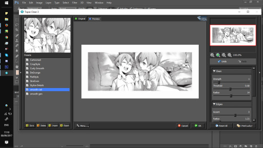
Here’s what it looked like when I used the filter without a border, as you can see it doesn’t look great at the edges.
For the most part, my settings stay the same and these are them:
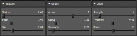
Now put a layer underneath your lineart and fill it in white with the paint bucket tool.
Then, go to ‘window’ and open up ‘channels’ before clicking the little circle highlighted below. Make sure you’re on your lineart layer!
Press delete and you end up with a weird pale looking image.
On your lineart layer, change the layer settings from ‘normal’ to 'multiply'.
Then duplicate the layer, right click and ‘merge’ them together.
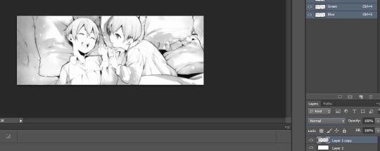
Now you have your lineart which you can colour! Make sure the layer stays on ‘multiply’ otherwise you’ll get fuzziness when colouring.

You might want to mess around with it a bit more though, personally I like it to be a little sharper so I'll edit it. Go to ‘image’ > ‘adjustments’ and then either ‘levels’ or ‘curves’ for example.
There's not much I can instruct about that part, just mess around with the settings until it looks how you want it! The best way to learn this is by doing it and everyone has their preferences.

Part three: Colouring
The lineart is finished so it's time to colour. I don't have a tutorial for this part though! It's really just going onto your preferred art program (I use Sai) and colouring below the lineart like any other image.
But this video seems helpful if you're completely lost:
youtube
After colouring my image on Sai, I ended up with this... clearly the colours are completely different to the finished product.

Part four: editing the image
This is probably the part that takes me the most time, but all I'm doing here is messing around with the filters until it looks how I want it. It’s super simple!

Again this is really subjective, but the main filters I use are ‘selective colour’, ‘curves’, ‘levels’ and ‘colour balance’.
There's no magic trick here because that's honestly all I do ahaha :D
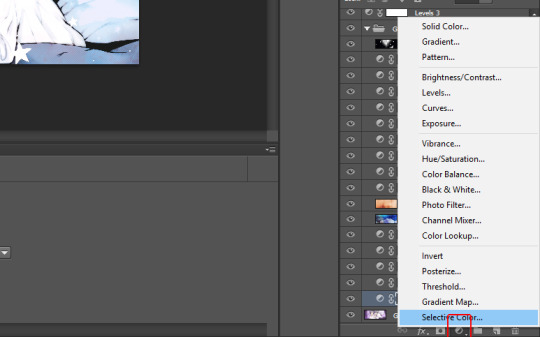
Oh! I also have a couple images I use frequently as screen-tones and overlays, the edit above has this one set on 'linear dodge' for example. The stars are just a layer which has been set on 'lighter colour' and placed above the edit too. You tend to use different textures for every edit you make so I'd recommend searching for some ones you like on Tumblr. :D
It can be frustrating at times but if you keep working at it you’ll probably end up with something you like! Hopefully this made some sense o:
165 notes
·
View notes
Text
New and Improved Minty Commissions~
Because editing the old post was annoying!
Hello and Welcome! Let’s get down to business, shall we?
All prices are listed in USD
Style A Pricing:
Chibi: $15 || Bust: $15 || Waist-Up: $25 || Knee-Up: $35 || Full-body: $40
Transparent BG: +$2.50
Full-Size Chibi Sample || Full-Size Anime Sample
Style B Pricing:
Chibi: $15 || Bust: $20 || Waist-Up: $30 || Knee-Up: $40 || Full-body: $45
With Colored Lines OR Soft Shading:
Chibi: $20 || Bust: $25 || Waist-Up: $35 || Knee-Up: $45 || Full-body: $50
With Colored Lines AND Soft Shading:
Chibi: $20 || Bust: $30 || Waist-Up: $40 || Knee-Up: $50 || Full-body: $55
Full Chibi Samples with Black Lines || Full Chibi Samples with Colored Lines
Full Anime Samples with Black Lines || Full Anime Samples with Colored Lines
Just Want A Sketch?
-Sketch lines can have a single color applied to them by request; the default color is dark gray.
Chibi: $10 || Bust: $10 || Waist-Up: $15 || Knee-Up: $20 || Full-body: $25
---
I cut off figures where it makes sense or there’s a natural line, so depending on the design; there may be more or less of the figure.
All orders will have a simple background. More complicated backgrounds will have an additional fee on a case by case basis.

Commissions / Art tag
WANT TO COMMISSION ME?
♦ Send me a note with: character and description (images preferred), what style and height you want (waist-up, fullbody, ect), your Paypal e-mail, and your offer. BE SPECIFIC.
♦ Paypal only. If I accept your offer, I will send you an invoice through Paypal for the full amount of the commission. I will not add you to my commissions list until you pay the invoice. For orders $30 and above, I can do half payments, with the second invoice sent after lineart is approved by the commissioner.
♦ I will send a sketch WIP and a lineart WIP (for colored commissions). Please look these over carefully, as making adjustments on the finished product would be difficult.
♦ TIME FRAME: ♦
I will always keep commissioners up to date with any changes or problems that crop up in the commission process. Generally, I can finish chibis in a few days and anime-style in a week or two. This can vary depending on my work schedule, how full my slots are, and the types of requests I get. The absolute longest I will take to finish a commission is two months, but my goal is a month for a full round of slots.
♦ CAN DO: ♦
- OCs (picture ref preferred), Forum Avatars , or Fan Art
- Girls and Dudes, but most importantly, CUTIE PATOOTIES
- Couples (for simple interactions like holding hands)
---> For orders where a single is $20 or more, take $5 off second character!
~~> For orders where a single is $40 or more, take $10 off second character!
* Please consider offering a little extra for these:
They either take more time, or I'm not as good as drawing them, so it'll take more time to make it look right
-Complicated designs, including armor, mechanical parts, and an overabundance of frills
-Furries or large animals, including dogs (cats, buns, ect. are not as difficult)
-Specific action pose requests
♦ NOPE ♦
- Sexually suggestive poses or *ahem* . . .you know.
Obscured nudity is fine, but if that hand is doing something that your mama don't approve of, I ain't drawing it! (even if the model is clothed!)
- Gore. Some blood is fine, or cute, cartoon-y organs for humor.
- Big, rippling muscles. It’s not that I don’t like them, I just can’t DRAW them.
- Real life people.
If you have any questions, feel free to ask.
I reserve the right to refuse any commission for any reason.
Even though it’s your commission, it’s still MY work. Please do not claim/post my work as yours, and don’t use my art commercially. Posting on other forums/website is ok as long as you credit me or link back to this account’s gallery.
0 notes
Last Seen Blogs
jdoramaid
@JDoramaID
i-got-chuu
i got chuu
slimetony
:)

grammarmancer
Protect Your Bed Mattress

osyoung4
OsYoung4.0