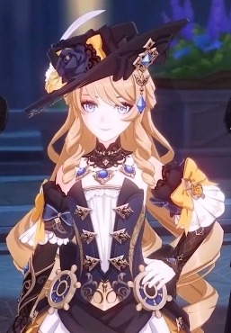
#isn't the colour palette cute
Text
Three for One 2

Warnings: this fic will include dark content such as dubcon/noncon, cheating, customer service abuse, and other possible triggers. My warnings are not exhaustive, enter at your own risk.
This is a dark!fic and explicit. 18+ only. Your media consumption is your own responsibility. Warnings have been given. DO NOT PROCEED if these matters upset you.
Summary: As a customer service associate, you’re used to work with a wide variety of characters. Your efforts to go above and beyond draw the attention of a certain set of customers who want more than what’s on the shelf.
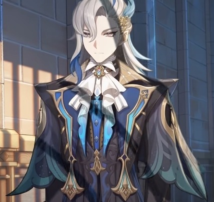
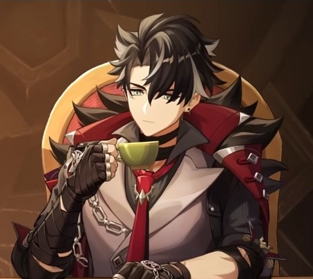
Character: Andy Barber, Lloyd Hansen, Ransom Drysdale
Note: The ho-lidays are the daddies and the baddies.
As per usual, I humbly request your thoughts! Reblogs are always appreciated and welcomed, not only do I see them easier but it lets other people see my work. I will do my best to answer all I can. I’m trying to get better at keeping up so thanks everyone for staying with me <3
Your feedback will help in this and future works (and WiPs, I haven’t forgotten those!)
Love you all. Take care. 💖

You bob around to the tinkling of carols as they waft over the store. Unlike your coworkers, you enjoy the repetitive tunes. They are so fun and bright and help the time pass between customers and stocking. Not that there isn't more than enough to keep you busy.
In the rare moment where you aren't distracted, you let yourself browse the colourful lipsticks and shining perfume bottles all around. You don't have anyone to shop for, not even yourself. You have your dollar store glosses and discount nail polishes. You don't see the need to spend too much on those things. Or maybe you just prefer what you know. Simple and cheap.
Around lunchtime, traffic really picks up. Several customers ignore your approach and brush by you before you can entice them into buying some Chanel. You've already hit your sales targets but you never really think of numbers.
A woman stops you and asks for a very specific palette. You know just the one. You think it's cute, it looks like a cupcake, and while you adore the aesthetic, it isn't worth the price tag. It's just powder!
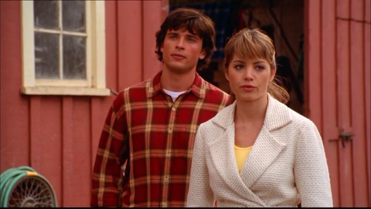
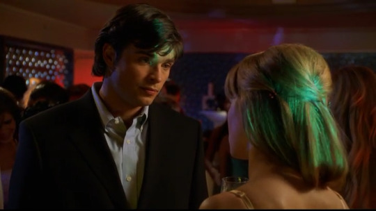
You show her where it is and Luanne comes over to take the reins. She's the makeup genius, her flawless contour is proof enough. You turn to float back to your zone and see a man watching you. You recognise him! Vaguely. You see a lot of people in a day.
"Good afternoon," you sing as you near him, "anything I can help you with?"
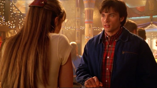
His throat bobs as he cheek ticks, "uh, yeah, er..." he pushes back his gray jacket, tucking his hands in his pants pockets, "you remember me?"
You smile as you try not to show your cluelessness, "I think..."
"I came in last week," he says.
You think, scrunching up your face as you tap your chin, "yes! You bought Liz Taylor for you mother."
"Mother-in-law," he corrects you, not unkindly.
"Yes, that's it," you jab your finger upwards, "you complimented my sweater."
"Yeah, that was me," He finally smiles, "anyway, I was thinking of getting a gift for my wife. Just a little stocking stuffer."
"Oh, that sounds so cute," you nearly squee. You get so excited to help people shop for a loved one. At the same time, you feel that void. Maybe one day you'll have a husband thinking of you. "We have some great gift sets, actually. They come with different scents so you're wife can figure out which one she likes best." You direct him over to a shelf, "oh, and if she has a favourite, you can get her a full bottle for Valentine's!"
He gives you a look. His eyes narrow just a bit and his cheeks round, "that's a good idea."
He glances over the shelf and you wait patiently. He turns back to you, his eyes flitting over your name tag as he reads it out, "do you have a suggestion?"
"Me?" You perk up, "well, I actually like the Coach. It's not too expensive and it's nice and subtle."
"Is that what you wear?" He asks.
"I don't... I use some cherry blossom body spray but I usually smell like the whole store by the end of the day," you shrug.
"Cherry blossom," he nods, "oh, by the way, I'm Andy."
He offers his hand in an overly formal way. You giggle but take it nonetheless. You don't really get that often.
"Sorry," he squeezes your hand firmly before letting go, "lawyer, habit."
"No, it's fine," you assure him, "I'm just a perfume salesman, is all."
"Well, you're really good at your job," he praises.
"How do you know?" You say.
"You're friendly and helpful. I have no complaints," he reaches past you and claims the Coach pack, "she's going to love this. I owe you."
"No problem. Do you need me to ring you up?"
"Actually," he sighs, "she has this idea. Christmas card. I'm supposed to find a sweater. So, I need to look around some more."
"Oh, that's so cool. A Christmas card? The sweaters are just over in the men's, right near the east entrance," you point, "they have some really cute Charlie Brown ones."
"Charlie Brown," he repeats.
"Anyway, I'll let you go," you clutch your hands together, "I hope your wife likes the perfume."
"I'm sure she will," he agrees, hesitantly clapping the kit between his hands, "uh, thanks. Again." He leans back on his heel, "oh and, that's a really nice colour on you."
"Uh," you look down at your gem green blouse, "thank you, sir."
"Andy," he insists, walking backwards, "again, you're a life saver."
You grin proudly and he spins on his heel, nearly knocking into Luanne as she comes over. He apologises as he side steps her and continues on. She gives you a strange look.
"Geez," she grumbles, "people. This time of year makes everyone so crazy."
"Well, he was nice," you say.
"Kinda cute, too," she intones.
"He was shopping for his wife."
"Lucky lady," she scoffs, "so, you wanna go on lunch first? I'm dying for a latte."
"You can go, I don't mind," you say, "I'm not very hungry."
"Deal," she winks, "I'll get you a hot chocolate for your trouble."
"You don't have to do that."
"I don't have to, I want to, sweetie," she preens.
"Fine, fine, I accept your coerced hot chocolate.”
🎀
Another day close to complete. It's like checking off items on a list. Each evening seems to darken sooner than the last, every morning rising too soon.
You yawn at the empty fragrance section as it’s only you left for the last hour. There isn't much to do except balance the till. Your headset keeps you entertained as electronics calls out possible shrink and home goods argue about their numbers.
“We need a body at returns,” Lucille cuts through the chatter. “Now.”
No answer comes and you slowly slide your hand up the wire. Before you can hit the button, your name is snarled from the other end. You're ordered up to cash to assist with the hordes.
You leave the ghost town that is beauty and as good as skip up to the front. You calm your step as you see Lucille sneering at you from behind a machine. You give a tiny smile and claim the extra screen behind returns.
“I can help the next person,” you call and wave your hand in the air.
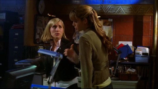
You stand back and wait for your first customer. A man comes up and throws a torn open package on the counter, the item bouncing out of the plastic. You flinch and barely catch it before it can slide off the other edge.
“Hello, sir,” you bat your lashes, “how are you today?”
“Not fucking well,” the man snarls. His mustache tickles your memory; do you know him? “It’s a piece of shit.”
“Oh, okay,” you look down at the trimmer and examine it, “you’d like to do a return?”
“Yes, I’d like to do a return,” he snaps, “are you dim?”
“Of course, sir,” you punch in your ID and passcode, “I’ll just get you going. Do you have your receipt?”
“A receipt? I bought the damn thing here, look it up.”
“Ah, alright, when did you buy it?”
“You don’t remember, little trigger finger,” he sneers.
“What do you mean?”
“Pfft, right, you think spraying people with skunk spray is fun?”
“Um, no?” Your cheeks tremor as you withhold a frown; you think you know him now as you’re hit by a sudden wave of Gucci cologne, the scent of a memory. “Did you have the card you purchased this with?”
“You don’t think I have money?”
Everything he says is aggressive. Your questions bounce off him like accusations. You don’t know what to say that won’t agitate him further, He huffs and kicks a foot out, leaning on his back heel as he reaches in his back pocket.
He flicks a black card onto the counter, “put it back on this.”
You nod and take the card, examining the nameless front. You turn it over and swipe it in the machine instead to search the number. He scoffs, “bet you never seen one of those up close.”
“Sir,” you smile bigger, letting the insult ping off of you. All the money in the world and he has no manners.
You find the purchase with the same sku and put his card back on the counter. He snatches it up as you start the return. You scan the barcode and continue on to the next screen, “what’s your name, sir?”
“Lloyd,” he answers curtly. You type, waiting, then look up at him, “Hansen.” He finishes sharply, “with an E, got it?”
“Yes, sir, and the reason for return?”
He rolls his eyes, “it doesn’t fucking work.”
“Alright. So it doesn’t cut the hair or–”
“It won’t turn on,” he growls.
“Right,” you take the trimmer and turn it over. It looks fine enough, even after he threw it. You slip the door of the battery compartment off. It’s empty, “and you had double As in it?”
“Double As?” He repeats.
“It needs batteries, sir.”
He pauses, eyes flaring, nostrils flaring.
“You think I’m stupid? That I don’t fucking know that? You’re not getting free fucking batteries from me.”
“Of course, sir, of course,” you rarely feel this addled, even this time of year, “I’ll get you your money back on a gift card–”
“Gift card? I want my money,” he holds up his card between two fingers.
“Yes, sir, I understand. As per our return policy, personal care items, once opened, are only eligible for a store credit return. Or you can exchange for another item. Would you like to look at our other trimmers? I can put this aside while–”
“What? How would I know that?” He hisses.
“It says on the receipt, sir.”
“I don’t have the goddamn receipt,” he barks.
“I know, sir, sorry. I can only refund this amount on a gift card. I can’t override the option.”
“I want a manager. NOW!” He demands as you jump in your shoes.
“I… I’ll see if she’s avail–”
Lucille has you jumping even more as she appears beside you, no doubt drawn by the raging man in front of you. She elbows you out of the way, not even acknowledging you as she puts on her mask. She leans on the counter just slightly.
“Sir, is there something I can help with? I’m the manager,” she says.
“I want my money,” he echoes once more. “I bought a defective product and I don’t want store credit. I drove out here twice for this bullshit.”
“Oh, certainly sir,” she brushes you with her hip, further edging you out, “right back on that black card, right?”
She scans her keycard, overriding the safeguard, and proceeds to the refund screen.
“Yes, exactly,” he snorts, “not like I don’t have even more money to spend here. Even if the customer service is lacking.”
You back away, unsure what to do. Do you just stand there for the transaction or do you go back to your department? You twiddle your fingers and bob on your heels.
Your eyes meet that man’s and he smirks smugly, wiggly his credit card at you. It’s fine, you won’t let him ruin your day. He’s already ruined his own getting so worked up.
🎀
It’s another busy shift. Your hot chocolate has gone cold from your neglect and you long to sneak away and shove it in the break room microwave. You can’t mourn the lukewarm drink as the line before you stretches on. You’re only a week from Christmas.
You finish wrapping the Prada bottle and hand it over the iron-haired woman with her cute curls. You wish her a good day as she waddles off. The next customer comes up, slamming down a cup so hard, the foam of the drink spits through the slot in the lid.
“Hello, sir,” you croon, “how are you today?”
“Here for a pickup,” he ignores your question.
“Right, can I get a name?”
“Why?” He challenges.
“For… for the package,” you sputter.
“Oh, uh, Drysdale,” he sniffs.
“I saw that earlier. I’m the one who called,” you brighten up.
“So you’re the annoying songbird,” he grabs his drink again, “took you fucking long enough. Line’s a mile long.”
“It’s very busy, yes. Everyone’s catching up on their Christmas shopping,” you bounce, “are you almost done yours?”
“Yeah, I bought myself cologne. So, chop chop, sweetheart.”
You nod and quickly spin. People get so impatient. You go into the small back room housed behind the shelves of lockup and you search the shelves. Drysdale. You pluck up the box and hurry back out.
“Right here,” you announce, “I have good news, too.”
“Tell me you’re gonna stop yammering,” he snickers.
“Um, no, the uh… the cologne is currently on markdown so I can do a price match and give you your money back.”
“Why would you do that?” He asks.
“Er, because… it’s policy?”
“You think I can’t afford it?”
“N-no, I didn’t say–”
“Look, I don’t need some department store busy bee to judge me, got it? This scarf costs more than your whole wardrobe,” he touches the patterned scarf around his neck.
“It’s a very nice scarf,” you agree.
He narrows his eyes, “you’re mocking me.”
You shake your head, “no, sir, I like the colours–”
“Give my goddamn package," he reaches and rips the box out of your hands, “and a tip, shut up and do your job. Maybe then you won’t have half the city waiting to get their shit.”
“Thanks,” you swallow down his anger. “Have a great day, sir.”
He doesn’t reply as he takes his cologne and storms away. You watch him and notice his cup still beside your till. It’s too late to call him back. You’ll just put it aside, you’re sure he’ll come back for it.
You move it to the other end of the counter and face the next customer, “hello, how are you?”
“Good,” the blonde woman answers with a gentle smile, “some people…” she tuts, “don’t let the grinches get to you, honey.”
“Thanks,” you feel the ice melt away, “I won’t.”
“Adorable cardigan,” she adds, “I really love the collar.”
“Oh, thank you,” you trill, “is this everything for today?” You gesture to the bottle of Calvin Klein on the counter.
“That will be it. And I’d love to have it gift-wrapped, thank you, hon.”
#andy barber#dark andy barber#lloyd hansen#ransom drysdale#dark lloyd ranson#dark ransom drysdale#dark!andy barber#dark!lloyd hansen#dark!ransom drysdale#andy barber x reader#lloyd hansen x reader#ransom drysdale x reader#fic#dark fic#dark!fic#au#multicharacter#multifandom#knives out#the gray man#defending jacob#series#three for one
469 notes
·
View notes
Text
Nora's Design and What It Might Have Been Hinting at
There's a very high chance this will all feel a little incoherent and like I'm maybe grasping at straws, but I really do think I have a point here, so deal with me, please.
Okay, so, Nora. Nora's design.
Ever since it was first revealed, the general consensus has been that it kinda sucked, especially compared to her design for Islands of Wakfu. Because let's face it, when we take into account the Council of Six's more varied and detailed designs...


Compared to them (and especially her flashback self, look how cute, and eager, and fun-loving she used to be!), Nora is literally just a pink ninja:

Let's face it, it was underwhelming.
However, and I know I'm not the first one who's come to the realisation that Nora's current design and colour palette is indeed intentional, rather than a poor choice, I believe I understand now what Ankama was trying to do.
Nora's design was meant to be foreshadowing of her actual role in the season. More specifically, her role in allowing the Necromes free access to the World of Twelve.
If you think about it, all the major Eliatrope players this season followed a very simple colour palette that tied them to the Eliatrope goddess and marked them as forces of good: while white was a very prominent colour, blue was the one they all had in common.
All the actual protectors of the World of Twelve... Except Nora.
Her design is the one that clashes the most with the rest of her family. But unlike Qilby, whose more monstrous appearance served as a reminder of his past atrocities and kept both Yugo and the audience on their toes because surely he must be up to something, Nora's more down-to-earth design kept the focus away from her.
In fact, I'd even say her white hair was another deliberate choice to make us subconsciously believe she was on her family's side. After all, white is a very prominent colour in the Eliatropes' palette, especially in the Eliatrope goddess. What's more, deep down, she is on her family's side! These past few episodes showed us that it was Efrim who used Nora to advance his master's agenda, she had no agency or say in the matter whatsover.
And yet, her most promiment colour is pink. A clear opposite from her family's more prominent blue. And what does pink remind us of? That's right.
Stasis.
Death, destruction, stability.
The Necromes.

And just like the Necromes, even Nora's eyes are naturally pink. These parallels only become more pronounced once Nora becomes possessed by Efrim, when all of her, even her portals, have similar hues.


Both her colour palette and role in the Necrome invasion are opposite from Yugo, especially once he too has been captured and had his Wakfu stolen.

I refuse to believe this contrast between the two isn't intentional.
Because now, now that even Qilby has acknowleged him as his King, now that he commands the Eliatrope Dofus and the Eliasphere, now that the World of Twelve and his loved ones need him more than ever... Now everything about Yugo is blue.
Nora is the unwilling traitor, so the pink in her outift had to reflect that. Yugo is the hero stepping up to the challenge now that things are more dire than ever, and he wears his people's colours with pride.
#wakfu#wakfu season 4#wakfu season 4 spoilers#wakfu spoilers#wakfu analysis#lokus#mon frère mon roi#my brother my king#character design#yugo the eliatrope#nora#wakfu nora#efrim#wakfu efrim#eliatrope goddess#adamaï#qilby#master joris#joris jurgen#amalia sheran sharm#eliatrope#necrome#toross mordal#ankama
105 notes
·
View notes
Text
Hazbin Redesigns pt.2
These characters are mostly ones, whose designs I never had big problems with, I just had different ideas for them sometimes.
Sir Pentious is female in my AU because her backstory requires it. Also I thought she would be cute as Ms Pentious. I made her colours more earthy and gave her a more serious look, since she will probably be an antagonist (she is still very excentric, she mostly pretends to be serious). I gave her design some elements that resemble steam and clouds to fit with her inventor theming. I kept the eye hat thing because I think it's fun.
For Cherry bomb I kept a lot of stuff from her original design. Her colour palette, her tights, her shoe situation and her hair looks pretty similar too. I toned the brightness down and made her look more Punk (because i'm pretty sure that she is supposed to be Punk). I gave her a prosthetic since I can imagine that she would loose a limb in an accident with her bombs. Ms Pentious made her the prosthetic (she and Cherry are officially dating here and are both antagonist from how it is now). I tried to make her look chaotic and spunky so her design was very fun to figure out.


The main issues I have with Velvettes original design is that she doesn't look like a demon really and pretty much just like a human with weird eyes. Also she suffers from the fact that Viv makes all her black characters grey. I made her a Vampire/Bat Demon because Vampires are creatures of the dark and it reminded me of how people on the internet often are. For her outfit I was mainly inspired by fashion dolls like Monster High. She is supposed to look modern and like a fashion influencer. Her redesign is very bright and obnoxious kinda to reflect the overload one can get from the internet and trends.
I wanted to make Vox older and boxier looking. He is an old TV show host who is upset that he has to stay current with the trends to keep being relevant, even though he doesn't view modern television as "real" television. He is jealous that Alastor can afford to keep his older format and style. I gave his outfit a similar colour sceme to that of Alastor. Vox is meant to look slimy and kinda pretentious. Other that that he isn't so neon anymore and has a less modern TV as a head.
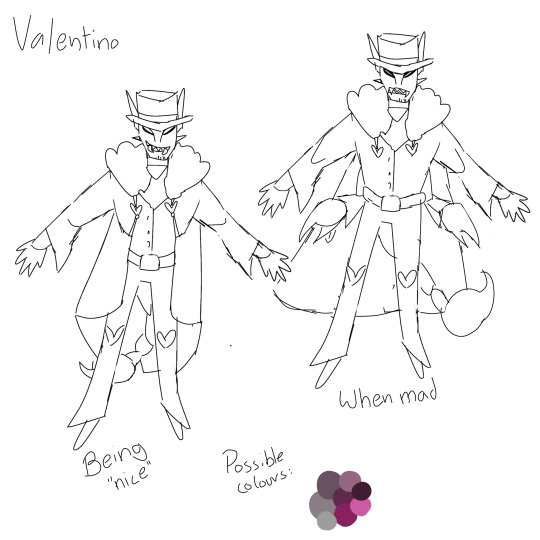
I have some ideas for Valentino but I didn't make the effort to actually make a full drawing for him, because I didn't want to (not for him). Also he probably won't really appear in my AU (still figuring out wether the Vees will even be important at all). He is not a moth here because Vaggie is already a moth and I didn't see the need for two (not related) characters with the same gimmick. He is a scorpion, since they're more intimidating. His outfit isn't all too different (from when he opens his coat in the show). Val would be more muscular and in general more menacing and still very manipulative.
Final character lineup.

Feel free to ask questions/give suggestions for my redesigns/rewrite.
#hazbin hotel#vivziepop#hazbin hotel redraw#hazbin hotel redesign#hazbin hotel critical#i dont support vivziepop
100 notes
·
View notes
Text
My thoughts on the Fontaine characters rn (pre 4.0)
I saw someone making a post about their thoughts and they were tragically wrong and I disagreed. So here I am, being opinionated.
I'm not gonna discuss leaks, I'm just talking about the character designs and what lore we know from the trailer and teaser :))
Lyney
So, Lyney is great. I love that he's kind of sussy, and his teaser that recently came out is almost... Sinister. And yet, he also checks the boxes of being really fun and extroverted! Venti vibes tbh.
Design wise? His animations are the best in the game, hands down. They suit the performance aspect of his character perfectly and are almost enough to make me pull for him.
Tragically, his character design isn't really for me. I think the simplicity works with the bombastic animations, and I'm glad to see he's wearing a reasonable outfit for the job he does (a rarity in Genshin). And yet, I'm a bit too much of a lesbian to be uber interested in the twinky direction his design leans.
Not pulling.
Lynette
So she's super cute. We have got a lot of cat girls already (I think Lyney should have also been a cat-person tbh) but I love that Lyney isn't actually doing cat things. Like, she's this subdued introvert, no meowing during her attacks or curling up in boxes like Kirara. She's just a person.... Who's also a cat.
I like her character design better than Lyney's; the blue just stands out a lot more than his red does, and the big bow is a better centerpiece to her design than Lyney's hat is to his. Plus, her animations are also nice.
We're getting her for free so I likely won't pull, but I am already preparing artifacts to build her on my account.
Freminet
Have I said how much I like sibling dynamics? These three actually seem pretty close and like they will gasp interact with each other! In comparison to the likes of the Kamisatos, this is miraculous.
I know several people who love this guy, and I do think he looks good. I saw some complaints about his hair cut (I think it's adorable), and the chunky boots & coat really serve to emphasise his awkwardness without sacrificing aesthetics.
Unfortunately, he's a physical claymore character, so it's a big skip from me.
Focalors/Furina
Well she's a brat huh. I worry after Raiden that they'll destroy Furina's character arc in order to make her more palatable, but I want her to go full Marie Antoinette. All the lore with the Oceanids disliking her and the general stuff about using the court for entertainment make me very interested in her.
As a design, I just dislike the twin tails. I love the blazer and the huge gem and the hat that's actually a crown!! Like, Furina is extravagant and over the top, obviously self obsessed - she looks perfect in that regard.
Since she's the archon and she's Hydro, she'll probably be broken meta wise. I'll likely pull, but mostly to make cool teams with her, not because she's a fave of mine specifically.
Neuvilette
... Father?
FR though, I understand why several people are crazy about this man. I do wish he looked a bit older since that's sort of where his characterisation is - he's done with Furina's shit and he's doing all the actual work of running Fontaine. With the elf ears, I expect him to be some sort of long-life species - he has no visible Vision and his hair kind of looks oceanid-like, so I figure he's not actually human. That along with the slits in his eyes. I hope he turns out to be older than Furina, and that he has a kind of reluctant dad & spoiled daughter relationship with her; we do see him tell her off in the teaser.
Neuvilette is the most feminine tall man character and the hair is a great aspect of the design. The colour palette is good and I do like the robes since he's a Judge, however I think it might get a bit boring to look at when you're playing as him - which is probably why the hair is so dramatic, in order to bring interest to the design.
He'll probably be Hydro and he'll probably be a catalyst based on that outfit (it's not exactly maneuverable enough for anything else ':))). I am interested in pulling almost a 100%.
Wriothesley
Another man???
I don't understand people talking about the lack of husbandoes in Fontaine, like look at these fine gentlemen.
We don't have much official info on Wriothesley so I'm gonna dip a little into leaks here, skip if you don't wanna know. He is some sort of prison warden which I bop with - it's an expected expansion on the justice landscape of Fontaine. He's on the rough side of the Fontaine infrastructure, in comparison to most of the other characters. That interests me since it feeds more into the duality themes of Fontaine, though currently we're unevenly biased rn to the more santized characters.
Design wise he's one of my favourites. White/black/red looks so good, as does his kind of punk esque chains. The tie puts me off somewhat, like he looks sort of smart and put together, but then the rest of the design undercuts that.
Leaks say Wriothesley is a physical standard banner five star. This fills me with fear. I also don't know what his actual personality will be, so let's say I'm undecided on pulling him.
Charlotte
I liked her personality and en VA in that one TCG event, unfortunately much like that event, Charlotte looks boring. She's cute, whatever, but she doesn't seem particularly story relevant and her design hasn't captured me.
I'm just not that interested.
Sigewinne(?)
Okay, she's cuter than Charlotte she's a sea slug person so immediately more interesting. She was also hanging out with Wriothesley, which is so adorable considering how different they seem.
We're dipping back into leaks here, but it seems like she might be another Hydro healer. I've seen people annoyed by this, but I'm perfectly fine with it - I don't have Kokomi and I like Nilou bloom as much as the next person.
If Sigewinne is a four star, I hope she's on a banner for a cool five star.
Navia
I know a lot of people like this woman. Taylor Swift etc (I am not overly into Taylor Swift), but I think Navia could be cool.
I find her design overcrowded. I do think this suits the fact that we're playing with French Revolution ideas and she's part of the bourgeoisie, so ofc she's overdecorated and elaborate in her fashion. Even though it makes sense, I still don't like the arsthetic of it.
On the other hand, I do like the yellow - it's not a colour we see in too many Genshin designs. I don't really like how it fits with the blue jewellery though.
Personality wise, I worry a bit that she's gonna be our waifu bait, but they did Dehya's characterisation really well without falling into that trap. Navia could be very fun and I think there's a lot of promise in the idea that she might be a class traitor, teaming up with us against the Fontaine government (wow Genshin loves a corrupt government huh).
Will I pull? She's a geo claymore user and my triple crowned Itto is already collecting dust. That's a no from me.
Clorinde
Everyone say hello to my wife:
(I'm waiting)
I've seen so many people mad at Clorinde when I think she looks great. Her outfit is simpler than is typical for Genshin, but that's cos she's a no-nonsense fighter type! Like how we saw with Lyney, more muted designs often mean more dramatic animations, and we already saw Clorinde doing some dynamic fight stuff in the trailer.
She really interests me in that she's a champion duellist, strong enough that even Childe wants to fight her. We see Clorinde works directly beside Neuvilette in the trailer, so she must be high up in position. A gun and a sword? She's trying to kill Navia, but the Devs describe their relationship as "complicated"??
Clorinde is an Electro woman and these are always queer fyi.
I hope she's pretty straight laced, but not quite in the Sara way. She's boring tbh, mostly because she is always answering to someone else, and she gets so little screen time. For Clorinde to work, I think she needs to have independence and apt presence in the story to be explored - not just a prop/obstacle.
Her personality makes me fearful, but rn I'm pulling 100%.
#genshin impact#Fontaine#Lyney#lynette#neuvillette#focalors#Furina#navia#Clorinde#sigewinne#charlotte genshin impact#freminet#Wriothesley
100 notes
·
View notes
Note
If you are still talking about neopets designs, plz review lutari? I always wanted one of them

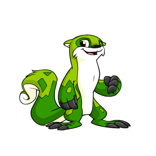


Lutari are probably most well-known for being one of the limited pets on the site, only being able to be made on their pet day and previously connected to the long-defunct Neopets Mobile game from back in the flip phone days. It's to the extreme where you can't even put one up for adoption, with them just running away instead of going to the pound. (Side note: TNT should re-release Lutari Island as a main site feature and make it so you can always create a Lutari while visiting. But I digress.)
Lutari are mostly just otters, but their very distinct, mottled markings, huge claws, and fluffy, curly tails are pretty distinct and make them feel unique, even though they're otherwise pretty straightforward. I like the amount of detail present; they have just the right balance of color, with white underbellies, black claws and noses, and two shades of the main color for their bodies, all of which is carefully balanced as to not be too busy. Overall, they're pretty dang nice... though they do have one drawback.

Considering that Lutari were released only shortly before conversion happened, you would think that they wouldn't have changed much other than losing their swimming pose (which is a shame, but a necessary change for customization). But in actuality, they actually changed quite a bit in various subtle ways, ending up with completely different proportions, markings, facial structure, and more. Here's a really great redraw that's more accurate to the original design, which really highlights the differences between the two:
The eyes are a completely different shape and the pupils are smaller, the mouth is smaller, the ears a completely different shape, the feet are weirdly elongated, the tail is less swirly... and they're such weird changes, because none of them actually have to do with customization.
Another good example of the changes made is Mr. Chipper, who was, weirdly enough, released prior to the Lutari species as a whole. He stands bipedally, and thus shows what a converted Lutari should've looked like. Also of note is the markings, which for some reason became weirdly angular on converted Lutari and less organic than they were originally.

And don't get me wrong, converted Lutaris are still fine, and are by no means ruined or anything like that. It's just a shame that they're less cute than they used to be, and that seemingly little care was put in to convert them properly.
Favorite Colours:

Maraquan: I went over this already in my Maraquan colour review so I won't go into too much detail here, but this design (based off a user submission) is beautiful. I love the use of an axoltle as a base, the pink and cream colors are lovely, and the gill ears are just perfect.


Pirate: While this design is pretty good as a whole, with a nice grey base with a few bright red accents and a properly cutthroat expression, it's the way they managed to seamlessly and subtly work a skull into the tail markings that really earns it a spot on this list. 10/10 no notes.
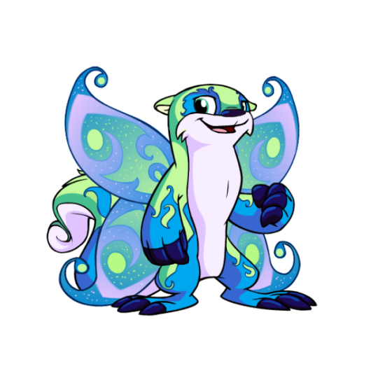
Faerie: While a little on the busy side, the faerie Lutari is quite pretty. The light green, blue and pink color palette works perfectly, and the beautiful swirled body markings work off of the Lutari's default markings perfectly. The wings also compliment it will, matching both the body colors and the intricate designs.
As an added benefit, you can also get a very pretty, less busy design out of this by using wings-be-gone, which arguably looks even better than the full color. I appreciate that kind of versatility.

BONUS: Camouflage isn't anything crazy, and it's not even all that camouflage-ish, but honestly I just really like this design. The use of a neutral palette and gradients creates a lovely and distinct color that's quite appealing for those who want a more realistic otter look or those, like me, who just like subtle and simple designs.
47 notes
·
View notes
Text
and the Unrelenting
Character Design of The Dark Queen of Mortholme, Pt. 2

(Pt. 1)
With the story playing out from the point of view of their opponent, the Hero is characterised mainly through the mystery they present to the Queen. They're unassuming, yet determined to go further than the Queen could ever imagine. Humble in a way she might view as lowliness, but they try to prove holds the key to remaining open to improvement. They might not be powerful, efficient or elegant—not next to the Queen, at any rate—but they for sure are resilient.
The first priority was for them to look tiny in comparison to the Queen; it shouldn't come as a surprise how little damage to the Queen they do per hit. Not weak, but certainly overpowered. More stocky and short, like all of their considerable willpower has been crammed into a compact package. A lot of the exaggerated proportions like the poofy trousers, big head and little hands and feet are to make them a bit cute and goofy. This is not a hardened adventurer, this is someone who's trying their best.
At the start I had some sketches with an uncovered head to contrast with the Queen's helmeted one, maybe to have a long ponytail to give the Hero's movements a nice flowy follow-through. That's before I decided to characterise them as a mystery, however, and all the subsequent designs got a hood to hide their face.
I even considered a whole cape, but it was too much. They're not actively hiding themselves; it's only the Queen who has difficulty comprehending their nature. Next to her decked head to toe in plate armour, the Hero should come off as someone comfortable being more vulnerable. Maybe they're a bit of a dumbass, maybe they're boldened by the knowledge that even if they get hurt, it won't stop them for long.
Thus, practical if rather unintimidatingly floppy-sleeved chainmail it was. They get a sword, because they're meant to evoke the most typical fantasy protagonist possible. Our interest with this character isn't in the character per se, but in the player-like will behind the avatar, so an overcomplicated design would only serve as a distraction. The only extra detail they get are the belts to suggest resourcefulness.
It's implied that between their attempts at the boss, they have whole little RPG adventures outside of the boss room that the player is locked in. The Queen doesn't get to participate in any of it, so we know nothing about this part of them. Yet we see the results as they with their new abilities, tools, perhaps dialogue hinting at their emotional attachment to some storylines that motivate them to push through. Design-wise, I thought I'd like to depict their updating toolkit not only through their animations, but through an evolution of their sprite: a shield appears in their off hand, a bow on their back, potions on their belt. (It's possible this will be cut content due to the effort of making multiple versions of every single sprite sheet, but who knows. I have poor impulse control.)
The palette, unsurprisingly, is mellow grays and warm hues to oppose the Queen's starkness and cold. Gotta use the clichés when they work! I didn't want the Hero's main colour to be too bright a red, though. It was picked (from the few potential options that would stand out from the blue-dominated background) to represent their fierce determination, but in her own way the Queen is determined, too. It's the Hero's stubbornness to improve, their malleability, which distinguishes them. So they wear a softer, earthier red.
#concept art#pixel art#character design#game development#indie dev#the dark queen of mortholme#dev blog
33 notes
·
View notes
Note
i luv ur dr art recently @_@ if you don't mind me askin who are ur fav dr characters design wise (not personality/story?)
LOVE when people ask me stuff like this yes - i'd gladly <3
Only included DR, SDR2, NDRV3 - we'd be here forever if it was the entire franchise. Also only accounting for their ingame default outfits
The placements on each tier is deliberate, the closer the character is to the top of that tier, the higher they are. I judge them by:
>Prominence of the Talent, its practicality
>Relevance to the character's identity/personality
>Colour and aesthetics :]
[ramblings undercut]
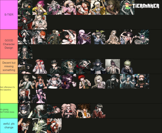
[S-TIERS]
Like Gundham for example is an S-Tier design as it ticks all above boxes whilst still in a school uniform. The Four Dark Devas are important to the design, they go with him everywhere and the 5 of them are a UNIT which shows his strong connection with animals. I love the bandages and the eye-scar as it has a double meaning that indicates yes he works with animals (they can be rowdy), but as a character Gundham builds onto this detail using these scars to create this dark angsty facade. Aesthetic-wise by his hair he has a unique character silhouette, and I like how his purple is made the focal point by the blacks and whites of his uniform... both reinforcing the villain-facade and highlighting the importance of the Four Dark Devas.
Similar reasonings for the other Top 2 of Souda and Miu this time toppled with the strong yellows and pinks in their design. It's eye-catching and easily conveys what their talent is. (I really wish they kept Miu's promo-art backpack into her regular sprites, imagine her emoting with 4 arms isn't that awesome >:] )
Honorable mention to Impostor (Twogami) as well. While the regular Togami design is... mid. I really appreciate how contrasting Impostor's colours and accessories are down to the necktie and poses! Like yes they are impersonating Togami, but their values and personality as a person are not the same. The deception of Togami's dark clothing vs honest white suit of the Impostor's. Impostor fucking CLEARS regular togami any day on all accounts I will die on that hill.
[GOOD CHARACTER DESIGN]
A lot of the talent indications on this tier are more subtle in compare to S-tier but they get the job done and they do it in a pleasing way (I like the colour palettes on Chiaki, Mikan and Ibuki for example). Like I loveeee Sonia's uniform especially for it's simplicity. And yet the design still alludes to the Princess talent by elegance in the bow, the brooch, her crowned braid and how the shape of her skirt resembles that of a puffy princess gown. I also think the reds in the design like Snow White are a cute touch!
To me, Sonia should be the standard in what a Danganronpa design SHOULD be in accordance to detail.
[BAD CHARACTER DESIGN]
[ie the Green and Blue tiers]
Reasoning why I put them here mainly because of wasted potential, either too basic (in a sense it doesn't tell much about that character) or not practical in any way for their talent... I HATE Ryoma's stripe leggings ik he went to prison but the execution of the concept looks awful.
And I hate Akane's and Sakura's outfits particularly cuz you KNOW why they made those skirts so short and I hate that. We could have gotten awesome gymnast of martial artist outfits but no......
I added Kiibo in that bottom tier because structurally even as a robot he is a visual nightmare if you're an artist trying to draw him. Especially when most of his suit is different shades of black and complicated chest cavity. And I despise the way that it looks like these robo-plates are attached on top of what looks like fabric long sleeves and pants as if the designer was too scared to fully commit to him being a robot. He is NOT 3D-optimised and he is NOT animator-friendly I'd throw up if I ever had to deal with him.
#ask stufff#stufff rambles#danganronpa#dr#sdr2#ndrv3#this is so unnecessarily long idc i love talking about design details i will have this#i was gonna start COLOURPICKING... and ANNOTATING dude shits serioussss
39 notes
·
View notes
Note
Thoughts about the Cure design from Wonderful Pretty Cure?
Overall: alright designs, none of them are instant winners or get me interested in the character based on looks above, but there have been more meh season reveals as well. With the striped ribbons they do look more unified than any of the seasons that have come out while I've been following the franchise so that's a point in their favour at least.
Wonderful:
A really standard pink Cure design both with colours and shapes. I always like a two-tone hair (and would certainly like it less if her hair was just pink) but we've had the pink+blonde combo several times already, how about something new with the hair colour? Doggy ear hairstyle is fun at least and the crown is probably the best design element. And striped socks, or tights I guess, are always nice.
Friendy:
Unique hair colour for a purple Cure is very welcome and her hairstyle is cute. I also like how the four Cures are split into two pairs design-wise, so even if the whole team still doesn't look quite as unified as I'd like, at least the pairs have a more of a theme going on with each other. I also like how they swap brooch ribbons.
But about Friendy, the Sherlock vibe is nice but I'm skeptical if anything will come out of it. Overall I find this is a solid design even if no individual element stands out particularly.
Nyammy:

Lillian:
My favourite of these, mostly thanks to the Stocking like hair. And finally it's a white haired Cure! A white palette with blue accents gives her a peaceful look. I'm also very much a cat person so she gets points from that too. And I said that no design makes me that interested in the characters, but I think I'll have to take that back because Nyammy's dazed expression does make me curious, it'd be really funny if she ends up being like lol I don't care about everything.
Probably the weakest one of the bunch for me. Theme colour discourse aside, this is kind of too monochrome for my taste and I really don't like how the pink stripe looks with the teal. Hairstyle isn't my favourite either and I think she'd look nicer if she had a separate skirt or shorts under the hem. But the hem shape is good and I like how it looks with the ribbon.
24 notes
·
View notes
Text
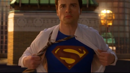
Lois Lane Costume Appreciation (Smallville seasons 4-5)
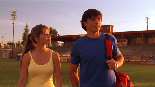
So in my recent* Smallville rewatch I had a whole new appreciation for the costuming, and in particular, my girl Lois and her colour story/clothing complementing Clark’s in different ways. We often see Lois and Clark wearing somewhat similar clothes - usually both in jeans, t-shirt, and jacket combo in either red or blue, with Clark in one colour while Lois is in the other. But I was particularly intrigued by yellow as the third element of the Superman triad, and while we don’t see Lois wear yellow as much as she does red and blue (or pink and white in the latter seasons) but it seems she is associated with yellow at pivotal moments in her character arc and relationship with Clark.
Standard caveat that I think a lot of this was intentional, but some things are probably me just reading into things and choosing to find meaning in in the visual storytelling. Additional caveat that red-yellow-blue was the standard colour palette of the show and the mise-en-scene relied heavily on this - particularly in the early to mid seasons - so it's certainly not exclusive to Lois and some examples may be coincidence.
But let’s talk yellow! (Expanding on this post)
Yellow is Earth’s sun Sol (in contrast to Krypton’s red sun Rao), the source of Clark’s abilities. It’s the heart of the Superman shield:
It’s the colour associated with the Crystal of Fire, one of the three components that make up the crystal that builds the Fortress of Solitude and houses the knowledge of the 28 known galaxies. The Crystal of Water (transference/transformation) is blue, and the Crystal of Air (symbol of the House of El) is red:
Fire is light and warmth; it can purify and cleanse. The crystal of fire had healing abilities, it's what restored Clark's powers in 4x08 Spell, and throughout the series, when Clark is injured and then healed by the sun, it's often accompanied by a yellow light.
The Crystal of Fire was also found in 4x01 Crusade where Lois first appears: as Lex unearths the crystal in Egypt, Lois comes across Clark (in the form of Kal-El) in a cornfield. (In what is likely a coincidence, Lois will return to Egypt in 10x01, and it's there she makes the decision to commit to Clark in 10x02, and she is possessed by the Egyptian goddess Isis in 10x05).
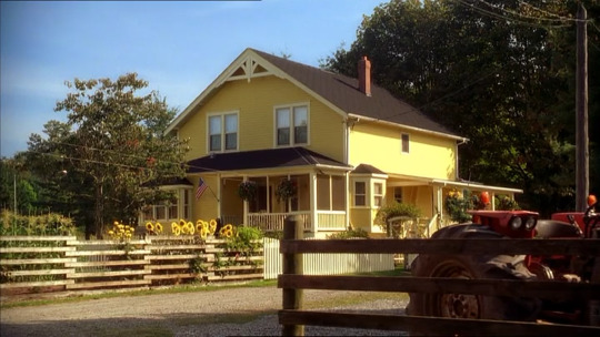
Yellow the colour of the Kent farmhouse, Clark’s home, as well as the kitchen (hearth) of the house. It's the flowers in the front yard that also draw their life from Earth's yellow sun (the barn is red, the sky is blue).
So basically yellow = healing/home = Clark's heart = Lois.
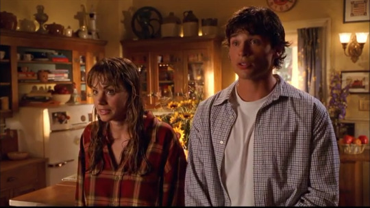
This kicks off in 4x02 Gone, where Lois wears Clark's red and plaid shirt, the first of several times Lois will wear his clothes over the course of the series. Clark is in a blue check, and it's notable that we first see them collectively in Superman colours for the first time when they are both together in the Kent house (in the yellow kitchen).
In 4x03 Facade Clark wears the same shirt that Lois borrowed, and Lois has a yellow top under her jacket (also note the blue blanket in the background of the barn).
We then see the same (or a similar) top without the jacket in 4x04, Devoted, where Clark and Lois banter and engage in some prolonged eye fucking eye contact. In this scene the primary colours are right there bright and bold, leaving no doubt that we've just been introduced to the Superman endgame.
Now, there may be an in-universe reason why Lois is wearing yellow here - it follows a football game, and yellow is one of the colours of Smallville High. However, Lois isn't exactly the school spirit type and she was wearing this top in the previous episode, so there's no doubt in my mind this was intentionally symbolic.
This is the final episode of Lois’s introductory arc, the end of the beginning, and a glimpse of the future.
We don't see Lois again for a while (and she spends most of 4x08 possessed by a witch). The next one might not count, but her cute breakfast themed pjs in 4x13 Recruit include red yellow and blue (and pink, a colour that becomes more symbolic for Lois in the latter seasons):

Sidebar, but Lois and her parade of themed pajamas delights me so much!
This is also the episode of an iconic save, where Clark goes all WHERE IS SHE on the freak of the week, and rescues Lois from drowning.
In 4x16 Lucy we don't get yellow in the costuming, but at the end of the episode Lois and Clark grow closer, acknowledging that they're now friends, accompanied by some more prolonged eye contact. Clark then looks through his telescope a a yellow shooting star passing between a red star and blue star (to the background of Mark Joseph's Fly ("written in the wind...now it all begins..."), intersecting with a meteor in an explosion of light, much like Lois has barrelled into Clark's life, setting him on a new course towards his destiny.

This show, honestly!
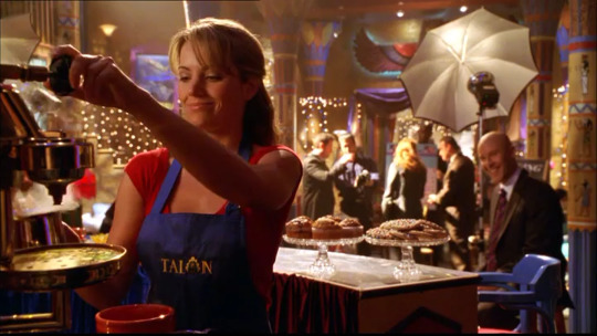
Next is 4x21 Forever, where Lois has found some sleeves for her job at the Talon (which is heavy on the yellow/Egyptian decor), and Clark of course is in red and blue:
Clark's shirt is not the same one that Lois wears earlier in the season, but Lois does wear this shirt later in the series, so she certainly has a thing for Clark's red and yellow plaid!
As Lois and Clark investigate Chloe and Lana's disappearance, she puts on an orange jacket (orange is another interesting Lois colour - a mix of red and yellow that pops up at interesting points in their relationship).
It's telling that Lois very rarely wears prints - she's into bold, block colours, and other than plaid, so is Clark - they often wear complementary costumes, and/or are mirror images (or close to it) of each other, both in the colour and style of their clothes.

I'm not saying this is soulmate behaviour, but this is absolutely soulmate behaviour!
We don't see Lois in yellow again until season five.
Now I know there was a lot of criticism levied at the show for Lois's relationships with A.C. and then Oliver, but honestly I don't really mind - let Lois be a slut in charge of her sexuality! There is no shame here for a girl who attracts would-be superheros, and goes after what she wants. GTFO with "Lois goes through the Justice League" misogynistic line of thinking.
In 10x09 Mera alleges Lois is attracted to power, but I think it's more she's drawn to strength of character, as well as people who challenge her - characteristics Clark shares, and where Lois doesn't quite fit with A.C. and Oliver, she will fit with Clark. What's interesting is that yellow pops up here, but in ways that aren't quite in sync.
In 5x04 Aqua we have Lois in a red swimsuit and Clark in blue shorts, and she is lain a yellow towel when she is saved by AC.

Then as A.C. and Lois get closer, she wears a blue and yellow suit (so collectively, she owns swimming outfits in Superman colours) and then a blue t-shirt but pink shorts. AC also wears orange and green (Aquaman colours), so while we have the yellow and blue, we also have pink and orange which are on the same spectrum but not red - close but things aren't quite right.

Other than the straps on Lois's suit, yellow is also present in the scene with the flowers, and the stripes on the cup (the Kent family mugs are often yellow as well!). Clark is present in the scene long before he walks in on Lois and A.C. kissing - kicking off a pattern where Clark is suspicious/annoyed by the men Lois dates.
At the end of the episode we get Clark in red, Lois inbBlue, and the helpful yellow of the barn props, as Lois wonders how she's ever going to meet a guy that wants to save the world, not own it, and Clark assures her one day she'll meet someone even more special than A.C. The anvils, they be dropping!
This one may be a stretch, but Lois is wearing a light yellow top in the early scenes of 5x06 Exposed aka the episode where Lois poses as a stripper and gives Clark a lapdance, but perhaps more importantly where Lois flexes her investigative skills, first by boldly challenging Detective Sawyer, and then helping Chloe track down a serial killer. We often see Lois in yellow when she's making steps towards her journalistic career.

Next up we have 5x08 Solitude, where Lois is working at the Talon, and we get a very direct Superman costume reference with Lois's top and apron with the Talon logo in yellow where the Superman crest would be.
That Lex is really amused by Lois is delightful to me! I wish that they'd let them share more screentime!
She decides to take down Lex in this episode, and in doing so ultimately helps Chloe uncover Milton Fine's true motives - arguably without Lois she never would have been able to save Clark in the Fortress and Martha would also have died. It also sets up the future Lois and Lex dynamic and her quest to expose his criminal behaviour.
So shame on anyone who says Lois doesn't serve a purpose in these seasons or that she's "not iconic Lois yet". She's not meant to be! She's on a journey, just like Clark is.
There's also this jacket in 5x10 Fanatic and I can't decide if it's a very light yellow or not, but this is when Lois becomes Jonathan's campaign manager, integrating even further into the Kent family. While I don't agree that Clark and Lois had a "sibling dynamic" in these seasons (I'm sorry, siblings don't stare at each other like they do!), Lois was in many ways a surrogate daughter to Jonathan and Martha - they immediately took Lois under their wing, believed in her, championed her, and she in return was ride-or-die for the Kent family.
In 5x20 Fade we continue the pattern of Lois in yellow when there's a romantic interest for her that Clark takes issue with, although in this case he's right as the guy is a hitman. Clark wears a light blue shirt, while Lois is in a red dress with yellow/gold straps - the lighting is also extremely unsubtle:

Incidentally, this is also the episode where Clark accidentally sees Lois naked.
Later in the episode Lois also wears a yellow top and blue jacket, and in a deleted scene it's actually Martha who picks this outfit for her after Lois says "if you ask me, [Clark] needs to finish the chapter on Lana, turn the page, start dating again." It's a very sweet scene, and the future mother-in-law vibes are strong as Martha says, "If I'd had a daughter, I'd want her to be just like you."

Also important to note that Martha is wearing red in this scene, and there is a later scene that was not cut, in which Martha tells Lois rather anviliously "maybe you have to get through all the wrong men, so you can recognise the right one."

Martha choosing yellow for Lois, as if unconsciously knowing what it means, it actually something that it so personal. Also, the face of a woman who knows her worth.
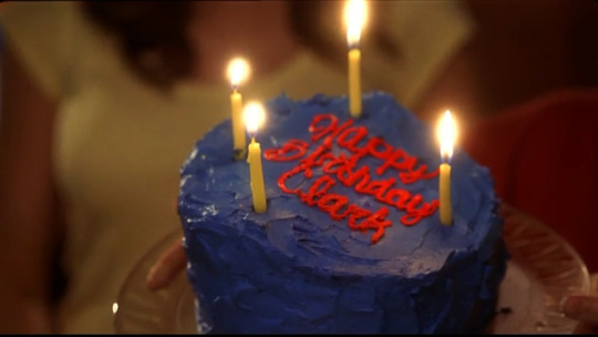
Speaking of anvils, there dropping all over in 5x21 Oracle, where Lois wears yet another yellow top for Clark's birthday, and made him a red and blue cake with yellow candles - and we see later in the episode that the inside of the cake is yellow as well.

Lois also gives Clark a red and blue journal with his initials in gold, wrapped in paper that's red on one side and yellow on the other, with red yellow and blue ribbons. It's actually an adorable gift, and it's a shame there was never see Clark writing in it.


Now, how many yellow tops does Lois own? I actually think this one is the same as in 4x21, so with the one above and the tank top that's at least three (plus the bikini), which is not an insignificant number!
But wait, I spoke too soon, because Lois is wearing another yellow top when she and Lana walk in on Clark rifling though the dorm room later in the episode - there's a different neckline/bodice to any of the previous tops, but I wonder if this is a continuity error because when Lois confronts Clark in the loft later on it once again looks like the top from the opening scene.
Or maybe not? Her hair is obviously different, but I'm not even sure it's the same jacket? The lapels don't look quite the same either, maybe it's not even meant to be the same day.
Lois just chose extremely similar outfits I guess!
The scene in the loft is the infamous "piggybank" conversation, where Clark says, "There are times when I think you don't know me at all, then others when I think you know me better than anyone."
I mean? I MEAN?!?!?!?!
Clark is also holding the journal Lois gave him, which is a nice touch. This is ripe for fanfic potential (if it's already been done, drop a link!).

That's it for the first two seasons of Lois, stay tuned for part 2!
*Recent when I first started putting this post together several years ago, it's been sitting in drafts for an embarrassingly long time. In fact, such a long time, I've completed another Smallville rewatch since then (hence the impetus to finally finish and post this).
#smallville#superman#lois lane#clark kent#clark x lois#clois#costume appreciation#yellow#meta#lois lane costume appreciation#long post#resurrecting this from drafts#2023 will be the year of finishing all that is unfinished#jlf posts
95 notes
·
View notes
Note
Hi I hope this is not too weird to ask...
How is your page sooo gorgeous I mean with the little lines between paragraphs and the cute letters how do you do itttttttt
Ps I looove Divorcing Orion Black and Heroes in Tattoos I can't wait to read more!!!
awe~ this isn't weird to ask at all, i'm actually really flattered, thank you so much for liking my blog aesthetics hehe~ (*ᴗ͈ˬᴗ͈)ꕤ*.゚
to create the line divider, i use the Procreate app on my ipad, if you're curious, the dimensions i use for them are 540 x 5 px
for the aesthetic pictures i have on my posts, i just go on pinterest with a colour palette and theme (e.g pink + blue ; koi fish/pond/bodies of water for this blog) that i like and create a board of aesthetic pins based on that colour palette and theme - after that it's just a case of picking out the ones i like, playing around with it on a draft post and sometimes even toggle around with the saturation, hues, brightness etc --
you can arrange a maximum of three posts in one arrangement and if you want to centre just one picture on a post, what i do is use two white square pictures and align them on either side to make it look centre, if that makes sense?
also, for the cute letters, there's a setting where you can make the letters small when you highlight text on a post you're writing, it should look like this : <s>
but im just extra when it comes to aesthetics, i just think it'll be more enjoyable for my darling readers to read if the aesthetics are good ( > 〰 < )♡ anywho~ i hope that was helpful!
P.S thank you so much for the love and support! ( ˶˘ ³˘(⋆❛ ہ ❛⋆)!♡ again im so happy that 'divorcing orion black' is being received so well even though it's not a genre i typically write on here hehe~
#☁︎ : kquil talks#aesthetics explained hehe~#impromptu tutorial#a little behind the scenes sneak peak#im an aesthetics freak okay?!#pinterest is my best friend!
13 notes
·
View notes
Text
Welcome to Art (7).
Thank you for meeting me here today, friends, for our special extra credit class, 'The Art of Gay Lore'! Now, if you'll all follow me to the art room...
Now, Professor Hassel may or may not know we're here, so everyone keep this on the down-low k? It's a weekend, we'll be fine... everyone participating today will be wired some totally legitimate LP in thanks, which... well, maybe don't mention that to Professor Hassel either? He does work for the League after all...
Anyway, I'm Professor Mini Holz, and today's special class is on the topic of the classroom itself! Now, would anyone like to hazard a guess as to why this classroom is particularly important on our journey into deeper homosexual lore?
A) Art is especially gay in Paldea
B) There's some interesting shit going on here
C) Everything Hassel does and is connects to his own homosexual love story and general softness
Correct, random guy at the back there! That's right folks, there's no true answer, because the answer is yes. (Though you can have extra extra credit for C, you've clearly read my metas.)
Now, let's start over on the left, shall we? Your eyeballs are mine, caught in my meta web...
We start with several colour charts, which is fairly standard for an art room.
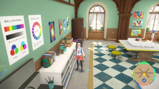
What's fun here is that this is the RGB colour wheel, which is not used really in art theory, but more to determine how colour is viewed in digital mediums. If you mix blue and yellow paint, you get green, not cyan. Likewise, the triple diagram beside it is for printing colours - cyan, magenta, and yellow. It's also the exact colour scheme of one of The Harvests in Artazon.
... Now, imagine a world where colour is used on a digital platform to create alternate meanings to those in standard colour theory, such as, oh I don't know, POKEMON TYPES. And then, imagine a scenario where a local and well-known artist does exactly that in his sculptures. What a wild world that would be, right? Insane...
Also, these are rainbow colours. Professor Hassel has two rainbow posters in his classroom. Let's carry on, it's too early in the class to lose my mind...
And as we move to the centre of our classroom, I need you to all just stand back for a second. That's right, against that wall over there...

The seats, guys. Those seats we sit on for every class are Grass, Dragon and Electric-coloured, much like that one Harvest that symbolises the unity between Professor Hassel, gym leader Brassius, and an Arboliva.

If you look closely and count, friends, you'll see that there's also six of each of them if we count the two Electric ones off to the left, which is how many olives orbit The Harvest. Fascinating isn't it, that there's such a clear reference to the harmony of Professor Hassel and his husband in the middle of our classroom, specifically where we're meant to relax? Almost as though he finds deep comfort in his marriage...
It's not the only thing evocative of those types in this room, though. If you turn to your right for me, and check out that curious little piece in the corner...

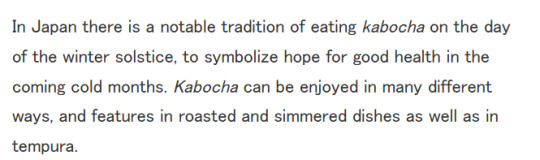
Mmm. A very familiar colour palette, I think we can all agree. Thank you to my colleague @spiritofstars for showing me this - she's already taken extra credit. This appears to be a kabocha, a certain type of squash, which a little research explains nicely:
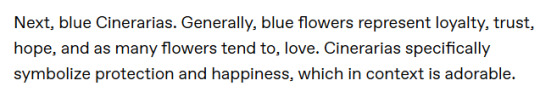
... Well. Now, who could we possibly know who has been 'deathly ill', and who Professor Hassel might wish to see safely through the winter? Ah yes, that's right - Brassius, that same one who told us that very thing in Art (4). This is reinforced by the presence of blue cineraria flowers beneath the painting, which as my other colleague @someguynamededdie pointed out in its recent flower meta, mean something super cute:
You see how the Dragon blue is the background colour, the 'protector' of the kabocha? We live in a society, and that society is so gay dear Arceus. My dear little bro also notes that orange poppies, the flowers next to the blue cinerarias, symbolise health and regeneration, so...
So, what does all of that together mean?
A) Professor Hassel is a goddamn sap
B) Professor Hassel is soft and protective and he makes me want to sob
C) Professor Hassel is completely enamoured with his windmill-jumping husband
Mmm, yes, correct! It's any and all of them, thank you for listening. We have this concept of 'protector' also summed up nicely in the top right corner of the room:

Here we find a Jigglypuff - a Fairy type, something Professor Hassel's Pokemon are weak to. And in the middle, we find a mannequin - a model, directly in front of a piece about a man being haunted by his past - look very closely, and you'll see the ghost in the distant window, looming over the more confident man at the forefront. And it's beside the Grass-type seats. But you'll note the Dragon-type coloured lamp on the same desk.
Here, we see a man who could be weakened, who could allow himself to fall victim to the ghosts of his past, the family he ran from - but because of the Grass, because of his own light, he doesn't. He stays here, and teaches us, and loves his husband.
Perhaps Professor Hassel isn't the only protective one, and perhaps Brassius isn't the only one who finds hope and salvation in his love. It's very interesting, isn't it class?
And Brassius, despite being a very prominent figure in the narrative of this room, isn't the only person being referenced here. If we move to the centre of the room, we of course find this:
There's a whole narrative here about 'flying free' - if we look at Professor's Jacq's Pokedex entry for Staraptor, we see that:

That's exactly what Professor Hassel did, left his family because they were terrible! It's crazy, really, because as a protector, he must also be very sturdy! Trust me, I've defeated him in the Elite Test - he calls himself 'the dragon guarding the final fortess', and he means it. We also see Brassius fly free - quite literally as he jumps off windmills, but he's been freed from his own awful past, too... by Professor Hassel.
And who must a Staraptor remind us of? Well, gym leader Larry of course, Professor Hassel's friend and fellow Elite Four member... much like those poppies over there, which bring to mind our good little Steel-type sister in Arceus, Poppy. In fact, I think she might well be responsible for some of these drawings...

Note the Phanpy, there, which could represent Rika as a little Ground-type cutie. But what's fascinating about this wall is the selection of Pokemon here.
Gyrados is a big, scary Water type which people often confuse for a dragon... Ditto can be anything, but adapts to its surroundings, always keeping its own stats intact... Eevee can one be one of eight different Pokemon one day, and its evolution is a joint decision between trainer and Pokemon... Cacnea is a small, cheerful, spikey Grass-type, which reminds me an awful lot of a certain gym leader, and Dedenne - well, Dedenne doesn't evolve, and yet we have a larger, rounder one, and a littler, happier one.
... Huh. They're all relevant, aren't they? Dragons being confused by their own paths; Eevee, its own fate undecided as a youngster; Ditto, who shows us that however much we change, we're still the same within; our pair of Dedennes, representing size and shape and happiness, and a little Grass guy who looks like Brassius, all smiles and victory - he even has a little crown!
... Wow. Even I wasn't expecting to discover this much! I hope you're taking notes... now, I don't know if Poppy did draw these lovely pictures, but there's one here that show a pair of Rookidee, and she has a Corviknight. I reckon that if nothing else, she definitely is responsible for this one, and that's adorable. The one on the right even looks unimpressed, which might have had something to do with it worrying about the future of that Tinkatink she also used to have...

But I'd like to leave you today, class, with a final painting, this one right here in fact, with the colourful squares.

Now, this is right next to the colour charts we looked at earlier, but - well, when someone has no colour, all they are is white. And from nothing grows identity - Grass, Electric, Fire, Steel, Water, Dragon, if we follow the colours of types. And so we have Brassius - from a small boy who doesn't yet know himself, to a Grass-type trainer, to one bursting with the creative sparks of Electric and the passion of Fire, to one who must 'steel' himself against the hardships of life... through Water-y tears, and to Dragon. And if we do a little more research into squares...
... Well, class. Isn't that enlightening. A journey to trust and stability, showcased in art. You could even view it the other way around - if this is about Professor Hassel, he starts as a Dragon, and he dissolves into tears... he 'steels' himself to live alone, away from a family who doesn't understand him... he embraces passion in Fire, makes music and art... until he finds his 'spark' in teaching, in the Elite Four, through the Grass-type trainer. And white, of course, is not just absence - white is what happens when all the colours blend together.
Well, I do hope you've enjoyed extra credit! Expect that LP as soon as I can get hold of Pen - wait, Sir?
How long have you been standing here? Have you been here the whole time? What do you mean I ignored you because I was too obsessed with lore?!
Look, I can explain - guys, book it!

#ephemeralartshipping#hassel x brassius#hassius#hassel#brassius#pokemon scarlet and violet#mini holz like 'aight imma head out AT TOP SPEED'#honestly they're just so married I weep#meta#naranja academy#my bad professor hassel jashaksns#going to head back later and he's just going to be like 'you could have asked dear'#'NO I COULDN'T SIR I'M IN TOO DEEP'#larry#rika#poppy
87 notes
·
View notes
Text
I've started seeing more people appreciating Elizanne and making content of it, which I couldn't be happier about! So let me tell you how I came up with Joanne x Elizabeth, because it was actually really funny:
So I was working on my "100 yrs later" AU back in late July of 2023 and was figuring out what the individual style of each character would be.
So I worked on Joanne and later Elizabeth and it dawned on me that I gave them very similar styles (still different from one another but very similar on terms of aesthetics) and figured that they probably start being friends in my AU because of that.
So I thought a bit more about their dynamic and realized that they both present themselves very similarly, while also having a lot of contrasts.
They bounced off eachother well, TOO WELL.
It was like connecting two puzzle pieces from completely different sets, that fit perfectly with eachother.
Let me elaborate even further on that:
-Their contrasting skillsets (fencing and reading) and personalities (bubbly and timid) make for a quite interesting dynamic and also serve as an opportunity to learn more from eachother.
-Strong Gf protecting her boyfriend, need I say more?
-they're both very high femme and have a very interesting relationship with their gender, especially within such a highly gendered society. Elizabeth is struggling to be a cute girl while also being incredibly strong and Joanne is the exact opposite of that (very timid and quite cowardly). Both of them do not adhere to their gender roles to different degrees and on different levels. I think they can bond over that while also learning from eachother based on the experiences they were allowed to have, because of their gender and their individual education (-> Example: Elizabeth teaches Joanne to fence and he teaches her to dance or something like that)
-I think both of them could be a kind of "safe space" for eachother, a person where they're not afraid to be judged for being "too sensitive" or "too bubbly".
-they're both incredibly emotional and I think Elizabeth desperately needs someone she can confine in on an emotional level.
-They both have unfortunately been confronted with the horrors beyond human comprehension and I think it's nice that they can perhaps find some comfort in eachother because of it.
-I'm gonna be fr and just say that these two have some incredible fluff potential that should definitely be utilized. LET THEM BE HAPPY THEY'VE BOTH BEEN THROUGH ENOUGH!!!! I want these two to HEAL!!!
-O!Ciel is a lovely character of course, but I don't think her relationship with either of the twins is healthy, especially since they're all very young and very troubled. There isn't any open communication, she's only appreciated when she can be utilized for her skills, and other than that she's seen as more of a burden and a status symbol. Elizabeth deserves to be bubbly girly girl without having someone around her who's constantly rolling his eyes at her and truly appreciates and loves her outside of her role as a Bride and her skills. Her cute and bubbly personality is part of her character and should be loved like any other aspect of her.
- As a sucker for colour palettes it's also very nice to see a very vibrant character paired with someone with more muted colours.
-Red and pink is a very underappreciated colour combo in ships and it should be utilized more.
#TLDR: the ship is very gender#elizanne#vio speaks#that was supposed to stay in the drafts for another week 💀💀💀 nvm yall#enjoy your food a bit early
8 notes
·
View notes
Note
TUNNELS UP THROUGH YOUR FRONT YARD
DAUN YOU BEAUTIFUL BASTARD YOU ARE THE REASON
I HAVE THOUGHT ABOUT
THE LOGISTICS
OF KISSING A SUNFLOWER, DAUN
CAN YOU EVEN IMAGINE ALL THE SEEDS POKING YOUR FACE, DAUN? BECAUSE I HAVE. CAN YOU IMAGINE HOW MORTIFIED YOU WOULD FEEL IF YOU WERE MAKING OUT WITH YOUR SUNFLOWER BOYFRIEND AND YOU GOT A SEED STUCK IN YOUR TEETH? I HAVE THOUGHT ABOUT THIS EXACT SCENARIO. YOU MANAGED TO MAKE A SUNFLOWER SO ADORABLE I HAVE SPENT A NOT-INSIGNIFICANT AMOUNT OF TIME FROM MY ONE AND ONLY LIFE TO IMAGINE HOW THAT EXACT SCENARIO WOULD GO. I'M NOT EVEN GONNA GET INTO THE SEVEN STAGES* OF GRIEF YOU'D GET INTO IF YOU ACCIDENTALLY HORFED UP SOME OF MOON'S SPECIAL STANK
YOU MAKE THE BOYS LOOK SO DAMN APPEALING I WANNA CRY. ANYTHING YOU DRAW WITH THEM USES THESE REALLY GORGEOUS, SIMPLE SHAPES THAT MAKE THEIR DESIGNS EASY TO UNDERSTAND, BUT THE DESIGNS THEMSELVES ARE SO UNIQUE THAT THEY'RE INSTANTLY MEMORABLE. also, this is kind of a weird thing to point out, but I really like the way you draw folds in clothes? it's something I've always struggled with, and you just seem to add a little scribbled loop or two at the armpits and elbows and suddenly that shirt that character's wearing looks hella comfortable. AND THEIR COLOR PALETTES ARE GORGEOUS AND PERFECTLY ACCENTUATE THEIR PERSONALITIES SUN ALL WARM AND GOLDEN AND MOON CHILL AND COOLER THEIR COLORS MAKE THE CHARACTERS FEEL LIKE THEY HAVE A TEMPERATURE
I LOVE YOUR SHORT LIL COMICS WITH THEM AND I WOULD HAPPILY READ A HUNDRED MORE and your short story with the flower boys was cute as hell too I'M A HUGE SUCKER FOR ANY STORY WHERE ONE CHARACTER SEES ANOTHER CHARACTER WHO'S A COMPLETE MESS AND IS LIKE "oh I'm so gonna fix you" IT'S LIKE MY CATNIP AND THE FACT THAT YOU DO THAT WITH REALLY GOOD ART AND CUTE STORIES AND A HINT AT A TRAGIC BACKSTORY? YES YES YES YES YES KISSING YOU STRAIGHT UP FROLICKING I AM THROWING HANDFULS OF THOSE WEIRD MUTANT RED MARIGOLDS THAT STARTED GROWING IN MY PORCH FLOWERPOTS AT YOU
*the extra two stages of grief are "Regret (Bass Boosted)" and "Evil Sleep"
HFSGJGKD I COULDN'T KEEP THIS ASK TO MYSELF ANY LONGER
ORDINARY YOU EXTRAORDINARY BASTARD, THIS IS WHY EVERYBODY IN THIS COMMUNTIY LOVES YOU.
Honestly I don't think kissing Sun would be that weird, since sunflower seeds are a bit dusty feeling, but rather tender and firm otherwise. If it gets in your teeth...
Chew it, spit the casing out into the trash, and swallow it. He'll lose his mind. (Y'know like because??? That's not a normal thing that happens during kissy kissy smooches and somebody not being upset by it would just reassure him that okay they DO like me, even my bad or weird parts, y'know??? It'd send him over the moon)

And I mean... I've discussed this before but you CAN kiss Moon. I made a loophole for the simps.
If he wants to, he can just (mostly) nullify his effects so that those in close proximity can't really feel them like they normally would. He just doesn't most of the time because it's helpful and Sun isn't really affected by it. However, the mostly part is still there, so you're gonna get HELLA good sleep after smooching this dude.
Did I also mention he'd totally hide the two of your faces with his petals whenever you kiss??? Did I did I?? It's just the two of you in those moments, nobody else.
Jsjsjsj thank you for all the praise I'm gonna shed tears
THE BOYS ARE JUST SIMPLE BECAUSE I HATE COMPLEX CHARACTER DESIGNS WITH A PASSION LMAO, IT'S FOR THE REDRAWABILITY and I have no idea how I did those colour palettes but I agree they do look really good (even though sun gets called eclipse sometimes heh)
I draw sleeves the way I do because it's just a simplified version of the way loose sleeves tend to fold (and I draw loose sleeves much more than I should) plus I've just stared at a lot of artists that do that over the years
AND IT WASN'T A SHORT STORY LMAO I'M JUST REALLY BAD AT WRITING CONSISTENTLY
Maybe... they can fix each other?? Teehee

BUT ALSO AGAIN GKJTSKS THANK YOU SO MUCH
Your flowers were spicy but they went down alright (a bit crunchy too, but that could've been the pot)
#SERIOUSLY THOUGH THANK YOU SO MUCH AAAA#fnaf moon#fnaf sun#flowershop au#art#moon x reader#sun x reader#fnaf security breach#i love tragic backstories so much#I'm gonna make a drawing with you comforting them one day#can you guys tell I like hurt/comfort#asks
295 notes
·
View notes
Note
HEY THERE MY LOVELY MUTUAL <3 <3
(I love when you reblog and queue my posts ur actually amazing ily so much I love reading your tags hugs hugs hugs <3 <3 <3 im in love, giggling kicking my feet everyday)
SAW THE CHARACTERS OPINION BINGO U REBLOGGED 👍 I GOTCHU
TAKAGI. BABY BOI OF DCMK (I remember seeing a poll rolling around somewhere about the most dcmk baby girl and Takagi won)
I will also have to have to ask you about Kaito HAHAH (my fav blorbo i will admit)
ok the thing is im from australia. choose an australian animal of your choice bc i am Intrigued. im not too sure how the bingo would translate though hahahah I don't think it would work very well
(feel free to also ask me anything or talk to me and about this bingo too >v0 b)
wait you know what i forgot LOL WE GOTTA HAVE THE PROTAGONIST DUO
SHIN/CONE AS WELL. PLS
*LIGHTS UP LIKE A CHRISTMAS TREE* MY DEAR MUTUAL, HI CYN, HELLO!!!!
Firstly: WE'VE NEVER TALKED BEFORE BUT LET ME TELL YOU, I WAS (still am) SMILING LIKE AN IDIOT WHEN I SAW YOU SEND IN AN ASK! Yes, I keep track and i'm always happy to see you in my activity and my dash! (I'm also really happy to see we mutually share that feeling; I relate to the giggling kicking feet sentiment a lot.) I'm happy to have this chance to interact with you, in a sense, face to face! Bless you, darling, and I'm sending hugs right back at you.
Secondly: YOU HAVE EXCELLENT TASTE AND YOU HAVE MY ETERNAL ADORATION ESPECIALLY FOR ONE TAKAGI WATARU, he always needs more love, I FREAKING ADORE THAT MAN.
Thirdly: warning notes apply, as stated in previous asks:
I tend to interpret things liberally: only my own rules apply, which means ->
I check everything that makes sense to me, even if they might seem contradictory
The Character Opinion Bingo in question
Prepare for endless ranting. And as a certain someone says: さあショーの始まりだ わ!
I. Takagi Wataru
The Babygirl and Malewife of My Heart
Personal Special Tag: #takagi is a good man
Points that I feel need a little elaboration:
I am so normal about them: I use the word "normal" as a synonym for "utterly obsessed with" and "absolutely love and adore". (I don't like the word in itself, hence, the only context I use it in, is this. But that is another story.)
*puts them in a salad spinner*: as in, the salad spinner is my brain, and he keeps rotating in it at high centrifugal force.
Canon isn't real if I don't look at it and That's a solid design right there: Detco Canon is... As much as I love it, I think we can agree it has its shortcomings/issues, and one of them is coming up. These two points go hand in hand at this moment because LOOK AT HIM!!! LOOK AT HIM!!! THIS MAN IS A BABY!!! LOOK AT HIM, HE'S PERFECT!!! THE SPIKY HAIR!!! THE SHAPES!!! THE COLOUR PALETTE!!! HE'S SO CUTE!!
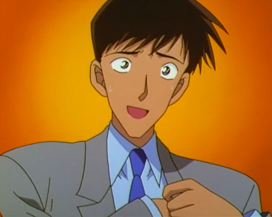
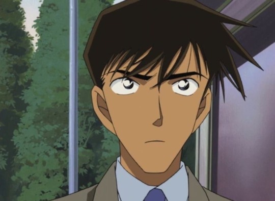
I resonate with this particular video: his new design in the anime (partly thanks to the general Square-and-Pointy-fication) is just... THEY HAD THE PERFECT MAN. IT'S A CRIME. Bless that he is at least still cute in the manga, even if not the same way as in the early anime. The sharp cheekbones and soft looking hair have their charm.
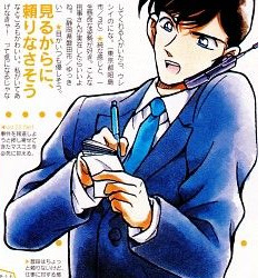
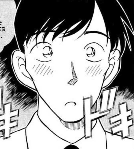
My point is: THIS!!!! MAN!!! IS!!! A BABY!!!!
Literally I would kiss them and I want to BITE them: he makes me go FERAL with LOVE, and makes me feel like I want to gnaw on something or eat a whole fridge or scream endlessly into a pillow. I wouldn't do it to HIM (I'll leave that to Satou Miwako), but generally, the feeling is there. (Okay, I'll be honest, I would totally give him forehead, cheek, or hair kisses.)
To close his section, have one of my favourite bits about this Baby Of A Man. That poll was absolutely right about him, THE ULTIMATE BABYGIRL (and Malewife TM).
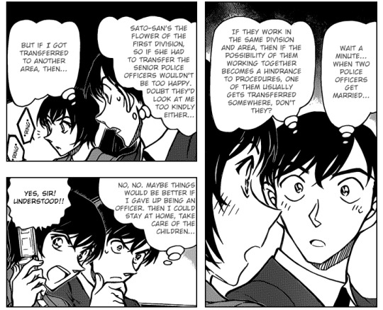
⊱✿⊰
II. Kuroba Kaito/Kaitou KID
The Local Mischief and Chaos Bringer
Personal Special Tag: #the magical agent of chaos
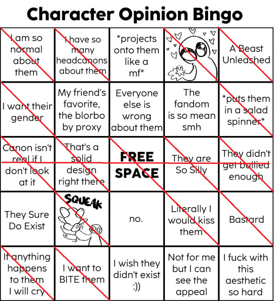
LOL I DIDN'T EXPECT TO GET A BINGO, EVEN WITH THE FREE SPACE HAHA
Some points are the same as for Takagi, but here is elaboration on the ones that don't match:
Bastard, A Beast Unleashed and They didn't get bullied enough: let's be real. He's an Absolute Menace. And I sort of love that about him. Highly competent (competency makes me go weak), and if that is not scary (and hot) I don't know what. And sometimes he also goes too far (lifting skirts is not okay at all, Kaito) and needs someone to put a leash on him (or kick a soccer ball at him/chase him in a classroom). I feel that sometimes he needs a bit of bullying a challenge, to think about things. And again, honesty: I love seeing him suffer a bit, I love his Panic Moments LOL. Not in a mean way. But I also love how kind he is; the baseball chapter in the MK manga has my heart, and the Clock Tower Heist, and the Red Tear chapter... Not to mention the Nightmare arc. He cares about people and making others happy.
I feel I went on a tangent here. Onto the bastard bit: he CAN BE SUCH A BASTARD AND I LOVE THAT ABOUT HIM TOO. Two of my favourite bits of Bastardry from him include 1) HOW HE DISGUISED AS RAN AND HOW HE BAITED SHINICHI AT THE VERY END OF THAT ENCOUNTER and 2) THE WAY HE SENDS SHINICHI CAREENING IN THE SIDECAR LIKE IT'S NOTHING (but also Shinichi getting right back at him and setting fire to the fckin fuel.) Pure Bastard Energy.
I want their gender: I love the way he is just so free-spirited about how he dresses/disguises. And I love the thought of him and Aoko doing outfit swaps (I blame that competition in MK for these. Also look at these delightful posts on the topic).
Canon isn't real if I don't look at it: I have... issues, with canon, you could say. Like the way he has no support system, especially bothers me. I would like to see his character treated with more care (be it MK or DetCo). I live for good character development, and I crave that for him.
To close this section, have one of my favourite conversations between these two menaces of nature.
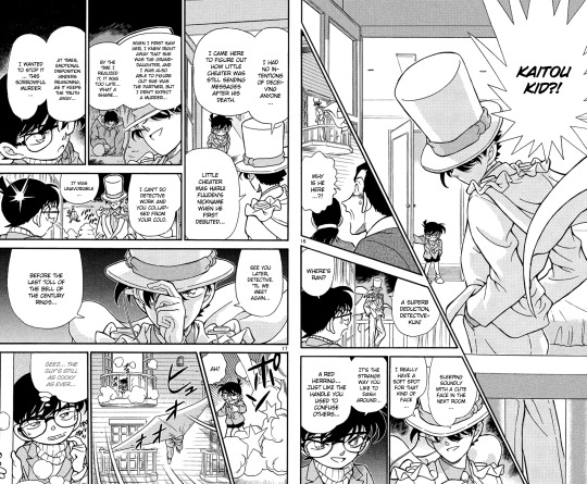
⊱✿⊰
III. Australian Animal of Choice: Koala
Fun fact: I've been in love with koalas ever since I got a keyholder plushie from relatives in Australia when I was like... in kindergarten? Or early elementary?
Also don't worry, *puts on sunglasses* I wouldn't have mentioned animals, if I thought I couldn't work with them.
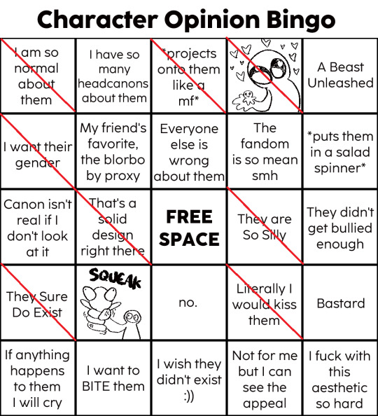
Elaboration is needed here I feel.
I am so normal about them: I'm not as obsessed as I used to be but I'm eternally fond of koalas. Did you know their fingerprints are so similar to us they could be mistaken for human fingerprints? Or how they spend most of their time sleeping because the eucalyptus they consume is toxic? Or how they can actually swim well? Or how they are literally surviving by being Dumb As Shit because Being Dumb Saves Energy? Yeah, I'm totally normal about them.
*projects onto them like a mf* and I want their gender: Oh to be a koala, just existing, sleeping, sometimes waking up to eat some eucalyptus, then going right back to sleep. I want that.
That's a solid design right there: HAVE YOU SEEN THEM? SO FLUFFY LOOKING!!! WITH BIG CLAWS!!! THE BIG NOSE!!! SO SHAPED!!! NOT TO MENTION THE EARS!!!
They are so silly and They Sure Do Exist: how did this animal even come into existence? Weird lil creatures. THEY ARE JUST SO SILLY. THE NOISES THE MAKE. Like oh my god.
Literally I would kiss them: THEY JUST LOOK SO SOFT, HOW DO YOU EXPECT ME NOT TO BURY MY FACE IN THE FUR?
⊱✿⊰
IV. Kudou Shinichi/Edogawa Conan
*Prof Agasa voice* He has many nicknames, like Gremlin Child, Absolute Menace, Ultimate Baby, Lil Nerd, Walking Encyclopedia Son, or Disaster Child.
I think I call him as many names as I do my dear Rosie, so that is quite telling LMAO
Personal Special Tag: #the detective gremlin
HDSBSKDB DOUBLE BINGO (AND ALMOST 4 BC HE'S ALSO DET'S FAV, SO ALMOST CROSSED OUT PROXY TOO KSJNVKSVNJS OK, my love for him is showing, I guess)
EDIT: FCKIN TRIPLE BINGO AS @vampirecatsw POINTED OUT oh my god, I'm blind
Again, some thoughts on relevant bits.
*projects onto them like a mf*: THIS CHILD IS SO FCKIN NEURODIVERGENT, AND I FCKIN RELATE, ALSO HE LOVES AND CARES SO DEEPLY IT HURTS AND I RELATE SO HARD.
A Beast Unleashed: another MENACE OF NATURE. You cannot let him roam free, he finds trouble like it's Breathing. Also love it when he goes ballistic. Or when he shows how competent he is. Like GOD. HE'S AMAZING, and he's a danger to criminals and himself, mostly.
Everyone else if wrong about them: not EVERYONE, just... some people. We agreed with a friend that some of our issues in portrayal lies with the fandom sort assigning him traits that Hakuba has, but not Shinichi (Hakubification). Of course, people can have their fun with it, but it's not for me and have my own opinions on the matter.
Canon isn't real if I don't look at it: again, DetCo has issues. Like the lack of continuity/ erased character development, or not bringing up issues ever again, and the like. Early DetCo was GOOD at these, and I miss those times.
That's a solid design right there and I fuck with this aesthetic so hard: HE IS!!!! SO SHAPED!!!!! SO ROUND!!! (or at least used to be) THE GENTLE CURVES OF HIS FACE!!! THE SILLY HAIR!!!! NOT TO MENTION HIS FCKIN WARDROBE!!!! I'M OBSESSED WITH HIM!!! Also, I have a huge thing for blue eyes and dark hair combination, not to mention the glasses... I'm fckin weak for glasses... god. He just hits all the right spots in my heart and brain. (Not to mention his personality, I WANT TO CRY I LOVE HIM SO MUCH-)
They didn't get bullied enough: I live for others teasing Gremlin Child. It's not quite bullying (never HURT HIM FOR REAL, I'LL CRY), but he needs to be TEASED MORE FOR SURE. I guess Bastardry also fits into this, that's good too.
SQUEAK: sometimes he is just so DUMB I want to SQUISH HIM HARD OR SHAKE HIM. I LOVE HIM, I SO DO, even if he is an idiot at times. God. I love him.
Literally I would kiss them and I want to BITE them: HIS CHEEKS ARE SO PERFECTLY ROUND I WANT TO CHOMP ON THEM. ALSO ALL THE KISSES TO HIM!!!!! BABY BOY!!!! GIVE HIM ALL THE KISSES!!!! AND HUGS TOO!!!
Bastard: the way he FCKS WITH SOME CRIMINALS. OH MY GOD. THE WAY HE IS SOMETIMES A MENACE ON PURPOSE. THE WAY HE SOMETIMES GETS SO ANNOYED HE JUST GOES FOR HIS WATCH. Also the way he is an absolute bastard to KID. His attitude is just so. *chef kiss* Love a menace of a child, HE'S AMAZING. HIS RAZOR SHARP SMIRK, THE MISCHIEVOUS CHILD FACE.
I have way too many favourite bits related to this boi. So. Have these random screencaps from my DCMK folder.

I hope you have fun reading this madness, Cyn! I HAD AN ABSOLUTE BLAST, YOU HAVE MY ETERNAL LOVE, may you have an absolutely blessed day, dear.
#detective conan#magic kaito#la junk talks#detco posting#asks#vampirecatsw#did i make shinichi be the 4th bc of a pun? totally#i've been infected with sillypunnitis#you literally went and asked about my favourites you are the best#(tho. that is not hard to do bc i adore so many characters in detco fkvjnfdvkjfnk i'm obsessed TM)#may you have fun reading this word vomit hahahah#god can you tell i love talking about them? gosh bc i do#also me thinking about what it tells about me that i would not SQUEAK takagi#but i would shinichi ksjfndfjvndfk#takagi wataru: too good to be squeaked
7 notes
·
View notes
Note
Oh mannnnnn Neopets reviews…how do you feel about my fav, Blumaroo?
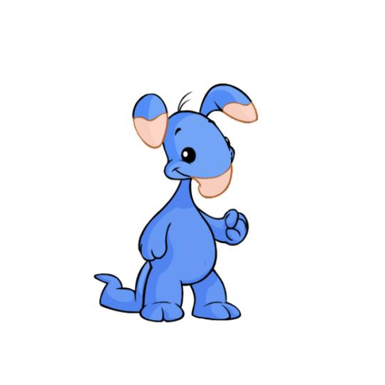
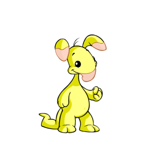
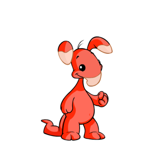
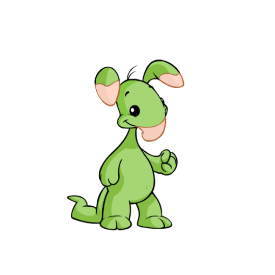
Blumaroos are very vaguely based off of kangaroos, but they don't share too much in common other than jumping ability and the -roo name. Instead, they have a great abstract design that feels pretty realistic while being a complete fantasy creature, with floppy trunk-like noses and details that they can bounce on.
Visually, the soft pink accents of the nose are complimented by the ears, and this base works as a good neutral to match any color. They have these nice dot eyes and smiles that capture their happy-go-lucky nature, and just have a nice shape to them. I also like them having their own land and distinct personalities; it helps them stick out a lot in my mind.
Customization-wise, the Blumaroo is a mixed bag. On the plus side, their old artwork was dated and needed a refresh (note the almost complete lack of shading). I like the way they're fatter now, the loss of the belly button is an improvement because it felt weird that they had one to begin with, and they come across as a bit happier in the new art.
But on the minus side, the lose of their old pose is a tragedy. Blumaroos bouncing and standing on their tails was one of their most interesting characters, and while it's obviously still a trait of the species, it's a shame that it's no longer shown in their art. This is particularly sad because their adorable heart-shaped feet are also hidden from view, which has the side-effect of no longer carrying the pink through the design as well as it used to.
I get that customization needed to regulate the poses a bit more, but seeing as each item has to be redrawn anyway, would it have been that hard to keep them on their tails? It's not like the Lutari where the pose would've made it difficult to see clothing or something. It's otherwise a fine conversion, but man, it would've been perfect if we got both the new art and old pose together.
Favorite colours:
Plushie: Blumaroos already look pretty huggable, but the plushie form ramps it up to 11. I love the soft blue color with just a few pops of color on the eyes and tail patch—it gives the impression of an old and much-loved plushie. The converted version isn't bad, but it unfortunately can't compete with the unconverted version, which has much bigger, floppier ears, a thicker tail, and a very cute pose.
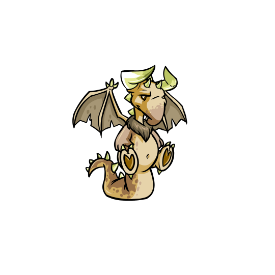
Tyrannian: Speaking of colours that looked better unconverted, dang, the Tyrannian Blumaroo got it rough. I love the original's brows and horn-ears, with this nice neutral dappled brown serving as the base. The converted version had to change some things obviously, but it also feels like they didn't really try—why doesn't it keep the same expression (unconverted Darigan Blumaroos have different eyes, so it's obviously not a problem to change them)? Why is the brown on the tail so much lighter to the point where it's barely noticeable? Why is the ruff now red instead of the dark brown of the wings? Why are the horns so small, and why is the perspective wrong on them relative to the ears? Bleh. At least the original's still great.
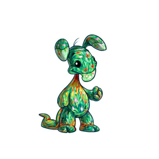
Oil Paint: Thankfully, here's a Blumaroo color that looks great with the customized pose. Such a beautiful color palette, combining little strokes of colors with pretty flower-like blotches interspersed throughout. I love how the colors also flow with the body, like how the torso goes from green to red, or how there's red right around the feet. Lovely all around.
42 notes
·
View notes
Text
As my previous post would imply, I received my Kamikaze Kaitou Jeanne Complete Blu-ray BOX while I was away over the weekend and am only just having a chance to check it out now.
The cover is a thin cardboard slip, not sturdy, and really only functions to keep the two BD cases and booklet together. The illustration by Kagawa is super cute though!
Um, in terms of the actual video it is improved from the DVD release but honestly because it's an early digitally animated series the differences aren't as noticeable as when you look at a remastered 80s anime composed of cel animation. I wouldn't say the KKJ anime ever looked great even by 90s standards, but if you're already used to its gaudy character colour palette then everything will look just like a BD version of what you're used to... I'm not exactly an expert on video transfer or anything so take my thoughts with a grain of salt.
The booklet contains episode summaries and character designs plus a really weak "gallery" which is just promo stills we've all seen 1000 times before. The full-colour character designs look nice and make the booklet worth checking out.
Finally the soundtrack is... well, I don't think the KKJ anime had a spectacular soundtrack to begin with but it really is nice to have it all released properly and in one place. There's a lot of familiar music cues and a few stand out tracks (I love Finn's theme and a lot of the melancholy music is quite nice) however, the majority of tracks really do sound "of the time" and have a clanging midi-esque quality to them
Would I recommend this BD set to others? Sure, if you're a fan of the KKJ anime and want to own it in a nice form, inclusive of things like character designs and the OG soundtrack, then you'll appreciate this release. If you've never checked out the anime then this probably isn't worth your investment without looking into the release further as it isn't top tier magical girl anime by a long stretch, but not everyone will feel that pang of nostalgia that justifies an expensive purchase like a full BD box set.
For me, I'm happy with it -- there aren't really any surprises, it's just a solid release for an older magical girl series and that's depressingly rare these days.
#kamikaze kaitou jeanne#phantom thief jeanne#kaitou jeanne#kagawa hisashi#hisashi kagawa#photo#photo: hotwaterandmilk#merch#merchandise#90s anime#magical girls#magical girl anime#anyway there's my thoughts
28 notes
·
View notes
Last Seen Blogs

leegy1211
제목 없음
glitzystim
stimboard req; closed
shared-braincell
shared salt blog

iso-photo
写想
inukag
towards tomorrow;