#i wanted to make an alignment axis with the horizontal axis being a measure of how likely they'd survive in a fight
Text

saw this while cleaning my hard drive and updated it a bit...maybe y'all like to see what kind of characters really get my heart going HAHA
#i wanted to make an alignment axis with the horizontal axis being a measure of how likely they'd survive in a fight#santana valencia and elena gonna be in the far left that's for sure HAHAHA#i was so conflicted on keeping carol up here...i really didn't like the direction they took with her in secret wars 2#i know that making her a main character in the marvel universe is like#a 'yay girl power' moment#but god you know what made me fall in love with her? the quiet and soft moments underneath her brash tough exterior#her relationship with her cat chewie#her friendship with jessica#i will not get over how hard it hit me when the whole world hated and mistrusted jessica after secret invasion#but carol welcomed her with open arms and showed her that she'll always be there for her#also god her grappling with her own creeping mortality when she realized she had a brain tumor going on#anw yeah all of that and more#they made her a sort of fascism enabler in civil war 2 (civil war not secret war sorry)#and it made me very >:c#kelly sue deconnick please come back#can't believe this just turned into me ranting about comics again ajskndskajd
4 notes
·
View notes
Text
Release Planning Advice
What Release Planning Entails and Why It Matters
While release and release planning are common terms, I find that different individuals attribute different meanings to them. I regard a release as a version of a product, for example, Mac OS X Catalina and Windows 10. Releases come in two flavours: major releases, like iOS 13, and minor releases, such as iOS 13.3.
Release planning is the process of determining the desired outcome of one or more major releases and maximising the chances of achieving it. This involves the following:
Establishing clear, specific, and measurable goals. I call these goals product or release goals and I capture them on a product roadmap.
Determining the work to be done. This typically involves the development team providing rough, high-level estimates.
Understanding date and budget constraints: Are there any hard deadlines that must be met, or is the budget fixed?
Monitoring progress from sprint to sprint and making adjustments as required. In Scrum, release planning is carried out iteratively, often at the end of a sprint when it’s clear how much the progress was made.
Release planning enables organisations to make informed investment decisions; it sets expectations, aligns stakeholders and development teams; and it allows product people to guide the work of the dev team.
It is therefore in your best interest—as the person in charge of the product—to make sure that release planning is effectively carried out. This requires you to actively engage in the work, rather than delegating it to the development team or Scrum Master.
Use a Product Roadmap to Plan Multiple Releases
Release planning takes place at two levels: across several major releases and within a single release. The former can be nicely done with a product roadmap. My preference is to work with a goal-oriented roadmap, like my GO Product Roadmap shown below, that states the desired benefits or outcomes of each major release for the next 12 months. Sample goals include acquiring new users, increasing conversion, reducing cost, and removing technical debt to future proof the product.
The goals on your product roadmap should tell a compelling story about the likely development of your product. They should describe the journey you want to take it on in order to create value for the users and the business, as I explain in more detail in the article “Product Roadmap Prioritisation”. Such a roadmap provides a continuity of purpose and ensure that individual releases build on each other thereby progressing and enhancing the product in a systematic way. What’s more, the roadmap goals help you focus the product backlog by limiting its content to items that are necessary to meet the next release goal.
But don’t forget to regularly review the product roadmap—at least once every three months, as a rule of thumb. As you learn more about the development team’s ability to make progress and better understand how to best meet the user and business needs, you will need to update your roadmap. This ensures that the plan stays actionable and provides the necessary guidance to the stakeholders and dev team.
Prioritise the Success Factors for Your Releases
In an ideal world, the development team will deliver all the releases on the product roadmap on time and on budget. But in reality, unforeseen things do happen. The development progress may not be as fast as anticipated, for instance, or one of the technologies may not work as expected.
To maximise the chances of success, I recommend that you prioritise goal, date, and budget for the releases captured on your product roadmap. One way to do this is to determine the impact of not (fully) meeting a goal, missing the desired release date, and exceeding the budget. Then fix the most important factor—the factor that would cause the biggest damage if you don’t adhere to and therefore has the biggest impact on the success of the product. Try to protect the second most important factor, the one that would create the second biggest damage. Finally, be flexible with the third one, the factor that has the least impact on the success of a major release.
You might have noticed that I haven’t mentioned quality. There’s a reason for it: Quality should be fixed and not be compromised. Otherwise, responding to user feedback and changing market conditions and quickly adapting your product will be hard, if not impossible.
Employ the Right Estimation Approaches
Estimating the cost of the releases on your product roadmap is helpful to acquire the necessary budget or, if your budget is fixed, understand if the roadmap is realistic and actionable—if the development team can actually implement it. Rough, high-level estimates are usually sufficient to meet this objective.
To come up with the estimates, draw on your experience of developing similar products or previous versions of the same product; consider whether enough people with the right expertise are available in your company, or if you will have to hire or contract people. This should give you an indication of the likely labour cost required. Then add the cost for facilities, infrastructure, materials, licenses, and other relevant items. Carry out this exercise together with the development team.
If you believe that the resulting estimates will be too vague, consider the alternative: Breaking the roadmap features upfront into epics and user stories will result in a long, detailed product backlog that is difficult to adjust and maintain. Additionally, this process can take days—and in some cases weeks—in my experience. And while you will get more detailed estimates, they will not be accurate at this stage.
Once you have secured the necessary budget and ensured that the releases on your roadmap are realistic, take the next step and stock the product backlog. As I explain in the article “The Product Roadmap and the Product Backlog”, I like to focus the backlog on the upcoming release and the next roadmap goal. To follow this approach, derive epics from the features that belong to the appropriate goal. Then explore which additional pieces of functionality the release has to offer and add them as epics to the product backlog. Finally, prioritise the items and refine the high-priority ones. This should result in a concise, compact backlog that is comparatively easy to adapt and that offers enough ready, high-priority items. Don’t forget to involve the development team in this exercise.
Additionally, ask the team to estimate the product backlog items. This might be done by using story points and Planning Poker, as explained in Mike Cohn’s book Agile Estimating and Planning.
Use a Release Burndown Chart to Track Progress
The release burndown chart is a simple yet powerful tool to track and forecast the progress for a release. Despite its usefulness, experience tells me that many Scrum product owners don’t use the burndown. But creating the chart is simple. Start by asking the development team to estimate the total amount of the product backlog items that should be part of the release. Rough, high-level estimates are sufficient. Then draw a coordinate system that takes into account time, captured as sprints, and effort in the product backlog, which might be expressed as story points.
The first data point is the estimated effort before any development has taken place. To arrive at the next data point, determine the remaining effort in the product backlog at the end of the first sprint. Then draw a line through the two points. This line is called the burndown. It shows the rate at which the effort in the product backlog is consumed. It is influenced by two factors: changes in the product backlog and velocity, which is the development team’s ability to make progress. Extending the burndown line to the horizontal axis allows you to forecast when the development effort is likely to finish, or if you are likely to reach the release goal and deliver all relevant product backlog items at a specific date.
The release burndown chart above shows two lines. The solid line is the actual burndown. It documents the progress to date and the effort remaining. The dotted one is the forecasted progress based on the burndown experienced so far. Notice that the burndown in the second sprint is flat. This might be caused by new items being added to the product backlog or the dev team revising estimates.
To achieve a forecast that is as accurate as possible, try the following three tips:
Base your forecast on a trend rather than a single sprint. This usually requires you to run two to three sprints before you can create the first forecast for a release.
Consider how representative the burndown of the past sprints is for the remaining sprints. In the example shown above, the second sprint has a flat burndown. This might be due to more items being added to the product backlog based on the first sprint review meeting or the dev team re-estimating items. To get the forecast right, it would be worth considering how likely it is that another flat burndown will occur again and to which extent you should account for it. If you decided that it was highly unlikely to reoccur, your forecast in the sample chart above would probably be steeper.
Make sure that you prioritise the product backlog by risk, particularly in the early sprints. This makes it more likely that the backlog changes in the first few sprints and then starts to stabilise. This makes forecasting the remainder of the development effort easier and results in a more accurate forecast.
If the forecast shows that you are off-track, that the burndown is slower than anticipated, then determine the causes. For example, the development team might lack some crucial skills, the team might be too small, a technology might not work as expected, you might have been too optimistic, or the initial estimates might have been wrong. Once you’ve identified the main cause, decide how to respond. The prioritisation of goal, time, and cost recommended above will help you with this.
Note that if you have to push out the release date or make a bigger change to the goal of the release, this may have an impact on your product roadmap and require you to adjust it.
Make Release Planning Collaborative
Release planning is best done as a collaborative effort in my experience by involving the stakeholders and the development team, as the picture below illustrates. To do so, schedule regular roadmapping sessions, possibly as part of your strategy review process and invite key stakeholders and development team members. Additionally, update and discuss the release burndown chart in the sprint review meetings where the same individuals should be present.
This ensures that the longer-term and short-term release planning decisions are made with the input from the stakeholders and dev team. This tends to lead to better plans, stronger alignment, and increased commitment to implement the decisions.
The post Release Planning Advice appeared first on Roman Pichler.
Release Planning Advice posted first on premiumwarezstore.blogspot.com
0 notes
Text
Everything You've Ever Wanted to Know About autocad 2007 64bit
It’s spring, which during the CAD entire world means a completely new launch of AutoCAD. Once again, Autodesk has managed to add a number of recent options and abilities to its flagship product. But while last 12 months the new ribbon-bar user interface overshadowed a relatively brief list of new capabilities, this time about AutoCAD 2010 features some amazingly impressive new performance for both of those second and 3D consumers.
Effective New Parametric Drawing Equipment
Topping the listing are highly effective new parametric drawing equipment that let users constrain drawings based on style and design intent. These new applications Enable you to implement both equally geometric and dimensional constraints to ensure that distinct interactions and measurements keep on being persistent even as the objects are modified. Even though very similar applications kind The idea of sketching environments in courses like Autodesk Inventor, This is often the first time they’ve been offered as indigenous instructions in AutoCAD. (Similar capabilities had been available in AutoCAD 2008 by using the IDX VCS plug-in, reviewed inside the March concern of DE.)
Geometric constraints Permit you to specify geometric associations amongst objects. One example is, you'll be able to specify that two lines continue to be perpendicular. With dimensional constraints, it is possible to push the dimensions or spacing of objects as possibly explicit dimensions or as mathematical formulation. Such as, you can alter the distance amongst two parallel strains by entering a different benefit or specify that the duration of an object is 2 times its width.
Equipment for including constraints are user friendly and conveniently Found on a different Parametric ribbon bar. As you increase geometric constraints to an item, Just about every constraint seems on the constraint bar adjacent to that item. When you shift your cursor above a constraint, its related geometry is highlighted. Constraint bars might be moved or hidden. To get rid of a constraint, you merely select and delete its icon from the constraint bar. AutoCAD 2010 supports 12 differing kinds of geometric constraints: coincident, collinear, concentric, repair, parallel, perpendicular, horizontal, vertical, tangent, easy, symmetric, and equal.
You may also drastically automate the process of applying constraints utilizing the Vehicle Constrain Resource. Vehicle Constrain applies constraints to selected geometry that falls inside specified tolerances. Such as, if you select a rectangle, Auto Constrain generates ideal coincident, horizontal, parallel, and perpendicular constraints.
Figure 2: Constraints also increase dynamic block generation. The updated block-enhancing surroundings consists of every one of the geometric and dimensional constraint applications furthermore a new Block Table Resource that allows you to set up lists of preset dimension values.
Dimensional constraints place boundaries on measurements of geometry. AutoCAD 2010 supports seven types of dimensional constraints—linear, aligned, horizontal, vertical, angular, radial, and diameter—just like the different sorts of Proportions. Dimensional constraints could be exhibited as a name, a worth, or an expression. A small lock icon appears adjacent to dimensional constraints to help you differentiate them from regular dimensions. Like geometric constraints, dimensional constraints can be simply moved, concealed, or deleted.
A Parameters Manager palette displays the name, expression, and worth of all dimensional constraints from the drawing. You can certainly improve values, rename parameters, substitute values with formulation dependant on Individuals parameters, delete constraints, and add consumer-described variables. It's also possible to change existing Proportions into dimensional constraints. In addition, you'll be able to Command whether a dimensional constraint is annotational or dynamic. Dynamic dimensional constraints resize while you zoom so They may be constantly readable; they're not intended to be used as plotted annotations. Annotational constraints, nevertheless, are meant to be plotted. They give the impression of being much like dimension objects, with their appearance managed applying variations.
Dynamic blocks improve
The brand new constraint resources have also been prolonged to AutoCAD’s dynamic block editor. Dynamic blocks, which were added in AutoCAD 2006, empower an individual block object to possess numerous versions. But producing dynamic blocks with complex behaviors has long been really complicated. Being able to use constraints in the block editor adjustments that.
In AutoCAD 2010, the block editor setting incorporates a lot of the exact same geometric and dimensional constraint applications present in the regular drawing window. Constraints made whilst working within the block editor utilize to your block definition. They are similar to action parameters Employed in earlier versions of AutoCAD, but are a lot easier to comprehend and manipulate. In addition, a completely new Block Table Instrument enables you to set up a list of preset values for each dimensional parameter inside a dynamic block. Whilst you can complete the table manually, You can even paste values from the spreadsheet or textual content file. The moment founded, you may promptly alter the full block by creating just one selection from your desk.
Also new is really a Test Block window. In earlier variations, to test dynamic block actions, you’d have to save lots of your changes, insert an instance with the dynamic block into your drawing, then see Should the block behaved as anticipated. The result was many trial and mistake. Although the Check Block Resource in AutoCAD 2010 allows you to verify conduct on the dynamic block in the block editor natural environment ahead of preserving adjustments.
Determine three: AutoCAD’s new mesh modeling resources help it become quick to build smooth, natural and organic designs. You could increase mesh complexity in particular regions the place additional detail is necessary, and use improved gizmos to control objects in 3D, with filters that will help pick particular sub objects.
Organic and natural 3D Modeling
When the parametric style and design resources only function in 2nd, there are various exciting 3D enhancements in AutoCAD 2010 likewise. The largest is a completely new list of subdivision floor modeling resources. Even though AutoCAD 2007 introduced some rather sturdy modeling applications, developing objects with easy surfaces and natural and organic qualities remained hard. AutoCAD 2010 improvements that Together with the introduction of a whole new mesh object. Instruments on the new Mesh Modeling ribbon tab let you build primitive mesh styles for example packing containers, cones, cylinders, and wedges along with revolved, ruled, and other kinds of mesh surfaces.
Not like solids, faces of mesh objects are divided into more compact faces dependant on mesh tessellation values. Consumers can control the default tessellation divisions for each kind of primitive and also the actions for changing objects which include solids and surfaces tai autocad 2007 into meshes.
The moment established, another set of instruments Permit you to incrementally enhance the smoothness of a mesh. You can also transform current 3D solids, 3D surfaces, 3D faces, polygon meshes, polyface meshes, locations, and closed polylines into mesh objects using the new Easy Object tool. Even When you’ve created a mesh object in a specified smoothness, you can easily increase or lessen its smoothness, which includes with the ability to confine the mesh complexity to spots wherever more depth is necessary. It's also possible to control the conduct of sub objects inside of a mesh using the new Crease Software, making sure that objects are unaffected by mesh smoothness along All those edges.
Additional mesh editing applications Permit you to split a mesh experience and extrude faces to deform the mesh object. After employing the various mesh tools to create natural and organic shapes, you can change meshes to sleek or faceted solids or surfaces, with Handle in excess of the smoothness of objects during the conversion system.
Figure 4: 3D printing abilities enable it to be quick for buyers to produce Bodily 3D models and prototypes by connecting on to 3D printing services suppliers.
That will help you manipulate objects in 3D Area, AutoCAD 2010 also features a new 3D Scale gizmo Along with the 3D Transfer and 3D Rotate gizmos that 1st appeared in AutoCAD 2007. Applying these interface resources, you may move, rotate, or scale picked 3D objects inside the constraints of the specified axis or airplane. For those who correct-click every time a gizmo is noticeable, a new context menu lets you alter the gizmo’s behavior. As in past releases, you are able to keep down the Ctrl important to pick out sub objects including an edge, deal with, or vertex. But now, You can even implement sub item variety filters to make sure you select the kind of sub object you predicted.
Drafting Enhancements
Besides these major alterations, AutoCAD 2007 has a bunch of a lot less breathtaking but equally useful alterations and additions, beginning which has a new First setup wizard that can help tailor each user’s set up depending on business, workspace, and drawing Tastes. The application menu has also been streamlined, and whilst Which means you’ll no longer locate the old pull-down menus concealed there, consumers can even now switch back to your AutoCAD Common workspace with menus and toolbars. But just after working with AutoCAD’s ribbon bars for in excess of a yr, several buyers now favor them. The fast Obtain toolbar has also been Increased, such as new selections to really make it simpler to add and take away equipment within the toolbar.
Hyperlink Down load autocad 2007 : https://indainam.com/download-autocad-2007-full-crack/
0 notes
Text
Measuring Air Quality Through Our Subjective Experience Part III [31 May 2017]
Around July last year, I worked on a project analyzing data from Thingful’s repositories in an effort to predict “missing data”. I was happy to reconnect with Umbrellium to to tackle a new challenge in IoT. The project combined some of the same thought processes and ideas that I had explored with Thingful, however, this time we were specifically tackling Air Quality and incorporating the use of wearables and our own data sources (WearAQ).
Building the wearables and coordinating where and with whom we were going to perform the experiment were the first stages of the project. Once we reached the point when we had collected all the data, we had to figure out what to do with it. This is where I came in. The purpose of this post is to walk through the thought behind the data science - the models we built, the setbacks we encountered and the results from beginning to end.
As Ling outlined in the two previous posts (Part I and Part II), we were looking to find the answer to a simple question - “Can we measure air quality through our subjective experience?”.
We had the students record their perception and we took our measurements (the PM 2.5) from a low calibration sensor that we carried while we walked. Then we had one sensor at the Marner primary school that was highly calibrated for a range of variables (NO, NOX, NO2, O3, PM2.5, PM10).
Our first challenge was how to incorporate the ground truth data. The AirSensa device’s data was specific to one location, while as the data collected by the students was over variable locations. When we consulted with air quality experts in the planning stage of the project, the first point they made was that measuring air quality reliably would be very hard as even being on different sides of the street has an effect. So even though students did not walk very far from the school and we knew that air quality is location dependent, we took a look at the variability of air quality over time to see what trend, if any, existed between the AQ readings from the school’s fixed sensor to the low calibrated hand sensor.
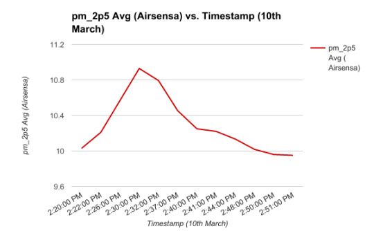
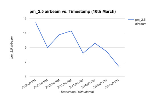
We observed a slightly downward trend being repeated. Both data sets were collected at large irregular intervals accounting for sharp dips and peaks. While not robust enough to warrant a direct comparison, we made our first assumption: AQ over time can indicate AQ over a short distance.
Building the model
The first thing we needed to do was learn more about prediction techniques for air quality. We spoke with experts in the field and researched modelling and prediction techniques. Additionally, since we were taking a new approach incorporating data from IoT sensors of varying quality and calibration we needed to devise a method that could handle mixed types of data.
The AirSensa device reports data at a resolution of 10 minute measurement intervals. The data we retrieved from the wearable Airbeam device was a little more sparse in it’s recording. To deal with this, we had to fill in the data to match the resolution between the two set of readings. For the purpose of a prototype, we wanted to explore how well a model could predict these values despite the varying differences in data quality between the two.

We also had to incorporate the results of the gestures. Due the nature of subjective measurements, we found the students were not 100% aligned in their perception of air quality. So to account for this We had combined the data as an average to give us a continuous range, between 1-3 (each number referring to a specific perception) to get an idea of air quality at each location and between each location.
So to put this all together, initially, we considered simply linearly interpolating between the data as a prediction model. However, we also tried the machine learning technique, “random forests” to impute some of the missing data.
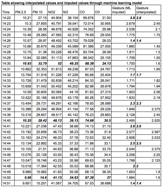
*The values in bold display the raw values. Note that this table shows both imputed and interpolated gesture results but only interpolated pollutant values.
Now we had a “full” data set to use, mimicking the ideal scenario where perception and air quality measurements were being captured every minute. The experiment was designed to see if we could use the perception data as a substitute to measure AQ. So the next step was to build out our model to predict air quality and see if we could line up the model to predict, with a certain accuracy, the perception data. We used two models, a random forest and a neural network.
Random forests are an extension of tree algorithms. Tree algorithms work by taking into account the likelihood of an output occurring based on a range of values of the predictors. A random forest simulates a number of these tree models and takes an average likelihood so as to eliminate the chances of an over or under estimating. Temperature is typically measured in whole steps i.e 16°, 17°, 18° and tree algorithms are more suitable to predict discrete outputs. Applying this method to the problem at hand, this meant that for air quality on a continuous scale there were too many possible outputs that rendered this approach relatively ineffective unless we isolated discrete values or buckets.
We also researched the possibility of using a neural network. Simply put, neural networks take a set of predictors, model them to see the relative effect of each on the output and then combine variables together to get another layer of predictors. These are also used more often for discrete value prediction, however can be adjusted to fit a continuous scale output. When we tested a model on a years worth of sample of data from an air quality sensor it responded with a high accuracy - between 90% and 100% accuracy dependent on size of the training sets. This results of the model fit the prediction of pollutants best and as such we used it for the experiment.
We applied the neural network over the data by splitting a dataset of 30 observations and 8 values into divisions of 70% and 30% to train and test our models respectively. We did this for both the interpolated and imputed datasets.
The results displayed below in the form of a confusion matrix. This is a method of showing the effectiveness of a model by building a matrix by which the vertical axis shows what the expected output was to be and the horizontal shows the predicted in order. A value of 1 is given per column to indicate the intersection between the prediction and actual result and 0 otherwise. An ideal result is a matrix with a leading diagonal. This works best with factor or classes of variables, but since we were dealing with such a small set of outputs and rounding off our outputs, a leading line of 1s would be the ideal.
From our results we found the following.

Comparing the two models side by side, we saw that the model that was applied to the imputed values gave us a lower accuracy. With a test set of this size we can’t conclusively say that one is better than the other due to a number of variables. Firstly comparing imputed to the interpolated values, we had a different spread of data. This could be due to the fact that the imputation model was simple and not very well optimized. Also, due to the complexity and small sample size of the of the data we may not have had enough data to go on to build an accurate model. Additionally, perhaps the imputed model returned a more accurate or “realistic” sense of perception data, and hence the lack of accuracy in the model is most likely what to expect if we were to pull from a complete actual dataset.
We did, however, manage to build a perfect model, under these specific conditions, for the interpolated data. As a result, we took this to validate the students’ perception of air quality by correctly predicting an assumption of their subjective opinion. We were careful about being aware of overfitting the model - i.e making it very specific to the data at hand. However, for the purpose of building a prototype we concluded this would give a good idea of how we expect the model to run.
So as a check of our hypothesis, we were able to build a model (taking into account certain assumptions) that validates with some accuracy that a person’s perception of air quality is correct.
Moving on, we wanted to check the other way i.e can we use perception data to inform us of air quality. Due to time and the constraints of limited data, we went about this by comparing the gesture data to the variability of a pollutant to see if by using a simple line of best fit we could obtain a workable result. Plotting groundtruth gestures against three pollutants we obtained the following results:
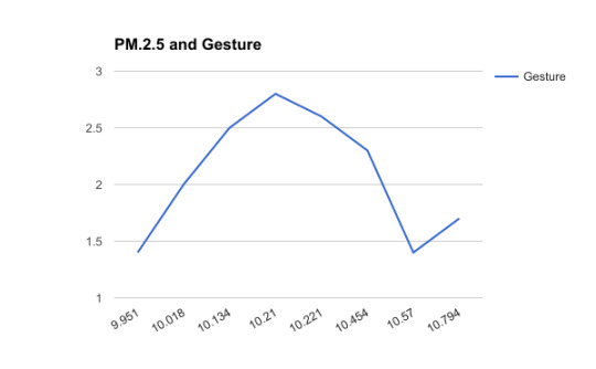

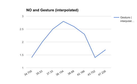
These results were clear in that location plays an important role in perception. Since we arranged the values for the pollutants in ascending order we would expect the graph to show an upward trend. However, this was not the case indicating that in fact, there was something other than just the air quality at the Marner sensor affecting the students’ perception.
All three graphs shared the same trend and we were curious to see if that was to be expected. Analyzing a data set of approx 250,000 observations, we found with the exception of O3, pollutants are positively correlated with one another. This verified our result indicating that the data was indeed correct and location and other factors were having an effect on AQ perception.
So, ideally for the the experiment to work effectively we would need a steady stream of data to feed into the model at each location of interest.
Findings and Suggestions for Improvement
Using a machine learning model we were able to build an accurate model (8/8 correct predictions) to predict students perception data. This validated a person’s perception of air quality by correctly predicting our assumption of their subjective opinion. When using perception data to backtrack and predict air quality we verified that location plays an important role in air quality and perception data. Values that should have been increasing experienced non-linear trend indicating the fact that something other than just air quality was affecting the students’ perception.
To address these issues moving forward, we’d need to take into account other environmental factors such as traffic, wind and incorporate the visual cues that the students’ recorded. We initially wanted to use sensors such as those connected over IoT networks as part of the machine learning model. This however proved difficult due to location and time of last refresh or update of the sensor. As IoT repositories such as Thingful grow we would be able to add more data to the models.
-Usamah Khan - @usamahkhanmtl
#wearable technology#community engagement#air quality#air pollution#students#children#collaboration#data science#blog
0 notes
Last Seen Blogs

scribblemakes
Monster Comic Man

vivoacademy
Vivo Academy

hydrewcoin
Hydrew Coin


umbrellaxey
Untitled