#i hate photoshop's quick selection feature >:(
Text


It's been requested so here it is: my gif tutorial! I hope to make this very simple as I've made gif making very simple for myself with the help of .atn made by myself and others. More under the cut!
First, what you'll need.
Photoshop (here's a link to a masterlist of free photoshop resources from birdysources)
KMPlayer, to get your screencaps.
These PS actions. (My gifmaking one, and this sharpening action from insomniacgifs.)
Some understanding of how to color gifs (I'll be linking my psd shown here, as well as including the process of making one.)
Next, how to get the videos that you want to gif.
I personally source my videos from Youtube, Twitter, and streaming services. (Firefox browser is your best friend, as it doesn't black out the screen that some services have.) If a Youtube Video Downloader isn't working, or if I'm capturing my own footage, I use the Xbox Game Bar's recording feature (windows + alt + r) to capture footage. There's also applications like OBS Studio. For Twitter, I use twittervideodownloader.com
Now, making the gif.
I use Photoshop CC 2018, but any PS with a timeline will work. But first, we gotta take our screencaps. Open your video in KMPlayer, and press alt+v. This will open up this second screen

These are my settings, with an easily accessible folder that I save my frames to. Find the scene you want to clip, and hit start & play your video, then stop when you have the frames you want.
Next up we're going to open up Photoshop. I changed my keyboard shortcuts so all I've got to do is hit ctrl+alt+o, but for you guys, you gotta go to File -> Scripts -> Load Files Into Stack

Select your screencaps of the scene you want to gif. Now that Tumblr allows gifs up to 10MB, the amount of caps you want is totally up to you. I stick to around 45-50, but sometimes there's a scene I need that's up to 150+ caps, and it still fits under the size limit. It all depends on the dimensions and coloring of your gif. I'm loading up 51 frames as the sharpening .atn deletes the final frame of your gif once it reverts back to frames, so I'll have an even 50 framed gif.
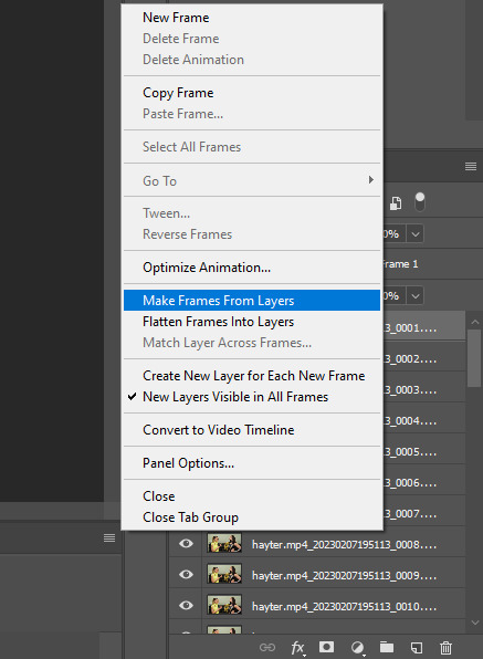
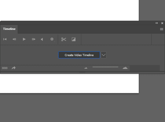
Your PS should look like this. Here comes the gif making itself. You want to hit Create Frame Animation at the bottom, where your timeline is. If your timeline isn't already open, click your Window tab up top, and find timeline in the dropdown.

After you hit Create Frame Animation, you want to Make Frames From Layers, which you'll find when you click the three lines on your timeline.
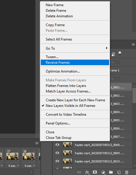
Then, reverse your frames.
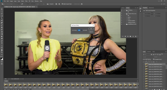
Finally, Select All Frames, click the arrow on the frames, and change the frame delay to .06 seconds.
Way to go! You've made a gif! Now, if you're like me, you'll get tired of having to do that over & over when making a gifset. So, I recorded and uploaded an .atn, which means all you gotta do is load up your frames, hit play on the .atn, and your gif is good to go. I'll link it again so you don't have to lose your place in the tutorial.
So you've made your gif, now what? Now we crop, sharpen, color, and save for the web. Let's get to it.
Tumblr dimensions can be tricky, but they're easy to remember. (I even made a little graphic for it!)

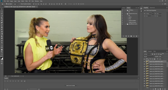
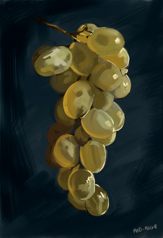
For my tutorial, my Jamie gif will be 268 x 268 :)

Here is my unsharpened, unedited gif of Jamie Hayter. I believe this clip was snagged from YouTube, but it's been awhile since I saved it. I use insomniacgifs' gif sharpening atn, as I hate manually sharpening gifs. So let us run that real quick. (I'll be using the Strong option. Don't forget to delete the final frame.)

Onto coloring! The example I whipped up for this tutorial is super simple, so let's go!
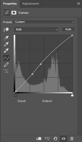
I typically edit the curves first. I'm not sure why, just something I picked up from my photo journalism class back in HS.

Next, I add a little brightness. (+10)

Then, I mess with Selective Color, just a bit. (Neutrals, Black +10. Blacks, Black +5.)

Now, I don't know exactly what Channel Mixer does, but it's fun. Here's my settings.


Some Saturation (+5)

And lastly, I edit the Color Balance!

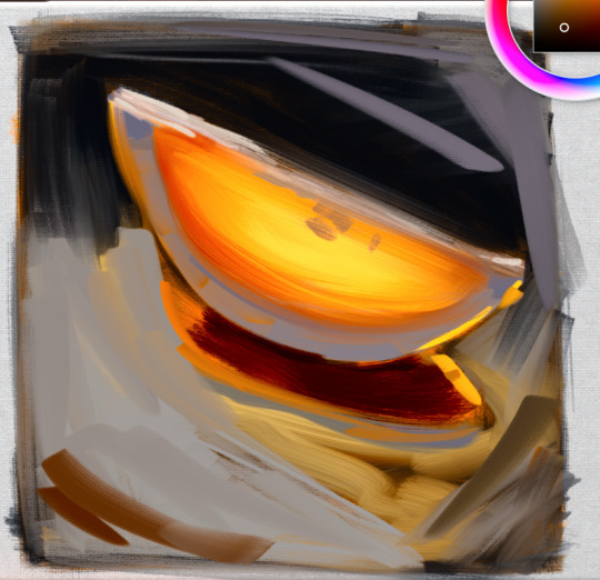
Aaaaand here's my final product! I also uploaded this as a PSD for you to save and use yourself!

Once your gif is all done, we need to save it properly. File -> Export -> Save for Web (Legacy). Here are my settings.

Note: Make sure your looping options is set to forever so your gif doesn't loop once and freeze!
And that's it! I hope this helped, and if you have any questions, my ask box is open!
#tutorial#gif tutorial#photoshop tutorial#wweedit#wrestlingedit#aewedit#*tutorial#keyara.gif#she's here!!#long post
206 notes
·
View notes
Text
GGWM - Get Giffy With Me
I am not professing to be anything even remotely resembling good at giffing, but I got a little message from @thisautistic (hope you don't mind the @, bb! I'll remove if you prefer) asking about how I did my Jay Does Corporate Pride bold gays Ayan set. We quickly realised I can't do anything concisely, and so was born this idea.
All my secrets laid bare. Not that I consider anything here a secret. Go ahead and steal my methods. Steal them. Run with them. They're yours now.
Specifically, I'm going to talk about background isolation and boosting, here, but I'm gonna start a new gif from scratch and show the steps to getting there.
So, I have Photoshop 2020. Or 21. I don't really know. That's the only tool I'll be using, other than the empty cereal box I call a brain.
We're going from this to this. (These are very, very quick and dirty, but they're for demonstrative purposes.)


And this to this.


Annoyingly, I think I prefer the "bad" example, but anyway.
Fair warning: this post is exactly as chaotic as you'd expect it to be, considering it's me writing it and I wrote it in an hour... which includes the time spent making the gifs.
Are there easier ways? Probably.
Let's go!
1. CAP SELECTION.
I have the entirety of The Eclipse capped already, but you'll want to cap your scenes if you haven't already. I prefer working with caps rather than video clips - they both have pros and cons, and I can talk about that some other time if anyone wants me to.
I'm doing two gifs for this little tutorial-turned-dissertation - one that's easy peasy to colour for the purposes of Corporate Pride, and one that makes me want to consume my own elbows. For comparison, or something.
First thing to consider, is if the background is a feature, you want your subject to stay fucking still Kanaphan I swear to god.
You also want to pick something with fairly good contrast. I hate black/white and otherwise relatively neutral backgrounds because they're so difficult to make look natural, but something already predominantly coloured? Lemon squeezy, baby.
2. IDENTIFY COLOURS.
I've taken the easy route and picked green, which is almost always going to contrast nicely with skin tones and makes my life easier, and purple which I have many many issues with, but also contrasts.
Also, this step isn't massively important, it just helps. For example, I didn't know I was going to use green for the First gif until I boosted a bunch of colours and realised how green that rock face behind him is.
I tend to use my beloveds Selective Colour and Colour Balance rather than curves. I don't understand curves. I only use it if I have to lighten something.
3. QUICK AND DIRTY BASIC GIF TUTORIAL ft. my boy Pawin:
Timeline> Video Timeline> Add Media> put in your frames, change your frame delay. Boom, basic gif. Or, to get particularly meta... gif gif tutorial!

What a babe. 🥰
And no, I can't explain why he's here. I have two perfectly fucked up gifs to fuck up, but I chose to spend 60 seconds of my life making a Pawin gif just for this.
4. COLOURING!!!
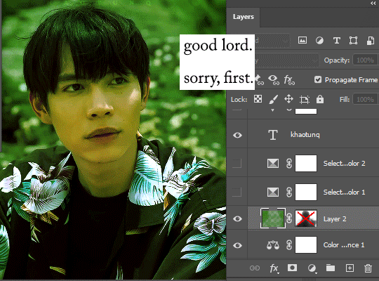
Go nuts. But here's my process for the Akk gif in specific.

This tells you precisely nothing, but it was fun to make.
I have no idea how to share the specific settings other than to give you the .psd. So as soon as I figure that out, you can have it. I don't recommend using the psd for any and all gifs, because my approach to colouring is interpretive at best, but I really don't care all that much so. Do what you like. S'what I do.
Not included in this: cropping/resizing, my sharpening action, swearing about First, apologising to First, laughing at the fact I changed his shirt colour entirely, swearing at First some more, shrugging and saying, "That'll do."
5. COLOUR FILL / BRUSH / OVERLAY
So, all of this is for this one step.
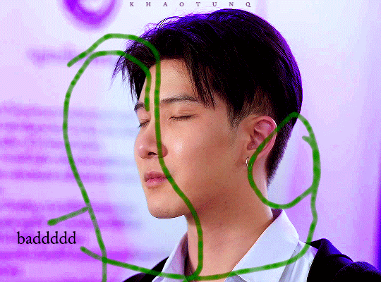
Here I will demonstrate why white/neutral backgrounds can suck unless you're looking for that particular effect.
For something like the gifset I made, I wanted to punch people in the face with colour, so I had to use scenes with backgrounds I could lean on. In the Akk gif, I noticed the green after fucking around with the colour balance (I tend to boost shadows blue or red, then highlights cyans, but I've been known to go wacky. I leave mid tones alone... for the most part.) so that's what I decided to lean into. When I started this little ramble 500 years ago, I was originally planning on orange. How fickle fate is.
Anyway! I prefer using brushes rather than a full colour-fill layer, because I feel like it gives me greater control. I also prefer adding colour gradually rather than starting with a block. So, I use either a large soft brush at 50% opacity, or a watercolour brush at 100% because it's semi transparent anyway.
I'll use broad strokes - I ain't here for detail work. Set it to Overlay or Soft Light, whichever floats ya boat. And then rather than erase anything, I'll create a layer mask and, using the same brush, splodge it around til nobody's face is green.
And then on the off chance things are eye-burningly saturated by the time I finish other colouring things, I'll just go kill the opacity on the overall colour layer. Like seu~
You have no idea the strength it's taking to not go back and redo this entire tutorial because I've taken too much yellow out of his skin and it's bugging the shit out of me.
This is a fake tutorial, Jay. Breathe.
TO KHAOTUNG!
I am man enough to admit I stole my own damn .psd for the other gif. I literally used the same settings other than futzing about with the neutral balance to try and get some kind of colour undertone.
This is the second gif with just the colouring, no additional fill or overlay:

Isn't he pretty? Don't we love him? I love him. He's so asjdkfhg. Ugh.
Anyway. I figured there was sort of a blue/purple tone. Knowing what I do, I know it's gonna be way too pale for what I want, and he also moves quite far across the frame, so it's gonna be a pain in the arse if I want to go SUPER saturated with any colour background,but this is a demonstration and nothing more.

I could use Linear Burn instead of Overlay but I always get annoyed at it. Because I am a deeply rational person.
Anyway, the point of the above is to kind of show that sometimes u just gotta leave a massive puddle of colourlessness around someone's head if they're moving a lot. I've gotten away with it in this case because it's pale, but if I tried to put any further boost to the saturation, it'd look insane:
I HOPE THIS HELPS
I apologise for my incoherence. It makes sense to me. Which should worry us all.
Anyway, final gifs:


+
Rejects of my War On Purple, because I promised those. Notice how they're all white, black or neutral (dark brown/red) backgrounds? Rage.


#i had far too much fun making this#it's entirely possible i'm slightly manic#i have no idea how to tag this#my gifs#i guess? i'm going to hate coming across this later but lmao#trust the process#even if the process is screaming and sliding sliders around til someone looks human again#adventures in gifmaking
11 notes
·
View notes
Text
today was my birthday!! ( ᐛ )و the ceaseless march of time never stops, but that’s not what i’m here to talk about, i got gifted a copy of realistic paint studio by my family! and i thought i’d share my thoughts here
all the fun of oil painting without the carcinogenic terrors of cadmium yellow!
so i’m coming at this from somebody who
primarily uses, and will continue to use, clip studio paint
has never actually used oil paints in any significant way
absolutely TANKED high school art classes back in the day. i mean bombed. i mean nosedive. sub f tier. my teacher pulled me aside and said i should give up on art school to save the place for ‘somebody who actually has talent, you will never be good’ tier. i kept at it anyway but all that to say that there’s a classical, ‘right’ way to do these sorts of things and i’m actually not sure what that is because i’m self-taught, so if you’re in the same boat this overview might be of use to you
right out the gate this thing costs £30, if you want the ‘vip’ set (which is only £5 more than the ‘base’ set and comes with extra tools so i’d just go for it). upfront i will say, clip studio paint often goes on sale for £25 and has a wealth of tools available to it. if you have a choice, without a doubt, pick up csp. the free asset store alone is unbelievable. this thing is robust but only in certain aspects, think of it more as a very, very advanced toy
realistic paint studio has a fun feature going for it, tutorials! you know those old bob ross paintalongs? almost every tool has a reference picture and a guide that teaches you how to use it, especially for the more difficult ones like watercolours

a couple i did
the pros:
the engine that handles paint and mixing is unbelievable. it is absolutely incredible. i’ve used a lot of art programs in my time (GIMP, photoshop, krita, csp, and whatever weird little novelties i’ve found floating around like alchemy, etc) and rps feels buttery smooth. unmatched
every brush you can use comes with a demonstration of how you can use it and for what purpose
far closer to traditional mediums as far as colour and general ‘feel’ goes so if you’re looking to make the jump from traditional to drawing tablet this is a great middle ground while you get used to it
supports tilt (but very usable without it, and i’m saying that as someone who doesn’t use a tilt tablet)
buttery smooth. i’m listing it again. i cannot stress this enough
the cons:
if you’re coming to this program from photoshop/csp the QoL features you are used to are gone. the transform tool is manageable but there is no mesh transform or perspective warp. no layer modes. no multiply, no overlay, no dodge, no hue sliders, no cropping, no gradient maps, no liquify. they were not kidding when they said ‘realistic’, if you make a mistake you have to rawdog it and paint over it.
the ui is not a traditional art program ui. you click toolboxes which bring up brushes, and you select from that set, then the box drifts off-screen. you’re either going to love this or hate it. you can assign certain brushes to hotkeys under the favouriting system, but that’s very limited so expect to see that little toolbox a lot
the export feature is clunky. most apps let you export from the file menu but you have to save your work, quit, retreat to the general app management area and export from there. there is a method of exporting in the file itself, but it only lets you set up these little postable scenes. it’s cute, but this isn’t intuitive. also, and this is a real nitpick, a lot of the pre-rendered scenes offered hide the very bottom of the canvas, where your signature traditionally goes
my general thoughts are that this is a cool, interesting piece of kit! it feels a little too janky to use consistently, especially if you need a quick and easy user experience for commissions or the like, but it’s the best at what it sets out to do. certainly ‘limited’, but i wouldn’t count that as a flaw, it isn’t like you can slap a multiply layer over a real charcoal drawing and call it done. i’d argue that if you want to improve, and you want to improve very quickly at that, you’re going to struggle to find a better digital medium to work in. you won’t be tempted to use shortcuts because they’ve been slapped out of your hands. you can’t liquify tool your way out of this one, me. i’m looking forward to sharing more studies and, when i think i’ve got a half-decent handle on it, lavishly painted sad old men
#rochedotpng#fun and interesting program! i've been having a great time with it#overall a mixed bag but what's in that bag is very very impressive
69 notes
·
View notes
Text
Affinity 2 thoughts
This is just a quick list of the features I think are neat. The Universal License made it an instant-purchase for me, which gives you the whole Affinity Suite you can use across MacOS, PC and iPad for $90 with their current discount.
Overall, some things were cool to get in this release. I didn't get nearly all I had hoped for, but I think it's a step in the right direction.
Designer
The Shape Builder Tool seems really cool and we can build some complex shapes out of basics pretty easily it seems.
THE KNIFE TOOL. THANK GOD. We can cut vectors and text into separate components easily now.
DXF Support - I'm excited about this one, but doesn't really apply to TTRPGs. It's cool. I'm stoked about this one for other projects, doesn't apply to game designers.
Photo
Non-Destructive RAW Development in Photo replaces Adobe Lightroom for me, which is wonderful. Hate Adobe.
LIVE MESH WARP! Yes. yes. yes. I don't have access to Photoshop, so I don't have Smart Layers. This gives Affinity those same tools to support mockup creation from scratch.
JPEG XL Support is nice to see, but not something we really mess with.
Publisher
The Book feature looks really cool. I need to dig into that more and what it actually means for us.
Notes (footnotes, side notes) - Yes, please I am going to footnote and sidenote the SHIT out of my games. I see us using this to release "Designer Commentary" version of our games easily.
Style Picker is great. This is really help out with workflow and fixing stuff. But also since it allows applying styles to individual characters, selections, or single-click for whole words, this a way to add fun color/styles to important words throughout a paragraph quickly. That's huge.
Performance improvements - I tested this out, and it loads the Banda's Grove afpub file in about half the time and doesn't lag anymore during scrolling and editing. So, kudos there.
4 notes
·
View notes
Note
I also have... thoughts on the new Mirai game. Don’t get me wrong — I played it for 6 hrs straight w/o realizing bc it was so fun and I’ve been waiting for it to come out in English we since they made the announcement for the Japanese version. 💖 But Project Mirai DX’ on 3DS controls are waaaay more comfortable for me and seem more in sync With the right and left hand?? I don’t really know how to explain... What are your thoughts on it??
I will NEVER stop my promoing for Project Mirai DX. I want Project Diva to be MORE like Project Mirai. I genuinely wanted a new, amazing installment of Project Mirai on the Switch as opposed this Diva game. This is my unpopular take and I will not repent for it. Also, I hope you realize what a wall of text you unleashed by asking for my thoughts.
About Mirai vs Diva in general:
The use of the track that notes were placed on in Project Mirai was so good and I really miss it going into Diva. The random placement of upcoming notes in Diva, especially with busy background pvs or fast notes, leaves me scrambling sometimes. Not to mention the way the track would be incorporated as almost another level to the PV in some songs, like it tracing rabbit shapes in Lots of Laugh or making liberal use of the rainbow colored hold bonuses in Reverse Rainbow. It really felt like an extra level of care from the creators.
Also the timing is so much harder in Diva oh my god. Project Diva is so demanding. Janitor Mod enjoyed the few songs that had an Extreme Mode chart in Mirai, but is struggling with Hard Mode in Diva. (Edit: I found out recently that her issue is most likely caused by lag from the joy-cons while I had the Switch hooked up to the TV. There’s a way to calibrate your lag, although I wish the game would have told you up front about the option kinda like Taiko no Tatsujin does. It really seems either playing in handheld mode or with a wired procontroller is the most recommended.) As someone who objectively sucks at rhythm games, it’s been kicking my butt.
I loved the level of customization in the outfits. The outfit swaps were not limited by character, only by gender. I think this would be appreciated a lot be people who’s favorite character is less loved in the outfit department too, it really expands the outfit selection when Meiko can wear the other girls’ clothes and whatnot. Not to mention that some outfits have recolorable sections that allowed you to really tie more disparate designs together.
Minor and inconsequential note in the grand scheme of things, Mirai felt like a bigger game with all of the tiny random things you could do, like the mini games and music editor and the buddy system. It probably doesn’t matter to people more invested in core rhythm gameplay, but even when I wasn’t in the headspace for rhythm games (or in a physical space that would prevent uninterrupted timed play), I still had other options to be engaged with. I miss that in Megamix.
About Megamix specifically:
Most of the issues I have are minor. This is my first Project Diva game, and as such, it doesn’t bother me in particular that its basically a simple rehash of Future Tone. I never had any of the previous games to get bummed that this is the same thing. Obviously, your mileage may vary. From what I’ve heard from others: don’t bother if you already have Future Tone really.
I’m also kinda peeved that there’s no physical English release, not even a limited preorder run. I’m a huge proponent of physical media for a few reasons, but come on. Previous English Diva series got physical releases.
I really dislike the art direction of the actual characters. I prefered the look of the models from Diva F and Diva X more than these. I just like the less exaggerated anatomy.
And yeah, the shader sucks. I tried not to hate it, but it does just look like someone was abusing the saturation sliders in a bad photoshop. It’s too bright and washes away already subtle facial features, almost always leaving them noseless. Characters look especially out of place in any stage that isn’t entirely abstract lights or shapes, as the backgrounds seem to use a different shader? If they really wanted to use the toon shader for the whole game, I wish at least they would have used the Diva F models. I think the simpler style of those models would have fit better at least.
Also, why no new modules besides Catch the Wave?? I know that the ones that stick to 2D pvs are by choice of the producer, but what about the 3D pvs? Seriously why couldn’t they have added Magical Mirai 2016 in for 39 Music?? They already have the design for it. No new design for Alien Alien, nothing for Teo or Hibana. And Roki just reuses the modules that are for Kodoku no Hate.
I personally don’t find any of the the DLC packs as enticing enough to actually buy. None of them have more than one or two songs I want. This will obviously vary on your taste.
I can’t wait for touch play mode to be added to the English version, I really preferred tap mode in Mirai so I’m was really pleasantly surprised to hear it would be added to Megamix.
That said, the menus are clean and mostly user-friendly with the exception of a few confusing names. The game play is fun, the load times are quick, and the song choices are safe but fine. Very Miku heavy, but that’s what I like. The shader means Future Tone’s unholy lighting bloom issue is reeled in (even it just looks bad in a new and different way). I’m glad the hairstyles are interchangeable even if I miss Mirai’s outft swaps not being character locked. The important points of it, you know, being a rhythm game are good. I’m just forever, and probably annoyingly, bogged down in aesthetics.
Post Touch Play addition edit: The system for choosing Touch Play vs button mode, quite frankly I’m sorry, fucking sucks. Having it be buried under layers of menus instead of a separate category like Mix Mode is infuriating. Just have the option come up along with the other two in the selection page. If you didn’t know it was an option, you would never find Touch Play. You would never even know about this whole game mode. As for how the mode actually plays, it’s fine. It feels really crowded on the bottom of the screen, but I’m not sure how else I would have done it? I don’t actually know which I prefer, button or touch screen.
I hope that if you’ve never played a Project Diva game before due to not having a Playstation, that you can get Megamix, I certainly don’t regret the purchase.
#Anonymous#haha sorry for the long post but you asked and i love to talk#not a module#answers#mikumod
83 notes
·
View notes
Text
LifeSuite Review 2021 — ⚠️SCAM EXPOSED⚠️
LIFESUITE WHAT IS IT
LifeSuite Is The ONLY All-In-One Powerpact Digital Solution You’ll Ever Need To Provide The Most Demanded Services On The Internet For LIFE – at an unbeatable one-time price.
==> Special Discount: Order Today With Best Price And Special Offers
Sure, we all know we have to adapt to the digital world if we want to stay afloat, feed our families and afford a decent lifestyle. But what comes next? Struggling To Adapt? Then just like me, I’m sure many of you figured out that you need to get so many things right to be able to sell online. The most important tasks to successfully go digital are: Storing your files safely… god forbid you lose all your important data; Hosting your website, it can’t be slow & unattractive after all it is your virtual identity; Reaching out to your audience fast enough, you don’t want to lose the opportunity to convert a client; Creating stunning graphics to make your audience stop & stare at your business; Hosting your own webinars to tap into the new age live-selling market; Creating funnels to successfully sell your product & count your profits.
==> Read More Here: Don’t Miss Out Today’s Special Offer <==
Don’t know about the next door genius. Hopelessly Searching For A Better Tomorrow? For all those who reached this stage of realization kudos to you. But you already know, knowing about what all you need barely solves the issue. It is actually the beginning of great suffering. Tried Everything Possible? Did you just like me get hoaxed into trying everything you possibly could? Wasting all your precious money on stuff like: Digital marketing books & podcasts, Marketing gurus, File storage facilities like DropBox, Graphic designing tools like Photoshop, Funnel builders like ClickFunnels, Autoresponders like Aweber, Webinar hosting platforms like Zoom, Hosting platforms like HostGator. And Still Failed?
>> Visit The Official Website Here to Place Your Order!
And to top it all. Did you still have to try and learn your way around these software, Hire a huge team of experts to work on each software separately, Pay more & more with each passing day, etc. Introducing The One Solution To All Your Problems, The One Trick For All Your Goal Manifestations Is Here. It’s called LifeSuite.
Everything Is Ready-To-Publish In 3 Quick Steps:
STEP 1: Get Access to the easiest all-in-one digital solution
STEP 2: Pick the service you need… cloud hosting, file storage, webinar hosting, auto responding, funnel building or graphic designing
STEP 3: Witness the magic of hot-selling digital services in skyrocketing sales & profits.
The Bottom Line: LifeSuite is designed for anyone who likes to be in full control of their business, but at the same time HATES complicated software. It’s for you if you simply don’t want to pay extra for storing extra data, bandwidth and designs want to build something uncomplicated which grows and makes you more and more as it does. It’s for you if you’re sick and tired of paying monthly subscriptions to storage, hosting, funnels, autoresponder & design platforms in return for mediocre support and massive downtimes.
HURRY UP GET EXCLUSIVE 50% DISCOUNT OFFER ON OFFICIAL WEBSITE.
At the moment – LifeSuite is available for MASSIVELY discounted ONT-TIME price but of course, this special offer CANNOT continue forever. Once this special launch ends – LifeSuite will then turn into a monthly subscription model. So – don’t miss this MASSIVE opportunity and get access right now.
WHAT LIFESUITE CAN DO FOR YOU
EXPERIENCE Ultimate Cloud Hosting: Host limitless websites on rock-solid cloud based servers; Create Ultra-fast loading sites with no downtime; Enjoy absolute peace of mind & security courtesy of End-To-End Encryption; Personalize unlimited email accounts & experience unprecedented bandwidth; Automated creation with maximum ease & sophistication for new-age marketers; End your struggles with one-click installer for WordPress & 100+ apps; Sleep better & live stress-free because your sites are malware protected.
EXPERIENCE Reliable Data Storage: Add, manage & delete your precious files from even the remotest island; Share files & collaborate with your team or family in just one-click; Avoid data snooping & third-party sharing by making the safe shift; Keep cherished memories and all your files secure throughout eternity with the backup feature; Save precious time thanks to quick-view enabled documents, images & videos; Download & upload files instantly using the lightning speed servers without a moment’s delay
With LifeSuite,you can experience Hot-Selling Webinar Creation: Understand the pulse of the buyer by hosting popular pre-recorded or live webinars within minutes; Increase engagement like never before by scheduling meetings, chatting & sharing your screen, audio & live video; Access ready-made webinars & products so that you don’t have to lift a finger to make huge sales; Connect regularly over video call with loved ones, business partners & teams during WFH era
EXPERIENCE Fastest AutoResponding: Access the fastest and most automated email marketing system to rule the charts; Live a life of absolute power with no cap on subscribers, lists or emails; Build your list on the go or simply import your contacts without additional verification; Maintain a harmonious work-life balance by scheduling your emails; Send instant broadcasts to your lists for quick amplification using free SMTP integration; Hit send to beautifully crafted email templates without any hassles
EXPERIENCE High-Converting Funnel Building: Simply drag & drop a few elements to create successful funnels; Pick the template of your choice & publish instantly; Pull high volumes of traffic with the help of social media syndication module; DFY affiliate products to sell the complete package with bonuses and reviews; Level up the pages & OTOs to make more money using the same products
EXPERIENCE Attractive Graphic Designing: Create visually appealing graphic designs without any prior knowledge in just a few clicks; Select from unique & stunning templates to customize and publish in just a few minutes; Skip additional softwares & experts…edit, create, share & embed from within the dashboard; Don’t spend another penny on optimization, all the graphics are already created to rank high across search engines
LIFESUITE FREQUENTLY ASKED QUESTIONS
Is LifeSuite a cloud-based software? A. It is 100% hosted on the cloud. You can access it from any device of your choice at any time & get all 8 digital solutions from one dashboard!
What do users have to say about LifeSuite? A. Users are loving LifeSuite & can’t stop raving about how it has changed their lives. You can read the reviews on this page.
What are the restrictions? A. It is 100% hosted on the cloud. You can access it from any device of your choice at any time & get all 8 digital solutions from one dashboard!
What is the monthly cost of LifeSuite? A. During this exclusive special period offer, LifeSuite is being offered (for the first & last time) at a tiny one-time cost. No monthly subscription fee.
I am a beginner, can I use LifeSuite? A. It is incredibly easy to use for anyone. The interface requires you to simply drag-n-drop a few things to create a masterpiece. Don’t worry about anything when you get this incredible technology that does everything for you.
Is training & support included? A. Absolutely. They provide step-by-step training to all their users to get them quick-started on their journey to success. Their team of representatives are also available round-the-clock for any assistance that you may need.
(ACT NOW AND SAVE) Click Here To Get at a Discounted Price!
Special Bonuses for the Dope Review Audience: You’ll get all the bonuses listed on the Salespage, but I’m going to give you guys a SPECIAL bonus as well. If you Download LifeSuite through any link on this page you’ll also get my bonus package over $2400 Value. Believe me, my bonus package will save you time, money and make your life a little easier !
Get For a Special Discounted Price Today (In Stock)
1 note
·
View note
Text
Can You Download Strava To Macbook Pro

Can You Download Strava To Macbook Pro Max
Can You Download Strava To Macbook Pro 2020
Can You Download Strava To Macbook Pro 2017
Can You Download Strava To Macbook Pro Windows 10
Mar 28,2019 • Filed to: DVD to Computer • Proven solutions
Have some DVD movies and want to watch them on your MacBook (Pro), MacBook Air, etc. Why wont my iphone photos download to my macbook pro. without the disc inserted into your Mac's hard drive? Want to transfer your favorite DVD movies to MacBook and put them in your iTunes library so that you can sync them to iPhone, iPad, iPod, etc.? If it is the case, then you are in the right place now. In this article, you'll learn how to rip DVD to MacBook Pro, MacBook Air, etc. friendly MP4, MOV, etc. with ease.
Solved: How can I install my Adobe Photoshop CS6 CD software into my second Macbook Pro since it has no CD drive? Arnaldo - 4952971. If you want to change your Apple ID on Macbook with Mac OS X, you can do that when you are logged into the user account you wish to change. If by any chance you Forgot Apple ID Password you will not be able to change your Apple ID and you must first retrieve your password. For that, you can check out our other article on how to Create iCloud Email. You also get four useful ports: one HDMI out with support for 4K at 30 Hz., two USB 3.0 Type-A, and one USB Type-C (which you can use to power your MacBook). Due to the shockproof nature of an SSD, you can throw the Minix NEO in your bag without worrying about damaging your data. Strava Running and Cycling is a free download available for iPhone and iPad on the App Store. Apple introduced the first MacBook Air, MacBook Pro, and Mac mini with M1 Apple.
To convert DVD movies to MacBook, you need a Mac DVD ripping tool. Here Aimersoft OS X DVD Ripper is highly recommended to help you rip DVD files to MacBook MP4, MOV, M4V, etc. with fast conversion speed and high output video quality on Mac OS X (including Mac OS X 10.6, 10.7, 10.8 Mountain Lion and 10.9 Mavericks). In addition, the built-in editor lets you personalize your video in clicks. Now download this program and follow the steps below to copy your DVD movies to MacBook with ease.
Aimersoft DVD Ripper
Convert DVD to iTunes supported MOV, MP4, M4.
Extract DVD background music to iTunes AAC, MP3.
Automatically transfer converted videos to iTunes Library.
Embed iTunes movie metadata for easy video management.
How to convert DVD to video for MacBook
Add DVD movies
Load the DVD disc into your Mac's disc drive and launch DVD Ripper for Mac. Then click 'File' > 'Import' > 'Load DVD' to import the DVD movies. Alternatively, you can easily drag the disc icon from your desktop to the interface of the program. You can preview the loaded DVD in the right viewing window and you can also take snapshots as you like.
Choose output format
The following step is to choose an output format. Simply click the format icon beside each video clip and choose a format from the drop-down list. As is shown in the following picture, you are available to nearly all popular video output format. If you would like to play DVD movies on your MacBook, you can you can select MOV, MP4, M4V. Or select a format under 'Apple Devices'/'Apple Software' to get video files with optimized settings for iPhone, iPad, iPod, iMovie, Final Cut Pro, etc.
Start ripping DVD movies
When you're satisfied with all settings, click 'Start' on the main interface to start ripping your DVD to your preferred video format that is highly compatible with MacBook.
What apps should I download for My New MacBook Pro or any other Mac device? Your search ends here as we present you with the list of the best apps for Macbook Pro 2020 or other macOS based devices i.e. Mac PC, Macbook etc. Keep reading to find out the essential apps for Macbook, which will help you in the long run.
What Apps Should I Download For My New MacBook, MacBook Pro?
Well, we have characterized all the must-have applications for your MacBook Pro and any other MacOS based device, based on different categories like Productivity, Entertainment, Social & other user needs. Check them out & download the ones you find the best apps for new Mac machines.
11 Best Apps For Your New Macbook, Macbook Pro, and other Mac Devices in 2020
1. Smart Mac Care
The best app for Macbook Pro 2020 is Smart Mac Care as it provides you with a perfect solution to optimize your Mac. This all in one tool will help you keep the Mac in good health by decluttering it and providing security from malware. Smart Mac Care comes loaded with the most amazing features to clean up the unwanted junk, cache, temporary, log and trash files. The Privacy scan helps you in removing the browsing history to keep you safe from the online tracking. The Malware scan detects the infections sitting on your computer and eliminates them.
Smart Mac Care proves to be the best software for Macbook Pro with its additional tools to remove duplicates,failed downloads and login items. With its overall cleaning process your Mac will get back to its optimum performance. You can see the considerable change once you have installed the Smart Mac Care on your Mac, Macbook or Macbook Pro.
2. Dropbox or Google Drive
Both the cloud storage services are household names at this point as useful apps for Macbook. The chances are that you already know the merits of Dropbox & Google Drive. Having any cloud storage solutions, you can get quick access to all your files & folder. With Google Drive, you can work on documents, spreadsheets & presentations even without the Internet. With Dropbox, you can synchronize the data of multiple computers at once place. Both of these services are the best free apps for Macbook Pro.
Both the universal cloud storage services have their own set of merits & disadvantages. If you ask us, Google Drive is a compelling choice as it brings 15GB of space along with best-in-class web apps. At the same time, Dropbox is a good choice for users who don’t need extra web services other than 2GB cloud storage.
Download Google Drive Or Dropbox.
3. Duplicate Photos Fixer
Usually, it’s advised to keep at least 10% free space from your whole Mac storage to ensure smooth working. If you are on your way to transfer your old photos to your new Mac, then make sure you keep your library duplicate-free. Finding & removing identical & similar images can be a tedious & time-consuming task. But if you use a dedicated duplicate finder utility like Duplicate Photos Fixer Pro, you can organize & declutter your Mac in the easiest way possible.
4. Password
Hate trying to remember every single password for every account you’ve ever used? Well, 1Password is a must-have app for MacBook Pro when it comes to storing all your passwords at one secured location in an encrypted vault. The vault gets locked with a single master login password for maximum security. The password manager keeps track of your security questions for different sites & helps you auto-fill them for a hassle-free process.
1Password is the best MacBook Pro app to install, as it works fantastically well for randomly generating strong, unique & secure passwords by auditing your existing passwords. This ensures that you don’t reuse any of them & keep altering them for better security. 1Password offers a 30-days free trial; after that, you can spend $4 per month to continue using the service.
5. VLC Media Player
VLC is another best app for MacBook Pro to install. It works perfectly well with minimal fuss once you start using it. The media player can play almost any audio/video files you throw at it. While most users would probably only use it to watch media, it also offers a decent set of features that most of the advanced users would enjoy. Adobe after effect free download for mac full version windows 10. For instance, VLC offers lots of editing tools to help you adjust the file properties & for an enhanced watching experience.
Its interface may sound a bit intimidating to novices, but once a user gets used to it, it is easy to access its various tools. This best free app for MacBook Pro comes packed with a wide range of codecs, making it a universal player. If you are a power user with a huge media collection, VLC is absolutely the best Mac program to give a shot.
6. Time Out – Break Reminders
Several studies show that short bursts of regular movements throughout the day are better for your health than longer workout sessions. But in our busy lives, that’s not always an easy proposition to execute. Thankfully, MacBook Pro has some best apps like Time Out – Break Reminders, which help users remember when to take breaks. With Time Out, the app can strategize how long each kind of break would last & the period between each break.
Can You Download Strava To Macbook Pro Max
While you are on a break, a progress bar is shown to evaluate how long until it is over. You have the buttons to postpone or skip the break. Additionally, you can choose to display a notification, play a sound, speak some words, or just run a script to remind it’s time for a break. This will prove to be one of the good apps for Macbook.
7. Audacity
If you’re looking forward to getting started with Podcasting or music recording, then Audacity is a great option to consider. An excellent app for MacBook Pro, Audacity is a free, open-source audio editing software that helps you make your recordings, remove digital noise, chop, combine & mix clips. You can rely on the audio editor to apply special effects, alter frequencies with Equalization, Bass & Treble.
Just install this free app for MacBook Pro, start importing different file formats, and alter the audio files with multi-tracking editing options. Talking about the interface, Audacity features a huge selection of powerful tools to remove vocals for the music track, reduce noise & access other handy wizards for professional results.
8. Flume
Can’t get enough of Instagram? Then you should install Flume For Instagram on your machine. It’s an excellent app for MacBook Pro that provides a unique social experience. You can upload high-resolution images & videos in square & non-square format. Besides this, you can use it to navigate your Insta feed, like, comment & more, making it the best new Mac apps to have.
To use this best free app for MacBook Pro, just install it > log into your Instagram account & just like your smartphone, you can browse feeds easily. Besides Flume, you can try using Photo Feed, App Insta for Instagram & Uplet to help you browse Instagram directly from your Mac machine.
9. Right Backup
Can You Download Strava To Macbook Pro 2020
From irreplaceable family pictures to the presentation you’re working on, every data is needed to be protected. Without a proper backup system in place, you can lose all those files in a blink of an eye. Fortunately, there are certain top apps for MacBook Pro, like Right Backup, that come with an automatic 12-hour scheduler to update your stored data every 12 hours. Since everything is stored in a secured cloud space, you don’t need to worry about protecting your data on Mac.
Right Backup, a useful app for MacBook Pro, comes compatible with multiple platforms; hence you can access your data anytime, anywhere from any device using the same Right Backup account. To get your lost data backup with the utility, all you need to do is log in with your account & start retrieving important files, photos, videos, documents in a few clicks
10. iSkysoft PDF Editor
One of the best & widely used solutions for viewing & editing PDF files is iSkysoft PDF Editor. It’s a complete suite of PDF editing tools to help users manipulate texts, images, links & other elements without any hassles. You can use this best app for MacBook Pro to crop, rotate, extract, split, add watermarks, change background colors & do a lot more. Talking about the interface, iSkysoft has a simple & intuitive dashboard that makes editing, organizing, review, converting & protecting super-easy.
Users can download & use the free trial version to try all the features once before they spend money to get the premium version. It promises a 30-day money-back guarantee as well if a user comes unsatisfied. You can read more about this top app for MacBook Pro here!
Can You Download Strava To Macbook Pro 2017
11. Systweak Anti Malware
Systweak Anti Malware is one of the essential apps for Macbook as we all know no device is safe. One must get a security tool to monitor it at all times, and Systweak Anti Malware can do this the right way. It will easily detect the presence of malware on your computer and remove it. This is one of the best Mac programs as it has an up to date database for malware, which helps scan the latest computer virus.
Can You Download Strava To Macbook Pro Windows 10
This must-have app for Macbook Pro comes with different scanning options for convenience. You can schedule scans with this new software for Mac, which is incredibly useful for all users who often forget to scan the system from time to time. Shows you all the threats and infected files with its location in the Quarantine section. You can easily remove all the malicious elements with their help and get rid of them from your Mac.
This is just a small selection of some of the Best Apps For MacBook Pro. There are plenty of other applications & utilities out there for each work. If you’ve got any Favorites, leave us a note in the comment section below!
What Do You Think?
6 Responses
0 notes
Text
02152020
I think I have achieved the workstation setup that really caters to my specific ‘workflow’.
I did have previous decent setups but I think what makes my current one stand out is that I went past not just considering how an actual peripheral will be used but instead to consider it part of my entire workflow. Like the keyboard, for example. Plenty of times before, I would pick a keyboard solely because I thought it would really feel good when I played my online games, and also when typing blog entries, etc. I never gave much thought about how it would fit the rest of the other accessories -- say, the mouse.
This time around, I tried to come up with a setup that would work well as a unit, and, at the same time, has parts that are in itself high-performing. Working from home has presented this need since I try not to mix work with pleasure. That just basically means I don’t use the work laptop for browsing personal stuff, and my personal desktop for work and development tasks as well. (I wasn’t always like this, of course. Back in the office, there was no choice but to use your office laptop for browsing. Haha!)
I was also kind of getting tired with the gaming look of the setup that I had for quite sometime. I thought I’d go for a look more aimed at productivity -- a little more professional, if I may say so. Add that to the fact that I try to always think of ways in which I could save time and space in my daily life. Among the things that had been at the back of my mind bugging me were my current desk devices and layout. The things that I had on my desk -- the gaming mouse and keyboard -- just took up too much space.
So my step 1 was to get rid of the gaming peripherals. I sold my Logitech G512 keyboard, the Razer Ergonomic Wrist Rest, and the Razer Mamba mouse. My colleague got the mechanical keyboard and wrist rest at a bargain, and a buyer from Carousell bought the mouse for a steal price also.
I went back to the Magic Keyboard that came with the iMac... but I could not make myself go back to the Magic Mouse simply because I just hated that thing. I never got the idea behind that device. It’s not ergonomic, which was toally un-Apple-like.
When I had my MacBook (before I had this desktop), I was curious what the fuzz was about this Magic Mouse so I decided to try and buy one. I thought it might make using Photoshop or Lightroom easier, etc. I was so wrong. In no fucking way did it make any of my computer use more convenient. I sold it two days later. Hahahaha! The only reason why I still have a Magic Mouse now is that it came with the iMac. I didn’t want to add for a Magic Trackpad back then since I didn’t think I wanted it -- and I still had my Razer Mamba mouse then.
This time I decided to go with the Magic Trackpad 2. I’ve seen Vuhlandes’ workstation on his vlogs and he has that same trackpad. Plus, I’ve always placed a premium on devices that offer both the options of using it wired and wireless.
When I started editing photos with the Magic Trackpad, however, the use of brushes was a pain point I encountered. Using the trackpad in performing any click-and-drag task proved to be very unintuitive and, frankly, just difficult. Any click-drag activity would require you to exert more effort, not to mention that it grants you less control than if you were using a mouse. So I looked around the internet on what tools other photographers use.
The main solution that I came up with was to use a graphic tablet. To that end, one of my brothers lent me his Wacom Bamboo Pen & Touch when I told them about the possibility of getting myself a Wacom. I tried using it immediately once he let me borrow it, and I was totally blown away. It presented too great of an ease in my photo-editing workflow, instantly turning it into a quick hassle-free moment. For the short period that I used it in Capture One, the focus was on the things I wanted to do to get the output that I wanted and less on the ‘how’ would I do those same things. The next day, when I told my brother I was sold on the idea getting myself a graphics tablet, he told me that I can have his Wacom Bamboo. Wow!
While the graphic tablet covered the difficulty encountered with photo-editing softwares’ brushes and sliders, it occupied considerable table real estate next to a keyboard. A full-time mouse is also not its primary use case (I’m guessing, of course) so for me -- a stickler to a-place-for-everything-and-every-thing-in-its-place mantra, it was not an ideal solution for casual use. There were still normal, everyday click-and-drag scenarios (e.g. moving folder items to a different window on a big display, etc.) that doesn’t exactly present the need to bring out a pen & touch tablet full-time. Those would still require a mouse.
My search for a mouse was for a couple of reasons, with one being the reason I explained above. One of the other reasons was that I wanted a heftier and a more reliable mouse to use with my day job: software development work.
The Logitech M720, the mouse that I had been using for my office-issued laptop, was becoming a little light for my taste. At the same time it was also unraveling now that I do mostly hardcore development work solely on a laptop display, without an extended monitor. It’s selection and click-drag accuracy (or lack of it) has become more pronounced with the smaller screen space. Using it in the office before where there was a monitor offset this nuisance by forcing me to just aim more precisely and click more deliberately at the target. Here, right now, there is just no way to mitigate that. It was the M720′s time to go. My Wacom-tablet donor of a brother happened to also want a mouse for his MacBook Pro so I just handed him this one.
The Logitech MX Master 3 was just the perfect choice for my mouse. It still has the multi-device capability that the M720 had -- which I had never used (I just knew it had that because of the additional buttons) --- but it was also bigger and heavier. It was also more reliable -- a conclusion I gathered from watching some couple dozen of YouTube videos and fiddling through Google’s search results of “best mouse for Mac”. So I did my usual online window-shopping for a week or so. Units of the mouse weren’t really easy to come by locally and prices were also really all over the place so I decided to go for the ones in the middle price range, eventually settling on a Facebook page that sells electronic components for robotics, and stuff. They happened to have an MX Master 3 in their inventory posted, which I found quite weird since they were selling mostly electrical circuit boards for Raspberry Pi and whatnot. I messaged them one evening and told them that I’ll order the next day and have it picked up once they confirm the order and payment.
When I finally got to use my own Logitech MX Master 3, it did not disappoint. It wasn’t over the top. I mean, you could consider the modern look to be (it really isn’t). But the performance? It didn’t hit you with a wow. It just flat out, simply delivered. It did what I wanted it to do. The setup was easy, the moving between my work laptop and my personal desktop was seamless. These days, I’m even playing Starcraft: Remastered with it. It was like a perfect marriage of all the features that I wanted in a mouse: the wired/wireless option, the multi-device support, modern design, right amount of heft, the softness of the click, the sleek charging cable, etc. It was just the right work mouse.
Now, let’s go to the keyboard.
Apple’s Magic Keyboard is no doubt an impressive piece of equipment and is very fun to use. However, using it for a long period of time will really suck since there is nothing really ergonomic about it. It’s too low and flat (both its frame and keys) that when you’re trying to type fast you would find that you are actually banging on the keys. That’s not good. I am also a deep lover of the number pad. This is also one of the reasons why I’ve always felt the need to get an external keyboard when using a laptop: I feel that a work setup is incomplete without a numpad. What I wanted now was a keyboard with a numpad that still has the compactness somehow of Apple’s keyboard. But as I was looking around what to get, I would still try and look for models that have my nice-to-have features: wired/wireless options and mechanical.
This is where I first began taking a serious look at the Keychron brand. Their Keychron K4 V2 wireless mechanical keyboard checks all those boxes that I’ve laid out. It’s a 100-key mechanical keyboard that can be used wired or wireless, and is compact. It also has the multi-device feature, which completely had me sold on it since I was just getting the hang of this particular feature on the MX Master 3 mouse. Just thinking of a one-keyboard-one-mouse setup for both my office laptop and iMac, I was already giddy with the space I’ve saved on my desk. And so in a way, when I had read up on all of the K4 V2′s features while waiting for my turn with the dentist, it was a no-brainer. When I got home that night, I ordered the keyboard online along with the Keychron wooden palm rest.
One thing that I also loved about the Keychron K4 was that its visual elements are very minimal. It doesn’t have a huge frame, and the design is pretty straightforward. It’s minimal and it’s also nostalgic. Its boxy keys takes me back to the times when I was playing alone as a make-believe hacker with the mechanical keyboard (all keyboards were mechanical back in the day) from our old computer. The K4 also has RGB lighting but it does grant you options to change the colors and lighting effects, or even turn it off completely (which I did with mine).
So now, I have a multi-device combo of an awesome mouse and an equally awesome compact keyboard for use for work and for pleasure, a trackpad for smooth scrolling and also serves as a backup cursor, and a graphic pen & tablet which I pull out from the side for a more precise and efficient creative workflow. I know, I know -- it’s really very specific to me. But so far, it works.
This entry took quite a while to finish. I started this one on the 15th, and it’s now sometime past midnight of the 20th.
0 notes
Text
After Effects: revisiting feature requests from 2008
June 2008 seems like a long time ago now. Adobe had only just released After Effects CS3 and I was mostly working on a G5 PowerMac. Four gigabytes of RAM seemed like an awful lot. George W Bush was the US President and the Apple iPhone was only 1 year old – a month later in July Apple would release the iPhone 3G, but that was still a secret.
Just a quick reminder about June 2008… After Effects came in a box, the iPhone was at version 1, and the US President was George W Bush.
What Apple did announce in June 2008 was the name of their next operating system – “Snow Leopard”. At the Apple Worldwide Developer Conference a few details trickled out – most significantly, the announcement that Snow Leopard wouldn’t introduce any major new features, but rather focus on performance and “under the hood” improvements.
When I read the various Apple news reports I started to wonder – what if Adobe took the same approach with After Effects? What if the next release skipped any major new features and instead focused on performance and small improvements? I thought it was worth daydreaming about.
Just for fun, I posted the idea on the After Effects email list, and asked for suggestions for minor feature requests that would make everyday work faster and easier. I remember finding the responses interesting, as there were several things I had never thought of. It was a good reminder that After Effects is used by lots of different people in lots of different situations. After a week or two, I compiled the suggestions together and emailed the list to Adobe, and received a thank-you email from Michael Coleran, the After Effects product manager at the time.
It’s not quite 10 years later, but last week Adobe announced the latest releases of their major CC apps, including After Effects. As usual with such a major update, it takes time to go through all the new features and work out what’s new and what’s changed. There are videos to watch, blogs to read, twitter posts to examine and so on. Right now, I’m not even sure what it’s called. Is it After Effects CC 2018? The update appeared on my Windows machine as just After Effects CC…
Whatever the name, how does the latest version of After Effects stack up against the list of feature requests I sent to Adobe almost 10 years ago? Let’s go through the list and see. Bear in mind that this is a list of suggestions from a range of different people, so there’s some overlap and a little ambiguity. I’ve loosely grouped them together according to the part of After Effects they apply to.
Interface:
Moving/dragging interface tabs around can be “undone”
I used to think this looked better than the current After Effects interface. I was wrong. So very, very wrong.
It’s hard to remember, but After Effects didn’t always look the way it did. Adobe gave AE a major interface revamp with version 7, but many users – myself included – initially hated the radical change and resisted the upgrade.
Eventually After Effects CS3 was released which prompted us to upgrade and grapple with the new look and feel, and it really was a big leap from the old floating-windows of After Effects 6.5. But while it now seems 2nd nature, dragging those tabs and palettes around took a bit of getting used to. It was easy to accidentally drag something to a new place, or close a panel you didn’t mean to, or basically just click in the wrong spot and find your workspace layout had become all messed up. Unlike changes to the timeline, these changes to the interface layout couldn’t be fixed with an “undo”.
Nearly ten years later it’s still easy to accidentally mess up your favourite workspace with an errant click, but can you “undo” workspace layout changes in the latest version of After Effects? Still no.
Verdict: Still waiting…
a colour swatch palette
It’s fair to say that we got more than we asked for! The Photoshop swatches palette is on the left, the Kuler panel in After Effects on the right also includes tools to create colour schemes.
In 2008, the majority of the work I was doing involved motion graphics for large corporate clients with strict brand guidelines. Clients generally had a small, rigidly defined colour palette to work from, but After Effects had no way of saving colours for easy and repeated selection, in the way that Photoshop and Illustrator did. With CC 2014, Adobe introduced the Kuler panel, which finally gave users a color swatch panel but also much, much more. While the Kuler panel is above and beyond the expectations of any AE user who just wanted the same swatch panel that Photoshop had, it’s unfortunate that Adobe hid this awesome new feature away in the “Extensions” sub-menu, so many users are probably unaware it’s there.
Verdict: We got it, but they’ve done their best to hide it from us…
colour labels for composition tabs…
After Effects used to be monochrome, but colour – and colour labels – slowly crept in over time. The lower image is from a time where layers could be given a colour label, but not the actual composition.
Using colour labels has become an essential part of my workflow, but if you go back far enough there was a time when the entire AE interface was monochrome. At some point, After Effects included colour labels for layers in a composition, but presumably there was a period where you couldn’t assign a colour label to the composition itself. But AFAIK, compositions have been able to have colour labels for some time now…
Verdict: Yes thanks!
colour labels for effects
…but there’s no way to assign a colour label to an effect. If you don’t use colour labels to organize your projects then this is probably pretty meaningless to you – but to those of us who do, they are an essential organizational tool. The “Select label group” function is one of those powerful workflow features that isn’t immediately obvious but can save an enormous amount of time and frustration. Perhaps a future version of AE will allow individual effects to have colour labels – but so far it’s a no go.
Verdict: No, not yet.
Plugins & Effects:
a list of favourite effects
While After Effects has allowed you to save your own presets for many years, the plugins themselves are always listed in same groups in the “Effects” menu. In the same way that many applications keep a track of recent documents opened, and After Effects keeps a track of recently imported footage, it would be nice to have a list of recently used effects. So far, however, that’s yet to appear.
Verdict: Still waiting…
Make obsolete plugins (eg Basic 3D) an optional install. Weed out older, redundant and inferior plugins. For example- why is there a CC Toner AND a Tritone? Do we still need a fast blur AND a Gaussian blur? The CC Power Pin is much better than the older Corner Pin, the “Hue/Saturation” effect is miles better than the “Colour Balance (HLS)” effect etc
Over the years, Adobe has bought software from other companies (or just bought the company) and also licensed existing plugins from 3rd parties so they come included with the basic install. Along the way, some older plugins have been superseded and others have duplicate functionality. In recent years, Adobe HAVE started to address this issue, by introducing the “Obsolete” menu. And while there is the potential to do more with the way duplicate functions are handled – and they confused a lot of people by changing the Gaussian Blur and Fast Blur effects recently – they seem to at least be aware of the problem.
Verdict: Well I guess they’ve made a start.
a button to move a layer to the centre of the composition
While After Effects has had an “align” panel for a long time, it was overhauled with CS 5 and gained the ability to align layers relative to the composition. Technically, to centre a layer you have to click twice – once for the horizontal and once for the vertical axis – but we’ll give Adobe a tick for this one.
Verdict: Yes thanks Adobe!
a button to reset the anchor point of a layer to the centre
a button to add a keyframe from within the effects palette
These requests are perfect examples of the types of workflow enhancements I was looking for, when I made the analogy between Apple’s approach to Snow Leopard and what I thought Adobe could do with After Effects. They sound so simple yet so useful – but so far neither of these features has been added.
Verdict: No, not yet. But check AEscripts…
a histogram in the “curves” effect
A lot of After Effects users – myself included – complained about the “old” curves effect. It wasn’t that great, and when benchmarked against the “levels” effect it was incredibly slow. In a rare move, Adobe publically announced they were going to completely overhaul the Curves effect and even asked for suggestions as to how it could be better. The “new” curves effect is fast, has a great scalable interface, and is generally much easier to use. While it doesn’t have all of the features everyone may have asked for, it’s vastly improved over the old one. I use it every day. But does it have a histogram? No, no it doesn’t…
Verdict: Still waiting… if they haven’t done it now, they’ll probably never do it. I’ll just keep on using the levels effect after the curves effect just for the histogram…
give all plugins a consistent edge crop and blend-with-original option (like the way all Tinderbox plugins do)
Tinderbox was one of the first 3rd party plugins I owned, but they were sadly bought by GenArts and then discontinued (I assume some of the technology made its way into Sapphire, GenArts existing plugin range). One feature that helped make the Tinderbox plugins feel professional was the way every plugin had identical controls to crop edges, resize the layer if needed, and to blend with the original image. While some After Effects plugins have some of these features, it was the consistency across all Tinderbox plugins which helped them feel like a high-end tool.
Compositing options – I love them!
Adobe addressed this with the CC 2014 release – which gave all effects a “compositing option” to fade the strength of the effect, and also the ability to use masks to isolate where an effect was applied to an image.
In CC 2017, Adobe went one step further and now every plugin that references another layer can now be controlled to see the layer either before or after effects have been applied.
Verdict: Yes thank you! The “compositing options” are very powerful and the improvements to compound effects in CC 2017 were an unexpected bonus.
a depth shadow effect (not sure what this means, maybe an extruded shadow, not a drop shadow?)
Remembering that this list is a bunch of suggestions from several people, I’m not actually sure what the person who suggested “depth shadow” really meant. But since After Effects introduced Layer Styles from Photoshop, which offer more options for shadows (as well as bevels and all the other layer style goodness) I’m going to assume that’s what they meant.
Verdict: Well we got layer styles, which are pretty cool. I guess that’s what you meant?
Fonts & Type:
a reset button on the character palette (but please don’t reset the font, it’s annoying)
If you’re jumping between different motion graphics projects, it’s common to be working with many different fonts, and many different character settings. Font size, leading, tracking and so on can be radically different between projects and when changing to another project it can be easy to miss settings in the character palette that should have been adjusted. Maybe (just hypothetically… it happened to a friend of mine) you’ve spent hours working on an awesome typography layout only to realize that all the text is superscript… or faux bold… or set to 110% wide. A quick button to reset the character palette would help avoid these sorts of issues.
While there isn’t a clickable button to reset all of the parameters in the character panel, you can choose reset from the character palette’s contextual menu. I’m not sure if this has always been there, but it’s good to know. The fact that the person who requested this specifically asked for the reset button not to reset the font suggests they knew about the menu option but really, really wanted a button to press.
Verdict: There’s a reset option in the contextual menu, but whoever suggested this really wanted a button.
keyframable text palette parameters
Animating text is one of the core uses for After Effects, and so it stands to reason that the text animation tools are incredibly powerful. The problem is that they are SO powerful that even basic text animation can be complicated, or just plain overwhelming. Common text treatments such as animated tracking require the user to manually add a text animator and potentially deal with selecting ranges and so on. Wouldn’t it be nice to be able to animate simple parameters like font size, leading and tracking without having to dive into the world of text animators? To date, Adobe hasn’t agreed.
Verdict: Still waiting…
make the default kerning optical (PLEASE! At least an option in preferences…)
In my experience, optical kerning nearly always looks better.
Verdict: Still waiting…
include fonts with the “collect files” function
Such a common and obvious request, and I can only assume that the reason it hasn’t been done is to do with legal issues surrounding the distribution of fonts. It’s also possible that Adobe’s push to the Creative Cloud TypeKit means they see that as a solution for font problems.
Verdict: Still waiting…
put all fonts used in a project at the top of the font list (as well as in alphabetical order)
Seriously Adobe, frickin’ accountants using frickin’ spreadsheets had it better than us for years!
This is something that Microsoft Office products have done for years, and it’s great. Especially for those of us who spend weeks at a time working with the same font, or sets of fonts, it’s amazing that an application that is used so heavily for text animation has lacked an easy way to identify which fonts are being used in the current project.
Verdict: Hooray! Thanks Adobe, they’ve overhauled fonts and the font menu with the latest release.
Masks
keyframable/ trackable mask axis
While Adobe have continued to add features to masks since it was released, it’s been up to 3rd party scripts to fill various voids and enable new ways to manipulate or work with masks. While there was a time when you could only have one mask per layer, the most recent release of After Effects now provides access to individual path points on a mask through expressions.
Verdict: Yes thanks Adobe! Christmas came early this year.
per-vertex mask feather
This powerful feature was added in CS 6. My own personal observation, however, is that lots of people asked for it but when it finally arrived not so many people actually used it. When you need it, though, it’s invaluable.
Verdict: Yes thanks Adobe! It’s there for when we need it.
Animation
separate X,Y & Z position keyframes
Verdict: Yes thanks Adobe!
adjust and save your own “ease” settings as keyframe assistants
The velocity of keyframes is what gives animation its personality. You could say that the “design” in motion graphics design comes down to velocity curves. While the default “easy ease” helps make animations smoother with the press of a button (I press F9 many time a day…) the default values can make your animations feel a bit generic. Being able to set and save presets for your own favourite “ease” settings would be a huge bonus, and if you have a project where the overall “feel” comes from using specific velocity curve values, it would save lots of tedious clicking and typing.
Verdict: Still waiting…
solids have their colour keyframable without using the fill effect
At first glance this might seem like a flippant request, but remember that this list was made in 2008 and After Effects CS3 was a lot more restrictive than it is now in terms of rendering order and the way compound effects worked (and see above for the compositing options now available). But in 2008 there would have been cases where changing the colour of a solid without having to use an effect would have been very useful. So while it’s clear that this feature hasn’t been implemented, other more significant features to the After Effects rendering pipeline have possibly made this request redundant.
Verdict: Still waiting, but we’ll give Adobe a pass on this one
Preferences
user-defined keyboard shortcuts
With so many apps offering this feature there’s little to add except to note how long it’s taken to arrive. The very latest release, CC 2018, finally brings keyboard mapping to After Effects.
Verdict: Yes thanks Adobe! Christmas came early this year.
adding a preference for the level of detail used by pixelmotion, so you can adjust the quality of time-remapped footage without resorting to using Timewarp.
This is an interesting suggestion, but it will need some explanation. When Adobe licensed the technology behind The Foundry’s “Kronos” plugin and introduced it to After Effects, they also introduced a level of ambiguity and misunderstanding with their terminology. Firstly, there’s the “timewarp” effect, applied to a layer from the effects menu. But there’s also the term “pixelmotion”, which is enabled by cycling through the frame-blending options in the timeline window. Behind the scenes, they’re doing the same thing – you can think of “pixelmotion” as the timewarp effect, but instead of being applied as an effect and being controlled by the parameters in the effects palette, it’s automatically and invisibly enabled by setting the frame-blending button to the appropriate setting.
But as anyone who has ever used pixelmotion/timewarp can tell you – the results aren’t always perfect. But if a layer isn’t rendering quite right with pixelmotion, the next step is to jump into the full-blown timewarp effect and play around with all the parameters. Wouldn’t it be nice and easy if there was a simple way of adjusting some of the pixelmotion settings globally, in the preferences panel, so that the user has a basic level of control over pixel motion. That way, minor artefacts can be fixed without having to change to the timewarp effect.
Verdict: Still waiting…
re-ordering queued items in the render queue when the current render is paused
Once you hit that “render” button, After Effects effectively locks you out of doing anything else until it’s finished. If you have lots of long, intensive compositions queued up then this can mean leaving your machine running for hours, or even overnight. Unfortunately, if your priorities change after you’ve started rendering and you want to change the order that compositions are rendered, you have to stop the whole process in order to be able to move items in the queue. It would save a lot of frustration if you could change the order of queued up renders without having to stop the current one.
Verdict: Still waiting…
saving or locking old render queue information
The render queue isn’t just a blue bar that shows how long you’ve got to watch cats on YouTube before you can get back to work. It’s also a record of what you’ve rendered, where you’ve rendered it to, and when you did it. Looking through the render queue panel can solve the mystery of how to fill in your timesheets, where to find that file you’ve lost, or whether “final final” came before or after “final master fixed”. Being able to save the render queue information or even lock it (locking in file paths for compositions would be very useful) allows this valuable data to be saved for future reference.
Verdict: Still waiting…
overhaul the “Pre-compose” function, at the very least to include options for the behaviors which are currently only available through scripts
If it wasn’t for AEscripts, I would be insane by now…
Pre-composing can be a necessary evil in After Effects, but for such a fundamental workflow tool the options were always limited. With many 3rd party scripts available to add more power and functionality to After Effects’ basic functionality, Adobe added a trim feature to CC 2014, but nothing more. Luckily, there are all sorts of 3rd party scripts out there to help you pre-compose exactly as you want to.
Verdict: Still waiting… best to head over to AEscripts.
an integrated scripting/ expressions environment
Expressions – love them or hate them, they’re essential to many people. But despite their power, you’re still stuck with a simple text box that’s not even easy to resize. If you move up to scripting, at least you have the Adobe ExtendScript toolkit app to help things feel more professional – but it’s hardly integrated with After Effects itself. Many users find expressions and scripting hard enough without being restricted to a tiny text box that has basic problems with copying & pasting text. It could be better…
Verdict: Still waiting for it to be easier to write expressions. The ExtendScript Toolkit is OK for scripters, but not exactly integrated.
3D reflections
Difficult to comment on this one. On one hand, obviously Adobe hasn’t given us 3D reflections inside the After Effects timeline. As After Effects is basically a 2D transformation engine, it’s unlikely they ever will. But they have given us increasingly powerful Cinema 4D integration, and bundled the lite version with the basic AE install. So if you think of Cinema 4D as the solution to this feature request, then Adobe have delivered it with bells on.
Verdict: I’ll just say a big thank you for the Cinema 4D integration.
real time scopes in Synthetic Aperture
Color Finesse is awesome but its integration with After Effects has never felt completely seamless. But the real problem with this request is that it depends on what you mean by “real time”. After Effects isn’t a real-time app, although there’s RAM previews. I do use Colour Finesse a bit and from what I can see, the scopes do update when you play clips within the colour finesse interface – but the playback itself is hardly what you would call real-time. But maybe that in itself is an improvement from 2008. I just don’t know.
However when Adobe released CC 2017 they included Lumetri, a new colour correction tool ported over from Premiere that brings scopes to the regular AE interface. Hooray! I’m going to guess that Lumetri is the future…
Verdict: I don’t know about Colour Finesse, but we got Lumetri. Close enough?
dynamic project structure system, with project folders linked to the file system
This is one of those power-features that makes perfect sense to one group of users, but probably has others scratching their head. Basically, this request means that instead of each user manually organizing their After Effects project by creating and naming folders, importing assets etc etc, After Effects would do this all automatically by copying the folder structure and files from somewhere on your computer. If you’re working on a network drive and someone adds a new folder or a new render on the network, everyone’s After Effects project would automatically (dynamically) update and maintain sync with the master folder. If this sounds useful then let Adobe know, because they haven’t implemented this yet.
Verdict: Still waiting…
And finally…
LAYER GROUPS
Yeah. Ha. Well somehow I’ve written 3,000 words on all these feature requests to date, and I could easily write another 3,000 just on layer groups alone. But let’s just say – they’re still not here. Let’s hope it’s not another 8 years before we finally get them.
The more things change, the more things stay the same.
So it’s approaching ten years since that list was emailed to Adobe and much has changed since then. The integration with Premiere has created entire new workflows for some users, and the integration with Cinema 4D has had – and will continue to have – a major impact on the motion graphics industry. And in 2008 who thought VR would become a thing?
But there’s still plenty of room for improvement. Sometimes, those of us who rely on After Effects every working day don’t need or even want the next big headline feature. We just want a few little tweaks to the sorts of inefficient things that we continue to do every day, to help make our lives easier. And layer groups. We really want them.
I’ll dive into CC 2018 over the next few weeks and no doubt I’ll notice many improvements and new features. But there’s always room to go back to the very basics of how After Effects works and make those little tweaks. Are you listening, Adobe?
The post After Effects: revisiting feature requests from 2008 appeared first on ProVideo Coalition.
First Found At: After Effects: revisiting feature requests from 2008
2 notes
·
View notes
Text
tutorial: cropping & editing icons on mac

Howdy everyone!
jerry-mod here with your first tutorial! we’re going to go all the way from start to finish, so depending on how much you know, you’ll probably be able to skip some of this. i, however, am leaving no stone unturned. so before we dive in, let’s gather our materials!
first of all you’re gonna make sure you’re using a macOS. duh right? it’s in the title.
if you have a mac, you have Quicktime, but you know i figured i’d mention it.
this tutorial will use Photoshop CC6, however i have used this method on CS5 as well. (really, as long as you can use timeline, you SHOULD be good. the positioning may be a little different though.)
you’ll want a frame ripper for this method... unless you’re using pre-made frames or print-screening. i personally use SnapMotion but i’m sure there are more comprehensive ones.
Photoscape is a bonus feature for this tutorial. i’ll show you how to mass edit file names with and without it.
okay! this tutorial WILL be image-heavy so if you’re ready, click the cut!
step one: clipping your media

now if you’re lucky, you may not have to do this. but in my experience, my computer likes me a LOT more when i don’t try to run an entire 11-22 minute video through a frame ripper. (read: my laptop crashed once; would not recommend.)
so first we’re going to open our video with quicktime. i work with .mp4s or bust, because photoshop really only likes to import .mp4s and .movs in my experience. they can be a pain to find if you’re not ripping from a dvd but kissanime/kisscartoon has treated myself and bubbles-mod very well.
next we trim. i don’t suggest any more than one minute segments. you can open the trim tool with command+t in quicktime to save you some seconds. if you want to be precise and just cut out the character you need, i’d suggest pressing and holding the yellow bar until you see the frame preview stretch like so:
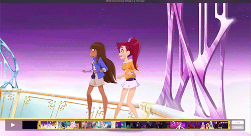
trimming is otherwise self-explanatory. you drag both ends to the place you want it to be and that’s your section. but, a tip for remembering where you left off:

this number on the right end is going to be your starting point if you’re going minute by minute.
step two: ripping your frames

this is where your frame ripper will come in. now snapmotion is a pretty simple program. you click. you drag.

click that auto button to switch it to well... auto. (i find that the settings it comes with are usually fine, but if you’re clipping something that’s very SHORT maybe change it from .100 to .050 or even .025 depending on how short we’re talking.)
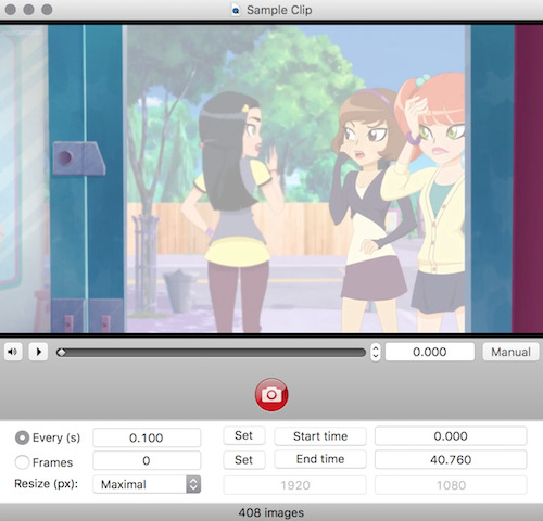
once you’re here, click the red button to rip those frames. it will bring you to a file screen so you can choose where to save it. (i suggest a new folder EVERY time.) oh and don’t try pressing enter. you HAVE to push that red button. enter just plays the video in this program. annoying, i know.

and there you go! all the frames are there! on to the next section-- which is really only a sentence...
step three: picking your frames

pretty sure all three of us mods can agree this is the worst part but... literally just scroll through and pick out which frames you’re keeping and which you’re tossing. here’s how i set it up for the most part:
first i preview using the space bar. (you can scroll through images this way too hella convenient.)
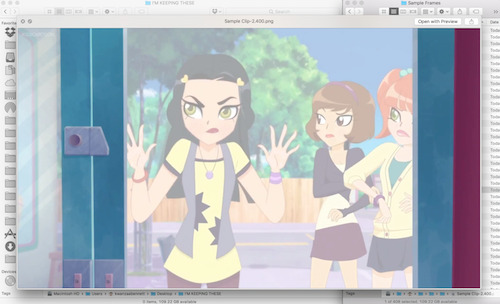
then i drag it over to a fresh folder titled so i know i’m keeping the frames.

rinse repeat tbh.
step four: cropping & resizing

you’re probably like: why do we even need explanation here? well you probably DON’T but a nifty little trick photoshop offers you is the ratio tool. so once you have your marquee tool open, go to the top where it says style and select fixed ratio.
set it to 1:1.

and just like that: you have squares. no guesswork. (this trick also works with circles, just sayin ;3)

as for resizing, i resize all of my photos at once when i’m done with cropping. it’s easiest to do this in preview because you can select all x00 files and resize them to 100px or whatever your jam is all at once.
step five: loading files into photoshop

now we're getting close to the fun part. (at least i think this is the most fun part.) the first thing we need to do is upload all of your frames to photoshop.
(i will warn that if you’re an order freak; photoshop will require you to use as many digits as the largest number or else you’ll get 1, 11, 12, 13, 14 before you get to 2s, etc. it. is. annoying. i personally run my files through photoscape and set them to 3 or 4 digits to avoid this but this is an optional step. if you want to know how to do this, i get to photoscape at the end.)
now. to mass-import: go to file > scripts > load files into stack

it’ll bring up this box:

click browse, select your files, and:
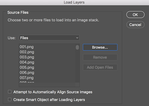
BAM! there they are. now click okay and... be patient. uvu”
step six: prepare for mass editing

now photoshop should look about like this:
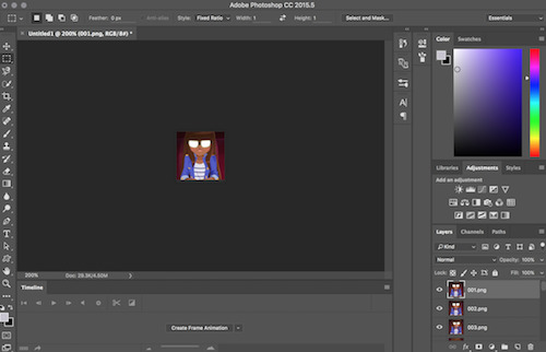
so go ahead and click that blurry “create frame animation” at the bottom. once you do, click the little lines to your right and make frames from layers.

once that’s done, go back to the same menu and convert to video timeline.
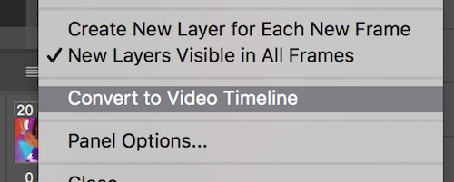
last step before we start editing is to go over to the layers. select ALL of them. then right click to open the menu and click convert to smart object.
step seven: mass editing (circular borders)

once your document looks like this, i suggest saving. because now you’re free to edit! i’m going to show you how to make a basic circular border for this tutorial. color editing will be left for another time because that’s a tutorial all its own.

first thing’s first: we need to make this slightly smaller. for this one, i’ll be using 96 x 96, but you can go smaller if you want a bigger border or a drop shadow. so resize in image size:

then we move over to canvas size

and take it back up to 100px.
next we need guides. they make making perfect circles MASSIVELY easier. you find lock guides here:
once you have the dialogue screen up (you’ll need to do these one at a time) set them to 2px and 98px both vertically and horizontally. your icons should be perfectly outlined.
go to the marquee tool and change it to oval/circle. now you can drag it from one corner to the opposite corner (assuming you left ratio in 1:1) to make a perfect circle. looks like so:

make sure you don’t accidentally deselect this, and make a new layer. i name it clipping mask so it’s easy to find but you don’t technically HAVE to. make sure to move it DIRECTLY BELOW the icons’ layer.

now go to the fill tool and fill it with literally whatever solid color. (the color you use won’t matter unless you mess with the icons layer’s opacity or style but again; another tutorial.)
once you’ve done that, right click the icon layer and select create clipping mask. Bam! It’s a circle.

next we add a border. your circle marquee should still be up (but if it’s not, just command click the icon on the clipping mask layer and it will re-select the circle you made). make another new layer and place it below your clipping mask layer. once this is done, go to the stroke tool. for the size we’ve chosen, 3px is the maximum we can do. pick the color that matches in the dialogue box; i chose magenta for this icon:

at this point we could call the icons done, but for grins and giggles, we’re gonna add a quick effect. head over to the clipping mask layer and right click it to bring up the effects menu and select inner glow.
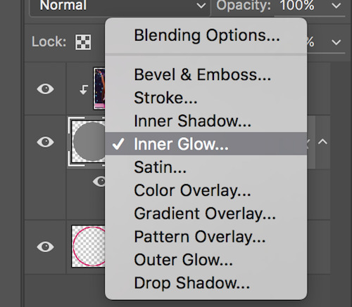
you can honestly play around with the settings and see what you like but here’s what i did for this set:

Before I reveal the icons, there’s one last thing we have to do: fix the timeline at the bottom. For some reason CC hates us and new layers do not automatically match the length of the timeline you’re working with. Easy but sometimes tedious fix. Just go down into the timeline and drag the layers that AREN’T the icons to match length:

Et voila! We’re ready to export.
step eight: mass exporting

alright fam we’re almost there! head on over to file > export > render video. make sure your settings match this screen (‘cause in all honesty i’ve had it set this way for so long i don’t remember what i changed... smh...)

that’s it! once you’ve set your title, click render and it’ll automatically name it Title000 and so on. (You can set it to start at 1 where it says Starting #). You’re going to have to use this method to export regardless, but if you want MORE naming options (like having JUST numbers for example), then photoscape has you covered:
i find photoscape easier to understand, anyway.
in either case, be sure to SELECT YOUR FOLDER before you click okay/render. in photoshop that’s “select folder” in the top left. in photoscape, that’s “save to” in the same location. don’t do what i’ve done on multiple occasions and accidentally start rendering files to your desktop. the worst.
final product!

#icon tutorial#tutorial#photoshop tutorial#ps tutorial#graphic tutorial#mod post ;#by Jerry Mod#GFI tutorials ;
101 notes
·
View notes
Note
hate to bother you but how did you get started on your graphics? I'm trying to get into photoshop and everything and you're just SO GOOD I had to ask for advice!
Hi there! First of all, you’re not a bother. And second, thank you for the compliment!!!!
I’m pretty sure the answer you’re not looking for to “how did you get started on graphics” is “I went to school for graphic design” because that’s really not helpful. But what might be helpful is this little list of graphic making advice I’ve put together of all the most important things you need to know going in:
Learn how to cut properly. I cut things out in 100% of my graphics. There are a ton of different ways to cut things out: lasso tools, quick selections, magic wands, layer masks, etc etc. I prefer using the polygonal lasso personally. There are a ton of videos on this and it’s the number 1 skill you need for graphic making!!!
Adjustment layers are your best friends. DO NOT go to image > adjustments to edit photos. Instead, go to window > adjustments to open up the magical toolbox of photo editing stuff. This way, all your adjustments are on different layers in case you want to delete them later without having to delete the original photo underneath.
Blending modes for layers are also friendly. You access these by double clicking a layer and going to Blending Options. The drop down has different features that do different things. It’s basically how people get a lot of their fancy overlay effects. They’re very tricky though so really feel them all out.
Make copies of everything. When I find images to use, I drag and drop them into Photoshop and then immediately make a copy of it. You’re going to fuck up, and when you do, you’re going to want to have the original. Also, for lit edits specifically, the best place for imagery is pinterest and weheartit. I want to put a disclaimer that these are the worst sites ever and if you make professional graphics ever don’t you dare touch them. But for purposes of Tumblr graphics it’s okay. And when you do find a picture you like, right click it and hit “Search for image on Google” to see if there’s a large HQ version.
Typography is really fucking difficult. It is the most difficult thing you’re going to do on your graphic. Take a look at current trends. Are people doing small minimalist type? Are they using big type as a graphic element? Reference here for a list of 20 pairings to check out. Of course, you’re going to end up downloading fun fonts from DaFont.com for instance. That site is great for headlines, but don’t use a big cursivey font for body copy. Basically, you need to take your time and you need to not settle. And also, there are fonts that are tacky and fonts that go out of style. Figure out a way to tell the difference and you’re golden.
It’s going to take you hours, sometimes days. I do this on the constant so sometimes I can sit down and whip out a graphic in a few hours. But listen, the best graphics you see on here are not done in thirty minutes. This graphic that I made recently took three days. It looks simple and cute, but getting to that point was a struggle. Don’t be afraid to walk away and come back to something if you aren’t satisfied. I’ve made a pact to myself to stop posting things I’m not 100% on. Also, don’t be afraid to doodle out your concept on paper.
Don’t be afraid to stray from your original vision. Going into it, you might have a picture in your head of exactly what you want the graphic to look like. Trust me when I say this is going to make things super difficult in the long run. Use that vision as a base, but go wild with experimenting!!! Make a copy of all those layers and then flip it upside down. You have to take risks in Photoshop and it’s the best place to because nobody has to see your 5 million shitty versions that happened first. And trust me, I always have 5 million shitty versions.
And lastly, get an honest friend. It can’t be me because if you ask me to critique your graphics you aren’t going to like me anymore and then I’ll feel bad and it will be a mess. But I run literally 90% of my graphics past my friend @greenmantle first because she tells me the god’s honest truth when something looks like shit. If you don’t take criticism on your graphics, you’re not allowing yourself to get better at it. Don’t rob yourself of that.
Good luck!!! If you need general advice, have Photoshop questions, or don’t mind me giving you a way too harsh critique of something, my IM’s are always open! Also, have fun, obviously. If you’re not enjoying making graphics it’s not worth doing it as a hobby.
#tutorial#asks for ts#answered#photoshop#good luck friend forreal#you got this#photoshop is a hell of a beast to learn#so dont get discouraged#once you get the hang of it its absolutely fun and rewarding#Anonymous
7 notes
·
View notes
Text
The Best Free Graphic Design Software for 2019
Creative Cloud may be the gold standard, but some of us non-designer “designers” need something a little more…free. I totally believe in the power of top-of-the-line software, but if you’re not going to need or use the features available, it’s too expensive. Enter the world of free graphic design software.
Maybe you’re just getting the hang of graphic design and you want to start slowly and inexpensively for now. Maybe you have one specific graphic design need and full-service suites are overwhelming. Or maybe you’re like me and you need to create the random social media post or blog image, nothing more.
For creatives who need pared-down graphic design tools, there are Adobe-like options out there that still do a bang-up job. Choose the one tool that does exactly what you need or piece together a free graphic design software suite with every feature you need access to. Let’s check some of them out.
Build and Animate 3D Graphics
Daz Studio and Hexagon
Daz Studio and Hexagon offer free 3D programs and they can work together if needed. Animate, sculpt and texturize 3D models and create animated 3D scenes with Daz Studio. Build 3D models from scratch with Hexagon, then import them into Daz Studio or another program for animating, rendering or styling. The Daz3D website also has pre-made 3D models for purchase.
Learn more about Daz3D
Blender
Source: Blender
Blender is an open source 3D graphics program with a host of features:
Animating
Modeling
Rendering
Rigging and skinning
Sculpting
Soft body simulation
Texturing
Video editing
Create short or feature-length films with Blender, and make your own extensions and tools if you need more functionality. The interface can be tricky to learn, but there are a lot of YouTube tutorials to help you out.
Learn more about Blender
Edit Photos and Images
GIMP
GIMP is a general image and graphics editor, not too far off from Photoshop (for freebie software, at least). It has an easy interface for beginners, plus plenty of tutorials on YouTube and the GIMP website. GIMP has advanced brushes, filters, layers and masks, and it can be used for digital painting, creating materials like posters and flyers, and photo retouching. Here’s a bit more about what GIMP is able to do:
Source: GIMP
Learn more about GIMP
Pixlr Editor
If you don’t want to download software, use Pixlr Editor’s browser-based image and graphics tool for editing. You’ll see all the familiar photo editing tools, like brushes, cloning, filters, lasso and layers. You can crop and resize photos, and edit portraits to get rid of red-eye and whiten teeth.
Note that the quality of your images may look pixelated in the editor, but they should be fine once exported.
Use Pixlr editor here
Once you’re finished perfecting your images, protect them with a watermark. We rounded up eight water apps to check out.
Design Online Graphics
Canva and Snappa are so similar in terms of what they can do that I decided to talk about them together. Both tools have these features:
Create a variety of online graphics, including blog images, ebook covers and social media headers.
Choose from their library of pre-made templates and free icons, fonts and images.
Upload your own fonts and images to use in your designs.
User-friendly interface that’s easy for beginners.
Personally, I prefer Canva because I like its interface more and I think the quality of their templates is a bit higher:
On the other hand, Snappa has more templates for Facebook ads and infographics:
Source: Snappa
Both Canva and Snappa have many of their features for free, but the biggest difference is that Snappa only lets you download five projects per month, while Canva has unlimited downloads (for everything other than images with a transparent background).
Learn more about Canva here and learn more about Snappa here
Build Infographics with Easel.y
If all you want to do is create infographics, opt for Easelly. Build your infographic from scratch or choose from free templates, then incorporate graphics and fonts from their library. Projects are saved online, so you can edit or export them at your convenience.
Learn more about Easelly
Create Vector Graphics
Inkscape
General graphics editors don’t always support vector graphics, which is why you may want a dedicated tool. Inkscape has the basic vector graphics tools you’d expect, but it also has features you don’t see in other free graphic design software:
Alpha blending
Cloned objects
Markers
Trace bitmap images
Variable width strokes
Learn more about Inkscape
Vectr
Source: Vectr
Vectr is another option for creating vector graphics, especially if you’re collaborating with another designer or a team. It has standard vector features and plenty of options for using filters, fonts and shadows, but where it really shines is with its live editing and sync. Work on a project in real-time, see changes as they happen and provide feedback ASAP.
Learn more about Vectr
Draw and Paint with Krita
Krita’s excellent for making concept art, comics, illustrations and texture patterns, and it also has photo and image editing features. It has advanced drawing aids like layer masks, smooth shapes and vanishing points, plus templates and customizable brushes and tools. Here are a few of its standout features:
Brush stabilizers to fix shaky lines
Pop-up color palette for quick selection
Wrap-around mode for patterns and textures
Krita was created by artists, for artists, including the starving artist (as much as I hate that term) thanks to its $0 price tag. There’s a lot packed into Krita, which can make the learning curve difficult to navigate. You’ll want to look up tutorials to get the most out of it.
Learn more about Krita
Wrapping Up
Great designers can do a lot with free graphic design software. Novice designers can improve their skills without dipping into their bank account. Either way, the programs on this list have their place in (almost) every designer’s tool kit. The best part about them all being free is that you can experiment with them without any risk.
Want some cool fonts for your design projects? Check out these steampunk and Victorian fonts.
The post The Best Free Graphic Design Software for 2019 appeared first on Elegant Themes Blog.
😉SiliconWebX | 🌐ElegantThemes
0 notes
Text
Why People Love to Hate KelsusIT
Some people reviews talk that the Dell Optiplex 755 Windows 7 Professional, Quick and Powerful 2.4GHz Intel Dual Core Processor, 3GB DDR2 High Performance Memory, Enormous 1000GB (1Terabyte) SATA Hard Drive, DVDRW/CDRW are magnificent luggage. In the company world, it is now essential to have accessibility to all your files from the pc from other remote access permits people to acquire information from their home or work computer from another computer in another location.Remote Desktop Software is available for both individual and business companies are finding that remote access applications can be very beneficial for a number of main advantage is enabling their employees to be able to work from home or while on a business for PC Remote Access There are many different strategies to use PC distant an employee is working on a massive project and needs additional time to complete it, a Remote Access program application will allow them to have the ability to work on it from home.Traveling is getting a massive part of every industry, with many individuals needing to go visit other locations from time to time.While the employee is off, PC remote access programs will allow them to utilize some of their traveling time to keep working.Choosing PC Remote Access Software The type of PC Remote Access applications that is needed will depend on what exactly the application will be used remote access software works by allowing an individual to access a host computer whilst operating from a computer that is found a person needs access to their home computer from work, a very simple program could possibly be in order.However, if a company is considering allowing remote access to company KelsusIT.com files the company will have to check into a program that is made directly for this.Setting Up Remote Access Software When a person needs access to their own home computer while on the job, setting up remote access is very first step will be to configure their home computer to act as the server is done by going into the controller panel and entering the operation and maintenance tab.There is going to be a system icon located in this region, click the area that is labeled remote.There will be a box next to allow users to connect remotely to this computer.Check the box and your home pc is prepared to be a password for the computer is not set up, it will be very important to do so now.Accessing the Home Computer After a host computer is set up, it will be time for you to check the sequence to check the connection a person will have to have the IP address of this host computer.Using this information together with the password which has been made, test the ability to connect with another is suggested to try this from another pc, which is close by so any problems may be fixed everything works correctlyFind Article. Some individuals reviews speak that the Dell XPS 8700 SuperSpeed Gaming Desktop – Intel Core i7-4790 Quad-Core Haswell 4.0GHz, 16GB Memory, 2TB 7200 RPM SATA Hard Drive + Intel® SRT 32GB SSD Cache, NVIDIA GeForce GTX 750Ti 2GB Graphics 4096 x 2160, 16X CD/DVD burner, Windows 8.1 are splendid bag. Dell Optiplex 755 Windows 7 Professional, Quick and Powerful 2.4GHz Intel Dual Core Processor, 3GB DDR2 High Performance Memory, Enormous 1000GB (1Terabyte) SATA hard disk, DVDRW/CDRW has worked wonders for me personally and I feel it will do wonders on you also.
Adding to the already strong line of HP Z Desktop Workstations, the HP Z420, Z620 and Z820 Workstations are updated to incorporate the hottest Intel Xeon® E5-1600v2 and E5-2600v2 households of processors-also called Ivy Bridge-as and fresh memory running 16 percent faster and 2nd generation Thunderbolt interfaces for innovative work flows. The show is EPEAT Gold registered and ENERGY STAR qualified, and the power supplies are rated 80 PLUS Gold. (5) Using Microsoft operating systems, such as Windows 7(6) and future Intel® CoreTM or Core vPro chips, the HP Compaq 8100 Elite Series offers quicker, multicore technology allowing intelligently improved performance that could match most businesses’ workloads. The HP ZBook x2 allows designers to effortlessly create with quad Intel® Core processors2, double the memory of some other removable PC3 and NVIDIA® Quadro® Graphics that deliver 73 % higher images overall performance in contrast to the Surface Pro4.
The HP EliteBook w-series is HP’s best combination of high-performance features and graphics in a business-rugged layout, featuring next-generation Intel Core i7 quad-core or i7 or i5 dual-core processors as well as 32 GB of system memory. HP’s strongest mobile workstation, the HP EliteBook 8760w supplies a 17.3-inch diagonal, high-definition (HD) screen,(2) a selection of high-performing AMD FirePro(3) or NVIDIA Quadro professional graphics and up to 4 gigabytes (GB) of video memory. (4) The EliteBook 8760w also can be configured with three hard drives and RAID 5 support – a first for HP mobile workstations. Intended mainly to be employed by one specific individual at one time, they are usually connected to some neighborhood region network and run multi-user operating systems The expression workstation has also been employed loosely to refer to everything from a mainframe notebook terminal to a Computer connected to a community , however the most normal type denotes the group of hardware given by numerous existing and defunct businesses such as Sun Microsystems , Silicon Graphics , Apollo Pc , DEC , HP , Next and IBM which opened the doorway for the 3D graphics animation revolution of the late 1990s.
The HP ZBook x2 permits designers to seamlessly develop with quad-core Intel® Core chips 2, double the memory of any other removable Pc 3 and NVIDIA® Quadro® Graphics that provide 73 % greater images overall performance in contrast to the Surface Pro four. Supporting the most recent professional graphics, 384 GB of program memory, and double M.two slots for HP Z Turbo Drive PCIe SSDs users may experience seamless functionality in visual effects and design visualization workloads. In the end, you can provide relatable examples in which a high performance device with Windows 10 Guru for sake actually provides a gap, such as with CAD professionals (compute-intensive software), data scientists (processing large info) and graphic design professionals (protecting intellectual property), to mention just a couple.
Dell XPS 8700 SuperSpeed Gaming Desktop – Intel Core i7-4790 Quad-Core Haswell 4.0GHz, 16GB Memory, 2TB 7200 RPM SATA Hard Drive + Intel® SRT 32GB SSD Cache, NVIDIA GeForce GTX 750Ti 2GB Graphics 4096 x 2160, 16X CD/DVD burner, Windows 8.1 has worked wonders for me personally and I wish it’ll do wonders on you too. The HP Z1 combines a sleek industrial design with accelerated performance featuring Intel® Xeon® processors, NVIDIA Quadro graphics, support for more than 1 billion colors and HP’s world-class reliability. But following these guidelines will give you plenty of useful suggestions on creating your own personal ultimate CAD Pc. These high performance computer programs are outfitted particularly for processing large 3D graphics and CAD softwares that saves you time.
1. Primarily based on desktop workstations as of June 14, 2017 and power primarily based on chip, graphics, memory, and energy provide. Designed for workstation-class professionals that demand mobility, the newest HP ZBook Mobile Workstations feature 4th Generation Intel® Haswell double- and quad-core chip options(4) and next-generation graphics technologies from NVIDIA and AMD, including the recently announced Keplar-based professional images from NVIDIA. According to workstation-class architecture, layout and software application certification, the HP Z200 taps the ability of Intel’s newest technology, offering dual-core processor options based on future Intel chips as well as quad-core processor options mobile computer workstation depending on the enterprise-class Intel Xeon® 3400 family.
youtube
Assessing the potent line of HP Z Workstations to reach new affordable levels of functionality, the HP Z200 Workstation is ideal for engineers and designers using Autodesk AutoCAD, photographers using Adobe Photoshop® and power office users. The HP ProBook 6440b and HP ProBook 6540b are directed at corporate clients who want an affordable combination of business-critical and advanced features in a full-function laptop PC. Featuring future Intel Core chips, and accessible with 14-inch or 15.6-inch diagonal HD(9) LED-backlit widescreen displays, the new HP ProBook b-series PCs are ideal for users who want strong, dependable performance. HP today introduced a new selection of powerful desktop and laptop PCs and displays designed to satisfy the performance and reliability demands of business users while helping businesses increase efficiency and decrease their impact on the environment.
Ideal for small businesses, the space-saving HP Compaq Pro 4300 Small Form Factor Desktop PC offers the hottest Intel processors backed by cheap, business-class quality and dependability. HP Converged Infrastructure technology spanning servers, storage, media, management and services applications; HP Converged Cloud; and HP Workstations and printers helped DreamWorks Animation process massive amounts of data, creating new levels of imagery and powering innovative computer graphics (CG) animated movie-making practices. The Dell Precision M4600 and M6600 signify the world’s strongest 15.6″ and 17.3″ mobile workstations with 2nd generation Intel® Core i7 chip harsh variant and 1600MHz system memory choices.
Designed like no other, the screen of the newest HP Z1 snaps open so customers can easily swap out components and make upgrades with no tools needed. (2) The HP Z1 combines a slick industrial design with accelerated performance, featuring Intel® Xeon® processors,(3)NVIDIA Quadro graphics, support for at least 1 billion colors(4) and HP’s world reliability reliability. 8, 2011 – To address the needs of an evolving work force that needs anytime, anywhere access to company applications and information, Dell today announced 24 new company computing solutions and kind components, like laptops, tablet computers, desktops and workstation computer systems in 1 particular of their largest-ever introductions in the organization’s history and portion of 39 new alternatives launching in the following calendar year. VeryPC mobile workstations use high performance discrete graphics chips from Nvidia to optimise the real time show of 3D objects on your screen.
HP Z Workstations are created and engineered to maximize the way the processor, memory, graphics, operating systems and ESRI applications work together in all configurations. If you want your workstations to be stronger but slightly more stationary, you are still welcome in HP’s world: the evenly fresh Z220 desktop carries Intel’s new quad-core Xeon E3 processor or, if that’s a bit too rich for your blood, a Pentium or quad Core i7. AMD FirePro and NVIDIA Quadro video cards are equally made-to-order updates, and the modern underpinnings add both USB 3.0 as well as headroom for up to 32GB of RAM, if the fear of paging to disk keeps you awake at night. The HP EliteBook 8540w Mobile Workstation comes equipped with a Intel Core i7-620M dual-core chip, a 320GB 7200RPM hard drive, NVIDIA Quadro FX 880M graphics, and 4GB of system memory.
Workstation performance Features professional NVIDIA Quadro graphics, ECC memory, quad-core Intel® Xeon® processors, independent software vendor options and whisper-quiet acoustics. CELSIUS W570power+: much more than a CAD powerhouse, this model is the tiniest VR-Prepared desktop workstation on the market and it can be configured with the latest Intel chip technology and with NVIDIA Quadro P4000 graphics in a compact 21-liter design. MDofPC Doctor of Computers expert professional repair services for all HP laptops, notebooks, tablet computers, workstations, all in 1 servers and computers, whether they’re the busy Pavilion series notebooks and computer systems or the HP Blade series servers along with other HP Touch Pads or retired, refurbished and discontinued HP versions.
CELSIUS W570power+: a whole lot more than the usual CAD powerhouse, this version is the tiniest VR-Ready desktop workstation on the market place and it may be configured with the most current Intel chip technologies and with NVIDIA Quadro P4000 images in a compact 21-liter design and fashion. Adding to the currently strong line of HP Z Desktop Workstations, both the HP Z420, Z620 and Z820 Workstations have been updated to include the hottest Intel Xeon® E5-1600v2 and E5-2600v2 households of processors-also called Ivy Bridge-as efficiently as new memory operating 16 percent faster and 2nd production Thunderbolt interfaces for creative function flows. The HP Z8, Z6 and Z4 Desktop Workstations are equipped with extreme power, unprecedented security2 and advanced layout, future-proofed to support the fast growing areas of virtual reality, machine learning and advanced design.
We also have a huge range of desktops & workstation deals : background towers, small & ultra small form factor (SFF / USFF) PC’s, all-in-one computers, slim desktop computers & micro / mini PC’s and a range of the best workstations for your company from top manufacturers such as: HP, Dell, Lenovo and Fujitsu. Poor people all around the country of Mzantsi are fighting against the prepaid electricity, water, poor services, corruption, and invasion of their space and palaces by jagged merchants from different lands, a very mean and bad government which selects its favorites and people they wanna benefit of, and this is done at the cost of the poor Africans of South Africa. There are options for using the applications or program on a desktop or a mobile since people tend to work besides their workstation sometimes making it hard to read and move information to peer personnel.
The top of the line center i7 processors are best for those that want to go for intensive multitasking and are made for computers that have to function as servers or database servers, video editing workstations or developer workstations. Thanks to noticeable improvements in technology and battery power, today’s laptop can do anything the very best laptops can (such as supply Internet connections, stereo audio and video cards) from literally any location. Today however it seems that notebooks are far outselling desktops.
Array Systems is a IT Outsourcing and Computer Network Support firm that aims to assist modest businesses across the greater Los Angeles area with all their technology requirements. Lim argues that social media may be viewed both as engineering and space for expanding and sustaining the networks upon which social movements depend” (Lim 2012, p.234) Twitter itself says, And with only a Tweet, huge numbers of individuals learn about or reveal their support for positive initiatives that might have otherwise gone unnoticed” (Twitter” 2013). DELL OPTIPLEX 745 Desktop PC, Intel Pentium D 945 INTEL DUAL CORE 3.4Ghz CPU with 4Mb Cache, 2Gb DDR2 RAM , DVD-ROM, 80Gb SATA Hard Disk, AC97 Sound, Windows XP. .
Some of the customer reviews speak that the Dell Optiplex 760 INTEL Core 2 Duo 3000 MHz 80Gig Serial ATA HDD 4096mb DDR2 Memory DVD ROM Genuine Windows 7 Professional 32 Bit Desktop PC Computer are splendid luggage. Dell Optiplex 760 INTEL Core 2 Duo 3000 MHz 80Gig Serial ATA HDD 4096mb DDR2 Memory Foam DVD ROM Genuine Windows 7 Professional 32 Bit Desktop PC Computer has functioned valuable for me and I believe it will do amazing things on you too. Shop for Desktop Computers : Computers – Purchase products such as HP Black 19-2113w All-In-One Desktop PC with Intel Celeron J1800 Processor, 4GB Memory, 19. .
HP 110t Desktop PC using 3rd generation Intel(R) Core(TM) i3-3250T processor dual-core 3.0GHz,3MB Shared Cache; 1TB 7200 RPM SATA Hard Drive; 8GB DDR3-1600MHz 1. .
from KelsusIT.com – Refurbished laptops, desktop computers , servers http://bit.ly/2JEG026
via IFTTT
0 notes
Text
8 Reasons to Stop Using Photoshop For Web Design
Judging by the amount of love it gets in all the design media, it seems like Photoshop is the perfect design tool. Designers and Photoshop go together like Peanut Butter and Jelly, it’s the holy grail of design productivity, you can use it to build anything your heart desires, and it will slice, dice, and make you a sandwich while walking your dog and waxing your car.
All kidding aside, a program that was once initially built as a photo editor and image manipulator (and a great one, at that) has slowly evolved into a bloated, sluggish, and overstuffed Swiss Army Knife sort of tool that tries to be everything to everyone. But the thing about Swiss Army Knives is that, while they are good knives, I don’t know anyone that would prefer to use them for cutting, sawing, unscrewing, scissoring, or bottle opening instead of a tool that was specifically designed for the job.
What’s so bad about using Photoshop to design websites?
Doesn’t translate to the language of the web
Websites have a lot of dynamic elements: states, pages, dropdowns, transitions, animations… the list goes on and on. So what do we get in Photoshop? Layers, Folders, Groups, and Smart Objects. Which one do I use for a state change? What about a dropdown? Do I build all my pages in one file or as separate files? Do I use a group, a Smart Object, or a folder for this button? What about the header image? The language used in Photoshop does not translate to the language used in building a website, and this causes inconsistency and confusion between projects.
Terrible vector management
Creating vector images is a necessary skill that designers need to learn to create scalable elements, like graphics and logos. And once you have experienced a real vector workflow (using a tool like Adobe Illustrator) you will wonder how you ever put up with the counter-intuitive vector tools inside of Photoshop. Standard vector elements are styled and controlled using entirely different sub-menus and dialog boxes, and you have extremely limited control over what you can do with them without using Layer Styles. Want to draw something custom with the pen tool? It’s another multi-step process or special option to make your pen tool convert to a vector shape instead of a path or selection.
Terrible Typography management
Much like learning a real vector workflow highlights Photoshop’s vector shortcomings, working with good typography tools like Adobe InDesign (which supports a CSS-like paragraph and character style panel for modular editing) makes the flaws in Photoshop’s type management extremely apparent. It’s gotten better over the years, but there is still no way to sample/duplicate specific typography settings, link text fields, or re-use text styles.
Terrible color management
Noticing a theme here? A good design program makes it easy to see which (Hex) color has been used on which element, and extrapolate that easily to CSS for building the actual site. Photoshop’s color management is all over the place depending on what you’re using (Standard layer? Vector layer? Text? Smart Object? Gradient?) and all of it is hidden under separate dialogue boxes, disrupting workflow at best, and forcing people to use alternative, less accurate color-sampling methods (like the eyedropper tool) at worst. And that’s not even including the Layer Styles options for color and border overlays!
Terrible slice/asset management
While this has gotten a little better with the latest Creative Cloud update (assuming you have decided to switch over to the monthly licensing model to get the latest updates), asset management in Photoshop has been lacking for quite some time. Even something as simple as slicing an image for the web involves visiting multiple secondary dialogue boxes to control the name of the slice, the type of file it will save as, and how it will render upon export. A good web design program would enable you to see and edit this inline.
Inefficient workarounds for multiple linked instances of single element
Much like good CSS aims to be modular and reusable, so that minimal edits are required to make changes, a good web design program would enable you to reuse elements in multiple places, where editing one element would result in changes to all of them. Photoshop can do this (sort of) using the Smart Objects feature, but this requires you to open the object in a new tab (or even a different Adobe program) which disrupts your workflow because your changes are not made inline.
Practically non-existent prototyping abilities
A good web design program would enable you to quickly prototype a working version of your design, whether by providing some sort of interactive panel, or exporting your design directly into HTML/CSS for previewing in the browser. A great web design program would even export optimized, intelligent, and standards-compliant HTML/CSS (including typography, colors, buttons, etc.) for use on a production site. Photoshop does none of this. It can’t export HTML at all, not even a table-based layout with inline styles. All you get are (poorly managed) slices of static images.
Doesn’t translate to responsive or agile design
The entire concept of a literal, pixel-perfect mockup is being challenged in the era of multiple devices sizes and constant design iteration. Photoshop does not contain any native flexibility tools that enable you to resize and reflow content on the fly (unless you integrate it externally with Adobe Reflow). But even if you are not concerned with creating a fully responsive mockup inside your design program, the fact that it’s a multi-step process to export usable content out of Photoshop makes it lousy for any sort of rapid or agile design process.
So what are some possible alternatives to the program everyone loves to hate?
(Update January 2016 to provide some newer alternatives)
Sketch
A mac-only application, this newer app is specifically design for web and digital UI interfaces. It is being adopted rapidly by the digital design community due to its ability to produce anything from quick wireframes to full mockups. Like some of the programs that preceded it, it combines the best of vector management with raster graphics, and comes with a ton of tools specific to web design (like excellent filler content for mockups). It does a good job of combining the language of the web with the language you’d expect in a design tool, and the learning curve isn’t too steep if you’ve worked with something like Fireworks or Illustrator before. If you’re on a mac, I highly recommend checking them out.
Adobe Fireworks
A former Macromedia acquisition, this web prototyping program was the gold standard in web design for several years. It had practically everything you could need – excellent vector and typography controls, inline management of slices, the ability to add States and Pages in addition to layers, reusable Symbols and Master Elements for modular design, the ability to preview your interactive elements as well as export to (table-based) HTML for prototyping. Unfortunately, Adobe never prioritized Fireworks in their development cycles, so it remained stagnant (not to mention a bit buggy) until earlier this year, when they announced they were ceasing further development of the program altogether. That being said, it’s still the most comprehensive alternative to Photoshop at the time of this writing. (Update: I’d argue Sketch replaced this now)
Macaw
Update: Macaw just got acquired by InVision, a company who makes some pretty great prototyping tools)
An upcoming tool (currently in development) that promises to take the best parts of the Photoshop and Fireworks GUI, and reimagine them as a semantic web design and prototyping program with a fully responsive canvas. Why is this exciting? Two reasons: encouraging a semantic approach to web design asset organization (the layer and group names become the CSS class names), and the ability for the program to make increasingly intelligent CSS decisions as it learns more about your project. Want to learn more? Go check them out! Or go back them on Kickstarter!
Google Web Designer
This just-launched beta by Google (unveiled earlier this week) is an HTML5 app that has a similar Photoshop-esque GUI, where what you design is converted to output code. This app seems to be specially designed for building animations and ad creation, including banners, interstitials, and expandable ads.
Original Source: http://marktimemedia.com/7-reasons-stop-using-photoshop-web-design/
0 notes
Text
My colleagues at Photofocus have heard me and seen me say some very choice words during a time, not so long ago, when I had a monitor that wouldn’t or couldn’t calibrate! At first, I couldn’t tell if it was the calibration tool I was using, or the monitor itself!
Monitor Calibration
Now color calibration is super important– it makes it simple for you to edit your images on your machine and basically have it be seen on other color calibrated devices they way that you intended it to. There’s a standard called sRGB that was developed to help a bunch of different displays, printers, devices, cameras and so forth, all see, print, and otherwise display the same color.
I’m sure you’ve seen the differences in colors for a picture that you’ve edited and displayed on a TV, laptop, or another machine. I see it all the time– try hooking up an iPhone to a Samsung TV. The colors are all sorts of wonky. And basically, that’s what I was dealing with.
For that very long and frustrating time, I had a 29″ LG Ultrawide monitor 21:9 — which is great for the horizontal space and interesting resolution for gaming (if you’re into that sort of thing.) When I first bought it, I noticed that it was exceptionally darker than my other monitor– an Apple Thunderbolt Display (a now discontinued display which calibrated really well.) I calibrated it with my Spyder Elite and went on my way. After my first gig with it. I decided to finalize everything and export images from my computer to my iPad Pro (which is relatively close to what I see on my calibrated machine.) That’s when I realized that all the time that I had put into the edits was a complete waste.
The images were nothing close to what I saw on my iPad, or even on another calibrated MacBook (that’s the joy of having calibrated machines, you can tell when something is off because they all look the same). I was furious. I spent hours trying to recalibrate the monitor with the Spyder Elite.. then tried all the different viewing modes on the LG followed by a calibration. Then I tried manually tweaking the color to hopefully make it look closer to a calibrated screen (I used the MacBook I had as a reference and iPad Pro as a second reference). I tried another calibration system– and it didn’t help either.
ViewSonic to the rescue!
My new pair of displays. The ViewSonic VP2468 is pictured on the left.
Did you know that ViewSonic has a professional line of monitors for photographers and videographers?? And they’re pretty dang affordable and packed with a bunch of features!
I found a 24″ professional 1080p IPS display (IPS technology helps a screen be more consistently viewable from different angles), called the VP2468 at $250 from B&H… and boy is it pretty!!
A ViewSonic VP2468 ended up arriving on my doorstep shortly after I boxed up my LG to sell. This little VP2468 is fascinating for a couple of reasons, and those reasons are why this is one of my favorites.
Nearly Frameless Design
I’m a sucker for sleek aesthetics — so this is top on my list. Would any customer trust someone who is using a really clunky and out-of-date looking piece of technology? It really makes all of my technology look out of date now that I think of it…
This thing is nearly frameless! It really is just so pretty. I can see myself getting another one or two of these displays and having a super stunning setup on my desk. I think the bezel is about 3mm or so thick– or that’s what it feels like.
Image of the monitor shot with one light, just to give you a feel of the beauty of it
Sometimes the bezel can distract from the image displayed on the screen (especially if it is super thick, all black or even worse, silver). Since colors are perceived to be to be brighter or darker than the surrounding colors, it is relatively important.
When I asked around, some people were more affected by things like that than others. If you don’t believe me and you have Lightroom, try changing the background color from gray to white or black, and tell me that the perceived brightness of don’t colors change because of background.
Color Calibration
The most important thing for a monitor (besides awesome looks) for a photographer, videographer or digital artist, is color rendition! These monitors come pre-calibrated out of the box. A print-out of values from when the factory calibrates it comes with the monitor. The pre-calibration is pretty dang nice and it matches my other monitor that I bought at the same time– which also happens to be another ViewSonic.
Image provided by ViewSonic – color.viewsonic.com
This monitor displays 99% of sRGB according to ViewSonic, but my calibration kit says 100%, so… believe what you will. Having a screen that shows all the colors that I expect it to sure makes my editing headaches go away. Since every display will have a color shift over time, it is important to have a way to recalibrate the screen. Thankfully this monitor provides a method of hardware calibration via their Colorbration Kit — which is developed with their partner for this series of monitors, X-Rite– a company that is known for their tools that help devices display consistent color across all sorts of devices. You can also use X-Rite’s CS-XRi1, I1 Display pro, and I1 Pro2 calibrators instead of the Colorbration Kit.
One specification that is really neat to know about this display is the Delta E value, which is the measure of change in visual perception of two given colors. It basically is a term for how the human eye perceives the difference in two colors. The Delta E value is less than 2 for this display. Basically, that just means this display is really awesome. For comparison, EIZO displays, for instance, ship a Delta E value of less than 3. So yeah… that reinforces that just means that this display is really really awesome for the price point.
Connectivity
Lots of monitors in the price range of this ViewSonic, support HDMI– and only HDMI (like the happily sold LG I had). Kind of a bummer if you have other methods of connectivity from different computers. So to me, it was a surprise when I saw all these ports:
4 USB-A 3.0 ports that stem from an upstream USB-B port to the computer– So that’s a 4 port USB hub!
A Headphone jack (I guess if you were getting audio from HDMI)
DisplayPort out as well as Mini DisplayPort and a regular Display Port, which support daisy-chaining!
HDMI of course, just in case you want it to– but not just one! Look! There’s two!
Ports for days… or lots of wires… or whatever you need!
I’m seriously not used to having a 4 port hub built into the display at this price point! I feel that every monitor should include those extra USB ports– I HATE bending under my desk to plug in a USB flash drive, calibration kit, mouse, keyboard or even Apple’s Lightning cable to charge my phone.
Screen Rotation
This monitor is able to rotate from a horizontal position to a vertical position, both in clockwise and counter-clockwise rotations. If you like shooting portraits, like me, having the portrait orientation image displayed full screen on a 24″ monitor is ever so helpful. I use this as a second display for Lightroom and having the secondary display available to show quick previews of whatever I’ve selected in my Library makes me so much more efficient.
90º or 270º– you pick!
Besides having it work in Lightroom, having the vertical position makes it easy for me to keep my distractions isolated on the side. When I’m working in Photoshop, the VP2468 holds my Facebook page open allowing for endless scrolling when I need a break. While this isn’t something super new, it is nice to see on a sub $400 monitor.
#gallery-0-5 { margin: auto; } #gallery-0-5 .gallery-item { float: left; margin-top: 10px; text-align: center; width: 50%; } #gallery-0-5 img { border: 2px solid #cfcfcf; } #gallery-0-5 .gallery-caption { margin-left: 0; } /* see gallery_shortcode() in wp-includes/media.php */
Convenient handle– it’s pretty light weight as well. This is the column that raises and lowers depending on what you need.
A solid and pretty base plate anchors the display and provides the ability to swivel.
Suggested Uses
If you’re looking for a stand-alone display, by all means, this absolutely works well! Where I think this display really shines is in the role of a secondary display to a laptop or even a desktop. Because of its weight and size, I’d probably use it in the studio when I want to shoot tethered. The IPS panel provides great and clear imagery from ridiculous angles so that you and your subject can see what is going on.
Currently, I’m using it as a secondary display. It fits so well when I work with apps like Lightroom (when it doesn’t blank a screen out– more on that sometime else). I’ll tend to have a grid view on one of my screens, and either the Develop panel or the Library panel open depending on if I’m culling, editing or searching through images.
Using that Secondary Display in Portrait Orientation, providing a larger view of all those portraits I shoot.
I’m happy with this display– like SUPER happy!
It may seem that I would be super happy with any display after the horrible LG display I had, but the VP2468 really surprised me with all basics I cared about as well as a bunch of ridiculous advanced stuff I could change if I ever needed to. It is more advanced than I ever need it to be.
The display looks super crisp the frameless design is pretty dang sweet. The stand is pretty nice as well since it can rotate to be vertical, tilt, swivel, and the display can change height– so if you don’t need a vertical display, you can at least adjust the display to be an optimal height!
This is the column that raises and lowers depending on what you need.I know that some people would argue that I opted for a smaller display as a replacement. Well, yeah, they’re right, I did. But I’d rather have a display that I know I could rely on to display colors correctly and has a boat-load of inputs than a super wide and ultimately strange display that only had inputs for 2 HDMI, for $230.
At a price point of $250, this is almost a no-brainer. 24″ is adequately large enough for most people out there, but if you’re itching for something bigger, you can get the 27″ bigger brother that includes a whole bunch of other features that I haven’t had a chance to play with! Perhaps in the future, when I find the need, I’ll pick up one of those too!
Check for the lowest price here.
Finally! A Monitor that Displays Colors Correctly! My colleagues at Photofocus have heard me and seen me say some very choice words during a time, not so long ago, when I had a monitor that wouldn't or couldn't calibrate!
0 notes
Last Seen Blogs

anoithatchuyennghiepvp
Untitled

erns62apr2424
VOY👀EUR

onurbruno
photos

southernhi-life
Southern Hi-Lite

eecorpgorv
Untitled