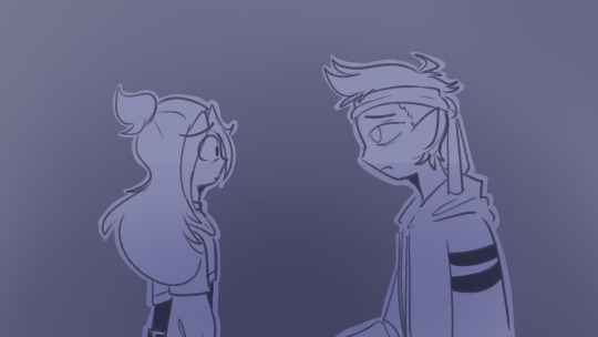
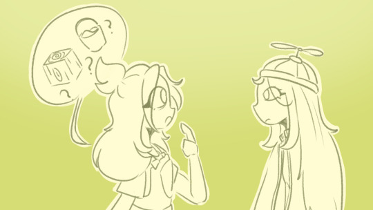
#i had to redraw the background so many times
Text

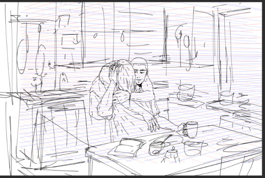
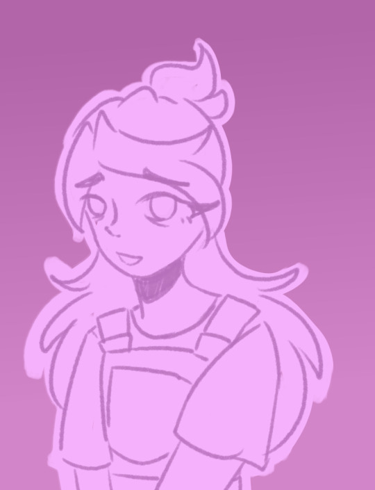
Thursday, March 28th - Food
Mrs. Serizawa is teaching Kastuya how to cook, so he can stop living off instant noodles. Today is a hearty beef & leak stew!
Mrs. Serizawa: Remember, the leaks need to be thoroughly washed.
Kastuya: Nods, Nods!
Mrs. Serizawa: Also, the more passion and enjoyment you put into your cooking will reflect in the final dish. So, relax and take it slow and your love will shine through.
#mob psycho 100#mp100#serizawaweek2024#Serizawa#Katsuya#Background#digital watercolor#sketch#Cooking#Food#Stew#Kitchen#Mrs. Serizawa#He's so nervous but so badly wants to learn#Love that I mad Mrs. Serizawa have the same bags under her eyes#you have no idea how long I look at Japanese kitchens for reference#I had to redraw Katsuya's face so many times. Just couldn't get the expression right. At least over 5x#little late#got too tired last night to finish it
59 notes
·
View notes
Text

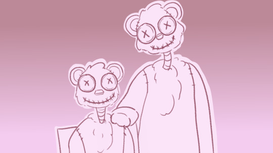
...i'm back.
#my arts#screenshot redraw#the owl house#toh#the owl house spoilers#toh spoilers#luz noceda#amity blight#willow park#agustus porter#gus porter#hunter toh#wait does he have a canon last name?? cause ive also seen the tag#hunter wittebane#i have a Very Many Emotions abt this show and yet surprisingly this is the first time ive drawn these dorks#i mean i guess ive had other Brainrot for a while but. still.#might be dual wielding my current Brainrots for a little bit so uhhh stay tuned?#basic background is basic#midnight posting
108 notes
·
View notes
Text
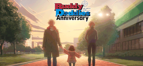
Because apparently I can't let anything go...
So a few days ago I made a post about Buddy Daddies' first anniversary coming up and I wasn't going to make something "official" but the brainrot is too strong so here we are...
This Sunday, January 7th, it's exactly one year since the first episode of Buddy Daddies was released! And I think that calls for a celebration!
I put everything under a cut because this got really long
I came up with a few things that the fandom could do to celebrate this adorable family! Of course these are not exclusive things! If you want to contribute anything that's not listed below, go for it!
1. A weekly rewatch of the episode that aired a year ago
Starting Sunday January 7th, we rewatch the episode that aired on that date last year. Nothing is stopping you from binging the rest of the episodes that day, of course! It would just be fun that a lot of us watch the same episode on the same day (or through a watch party if anyone knows how to do that)!
2. Create!!
This is literally what it says: create! Just anything related to the episode of that week!
There are so many options, but I'm just giving a few things I could come up with
- Fanfics surrounding that week's episode. Dive into a scene you wished had more details. Write a scene you feel should've happened in the episode but didn't. Write a scene for a headcanon that you have. Really anything you want (it would be fun if it had something to do with that week's episode, but no one's going to punish you if it isn't).
- Make a gifset for that week's episode. Make a set about your favourite character from that episode, your favourite moment, favourite quotes, favourite outfits,... Anything goes really!
- Make fanart! There are so many talented artists in this fandom who make amazing pieces of art! It would be fun to see you make something that links back to that week's episode. I'm thinking about redrawing your favourite screenshot in your style. Draw your favourite moment. Draw a scene that you wish happened in the episode. Redraw your favourite piece of Lily art in your style! (I know this last one is less linked to the episodes but who cares). You brilliant people can probably come up with other things still!
- Write a theory/headcanon/character analysis/... I have seen so many people write insightful posts about things that weren't explicitly shown on screen. There are characters we get very little background info over. Characters that we know a few things about but it feels like there can be so much more written about them! Write about your headcanons, both for past and future versions of the characters. Write your theories about certain things. It feels like there's still so much to say about this anime and a lot of people out there who know how to put those things into words!
- Make an edit! This can be a video edit, a literal photoshop edit. Make wallpapers, phone backgrounds, profile pictures, memes,... Anything you want really!
3. HAVE FUN!!
I know it sounds like it, but there really aren't any rules to this! Just have fun! It would just be fun that whatever you decide to post is in some way linked to the episode, but that's not set in stone, obviously! Just enjoy!
I think it would be fun to dedicate a week to each episode (so a 12/13 week event if we count the recap episode), starting on the day that episode first aired last year and ending the day before the new episode aired (ex. for episode 1: starting on Sunday, January 7th and ending on Saturday, January 13th). You can decide if you just want to post something about your rewatching the episode or if you want to create something. If you want to make something, you can do multiple things if you want.
And again: no one is going to punish you if you posted something from episode 1 during episode 2's week! We're all busy and don't always manage to get something done in time, so don't stress about not being able to finish something "on time".
Lastly, I think it would be fun to make this into a hashtag as well! I thought of using the tag #Buddy Daddies Anniversary (very on the nose, I know, so if someone knows something more fun, please share it with the group).
And like I said before: HAVE FUN!!
#Buddy Daddies#Rei Suwa#Kazuki Kurusu#Miri Unasaka#KazuRei#Buddy Daddies Anniversary#Me 2 days ago: I'm not making this anything official#Also me the past 2 days: but what if I did#It really doesn't matter what you make#It would just be cool if it was linked to that week's episode but again not an obligation!#We're just celebrating this family!
84 notes
·
View notes
Text
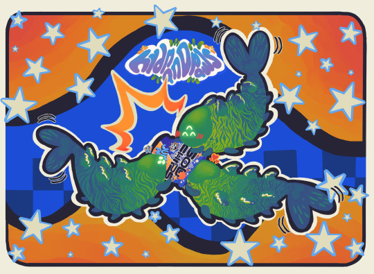

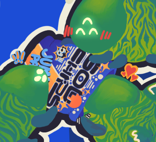
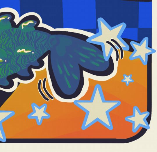
utterly adore that photo of the three giant marine isopods having their fun with a bag of doritos, and i decided to redraw it with hive worms because i just. feel like this is something they'd do. i swear these guys are like, my fav muse atm asldfghgfd. they're so fun to put in situations hehe!!
i actually started on this last year, promptly gave up but kept it for when i felt more motivated to return, and eventually i did! and these last few days or so i've been really hamming at the shit outta this thing. i've kind of come to realize that this is the kind of art i love making- busy, highly colorful, time-consuming and detailed. imperfect but close to my heart and sparking great joy regardless.
i hope everyone enjoys the result as much as i do 💖💖💖
details
✦ painted worm markings and curtains to create both blending and fading
✦ original jumbo chip bag design, "SOL CHIPS, 5g!!!" (i might make an individual vers of this later bc i had so much fun with this)
✦ asymmetrical linework here and there
✦ borders upon borders for layering and fun
✦ glowing worm eyes
✦ asymmetrical half-background checker pattern
✦ signature aligned to flow with the curve of the curtain border
✦ stars. so many stars.
✦ no worm stripe pattern is exactly the same!! snowflake worms. they're also emoting differently but each are excited for this wonderful, free bounty.
✦ outer dark border only open at the blue gaps. not sure why i did this, just felt right ykwim
🗨️🦜 twitter link!
#destiny 2#oh worm?#hive worms#hive worm#isopod doritos#art#fan art#hoping to make this one into a sticker as well if the other turns out well!! maybe a small print too if anyone wants one :O
58 notes
·
View notes
Text
Last Line Tag Game
Rules: in a new post, show the last line you wrote (or drew) and tag as many people as there are words (or however many you like).
I got tagged by @arialerendeair and had to think for a bit because I just recently shared something and haven't written anything new beside my Big Bang fic. Today I found a sketch I still haven't properly cleaned and worked over despite liking it a lot, so I'll show you that
I cut out the background and made it look worse than before I guess, but I had to adjust the head sizes so that meant either redrawing/finishing it or cutting and erasing the paper coloured bg. because my photos suck. Digitalising traditional art is a pain :(
Anyway

I think I haven't shared this before but as I might have mentioned before my memory is terrible so uuuugh. I might've? I really don't know. Anyway, I want them to be happy so I drew this some time ago :)
I'm sick with Covid and can't think very well so I'm not tagging anyone, please just. show me your stuff. you've got WIPs? I wanna see/read them. Do it. Yes you
#I'm sick i hate it#but I love these two#I have to somehow manage to draw I have withdrawal symptoms#dreamling#the sandman fanart#hob gadling#dream of the endless#sketches#teejaystumbles
109 notes
·
View notes
Text
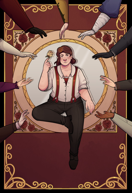
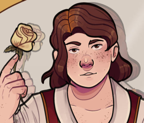
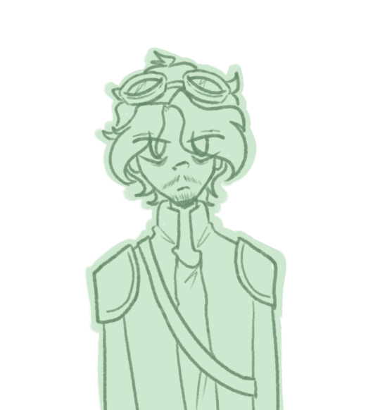
Fascinating is increasing…
Jamie uses (they/them or he/him pronouns)
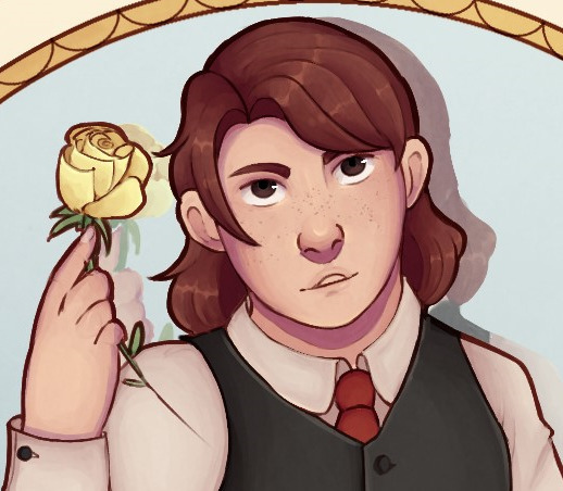
This is a redraw of an older piece from 2021 (well, more of reinterpretation, changed some things)
Artists' ramble of overview and choices undercut for those who care about that kind of thing
This was really fun to do, just an overview in how my style has changed, as well as my approach to Jam's character design has shifted. The original piece was one of my proudest drawings at the time, and im still quite fond of it.
Many things are the same, but also quite different, which is neat to compare. I take a different approach to colouring these days.
I also changed Jamie out of their more typical attire into a dressed down state, to give the more vague casual and ~seductive~ vibes alongside the references to the seduction mechanic of 'fascinating' in the game.
I also shifted the overall background to red, because i remember when i did the original piece I had inititally wanted to do a red background but couldnt figure out how to balance the colours. So challenged myself to do that this time.
I also shifted the flower imagery used in the background
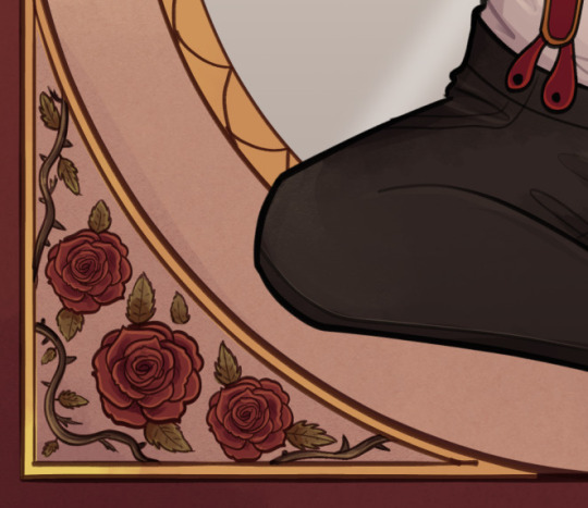

I switched to real roses - with thorns and all - to give a more ominous implication. Inherent tragedy and all that.
I also added some more hands, and if you know my art you should know who and why XD. the top middle on u probs wont tho, thats there to represent Jam's ex from the surface.
Overall i wanted it to come across with slightly more of a darker undercurrent in the drawing.
61 notes
·
View notes
Text

Happy New Year 🎊
I had this idea a bit too late for it to be doable for the new year (exactly at the right time), but i still wanted to make it. It's a redraw from the new year's cutscene in game.
Although it is a redraw it was a bit of a pain in the ass cause: too many characters, and to manage to draw the background, but i am happy with the result and to have managed to actually finish it.
I started playing P4G late April this past year and it occupied big part of my mind throughout the year. I really wasn't expecting to get so attached i gotta be honest.
Each individual in the IT may not be exactly my favourite character ever, but i love how they work as a group. I love their dynamics so much and i had so much fun with some of their interactions (literally laughed my ass off). Each one of them has this weird particularity that make them very special to me and i love them for that.
I got to spend the night with my friends this new year's eve and i really enjoyed it a lot (despite being super tired these last days due to work and personal stuff).
We have our silly talks, our serious moments and i think that is what the IT reminds me of and that's why i like their energy so much.
I hope this year is better than the previous one.
Happy New Year everyone!
#persona 4#investigation team#yosuke hanamura#yu narukami#souji seta#teddie p4#rise kujikawa#chie satanoka#yukiko amagi#naoto shirogane#kanji tatsumi#my drawings#happy new year
330 notes
·
View notes
Note
Hello Amalas! I love your artworks coz they're so detailed and you can even make clutter look beautiful. I'd like to ask: what reference do you use for the background? Do you go outside and take pictures or sketch here and there? Do you use photo books? Internet? Coz everytime i look at your artworks in a bigger screen, it makes me feel like i'm transported to the place-- like i'm a passer-by or a fellow diner watching your character a few steps or tables away from where i am.
Awww thank you!!
Okay
This is gonna be a bit longer
It’s a mix of a lot of things and a lot of the things around me. I not only love to draw cluttered places, but I also always kinda lived in lovely cluttered places. So a lot of inspiration is just taken from the things around me, my own memories, and the things I like.
My latest pic for example is something that is created by just an idea I have of a kitchen, based on things I know and things I’ve seen. I didn’t have a specific reference here.
I mostly always start with my characters and then very roughly sketch the room I have in mind around them.
And based on this I create my perspective lines and map out the space a bit clearer. Measure my distance with the perspective lines and create my surfaces.

And then I go into lineart. First for the surface only.

And when I have all my surfaces I only then go into my detailed clutter and add it all over time.
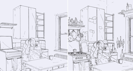
As said, this kitchen was fully made up and only really got shaped into form on my canvas.But I for example have a gas stove and one of those espresso cans at home, so just a quick walk into my kitchen allows me to look up certain items if I’m unsure how they look.
But there are also a couple of items by now that I have stored in my own personal mental library. When you look at my pieces closely there are a bunch of items that I have in several of them. Poles, electric cables, a certain type of window, stacked bowls and cups, soda cans, etc
And those are all items that I can draw by now without any reference.
And then there are some new items that I have to look up, so I mostly just do a quick google search to get an idea on how they look.
For example this bedroom piece was created like the kitchen above and just based on an idea I had in mind, rooms I knew or saw somewhere and then just created out of my head.
I started with a rough sketch
And then continued the same way as with the kitchen piece.
But here I had some very typical late 90s items in mind, and as I could draw the bed, room, window, and some small details just out of my head, there were a couple of items I looked up on google to get the right look for them!

So I created a small library from pics I found on google and just put them on the side of my pic to have them as a ref.It doesn’t have to be a perfect ref. Just a good enough pic to give me an idea of how an item looks like.
Sometimes I have an idea of a room but want something specific and it should look more or less authentic so I go on a google search for similar places.I still like to create my own version but I look at certain structures and items that those places have and try to incorporate them into my piece
Like with this one for example. I just used some photos from google that gave me a good idea of a place like this.
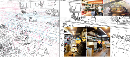
Many of those items are still chosen from my mental library, but I also have some things I look up and some loose references.
Keep in mind that I’m doing this for some time now! And I build up my mental library and how I want to draw things over time! This is not something that comes over night. It takes time! And it comes by repeating things and drawing them over and over.
I also love to take photos and when I visit new places or see something I like I take photos. One because I love to take photos, but also as a future ref. And some of those photos I use as loose refs as in the examples above. And sometimes I even pretty much just redraw them. Because I really like the structure, or want that specific look or even specific place!
For example I took this photo when I was in New York and as the Aran and Tao story takes place in New York I really wanted to create a place like this! A structure and street similar to the photo.
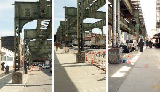
And as you can see especially the train structure and street look is something I used for this drawing here
So long answer short
It’s a mix of things!I have a good mental library by now, I like to draw the things I know and the things around me, and when I go for a certain city, or street look I like to work based on photos I took by myself and use them as refs.
And taking photos also helped me a lot with my background drawings. It gave me an idea of how my irl 3d street view looks on a 2d photo, an idea for lines and angles, what works and what not, and what to look for in backgrounds, what I like in city scenes, and what I want to create.
Google photos can be helpful refs, but I like to use them more loosely to only give my brain a reminder again on how a certain item or space looks like.
When I really redraw something or stay close to my ref I like to take my own ref photo, so all is my work.
#amalas answers#how I draw backgrounds#drawing backgrounds#using references#long post#art references
325 notes
·
View notes
Text
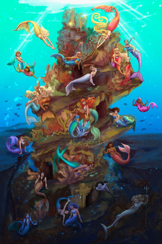

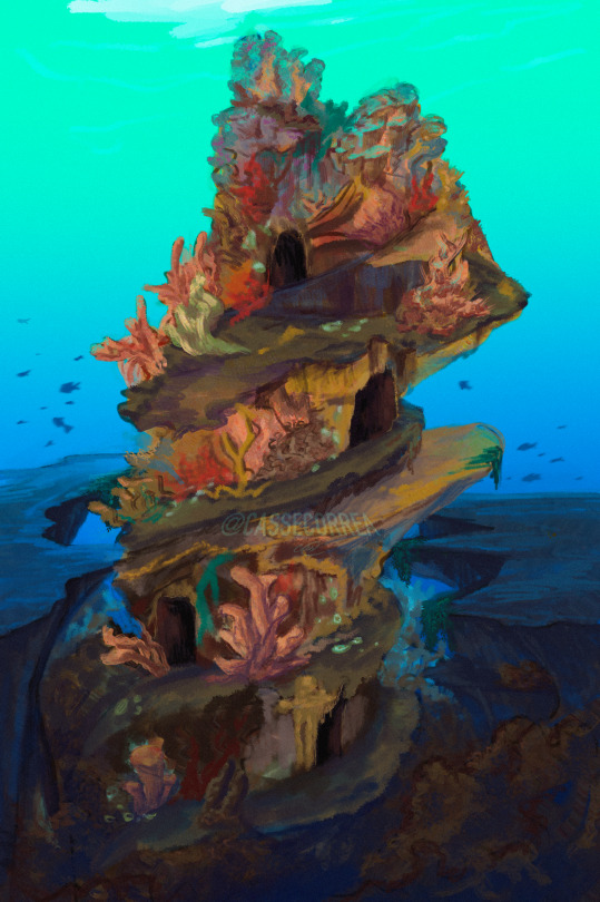
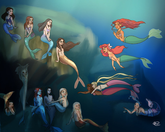
23 Mermaids! How many can you name? 🧐
If you’ve been here long enough to recognize the original, then here’s some cake thanks for staying this long 🍰 This redraw has been in the works for a while and I’m so happy to see it completed.
I added a few more merms since last time, and this time around I’m pretty happy with how most of them came out, and especially the background!
Hope everyone had a good Mermay 👋🏼🧜🏼♀️ I could keep drawing merms forever 😌
*You can find each individual merm on my IG feed, they all have dedicated posts! I even posted comparisons between the 2019 merms and the 2023 ones :) If you can support them over there, I’d much appreciate it, every single Mermay post flopped, hard :(
#Mermay 2023#the little mermaid fanart#Disney princess fanart#Barbie movie fanart#mermaid melody fanart#Barbie fanart#Harry Potter fanart#mermaids#my art#character design
115 notes
·
View notes
Text
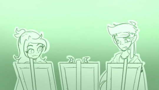
Do you want to hear me talk about The Animatic? No? Well that sucks because I'm talking about it anyway.
I don't know what made me suddenly want to make a full length animatic, but the urge descended upon me and I did anyway, despite my horrible horrible track record.
●~●~●~●~●
I'd actually had a couple voice clips cut out since July (because that's when I started Jealousy), but the bulk of it was done 15/16 August. And! This song (Pentatonix's God Rest Ye Merry Gentlemen) is actually the second one I tried piecing together.
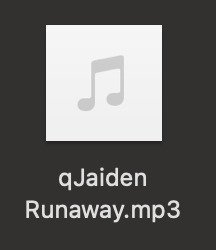
The first song was AURORA's Runaway! I swapped songs pretty early on because
Runaway was 4 minutes long and God Rest Ye Merry Gentlemen was 2.5 minutes long
3 minutes in, I ran out of voice clips.
I used a lot more voice clips for Runaway than God Rest Ye Merry Gentlemen, not just because it's longer but also because the song is significantly slower and thus easier to fit voice clips in it. Not just more voice clips, but the voice clips were longer too.
(God Rest Ye Merry Gentlemen had 9 source clips. Runaway had 15.)
Hindsight is 20/20 though, because due to the slow-paced nature of Runaway in comparison to God Rest Ye Merry Gentlemen would have resulted in far less frames needing to be drawn, or precise cuts or-
Well, you get the point.
●~●~●~●~●


I have two files for this project! Yes, it was pure Medibang. The reason for the two files is that there were so many layers that the first file was lagging to hell and back and I couldn't even draw a straight line because of how bad it was.
●~●~●~●~●

This was the actual first frame I ever drew for this! If it looks familiar, it's because I was mirroring this. It's my first ever fanart for QSMP.
At the time of starting this, I had maybe 3 pieces of QSMP fanart and was super uncertain of what I was doing, so it definitely happened again - mirroring a piece of fanart into an animatic frame.

●~●~●~●~●
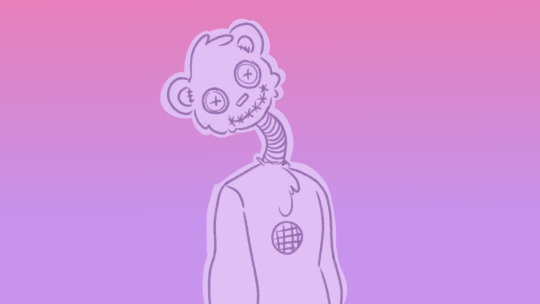
This was the first time I ever drew Cucurucho. I had an idea and it was simple to execute but over time I forgot about the voice box.
This, on the other hand, was the last frame I ever drew. The Cucurucho designs are largely the same, with some minor differences (bigger eyes, more stitches, no voice box, thinner tube).
●~●~●~●~●
This was the first time I successfully drew Cellbit. Emphasis on successfully because even this one bit took me forever. I never really had to redraw any frame once I drafted it, but this. This took me 5 redraws. It was my greatest nightmare.
●~●~●~●~●
I've said it before but these two frames side by side?
It was my favourite part of the animatic for the longest time. Hands down, no debate, I adored it.
●~●~●~●~●
You may notice that most frames had the subjects coloured in a lighter colour, but a couple didn't. Some were intentional, to better show off lighting and backgrounds and depth and stuff.
Some.... were not.
(Oops.)
●~●~●~●~●
Some of my other favourite frames include:
Which would have been better if I hadn't messed up the shading.
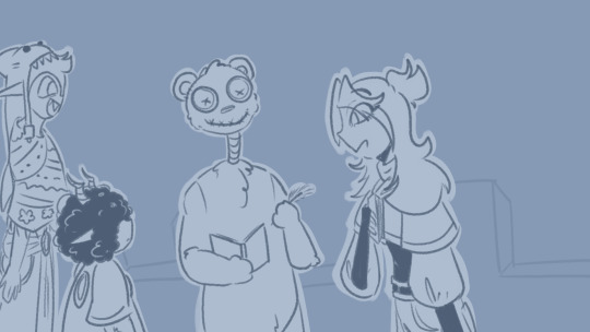
Because this was so many characters. And Cellbit.
And the Bagheras, which I really had a ton of fun drawing near the end. Because these two were drawn at the end. The same day, actually. The first one did have a draft already, though.
●~●~●~●~●
Some little details:
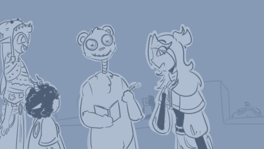
Between these two frames, BBH and Cellbit pop up in the background. There's a flash of white immediately after, which is supposed to be the camera flash when BBH takes a photo.
••●••

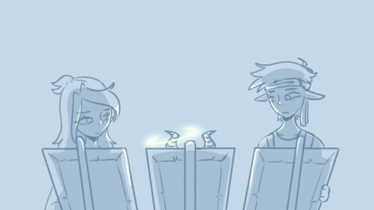
Jaiden (and Roier) in the early scenes have perfectly normal eyes.
This changes immediately after Bobby's death, albeit rather subtly.

By the time the beginning of the Cucurucho tasks rolls around, the shadows under their eyes have had time to develop and become more prominent.
••●••
Roier does a little rooftop espionage.
••●••
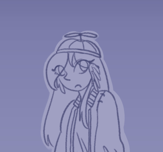
Similar/Similarly located scenes have similarly coloured backgrounds!
It's most prominent with Bobby Fields' Rose/Lavender palette, with a few (not all) examples.


(The words associated with this last image are actually from when Jaiden got stuck on a ladder on her way down from the sunset tree while trying to chase Cucurucho. I just found that funny.)
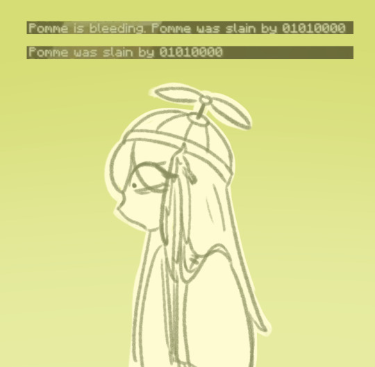
But the colour thing is also key with Baghera and Jaiden's conversation with Pomme's non-canon death.

The colours used for 1) the gradient background 2) the lineart and 3) the subject base colour are identical in both images, even if they're a third of the video apart.
●~●~●~●~●
Anyway, this was made with Medibang and iMovie, even if I do have Krita and DaVinci Resolve and FlipaClip and-
.........Yeah.
Tried and true basics, I guess.
(Krita and DaVinci both cause my laptop to overheat. I struggle with Krita so incredibly badly, even though I have friends who swear by it.)
●~●~●~●~●
Also I maxed out the image count on this post.
12 notes
·
View notes
Text
Other Unposted Commentaries
The Garden of Earthly Delights
it was the first historical art i was obessed with as a kid. there are sooo many details and i get lost in it so easily but in a good way, I love to get lost in this. (anonymous)
Saturn Devouring His Son
Goya had this shit painted on the walls of his house. Anyways this painting is very me very yummy human it really feeds into my desire to tear into human flesh and I also like the anguish on Saturn's face as he chomps into his son. Once I made cookies of the son so I could experience being Saturn yeah anyways this ones great if you love fucked up families and cannibalism (snowdoesntexist)
If "Saturn Devouring His Son" by Francisco Goya hasn't been submitted yet, someone's asleep. There is nothing about this painting that isn't disturbing. The dark background, the subject, the posture, the stark white of the eyes, the gaunt limbs, the hands digging into the back, just everything. Every time I remember this painting exists, I expect to meet him in a dark hallway and it's terrifying. (artemistakenidentity)
One art that fucks me up is Francisco Goya's "Saturn Devouring His Son".
Even without all the context of where the painting comes from, it fucks me up due to the contrast between the horrific act and Saturn's look of profound desperation as he commits it. (jackmusclescarier)
it is probably the only painting that legitimately frightens and unnerves me even through goofy ass recreations, like the "corporate art style" redraw of it and other parodies. just primal fear. (firebuug)
Judith Slaying Holofernes
judith slaying holofernes fucks me up in a good way (chaoticwhoknows)
Ivan the Terrible and His Son Ivan on 16 November 1581
cliche but ivan the terrible and his son ivan fucks me up in a sad way (chaoticwhoknows)
The Fallen Angel
Please for the love of all that is painful, do the Fallen Angel by Alexander Cabanal. (@myet33th)
-the teardrop says it all (unendingballofstress)
the tear the anger the skin the muscles the other angels in the sky leaving him his wings going from pure white to colored/black he's stretching preparing to Be Evil bc that is what god forced into him. betrayal <;3 (@that-one-queer-poc)
#art that fucks you up tournament#i would tag this with announcement but it's... not really...#bonus content
29 notes
·
View notes
Note
sorry to bother but i have a few questions! curious if you ever used other art programs besides sai and more about art things
- have you ever used sai 2? i think its still being refined
- whats your art program “progression” if you ever used a program before sai exactly, like ex: ibispaint -> fire alpaca -> sai
- are you a many layers artist with a seperate lineart layer and color each individual spots like skin, hair, eyes and etc in different layers? or do you combine the lineart and colors and just paint over it? or maybe you have multiple ways?
- do you use references a lot? or do you “wing” how stuff looks like? (which could honestly show te growth when it looks so right which you do always! your art is amazing?)
i still have so many questions but i dont want to bother by making this ask too long, sorry about that!
ooh this is interesting
i have sai2 downloaded, but i think i got the wrong version (the one that has a time trial thing and stops you from saving the files after a certain period of time). and i kinda just never bothered switching to it amd looking for a normal version? i know sai2 has a lot more options and textures and what not, but i like my old sai1 more for some reason.
for the art program progression, hmmmm. it's pretty much all sai1 i think! i have fire alpaca installed and still use it to make gifs and animations or to import text to sai / manage files / edit minecraft textures / etc, but it was never my main program. i drew some stuff in ibispaint as a kid before i had my computer, but i think back then i also mainly drew on paper, ibis wasn't my "main". never got into photoshop, never used any other programs.
for the layers. i do use them a lot, but like, for testing mostly? for example, when i want to change something in the sketch, i copy the layer and then compare the old and the new versions, deleting the one i don't like. i color and shade on one layer, but when i want to check how it'll look with different colors, i make a new layer and then compare them. when i want to fix something, like redraw the eye or clean up the sketch a bit or see how the character will look in a coat intstead of a vest, i make the new layer on top and just paint over everything. and eventually merge all the layers together and keep adding on top. so, i make a lot of layers, but then i also delete/merge a lot of them.
i used to use a lot of references and put all of them in the backgrounds of my drawings with low opacity to create this effect of busyness but also so i didn't haveto switch tabs constantly. but i stopped doing it for some reason. i do still use references, mostly for things that i don't have much experience drawing or want to be accurate. like armor, muscle structures, certain clothing elements, instruments, background elements, etc. and i wing things like poses, anatomy, expressions, clothing, lighting, composition, whatever else. i also recently find myself looking at a lot of art of other artists for inspiration, but not necessarily as references? like, the specific way that one artist drew hair poking out of the bandana, or the specific way that other artist drew a shadow on the glasses, or the specific way that other other artist drew a tail, its inspiring and i go "huh, i never thought of that" and i try to implement it in my art. well, i guess kind of like references.
i feel like you've answered all your questions in your ask, so this wasn't very helpful, but uhhhh...... yeah! thank you for this ask and thank you for the kind words, it was a lot of fun! and feel free to ask anything else
28 notes
·
View notes
Text
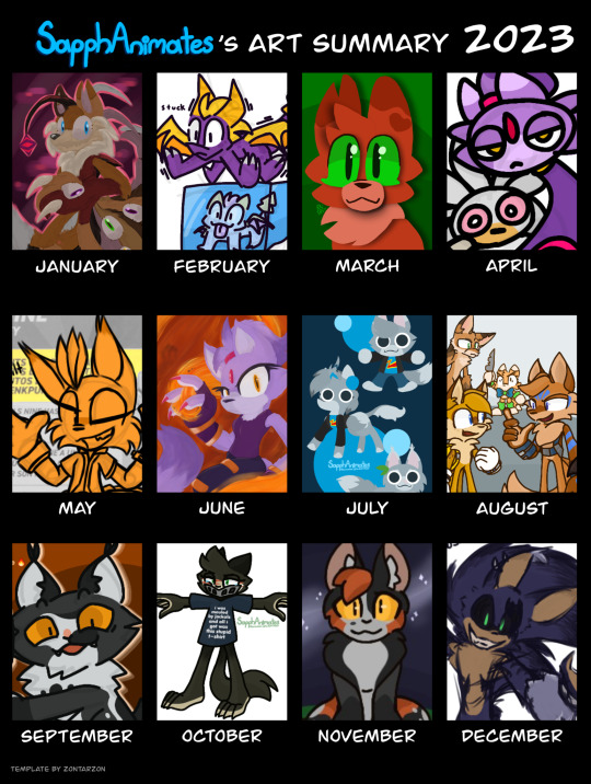
2023 Art Summary
I originally created my blog back in April, but I've decided to jump on the trend and share a compilation of some of my favorite works.
JANUARY
My first attempt at a digital painting style, featuring a character I don't believe I've introduced here before. A reimagining of the Tails Doll, with a Phantom Ruby twist: The Phantom Amalgamation (or Maggie, as my friends call them), made for Project Alacrity. I'll have to get around to redrawing them so they can have a proper introduction.
FEBUARY
Fanart for YouTube creator, Miharu the Fox. Whilst watching one of her streams, I asked what I should draw, with her co-host Marc suggesting that I should "Draw Spyro glitching into the abyss." Seeing that they were playing Spyro Enter the Dragonfly, it seemed only fitting. So I drew him shaking on top of a trapped baby dragon in ice.
MARCH
An attempt at a papercraft style using a tutorial by YouTube user, CariadsCoffee. The character pictured is Squirrelflight (or rather, Squirrelstar) from Warrior Cats, using my own design. Learning this method of drawing is what eventually led to me adopting the lineless style I use in many of my posts.
APRIL
Parody designs of Silver and Blaze, aptly dubbed Pothead and Lighter. They originate from a Sonic 06 parody comic for 4/20 that was written by my friend, @alzikeiswrong , and was illustrated in TuxPaint by me. Whether or not I decide to actually finish and post it is a mystery.
MAY
A post made as a gut reaction to discovering the amount of articulated parts the Jakks Pacific Tails Nine figure had. 70 points of articulation is ridiculous, but man is the figure amazing. I just wish he was to scale with the normal Tails figure.
JUNE
My second attempt at a digital painting, this time featuring Blaze the Cat. Manipulating the flames and how they interacted with Blaze and the background, was a fun challenge, as well as figuring out the textures and posing.
JULY
This is the point when I discovered my lineless style. Specifically the one I use when drawing my fursona, Sapph. Her design has developed a lot over the years, from being a Minecraft X Warrior Cats crossover OC, to slowly rounding out and becoming less Minecraft, gaining new design details in the process, to where she is now.
AUGUST
A drawing of multiple AU designs of Tails for Project Alacrity, socializing at some sort of get together. This was mainly a test to practice how to frame a drawing with multiple characters in it, as well as giving them each something to do. To show the differences between these various different versions of the same core character through their designs and how they interact with one another.
SEPTEMBER
One of the ask answers for my MommyClan cat's ask blog, @stepcousinclawspeaks . Stepcousinclaw was originally created for the fanclan in August, but this panel was one of my favorites. It shows his chaotic and often arsonistic side really well. I'll return to the blog soon for a big story update. Stay tuned!
OCTOBER
October brought with it the Sonic OC Showdown 2, which I had miraculously managed to get my Trace the Tasmanian to participate in. She passed the first round by a close call, but lost by a wide margin in the following. It was a good fight, with a good string of propaganda art coming from me and some of my supporters as a part of the campaign. Thank you all for supporting me while I was a part of it.
NOVEMBER
Whilst exploring through old files, I came across a template I saved. I used it to share the designs I made for various Warriors characters, some who I already had made designs for, and others I had to make up on the spot. One of my favorites was Spottedleaf. The balance of colors and details seem just right to me, as well as being a vast improvement from the color inaccurate one I had made as a ten year old.
DECEMBER
December's was fun. I haven't ever really had a "set style." Every time I try to revisit one specific design I always make something a bit off. Same can be said for this sketch style. I loved doing it. It felt the most accurate to how my art on paper feels as I draw it. Rough around the edges, but lifelike. Sadly I've had a hard time returning to it after dumping out all my thoughts around the 06 AU onto my screen. I've been working on it. There's more to see in the coming year, so I hope you'll stick with me to see how I can grow as a young artist!
Template is by @zontarzon !
#sapphanimates#sapph talks#art recap 2023#sonic the hedgehog#project alacrity#sonic au#trace the tasmanian devil#sonic oc showdown#warriors#warrior cats#spottedleaf#sonic oc#crypt the hedgehog#stepcousinclaw#mommyclan#miles tails prower#sapph ginger#tails nine#jakks pacific#blaze the cat#pothead and lighter#silver the hedgehog#phantom amalgamation#tails doll#spyro#squirrelflight#squirrelstar#spyro the dragon
12 notes
·
View notes
Text
oh no I accidentally started making fakemon for the first time since my fake Fidough and Lechonk evolutions. these were designed for a few people from their discord usernames and from their own vague description of things they might wanna see
-
first up is @whitster-lizzy

I think by the end of a somewhat confusing back and forth that I was supposed to make a combo of Bulbasaur, Medusa, and poison ivy. I took inspiration from the last two, but just could not get Bulbasaur's plump little front half to look good morphed into a tail. instead, I went for more of a 'protector of the forest' thing and added a maternal vibe that Whitney kinda gives off and ended up with this. I wanted to put an emphasis on three for the three leaves of poison ivy, so even its tears (which may or may not be from sad edits and the inability to hug anything without poisoning them :(() carry that, as do the scales sporadically thrown around there. the arms became vines when I was too tired and frustrated to keep trying to redraw actual arms to get them to look right (oops) and the hair is just a mess as I'd expect vine-hair to be
-
next is @rauko-is-a-free-elf, who started this whole thing with a comment about someone mispronouncing their name as 'Rocco'

for whatever reason, I came up with an ice bird instead of something that screams 'rock type' idk why either. took inspiration from blue jays (one of their favorite birds) as well as peacocks with the tail and tried to go for sort of a crystal structure on there (along with dots that were supposed to be snow but failed to look like it) while still including the distinctive dark swoops blue jays have on their tails. the wings were supposed to be icicles and that was actually the first thing I designed rather than the head or the body. it really does make use of diamond shapes so I did try to add some rock type elements to it mostly in color scheme though maybe it would've been better without. I'm not really sure why it has a mask other than I wanted to give its face some dark lines like blue jays have but my brush was too thick to add too many little details. so mask👌
-
now we have @bleuzombie

I didn't have any sort of a prompt or direction for this one and based it entirely off of their username. I originally took inspiration from Machop in the way of body shape and went from there, developing a vaguely reptilian form somehow that looked a lot more lizard-y before the dark typing came out in the form of skeleton-bits not unlike the Cubone line. the spiky bat there is a reference to The Walking Dead ofc, which led me to develop more of a baseball vibe with the dark line under its eyes representative of the grease baseball played use to reduce glare and with the sorta long sock-like design for the feet, along with the baseball stitching pattern that doubles as what's supposed to represent the stripes like all baseball uniforms have. its hands have always looked boxing glove-y from the very first beginnings of the sketch so I just colored them to match the rest of the color scheme and oh no now it's a fighting type oops
-
now @nickelkeep

this one is also inspired by their username, which at first had me thinking about how dragons hoard coins but then somehow got turned into c a t and I don't really know why. either way I tried to keep a coin theme going (especially with its eyes, which are supposed to look like coins) while also making it a dark/fairy as sorta requested and it became a representation of the duality of cat: both angel and devil (also a twist of money being the root of evil and all that). so it got fluffy and spiky at once and now has pitchfork-themed whiskers and a few occult symbols to offset its scarf and heart motifs. I think this one was actually the first design I worked on and to the relief of everyone, I actually used a reference of a cat to get the pose right 🎉
(idk why there's a bad drawing of a nickel I think I was originally gonna make that into a background but I did decide against it in favor of making these look more like official pokemon character reference sheet things. enjoy the bad nickel anyway)
-
next one up is @anyreiart
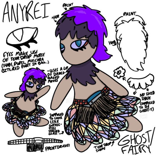
idk what happened with this one. I don't know much about anyrei and their username doesn't inspire much in the way of fakemon (beyond a few seconds where I thought of making a sun-inspired something with the 'rei' becoming 'ray'), so I went with a theme based on what I do know, which is that they paint, along with two pictures that they sent, one of which was Gothorita (the other was for a hairstyle I think but I did steal the funky red and black checkered tie from that because reasons). going off of that, this one is supposed to look like a paintbrush with its body and its edgy anime hair, and its belt continues carrying the paintbrush motif. since I was provided with the request to make it goth, I added thick eyeshadow-esque lines under its eyes and kinda used the hairstyle from the picture while also turning it into a paintbrush that utilizes their favorite color as the paint color. carrying the gothic art idea, I tried to make its lower half (originally meant to be a blobby sort of easel shape before I changed it) into something resembling stained glass windows that was famous at the time (I got confused multiple times while making the stained glass design so it's not all that consistent uh). it was supposed to be dark type, but ended up giving off more of a ghost/fairy vibe after I realized I accidentally made it a ballerina paintbrush (oops)
-
moving on to @as-lost-as-sams-shoe
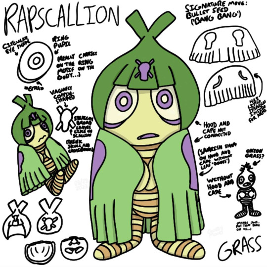
this one is heavily inspired by their username, starting with the scallion, which is a kind of oniony thing. they themself actually added the 'wrapped' part to push the pun a little further, which made me think of Swadloon and its cozy little leaf blanket, which naturally led to the scallion with its massive head and slimmer body (to match the shape of an onion more than a scallion admittedly) to be all wrapped up. scallions have leaves that look like they were cut straight across, which lead to the development of its 'bangs' (which was also inspired by the fact that scallions themselves grow underground and only the leafy parts are seen, adding a 'shy' element) as well as the tassels along the bottom of its leaf-wrap. the lines along its body are made to represent both the rings inside of an onion as well as the word 'rapscallion,' which is a term that can be used to mean villain or bad guy, earning it prison-esque stripes. its eyes are massive as a play on onions making people cry, and the smaller parts of its eyes that I can't remember the names of are based off of onion rings. the skull and crossbones shape is just to make it pirate-y, which is what I can't not picture when I read the word 'rapscallion' for one reason or another
-
and finally @zybynarx, who gets a finished one as well as a sketch I scrapped and started anew
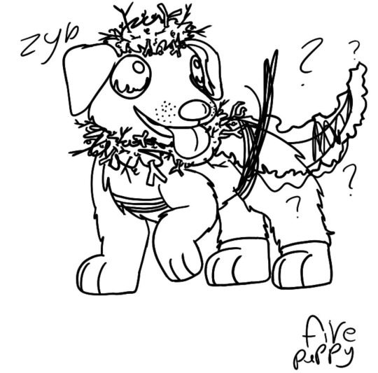
I actually had a lot to work with for this one, as they specifically asked for a fire type puppy pokemon. first instinct is ofc to go for a dalmatian, which is the firehouse dog or whatever, and I wanted to make the lower half black as a reference to that scene from 101 Dalmatians where they coat themselves in ashes to appear completely black. I made some firefighter-y stripes and tried to make its back legs look almost like boots which looks, in a couple of word, super weird. I then added tinder fluff on head and a kindling sort of thing on the neck, but when I tried to develop the back half's design, my brain sorta died and I couldn't decide what to do, so I went back to the drawing board fully intent on making like a complete copy of what I'd already tried
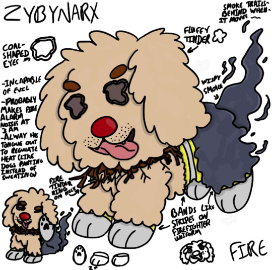
instead I ended up with this personification of tinder that's just all fluffy all the way down instead of the almost lion mane of tinder design I was originally picturing. I carried over the themes of adding firefighter stripes to allude to a firefighter's jacket as well as the kindling collar thing the other one had. I kept the bottom half black but made it more like wispy smoke than ash that trails behind it when it moves (which is a lot because puppy). the eyes are two pieces of coal and the nose is supposed to look like a match but doesn't. it looks very fluffy but is probably too squirmy to make a good lapdog. it just has that squirmy ball of energy vibe to it
-
whether people really like these or not, it was definitely a learning experience, and I did pick up on a lot of things to keep in mind for future fakemon designs (particularly not to overcomplicate things and go more for consistency, which I did not originally do as I wasn't planning on make them into character sheets at all and didn't plan beyond the main drawings of the fakemon)
this craziness is a result of the @deancasanimebang (which is still accepting artists until October 1st :0)
(08/28/23)
#my art#pokemon#pokemon fanart#fakemon#art made for other people#in a more literal sense#like these are gifts#unwanted gifts perhaps but still gifts#my bang legacy#spn anime bang#deancas anime bang#my requests
23 notes
·
View notes
Text
November Levi A Than Redraw 4 of 30!
You know, it's really funny, when I had to go through all of these, I kind of realized that Levi has about as many unique panels as fran who was there for half the amount of time. It was a struggle to find interesting looking panels that weren't copies of a pose that he was doing elsewhere. Like the man is almost constantly stanced or somewhere in the background so me trying to find him like the spongebob pointing meme.
Also if you’re interested in Submitting for other Varia members for me to redraw in their months you can check what I still need (here~)
The Image I redrew is under the cut, just to keep the post small.
Genuine question, aside with the usual why's with his design, why did she make the mustache so fucking long
17 notes
·
View notes
Text
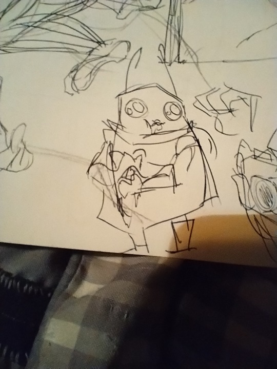
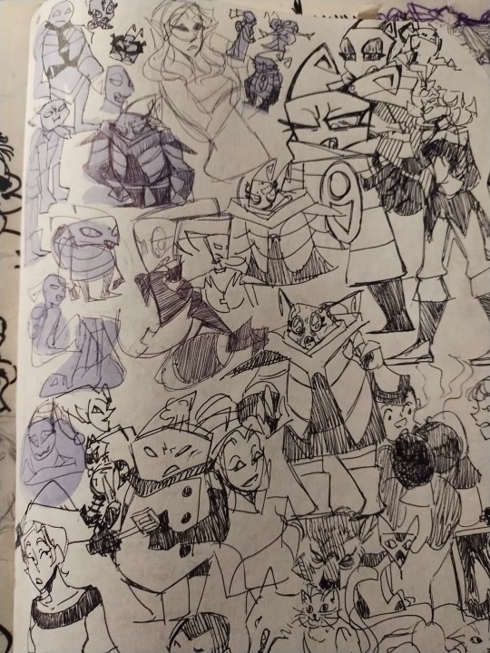
If anyone was wondering why I draw Skoodge vastly different from in the show it's cause of Zim
I cannot draw his rectangular little body next to Zim with out fucking it looking super weird! Also I was really really struggling with twisting and turning him, so I embarked on this journey of finding a way to draw Skoodge that feels like Skoodge


Now none of those are bad (hell one is me copy a screenshot to figure this little shit out) but they're all in the same or very similar pose for a reason. I'd cut running Skoodge in half if I wasn't so proud of how I drew the top and bottom of his body separately
Wanna know what happened in the background? In the forgotten doodles of my sketchbook during this time?

This mother fucker. This was my third doodle of Cherub. I'll admit its that little face that got me cause I don't usually draw randomly doodled characters more then once
I made him during this little character design task I set myself up with

I was having a lot more fun drawing girls or the tallest tho (which is why Krysa pops up a few times
This page is where he first appeared
And cause they're a pair here's the first drawing of imp

But this little doodle is what made me go Oh ho! This needs to be an actual character

I legitimately need to redraw this, it's so cute but so tiny and not easily readable
By the time I settled on the smaller details of his body shape and realizing oh shit this is basically what Skoodge should have been I had found some traits that feel like Skoodge to me (which is weird AF sense I've been struggling with his character so much up until like 3 or 4 days ago.) No visuals here cause I'm on my phone might add them later (also apparently am at the limit didn't realize I put so many up there lol
I'm pretty happy with my Skoodge design right now, but still feel like it could be improved or I learn how to better draw his shapes.
This was all spurred by me looking at character designs of old women, dads and tank like dudes lol
9 notes
·
View notes
Last Seen Blogs

popowpowpow
POW
a-bird
how could you do this to me.
lulitaribbonart
🎀 ~ Lulita Ribbon Art ~ 🎀
thpeach
p e a c h
expert-review-guide
Expert Review Guide