#i brightened up the pics bc it was dark a bit
Note
https://at.tumblr.com/talays-portkey/bad-buddy-week-2022-day-1-favorite-character/yyuid20tgjuk
How'd you do this amazing gifset? Will you do a tutorial pretty please?
hi anon! sorry am quite late with this but i honestly didn’t know how to go about this ask. but am gonna try so here goes.
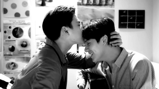
the set i am talking about is this one i made for the bad buddy week.
first of all, i wanted to note that this is not a gifset. these are still images and i do photo editing. which just happens to be so bc am too lazy and scared to try and figure out giffing. if you’re looking for gif tutorials, i can recommend the @/usergif blog where they post quite a few ^^ some of them have helped even me bc after you get the basics down you can kind of… morph the giffing tutorials into photo editing bc the main point is the same. but to the tutorial! or at least my attempt at such.
this post has five images and i’m not getting into every detail separately in each of them so i tried to make this tutorial into parts that have different themes! i hope this helps. i honestly have no idea what i'm doing here so feel free to ask more questions! (also sorry but my gimp is in finnish. i’ve tried my best to find the english terms tho)
I. Coloring
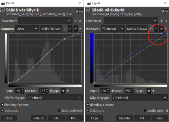
i’ve used four types of different coloring techniques in this set. all start with the basics: adjusting the curves by choosing colors > curves to make contrasts a bit stronger (bright parts brighter, shadowy parts darker). my initial plan for this set was to make the images darker than they were so i have also adjusted the curves accordingly (you can bring the upper part of the curve down quite a lot in this).
i don’t have a main setting or anything but i usually aim for an “eye pleasing curve”. i also usually brighten all the colors of the image by dragging up the red, green, and blue channel curves and then adjusting the colors > exposure (not brightness-contrast, do not touch that).
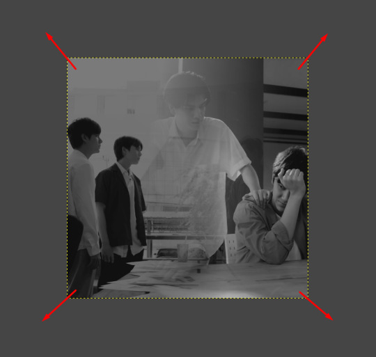
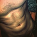
(i am using a random screenshot of patpran as an example in this so excuse me)
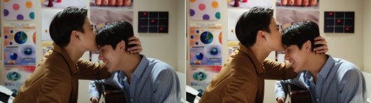
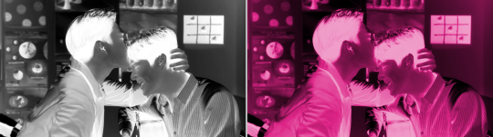
on the left i've only adjusted the main curve as seen above and on the right i've added some brightness/saturation by adjusting the blue, green, and red channels too. you can see how the colors pop a bit more. am usually quite moderate when it comes to coloring and colors in general and like subtle touches, but feel free to go wild if that’s what you like.
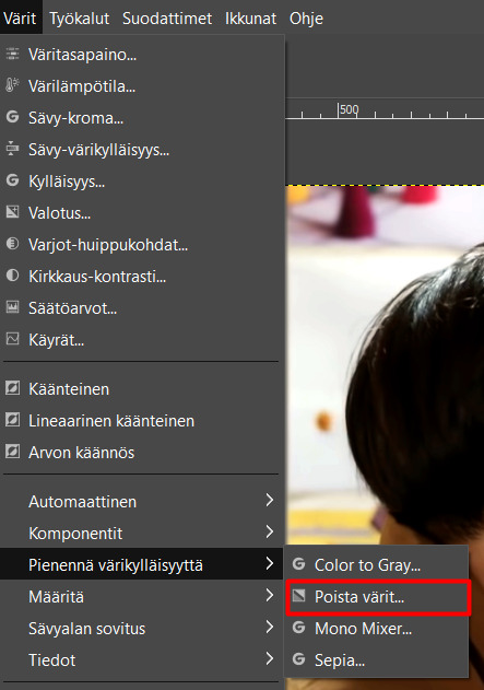
back to the edit itself then. the first coloring in this set is basic black and white. on gimp, i usually go with the desaturate (pienennä värikylläisyyttä) > desaturate (poista värit) > luma.
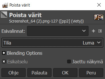
i dunno why i like luma so much as the setting but i think it has the best contrast? i like to adjust the contrast even more through exposure by dragging the brightness up a bit and then making the shadows darker and more intense. to show this in my example image:
this process applies to all the b&w images in this set which are parts of images 1, 2, and 5:
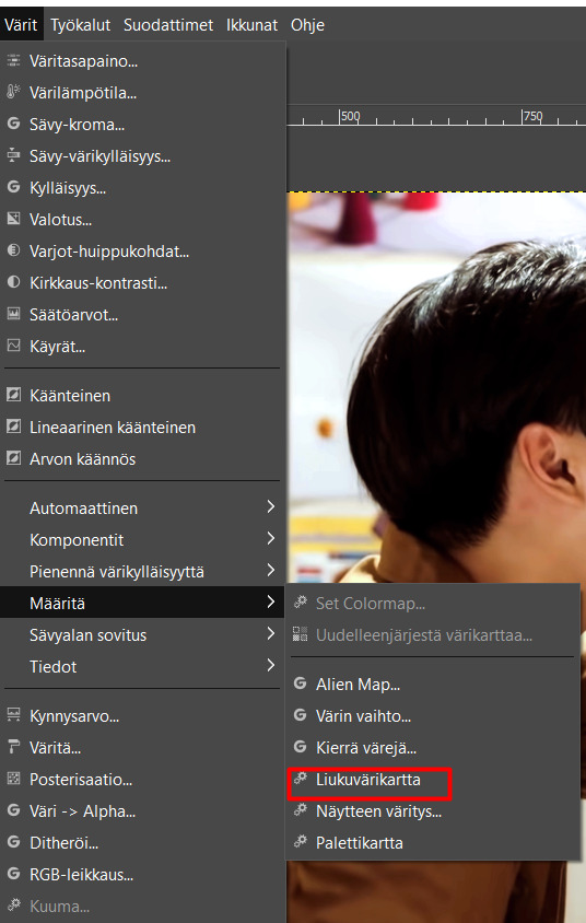
the second way of coloring happens through the gradient map (liukuvärikartta) or colorize (väritys). i like to switch between these two to see which one looks nicer. for this set, i think i used colorizing rather than the gradient map bc that’s usually easier.
to use this method, you just take the image you want, choose colors > colorize, and this colors the whole image with the color you choose. i like to usually play around with the settings to get something that looks the most natural. once again to show with my example pic:

the one on the left has a very saturated color that is quite dark. the one on the right has a lighter color with less saturation. if i wanted to adjust the colors further, i’d probably go with some colors > color balance to make final touches and to add in some subtle color variation so that the image doesn’t appear too flat to me.
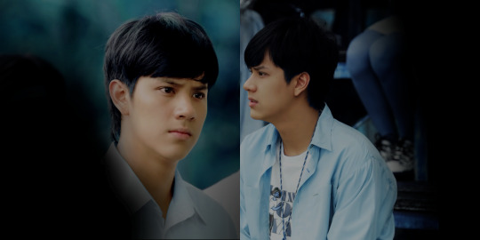
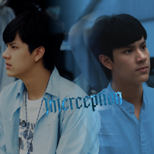
in this set, i’ve only used this method in image 3 where i have made the right side part simply blue. i didn’t want too bright of a blue so the color is kind of toned down and rather light instead. the base color for its colorization i’ve chosen from one of the other images (most likely the first one).

the third way, which includes both types 3 and 4, happens with selecting certain parts of the image and then adjusting the colors outside of this area. this can be seen in images 1 and 4 but also in 3 and 5. i have merely selected pran’s face to be excluded from what my coloring affects.
i select by hand using the lasso/free select tool (bc am picky like that and hate myself). you can also use the select by color -tool or the fuzzy select (sumea valinta) if you want but they give you various results. choosing by hand has always been my safest bet bc i can control the area i’m selecting. you can try various ways and see what pleases you the most (or what you have the patience for).

in images 1 and 4 (the left side image) i’ve made my selection and then inverted it by right-clicking the image (select (valitse) > invert (käänteinen)) so i can only edit the colors around pran’s face and not affect his skin color.
after the selection is in its place, i click colors > hue-saturation (sävy-värikylläisyys) and play with the colors. you might have to do this several times bc sometimes you can only change certain color to a certain point.
on top of this, i usually use colors > color balance to kind of correct the colors bc changing individual colors separately doesn’t always look as nice. also, brighter spots are often left quite colorless so i might adjust the curves once more to drop the brightness a bit and then get more color to these parts by playing around with the color balance options.
in some cases, i use color balance first to kind of get some color(s) to pop so that it’s easier to change/affect them in hue-saturation. you learn to see this stuff as you go, just play around and try different things.
(for the pic on the left, i think i only used hue-saturation and color balance without ever selecting pran's face bc the background trees and the green in them managed to cooperate with me this time. so cheers to that.)
in images 4 (right) and 5 (left) i have once again selected pran’s face, inverted the selection, and then just used color > colorize. (in image 3 (left) i’ve selected pran’s shirt in the same way but stuck to this selection without inverting it so that i could only change the shirt’s color.)
using this way is a bit risky bc sometimes the selected area and its edges especially stand out. you gotta check how it looks and probably adjust the coloring with some color balance nonsense (be especially careful with shadowy areas while doing this. black is a safe place for an edge (i often use the hair) but if you change the dark part’s color you might be in trouble so don’t touch that). i always just hope that no one pays too much attention to certain lines that might look a bit weird.
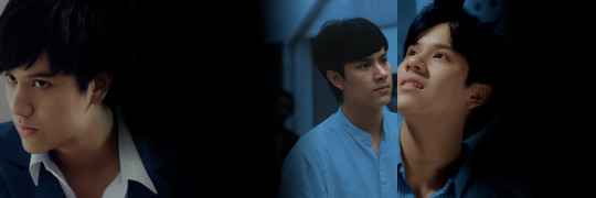
with the colorize option you also gotta be careful not to make the colors too intense or bright and try to tone them down to match the original background color level. in image 4 (the middle one in the pic above) this was a bit of a challenge bc colorize was supposed to make the rather bright image darker but i couldn’t make it too dark bc pran’s still bright face started to look funny. but it is what it is i guess. just play around with settings and you’ll get there! exposure and curves are also your best friends.
(also, once you have some area selected, you can use “both sides” of this selection. i often do the outside coloring first, invert the selection back, and then very carefully do some adjustments inside the selection. in this set it would mean doing the main coloring first and then doing some subtle enhancing to pran’s skin color.)
II. Blending
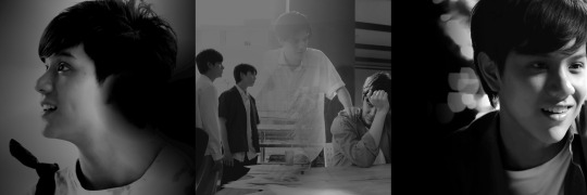
for this edit, each image includes at least two different pictures blended together as the background of the image. mostly i use headshots of pran, tho for example image 2 has farther away shots with pran only as part of the image.
i personally like to do the coloring and blending simultaneously, usually starting with coloring both images close to what i want them to look like, and then blending them together before some final adjustments for the colors.
(also note that on gimp, everything that’s outside the picture frame aka what you can't see isn’t affected by any of your coloring, so be sure to place the pictures where you want them and stick to that placement or you might end up with unwelcome surprises!)
(i mean all this space you have outside your image. the layer edges, the yellow dotted line, can still appear here if the layer is bigger than your actual image!)
what i’ve noticed with blending (or layering) is that you just slowly start figuring out what works and what does not, what images to pick and which images can go together at all. but i am a stubborn mule when it comes to what scenes i wish to stick together, so i suffer continuously. not every result is as pretty as i hoped it would be.
but well, photo editing gives you that freedom. it gives you a lot more moving room than giffing, which i personally think is a huge plus. you can get down to the details and not think about how those details might appear once the image moves. yall making gifs are magicians who i can only bow down to. wish i had your power.
but yeah, my basic blending method is to use the other image as the “background” and then plaster the other on top of it as a screen. (i also add an all-black background under both images to help me once am actually doing the blending bc otherwise you will get holes into your images. use black to keep your actual colors! you can try with white instead to know what i mean.)
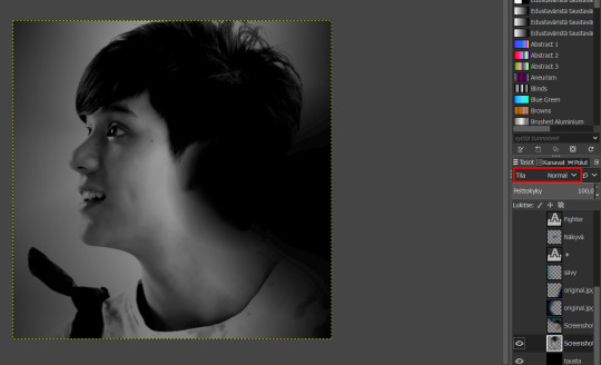
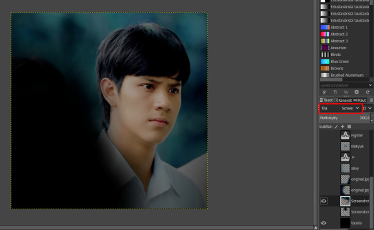
i cut the image set to normal to how i want it to appear and to the size i want it to be (in this set it’s a 1079x1079 square bc the height of the screenshots) and then bring in the other image and set it as screen.
with this, it’s easier to see how the two images might settle together. i apologize for not having the original screenshots to demonstrate this anymore but once one of the images is how you want them, you can easily drag the one set to screen around and figure out its placement. for this first image i wanted both prans to stick quite close to the center so that the colored one would kind of emerge from the black & white version’s hair. i guess you can see what i mean here:
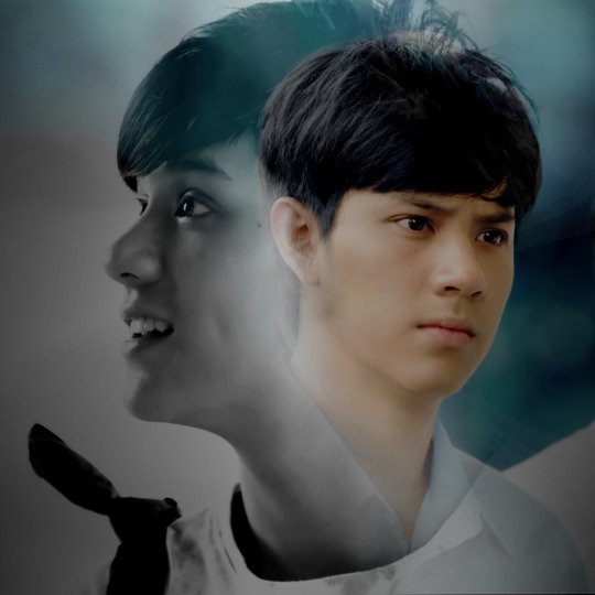
(the result as seen on the set without the text layers)
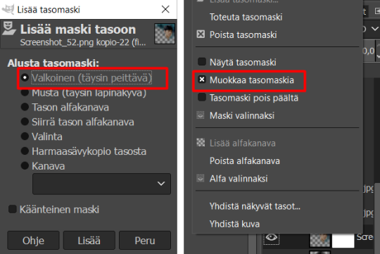
for the actual blending i use layer masks and the gradient tool. add a layer mask to the image you wish to edit by right-clicking the layer (before doing this, make sure this layer is the same size as your image by doing this on the right-click menu of the layer:
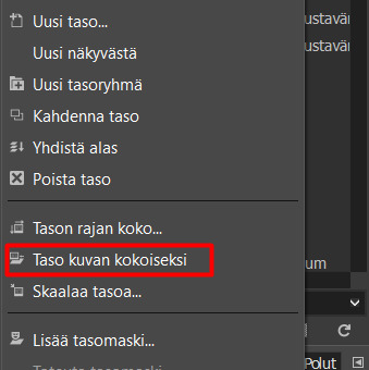
this says “layer to image size”. this cuts everything outside the image border off of that layer or if the layer is smaller, adds see-through parts to fill it. if you don’t do this, you will get these very unfortunate lines while blending bc the gradient tool’s effect + the layer mask won’t reach outside the layer’s edges).
now choose the layer mask you created to be white (full opacity), and then choose edit layer mask (this is usually the main setting but you can check by right-clicking the layer again).
now choose the gradient tool, your colors being black and white. the shape of the gradient can be linear (lineaarinen) or radial (säteittäinen). i usually choose them depending on how much of the image i kind of need to “take away”. the linear shape is good for cases where you need half of the image to blend away or want a straighter line to your blending, radial works best for a bit more detailed blending and softer edges. i usually start with linear and then switch to radial if i feel like i need more of an abstract shape.
for the first image of the set, i think i’ve mostly used radial bc i didn't need to take away too much. in the above images, you can see the strongest blending happening in the b&w image around pran’s ear which i’ve made “disappear” so that the colored pran shows up better. technically, blending is just turning parts of your image black so that other images can show up better in those parts.
note that on gimp, you can only use the gradient tool once on a layer mask. at least this is how i’ve taken it works, anyone correct me if you know better. but bc of this, when you’re done with one gradient, right-click your layer and then choose apply layer mask (toteuta tasomaski).

this makes the gradient actually “happen”, and after this you’re editing your normal image again without the layer mask present. if you need to do more gradients, add another layer mask and edit that. repeat the cycle until you’re satisfied. (i also use the layer masks and gradient tool to make some of these images darker, especially from bright corners. this is where your total black backround comes in handy!)
in this set, my blending/layering also includes a color layer (i usually name it sävy which means hue) which in this one adds more blue to the image. it’s basically just a whole blue layer on top of the background images. it is set to screen and then blended out to look like this hazy color on top of the image.
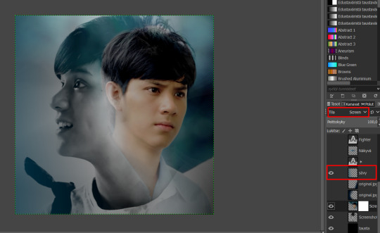
in the image 1 this layer shows up on the left side edge (note the subtle blue). bc it’s sometimes hard to work with only one of these types of layers, i might add several. or if i want different colors then i need several of these too. i love them tbh and have been using them quite a lot in the past. i think in this set only image 4 doesn’t have a layer like this bc it was already so blue it didn’t need it.
another thing i’ve blended into the background images is the texture. images 1, 2, and 4 include textures (or at least what i like to call textures). for the first image it’s the windows/pillars, for the second one it’s the text, and for the fourth one the armor texture. these are just images added on top of the others. once again set to screen, then blended out to not cover too much of the main background. adjust the coloring to make them blend in better. i prefer making the textures black and white and then adjusting their brightness but you can try different ways.
if you wish to know more about how the gradient tool and the layer masks work, feel free to ask!
III. Typography
my favorite thing! really, it’s just up there. i love playing with the text and different fonts. in this tutorial, i will mostly focus on the gradient map effect i use for most of the main titles in this set.
i see ppl using this technique a lot in gifs these days and tbqh, i think it also looks a bit better like that bc there’s the movement to help it stand out more. but it also works for still images if you make it right (which. am not sure i can do but i am trying my best).
first of all, create your text layer and place it where you want it to be in the image. if you want it tilted or something, do that now too. then hide the layer.
next, you need a copy of your whole background image (or at least the parts of it you wish to show up in the text). for example, in image 4 i have not included the armor texture to this bc i thought it would look too messy (the text is quite small and the smaller details won’t show up so you might need to abandon some). you can create the copy by right-clicking the layers and choosing “new from visible” (uusi näkyvästä).
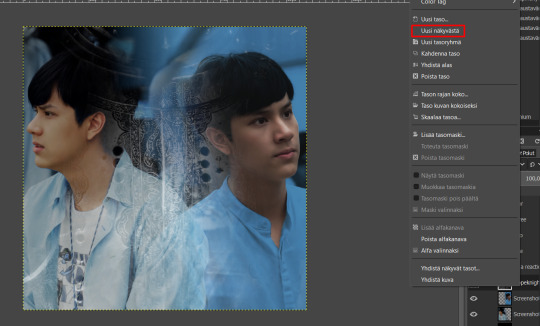
this should create a new layer that has all your visible layers stacked together as one.
then you need to pick your colors. i picked from the images i’ve used bc that guarantees that the colors fit. the front color needs to be bright and the back color dark/very saturated for this to work. you can adjust the gradient these colors create on the gradient editing page on the right. i usually like to bring the middle point a bit closer to the left so that the “shadows” get a starker line but this might also just be some kind of a placebo effect. i often end up editing the result a lot with other adjustments anyway so it doesn't really matter to me.

(am using my random screenshot as an example again bc it’s easier to work with)
now choose the layer with the copy of your background and click colors > map (määritä) > gradient map (liukuvärikartta).
this should create an image that has your chosen colors looking like the bright and shadowy parts got inverted. here to show it with my example image:

on the right image i’ve then played with the contrasts using curves and exposure. this is also the only point where i might use brightness-contrast. i usually like stark contrasts bc otherwise the differences and colors won’t show up as well in the text. note that adjusting the brightness at this point might also affect the hue (see how the pink has turned more red after i did some exposure adjustments).
now go to your text layer and by right-clicking it, make a selection out of the alpha.

choose the image layer you just did the gradient map on, still with the selection active. invert the selection and then hit delete. you should now have the text as this nice colored gradient that shows details of your image in it. you can adjust the colors even more now that you know how the text looks on top of your image.
another way to do this, which i’ve tried lately, is to create the gradient map image with black and white so you can easily adjust the contrasts, and then use colorize to get the color you want. i think this works well too, tho the result is a bit different bc the other color is always black (so this doesn’t allow you to use more than one color basically). you can try both ways and see which one looks the best.
(i guess the same result you get by making the gradient map out of your chosen color and black. i just like being difficult :’D)
some comparisons of the text results:

and how the text looks in the edit itself:
(this one is without the white “shadow” i’ve made out of the text layer that would otherwise stay hidden.)
IV. Additional Details
bc i’m a hoe for details i usually have a ton of these in my edits. i both hate and love them. i love how they look but making them is always a pain. most of the time in making these goes to the png hunting which doesn’t seem to get any easier even if i keep finding new sites and tools for it. if you need recs for where to find pngs and other resources, here’s one list. otherwise i just recommend googling and going around the world wide web.
the details am focusing on here are the statistics in image 2 plus the sword in image 4. both are quite simple to make but require a bit of patience (and trial and error which i’ve figured is a requirement for most editing).
beginning with the statistic boxes which i agonized over while making this set. my first plan was to create them myself by just making little boxes but i started thinking those wouldn’t look nice. so in the end i just ended up downloading the standard dnd character sheet you can find online as a pdf and then cut one of the statistic boxes from there. for this, i actually used the fuzzy selection tool so that i wouldn’t have to cut everything by hand. it worked quite nicely for such small details.
the dnd font you can find online and download for free. then i’ve just colored the borders of the boxes blue rather than black (using colorize i think) and made them a bit see-through (drop the layer opacity). i recommend duplicating the box layer only after this point so you can have the same coloring for each. then add the texts inside each and done. (as a side note, make a habit out of naming your layers appropriately. it might seem like a waste of time but trust me, you will thank yourself later when you have way too many layers and zero idea which is which.)
the sword was a bit more complicated. i created the sword-in-stone image myself by finding a png pic of a sword i could use for the handle and then just. drawing the stones with the brush by using straight lines (press shift while using the brush). i quite closely followed the image used in the insp post of this set, tho i wanted the sword in mine to be a bit bigger and have the images set differently. i struggled some but i think the result looks quite cool.

this is how the border looks. your goal is to manage to draw something like this for yourself which is the easiest once you have something to use as reference (the png).
the images used in the sword i’ve colored separately using the colorize method for the colored ones and the desaturate > luma for the b&w ones. adjust them with some curves/exposure. then i brought them onto the main image, made them smaller, and fit them inside the lines i’d drawn on a separate layer. be sure you always draw things on a separate layer (or so help me god).
these lines are also easy to use for cropping the images once you need to cut them into shape. i remember doing this by following the lines i’d drawn while using the lasso/free selection tool (you get straight lines automatically with this one so very easy). it takes some time but with straight lines, it’s not too much of a hassle. then just delete the parts you don’t want showing in the image.
(be careful tho while adjusting the image inside the lines so that you don’t get any empty corners etc. or you will break the shape!)
this is how the “sword” looks without the border:

(i’ve been very obsessed with such shapes made out of pieces lately so i will probably suffer with similar things in the future too while trying to figure out easier ways to do it. let’s see what happens.)
but this was basically it! if you need more details or want me to explain something again feel free to ask! i hope this helps you somewhat. thank you so much for asking, i love sharing my process even if it does sound very messy like this :’D i also like sharing more details about gimp bc i feel like i’m such a black sheep when it comes to using it.
have an amazing day!
#uuhh really dunno how to tag this#tutorial#???? idk man#can this be called that when this is a mess#but i had fun creating this!!#hoping this answered any of your questions#or was anything you hoped
8 notes
·
View notes


Last Seen Blogs

lgbtqreads
LGBTQ Reads
kubus389
NICE BOY
noblechaton
Lost Stars

priscelacruz1984
London Deaf l ❤️ Love You