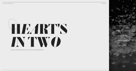
#i am a SUCKER for minimalist design
Text
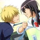
Review: ‘Madame Web’ is actually a good movie. Yes, really.
I'm not gonna lie: while I was heading to the theater, I was concerned going into “Madame Web.” The majority of X, formerly known as Twitter, users seemed to be against what they saw as meager storylines and weak writing, characters, and performances, especially compared to other Sony/Marvel superhero movies, so I was hesitant. I was expecting “Madame Web” to be a lot worse than it was, but a few good performances and strong found family themes elevate “Madame Web” above some lesser Sony/Marvel superhero movies.
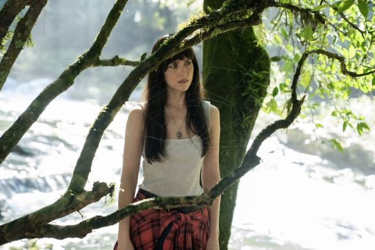
Columbia Pictures’ “Madame Web” was released in theaters on Feb. 14 and follows Cassandra Webb (played by Dakota Johnson), a paramedic in New York City. Webb finds herself having to protect three teenagers from Ezekiel Sims, a murderous adversary with superhuman powers who is hunting them.
“Madame Web” is set in 2003 and sort of pays homage to the conventions of the comic book movies of that era. The muted color palette and minimalistic special effects are all designed to remind viewers of movies like 2002’s “Spider-Man” or 2003’s “Daredevil.”
Also, like many of those movies, Webb is depicted as aloof and antisocial, with her friend having to drag her to social gatherings. Occasionally, with these characters it doesn’t feel realistic, but Johnson really sells it which makes it all the better when she finally finds her chosen family.
The other star of “Madame Web” is Adam Scott. I’ll admit that Scott and his glorious deadpan was half of the reason why I actually watched the movie in the first place, and he absolutely killed it as Ben Parker, a name most Spider-Man fans will recognize.
That’s the other thing about Sony’s recent Spider-Man Universe — it doesn’t have Spider-Man, but it gets really close. Sony is trying to convince people that its movies are in the Marvel Cinematic Universe, but they’re not. It is this confusion that is driving audiences away from its movies after films like “Morbius,” which was both a critical and commercial failure. It’s a shame too, because with better marketing more people might be able to actually enjoy this movie.
I mentioned that Adam Scott was half the reason I wanted to watch “Madame Web,” the other half was because of Isabela Merced. Merced, known for her starring role as Dora the Explorer in 2019’s “Dora and the Lost City of Gold,” brings layers to the role of Anya Corazon, who was my favorite of the three girls. The A-plus-student Corazon was one of my favorite characters in the 2017 “Spider-Man” animated series. Still, Merced portrays her as more than just an intellectual here, which I appreciated.
Sydney Sweeney and Celeste O’Connor were okay as Julia Cornwall and Mattie Franklin, but the script doesn’t give them much to do other than be a goody-two-shoes and a rebel, respectively.
The writing for “Madame Web” is kind of basic. The hero gets powers that she can’t control, finds the other main characters and must come into her power to save them – it’s all been done before. I am willing to forgive it, though, because of the ending.
I’m a sucker for the found family trope. It’s one of my favorites and “Madame Web” is a great example of it. Webb is initially reluctant to save the girls, but after learning that their real families have abandoned or left them, she takes it upon herself to protect them. By the end, Webb accepts Corazon, Cornwall and Franklin as her chosen family.
The villain in “Madame Web” is also bland. Sims sees a vision of Corazon, Cornwall and Franklin killing him, which is fine, but what I don’t get is why he doesn’t just try to talk to them first, instead of going right to hunting them.
I also thought the dialogue mixing for him was off. Whenever he spoke in voiceover, it sounded much deeper than his actual voice.
There was a lot of good humor in “Madame Web.” Johnson and Scott have a good rapport as Webb and Parker, with Scott stealing the spotlight in every scene he is in. The girls also have good chemistry.
The music was surprisingly good. I appreciated the use of Britney Spears’ “Toxic” as a plot device, and Tiffany’s cover of “I Think We’re Alone Now” was also appropriate for the scene, because they were, in fact, alone.
Unlike most of X, I actually enjoyed “Madame Web.” If you ignore what people on the Internet say, maybe you will too.
by Tyler D'Errico - The Collegian
"Cassie"
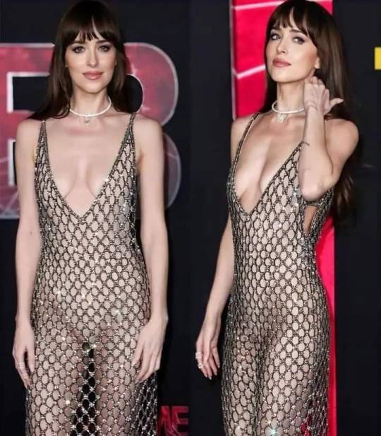
Madame Web premiere
#madame web#movies#scifi#sci fi movies#si fi#superhero#dakota johnson#adam scott#sydney sweeney#comic book movies
5 notes
·
View notes
Text
❤️ ranking all autonomic flags of spain ❤️
my expert opinion on all of the flags of spain. sometimes i know what the symbols mean sometimes i don’t — do not expect an informed opinion is the general rule. i will not look a single thing up. anyway here we go
andalusia
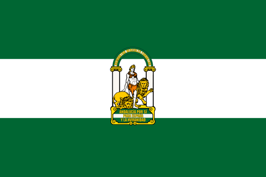
starting off strong i have to admit that putting semi naked twink hercules with pet lions front and center on your flag is a power move and i am unfortunately a sucker for pillars of hercules symbolism. i think it’s as neat as nationalist imagery gets but you do get points off for mentioning spain in a positive light in the inscription. at least the first statement is andalusia first and the font is charmingly outdated (vintage 1930s) so it ALL gets a pass — also medium dark green is an interesting & original color for your flag, looks harmonious with the white and small amounts of yellow, good job andalusia. not a very original (at all) three horizontal line format but still 9/10
aragon
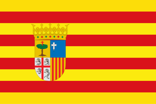
sigh. if only catalonia hadn’t nicked the flag that is rightfully yours.…. you are reduced to having to slap an ugly coat of arms on this fine heritage layout… 😢 is the bottom left quarter like, sardinia? if so it’s nice that they’re reminiscing about their old possessions. wish i knew what the other quarters are but it doesn’t change them being kinda ugly unfortunately. what’s up with the cross springing from the tree? anyway the first of the four crown of aragon flags gets only a 5/10 even though it pains my heart.
asturias
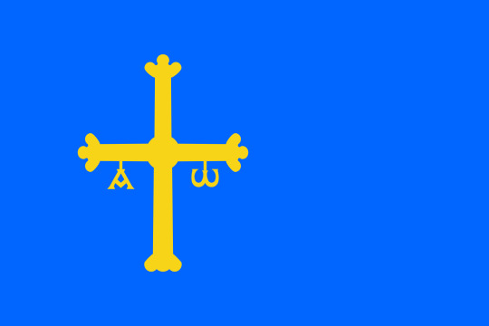
yeah this is sick unfortunately. 10/10.
balearic islands

our second crown of aragon flag is one that confuses me a lot. the white castle on a purple field has always been the traditional arms of… valencia. i get that we’re neighbors but why is it on the baleares flag now (as i said i am not looking this up). suspicious. highway robbery aside this flag kinda slaps (but i am so, so biased towards all of the four red stripes flags you won’t even believe it) and we always like to see rare purple in flags. 8/10
canary islands

white blue and yellow has to be one of the most visually pleasant, underutilized flag color combos ever and i applaud canarias for this utterly charming flag. it knows what’s important (OCEANO) and it also has- check this out- dogs rampant. is this a reference to can / perro => canarias? no fucking clue. anyway 9/10
cantabria
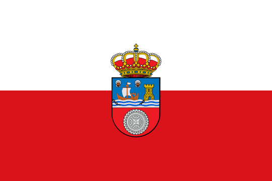
im gonna be honest i hadn't seen this flag in my life. there are two parts to this flag: the two stripes (1) and the coat of arms (2). (1) has to be the most boring layout for a flag ever (like seriously horizontal half white half red??? hi poland monaco indonesia whatever) and (2) is seriously one of the ugliest coats of arms ive ever seen. it kinda screams graphic design is my passion. i like the emphasis on being an important harbor (tower and the chain in the sea) and the uhh. circular rune thing but with them all being thrown together in an elementary school-looking drawing with floating heads and everything it’s just not very good. 2/10 only because there is worse in this country
castile - la mancha

on an intellectual level i know i should levy the same criticism against this flag as i did against cantabria on account of this also being a supremely unoriginal half red half white flag but on an emotional level. this looks cooler. it has an actual symmetric castle and the whole thing is minimalistic and powerful. go castile the new 8/10
castile and leon
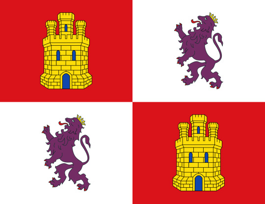
this one is such a classic im so sorry, im so sorry im gonna be a basic bitch but i cant help it this is our stereotypical medieval flag for a reason. you can just visualize this thing on columbus’ standard as he plants it on hispaniola in a bad illustration from a francoist children’s book. castles and lions rampant in a simple symmetrical layout and you know what, yeah, peak flag. it is my impression that some leonese don’t appreciate being shoved into this castile thing with them having been their own kingdom for way longer but what do i know. anyway go castile the old 9/10
catalonia

why is this their flag again. why do they get the og crown of aragon flag without any add-ons. is it because they got to choose first?? the flag itself is a 10/10 but this gets 6/10 out of spite.
ceuta
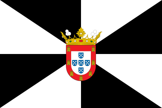
it’s. it’s ugly. it attacks my senses and yet i respect them for going very hard while doing their own thing. interesting color scheme and layout. the stark black and white diagonals give me a bit of a headache if i look at this for too long but it’s true that you’ll never risk mixing up this flag with any other. also the portuguese coat of arms is a very nice touch as indeed this was a portuguese settlement that remained loyal to felipe iv after 1640. uwu. for being the most loyal, ceuta and its disconcerting flag get 6/10.
15 notes
·
View notes
Note
so my tattoo is only small bear and only outlines, it's on the inside of my upper arm and the pain was honestly 1/10, the thing i wasn't expecting was that it feels like someone is just pressing down on you so hard but not in a painful way? 😅 the 1 time i had my legs waxed was 1000 times worse
a small bear? that sounds adorable what the heck 🥺 i seriously am such a sucker for minimalist tattoos.. tbh, i think i'll design my own tattoo before getting it.
ah gosh yeah, there's definitely worse pain out there 😂 i do laser hair removal/waxing and i image that burns/hurts more, too lmaooo 🤝
#tbh i don't know why i'm so scared either bc#i cope well with pain !! so i shouLD JUST GO AND DO IT#notes for rid 🌹#yaila <3
4 notes
·
View notes
Note
Hey there lady. I love your builds. You do such an amazing job. I really like the San My Penthouse and your latest one you posted today was beautiful. I need to update my mods so I can resume my new save I started with your sims, but if you don’t mind…
What is your favorite type of build and what is your least favorite type of build?
Aww thank you so much. I’m glad you are enjoying them. I can’t wait to see your next update. As for my favorite type of build… This is going to be a long one. I would say anything that lets be my authentic maximalist, artsy, eclectic self. I find it easier to build storybook style homes, vintage junky thrift shops, or eclectic art galleries. I honestly just love building but I think my least favorite build style would have to be anything brutalist, sterile and minimalist. Don’t get me wrong I like contemporary and modern just not sterile and cold. I’m also not a huge fan of everything being shades beige or grey. At least not as a constant design style. I love color. I personally gravitate towards color, clutter, and unique statement pieces. I HATE HGTV. I used to love Debbie Travis, Candace Owens, and David Bromstad but now everything looks like a Pottery Barn magazine or a Toll Brothers model home. Now, as for me IRL I am a sucker for old architecture that was either well kept or restored, that has some charm or character. Sorry for the long answer but thank you for the ask.
2 notes
·
View notes
Text
8 Absolutely Unique Tarot Deck designs
For when you can't decide on which to get
Ah yes, it's always exciting to buy a new deck. The Rider-Waite deck has been the classic bread and butter of beginners, a friend of mine even said you can never go wrong with buying one. However I wanted to find a specific design; It'll be my first deck so I wanted it to be special. In my quest to find the most unique ones that really resonated with me, I found eight that stood out the most that I will put in four categories: Simplistic, Stylistic, Macabre and Magical.
SIMPLISTIC
As the old adage goes: Less is More. As much as I am a sucker for all the flair and themes of other decks, these designs in particular I adore because they're able to boil down the cards to minimalistic, easily understandable symbols
Golden Thread Tarot
Designed by: Tina Gong
This one resembles the original Rider-Waite deck the most among all the entries on this list. I'm a big fan of the more cartoonish art style they adopted. Where The Golden Thread Tarot lacks in color it makes up with this elegant gold foil bordering and illustrating the cards. Moreover, it's created using recycled plastic!
2. Synesthesia Tarot
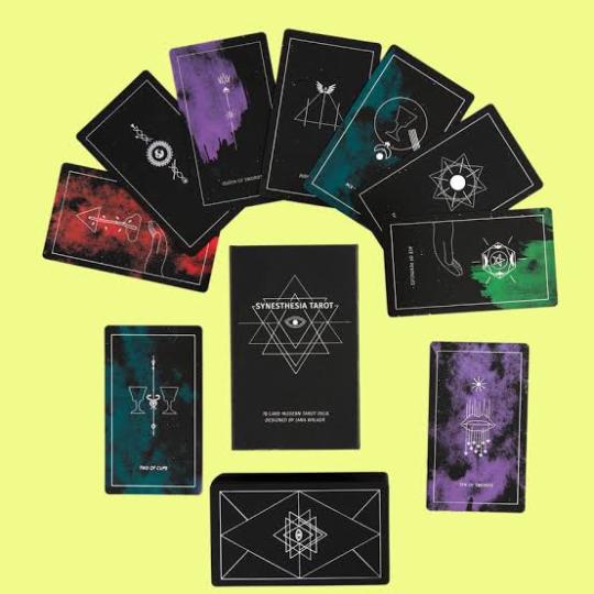
Designed by: Jana Walker
This deck design takes things even further and sticks to an even simpler iconography. I love how the design is stripped down to the absolute basic symbols of the cards but with a splash of color to make it even more unique! With silver foil accents and a matte black finish, what's not to love about the Synesthesia deck?
STYLISTIC
Departing from the minimalist designs, we arrive at the more unique and elaborate interpretations of the Rider-Waite tarot deck. These two designs in particular still resemble the original design quite a bit, but their designs usage of color and lines are what really make them stand out for me.
Sambucus Tarot
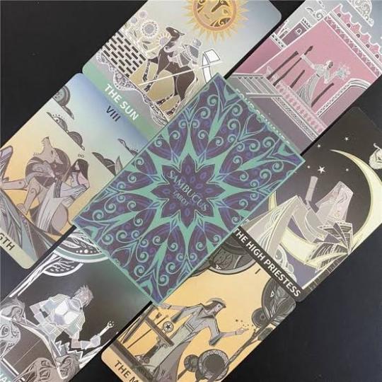
Designed by: WohStudio
The designers drew inspiration from the Sambucus plant, which they believed to have magical properties being considered to be one of the oldest magical plants. What drew me to the Sambucus deck in particular are its unique usage of curved lines and the plantlike motif that is prevalent all across the whole deck design. Each individual card deck is covered in a holographic foil which makes the whole deck look really nice when all the cards are stacked together!
2. Mystic Monday Tarot
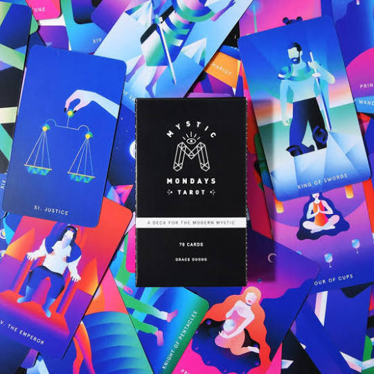
Designed by: Grace Duong
In contrast to the previous deck, this design leans more on the flat art style. While I usually don't like similar art styles, the colors on this deck are what really stood out to me. Each illustration in the Mystic Monday deck feels like a punch packed with vibrant color! The gradient coloring style looks so clean and I just love how clear and angular the illustrations are!
MACABRE
Skulls! Eyes! Flowers! Knives! The designs of this category really lean into the spooky themes of tarot and are sure to draw the attention of curious onlookers. Aside from being impeccably designed, they're certainly going to be one hell of a conversation starter!
Antique Anatomy Tarot

Designed by: Claire Goodchild
This is the very first deck I bought. Each card design in the Antique Anatomy draws inspiration from anatomical and botanical illustrations during the Victorian Era. I personally love antique illustrations especially from that historical era so I was naturally a big fan of this design. Another neat detail I like about this design are the flowers. In The Sun card there are Marigolds, a flower associated with positive emotions and well, the sun itself. I think that matching the flower language with the cards' meaning adds another layer to the Victorian apothecary vibe of this whole deck!
2. Prisma Visions Tarot
Designed by: James R. Eads
This specific design stands out for me in a number of ways. First off, the Impressionist art style of this design is just beautiful. The way each illustration is drawn gives it an almost antique storybook feel. Prisma visions giving the Major Arcana an ornate border to make them distinct from the Minor arcana is a nice touch. However I most especially love how each Minor Arcana card can be put side by side and each card's illustrations form a single panoramic illustration, mirroring how the meaning of each Minor Arcana suit also tells a broader story!
MYSTICAL
If the previous two were all about the spooky, these last two are all about the spiritual! Tarot is naturally very mystical in nature and there are plenty of designs that are sure to fall under this category. Despite that, the themes of these specific decks are just so much more magical that they never fail to stand out for me!
Tarot of the Divine

Designed by: Yoshi Yoshitani
When I found out there was a deck that combines folklore and mythology with tarot, I had to learn more about it! The Tarot of the Divine features various folklore illustrations that match up with tarot imagery. The folkloric origins are so wonderfully diverse! Not only does it have well-known ones like the Chinese and Japanese tales of East Asia to the Greek and English stories of Europe, there are also the more obscure ones, like the ones from the Maori Tribe of New Zealand! The colorful art style is another cherry on top and combined with the stories, this deck almost feels like a children's storybook!
2. Oriens Animal Tarot

Designed by: Ambi Sun
For the animal lovers! I like how the tarot symbolism is still very prevalent throughout the whole design, only with animals as the main subjects rather than people. From fluffy red pandas to feathery cockatiels there are certainly a large variety of critters! Though Oriens may be mostly animal-themed, its design is so much more than just that. The starry motif and the usage of color in this deck gives off an ethereal vibe. Combined with the nature motif, these cards' illustrations make it feel more like representations of spiritual beings than animals!
Overview
With so many designs, it can be really hard to pick a favorite one to get. Personally, I wish I had enough money to buy all of these! Hopefully this carefully curated list of diverse deck designs can help you pick! If none of these still manage to catch your interest, make sure to keep visiting our website as we'll be making more of these concise lists to help even the most indecisive people find their very own tarot deck!
#this is a fat wip#idgaf school output momen#it is currently 3am this is due tomorrow oh my god#blogpost two of four
0 notes
Text

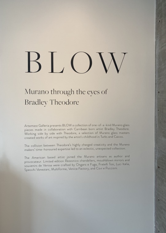
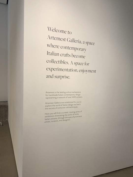


Artemest Galleria ~ 11/12/2022
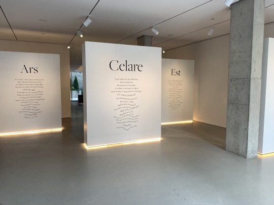
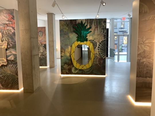
Today I went to Artemest Galleria, a small gallery space amongst many others in Chelsea, NYC. Although from the outside looking in, this space seems almost barren with its open plan and all-white walls and ceilings, I was drawn into this particular gallery when I saw the large, interestingly warped words pasted onto the modular stand-alone walls. (As a communication design major, I am a sucker for eye-catching text treatment.) I walked into the space to read the words which were lit up from below, making each small wall segment appear to be almost floating. I expected the text to be about the current exhibition being shown, which was called "Blow," and was a collaboration between an Italian glass company and a Caribbean artist named Bradley Theodore. But upon actually reading the paragraphs, they appeared to be repetitious, artsy descriptions of the gallery itself. I am inclined to believe that they do not change from exhibition to exhibition, so considering these walls are most of what you can see from the outside looking into the gallery, I presume the gallery front will appear the same to passersby even if the artwork inside changes. If this is the case, I believe it could discourage patrons to become repeat visitors.
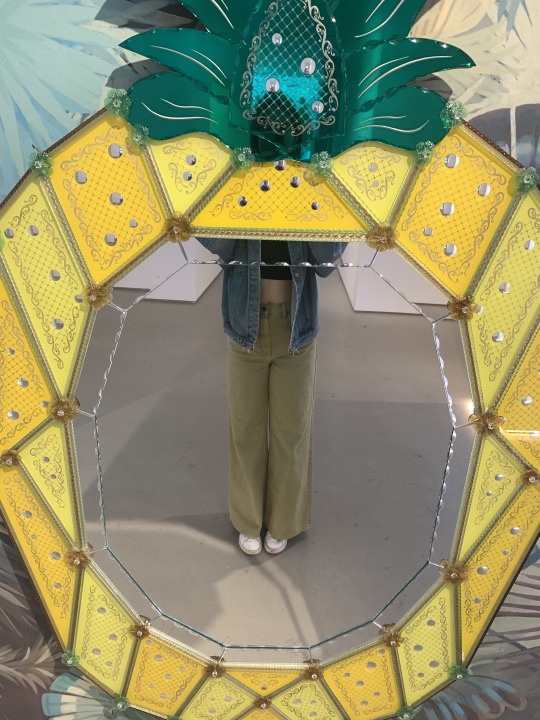
The only work actually related to "Blow" that I could see upon walking through the gallery door was a low-hanging chandelier in the corner which was adorned with many beautiful glass pineapples. I appreciated how I could walk right up to the lit-up fixture and appreciate its details and the shadows it cast on the wall. It left me wanting to discover more glass pieces in the collection. As I walked through the space I found that the artworks were displayed on the back of the scattered white walls. I found this to be an odd choice, as the artwork felt less like it was on display for the public and more like it was something hidden that must be found. But I did enjoy knowing that the farther back I walked the more beautiful glass pieces I would see.
Since most of the pieces featured mirrors and/or light, and the sole fact that they were made out of a reflective material, to begin with, not only were the pieces themselves interesting but so were the shapes and patterns they reflected onto their surrounding surfaces. I wonder if they were actually facing the windows if the natural light would cause this aspect to change throughout the day. Or perhaps the curators' purpose for not having it face this unpredictable light source was so that they could control where/how the shadows and reflections landed in relation to the pieces.
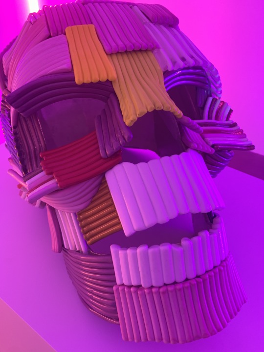
Just when I thought I'd reached the end of "Blow" I passed through a hallway near the gallery desk and had my eyes drawn to the left by a mysterious neon light source coming from another room. I walked into the pink and blue portion of the space to see a minimalist, contemporary display that highlighted a large and colorful glass skull as the centerpiece. Other works featuring skull imagery were hung up on the walls of the small room, but the neon lights emitted such strong colors that it would be impossible for me to know the true nature of all these pieces, no matter how closely I looked at them. I understand this to be an artistic choice, however, and I appreciate it.
Stepping back outside of the small room there was what appeared to be a mock-dining room setup. I was a bit confused about whether or not this portion of the gallery had anything to do with the "Blow" exhibition or not. Although there were some artistic mirrors with cultural imagery featured on one of the walls of this display, I came to my own conclusion that it was a separate section of the space not meant to correlate with the previous rooms I'd visited. Perhaps it was just meant to be a formal-looking lounge area for visitors. Was it a permanent part of Artemest Galleria? Was it a space to show off other pieces for sale from the Italian company it worked with? There was no text/labels indicating exactly what the purpose of this out-of-place room was. It was attached to a back patio, which I went onto and which appeared to be an extra random space that simply came with the place. I think it would be great to include sculpture works that could stand up to the outdoors to have a reason for visitors to go out there and to be able to give more artists a space to display their work.
There were a few things that surprised me about my experience at this gallery. From the expectations that came from a title as sexually implicit as "Blow," to the work being not sexual in nature at all, to the small journey it was to find all the pieces in the space, to the confusion about which sections were connected and which were not... Overall, I think there are a couple things I would change about the Artemest Galleria experience just to give viewers a more clear storyline/experience of the artwork. But as for the exhibition itself, I thought the Bradley Theodore work was beautiful, and its maximalist style contrasted so much against the minimalist space. The majority of my time was spent just looking closely at all the details of the gorgeous glasswork.
0 notes
Photo
someone says minimalist skin and i say Bet
#jcink#jcink codes#jcink skins#jcink skin#jcink code#portfolio#jcc codeathon#i am a SUCKER for minimalist design
15 notes
·
View notes
Text
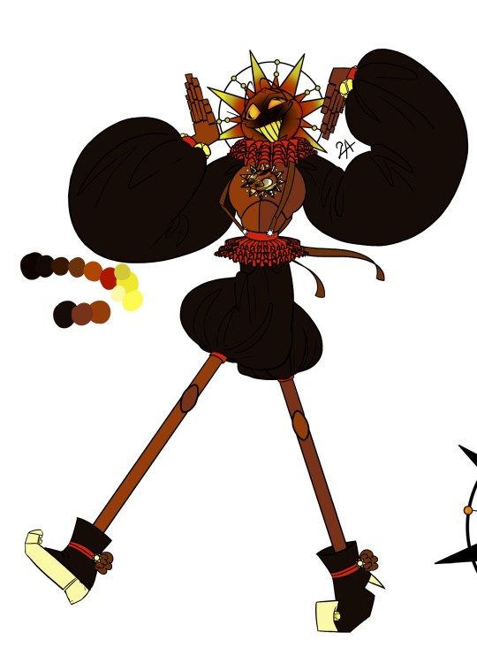
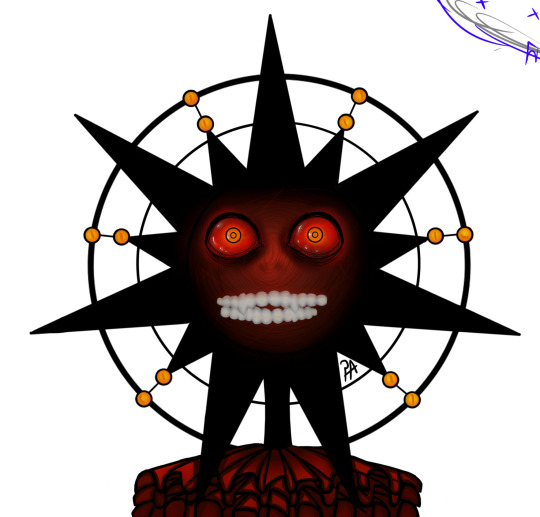
Wanted to upload these two on my TikTok but my dumbass still didn't figure out how this app works so Tumblr gets to see these two.
This is the eclipse sun design for my AU, where the Pizza Plex is Astronomy themed.
My ramblings on partial and full eclipse sun under cut!
☀️ Partial eclipse (left) was a scrapped design to make the daycare teach children about astronomy but after a while they stopped working on the project so full sun eclipse (on the right) ended up halfway finished.
☀️Sun and moon in this AU don't share the same body but instead the eclipse for both of them are their own character (sun has 2 different AI's and moon got 1 since he has less of an importance to the Pizza Plex) they are sentient and still see what's happening around them through suns eyes .
☀️ Partial sun eclipse (i will now call them from here on out Soleil) is more of a Teacher figure for the children but he has very much the "teacher that trys to be hip with the young folks™" vibe. (And also underpaid clown vibes)
☀️He has a build in projector to show the children our star system and teaches about it in a fun and engaging way (songs, quizzes where they can find prices ECT). But they ended up being scraped because of the cost and also since they ended up concluding that children in the daycare aren't here for learning and more for playing and messing around
☀️ this made him very upset and jealous of sun and he trys to come out every now and then to sabotage his work (very much a salty and petty AI) but after a while the staff build a blockage for it until they got enough time to remove him fully
☀️This whole thing made him more angry and emotional. His part of the body/design became less and less take care of until they stopped it completely. They also forgot about it because around that time Monty (who is a dragon in this AU) trashed Bonnie so they had bigger problems to work on.
☀️After pewpaw hacked the group he also destroyed the wall for sun and as an aftermath corrupted Soleil.
☀️This made him emotional,unstable and unable to control his body fully. He only comes out when the light is dimly lit since suns energy is tied to the light and after a while in a less lit room he doesn't have enough energy to hold him back.
☀️that leaves us with full eclipse (who is here from now on called just eclipse to make things easier). eclipse has an unfinished design, he has no face plate and his clothes are minimalistic with dark colors and his separate voice box (for extra things that where planned) doesn't function right making him almost fully mute. Full eclipse is not Soleil he is a separate almost non existing AI (or better worded an unfinished AI).
☀️He is more calmer still angry and emotional but he doesn't have enough energy to express it and understands why they both where scraped so he isn't violent like Soleil and copes through it with grief. When he comes out he mostly wanders around and watches the staff or goes to a few of the attractions to kill some time. Eclipse by himself is a more friendlier fella being more based off of moon.
(basically a big cuddle bug who is very protective and tired 24/7 but also has some emotional outburst and trust issues)
(he also looks so creepy because i am a sucker for creepy characters who are actually really nice and soft)
11 notes
·
View notes
Text
Infinitely Ordinary
Lee Felix x OC
Summary: "𝕀 𝕣𝕖𝕞𝕖𝕞𝕓𝕖𝕣 𝕨𝕙𝕖𝕟 𝕀 𝕝𝕖𝕒𝕣𝕟𝕖𝕕 𝕙𝕠𝕨 𝕥𝕠 𝕤𝕝𝕠𝕨 𝕕𝕠𝕨𝕟"
Busy. Busy worrying, working, just trying to survive. That was the daily life of Jordan Johnson. The world never seemed to slow down; not for her...not for anyone. Finally deciding to take matters into her own hands and get some much needed R&R, she jets off on a trip to South Korea. While there, she unexpectedly meets her soulmate. Will they be able to find happiness together, or will his status get in the way?
Genre: Fluff
Length: 1.5k
Chapter 3: Dream Boy
Buckle up kiddos, the story is gonna pick up in this chapter! We also may or may not be meeting a certain someone this chapter ;) Now, let's get into it!!
So maybe lying down on my bed after an insanely long flight wasn't my brightest idea. I was so sure the day I landed would also be spent exploring, but my body had other plans for me. After flopping uncerimoniously on the bed in my hotel room, the exhaustion caught up to me and lulled me to sleep. For 14 hours.
When I finally woke up from my unintentional hibernation, it was 6 AM.
Lovely.
With my body refusing to go back to sleep, I dragged myself out of bed and began getting ready for the day.
Knowing how early it was definitely put my mind at ease and let me take my time in the shower. I let the hot water cascade down my back as I hummed a little tune to myself. Most of my shower was spent taking in the warmth if I'm being entirely honest. Oh the perks of not having to pay a water bill.
When the water started to run lukewarm, I turned off the faucet and got out. I made my way to my bags that I had left near the door the day before. Grabbing one and heaving it up onto the bed, I ruffled through my clothes and chose an outfit: frayed black shorts, a cropped maroon and white striped shirt, and some Dr. Martens.
Returning to the bathroom, I got dressed, did my hair, and brushed my teeth. Giving myself a once-over, I gave myself a small smile and nod in satisfaction.
Sitting down on the bed, I grabbed my phone off the nightstand. The screen read 7:45 AM along with a few notifications. I responded to the few texts I had received from close friends and family assuring them that I arrived safely. I then quickly checked the other random notification that were primarily from social media. Satisfied with the lack of notifications, I turned my phone off, unplugged it, grabbed my backpack, and made my way out the door.
While there were many places I wanted to visit in Seoul, my stomach decided that breakfast was a necessity before I visited any of them. Unlike my hometown, there were many cafes around, so finding one using navigation and calling a cab was unnecessary. Instead, I opted to just walk around for a bit until I found a cafe that seemed interesting to me.
It didn't take long for me to find a cafe that I wanted to go to. The moment I stepped into the cafe, I was greeted a hoard of dogs. There were so many different breeds scattered about the building.
Coffee, pasteries, and dogs. I was in heaven.
I quickly paid the server my entrance fee and was lead to a table in the far right corner.
Placing a menu on the table in front of me, my server smiled and bowed politely before making their way back up to the counter. I picked up the menu, scanning through the various snacks and beverages. While there were some decent cafes back home, I don't think I had ever seen one with such an extensive menu.
And the dogs; you can't forget the dogs.
Picking something to drink and something to snack on took me much longer than I had originally anticipated. It also may or may not have ended up being more than just one drink and one snack...only sorry to my bank account on that one.
Waiting for my order to come out, I took a good look around the cafe. Everything about it was so different from the cafes I went to back home. Most of the ones I had been to before had a very rustic or very modern design. This cafe was definitely modern and minimalistic, but it was also very homey. The entire vibe of it made me very relaxed.
Mindlessly petting one of the lovely pups next to me, I began fiddling with my phone. Social media was always a good distraction from my unbearable impatience regarding food. Plus, it gave me the time to message some friends and family to tell them I'm safe and out having a good time.
I was soon brought out of my trance by a gentle buzz emitting from the coaster coaster I was given; my order was finally ready. I made my way to the counter and swapped my buzzer for a tray with way more sugar than I needed on it. I could almost cry just looking at everything I bought.
Sitting back down in my corner, I gently placed the tray on the table. I first made sure to photograph everything I had ordered. Typically I wouldn't do this when I went out for food or drinks, but I wanted to make sure I had memories to look back on from this trip. After all of my items had been properly documented, I went straight for the Oreo roll cake and Cookies N Cream milkshake.
What can I say? I'm a sucker for sweets.
I was so engrossed in all the sugary snacks and beverages in front of me that I didn't hear the bell above the door ring. The presence of another customer vaguely registered when he began ordering. I was still very much focused on what was in front of me, the patron's deep Korean becoming background noise. It wasn't until the man took a seat at the adjacent table that I was actually aware there was another person in the cafe.
From what I could tell, the man wasn't terribly tall or short, was roughly the same age as me, and oddly familiar. I couldn't clearly see his face because he was bent over in his seat petting a Golden Retriever, but something about him screamed that I knew him.
Ignoring the itching in the back of my mind, I focused on my food again. I was once again completely enchanted by the copious amounts of sugar... or at least I was until the man's buzzer went off and he made his way past me to get his order. It was in that moment that I got a decent glance at his face.
Freckles. Lots of freckles.
Holy shit. It's Lee Felix.
My heart was racing, pounding so loud I'm sure others could hear it. My cheeks were definitely the color of strawberries, my pale skin never failing to show internal emotions. My right forearm burned.
Wait, why is my forearm burning?
Feeling beyond flustered at the fact that my ultimate bias is sitting less than 10 feet away from me, I tried to distract myself. First I acted like there was something really interesting on my phone; that didn't work for long. I turned my attention to my forearm instead, which had now turned from a burning to just being oddly warm.
My eyes widened.
There, on my previously empty skin, was a tattoo of a sun.
No. Fucking. Way.
It seemed I wasn't the only one experiencing this sensation, as when I looked up I locked eyes with the freckly boy.
I froze.
Sitting there doing nothing obviously wasn't going to do either of us any good. I think Felix realized I wasn'tt going to make the first move, so he slowly got up and made his way towards me. Gently, he grabbed my arm, examining the new ink. I glanced at the arm grasping mine.
There was a crescent moon.
Taking a deep breath, I looked up to meet his eyes once again. His gaze was warm yet firm, doing nothing to calm the butterflies running rampant in my stomach.
"Well shit," I breathed out before I could stop myself. I quickly slapped my hand over my mouth, cursing myself for being so stupid.
Apparently my thoughtlessness was enough to lighten the situation a bit, Felix letting out a little chuckle.
"I'm so sorry! My mind is running a mile a minute right now. I'm not sure what I was expecting to happen today, but this definitely wasn't it," I say, letting out a nervous laugh.
"Don't worry, you're totally fine! I can definitely say this isn't something I expected either," he smiled at me.
I finally found the courage to move, standing on wobbly legs. I hope I didn't look as unsteady as I felt. I swear if someone breathed on me I would collapse. Nonetheless, I powered through and leaned back on the table slightly for support.
"I'm Jordan," I mustered, sticking out my hand and offering a shy smile.
"Felix," he replied while reciprocating my actions.
Dropping hands, things grew slightly awkward once again.
"So... I guess we're soulmates?"
A/N: AAANNNDDD that's where I'm gonna leave this chapter :) Our two main characters have finally met, so things should start picking up here soon! Thanks again for reading!! See you guys in the next chapter :) ~youngwings-writes
<previous | next>
#lee felix#lee yongbok#felix lee#stray kids#stray kids imagines#stray kids drabbles#stray kids felix#felix stray kids#kpop#kpop imagines#kpop drabbles#skz#youngwings-writes
3 notes
·
View notes
Text
“Tag Thingy” ✨
was tagged by @vivianastudies 🥰 i like this one; there are a lot of unusual questions.
how tall are you?
i’m loli-sized at 4′11.
what colour and style is your hair?
i have black hair that’s cut in a blunt bob. sometimes i look like an arthoeTM, but most of the time i look like a mushroom.
what colour are your eyes?
dark brown.
do you wear glasses?
just for aesthetic or to block radiation from screens.
do you wear braces?
not yet.. but probably soon.
whats your fashion sense?
people call me “Koreana” a lot, but honestly, the clothes i wear depend on my mood and the weather. i don’t have a singular aesthetic. in general, though, i do love tucked-in sweaters, dainty gold jewelry, camisole tops, semi-turtlenecks, and minimalist designs. my wardrobe’s palette is overrun by the colors blue, white, gray, and black.
full name?
reinrose.
where were you born?
in Tondo, Manila. (Philippines.)
where are you from and where do you live now?
i’ve never stepped foot outside this country, but i move around a lot. i’ve lived in Quezon City, North Caloocan, Baguio City, and now, Intramuros.
what school do you go to?
i’d rather not say, honestly. i don’t like it here.
what kind of student are you?
the burnt star, i say. i used to be an overachiever and at the top of everything, but now, i just want to graduate. the culture in my current school, especially regarding the professors and administrators is quite sickening, tbh, but i’m in my last year, so i just want to get it over with and self-study. i love studying a lot; i just don’t like the non-inclusive, institutional (a.k.a. restrictive) forms of “learning.”
do you like school?
not particularly, no 😐
favorite subject?
it’s so hard to choose! i’ll go with humanities and social sciences.
favorite tv shows?
i don’t watch TV, but i binge-watch a lot of Netflix series and anime. my recent go-tos are Forensic Files, The Good Witch, Fairy Tail, and Jojo’s Bizarre Adventure.
favorite movies?
maybe it’s easier to pick favorite genres (i love true crime, thrillers, and fantasy), but i do love Studio Ghibli and A24 films. also the old Harry Potter movies.
favorite book?
again, it’s probably easier to pick a favorite genre. i’m a sucker for good world-building (like Harry Potter) and strong female leads (like Rebel, the fairy series). altho.. i know it’s cliché, but the one book that haunts me is George Orwell’s 1984. just thinking about it has my stomach in knots.
favorite past time?
i have a lot of hobbies, but what i’ve been doing a lot lately is journaling, binging Netflix, playing video games, cleaning (don’t judge me), reading tarot/oracle cards, hunting for flowers to press, and, unfortunately, shopping.
do you have regrets?
i used to, but i’ve been through so much. eventually, you understand that there’s no point in wanting to change the past. you just have to take what you learned and keep moving forward. we’re not made to live perfect lives, just our best 🤷🏻♀️
whats your dream job?
i’m going to be an entrepreneur. i have it all planned out; i just hope the universe works with me.
would you like to be married?
yep 👰🏻
do you want kids?
in the far, far future. maybe my SO and i will adopt, though, because i NEVER want to go through pregnancy.
how many?
one or two.
do you like shopping?
..a lot.
what countries have you visited?
n o n e.
scariest nightmare you ever had?
i have a lot of these, but the latest i remember is going to a cult school, escaping, then hiding in a frail little trailer that doesn’t run while being hunted by a serial killer.
any enemies?
it’s a thin line. i’ve cut ties with a lot of people, and i avoid a lot of people, but i still wish the best for them, because deep down, i know everyone’s going through something.
self doubt?
for sure, but we’re shushing those thoughts in 2020, aren’t we? 💯
any significant other?
yes, and i am so lucky to have him.
do you believe in miracles?
sure. just not uh.. biblical miracles.
how are you?
i’m healing 🙂
i tag:
@stephie-studies @caffenotes @scholastc @moonshinestudies @hannybstudies @indiaisstudying @chayanastudies @bujowsofie @izzybee-studies @studeius @sonderstudy
42 notes
·
View notes
Note
show us your favorite tokusatsu suits and tell us why you like them!
In no particular order:

1) Patren X/Lupin X - Lupinranger vs. Patoranger - I really like the gimmick of one person being able to switch between two ranger forms. I’m a sucker for gold and silver suits, and I really like how Patren X looks more like a Lupin suit and vice versa. Lupin X looks powerful, and I like Patren X’s coat.

2) Draco Commander from Kyuranger - I am a sucker for suits that have a coat element to them, and it’s such a lovely shade of purple too. Draco Commander’s gun just adds to the cool element.
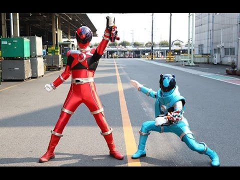
3) Ursa Minor Skyblue from Kyuranger - One thing I’ll appreciate is that they didn’t magically age up Kotaro when he transformed, he’s kid-sized even in ranger form. The bear motif is naturally a favorite of mine, the sky blue is a very vibrant color, and the scarf is retro cool.

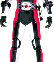
4) DekaMaster from Dekaranger - The only thing I don’t like about this suit is that Doggie Kruger can’t actually seem to fit in it, but otherwise, it’s a suit fitting the ultimate swordsman. The 100 can come across as being extra, but it’s not just for show, in DekaMaster’s first appearance he dispatches 100 mooks. I like the blue, black, and red color scheme, too.
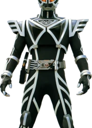
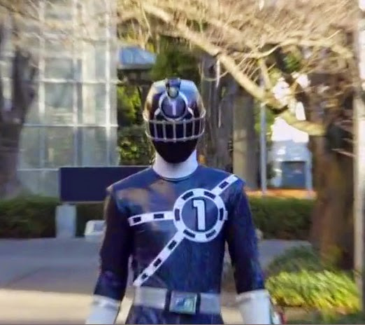
5) Kamen Rider Delta from Kamen Rider Faiz - The tertiary Rider from Faiz, Delta’s suit is incredibly cool. The black and white minimalist color scheme looks very fresh, and its weapons have a purple motif as well. I just wish the character that took up the Delta mantle was as cool as the suit was.
6) Kamen Rider Decade - The helmet is really cool, the magenta color is very cool (although I think it’s Tsukasa who makes it cool), and I like the pattern on the chest. It’s very visually appealing and fitting for the passing-through Kamen Rider. (Remember that!)


7/8) Kamen Rider Knight and Kamen Rider Knight Survive from Kamen Rider Ryuki - Kamen Rider Knight is kind of a Batman expy, but it’s awesome. I’m a sucker for a black motif, and the Knight helmet is very cool. The Survive form adds a lovely blue to the black, especially the wing armor on the shoulders and chest.

9) Kamen Rider Zolda from Kamen Rider Ryuki - The suit looks mechanical/robotic, which makes it stand out I wonder if it’s meant to be a reflection of how cold and analytical Kitaoka’s character is at first? Green is one of my favorite colors too, and the favorite color of all shooty Riders. He has big guns, too.
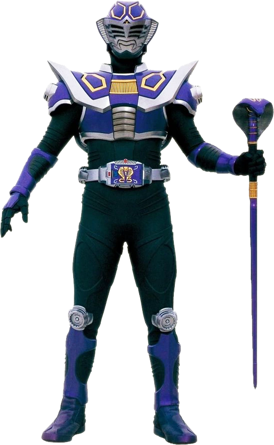
10) Kamen Rider Ouja from Kamen Rider Ryuki - The Ryuki suits are all so well done, honestly. I really like the purple here, Ouja’s helmet, and the snake motif. The suits are kind of minimalistic compared to later Rider suits (even Faiz one year later), but have such a charm.
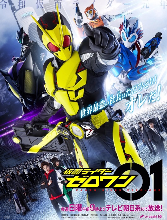
11) Kamen Rider Zero-One from Kamen Rider Zero-One - Zero-One hasn’t started yet, but I’d feel bad if I didn’t include it here! I really like how sleek and agile Kamen Rider Zero-One looks compared to Heisei and Neo-Heisei Riders, and its henshin jingles are awesome.
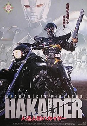
12) Hakaider from Mechanical Violator Hakaider - The suit design in this movie was generally well done. I love Hakaider’s reimagining in his movie, making him look even more badass and cool. The black and gold is a great look, and the shotgun is a classic.
The following suits are walking spoilers, so I’ll hide them behind a read more:

13) Leo Red Orion - The white suit is so clean looking, it’s such a great visual indicator of how much Leo Red has grown over the course of the series.
14) ToQ 1 Black - I generally didn’t like the ToQger suit design, but ToQ 1 Black is one where they got it right. I really liked the black version of the suit, and even though it was black it also had these colorful kind of oil spatter things on it too.
13 notes
·
View notes
Text

tried & tested by yours truly, these are the chrome extensions I couldn’t live without as a college student! in my opinion, studying in chrome without these extensions is like...trying to run without shoes on. sure, it can be done, but it’s just uncomfortable and not as great as it could be. I am always looking for more extensions that give me the illusion of having my life together — so please reply with your recommendations, I’d love to check them out :)
*bolded are my #1 favorites!!*
new tab —
COMMITTED: my preferred new tab! I love this one because it is basically a super simple and intuitive to-do list in a convenient location. you can set recurring tasks that will appear on their assigned days, and also list deadlines next to certain tasks if you so choose. pro tip: the developer is planning to start charging for this extension, so install it now while it’s free!
MOMENTUM: beautiful and functional, it’s no surprise that this is the most popular new tab among studyblrs. perfect for a breath of fresh air every time you open a new tab. includes the time, weather, a to-do list, a motivational quote, a beautiful background landscape that changes every day, and a space to write your goal for the day.
LAGOM: even simpler than Momentum with its grayscale color scheme and the fact that it only features the time, date, weather, and search bar. although this doesn’t provide it a lot of material to work with, it keeps things fresh by changing up the design daily. this is ideal if you’re a true minimalist who doesn’t like an overwhelming new tab.
tab organization —
TOBY MINI: really useful widget for organizing and saving your open tabs. if you’re like me and you often get lost in the mire of tabs you have created, this is a game-changer. It’s basically like a bookmarking system, but more streamlined, easier to use, (cuter), and it closes a tab for you once you save it in a collection, thus decluttering your workspace! refer back to your collections of tabs by opening the widget from your toolbar, e z p z.
sticky notes & highlighters—
OURSTICKYS: i have literally always dreamed of sticky notes that stay static on a webpage and remain there even after closing the page and coming back to it later...so this extension is, quite literally, a dream come true. you can change the color of your sticky notes, the font, the size, and you can have as many as you want!! the widget will keep a record of all the pages you have stickies on, so don’t worry about losing your little buddies. god i love sticky notes.
STICKY NOTES: since i love sticky notes, i use two different sticky notes extensions! but the difference is that this is basically functions as an open notebook. surf through as many pages as you like and write down notes in the same place without having to navigate to a different webpage. this little widget will be your constant companion. tbh this extension demonstrates more consistency and trustworthiness than any boy i’ve ever dated.
LUMIO: an total game-changer. an absolute baller. fuckin superb. this is the highlight extension to end all other highlight extensions. highlight your phrase in question, and the yellow Lumio icon conveniently pops up beside your selection. once you click that, your highlight is saved to the Lumio widget. this will also display all the other highlights you make on that page in one place, as well as giving you the option to add notes to a highlight or save it to a collection. uh, yeah, Lumio is that bitch.
SUPER SIMPLE HIGHLIGHTER: however Lumio has one fatal flaw...you can’t change the color of the highlights on a webpage. in the case that you highlight for the visual contrast, i recommend the Super Simple Highlighter. just as the name suggests, highlight your chosen phrase, right-click, and select the color you would like to highlight it. it will remember the highlights you have made on a certain webpage and keeps them easily accessible in the widget every time you’re on that page, so...yes I concede, Super Simple Highlighter is also that bitch.
pdf annotation —
KAMI: e s s e n t i a l if you ever have to interact with pdfs. with kami, you can view, annotate, highlight, sign, and save pdfs to your google drive! I’ve found that it’s better than other pdf annotating extensions because it can read scans, which are notoriously difficult to interact with digitally, and it lets me search terms and highlight on them. basically, kami is a pdf conquerer.
timers & website blockers —
FOREST: although i didn’t believe in Forest at first, it eventually grew on me (cue drum kit). this is funny because Forest encourages you to focus on the task at hand for a specific amount of time by growing a little tree. a little tree that will die if you wander on to a site on the blacklist (in whitelist mode, it will die if you wander off the sites on the whitelist), thus metaphorically killing your focus. I personally use Forest because guilt tripping tends to work on me and I also think that little tree is soo cute!!
STAYFOCUSD: if positive reinforcement a.k.a guilt tripping isn’t enough to enforce some self control, I highly recommend StayFocusd. put any website you tend to waste time on, from a specific page to an entire domain, on your blacklist and set an allotted time per day. once that time is up, that sucker is blocked until your chosen reset time (midnight is default). there’s even an option to make you do a puzzle before you can access your settings, in case you are easily tempted to change them!
NOISLI: creates ambient noise for your study session needs. whether you like the ambience of a crowded cafe, rainy weather, a crackling fire, a rumbling train, or a specific combination of all of the above, Noisli does the job well. it offers sixteen different ambient settings to choose from, so have fun creating your own mixes (which you can save and listen to again and again, of course).
research & writing —
GOOGLE SCHOLAR: everybody searches for sources on google scholar at some point, so make it easier by condensing the webpage into a nice little pop-up widget! makes it super easy to search google scholar without leaving the webpage you’re currently on.
CITE THIS FOR ME: as someone who hates citing her own sources, a bibliography extension is kind of a necessity for me. it kinda sucks that you have to make an account and enable ads in order to save your sources on this one, but it does work better and is less frustrating than other bibliography extensions out there (however it’ll still try to trick you into paying for a subscription—just close the tab folks!!)
ONE NOTE WEB CLIPPER: if you use Microsoft One Note (which you should b/c One Note is the bomb), this is a great way to save information from webpages into a One Note document without interrupting your research flow. you can save entire webpages/pdfs, or specific screenshots of a page, or just the link—all from a nice little pop up window on your toolbar. how lovely. how streamlined.
POWER THESAURUS: highlight a word, click the little blue button that pops up next to it, et voilà, you have all the synonyms and antonyms of the word you could ever ask for!
READING LIST: if you’re anything like me and you constantly stumble upon tons of articles that seem infinitely more interesting than what you’re supposed to be researching and then you end up going down the rabbit hole of whatever that’s about, consider Reading List! resist the temptation to procrastinate with another article by simply saving it for later with one click. more often than not, you’ll realize it wasn’t as interesting as it first seemed once you go back to actually read it. you’ll be glad you didn’t waste your time in the moment.
miscellaneous useful stuff —
ADBLOCK: if you don’t have it yet, baby what is you doin??
GOOGLE MAIL CHECKER: helpful little extenstion icon that displays the number of unread emails you have, so you can notice when you get a new one.
aaaand that’s it for my review of my favorite chrome extensions! as this is my first original studyblr post, please be merciful (lmao). hopefully in the future they won’t be this long & boring, but I do intend to continue creating informational content to help out my fellow students! as i mentioned earlier, please feel free to send me your own favorite chrome extensions—I literally install them left and right like nobody’s business, so please enable my addiction:)
13 notes
·
View notes
Text
Meet The Writer Tag Game
@pens-swords-stuff tagged me for this fun thing, thank you so much, my lovely ~ :D
Rules: Answer the 10 questions, write 10 questions, then tag 10 people.
1. Your main character is designing their own Dream House. What does it look like?
Oh how fun! Lemme think …
Well, Lexia, I think, would like something by the beach. She’s not a city girl, despite what many might think (you know, always sneaking off with Adom to some far off place, adventure-seeking and all that). I think she’d want a nice porch, and lots of windows, too, so she can always be connected to the outside without always having to actually go outside. And, the more I think about it, her house would be filled with things that remind her of other people (Rembrant and Hera, her parents, Miles and Stephen, and lots of things from her travels) so from the outside I can imagine it might look something like a museum of maudlin. Kinda has that sadness that comes along with holding on and nostalgia. You just know she’s seen through a lot and doesn’t really want to let go of much.
This tenancy would probably annoy her boyfriend, Miles, a lot because I see him as something of a minimalist. He values simplicity and wouldn’t want anything super big. If he lived in the real world, he’d be enamored with the emphasis on simplicity you find in Eastern homes and culture. So, when Miles and Lexia inevitably share a home together, that will be something they’ll need to work out! I feel like Miles could help her let go of some of that baggage, though (”Collect moments, not things” style). I think Miles would have a killer garden though; that’s where his money goes.
Isva’s house would be full of art, I know that much, but I don’t know where exactly it would be or what it would look like from the outside. Like Lexia, she’s kind of a relic-keeper herself! (there’s a pun in there if you’ve read my draft, but you haven’t, so lmao) lots of stuff from her adventures and just … trinkets. Like an old witch’s house, really. Very bohemian and soft.
2. What is the weirdest thing that has ever inspired a WIP?
Honestly, my inspirations for most of WIPS have not been fairly weird. Most of the time I’m inspired by something I’ve seen or read, or my imagination going to places it wants to for fun’s sake, conjuring up things that light me on fire. So I can’t really think of anything that would be weird by anyone’s standards.
3. Which character in your current WIP is the most fun to write, and why?
So far, Lexia and Rembrant have been the funnest to write so far. The more I think about it, the less surprised I am by how interesting Rembrant is to me; I’m a sucker for serious dad characters. I love dad characters. Dads, guardians, you name it. Maybe because I never had a father myself, exploring those “Batman dad” types is always really interesting to me and they always unfold in a way that’s particularly fascinating for me.
Lexia is fun mainly because she’s the type of main character I’d love to read about. Really courageous and compassionate, really sexual (which is an aspect of female characters that’s always ignored or not touched upon in YA or New Adult fiction; it’s always the guys!) and she’s awfully funny to me, as well. Just a little gumdrop I wanna hold close lmao.
So far, in The Raven’s Wing, all the characters have been very fascinating (Honorable mentions to the twins, Miles and Stephen, who are also pretty fascinating!)
4. Choose an 80s song for your main character(s) theme song!
Not really theme songs but songs that suit the characters and their conflicts so shushh
Lexia: What a Feeling by Irene Cara
Miles: Rush Rush by Paula Abdul (it came out in 1991 but shut up shushh) or Take My Breath Away by Berlin
Stephen: Don’t Stop Believin’ by Journey
5. The characters in your current WIP are in high school. Who gets voted “Most Popular/Most Likely to End up In Jail/Friendliest” etc?
Lexia: Most likely to travel the world
Miles: Most likely to befriend everyone at his first job
Stephen: Most likely to … (I have no idea so imma leave this blank lol)
6. Tell us a place in the world that you desperately want to visit, and why.
Idk man, I just want to visit every place Europe has to offer me. I love Europe, but I really want to go to England, as it’s called to my heart for so long now. I’ve never liked living in the US and probably never really will if we keep going in tHIS DIRECTION
7. What is the absolute trashiest TV show that you’ve ever watched?
I’ve loved Maury ever since I was a little girl *insert laughing-crying emoji* Do not idolize me for you do not know my flaws.
8. Hollywood comes knocking, wanting to put your life story on the big screen. Who’s cast to play you? What about your nemesis/love interest?
I honestly don’t know who would/should play me, as no one really reminds me of myself? As long as it’s a black actress and they get my deep voice right lolol I don’t care.
And as for love interest… Someone older than me, like Hugh Laurie or Tom Hiddleston … Or Cillian Murphy. Also any actor who has ever played the Doctor is fine it’s all fine lmaooo.
As for a villain, idk it has to be someone who’s really good at evil like Isabelle Fuhrman or Sean Harris (and idk I think I’d just be smiling at them the whole time)
9. Favorite flower(s) and why?
I love me some roses because I am a starry-eyed maiden at heart. It’s just the classic romantic flower, and I’m a sucker for traditions and cheesy romantic cliches like that.
Lotus flowers are breathtaking, also lilies and if I ever have a daughter her name is gonna lily (or ivy — see what I’m doing here? Lol)
10. Is there a genre that you’d love to break into in the future?
Spy fiction!!!! I have a spy WIP but I have no idea what I’m doing and I’ve seen all the mission impossible movies is thAT ENOUGH
TAGGING: @promptsforthestrugglingauthor @kagami-sage @reining-in-the-fire-writing @write-like-a-freak @brynwrites I can’t think of anymore people so lmao You dont have to participate if you don’t want to! No pressure!
And whoever wants to do this, I’m tagging you too!
1 note
·
View note
Text
I was tagged by @themotherlimabean, thank you for tagging me and sorry for not getting to this earlier!
So the rules: Answer the questions and tag 20 people. Let's do this!
The last:
1. Drink: Water
2. Phone call: To my mom telling her I was coming back to school from a field trip
3. Text message: Talking with a friend about their new story idea and OCs!
4. Song: Jon Kuwada - Cherry Cola (It's such a soft and sweet song I love it)
5. Time you cried: Around a month ago about School Stress™
Have you ever:
6. Dated someone twice: Nope
7. Kissed someone and regretted it: Nope
8. Been cheated on: Nope
9. Lost someone special: Someone whose tumblr I really liked and used to talk with occasionally deleted their account so there's that
10. Been depressed: Honestly who on this website hasn't been depressed at one point
11. Gotten drunk and thrown up: Nope
favorite colors:
12. Teal!!! (and no, it's not just bc of Homestuck)
13. Pink! (Especially along with gold or white!)
14. Muted colors. They're easy on my eyes and give me a minimalist vibe (which I like)
15: Pastel! And anyone that says that there are too many pastels can fight me!
16. A general idea, but any color connected with any character I like. Because I'm a sucker for sneaky references
in the last year have you:
17. laughed until you cried: YEAH! I've had so many dumb conversations with my friends that I still laugh when I remember them
18. found out someone was talking about you: Mostly my teachers being concerned about me, it was pretty nice to know actually
19. met someone who changed you: Definitely! Everyone I've met has changed me for better or worse somehow
20. found out who your friends are: I guess? I definitely know who I don't want as my friends though
21. kissed someone on your facebook list: Nope
22. made friends: YES!!! SO MANY NEW FRIENDS! :D
23. fallen out of love: No, but I've had to let go of a few crushes here and there
general:
25. what did you do for your last birthday: Ate at a bunch of buffets and bought some new books!
26. how many of your facebook friends do you know in real life: Basically everyone, I prefer to keep my irl friends on Facebook and interent friends on other sites
27. do you have any pets: I used to a bunch of fish as a kid, but they all passed away :(
28. what time did you wake up: Always 5:30 am for weekdays. For weekends, it can be anywhere from 6 to 10 am
29. what were you doing at midnight last night: Awake, chatting with friends and doodling
30. name something you can’t wait for: The weekend for me to focus on personal projects and summer vacation :D
31: what are you listening to right now:
32: have you ever talked to a person named tom: Not any that I'm aware of
33: something that’s getting on your nerves: Feeling like school is eating up my entire time and being :)))
34. do you want to change your name: Not really. I like my real name as is.
35. hair color: Black
36. long or short hair: I lov really long hair, but I keep mine just around shoulder length for easy maintenence
37. piercings: I have my ears pierced (and have small earings)
38. tattoos: Maybe? Probably something small in a place that's easy to hide
39. blood type: OOOOOOOOOOOOOOOOOOOOOO (It's O)
40. nicknames: Mar, Pancake, Basu (from an old blog)
41. relationship status: Single and Not Legal
42. zodiac: Scorp :V
43. pronouns: I prefer She/Her or They/Them but any are fine really idc ¯\_(ツ)_/¯
44. most visited website: Youtube, Messenger, Discord and This Shithole
45. right or left handed: Right.
46. Surgeries: None (and hopefully never)
47. Sports: I love walking/running outside!
48. Favorite tv show: I'm not sure if they count (since they're not on TV), but I've been watching Made in Abyss and Houseki No Kuni and they're great!
49. Vacations: We go to malls and attend some cons here and there. But aside from those, I mostly just stay at home or visit relatives.
50. Sneakers: I literally own only one pair of sneakers for physical education class. I like the way they look though.
More general:
52. Eating: Nothing rn. But I just ate a bunch of chocolate a while ago
53. Fave drink: I unironically love Mountain Dew. Fight me
54. What you’re up to: Chilling out and computering -w-
55. Waiting for: A 3-day weekend coming up in a few weeks :D
56. Want: Happiness, Friends and INFINITE MONEY$
57. Get married: As long as I really love that person, I'd love that in the future!
58. Career: Anything to do with graphic designing and animation! I also wouldn't mind a career to psychology too
which is better:
60. Hugs or kisses: HUGS ARE GREAT!
61. Lips or eyes: Eyes!
62. Shorter or taller: Both are great, but I generally like tall more
63. Older or younger: Either??? As the age gap isn't too large
64. Nice arms or stomach: Both are nice, but arms
65. Hook up or relationship: Relationship. Period.
66. Troublemaker or hesitant: I'd probably go with hestitant to be safe
have you ever:
67. kissed a stranger: Nope
68. drank hard liquor: Nope
69. lost glasses/contacts: I don't wear either
70. turned someone down: Nope
71. sex on the first date: Nope
72. broken someone’s heart: If I have unknowingly, I'm so sorry
73. had your heart broken: A few times, but not romantically
74. been arrested: Nope
75. cried when someone died: No, or at least not yet
76. fallen for a friend: I've pretty much felt some sort of crush for all my irl friends so yes
do you believe in:
77. yourself: Not quite, I'm trying to though
78. miracles: Definitely
79. love at first sight: Attraction, yes. Actual romantic love, no
80. santa claus: Not since I was 5
81. kiss on the first date: Depends????
82. angels: Yeah
other:
83. current best friend’s name(s): THERE'S TOO MANY ;-; I LOVE ALL OF YOU ;A;
84. eye color: Brown
85. favorite movie: Friend Request (As much as I love comedy, I'm a sucker for the occasional horror movie)
Done and done, and now for the tagging!
This definitely isn't 20 people but,
@avememaria, @marilode, @ion-byte@ion-byte @to-unknown-lands, @lupa-von-wolf, @wait-what-pancakes, @starafire, @nyeko-sama, @blastixriotz, @gaswe123
(You guys don't have to do it if you don't like, so please don’t worry about answering it)
Anyone else that wants to try this out, feel free to do so!
#asks#long post#Sorry if this is SUPER late#I've been waiting the week week to answer this#also @all the people I tagged
3 notes
·
View notes
Photo
Icon Project: Music is Minimalist
Okay so these aren’t exactly icons in the sense that you could plug them into a user interface or post them on a signage but I couldn’t post about icon designers without mentioning Anthony Morell and his Music is Minimalist project which I fell in love with over the summer.
To me the true essence of icons is conveying information in the simplest fashion and this often involves distilling a story into a single image. In that case, the Music is Minimalist pieces are truly iconic. Each one not only conveys the song title but they always pack in a playful and quirky twist. It’s like catchphrase except actually fun and nice to look at.
I’m a sucker for side projects and regular challenges so I also like the fact that this is a productive side project: designing one icon a day. I can imagine it would be quite different compared to creating a whole icon set at once where you can plan them out in advance and redesign as necessary for consistency.
Overall, this isn’t necessarily the style or direction I am likely to go for my own icon set but what I really like here is the way he captures such character in a simple design and conveys a story through the icons. Each one feels like it has a smile baked in and that moment of realisation when the title and icon ‘click’ is pure brilliance. That kind of character is what I hope to achieve in my designs for this project, I just don’t know what story I’ll be telling quite yet.
See all the icons on the Instagram.
1 note
·
View note
Text
Melania Trump compared to 'My Fair Lady' after meeting the queen in white dress and hat
yahoo
While Donald Trump has kicked off his 3-day London visit with some potshots at the city’s mayor, the first lady is taking the opportunity to show some strong sartorial love for the U.K.
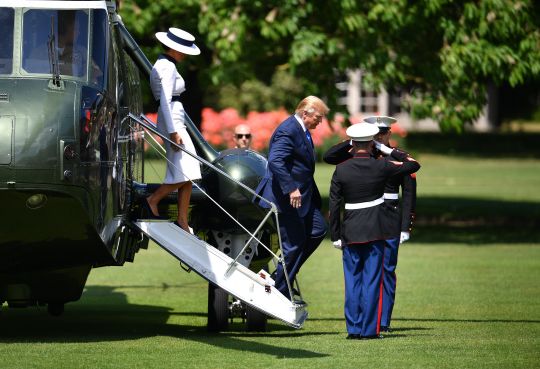
Melania Trump and the president visited Buckingham Palace on Monday afternoon. (Photo: Jeff J Mitchell/Getty Images)
On Sunday, Melania Trump boarded Air Force One in a $4,400 Gucci city print dress featuring images of London landmarks. By the time she and the president touched down in the U.K., she’d changed into a navy skirt suit paired with a silk scarf-print blouse ($890) from the famed British fashion brand Burberry.

The first lady left for the U.K. in a Gucci dress paying tribute to London. (Photo: MANDEL NGAN/AFP/Getty Images)

She landed in London in a silk Burberry blouse paired with a navy skirt and blazer. (Photo: MANDEL NGAN/AFP/Getty Images)
But when it comes to meeting the queen, FLOTUS tends to look to mainland Europe. Last year, she opted for a pale Dior skirt suit when joining Queen Elizabeth II at Windsor Castle. This year, she chose a more dramatic look from an Italian label: Dolce & Gabbana.

Camilla, Duchess of Cornwall helped welcome the Trumps to Buckingham Palace. (Photo: MANDEL NGAN/AFP/Getty Images)

The first lady wore a Dolce & Gabbana design to meet the queen on Monday. (Photo: Yui Mok/PA Images via Getty Images)
Mrs. Trump arrived for lunch at Buckingham Palace — where she and POTUS were greeted by the queen, Prince Charles and Camilla, Duchess of Cornwall — in a white, knee-length Dolce & Gabbana dress with a dark navy collar and belt, a matching hat from Hervé Pierre perched on her head.
Here is the sketch of the hat, courtesy of Hervé Pierre: pic.twitter.com/v8MzORMmtX
— White House Fashion (@WhiteHouse_Fash) June 3, 2019
While her Buckingham Palace look may not have been British, it may have been inspired by one of the country’s most famous fictional characters. Royal-watchers can’t help but compare the look to the Ascot ensemble worn by Audrey Hepburn as Eliza Doolittle in the 1964 film My Fair Lady.
Why is Melania Trump dressed like Eliza Doolittle from My Fair Lady? pic.twitter.com/2Wlxgh375p
— Tósìn (@DameTosin) June 3, 2019
Minimalist Cecil Beaton Ascot scene. My Fair Lady
— notabot (@upserny) June 3, 2019
@LauraBenanti I think Melania is channeling her inner Eliza Doolittle with this look. #myfairlady #theaternerd #TrumpInUK #myfairflotus https://t.co/Db8IQ06IDp
— kelly betts (@TheotherKellyB) June 3, 2019
Ooh, I like this @FLOTUS outfit. Kind of a simplified My Fair Lady vibe. And I am always a sucker for a jaunty hat. https://t.co/sBaSppmcFM
— Alexandra Romero (@AlexaMRomero) June 3, 2019
Is Melania auditioning for My Fair Lady? @FLOTUS
— Eileen McCormac (@EileenMcCormac) June 3, 2019
FLOTUS wasn’t the only one wearing white. While the queen stuck to her color-embracing guns in a green Stewart Parvin coat, Camilla wore an ivory Anna Valentine dress paired with a Philip Treacy hat. Ivanka Trump could also be seen wearing a white dress as she watched the proceedings from inside Buckingham Palace.

Ivanka Trump and husband Jared Kushner also visited Buckingham Palace. (Photo: TOBY MELVILLE/AFP/Getty Images)
The first lady may have taken her style cues from a member of the royal family. Almost exactly a year ago, Meghan Markle wore a similar My Fair Lady-esque look to the opening day of Royal Ascot.
Read more from Yahoo Lifestyle:
Ivanka Trump slammed after sharing photos from family vacation: 'Shame on you'
Sarah Sanders called 'an embarrassment' for saying Congress isn't 'smart enough' to read Trump tax returns
Alexandria Ocasio-Cortez's boyfriend got a makeover after haters said he looked like a 'bin raccoon'
Follow us on Instagram, Facebook and Twitter for nonstop inspiration delivered fresh to your feed, every day.
yahoo
#news#Donald Trump#Buckingham Palace#hidden:vv_16x09:9898d8ee-29c5-3af6-8739-5b4b0c4f5f98#_category:yct:001000069#_category:yct:001000073#_author:Erin Donnelly#Melania Trump#_lmsid:a0Vd000000AE7lXEAT#_revsp:wp.yahoo.style.us#_category:yct:001000070#Ivanka Trump#British royal family#Camilla#Duchess of Cornwall#queen elizabeth#hidden:vv_09x16:af4b77d9-920d-3340-ad38-c9b69366c8af#_uuid:50e9ec61-e480-342a-b029-be0b6992a779
0 notes
Last Seen Blogs
cryptidghostgirl
fics n stuff
wonderinc-sonic
Wonder, They/Them

princesssarisa
My garden of musings

ao3feed-starker
AO3 Tony x Peter Feed