#hire a cover artist

Text
Top 10 best RotE covers
So my Top 10 worst RotE covers has been making the rounds again, and it reminded me that I had started a list of my 10 favourite covers. NGL it was much harder to find 10 covers I liked than it had been to find 10 really bad ones, but there are still some gems out there 💖
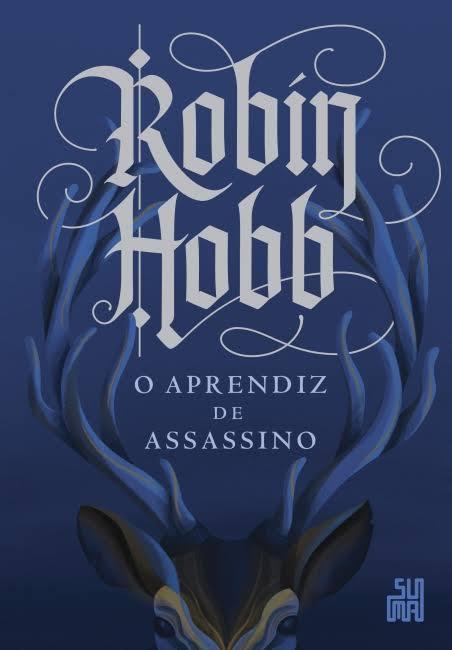
10. Assassin's Apprentice (Brazilian Portuguese)
This is where you can clearly see that I don't have much to work with in terms of good covers for this series. Do I love this? No. Is it generic-looking? Yes, but the stag and font look badass and the result is effective
9. Assassin's Quest (Turkish)
Nice and graphic, I really like the tile effect and this red is very striking.

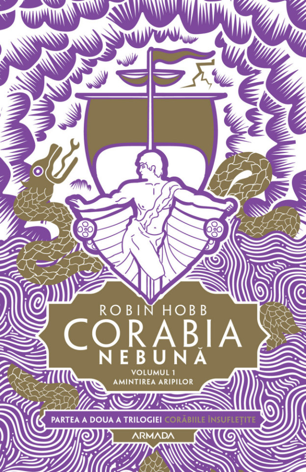
8. Mad Ship (Romanian)
I'm not sure if the figurehead is supposed to be Paragon or Kendry, but they did take a risk and the result looks cool and very different from every other cover out there.
7. Royal Assassin (Polish)
What I really like about this one is that instead of looking badass and in charge like in most covers, this Fitz looks sad and lost, so the artist got that right. And the cloak that morphs into a trail of blood is 👌👌

6. Fool's Assassin (French)
Bee actually looks her age and there's a heartbreaking contrast between this small and lonely child and the pyre burning next to her. Very good one!
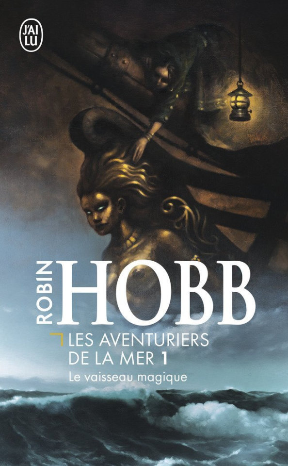
5. Ship of Magic (French)
Althea reaching out to a gorgeous and very dramatic-looking Vivicia with a mysterious atmosphere around them, yessss! Really cool and memorable
4. Fool's Errand (UK)
A classic, and this spot is for John Howe's covers in general. I don't love them all but there's a very unique and ethereal feel to his art, his use of colours is wonderful and there are always a lot of details to look at.

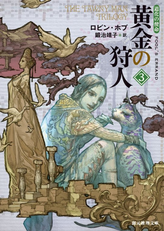
3. Fool's Errand (Japanese)
The Japanese editions for Tawny Man look unreal and it was extremely difficult to pick just one so again, this spot is for the whole set. So, so beautiful and imaginative!
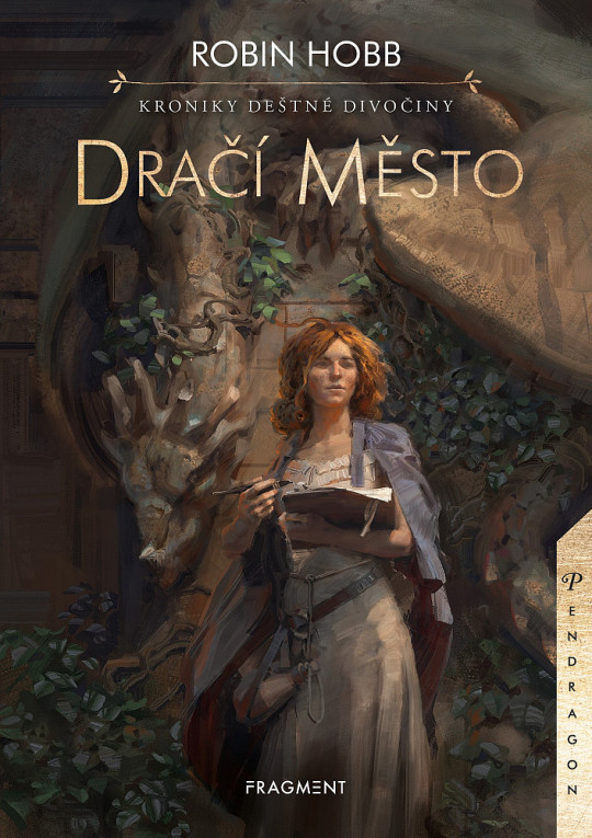
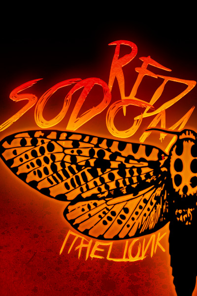
2. City of Dragons (Czech)
I fell in love with this style as soon as I saw it. It looks absolutely fantastic, damn, look at this Alise and the stone statue behind her!! I love that all the covers from this edition of RWC focus on a different character instead of just showing random dragons. The artist has obviously read the books and it shows.
1. Fool's Quest (UK)
I am not just saying that because this is the edition I own, but Jackie Morris is the queen of RotE covers for me. I have nothing bad to say about her covers, they look stunning and they work extremely well as a set.

#rote#realm of the elderlings#robin hobb#the farseer trilogy#the liveship traders#the tawny man trilogy#rain wild chronicles#fitz and the fool#covers#the japanese and czech ones look so so good#and yeah none of the supposedly fancy illustrated editions are in this list :x#they could've been so much better#i wish publishers would hire more fan artists for their covers...#one can dream
114 notes
·
View notes
Text
Rewatching the earlier, and even pilots episodes, of Ninjago are so WILD man. First of all, you notice all the things that are just plain forgotten about or pushed aside in later seasons. Kai originally being the main character, sure, we all know that one, but Cole was heavily implied to be, or become, the leader of the Ninja, that was Cole’s thing. Zane was automatically described with having a sixth seer sense, when nowadays it shows up very, very infrequently. Lloyd used to basically be the Avatar, does anyone remember that? This kid was just the Avatar.
And then you remember the silly things. Like how the skeleton army was once a threat. Like...the skeletons. We battled a giant snake, smaller snakes, robot armies, sentient video games, Garmadon a billion different times, the Overlord, Oni...and the skeletons used to be a worthy adversary. The skeletons.
Did you all remember that Cole’s earth dragon used to...breathe earth? I’ve been forced to remember. Rocky used to breathe earth as a form of attack. It was shown through brown swirly wisps in that beautiful, incredibly shitty 2011 effect. The Underworld used to be implied to be the place where all dead people went, or at least the bad ones. We never heard of a Departed Realm. Do we remember the time Cole had a scene that was a direct parody of Michael Jackson? I sure do. Genuinely the highlight simply because I don’t know how to describe the emotion I felt upon seeing it.
#ninjago#lego ninjago#kai#cole#zane#skeleton army#rocky dragon ninjago#dragons#early ninjago seasons#ninjago underworld#skulkin#talk#text post#garmadon#kai smith#cole brookstone#zane julien#also the skeletons lived in the underworld#there was no departed realm yet. was this just where we were expected#to believe people went when they died? to the skeleton army?#garmadon hired these guys. he wanted these guys to help him#there was so much happening#in the pilot episodes the main villains were the skeletons with garmadon looming in the background#then there were the SNAKES that lloyd unleashed. which. now i love lloyd with all my heart and soul--#but at least 80% of all the ninjas problems wouldve never happened if lloyd didnt unleash those dam snakes#no pythor. no great devourer. no aspheera. no villain team-ups. no dead guys back from the dead. no underground city that momentarily#worried them. no ancient cities to find#like a good solid CHUNK of the ninjas problems straight up would not have happened if baby lloyd just put that cover back on the snakes#im sure the writers and artists can do something angsty with that. i believe in you guys#baby lloyd fr was the reason the apocalypse was unleashed like 20 times if you wanna squint do you think that keeps him up at night
182 notes
·
View notes
Text
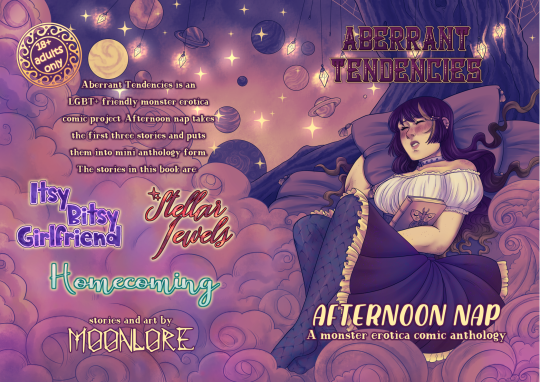
Attention all authors! I'm going to run a brand new type of commission from now on: Book covers!
I've been improving my book cover game over the past few years and will only be getting better at them as time goes on, so! I am opening a brand new commission style.
For the small press, independent, self published authors, the rates are as follows:
For just the front cover (and simple back cover) €400
For a wraparound cover €500
These rates are ONLY for the small press authors. If you are affiliated with a publishing house, commercial rates apply as per the Graphic Artists Guild suggestion, starting from €2000 for front covers and €3000 for wraparounds
If you have any pals who are writing books and need a cover artist, then send this info their way!
#art#artist#artist for hire#artist for commission#terato#exophilia#comic#ttrpg#dnd#commission#commission prices#book cover
83 notes
·
View notes
Text

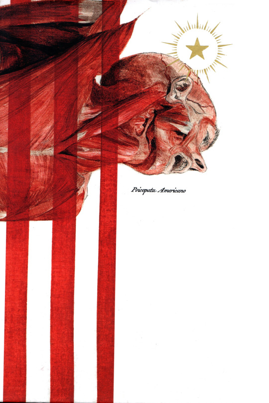
american psycho (1991) by bret easton ellis — brazilian edition
front & back cover by retina 78
#i looked it up an it seems like retina 78 is a publisher they hired to do the cover and not an actual artist... which is a shame#american psycho#bret easton ellis#my scans#mine#tw gore#tw body horror
22 notes
·
View notes
Text
oh my god checking my release radar every week is a fucking nightmare now cause all the cover arts for songs are AI generated even from bands that I KNOW have the money to commission a cover... this is so anger inducing dude
#ai generated cover. ai generated cover. stock image with text. ai generated cover#thunderclap#please for the love of god stop it get some help hire an artist or draw it yourself this sucks dude this sucks!!!!!!!!!
24 notes
·
View notes
Text
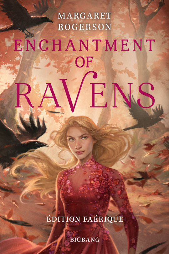
God this cover is such a downgrade from the original lmao. How did Charlie Bowater get worse at this? All the crows are in exactly the same pose, the protagonist’s pose is painfully boring, her face is once again completely indistinguishable from every other character cover Bowater has ever painted.
#imagine re-hiring an artist for a special edition cover and she delivers what looks like a generic Middle Grade cover#it’s honestly baffling how she manages to crank out such bland work despite her skill#book covers#it’s just so blaaaaah
21 notes
·
View notes
Text


Some book covers I made! Please note I did not make the assets used, most of the art was commissioned by the authors. Please email me [email protected] for info on cheap comissions!
#graphic designers for hire#graphic design#book cover commissions#graphic design commissions#writeblr#typography#artists for hire
5 notes
·
View notes
Text

SEQUEL TO THIS POST, A fake cover I made based on a story / rp me n my pals are doing with our spider-sonas!
#spiderverse fanart#spider sona#artists on tumblr#digital art#across the spiderverse#edge of the spider verse#fan comic#Fan cover#artwork#fan art#silly goofy things#marvel hire me
10 notes
·
View notes
Video
youtube
Lingua Ignota // Ein Traum
Pentiment Original Soundtrack - 2022
#lingua ignota#pentiment#soundtrack#original soundtrack#ost#obsidian entertainment#kristin hayter#heinrich heine#ein traum#oh hey this is on streaming now#how much y'all wanna bet josh sawyer hired the album artist for Ys for that cover huh#anyways this isnt necessarily a christmassy song but it IS melancholy and of mixed religious heritage so im posting it today#the biography of heinrich heine is interesting imo#a jew who converted to lutheran christianity to escape antisemitism#the lyrics to the song seem to be wistful for a peaceful; more accepting germany#and the song is somewhat out of time; being written ~300 years after pentiment is set#and ~200 years prior to the present#gonna try to sink some more hours into pentiment this week. havent finished it yet so idk what the song means in context#also hi. im incapable of making a post without a paragraph of tag commentary apparently
31 notes
·
View notes
Text
Everyone go check out @madbrake's blog! They have absolutely gorgeous art. I couldn't stop gushing about it when I first saw their work. :D
#madbrake#artists#artists on tumblr#art#it's so pretty what the hell#someone hire them for designing book covers or a series or something#genuinely envious of their art skills (affectionate)
2 notes
·
View notes
Text
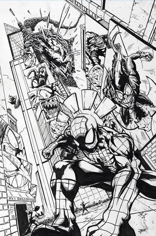
SPIDER-MAN VS. GREEN GOBLIN
Green Goblin's everywhere -- Spidey's senses are going off!
•
For more of my work, check the links below:
Portfolio: https://www.iampowers.art/
Etsy: https://www.etsy.com/shop/IAmPowersArt
Instagram: https://www.instagram.com/iampowersart/
#art#artist#comics#illustration#drawing#i am powers#marvel#ink#traditional art#artist for hire#artist for commission#art wip#fanart#spiderman#peter parker#green goblin#comic cover#superheroes#new york#time square
2 notes
·
View notes
Video

“The Tree begins as a Seed”
A gift for my partner @mxihi of a character from his story<3
42 notes
·
View notes
Text
[blearily making edits to last 3 rec posts] high horse forever. get on my level.
#my ramblings#sigh… this came up while we were driving to the concert#but if I had $6000 I would hire an artist to redraw my comic#well that would only cover one of them. $16000 for both right.
5 notes
·
View notes
Text
having a vtuber model would fix me i think
#i would be a doll i think. a 1/3 scale ball jointed doll. i have a name picked out and everything. my fans would be called the toybox and i#would try to hire pako as my character illustrator. i'd stream mainly abandonware and doujin games and when i play eroge i'd scramble to#cover the screen in the akiha no sex gif to censor it before i could get in trouble with youtube. and i'd hire all my favorite artists to#make assets for me. and it would be nice. (<< regularly thinks abt this and is eagerly awaiting the day when he lives alone and can finally#make it a reality)#romeo.txt
2 notes
·
View notes
Text

Commision piece:
Album cover for a DJ named Apollo Banx.
His music is available on multiple platforms
#art commisions#adobe illustrator#adobe photoshop#procreate#freelance illustrator#artists on tumblr#digital illustration#artist for hire#illustration#dj#house music#album#album cover#album cover art#new music#apple music#soundcloud#spotify
4 notes
·
View notes
Last Seen Blogs

adventuresinwordcraft
Jennifer Boeder

shadowyiloveyou-blog
Sin título

likedrotten
OH! WELL! I NEVER WAS THERE EVER...

aylameridian
Ayla Meridian

vanbasten
non è più domenica