#great artists look into detail and color scheme
Note
Haiii <3
I've seen your damnation au posts floating around my dashboard here and there, and I scrolled past many times by now (i had completely misunderstood the plot, not your fault, im just smooth brained)
I finally caved and read it, and holy shit wow, its so good??? I took the quiz, and got the one I wanted on my first try (Pomefiore) and WOW. I then proceeded to read all of the others, and they're all great (especially the Savanaclaw one, I liked the world building you did, all of the leaps felt logical), but Pomefiore remained my favourite.
I REALLY liked it, reread it several times. I wished to express how much I liked it, so for you Shiny, I bring two drawings as tribute. I bring a little meme I felt was funny, and my take on the raven retainer, because the look described was GENDER (mmm cloak and concealed sword and poison and dungeonnnnnn)
Thank you for writing it, it brought much joy to me. If you ever make a Diasomnia one, I'll be dragged back by my ankles (Lilia is so premium)

(aaaaa i love his outfit so much)
(featuring, what retainer looks like with the hood up)
I can see how people may not want to read. Imagine wanting to read as a sweet little treat, opening the 'read more' part and getting something that covers almost your whole screen-- yeah, that's my bad. 😭
Anyways, your take on Raven!MC is very stunning?? They're serving. Cunty (I recently learned that word from a mutual, hoped I used it right). The golden chains reminding me of a bird locked in a cage, the color scheme of the background fits so well especially considering the dorm, even the book is a great addition! And the bandages for the hand injury!! I nearly missed that! So much attention to detail. Each brushstroke looks so smooth and satisfying, I just can't explain it.
In simple words, I love your style. Give me your artistic talent.

52 notes
·
View notes
Text
Paint Job (Buggy the Clown x F!Reader)
Summary: In which Buggy indulges his two favorite hobbies: doing your makeup and driving you crazy.
Pairing: Buggy the Clown x F!Reader
Rating: General.
Word Count: ~1k.
Warnings: Pregnancy.
A/N: my birthday was yesterday so i wrote this for myself
Your belly button popped out. He had no idea until you stripped your clothes off for a nap and fell asleep cradled in that dumb pregnancy pillow you use instead of cuddling with him.
He squints at it. It looks funny. Round. Sticks out. Kinda like...
...hmm.
The intrusive thought hits him like a fish jumping out of the water and into a boat.
You'd look so cute and he'd get to show off his artistic talent. Not to mention that everyone would know whose baby is in your belly. Not that there's any doubt, of course, but he has to mark his territory somehow and he suspects that you wouldn't appreciate being peed on.
(The obvious answer of putting some jewelry on those naked ring fingers of yours has occurred to him many times, but that thought is somehow scarier than fatherhood. So he ignores it.)
Grabbing his bag of tricks from the vanity, he tiptoes to the bed. He sets himself down slowly, gently, carefully. The bed squeaks as he eases his weight onto it, but you don't stir.
He works quickly. First some white greasepaint, squeezed onto his wrist and dabbed onto your belly with a makeup sponge. Follow that with a bit of black paint, applied with a careful stroke of the brush. Then pigment sticks for the detail work and outlines...
The baby seems to enjoy it. It occasionally moves in response to his touch. Nothing herky jerky -- just little shifts and nudges. Makes his heart melt. He can't wait to meet the little rugrat.
And now the piece de résistance, a dab of red right on the mound of your navel.
Et voilà. Perfection.
He leans back to marvel at his artistry as he wipes the extra makeup from his hand. In another life, he'd have made a damn good painter. Hell, maybe he should invest in some acrylics and canvas. Start a money laundering scheme.
Buggy notices that your eyes are open. Two little windows into a warm, dark abyss. The same color as falling asleep in a cozy bed on a cold, dark night.
“Having fun?” you ask.
“Tons,” he says coolly. “How was the snooze?”
“Great, ‘til your kid started tap dancing on my bladder.” You lean back on your elbows as you stretch your legs out, splaying your toes out like Richie does after he wakes up from a nap. Your belly rests on your thighs now. Try as you might, you can't see over the top. “What were you doing?”
He hops off the bed and offers you his arm, easing you to your feet. He guides you to his vanity with a hand on your waist. Your gait has gained a wobble and, while he's never seen anything hotter, being on a constantly rocking ship makes him nervous.
Your eyes go wide when you see his Jolly Roger painted across your stomach, your belly button forming the nose. You twist this way and that, your smile growing with each shift.
He rests his head against yours. “So everyone knows just who put you up the pole,” he murmurs.
“As if there's any question with how handsy you are,” you snort. You turn that warm smile to him. “Love it, Bugs.”
He didn't think you'd be upset, not really, but hearing you happy eases his nerves greatly. “I decided to take an impressionist approach,” he says. “You can tell from the brush strokes and my liberal use of white.”
You were right, that night you first spent together: you laugh like a gaggle of News Coos. Clattery, loud, inelegant. It's his third favorite sound in the world. The second is that snort you make when you're trying not to laugh, and the first is... Well, his pursuit of that sound is what led to your current condition.
He pushes the gag a little further. “Made it during my Alabastan Period, where I was influenced by--” You push your lips against his. He keeps talking, just to annoy you. “--traditional geometric patterns of nomadic--”
You grab his cheeks and shove your tongue in his mouth. Once he's runs out of breath, you pull away with a big red splotch across your smile. “Shut up,” you say.
“Never.” He moves behind you. He pops his hands off to lace his fingers underneath your belly as he drapes his arms around your shoulders. "How's that?"
You sigh in relief as the weight is lifted off your organs, your spine, everything. "Fucking hell, thank you," you breathe.
He makes a mental note to thank the old ex-con who told him the trick. Surefire way to make your old lady love you forever, she'd said, grinning at her husband. How else you think I ended up with having six kids with this knucklehead?
The thought of six little humans running around fills him with dread... but at the same time, everyone loves a family act. Matching threads for everyone, him in his best and you all dolled up like a work of art. Suits for the boys and little tutus for the girls.
Six little faces looking up at him in adoration, six little creatures to do his bidding, six little people guaranteed to worship the ground he walks on...
You snap your fingers in front of him. "Hey. Clown."
That's enough to bring him back to earth. He hopes to every god that will listen that it's just one in there. "Just distracted by your beauty," he says.
You give him a dry look. "Liar."
"Alright, ya got me. I was thinking about your tits." Buggy rests his chin in the crook of your neck. “How much longer?”
You reach up to pat his cheek. “Couple months.”
He groans. “But I wanna meet Buggy Junior noooow-wuh,” he whines.
Your smile vanishes. “Over my dead body you name my kid that.”
“Why not? It's a great name. Buggy Balthazar Zebulon Xerxes Mixolydian Macadamia--” You pinch his lips shut with your fingers, but he keeps talking. “--Jeremiah Jubilee--”
You turn and shove your tongue in his mouth again. He shuts up for good this time.
---
To the "Curious Courtship" Masterpost | To the Mastahpost | Tip Jar
#buggy the clown#buggy x reader#buggy x you#buggy the clown x reader#kiss marry kill#one piece x reader#one piece#one piece live action#fan fiction#one piece fanfiction#reader insert#x reader#emberly writes#smash or pass#the curious courtship of buggy the clown#dad buggy
114 notes
·
View notes
Text
WHEN MC CAN DRAW
Drawing and the arts is one of the things you’re most passionate about. There’s a lot of things, and certain demons, that are out there to give you inspiration to draw. How will the brothers react when they find out you’re a great artist?
literally in the middle of drawing when I thought about this and i'm wondering why it took me this long to think of an Artist!MC prompt damn. Enjoy reading!
------------
Lucifer
He already had a vague idea that you have a keen eye for the arts when he took you to a gallery once. You’re familiar with a lot of paintings in the human realm, but none of them could quite compare to the styles down here in Devildom.
Lucifer wanted to teach you more about the cultures of Devildom through painted histories and stories which is why he took you to the gallery, and he notices how observant you are of the details on the artwork. He assumed maybe you’re just very educated with the arts up in your world.
Though one day he found you in your room trying to draw a piece with the styles similar to the paintings you both saw the other day. The linework and colors are very on point, Lucifer would have assumed this wasn’t done by your own hands if he saw it displayed on the walls.
“You’re quite talented if you drew all this after just one art gallery tour.” Lucifer says as he moves closer to further inspect your art. If you ask him how to improve it or how the method works, he would be happy to give you some tips or pointers.
“As impressive as this is, I would like to see something you’ve made in your own style.” Lucifer would want you to show something that speaks more about you, not about Devildom. He’s curious to see what makes your art style original. He wants to see you take pride in whatever you create of course.
He’d love to have one of your artworks be framed somewhere in the house. You can use his office for that peace and quiet so that none of his brothers would disturb you while you worked. Lucifer wanted it framed in his room for him to enjoy, though after his brother’s protests and one heated dinner discussion, the piece was placed in the living room instead for everyone.
Mammon
Mammon doesn’t really have the best sense of boundaries when it comes to your room, so he ends up barging through the doors to see what you were up to and maybe try to whisk you away for a bit of gambling for the evening. Though he finds you on your desk doing some homework, papers scattered on your bed.
You tell him you’re busy working on a project so he whines but stays with you in your room. You have homework about summoning circles so you had several discarded drafts resting on your bed. Mammon can’t help but go through the papers while he waits out of pure boredom.
Mammon eventually spots under the pile a few of your own personal artworks you’ve made. You forgot to keep them away since they got buried underneath all those papers. “EY!! This ain’t part of a class project right?! This looks freakin’ fantastic!”
You can tell he’s being genuine about his compliments just by seeing the look on his face. “I-I'm not just sayin’ that cuz you’re my human! I know a gold mine when I see one yaknow?” Mammon says while he goes through the pile to see if there are more works out there for him to admire. He might be tempted to steal one of them just so he can piece of something you’re passionate about so close to him.
He would definitely urge you to sell some of them for profit, put up commissions online or advertise it on RAD. At first you wondered if this was part of his money-making schemes… he admits it was at first but he wants you to succeed in this if it’s something you genuinely want to do.
“You gotta cut me some slack sometimes ya know? I bet you’ll make bank outta this. I know my old plans for quick grimm haven't worked out, but this one I'm SURE won’t fail” his enthusiasm is almost contagious. Regardless of your decision, Mammon is happy enough to sit back and enjoy your artwork.
Levi
He is going to be so ecstatic knowing that you’re actually really good at drawing in any form of medium. Levi found out one day when he asked to borrow your notes for class and you lend him your notebook. He was flipping through the pages until he noticed that you’ve been doing little doodles at the back. “I-is that…”
Your peaceful little afternoon got chaotic when you heard an excited scream from down the hall, followed by rampant footsteps that got louder in a matter of seconds until your door opened. Levi has your notebook in hand, with the biggest grin plastered on his face.
“Y-YOU COULD DRAW RURI-CHAN?!” Levi doesn’t even give you the time to speak when he shows you the doodles and starts going on a rant on how you captured the details of her outfit so perfectly. Even the magic staff is actually on point!
There’s times he would be peeking by your door while you’re doodling something in your room. Levi wanted to ask if you could draw his favorite characters but he’s too shy to do so, but he’ll be the happiest when you agree to it.
“I-if you need the references i have a few!” He would say ‘few’ but ends up giving you what’s almost an entire album of art references that you could use. If you want, he can even take the figurines of said characters off his shelf (which is rare) so you can have a better look at it from all angles.
Levi would definitely have it posted on the walls, keeping all your artworks like a new collection. He would gush about how he wishes he could draw because it’s another way of expressing your love for something you care about. Would definitely commission you for certain things because he doesn’t want to keep asking you for free art.
Satan
Recently he got you hooked on this detective novel series, and you both spend a lot of time together just talking about your favorite parts. Satan loves that chase scene between the detective and thief since it was written so well, it’s almost like you can play the scene in your head.
He’s with you in his room, sitting on the couch with the book propped up by your knees. He assumes you’re just rereading the book and does his own thing. He likes that about your company where the silence is comforting, though there are times you ask Satan what he thinks the detective or the thief looks like in his head.
By the time Satan had to answer one more query that he realized you’re not actually reading the book. He sees that you’re holding onto a pen as you scribble something behind the book, so he decides to sneak behind you while you’re distracted out of curiosity.
He’s surprised to find you drawing on a notebook, looking at the chapter of the book with the chase scene that he mentioned the other day. “You’re… drawing the scene?” He asked, the corners of his lips tugging into a smile. He’s impressed that you got the compositions so well too. To him, you brought this scene to life.
“Is this why you were asking me all those questions? Well, I’d say you perfectly captured the scene and-” He’d talk about the details you’ve drawn and how it matches what’s written in the book, like a professional critique. He’d love to see the piece once you finish, and even see all your other works you’ve done in the past as well. One cat drawing would make him excited for sure.
One time you made him a bookmark by using your art for the designs. The brothers know that Satan doesn’t use those as often because he tends to finish books in one sitting, but he began to have that cute little bookmark pressed between the pages of his current book. Not only is the design so perfect, it’s from his precious human too.
Asmo
Asmo is adoring the attention he’s been getting from you recently whenever he would make a little fashion show in his room with all the new outfits he’s bought. He loves the awe he hears from you and how you eye him up and down after he strikes a pose.
He even saw you buying a magazine with him on the cover, and he just can’t help but feel giddy at the thought of how much you probably adore him because who wouldn’t? You must really love how he looks, right? Asmo even thought of giving you a private show just for your eyes.
Though he found out eventually that you’re using the poses in his magazines as reference when he saw that you’re trying to copy the pose he made on the cover. “I’m rather offended that you didn’t reference me, the source material itself! I’m always ready to be your model, hun!”
Asmo would make the perfect model because being in model magazines, he’s used to holding on poses for periods of time without complaint. He’s not shy about his body either so you can ask him to be in any sort of pose for you (but you have to stop him from being not so family friendly when you try to fix his position).
If you’re good at designing clothes then Asmo is going to fall for you even harder. He would admire all the designs you can do, and if you’re open to suggestions then as someone who works and shops frequently at Majolish, he would have a lot of good ideas. He’ll have the connections to make your designs come to life and model it for you.
“I just know if you posted these fine works on Devilgram, it’ll get you tons of views for sure! Especially if the muse is me” Asmo says with a wink as he admires your art. If you made an account then he’ll be loud about it on his social media, wanting people to feast their eyes on it.
Beel
He does a lot of home workouts so often you spot him doing a lot of stretches or lifts around the house. There’s even times you offer to help like sitting on his back while he does his push ups or just being his little moral support.
Though he noticed all the attention you’re giving on his muscles recently. You offered to wipe off the dirt and sweat he got from his Fangol practice, and Beel sees how much you’re staring intently at his muscles while you wipe him dry with a towel. “MC… is there something wrong?”
It's only then you realize that your eyes have been glued to him for so long so you decide to explain. You tell Beel that you’ve been sketching recently with someone of his body type but you can’t seem to get the muscles correctly. Hearing that makes Beel smile though.
“Well, if you want me to help I could. But I want to see your works, if that’s okay with you” Beel said. He’s not much of an artist himself (Satan notes that Beel’s art still haunts him to this day), so he’s very supportive knowing that you can draw.
He has this awe in his face like how he looks when the restaurant serves him the biggest platter of food as soon as he sees your artworks. Beel is happy you’re sharing such talent with him. “This piece is so colorful. It reminds me of the rainbow layered parfait we had the other day… oh, now I'm hungry.” Even if Beel can eat books and things that aren’t exactly food, he never once tried that with your artworks.
He’d invite you more often to his little home workouts so you can study his muscles more closely. Beel would love it if you sit on his back while he does push ups as you draw. The sound of the pencil scribbling would bring him to focus.
Belphie
There’s an upcoming event for RAD that requires a lot of decorations. Since a lot of people are busy with their own tasks, you and Belphie were paired up to think of possible decor for the stage.
Belphie complained how Asmo or Levi should’ve been here instead but since they’re both in charge of the outfits, then he’ll settle with this because at least it requires minimal work. You both were trying to discuss the backdrop designs and the props but he fell asleep midway.
Belphie wakes up in a few minutes later to the sound of scribbling pens when he saw you creating the designs. You asked him to pick from one of the sets you made but he’s too stunned to even decided when all of them are so good. “You made all of that while I was asleep?” Belphie is in a state of disbelief.
The one that struck him the most is the starry sky landscape. For someone who loves to watch the stars, this one was particularly mesmerizing for Belphie. So out of personal bias he chose that one.
He never stopped bugging you about your art, always wanting to see what you’re drawing when he spots you on your notebook. He’s not much of a ‘draw me next’ kind of person, but he’d be absolutely happy if you did. More so if you drew him and Beel together.
Whenever you’re drawing, Belphie wants to take a nap by your lap while you do your work. He likes the look you make whenever you’re trying to figure out something in your art before he drifts off to sleep. His favorite part is waking up to see that you’ve already finished your piece so he gets to admire it first.
#obey me#obey me shall we date#shall-we-date-obey-me#obey me lucifer#obey me mammon#obey me leviathan#obey me satan#obey me asmodeus#obey me beelzebub#obey me belphegor#obey me headcanons#obey me scenarios
335 notes
·
View notes
Text
If there's one thing I'm proud of as an artist, it's the fact I'm a style chameleon. I decided to sit down and recreate 4 artists I really love, and who better to do it with than with the most varied character in the entire franchise: King Dedede! This isn't just for appreciation though, but a study on how other people translate DDD's design, since character design is a passion of mine!
Let's start with @miniiieevee!
Oh my gosh their art is super great, and I think the most important part of getting the style right was the sparkles. I have never seen someone do highlights this way, and it's both super recognizable and super cute! For the King himself, we have a nice round beak, visibly blue eyes, a distinct head, pointed crown jewel, an undershirt, and stripes along the top of the belt. Like most of us, they use the (owo) kind of mouth and really fluff up the coat. Separate fingers can also show up for posing, following Spongebob physics. The stitching on the gloves and the little round eyebrows are another really cool touch! Out of all of the styles I looked at, this one has the most pastel colors.
-
Next is @das-a-kirby-blog!
Das-a-kirby-blog has such a cool variety in their work, from really shapey sketches to super abstracted color schemes, which while super amazing, didn't provide me the best ref material. The colors here are frankensteined from a few sources, so I hope they capture their actual base color palette. They go for the pin-shaped route for body shape, with the undershirt (though sometimes there's no under layer), typically black eyes, extra belt stripes, and a chunky diamond shaped crown jewel. My favorite touch is the cottonball on the crown. Like I said at the top, they excel at shapes in their art!
-
Third is @jojo-schmo!
I've been silently reading their roleswap comic, but I should've been loudly reading it because I super recommend it! I'd also say design wise their Dedede is the most unique! Besides myself they're the only one here to pick the kimono, they have a single blue stripe at the top of the belt, a triangular jewel, and the coolest element of the style, spirals! I've not seen anyone stylize the trim this way, and it's so cool in execution. Another unique element that really adds to certain expressions is the spiky teeth (which matches real life penguins! ...Don't look it up).
-
Last but not least, @cosmicwhoreo!
God, their art is everything. The flow of the lines is so clean and smooth and everything they draw is super expressive. Their Dedede is by far the hugest, and also marks the 4/5 DDDs with a separate head, and 3/5 with black eyes. We have the belt stripes, occasionally a shirt, and a smooth tear drop jewel, but a uniquely shaped crown band. This design sees a lot of influence from the anime unlike the others here, so the color scheme is the most unique.
-
As a conclusion, it's really cool to see all the different design elements that we pick and choose for DDD. Some give him his smash outfit. Some people give him a body type closer to K64 or KATFL. Some people draw his eye color, or separate eyebrows, and others don't. There's no detail that's the same across every version, but they're all our lovable king. If you don't recognize one of these artists, check them out! I can only do a fraction of the incredible work they do, and let me know if there's any other characters or artists you'd like to see this exercise with!
#my kirby art#kirby#king dedede#art style study#I actually have no idea if @s notify the person or not#Probably?#I hope I did you guys justice
445 notes
·
View notes
Note
You like all the Papa Louie customers eh? Name one good thing about every customer (currently)/lh
*slicks back hair* It's showtime.
Akari - Her coolness factor is unreal. Love the motorcycle, love her whole biker getup, and it's reasonably possible she might be a reference to that Akira anime thing. Which would be pretty sweet
Alberto - BRASILERIO NUMERO UNOOOOOO!!!!!!!!! Also him hating dentist appointments is quite the amusing fun fact. I like how his favorite holidays have had a general consistent pattern in all the games (favor SJ in the sweet games, SL in the savories)
Allan - Love his pompadour! Also glad that Flipline wasn't ever afraid of keeping his unibrow and missing tooth throughout the years... Also that one Brody's Gallery fanart probably awakened something within me. Sideburns are hot, y'all
Ally Kabam - They just revealed her so we don't really know all too much about her, but that doesn't mean I can't sing her praises! And by design alone, I can tell you that she's a STRONG customer: Brimming with both style and personality! Definitely setting the tone for the rest of the lineup, let's hope the rest of 'em live up to the hype
Amiria - They did throw quite a curveball revealing her to be a Tacodale local, but I dig it! Also great to have an official dental worker around! Designwise I absolutely adore her coat in the Style B, fuzzy thing that it is
Amy - That color scheme is a real treat, I say I say. And she's something of a fine art appreciator according to the little info snippet we got out of her creator on the forum, love that for her too... Plus the whole romance novel aspect adds to it quite well!
Austin - His design is straight up just a bottle of awesome sauce and I love that for him. Also shoutouts to him being autism rep, even if it was an obscure post from Tony... He's got that sauced up special interest swag
Bertha - Underrated queen. The fact that she's umpired 856 consecutive games calls to mind the image of her personally swimming to the mainland and back during the events of Freezeria Deluxe so as to not break the record, that's entirely headcanon but still it counts! It counts. And her Halloween costume is BOTH Jason Voorhes and Freddy Krueger at the same time, which is just. LOL
Big Pauly - An icon! His golden confidence as a salesman shines bright as the sun, and he's one of the very few characters to appear in every Papa Louie game/platformer if that means anything. I like to imagine he's one of those fast-talking infomercial type salesmen, the Billy Mays of the Flipverse. Can you imagine, in-universe Big Pauly YTPs
Boomer - Her entire design screams "America" but America doesn't exist in the Flipverse so she straight up came up with all that by herself. Amazing. Plus you gotta love how she lets all her hair down in the Style B
Boopsy & Bill - They absolutely SELL the ventriloquist gimmick. Y'know, to this day I still wonder how they managed to get the mouth animations to work... Also the style swap they do is a wonderful visual gag. They've got a boatload of personality
Brody - A greasy disheveled mess of a man. Everyone's favorite character archetype! Kinda crazy how active his flipdeck details him to be: Switched majors multiple times, an active caricature artist in Powder Point, lover of cult classic movies and friend of Skyler... He's a lot to work off of, he is
Bruna Romano - Looking at her orders over the games, you notice she tends to order dark rich flavors more often than not. Rather interesting... Also I love that she manages the band on top on playing in it, not something you see characters do every day
Budwin - Honestly kind of surprising how quickly his flipdeck made me feel for him. Suffering from chronic drowsiness, had to drop out of college, barely even making a living... And he still manages to make it to the Papa's establishments with a smile on his face
C.J. Friskins - What a weird little man (affectionate). Bro straight up wears a cat tail on his BUM at all times and made his debut as the Lunar New Year guy (a holiday which has yet to reappear), he's got this really offbeat, perhaps even offputting charm to him
Cameo - Or DrydenTH3Cultivar, as you know him online. The man is a VIGILANTE GAMER what's not to love about that!!! Also his whole outfit is kind of ridiculous in its own beautiful way, what with the whole peanut necklace & wristband combo. And the Crocs! Oh, the Crocs
Captain Cori - I do wish we got a little more info out of her flipdeck, but what we have to work paints a hell of a vivid picture! With her Pirate Bash getup and her wonderful new Halloween costume, she's just brimming with what I can only describe as "tough girl swag" (also she has popeye arms and that's amazing)
Carlo Romano - The fandom's favorite twink. Most people don't seem to talk about how he jumpstarted Marty's career in SatS, which is honestly kind of incredible to me... Also his Mocharia order was freaking hilarious with how much he hates coffee
Cecilia - There's just something about the way she existed for 11 whole gamerias without any info, then Matt & Tony basically building her entire backstory into the Bakeria plot (or vice versa, who knows what order it happened in)... She really is the flagship Bakeria character. And that's not bad at all
Chase - Has got to have had one of the most incredible flipdecks of all time. I think about the Oilseed Springs Reptile Extravaganza and Petting Zoo a whole lot more than I bet most people do, especially what the pyrotechincs and stunts entail... Also Smokie's one of the cutest pets I have ever laid eyes upon
Cherissa - Finally, an essential oil saleswoman who's trustworthy! Her whole cherry theme is honestly rather captivating, 'specially how the Style B transforms her into a cordial-based entity. I can tell they had fun designing her! I also adore the way they did her hair
Chester - There's something about this old man I can't help but find as a guilty pleasure. He's cranky, he's a gossip, he hoards doomsday supplies and has a permanent expression of contempt... Irresistible!
Chuck - I used to think that he was a Calypso Island local, kind of hilarious to think that's he's just a model (a stock photo model even) who happens to be associated with the island's trademark Surf Shack. Nearly all his outfits so far have been Hawaiian shirts, I wonder what they'll do for his Halloween costume
Clair - Love the family dynamic, but this is about each character as an individual. So! Clair's really fun to imagine and build headcanons around. Her being a physician with hectic hours, on top of being a loving mother... There's like so much you can do with a character base like hers! Plus her Style A is as classy as it gets. I've always been just a little curious about that button belt-thing she wears
Cletus - People seem to find him off-putting at best, with the whole sleeveless look and the bunny costume, but frankly I don't care. Let the old farmer man have weird eccentricities! He loves going antiquing at auctions! He operates a scrapyard where people can pay to find goodies! He's one of the most interesting characters in the whole cast if people just care to look into him deeper!
Clover - The back of her hair kinda looks like an explosion, which you gotta admit is pretty badass. Putting that aside, the checkerboard fit really suits her! Puts the ska into the ska-punk that is Scarlett and the Shakers, heh. I also like how she always carries drumsticks in her dress like a prop, more customers should carry props as part of their outfit honestly
Connor - The people of the forum really like to dunk on him, but frankly there's no one as much of an underdog as he is! I gotta hand it to Maz for helping me find the potential within him, there's so much that can be done with his character if you just look. I also really enjoy his orders in savory gamerias, that chicken sandwich would be LEGENDARY
Cooper - Sometimes being basic can be a good thing, and I think nobody else displays this as well as Cooper does. He's a simple man! Cooks his pancakes in the morning, looks out for his brother in the afternoon, he loves his family & his cat, and most importantly he's HAPPY. He is content with life!
Crystal - Oh how fabulous! Oh how decadent! Crystal is one of those customers that truly lives up to their name, I simply adore her gaudy aesthetic. Especially that sparkly texture on her shirt! Love it when they go for that kind of shading. Gotta give a shoutout to Cannoli too, love how he's like a cross between a mink and a feather boa (no limbs in sight)
Daniela - The theorizing about her military-based design choices was WILD before her flipdeck came out. Even afterwards, Daniela has always been something special! I do like the way she's consistenly ordered caramel & chocolate, and she's a top contender for the most GORGEOUS hair in the whole Flipverse when she takes down the bun
Deano - He's always been one of my favorite customers, really. Hell, I wear my own boater at an angle because of him! I also do like the hints towards him having some kind of connection with space, what with dressing up as an astronaut for Halloween and favoring Comet Con a couple times. Subtext is awesome!
Didar - Hell yeah! I loved his connected design with Simone from the get-go, but he really came into his own after the flipdeck came out. An amateur filmmaker, sasSugarsquatch hunter, AND a Maple Mountain resident all at once! Like I said with Brody, I love when characters are multiple different things at once. And there's the fun fact about his name translating to vision in Hindi, genuinely nice touch from the boys at Flipline
Doan - I don't know why people use the "exists in real life" excuse to leave out customers who are as much a part of this universe as any other character. Doan's got a pretty good deal going for him! I love the fact that he's canonically the artist behind Papa's branding and his posters, which means he's likely the one responsible for that Mousse poster in Mocharia (lmao)
Drakson - I've posted about it before, but the most charming part about him has to be the contrast between his dark and brooding design & his colorful cheery Hello Kitty-esque orders. Flipline knows how to implement a hilarious gag here and there! And as it stands right now, I really like how mysterious and edgy the band itself seems to be. I mean, on-stage argument and offstage fights? Sign me up!
Duke Gotcha - The face of Nowtime News has been getting a lot more popular as of late, and honestly it's all deserved! The Breaking News segments in the new games are probably my favorite new feature of the post-Flash era, and his expressions are a huge part of what sell 'em, so good on him for that! Duke... Gotchaaaaaah
Edna - She's like the patron saint of the X-Zone, if you think about it. Seriously though, I really find it interesting how she was tied to the X twins and the overarching lore of the Flipverse (properly honored in her fantastic Style B)! And her being an old seamstress gives her a great pinch of flavor on top of that
Elle - We may not know anything about her or even who her creator really was, so there's not much to go off with her... But that's kind of her charm, in a way. She could be anything! She's a mystery about herself, and that's pretty cool if you ask me
Ember - Spicy one! People don't really talk about her also being a scoutmaster, which is a shame because that's one of my favorite aspects of her character. Every day I pray Camping Season becomes a holiday just so we can get her in her official scoutmaster uniform
Emmlette - She's a drama teacher, how can I not love her? Being a student of the performing arts myself, I really do see a lot of my past acting teachers in her. They really did do their research when they made her! Also if you don't love her egg motif, you're just lying to yourself
Evelyn - Every time I think of her, I think of that one fanfic that accurately predicted her to be a retired movie star. Like it actually blew my mind when they revealed her flipdeck, that was a crazy day in Flipline history if you ask me. And they did hint that she'd be Olivia's grandma with those black olive wristbands, I always like to see design hints like that!
Fernanda - I often think about how she's the one who convinced Franco to take the risk and start Fernaco Architecture. There's something frankly so sweet about how the name of the company would also be their ship name. Plus, everyone loves a good poncho! And her jewelry's pretty great too
Foodini - Showing up at the end of every ingame day, it's probably safe to say Foodini's one of the most iconic characters to the whole franchise, up there with the ranks of Papa Louie himself! I really dig the whole game show host aesthetic, sometimes wonder if the hat design choice was a reference to the late Chuck Barris
Franco - He's absolutely rich with lore. Moving to Burgerburgh for his architecture job, starting a family there, then moving back to his hometown to chase his dreams and become an architecture magnate... He's made a veritable mark on the Flipverse as a whole! Also he has a really fun bodytype
Georgito - Honestly, Tony was goddamn hilarious for this one. Imagine being the original George friend who was insistent on being added as a specifically wealthy customer, and then getting depicted as the leprechaun of the Flipverse. Godspeed, Tony! Georgito himself is a rather dapper individual on his own, and I will say he's probably one of the very few cases where "smooth shading" hair has looked genuinely good
Gino Romano - My favorite Romano! I always do love an underdog. The way that he's a repeat fan of St. Paddy's Day and Bavariafest does paint quite a vivid picture of his flavorly tastes, and the fact that he was one of the founding members of the band is an interesting tidbit! And one more thing, I think it's pretty heavily implied that he has gigantism—making him another member of the disability rep crew
Greg - Kids usually hate tomatoes, so it's refreshing to see one that can't get enough of them! Also the fact that the sentient tomatoes from the platformers became one of his core personality traits. lol
Gremmie - The classic Freezeria closers have a soft spot in my heart, and Gremmie's no exception! There's plenty to be said about his uniquely crooked posture and his face-covering hair, but what I really like about him is how threatening his general vibe is. Wish he was a closer more often...
Hacky Zak - Yeah yeah, his old hair wasn't any good at all. But it does go to show that Matt & Tony listen to the fans, I really started to like Hacky once they changed it up! He rocks that hoodie, you have to admit
Hank - As short of a flipdeck that he has, Hank's definitely made his mark as a remarkable customer. I enjoy the way he's had very brief moments of being a closer, and the fact he hates night shifts does stir the imagination quite nicely. Plus, it's kinda funny how they always reach for him when they need a policeman character even though he's literally just a highway patrolman
Hope - There's something about her that's particularly unique. I think it's the unnaturally wide eyes, the resting grin, and how messed up some of her orders can get (WHAT was that BTC Freezeria order??) that makes her come off as vaguely unsettling... And I wouldn't want to have it any other way. Honestly it's great that they can go so wild on a KCP customer, goes to show that everyone has a place and a personality in this universe
Hugo - DJ Honey Buster is in the house! Him and his Warped Records record store have quite the history in the Flipverse, what with that one Travel Trout post designating it as the last of its kind. Hugo's a fighter! I also love how he modeled his DJ persona after his favorite kind of sauce. You'll never catch him eatin a burger with no honey mustard
Iggy - Every series with an ensemble cast of characters has to have at least ONE nerd, let's be real. Iggy sure does deliver! I love his color scheme, the way the highlights of yellow contrast the purple is really striking! And his flipdeck info is a lovely window into the in-universe sci-fi situation, I wonder what a show based off of Meteor Blaster could possibly look like
Indigo - Lots of forum FCs fall into the "fashionista" category, but frankly I don't think anyone does it like Indigo does! She absolutely KILLED it with Volcano Gala, I imagine that it was her and her alone who designed all those special outfits (even Pally's). And we love her for it!
Isadora - If you read between the lines of her flipdeck, it seems that she's another member of the implied disability crew! Honestly her flipdeck info pretty accurately aligns with the experience I had in middle school, so I did find the thing personally relatable for what it's worth. Also I like to imagine she made her Style A by cutting up the school uniform that was her Style B and turning it into a brand new outfit
Ivy - She's really so much more than a funny hairdo, if it weren't for her we wouldn't have Travel Trout! And who doesn't love her outfit? I've seen plenty of people lobby for her scarf in PLP and I couldn't agree more, she's fashion
James - Don't be grossed out that he uses a plunger as a weapon, it's clearly a drain plunger and not a toilet plunger. He's not swinging around a toilet pooper or anything. I'm getting off track, James is great! Love that he's one of the few customers to tout a name tag, and his unique facial proportions leave quite the impression
Janana - They literally couldn't have exaggerated the banana motif more. And that's what I love about her! On the other hand, I like how her flipdeck info couldn't have less to do with bananas. Most of the outsiders seem to be surprised when I tell 'em she's actually a music agent. I also like how the bands she manages have slowly started to show up more in the games lately
Johnny - Another character who has a whole lot going on under the surface. Behind the whole "attractive werewolf lumberjack" thing that most people fixate on, the man sells Christmas trees he chopped himself & consistently earns medals in the annual Woodchop Show! More people should talk about the Maple Mountain Woodchop Show if you ask me, tbh
Jojo - What can't be said about Jojo? In terms of gameplay, he's probably the most unique customer in the series! And there's the mystery on whether he's balding or has a luscious head of hair, since we never see him without some kind of head covering—I love seeing everyone's different takes (I'm a balding truther myself)
Julep - She comes packaged with some fantastic lore about Cornelius Poweder and the history of Powder point, and that flower dress in her Style B is frankly gorgeous. Also her whole name/design is a play on mint juleps, which is great
Kahuna - He's got a great contrast with Gremmie as the island's two surfer dudes, him being the native Hawaiian to Grem's Californian surfer dude, but he's also very much a force to be reckoned with by his own merits. Like his surfboard craftsmanship and surfing prowess! By all means, Kahuna is indeed the best surfer on Calypso Island at any given time! That's just canon, we all know Gremmie's an amateur at best...
Kaleb - I liked him ever since I laid eyes on him, the mystery behind what his deal is was probably his biggest draw at the time. And they revealed him to be the Hot Topic manager Funko Pop collector... I can earnestly say I did NOT see that one coming. Also his familial relationship with Trishna is pretty cute!
Kasey O - For some reason she's also one of the less popular customers, which is frankly a crime because good GOD she's badass. Like, she straight up leads a wrestling stable! She WON the Women's World Championship!! She has a charity and visits kids in hospitals in her own time!!! And to think that some people are so shallow to relegate her to the "dorito girl" with unconventional facial proportions, god knows how that's measured... Sometimes the fans disappoint me beyond what words can describe
Kayla - Whatta lady. There's something about her rise in the acting world that I aspire to achieve, rising from commercial work to Windie acclaim... That's how my wildest fantasies play out, isn't it the way. There's also something to be said about her fantastic choice in jewelry! I always prefer to keep her in her Style A because I love that bracelet so very much
Kenji - Another underrated customer to shine a light on! While his flipdeck info practically boils down to "he eats (wow!)", there's some hidden depths in his goofy little alternate outfits and the fact that he hates dining etiquette more than anything else. Man does NOT bother with the cutlery I can tell you that much
Kenton - A character created by someone I'm acquainted with, that's a first for this list! I was very hyped to see Kenton rise up to the top, all the way down to seeing his Style B be designed before it made its appearance ingame. Did you know that according to his creator-made bio, he didn't see his parents hardly ever growing up? (just his dad specifically, mom died at age 7)
Kingsley - Hail to the king baby! This guy's been through a lot of different suits throughout his career (I specifically remember him touting the all-yellow suit throughout my whole childhood), and every time he serves it on a golden platter. Even without the Customerpalooza thing in his name, the man is one of the most iconic characters of the franchise, and a solid character in his own right! He doesn't like hecklers, which I find amusing
Koilee - That koi dress seriously BLOWS ME AWAY, I cannot get over how good it looks with that scale detail. Like genuinely, the way they drew that blows me away... Peak Flipline artstyle. And as a character, I love how she lives so peacefully in Sakura Bay while balancing a job over in Oniontown. I like to imagine there's a sophisticated train system that gets her there, and that she got fired from the aquarium before vacationing in Oniontown to get her mind off of things
LePete - The first of the three baddie fans, LePete definitely stands out in the trio. He comes off as more serious than the other two, which I really like to lean into in my ongoing Life in the Flipverse comic... And also he wears a COCONUT on his HEAD that's amazing come on! I do like how he's the only one to never have actually been to Munchmore before, at least canonically speaking
Liezel - WOohoo! People have sung her praises plenty before, so I'll take the time to appreciate the lesser-pronounced aspects of her character, like how she didn't favor the same holiday twice until Mocharia or her undying dedication to spumoni. Spumoni's great! Wish it was more widely available... Also the whole "parmesan kiwi" thing in sushiria was one of her more memorable moments, especially before her flipdeck reveal
Lisa - A fantastic Burgeria era customer, one of the best even! That unique hairstyle really makes her stand out in the grand scheme of customers, and I find that they did a really good job establishing her role in the Fernaco family while making sure she was her own person as well.
Little Edoardo - It's definitely easy to see why he is (or was) Tony's favorite character! The elder of the Romano Family Quartet, this man is a notably unique addition to the family in multiple ways. His early streak of having weird gameria orders was fun, even if that title was later relegated to Xandra and Xolo. And of course, the Pastaria story was really adorable to see unfold! Edoardo and Olga make such a cute couple, which I know is something of an unpopular opinion but it's my opinion nonetheless
Lloyd - FINALLY, they let an old man be athletic for once! Lloyd's one of the characters that admittedly weirded me out the first time I saw him, but ultimately grew on me as the time went on. And it's also pretty neat how they let us have a centenarian customer on the official payroll, too
Maggie - From aimlessly drifting through life to Taco Mia worker to accomplished politician, Maggie's got one of the most comprehensive character arcs in the whole series! There's also something to be said about her representation of Cinco de Mayo, which I'm hoping to see possibly return in Paleteria (I know it'll go hard in this game I just KNOW it)
Makaila - Well, there's always gonna be one character you struggle with... She may be a landlord who rubbed capitalism all over the shores of Calypso island, but I do have to admit that her hexagon motif & Style B dress-coat combo really do strike a fantastic design! And I guess that in a meta sense, it is nice to have a more morally ambiguous customer in the mix
Mandi - I'll admit it's a bit harder to distinguish where the line is between real life and in-universe for Mandi, even more so than with other IRL customers, but nonetheless she makes it work! The owl motif is really really cute, especially with that Wendy's Wheels kart! Wouldn't be surprised if she dresses up as an owl for Halloween, heh.
Marty - Scarlett and the Shakers just wouldn't be the same without him! Marty's diamond motif doesn't come up as much as the other members' respective suits do, but I think that kind of adds to his own offbeat style in a way. He's definitely more of a free spirit with the burguitar and all, I just know he brings a unique flavor to the band. Outside of that, I like how one of his more noteworthy traits is having a beloved hatchback
Mary - MarySue is one of the fandom's most decorated ships, and for good reason! Mary is one of those characters who is completely brimming with personality, from her flipdeck all the way down to the design of her kart. Painter by day, bagpiper by night, full-time pug enjoyer! She's like the sun to Sue's moon in that sense, with her enthusiasm for life meshing with Sue's hard-working demeanor
Matt - While I know this is about the customers as characters and not real individuals, I have to give a shoutout to Matt for being one of the most genuinely pleasant people I've ever had the pleasure of knowing. As a customer, I really dig how he goes full sports fan in his Style B! And for one of the hockey teams no less, you don't see those get much rep in the Flipverse
Mayor Mallow - As far as politician characters go, you have to admit this guy's inherently one of the funnier ones. I mean just look at him! The way is posture tilts so far back, the rosy cheeks he always has, having a big letter M for a belt buckle... I can just tell they were having so much fun when they designed him. Also he loves parades and hates debates, lmao
Mesa - Another no-info KCP winner, so we have to go on design alone for her. And her design really carries her far! She just oozes style, from the top of her mini top hat to the bottom of her fiery patterned dress! And the color orange really elevates the red-black color scheme of her outfit! Dare I say it, her design is strong enough to rival those of the official customers. She deserved her KCP win through and through
Mindy - She's quirkyyy. Love her evolving look throughout the years & how her hair color is always fluid... I wonder if she's ever experimented with being a redhead. Wonder what other hair experiments she's done on herself and her boyfriend, I bet that man's mop was nasty before he met her (honestly the more I think about their dynamic the more I realize just how fun it can get)
Mitch - The funny man!!! Mitch and his messy mess!!! Big fan of how he contrasts with his coworker Maggie, while she's made big things of herself and is very accomplished all Mitch wants to do is eat food like Kenji and go outside. And eat hot chip and lie. The outdoorsman aspect is something I realize I kinda gloss over in my head more often than not
Moe/The Dynamoe - Again, fan favorite characters! I already posted that long and comprehensive speculation on Moe's possible Moe-tivations and the creation of the alter ego Dynamoe, so let's focus more on his design: It was a real stroke of genius to have him turn the color scheme on his head between outfits! Compare that to Joy/Ninjoy, where the red/blue of her work outfit can combine to be the purple of her hero costume... Neat stuff innit? Love his spiffy white gloves too
Mousse - Oniontown's definitely one of the more dingy locations in the Flipverse, and Mousse provides a pretty comprehensive window into that seedy underbelly that hides under the surface of tourism and history. I'd do anything to get official backdrops of the Gingersnap Lounge... The twins also really make themselves known in their orders, always keeping the light/dark food theme consistent between games. Or is it whipped cream/choco mousse theme? Hm
Mr. Bombolony - His name is DOB for crying out loud... He writes PARODY SONGS and SINGS THEM for the morning announcements... And even just his design, that goofy oversized shirt he proudly wears... There isn't a single aspect about this man that isn't absurdly hilarious, and I completely adore him for it. A walking legend. Dob Bombolony, destroyer of worlds and purveyor of DadCringe
Nevada - If I were a member of the Flipverse, I would ABSOLUTELY stop by her storefront and grab me some genuine ocean jewelry. One of the things that I've always liked about Nevada is the way she accessorizes her head specifically—the feathered hairpiece, those tinted glasses, and the double braid of her hair are what make her an icon!
Nick - I've always had a soft spot for Nick. He's just a sorta clumsy kid who loves life on the rapids, sometimes he wears his safety gear and sometimes he doesn't. What you see is what you get with Nick, and that's what I like about him! Also I wonder how he ended up being friends with Mitch, though the two of them being outdoorsy types seems to lead to an obvious conclusion
Ninjoy/Joy - Ahh, what would the Flipverse be without her? I always found it downright fascinating that the vigilante hero of the Flipverse is related to Papa himself by blood. And her distaste for Nowtime News is incredibly interesting too, for all the questions it raises about what the tension is like: Do Duke Gotcha and Shannon have the same beef as the rest of the corporation? How does Nowtime depict The Dynamoe? And what does Joy think about the corporation when she's not busy being Ninjoy? All very intriguing questions that just wouldn't be possible without her, you go girl
Nye - He canonically has a sugar daddy. Straight up, his creator has confirmed that he has a sugar daddy & has created a design for said sugar daddy. That is INSANE especially for what this series is... But enough about that, Nye stands quite well on his own even without that aspect of his character. The Style B he wears does an incredibly excellent job of balancing two different patterns without it becoming overbearing on the design, which is pretty tough to pull off well!
Okalani - Even after the hotbed of controversy that was her flipdeck, I find that Okalani's really a great customer through and through. I just know she has the most wonderful friendship with the other island locals... And you can't deny that her hairstyle is beautiful
Olga - Like I said with Little Ed, the marriage and relationship has gotta be one of the cutest things Flipline's done! And the fact she still wears that wedding dress as her Style B outfit is both amusing and adorable, if I do say so myself
Olivia - They managed to strike a beautiful compromise between goofy and stylish in her design, a trait befitting of her status as the party girl! She's also quite a shining example of how to properly execute an offbeat color scheme, everything comes together really well in both her outfits (and the holiday ones too, but those ones switch the colors up)
Pally - Never gonna be able to forgive the fans for how they treated Pally at first. There isn't a better representative for PLP out there! The gimmick of having outfits from the ingame holiday clothes selection was great at displaying the lesser-used items, but I think Pally really found her true potential when the flipdeck hit the pages—she might just be the most powerful optimist in the whole Flipverse! And I mean the WHOLE Flipverse, across every dimension they have
Papa Louie - The man himself. The FACE of the series. The Italian mustache monopoly man with the pizza procuring prowess... And we really do owe it all to him, Flipline Studios wouldn't be what it is today without him! As a character, I have to say that he's surprisingly versatile. Some depict him as the friendly lovable chef that the universe paints him as, some show him as a despicable greedy crook who throws anyone under the bus at the drop of a hat... And frankly I'm glad that he gets this much variance
Peggy - Country girls make do. Peggy's design might not be the flashiest, but she really does feel authentic as a cowgirl. And it's quite charming how she's like the flagship character for spicy foods, even more so than Ember the firefighter and Mesa the, uh... Fire motif! On top of that, her hairstyle is an interesting one to pick apart as well. I always imagined that her cowgirl activities kick up enough dust to make her hair go stiff, which is why it curls up against gravity like that
Penny - Love her or hate her... Who am I kidding, why would anyone hate her! Even the most jaded of us have to admit that the whole flower motif she has is adorable. And there's also something impressive about her being present in every game in the franchise, all the way back to the original WPA! I wish some of the Youtubers were more normal about her, though... But bemoaning the weirdos isn't what this list is about
Perri - I must say it's quite bold for a cyclist character to never be seen wearing a real helmet, but there's so much more to Perri than just her looks. She lives in a WINDMILL! She bought a windmill and turned it into her HOME! One can only imagine the whimsy that she lives through every day
Petrona - If anyone in this universe deserves the title of girlboss, it's Petrona without a doubt. Her flipdeck may not have been the longest, but it got the job done quickly and efficiently. Much like herself! I like how even her design reflects her no-nonsense attitude and determined work ethic
Pinch Hitwell - Sometimes I think about how the only named baseball player we know of so far is a substitute batter. And how he's apparently a good enough substitute batter to appear on a poster for oatmeal cookies... Also how he doesn't even order oatmeal cookies in that game, despite being on THE POSTER FOR IT alright enough of that tangent. I have to be genuine here, I really consider Pinch one of my favorite customers! There's just something so charming about his looks, his new outfits for each town, and the way he always keeps finding new ways to surprise us
Professor Fitz - Again, no ensemble cast of characters is complete without at least one eccentric scientist! Professor Fitz delivers on every front, from his bow tie to his lightning bolt hair, and the notable tinge of green in his outfit really helps him stand out in the realm of scientist characters. And we can't forget that his title of professor isn't just as a scientist, but as an academic too!
Prudence - People rag on Flipline for having weirder names as the games went on, but she goes to show that odd names have always been at the heart of the series. Her relationship with Pickle is really nice too, very fun to see someone who carries a dog in a bag! For some reason I've always associated her with Elle Woods of Legally Blonde (and vice versa)
Quinn - And here she is, the reigning queen of the closer lineup! Her constant presence as a closer marks her as a familiar face to even the most fledgling greenhorns of the franchise. The vast amount of differing headcanons I've seen for her do well to stimulate the imagination, from the divorce scenarios of the forum to the rom-com fanworks this site has to offer! Whether they revolve around Timm or not, it's always a pleasure to see people's takeaways on such a unique customer
Radlynn - Radish girl radish girl radish girl. As far as the baddie fans trio goes, her position is unique in that she personally MET Radley, and that iconic knit hat was a gift from him to her! There's also something special about how her Style B is literally Radley's very own outfit from his own debut appearance, down to that wide brimmed hat and goggles. That's dedication
Rhonda - Glad to have a real trucker on the character lineup, and as far as trucker characters go, I don't think I've ever seen any quite like her! I don't express it often, but she's definitely one of the higher tier customers in my personal rankings. And her relationship with Rico is by far my favorite official canon pairing!
Rico - Byeah incarnate. His character arc happened humourously quick, with him being a rough biker in his intro and then immediately mellowing out once he hit the shores of Calypso. The chili arc was a great one too, with his recipe making it all the way into the ranks of Papa's very own restaurants! His chili even gets served up at the Pastaria, and they're a very high class establishment so you KNOW his chili is god tier
Ripley - We have a customer directly tied to Munchmore! Hell yeah! Her expeditions were by far one of the most interesting things to happen to the blog since, well... Ever! I really do miss those posts, they were a great way to get a better look at that dimension & Ripley's quirky way of speaking was a sight to behold too
Rita - The forumers have a bad tendency to sell Rita short. While her Burgeria job may be a noted part of her personality, she's also got some extra depths of her own! Like how she straight up moved to Burgerburgh when she won her job, or the way her outfit's slowly evolved over the years. I'm not kidding, that outfit progression is genuinely a sight to behold! And of course how can I not mention the film buff aspect of her personality, considering she's basically the FACE of Sugarplex Film Fest
Robby - This man was stranded on an island for 3 years. It's highly likely he was the only survivor of the shrimp boat capsizing... And how did he emerge from this experience? As a PIRATE! I dare say that's one of my favorite takes I've ever seen on a castaway story
Rollie - Oh, how I love him. There's just something I personally find so charming about Rollie... It might be his outfit, maybe it's his detailed backstory, the Halloween costume definitely factors into it... But one thing is for certain: His status as my all-time favorite customer isn't going anywhere! Keep rollin' on, you magnificent man
Roy - I'd argue he's just as important to the series as Papa is, if not more (at least for the mainline gamerias). The perpetually exhausted heir to the franchise's name, Roy really is much more than a mere delivery boy—he's the wheels that keep the original Pizzeria moving! And I really like how much of his personality comes out in the Style B, he clearly knows how to rock outside of work
Rudy - He's definitely the one who keeps the punk in ska-punk, that's a given. And he also goes to show how even a bassist can be a standout member of a band! Even outside of Scarlett and the Shakers, he's got quite a unique set of circumstances. His flipdeck establishes his deep connection to Powder Point as a town, as well as showing how much he absolutely despises Guy Mortadello above anything or anyone else... It's always funny when a flipdeck lists a character's hates as another established character
Santa - Ho ho ho! Merry Christmas to all, and to all a good night! Figy Pudding! While it's incredibly funny on its own that Santa is real and casually eats at restaurants in broad daylight in this universe, it's also really funny how his existence means that every customer in this series now has a Ryu number of 2, if you're familiar with that at all. I've known people who want Santa Claus carnally
Sarge Fan - What I find fun about him is that while the other two baddie fans at least have some connection to their respective bosses, Sarge Fan kinda... Doesn't. Radlynn met Radley when she was young, LePete found a crumpled poster of his hero, and Sarge Fan... Nothing happened, he's just like that for some reason! Love a guy who's just an inexplicable little freak. Also he runs the Pop Dart stand in Powder Point when Foodini's off the clock, which is its own little mystery in itself
Sasha - She's part of the school's marching band and debate team, she's an apprentice cheesemaker, she's always got a loving family to fall back on... We have a pretty clear picture of what Sasha's life is like, don't we? And of course there's her notable obsession with the creatures of Munchmore, which seems to imply that her memories from her time there were deeply cherished, formative even
Scarlett - And of course, the face of Scarlett and the Shakers! I really like how it's listed that she hates Pop Music (girl would NEVER be a Swiftie, in fact I bet none of the SatS members are) and how she wears so many different hats as a member of the band, metaphorically. She's the lead singer, she writes all the songs, and she'll even bust out extra instruments when the show calls for them! Talk about a renaissance gal!
Scooter - I remember back when playing the platformers in my youth, she became my go-to character pick because the skateboard was just THAT fun. And I also really groove with her cherrybomb motif! Plus, she's a strong contender for the hardest pose anyone's ever hit in a flipdeck
Shannon - She was Nowtime News before Nowtime News was even a fleshed-out thing! I've always been fond of her eclectic style. Especially how her sweater used to have a mismatched button, I wish they didn't patch that out... Team Gotcha just wouldn't be Team Gotcha without her
Sienna - She is REALLY dedicated to autumn! Even if Thanksgiving gets replaced someday (hopefully), I'll never be able to see her favor any holiday outside of that three-month bracket... She just straight-up is the season of fall incarnate, see? Anyways she's also got quite a backstory on her back, having grown up in Toastwood only to find a new beautiful home in Portallini! Something about the detail that she's struggling to make friends also makes me feel for her, like a window into her personal life
Simone - She's THE lo-fi girl and don't you forget it! One thing I always liked about her is how her outfit and hairstyle look like something straight out of the Sims future expansion pack, if that's anything to go off of. Gives her a really pointed vibe, it does! And let's not forget how the meaning of her name is "listening", to go alongside Didar's meaning of sight and vision—they did their name research!
Skip - There's a lot of things I like about Skip. His ever-present love for pistachios, his trait of being a tailgating football fan, heck even the way they designed his stubble... But above it all, what I really think is the best part of Skip is the tenderness that he has deep down, shown by his care of Pastrami. Rat owners tend to be mistreated by their peers, just as the animal itself is strongly associated as being a pest to be eraticated, so the fact that he proudly carries Pastrami everywhere shows that Skip has true compassion that shines beyond the hatred and intolerance of the world around him... And for that, I can't help but love him
Skyler - Remnants of Skystone may be long lost media at this point, but I'm glad that we got Skyler out of it! On top of being references to the now-gone MMO, her outfits are absolutely stunning on their own, quite unlike anything any of the other customers have. There's also the touch of her being a jewelry student who uses her talents for steampunk cosplay, which is a fabulous way of making it make sense in-universe!
Sprinks the Clown - I've always had something of a deep respect for those who pursue a career in clown performance, even having dreamed of such a thing as a youth myself. So I may have something of a soft spot for a working clown like Sprinks, sue me. I quite like how they explained her Style B as her dedication to the craft even on her worst days, which I also find really admirable! You have to be strong to be a clown, and she's certainly stronger than I could ever be
Steven - While his looks are deceivingly simple, his creator left a paragraph that really defined how I perceive the man. I believe it was implied that he plays in a punk-metal band at night, which is already pretty badass on its own! Seems to be supported by his consistent favoring of Groovstock, which is pretty good attention to detail from Matt and Tony. Steven's bio also mentioned that he has a "hot chest" multiple times, for whatever that's worth...
Sue - The second half of the whole that is MarySue, Sue is a true powerhouse of a character. I have to compliment how well they work as a couples dynamic, with Sue's irritability and Mary's general exuberance, I can easily imagine how Mary helps to relieve the daily stress that Sue endures while Sue helps keep Mary grounded in reality... Even if we don't explicitly see it, they really do have great chemistry!
Taylor - Taylor's probaly one of the best classic customers in the set, franky speaking. I do appreciate how his outfits contain remnants of bygone eras, such as his walkman in the Style A and the power glove in the Style B... Really goes to show how long this series has been around, hm? And I really love how they accomplished the earbud effect by utilizing the back hair sprites!
Timm - I'll be damned, he's fantastic! He's definitely made his mark around here, what with the association with Quinn & all the baggage that comes with that. And I do often think about his "very manly perm" alongside his prominently displayed chest hair... Put that in your pipe and smoke it, eh?
Tohru - While I may have had my qualms with her general reception, I cannot deny that Tohru is a very solid character in her own right. I gotta respect the fact that she's a stage crew member, of course, and her being a let's player opens up a world of possibilities for fun gaming scenarios to put her in. And her design, of course! I really do adore the button motif they gave her in the Bakeria refresh, and her updated pigtails are honestly a real treat to look at. And the color scheme's great too
Tony - Aside from being the creative genius behind all these characters, Tony's a pretty fun customer to have around himself! Love love LOVE that Mothman costume, and how it pushes the boundaries of what can be done in the Flipline artstyle. I also find it fun how you can customize the length of his hair once you unlock both his styles
Treble - They were a star ever since they first appeared! Gotta say that them receiving their flipdeck in the eleventh hour of pride month was one hell of a clutch. Flipline did a really good job on the characterization front, I don't think any of us were expecting them to be an auto shop high schooler but I'm not complaining! Only makes the alt-punk outfit more poignant, really
Trishna - Fashionista! As a customer, she adds distinct flavor to the Whiskview Mall employee lineup while still managing to fit in with the general vibe. She also absolutely nails the fashionista angle, from the casual Style A to her over-the-top elegant Style B! And you gotta love that custom phone case she touts in that flipdeck pic
Utah - Being the only non-closer Calypso Island native in the original Freezeria, Utah definitely had an important impact in her debut appearance. I theorize that's how she became such a popular customer in the first place... One thing I like is how pink lemonade quickly became one of her defining characteristics, I mean just look at her Wendy's Wheels kart! Oh, and she absolutely killed it in her Summer Luau exclusive outfit... I dare say it's even better than her regular styles
Vicky - It's been said before but I have to reiterate it, Vicky haters are the weakest link. She's got impeccable style, she's got mom cred with Mindy, and she maaay not have that much talent as a makeup artist but we still love her just the same! I really do find it wholesome how she and her daughter both run the salon, a true family business that it is
Vincent - And speaking of family business! Always ready with the customer coupon and Style B deliveries, it's easy to get familiar with his recurring face. And apparently vice versa, considering he goes all across the globe for his deliveries & remembers EVERYONE'S name that he meets... Honestly that's kind of insane when you wrap your head around it! One thing I found surprising is that the bag he wears is entirely removable with the right tools, and doing so reveals that his jacket had a secret zipper all along... The intricacies of the character models never cease to amaze
Wally - The Mayonnaise Man himself, where do we even begin... Well, how about his fishing history? Ever since his debut, he's always had an association with fish, with the whole anchovy thing kind of being the entire basis of his flipdeck. Fishing is clearly in his blood, with what we see in his Style B alluding to either a hobby or a history as a fisherman, probably both... Yeah yeah I know, I've said it a thousand times already, but the hidden depths of these characters really do go a very long way.
Wendy - She's so cool! Even the two-tone plastic frame glasses start looking a little badass when she sports 'em, not easy to do that! And we gotta give her the respect she deserves for being the driving force behind all these Wendy's Wheels updates, which remain to this day the greatest ongoing blog feature (not counting sneak peeks)
Whiff - He may have bad posture and an odd expression, but that shouldn't get in the way of his worth as a customer, should it? For what it's worth, the man's outfit really compliments his character, and you're just flat-out lying if you deny how hard he rocks the tattoos! Like come on, they're gummeels! And considering the artstyle, you have to admit that it's pretty funny that he hates leg day when nobody has any legs
Whippa - The other Oniontown twin, let's see. I talked about the twins' info with Mousse, so let's shine more of a spotlight on their designs this time. Love 'em! Love how their opaque shades build them up as threatening people from the get-go, love how their outfit patterns are shared between styles, and it's quite good how they're both essentially the skinniest twigs to walk the Flipverse so far. Whippa in particular really goes above and beyond with her outfit, that slick white hairstyle absolutely slams down! And the Style B, oh good LORD that is one hell of a slick Style B
Willow - There's always gotta be a goth girl, hum? As far as goths go, I appreciate the unique angle they went for with Willow! They weren't afraid to go all out with the teal, and her Style B only goes farther with the bright colors! Her flipdeck info serves a good deal too, she's a very shy poet and she cares for her pet tarantula Jackie very dearly. Speaking of, Jackie! The greatest pet in the whole Flipverse, bar none, even past the likes of Smokie and Pastrami
Wylan B - Y'know, there's some kind of subtle nuance in the way both he and his dad try a little too hard to be seen as "cool" that comes back around to being cringe, but both in generationally different ways. A neat touch all things considered... Also that Style B goes absolutely INSANE
Xandra - Weirdgirl representation! While there's plenty to be said about her and her brother's place in the universe, this is still about their strengths as indiviuals. One thing Xandra has over her brother is her fabulous tutu and the makeup to match! Plus, her clown costume is kind of just generally better than Xolo's
Xolo - As for things that Xolo leads the race in, one need not look farther than his magical fantabulous scarf! Really, I think that it's one of his best features, alongside those rockstar-like torn sleeves. Definitely paints him as the rougher, tougher side of the family... Also, his pants being all patched up with patches connects him to his foster mother Edna in a really cute way
Yippy - Cookie Scouts! We know about them thanks to her. She's really a lot more hardworking than she seems on the surface, given how she somehow makes enough money as a cookie scout to visit the restaurants as often as the grown-up regulars do. And her Creameo belt buckle wass a very inspired choicie to go along her cookie theme
Yui - I'm not entirely sure what official information for her is out there to be honest, but even without it, she's a very strong customer! Her orders certainly make a strong impression, and that Style B of hers might just be one of the greatest Style Bs ever put to a KCP contestant!
Yuko - Hey, the first customer to carry around a prop! That parasol of hers is probably one of my favorite design decisions done to a recent customer, especially how it makes her Style B shine like the sun! Her info was also quite full of surprises, such as how she's the mother of Prudence and how she was one of the original Pizzeria apartment residents. Can't wait to meet Espen!
Zoe - Last but certainly not least, my favorite hippie! Speaking of props, I really love the way that she always has her guitar on her. And that beautiful paisley pattern that decorates her outfit really adds to her design too! I do like how her dream in life isn't anything overly ambitious or grandiose, she just wants to own a coffee shop and support the arts with it. Truly a good person to the core, she is! And her fear of heights is a very interesting cherry on top
That took a couple days, but it was fun! Really worth the effort. Can you tell how passionate about this series and all its characters
#papa louie#flipline studios#flipline#papa's pizzeria#I really hope I didn't miss anyone#also I intend to share this to the forum too so I had to pull the reins on the swearing a little#also the keep reading cutoff goes down a paragraph every time I edit this. I have to readjust it
81 notes
·
View notes
Note
Could you review the Eyrie? They're one of my favorite Neopets.
(Note: I don't have any Pokemon review requests right now, so I'm doing one extra Neopet review to backlog through those a bit.)

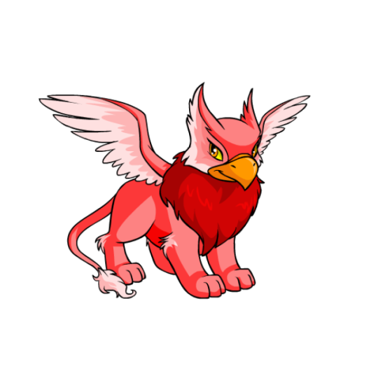
I always thought Eyries were really nice-looking pets. They're basically griffins, but with these really distinct owl-like feathery "ears" on their head that have edge markings dividing the front from the side. It gives them a really nice head shape when combined with the beak, and the overall anatomy is surprisingly realistic (wings are a bit off technically speaking, but that's okay). Like out of all the Neopets, Eyrie are one of a few that you could picture IRL without many changes.
In addition to the head markings, they also sport several lighter areas on their wings and tail, along with a thick fluffy mane that's usually darker but not always (even the base colors don't have this consistent). These break up the body in classic Neopets style and make it easy to read. Their beaks are traditionally orange, which is accented by their eyes so the color is carried through.
Eyries are one of a few species that benefited from customization. Their old art wasn't bad, but the wings were all wrong (they were going backwards against the body lengthwise for some reason, and were halfway down the torso instead of coming out of the mane) and elements like the mane shape and tail position look a lot better. Otherwise, the changes were minimal.
Favorite Colours:
Chocolate: The chocolate Eyrie does everything you want it to do. Whipped cream for the areas with long fur, wafer wings, chocolate swirl ears, white chocolate accents, and some fancy decorative filigree markings. It is completely over-the-top and looks delicious. My only nitpick is that the waver texture is flat, when it should go back in space at an angle and have more of a bend to it.


Darigan: The Darigan Eyrie honestly doesn't event look that different than the regular Eyrie, but it does emphasize how well griffons work as vaguely demonic high-fantasy creatures. While subtle, changes include a different beak shape, more fur, extra-thick wings, a fluffier mane that goes behind the head, and giant claws.
Both the converted and UC/styled versions are fine, though they have their pros and cons. The converted version looks a bit too much like a normal Eyrie due to the change in pose, and the lose of the spearhead tail-tip and subtle feather wing textures is criminal. However, it is much better shaded than the UC version, and it fixes some of the janky anatomy like the weird fold in the wings and the screwed up haunch and foreleg.
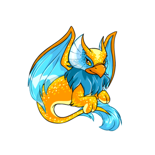
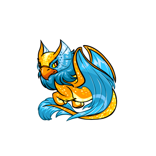
Maraquan: A lot of Maraquan pets nowadays tend to be based off of specific aquatic animals, and while that's fine, I really like it when they just take the base Neopet and adapt it to living underwater in a more abstract way. Such is the case of the Maraquan Eyrie, which has pretty fin-like wings, fins on the head instead of feathers, a swisy, extra furry tail, and a beautiful orange and blue color scheme. Little details, like the speckles and the lighter orange on the underbelly and paws, dd a lot to the design, and the whole thing flows beautifully.
It has a UC/styled version, though the differences are fairly negligible. The UC version has a slightly better pose, high-contrast thick and thin lineart, a wavier mane, and a better head shape. However, the converted version is still pretty spot-on, and it fixes the wing anatomy by putting them on the shoulders where they belong (Neopets artists learn to draw wings challenge) (impossible). In other words, both are great.
27 notes
·
View notes
Text
♠ Knight of Spades - Mari ♠
〈 Protector of Innocence 〉
━━━━━━━━━━━━━━━━━━━━━━━━━━━━━━━

━━━━━━━━━━━━━━━━━━━━━━━━━━━━━━━
Ahhh I finally get to post this :D It was an honor to be able to contribute to the amazing project that is Yuri!!! On Cards from the Yuri!!! On The Web Discord server!
You can see the entire project via this masterpost!
If you'd like more context for this gigantic YOI AU, head over to this blog post for an explanation of everything.
I'd like to give a massive shoutout to @arom-antix and @lines-on-ice for basically putting this all together and making this amazing idea a reality. I know Arrow credits me as one of the admins of this project, but I really only made a Google Drive and did a little research for the artists on how to format their cards haha
I had a ton of fun coming up with Mari's design as the Knight of Spades. I knew right away that I wanted Mari's design to reflect her Japanese heritage since the suit of Spades is a fully Japanese cast.
I've cut me talking about the art itself and my thought process while working on it so I don't nuke your dash, but if you'd like to read my ramblings feel free to
Making Mari a samurai was an easy choice since, one, that's basically what a knight was in Japan (albeit there was no legal binding between a daimyo and his samurai), and, two, I've always HC'd Mari as a protective older sister in the sense she'd be fairly hands off until someone made the mistake of bullying her little Yuuri.
I wanted her armor to be blue since that was the overarching color scheme for Spades, but choosing what blues to use was.. Difficult. There needed to be enough contrast between the different pieces of her armor to show that the armor is made of multiple parts while keeping the hues and brightness values close enough to still look cohesive. I also wanted to keep the blues relatively low saturated to bring our Mari's blonde highlights.
(As I was coloring her armor I realized half way through that I basically drew a Samurott ginjinka oops ( ̄▽ ̄*)ゞ)
I had originally intended for the sarashi (the belt) to be pure white, however when I put all the base colors down I realized the white was too much and pulled your eyes away from Mari's overall form. I knew having the belt be pure blue would make the belt blend in too much with the rest of the armor, so I ended up making the belt mostly blue with white accents as a compromise. I still wish the belt could have been white, but oh well.
As for the katana.. That was originally going to be pure blue, but like the belt problem, I had issues keeping the katana from looking muddied. I ended up trying five different variations of black/dark gray until I settled on what you see above lol. It was really difficult making the hilt of the katana look nice because if I went too dark with the blacks I would lose detail on the hilt, but if I went too light I would lose the contrast with the hilt's blues. As for the saya (scabbard/sheathe) I wanted it to be black, but I ended up matching it to Mari's armor instead because a black saya with a mostly black hilt somehow made the entire katana look flat.
The color palates I used for everything else was just me eyeballing her fleshtone and hair color through various screenshots I ripped directly from the show.
The background gave the the most trouble out of everything though because I'm not particularly great at making interesting, minimalistic backgrounds for my art. The card looked to plain without some sort of variation of color behind Mari, but since her armor was already so complex I needed a background that didn't take away from those complexities and didn't muddy the entire piece. I had originally planned to do a sumi-e type background, however I found that no matter what I did the sumi-e designs took away focus from Mari. Eventually I settled on a default abstract Procreate brush and drew lines until something stuck.
Overall I had a blast making this and also the borders for the rest of the cards! I learned a lot about how to format and prep digital canvases for making a card deck, too lol
#eeeeee im so happy about how this whole project turned out#i hope you all enjoy :>#yoi#yuri on ice#yuri!!! on ice#mari katsuki#katsuki mari#yoi fanart#yuri on ice fanart#yuri on ice!!! fanart#katsuki#digital art#art#my art
79 notes
·
View notes
Text


~Commissions are open!~
It would be absolutely delightful if you distribute this post or even want to support my projects and order something special for yourself;зз In addition, I recently changed prices so this information may be useful even to those who already saw previous price list;***
Below I have described in detail almost all the necessary information, but please do not hesitate to write and ask me for any reason in a private message or ask - it will be my pleasure to tell or show you more, and I am always glad to have pleasant acquaintances***
What can I do for you:
Design and illustration of your original character (based on references or text description)
Your portrait, a portrait of your loved one, a celebrity or a person you like (including historical figures)
A portrait of any artistic character - from any fandom, and although my work is closer to gothic fantasy, it is a great pleasure for me to work with new themes and develop myself. The fandoms I'm most familiar with are listed in tags;з
I like to design clothes on my own, interpret the appearance and style of characters, but I am always very attentive to the interests and desires of other people**
I do portraits in three formats - bust, waist-length and full-length, and with three different stages of completion - line art, flat color and full shadow work. They can be completely different in style, and you should pay close attention to the difference in the execution of these formats - the busts are always more detailed in the character's features, the atmosphere is more consistent in waist-length paintings, and full-length drawings are well suited to demonstrate clothing design or depict a scene.
On average, I complete the work within three to four days, but in case of various circumstances I leave myself up to a week, the lion's share of the time (usually the first day) is occupied by sketch and line art, as well as the background - depending on the complexity and its cost , and the duration of the work can vary greatly, but on average I do them in a day or two.
I can make completely different backgrounds for you - for bust or chest-high portraits, graphics or bokeh with some elements of the environment are more suitable, for full-length portraits, you can perform both art nouveau design and full surroundings with a landscape or interior design.
What can I do and approximate prices:
- Bust of one character up to the chest.
Sketch: $ 40
Flat color: $ 45
Shadows & Color Treatment: $ 50
- Portrait of one or more characters up to the waist.
Sketch: $ 55
Flat color: $ 60
Shadows & Color Treatment: $ 65
For background + 5 $ minimum.
For each new character + 10 $
- Character (or several) in full growth.
Sketch: $ 70
Flat color: $ 75
Shadows & Color Treatment: $ 80
For background + 10 $ minimum.
For each new character + 15 $
I also accept tips - most often they are included in the cost of the background, which is done at the end, after the main character design.
Whoa !! You’ve read almost everything! Thank you very much! Here, under the cut, I describe the whole process of work and how we pay. This is very useful information about most of the questions that you may have, if you want to purchase my work, I advise you to take a look too;)
How do we work on an order?
Please feel free to contact me via Tumblr or mail for any questions you may have! ~ If you have an interest in my work, and you want me to create something special for you - share this with me in a message, we can discuss all the details and cost of your painting**
After I discuss the content of the painting with the client and receive additional materials from him (a photo of the person I am drawing, or references that are close to what is expected of me), I start creating the first sketch.
In accordance with the request, I make a sketch of the future painting, which will contain all its important elements and an approximate color scheme (if any) that I will use. At this stage, you can freely make your amendments, and when the content suits you, I will ask you for an advance payment of half the cost of the work without price of background (through Paypal).
After that, work on the portrait will begin. Its duration varies on several factors - to a greater extent on the volume and complexity of the work itself, as well as on my own workload with other orders. I will contact you at various stages of the work readiness to show its progress and make the necessary corrections.
After completing the portrait, I will send you its version in low quality- you familiarize yourself with it, and after you pay the rest of the amount, you will receive the final result of our work! ~
#the arcana game#dragon age#tes#tarot#nadia satrivana#asra alnazar#julian devorak#silco#portrait#oc#original character#comissions#comission info#dagoth ur#castlevania#arcane#artist from ukraine
433 notes
·
View notes
Note
Your oc pairings doing the tiktok couples paint each other trend? (It's what it sounds like, couples paint each other and film it to show their reactions) (unfortunately I've seen a lot of sad cishet ones where the guy paints his gf or wife really badly, like intentionally, where the gf/wife looks like a monster so I need some actual nice ones to feel better and thought I'd ask about your ocs)
Awww that sounds so cute! (though it really sucks about the sad cishet ones, I don't know why you'd want to paint your partner badly on purpose, that's just mean and awful :( )
I'm just gonna answer this for the couples you know I think, just for simplicity's sake
Rae: Isn't that much of an artist, but she'd do her best. It's not fantastic quality but it's really clear that she tried to get all the details (especially in his eyes because she loves his eyes). I think she'd either just stick to drawing a bust of him just to make sure it's manageable, or would try something ambitious like him with his wings wrapped around her.
Warren: Refined upbringing... I'm sure he's taken some art classes, not to mention his mom liked to paint, so he knows how to paint. He hasn't done it in years so it's a bit of a slow start, but once he finds his rhythm he actually makes something really beautiful. It has Rae crying a little when he shows it to her (but happy tears of course)
Robin: She's more of a music person than a 2D art person, so her solution is to paint a bunch of wiggly stripes in shades of blue and silver and say "it's you at superspeed" - kinda cheating, but it makes Peter laugh.
Peter: Tries his best... that's about all he can say. He tried to paint her singing onstage for Carmen since that's how they met, but it's a little lopsided and goofy since he's not the best painter. It's not intentionally bad, he's just not an art guy, so he and Robin just laugh together when he shows her.
Madison: Would probably opt to sketch him rather than painting him (she's better at sketching, it was one of her hobbies to pass the time out in the woods), and would actually draw a really accurate sketch of Alex. He's very impressed (and it makes him a little embarrassed about his own drawing, honestly)
Alex: Isn't a great artist, so he kinda just stuck to the key details - plus, as we both know, she's kinda hard to draw. Madison thinks it's sweet no matter how it turns out though, he could have drawn a stick figure and she'd still think it was sweet that he tried.
Jasper: Tries to draw the time the two of them kissed across the railing at Jasper's derby bout...
Kyle: Ends up, by total coincidence, drawing the same exact moment, since it's also his favorite kiss that they've had. Jasper's is more cartoony and Kyle's is stuck in that vague zone of "past the anime character stage but not quite the right proportions yet" but they were both so surprised to flip it and reveal the exact same moment that neither of them are really paying attention to the quality of the paintings.
Prometheus and Corinthian: I feel like as dreams they'd probably have some kind of like... photographic art thing? I mean, they are themselves artistic creations, in a way, and they're not exactly human.... I guess what I'm saying is they'd both make realistic paintings of the other, and though they'd both find it sweet they also wouldn't quite understand the point of it... it's more of a human trend, I think.
Indie: Also opts to draw him rather than paint him (maybe with pastels or colored pencils, and she'd play with a fun color scheme), since she already enjoys drawing. It comes out really clean and accurate, and Hux is both impressed and maybe a little overwhelmed because I can't imagine anyone's paid enough attention to draw him before he met Indie.
Hux: I also feel like he knows how to sketch a bit (admittedly this is a headcanon I latched onto from a fic I read, but still), though he's probably rusty since he hasn't drawn since he was a teenager. Indie kinda tries to brush it aside when he shows her, saying he's biased and she definitely doesn't look as nice as what he drew, but he insists that it's how he sees her. I mean, we already knew he's completely smitten for her.
#my friends!!!#answered asks#my ocs#rae mckinney#robin cassidy#madison douglas#jasper wilson#oc prometheus#oc indigo
4 notes
·
View notes
Text
So. What's the deal with Malroth's human form in Dragon Quest Builders 2?
AKA "but why does he look like that?" (Spoilers ahead for Dragon Quest Builders 2 and Demon Lord Dante.)
If you're a fan of Dragon Quest Builders 2, or otherwise know a little bit about its lore and cast, you probably know what Malroth looks like in his human form. And if you also know what he looks like in his original, monster form, you might be kind of puzzled by the design they chose to give him. If you're not - well, first of all, fair, but here's a quick comparison image to show you what I mean:

It's not that Malroth's human form is a bad design or anything, and it does have a few neat callbacks to his monster form - most notably, the color scheme, and his bone necklace in place of the original giant skull necklace. But apart from those admittedly minor details? The two really look nothing alike. Original Flavor Malroth looks like Ray Harryhausen's Kraken with extra features and a different face, while Human Malroth looks like nothing so much as the average Japanese concept of a demon, with his oddest features being pointy ears, a pair of hair antennae stylized to look like horns, and red eyes that his original form notably does not share.
If I didn't know these two guys were the same character, I never would have guessed. Your average white twink Tumblr humanization has more in common with the source material than this guy does. And that had been bugging me for a while - again, not because it's bad, but because why? What was going on in the character designer's mind that led to these choices, in particular? It was a mystery I had no idea how to solve.
Luckily, that's no longer an issue. Due to a turn of events that involved the original Devilman manga being misfiled as yaoi on a manga site, I am pretty sure I know exactly what is going on with Malroth's design, and am prepared to explain it with attached evidence. But in order to do that, we're going to have to hop in this little time machine and go all the way back to the far-flung past of 1971.
Part 1: Nagai Go and Demon Lord Dante
For those who are unfamiliar, Nagai Go is the artist and illustrator behind the original Devilman manga. If you know what that is, great, but if not, it doesn't particularly matter - we're not here for Devilman. We're actually here for its predecessor, the equally weird (and unfortunately incomplete) Demon Lord Dante, also known as Mao (or Maou) Dante.
The premise of Demon Lord Dante is similar to that of Devilman - an ordinary human fuses with a demon, gaining supernatural powers and the ability to transform into a demonic form, while retaining his human consciousness and morality. Unlike Devilman, however, who mostly looks like a funky dude or perhaps a Batman-themed stripper, Dante - as Ryo's demon form is known - is a building-sized amalgamation of man, bat, and beast. And, pertinently to this topic, his face looks like this:

If you haven't already noticed the resemblance, go up and take a look at that picture of Malroth again, then scroll on back here. Yes, they have the exact same face, and if you were wondering if that's a coincidence - not remotely. Toriyama Akira's monster designs for Dragon Quest, particularly in the 'demon lord' character category, draw a lot from Nagai Go's artwork - you can see a lot of the details he likes to use for his demon lords in the original Devilman manga, for instance.
Now, while this tells us a little bit about where Malroth originally came from, it's still just setup for the main event. And for that, we'll have to jump ahead to 2002, where the tragically cancelled (and honestly kind of dodgy) manga finally got the adaptation that it, and its main character, deserved.
The anime of Demon Lord Dante starts off basically the same as the manga (albeit with far fewer plothole-inducing timeskips). The protagonist, Ryo, keeps having dreams where he sees (and sometimes is) the demon Dante, escalating in him finding the demon in question, setting him free from his frosty prison in the Himalayas, and immediately getting vored. Next thing he knows, he's been summoned back to Japan by the Satanic cult who's been trying to bring Dante back for ages, only now he's taken over Dante's body and is himself a monstrous hairy colossus. He goes on a confused rampage, and then I run out of manga so I can't really tell you what originally happened next.
In the show, though, another demon explains what's happened to him, and he eventually figures out how to use Dante's powers to regain human form and return to his home. This kicks off a storyline in which he tries very hard not to be a demon, because Angst Angst Angst, while fending off multiple demons whose voices he keeps hearing in his head insisting that he is totally the really real Dante, he just needs to "regain his memories" to supercede the personality of Ryo and get back on track with the whole monstrous rampage thing.
Hopefully this is all starting to sound familiar.
Now, there are pretty big differences between the plots of Dragon Quest Builders 2 and Demon Lord Dante. I won't go into them, because they're pretty major spoilers and aren't really relevant to this topic, but it definitely isn't 1:1. However, there are also some striking similarities, what with the exploration of who is really good or evil, themes of religious violence and exploitation, and so forth. There is also a very cute plane in one episode, which I have to show you not because it's cute, but because... well. See for yourself:
It's not exactly the Buggy Buggy, but it is an adorable animal-shaped flying vehicle, armed to the teeth and ready to fight G*d. I'm not kidding, that's what they use it for. Hopefully they don't keep pushing the wrong button and accidentally shooting beams when they meant to descend.
Anyway, I've been building to a point here, and it's finally time to bring it all together. Because while Ryo spends a little bit of time in his gigantic monster form, and a lot more looking like a normal human, there are points in the show where he needs to demon out without turning into an entire skyscraper, and when that happens, he looks like, well This.

Beefy pecs, pointy ears, fluffy hair, and of course, horns.
It's not exactly Human Malroth, of course. The most obvious difference is that, well, this guy isn't terribly human-looking - he's got wings, furry beast legs, and other assorted features. He also isn't as tan as this screenshot would seem to imply; his skin simply looks darker because, like most of the scenes this form appears in, the ambient light levels are pretty poor. (This particular shot was taken at night.)
But it is a lot closer. Like, weirdly closer. Check out the curve of the horns, which is mirrored in Human Malroth's hair antennae despite appearing nowhere on OG Malroth himself. And while this screenshot doesn't show it very well, his eyes in this form are red, like Human Malroth's.
So... yeah. I won't say there's no possibility of my being wrong, because it's impossible to know 100% of what goes into a game's creative decisions, but it looks like Dragon Quest Builders 2 drew a good chunk of inspiration from Demon Lord Dante - including the design for Malroth's human form.
65 notes
·
View notes
Text
Bellmore and Babylon Professional Interior Painting Services Will Upgrade Your House

Bellmore and Babylon Professional Interior Painting Services Will Upgrade Your House
First of all,
Few things have the ability to change your living areas with such dramatic effect as a fresh coat of paint. The professionals at All Pro Painting Co. are ready to offer you first-rate interior painting services that will revitalize your home, whether you live in the quaint neighborhood of Babylon or the gorgeous town of Bellmore. Our talented crew of interior painters is committed to realizing your vision and providing a smooth, fashionable makeover that will astound you.
Painting Interiors: Crafting Beautiful Works of Art in Bellmore
Our interior painters in Bellmore are your go-to people if you want to redesign the interior design of your house. Every homeowner has a different vision for their living areas, and our skilled experts are good at turning your concepts into exquisitely rendered realities. From choosing the ideal color scheme to applying the newest painting techniques, we make sure your house expresses your individuality and sense of style.
Revealing the Allure: Babylon Interior Painting Services
Our interior painting services are a monument to exquisite craftsmanship and meticulous attention to detail right in the middle of Babylon. Our crew carefully preps your surfaces and applies paint with accuracy, whether you're going for a modern or cozy look. Our commitment to excellence guarantees that your walls will not only have an exquisite appearance but also endure throughout time.
The Differentiation of All Pro Painting Co.: Excellence in Each Stroke
At All Pro Painting Co., we take great satisfaction in our dedication to quality work. Our interior painters are artists who take delight in their work, not just craftspeople. We turn your rooms into unique works of art that perfectly combine beauty and usefulness because we have an exceptional eye for detail and a passion for perfection.
Enhance Your Area: Transform It From Boring to Stunning with All Pro Painting Co.
Is it time for a makeover of your home? Our Bellmore and Babylon interior painting services are intended to turn your place from drab to gorgeous. Our talented painters employ their skills to turn your vision into an amazing reality, whether you're trying to create a calm haven for oneself or an engaging ambiance for guests.
Experience Counts: Put Your Trust in Bellmore's Top Interior Painters
Experience counts when it comes to improving the interior appearance of your house. With years of experience serving the Bellmore and Babylon neighborhoods, All Pro Painting Co. Our reputation for producing outstanding outcomes speaks for itself, making us the go-to option for homeowners looking for dependable and superior interior painting services.
To sum up
The best is what your home deserves, and All Pro Painting Co. is here to deliver it. Our interior painters in Bellmore and Babylon are ready to breathe new life into your interior spaces since they have a passion for artistic expression and a dedication to providing unmatched outcomes. A world of brilliant color and beauty awaits you when you bid drab walls farewell. To begin your journey of transformation with All Pro Painting Co., get in touch with us immediately at https://www.allpropaintingco.com/.
📍 : 575 Hempstead Turnpike, West Hempstead, NY 11552
📞 : (516) 481-2787
2 notes
·
View notes
Text
As a companion post, i also redid my least favourite Gwent card art into a top 20, though i daresay a lot of the technical complaints are universal. I'll try not to be too mean.
Also under the cut.
My (but i am objectively correct) top 20 least favourite Gwent card arts:
They can't all be precious...
There's a certain amount of "why is she naked" or "why is she dead" or "why is she dead and naked" kinda art, but then Karol Bem rolled up and somehow made the card pool so much worse. At least Whoreson Jr. is technically impressive.
20: Ciaran aep Easnillen by Bryan Sola
...however i'm still allowed to not like it when my blorbos suffer on their card arts. Bryan is a great artist and i'm sure he didn't mean malice, unfortunately this is Ciaran's most memorable (read: literally only) scene. This is mostly personal bias.
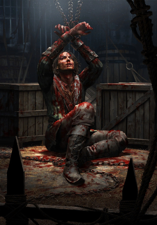
19: Milva by Bartłomiej Gaweł
To be nice! I like the tiled floor, that's a nice level of detail. I like her practical outfit in the spirit of the old minigame art, too. Heck, even the tragic irony of the scene wouldn't be so bad - she clearly shot before getting shot... If only this wasn't Milva's only card art for years and if she wasn't a well-explored book character with plenty of scenes to choose from. It could've been way worse too i guess.
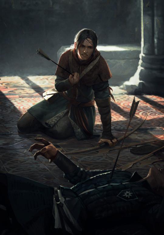
18: Chapter of Wizards by Maciej Łaszkiewicz
Listen. Maciej is a cool artist with a very distinct, also quite "classical painting" style. I like a lot of his pieces from the last card sets. But. Whose idea was to solve the question of representing a historically changing organization with a statue of its founders? Furthermore, who thought people are gonna be blown away by the in-game avatar this inevitably spawned? :D It's just funny more than anything. I guess I can appreciate the Lord of the Rings reference.

17: Mammuna, also by Maciej Łaszkiewicz
This one is unfortunately not that funny. I'm not sure i can explain it; it's a Monsters card, offputting things are the name of the game. This is one of the artworks that definitely, or probably, fall under completely personal reactions, or at least i never heard loud complaints about it the same way say Coup de Grâce is widely considered one of the best Nilfgaard card arts. Maybe i don't like how the character design seems a bit random, maybe i'm tired of the tired witch=hooked nose trope, maybe it's the color scheme and weirdly unpleasant looking textures. I guess it's just very much not for me.
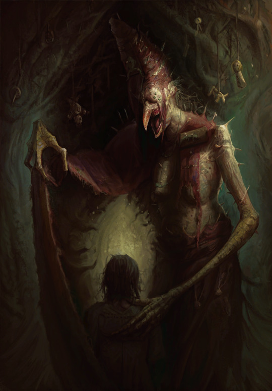
16: Selfeater by Alicja Użarowska
Similar case as previously. I don't even mind a lot of gross art - the infamous Parasite (the parallels now that bg3 is out lol) isn't on this list - and the Monsters faction is there to go crazy with this type of stuff. And yet, i can't stand this little abomination, and neither can most of the Gwent playerbase. It's not even the toe-in-mouth that really makes it bad, at least for me it's the texture and stretching of its skin. It simultaneously looks like it's melting and about to tear apart. Just an overall no thanks.

15: Miner by Christof Grobelski
Christof is my new, excuse the zoomer language, pogchamp, because i think he is severely underrated given the crazy impressive lengths he went into with card art like Vivaldi Bank and even Phooca, and Miner isn't really bad. Unfortunately, fear of depths.

14: Doppler by Bartłomiej Gaweł
Bartłomiej loves himself some dirt and mud and wet beast wednesday, and i can appreciate that. But this one isn't it. The palette, the scene. This, beside Dudu's card art, is the only way dopplers are represented in the game, and that's a shame. Leave the poor soul alone :(.
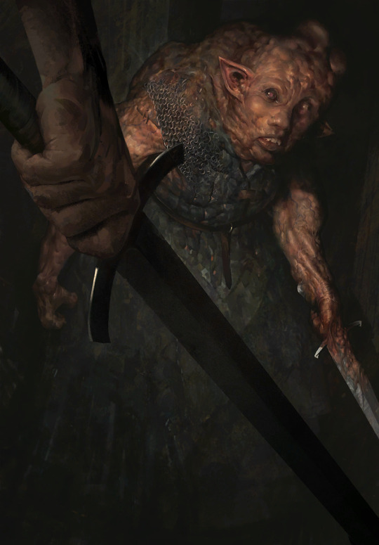
13: Brehen by Oleksandr Kozachenko
I'm sorry to say, this is the weakest Way of the Witcher art. I appreciate it's the one scene everyone knows Brehen for, but why must he look like the village lowlife parents tell you not to talk to? I mean, not that Brehen could be trusted with kids. He's despicable, but that doesn't need to be communicated by making him look unappealing. On the other hand, wouldn't his personality have more impact if he was comparatively good looking? Or maybe i'm a shallow bitch who'd rather some eye candy... To give some credit to the character design though, the fact the lady is wearing the opposite of revealing clothes is a welcome refreshment. And i quite like the shading on her clothes too.
12: War Chariot by Grafit Studio
There are a couple of more fairytale-like, bright and whimsical card arts, and there are arts with smoother, almost glossy textures, neither is really my issue with this. What rubs me the wrong way is the scene itself. It comes off as showing the elves as something grotesque, the butt of a joke, and, sure, this is a Northern Realms card, but it still feels... unserious in the wrong way. Admittedly i am biased.
11: Toad Prince by Marek Madej
It's again a matter of personal taste in the Monsters faction, because in essence, everything i don't like about it can really be justified by having the red faction sticker. But he still looks like a formless mass of vaguely green snot to me. And his comparably thin little arms look like he's wearing long sleeves that also got covered in green snot. Which, admittedly, was the case for the whole sewer in Hearts of Stone, so who am i to complain. It's far from the worst, maybe it shouldn't be this high on the list, at least this piece mostly fades into obscurity and Marek is an actually skilled artist. I'm saying this because Bem's time draws near.
10: Vilgefortz by Nemanja Stankovic
Full personal bias. Technically very much fine between the different textures, little drama in the lighting and fire particles borrowed from Bryan Sola. Look at the crazed look in Vilgefortz's face, lore accurate. Then look at the gloves of the guy he's melting into paste. And then suffer with me.
9: King Radovid V by Nemanja Stankovic and Radovid: Judgment by Valeriy Vegera
Ok, this is a special case. I'm lumping them together because my issue with them is the same; their metatext. CDPR has a very obvious boner for Radko and despite writing him to be a complete cringefail idiot, they keep pretending like he's the coolest mf this side of Yaruga. If they actually allowed him to be the 17yo grooming victim he is with some nuance and without the thinly veiled nationalism projected onto the worst possible candidate with no self-reflection, i'd hate his ass (at leas the Gwent one) a lot less. Also the second art is the stupidest decision in the last card drop. Calanthe died for this. Literally.
8: Saov Ainmhi'dh by Ivan Vilmant
Price of Power's infamous outsourcing of card art led to this unfortunate letdown. The artist tried! You can tell. But, in a spark of bitter irony, the spectral deer ended up looking as plastic as the Hobbit movies it references.

7: Temple of Melitele by Karol Bem
This should be higher and would be if i didn't have to go through some more "please don't do this, good artist". But trust, this is one of Karol's worst crimes against good card art. From afar it looks alright! Cute piece with maybe even a bit of an old postcard vibe. Then you look closer and it falls apart completely. From the top; some roofs have texture, some don't. Some windows and arches don't line up or have ever so slightly off perspective. In places that are unexplainably sharper or blurrier than others, it's apparent Karol used extra assets. And on the very left, the foliage just sort of blends in until it disappears, because Karol doesn't understand depth. As a cherry on top, check out the little wooden bridge making no sense. The more and closer one looks, the more of a mess it is. Karol, you bloody hack.
6: Savvy Huckster by Siarhei Hlushakou
This one, surprisingly enough, is more bearable upon closer inspection, but something about it used to absolutely grate my nerves when i still played or watched the game somewhat regularly. I don't know if it's the odd use of its color palette, the kind of obsolete idea of a card to begin with or the weird rocks on the tray unpleasantly standing out, or all of the above, but i can't stand looking at it for too long. But again. At least the artist actually painted something. Right, Karol?

5: Kerack Cutthroat by Valeriy Vegera
Technically alright, if only too dark and washed up. Then again, the scene itself is tired too. The "why is she naked and dying?"
And actually, taking the premium into account, why must she be getting stabbed over and over infinitely? Y'all didn't think this one through, did you. I'm sorry Valeriy, i still love your art, but this one really wasn't it on pretty much any front. But, even for this one, like every other legitimate artist on this list, you get the honorary "not a hack" badge.

4: Saint Gregory and Rosa and Edna var Attre by Karol Bem
These two don't necessarily have all the same issues, but i guess there isn't enough slots in the universe to describe Karol's astonishingly low levels of competence.
St. Gregory suffers from Karol's lack of depth understanding, but moreso it's a good example of that thing he does where he applies atrocious amounts of noise or grain onto everything. Enlarge and look at the area of and around the center left guy in the forefront. I'm also really not a fan of the magic fire glow this thing has.
Rosa and Edna deserved so much better. To get the carelessness out of the way, check out Rosa's thumb in the foreground. What. Both their faces are inhumanly smooth, someone said they might be 3D models painted over and i wouldn't be surprised. Even in such a detail as the texture of the wooden sword you can kind of tell Karol relies on outsourced assets and thelike a lot; he doesn't have that much of a personal style (other than the awful grain) so when a unique texture shows up, it's probably safe to assume he pasted it in. To top it all off, the lighting of this piece is atrocious.


3: Yaga by Bogdan Rezunenko and Lesser Witch by Karol Bem
Fatphobia. Just don't. That's to Bogdan. You, Karol, quit trying to fit in with the cooler kids, and by that i mean you should've long since quit making Gwent art by the time this unfortunately saw the light of day.
I did promise i'll try not to be too mean, but there really isn't much to say about these two. Bogdan is a capable artist who should maybe check his biases or maybe just think about whether the way too estabilished visual shorthands for evil are faulty (they are). Karol Bem wouldn't know believable illusion of perspective and good texturing if they smacked him across the face.

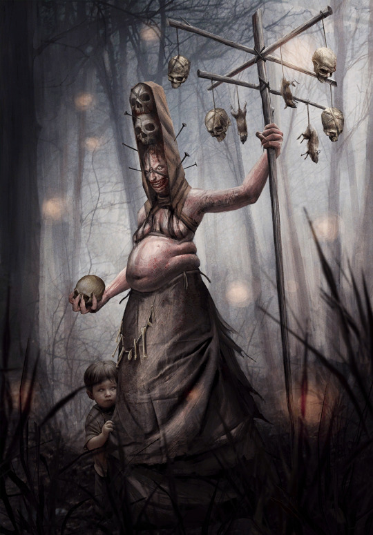
2: Artaud Terranova by Katarzyna Bekus
Molegion actually tried to explain this one to me. And, sure, having terrible characters with terrible traits represented by doing terrible things is fine on paper. For once we got a book scene, too (god why are most of the book scenes in Gwent all the painful stuff), that's cool. Making the canon pedo fat, i think less so. It's otherwise technically a good artwork with merits, i like Ciri's hair, the textures in the columns and the color palette. The pose, as much as i hate it, makes anatomical sense (this will become relevant in a short bit). But i can't get over how in the premium Ciri has to wriggle around waiting for Geralt who just won't show up.
In the end, did Terranova have to exist in Gwent at all? Since this was in the Thanedd drop, why not a Nilfgaard Isengrim card? That would've been cool. He actually has a few usable book scenes.
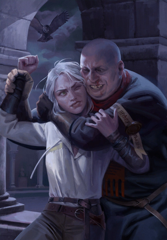
"Honorable" mention: Little Bird by Karol Bem
Karol's worst tendencies: the card. A pile of assets, none of which are fitted, or in the case of the stuff hanging from the ceiling, even cropped well. Misunderstanding of depth, the hanging herbs are blurry but the guys under them are sharp, the items in the foreground are blurry again but way too much. Strands of the girl's hair straight up cut off in the middle and then resume again. And, of course, a noise effect to try to cover it all up. I swear to god Karol.
1: Vereena by, of course, Karol Bem
I hate to hate it. Because it could've been another book-adjacent scene and the color scheme is actually a rare moment of brightness for Karol, because usually, Vereena is put in colder tones. But unfortunately, he bungled this one in a whole new kind of spectacular fashion.
The leg. The leg is very obviously, undeniably, comically, anatomically...incorrect. The rest of her isn't very good either, the front hand looks awkward, her neck and shoulders aren't properly built. The foot is too small. Even the hair is made in a way that makes it look like a weirdly solid mass. The drapery doesn't make sense in the waist area.
On a vibe or depicted scene level, there are probably pieces i loathe more than this one, but as an artist and a person with legs, the painfully obvious anatomy issue of this one earns it the title of worst Gwent art in my book.
Karol Bem is a hack, which is why this happened at all. I'm willing to believe he's not a malicious person either, but he should probably stop seeking work in a field he clearly has to fake his way through. Perhaps he'd make a better graphic designer?

To add something more positive at the end of this list as a whole, Gwent has a card pool of, i believe, a little over a thousand and a couple hundred, and the strong majority of it are incredibly stunning works of art. The overall quality is of its own kind, and it's much easier to choose 20 amazing and impactful pieces than find 20 that are bad enough to be ripped apart online. The existence of premiums is cool, but the static art on its own is some of the best modern fantasy art to be found. That's really heckin cool for an obscure game set in a relatively obscure universe.
#shut up elis#the witcher#gwent: the witcher card game#bem gave me a tummy ache it's nearly 4am and i'm about to peace out#read peace as pass btw#(im fine)
3 notes
·
View notes
Text
I'm Obsessed with the Immortal Thor 7 cover art
This cover is so detailed and just gorgeous. The covers for this series have really all been full of details, but I want to talk about this one because of all of its connections to the myths (and also previous issues).
Spoilers for The Immortal Thor.
Let's start where I always like to start, with Loki. He is buried under food, which (obviously, after reading) references his first trial of trying to eat faster than fire, called Logi both in the comic and the myth. I just love how so many characters in this myth are named versions of Loki's name (Logi, Utgard-Loki; Lukki was originally Hugi in the myth, as Loki says later), and I had hoped we would get an explanation in the mythology of why that is, but we never really do. (If anyone has seen an explanation, please let me know; I'm intrigued to hear about both contemporary analytical explanations or if an older source has an answer.)
Thor wrestling this weird, green cat. I love all of this. His tail is actually the head of a snake, complete with cute little hissy tongue. His back and tail have orange and black tiger-like stripes, but the pattern changes on his hind leg to a scaly look. The more you look at his cat face, the more you see Jormungandr's true face beneath! I love this. I love Jormungandr.
Okay, this isn't specific to the cover, but I just noticed Utgard-Loki's bone horns are shaped the same as Loki's helm. Also he's not on fire on the cover. Maybe that's to keep with the cool color scheme, but I think he looks way more metal when he's aflame.
Which brings us to these dice Utgard-Loki is rolling. They are certainly dice, but clearly only one side is marked. Why did Alex Ross (the cover artist) decide to only illustrate one side of each die? Artistically, I think probably to draw attention to these sides of the dice; if all visible sides were marked, there would be too many details with no obvious side to draw the eye. Thematically, Utgard-Loki has rigged all of these trials; the dice are meant to fall only on these sides. And each marked side has a different set of 3 runes, one of which we've seen already in this series: Raidho, which corresponds to the letter R. Interestingly, also on this same die is Thurisaz, which corresponds to Th (thank you, very difficult poetic theme choice for issue 3). So what I'm hearing you say is, hey, so is that middle rune Othala (because of course, you read that post)? Nope! However, it does represent a different sound for O (I think the long o ('oh'), because the name for the letter is Óss or "god" aka Odin, at least according to Wikipedia), so perhaps it still spells 'Thor.' Which would be BRILLIANT, because guess what the other die spells?! Lögr--kaun--íss, or LKI, LOKI. And thank god (heh) for that, because I was ready to go full analysis on the symbolism for what these runes represent, but we can safely go with Occam's Razor on this one. (Of course, I did do this with the issue 3 poem, so it's certainly something you can do, I just doubt that was the intended vision when Ross created the puzzle.) (And I am a little pissed I used Othala instead of óss/ansuz, because I could've done some great things with the symbolism. All well.)
#loki#loki comics#marvel comics#the immortal thor spoilers#the immortal thor#the immortal thor 7#the immortal thor cover art#al ewing comics
4 notes
·
View notes
Text
Level: “SERENITY” by irrene, TkcpeR, shman, skyeeuwu, @redlionlol, @arekushi14, @itzabunnyy, @neohhhh, Toothpeck, oneill4, rosekawa, @redoneburgz, xHeiDax, Kutsu, CHEFLIZ and @deactivelol (Hard Demon 10 ★?)
Finally, here's the "showcase" I was talking about!
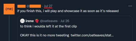


So back in July, I saw someone on Twitter post a preview to a level they were working on. And I promised if they finished building it, I would write a level review about it. Well, here's a lesson: never propose a bet that you cannot win.
(continue under the cut)
Because irene banged this out as a megacollab in a matter of months! And if I wasn't mistaken by the first preview, the level looked potentially extreme-demon difficulty. Thankfully, the gameplay was nerfed since then, so 2,445 attempts later, I can now review the gameplay and deco in full detail!
First, we have to address the elephant in the room: the song is "왜? (Why?)" by Mid-Air Thief, who is a REALLY good music artist. It's unusual for Geometry Dash levels to use songs like these, but in this level it works amazingly well. However, the song is NONG, which stands for “not on Newgrounds”, meaning you have to download the song.

What's interesting is this level was hosted ENTIRELY on twitter. Everyone who built a part in this level is close friends with irene, and some interact exclusively in gdtwt. As a consequence, they have little presence in the wider community (I struggled to find their GD usernames for this post like I would normally do).
The color scheme is sky-blue and white, and the level constantly employs "cloud" and "flower" motifs, which make for a unique atmosphere. A similar level is "moment" by icedcave, Stormfly, and lexycat (coincidentally, lexycat also built a part in this level). My favorite part is at 27%, where cloud decorations are turned into solid obstacles that you have to weave between. This just so happens to be irene’s part, and was the part I saw in the first preview.
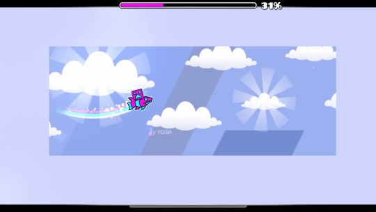
As the speed changes throughout the level, the player is thrust into clouds of smoke or flowers, in line with the intensity of the song. This makes some parts of the level difficult, especially in the middle—one of the hardest parts for me was 73%, where the player is hidden behind a cloud made of player colors, and you have to dodge spiked structures that look hazy and blurry.

The theme and difficulty juxtapose each other: on the one hand the level appears bliss and heavenly, while on the other it clearly looks challenging and feels restless. Finally, the endscreen at the end says "SERENITY" in Korean characters that look very similar to their respective English letters, which may reference how the music artist is Korean. Great job to everyone who worked on this megacollab!

24 notes
·
View notes
Note
hi i love love ur designs ive been following u for probably years now n theyre so good i can and do stare at them for minutes. i picked up drawing early last year n rly enjoy designing characters n i was just wondering if there was anything u did to improve at picking color palettes or if it just naturally happened from designing so many characters. also where do u find inspiration for the outfits ur art is so cool<3
Thank you very much i'm always flattered when people enjoy my designs. Please take everything I say with a grain of salt, ive never been trained formally in designing characters or anything like that and i'm a fully self taught artist for digital art.
I would have to say, a good key part of designs is not JUST in color palettes but in contrast and hue values [darks and lights]
i would suggest you can work on contrast and your values, by working with monochrome palettes of any color of your choosing- working from light and dark from there
Also a lot of color palettes, ill be honest its kind of a hack, its like, complementary/contrasting colors often together either be it in equal terms or using one main color and then using its complementary color for 'accents'. Smaller details to pop. I like to make sure accent colors have more than just one tie into the design so it feels like it fits into the design. Like imagine a wholly green outfit in different shades of green with ONLY a bold red lip. that looks tacky, it would need more accents of red to tie in to balance the design
or analogous color schemes like Pink and Yellow with some orange, or my favorite is "Peacock" Green, Blue and Purple i love those colors together so much and im sure many notice it with the frequency i like to utilize those colors
While working with colors i like to hide my lineart layer to check and see if colors are distinct and readable without just the lineart as well
A lot in designing also has to do with your own style, ive grown and adapted a more simple style and so my clothes are typically more on the simple style but i try to make a good silhoutte shape with them, silhoutte is a great part of character design too but when youre just starting out I don't think it's that highly important.
Of course, references. I enjoy looking through a lot of fashion of many different time periods, i love hanboks, i love hanfus, i love medieval headpieces, i love punk and the best part is you can just make a combination of multiple different facets of a piece and stitch them together to work out .
11 notes
·
View notes
Note


[trigger warning for passing mentions of murder... does that count as heavy content?]
could you review the design of my ace attorney ocs?
valerie n. toine used to be a rather successful defense attorney (look on the left with the sweater vest), but after losing a case while trying to defend her fiance who goes on to die in prison, she grows cold and bitter. she becomes a prosecutor (look on the right) and plots her revenge against the man who she deems responsible, which of course in the ace attorney universe means trying to murder someone and falsifying evidence while prosecuting the case. i really wanted her to look sort of romantic and lovecore-y overall, as love is a pretty big part of her story, but obviously she has to look well-put-together and somewhat imposing as well. and i wanted her younger self to look, well, younger and more sweet/care-free.
the second one is a bit of a self insert (and doesnt have a proper reference yet), his name is jack tryles, hes a law student who acts as phoenix wrights co-counsel for a while and who val ends up stabbing in an alleyway lol. he survives though, dont worry. being a self insert his design is kind of whatever i think looks cool than anything too based on his character/story, so id appreciate critique on more of a purely visual standpoint for him.
[Again mentioning that I'm not able to comment on anything regarding the Canon text here, as I'm not familiar with the ace attorney games beyond a pretty surface level]
Valerie N. Toine:
Lemme just say I'm very much enjoying the outfit design here, having her be lovecore aesthetically while her main conflict focuses on, ykno, love, is very cool! The fact that she has an engagement(?)/wedding ring in the Before version, while in the After version it's some other nondescript ring? Mwah. Also I just wanna say, the heart shaped buttons on the jacket, in the After version, wonderful detail. Though this all did make me wonder, what if the After version was more themed around like, heartbreak and grim lovecore instead of the positive kind? Not a criticism by any means, just my suggestion for if you wanted to make the change more dramatic (maybe like adding more black, deep red and wine colors, stuff like that). Depends on if you want a more artistic or realistic impression I think! However the After outfit (hair included!) is very good as is :] also I love how, in the small headshot, her hair is in a heart shaped bun.. Mwah. Again.
In my opinion the design has a good balance with not being too simple and not too complex, and despite what I said about the color scheme earlier I think you did great with darkening the colors on the After outfit, while still keeping energy from the first one. The lessening of white is a nice subtle touch, also, great color planning on your part for making the boots (2nd vers) the same color as her bell bottoms (1st vers)! Just a very cohesive well coordinated color scheme across both iterations. The glasses and the bow staying despite everything keeps a good bit of consistency.
I think you succeeded in having her look like someone to not be taken lightly (2nd vers. Obviously), she definitely looks very formal compared to the first version. More.. Angular, ykno? Mostly thanks to the clothes. I feel like maybe I'd also add something to her Person as well, to signify the change? Due to the art style ofc I can't know if you intended her younger self to look physically younger and springier (this is a reference drawing so I'm not judging that at all), but if not I highly encourage that!
Well put together - absolutely!
Imposing - hmm? I'm not saying she doesn't necessarily look imposing - she very well could depending on how she'd be portrayed visually but mostly, from comparing the two versions I moreso get a sense of "Professionalism vs. Chill and casual", and Mature vs. Carefree, ykno? The sharp shapes in her hair do well to further the more serious and imposing image but I feel like there could be a slight bit more, if you want her to look more intimidating. Unfortunately I'm not sure if I can quite put my finger on it. My overall opinion is that the design is Good, it works, it's cohesive, and I really can't reasonably come up with anything I'd seriously think should be changed. For a very subjective personal take, in my taste, I'd probably make it even more - dramatic, cartoony? Exaggerated?? But, that is all up to how you want to portray her. I personally like to get super into designing something unless I'm intending them to look plain or "normal" (human terms), however take this from someone who primarily does surreal or fantasy (and nonhuman) designs, haha. Really, I think this is great, skilled visual design and honestly I wouldn't say I'm extremely good at outfit design myself so, while adjustments or flavor details could be added - she totally doesn't need them! I honestly could've gone on more about the small details that change between the two versions but I'll just cap this off with saying Great work!
Jack Tryles (Can I just say that last name is so tasty in my mouth. Also is it a.. Pun? Like "trials"??)
Definitely a bit more visually busy, and although it could give off a more messy or chaotic impression I kinda like it. If we compare him to Valerie, she really does come off as very put together and composed. Not that he doesn't, though! Just by comparison.
The fullbody outfit has a fun combination of shapes that give it a good amount of visual variance. There is slight asymmetry with the positioning of the pins and other accessories but he still keeps a fairly professional image - just one that's lots more personalised and customised than Valerie.
I would say, maybe the jacket could also have pinstripes like the pants? I find it a small bit inconsistent with only one of them being pure black. It's not a huge deal to me though, and I'm moreso tilting my head at it than finding it a downside. Just makes it seem that the pants and jacket aren't a part of the same set, if you get me? Though that could also work to establish personality more, like many of the other personalized touches. I think for this design, he has just the right amount of accessories! Not too many not too little. I also love that the soles of the shoes are green! The color scheme is minimal, definitely more reserved, but imo it works for what it's trying to be - which is, I assume, a work outfit.
For me personally I think I might wanna break up the large areas of black, it's just on the cusp of being a bit too much of the same color next to each other but you can again take this as a personal comment. It's just what I think would make it more visually appealing, though I do like black! Maybe you could add a lighter tone of green somewhere?
Still, it works, it's interesting enough to look at, can't find much I'd complain about. Although I think the color planning on Valerie is a bit more engaging since there's more variety of different looking things (like with patterns for example) that still fit together. Still, no complaints as I said. I'm also not sure how much I'd feel appropriate commenting on him considering - self insert, which is meant to moreso reflect on you. I will say, they do look like they fit well into the same story so, good work all around in designing them both together :]
#Oc review#Character design#Character design review#Ask#I hope the commentary was fine!#I'm nervous if it's a bit. Saying alot but not much#Since non fantasy human designs tend to not be my area#By that I mean I've only recently gotten all into that#Maybe I'm just worrying alot since. (glances at my exhaustion lately) so ykno#Enjoy nonetheless!#I honestly couldn't think of that much to critique nor change suggestions on these! You did good!
17 notes
·
View notes
Last Seen Blogs
lilveeblog
lil vee
undergroundmadnessmj
Underground Madness
alizera62quartz
@Alizera62
euphor-1-a
sora
vegetasleftsock
Simp Of A Sock