#gradient play button
Text
Me, trying to continue my RF2 replay on my day off, only for my controller to not cooperate-

It's a 1st run Xbox One controller, so this thing is old and, well, abused. And today, good lord, it showed its age.
Thank goodness I have a spare. But uh. Time to buy a spare for the spare
#Margot talks about Nothing#all I wanted to do was make sure all my hotkeys worked and drift and double clicking and stiffness galore#Trying to reset controls and hot keys on Desmume was... futile#Two cats tore apart my computer desk the other day and I think the fall this controller took was the end#I love those cats but GIIIIIRLS WHY#The old controller was a beautiful blue-black gradient with cyan buttons it deserved so much better#Now I'm using a red+white controller I call the Red Dead Controller [guess what I played when I bought it]#they destroy this I'll have two tiny fur coats
2 notes
·
View notes
Text
Support me on Patreon or send a tip on Kofi!
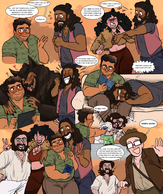
One day in January I thought, "wouldn't it be hilarious if there was an episode where the camera crew changes places with a crew filming a documentary on werewolves in california. and everyone is playing a werewolf counterpart version of their character?" And it all devolved from there. Ty to @vampireshmampire and @memosminifridge for riffing with me and coming up with hilarious ideas <3
(ID in alt and under cut)
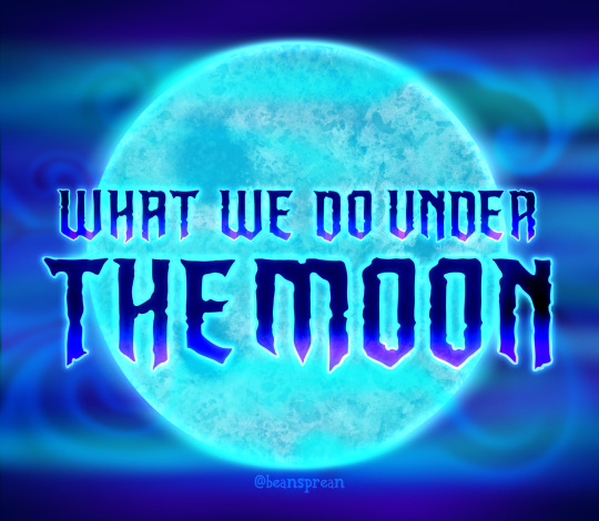
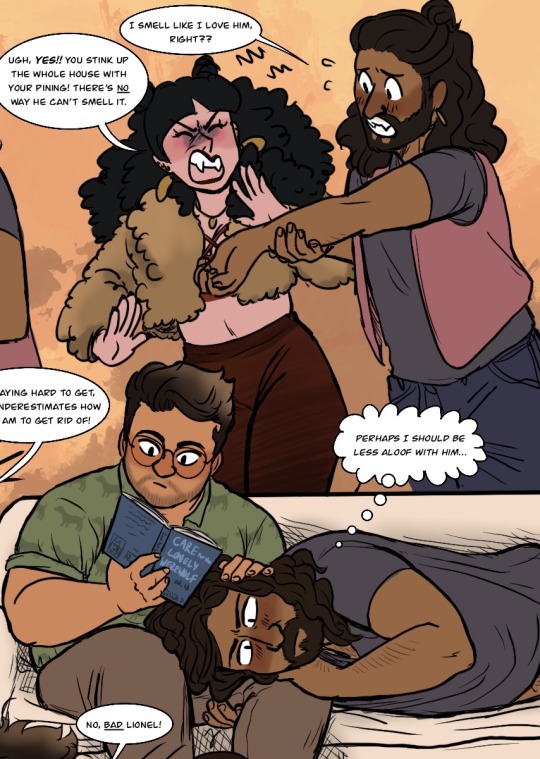
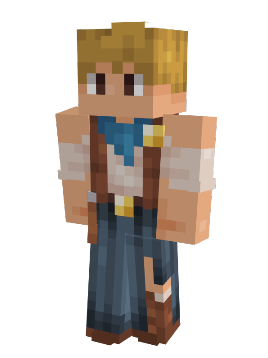
ID: 1. Title card, close up on a full moon glowing blue, surrounded by swirls of fog and bands of purple, blue, and green light. Overlaid is tht title "What We Do Under The Moon" in the What We Do In The Shadows font, letters dark blue with a brighter blue to purple gradient at the bottom, backlit in white.
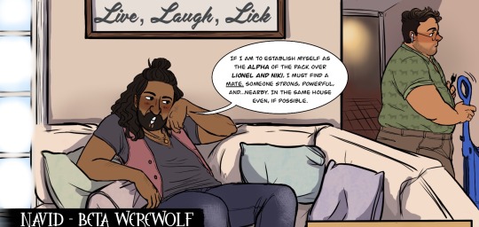
2. Wide shot of the werewolf character played by Kayvan Novak doing a talking head. He is wearing medium wash jeans, a grey tee shirt over a millennial pink vest, a small gold medallion around his neck with a matching crescent moon earring, and has his long wavy hair half up in a messy bun. He is sitting on a light cream L-shaped couch adjacent to a glass patio door letting in the sunlight and below a wall hanging that says 'live, laugh, lick'. The lower third identifies him as "Navid - beta werewolf". Navid leans back casually against the cushions and props one elbow up on the back of the couch, leaning his head into that hand, and says, "If I am to establish myself as the Alpha of the pack over Lionel and Niki, I must find a mate. Someone strong, powerful, and...nearby. In the same house even, if possible." As he speaks, he glances meaningfully to his left, where the character played by Harvey Guillen is standing behind the couch, his back to Navid as he fusses with a vacuum. He is wearing square retro glasses, airpods in both ears, brown chinos, and a short sleeved green button up unbuttoned to the sternum with a dog silhouette pattern and sleeves rolled up his biceps. His beard is well-kept stubble and hair is buzzed short on the sides, curls pushed to the side in artful disarray and sun-bleached a lighter brown.
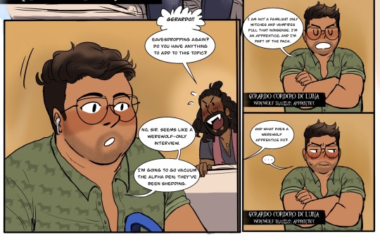
3a. Close up on Harvey's character as he walks down the hall away from Navid's talking head. In the background, Navid whips around to lean over the back of the couch with an expectant grin, howling, "Gerardo!! Eavesdropping again? Do you have anything to add to this topic?" Gerardo barely pays him mind, tossing his reply over his shoulder: "No, sir. Seems like a werewolf-only interview. I'm going to go vacuum the alpha den, they've been shedding." 3b. Waist-up of Gerardo standing with his arms crossed, doing a talking head. The lower third reads "Gerardo Cordero de Luna, werewolf familiar (familiar is crossed out) apprentice." Gerardo says haughtily, "I am not a familiar! Only witches and vampires pull that nonsense. I'm an apprentice, and I'm part of the pack." 3c. Repeat. Offscreen, one of the crew asks, "And what does a werewolf apprentice do?" Gerardo goes a bit red, embarrassed, and glares off to the side, hesitating to answer.
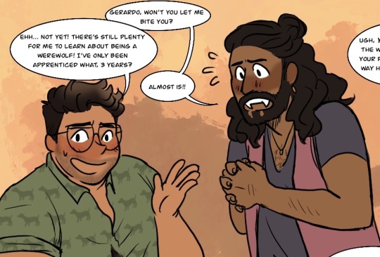
The following are all cropped close ups on a mottled orange and yellow background from a colored doodle dump. 4. Waist up of Gerardo and Navid as Navid begs, hands laced together, "Gerardo, won't you let me bite you?" Gerardo avoids his gaze with a nervous grin, flapping his hand dismissively, and replies, "Ehh...not yet! There's still plenty for me to learn about being a werewolf! I've only been apprenticed what, 3 years?" "Almost 15!" Navid shoots back.
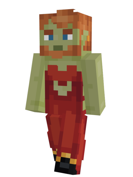
5a. Knees up of Navid and Natasia Demetriou's werewolf character, Niki. She is wearing dark red gradient high waisted leggings, a dark red low cut bralette with crossed straps in front, a fluffy cropped brown fur coat, a gold medallion matching Navid's, and multiple golden piercings in her ears with two large oval discs dangling from the lobes. Her lipstick and square cut nails are dark red, and her long hair is permed in tight fluffy curls half up in twin buns. Navid grabs his left wrist with his right hand and thrusts it at Niki's face with an anxious expression, asking, "I smell like I love him, right??" Niki curls her lip and cringes away from him, hands up to swat his arm away as she spits back, "Ugh, yes!! You stink up the whole house with your pining! There's no way he can't smell it." 5b. Knees up of Gerardo sitting on a light cream couch, reading from a book titled "Care for the Lonely Werewolf" help up in his right hand. Navid is laying across the couch, sans vest and hair loose, with his head resting on Gerardo's left thigh. His right hand is trapped beneath him, fingers hooked at the back of Gerardo's knee, and his left rests on top beneath his cheek. Gerardo's left hand his idly petting his hair. Navid stares intently into the middle distance, thinking, 'Perhaps I should be less aloof with him...'
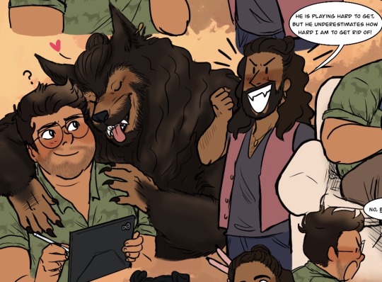
6a. Bust of Gerardo, who is holding up an iPad in his left hand with a drawing stylus poised in his right. Navid, large and hairy in werewolf form but still sporting his dangly earring and little hair bun, is hugging him from behind, clawed hands on his shoulders and wet nose nuzzling into the side of his face. Navid's eyes are closed and his mouth is hanging open, tongue lolling out happily. Gerardo looks up at him with a fond, if confused, smile. 6b. Knees up of Navid raising a triumphant fist with a grin and confidently declaring, "He is playing hard to get, but he underestimates how hard I am to get rid of!"
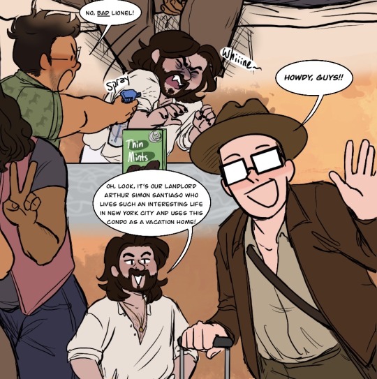
7a. Waist up of Matt Berry's werewolf character, Lionel, who looks much the same but is casual in a light cream linen shirt unbuttoned well below his sternum tucked into matching linen pants, his only accessory the gold medallion matching the others'. He is standing in front of a countertop hosting a box of Thin Mints and cringes away with a drawn-out whine as Gerardo pops into frame to spray him with water, scolding, "No, bad Lionel!" 7b. Waist up of Mark Proksch's character, who appears to just be Colin Robinson dressed like Indiana Jones, as he walks into frame with a rolling suitcase. He smiles and waves, shouting, "Howdy, guys!!" Lionel stands in the background, hands on hips with an easy smile, and says. "Oh, look, it's our landlord Arthur Simon Santiago who lives such an interesting life in New York City and uses this condo as a vacation home!"
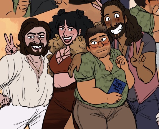
8. Group shot, knees up, of Lionel, Niki, Gerardo, and Navid smiling for the camera. Lionel has one hand on his hip and the other around his wife's waist, leaning into her. Niki has one arm thrown around Lionel's shoulders, flashing a peace sign, and the other held up behind Navid's head to give him bunny ears. Gerardo is standing slightly in front of her, one hand clutching a pamphlet for Tisch School of the Arts and looking a bit uncomfortable as if he had been dragged into the photo last minute. Still, he offers the camera a hesitant smile and allows his left arm to be crushed to Navid's chest as the werewolf pulls him close with an arm around his shoulders. Navid leans his entire body into Gerardo with a huge grin, flashing a peace sign with his free hand.
9. Uncropped version of the entire doodle dump, repeating images 4 through 8. /end ID
#wwdits#wwdutm#werewolf au#nandermo#navardo#mlm#what we do under the moon#what we do in the shadows#what we do in the shadows fx#my art#fanart#image described
553 notes
·
View notes
Text
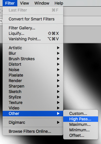
how to make cool blobby turing patterns in photoshop
i'll preface with i learned the basic loop from skimming a tutorial on youtube, but as someone who prefers written tutorials i'm sure many would appreciate one! also, the second part of this is some of the visual effects i figured out on my own using blending modes and stuff.
i'm using photoshop CS4 on a mac so some buttons and stuff might be in different places on windows and newer photoshop versions but all the actions are the same. my canvas is 1000x1000 pixels.
UPDATES (i'm hoping these'll show up whenever you open the readmore?)
it's possible to do something similar in krita using this plugin, made by the love @arcaedex
it's also possible to do this in photopea, a free browser alternative to photoshop! the results are pretty much identical.
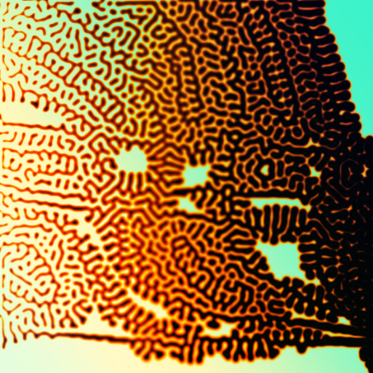
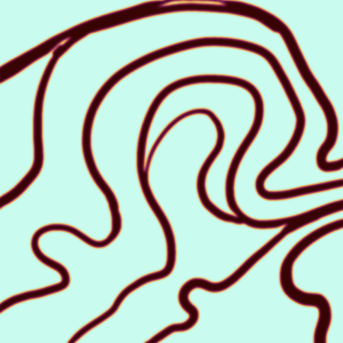
FIRST off you wanna get or make a black and white image of some kind. it has to be one layer. can be noise, a photo, a bunch of lines, whatever. here's mine, just some quick airbrush lines:

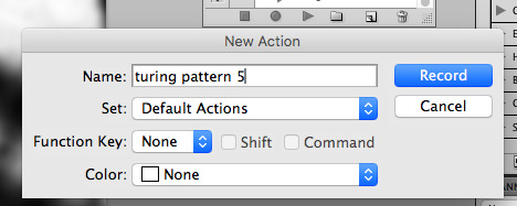
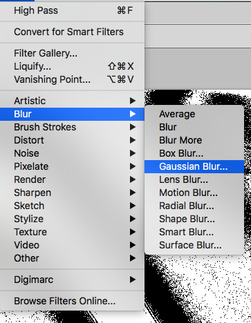
now find the actions tab. idk what it looks like in newer versions of photoshop but you probably won't need to dig!
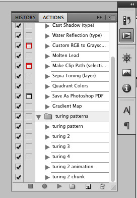
hit the little page thingy to make a new pattern. once you hit 'record', it'll record everything you do. the little square 'stop' icon will end it.
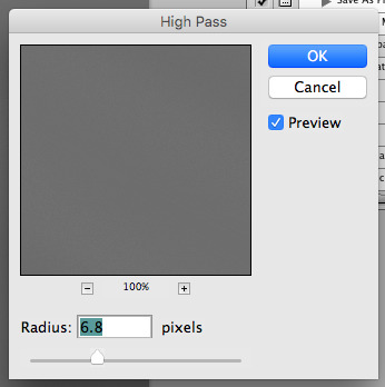
now you want to do a high pass filter. you can mess around with the radius to change the size of your squiggles, but the tutorial had it set to 6. experiment!
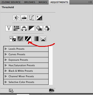
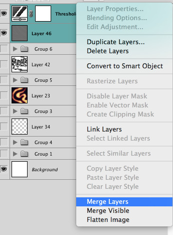
now add the 'threshold' adjustment layer. i use the adjustments tab but i think there's also a dropdown menu somewhere. keep it at the default, 128. merge it down. (control or command + E or you can right click it like some kind of weirdo)
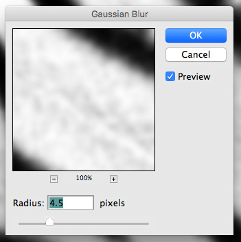
and finally, the gaussian blur! the radius of this affects the shape and size of your squiggles as well. i like to keep it around 4.5 but you can mess around with that too.
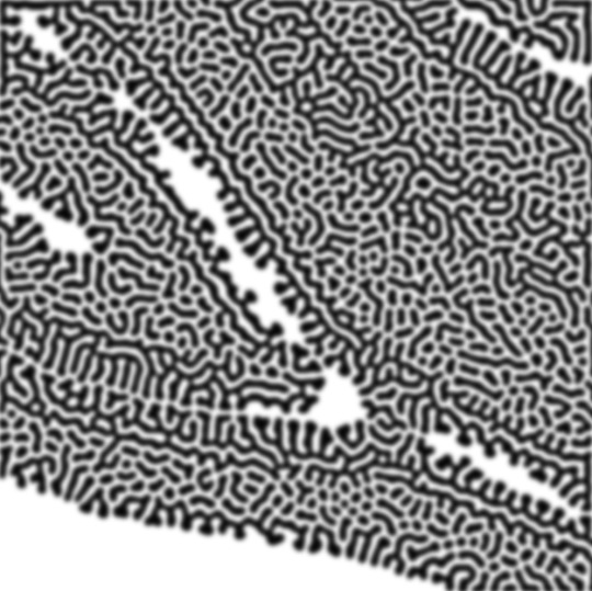
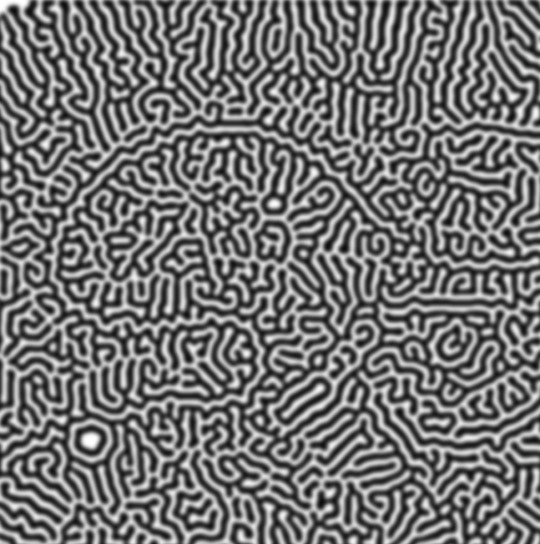
after that, hit 'stop' on the action you're recording, and then repeat it a bunch of times using the 'play' button, until you have something you like, like this:
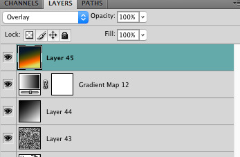
WOW!! that was fun!! and only a little tedious thanks to the power of macros. anyway, here's some fun layer blending stuff i like to do. it's with a different pattern cause i made this bit first.
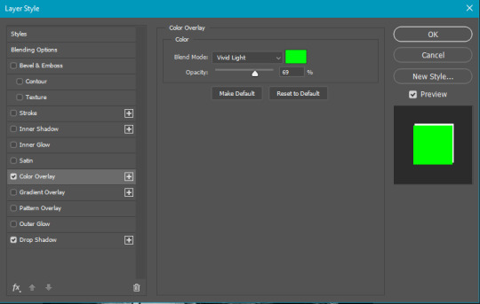
anyway, using a black and white gradient (or a grey base that you do black and white airbrush on), make a layer with the vivid light. this will make the blobs look thicker or thinner.


then, for cool colors, do a gradient map adjustment layer over that:

and finally, my best friend, the overlay layer. just using a gradient here bc i'm lazy, but feel free to experiment with brushes, colors, and blending modes!

NOW GO. MAKE COOL SHIT WITH THE POWER OF MATH. AND SEND IT TO ME
also these are not hard and fast rules PLEASE mess around with them to see what kind of weird shit you can make. here's a gif. as you can see i added some random airblush blobs in the middle of it, for fun.
921 notes
·
View notes
Text
Hunter's Requiem

demo [tba] | forum [tba]
dark fantasy, horror (?), romance
You are a minor deity of the Hunt, known by your followers as The Hunter, used by the other Higher Beings as The Hound. The All-Seeing Sun had given you countless tasks over your existence.
Yet one day, while on a mission sent out by him, you were summoned and judged for treason. The punishment left you mangled; your magic ripped off.
Cast away, you went into a deep sleep to recover.
After centuries you awoke to find your name spoken in whispers in the darkest nights. The Traitor. The world has changed, yet you still have true believers who await your awakening.
Will you be successful in your revenge? Will you be able to topple the gods or will you try to live in peace?
Features:
Play as male, female, nonbinary.
Your choices will affect the fate of your followers.
Befriend, romance or even antagonize a wide cast of characters.
Have a loyal shadowy companion by your side.
Astaroth [M]
"And to think I hated you. Now I can’t imagine living a single day without you.”
Your “other half”, attached to your psyche. He is content to stay in the backseat and offer comments.
Tall and lean with gray skin. His face is sharp and angular, eyes with black sclera and white iris. Long black straight hair parted only by his antlers. His hands are black, tipped with long claws. The gradient loses color the closer it gets to his elbow.
When he grins at you, you see beast-like teeth glinting in the light.
The Beloved Moon [F]
"That was the worst mistake I ever made. Please, I will do anything you want for you to forgive me.”
Moon has a curious interest in you. Since the moment she saw you, she had sought any chance to talk with you.
A short woman with deep blue skin and freckles that shine like stars. Her skin is shifting between deep blue and purple. She has a round face with full lips and a button nose. Round eyes with black sclera and bright blue iris stare at you with curiosity. Her long curly hair is white with pale blue streaks. Massive white feathered wings cover her back, sometimes used to cover her body like a cloak.
Her smile might be gentle but the sharp fangs showed less so.
The Eternal Night [NB]
“I have turned a blind eye to the world far too long. I will no longer allow anything to happen to you.”
The Eternal Night is a distant person. Even more towards the other gods, yet for you they show a kinder side.
They are tall and slender. Their sharp face is softened by full lips and expressive eyes. They have dark grey skin paired with stark white hair, that reaches their chin. The wavy strands frame their face nicely. Their eyes-- black sclera with crimson iris—are often covered by their mask. Massive black wings sprout from their back, and then the light catches the feathers right they look more blue than dark.
Santana [F/M]
"Why is it that every time I look at you I feel that I have known you for lifetimes? Why does my soul yearn for you?"
A priest you met in your past, a rather interesting person with a stubborn brand of kindness.
Tawny skin sprinkled with freckles. Golden hair is kept in a braid, far away from their face, yet a few strands escape and frame their heart-shaped face. Expressive eyes look at you, their blue gaze shining brightly.
They stand at an average height, donning the white and golden robes of the priests of Sun. Over that, they wear a chainmail.
You thought you lost them to the sands of time.
??? [F/M]
“Do you have any idea how long I prayed to see you, to hear your voice?”
Every day, they're slipping farther, their grip on the edge of the chasm growing fragile. Can you drag them back or will you shove them off?
#interactive fiction#if: intro#if game#if wip#interactive novel#interactive game#hunter's requiem if
609 notes
·
View notes
Note
how good is Hypnospace Outlaw at the 90s aesthetics?
I haven't played Hypnospace! It looks fun!
But looking at the trailer and some gameplay videos... well, don't get mad, but this is exactly the kind of stuff I wrote my article in faux protest about.
It's not wrong, it's not bad, not saying that. There's truths in there about 90s design. But if you're asking me, the game has a thick layer of Vaporwave over everything. It just comes across as fake 90s to my tastes, personally.
But I think that was the point. I think that's what Tendershoot was going for. It's a surreal game about surfing the web in your sleep, right? So the design isn't going for accuracy, it's more that dreamy fantastical look people remember (or misremember.) It works for them!
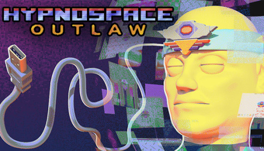
Like, I like the key art! That's pretty good. CGI head in space would have been right at home on a Trapper Keeper. That USB cord should have totally have been a serial port instead tho.
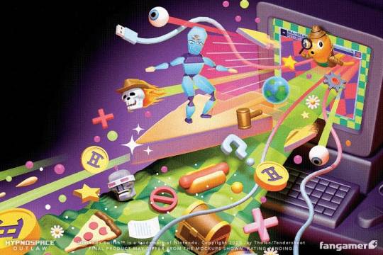
And this box art is chef's kiss. I feel like I'd see this on a textbook in computer class.

What I've seen of the actual game though? Hmmmm. You're asking a web designer here for an opinion, and this is a game all about web design. Like they get some stuff right. UI is a lot of fun, down to the Winamp-style skeuomorphic buttons in some of the screenshots.
But for something that's supposed to be set in '99, that's a huge overuse of pastel pink and purple gradients. It's like an Instagram filter over the whole thing. That's Vaporwave, and while it looked cool in 2018 that's not really what was going on at the time.

The MS-DOS sized pixel text bugs me when they should have gone with Windows 98-style higher resolution. They seem to run all their images through an aggressive dithering filter when in reality, JPGs existed too. But it's funnier to have all those crusty GIFs in there, that ages the art more. And is that a poop emoji button? An emoji in a 90s game?

Sorry, that sounds like I'm picking on a game I haven't played. Not trying to knock down any Hypnospace fans. The game looks fun! I'm just being a design nerd and taking a magnifying glass to something I've never seen before today. If you love the look of the game, that's valid! I like Vaporwave too. But Vaporwave is its own separate thing.

So, real quick, let's talk Vaporwave. It's important to understand Vaporwave is evocative of the 1990s, but wasn't an actual thing in the 1990s. The point of Vaporwave is it's meant to be a surreal parody version of the decade, as seen through the lens of the 2010s. I think what happened over the past decade was everyone forgot it was a parody and took it at face value. Vaporwave and 90s just became equals.
And that's how we got this:

What I wanted to share with you all was Vaporwave and Memphis style graphics are starting to be like THE ONLY representation of the decade. I wanted to share that there's more out there to pick apart and use for retro throwbacks.
Maybe further into Hypnospace they get into that other stuff? Thanks for tipping me off about the game! I'll add it to my Steam list.
;-)
344 notes
·
View notes
Text
Hhheeeeheheh I love these skins so much I CANNOT wait to see them in-video... But until then here's my ranking of them, long rambly full thoughts below.
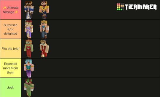
Also here's the tierlist!
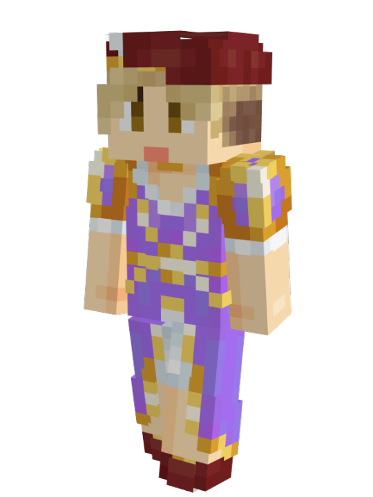
Ultimate Slayage: no discussion these 2 are the best. Every single one of Sausage's skins are a smash hit & this one is no exception, it's just so well done. The eye make-up the little tied shirt thing the HUGE extravagant sunflower, contrasted by those big clomping boots... The GENDER of it all aough I love him.

& Pix of course. Pix my guy just STUNNING. Idk about the other skins but this one is very likely made by Pix himself (bc of a thing he tweeted) & that makes it all the more impressive bc it's just?? So good??? The floor-length the off-the-shoulder sleeves leading into long gloves(?), the corset-y bits with golden buttons or lacing up the front, the BRIGHT BLUE bodice bits which (based off the colour) are definitely Ancient Capitollian Dodo feathers or inspired by them at least... It's just a masterpiece. The only comment I might have is maybe make sure you match your foundation right, Pix... But I've also decided he's in a full white lace/mesh bodysuit under the dress so. ¯\_(ツ)_/¯

Surprised &/or Delighted: honestly this category fits all of them purely bc I don't think anyone expected these ^^. Oli & Jimmy are in here specifically because, while they're not my ultimate brain-frothing faves, these dresses are extremely good adaptations/elevations of their regular skins— Oli's especially looks so natural on him bc it's in exactly the same glitzy faux-medieval style as his bard outfit. The purple is a staple colour with him, fits the royalty theme, & somehow looks both elegant and like a Halloween costume with its bright shade & tinsel-like gold trims. It's silly and fantastic and VERY Oli Orionsound. Cannot wait for him to play the fainting damsel-in-distress at every occasion <3
Jimmy's is plainer but just as faithful to his sheriff skin: off-the-shoulder sleeves appear to be a theme with these skins and they look amazing on everyone, Katherine is so epic if this was her Royal doing. Jimmy looks AMAZING in a long jean(?) skirt & the slit just elevates it even more... I am beginning to notice I have a Thing for long skirts and big boots ^^;. This is going to look stunning with the hat, and just plain adorable at Jimmy's current height.
Fits the brief: ok so these skins are fantastic and I LOVE the colour on both of them, but there's not as much tying them to their Empires... fWhip's goblin skin is so intricate with that embroidered waistcoat & bright primary colours so it's a shame to lose that, though the plain red looks very elegant on him & the shape of the dress stands out from the other skins in a very fun way. It's definitely between the 2 categories and I will likely be swayed by the first bit of fanart I come across for it, but for now: yeah.
Joey's is the opposite case, where it fits the brief and the simplicity of it not only looks good but makes some sense (semi-broke pirate usually wearing tattered sailor's garb). I just wish it had gone a bit further to match Joey's big personality. The slit and shape is lovely (as is the neckliiii— wait where does that neckline end? /pos), but what about some more gold, or prismarine accents? Fishnet gloves, or stockings striped like his shirt? It just feels like it could go much further, & maybe fanart will push it there for me. Also I'm removing points for no dress + epic pirate boots /j
Expected more: oh this skin... Yeah I'm not blown away by it. The colours that are present are very nice but there just aren't enough of them, and the shape... The cutaways at the hip are very nice, but Girl. That is a tank top. & for some reason the skirt refuses to register as one in my brain despite the pretty gradient. With the vibes of Chromia I'm picturing Scott in something shorter and frillier, high-heeled boots, feathered hat and cape— real Barbie and the 3 Musketeers kind of vibe basically. I need to draw that. Definitely more colours though, that's the first step. Bi-coloured bodice, tie-dye skirt with petticoats, a flower crown, something!! Maybe there's custom items involved to accessorise, maybe this is a temporary self-made dress while waiting on a commission, idk but I'm going to need to see some out-of-this world fanart to salvage this skin as it is. :/ Sorry Scott, sashay away.
And finally...
Joel: Joel. Joel Smallish "Massive" Beans that is a recycled MCC skin I am SURE of it. Joel this is so lazy and stupid and perfectly on-brand I love it I hate it this is peak Wish/Aliexpress cosplay. Keep it up you bastard (I still want to see / draw him in proper femme greek garb. But alas).
ANYWAY.
Big long ramble, thankye for reading this whole thing & feel free to make your own lists / yell at me for interpreting these pixels wrong. No matter my minor gripes the fact we have these looks at all and go insane over them is so so SO fun ^^
#HOOH BOY this took me an hour to make the tierlist / type out my onions lol#but these looks are ✨worth it✨#esmp s2#empires s2#empires smp#esmpblr#empiresblr#esmp ensemble#namemc spoilers#fwhip#joey graceffa#mythicalsausage#oli orionsound#joel smallishbeans#scott smajor#jimmy solidaritygaming#pixlriffs#WOOOH. LOTS OF TAGS ^^;#eMerambles
307 notes
·
View notes
Text
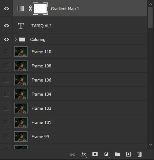
gradient text tutorial
This tutorial is for @ladynephthyss but y’all can have it too xD
We’ll be adding text so the final gif looks like this:
This tutorial assumes basic knowledge of gif-making, Photoshop, and coloring. I’ve only described the text tutorial in this.
Tutorial under the cut:
Couple things to note beforehand:
There is a lot of trial and error involved when doing any sort of text, and this is no exception! You might have to play around with the colors and the settings before you find something that looks good and readable!
This tutorial is inspired by the difference text effect in these tutorials: one and two by @anya-chalotra (highly recommend checking those out!), just done a different way.
This text effect works better on big gifs (540px width) that have quite a bit of movement below the text so you get that effect.
Find fonts that have bold shapes or some width to them, so you can see the movement.
This is my starting gif, after sharpening and coloring.

First, I position my text where I want it. (this can be moved around later, I just like to get an idea). Remember what I said about fonts? Try to use ones that are thick for this effect so you can see the gradient/movement underneath the letters. I’m using Intro.
It doesn’t matter what color the text is at this stage, I just do white text so I can see it:
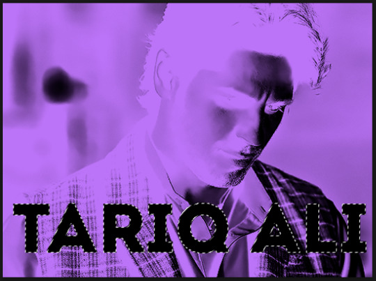
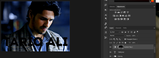
Then, add a gradient map in the color you want your text to be. For this one, I chose black and purple. The more contrast there is in your colors, the better it looks. You’ll be able to change this later though, if you don’t like the way it looks.
This is how it looks with the gradient map:
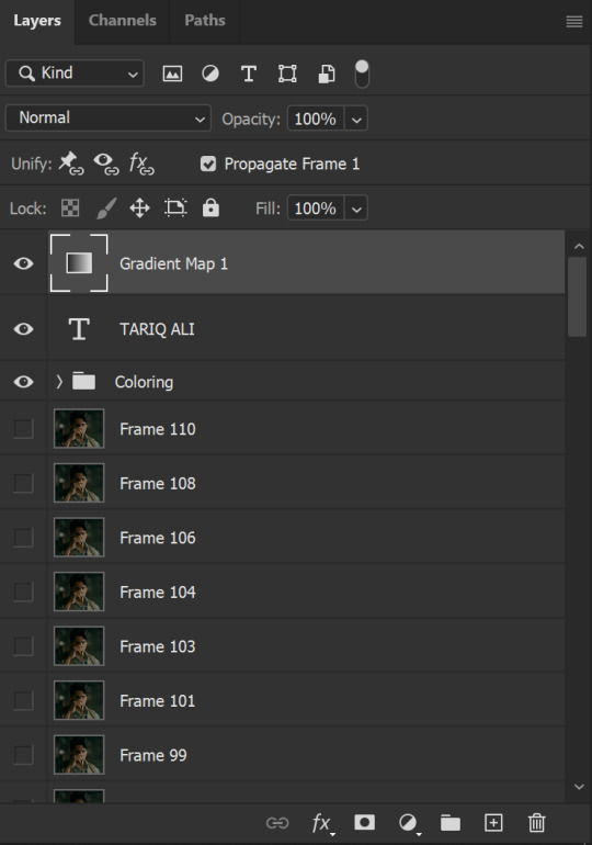
Now, we’re going to go over into our layers panel, and where we have the white box (the layer box), we’re going to select and delete that...
...so it looks like this:
Then, while pressing Ctrl, we’re going to hover our mouse over the T in our text layer. Your cursor should show a white box with a dotted border. Press the T in the text with the specialized cursor, and you should get a dotted line all around the letters, like so:
(I’m not able to get a screenshot of the cursor for some reason but I hope the instruction made it clear!)
Then, make sure you have your gradient map layer selected, and press the layer mask button (shown by a white arrow in the below image - it looks like a white rectangle with a black circle in the middle.)
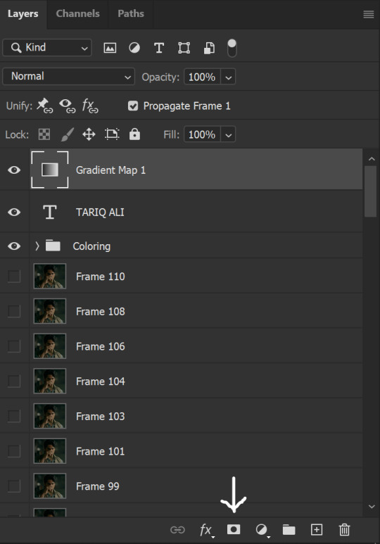
This is what it should look like:
Right now, it’ll look like some solid color (which depends on your gradient). This is because we still have the text layer visible. Once we press the eye icon next to the actual text layer to hide it, you can see that this is what it looks like:

(You can also delete the text layer, but I don’t, just because if I decide to put these two words on two lines, or change their spacing or whatever, I don’t want to have to make a new layer. I can just edit that one before re-masking.)
As you play your gif, you’ll see that this is what the whole movement looks like:
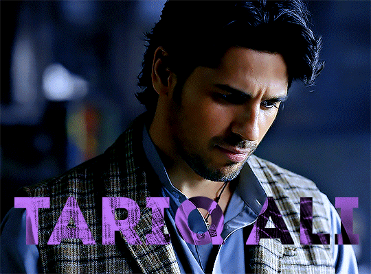
You can see that the movement of him lifting the glass to drink his tea shows through the text, too. Almost like a weird color X-ray type thing, where the lighter color shows on darker shades of the gif, and the darker color shows on the lighter part of the gif.
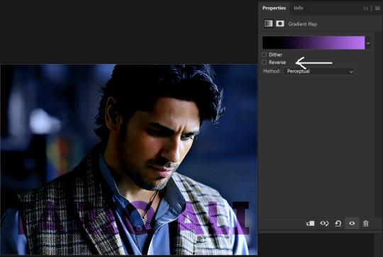
Note: sometimes, depending on the way your gradient is made, you might get text that looks like the picture below. Just hit the reverse button (shown with a white arrow), and you should get the text looking like it does above.
This is the basic way to do it. Now, we can easily edit this, if we feel like there’s too much purple and not enough black. To do that, we go into the gradient, and change the slider positions of the colors. This is purely an aesthetic preference, but I’ll show you how to do it below:
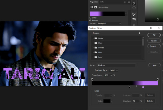
For example, I moved those sliders so there’s more black and less purple, and the gradient feels more like two colors only, instead of all the various hues of dark purple/gray-purple.
This is what the gif looks like:
In the gif before this one, the black was more of a muted gray. In the one directly above, you can see that it looks much more striking. So play around with that until you find something you like.
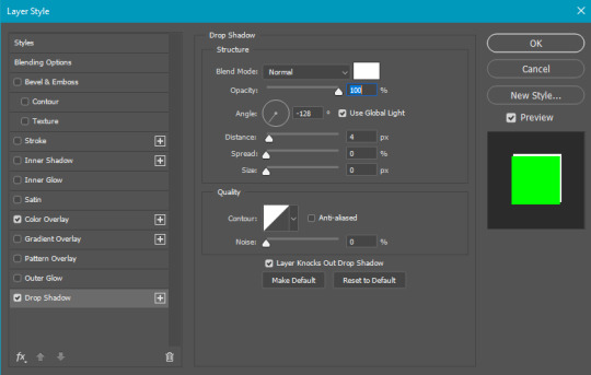
It still doesn’t look very visible to me, so I’m going to add a drop shadow underneath (again, this is a preference thing). You’d do it just like you would with a regular text layer. Right click the Gradient Map layer and select Blending Options. Add a drop shadow.
This is what mine looks like:
And that’s it! You can keep playing around with the whole thing until you’re happy with it. You can even keep changing the color, and the great thing about that is you’ll be able to preview it as you change it to see what works with your scene. For example, I tried white and black text here:
And that’s it! Feel free to drop me an ask if anything’s confusing! Happy giffing!
#zee's tutorials#tutorials#gif tutorial#typography#gradient text#photoshop tutorial#resources#ps help#dailyresources#completeresources#itsphotoshop#allresources#dailypsd#userisha#userdahlias#alielook
415 notes
·
View notes
Note
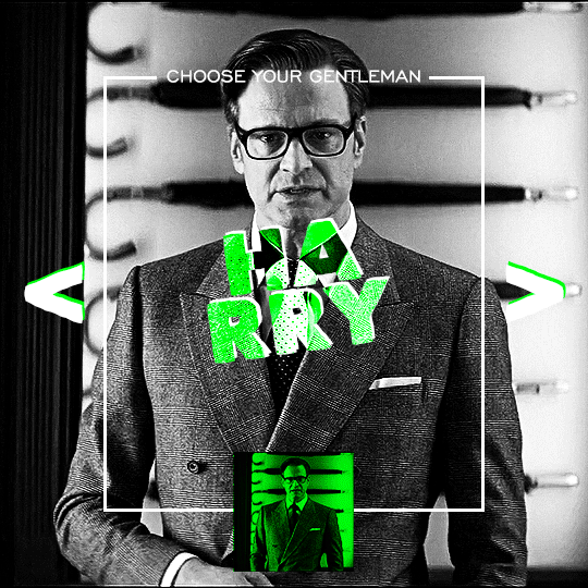
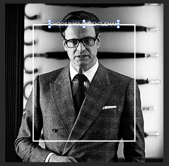
Hi, I love your blog and your edits. I was wondering if you could do a tutorial on how you combine multiple gifs into one in the first gif of yours MIKELOGAN’s 5K FOLLOWER CELEBRATION || GET TO KNOW ME MEMEFAVORITE ACTORS [2/10]Colin Firth (September 10, 1960) set? Thank you for reading this and helping me.
thank you so much, that's so kind!! this is the post in question (which was inspired by this gorgeous set) and i'll break down how to do it step by step below the cut!
i ended up saving this gif as a psd because i remember it taking me so long and being really frustrating, i just wasn't sure why. for reference, i posted that set back in september, just over four months ago. looking at the psd, i can see just how far i've grown as a gifmaker bc that thing is a hot mess. i made it about 3x more complicated than it needed to be, so let's do this the right way lol
note: i was still using 0.07 frame rate at this point. i have since switched to 0.05 for smoother, quicker gifs.
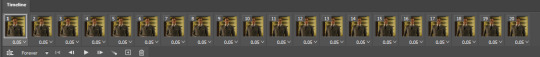
what we're going to do is create all of these gifs separately and put them together at the end. in total, there are 6 individual gifs. let's start with harry.
i gif by importing video frames to layers, but if you prefer to screencap, load those in instead. because this ends up being a pretty large gif, both in size and length, i kept it to 20 frames per clip.
once you're satisfied with the frames you've chosen, crop your canvas to 540px x 540px. this is what i'm left with
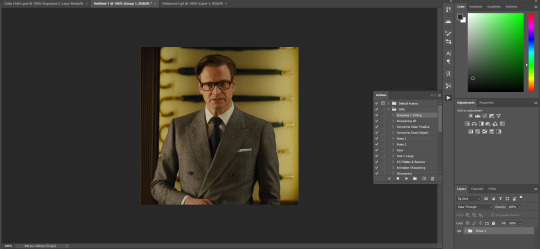
this is when i sharpen my gifs. everyone's process is a little different. i created my own sharpening action, which converts my frames to video timeline and then sharpens.
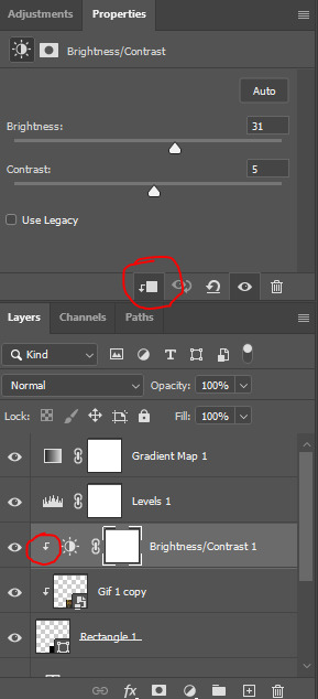
the next step is to color your gif. if you're going for the overall look in mine, here were my layers:
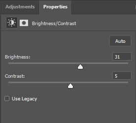
a brightness/contrast layer with brightness set to 31 and contrast to 5. this will depend on the scene you're working with

a levels layer using the black and white eyedroppers. the top one is your black eyedropper. to use it, click it and select the blackest part of your gif. do the same with the white eyedropper and select the lightest part of your gif. you may need to play around with selecting different points depending on your scene and the original coloring
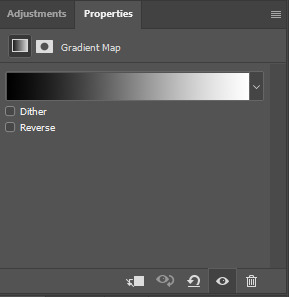
finally, a simple black & white gradient map layer on top
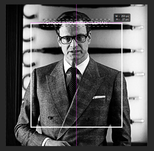
now we're going to add the thin rectangular border in the middle of the gif. i use the rectangle shape tool for this (press U on your keyboard) and these are my settings (x and y coordinates don't matter):

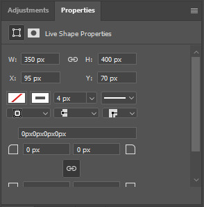
to center it perfectly, i use ctrl+T and drag it until it snaps into place with both the vertical and horizontal guides.
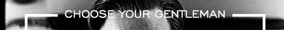
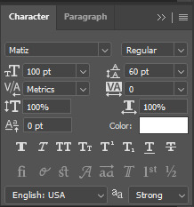
next, let's add the "choose your gentleman" text that goes at the top of the border. here is the font i chose and its settings:

once again, press ctrl+t and drag this to the vertical center of your gif and to the center of the top of the border. you should feel and see it snap into place. this is what we have now:
now, we're going to use a layer mask on the border so we can read the text. select the rectangle layer and click the layer mask button
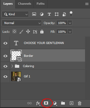
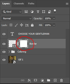
with the layer mask selected (as shown in the second image), use the rectangular marquee tool (M on your keyboard) to draw a rectangle around your text, taking care to keep it just a little larger
as you can see, you'll know when you're perfectly centered through your text layer and vertically on the entire canvas. select your brush tool without deselecting this rectangle (B on your keyboard) and paint the selection with a black brush. this masks that part of the border!

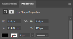
let's add the small square gif that goes at the bottom of the border now. i think the easiest way of doing this is to use the rectangular shape tool (U) again. the size of this gif is 110x110, so create a black square of that size with no stroke. Use ctrl+T to drag it to the center of the bottom of the border (the x and y coordinates don't matter):
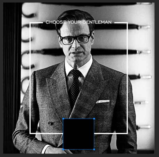
now duplicate your original gif layer (ctrl+J) and drag it to the top of the layer panel. right click on it and create clipping mask. this will make it so the gif only appears within the confines of the square we just created. resize your gif by using ctrl+T and, making sure the proportions are locked, drag the corners to the edges of the square.
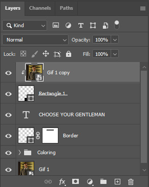
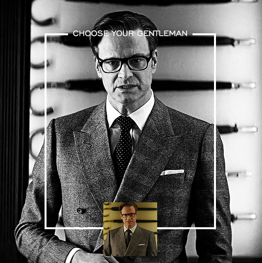
this gif is not colored at all as we only duplicated the gif itself and not the coloring layers. i duplicated those as well and dragged them on top of our small gif, but it's important to make sure those are using the clipping mask as well. you can click this on the properties layer of each adjustment layer to make sure they do.
you'll know you've been successful when you see the small arrow next to each of your coloring layers. this keeps them from affecting the coloring of the larger, main gif.
we're going to change the gradient map adjustment layer from black & white to black & lime green (or the color of your choosing). click on that layer and then on the map. this will bring up the gradient editor. click on the small white color stop at the far right end of the gradient and then on the color picker, choose a new color.

the hex code i used for the lime green is #00ff0c
our last steps are the angle brackets on either side of the gif and harry's name in the center. here are the settings i used for those (angle brackets on the left and harry on the right):
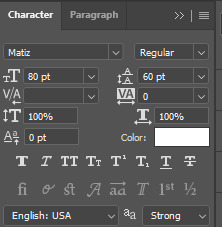
the layer styles for harry's name (double click on the text layer to call up this menu OR right click > blending options):
and for the angle brackets:
by now, you know how to utilize ctrl+T to move these layers where you'd like them. harry's name is centered horizontally and vertically and rotated at a bit of an angle and the angle brackets are centered horizontally and i just eyeballed where to put them in relation to the space between the border and the edge of the gif.
this is the complete first gif. what i would do for your own sanity since you have two more of these two create is 1) save it as a psd just in case something crashes and 2) don't convert it to a smart object until you have all 3 gifs completed and are ready to put them together.
the nice part about having the first one done is you've ultimately done the hard part. create your two other gifs, but you'll be using at least roughly the same coloring and all the same text, just with the colors adjusted, so you can drag those layers from your completed first gif to your others as you work on them.
once you have all 3 gifs completed and still on 3 separate canvases (and saved as psds bc this is adobe friggin photoshop and shit breaks all the time), convert all layers on all the gifs to smart objects. this will simplify the final gif and make things much easier.
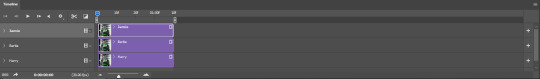
then, bring gif #2 and gif #3 both onto gif #1's canvas. this is what it will look like at first on the timeline and in your layer panel:
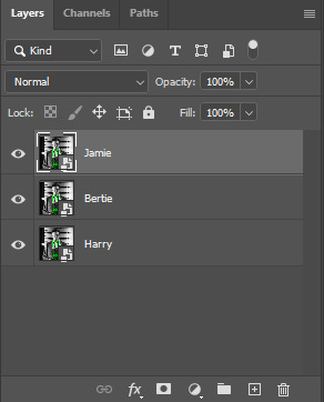
(full disclosure, i'm not making the other two lmao, i'm lazy and i already did it once in a way harder way 😂)
to get the gifs to play after one another rather than simultaneously, you just have to drag them after one another on the timeline!
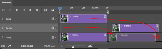
a little bit hard to show the actual process, but you're just clicking the bertie layer and dragging it down to harry's line after the harry layer. then do the same with the jamie layer, dragging it down to the harry layer after bertie. when you're done, it should look like this:
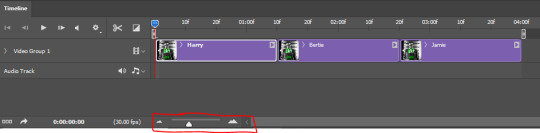
btw, the little slider i circled is what enlarges or shrinks the timeline view, so if you need to see something broken down a bit more/slower, drag it to the right. if you need to zoom out, drag it to the left.
and that's it! export and save your gif!
if you have any questions or anything is at all unclear about this, please let me know! i'm happy to help!
#answered#Anonymous#gif tutorial#my tutorials#gifmakerresource#completeresources#dailyresources#LISTEN. the way i did this 4 months ago was SO FUCKED#i made it SO SO much harder than it needed to be#you know what that is? growth.
88 notes
·
View notes
Text
more details of experiment edits on AAC:
first i will show 3 pictures of Supercore 50:
how it looks automatically without any edits
my current grid set that i use for communication
the version of this grid set i added just to try colour changes and other visual edits.


[Image description: 3 images of the same vocabulary grid set in Grid 3, called Supercore 50. the first image has rounded corners on buttons, a white background, bigger spacing, and text labels on every button with text above symbol. second image is similar looking with same rounded buttons, but less spacing. is different by black background, text label removed from folder and menu/function buttons, text below symbol. third image is very different looking from other two. same black background, menu and main folder buttons have black background with simple coloured symbol, mainly yellow. no folder buttons have text label, and many have simplified symbol. all button colours are altered in tone and shade. all darker colours, easier on the eye. the "little words" buttons are changed from almost white to dark grey with yellow text. End ID.]
here is explanation:
added new version of my grid set (Supercore 50) to just play around with and change colours and see what works. didn't want to mess up my actual grid set with all my personal edits and added vocabulary. didn't go to bother of making it all "uniform" across the whole device (because is time consuming and i will have to do that eventually on my real grid set).
mostly just tried out different colours. and how to make home page as easy to visual process as possible. didn't change colour coding (for example pronouns yellow, verbs green, adjectives blue, little words grey-ish - that all stay. just change tone of colours to not "attack" eyes).
eyes can't cope with a lot of "whiteness" in any colours, especially on a screen where there is so much white/blue light already. makes much sensory overload and bad headaches. pastel colours or very bright neon or light blue/purple/yellow/grey... not fun. brain simply skips over any blocks of those colours cause it can't get past whiteness to see what is on the button.
in Grid 3 edit menu you can change colour of button - there is a palette of pre-made colours, but you can also do "adjust colour" and choose custom colour there. and there is something called "button styles" so you can just edit one button how you want, then say "update style" and it will change all buttons with that "style".
i worked out that turning down "saturation" and "luminosity" helps me a lot. then the colour doesn't "attack" my eyes so much, so i can actually search the screen for the symbol/word i want. better visual scanning ability.
also removed borders on buttons. just adds extra stuff for eyes to get "stuck" on. it looks cleaner without border.
On Grid 3 there is also different button "themes" available (different from button styles), which changes the entire automatic look of the entire grid set with just change that. changed from "modern" to "blocky" theme. because there is a slight "colour gradient" on buttons with "modern" theme (I think🤷🏻♂️). meaning there is more highlight at the top of the button on more shadow/darker at the bottom. makes it hard to see the symbols and text because it is not "flat" looking. to me the "modern" theme looks slightly bumpy and 3D, the "blocky" theme looks flat. and brain can't process 3D (especially not at same time as try to search for words and scan screen).
i also made the "menu" buttons or "grid functions" buttons have black background (to match black background of entire grid set), with symbol in yellow. and remove text labels for these buttons and some folder buttons. this helps because then only the word buttons "jump out" at brain. so there is less "bulk" of the screen to process. and the "function" buttons have only simple symbol, so can easily find!
this is all still only changed in the blank version of Supercore 50 that I added for this specific purpose. it is a HUGE change to my AAC. so i can't just change it all at once. it will have to happen in stages. and i am still not 100% sure of all the changes. (for example i don't really know what to do with the folders. don't like how they look right now...). so i have to be very confident in a change before i can make my real grid have it.
(also there is still folders and buttons i haven't changed at all. just mostly did home grid so i can see the difference. still working on it and will be long time until ready to change my real AAC).
i will keep updating on the changes!
#ezra talk aac#autism#autistic#nonverbal#nonspeaking#aac#aac device#aacdevice#aac user#sensory processing disorder#visual processing disorder
33 notes
·
View notes
Text
Formalities
Media The Queens Gambits
Character Benny Watts
Couple Benny X Reader
Rating Flirty Af + Mild Smut
Warnings Drug use
I giggled running after the other girls, I wasn't sure where we were going, or where we were but that sort of thing was par for the course. The other girls ran off without me but I spotted a ladies' room so I ushered myself in and shut the door behind me. I spotted myself in the mirror taking a good look at myself for the first time in ... I wasn't sure how long.
My white plastic knee-high boots hugged my legs tightly, my tights so ripped and laddered little remained of them, my black sleeveless shift dress tight to my withering body, a white plastic belt around my waist with a round buckle, my little wrist high white gloves, my necklace long gone, earrings too, my make up smudged and muddled into nothing but madness, my hair still stiff half up and half down with my white clip to pin the back.
In a moment of clarity, I threw away my tights, wiped off my makeup and washed my face with the sink's water and soap, I took my little comb from my white leather clutch bag and fixed what little needed to be repaired on my hair, I dried my face and fixed my smokey eye shadow high to, my two liner lines one at my eyelid the other at the crest of my eye where my eye shadow ended, I added a slight blush to my cheeks and nose tip leaving my freckled exposed, I added mascara to my already fake lashes both top and bottom, and I grabbed my black lipstick so dark and dense as well as my white lip liner, I lined my lips perfectly and then added the lipstick blending the two with my finger to create a sort of gradient to my lips. I spritzed enough of my perfume to drown an elephant and refilled my bag before heading back out following the direction the other girls had gone.
I soon picked up on the music playing and found myself in an art Deco-style bar, with carpets, a grey floor with dancing people, and a bar littered with people, I found my way to the floor setting my handbag on the floor to dance around, I found the other girls I had spent my time with even if I didn’t even know their names. They greeted me with a smile and handed me a drink which I quickly had and joined the dance.
My mind became fuzzy, the vibration of the music through the floor, time seemed to slow, like all that existed in the world was myself and the music as I danced.
In a moment of clarity, I looked across the bar, as they offered me another drink.
I saw him across the bar, and sat on one of the stools. He had a pair of black shined shoes, a pair of black jeans tight to his legs, a black t-shirt with some silver chains hung low, a green button down with only two or three of the bottom buttons done up, he had a thick leather trench coat over him and a cowboy hat on the bar beside him, He had fluffy blonde hair and a gracing of facial hair, his brown eyes seeming to linger on me as I danced. I smiled at him as I danced having some more of my drink, He smirked watching me, and taking a drink of his own beer.
I passed the drink along and continued to dance for a while until I felt a hand across my arm.
His hand stroked across my arm gently up towards my shoulder so I moved back to press us together. I was utterly lost in the music and movements feeling him grind against my back and I often did it back to him too, his hands often stroked my arms and waist guiding our dance to the music, his jacket gone often the cold of his chains and rings would make me jump a little, I could smell his teakwood scented aftershave, often feel his facial hair tickling against my skin when he would move closer to my exposed neck, I often found my hand moving back to twist my fingers in the locks of his hair.
“You’re a good dancer.” He whispered in my ear
“I have a good partner” I smirked back just as the bottle found its way to my hand again I went to drink but he grabbed the bottle
“Don’t.” He warns
“Why not?”
“It’s not just beer”
“I know” I giggled
“Don’t.” He warns “I think I’d like to dance with you sober”
“Really?”
“For me baby” he whispered
I blushed and passed on the bottle without taking a sip continuing to dance getting more intense
“Good girl” he smirked
“Can we dance?”
“Of course, we can”
We danced getting closer and closer his hands wandering up and down my body his fingers gently stroking across my bottom lip
“You’re beautiful” he cooed
“I don’t know if you are handsome or not, haven’t looked at you.”
“Why don’t you?”
“Why should I? We’re just dancing”
“What if we wanna do more than dance?”
“Boys often don’t wanna do more than dance”
“Who said I was a boy?” He whispered, “What do Men want?”
“Men? Well they often want more than a dance” I smirked as I slowly turned to face him, the boy from the bar but his jacket gone left with his hat and his beer at the bar
“Hi”
“Hi” I giggled lazily wrapping my arms around his neck and pressing my body tight to his so much I felt the cold sting of his belt through my dress “Handsome” I smiled
“You flatter me Baby” He smirked wrapping his arms around my waist his hands on the opposite hip guiding me as I danced our grinding only got more intense “I never caught your name?”
“I didn’t throw it.”
“Humm Guess you didn’t” he smirked stroking his hands down my ass
“Who needs the formalities? We're only dancing” I whispered playing with the tiny thin hair on his chin
“Maybe I think we’ve danced enough” he whispered touching his nose to mine
“You can never dance enough” I smirked running my hand down his chain and letting my body slip down his by the time my hand met the buttons on his shirt my head was at his belt but he forced me back to his eyes “Will you tell me your name?”
“Why? Do we need the formalities?” he smirked back “Benny. Benny Watts”
“Benny. Benny. Benny” I giggled nuzzling into his neck
“Do I get to know about you?” he whispered pulling us even closer
“Y/n”
“Y/n” he smirked “A name as beautiful as the rest of you” He cooed
“You flatter me” I smiled taking his hand and spinning out and he quickly spun me back into his chest
“Come and stay in my room tonight”
“What?”
“Come up and stay in my hotel room tonight.”
“Oh? And do what?”
“More than dance baby” he smirked
“Okay” I smiled
“Yeah?”
“Yeah” I giggled
“Come on” He smirked we grabbed our stuff and he wrapped his arm around my waist and tugged me through the hotel and up to one of the bedrooms, it was an impressive room and I giggled and collapsed on the bed. “Comfy baby?” he smirked
“I didn’t know I was in a hotel”
“Didn’t you?” he asked
“No” I giggled
“You do know you in Las Vegas right?”
“Am I?” I giggled “Cosmic”
“I think you need to get to bed.” he said going through his bag “Here you can borrow my shirt tonight,” he said handing over a shirt from his bag “Get yourself to bed,”
“Will you come and cuddle?”
“Absolutely baby” he smirked stripping off and climbing in the bed as I did too “Come on bed”
“Okay” I giggled cuddling up to him and I fell asleep almost immediately.
#tbs#thomas brodie sangster#thomas sangster#tbs smut#thomasbrodiesangster#tbs imagine#tbs imagines#thomas brodie sangster imagine#thomas brodie sangster smut#thomas sangster imagine#benny#benny x reader#benny smut#benny fanfic#benny imagine#tqg benny watts#benny watts imagine#benny watts smut#benny watts#bennywattssmut
56 notes
·
View notes
Photo

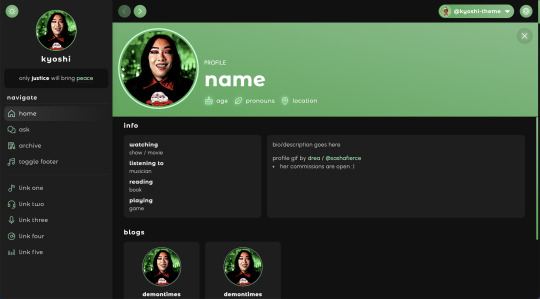
kyoshi | theme by sage
get the code - $1: live preview / static preview / view on @tina-snow
inspired by spotify, featuring an (optional) music player and profile menu
- the song in the preview is Good Days by SZA
- rina gif by @sashafierce ♡
basic features (more info below the cut):
optional: music player, tags on click, glow effect, & explore menu
full length sidebar blog icon, custom description, & up to 5 extra links
explore menu with sections for updates, bio, blogs, lots of links, & socials
customizable: colors & color gradient, body & title fonts, font size, and post margin
540px posts, scroll to top button, responsive design, search bar, day/night toggle, & adjustable border radius
nothing needs to be changed in the code, everything can be changed in the customize panel! instructions for how to customize this theme below the cut
terms:
reblog if using
do not touch the credit
view all terms
credits listed in the code / credits page
please consider supporting me ♡
make sure you read through this post and check the additional links provided before asking questions!! this theme is currently on sale as part of my 1k followers appreciation :) as of september 1st it’ll be $3!
footer
uploading your song:
i recommend using google drive to host your mp3 files - below is a brief explanation for how to do this but you can also see the resources provided here by glenthemes and more links on my credits page
to start you need an mp3 audio file, once you have the one you want go to google drive and click: + New ➞ File upload
select your mp3 audio file and click open
open your newly uploaded audio file in google drive and click the three dots on the top right, then click Share and under General Access change it to Anyone with the link can view
copy the sharing link provided, it will look something like this: https://drive.google.com/file/d/1pBA6KdlLEzoEZPQ6hmaSr9LGLeCQGPxz/view?usp=sharing
go to the following site and paste your sharing url in the first box provided: https://www.joelgrayson.com/drive-download-link-generator
your final product should look something like this: https://docs.google.com/uc?export=download&id=1pBA6KdlLEzoEZPQ6hmaSr9LGLeCQGPxz
make sure the music player is toggled on in the theme, paste your audio link in the Song URL field
notes:
the song will automatically repeat once it’s finished playing
if you choose the “toggle footer” option, the footer will disappear and a button will appear on the sidebar that allows you to show/hide the footer
the footer has links for random posts, archive, askbox, & home
if you toggle the music player off, the music info on the left side of the footer will be replaced by your blog icon, title, & url
profile
header section:
your profile image is uploadable, 200px x 200px, & circular
there’s space for your name and 3 info stats with icons
updates section:
up to 6 updates with text and a title
this section will scroll if it gets too long
bio section:
this section will scroll if it gets too long
blogs section:
can be toggled on/off
up to 6 blogs
the blog images’ size will adjust depending on your font size, the default is about 100px x 100px
links section:
can be toggled on/off
up to 12 links
leave the section title field(s) empty if you want fewer links
up to 6 socials links
sidebar
image:
if you’ve uploaded a profile image this is what will show on your sidebar
if there’s no profile image uploaded, the sidebar img will be your blog’s icon
both images’ size will adjust depending on your font size, the default uploaded img is about 105px x 105px, the icon size is about 90px x 90px
notes:
the sidebar will scroll if it gets too long
i recommend keeping your description short and personally i think it looks better when it doesn’t scroll
the sidebar will disappear and become toggle-able if your browser window’s width gets too small
the sidebar toggle will appear above the profile toggle in the dropdown menu on your header
#phantom theme#phantom code#themes#themehunter#theme hunter#tumblr themes#spotify theme#tumblr theme#codehunters#completeresources#allresources#tumblr resources#kyoshi#userbru#tuserssam#useraashna#usernik#tuserlucie#atla#music player
777 notes
·
View notes
Text
Devlog #12: Localization Milestone and Key Art
Hello everyone! Welcome to this month’s devlog!
If you just stumbled upon this, I am Adrienne, also known as insertdisc5! I’m the developer, writer, artist, main programmer, etc of the game. The game being In Stars and Time, a timeloop RPG, which is also the next and final game in the START AGAIN series, following START AGAIN: a prologue (available here!). You can find out more about In Stars and Time here!!!
LET’S GET TO IT. This month has some localization news, as well as a breakdown on key art! What’s key art? Where do you use it? Can you eat it? Read and find out.
The first pass of the Japanese localization is done and implemented!!! You can play the whole game in Japanese from beginning to end now!!!
The next step now is the localization QA, where the localization team plays the game and makes sure the Japanese script works in context. The team got the script in an excel sheet and I tried my best to give context for scenes where I could, but playing through the game themselves allows them to get The Most Context. All Of The Context. So they can make changes to their localization so it can be the best!!!

That’s it for news. Other things are chugga-chugga-chuggin’ behind the scenes as well, and I can’t wait to share it all with you all!!!
Today’s topic-since-I-don’t-have-much-to-talk-about is: key art!

“Adrienne what on Earth is a ‘key art’” This above is the key art.
More generally (and keep in mind this is my layman self talking, I’m sure you could get a better answer elsewhere, but also you’re here, so you might as well learn something huh???), key art is The Big Art that games (and, I assume, other mediums???) use to show off their style and visuals in things such as store fronts, articles, and other such things. It’s Mario jumping in a cool way with his lil star buddy while the planets are behind him. It’s Kratos and Atreus on a boat. It’s sad Siffrin in the foreground, surrounded by stars, while his friends are having fun in the background. It’s The Art!!! It’s the first thing people see about your game!!! It needs to be cool and represent your game!!!
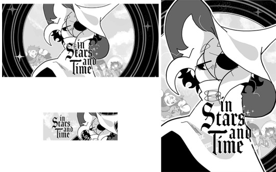
Here’s some examples of the key art being used for Steam store assets. Itch.io is very kind and asks for like 2 assets, but Steam asks for a whoopin’ 30 assets, all with different sizes and orientations, so it means one of the biggest things your key art should be is MODULAR AS HELL. From a massive 1440x3160 vertical banner to an itty-bitty 231x87 horizontal button (called a capsule, it’s the small banner above, and since it’s usually the first thing you see about a game it is THE MOST IMPORTANT ASSET), your key art needs to be ready for anything!!!
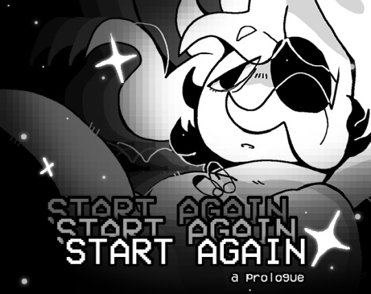
For the prologue, I did not plan for this very well. I learned pretty late in development that store assets for itch.io (and later, Steam) were gonna be a thing I should worry about, so I ended up deciding to use the title card art. Which, like, it worked out.
BUT! I had to redraw Siffrin to make sure their hat and body weren’t weirdly cut out, and had to remake the pixelly gradient like a thousand times for each asset to make sure it wouldn’t hide Siffrin’s face. And that’s without mentioning the hell I went through to make sure the massive title logo would fit. Why did I think “START AGAIN START AGAIN START AGAIN: a prologue” was a good title. It was so hard to make it fit in its entirety every time (because, of course, Steam asks you to show the logo in its entirety in every single asset). Why did I choose this title (I’m a Kingdom Hearts fan and my heart is rotten and thinks long titles are funny)
So since I went through hell with START AGAIN’s store assets, for ISAT I made sure to think about the key art way ahead of time teehee.
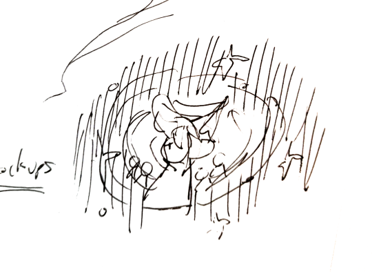
Every so often I become an absolute genius so I only had to sketch the key art once, as you can see above. You don’t need to understand it because I do and it’s all that matters. Teehee!

Here's the rough illustration! I made it to block out the shapes, and figure out where that dang logo would go. Once again, reminder: if you have text of any kind, figure out where it goes in the rough stage. Future you will thank you. I also had Siffrin look directly at the camera in this rough stage, and then figured. That it would look sadder. If Siffrin looked emo-ly to the side. I do like the look at the camera though. He Is Looking

To talk about The Meaning very quickly, I wanted to show Siffrin front and center, since the whole story is about them. And I wanted to show the whole party, but clearly separated from Siffrin- Siffrin is stuck in a time loop, feels completely apart from them, and I wanted to show that in the key art! With the expressions too- everyone else is happy or engaged in something, interacting with each other, while Siffrin is in his emo phase. And also stars everywhere. Because of course.
Here are all the layers I used- I made sure to draw them on a vector layer in Clip Studio Paint, which means the lines never become pixelated even if you zoom in a lot! As a side note, the full file for this is 4000x3000, which I thought would be too big, but is actually just the right size for all those dang assets.
I also made sure that Siffrin would look the most detailed, since I knew that while everyone could fit for the bigger pictures, for the itty-bitty small ones (or the extremely horizontal ones), I would only show off Siffrin’s face. MODULAR!!!!!
In the end this key art worked pretty well to make the store assets, but if I could talk to past me I would tell them. Make the circle bg taller so it’d fit the more vertical assets. And find a way to leave more space for the characters in the background. I had to remove them/rotate them/zoom them out very often because Siffrin hides them too much because Siffrin is just too dang big. But that’s still manageable, past me. You did a good job past me
So, TLDR, from my experience, what you need to keep in mind when making your key art is:
-make sure it has enough layers to be able to move things around as needed, but not so many layers that you become lost
-fun art that represents your game and its vibe well
-cool everywhere, but able to get by if you zoom in on one thing (which usually for ISAT’s assets is Siffrin’s face)
-able to work in a vertical and horizontal format and at many different sizes
I hope my key art made people interested enough in the game to try to find out more!!
That’s all I have to say for today! Let me know if you have any questions, or if there’s any aspect of the game development struggle you’d like me to talk about! See you next time!!!
AND DON’T FORGET TO WISHLIST THE GAME ON STEAM ALSO IT REALLY HELPS BECAUSE STEAM’S ALGORITHM IS MORE LIKELY TO SHOW OFF GAMES WITH A HIGH AMOUNT OF WISHLISTS THAT’S THE REASON WHY GAME DEVS ALWAYS ASK TO WISHLIST!!! OKAY BYE!!!!
#devlog#indie dev#in stars and time#start again start again start again#indie game#reference#video games#sorry if the post breaks i had to format this whole post on my phone. pelease clap
267 notes
·
View notes
Text
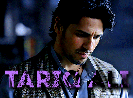
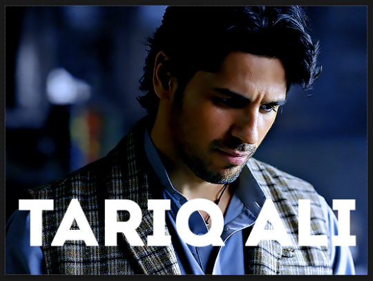
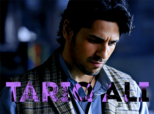
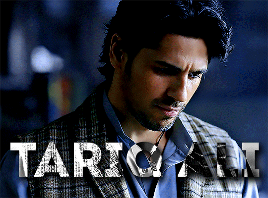
。SINKING IN SQUARE OCEAN

━━ PAIRING: tartaglia/reader
━━ CONTAINS: modern!au, usage of childe's real name, briefly mentioned college!au, childe is over 20, exes to open interpretation, not beta'd
━━ WORDCOUNT: 0.9k
━━ NOTES: figure it's childe who drags me back here. enjoy whatever this is that i thought of at 2am and wrote while half-asleep. anyway, don't be like them who wait for or send messages to your exes xoxo
━━ CHILDE'S BIRTHDAY 2023
A taunting red circle with the number 46 written on it (in some random Sans Serif font he couldn’t care less about) mocked him. He thought about it—played with the idea of tapping the irrationally vibrant gradient of the app and just copy-pasting a half-assed 'thank you' message stored and minutely edited in his notes app before tapping send and rinsing and repeating and—in the end, he chose to cling immaturely to the sincerity hidden under the wraps of his fragile humanity. He thinks of it this way; like the unsettling emptiness that sinks in when the bouncing Sony logo doesn’t hit the corners of the television screen. He doesn’t think he can bring himself to be half-hearted to anyone when they went through the trouble of greeting him on his special day. It’s a lonely feeling to be disregarded. He knows that. He’s the special boy of the day but he feels disregarded, and it’s a lonely feeling, and he’s reminded of it all over again so he groans into his pillow, suffocates himself a little before he’s back again to staring at the taunting red circle. 46 messages but none of them were from who he wanted it from the most.
He’s prepared himself for the inevitable disappointment at least three days ago. He’s psyched himself up saying ‘C’mon Ajax! It’s just a message! You can do without it!’ because yes, he can do without another repetitive, standard greeting that may or may not have confetti or cake emojis. It doesn’t matter. He doesn’t count. He doesn’t hold it against anyone if they didn’t tag him on an Instagram story with a picture of him and their person together. It was fine. Pleasantries are overrated anyway.
So why? Why did this one—or the lack of it—hurt?
He’s not the perfect boyfriend. He thinks he’s particularly an even worse ex-boyfriend because ex-boyfriends cut you some slack and give you some space and never think about your shared times together at 11:45PM the night before an early shift. Good ex-boyfriends don’t stare at their phones, refreshing profiles and friends’ profiles for even the faintest shadow of their ex. Okay ex-boyfriends don’t make burner accounts like a freaking stalker just so he can still press the tiny heart button at the corner because he does like-love it. The photo. You. Who knows. But what he does know is that even bad ex-boyfriends let go and that’s the thing. Letting go is the one thing he can’t do and it all comes rounding back to his predicament. He’s staring at the taunting red circle that remains unchanging even as he blinks and swipes and opens and exits other apps. It stays the same.
Someone knocks on the door and he mumbles an unintelligible reply. He thinks he hears a ‘Good night, ‘Jax. Happy Birthday’ from his mother. When her footsteps recede and leave him back to the solitary confines of silence and his yellowed walls, it was 12:02AM. His entire arm feels cold and it’s partly because the fan was hitting it and partly because blood has moved down from how he’s been holding his phone while lying in bed. It’s uncomfortable. He feels his palm turning sweaty too.
So he drops it.
It falls and hits his hip and he winces while it clutters to his side over rumpled Spiderman bed sheets that he’s had since he was eight. Honey-ginger fans against his freckled cheeks before it settles, closing finally and accepting the nihility that comes with the darkness.
But then he snaps them open again and he blindly reaches for his phone, furrowing his brows as he’s assaulted by the light from his lock screen—a family picture taken on a very bright sunny day. He ought to change it for midnights like this. Later though, after he sets an alarm because he has to earn some way and tomorrow, he’s on the early shift.
It’s 12:08AM when he freezes. A taunting red circle with the number 47 written on it (in some random Sans Serif font he couldn’t care less about) mocked him. His thumb hovers over it, controlled by his mind that chastises his heart for feeling ecstatic when it can be anything but the thing he wished for when he blew his birthday candles. In the end, he steels himself from disappointment all over again, tapping the corner and feeling ice-cold water pour over him as he sees your nickname.
“Happy Birthday. More birthdays to co”
He knows that—knows you, knows that the ‘o’ in the keyboard is close to the ‘send’ beside the text bar so before you could try to exit the app or pretend to be offline, his fingers that were tensing from the cold aftermath of the rain were fumbling to type a reply.
“Tank u but mt bday is yestrday :P”
He cringes at the typos and the reply and the emoticon and he never wanted to die as much as he did today, a day after his twenty-something birthday. He lost count. Time stopped for him at twenty—at the day he moved back into his family home after dropping out of college and leaving you.
With his eyes squeezed tightly, he mutters hopes and wishes to a god he didn’t believe in. Still, he was willing to convert if they spared him the aftershocks of birthday magic. It’s only ten minutes after his birthday. That’s got to count for something, right?
Seconds trickle by slowly but it appears. Three dots circle and dance cyclically and hesitantly but they do and he knows, at least, that the conversation’s not over yet, and that for now, that’s enough.
© 2023 𝐓𝐀𝐑𝐓𝐀𝐆𝐋𝐈𝐀𝐗𝐗. all rights reserved. do not copy, claim, repost or translate in any platforms but reblogs are appreciated.
#genshin#genshin imagine#genshin scenario#genshin x reader#childe x reader#genshin impact#genshin x y/n#genshin x you#genshin self insert#gi x reader#childe#tartagila#childe x y/n#childe imagines#childe scenarios#tartaglia x reader#tartaglia x y/n#—𝐭𝐡𝐞 𝐚𝐰𝐚𝐢𝐭𝐞𝐝 𝐨𝐩𝐞𝐧𝐢𝐧𝐠 𝐧𝐢𝐠𝐡𝐭
72 notes
·
View notes
Text
Emptyinsion
[pt: Emptyinsion /end pt]

[ID: a rectangular flag with 5 equally-sized horizontal lines. colors in this order from top to bottom: a gradient from white to blue. End ID]
requested by anon
Emptyinsion: a gender connected to feeling empty inside.
Etymology: empty, ins(ide), “ion” meaning the action of
@radiomogai , @imawanokiwaaa

[ID: a purple-pink line divider. in the center is a purple-pink circle outline in purple, with a purple play-button in the center. End ID]
79 notes
·
View notes
Text

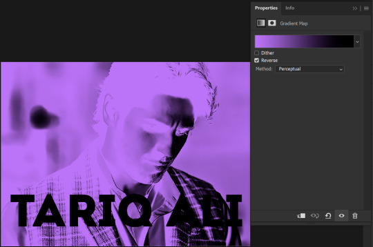
Gradient Maps For Dummies <3
— as written by a dummy
it’s been a while! hello gracious reader and welcome back to the series where yours truly fails at explaining things: photopea for dummies. if you’re unfamiliar, this is a series where the admin of this blog tries to explain how photopea works. whether or not the series is successful is yet to be determined.
today, we’re attempting to tackle yet another one of photopea’s adjustment layers: gradient maps. gradient maps have become more popular in the editing community lately, so i’ve been meaning to make this one for a while. apologies for the delay!

what is a gradient map? a gradient map is a form of layer that adheres a gradient to a photo’s dark and light values. a gradient fill is something different altogether, wherein a gradient is made atop the image without regard for the image’s original form.
think of it as a bedsheet. when held upright, a shield is just a rectangle, but if you lay it on something three dimensional, you can see the object beneath, because gravity causes the sheet to adhere to whatever is beneath. in our case, your image is two dimensional, but a gradient map applies different colors to the dark, light, and middle values.
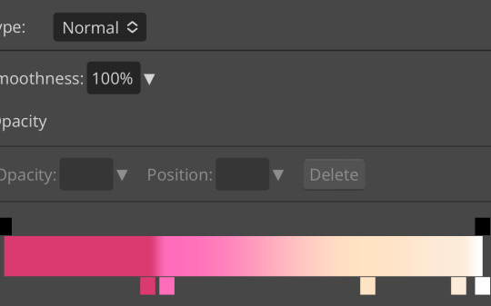
this is the gradient map used on all of the icons above. i made this one by experimenting with different colors. to add colors to a gradient map, double tap below the line, and you’ll see a small square appear. click the square to choose the colors you desire, and feel free to adjust it as you wish.
in photopea’s gradient maps, the colors closest to the left will adhere to the darkest parts of your image, while the colors closest to the right will adhere to the lighter parts of your image. the saturation and lightness values of your color itself don’t affect this at all—for example, here’s the same gradient map applied in reverse.
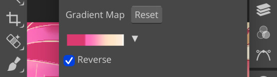
(to reverse a gradient map, toggle the reverse button as seen above. to undo it, just click the button again.)

pretty different, right? especially with no blending modes or adjustments in opacity, this gives your images a spooky negative look. if that’s what you’re going for, go crazy. if you want something a little more plain, set your darker colors on the left, and your lighter colors on the right.
exactly how the editor utilizes a gradient map is up to personal preference. some editors use gradient maps in lieu of complicated psds, while others like myself use gradient maps as one of the pieces of our complicated psds. gradient maps often go hand in hand with blending modes—for more on that, see here.
personally, i use a gradient map as a base for most of my psds.

the exact settings are up to you, but i typically use either blending mode soft light with 50-75% opacity, or blending mode overlay with 10-25% opacity. the gradient map i use is one of the default ones available in photopea, a simple black and white set to reverse.
i like to use this gradient map to soften the colors and as a simple, easy to do base for all of my psds. if you look in some of the psds i have posted, you usually see this at the bottom or close to it.
how else can i use a gradient map? anyway you want, really! as you can see in my example image, gradient maps can be used to completely change the colors of your project, or to add a little bit of spice. something else you can use is a noise gradient map for texture.
go to the gradient map itself as if you’re going to adjust your colors, and switch the type from normal to noise. then click randomize until you land on something you like!
it looks something like this. set to normal is pretty chaotic and janky looking, but set to soft light or to a lower opacity hue setting, this can be a great way to add some flare to your psds!
like with a lot of things in photopea, it’s best to experiment on your own and figure out what works best for you. i recommend playing around with opacity and blending modes, as well as what color combinations you personally like. every editor’s style is different, and the sky’s the limit with what you can do!
yours truly, canarysage
#i have a migraine so i sincerely apologize if this is incomprehensible#photopea for dummies#ʚɞ — tips.
29 notes
·
View notes
Text
@fishmech replied to your post “”:
@secondbeatsongs well the convenient thing for winamp skins, is the skin file is actually just a renamed zip, containing standard image formats, and for these freeform "modern" skins introduced in winamp 3 onwards, xml files describing what parts of the images are meant to do what function/display what info etc. older winamp skins that are confined to the standard window shapes are even simpler, cuz you just need images in a renamed zip file
@secondbeatsongs i'd reccomend starting by simply making copies of the default Classic and Modern skins that come with winamp , and just start editing off those as templates to get a feel for what works and what doesn't. and of course any modern graphics package should offer tools to create simple gradients and fake reflections and all the rest key to this particular style, you'll just need to make sure your output files are in the right sizes.
so the good thing about this is that windows media player skins pretty much work the same way, so I'm sure I already know how, skills-wise - I made a bunch of WMP skins as a kid, so I know how to do the XML and the hover images and everything.
it's really the amorphous shiny-smooth graphics that I love so much, and that's what I desperately want to learn how to do. I want to make things that look like weird old mp3 players! I want the cluefinders laptrap aesthetic! I want to make things that look like they stepped out of a late-90s or early-00s disney channel original movie!
so yeah! code-wise and image-formatting-wise, I can do it. but unfortunately I am not good enough yet at the shiny fake reflections to make things exactly how I want.
ah well. I'll get there eventually!
also, for funsies: here are screencaps of some of the WMP skins I made back in the day:


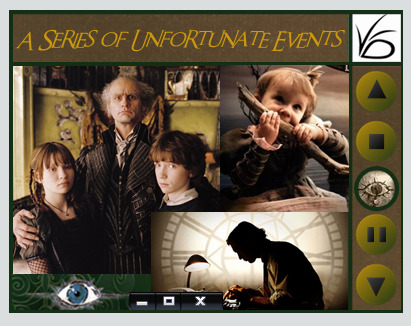


...y'know, looking back at these, these are pretty good, considering I was 12-14 when I made all of them! I was not bad at graphic design, turns out!
and a lot of them have bonus stuff - the ones that have a picture for the play button, the picture changes into something else when you hover over them - like, in the Mythbusters one, the truck explodes, or in the ASOUE one, the eye turns into a picture of Count Olaf.
there's some fun alt text too (esp in the ASOUE one)


and if you hover over Adam and Jamie in the Mythbusters one, little speech bubbles pop up with quotes from the show

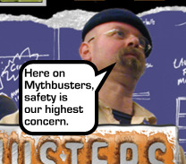
these are like! not bad for a literal twelve-year-old! I'm proud of past!me!
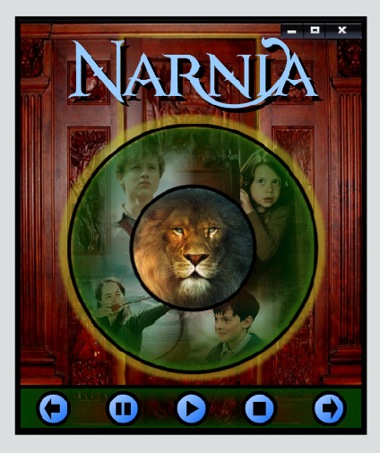
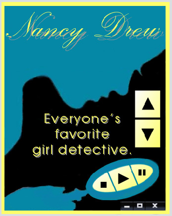
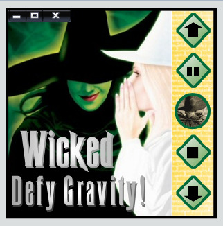
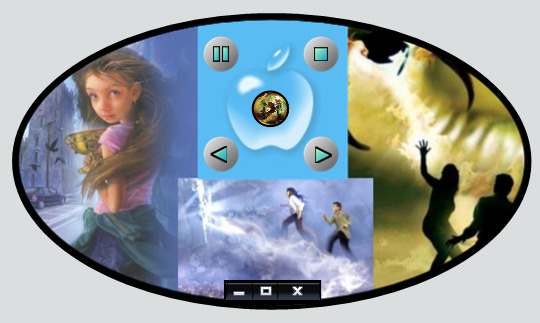
#fishmech#young wizards#twilight#mythbusters#eragon#nancy drew#asoue#wicked#narnia#those are all the fandoms of the WMP skins in the screenshots#ah the mid-late 00s 🥲#personal#sbs rambles
37 notes
·
View notes
Last Seen Blogs
weirdcor3
stay a while
dameronalone
the bull is a metaphor
jesusatucanal-blog
Jesusatucanal💄

thejudgegroup-blog
Untitled
luvvbugs
m