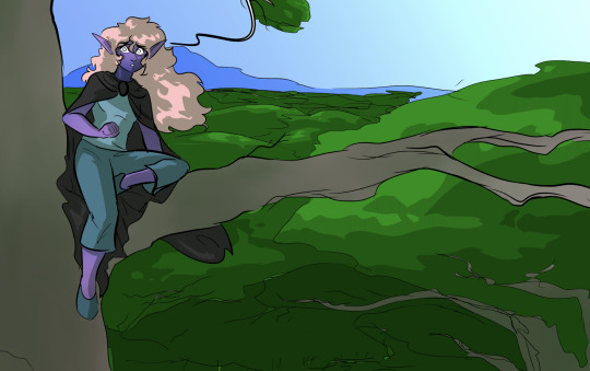
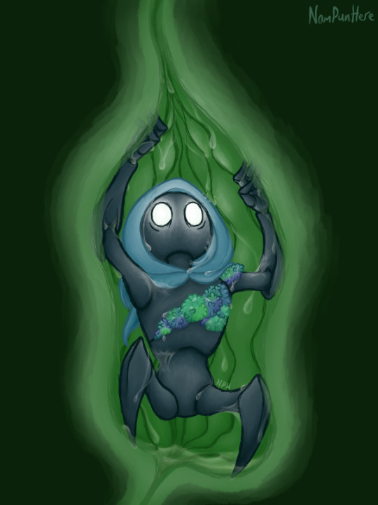
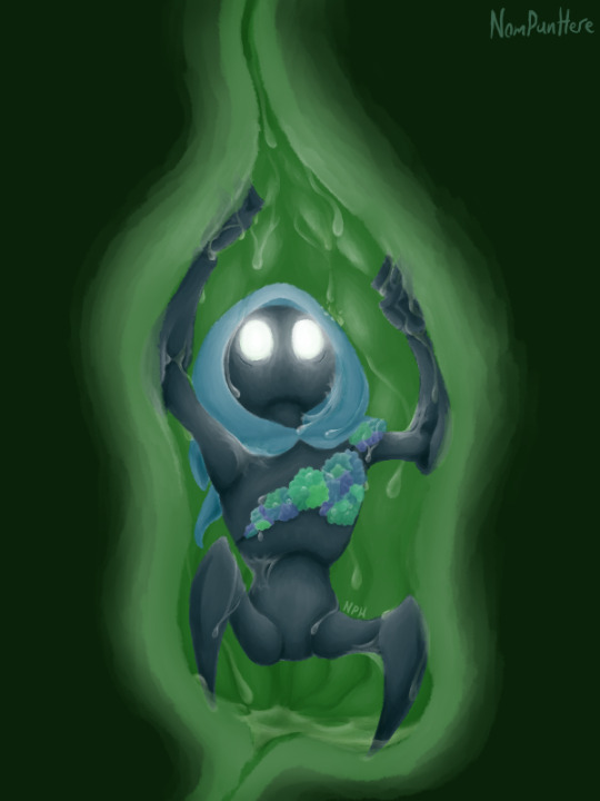
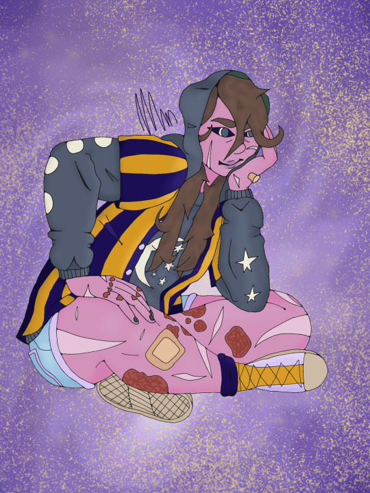
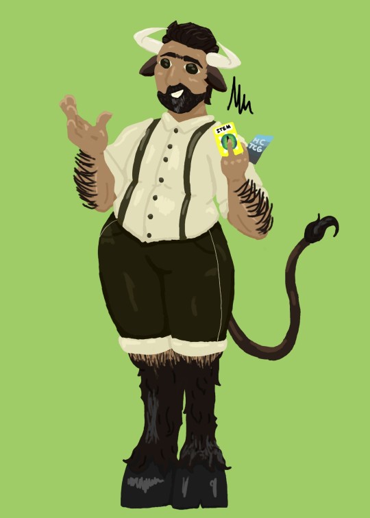
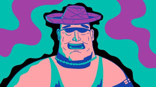
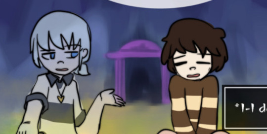
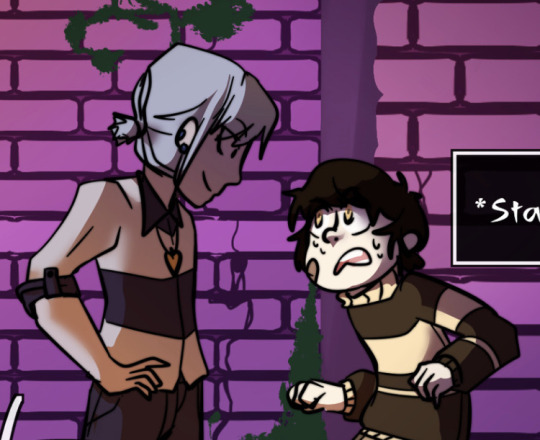
#experimenting with lighting and lineless art this time
Note
So far, has there been any sort of art technique or process you've tried that made you go "that was surprisingly easier/harder than I expected"?
Oh man, yea. So many things. Doing this comic has been a learning experience and a half because of all the textures and effects I have to do, most of which I figure out on the fly because I've either never done them before or I've never done them that many times before.
The first "surprisingly easy" effect I'd never succeeded at before was the scales on the Storm Drake in the interlude after chapter 6:
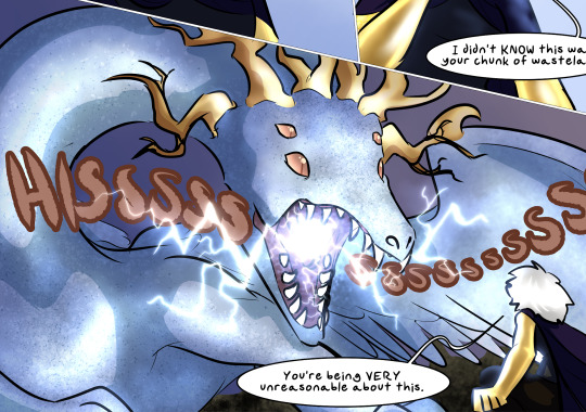
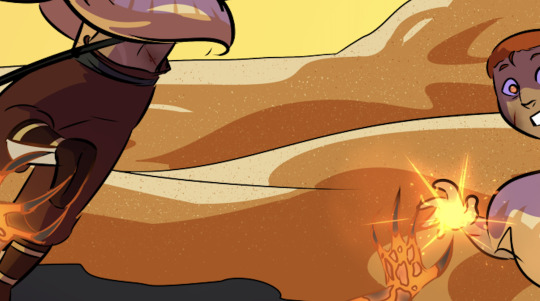
It's a Droplet particle brush used on two layers, one set to Multiply and the other to Screen. It produces a very easy texturing effect that works on everything from scales to sand to rock, making the surface look like it's catching the light in complicated ways. I used it again in Dainix's desert flashback in chapter 19 to make the sand look like it was catching the light.
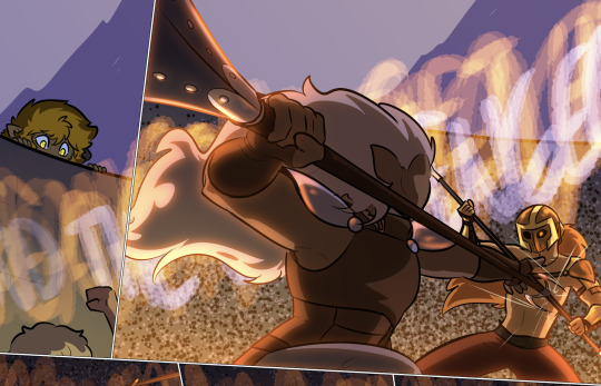
I actually used a similar method to draw the background in the arena fight in chapter 12 - using a rounder particle brush, but the same combo of Multiply and Screen to produce a chaotic pattern that gave the illusion of a massive background crowd without making me hand-draw ten thousand tiny people.
This one was an effect that didn't surprise me and that I sadly had very little cause to replicate, but I LOVED the multicolored highlighting effect in Erin's chapter 6 flashback in the heart of the Storm. It ended up being very simple to do and it just looked SO pretty.
Changing the highlighting colors to just the cool-tones for this page just made me like it more.

When we hit Falst's intro arc and I had to draw about a million forested backgrounds, I decided to refine the process I'd used in the first few chapters, because I wasn't happy with those results:
Starting in chapter 8 I tried a lineless style for forested backgrounds, and it worked out better than I'd hoped. Not only did it produce a feeling of depth and shadow, I didn't even need to plug in my drawing tablet to do it - I could literally do these backgrounds with my trackpad and mouse, which was a huge timesave. Combined with a little experimental sunbeam stuff and these forest backgrounds ended up both shockingly simple to make and VERY nice to look at.


I used a similar technique for the soulcrystal in The Collector's lair - stacked Multiply and Add layers with nested rough shading patterns similar to the ones I used for foliage, but with more overlap to produce the effect of chaotically scattering light.

This was another no-drawing-tablet one, and I liked this texture so much that I willingly redrew it for the stinger in chapter 18 rather than copying the texture from the earlier chapter.
In terms of effects that took longer than I anticipated, Dainix's fully-realized Crucible form has been giving me trouble for literally as long as I've conceived of the comic. Drawing fire is already hard enough, but giving that fire a semi-solid, tangible form that was clearly readable as a humanoid figure was a HUGE pain in the ass. The head and arms were easy to design, but what to do with the bottom half was always a struggle, and beyond that I wasn't always sure how opaque to make him - real fire is a semi-translucent light source in constant motion with no clearly delineated edges, and if you draw it in a way that deviates from that too much it can make it feel less like fire. It took a while before I was happy with the color balance on him to make him suitably glowy without losing the internal detailing that made his expression readable.

Similarly time-consuming, working out how to do Vash's "nova mode" took some trial and error. I wanted to make it clearly visually distinct from Paladin light magic and regular fire magic, so I focused on trying to replicate the texture of the surface of a star, with sunspots and flares rather than licks of fire or sharp-edged lightsaber vibes. I'm happy with how it ended up, but if I recall correctly it took upwards of two days just getting all those glowy effects sorted out.
Then drawing the actual starfire blast was an even bigger pain, because again I didn't want it so glowy that it was completely unreadable. To be honest I'm still not sure if it worked.
This is a very recent one, but it took me a while to figure out an effect I was happy for to communicate "this place is really, really dark." I didn't settle on a blanket dusty purple desaturation layer until quite late, to sort of replicate what night vision supposedly looks like for animals that can see decently well in the dark. Lights and darks are preserved, but color isn't so much, and this way I wasn't way-overshadowing everything and making it impossible for US to see. And conveniently the actual effect is quite simple to do - it's just a universally gray layer at 50% opacity set to the "Saturation" combine mode, stacked with a universally dusty purple layer at 70% set to the "Color" combine mode. Very easy to add quickly and copy/paste across different pages.
There's probably more, but yea. Almost all of the "that was surprisingly difficult" effects either get easier with time or I figure out ways to simplify them and make them work in fewer layers. This is the really fun thing about a longform project like this - I keep finding new ways to challenge myself I'd never even thought of before.
225 notes
·
View notes
Note
Hi Azul! I’ve been a fan of your art for a little while now, and I wanted to ask how you learned to render lineless artworks the way you do? Any tips to someone trying to learn? You’re a huge inspiration to me (no pun intended haha) and I also wanted to thank you for motivating me to draw on slow days.
Hi! thank you so much for your nice words, it means a lot to me to be an inspiration and it's a pleasure to share about my experience.
To render I usually keep two things in mind:
1. Make sure that what I'm drawing works correctly as a 3D figure and have a three-dimensional view of it the entire time I am drawing it.
2. The direction of light, knowing it and keeping it in mind will help you know where the shadow will go.
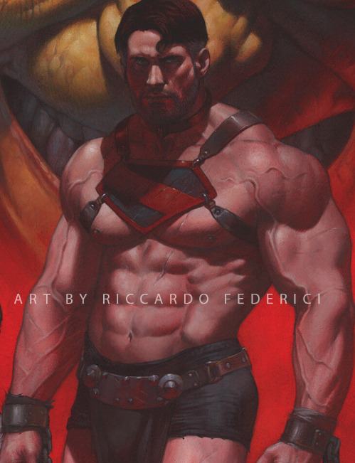
Visual environment concept art work has helped me learn about the use of depth and importance of contrast of tones and colors. But of course, knowing something logically is not always enough, I live attached to visual references and studying them.
One of my best recent painting studies and references was the art of Riccardo Federici (a big inspiration rn).
I analyze every reference I see, just that. Every time I can't do something, I look for something that can show me and, in this way, it not only helps me with my current illustration, but also helps me learn new information that I'll use in my later illustrations.
So there's the method that has worked perfectly for me. More than just copying, analyzing how something is constructed and elaborated to know what I'm doing and make learning effective.
I'll leave here some YouTube channels that I've been watching and also a good reference and study page.
Proko
Ben Eblen
Line of Action
(also Pinterest but ik we all already live there)
27 notes
·
View notes
Note
cherrypie?!
here is ur slice of cherrypie
First time in a real long time experimenting with lineless art.. difficult since i still somehow don't understand shading and lighting but i think ill keep trying it out
25 notes
·
View notes
Note
15!!!!!!
15. Have you noticed your style change over time?
Sure, I think so! To be honest, I have always liked experimenting with different styles (and as far as fanart goes, I usually try to somewhat copy the style of the original), so it’s hard to pin down the differences in my “core” style ig? if anything, it’s just been a gradual blending of the styles from the fandoms I’m in now vs. then
For instance, once I got into Thunderbolt Fantasy I started doing way more painting/lineless art, since the source material is film rather than illustration. Since then, I’ve started using looser and less prominent lineart, with lots of elements (stray hairs, highlights, etc) going over the lines. I’ve also learned a LOT about color in recent years and started using more complex lighting
^ Herons w/ birbs in December 2020 vs. December 2023!
8 notes
·
View notes
Text


Hooooo that took a while- I mean, uh, woah, more art! Started this sort of reference sheet thing like a month ago or so, been working on it very sporadically, and brain kept wanting to add more details and shading so it kinda just kept going and going. but hey, twas fun! and I got some more experimenting in, this time with not actually having proper shading and highlight layers and instead just messing around with the brush opacity
So anyway, it's plant boi. Or Moss!T/iso, as I've been calling him. Sort of just to show how I visualize him, and also what he's been up to since his, uh, revival. tho of course the internal there is from while U/nn was still healing him
And also a bit of a teaser for what should be my next fic! Admittedly, I haven't been working on it as much as I'd like to, with college stuff and also working on the art here. for now, enjoy the snack until I can finish the meal ;) (also click for higher quality, I worked hard on this ;w;) (like seriously the Hunter's hood took hecking ages and for what)
and look below the cut for an extra treat~ (warning for fearplay)
oh gee, wonder what happened to our boi here. merhaps a follow-up to that last image? either way, rip Tiso (he'll be fiiiiiiine)
seriously this was supposed to be a quick bonus sketch but as soon as I started coloring in the face and leaving light around the eyes I was doomed. ....WAIT SHOOT THE LIGHT- okay fixed. the colors really do look way better on my drawing tablet than my laptop screen huh
here is the undarkened version
aaaaaaand lineless. because I went out of my way to make sure it looked good without the lines :>

okay that's actually it now eheh bye
—————————————
DNI NSFW blogs, blogs that post exclusively hard and/or fatal vore, weight gain blogs, mpreg blogs, proshippers, TERFs, ace exclusionists, etc.
#soft vore#safe vore#extreme cuddling#g/t vore#half size vore#hk vore#hk spoilers#fandom vore#vore art#my art#tw bugs#fearplay#yeah that's probably enough
131 notes
·
View notes
Text
Hey guys, lets talk about smthm real quick. I got into mcyt in august of 2021, and two months later I started drawing fanart.
This was my very first piece, and it's heavily influenced by the fact that I was just leaving the jse and markiplier egos fandom. I didn't like it very much, but I was happy to begin experimenting with lighting (something I still shy away from today.)
I drew this one very shortly after (it's Tango, don't ask me what my design idea was) amd I loved it! And I'm still glad I drew it, I can see the things it began to teach me, but the pride in it isn't there anymore.
At some point, this was one of my favorite drawings I did. And I still really like the sketch! However, I still would grow and see the critiques others had from here. I don't remember much from this time, so I don't have much else to say.
At some point I got to this (the steps now are a bit all over the place, long gaps, back and forths between art styles) and then I refined this sketch style! It was low energy but it worked! This is a begginning example but, there were some better ones too.
Such as this! And this is about when I started getting more consistent designs, too, and took on a different style of shading that ended up staying! Very shortly after, I begin studying different body types and aging and the like.
Then there was the conscious descision to go lineless. This here was the first attempt, and it has room for improvement. This style, still has adapted, but let's look at a favorite piece from this (that isn't super complex)

Now the pen i used for this is a bit different in all honesty because I switched devices now, as up until this point every single one of these had been drawn on a phone that was cracked to all hell, but the general rules to it are the same, same kind of shading, and such. This piece also showcases a bit of my experimentation with body types. I'd also go as far as to say this is my last drawing in that style.
And most recently, we have this. While it's still a variation and a similar style, there are notable differences. It, while still holding true to anatomy on a level, has a cartoonish aspect that wasn't there before, with differences in the shading. I enjoy this style immensly and I thought just my journey in this fandom was interesting. I'd take you through my entire art journey, but most of those are signed with legal names.
If there's anything to take away from this, it's that if you aren't happy with it now, keep going, it does work. And if you are happy, keep going amyways, who knows, maybe you'll improve drastically too. Just keep going, and one day you'll pause and be blown away by what you can do now.
#grian#mumbo jumbo#vintagebeef#tangotek#pearlescentmoon#goodtimeswithscar#welsknight#ijevin#a journey#art progress
16 notes
·
View notes
Text
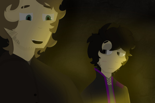
WOW Geist drawing?? I know, it's rare these days. But I finally got some of my OCs out of my brain and onto a canvas and I'm decently happy with the result! I did a lot of experimenting with this one: I learned how to do lineless art the proper way (it is SO much easier than my shitty method before) and worked with fire lighting for the first time, as well as different blending methods and whatnot (I used Multiply and Add for this one). This is a little snippet of the lore for their story I've been developing seriously since 2021, but developing at all since 2020.
The story is set around an archipelago with different communities on each little island. The dude on the left is Doiro Homestead, mayor of a currently unnamed island (I'm changing the names, the originals are no longer canon) that is mining-run. The guy on the right is Angelo Grim, the sole resident of the smallest island in the archipelago, simply referred to as Angelo's Island. His life work is mapping out and researching the Underworld, which is actually a unique ecosystem deep underneath the earth's surface, but the Underworld is linked to negative beliefs by many so he is seen as suspicious to most people he interacts with. Doiro is an exception to this.
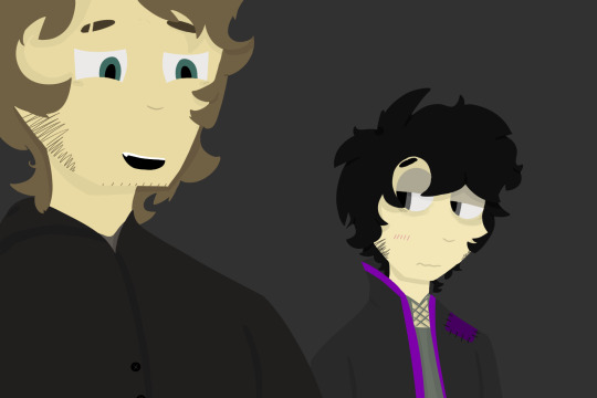
Characters without the background and lighting:
3 notes
·
View notes
Note
1, 10, 13, 21 - Art Ask!
Thank you so much for the ask! ❤︎
1. How would you describe your style?
Very good question... I think since I started doing my digital art lineless it looks softer. I also try to work as clean as posible, both on digital and traditional.
When it comes to art style I don’t like to stick to one thing, I like being versatile and allow myself to try a little of everything, sadly most of said experiments are only on my sketchbook.
10. How many different sketches do you usually have until your piece is finished?
Most of the time one for traditional is enough. I like working on the final piece of paper from the beginning. If the paper gets too damaged or is not the proper paper (ex. watercolor paper or marker paper) then I'd use a light box to transfer it to a new sheet.
Digital is usually about two to four of them. Only if the piece is quite complex or I'm not sure exactly what I'm going for I'd start with a very rough sketch with a marker brush to define shapes. The next sketch is for general details, then a new one for small details or things I didn't get right on previous sketches, I like picking a pencil like brush for these ones, or whatever brush with medium hardness and opacity levels. The fourth one only exists if there is still something I didn't draw properly at this point.
13. How long do you usually take on a piece?
I don’t have an clear answer for this. A doodle might go from anywhere between a couple minutes to a few hours. Linework can take a few hours too, on traditional it is a very slow process. Coloring takes as much as my energy allows it to. I’d say a not so complex character with a simple pose, full body and full color can take 8 hours at least.
Overall I work slowly. A fast piece is done within two days.
21. Something you would like to improve on?
Everything! I'm looking forward to keep improving on anatomy, human faces and character design.
Backgrounds and coloring are something I struggle a lot. Stiffness is something I always try to fight along with color picking.
Having a lot of room to improve is nice, it keeps me invested, yet art is just my hobby. My first rule is to enjoy it, then to improve it.
4 notes
·
View notes
Text
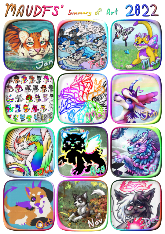
It's that time again for the summary of art! 2022 is on its way out and it was certainly a year...
This was the year of the water tiger in the Chinese Zodiac. I enjoy using Zodiac things as prompts AND my birth year was of the tiger, so that is January's image. I used the lasso tool for a lineless look, it was fun.
February's image is a bunch of air type raptors of a species I have been thinking of for a while. I was trying to flesh out what markings they would have and what kinds of color morphs might exist. (front to back: rare (sunset), common (blue-jay), melanistic (dark), leucistic (light), and albino) Of course they are not finished (I guess headworlds are never really finished) but I would like to someday update my websites bestiary with all the characters and species I've created and these would be one of the featured ones.
March's image is for an Ovipets challenge that I won! It is a Catus with butterfly wings looking at butterflies in a field of clover.
In April I made a bunch of shuffle-style icons and little sprites for my characters for things like their toyhouse pages or my website... so basically a bunch a stuff that won't get posted by itself.
For May here is a sketch of Fulvina from Spectrobes (the thing my Fulvina is named after! I had to draw it eventually, but) I didn't finish it at the time because I was having trouble with the lines, though I do plan on finishing it. Spectrobes as a whole could use some more love!
June's image is Amdy as a Unicorn, as I was seeing Junicorn challenges but didn't want to draw something every single day. I also chose this because well, why do I have so many so-called shapeshifters yet I only draw them in one form? I should show what else they can do!
July is ArtFight month and this time around I found some very cool characters to draw including a dragon named Colors! This was very fun to draw.
August I created a character called Daemon, seen here. Haven't really fleshed him out much though XD.
September Flight Rising released a gene called Soap that makes the dragon extra shiny, and I knew I had to draw it. What better than a vaporwave dragon? Flight Rising has released a LOT of stuff this year now that I think about it!
For October, a WIP of Alban... didn't finish much this month. I wanted to draw some Halloween images and make a bat-sona but that didn't happen in time. Somewhat related, this is the third year in a row I started to feel depressed beginning in October and into the winter, DESPITE loving Halloween and colder weather, so I'm wondering if that's a sign of seasonal depression or something? Yeah.
November's image is more Ovipets, this time dogs (Canis and Lupus) playing in fallen leaves. Used lots of different CSP brushes in this one. (For the single purchase version, of course... as if I'd deal with a monthly subscription for an art program... I don't know who thought THAT was a good decision)
December I finished this piece of Cygnet. I was going to try to draw more for December, but the sheer cold of this country wide snowstorm(!) seems to have put me in hibernation mode, so I'm gonna go ahead and finish with this.
Now's also a good time to say that I still don't mess with ΝFТ's or АI art, (I don't consider either of these things to be “art” and I don't have the energy to argue about it) so I've been experimenting with new watermarks to try and combat that in a subtle way... still watching Twitter catch fire. Still wearing a mask (end date: undefined). Still love playing Legends Arceus... STILL too shy to socialize!! Come on, that's gonna end up being my new year's resolution for like, every year! Gosh XD But I must continue to try... I must..!
As always, thank you for coming by and reading. :3
1 note
·
View note
Text
One of Werewolves's experience during Art Fight 2023
This was my first Art Fight and I only did two attacks and one friendly fire. Still, what a journey it was!
Preparations
At first I just uploaded old drawings of my three characters at June 23rd and started waiting for Art Fight.
Later I thought about updating their references and adjusting their bios and decided to not waste any time. Light Trinitrotoluene and Billy Brainstorm got updated pages and I planned to make one for Charles too, but was a bit late and Art Fight already started. So I had to do last page later.

THE FIGHT
I picked my targets before event started and after some time opened my art program.
Cop Flop
My first Friendly Fire was for GreenManeHeart.
I liked Dawn's design and got interested in character itself.
I tested here how perspective works with blending modes and the result was fine, but I can definely see huge room for improvement now. Glad that I even started doing this, not just because of experimenting, but because I didn't draw any pvz fan-art for three years.
Summerween Carver? Spooky Month Carver? Uh....

Next target was MarsyaDBluebell. Specifically, Marsya the Maine Coon Cat.
I'm quite a fan of characters who kills like it's their daily chores and almost doesn't feel any regrets. Interesting to analyze them and some of them just badass.
Tried to do lineless art with black shading and the result was solid. After this attack I finally updated Charles Strongman's page.
The Grand Launch

My last attack in Art Fight 2023 for ZeonSniper, featuring: Gerbella, Mino and Atlas.
This time I returned to my main style with huge colored outlines. Never thought that this attack will be one of my best artworks..
Epilogue
In all three attacks I had trouble with beginnings and had to rethink of concepts, then start again. However, after that I enjoyed the process of illustrating my wacky ideas and showing them to my favourite artists.
Overall, Art Fight was fun. But now I will just wait for results, until next time.
#artfight 2023#af 2023#art fight#team werewolves#team werewolf#pvz fanart#pvz#andy apple farm#oc#ocs#others ocs#Eddrawsthings
2 notes
·
View notes
Text
Developing... More Ideas
I had my storyboard and so wanted to draw myself as a kid, this was the only character which I had not yet established. The transition between current times and me when I was younger was part of the film so I wanted to keep it simple and keep it consistent so it would read well, using my previous drawing of the man in his canoe I came up with these two character designs.
I really liked these as they felt pretty accurate and consistent in their style. They were also vanilla enough to allow me to sponge up any design choices and style changes which crafting my palette and style would involve.
Style Frames
I moved on to developing my style, I chose a palette based on my memory of the pink sky and greeny blue sea, to contrast I used black to provide negative space where needed. I used this palette as it was pretty versatile in its tones and because of this I had options when it came to choosing darks, mids and lights. Keeping the relationship between colours was important, I couldn't switch up the function of one colour for 2 close shots unless I made transitions which smoothed out and visually justified these changes in function.
The first frame I drew was to help me figure out my palette and how I would use it to illustrate music.

I then drew this to take that palette and learn how it can be applied to the landscape, making sure it would get the right atsmophere
Finally I redrew the geezer using this style, I wanted to try and keep my original linework as a guide and then use a softer, lineless style to give the memory more fluidity and help it feel like ideas and images mixing up when it transitions from background art to character animation.
The 3 style frames helped me understand what my palette could do and this really helped with my animatic and with how I would visualize the memories. My focus changed from accuracy of setting to accuracy of my experience, I used the colours and the way they moved to try and connect this sequence together in a disjoined way which flowed like a thick honey, holding shape for very little time before going flat.
0 notes
Text
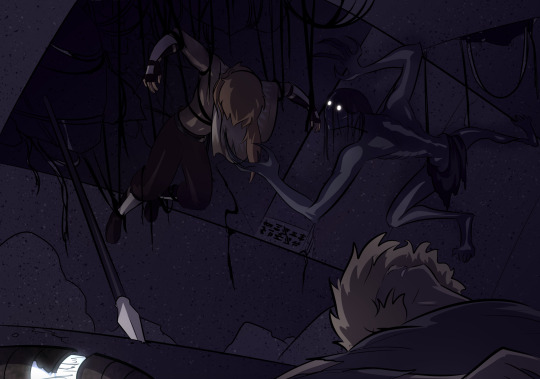
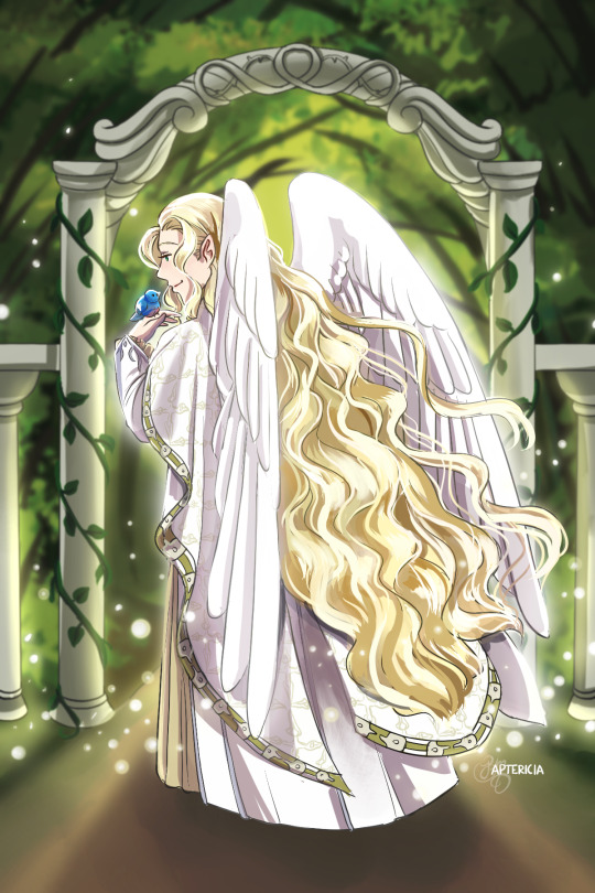
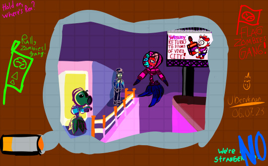
The Sea Urchin and the Bioluminescent Cave
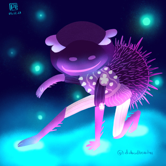
05.12.21 Inspiration from helmet urchins, sea urchins, and their shells
#mermay#mermay2021#illustration#digital art#creature feature#experimenting with lighting and lineless art this time
4 notes
·
View notes
Photo

warriorm cats
#warrior cats#hollyleaf#my art#now art dialouge in the tags!! i wanted to experiment with lineless and a more angular style#initally i was just going to block out the lights and darks and then paint them but i ended up liking it so much i just kept it#and slapped a little overlays on it to bring it together#it actually wasnt initally hollyleaf just whilst doing the main shape i thought it looked like my holly and went with it#i primarly put all my focus on the light and how itd cast shadows. However some parts feel awkward so idk#not bad for my first time doing this sort of colouring!!!#also whilst i did the block shading with black i used pink tones for light overlay and green for dark overlay#and colour was added by using a multiply over the black and white base!#too tirred to proof read this to check if it makes sense good night
50 notes
·
View notes
Text

It's done, it's done!!! This may be one of my favorite pieces I've ever made.
[Etsy]
I was incredibly nervous about coloring this, but the colors actually turned out close to what I was hoping for - and in much less time than I expected, too! (This was somewhere between 9-10 hours, I think? I can almost guarantee that my Bottoms Up pieces took at least twice that.) I wanted the atmosphere to look a bit more unsettled than a usual beach setting, like they'd ended up there after a rough storm. Also, I tried doing light sand at first, but it just didn't look right - instead, I channeled my only experience with black sand beaches, the Punalu'u Beach on the Big Island of Hawai'i!
One of my favorite parts was painting the clouds! I'd really like to be better at painting, improving my comprehension of form and complex colors, along with less reliance on linework. (My weighted linework is what first got me attention from the GO art community, but honestly, at this point I feel rather stuck with it - like it's limiting my potential. I'd love to try going fully lineless soon, though the thought also terrifies me - I hope it would still look like "mine," whatever it is that defines my style!)
#good omens#good omens prime#good omens fanart#good omens art#good omens artists#ineffable husbands#ineffable husbands fanart#ineffable husbands art#crowley x aziraphale#aziraphale x crowley#aziracrow#aziraphale#crowley#mermaid#naga#good omens print#good omens merch#naga crowley#made by samael#madebysamael
418 notes
·
View notes
Note
Hello hello!
I come to you with an artistic existential crisis (feel free to ignore). So, I'm still kinda new to art, and I love drawing but the thing is, there so much stuff on social media, different people that I find absolutely amazing and I'm an easily influenced person and always come back to doubting myself on the path I'm currently taking. For exemple I do lineart but there are so many incredible lineless pieces of art that I question myself about this (I tried, it didn't feel right for me but I still feel like maybe I should try harder?) And then there are those who use thick lines while I do mine thin, muted colours versus bright colours or simply black and white...
So I guess what I want to ask is: how do you differentiate the art you simply admire and the element you actually want to put in your own art? How do you know what kind of stuff you want to make? Or I guess how you figured it out since you've been doing this for a really long time.
Anyway, thank you for gracing the world with your amazing art and have a nice rest of your day!
Oh it’s a daily struggle lmao, I see art I love and I’m like THIS WHAT I WANT TO DO and when I first started out, my style varied widely bc of that. But in general, my art is always influenced by whatever I’m currently interested in haha. Since I’m back on my Naruto BS, I take heavy influence from Kishimoto’s work, but I’ve added my own flair and stylistic choices based on my own experiences and personal taste. So it really is up to you on what you want to incorporate into your artwork.
I usually just keep a couple things in mind:
1. It takes time to incorporate new elements into your art style. Of course your style is going to be different from the original work, so whatever element you want to add has to be fitted to YOUR work, as it was fitted to the inspiration’s work. It may not work the first few times, it may not work the first dozen times, it may not work at all, but it never hurts to try it out. And Hey, you may even develop something new and better suits your style, which is what often happens to me haha.
Honestly there is nothing stopping you from trying out ALL of those different elements you mentioned, I certainly have before and I’m sure all artists have at some point. That’s the point of practicing and producing art! Go wild, especially since you said you’re just starting out
2. Keep in mind what your art goals are. Are you trying to achieve an aesthetic for professional purposes? Are you trying to match a style to tell a certain story?
For me, my goal is to be as LAZY AND FAST AS POSSIBLE. I don’t have much time to spent drawing so when I do want to draw something or make a comic, I want it to be done FAST. That’s why I rarely color. I simply don’t have the time to spend 8 billion hours thinking of a color palette and lighting and rendering artwork. Otherwise I’d never produce any content or finish any of the stories I want to write.
The same goes for linework, rarely do more than 2 passes of refining lines bc that would take too much time. That’s why my line work is squiggly and sketchy at times and that has somehow turn into a stylistic detail for me along the way. Of course, with practice, I’ve developed more confidence in line placement so I don’t have to do more than a couple passes anyway.
But this is just me, I don’t draw professionally and really only draw to satisfy my own interests, so this works for me. I am fully aware my work is not professional quality nor do I intend it to be, and I’m totally ok with that.
73 notes
·
View notes
Text
Re: Tower’s Tale art style might change (again)
So TT has had its few share of style changes. Most of them have been due to me just “improving as an artist” and trying to find the balance between something that looks good while also not taking too long to draw.

…Another one may be coming very soon! And this one might be the most drastic of them all. Here I have a sample of Khun and Bam in the upcoming style (pending revisions and practices practices practices!)

So you’d be looking at almost lineless artwork, with less dependence on “shadow/multiply” and highlight layers
This lil post will highlight some of the reasons why the style is very likely to change going forward.
1. The artist is finding their style. Tower’s Tale is bound to change styles over time - after all, it’s a project that will take many years to complete! The art style may change in the future again, and while I have no control over Soli a year down the line, this style is what resonates with me at the moment, and what I am comfortable with drawing.
2. It’s aesthetically pleasing. It just looks good! Of course, whether something looks good or not is subjective, but, from my bias, this. style. just. rocks. I mean scroll back up and look at their hair. Bam’s hair has always been a hassle to draw because the ends just don’t look sharp enough for me (and I’m too lazy to go back with an eraser and sharpen the hair of every panel).
3. It saves time. Believe it or not, this style saves time! Usually, I’d have a storyboard, a sketch layer, a line layer, a color layer, and a shadow layer (+ backgrounds which vary from 1-3 layers, overlay layers, text and panel layers). With this style, I can have a storyboard layer in the background, and the layer right above it is a mix of lines and colors and shadows. Once I get to drawings that heavily rely on background lighting, I also won’t have to worry as much about strict color palettes. The drawings above took about 12-15 minutes each. Though of course I won’t know how much time I’ll actually be saving until I practice full pages.
4. It’s more fun to draw. Recently, I’ve found that I like drawing things that are a little… messy. Quick, irregular, energetic shapes that can get the figure across while still having enough order and proportion to be pretty. And hey, isn’t drawing comics about having fun?
Now. What’s the point of all this? Why am I trying to convince you?
Well, I figure that there is a chance of someone being upset over the style change (highly unlikely.but you never know). Reasons for that might include the fact that
a) It’s a sudden change. changes like these should be carried out between arcs/seasons, not in the middle of one.
b) Tower’s Tale may be even more delayed. I still have to carry out a couple of experiments before I truly finalize the new style.
c) Branding or something. You start reading and you get an art style, and suddenly! There’s a change in it and it’s no longer the one you cherished.
Though, to be honest, I don’t think people read TT for the style that I’ve had so far. In my opinion, it just doesn’t really stand out. The new art style, on the other hand, does. (At least I think so-)
All that said, the ask box is always open, so any thoughts, suggestions, advices and concerns can be put in there in hopes that I’ll one day see it.
See you soon~
19 notes
·
View notes
Last Seen Blogs

kawaiiweaselpartyflap
Untitled
shimmer-lamp
Soup with star noodles
worthlesspsychotic
Worthless_Psychotic

gayme-cube
GaymeCube
fudeh
malisang