#endsheet
Text
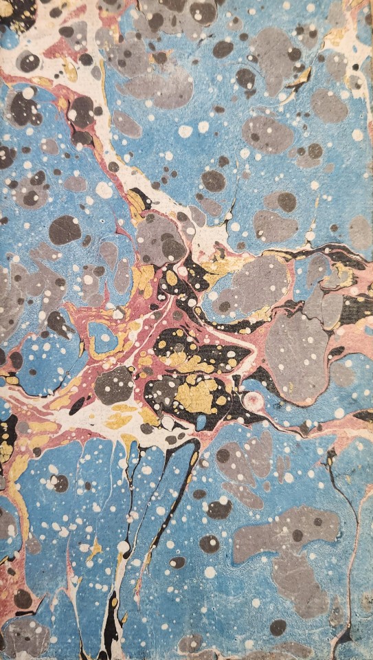
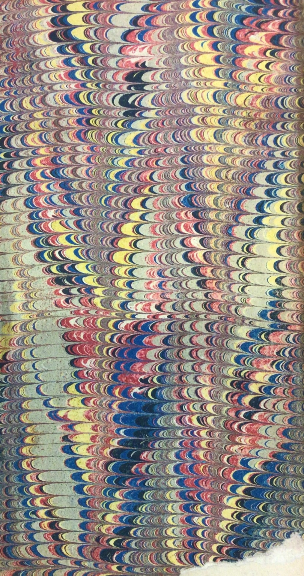
From: Duncan, John, 1721-1808. An essay on happiness. London : Printed for T. Cadell, 1772
PR4639.D26 E7 1772
#marbledpaper#marbledendsheet#marbled#marbling#papermarbling#endsheet#beautifulpaper#1770s#late18thcentury#rarebooks#specialcollections#libraryofva#marbledmonday
200 notes
·
View notes
Text
la jessi en casa
Novinha com calcinha transparente e buceta cabeluda
HypnoSissy
Bbw gets fat ass clapped doggy pov
Perpendicular Assjob - IntercruralSex
some blood
Petite Goth Girl Flirting with Herself in the Mirror, Changing Clothes
indian tamil sex videos
Hands free orgasm - I am masturbating with my legs ~DirtyFamily~
Milf and cute boy hot scene
#freith#Giulio#Chamite#contextured#surrept#feyly#sculpture#recordedly#smirch#paralimnion#capercally#immatures#codeveloped#fireclays#endsheet#railroadish#eloigning#ITC#dognaping#ngoma
1 note
·
View note
Text
Flare Signal (by @queenangst/achievingelysium on AO3) Fic Binding Update #5
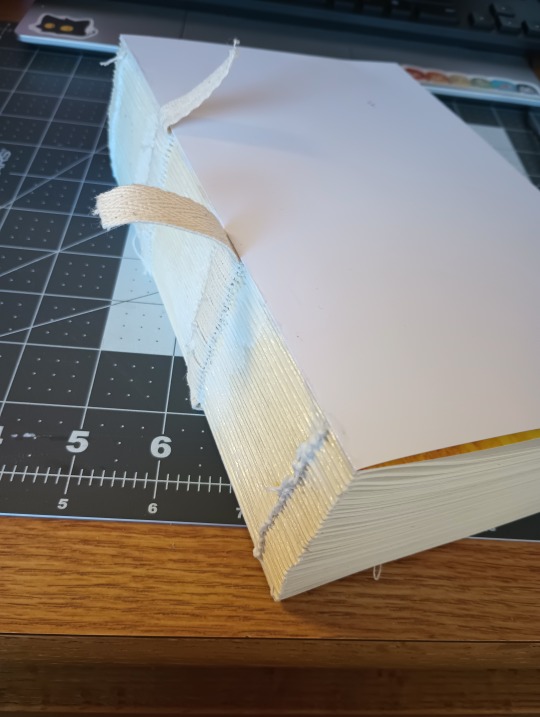
I'M BACKKKKK
uni has been kicking my butt but I've finally had some time for bookbinding again. Spine is glued and endpapers are attached! Next up is trimming (which will take ages since I don't have a guillotine ;-; but it's WORTH IT)
#me: i'm not that much of a sucker for symbolism#also me: ehehehehehe the front endsheet has a blood splatter and the back one doesn't to symbolize the journey from villain to hero#bookbinding#fanbinding#fic binding#flare signal#fanfic binding#mha#bnha#boku no hero academia#my hero academia
31 notes
·
View notes
Text
From our stacks: Detail from a delightful endpaper in a book storage box. It's possible that it was made in our bindery. (We used to have an in-house bindery here at DPL.)
#endpapers#books#library#libraries#design#end-papers#endsheets#bookbinding#book cover#book covers#detroit public library
80 notes
·
View notes
Photo

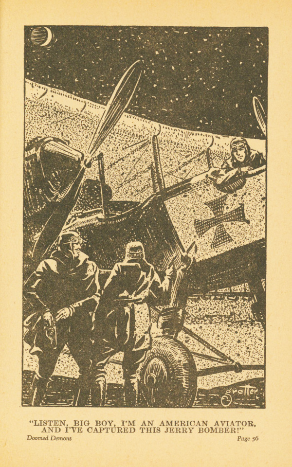

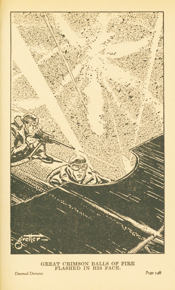
Publishers’ Binding Thursday
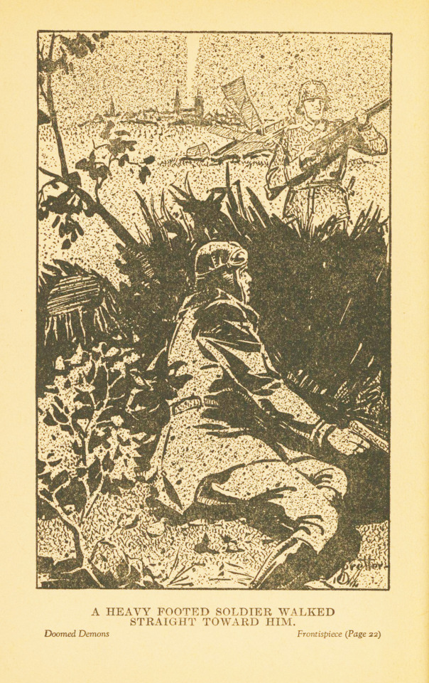
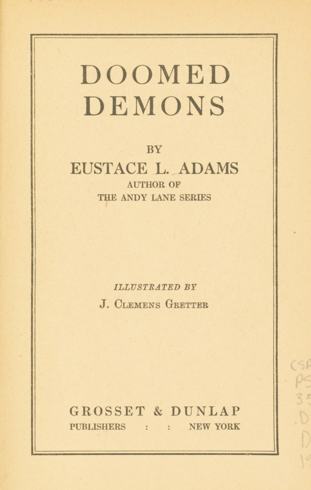
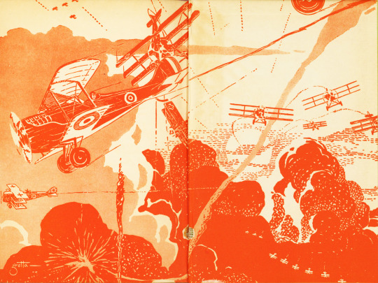
I found this publishers’ binding while browsing the stacks on the hunt for a good one. My eye was drawn to the bright green bookcloth and then I saw the nice font and sweet little biplane on the cover. Once I looked inside, I noticed the bright, orange-red endpapers and the illustrations that show so much action and movement, one of which has a caption that starts “Listen, big boy...”
The book is Doomed Demons by Eustace L. Adams (1981-1963), an American author best known for writing aviation adventure stories for boys. Doomed Demons was published in 1935 by Grosset & Dunlap in New York and features a story about WWI fighter pilots. The illustrations were done by J. Clemens Gretter (1904-1988), an artist and illustrator from Indiana who also worked as a cartoonist for comic books and signed much of his work “Clem Gretta” or simply “Gretta.”
View more Publishers’ Binding Thursday posts.
-- Alice, Special Collections Department Manager
#Publishers' Binding Thursday#publishers' bindings#airplanes#biplanes#war stories#WWI#Eustace L. Adams#Eustace Lane Adams#J. Clemens Gretter#Gretta#Grosset & Dunlap#illustrations#fighter pilots#Alice#big boy#endpapers#endsheets#illustrated endpapers
80 notes
·
View notes
Text
I don't feel like I'm doing v well on the whole getting my comic done on time thing.
I'm not working on it every second like I probably should. But fucking.
I don't want to burn out too early either.
Hoping for good things to happen this weekend and hit the halfway point...
#I'm gonna write the colophon resources and translate some of my work sketches into endsheets so that's four right therer#and I'm halfway done through another set of 4
2 notes
·
View notes
Photo
The endsheets are those pages at the front and back of a book, often decorative or blank sheets. They serve a structural purpose, constructed in a way to attach the book cover to the text. They also serve an aesthetic purpose, guiding the reader from the outside to the inside of a book. Considerations are the weight/feel of the paper, its color and texture and how it relates to pages within the book. For this book I chose a marbled paper by @leahzhangke and a handmade cotton paper for the blank sheets that have a similar thickness to the book’s original papers. I fold the endsheets and glue them together at the spine using strips of linen and tissue. Now they’re ready to sew onto the text block. Stay tuned! #donwidmerpaperarts #bookbinding #endsheets #paperarts #finebinding https://www.instagram.com/p/CpN4nLmLEhx/?igshid=NGJjMDIxMWI=
1 note
·
View note
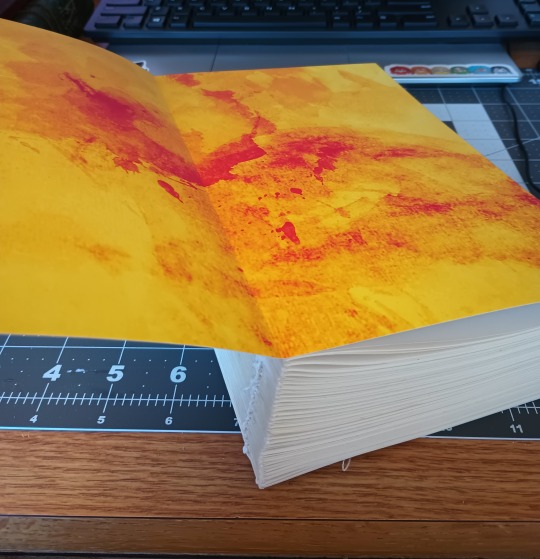
Text
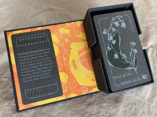
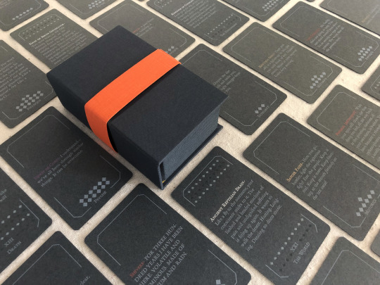


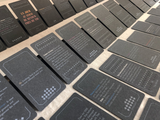

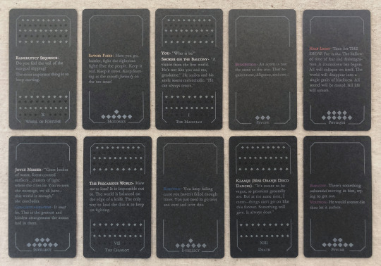
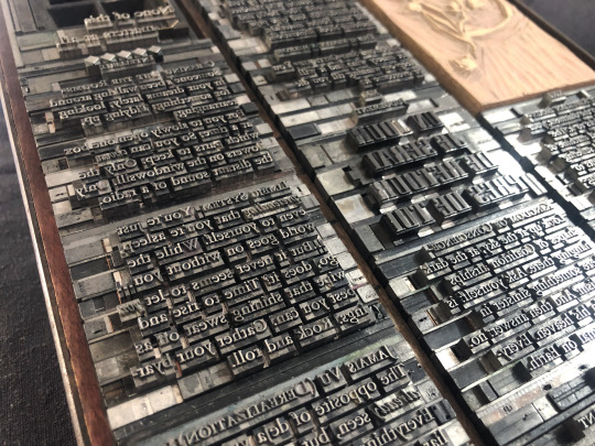
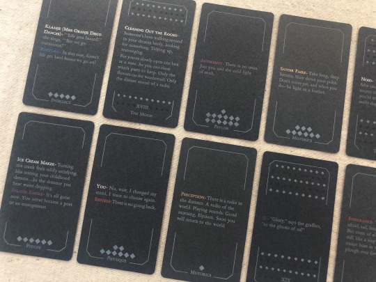
[image description: photos of The Disco Elysium Tarot, printed letterpress in an edition of one from handset lead type and linoleum blocks. It is a complete 78-card tarot deck printed primarily with white text and illustrations on medium grey cardstock, in a custom dark grey hardcase box with a hand-marbled orange and yellow endsheet. The backs of the deck are decorated with an illustration of a sprig of may bells, and a quote from Smallest Church in Saint-Saëns: "None of this matters at all." The interpretive meaning of each card is expressed on its face with a small excerpt of the game's text. The Minor Arcana are divided into four suits of Harry's Attributes—Motorics, Psyche, Physique, Intellect—and each card in that suit is a quote from a skill under that Attribute. The Major Arcana are assigned quotes from other sources like NPC dialogue or Thought Cabinet problems & solutions. Pips for the Minors are counted with diamonds like the game's skill points; each actor or title is printed with their in-game color, but made shiny & metallic with bronzing powder.
each piece of text was set in handset lead type, assembled from individual pieces for each letter and space, and printed relief on a chandler & price clamshell press. end description.]
🎊🎊 Desert Bus for Hope starts for 2023 on nov. 11th and i have made an item this year for the craftalong that will be up for giveaway between 6am-12pm on Monday the 13th! 🎊🎊 It is a full tarot deck based on Disco Elysium and it has several pieces of my heart & soul in it but NOT my blood because i put a bandaid right on that :) donations for this and any other auctions & giveaways for Desert Bus go to Child's Play Charity.
notes: i did not make a whole new interpretive model for this deck, apologies, that was outside of my scope. it's generally compatible with a Rider-Waite model, with Motorics for Wands, Psyche for Cups, Physique for Swords, and Intellect for Disks. (full distribution of text listed by card, linked below. any spelling or transcription errors you find there, i promise i fixed them in print—that's copied from my digital mockup which was copied hastily from screenshots.)
i also do not track hours on these kinds of projects because that way lies madness, but i will say: i knew how much time it would take to print it. it was a lot but i was not worried about it, i know how to print. i was very worried about how much time it would take to absorb the sheer amount of text, and distribute it across the cards, and really get an array i believe in. i was right to worry, and i have absolutely had a few anxious nightmares about discovering the Perfect excerpt that should've gone in and i missed it, and the suit of Intellect made me want to lay on the floor a few times, but still! i believe there's many versions of a deck you could make from this game and this one is a good one.
i think the Minors fit really well with the double-edged sword of Harry's skills, their advice, their priorities. the circular way the Fool-World assignment works out makes me smile every time. The colors on The Star came out so nice. i think Justice fulfills some of my favorite things about Kim's character & purpose in the story. i worried sometimes that editing to such short clips would lose too much of the politics of the game, but of course you can't really take them out and they're especially present in the Majors—the Devil and the Hierophant, The Star and The Sun. i've wanted to design a tarot deck for years and i love this game deeply and i let this idea percolate for a few months and it never stopped making me laugh so here it is, & given a beautiful purpose :)
i also literally could not have done this without xyrilin's Disco Reader and the FAYDE On-Air Playback Experiment to navigate the dialogue and skill checks. Really couldn’t have tied the whole concept & colophon in its final bow without the Disco Reader :)) thank thank thank, they're so fun to investigate that it was honestly very difficult to focus on my task instead of veering off and exploring every branch in an extremely disorganized way.
actual printing went well honestly, very few problems! i think that means i'm getting pretty good at planning one of these monstrosities, although perhaps it also means i'm not challenging myself enough. hmm. no that's silly there's 78 ding dang cards in this thing. anyway the drop & replace formes worked well, no registration issues. mum convinced me to overprint another half a deck's worth of cards when I was printing backs & borders and of course she was right :/ there were a handful of cards that actually had better line breaks and fewer lines total in true type than in the digital mockup, so i needed all the spares I had to put those new short quotes into the appropriate border breakage. next time i will not question her.
handset in Garamond, Eden Bold, and secret Neuland.
WIP : full text card assignments
bonus photo of the kind of trash notes i always take to plan things like how many borders were printed with space for short excerpts vs long excerpts, and how many of those are majors vs. minors, because they have a slightly different frame at the bottom edge, etc.
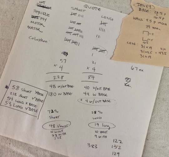
[image description: they are truly garbage notes, i tell you. half of it is written at angles to the other half, many numbers in the math problems are not labeled, mistakes are scribbled over. it gets me there but it doesn't look pretty. end description.]
#desert bus 2023#desert bus for hope#disco elysium#book arts#letterpress#letterpress printing#handset type#printmaking#db2023#finished works#long post
698 notes
·
View notes
Text
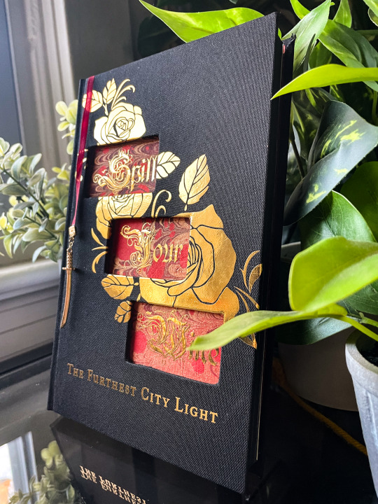
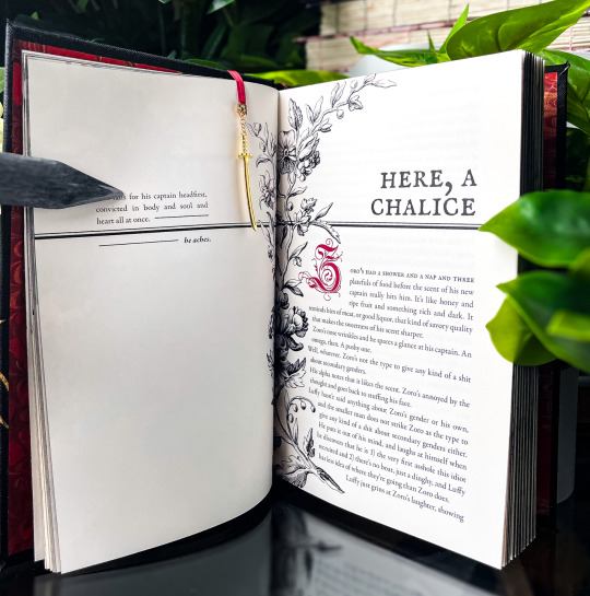
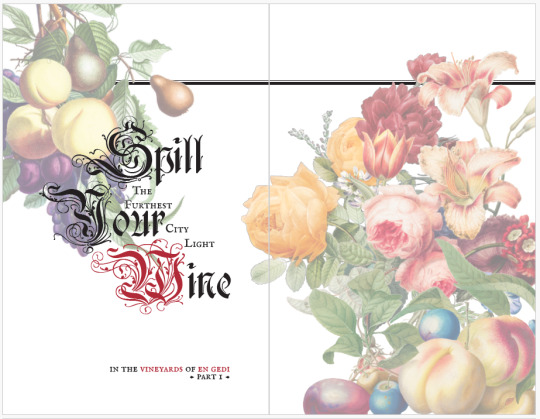
excellent news from usps--i can now talk about this beauty!! i had the pleasure of typesetting and binding @the-furthest-city-light's wonderful zolu fic spill your wine and it was a ride from start to finish (repurposed prototypes and injuries included). overall, i'm extremely pleased with how it turned out!!

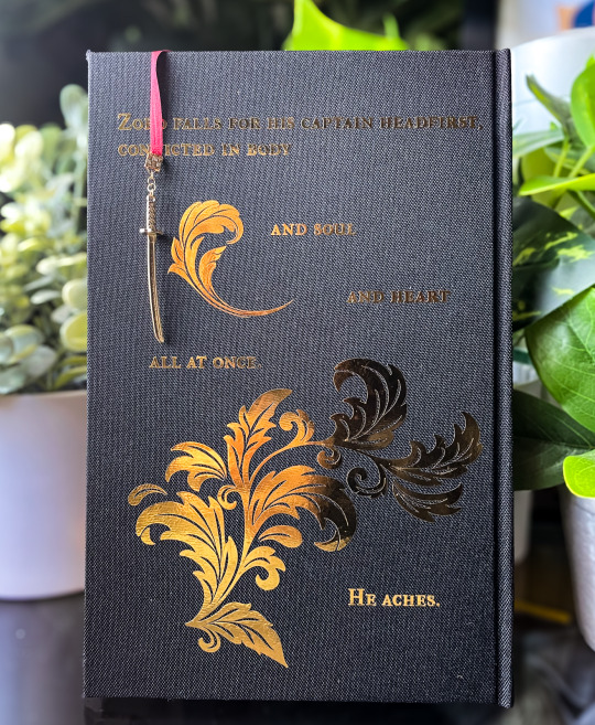

this was a full fabric, square-backed case binding with a peek through cover showcasing a heat transfer foiled title on the (red, burgundy, gold) endsheet (and a hidden katana design to match the charm). things got a bit weird near the spine because i didnt anticipate my glue acting funky under the heat, but live and learn! the outside covers turned out plenty clean.
the edges are painted with matte black acrylic and sealed with beeswax, and the bookmark is a little 4mm burgundy silk number tipped with a gold clasp and katana charm (of course). the silk is very thin/fragile, so in the future i think ill double the length i use.

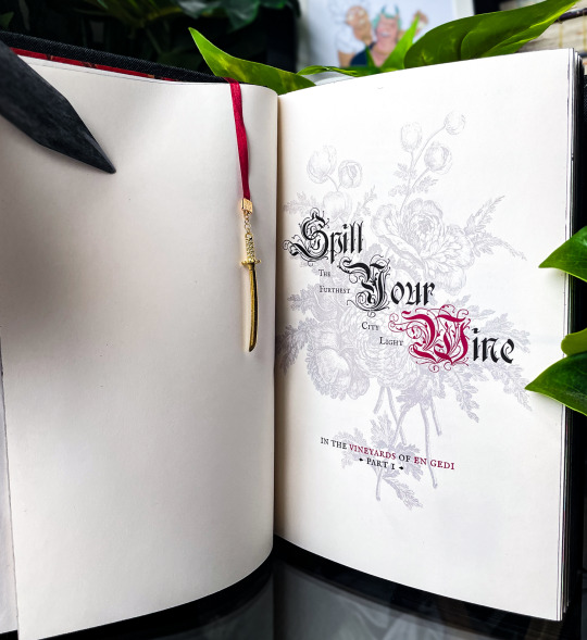

i also had a great time typesetting this! when i first read this i knew i wanted to do something that was both angular/modern and ornately victorian (with a red, black, gold scheme). this had to be decadent and beautifully clash-y, because nothing less would suffice for the kind of author who'd use a verse from the canticle of canticles as the summary for a fic series like this. truly iconic. nerds will notice that this is a little visually reversed from the way books are traditionally typeset, which is also intentional. i think it fits the vibe of the bind and the fic. i hope the vision came through.


this was actually the second case i built; i wasnt happy with the first one so i ripped it up and made a notebook (with the front and back covers) and bookmark (from the spine) for dani, which was a fun little experiment. i just... didnt take any pictures, apparently?
overall this was a really fun and challenging project, and i cant believe its done!!!! wow!!!
#zolu#bookbinding#fanbinding#bad blade bindery#binderary 2024#yes jojo those are your one piece volumes i think i accidentally stole them
258 notes
·
View notes
Text
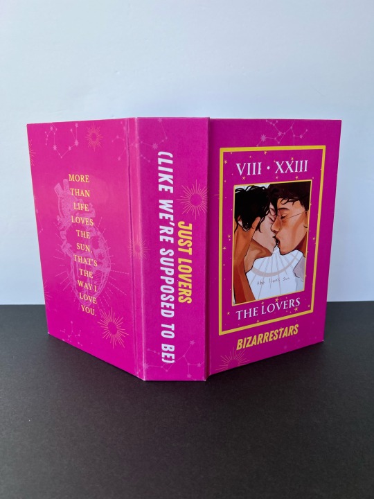
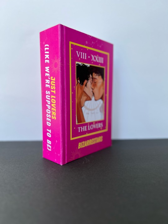
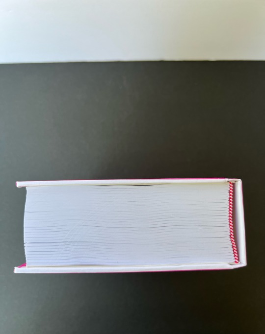
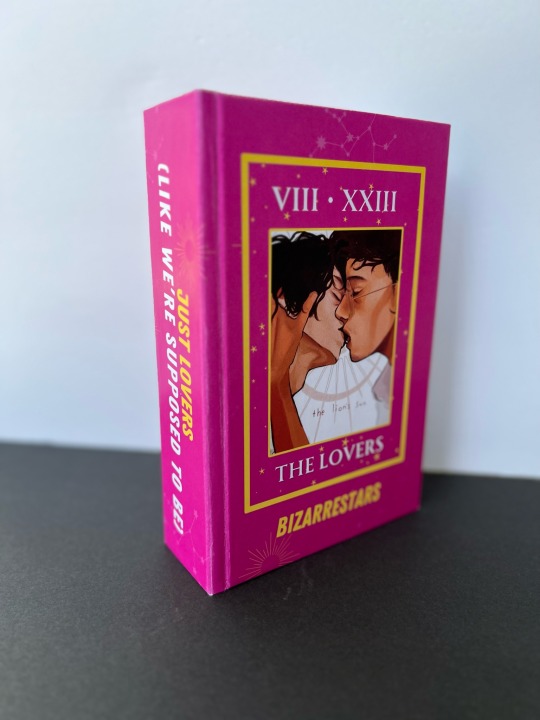


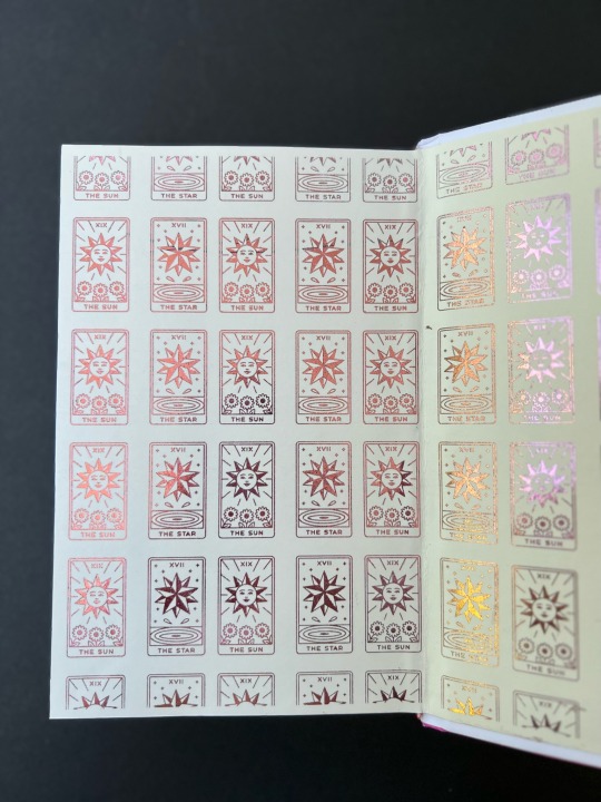
just lovers (like we’re supposed to be) 💕✨💖
DEETS:
my most favorite bind I’ve made so far 🤭
First time doing a wrap cover and I’m now obsessed with this method of cover decor 😌
Typeset, endsheets and cover design by yours truly.
PERFECT, BEAUTIFUL fanart by the ever lovely & talented Mink @popcornhee
Bound for personal use only- ZERO profit/$$ exchange of any kind. I’m keeping this typeset private per the author’s request.
#fanfic bookbinding#jegulus fic#jegulus#bookbinding#fanfic#mauraders#wolfstar#just lovers fanfic#Spotify
202 notes
·
View notes
Text
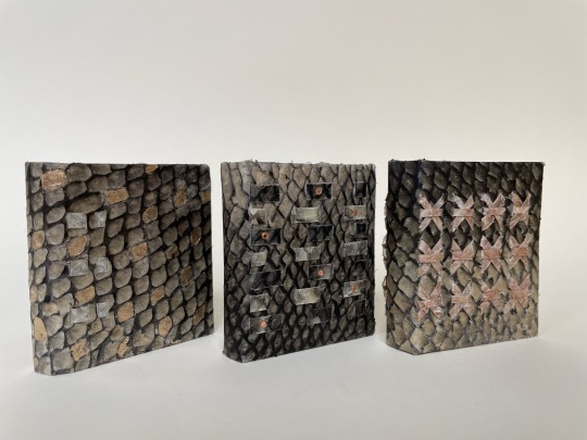

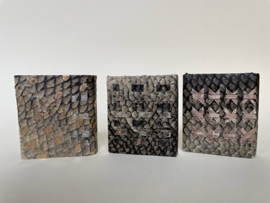
Folklore Fish
Three miniature books inspired by folktales involving fish. Full semi-limp bindings in salmon parchment made by the binder (me), sewn on salmon parchment tapes, red-orange Lynweave tipped endsheets.
Dragon Gate (Chinese): Rough edge gilding on three sides, surface gilding
Salmon Boy (Haida-Tlingit-Tsimshian): Marbled top edge, extra tapes woven across the cover, copper tooling
Salmon of Wisdom (Irish): Nine salmon parchment sewing tapes tanned in hazelnut shells and plaited into the covers
#my folklore fish books! soon to be on exhibit!#bookbinding#salmon#books#handbound books#hand binding
545 notes
·
View notes
Text
From: Howell, James, 1594?-1666. Epistolae Ho-elianae. London : Printed for Thomas Guy, 1678
PR3517.H5 Z5 1678
#marbledpaper#endsheet#marbled#marbling#beautifulpaper#english#1670s#late17thcentury#rarebooks#specialcollections#libraryofva
188 notes
·
View notes
Text
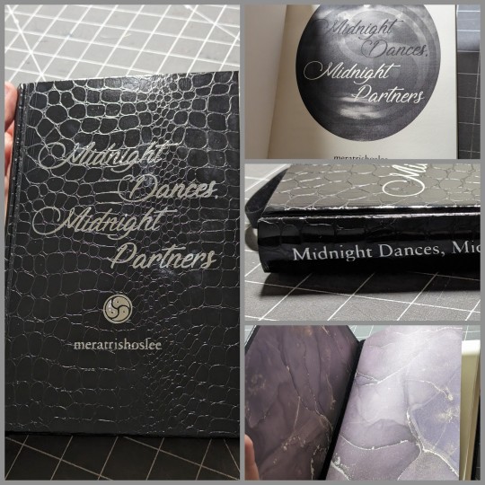
Since the author now has the book in hand, it's time to share my binding of @meratrishoslee’s incredibly spicy Lusrael fic Midnight Dances, Midnight Partners.
The cover is Neenah Pellaq Croco in Black. I love their faux leather lines because they're all coated paper(!) and very easy to use.
Titling is done in silver HTV, which worked quite well on this paper. Endsheets are from the Ink Drops Dusk pack.
This binding also features a black velvet ribbon bookmark with a stamped silver charm I picked up at a Celtic festival last year with this book in mind, though I am certain the artist never expected it would be put to this use.
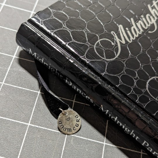
The typesetting was a fun process—I had a few requests from the author that I tried to incorporate as best I could, including renaming the chapters, the choice of triskelion on the cover and throughout, as well as making the margins larger to accommodate notes and markup of the text.

Mera—thanks so much for allowing me to work on this, and for working with me throughout the process! Sorry again for taking so long to send your copy!
#fanbinding#ficbinding#bookbinding#my books#ofmd fic#lusrael#midnight dances midnight partners#image description in alt
90 notes
·
View notes
Text
Resource Post: Supplies, Equipment, and Software
So I've had some people ask about the supplies and equipment I use to make my books! This is not a comprehensive list, nor is it an official tutorial on how to make a book (for that, I recommend starting with Renegade Publishing's resource documents, DAS Bookbinding, or SeaLemon's YouTube tutorials -- all free, no patreon required!), but if you're floundering because you don't know what you need to get, hopefully this will help a little bit ❤️ If I discover more good resources or change up my style, I'll add to this post.
Of note: I'm based in the US, so this list is unfortunately pretty US-centric. Apologies!
SUPPLIES
Disclaimer #1: I have a background in book conservation, so I'm picky to a fault about the supplies I use. To make a long-lasting book, you want to look for "acid-free" or "archival" materials -- BUT, a lot of consumer craft stores have realized those are good buzzwords to slap on products even if they aren't really archival. Your best bet is to buy from stores that supply materials to libraries and archives; those tend to be higher quality and stick to actual archival standards. Talas, Hollander's, University Products, and Colophon Book Arts Supply are good places to start.
That said! If price matters more than longevity, hitting up Michaels or Joann Fabrics is totally fine. This is a hobby. The bookbinding police are not gonna come smash down your door because you didn't use archival-quality craft paper. My big recommendation, though: at least get your glue and paste from Talas. High-quality adhesive makes a huge difference in how well, and how long, a book holds together. Bad adhesives can turn brittle with time, stain your paper/cloth, and make all your hard work fall apart.
So, all that said, here's what I use:
BOARD - Davey Binder's Board, 0.098"
GLUE - Jade 403 PVA
PASTE - Zen Shofu wheat paste (you shouldn't have to buy more than half a pound -- a little goes a long way)
CLOTH - Either Arrestox or Dover bookcloth, which comes in a wide variety of colors and holds up extremely well to whatever you want to do to it
THREAD - 25/3 linen thread, which I run over a small block of beeswax to make it easier to handle and give it better "locking" properties as I sew. For bigger books of ten signatures or more, I sew onto 3/8" linen tapes for extra support.
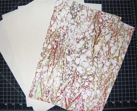
DECORATIVE PAPER - Hollander's is a treasure trove of decorative papers for endsheets and covers; Talas has some really nice ones, too, but they tend to be pricier (since unfortunately everything at Talas has gotten a lot pricier lately)
PRINTING PAPER - Hammermill Colors paper, 20lb, in cream; 24lb is also a good weight that feels a little more substantial than regular printer paper. (I'll probably switch to 24lb once my 20lb paper runs out.) To get the right grain direction, I buy a ream of 11x17 paper and cut it in half to make standard letter-sized sheets (8.5x11). Here's a quick primer on grain direction and why it's important when making a book!
ENDBANDS - I've never had the patience to sew my own endbands (though I hope to gain that patience someday!), so I just use premade ones like these.
EQUIPMENT
Disclaimer #2: a lot of the stuff on this list is professional-grade (or close to it) with prices to match. You definitely don't have to buy everything right off the bat. It took me fifteen years to accumulate it all, and you can DIY a lot of bookbinding equipment -- a good googling will lead you to all sorts of innovative ways hobby bookbinders set up their shops. The Renegade Publishing resource documents also have a lot of A+ recommendations.
PRINTER - For text, I use a Brother B&W laser printer with auto-duplex (auto-duplex is key when printing a book); for images, both B&W and color, I use a Canon color inkjet printer set to at least 300 DPI. I fully admit having two printers is an absurd setup, but what laser printers can do well, inkjets absolutely suck at, and vice-versa -- and like I said, I'm hella picky. You can get by fine with a single laser printer! Just make sure it's got auto-duplex to save yourself a lot of pain.
GUILLOTINE - I have this model, which goes in and out of stock with some regularity. The trick with this guy is to (a) sandwich your text block between some scrap board so the clamp doesn't leave a dent, and (b) REALLY CRANK DOWN on the clamp as tight as you possibly can to keep the paper from shifting as you cut. This fixes 99% of the skewing problems mentioned in the reviews.
PRESS - I have a little cast-iron press I bought off a coworker for fifty bucks; similarly, you might have luck searching eBay, looking at Affordable Bookbinding Equipment (Jim does incredible work!), searching craft stores for a flower press, or even just using two pieces of wood and a few C-clamps. SeaLemon on YouTube also has a good video on how to DIY a book press.
PRESS BOARDS - For setting the hinges in the press, I use a pair of brass-edged boards like these. It's a good investment if you want to get really nice, crisp hinges, but it's also 100% possible to DIY brass-edged boards if you want. At my very first job, we even set our hinges by taping sewing needles to the book before putting it in the press!
FINISHING PRESS - I have this one, which I use to back my books in combination with these backing irons
BACKING HAMMER - To my chagrin, I've discovered that having an actual backing hammer makes backing a book way, way easier. Some folks have had good luck with a cobbler's hammer or just a regular old hammer from a hardware store, but I splurged on a student hammer from Hollander's, and it works fantastically. (I wouldn't recommend buying the "professional" hammers, though, because seriously, $90 for a hammer?! No.)
BONE FOLDER - I'm actually not a fan of bone folders made from real bone; I like Teflon folders a lot better for scoring and flattening. (Real bone folders tend to burnish the material, an effect I'm rarely going for.)
CUTTING MACHINE - A Silhouette Curio. This is 100% optional, but it's how I do the bulk of my cover designs, including cut-outs, embossing, foiling (with a foil quill attachment), and spine titling. The software and overall quality are way better than Cricut, and its 5mm clearance means you can fit more than just vinyl in there. Sadly, Silhouette has discontinued the Curio, but it's still possible to buy from third-party sellers -- and if you don't care about the 5mm clearance, I've heard good things about the Silhouette Cameo line.
A side note on vinyl, from the obnoxiously picky book conservator: if you're aiming for longevity with your books, using HTV in your book designs may not be the best idea. Not only can the adhesives be questionable, but the plasticizers in vinyl break down in really weird, gross ways once several decades have passed. That's why I tend to stick with cut-outs and foiling instead of HTV. But, again: if you just want to make something pretty, don't worry about it!
SOFTWARE
TYPESETTING - I use Affinity Publisher -- it's similar to Adobe InDesign, but with a flat cost instead of a bullshit subscription model. I am by no means an expert in this, since I've only been designing books for a couple years; pretty much everything I learned, I learned from Aliya Regatti's tutorial, plus or minus a lot of googling and noodling around. I've discovered that it does get cranky if your book is over 250 pages or so, meaning you may have to split longer fics into multiple files. That said, I've been really happy with it, and it goes on sale every now and then if the $70 price tag is too much.
As always, Renegade Publishing has a whole lot of tutorials for other software options, including Microsoft Word, InDesign, LaTeX, and Scribus if you already have access to one of those instead.
IMPOSITION - "Imposition" is when you lay out a book so all the pages are in order once you fold + gather the signatures. Since Affinity Publisher doesn't do this automatically on export, I use Bookbinder 3.0, which is an old but nice little Java program that breaks a single PDF into a series of properly imposed signatures. I usually set it to 6 sheets per signature.
MISCELLANEOUS
IMAGES
The Noun Project is a gigantic repository of basic SVGs and PNGs that are not only great for cutting machines, but for adding flourishes to your title page, chapter headings, and scene dividers. Every single book I've made has used at least one image from here; I pay for the yearly Noun Pro subscription, but it's not necessary to use the site.
Unsplash is perfect for photo elements
Pixabay not only has a great archive of photos, but illustrations and vector images as well
Surprisingly, Wikipedia also has a lot of good Creative Commons photos attached to their articles!
FONTS
1001Fonts is a good starting point for finding free fonts, as is FontSpace and DaFont
If you're willing to pay for fonts (and sometimes it's worth it for a well-designed font that's perfect for your project), Creative Fabrica and Pixel Surplus have some good stuff, including discounted bundles of multiple fonts
251 notes
·
View notes
Text

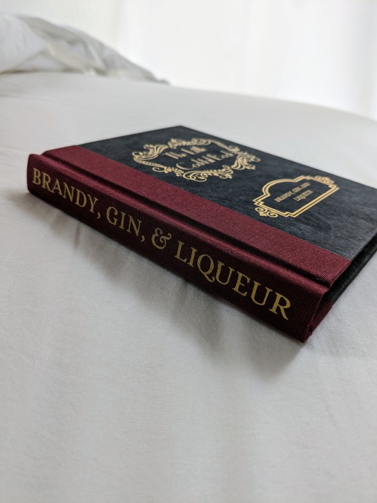
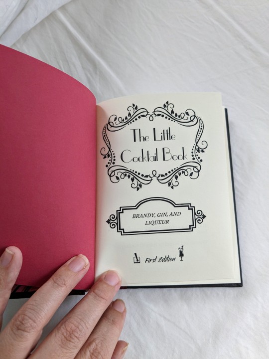
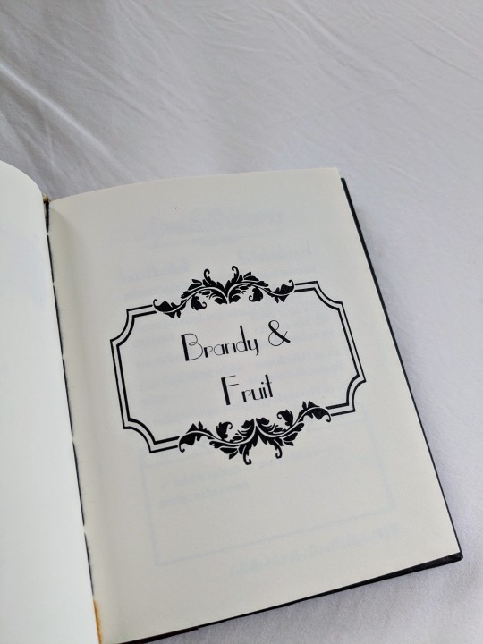

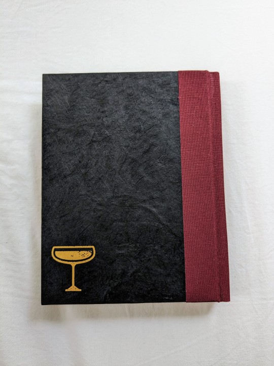

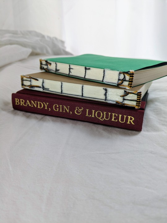
Years and years ago, my brother got into mixing cocktails and, over that time, we have acquired a very large collection of favorite recipes, most of them coming from KindredCocktails.com. When I started getting into bookbinding, my bro thought it would be a fun thing if I put our favorite internet recipes into a physical book.
The initial plan was for these to be in a single volume and, after nearly two years of transferring and formatting the recipes, I realized that the book would be too big and I feared it being unwieldy. Plus, I like the idea of adding in new discoveries and binding new editions. If it was already massive, there wouldn't be room to grow.
So I made a new document and pretty much started over. I realized that I wanted to change a few aspects of the design, so it was only a painful return to start for a few days. lol

(The drink Harry orders in A Deathly Visit because I can't help myself)
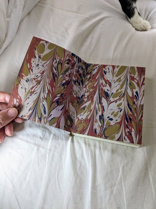
I'm making three copies of each volume. One for us, and the other two will be Christmas gifts to my sister and to one of my aunts -- both cocktail lovers. The endsheets are my own marbled paper. Here are the endsheets on the other two textblocks:

To say that I am proud of these little books is a massive understatement. Fingers crossed that the other two will finish up as nicely as the first one did.

32 notes
·
View notes
Text


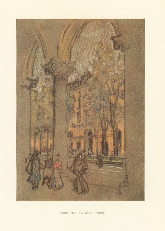

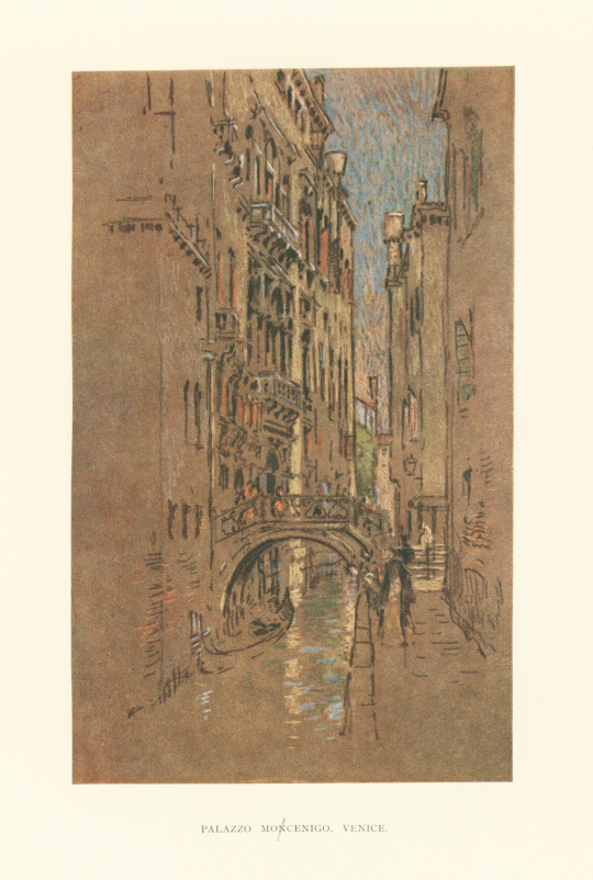

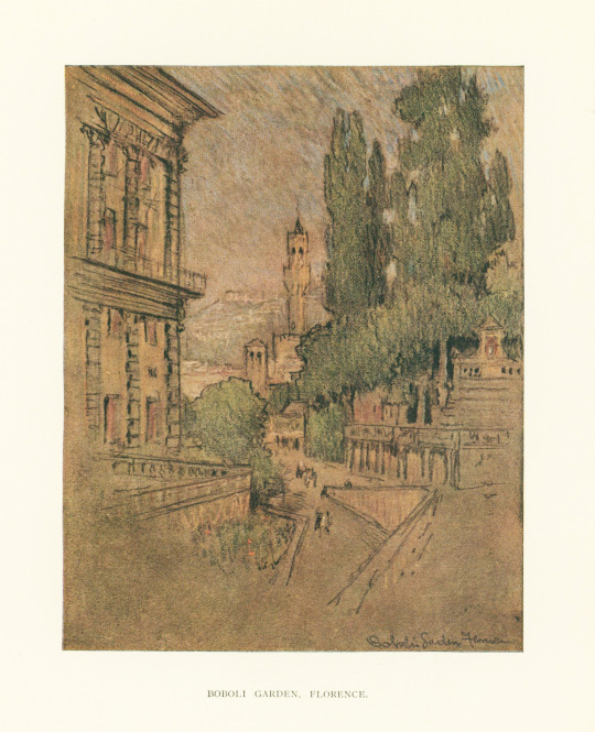
Publishers' Binding Thursday
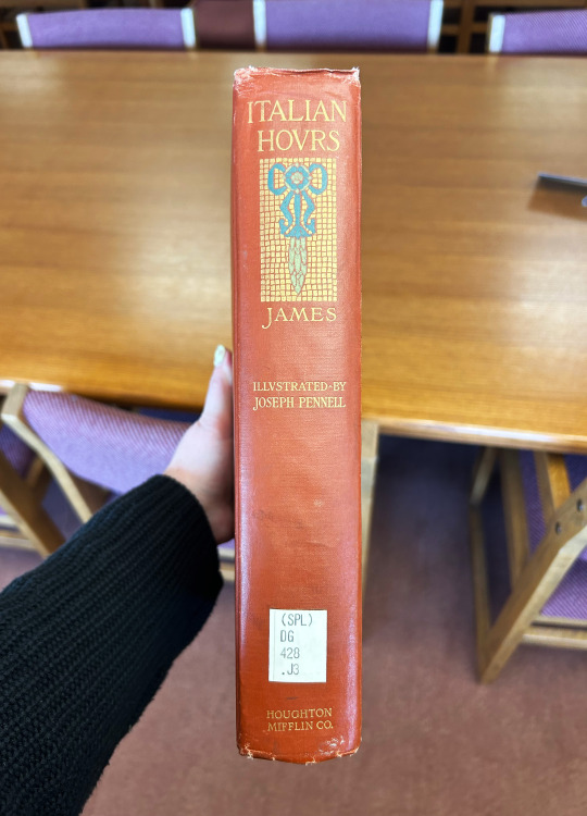
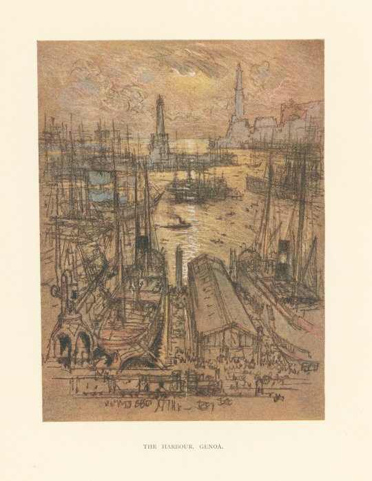
I found this book while browsing the stacks in search of a good publishers' binding. This one does not disappoint! This is Italian Hours by American-British author Henry James, published in 1909 by Houghton Mifflin Co. Italian Hours is a book of travel essays about Italy, a country that James loved, that are considered very charming but not unrealistic. This edition features illustrations of Italian scenes by American etcher, lithographer, and illustrator Joseph Pennell.
The cover features a mosaic-esque design stamped in gold with a blue florals and flourishes and leafy green patterns. The book cloth is a brickish red-orange color and the spine features a motif similar to that of the front cover. There's nothing special about the endsheets, which is always a disappointment to me. I just wish more people paid attention to the endsheets! But otherwise it's a very nice binding.
View more Publishers' Binding Thursday posts here.
-- Alice, Special Collections Department Manager
#Italian Hours#Henry James#Houghton Mifflin Co.#Joseph Pennell#illutrations#publishers' bindings#Publishers' Binding Thursday#gold stamping#Italy
102 notes
·
View notes
Last Seen Blogs

orkide11
Untitled

potato2chicken
Untitled

bigdicksue
Sem título

brynsecho
Echoes Corner

destellodeamor
destello de amor ❤︎