#eh: collection
Text
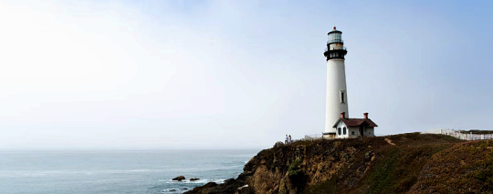
✧ UNSPLASH COLLECTION 086 — BY EVANSYHELP.
In this Unsplash photo collection, you’ll find ( 223 ) lighthouse keeper-themed photographs that are suitable for graphic design and free for both personal and commercial use. Please like or reblog this post if you find this helpful, and remember to like any photos you use!
Content warnings: ocean, food, smoking, storms.
✧✧✧ ( VIEW COLLECTION. )
#i didn't have the spoons to do the whole graphic and whatnot but wanted to get this live#rph#unsplash#unsplash collection#rp resources#ps resources#eh#eh: collection#lighthouse#lighthousecore#lighthouse keeper
56 notes
·
View notes
Text
why Aurora's art is genius
It's break for me, and I've been meaning to sit down and read the Aurora webcomic (https://comicaurora.com/, @comicaurora on Tumblr) for quite a bit. So I did that over the last few days.
And… y'know. I can't actually say "I should've read this earlier," because otherwise I would've been up at 2:30-3am when I had responsibilities in the morning and I couldn't have properly enjoyed it, but. Holy shit guys THIS COMIC.
I intended to just do a generalized "hello this is all the things I love about this story," and I wrote a paragraph or two about art style. …and then another. And another. And I realized I needed to actually reference things so I would stop being too vague. I was reading the comic on my tablet or phone, because I wanted to stay curled up in my chair, but I type at a big monitor and so I saw more details… aaaaaand it turned into its own giant-ass post.
SO. Enjoy a few thousand words of me nerding out about this insanely cool art style and how fucking gorgeous this comic is? (There are screenshots, I promise it isn't just a wall of text.) In my defense, I just spent two semesters in graphic design classes focusing on the Adobe Suite, so… I get to be a nerd about pretty things…???
All positive feedback btw! No downers here. <3
---
I cannot emphasize enough how much I love the beautiful, simple stylistic method of drawing characters and figures. It is absolutely stunning and effortless and utterly graceful—it is so hard to capture the sheer beauty and fluidity of the human form in such a fashion. Even a simple outline of a character feels dynamic! It's gorgeous!
Though I do have a love-hate relationship with this, because my artistic side looks at that lovely simplicity, goes "I CAN DO THAT!" and then I sit down and go to the paper and realize that no, in fact, I cannot do that yet, because that simplicity is born of a hell of a lot of practice and understanding of bodies and actually is really hard to do. It's a very developed style that only looks simple because the artist knows what they're doing. The human body is hard to pull off, and this comic does so beautifully and makes it look effortless.
Also: line weight line weight line weight. It's especially important in simplified shapes and figures like this, and hoo boy is it used excellently. It's especially apparent the newer the pages get—I love watching that improvement over time—but with simpler figures and lines, you get nice light lines to emphasize both smaller details, like in the draping of clothing and the curls of hair—which, hello, yes—and thicker lines to emphasize bigger and more important details and silhouettes. It's the sort of thing that's essential to most illustrations, but I wanted to make a note of it because it's so vital to this art style.
THE USE OF LAYER BLENDING MODES OH MY GODS. (...uhhh, apologies to the people who don't know what that means, it's a digital art program thing? This article explains it for beginners.)
Bear with me, I just finished my second Photoshop course, I spent months and months working on projects with this shit so I see the genius use of Screen and/or its siblings (of which there are many—if I say "Screen" here, assume I mean the entire umbrella of Screen blending modes and possibly Overlay) and go nuts, but seriously it's so clever and also fucking gorgeous:
Firstly: the use of screened-on sound effect words over an action? A "CRACK" written over a branch and then put on Screen in glowy green so that it's subtle enough that it doesn't disrupt the visual flow, but still sticks out enough to make itself heard? Little "scritches" that are transparent where they're laid on without outlines to emphasize the sound without disrupting the underlying image? FUCK YES. I haven't seen this done literally anywhere else—granted, I haven't read a massive amount of comics, but I've read enough—and it is so clever and I adore it. Examples:


Secondly: The beautiful lighting effects. The curling leaves, all the magic, the various glowing eyes, the fog, the way it's all so vividly colored but doesn't burn your eyeballs out—a balance that's way harder to achieve than you'd think—and the soft glows around them, eeeee it's so pretty so pretty SO PRETTY. Not sure if some of these are Outer/Inner Glow/Shadow layer effects or if it's entirely hand-drawn, but major kudos either way; I can see the beautiful use of blending modes and I SALUTE YOUR GENIUS.
I keep looking at some of this stuff and go "is that a layer effect or is it done by hand?" Because you can make some similar things with the Satin layer effect in Photoshop (I don't know if other programs have this? I'm gonna have to find out since I won't have access to PS for much longer ;-;) that resembles some of the swirly inner bits on some of the lit effects, but I'm not sure if it is that or not. Or you could mask over textures? There's... many ways to do it.
If done by hand: oh my gods the patience, how. If done with layer effects: really clever work that knows how to stop said effects from looking wonky, because ugh those things get temperamental. If done with a layer of texture that's been masked over: very, very good masking work. No matter the method, pretty shimmers and swirly bits inside the bigger pretty swirls!
Next: The way color contrast is used! I will never be over the glowy green-on-black Primordial Life vibes when Alinua gets dropped into that… unconscious space?? with Life, for example, and the sharp contrast of vines and crack and branches and leaves against pitch black is just visually stunning. The way the roots sink into the ground and the three-dimensional sensation of it is particularly badass here:

Friggin. How does this imply depth like that. HOW. IT'S SO FREAKING COOL.
A huge point here is also color language and use! Everybody has their own particular shade, generally matching their eyes, magic, and personality, and I adore how this is used to make it clear who's talking or who's doing an action. That was especially apparent to me with Dainix and Falst in the caves—their colors are both fairly warm, but quite distinct, and I love how this clarifies who's doing what in panels with a lot of action from both of them. There is a particular bit that stuck out to me, so I dug up the panels (see this page and the following one https://comicaurora.com/aurora/1-20-30/):

(Gods it looks even prettier now that I put it against a plain background. Also, appreciation to Falst for managing a bridal-carry midair, damn.)
The way that their colors MERGE here! And the immense attention to detail in doing so—Dainix is higher up than Falst is in the first panel, so Dainix's orange fades into Falst's orange at the base. The next panel has gold up top and orange on bottom; we can't really tell in that panel where each of them are, but that's carried over to the next panel—

—where we now see that Falst's position is raised above Dainix's due to the way he's carrying him. (Points for continuity!) And, of course, we see the little "huffs" flowing from orange to yellow over their heads (where Dainix's head is higher than Falst's) to merge the sound of their breathing, which is absurdly clever because it emphasizes to the viewer how we hear two sets of huffing overlaying each other, not one. Absolutely brilliant.
(A few other notes of appreciation to that panel: beautiful glows around them, the sparks, the jagged silhouette of the spider legs, the lovely colors that have no right to make the area around a spider corpse that pretty, the excellent texturing on the cave walls plus perspective, the way Falst's movements imply Dainix's hefty weight, the natural posing of the characters, their on-point expressions that convey exactly how fuckin terrifying everything is right now, the slight glows to their eyes, and also they're just handsome boys <3)
Next up: Rain!!!! So well done! It's subtle enough that it never ever disrupts the impact of the focal point, but evident enough you can tell! And more importantly: THE MIST OFF THE CHARACTERS. Rain does this irl, it has that little vapor that comes off you and makes that little misty effect that plays with lighting, it's so cool-looking and here it's used to such pretty effect!
One of the panel captions says something about it blurring out all the injuries on the characters but like THAT AIN'T TOO BIG OF A PROBLEM when it gets across the environmental vibes, and also that'd be how it would look in real life too so like… outside viewer's angle is the same as the characters', mostly? my point is: that's the environment!!! that's the vibes, that's the feel! It gets it across and it does so in the most pretty way possible!
And another thing re: rain, the use of it to establish perspective, particularly in panels like this—

—where we can tell we're looking down at Tynan due to the perspective on the rain and where it's pointing. Excellent. (Also, kudos for looking down and emphasizing how Tynan's losing his advantage—lovely use of visual storytelling.)
Additionally, the misting here:

We see it most heavily in the leftmost panel, where it's quite foggy as you would expect in a rainstorm, especially in an environment with a lot of heat, but it's also lightly powdered on in the following two panels and tends to follow light sources, which makes complete sense given how light bounces off particles in the air.
A major point of strength in these too is a thorough understanding of lighting, like rim lighting, the various hues and shades, and an intricate understanding of how light bounces off surfaces even when they're in shadow (we'll see a faint glow in spots where characters are half in shadow, but that's how it would work in real life, because of how light bounces around).
Bringing some of these points together: the fluidity of the lines in magic, and the way simple glowing lines are used to emphasize motion and the magic itself, is deeply clever. I'm basically pulling at random from panels and there's definitely even better examples, but here's one (see this page https://comicaurora.com/aurora/1-16-33/):

First panel, listed in numbers because these build on each other:
The tension of the lines in Tess's magic here. This works on a couple levels: first, the way she's holding her fists, as if she's pulling a rope taut.
The way there's one primary line, emphasizing the rope feeling, accompanied by smaller ones.
The additional lines starbursting around her hands, to indicate the energy crackling in her hands and how she's doing a good bit more than just holding it. (That combined with the fists suggests some tension to the magic, too.) Also the variations in brightness, a feature you'll find in actual lightning. :D Additional kudos for how the lightning sparks and breaks off the metal of the sword.
A handful of miscellaneous notes on the second panel:
The reflection of the flames in Erin's typically dark blue eyes (which bears a remarkable resemblance to Dainix, incidentally—almost a thematic sort of parallel given Erin's using the same magic Dainix specializes in?)
The flowing of fabric in the wind and associated variation in the lineart
The way Erin's tattoos interact with the fire he's pulling to his hand
The way the rain overlays some of the fainter areas of fire (attention! to! detail! hell yeah!)
I could go on. I won't because this is a lot of writing already.
Third panel gets paragraphs, not bullets:
Erin's giant-ass "FWOOM" of fire there, and the way the outline of the word is puffy-edged and gradated to feel almost three-dimensional, plus once again using Screen or a variation on it so that the stars show up in the background. All this against that stunning plume of fire, which ripples and sparks so gorgeously, and the ending "om" of the onomatopoeia is emphasized incredibly brightly against that, adding to the punch of it and making the plume feel even brighter.
Also, once again, rain helping establish perspective, especially in how it's very angular in the left side of the panel and then slowly becomes more like a point to the right to indicate it's falling directly down on the viewer. Add in the bright, beautiful glow effects, fainter but no less important black lines beneath them to emphasize the sky and smoke and the like, and the stunningly beautiful lighting and gradated glows surrounding Erin plus the lightning jagging up at him from below, and you get one hell of an impactful panel right there. (And there is definitely more in there I could break down, this is just a lot already.)
And in general: The colors in this? Incredible. The blues and purples and oranges and golds compliment so well, and it's all so rich.
Like, seriously, just throughout the whole comic, the use of gradients, blending modes, color balance and hues, all the things, all the things, it makes for the most beautiful effects and glows and such a rich environment. There's a very distinct style to this comic in its simplified backgrounds (which I recognize are done partly because it's way easier and also backgrounds are so time-consuming dear gods but lemme say this) and vivid, smoothly drawn characters; the simplicity lets them come to the front and gives room for those beautiful, richly saturated focal points, letting the stylized designs of the magic and characters shine. The use of distinct silhouettes is insanely good. Honestly, complex backgrounds might run the risk of making everything too visually busy in this case. It's just, augh, so GORGEOUS.
Another bit, take a look at this page (https://comicaurora.com/aurora/1-15-28/):

It's not quite as evident here as it is in the next page, but this one does some other fun things so I'm grabbing it. Points:
Once again, using different colors to represent different character actions. The "WHAM" of Kendal hitting the ground is caused by Dainix's force, so it's orange (and kudos for doubling the word over to add a shake effect). But we see blue layered underneath, which could be an environmental choice, but might also be because it's Kendal, whose color is blue.
And speaking off, take a look at the right-most panel on top, where Kendal grabs the spear: his motion is, again, illustrated in bright blue, versus the atmospheric screened-on orange lines that point toward him around the whole panel (I'm sure these have a name, I think they might be more of a manga thing though and the only experience I have in manga is reading a bit of Fullmetal Alchemist). Those lines emphasize the weight of the spear being shoved at him, and their color tells us Dainix is responsible for it.
One of my all-time favorite effects in this comic is the way cracks manifest across Dainix's body to represent when he starts to lose control; it is utterly gorgeous and wonderfully thematic. These are more evident in the page before and after this one, but you get a decent idea here. I love the way they glow softly, the way the fire juuuust flickers through at the start and then becomes more evident over time, and the cracks feel so realistic, like his skin is made of pottery. Additional points for how fire begins to creep into his hair.
A small detail that's generally consistent across the comic, but which I want to make note of here because you can see it pretty well: Kendal's eyes glow about the same as the jewel in his sword, mirroring his connection to said sword and calling back to how the jewel became Vash's eye temporarily and thus was once Kendal's eye. You can always see this connection (though there might be some spots where this also changes in a symbolic manner; I went through it quickly on the first time around, so I'll pay more attention when I inevitably reread this), where Kendal's always got that little shine of blue in his eyes the same as the jewel. It's a beautiful visual parallel that encourages the reader to subconsciously link them together, especially since the lines used to illustrate character movements typically mirror their eye color. It's an extension of Kendal.
Did I mention how ABSOLUTELY BEAUTIFUL the colors in this are?
Also, the mythological/legend-type scenes are illustrated in familiar style often used for that type of story, a simple and heavily symbolic two-dimensional cave-painting-like look. They are absolutely beautiful on many levels, employing simple, lovely gradients, slightly rougher and thicker lineart that is nonetheless smoothly beautiful, and working with clear silhouettes (a major strength of this art style, but also a strength in the comic overall). But in particular, I wanted to call attention to a particular thing (see this page https://comicaurora.com/aurora/1-12-4/):

The flowing symbolic lineart surrounding each character. This is actually quite consistent across characters—see also Life's typical lines and how they curl:

What's particularly interesting here is how these symbols are often similar, but not the same. Vash's lines are always smooth, clean curls, often playing off each other and echoing one another like ripples in a pond. You'd think they'd look too similar to Life's—but they don't. Life's curl like vines, and they remain connected; where one curve might echo another but exist entirely detached from each other in Vash's, Life's lines still remain wound together, because vines are continuous and don't float around. :P
Tahraim's are less continuous, often breaking up with significantly smaller bits and pieces floating around like—of course—sparks, and come to sharper points. These are also constants: we see the vines repeated over and over in Alinua's dreams of Life, and the echoing ripples of Vash are consistent wherever we encounter him. Kendal's dream of the ghost citizens of the city of Vash in the last few chapters is filled with these rippling, echoing patterns, to beautiful effect (https://comicaurora.com/aurora/1-20-14/):

They ripple and spiral, often in long, sinuous curves, with smooth elegance. It reminds me a great deal of images of space and sine waves and the like. This establishes a definite feel to these different characters and their magic. And the thing is, that's not something that had to be done—the colors are good at emphasizing who's who. But it was done, and it adds a whole other dimension to the story. Whenever you're in a deity's domain, you know whose it is no matter the color.
Regarding that shape language, I wanted to make another note, too—Vash is sometimes described as chaotic and doing what he likes, which is interesting to me, because smooth, elegant curves and the color blue aren't generally associated with chaos. So while Vash might behave like that on the surface, I'm guessing he's got a lot more going on underneath; he's probably much more intentional in his actions than you'd think at a glance, and he is certainly quite caring with his city. The other thing is that this suits Kendal perfectly. He's a paragon character; he is kind, virtuous, and self-sacrificing, and often we see him aiming to calm others and keep them safe. Blue is such a good color for him. There is… probably more to this, but I'm not deep enough in yet to say.
And here's the thing: I'm only scratching the surface. There is so much more here I'm not covering (color palettes! outfits! character design! environment! the deities! so much more!) and a lot more I can't cover, because I don't have the experience; this is me as a hobbyist artist who happened to take a couple design classes because I wanted to. The art style to this comic is so clever and creative and beautiful, though, I just had to go off about it. <3
...brownie points for getting all the way down here? Have a cookie.
#aurora comic#aurora webcomic#comicaurora#art analysis#...I hope those are the right tags???#new fandom new tagging practices to learn ig#much thanks for something to read while I try to rest my wrists. carpal tunnel BAD. (ignore that I wrote this I've got braces ok it's fine)#anyway! I HAVE. MANY MORE THOUGHTS. ON THE STORY ITSELF. THIS LOVELY STORY#also a collection of reactions to a chunk of the comic before I hit the point where I was too busy reading to write anything down#idk how to format those tho#...yeet them into one post...???#eh I usually don't go off this much these days but this seems like a smaller tight-knit fandom so... might as well help build it?#and I have a little more time thanks to break so#oh yes also shoutout to my insanely awesome professor for teaching me all the technical stuff from this he is LOVELY#made an incredibly complex program into something comprehensible <3#synapse talks
740 notes
·
View notes
Text
Mumbo and Iskall are going end busting on Tuesday Alexa play Do You Even Bust? by elybeatmaker on repeat
#Source Iskall’s stream today Sunday the 18th of February#they they they they they they they they they they they they they they the eh#< guys when they’re normal#hermitcraft#Hermitcraft spoilers#iskall85#Iskall#mumbo jumbo#mumskall#I mean not explicitly but you know relevant to mumskall enjoyers#the void collection
414 notes
·
View notes
Text
Hey Sam, where’d you get that weird glowy green plant?
#EH magic#sam manson#ectoberhaunt23#botanomancy#danny phantom#my art#Sam’s collecting stuff from the ghost zone for her green house#hopefully its not an invasive species
638 notes
·
View notes
Text


buncha misc doodles
#going to vomit abt the first img first#scars scarheart (peanut butter previously) and siblings with jellie#he has similar tabby markings to her ehe#they're kittypets but scar left for the clans#fire and princess type beat#he enjoys causing (and inadvertently getting into) trouble too much hence the scars#grians sunchirp and enjoys collecting feathers and decorating himself with it#while escaping from a dog he accidentally brought it to a wandering scar and man got attacked#grian brought scar back to camp out of guilt which is how he was introduced to the clans#since scar gets into a lot of scuffles (although pretty wounded) he put up a bit of a fight#he's a decent fighter for someone without training and all his scars impressed the clan enough to take him in#grian offered to be his mentor/supervisor and begrudgingly dedicated himself to making scar welcome/adjusted and formed a close bond from i#they were just silly cat designs but my mind went crazay#grian#grian fanart#goodtimeswithscar#goodtimewithscar fanart#smallishbeans#smallishbeans fanart#kopparts
155 notes
·
View notes
Text

( click for better res )
Alternative versions:


Based on the movie poster of Solntse Svetit Vsem
#Eternity#Medicine Pocket#reverse 1999#patch 1.8 spoilers#but like at this point everyone knows 😭#i dont actually know what the text says….#fuck it we ball#i actually finished this much earlier but like. eh. algorithm.#mochart#EterPocket#Medinity#white woman save me save me white woman#re99#r1999#reverse 1999 fanart#i think this deserves THE tag#medpoc girlkissing collection#their garments are so fine#yuri#nblw#maybe i should make them kiss kiss
86 notes
·
View notes
Text


& he forgives you
dogs are like that
so loyal
dead dogs are just happy you're here
Let Dead Dogs Lie, Silas Denver Melvin (from Grit)
〔You grit your teeth so hard that they shatter into fangs.〕
#in stars and time#in stars and time spoilers#isat#isat spoilers#isat sprite edit#sprite edit#isabeau isat#of stitches in sequence#basil paints#does this actually. count as spoilers actually? eh.#NEEDED to get some good sharp smiles in there.#the original caption was a different poem (one that starts with 'i love you like a rotten dog') but i couldnt find a source for it.#i think this one works pretty well though.#grit is a poetry collection and its inherently queer. silias denver melvin is trans masculine.#the entire collection is online in pdf form for free!!! i really recommend it if you enjoy poetry!!!!!#in response to 'when you have children' is another one of my favorites from it.#SORRY. for the poetry ramble on my silly osis post.
118 notes
·
View notes
Text
so. uh. surprising thing about jason, who might be one of the most inconsistently written characters ever, is the fact that one trait about him has remained constant throughout different eras, reboots and even an elseworld. no, it's not his thighs tho that would be a very good guess.
it's his suicidal ideation. yeah.

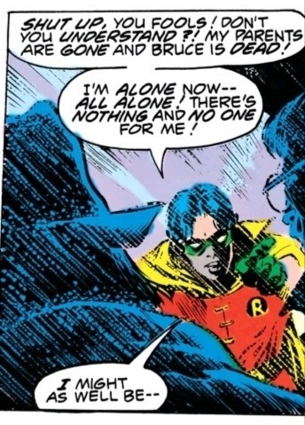

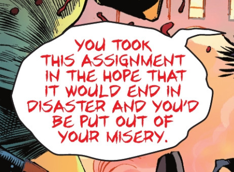
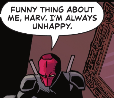

[here's me screaming about the fact that he feels like a phantom that has outlived its purpose of haunting in detail if you're interested]
#issue numbers are in the image descriptions box for anyone who wants them#pls feel free to add this lil collection#um. do i tag other characters mentioned here orrrr#eh whatever the fuck im too sleepy for that#plus this is abt jason. so.#jason todd#tw suicidal ideation#cw suicidal ideation#suicidal ideation cw#suicidal ideation tw#just making sure nobody gets triggered#dc
146 notes
·
View notes
Text

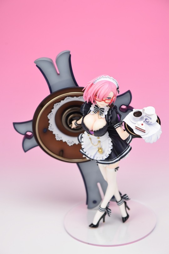

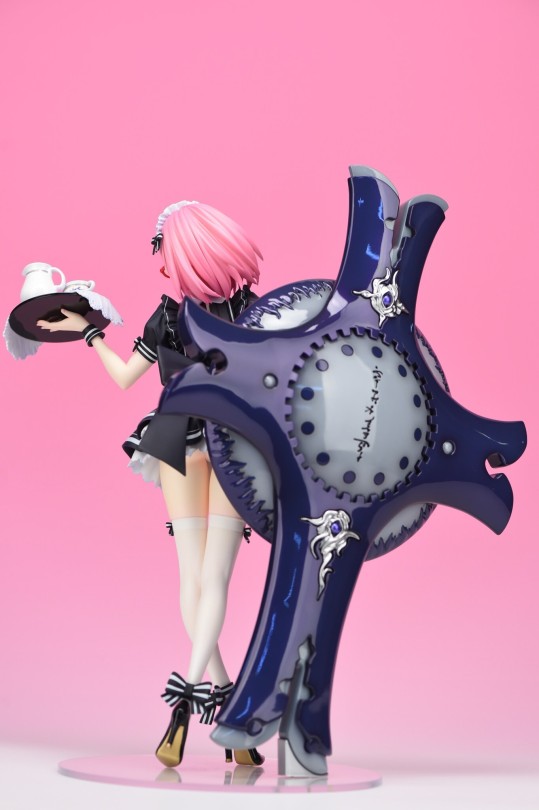

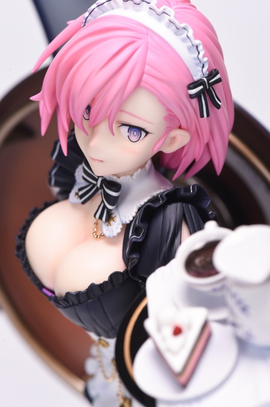
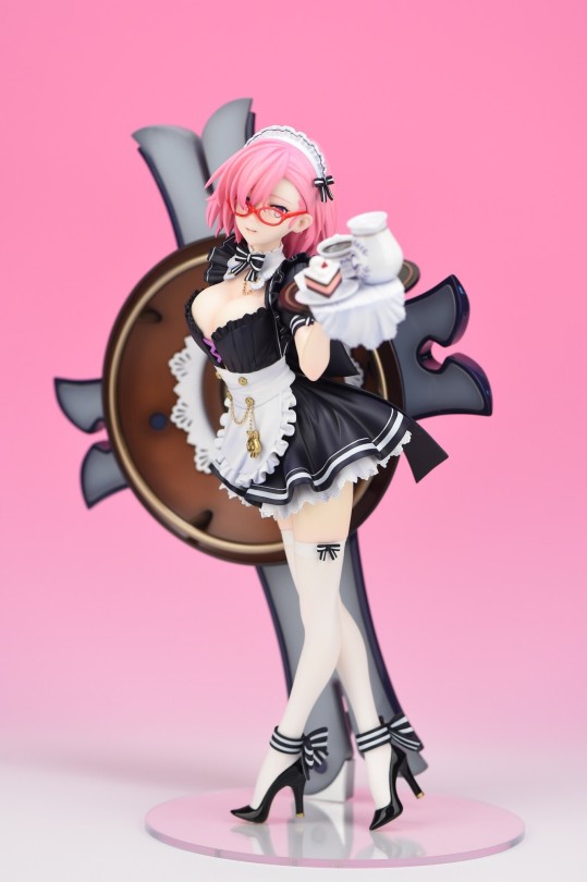

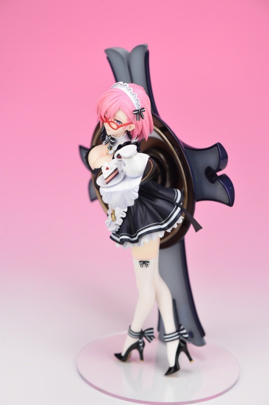
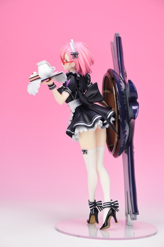

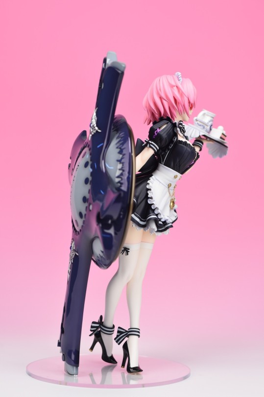
Mash Kyrielight - Maid Ver. by Cerberus Project
#the version of her w/o glasses is technically a different figure but. eh. i'm putting her in the same post#anime figure#figure collecting#fate#fate series#fate grand order#fgo#fate go#cerberus project#garage kit#mash kyrielight
246 notes
·
View notes
Text


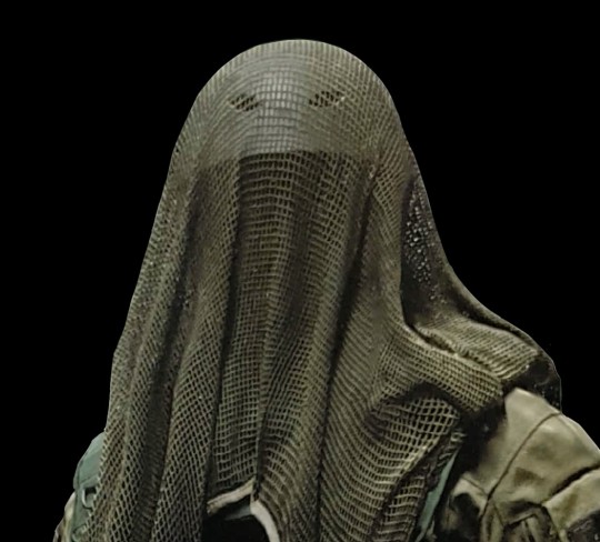
idk what posessed me to make this. I feel sick. 🙃
#spider socorro#avatar 2#i was trying to shorten my spider super-mix into a mini-mix and i got the feeling i needed a collection of distressed spider#for reasons#eh idk. just chuck this on the pile i guess in case anyone else wants it#kid's post
171 notes
·
View notes
Text
Funny as shit to me when people draw krüger as a snake cos it just reminds me of a sphynx Moth or swallowtail caterpillar
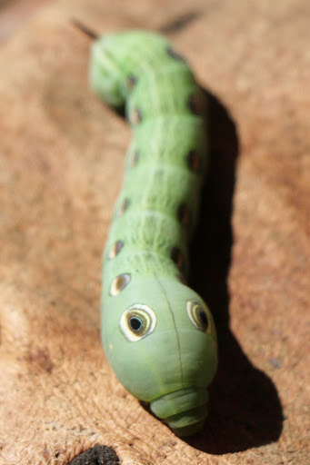
Fake eyes full of malintent
#People drawing him as a snake sparks joy on my dash though#That shit gives me a right giggle#Might also have to do with krüger collecting/liking reptiles being a longtime headcanon of mine but eh#Whaddyakno#The more disproportionate the drawing the better#That fucking guy is like roadkill to me#Dead wasp on the ground#Cod#Call of duty#Cod warzone#Warzone2019#Cod krueger#Krueger#Sebastian krueger
67 notes
·
View notes
Photo

✧ UNSPLASH COLLECTION 085 — BY EVANSYHELP.
In this Unsplash photo collection, you’ll find ( 290 ) deserted island-themed photographs that are suitable for graphic design and free for both personal and commercial use, as requested. Please like or reblog this post if you find this helpful, and remember to like any photos you use!
Content warnings are available in the link below.
✧✧✧ ( VIEW COLLECTION. )
#rey1x1#rph#rpcha#rp resources#ps resources#unsplash#unsplash collection#deserted island#yellowjackets#lost#the wilds#eh#eh: collection
43 notes
·
View notes
Text
Hornets 36 - 40
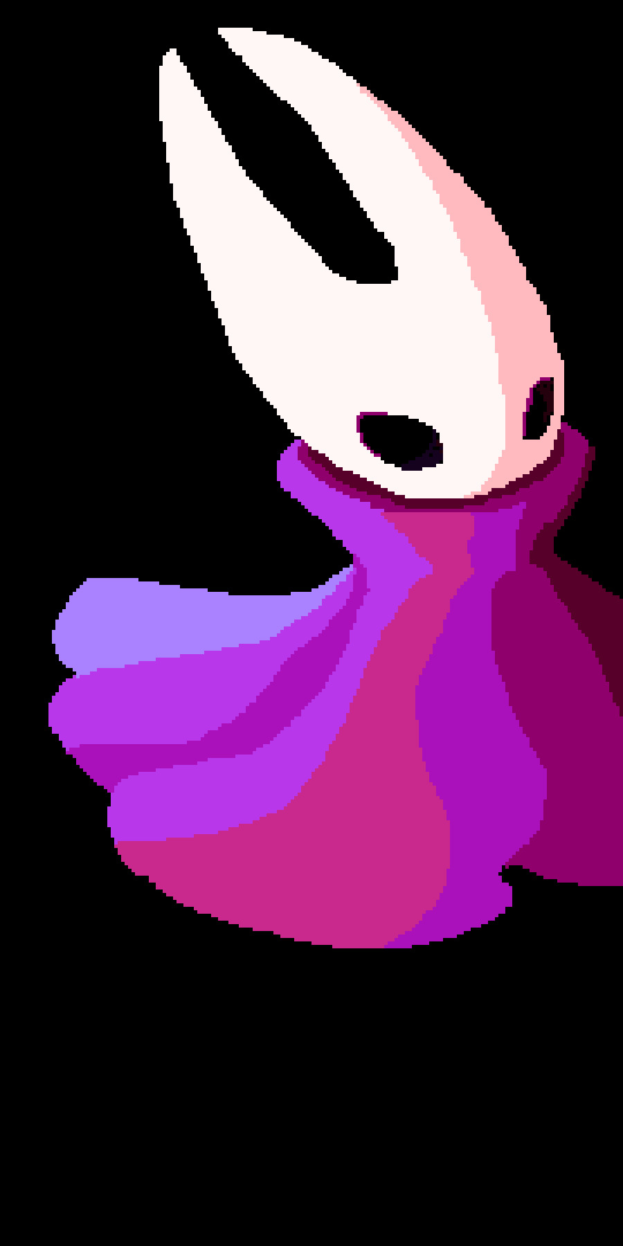

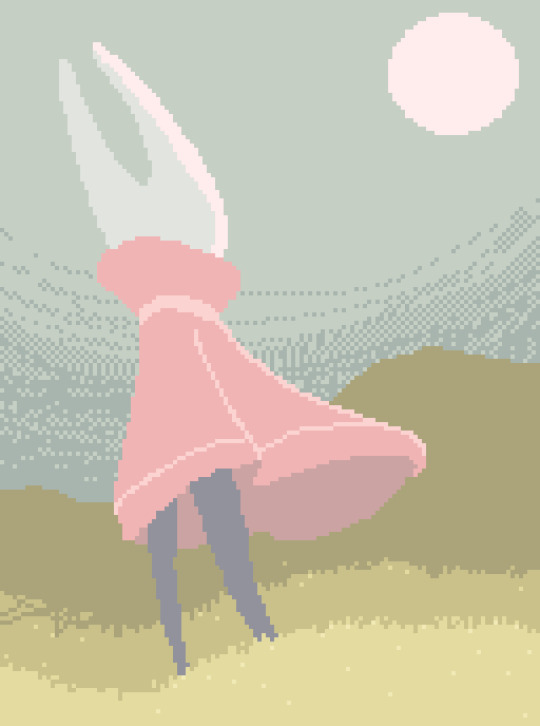

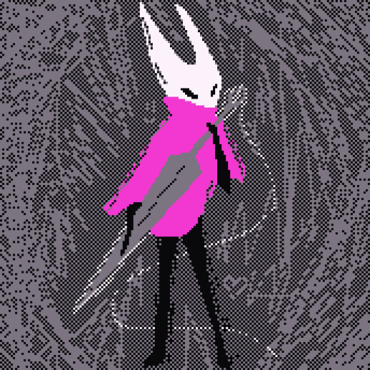
#and i think that's up to date!#2024 art#fanart#pixel art#pixel hornet collection#hk hornet#hk fanart#hornet#hollow knight#eh thats all the tags im using this time#these are the first arts i made after discovering piskel's dithering tool
26 notes
·
View notes
Text
The Collective Seraphic Writing System
This post is going to be the one dedicated to explaining how the Seraphic writing system works. This writing system is entirely digital, as physical writing is no longer in everyday use throughout the Collective, so it's a bit inconvenient to actually write out. It's also weird to read, because it's written in a way that makes the assumption that you know how to speak and understand Seraphic, but I'll try to explain what I can.
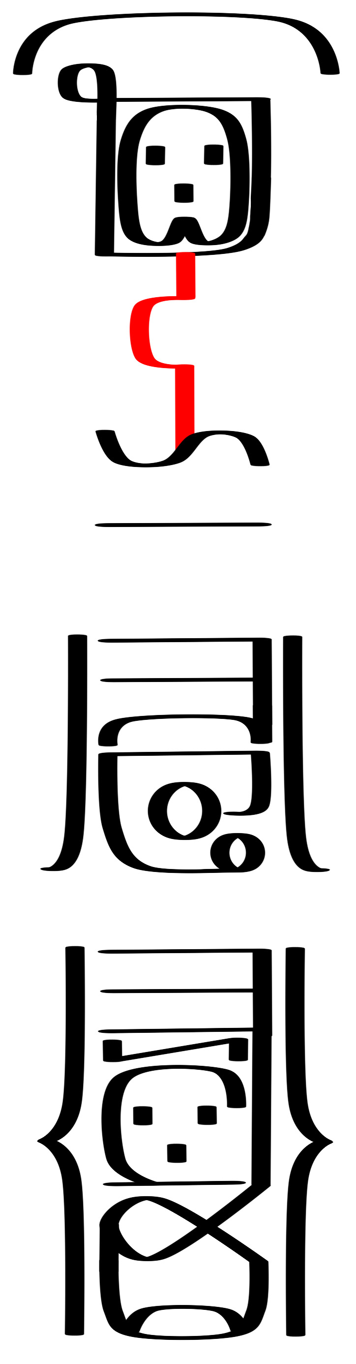
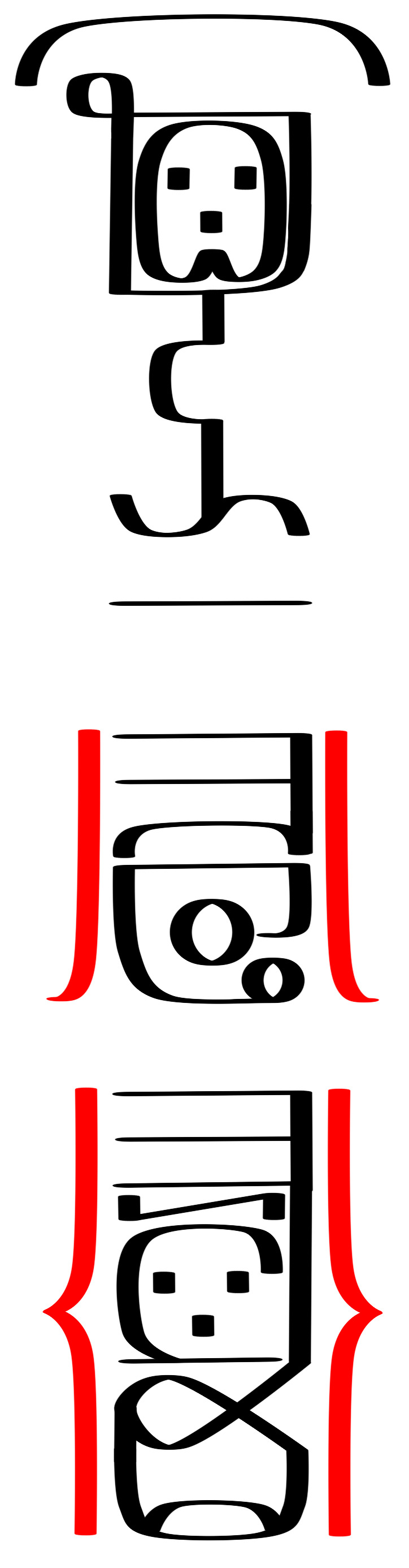
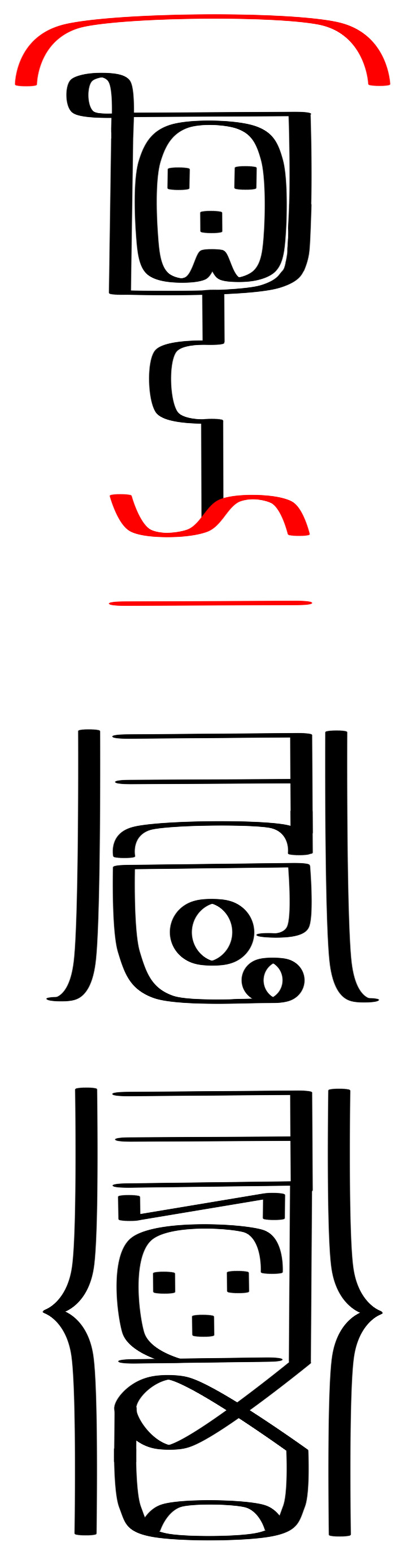
Seraphic has two written forms: longform and shortform. Longform is used primarily to teach young instars how to read and write, and as a way to show how a shortform word is meant to be read. Shortform is the main form of writing, and due to its complication it's usually put off for a year or two before being taught in pupariums. Shortform is the method I'll be teaching today. It's primarily morpho-phonetic, with elements of both an alphabet and grammatical logograms, and is written bottom-to-top and right-to-left in reverse boustrophedon (the path of writing goes up, flips 180°, and goes back down). Because of this, you're expected to be able to read both right-side-up and upside-down. For this post, I'll be using an example sentence to highlight specifics areas of the writing system, as shown below:
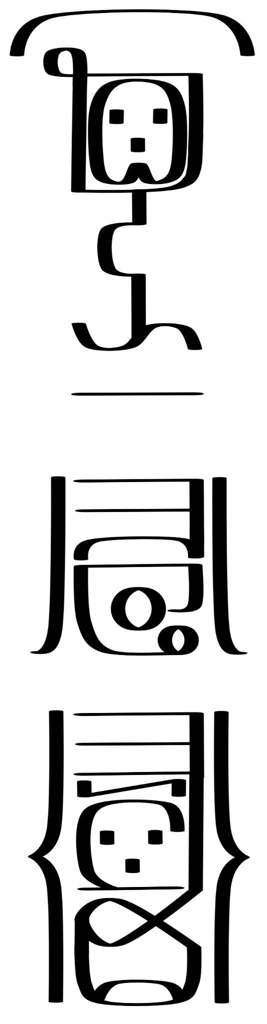
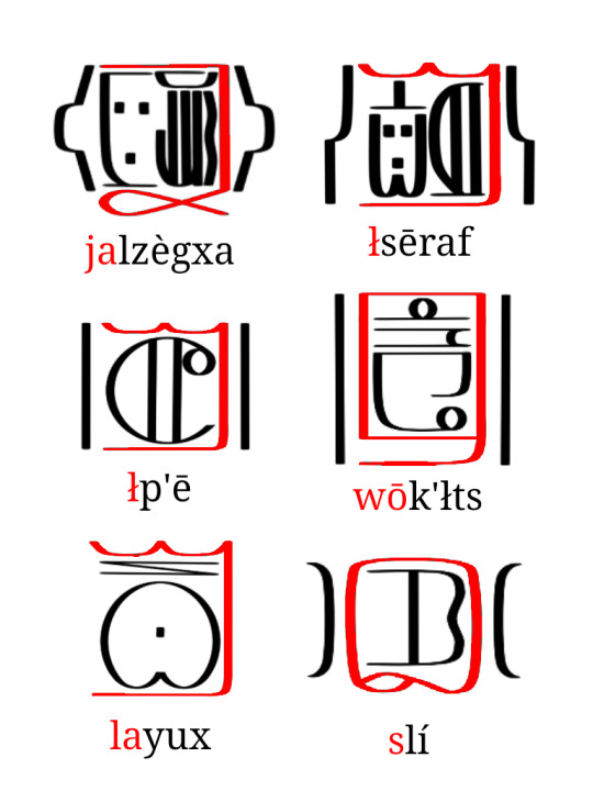
It reads: nJasāğn k'œ̄nan ālxōr e-fya.
"There are 16 dull knives on the floor."
There are seven elements you need to be aware of when writing in Seraphic: the alphabet, class cartouches, procedural and plural ligatures, preposition glyphs, tone diacritics, numerals, and punctuation. I'll be going through each one step-by-step.
Alphabet

The alphabet makes up the majority of Seraphic writing. There are 30 consonants and 6 vowels, and they all arrange into syllable blocks called "cells". Each consonant takes one of three forms depending on if it is at the start of the syllable, before a vowel, or at the end of a syllable. The alphabet is featural, meaning that the way each letter is written is meant to encode its pronunciation. Here is the alphabet in full:

Each consonant (excluding the ejectives) showcases the three variant forms it can take (similar to capital and lowercase letters in the latin alphabet). The largest, leftmost character is the form that hosts the interior vowels within it. The rightmost vertical form is used when preceeding another consonant, and the upmost horizontal form is used at the end of syllables. If a syllable contains a syllablic consonant, the main consonant will have no vowel within it and instead a syllable-final form of one of the syllabic consonants (r, l, m, n, or ŋ) placed on top of it.

Concerning vowels, they are solely meant to be written within consonants, acting sort of like internal diacritics. They cannot exist on their own, nor can more than one be written within the same consonant (Seraphic doesn't allow diphthongs), and if a vowel must be written by itself it is written within the glottal stop letter ' (in this instance acting as an independant vowel holder).

These rules apply to individual syllables. In multi-syllabic words, each syllable cell is arranged together in a specific way based on the number of syllables in order to keep the line uniform and compact.
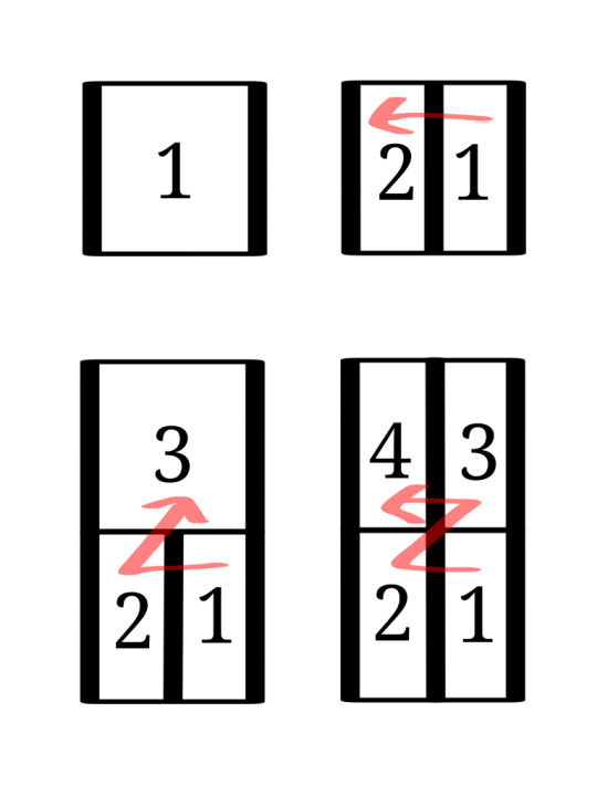
the flow of reading word-internally definitely follows the overall direction of writing (bottom-to-top, right-to-left) so broken down an entire word will usually look like this when written:
Seraphic written in longform will be written entirely using the alphabet. Spaces are put between words, punctuation and numeral symbols are still used, and tone diacritics may be included as well, but otherwise it's entirely spelled out in this way. Writing this way makes the text as a whole quite longer, and can come off as childish or imply you're a new learner of Seraphic, so shortform will usually be used in official contexts. In shortform, alphabetical letters are restricted to non-declined parts of nouns, adjectives, and proper nouns.
Class Cartouches
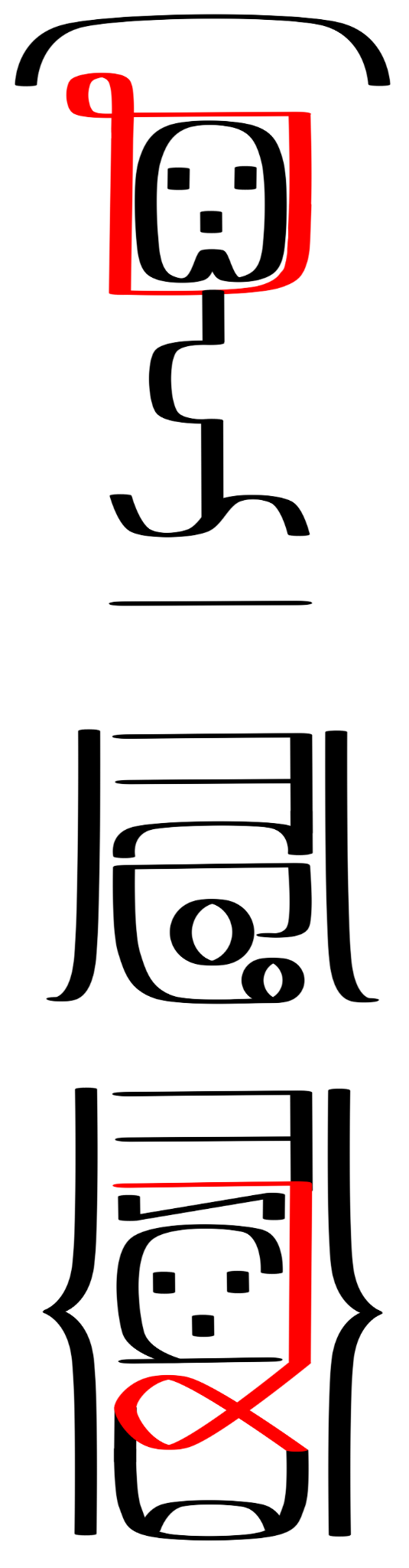
In Seraphic, there are seven noun classes: Solar (people), Astral (animals), Vital (plants), Terranean (places), Metallic (objects), Lunar (concepts), and Oceanic (everything else). Similarly, the writing system employs seven symbols called "class cartouches" to encode which noun class a word is in. This is drawn from this writing system's predecessor, the Aeonic Seraphic alphabet, that also used glyphs to notate class. These are the seven noun class cartouches:
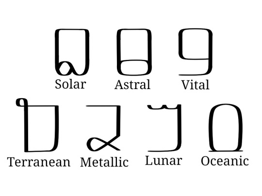
The thing about the class cartouches is, not only is it morphological, but it's also phonetic. A noun is never spelled out in its entirety, usually only part of it is. When a class cartouche is used, it's supposed to stand in for the class prefix itself without having to additionally spell the class prefix in the rest of the word. For example, in the word zājlux (tail), the "-jlux" would be spelled out, and the solar class cartouche would be drawn around it to stand in for the "zā-". Even though you don't write it, you still know it's there because of the class cartouche. Because of the nature of the noun class prefixes, and how many different forms they can take, it can be daunting to have to guess if you're supposed to pronounce a word with a "za-" or a "zo-", but there are patterns to which prefix (and thus, declension patterns), is meant to be read depending on what the following sound is.
Solar class
read as zā before f, v, s, z, c, j, pf, ts, tc and any cluster of two consonants (e.g. zāsā, zāfr, zājlux)
read as z�� before x, ğ, h, ', and kx (e.g. zōxō, zōxur, zōğœcl)
read as zē in stressed syllables, and occasionally before consonant clusters (e.g. zēzmp'ux, zēzt'e, zēvasax)
read as s before vocalics (vowels and syllabic consonants), r, l, w, y, n, t, d, p', or k' (e.g. srāc, sēr, sōğœc)
read as ts before t', the ts replacing the t' entirely in pronunciation, for example tsn would be written as (Solar)t'n (e.g. tsn, tsā, tsłzaf)
Astral class
read as ğr before f, v, s, z, c, j, x, ğ, h, pf, ts, tc, kx, p', t', k' and and cluster of two consonants (e.g. ğrzles, ğrxur)
read as x before vocalics, r, l, w, y, ŋ, k, g, p', or t' (e.g. xūc, xŋox)
read as kx before k', the kx replacing k' in pronunciation (e.g. kxa)
Vital class
read as wā before r, l, w, or y (e.g. wāya, wārāc, wāwax)
read as wō before k', k, g, x, ğ, ŋ, or kx (e.g. wōk'ł, wōxur, wō'ōf)
read as wē before consonant clusters (e.g. wēzles, wējlux, wējlozln)
read as ū before n, m, p', p, b t', t, d, f, v, s, z, c, j, pf, ts, or tc (e.g. ūt'u, ūp'n)
read as w before vocalics (e.g. wē, wīn, wājr)
read as wī occasionally before consonant clusters (e.g. wīzya)
Terranean class
read as va before f, v, s, z, c, j, pf, ts, tc and any cluster of two consonants (e.g. vafl, vasērn, vasa)
read as vo before x, ğ, h, ', kx, and consonant clusters (e.g. voxāl, vodsā, vojrayux)
read as vu in stressed syllables and occasionally before consonant clusters (e.g. vujlux, vulvren, vuzajni)
read as f before vocalics, r, l, y, w, m, n, ŋ, p, b, t', or k' (e.g. fe, fruvn, fmağo)
read as pf before p', pf replacing p' in pronunciation (e.g. pfan)
Metallic class
read as ja before f, v, s, z, c, j, pf, ts, tc and any cluster of two consonants (e.g. jafa, javlni, jawaya)
read as jo before x, ğ, h, ', and kx (e.g. joxl)
read as c before vocalics, r, l, w, y, n, t, d, p', or t' (e.g. can, cya, cenaŋx)
read as tc before t', the tc replacing the t' entirely in pronunciation (e.g. tcłvr, tcāŋğl, tcū)
Lunar class
read as la before r, l, w, or y (e.g. lara, layeğr, lalel)
read as lo before k', k, g, x, ğ, ŋ, or kx (e.g. loxir, loğn̄, loxel)
read as le before consonant clusters (e.g. levp'ā, levren, lejt'ān)
read as li in stressed syllables and occasionally before consonant clusters (e.g. liwayi, lit'n̄, livasāx)
read as y before vocalics (e.g. yar, yu, yawu)
read as l/ł before n, m, p', p, b t', t, d, f, v, s, z, c, j, pf, ts, or tc (e.g. lce, łzēwok'u, lvulvren)
Oceanic class
read as a/ā before m, n, p', p, b, t', t, d, s, z, f, v, c, j, pf, ts, tc, w, r, y, l, and all consonant clusters (e.g. ap'i, āt'ē, ācèya)
read as o/ō before ŋ, k', k, g, ', x, ğ, h, and kx (e.g. ōxūr, ōxān)
read as aw/āw before vocalics (e.g. awun, awaf, awaman)
Of course these rules are not hard set, and there are several instances where a written word contradicts these rules or even when two words end up spelled the same, but for the most part these rules will generally be consistent for most written words. It seems like a lot to remember, but usually it's a thing that you eventually develop a sort of "ear" for.
Procedural and Plural Ligatures

The procedural and plural ligatures are additional glyphs used to mark, respectively, the procedurals and the plurals of a noun. The procedural are written at the bottom of the noun (since Seraph is written bottom-to-top and these are prefixes of course), and there are 12 separate procedural symbols in use. Similarly, the plurals, being suffixes, are written at the top of the noun and contain only three symbols (the singular is usually unmarked). They are as follows:
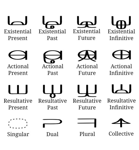
The plural ligatures attach to both nouns and adjectives freely, but in order for a procedural ligature to attach to an adjective, the adjective needs to be put in the oceanic class and subsequently written with the oceanic class cartouche. Additionally, if you want to write remote past/future forms for each procedural, you would need to attach the resultative present ligature underneath the preexisting past or future ligature (these conjugations haven't developed their own separate ligature forms, so they follow the tradition of using the resultative in addition as semantically that is where the remote forms originated). I don't really have a way to show you how to pronounce the plural forms, as even though the different pronunciations are pretty few they're actually pretty inconsistent on which one goes where. It's just one of those things you kinda have to already know. You can check the introduction to Seraphic post to see what forms the plurals can take, but otherwise it's basically, like, memorization. The procedurals on the other hand DO have a predictable pattern of pronunciation, but each tense has a different form based on what class and declension the noun is in, and with six tenses and seven classes each with at least three different declension forms, it's definitely something I can't summarize here. Again I HAVE to make a separate post for that because the declension forms are vital to knowing how to decline properly in Seraphic.
Preposition Glyphs
This section will probably be the easiest to explain really. The preposition glyphs are pretty easy to recognize. They're written in between words, attaching to both of them instead of floating freely like regular words are. There are 19 glyphs for the 19 prepositions, and they don't really change form. Sometimes, if occurring at the beginning of a sentence, they'll have one end sorta lopped off, but not everyone follows through with this convention. Here are the glyphs listed below:
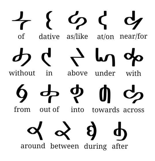
Two or more prepositions can't occur sequentially, it's a very one-at-a-time situation, although in colloquial speech you'll see two prepositions being used in certain instances.
Tone Diacritics
Seraphic is a tonal language, and luckily it has diacritics to indicate the tones. They frame the words on each size, being used on both nouns and adjectives where applicable. You'll usually see them in formal contexts like government documents and letters of address, on signs and boards and menus and any kind of display especially in highly populated areas, in use by those whom are just learning Seraphic and don't have a hang on remembering all of the tones yet, and just in any context where clarity of literacy would be important. In everyday colloquial text conversations and things the tone diacritics will be usually dropped as context is sufficient enough to know, although tone diacritics may be reintroduced to differentiate homonyms that are distinguished only in tone (e.g. lxal "power" vs. łxāl "day"). There are eight individually recognized tone diacritics:
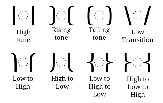
The low tone is the base tone and is usually left unmarked, so there's no sign for just the low tone. When a low tone transitions to a rising or falling though, the low transition diacritic will be used to connect the two. Many of these diacritics are usually connected consecutively when a word requires it, flowing as if they're one larger tone diacritic. This can give a whole host of unique tone symbols, but for the most part, all of the tone symbols can be broken down officially into the 8 diacritics. There isn't a 1-1 correspondence between individual tone diacritics and syllables within a word, usually you can know from context and just knowing how the word is pronounced. For example, the word łxāl would be written with one high tone marker even though the word is two syllables, but it's meant to infer that the entire word is pronounced with an even high tone. Here are some additional examples:
The top example is the word jalzègxa "chronicle". You can see that it uses the two low tone transitions to connect to the central falling tone, representing a low-falling-low relationship. The word below that is māzefādnu "hourglass". It employs a high-low-high, and then a high-low, with the last high-low meant to merge with the high-low-high. So truthfully it's meant to be interpreted as high-low-high-low. There's a lot of possibilities, but breaking it down will simplify what tones are being used specifically.
Numerals and Punctuation
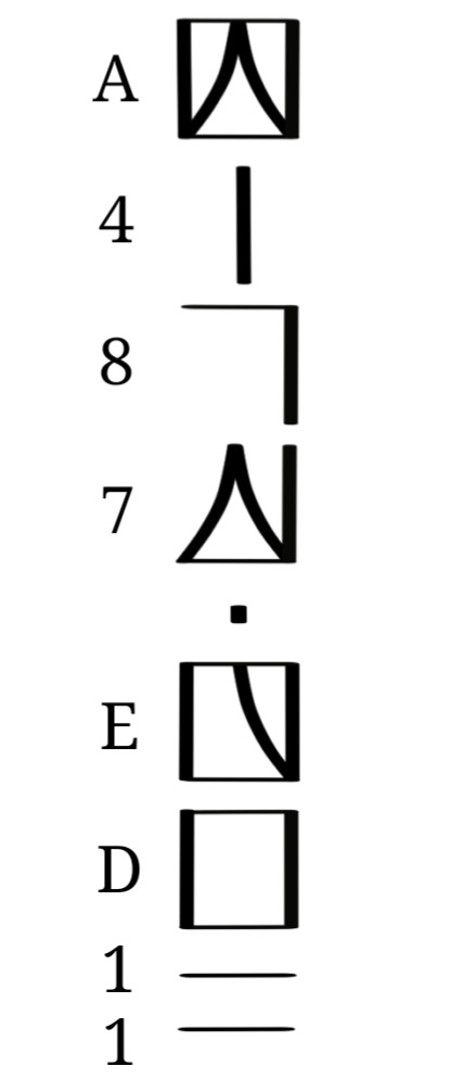
This final section will discuss Seraphic numerals and punctuation. Now, unlike in most human languages which uses base-10, having 10 unique symbols to represent the values of 0-9, Seraphic uses base-16 and represents the values 1-16 with 16 individual symbols. In base 16, we would write 16 as 10, standing for one set of 16 and zero sets of 1. It's written in positional notation like arabic numerals, where each position represents a power of 16 (instead of a power of ten like in base-10). Here are the numerals:
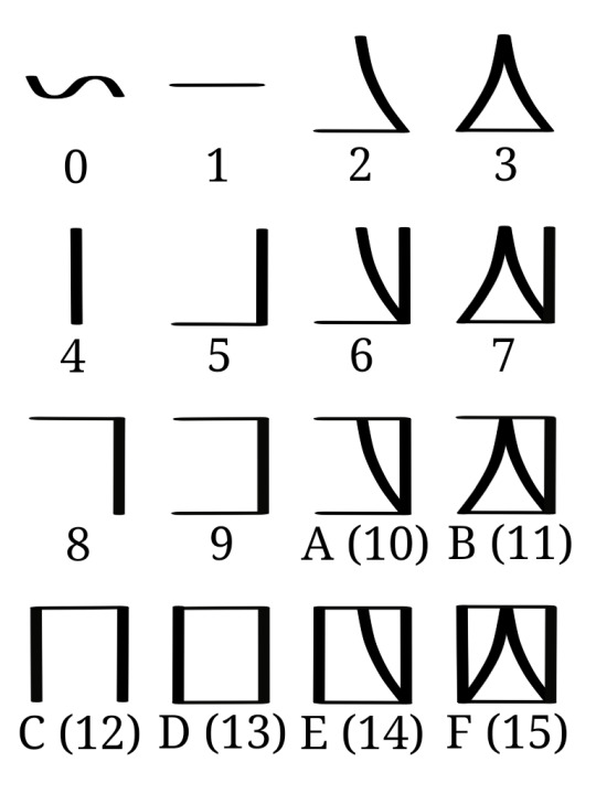
If you were to write a number like 299,792,458; you'd convert it into base-16 which would be 11,DE7,84A; and since Seraphic numerals are grouped in 4 instead of 3 it would actually be 11DE,784A. This is how you'd write that:
Both Arabic numerals and Seraphic numerals describe the same amount of things, they just group things differently. We group in sets of 10, they group in sets of 16.
As for punctuation, there are only 5 marks that's in standard use, and these are them:
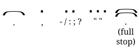
Single bar - separates individual sentences.
Single dot - separates clauses for clarity, separates numerals into groups of four.
Double dot - separates individual words such as in lists or replaces a single dot when separating clause groups.
Triple dot - Distinguishes quotes and dialogue, as well as highlighting names, terms, and titles.
Double bar - used to end full paragraphs/passages instead of a single bar.
Overall, that's pretty much everything I can detail about how the Seraphic writing system works! It's complicated but it was very fun to develop and boy was it satisfying to get it to work. Hopefully you'll now be able to decode a little better Seraphic writing, and maybe even write something of your own!

ŋKowīci cu-stux 'ōf tsa-levp'ā cu-zāsláf pi-lizt'n ğōdjasa! (Thank you all so much for reading!)
#conscript#constructed script#neography#conlang#constructed language#artlang#writing system#orthography#seraphic#collective seraphic#whoa boy this one is even longer#had to do a lot of writing and doodles for this#of course i needed them so itd all make sense#i needed to provide examples#either way i hope this made any sort of sense#ill provide the declension forms soon enough and that should be relatively shorter#idk if it'll be easier to explain though#eh whatever
42 notes
·
View notes
Note
your posts are cool (even if I don't completely understand what's going on in the au) and also the sona you draw is a goober
Thank you!!! /// If it helps I'll put down some links to some loreish stuff! (Of course not in order >:) )
What is Emergence?
Iterator Generations
My Goodbye
CD ES and APL
Embers Floating in Time
EFiT and ES
Disaster
The Agreement
Repeating Pattern
Organism
A Humid Breeze, Seven Distant Valleys
Bad News
Oopsy
Denial
Settle Down
The Meeting (And some silly stuff)
You call the shots
Support
A new path
Doubt
Divorce/j
Sliver of Straw
Kaboom
Valiant Local Group
Growing Concerns
Timeline
Stand Down
First Comic Page
There will be more comic pages and eventually I will get to what's above- it'll eventually all make sense~!
#rainworld#Emergence#just a collective of everything#lore shit#QNA#rain world au#rain world#rw#toxtalk#>:)#i might of missed a thing or two but eh
62 notes
·
View notes
Text
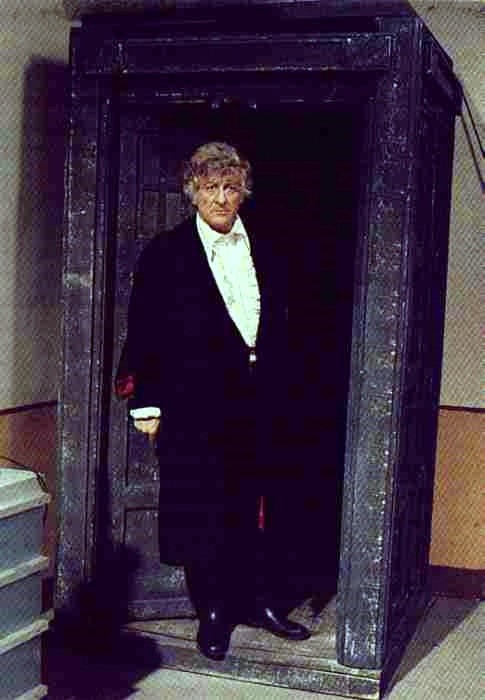

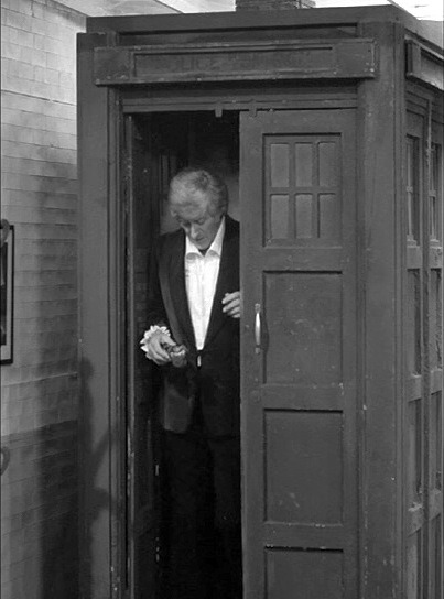

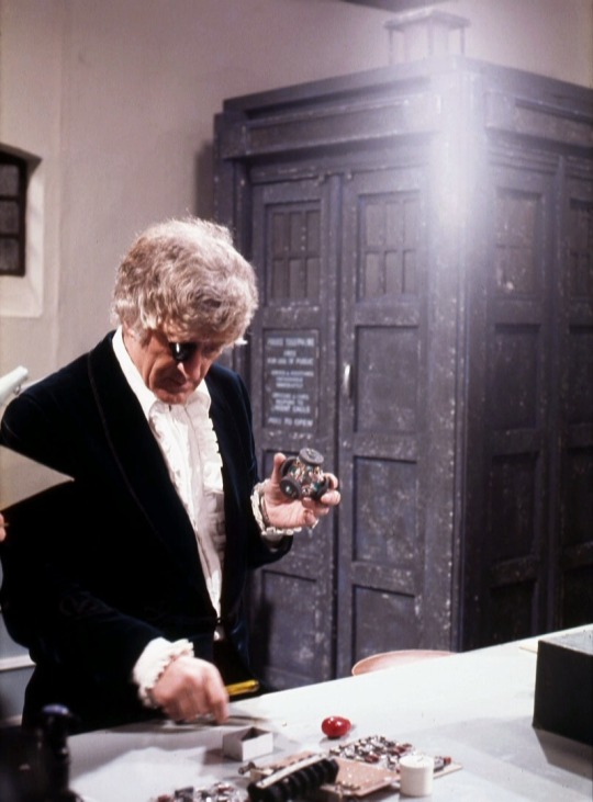

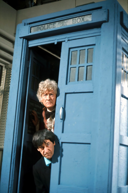
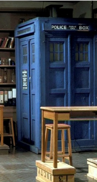


not as many again but to be fair, she wasn't feeling very well. if this was a collection of bessie it'd be a different story :D
[1] [2] [4.1] [4.2] [5] [6.1] [6.2] [7] [8] [9.1] [9.2] [10.1] [10.2] [10.3] [10.4] [11.1] [11.2] [11.3] [11.4] [11.5] [12.1] [12.2] [12.3] [12.4] [13.1] [13.2] [13.3] [14]
#doctor who#the tardis#tardis#classic who#70s who#is... is that a tag?? eh. oh well#third doctor#also#second doctor#lol#also also#delgado!master#she likes posing with her thief and his strays lol#my TARDIS collection#<3#doctor who bts
30 notes
·
View notes
Last Seen Blogs

youtube-screenshots
Your Favorite YouTubers
hime-samach4an
we are standing on the edge so young and hopless

lamillo
Untitled

neon--nightmare
WIGGIDY WOGGIDY!

casualvioletboy
don't judge a book by its cower