#digital colorist
Photo
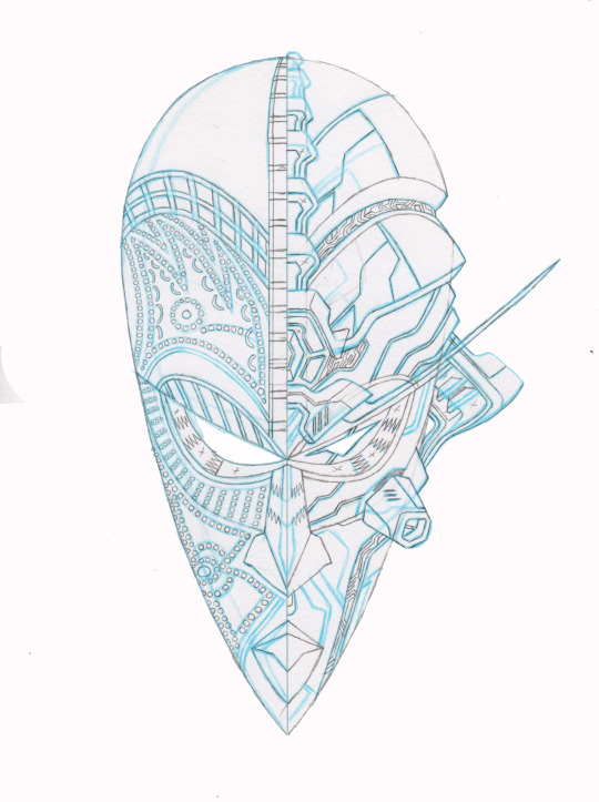

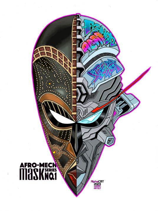
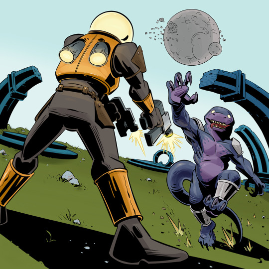
Afro-Mech Mask series no. 1 The Process
[Yes, I still draw and ink traditionally!]
#afrofuturism#african mask#mecha#human artist#penciller#inker#colorist#digital colorist#black art#artists on tumblr
14 notes
·
View notes
Text
instagram
One of the top highlights of my colorist career in 2022 was coloring for my Presidential Candidate, Leni Robredo.
It was an honor to be part of this Pink Movement by coloring this ad campaign for her
#nalacolors#colorgrading#color grading#colorist#digital colorist#davinci resolve#davinciresolve#Instagram
0 notes
Text
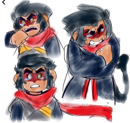
LMK FANS WHERE U AT
art is by RenMist on Twitter!
I don’t make art often, so if you wanna stick around on my blog, consider checking this out:
1K notes
·
View notes
Text
I think 90% of my gripes with how modern anime looks comes down to flat color design/palettes.
Non-cohesive, washed-out color palettes can destroy lineart quality. I see this all the time when comparing an anime's lineart/layout to its colored/post-processed final product and it's heartbreaking. Compare this pre-color vs. final frame from Dungeon Meshi's OP.


So much sharpness and detail and weight gets washed out and flattened by 'meh' color design. I LOVE the flow and thickness and shadows in the fabrics on the left. The white against pastel really brings it out. Check out all the detail in their hair, the highlights in Rin's, the different hues to denote hair color, the blue tint in the clothes' shadows, and how all of that just gets... lost. It works, but it's not particularly good and does a disservice to the line-artist.
I'm using Dungeon Meshi as an example not because it's bad, I'm just especially disappointed because this is Studio Trigger we're talking about. The character animation is fantastic, but the color design is usually much more exciting. We're not seeing Trigger at their full potential, so I'm focusing on them.
Here's a very quick and messy color correct. Not meant to be taken seriously, just to provide comparison to see why colors can feel "washed out." Top is edit, bottom is original.
You can really see how desaturated and "white fluorescent lighting" the original color palettes are.
[Remember: the easiest way to make your colors more lively is to choose a warm or cool tint. From there, you can play around with bringing out complementary colors for a cohesive palette (I warmed Marcille's skintone and hair but made sure to bring out her deep blue clothes). Avoid using too many blend mode layers; hand-picking colors will really help you build your innate color sense and find a color style. Try using saturated colors in unexpected places! If you're coloring a night scene, try using deep blues or greens or magentas. You see these deep colors used all the time in older anime because they couldn't rely on a lightness scale to make colors darker, they had to use darker paints with specific hues. Don't overthink it, simpler is better!]
#not art#dungeon meshi#rant#i'm someone who can get obsessive over colors in my own art#will stare at the screen adjusting hues/saturation for hours#luckily i've gotten faster at color picking#but yeah modern anime's color design is saddening to me. the general trend leans towards white/grey desaturated palettes#simply because they're easier to pick digitally#this is not the colorists fault mind you. the anime industry's problems are also labor problems. artists are severely underpaid#and overworked. colorists literally aren't paid enough to do their best#there isn't a “creative drought” in the anime industry. this trend is widespread across studios purely BECAUSE it's not up to individuals#until work conditions improve anime will unfortunately continue to miss its fullest potential visually#don't even GET ME STARTED ON THE USE OF POST-PROCESSING FILTERS AND LIGHTING IN ANIME THOUGH#SOMEONE HOLD ME BACK. I HATE LENS FLARES I HATE GRADIENT SHADING I HATE CHROMATIC ABBERATION AND BLUR
2K notes
·
View notes
Text
youtube
I just added a new coloring video to my YouTube go take a look and don't forget to subscribe!
#art#artwork#artist#artists#draw#drawing#drawings#painting#coloring#colorist#digital art#digital artwork#digital artist#digital painting#digital coloring#digital colorist#digital drawing#new art#new artwork#creative#creativity#artists on tumblr#artists of tumblr#youtube#youtuber#new youtube video#new video#new vid#youtube channel#Youtube
1 note
·
View note
Text
Just a bit about me…
Just a bit about me…
Yes, I am the female who does NOT look the same in person as she does online. What are you gonna do about it? I’m not Khloe Kardashian 🤷🏽♀️
Obscure History, Paranormal Mysteries, Spiritual Shit, Bad Opinions, Garbage Art, and Self-Deprecating Humor
Hello, my name is Madelyn (most call me Madi), I’m a 26-year-old wife and mother to a beautiful 3-year-old daughter, and I currently live in a too…
View On WordPress
#about me#alittletoopictureimperfect#altpi#bad opinions#blogger#creative nonfiction writer#digital colorist#freelancer#fresher#garbage art#jobseeker#me#obscure history#researcher#spiritual shit#truth seeker#writer
0 notes
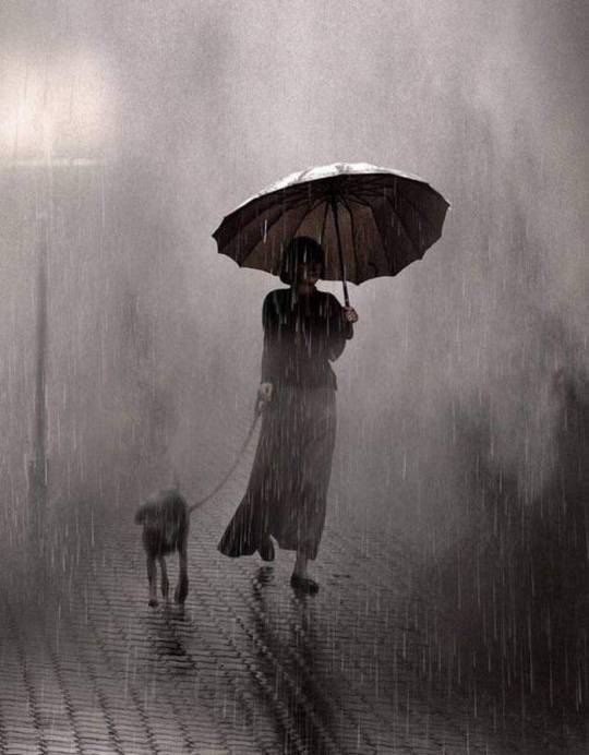
Text
I am risking that rain and loving it
61 notes
·
View notes
Text
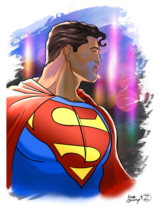
#thekryptonknight#my colors#art#colorist#dc comics#illustration#digital art#procreate on tumblr#procreate#dc studios#superman
40 notes
·
View notes
Text

1.Saul Leiter, American colorist
2. surrealistic world edit challenge on picsart
36 notes
·
View notes
Text


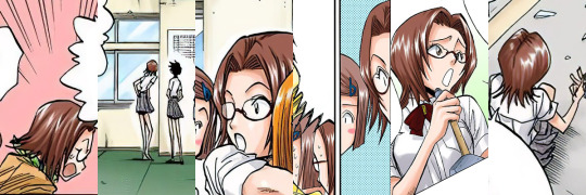


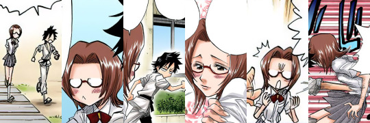

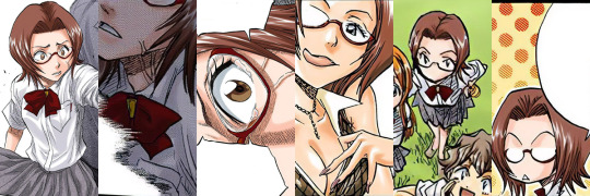


#bleach#chizuru honsho#i forgot some random bonus chapters#and had to go back and tack them onto the end there#its a shame chizuru was just kind of a weird joke character#i actually really like her design#the digital colorist picked a weird washed out color for her hair#but Kubo's omake art gives her this pretty sort of plum red color#she was not my first choice but she's kind of one of the only characters left with both enough appearances to be worth cataloging#but also few enough to not be an impractically large collection
33 notes
·
View notes
Text
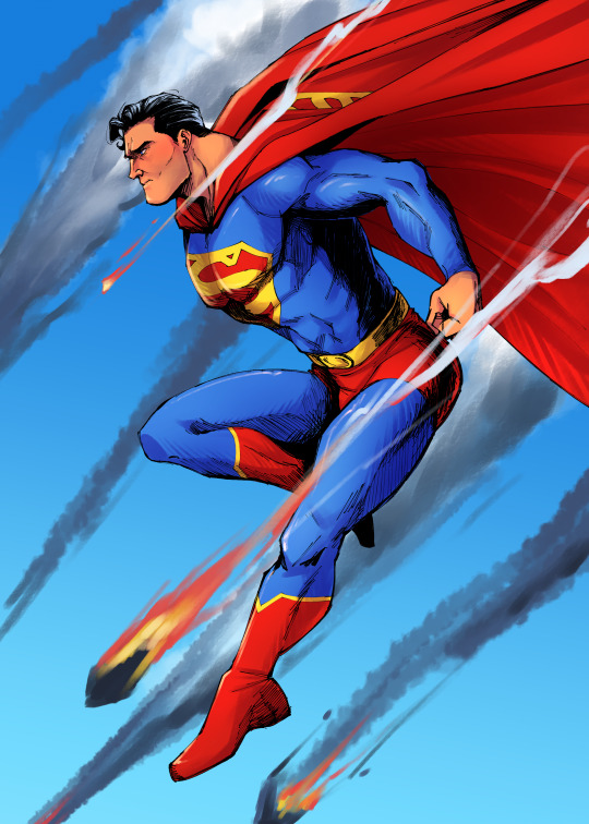
so after watching a couple ryan benjamin vids about inking i decided to give his style of inking a shot, and it's pretty good? i think i did some of it wrong though so my lines came out a bit chunky in places... just takes practice i guess?
(please do not ask for the context of this i added the background after i finished the piece and i have no clue what he'd be doing that would cause stuff to rain from the sky)
#superman#clark kent#dc comics#dc fanart#dcu#doodles#digital art#i rescued my terrible mimic of ryan benjamin's style by doing my pretty okay coloring#im pretty happy with how my rendering is coming along tbh#i stole some style elements from leyendecker (the hatching paint mostly)#so its very nice#i enjoy it#i also stole some stuff from.... the colorist whose name is really hard to pronounce#they always make clark rosy cheeked and a bit tan so i was like hell yeah im doing that too#and of course the king dan mora is the inspiration for the cape and hair#i think slowly... slowly... im starting to develop my own style again#i had my own style for a long time but i got a bit sick of it tbh bc it felt like i stopped improving#so here we are
309 notes
·
View notes
Text

💙💚
#anime#anime art#art#artist#digital art#artists on tumblr#bnha#boku no hero au#colorist#coloring#my hero academia#boku no hero academia#mha#horikoshi art#digital artist#manga coloring#mha manga#boku no hero art#anime artist#horikoshi sketches#deku art#deku#mha deku#bnha deku#bnha izuku#midoriya izuku#izuku midoriya#mha izuku#anime aesthetic#aesthetic
189 notes
·
View notes
Text
instagram
Golden hour for Malboro
#nalacolors#color grading#colorgrading#colorist#digital colorist#colorcorrection#davinci resolve#davinciresolve#Instagram
0 notes
Text
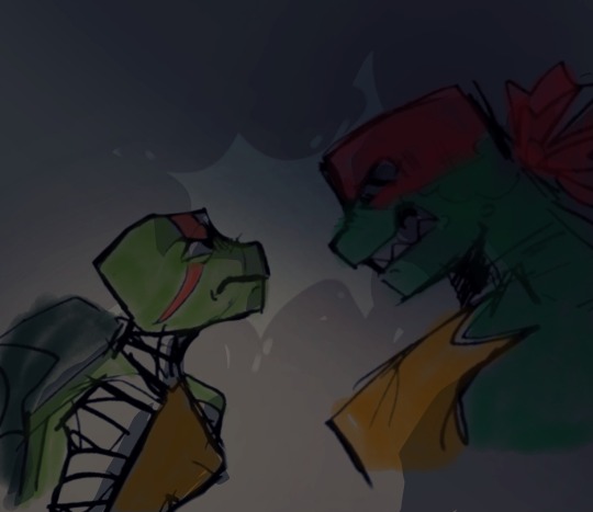

art belongs to @circusinarun
their art is fucking GORGEOUS. Check out their art!
#tmnt#rottmnt#rise of the tmnt#teenage mutant ninja turtles#rise of the teenage mutant ninja turtles#coloring#color#digital coloring#colorist
25 notes
·
View notes
Text
People are more complicated than the masks they wear in society
#art#artwork#artist#artists#draw#drawing#drawings#color#coloring#colorist#colors#digital art#digital artist#digital artwork#digital drawing#digital color#digital colorist#new art#new artwork#artists of tumblr#artists on tumblr#horror#horror fan#horror fans#horror movie#horror movies#creative#creativity
0 notes
Text
Precious Stones in Flight Speedpaint #74
Precious Stones in Flight Speedpaint #74
IG/FB/YT: @your_local_talentless_artist
Track: What Am I — Ferco [Audio Library Release]Music provided by Audio Library PlusWatch: https://youtu.be/_df9xMnO6n8Free Download / Stream: https://alplus.io/what-am-i
youtube
View On WordPress
#abstractart#artlife#avians#birds#black artist#color therapy#colorin art#coloring#coloring artist#coloring artwork#colorist#different#digital art#digital artwork#digital coloring#digital colorist#feathers#flight#jewel#jewelry#jewels#nature#new artist#newage#penup#pigment#star#stones precious stones#Youtube
0 notes
Last Seen Blogs

rip-euphemia
💖333💖
govataan
Angaran Welcome Center

melghi
I'm new here, i know nothing... But i'm happy
kleenealgebracow
Kleene Algebra Cow
war-is-hell
The 4077