#css grid media
Note
Hii ! I’m in a bit of a problem rn and I’m wondering if you could help ( sorry for bothering you )
So school just finished and I’m on vacation for like 3 months so I really want to learn how to code ( I mainly want to make cool websites and stuff ). So I started to learn html and css but it just seems so overwhelming especially seeing all the ressources and tutorials online, could you please help me know what to learn first ? 💖

Hiya! 💗
Yeah, I can help! It can be overwhelming at first, but it's best to break it down into chunks and tackle them bit by bit.
For now, as a complete beginner, use these 3 resources:
HTML and CSS course video - LINK
W3School (for extra help) - HTML LINK | CSS LINK
MDN (for even extra help) - HTML LINK | CSS LINK
After that, work on projects to test your knowledge:
List of 11 projects to tackle - LINK
Here is the list of things you want to cover in HTML:
Basic structure
Tags and elements
Attributes
Forms
Semantic markup
Tables
The same but for CSS:
Selectors
Box model (margin, padding, border)
Typography (fonts, text properties)
Colours and backgrounds
Layout and positioning (floats, flexbox, grid)
Responsive design (media queries)
Transitions and animations
Now that you have a list of what you need to cover, tackle them one by one, making sure you understand the topic before you head over to the next. The video tutorial covers all of this and more. If you don't understand a bit in the video, stop and look on W3School and MDN for further understanding and then continue on with the video. Also, tackle the video slowing. Don't rush, don't do it, it'll just make the learning process even longer if you getting not understand things.
The resources I listed are my complete go-to. After that, as you've noticed, there are hundreds more. Go through the ones you need for the specific project you're working on or the topic you're studying only.
Hope this helps and good luck! 💻💗
#reources#coding#codeblr#programming#progblr#studying#studyblr#comp sci#tech#html#css#html css#coding resources
99 notes
·
View notes
Text
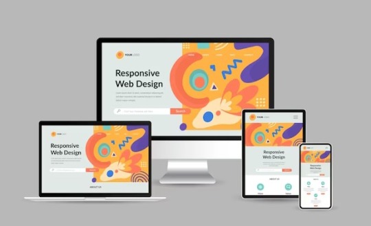
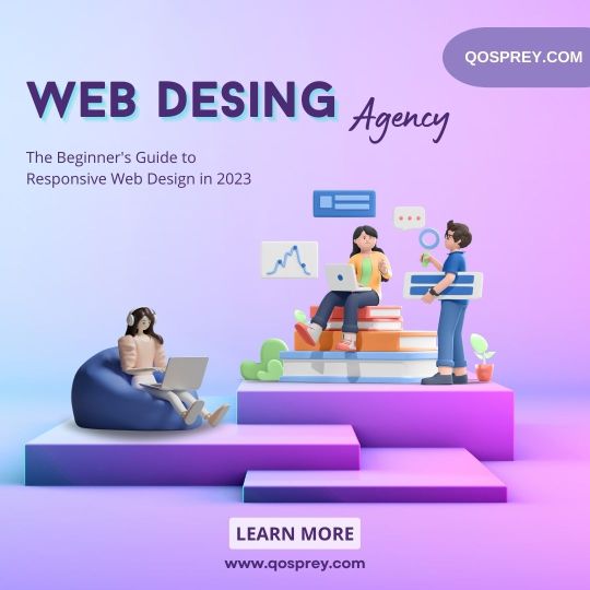
Responsive Web Design and Development: Creating a Seamless User Experience

In today's digital age, where mobile devices dominate the online landscape, responsive web design and development have become paramount for businesses and organizations. With a plethora of different screen sizes and resolutions, it's crucial to ensure that your website provides a seamless user experience across all devices. In this article, we will explore the concept of responsive web design and development and its importance in creating a successful online presence.
Understanding Responsive Web Design
Responsive web design is an approach to web development that focuses on building websites that adapt and respond to various screen sizes, orientations, and platforms. The goal is to create a fluid and flexible layout that adjusts seamlessly to provide optimal user experience, regardless of whether the site is accessed on a desktop, laptop, tablet, or smartphone.
Traditional web design techniques often involved creating separate versions of a website for different devices, leading to higher development and maintenance costs. Responsive design eliminates the need for multiple versions by utilizing a single codebase that intelligently rearranges and resizes content based on the user's device.
The Key Elements of Responsive Web Design
Responsive web design relies on a few key elements to ensure that websites look and function flawlessly across devices:
Flexible Grids and Layouts:
Responsive websites use flexible grids that adapt to different screen sizes. By employing relative units like percentages or ems instead of fixed pixels, elements on the page can resize and reposition fluidly. This allows content to adapt and fit into the available space, providing an optimal viewing experience.
Media Queries:
Media queries are CSS rules that apply different styles based on the characteristics of the user's device, such as screen size, resolution, and orientation. By using media queries, developers can create specific layouts and styles for each device type, ensuring that the website adapts accordingly.
Flexible Images and Media:
Images and media elements, such as videos and audio players, need to be flexible as well. Responsive web design utilizes techniques like CSS max-width property and fluid images to ensure that media content scales proportionally to fit the screen without distorting or overflowing.
Mobile-First Approach:
With the majority of web traffic coming from mobile devices, adopting a mobile-first approach has become a best practice in responsive web design. Starting with the mobile layout and progressively enhancing it for larger screens ensures that the core content and functionality are prioritized for smaller devices, resulting in a more efficient and user-friendly experience.
The Benefits of Responsive Web Design
Implementing responsive web design and development strategies can offer numerous advantages:
Enhanced User Experience:
A responsive website adjusts seamlessly to different devices, providing an optimal browsing experience for users. Content is easy to read, navigation is intuitive, and interactions are smooth, regardless of the screen size or platform used.
Improved SEO Performance:
Search engines like Google highly value responsive design, as it eliminates the need for separate URLs or duplicate content. A single, responsive website consolidates all your site's traffic onto one URL, making it easier for search engines to crawl and index your pages, leading to better search rankings.
Cost and Time Efficiency:
By adopting a responsive approach, you only need to develop and maintain a single website, reducing costs and saving time compared to creating multiple versions for different devices. Changes and updates can be applied universally, simplifying the maintenance process.
Future-Proofing Your Website:
Responsive design ensures that your website is ready for the future, as new devices with varying screen sizes and resolutions continue to emerge. By building a flexible and adaptable website, you can easily accommodate new technologies and ensure your online presence remains relevant and accessible.
Conclusion
Responsive web design and development is no longer optional but essential for creating a successful online presence. By adopting this approach, businesses and organizations can provide a seamless user experience across devices, enhance their SEO performance, and save time and resources. As technology continues to evolve, responsive design ensures that your website remains user-friendly and adaptable, enabling you to stay ahead of the curve in an ever-changing digital landscape.
Source
#AppDevelopment#WebDevelopment#MobileApps#WebApps#SoftwareDevelopment#UIUXDesign#MobileDevelopment#WebDesign#CodeLife#TechSolutions#AppDesign#MobileTech#WebDev#DigitalTransformation#ResponsiveDesign#Innovation#TechIndustry#AppSolutions#WebSolutions#CodeNerds
19 notes
·
View notes
Text
ill put it out there if anyone needs help with css and html i can help you. especially if you have responsiveness/flex/grid/media queries questions.

10 notes
·
View notes
Text
Mastering Web Development: A Comprehensive Guide for Beginners
In the vast landscape of technology, web development stands as a crucial cornerstone. It encompasses the art and science of building websites, ranging from simple static pages to complex web applications. Whether you're aiming to pursue a career in software development or seeking to enhance your digital presence, understanding web development is essential.
In this comprehensive guide, we'll take you through the fundamental concepts and practical skills needed to master web development from scratch. Let's dive in!
1. Understanding HTML (Hypertext Markup Language)
HTML serves as the backbone of every web page, providing the structure and content. It uses tags to define different elements such as headings, paragraphs, images, and links. By mastering HTML, you'll be able to create well-structured and semantically meaningful web documents.
2. Exploring CSS (Cascading Style Sheets)
CSS is the language used to style HTML elements, enhancing their appearance and layout. With CSS, you can customize colors, fonts, spacing, and more, giving your website a polished and professional look. Understanding CSS selectors and properties is essential for effective styling.
3. Introduction to JavaScript
JavaScript is a versatile programming language that adds interactivity and dynamic behavior to web pages. From simple animations to complex web applications, JavaScript powers a wide range of functionalities. Learning JavaScript fundamentals such as variables, functions, and events is crucial for web development.
4. Building Responsive Websites
In today's mobile-centric world, it's essential to create websites that adapt seamlessly to various screen sizes and devices. Responsive web design achieves this by using fluid grids, flexible images, and media queries. Mastering responsive design principles ensures that your websites look great on desktops, tablets, and smartphones.
5. Introduction to Version Control with Git
Git is a powerful tool for tracking changes in your codebase and collaborating with other developers. By learning Git basics such as branching, merging, and committing, you can streamline your development workflow and effectively manage project versions.
6. Introduction to Front-End Frameworks
Front-end frameworks like Bootstrap, Foundation, and Materialise provide pre-designed components and stylesheets to expedite web development. By leveraging these frameworks, you can create responsive and visually appealing websites with less effort and code.
7. Introduction to Back-End Development
While front-end development focuses on the user interface, back-end development deals with server-side logic and database management. Learning back-end languages such as Node.js, Python, or PHP enables you to build dynamic web applications and handle user interactions efficiently.
8. Deploying Your Website
Once you've developed your website, it's time to make it accessible to the world. Deploying a website involves selecting a web hosting provider, uploading your files, and configuring domain settings. Understanding the deployment process ensures that your website goes live smoothly.
9. Conclusion and Next Steps
Congratulations on completing this comprehensive guide to mastering web development! By now, you've gained a solid understanding of HTML, CSS, JavaScript, version control, frameworks, and deployment. As you continue your journey in web development, remember to stay curious, practice regularly, and explore advanced topics to further refine your skills.
Resources for Further Learning:
Online tutorials and documentation
Interactive coding platforms
Community forums and discussion groups
Next Steps:
Explore advanced topics such as web performance optimization, server-side rendering, and progressive web apps.
Build real-world projects to apply your skills and showcase your portfolio.
Stay updated with the latest trends and technologies in web development through blogs, podcasts, and conferences.
With dedication and perseverance, you'll continue to evolve as a proficient web developer, creating innovative solutions and contributing to the ever-changing digital landscape . Happy coding!
3 notes
·
View notes
Text

Responsive Web Design: Best Practices for Optimal User Experience and SEO
In today’s digital age, where the majority of internet users access websites through various devices, responsive web design has become paramount. It’s not just about making a website look good; it’s about ensuring seamless functionality and accessibility across all screen sizes and devices. Responsive web design (RWD) is a critical approach that allows websites to adapt to different devices and screen sizes, providing an optimal viewing and interaction experience.
Importance of Responsive Web Design:
Responsive web design is essential for several reasons. Firstly, it improves user experience by ensuring that visitors can easily navigate and interact with the website regardless of the device they’re using. This leads to higher engagement, lower bounce rates, and increased conversion rates. Secondly, with the proliferation of mobile devices, responsive design is crucial for reaching a wider audience. Google also prioritizes mobile-friendly websites in its search results, making responsive design a key factor for SEO success.
Key Principles to Follow:
Fluid Grids: Instead of fixed-width layouts, use fluid grids that can adapt to different screen sizes.
Flexible Images and Media: Ensure that images and media elements can resize proportionally to fit various devices.
Media Queries: Utilize CSS media queries to apply different styles based on screen characteristics such as width, height, and resolution.
Mobile-First Approach: Start designing for mobile devices first, then progressively enhance the layout for larger screens.
Performance Optimization: Optimize website performance by minimizing HTTP requests, reducing file sizes, and leveraging caching techniques.
Tips for Optimization:
Prioritize Content: Display essential content prominently and prioritize functionality for mobile users.
Optimize Touch Targets: Make buttons and links large enough to be easily tapped on touchscreen devices.
Viewport Meta Tag: Use the viewport meta tag to control how the webpage is displayed on different devices.
Testing Across Devices: Regularly test the website across various devices and browsers to ensure consistent performance and appearance.
Progressive Enhancement: Implement features in layers, starting with basic functionality and progressively enhancing it for more capable devices.
Impact on User Experience:
Responsive web design directly impacts user experience by providing a seamless and consistent experience across devices. Users no longer have to pinch and zoom or struggle with tiny buttons on their smartphones. Instead, they can effortlessly navigate through the website, leading to higher satisfaction and engagement. A positive user experience ultimately translates into increased conversions and customer loyalty.
SEO and Responsive Design:
Responsive web design plays a significant role in SEO. Google, the leading search engine, recommends responsive design as the best practice for mobile optimization. Responsive websites have a single URL and HTML code, making it easier for search engines to crawl, index, and rank content. Additionally, responsive design eliminates the need for separate mobile websites, preventing issues such as duplicate content and diluted link equity.
Real-Life Examples:
Apple: Apple’s website seamlessly adapts to different screen sizes, providing an optimal browsing experience on both desktops and mobile devices.
Amazon: Amazon’s responsive design ensures that users can easily shop and navigate through its vast catalog on any device, contributing to its success as a leading e-commerce platform.
HubSpot: HubSpot’s website is a prime example of a responsive design that prioritizes content and functionality, catering to users across various devices.
Conclusion:
In conclusion, responsive web design is not just a trend; it’s a necessity in today’s digital landscape. By adhering to best practices and optimizing for user experience, websites can effectively reach and engage audiences across desktops, smartphones, and tablets. As Google continues to prioritize mobile-friendly websites, investing in responsive design is crucial for maintaining visibility and driving organic traffic. Embrace responsive design to stay ahead in the competitive online ecosystem.
Web Development Services:
Blockverse Infotech Solutions has been a pioneer in providing exceptional web development and design services for the past five years. With a dedicated team of professionals, Blockverse ensures cutting-edge solutions tailored to meet clients’ specific needs. Whether you’re looking to create a responsive website from scratch or revamp your existing platform, Blockverse Infotech Solutions delivers innovative designs and seamless functionality to elevate your online presence. Trust Blockverse for all your web development and design requirements and witness your digital vision come to life.
3 notes
·
View notes
Text
Navigating Responsive Design: Best Practices for Website Builders
In today's digital landscape, where users access websites on a myriad of devices with varying screen sizes and resolutions, responsive design has become an essential aspect of modern website development. Mastering responsive design involves understanding the principles and strategies that ensure a seamless user experience across devices. From flexible layouts to optimized images, implementing responsive design techniques can significantly enhance a website's usability and accessibility. Let's delve into some essential strategies for mastering responsive design in website development.

First and foremost, creating a responsive layout is fundamental to accommodating different screen sizes. Instead of fixed-width layouts, developers utilize fluid grids and proportional sizing to ensure that content adapts dynamically to the user's device. By employing relative units such as percentages and viewport width (vw), elements on the webpage can scale proportionally, maintaining consistency and readability across various screen sizes.
Moreover, adopting a mobile-first approach is pivotal in responsive web design. This methodology involves designing for mobile devices initially and then progressively enhancing the layout for larger screens. By prioritizing mobile optimization, developers ensure that the website delivers a smooth experience on smartphones and tablets, which are increasingly prevalent among users.
Another crucial aspect of responsive design is media queries. These CSS rules allow developers to apply different styles based on the characteristics of the device, such as screen width, orientation, and pixel density. Media queries enable targeted adjustments to typography, layout, and images, optimizing the presentation for each device category. By leveraging media queries effectively, developers can create adaptive designs that seamlessly adjust to the user's viewport.
Furthermore, optimizing images is imperative for responsive web design. Large, high-resolution images can significantly impact page load times, especially on mobile devices with limited bandwidth. Techniques such as responsive images, where multiple image sizes are served based on the device's screen size and resolution, help minimize bandwidth usage and improve loading performance. Additionally, using image formats like WebP or JPEG 2000 can further reduce file sizes without compromising visual quality.
In addition to layout and media optimization, ensuring touch-friendly navigation is essential for responsive design. On touchscreen devices, traditional mouse-centric interactions may not translate well, leading to a frustrating user experience. Implementing touch-friendly elements such as larger buttons, ample spacing between links, and swipe gestures enhances usability on mobile devices, making navigation intuitive and effortless for users.
Moreover, performance optimization plays a crucial role in responsive design. As users expect fast-loading websites regardless of their device, developers must prioritize performance optimization techniques such as minification, caching, and asynchronous loading of resources. By reducing unnecessary HTTP requests and optimizing code and assets, developers can significantly improve the website's loading speed and overall performance on all devices.
By harnessing the latest technologies and best practices in responsive design, VerloopWeb guaranties your website adapts seamlessly to varying screen sizes and resolutions, delivering an exceptional user experience across desktops, tablets, and smartphones. With VerloopWeb, you can confidently navigate the ever-changing digital landscape, knowing that your website will always remain accessible, engaging, and visually stunning, regardless of the device used to access it. Partner with us today and elevate your online presence to new heights with our expertise in responsive website design.
#website development#web design#responsive web design#website designers#front-end development#website maintenance#dedicated web designer
2 notes
·
View notes
Text
how to add masonry and infinite scroll to a tumblr theme
Hi, welcome. If you’re here, it’s because you want to add either Masonry, Infinite Scroll or both to your custom Tumblr theme.
Heads up, this guide requires some familiarity with HTML, CSS and Javascript as you will be editing your current theme and since all themes are different, I can't give step-by-step instructions on how to edit your exact theme.
Also, this post is best viewed on my desktop theme. Blame Tumblr for not supporting Markdown properly.
OVERVIEW
Alright, so what are we even adding? Basically, Masonry is used to display your posts in a nicely laid out grid, even if they're all different sizes. You tell it what your posts are, what you want them to fit into and it'll come up with a nice grid layout for you. Infinite Scroll is used to... infinitely scroll through posts with having to go to another page. It’s the endless scrolling of your Twitter/Instagram/whatever feed.
Now maybe you’ve already got one or the other in your theme and you’re looking to add the other one. Sounds pretty simple, yeah? It kind of is. The trouble is that Masonry and Infinite Scroll interact with each other. When you’re using Infinite Scroll, whenever you scroll down and load more posts, Masonry needs to check whether your post layout is still okay and correct it if it isn't.
PLUGINS
For the sake of this guide not getting too confusing and because they integrate so easily together, we’ll ONLY be using David DeSandro's Masonry and Infinite Scroll Javascript plugins. If you’ve got different versions of these plugins, remove them now as they may cause issues.
First, we need to add the plugins to your theme’s head:
<script src="https://unpkg.com/masonry-layout@4/dist/masonry.pkgd.min.js"></script><script src="https://unpkg.com/infinite-scroll@4/dist/infinite-scroll.pkgd.min.js"></script>
HTML
To get Masonry working, we need to know what your posts are and the container that they're in. Give your posts a class (e.g. .post) and your container an id (e.g. #posts). We can also specify additional options, such as column width and spacing between the posts. We want the layout to be responsive, so by following the example code Masonry provides, we'll create post-sizer and gutter-sizer.
To add Infinite Scroll, we need to know what the posts are (same as Masonry) and where to get the new content from - this will be the next page of posts on your blog. Tumblr lets us get that easily using pagination variables. Make sure you give the next page a class (e.g. .pagination__next), since this is where we'll be loading new posts from.
Your HTML might look something like this:
<div id="posts"> <div id="post-sizer"></div> <div id="gutter-sizer"></div> {block:Posts} <div class="post" id="{PostID}"> <div class="post-content"> {block:Text} {/block:Text} </div> </div> {/block:Posts} </div> <p id="footer"> {block:PreviousPage} <a href="{PreviousPage}">« Previous</a> {/block:PreviousPage} {block:NextPage} <a href="{NextPage}" class="pagination__next">Next »</a> {/block:NextPage} <a href="/archive">Archive</a> </p>
CSS
For the styling, we want the layout to be responsive so we'll set post-sizer and gutter-sizer to have a % width. For the rest of the styling, we'll use some of Masonry's example code again.
Your CSS might look something like this:
* { box-sizing: border-box; } #posts { width: 800px; } #posts:after { content: ''; display: block; clear: both; } #post-sizer, .post { width: 32.66%; } #gutter-sizer { width: 1%; } .post { background-color: lightgrey; margin-bottom: 10px; } .post-content { width: 100%; padding: 10px; float: left; }
JAVASCRIPT
In your theme's head, we can create a new script and set up Masonry inside it like this:
<script> window.onload = function() { var elem = document.getElementById('posts'); var msnry = new Masonry(elem, { itemSelector: '.post', percentPosition: true, columnWidth: '#post-sizer', gutter: '#gutter-sizer' }); } </script>
Then to actually get Masonry to generate a layout, we need to call it like this:
msnry.layout();
Usually, that's all you really need for Masonry but for Tumblr posts, any media embeds might take a bit of time to load. For example, Instagram embeds get taller when they're fully loaded (or at least they used to) and this can screw up the layout of your posts. To deal with this, you can add an observer that checks for any changes with media embeds and calculates a new layout if needed:
const embedObserver = new MutationObserver((m, o) => { msnry.layout(); }); embedObserver.observe(document, { childList: true, subtree: true });
Then finally, we need to set up Infinite Scroll. Remember, we're using the same posts that Masonry is changing. Since this plugin is made by the same guy who wrote Masonry, we can integrate it easily using outlayer:
let infScroll = new InfiniteScroll(elem, { path: '.pagination__next', append: '.post', outlayer: msnry });
Every time it loads a new page, it'll update the URL in your address bar. If you want to turn that off, you can add a new line to the previous codeblock, setting history to false:
let infScroll = new InfiniteScroll(elem, { path: '.pagination__next', append: '.post', history: false, outlayer: msnry });
And that should be it! The whole script should be something like this:
<script> window.onload = function() { // INITIALISE MASONRY var elem = document.getElementById('posts'); var msnry = new Masonry(elem, { itemSelector: '.post', percentPosition: true, columnWidth: '#post-sizer', gutter: '#gutter-sizer' }); // CALL MASONRY LAYOUT msnry.layout(); // CALL MASONRY LAYOUT ON EMBED LOAD const embedObserver = new MutationObserver((m, o) => { msnry.layout(); }); embedObserver.observe(document, { childList: true, subtree: true }); // INITIALISE INFINITE SCROLL let infScroll = new InfiniteScroll(elem, { path: '.pagination__next', append: '.post', history: false, outlayer: msnry }); } </script>
FINALLY...
Do keep in mind that your theme code will be different to this, so it's not a case of just copying and pasting everything directly. Remember to remove any old Masonry or Infinite Scroll plugins you already have. Your class and id names will probably be different and you may need to add certain HTML elements if you're missing them. You'll almost certainly need to tweak the styling too.
Feel free to shoot me a message if you need help or want to heckle me about the guide being outdated.
19 notes
·
View notes
Note
I think your Rainbow High doodles have been so cute - any headcanons you want to share?
😳😳😳💕✨ omg! yeah!
Sunny: she/her 16 scene style! did her own hair before coming to rainbow high and now she trusts Jade to take care of it for her! She’s autistic and has adhd! loves coding, anime, and making tiktoks! 💕Violet💕 she always stays up late and drinks a lot of energy drinks! she works really hard to try and prove herself and her skill (bc her mom is the head of the academy/university) even tho she is super skilled and talented! she has a big fixation on dress up games since she was young, she also loves mystery podcasts while she works! i’d like to think she made a big effort to learn japanese so she can listen to/watch anime without subs! she’s not fluent yet but she’s learning! she’s also really short so she wears big platforms all the time! she always tries to help others feel supported and included (before she met Violet she was bullied and felt ostracized, violet helped her feel like she could be herself and still be likable and loveable). also they have a lot of ear piercings! they also have spider bites and gauges! she loves sugary foods also!
Violet: she/her, 16, girly chic! does lots of “insta baddie” tuts for people on youtube. She carrie’s around digital copies of her release forms and keeps everything up to schedule bc if she doesn’t she gets really stressed out. she’s also totally one of those people that makes their notes look really tidy and always tries to set up her shots well! she keeps a grid on her camera so she can do thirds. she learned some css from Sunny to help her make her digital media really pop! she’s really particular about how her pictures look and likes to edit her own pictures and take her own pictures! her instagram is perfection! also 💕Sunny💕 and she gets really embarrassed by her bubbly supportiveness but she really loves it! sometimes she gets imposter syndrome and Sunny helps her feel more confident!
Jade: she/they, non-binary, 17 they are autistic and have bipolar disorder! they love to create moods and characters through makeup and hair. her hair is so long so they could practice even when they didn’t have anyone else around. they don’t particularly enjoy wearing a lot of makeup but she does wear it often! her every day look is like simple color correction and brow gel, their eyelashes are naturally pretty thick, but they do like when they’re extra long! Jade has some problems with aggression, they can get easily frustrated when faced with criticism and she’s had to work hard on trying to be more comfortable communicating and receiving feedback. she dresses pretty masc most of the time but they also love to dress up and go to the club! their favorite person is 💕Bella💕 and they are fiercely protective of her. they love collecting new makeup, brushes, and hair bundles/tools, etc. they get really excited over color pigments and unusual colors! they love to skateboard and longboard while listening to music. sometimes she and poppy longboard together! they have a double eyebrow piercing on the left side and dimple piercings!
Bella: she/her, 16, ocd, girly preppy chic/romantic academia style, love musical theater and sets! actual started building sets when she was supposed to act in her first musical when after a rehearsal when she saw them building and painting, it’s history from there! despite having such a doll aesthetic she is very strong and can absolutely build a set on her own. she’s really good at drawing and keeps a small sketchbook with her so she can doodle any cool or inspiring architecture she sees! she watched a lot of gossip girl growing up lol. she can get really fixated on an idea and will not stop until she’s achieved her vision. sometimes it causes problems for her and can really make her hyper-fixate or work obsessively on things. she knows she can do that so she tries to catch herself and make sure she takes breaks and uses coping mechanisms (timers, priority lists) so she can try to work a lot and also healthily! 💕Jade💕 is absolutely her favorite person ever and tries to hang out with them whenever she gets free time. they text all the time and have nightly facetime chats when they can.
Skylar: she/her, 17, she has problems with self esteem and depression. She dresses in like business casual girly core! she often feels like her skills are not up to par with others and compares herself to others a lot, even though she is MASSIVELY skilled and talented! some of her best designs are from when she is just doodling in the margins of her notes or sitting in her room listening to Poppy’s playlists. she loves denim! she says that she jokingly makes a lot of stuff out of denim/upcycled jeans but she actually loves them! she love how impassioned 💕Ruby💕 is and it helps her feel more confident in herself! Ruby helped her a lot after her breakup and a few months after Skylar confessed to Ruby and they started dating! She loves to collaborate on designs and like to let her models be a part of the design process so their true colors can really shine!
Ruby: she/her, 17, adhd, She can get really excited about things and can seem really impatient and may even come off a little rude but she just gets so excited sometimes she can’t contain it! she’s working on being able to wait on others, she doesn’t necessarily like to rush, she just gets really impassioned! she loves brands like Supreme and Hypebeast, toooootally loves brands and always has the newest kicks. SNEAKER OBSESSED! fr fr. she is always online bidding on vintage and limited edition sneakers (she also loves bootlegs!) she loves to paint with chiseled markers and does graffiti in her spare time (she has a secret tiktok account that she’s posts her graffiti on but she wears a mask for safety). When she first met 💕Skylar💕 she liked her but knew she was in a relationship so she tried to peruse someone else (we all saw how that went yikes 🥲) and her and Ruby grew closer and developed a supportive friendship that turned to Skylar and her dating! sometimes she’s goes to the skatepark with jade! she likes to distress and rock out with her bff! she has a nose piercing on her right nostril!
Poppy: she/they, 16, autistic and has synesthesia, she has a boho natural type style and loves butterfly themes, They’re definitely a beach bum when they’re home on the island! she loves to dance in the sun to their hand crafted tunes! she uses a lot of found and natural sounds that she manipulates in her music. she also became a DJ at a younger age and was able to spin for lots of beach parties, even for her parents! she and sunny created a light program to interpret sounds as what she sees when she hears them, that way her music is a fully interactive experience! she was a piano prodigy very early on as well, music just makes sense to her! while she does make a lot of happy/peppery music, her more ethereal and ambient music really makes waves. with natural sounds and her vivid synesthesia she can really create soundscapes that take you to another world. she gets really homesick often and misses her parents a lot. her parents were a great support group for her, and now she has her bffs! she wears her headphones all the time, and certain sounds/noises can really overwhelm and overstimulate her so she has noise canceling as well. she’s too wrapped up in her music to be concerned with romantic relationships, likely ace.
Amaya: she/her, 17, casual goth style! loves straps and silver! autistic/adhd/ocd. can have laser focus on what strikes her interest, and has a hard time working on things that are boring to her. that’s why whenever she feels a creative spark she goes headfirst into working on it! she normally does not stop until she finishes, she often will skip meals and sleep to get an idea into motion. she craves to be accepted as part of a group and is never afraid to speak up for herself and others (she had been bullied in the past and taken advantage of for her work ethic and ideas, after which she confronted the people in a peaceful way and they were able to settle their differences and be amicable). she loves expressing herself creatively, drawing, fabrics, hair color and makeup! she and Jade have worked together color mixing hair dye and pigment to make new colors for some of their looks! it took a long time for her to gain Jade and Rubys trust and confidence, but now they support her no matter what! she can be really awkward when she has a romantic interest lol! her confidence goes to clumsiness and she gets very frustrated! she has a septum piercing!
💕💕💕💕💕💕💕💕💕💕💕✨✨✨✨🌟
also i think of the school like an academy that you can get into from just about any age as long as you have the skill/talent! the auditions and screenings for the school are really intense because the fashion industry is really intense. all students at the academy are put through psychological exams and all have mandatory therapy sessions to help with the stress! they are places in special teams based on their initial testing that they will hopefully work best in! they also honor all requests! i think of the school as more of a preprofessional academy that professionally trains it’s students to best cope with stress and creative blocks while allowing the, to network and meet people actually in the industry!
lmk if you want to know more!
9 notes
·
View notes
Text
Responsive vs. Adaptive vs. Neither of those things
Aight so. Big topic. We hear the word 'responsive' a lot when talking about web design but it's kind of a wishy washy topic for lots of people outside tech, especially if you've mostly coded while interacting with jcink. John did it really weird, with two skins- one for mobile, and one for desktop. This is actually pretty convenient because it helps distinguish two ideas. If you go to a website like youtube or even tumblr and resize your window as large as you can and as small as you can. These sites are properly responsive- the layout changes and adapts to the size of the screen. Youtube is (unsurprisingly) better at this than tumblr. It changes to use all of the available screen width at every size, pretty much no matter what. Tumblr (the dash anyway) only expands to a certain size- but it also doesn't break when you make it really small.
Now go look at the base jcink skin- jcink support forums for instance. If you look at it on a phone, it'll mostly look okay, and after a certain size, will mostly look okay on desktop too. But there's this whole area between the two where things start to get janky. The fixed sizes of everything start to spill over the window size. That's an adaptive skin. Everything is a fixed size, and which layout you see depends on the type of device you're using. Adaptive sites are generally seen as outdated at this point. Almost no one is coding this way anymore.
Now go to a jcink skin. Do the same thing with making your window bigger and smaller. In every skin I've ever seen, *something* will break. Text will overflow, you'll have to scroll from side to side to read a post, images will start to overlap other content. That kind of thing. Some sites will resize to a certain point, but almost none of them will do so all the way down to a mobile size, or even half of a laptop screen. This is neither adaptive nor responsive.
THIS IS OKAY. I mean it's not ideal, but almost no one coding for jcink is a professional, and these are legitimately difficult things to get right. You have to be thinking about it from the start of the design process. What's going to happen to that icon when the screen gets small? What about the topic information? How are you going to keep information which looks beautiful at a desktop size looking good at tablet and phone sizes? It's legitimately difficult, and if you're not building with that in mind from the start it's a non-trivial task to make an unresponsive skin responsive.
If you want to start thinking about these things, I'd recommend reading about media query breakpoints. For jcink, I think it's fair to code for desktop first (usually it's mobile first today) because people using a jcink site will usually want to be typing in it somewhere. Anecdotally, I think even people who post on mobile usually are writing in a notes app first. My skin worked really well at a 600px breakpoint, but other skins might need different figures. That's okay! As long as you can identify (maybe two) places where your views start to breakdown and have consistent behavior in your css for those breakpoints, you should be fine. I think it's good practice to know what you want your mobile version to look like, and code at least the skeleton of both views as you go, so you don't back yourself into corners.
That's already a lot of text, so I'll stop there. I'll follow this up with a few different ways you can approach responsive design beyond breakpoints- grid, flexbox, and percentage based css. I can't really effectively teach these things on tumblr, but I can talk about the pros and cons of each approach so you can start looking into the things that seem like they might fit your use case.
2 notes
·
View notes
Text
Tutorial: Creating Table using Flexbox
This tutorial is meant for those who wants to create a table without using <table>. An example can be shown below:
[DEMO]
2 COLUMN TABLE
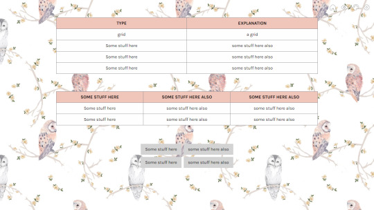
1. Prepare the HTML. For tutorial sake, I markup as follow:
<div class="table"> <div class="table-row"> <div class="column title column-border"> Some stuff here </div> <div class=" column title"> Some stuff here also </div> </div> <div class="table-row"> <div class="column column-border"> Input </div> <div class=" column"> a grid </div> </div> </div>
Explanation:
By creating this, we'll be having a two-column table with three rows including its title [table header].
class="table" refers to the 'wrapper' that will wrap the cells to make it a table.
class="table-row" refers to the row of the table for all the table cells. This acts as another 'wrapper' for both table cells to be bound together.
column is the class that we will use to design our table cells.
title is the class that we will use to decorate the first row of the table. Think of this as our table header.
column-border is the seperator that seperates between the first column and the second column.
2. Secondly, we can first design the table. You can design however you want but this is what I did:
.table{ width:70%; margin:4rem auto; background:#FEFEFE; border:1px solid #89888D; border-bottom:0; }
TAKE NOTE!:By adding margin:4rem auto, it will cause the table to be moved to center. Please change the value accordingly.
3. Once you click [Update Preview], you'll see that the outline of our table is there but the table cells are still stacking on top of one and another. To ensure that the table cells are in-line at its respective rows, this is when we design our table-row by using flexbox. Here's the code:
.table-row{ width:100%; display:flex; flex-flow:row wrap; border-bottom:1px solid #89888D; }
Remember that our table does not have a border at the bottom of the table? By including a border-bottom inside .table-row, it will create a border at the bottom of the table. The reason why we do not include the border-bottom into our .table is because by doing so, there will be a 'thick' line at the bottom of the table because of the existence of two lines from .table and .table-row.
4. After we positioned the cells according, we can customise them. For tutorial-wise, I coded them as follows:
.column{ width: 50%; padding:.5rem 1rem; text-align:center; }
What this tells us here is that we want each cell to be half of the table.
5. Next, is for our table to have its own seperator. This is when we should utilise our column-border class. You just need to add this code:
.column-border{ border-right:1px solid #89888D; }
6. Our table is almost complete but we then need our table header to seperate between the titles and the inputs. You can code your title class however you want to but this is what I coded:
.title{ background:#F0C5BA; text-transform:uppercase; font-weight:600; }
With that, you're done! If you want to add more rows, you can add this code into your HTML:
<div class="table-row"> <div class="column column-border"> Input </div> <div class=" column"> Another Input </div> </div>
3 COLUMN TABLE
Say that you want to make a three-column table as per the second example of our demo, you need to edit your HTML and CSS. For the HTML, inside the <div class="table-row"></div>, simply add this code:
<div class=" column"> Other Input </div>
Then, at your .column, replace 50% with 33.33%.
At the second column of your HTML, please ensure that you also add column-border inside you class attribute. Meaning to say that it'll will look like this: class="column column-border".
With that, you're done!
MAKING YOUR TABLE RESPONSIVE
There's no easy way of making your table responsive. However, if you want to make your table responsive, here's an approach for it:
@media screen and (max-width:1024px){ .table-row{ flex-flow:column wrap; } .column{ width:100%; } }
By doing so, your table will look like this:

I hope this helpful for those who wants to create a table without utilising <table>.
17 notes
·
View notes
Text
The Marvel of Responsive Web Design: Navigating a User-Centric Digital Landscape
Hey there, fellow web enthusiasts it's your digital marketing agency in Dwarka, vrankup! 🌐 In today's fast-paced digital realm, where every swipe, tap, and click could lead you down a rabbit hole of information and entertainment, web design has evolved into an art of seamless adaptation. Welcome to this exciting ride through the dynamic universe of responsive web design! Buckle up as we delve deep into why it matters, the nitty-gritty of its principles, and a treasure trove of best practices that can transform your web creations. Whether you're sipping coffee on a desktop or thumbing through your smartphone, this guide will be your trusty co-pilot through the responsive web galaxy.
The Responsive Revolution
Picture this: You're hunched over your laptop, meticulously crafting the perfect website layout. Now, visualize your masterpiece on a smartphone screen. Wait, why does it look like a Picasso on steroids? That's where responsive web design swoops in like a superhero! 🦸♂️ It's the technique that makes your website adjust effortlessly to fit screens of all sizes, from colossal desktop monitors to those itty-bitty smartphone displays. The idea is to give users a seamless experience, regardless of their device. Imagine that - no more awkward pinching, zooming, or squinting. Responsive web design is the key to a harmonious user journey.
Why It's the Real Deal
First off, let's talk about our gadgets. They're our sidekicks - always with us, whether we're lounging at home or conquering the concrete jungle. With users switching between smartphones, tablets, laptops, and whatnot, your website must be adaptable. That's where responsive design steps in, ensuring your content shines, no matter the screen size. But there's more! Think about Google and its SEO ranking algorithm. It adores mobile-friendly sites, boosting their visibility in search results. So, if you're aiming for web stardom, responsiveness is your ticket to SEO success.
|Digital marketing agency in dwarka|
Responsive Design: Unveiling the Magic
Hold on to your digital hats, because here come the secret ingredients of responsive web design! 🎩💫
1. Fluid Grids: It's like having a shape-shifting foundation for your website. Instead of fixed-width layouts that look wonky on different screens, fluid grids use relative units (like percentages) to make your content flow smoothly. It's like having a web design dance party that adapts to every beat.
2. Flexible Images: Ah, images - the pièce de résistance of any website. Responsive design makes sure they behave like chameleons, adapting to their surroundings. CSS tricks like 'max-width: 100%' keep images from breaking the layout on smaller screens. And with HTML's 'srcset' attribute, you can provide different images based on the device, like a magician changing outfits for different acts.
3. Media Queries: These are like the responsive design spells in your web development wizardry book. With media queries, you can sprinkle CSS rules that alter your design based on the device's traits - be it screen width, height, or orientation. Imagine your website's design adjusting its makeup as it transitions from a smartphone to a tablet!
Best Practices: Crafting a Responsive Masterpiece
Ready to craft your own responsive symphony? Here's the sheet music - our top-notch best practices!
1. Mobile-First Approach: Think small, my friend. Start designing for mobile devices first and work your way up. This approach keeps your design lean, focusing on the essentials for the smallest screens and then adding embellishments for larger ones.
2. Use Relative Units: Pixels, schmixels! Embrace relative units like percentages, ems, and rems for fonts, padding, and margins. They're like the universal translators of responsive design, ensuring your website understands the language of all devices.
3. Extensive Testing: Before the big show, run dress rehearsals on real devices and simulators. Test, test, and test again! Check if your navigation is smooth, images scale gracefully, and your layout waltzes beautifully on screens of all sizes.
4. Performance Tune-up: Mobile users are all about speed - no one likes waiting in a virtual queue. Compress images, minify CSS and JavaScript files, and consider lazy loading to keep your responsive creation loading lightning-fast.
5. User-Centric Design: Keep your users at the heart of it all. Focus on delivering what they need most, especially on smaller screens. Trim the excess and let the essentials shine through.
The Grand Finale
Responsive web design isn't just a tool in your arsenal - it's a mindset. It's about embracing change and ensuring your digital creations are welcoming to everyone, no matter the device they wield. As technology continues its relentless march forward, responsive design ensures your website remains relevant, accessible, and captivating to users old and new.
So, there you have it, intrepid explorers of the web cosmos! With the principles and best practices of responsive design in your toolkit, you're well-equipped to navigate the dynamic tides of the digital sea. As screens continue to shrink, expand, and evolve, your websites will stand strong, adaptable, and ready to provide users with an experience that's nothing short of extraordinary. Get out there and design responsively - the digital realm awaits your creative brilliance! 🚀
Catch you later,
Digital marketing agency in dwarka, vrankup!
#website designing company in dwarka#seo company#seo#website designing company in gurgaon#noida#digital marketing#digital marketing agency in dwarka#vrankup#digital marketing company in dwarka#website designing services in gurgaon
2 notes
·
View notes
Text

Responsive Web Design
Responsive web design ensures web pages automatically adjust to suit the user's screen size. There is a large variety of devices used for viewing the web, all with varying screen sizes. So web developers need to keep this in mind when creating websites. They use a mix of flexible grids and layouts and clever use of CSS media queries which describes different styles for different screen sizes.
If you are unfamiliar with the CSS programming language and the code used for styling different screen sizes, you might think you can only set 3 specific web design styles: one for desktop computers; one for tablet devices; and one for mobile phone devices. However, with CSS coding, you can set as many different styles as you wish for different screen sizes.
At MarkIT Space, we design for and test 8 standard screen widths:
2560 pixels wide (large monitors)
1920 pixels wide (standard monitors)
1440 pixels wide (standard laptops)
1024 pixels wide (small laptops)
768 pixels wide (tablet devices)
425 pixels wide (large mobile phones)
375 pixels wide (standard mobile phones)
320 pixels wide (small mobile phones)
7 notes
·
View notes
Text

I can help you. With html or css. Responsiveness, grid, flex, media queries, anything. Just ask. We gotta get out of here man.
10 notes
·
View notes
Text
Brower Electric - Commit #3 - Service Information Tree
This commit used a Bootstrap 5 Grid to build an information tree for the site.
On Desktop:
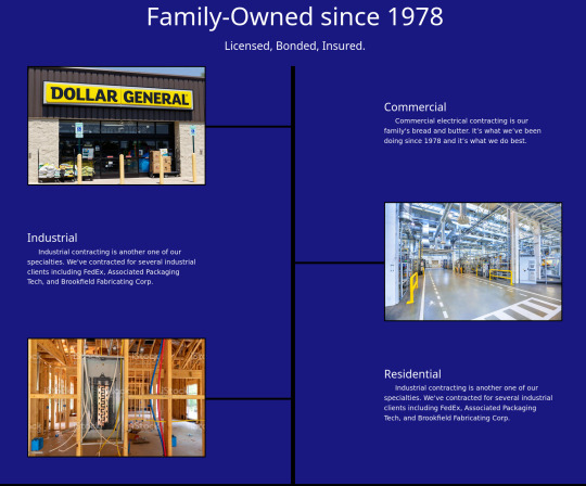
On Mobile:
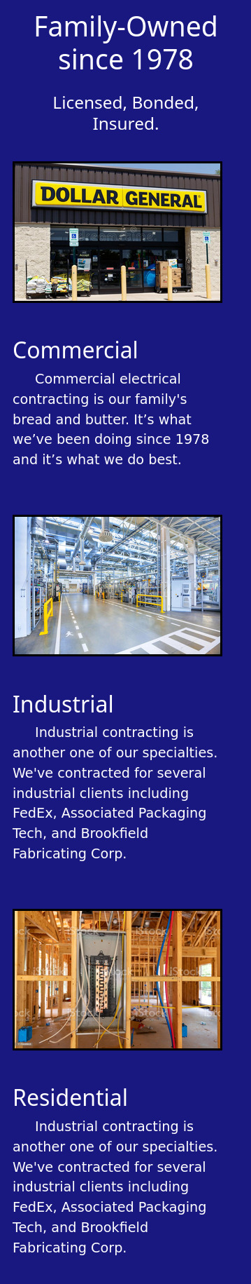
In Between:

The HTML:
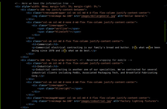
First, I set up a container div with a width of 90vw and 5% on each side. This keeps everything in the middle and at least 90% of the width is used.
The Bootstrap 5 Grid system is a framework for flex-boxes. Basically, they set up the rows and columns classes for me, with pretty extensive responsiveness and including table/grid-like tools that let you adjust the size of the cols without sweating.
By default our cols are not flex containers, so we added d-flex and related attributes so that we can position the column content using flexbox tools.
The middle row flex-wraps in reverse so that even though it's positioned opposite the others on desktop, when wrapped, it reverses itself back to a sensible position.
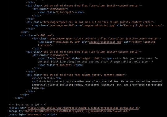
The reason that I have both an image and a surrounding wrapper is so that I can flex position the image to keep it in line with the rest of the page. The border is applied to the image directly though.
The middle cols contain the lines. This was the biggest challenge. The lines are contained in a positioned (relative) wrapper stretched to fit the div. Because the wrapper is positioned but not flex, I can use absolute positioning for my line spans. This is desirable because flex positioning, which I generally like better, does not let you overlap your elements as easily. Took me more than an hour to figure out this solution.
The vertical line is 350% height in the top div, but not present in the middle div. This is to work around the row padding and stretch across all rows. The last div has a 100% height vertical line to help hide make sure the line does not cut short as the page flexes. This took me like 10 minutes to come up with but it was a satisfying fix. Maybe writing the div outside of the rows and positioning it in regard to the whole section of the page could be better though.
The CSS:
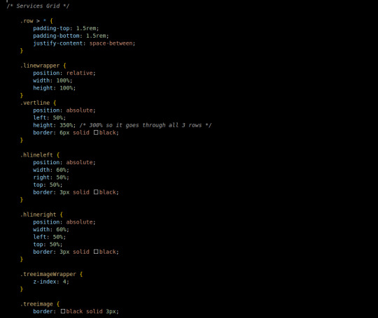
The CSS is comparatively simple since Bootstrap lets me do a large amount of the styling on the HTML doc.
Every row child has a top and bottom padding, additionally they position themselves across the row with equal space in between.
The linewrapper stretches to fit it's div with width and height at 100%. Because it's relatively positioned, I can play with absolutely positioned elements on the inside.
The vertline, as mentioned earlier, has 350% height, no width. a 6px black border and is absolutely positioned 50% from the left border of it's wrapper.
the hlines are similar. Absolutely positioned 50% to the left or right of the wrapper, with a 3px solid black border. The width of the line is 60% so it goes through and under the image. The treeimageWrapper has a z-index of 4 so that the lines go under it.
The treeimage has a 3px black border.
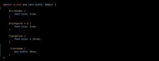
I added one media query to the tree images to make sure they are at least 30% of the viewport in terms of width on desktop. Without this, you get some baby-sized images.
Conclusion:
I think that learning to develop is a lot like learning to play chess. When you practice chess, you get better in two ways: 1) You get used to stretching your brain in the chess direction and 2) You have at least some memory of how you have solved similar problems in the past.
It took me a few hours to write, what I realize now that I review it, is a small amount of code. I'd say more than 50% of the code I write, I delete and rewrite before I actually solve the problem. I think that as I solve more problems like this, my memory of their eccentricities will strengthen and I will be able to write quick solutions because, well, I've already solved it.
You can visit the site's github repository here: https://github.com/Xacheri/BrowerElectric
4 notes
·
View notes
Text
Best WordPress Plugin For Website
Slider Revolution Responsive WordPress Plugin
This versatile WordPress plugin helps beginner and mid-level designers WOW their clients with pro-level visuals. You’ll be able to create anything you can imagine, not just amazing, responsive sliders:
Stunning visual elements such as sliders & carousels
Eye-grabbing hero sections that stand out
Whole websites that could win you awards
Full web pages that glue visitors to the screen
Rich and dynamic content your clients will LOVE
Without writing a line of code. In a matter of minutes. Using any type of media you want.
Check out the Demo...
Bookly PRO – Appointment Booking and Scheduling Software System
Bookly Pro is the best booking plugin for WordPress websites (customer’s words – not ours). The process of booking appointments is fully customizable for your clients. It’s anywhere from 2 to 6 easy Steps. Here’s a walkthrough of the user experience in the standard 6-Step scheduling process.
This piece touches on add-ons and focuses more on the standard booking plugin. Check out our add-ons and the deeper customization options they provide.
Check out the Demo...
Essential Grid Gallery WordPress Plugin
Essential Grid Gallery is a premium plugin for WordPress that allows you to build great looking image, video, and audio galleries from various sources! Use the adapted WordPress gallery functionality, posts, and pages, include albums built with other plugins like NextGen Gallery, connect to the big social media streams like Instagram, YouTube, Vimeo, Twitter, Flickr, etc., or build a complete custom gallery grid. Our template library will give you example grids that will look outstanding on mobile devices too and are easy to configure and fill with your content!
Check out the included template library with its 50+ ready-to-go starter grids & skins!
WPBakery Page Builder for WordPress
Have you ever noticed how much time you waste while manually coding layouts? No more trial and error with shortcodes or CSS! Now you have everything it takes to design anything and for any page. Yes, WPBakery Page Builder works with any WordPress theme!
Say hello to the most popular WordPress page builder plugin! WPBakery Page Builder is easy to use drag and drop page builder that will help you to create any layout you can imagine fast and easily. No coding skills are required!
WPBakery Page Builder is the #1 Best Selling drag and drop frontend and backend page builder plugin on the market – already powering 2,000,000+ websites. Join now and start creating beautiful WordPress websites in no time with minimum effort, and – of course – no coding and [shortcodes].
Check Out 50+ Built In Content Blocks
#wordpressplugin#wordpressplugins#wordpressplugindevelopers#videomarketing#marketingtips#marketing#plugin#plugins#pluginhybrid#PlugInBaby#pluginsolar#plugintonirvana#pluginplay#PluginzKeychains#plugintawho#plugintawhat#plugintaalll#Pluginz#plugintoGod#pluginproduction#PluginRealty#plugincar#pluginadventure#PlugInMarketing#plugintees#pluginwithusnow#PlugInThursday#pluginthegear#PlugIntothePower#plugintotheuniverse
4 notes
·
View notes
Text
Responsive Web Design (RWD) is a web design approach that creates websites that provide an optimal viewing experience for users across a wide range of devices, from desktop computers to mobile phones. RWD uses a combination of flexible grids and layouts, images, and intelligent use of CSS media queries to create a single, fluid design for all devices. Responsive web design makes it easy for websites to adapt to the size of the user's device, allowing for better usability and improved user experience. Additionally, this approach reduces the need for separate mobile sites and allows for a single source of content to be used across multiple devices.
#website#webdevelopment#webdesign#web developing company#web developers#webdoithuong#agency#company#management#businesses#services#deal
2 notes
·
View notes
Last Seen Blogs

toast-art
⁕•Have some toast•⁕

thesarcasticfox
Untitled

canberratalks
Canberra Talks
hoshiberry
I LEFT TUMBLR CHECK MY DA